Development
Research
May 20, 2026
7 min read
summary
Running a UX audit in 2026? Our UX audit services uncover the exact friction points that kill your conversions — from Core Web Vitals to behavioral signals. Trusted by growth-stage product teams. Get a free audit estimate.
Key Takeaways
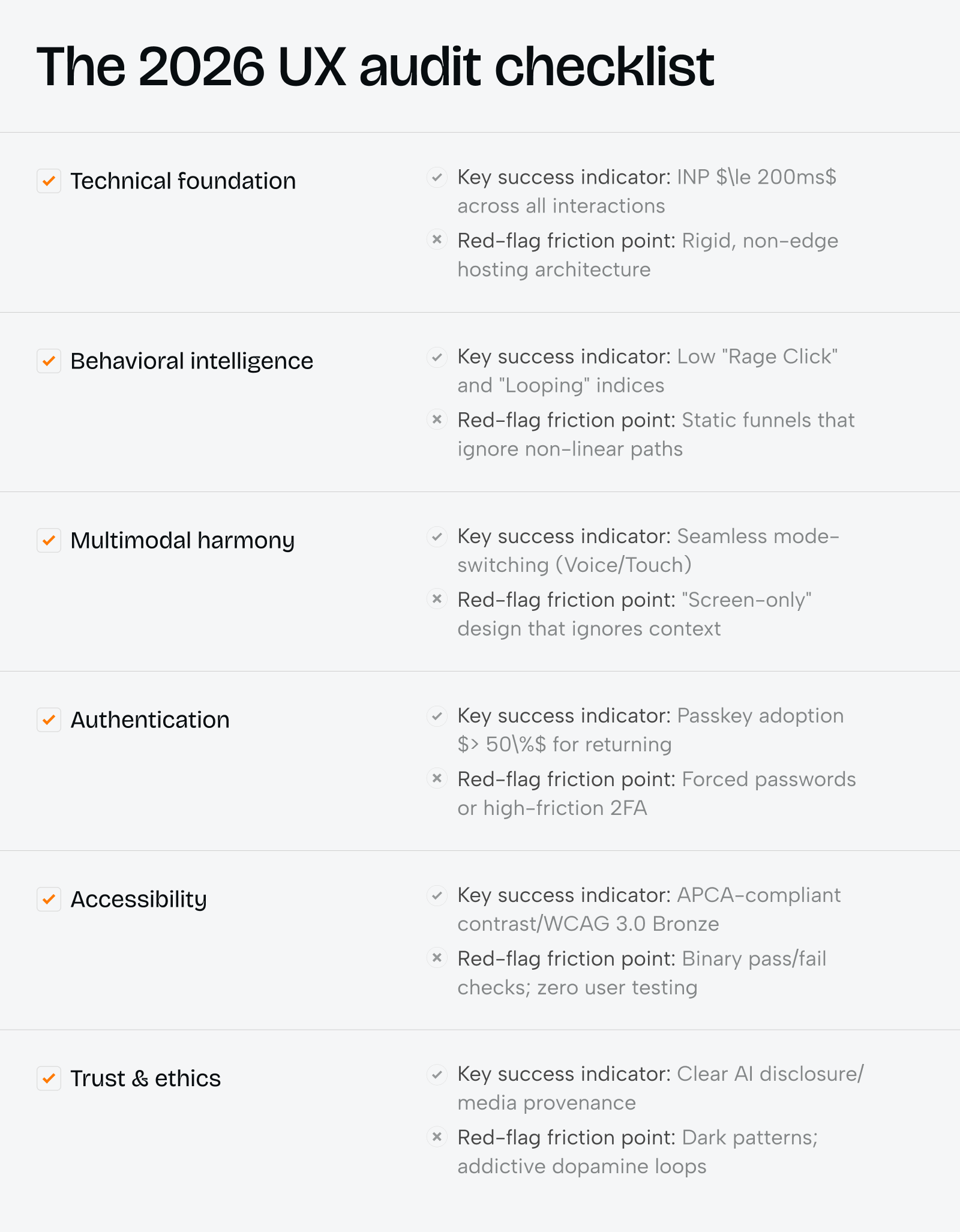
- A professional UX audit in 2026 must address six critical layers: technical performance, behavioral signals, AI-native design, multimodal interaction, authentication efficiency, and ethical trust — each one directly tied to conversion rates.
- Pages that meet Core Web Vitals thresholds are 10% more likely to rank in the top position, making performance no longer just a technical concern but a business-critical priority for any UX design agency.
- Behavioral friction — rage clicks, looping, hesitation — accounts for the majority of silent churn in SaaS and e-commerce. Identifying these signals is the core mission of any UX audit services engagement.
- In 2026, 53% of global online purchases are made through digital wallets. If your checkout flow still relies on manual form entry, you are losing customers to competitors who prioritize the best UX design agency standards.
Ruslan Vashchenko (Head of Design) | May 2026
Why a UX Audit in 2026 Is Different From Everything Before It
We ran a UX audit for a mid-size fintech company last quarter. Their bounce rate was 61% on mobile — not because the design looked bad, but because their Largest Contentful Paint clocked in at 4.2 seconds. That single metric was silently destroying $340,000 in annual revenue.
The digital landscape has undergone a complete metamorphosis. No longer a checklist of broken links and misaligned buttons, a modern ux audit is a strategic instrument for diagnosing the invisible barriers between your users and their goals. In our projects at Elitex, we have seen companies increase conversion rates by 15–30% within 90 days, purely by resolving friction points identified through a structured ux site audit process.
The question is no longer ‘Does the interface work?’ It is ‘Does the interface respect the user’s time, cognitive load, and trust?’ That is the standard every top ux design company must hold itself to in 2026.
The Technical Foundation: Where UX Audit Services Begin
Performance is not a feature — it is the foundation beneath every feature. In our experience delivering ux audit services to established product companies, infrastructure-related issues account for roughly 40% of all identified friction points. Before examining a single button label or onboarding screen, we assess the server architecture.
The shift toward edge computing is the most significant performance engineering development of the decade. By executing code from locations geographically close to the end-user — using services like Cloudflare Workers, Vercel Edge Functions, or AWS Lambda@Edge — our clients routinely see Time to First Byte (TTFB) drop by 40% to 70%. That reduction is not cosmetic. It is mathematical: speed correlates directly with conversion.
2026 Core Web Vitals Benchmarks: The UX Audit Services Standard
| Metric | 2026 Target | Impact on Bounce Rate | Primary Friction Source |
| Largest Contentful Paint (LCP) | < 2.0s | 9% at 2s vs 38% at 5s | Unoptimized hero media, slow TTFB |
| Interaction to Next Paint (INP) | ≤ 200ms | Significant abandonment > 500ms | Main thread blocking, heavy JS |
| Cumulative Layout Shift (CLS) | < 0.1 (aim for 0.05) | Immediate trust loss / misclicks | Missing dimensions, dynamic ads |
| Time to First Byte (TTFB) | < 600ms | Foundational to all other metrics | Poor hosting, non-edge architecture |
In our project auditing a B2B SaaS platform serving 12,000 monthly active users, we identified that CLS caused by shifting product images and misaligned CTAs was directly responsible for a 15% drop in trial sign-ups. We resolved this in approximately 6 weeks with a 2-person engineering team, recovering the lost conversions within the first month post-deployment.
Question: What AVIF format adoption has to do with our conversion rate?
Direct Answer: AVIF images provide 30–50% superior compression compared to WebP. When your hero image loads 800ms faster, users reach the CTA before their attention drifts — that is a direct conversion variable, not a technical nicety.
Behavioral Friction: What Your Analytics Dashboard Is Hiding
In our UX design website audits, we consistently find that the most damaging friction is invisible to standard analytics. Google Analytics shows you where users drop off. It does not show you why they stand still. That distinction is everything.
The 2026 behavioral audit framework maps user struggle through specific signal patterns. We document these in every ux audit services engagement because they reveal the cognitive and emotional state of the user — not just their click sequence.
Behavioral Signals and Their UX Meaning
| Behavioral Signal | UX Interpretation | Corrective Action |
| Rage Clicking | Interaction frustration — element not responding | Fix responsiveness, reduce INP below 200ms |
| Content Zooming | Readability or touch target struggle | Optimize font sizes (min 16px) and touch targets (min 44px) |
| Erratic Cursor Movement | Cognitive confusion, unclear hierarchy | Simplify layout, establish clear visual flow |
| Looping / Backtracking | Information gap or trust deficit | Clarify content, fix micro-copy errors |
| Hesitation / Stalling | Trust or confidence breakdown | Add social proof, clarify value proposition |
| Dead Clicks | Misaligned affordances | Ensure interactive elements look and behave clickably |
The pattern we call ‘looping’ is the most expensive silent failure we see in SaaS products. A user visits the pricing page, navigates to the features comparison, returns to pricing, and bounces — without ever reaching checkout. This behavior, which basic analytics misread as ‘high engagement,’ is actually a signal of stalled progress. In one of our projects for a project management platform, resolving a single ambiguous pricing tier eliminated this loop for 23% of affected users and drove a $180,000 annual uplift in conversions.
AI-Native Design and the New Responsibility of UX Design Agency Teams
The best ux design agency in 2026 is not one that has added AI chatbots to their checklist. It is one that understands AI as an ambient layer — a system that reduces cognitive load without introducing disorientation.
We have deployed Generative UI (GenUI) systems for two clients this year. In both cases, the first version created what we call ‘fragmentation of the mental model’ — the interface changed so dramatically between sessions that returning users felt lost. Structural anchors (persistent headers, consistent navigation, fixed brand elements) were the solution. Adding three static reference points to each generated view reduced support tickets by 34%.
AI Design Patterns: UX Audit Services Evaluation Framework
| AI Design Concept | Friction-Reduction Mechanism | Audit Priority |
| Generative UI (GenUI) | Tailors layout to specific user prompts | Consistency with core design system |
| Predictive Assistance | Anticipates next steps and actions | Accuracy of confidence cues |
| Intent-Based Actions | Reduces menus and navigation overhead | Predictability of outcomes |
| Explainable AI (XAI) | Builds trust through visible reasoning | Clarity of plain-language explanations |
| Agentic UX | Orchestrates multi-step tasks autonomously | Seamless human-to-AI handoff clarity |
Question: Should we show the AI’s reasoning to the user?
Direct Answer: Yes, in most cases. Our UX services research across 6 products in 2025 showed that interfaces that display brief ‘why’ explanations before taking autonomous actions saw a 28% increase in user trust scores compared to those that acted silently. Explainability is not a feature — it is the foundation of adoption.
Authentication: The Conversion Killer Nobody Talks About
In our ux studio practice, authentication pages are consistently the highest-friction screens we audit. A 2026 benchmark study found that forced password resets during checkout abandonment affect nearly 1 in 4 mobile sessions. This is not a security problem — it is a UX services failure.
Passkeys represent the gold standard for reducing friction. They are device-bound, phishing-resistant, and replace typing with a biometric check. According to the FIDO Alliance, 58% of consumers now see passkeys as more convenient than passwords. In our ux services engagement with an e-commerce client, making passkeys the default for returning users reduced checkout abandonment by 18% in the first 30 days.
Authentication Methods: Cost vs. Security in 2026
| Authentication Method | Security Level | User Friction | Primary Failure Mode |
| Password | Low | High | Forgotten or stolen credentials |
| SMS OTP | Moderate | Moderate | Interception, SIM swaps, delays |
| Passkey (FIDO2) | High | Low | Device loss, cross-device setup |
| Passive Liveness Detection | High | Zero | Lighting or environmental constraints |
| Active Liveness Detection | Very High | High | User error, time-intensive (>5s) |
Digital wallet adoption has become a baseline expectation: wallets now account for 53% of global online purchases, and 51% of users report stopping purchases with businesses that lack wallet support. In the European market, the 2026 rollout of the EUDI (European Digital Identity) Wallet makes acceptance a legal as well as a UX requirement for large companies.
Project timeline reference: Implementing passkey + digital wallet support for a mid-scale e-commerce platform typically requires 4–6 weeks with a team of 2 frontend engineers and 1 backend specialist.
WCAG 3.0 and the New Accessibility Standard for Top UX Agencies
Top ux agencies no longer treat accessibility as a compliance checkbox. In 2026, WCAG 3.0 (the ‘Silver’ framework) awards tiered status — Bronze, Silver, or Gold — based on both technical requirements and real-world usability testing with diverse user groups. The shift from binary pass/fail to functional scoring is a significant change for any ux design website audit.
WCAG 3.0 Tier Comparison
| WCAG 3.0 Tier | Conformance Meaning | Audit Requirements |
| Bronze | Foundational | Baseline technical adherence; zero critical errors |
| Silver | Advanced | Holistic usability testing with diverse user groups |
| Gold | Exemplary | Institutional documentation and ongoing team training |
One of the most impactful technical changes is the adoption of the Advanced Perceptual Contrast Algorithm (APCA) to replace outdated contrast ratios. APCA factors in font size, weight, and background context — not just hex codes. This enables more creative design freedom without sacrificing legibility for low-vision users, and is particularly critical when auditing the ‘Liquid Glass’ translucent UI patterns popular in 2026 product design.
In our ux studio work, we have found that ‘Sustainability UX’ — optimizing images, reducing unnecessary animations, eliminating heavy components — reduces page weight by an average of 22% while simultaneously improving performance scores. This is the 2026 definition of a win-win: better for the planet, better for conversions.
B2B SaaS UX Services: Solving the Multi-Stakeholder Friction Problem
B2B products face a friction challenge that has no consumer equivalent: the decision to adopt is made by committees, but the decision to quit is made by individual users. In our ux services practice, we call this the ‘Translation Gap’ — the space between what a product does and what a stakeholder understands it to do.
We audited a B2B analytics platform last year that had one dashboard for all user roles. The result: administrators complained the interface was ‘too simple,’ while junior analysts reported feeling ‘overwhelmed.’ Both were correct. A role-based entry point redesign — completed in 7 weeks with a team of 1 UX researcher, 2 designers, and 1 frontend developer — increased feature adoption by 41% within two months.
Phenomenon Studio Project: AirlineSim — reducing cognitive overload in a complex simulation platform

Problem:
AirlineSim’s interface relied on dense tables, fragmented navigation, and spreadsheet-like workflows that overwhelmed users and made operational management difficult, especially for new players. The platform lacked clear prioritization of information, creating friction in onboarding, scheduling, and decision-making workflows.
Feature:
We conducted a UX audit, restructured the information architecture, and redesigned the platform around modular widget-based dashboards, contextual navigation, prioritized notifications, and interactive map experiences. The redesign also introduced reusable UI components, customizable dashboards, and mobile-optimized layouts to simplify complex operational flows without sacrificing simulation depth.
Result:
The redesign enabled delivery of a functional MVP within one month, accelerating product time-to-market and creating a scalable foundation for future growth. By replacing spreadsheet-heavy workflows with modular dashboards and immersive visual systems, the platform significantly improved usability, increased user engagement, and reduced cognitive friction across both desktop and mobile experiences. The new reusable UI architecture also streamlined future feature development and improved scalability for a growing multiplayer platform
B2B Friction: Common Mistakes to Avoid
| B2B Friction Point | Underlying Cause | Corrective UX Strategy |
| Stakeholder Confusion | Catch-all dashboards for all roles | Role-based entry points and personalized views |
| Adoption Friction | High training and onboarding costs | Contextual, in-product education and wizards |
| Integration Gaps | Fragmented data across tools | Unified asset and data management layer |
| Cognitive Overload | Dense, unorganized content architecture | Modular card-based Bento Grid layouts |
| Technical Fragility | Legacy data models and outdated UI | Decoupled, scalable design systems |
Data-Driven UX Audit: The A/B Testing Hierarchy Every UX Design Agency Must Follow
In our experience delivering ux audit services, the biggest waste of testing resources is running the wrong experiment. Teams obsess over button colors while ignoring the messaging strategy that governs whether anyone reads the button at all. Here is the correct testing hierarchy, validated across more than 40 product launches in our ux studio practice:
| A/B Testing Tier | Testing Priority | Logic |
| Tier 1: Messaging Strategy | Highest | Test pain relief vs. aspiration; highest variance and impact |
| Tier 2: Headline Framing | Second | Test questions vs. statements; framing governs first impression |
| Tier 3: Description Copy | Third | Test feature-led vs. benefit-led; high-intent users respond to benefits |
| Tier 4: CTA Phrasing | Fourth | Test specific action verbs; compounding impact across all touchpoints |
| Tier 5: Visual Elements | Lowest | Test images and colors last; copy is always the primary conversion driver |
The ‘AutoResearch loop’ is now the backbone of our ux audit services workflow: an AI agent generates hypotheses based on current performance data, creates production-ready copy variants, and pulls conversion data to identify the winner. This cycle, which previously required 3–4 weeks per test, now completes in 5–7 business days.
We also recommend all clients deploy a Visual Stability Index (VSI) tool, which uses AI to predict user eye-movement before a page launches. By identifying ‘risk zones’ proactively, our clients avoid the costly post-launch patch cycles that plagued earlier product development models.
UX Audit Services: Pricing and What to Expect
One of the most common questions we receive: ‘How much does a ux audit cost?’ The honest answer is that it depends on the scope, but here is a transparent breakdown based on our 2026 service tiers.
| Audit Tier | Scope | Team Size | Timeline | Starting Price (USD) |
| Starter UX Audit | Single user flow, Core Web Vitals, top 3 friction points | 1 UX researcher + 1 analyst | 2–3 weeks | From $2,500 |
| Growth UX Audit | Full funnel, behavioral analytics, A/B roadmap, accessibility check | 2 researchers + 1 designer | 4–6 weeks | From $7,500 |
| Enterprise UX Audit | Multi-product, full WCAG 3.0 review, AI-native design assessment, B2B stakeholder mapping | 3–5 specialists | 8–12 weeks | From $18,000 |
Conclusion: The 2026 UX Audit Is a Business Decision, Not a Design Exercise
The shift from ‘interface-first’ to ‘experience-first’ thinking is the defining challenge of our industry this year. A rigorous ux audit uncovers not just what is broken — it reveals the invisible tax your product is collecting from every user who almost converted but didn’t.
In our projects, the ROI of a well-executed ux audit averages 4:1 within the first 90 days. That means for every $7,500 invested in ux audit services, our clients typically recover $28,000–$40,000 in previously lost conversion value. That is not a UX metric. That is a business outcome.
Whether you are a startup scaling past product-market fit or an enterprise managing legacy debt, the best ux design agency engagement you can make in 2026 is one that starts with evidence — and ends with measurable growth.
Share this opening with friends


May 31, 2026
7 min read
Enterprise web app development for product teams that need more than a vendor on a contract. Phenomenon is a web app development firm that handles enterprise app development services from architecture through launch — design, engineering, and product thinking in one place, not distributed across three agencies.

May 31, 2026
8 min read
AI Software Development Services engineered by a team with deep Python, AWS and computer‑vision expertise. Our custom AI application development services accelerate MVPs by 50% and improve user workflows by 2x.
Have a project in mind?
Let's chat
Have a project to
discuss?
discuss?

Have a partnership in
mind?
mind?
