AirlineSim — realistic online airline management simulation
AirlineSim — realistic online airline management simulation - Website Development - Photo 1
Faster time-to-market

Delivered a functional MVP within a short timeframe, allowing the client to enter the market quickly and gain early traction.

Built with scalability in mind

Designed the MVP with a flexible architecture, ensuring smooth transitions for additional features and scaling as the product evolves.

Deeper engagement

By integrating maps, radars, aircraft illustrations, and customizable airline branding, the simulation feels more alive and engaging. Users connect emotionally with their airline rather than seeing it as just rows of data.

Overview
AirlineSim is the way to experience the reality of running an airline

As a long-running online simulation, the goal was to create a platform that mirrors the complexity of the aviation industry. Players are challenged to build and operate their own airlines, balancing fleet management, scheduling, pricing, and competition in a dynamic, multiplayer world.

Through detailed modeling and a global community, AirlineSim delivers a captivating business environment that reflects the strategic depth and challenges of real-world aviation.

Client
Airline sim Icon - fi_4628635 (3)Germany
Technologies
Icon - Vite-1 12Vite Icon - React (2)React Icon - TypeScript (2)Typescript Icon - scss-svgrepo-com 1SCSS Framer motion Icon - React-Router--Streamline-Svg-LogosReact Router Icon - Redux (2)Redux
Business needs
Client request & business goals

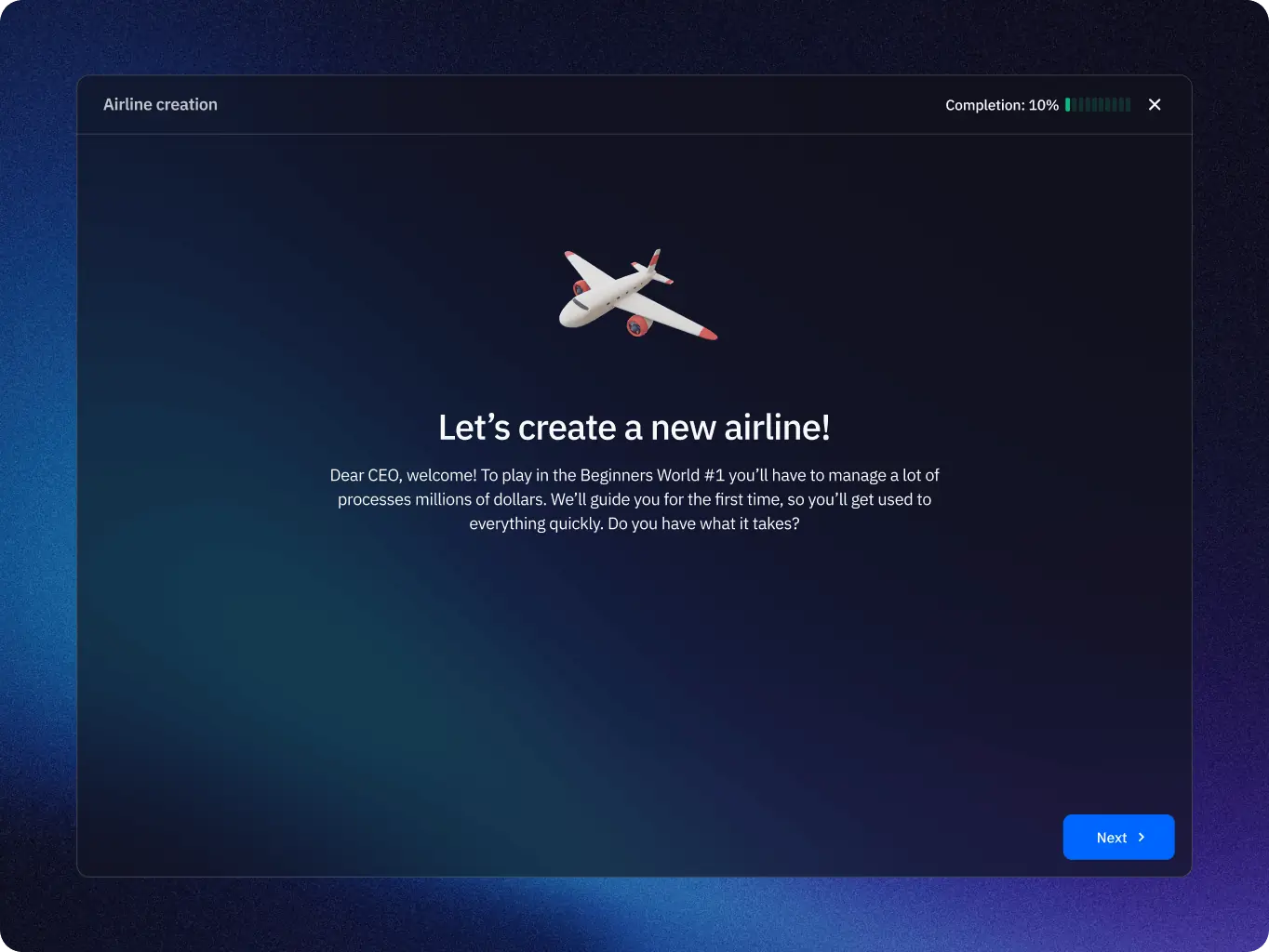
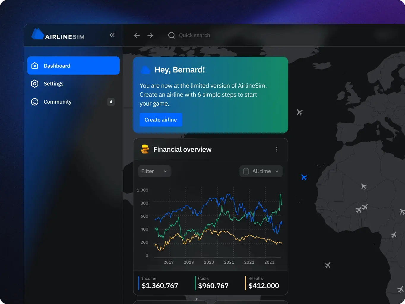
The client approached us with the request to redesign AirlineSim in the form of an MVP that would modernize the user experience while preserving the depth of the simulation. A key requirement was to shape the interface in a way that visually feels closer to a game, making complex processes more intuitive and engaging for players.

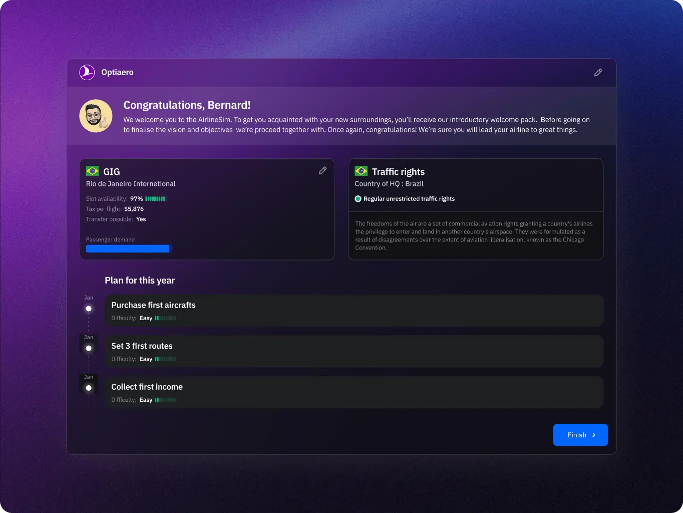
The goals were to clarify the flow of onboarding and user progression, ensuring that new players understand their next steps and are continuously motivated to advance.

The overall objective was to build a foundation for a platform that not only reflects the strategic complexity of airline management but also communicates it through a clear, accessible, and visually compelling experience.

AirlineSim — realistic online airline management simulation - Website Development - Photo 4
Challenge
Problems & solutions
Problem
The interface was cluttered and made it difficult for users to access key information quickly.
Solution
We introduced a widget-based dashboard with clear navigation and immersive visuals, making data easy to scan and the experience more realistic.
Problem
The map was visually dominant and often created clutter, distracting users from key actions. It lacked clarity on when and how it should be used, which reduced both usability and immersion.
Solution
We limited the map to contexts where it adds value — such as the homepage and route planning — and applied a neutral color scheme to reduce visual noise. Combined with a widget-based interface, the map remains informative and eye-pleasing without overwhelming the user.
Problem
The game involves constant changes – flights departing and landing, weather shifts, and slot availability. Without proper guidance, users could easily miss critical updates.
Solution
We introduced a notification system with clear prioritization, highlighting urgent events and mandatory actions.
Problem
The interface relied heavily on tables and graphs, which felt more like a work tool than a game. For new players, this lack of visual engagement made the experience less appealing and harder to stay motivated.
Solution
We enhanced the UI with visual elements such as maps, aircraft illustrations, and dynamic widgets (e.g. weather, clocks). These “eye-candy” features made the interface more engaging while keeping it informative and functional.
Icon - process-1
Wondering about the price? We’ll help you find the best solution!
Research
Understanding how to make a complex simulation engaging and user-friendly

To redesign AirlineSim, we began by analyzing how players interact with the platform and what makes the simulation both challenging and enjoyable. Our research focused on the balance between realism and usability: the game delivers large amounts of operational data, but the interface often felt overwhelming and lacked the visual appeal expected from a game.

Through UX audits and competitor analysis, we identified key opportunities: simplifying data presentation with widgets, integrating maps and 3D visuals in meaningful ways, creating a clear notification system, and adding customization options to strengthen player immersion. These insights guided the design direction toward a more intuitive, engaging, and game-like experience.

Stages

  • UX Audit
AirlineSim — realistic online airline management simulation - Website Development - Photo 7
Stage 1
UX audit

We conducted a detailed audit of the existing AirlineSim platform. The focus was on understanding how users interacted with complex data, what slowed them down, and where they experienced friction. By mapping out key flows such as onboarding, flight scheduling, and aircraft management, we highlighted usability gaps and areas where the interface felt more like a spreadsheet than a game.

This gave us a foundation for creating a design that balanced realism with engagement.

AirlineSim — realistic online airline management simulation - Website Development - Photo 8
Design
Designing clarity in complexity

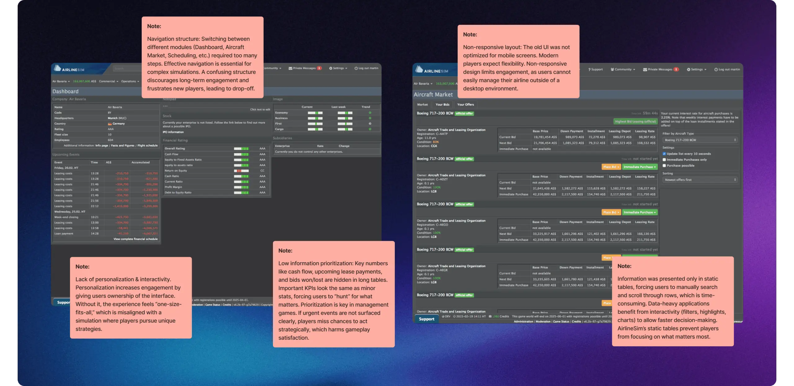
AirlineSim is a deep and data-driven simulation where every decision relies on accurate operational details. The challenge in redesigning its interface was to keep the realism and complexity of airline management while ensuring that players are never overwhelmed.

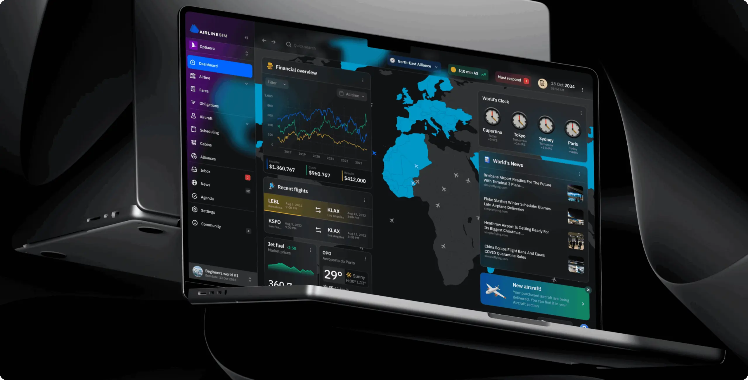
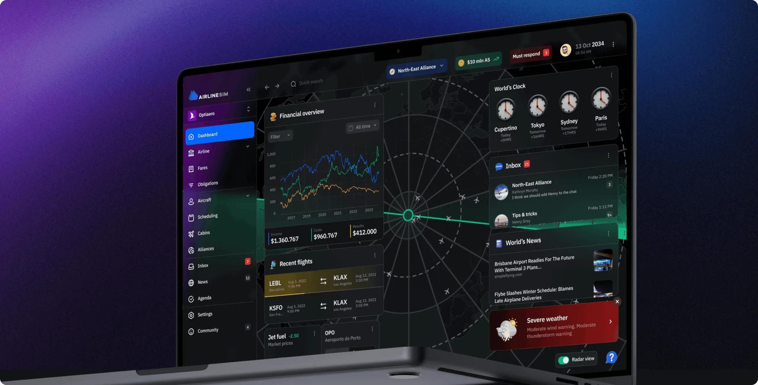
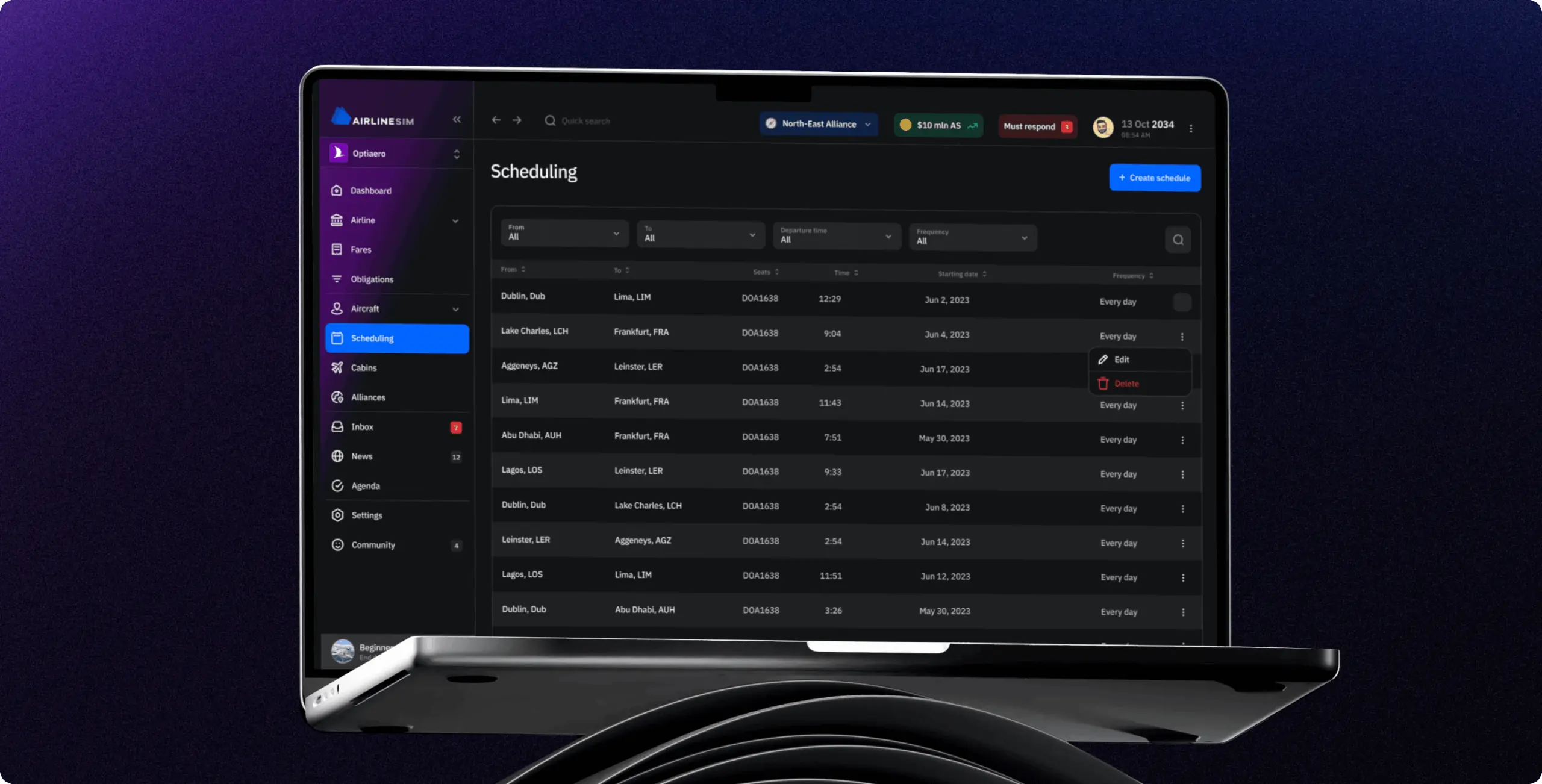
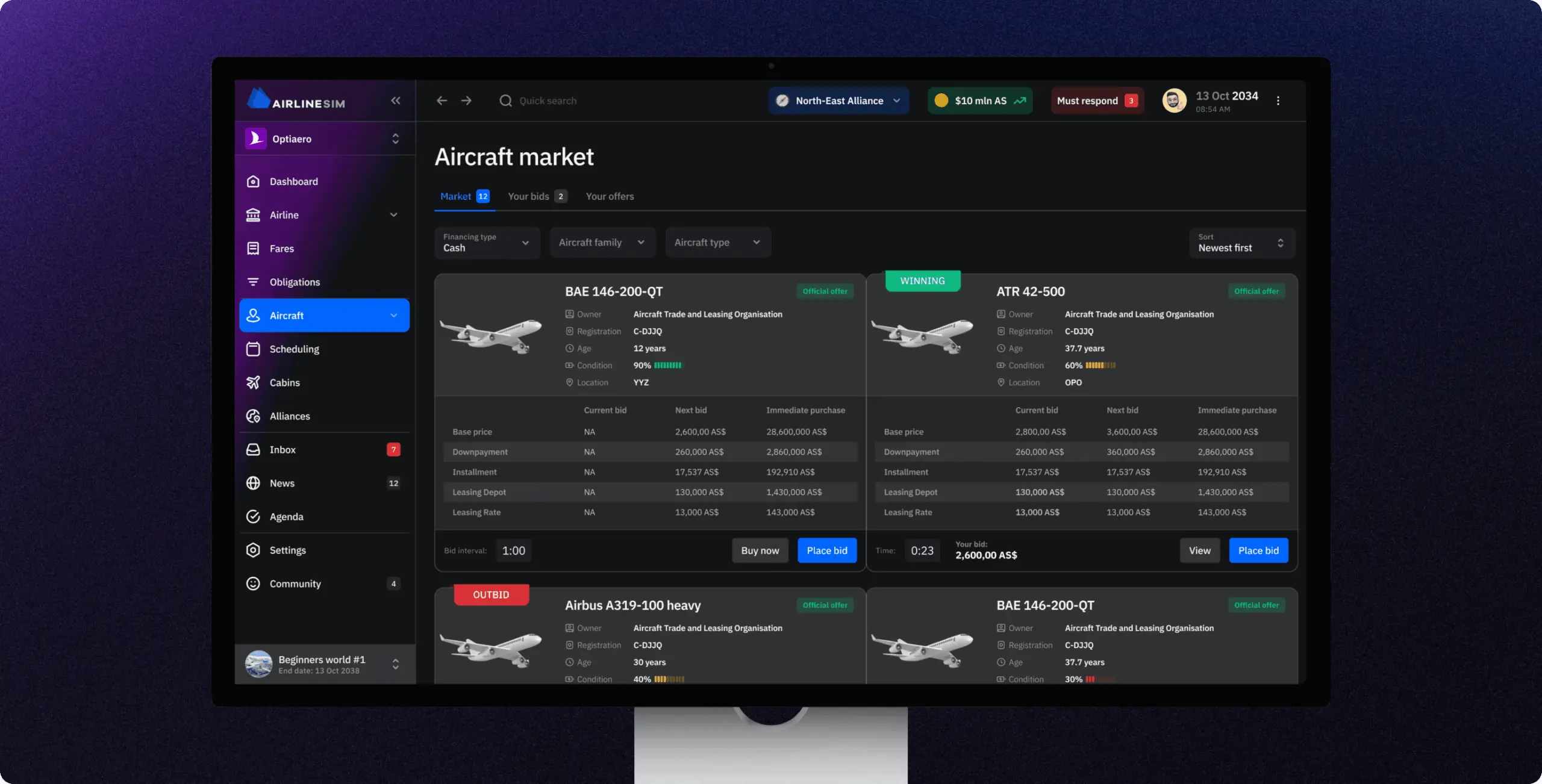
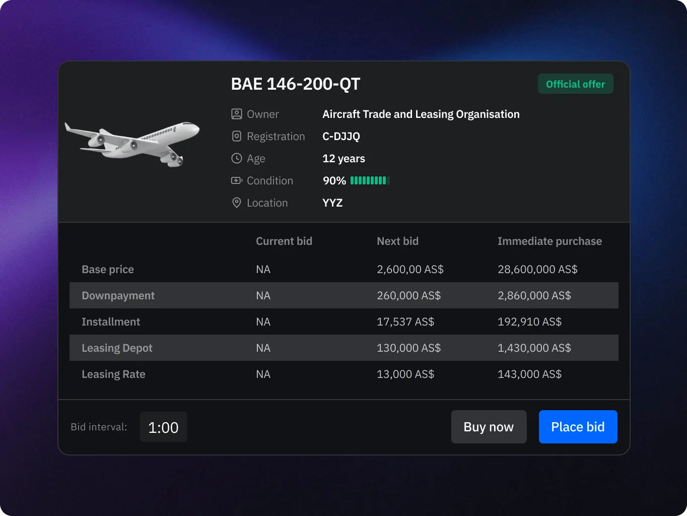
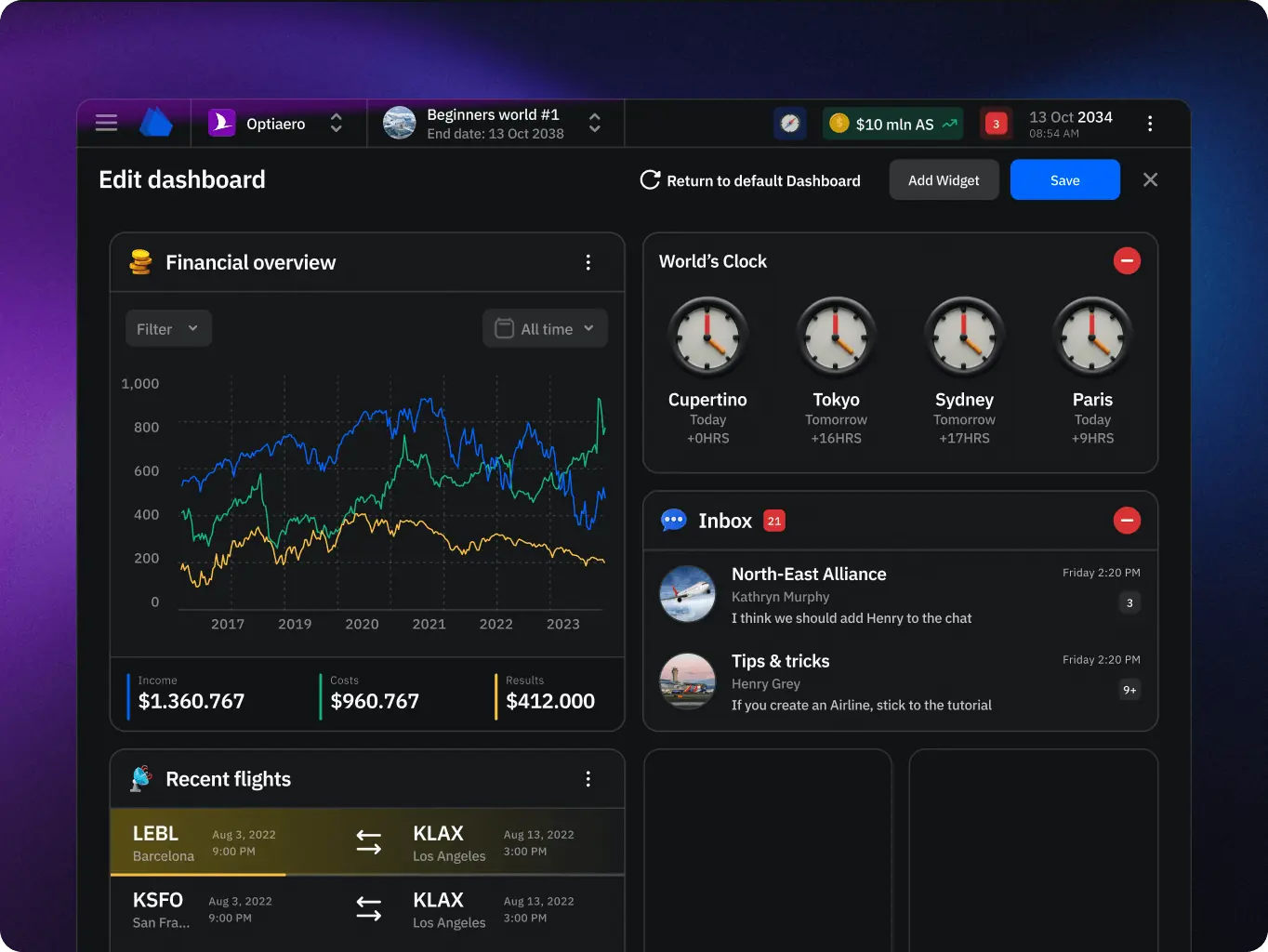
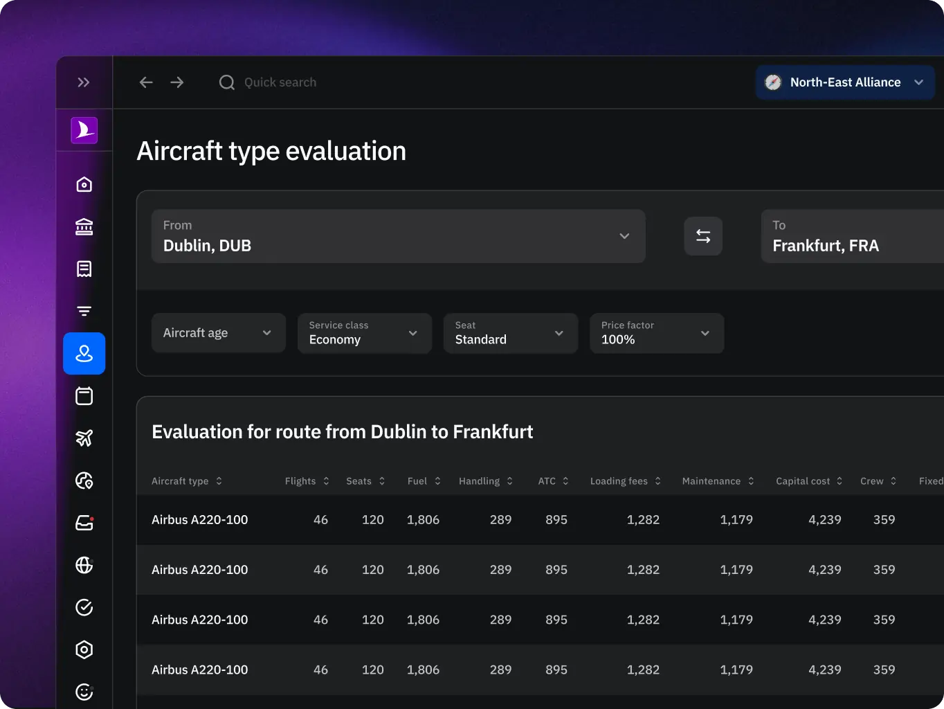
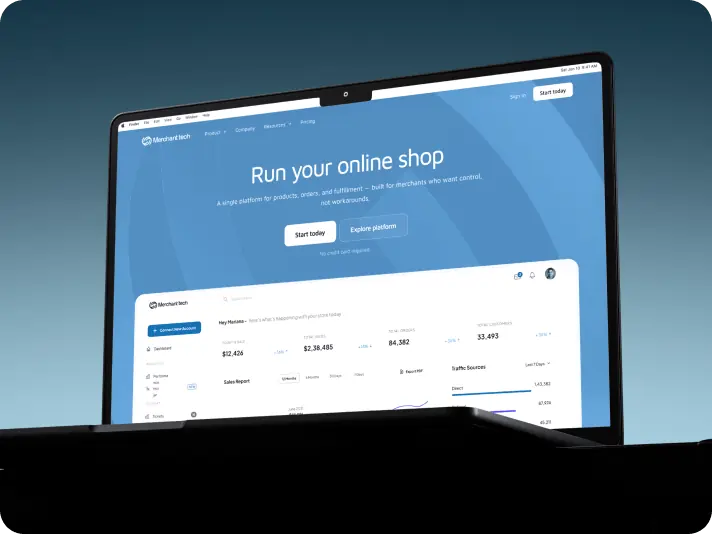
The new design system tackles this by introducing a modular dashboard with widgets, maps, and real-time data visualization. Instead of forcing users to parse endless rows of numbers, information is grouped into meaningful blocks, creating a quick “at a glance” overview while still allowing access to detailed insights. This mirrors how airline managers in real life work with multiple screens to monitor operations – only here, everything is carefully prioritized and layered into one clear interface.

The result is a design that balances simulation depth with accessibility: engaging for players who want immersion, and approachable for newcomers who need clarity.

Stages

  • wireframes
  • design direction
  • ui design
  • mobile adaptation
AirlineSim — realistic online airline management simulation - Website Development - Photo 9
Stage 1
Wireframes

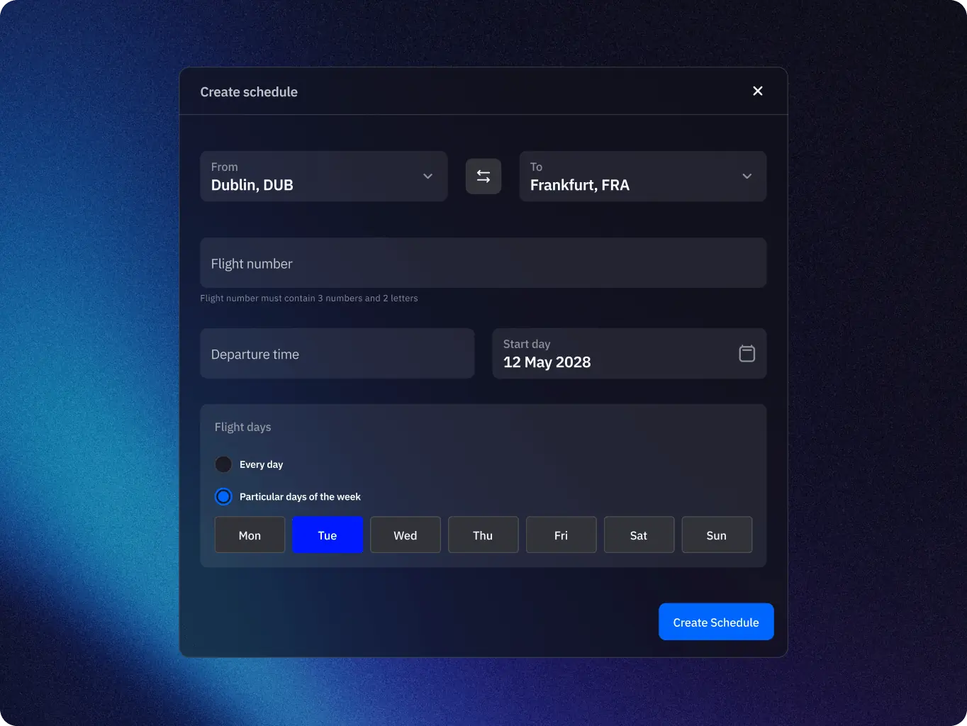
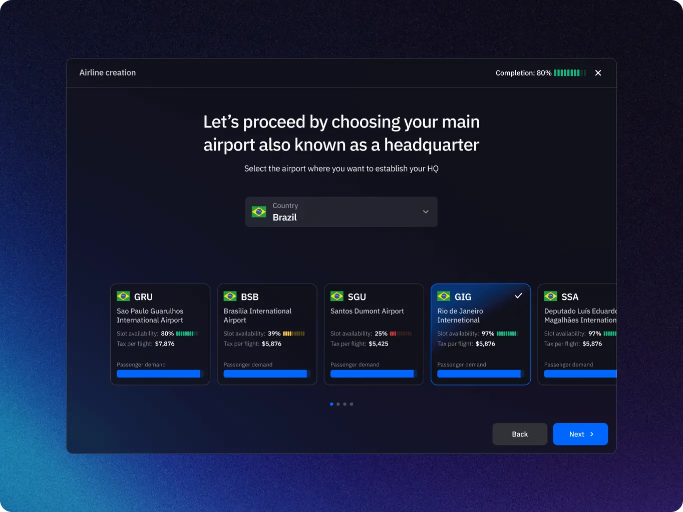
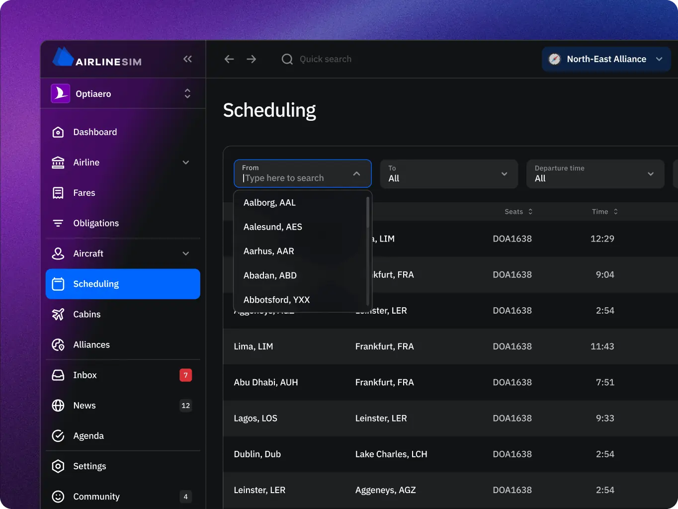
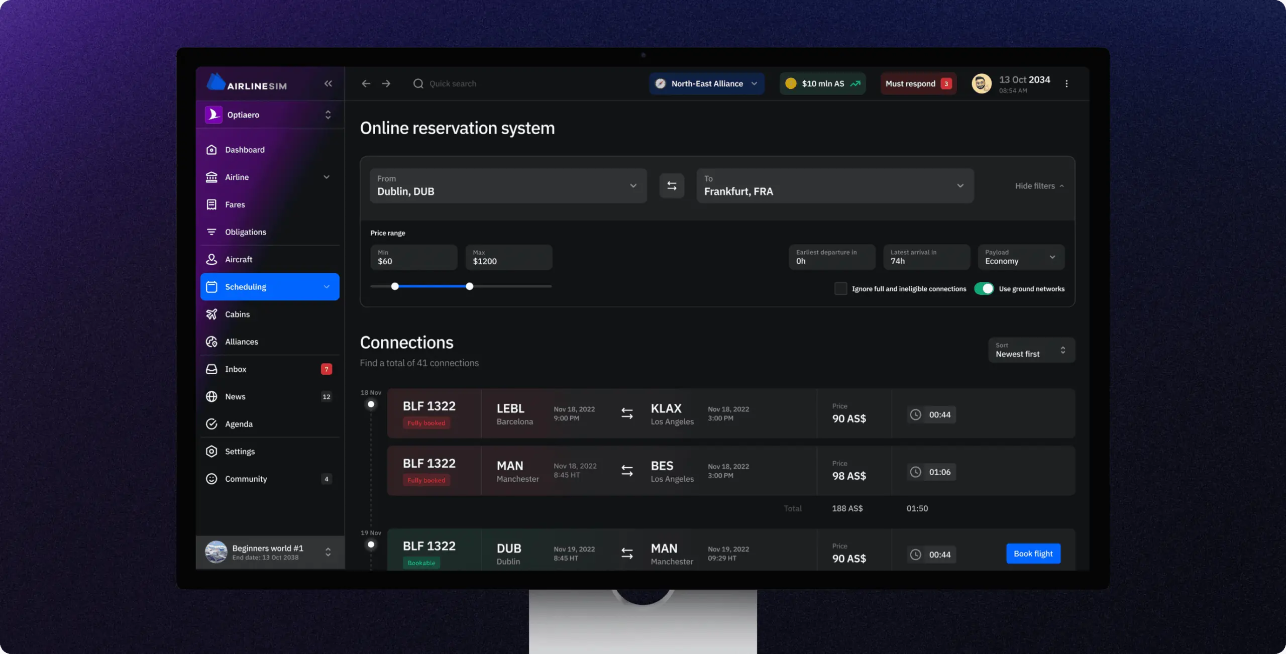
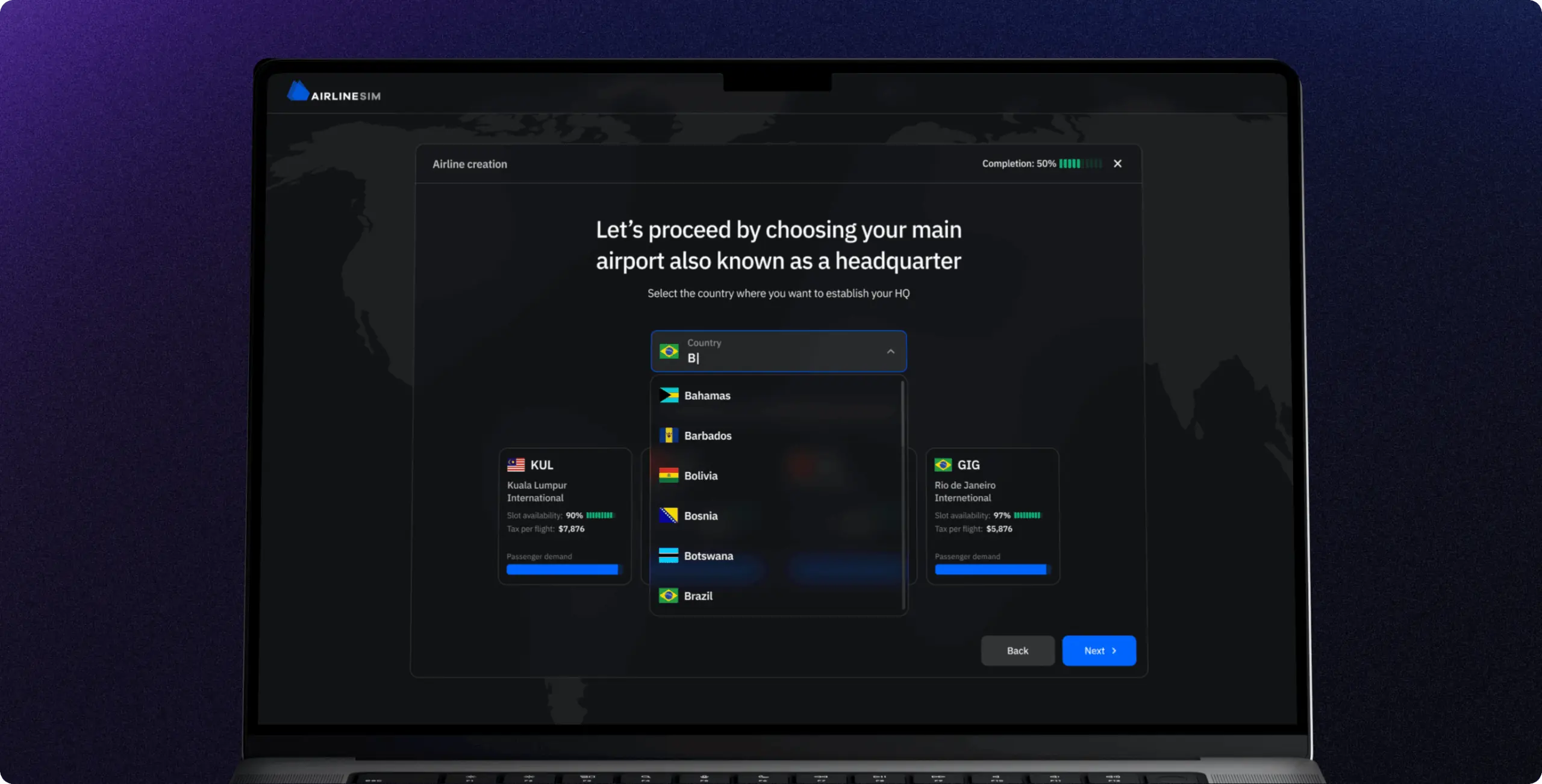
Next, we created wireframes to test new layouts and flows. These wireframes simplified the presentation of information by grouping related elements and introducing widgets as the core building blocks. This stage allowed us to quickly validate ideas like collapsible navigation, customizable dashboards, and notification systems. It helped define how players could move smoothly through the game without feeling overwhelmed by data.

AirlineSim — realistic online airline management simulation - Website Development - Photo 12
AirlineSim — realistic online airline management simulation - Website Development - Photo 13
Stage 2
Design direction

At this stage, we developed a complete design concept, combining structure and style into a unified vision. It included modular widget systems, immersive maps with neutral palettes, customizable branding options, and categorized notifications. The concept captured the client’s request for a “game-like” interface while keeping the simulation’s complexity intact.

Stage 3
UI design

The redesign of AirlineSim’s interface had to respect the complexity of airline operations while making the simulation easier to navigate. Since every decision in the game depends on detailed data, the goal was to present this depth without overwhelming the player.

To achieve this, the interface was built around a modular dashboard that uses widgets, interactive maps, and live data feeds. Information is no longer buried in endless spreadsheets but arranged into clear, functional blocks that highlight what matters most at a glance, while still providing access to full detail when needed. This layered structure takes inspiration from how real-world airline managers monitor operations across multiple systems, but condenses it into one streamlined view.

AirlineSim — realistic online airline management simulation - Website Development - Photo 16
Stage 4
Mobile adaptation

Finally, we adapted the design for mobile platforms. Given the large volume of data in AirlineSim, the challenge was to keep critical information visible while optimizing layouts for smaller screens. We introduced collapsible menus, simplified widgets, and prioritized landscape view, ensuring the same immersive experience was accessible on the go.

Features
Project’s core features
AirlineSim — realistic online airline management simulation - Website Development - Photo 23
AirlineSim — realistic online airline management simulation - Website Development - Photo 24
AirlineSim — realistic online airline management simulation - Website Development - Photo 25
AirlineSim — realistic online airline management simulation - Website Development - Photo 26
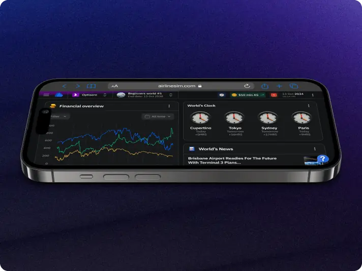
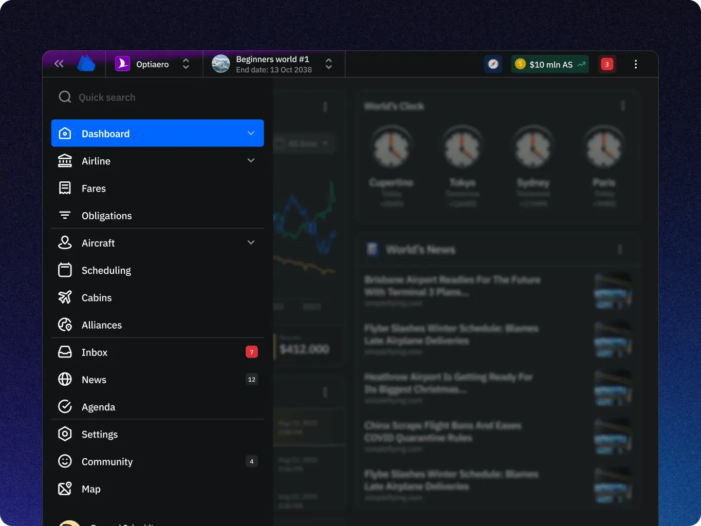
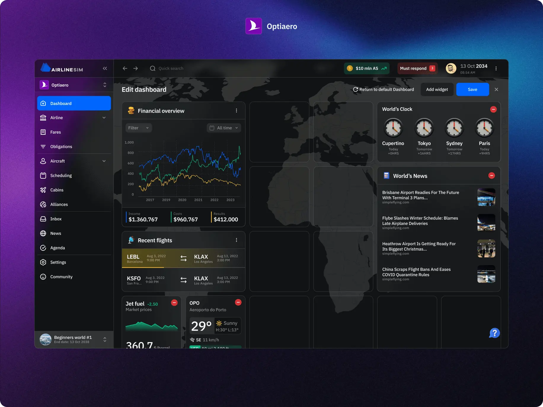
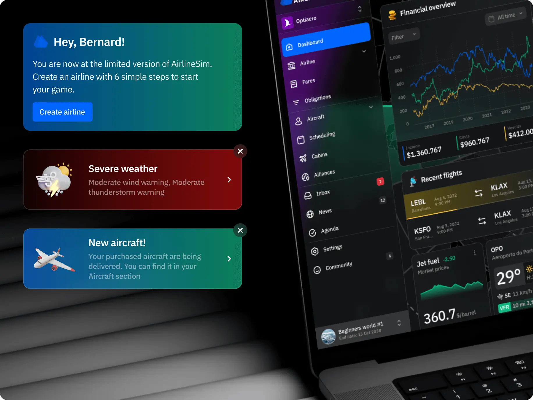
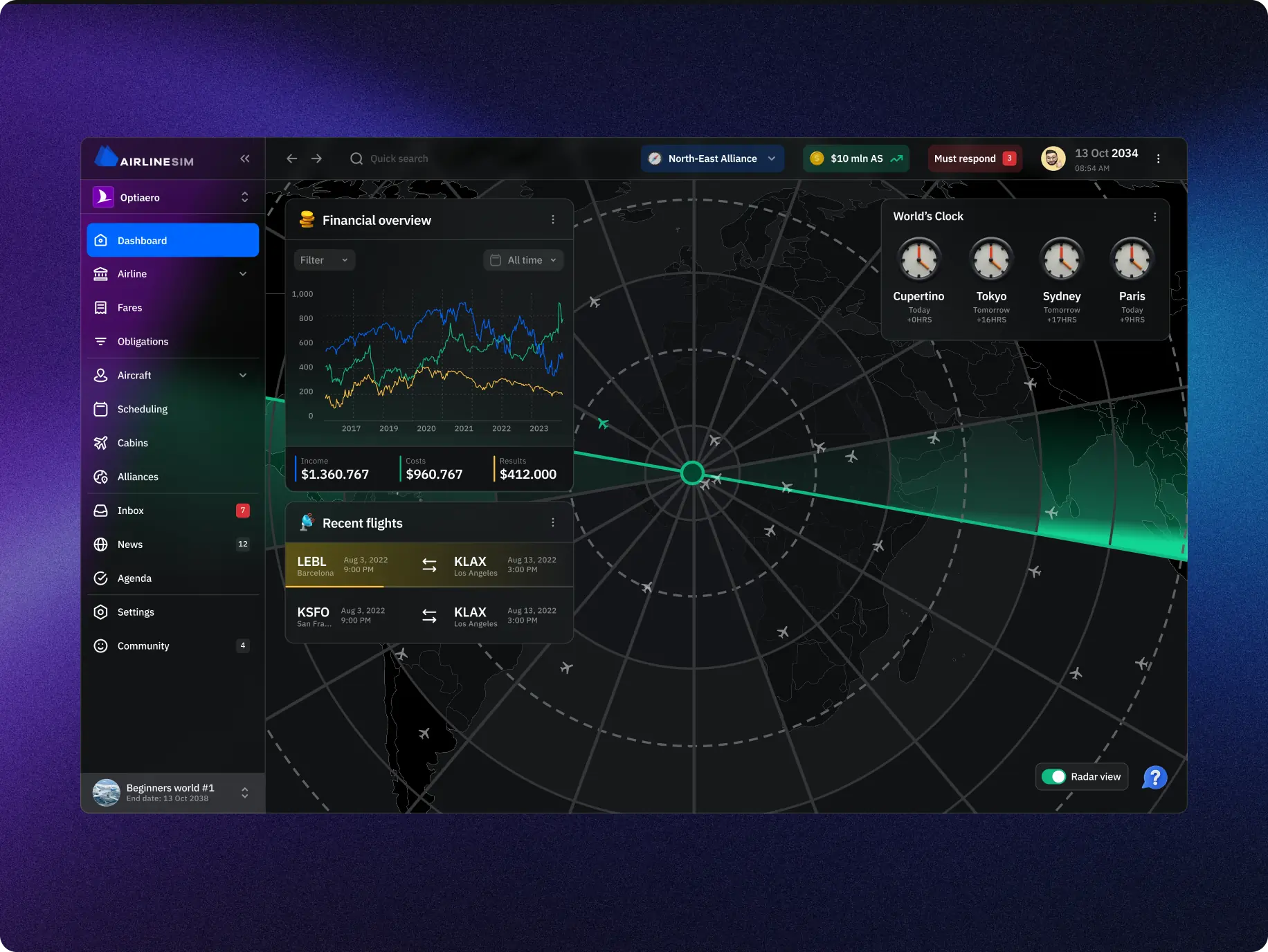
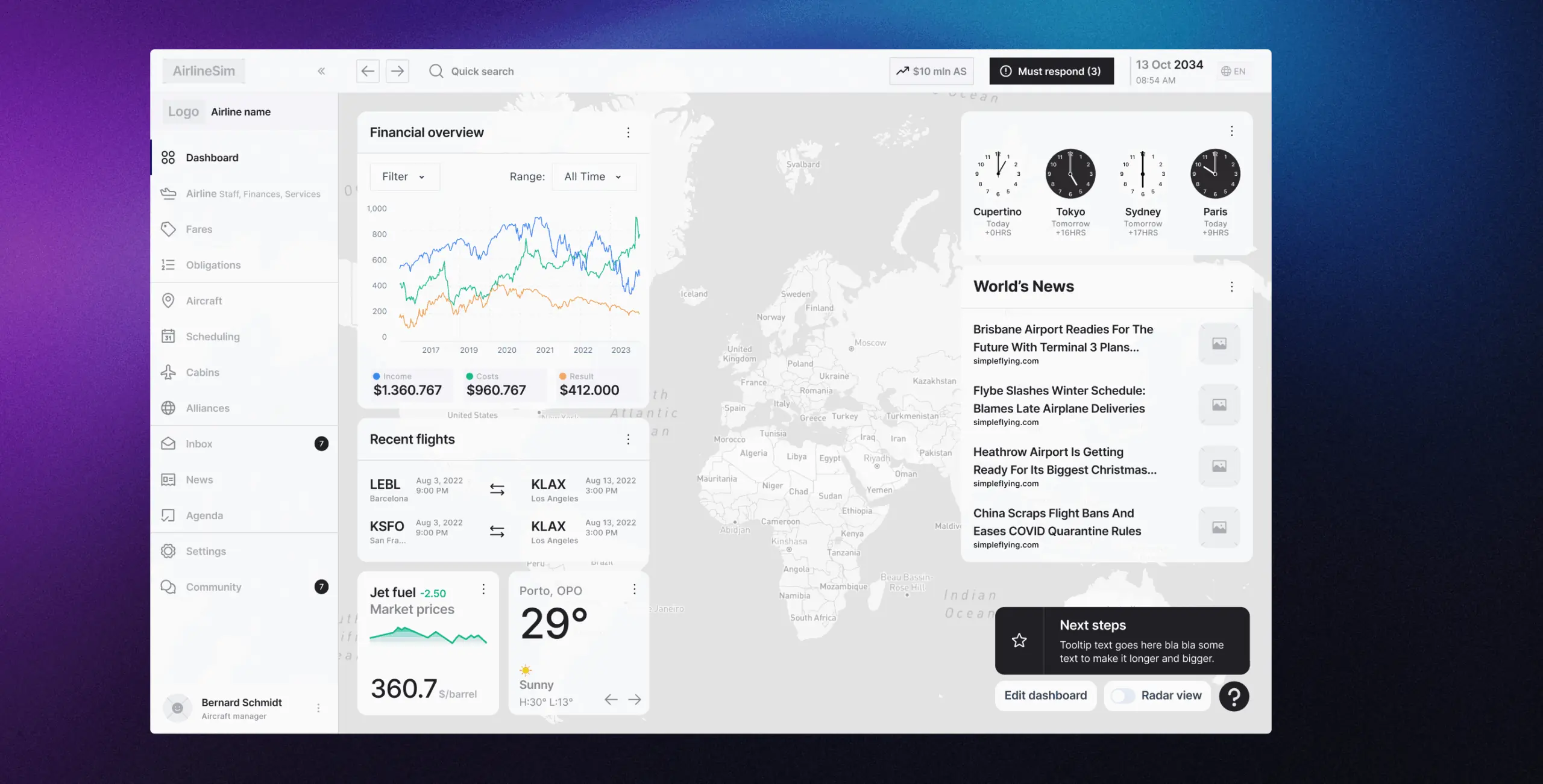
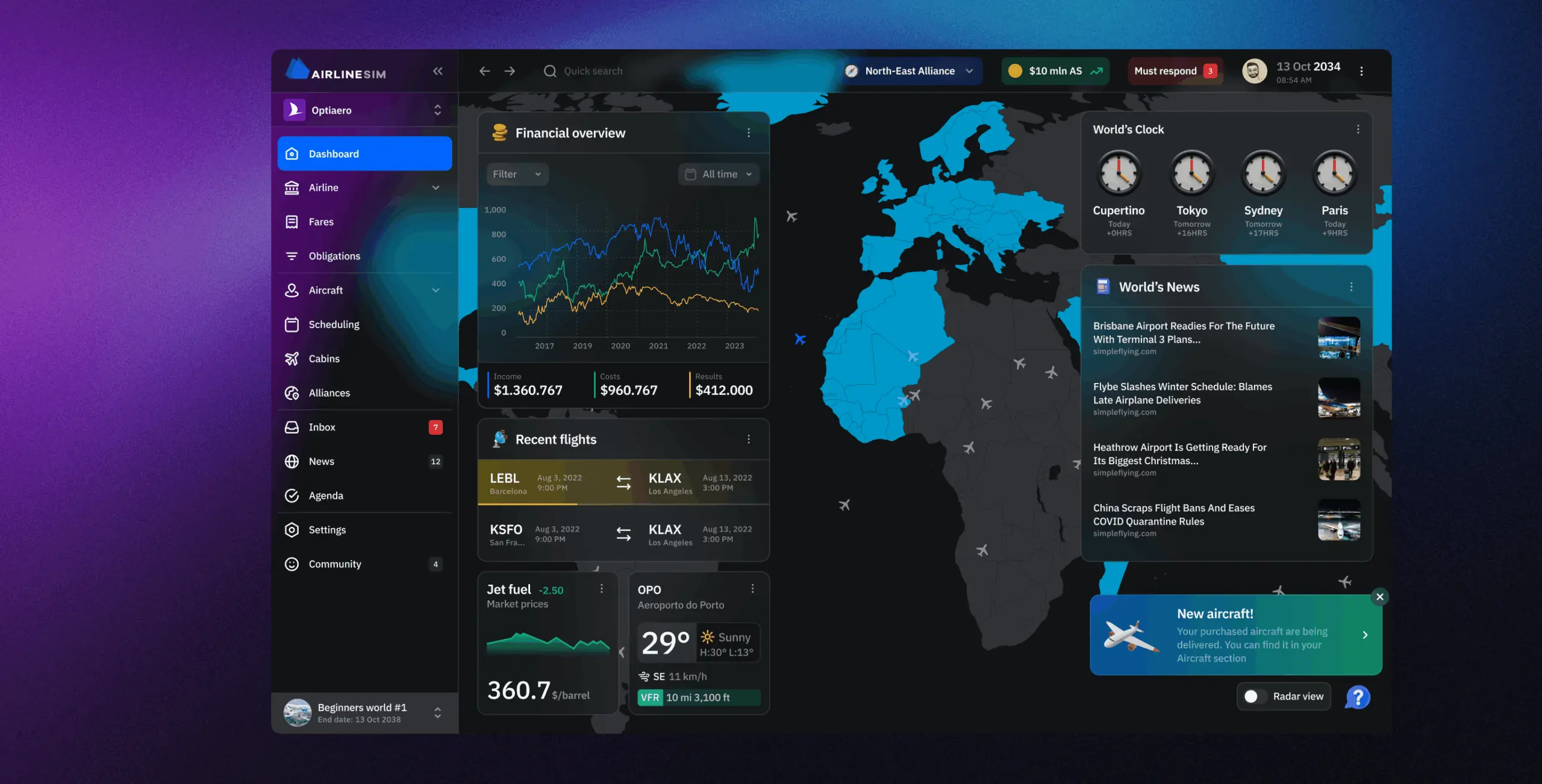
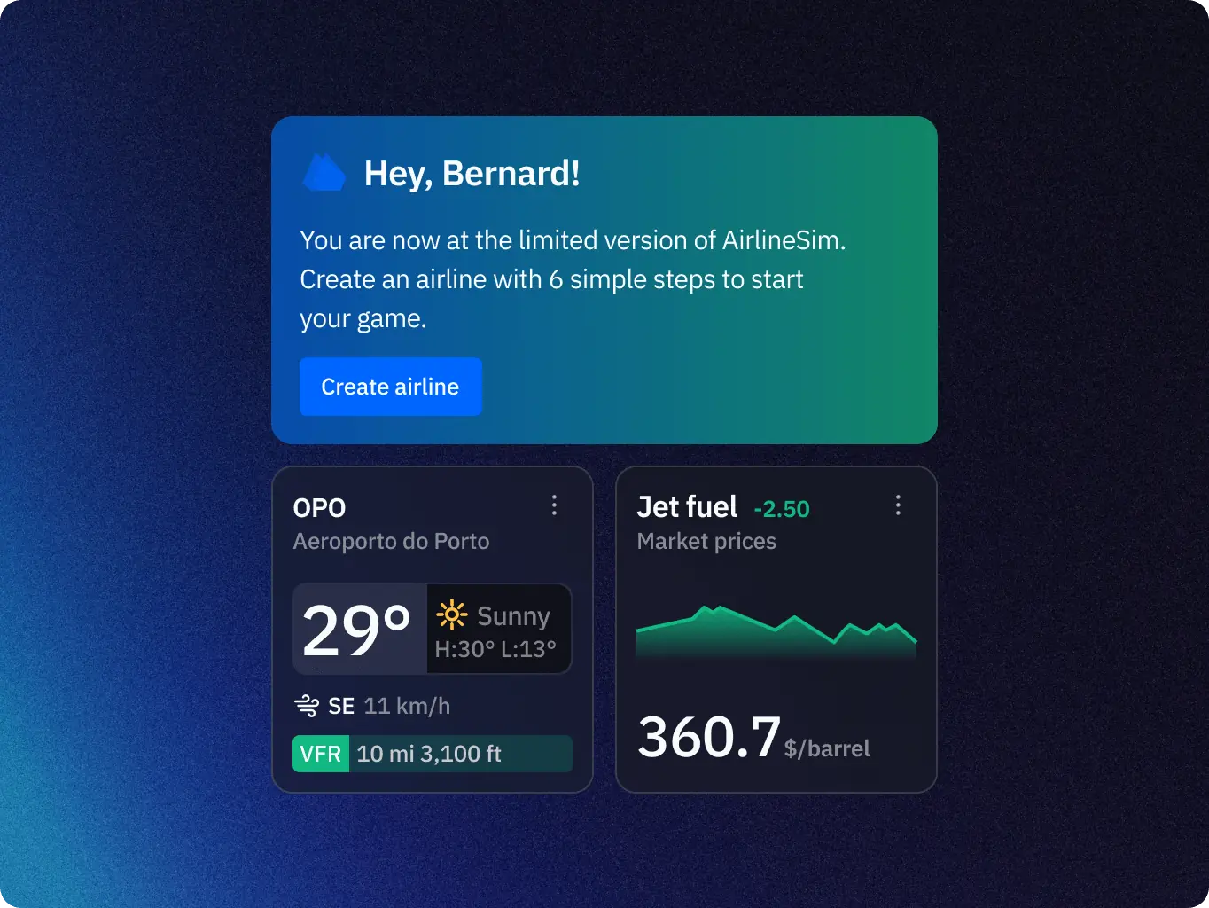
Dashboard customization

Users can personalize dashboards with their airline’s colors and logos, as well as choose which widgets to display. This creates a stronger sense of ownership and makes each airline feel unique.

AirlineSim — realistic online airline management simulation - Website Development - Photo 27
Notification system

A new notification system keeps players informed about critical updates — from flight incidents to world end dates — while categorization by urgency prevents information overload.

AirlineSim — realistic online airline management simulation - Website Development - Photo 28
Map and radar views

Together, maps and radar elements transform the dashboard into an operational command center—where decisions can be made visually and intuitively. This not only improves efficiency but also makes the experience engaging, closer to managing a live ecosystem than processing raw data.

Development
Modern frameworks ensured performance and scalability on all devices

Modern frameworks and development practices were applied to ensure performance, scalability, and a seamless user experience across all devices. By focusing on modularity and reusability, the platform was prepared for rapid feature expansion without compromising stability.

The implementation of responsive layouts and optimized rendering allowed the simulation to handle large volumes of data while remaining accessible and engaging on both desktop and mobile.

As a result, the product achieved consistency in design, reliability in performance, and the flexibility required to support the growth of AirlineSim as a complex, data-heavy platform.

Stages

  • Front-End development
AirlineSim — realistic online airline management simulation - Website Development - Photo 29
Stage 1
Front-end development

At this stage, the interface was built on top of the existing APIs and data storage. A reusable UI kit was implemented, providing ready-made components that simplified the creation of new features and ensured consistency across the platform.

Several core features were developed to enhance the user experience: an interactive background map was introduced, dynamically highlighting active countries depending on the account settings; the ability to switch between airlines was implemented, with the interface smoothly adapting its visual style to the chosen airline’s branding; and a set of widgets was created to display financial metrics, scheduling statistics, and progress tracking, with flexibility for future customization.

These solutions allowed users to interact with complex data in a clear and intuitive way, while also giving the platform a dynamic and personalized look.

Technologies
Selected technologies
Icon - Vector
React
Icon - Typescript (3)
Typescript
Icon - Redux (3)
Redux
Icon - Vite-1 12 (3)
Vite
Icon - Framer (3)
Framer motion
Icon - React-Router--Streamline-Svg-Logos (2)
React router
Icon - scss-svgrepo-com 1 (2)
SCSS
Icon - process-1
Wondering about the price? We’ll help you find the best solution!
Results
Redesign results that transformed AirlineSim into a more engaging simulation
Faster time-to-market

Delivered MVP prototype within a month, allowing the client to develop the product quickly and gain early traction.

Built with scalability in mind

Designed the MVP with a flexible architecture, ensuring smooth transitions for additional features and scaling as the product evolves.

Deeper engagement

By integrating maps, radars, aircraft illustrations, and customizable airline branding, the simulation feels more alive and engaging. Users connect emotionally with their airline rather than seeing it as just rows of data.

Through the redesign, AirlineSim evolved from a data-heavy simulation into a more engaging and intuitive platform. By combining widget-based dashboards, visuals, and mobile-friendly layouts, we created an experience that balances realism with playability and keeps users motivated to stay and explore.

More cases
We have dozens of products & hundreds of websites developed by our studio. We're happy to share the results with you!

#branding

Scrambly – rewarded discovery platform for games and apps
Scrambly Icon - imageItaly
Results

Clearer brand positioning

Consistent visual system

Improved market perception

Image - Rectangle 34624328 (2)

Illia Frantsevskyi

CTO & Co-Founder

They demonstrated a high level of expertise and efficiency in every phase of the project.

#Website design #Website development

Pretty Patty: a deliciously interactive fast food experience
Pretty patty Icon - image (2)Switzerland
Results

Brand alignment & vibrant design

Improved сonversion opportunities

Customer-centric approach

Image - image (15)

Adrian Smith

Co-Founder, PRETTY PATTY

They always respected deadlines, were super reactive, and were super helpful.

#Web app design #MVP building #Web development #Blockchain development #Dedicated team

GlobalX – DEX
GlobalX Image - fi_4628635 (3)USA
Tech Stack

TypeScript, React, Wagmi, Ether.js, Tanstack Query, Radix UI, Framer Motion, D3.Js, Redux, GraphQL, Apollo, Zustand, Magic SDK, Jest

Timeline

5 month

Results

Enhanced usability

Responsive performance

Scalability and security

Image - Rectangle 34624326

Joshua Caleb

We reached out to this team for the development of our cryptocurrency exchange web app (DEX Swap), and the result exceeded all expectations. We’re very pleased with how everything turned out in terms of both functionality and design. The app works flawlessly, and its interface is very user-friendly.

Contact us

Have a project in mind?
Let's chat

Your Name

Enter your name *

Your Email

Enter your email *

Message

Tell us about your project

You can upload maximum 5 files
Some of your file not loaded, because maximum file size - 5 mb
Your budget for this project?

By clicking this button you accept Terms of Service and
Privacy Policy

Icon - launch
Thanks for taking time to reachout!
Stay connected with us by subscribing to our LinkedIn account. By following, you’l be the first to hear about our latest updates, news, and exciting development. We look forward to sharing our journey with you!
Icon - launch
Thanks for taking time to reachout!
We’d love to hear more about your project! Feel free to schedule a call using the link provided. This will help us better understand your vision and ensure we’re aligned on all the details.
Have a project to
discuss?
Image - ksenia
Kseniia Shalia
Account Executive
Have a partnership in
mind?
Image - polina
Polina Chebanova
Co-Founder & CPO