


Pragmatike – connecting businesses with top remote tech talent
Client
Pragmatike
 France
France
Services
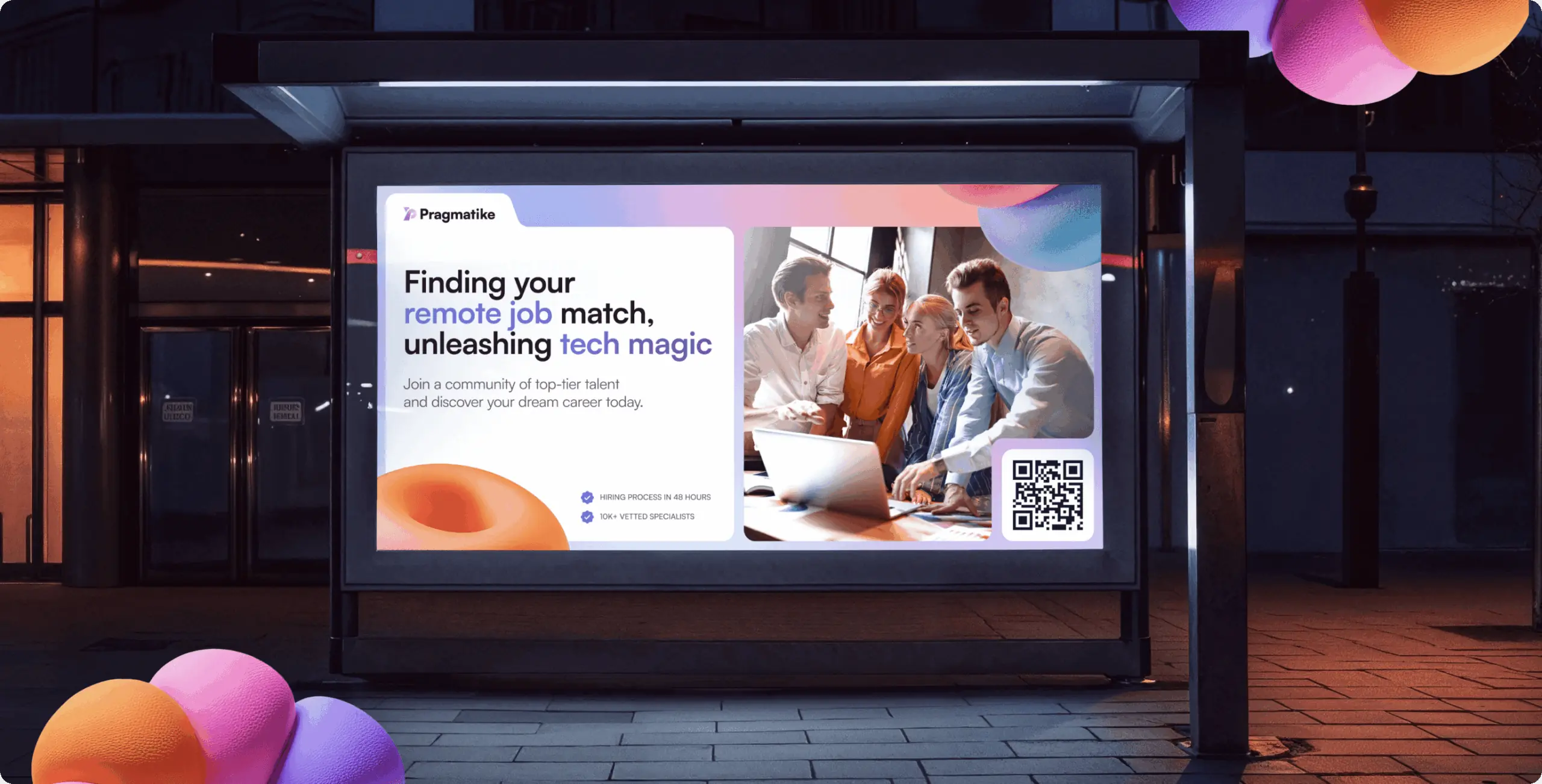
Pragmatike approached us with the goal of redefining their brand identity to better reflect their innovative approach to remote tech hiring. The primary objective was to emphasize their global reach, human-centered values, and commitment to connecting businesses with top-tier talent.
Our role
We took on the challenge of crafting a brand identity that aligns with Pragmatike’s vision of seamless remote hiring. Our role encompassed developing a modern and scalable design system, creating a logo that reflects innovation and trust, and defining clear brand guidelines for consistent use across platforms. By combining strategy with creativity, we ensured that every element of the brand communicates Pragmatike’s expertise and global reach.
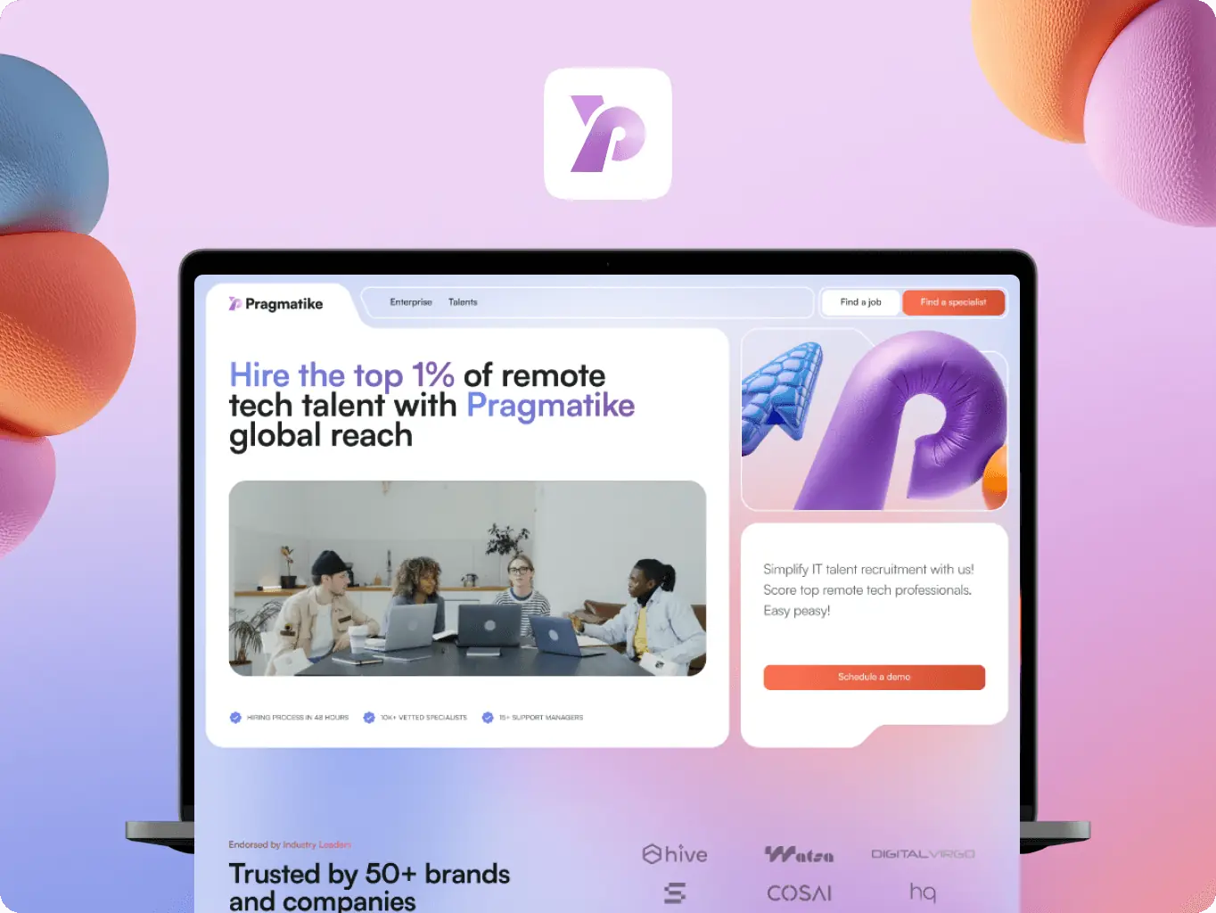
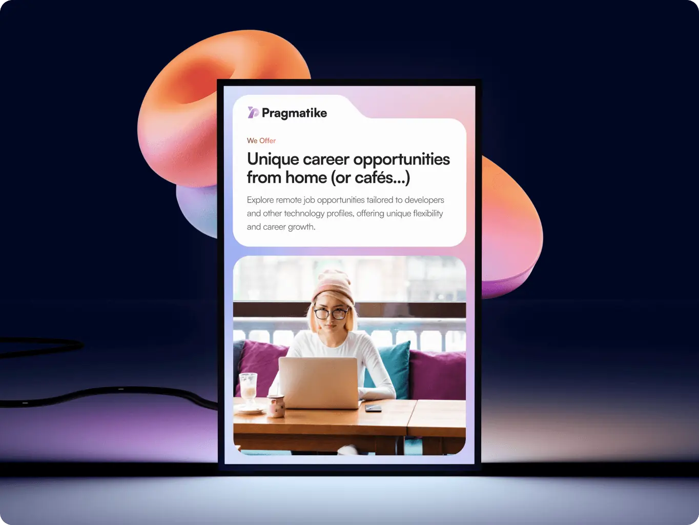
The branding process for Pragmatike focused on creating a distinctive and scalable identity that reflects its role in connecting businesses with top remote tech talent. We developed a cohesive visual system that balances professionalism with a modern, human-centered approach, helping the brand stand out in the competitive tech recruitment space. From the logo and visual language to brand assets and guidelines, each element was designed to communicate trust, expertise, and global reach while ensuring consistency across every touchpoint.
Stages
- Logo Design
- Colors & Typography
- Brand Assets
- Brand Guidelines
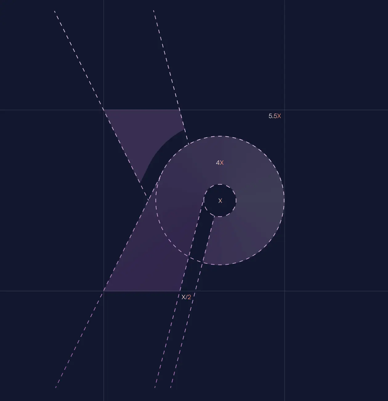
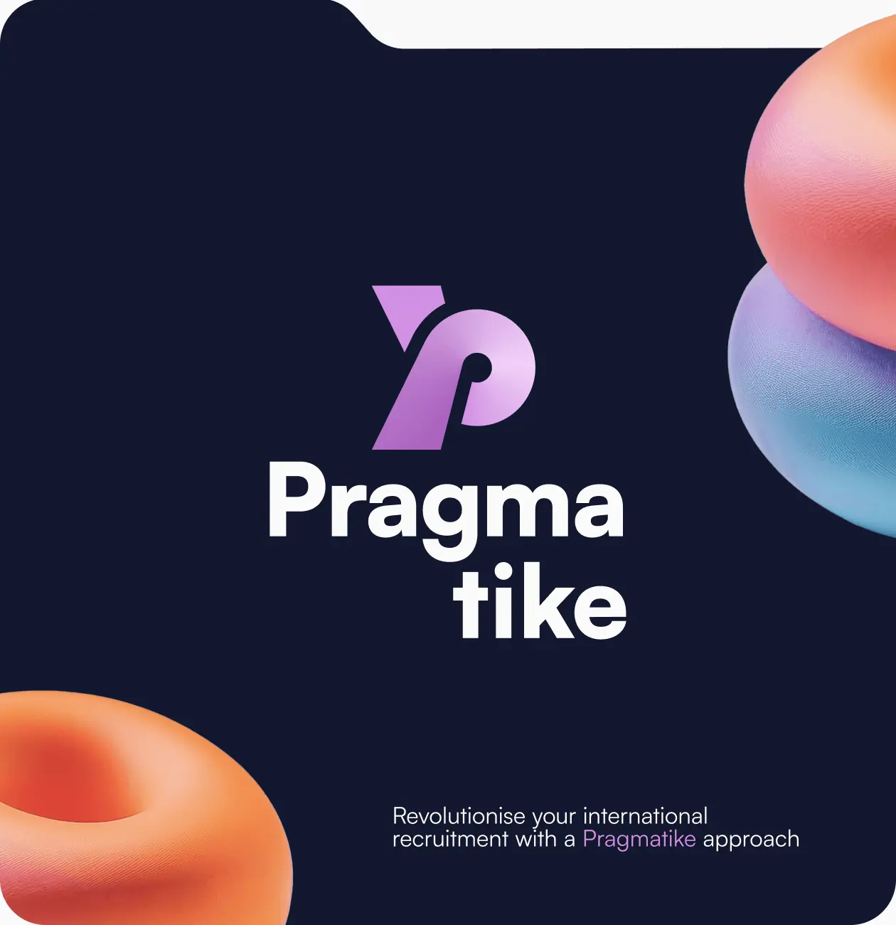
The logo design process focused on creating a visual symbol that encapsulates Pragmatike’s essence: innovation, professionalism, and a pragmatic approach. By combining the abstract representation of the letter “P” with the concept of a magnifying glass, the logo highlights the brand’s expertise in connecting businesses with the right professionals. The dynamic design conveys speed and precision, while its minimalistic style ensures clarity and recognition across diverse platforms. This approach provided a solid starting point for building a cohesive and versatile brand identity.
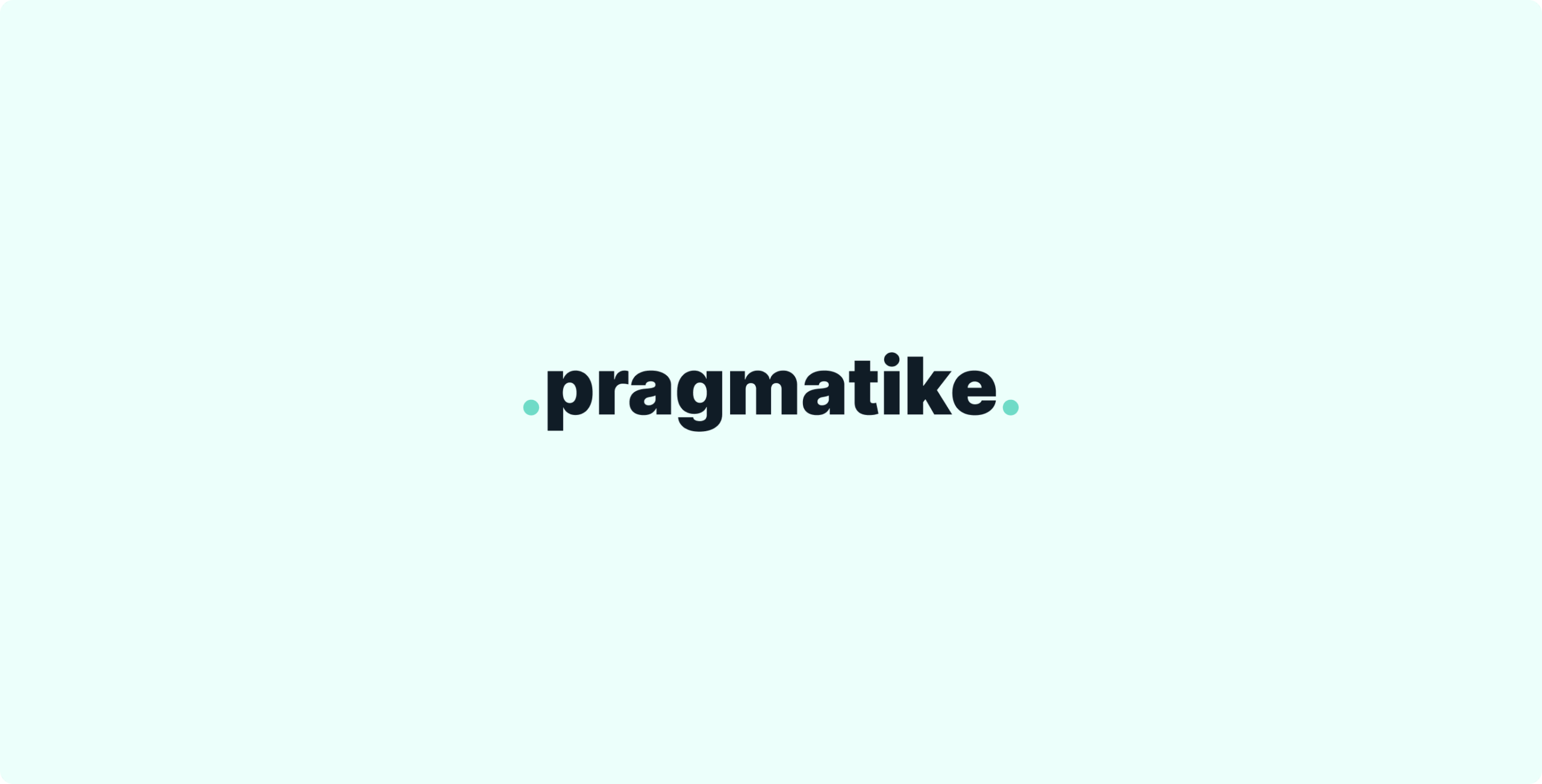
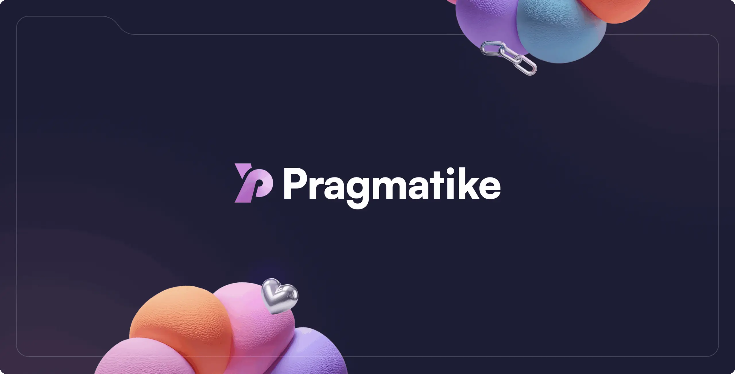
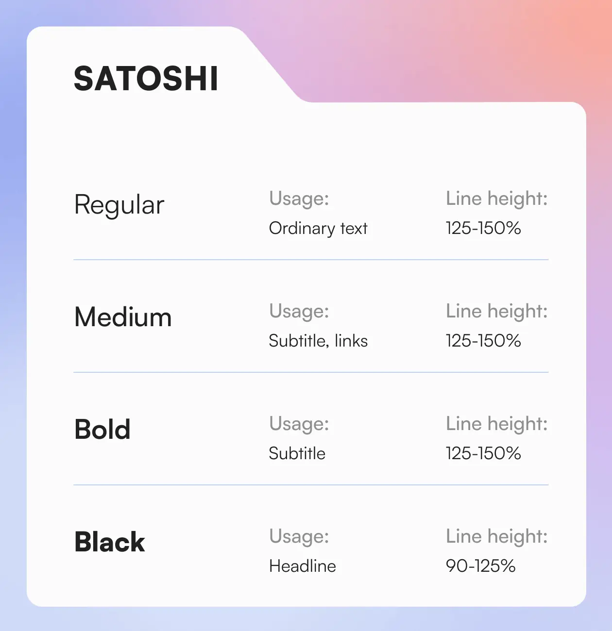
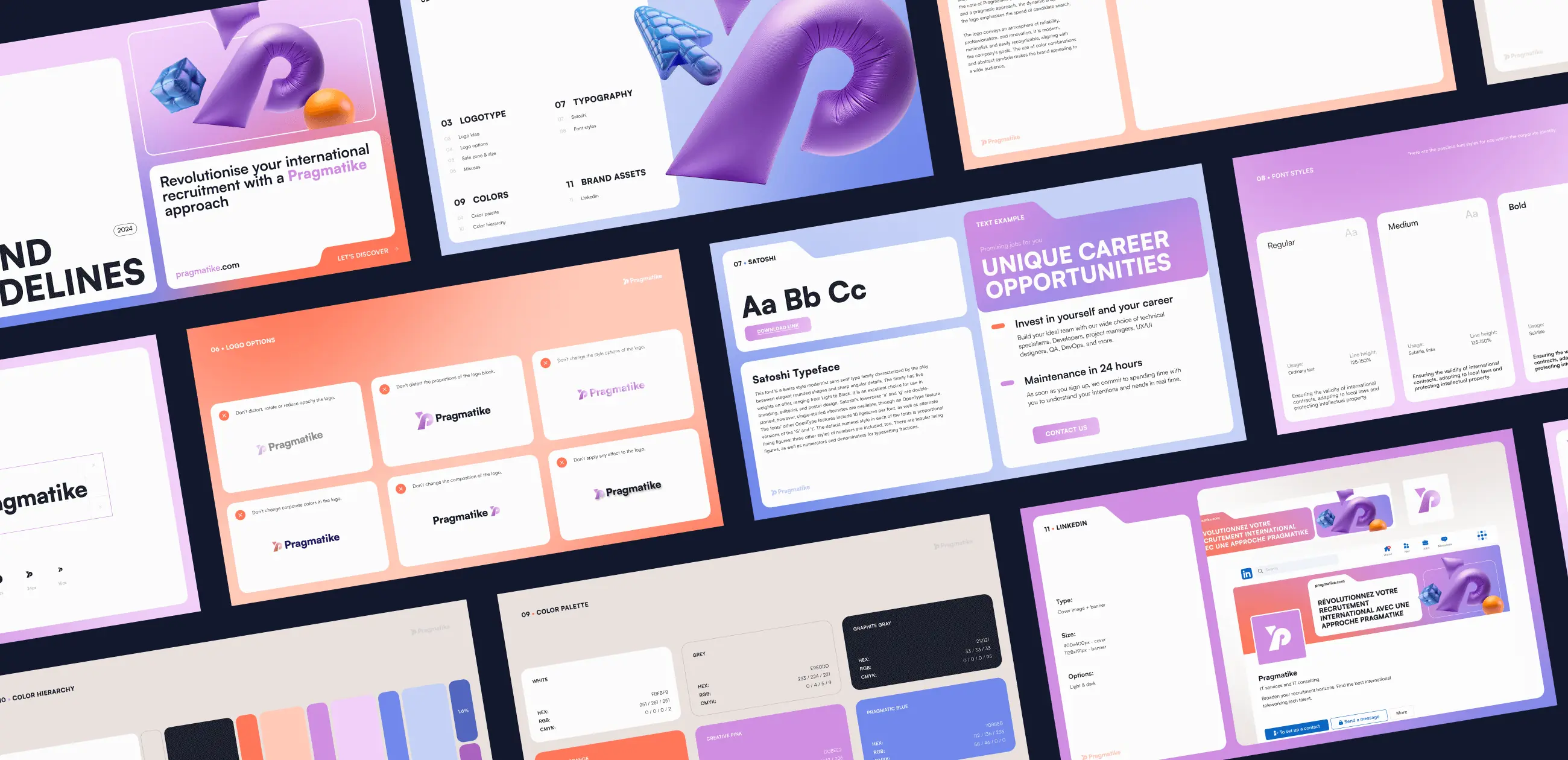
The selected colors and typography were designed to address the need for a modern, professional, and approachable brand identity. By combining dynamic accents with neutral tones, we created a palette that balances energy and trust, while the typography ensures clarity and versatility across all applications. Together, these elements form a cohesive visual system that strengthens Pragmatike’s presence and enhances its communication across platforms.
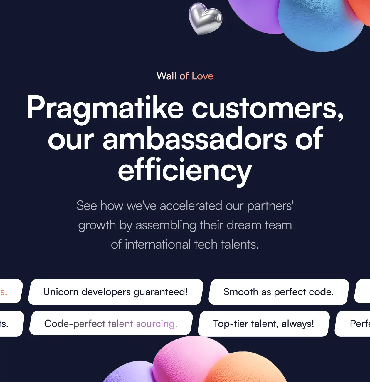
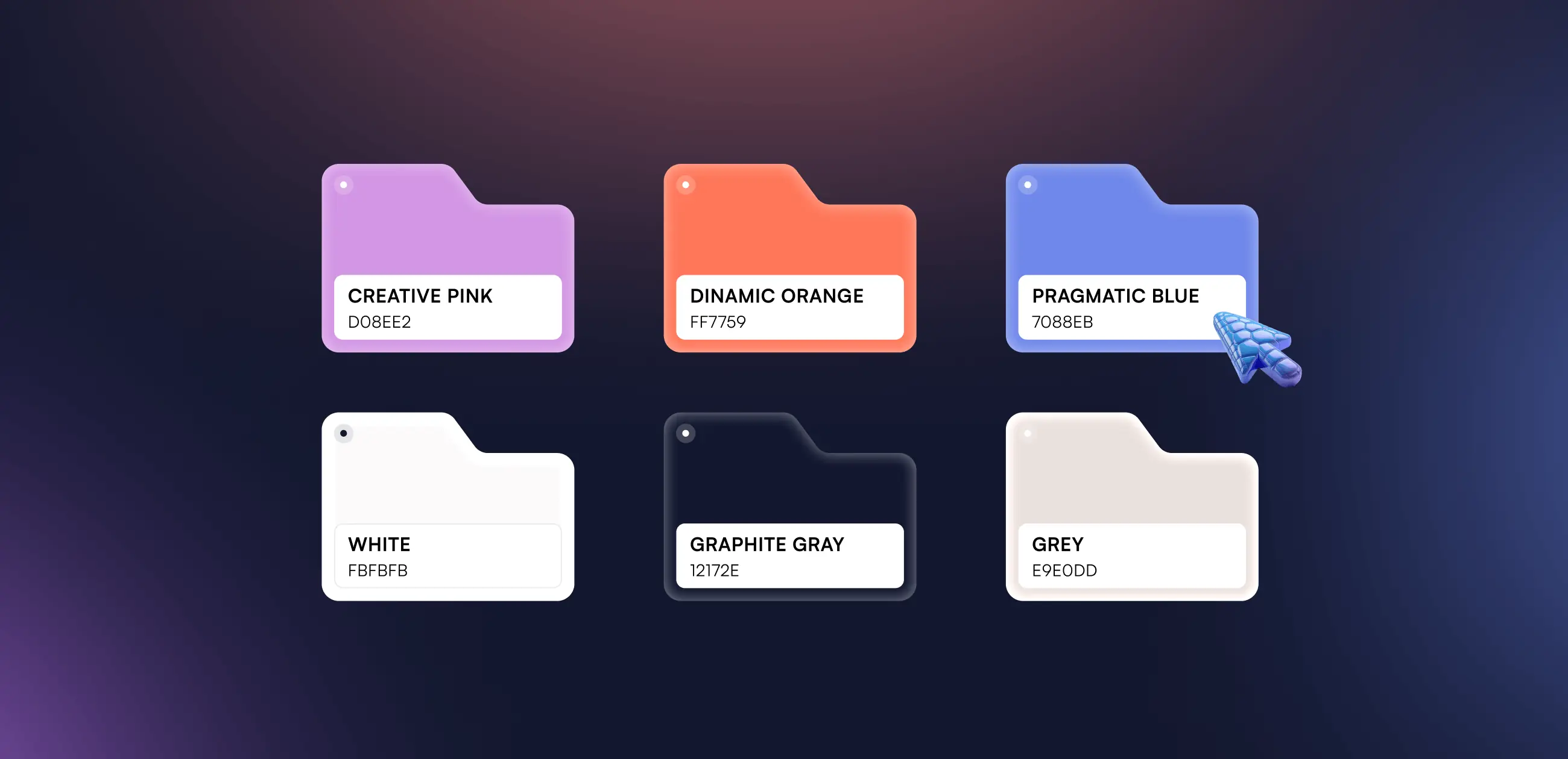
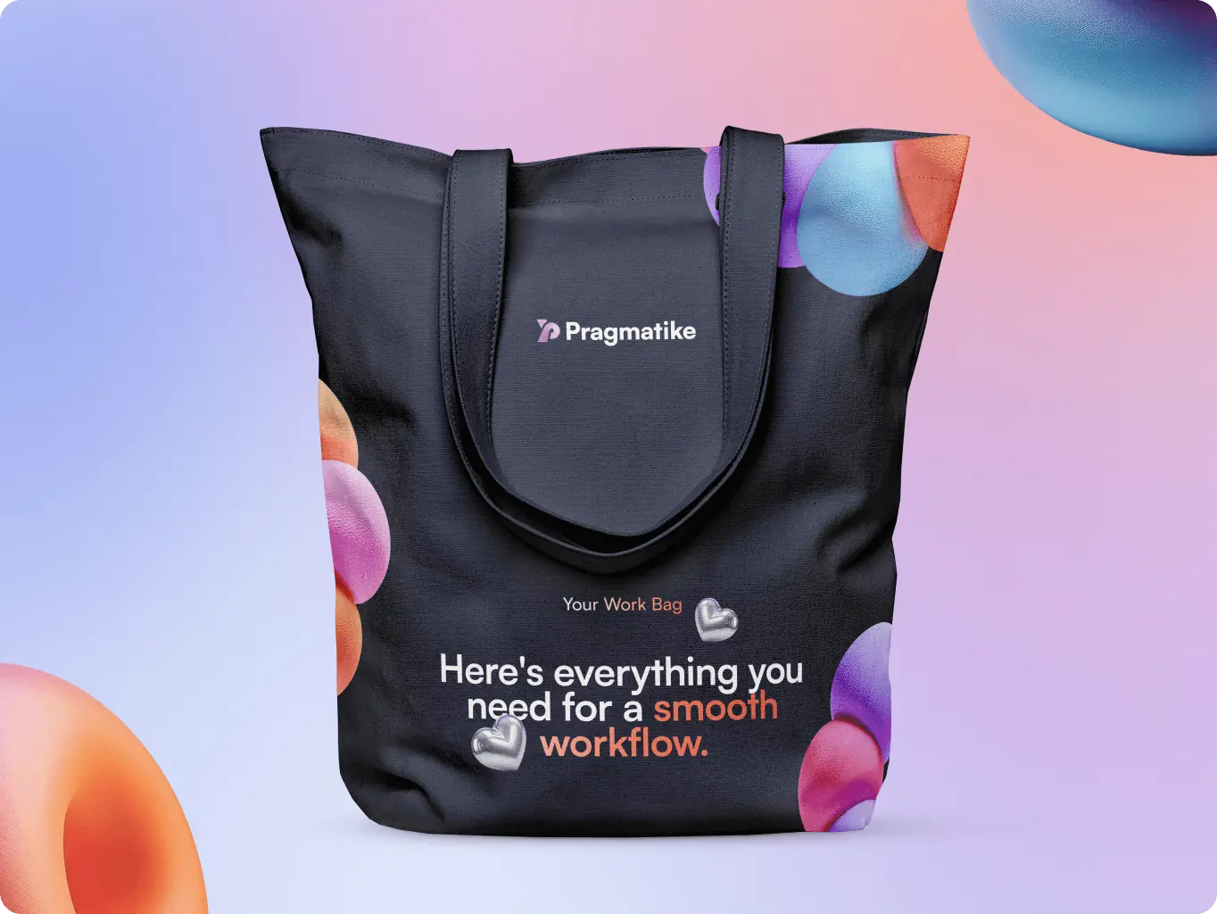
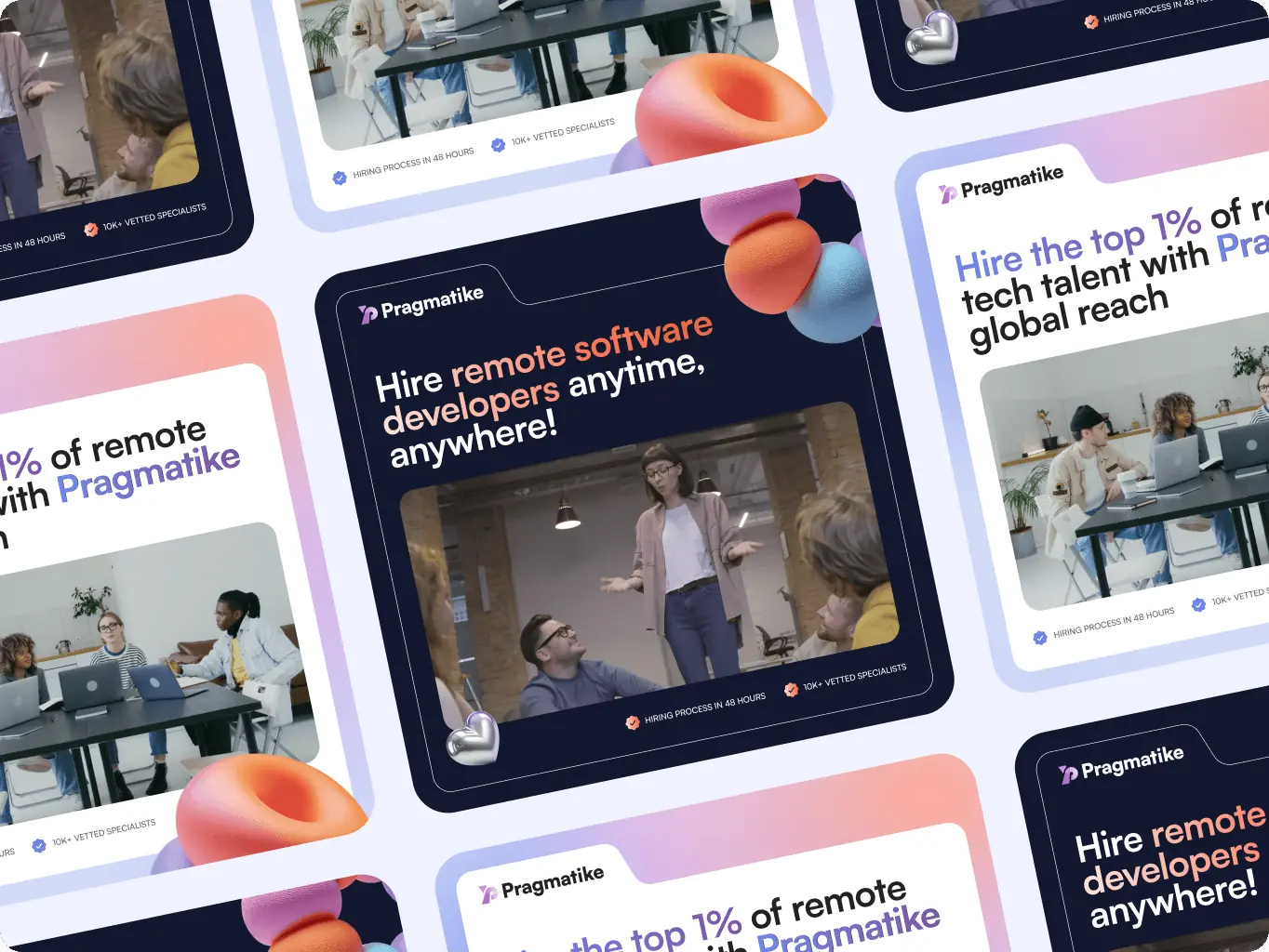
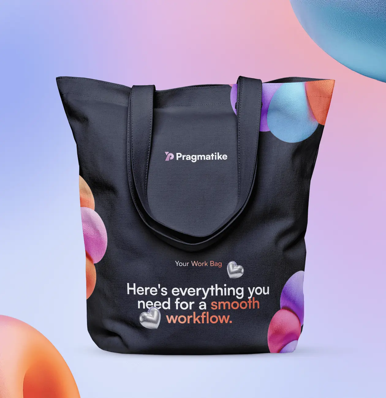
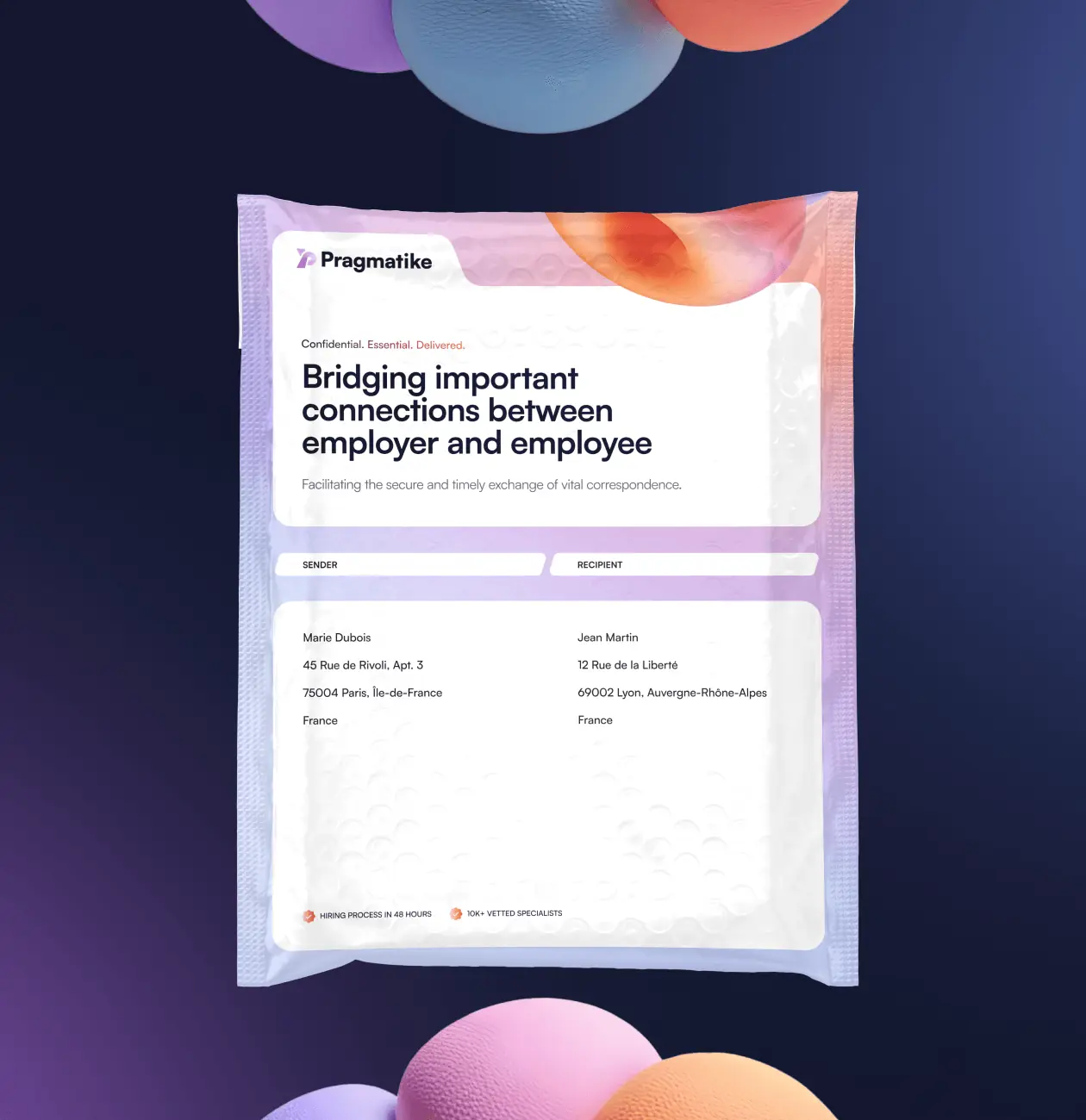
The brand assets were designed as key communication tools to connect Pragmatike with its clients effectively. Each asset was crafted to convey the brand’s professionalism, innovation, and trustworthiness while maintaining a consistent visual language. By seamlessly integrating these assets across digital platforms and physical materials, we ensured that every interaction reinforces the company’s message and strengthens its relationship with the audience.
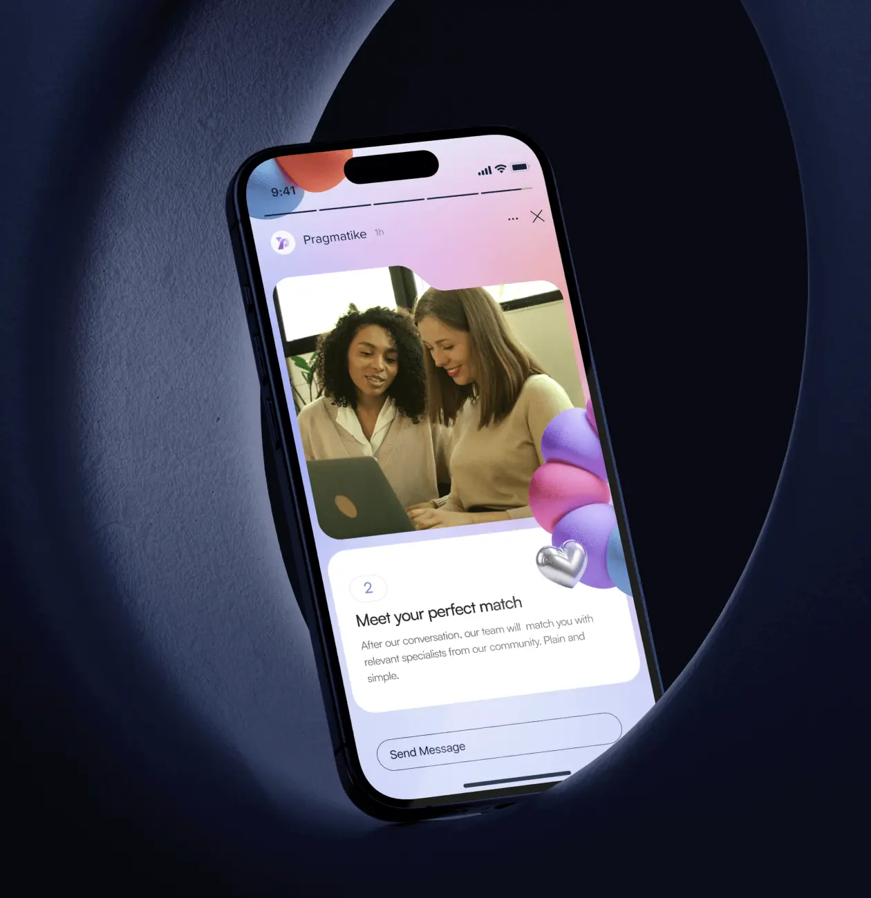
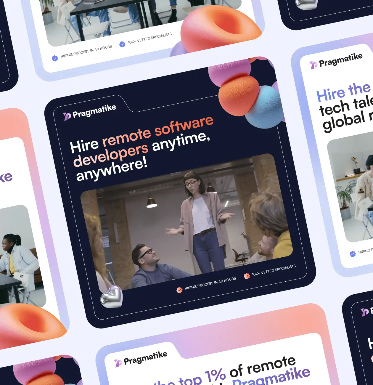
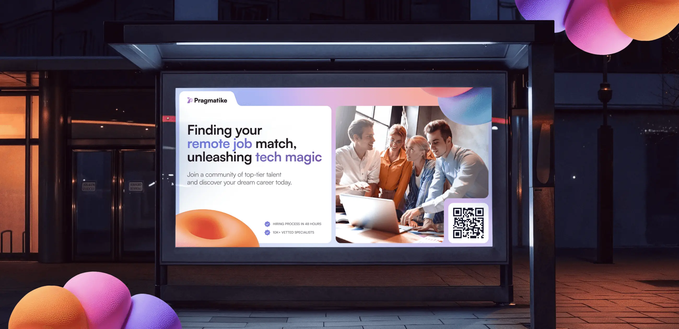
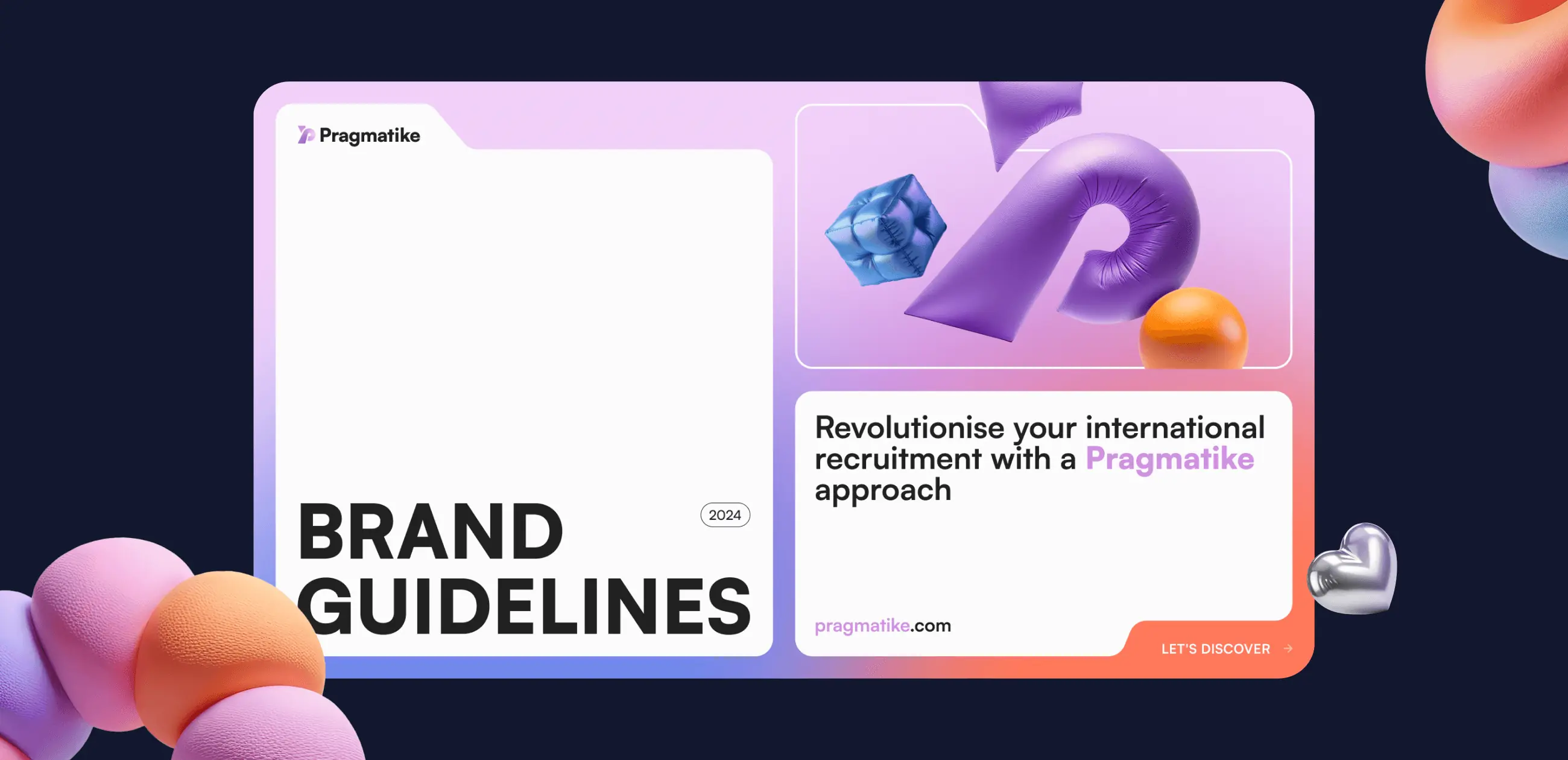
The brand guidelines serve as a comprehensive framework to ensure consistent and effective communication of Pragmatike’s identity. These guidelines provide clear instructions on how to use visual elements, such as the logo, typography, and color palette, across various platforms and materials. By establishing these standards, we created a cohesive system that allows the brand to maintain its professionalism and clarity while adapting to different communication needs.
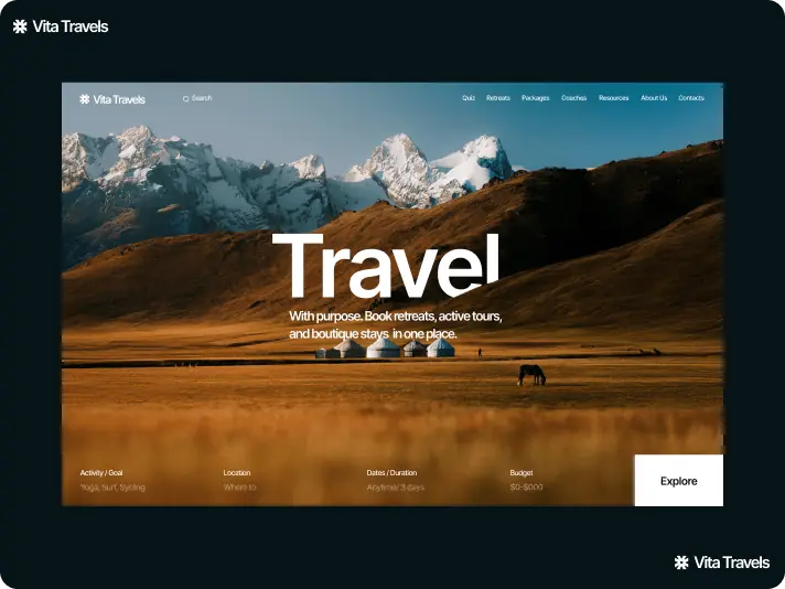
#Website design #website development
vita travels
 USA
USA
USA
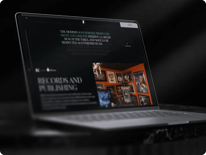
#Website design #Website development
Lucas Keller
USA
USA
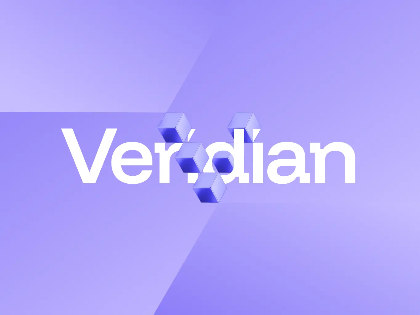
#branding
veridian
USA
USA
