Hyperbridge approached us with the goal of refining its brand identity to better align with its vision of secure and decentralized blockchain interoperability. The primary objective was to establish a strong, future-proof visual identity that reflects its technological expertise, trustless infrastructure, and commitment to seamless cross-chain communication.
We took on the challenge of redefining Hyperbridge’s brand identity to align with its vision of secure and scalable blockchain interoperability. Our role included developing a modern and adaptable design system, crafting a logo that embodies trust and innovation, and establishing comprehensive brand guidelines for consistency across all platforms. By merging strategy with design, we ensured that every visual element reinforces Hyperbridge’s technological expertise and commitment to decentralization.
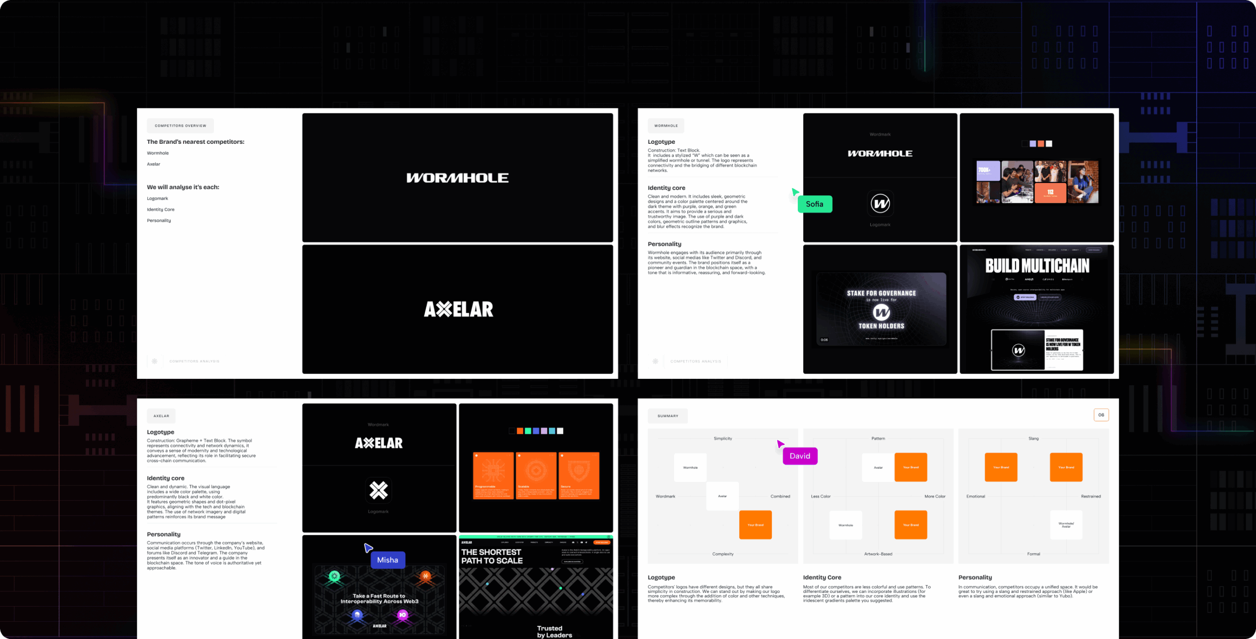
Our branding work for Hyperbridge started with a competitive analysis of direct players like Axelar and Wormhole. We examined their visual language, tone of voice, and strategic positioning to identify key industry patterns — and where Hyperbridge could stand apart. These insights shaped a brand identity that balances technical sophistication with accessibility, aligning with Hyperbridge’s mission to empower developers and enable seamless cross-chain interoperability.
We were tasked to create a modern, adaptable design system, a logo that embodies trust and innovation, and comprehensive brand guidelines to ensure consistency across all platforms. The new identity should merge strategic thinking with design execution, so every element reinforces our commitment to security, scalability, and decentralization.
Stages
- logo design
- colors & typography
- brand assets
- Illustrations
- brand guidelines
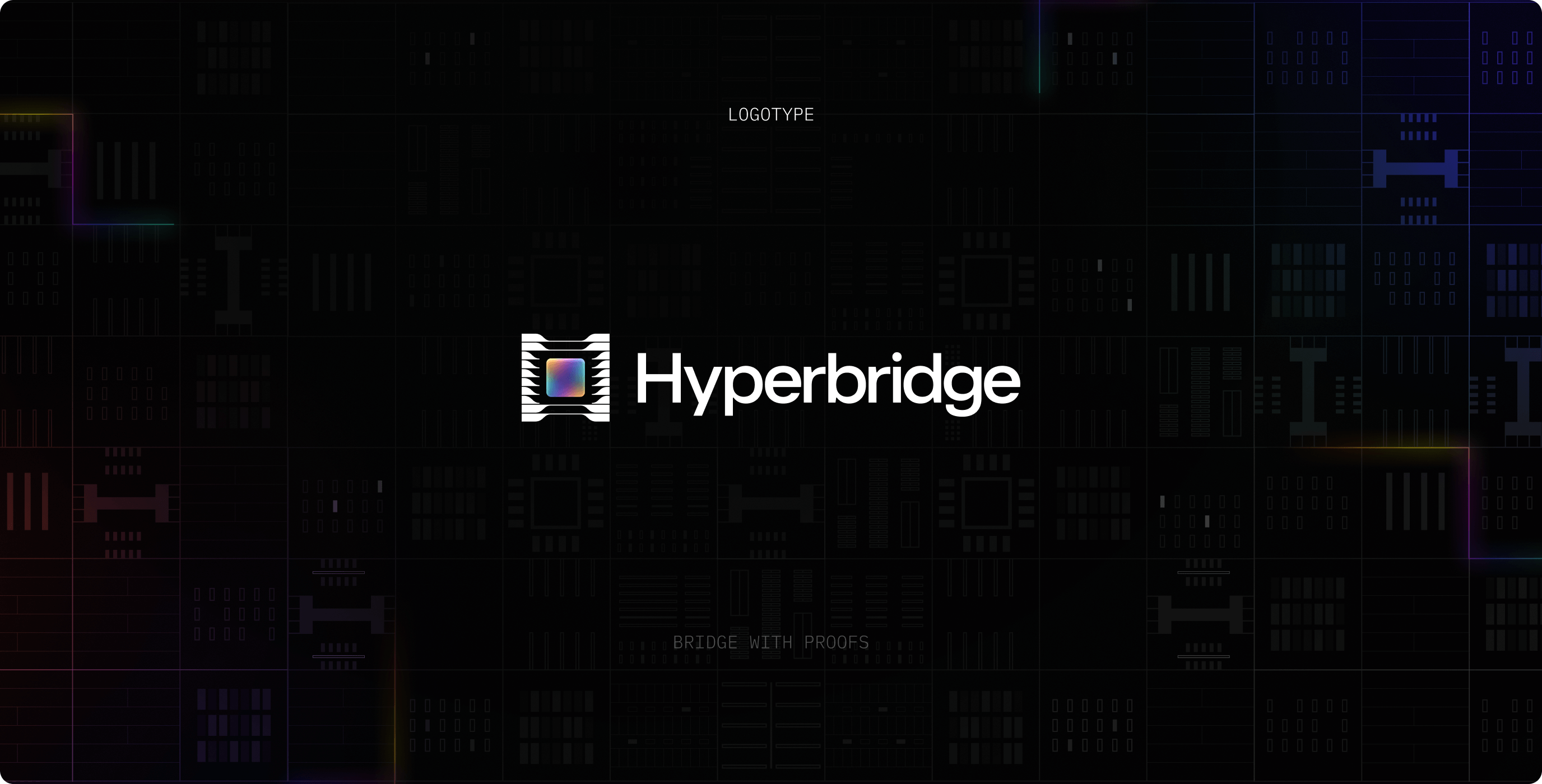
The Hyperbridge logo unites two key aspects: processing and technology. The symbol represents a microchip in action, with dynamic gradients emphasizing movement and innovation. A structured text block with a technical typeface reinforces the brand’s identity.
The combination of effects and gradients makes Hyperbridge stand out, ensuring a distinctive and futuristic presence in the blockchain space.
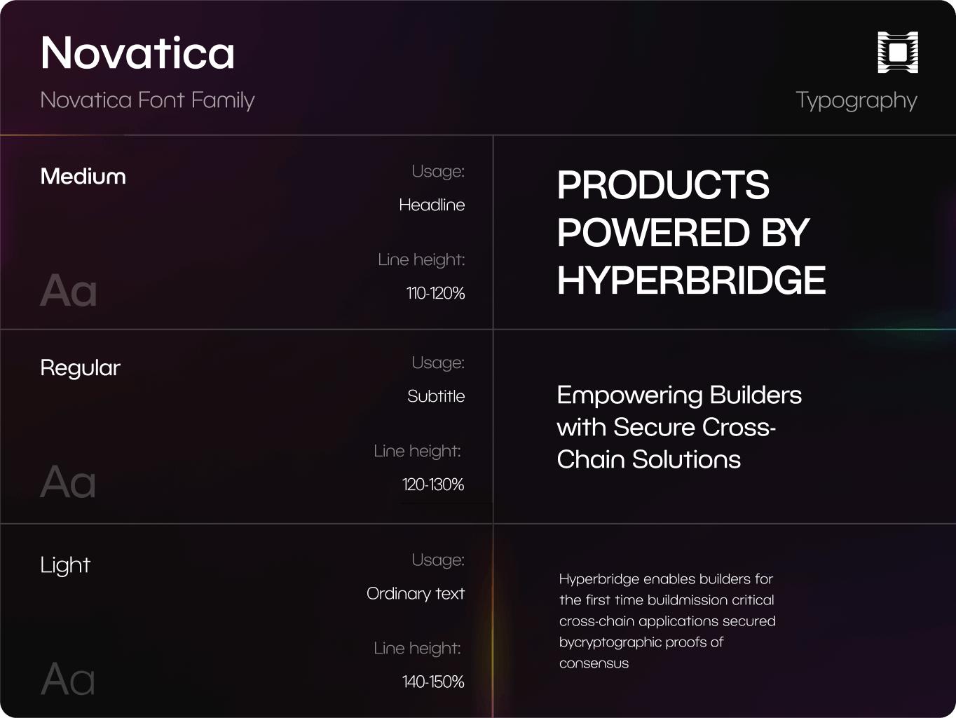
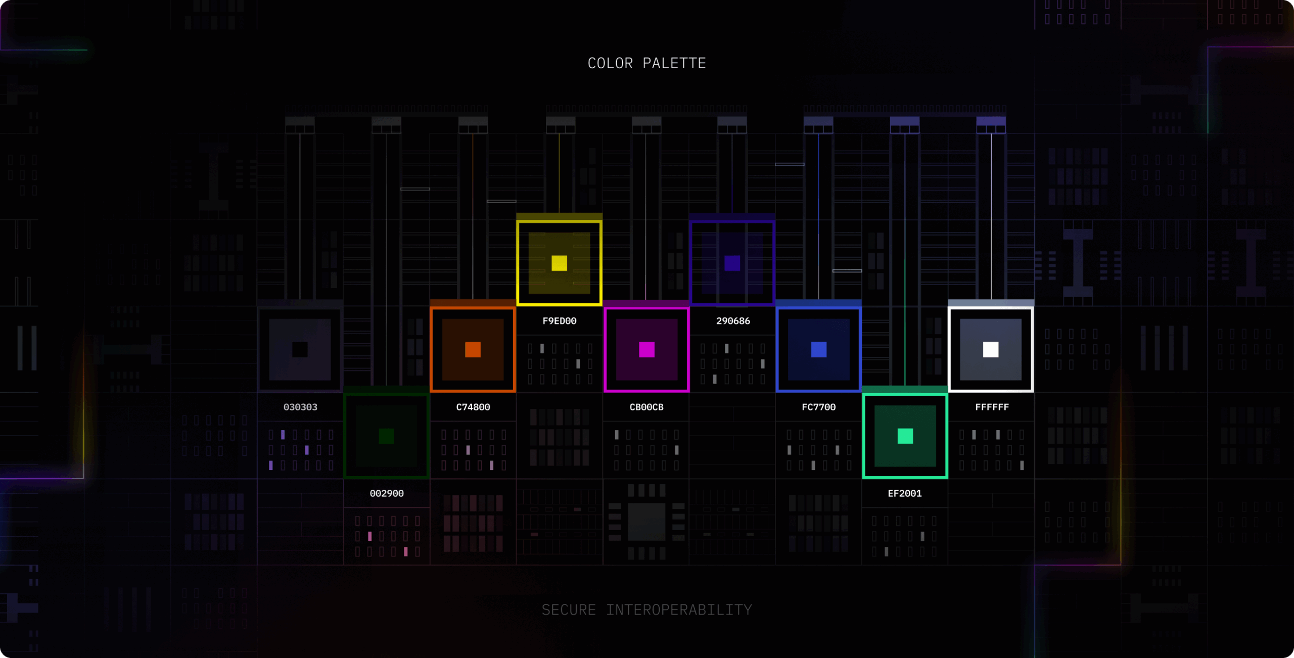
Hyperbridge’s visual identity conveys a balance of precision and innovation. The typography reinforces structure and clarity, while the color strategy enhances the brand’s futuristic appeal.
The chosen typeface ensures readability while maintaining a technical and modern feel. The color approach integrates deep contrasts with dynamic accents, reflecting the brand’s adaptability and cutting-edge positioning in the blockchain space.
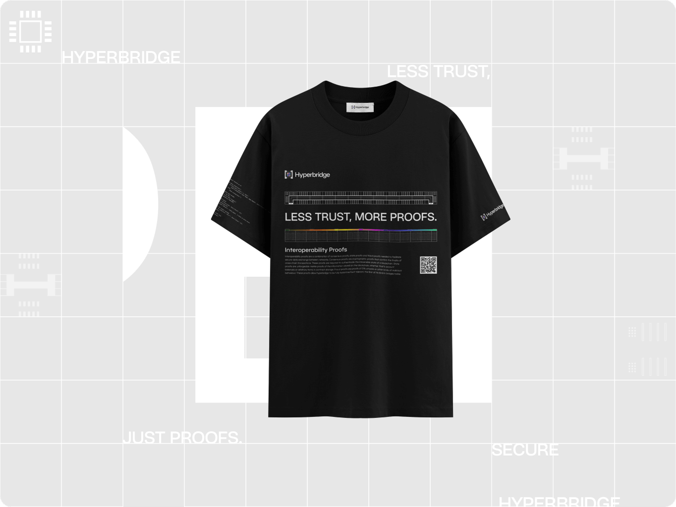
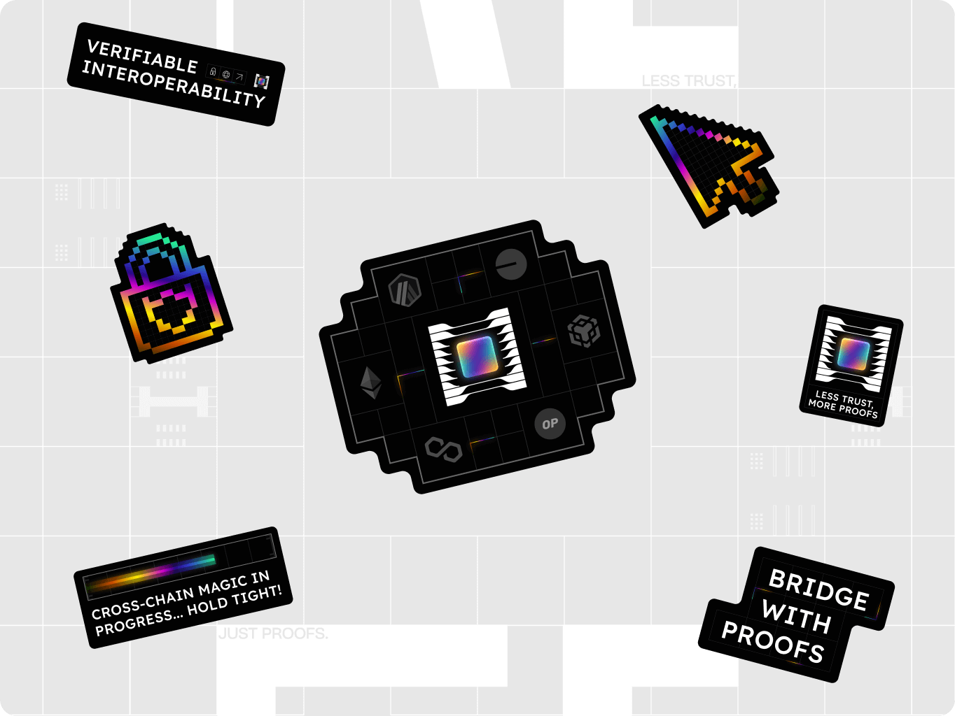
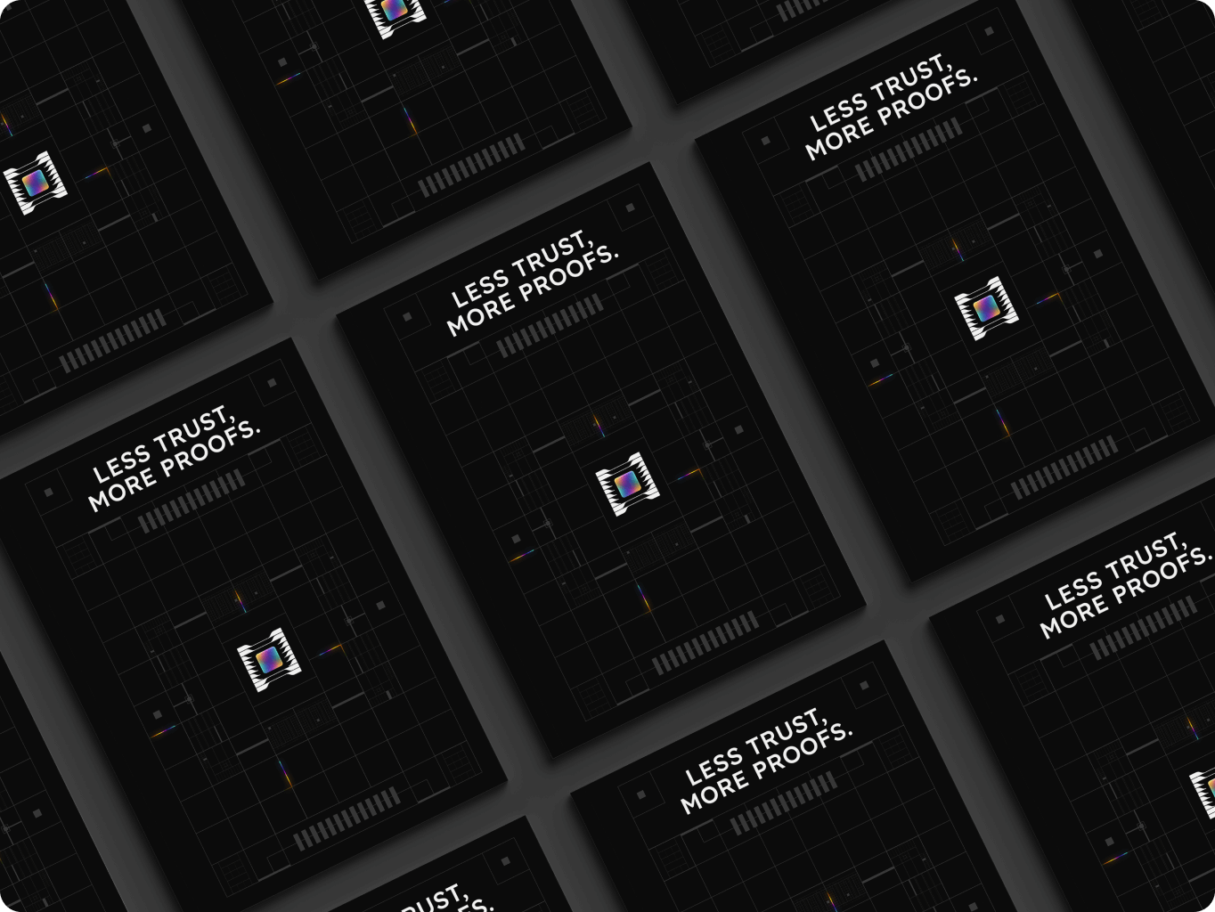
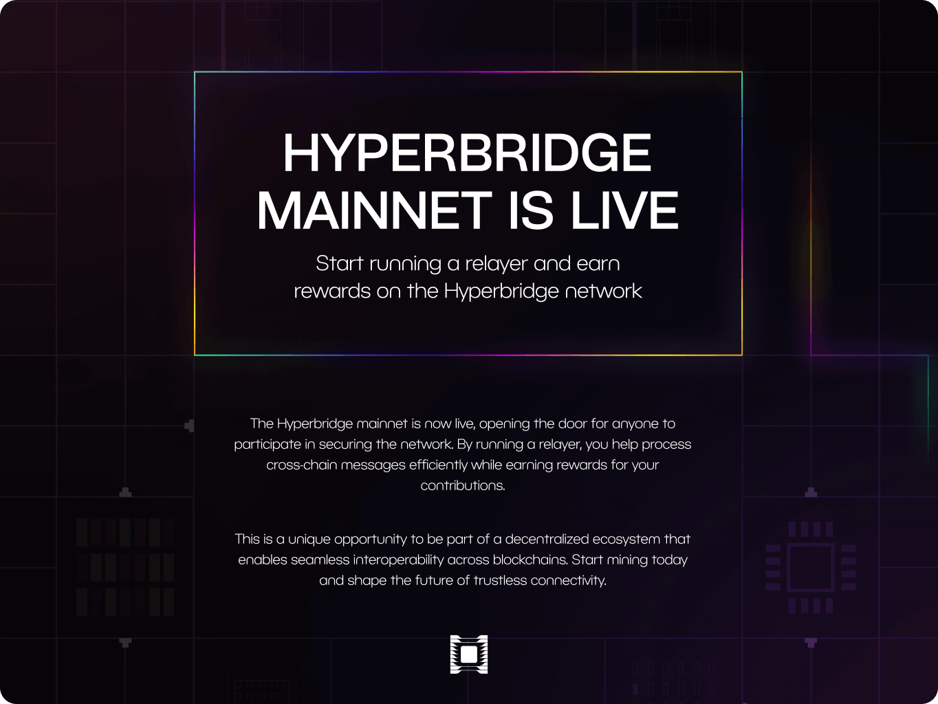
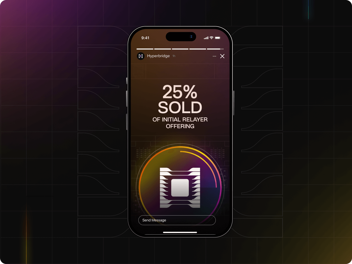
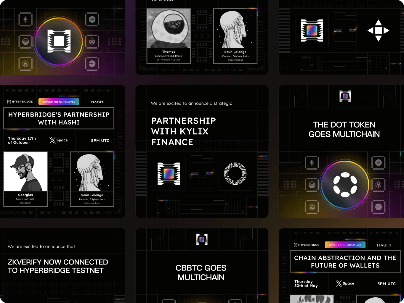
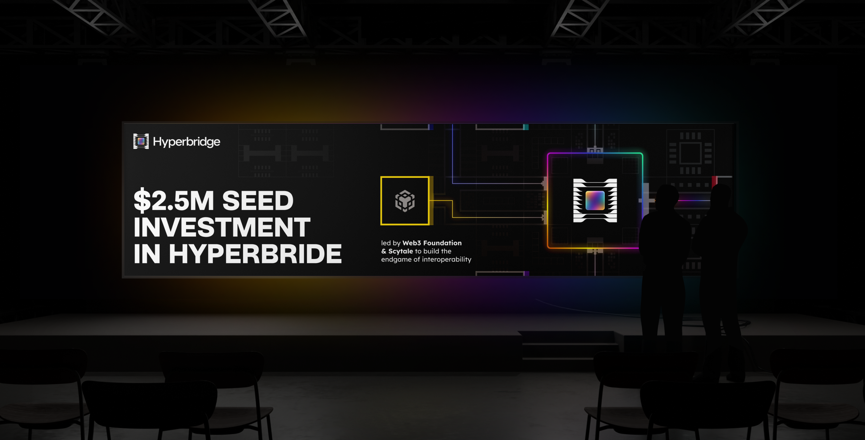
Hyperbridge’s assets ensure a cohesive brand presence across digital and physical touchpoints. Designed for engagement and recognition, they reinforce the brand’s identity through structured visuals and dynamic elements.
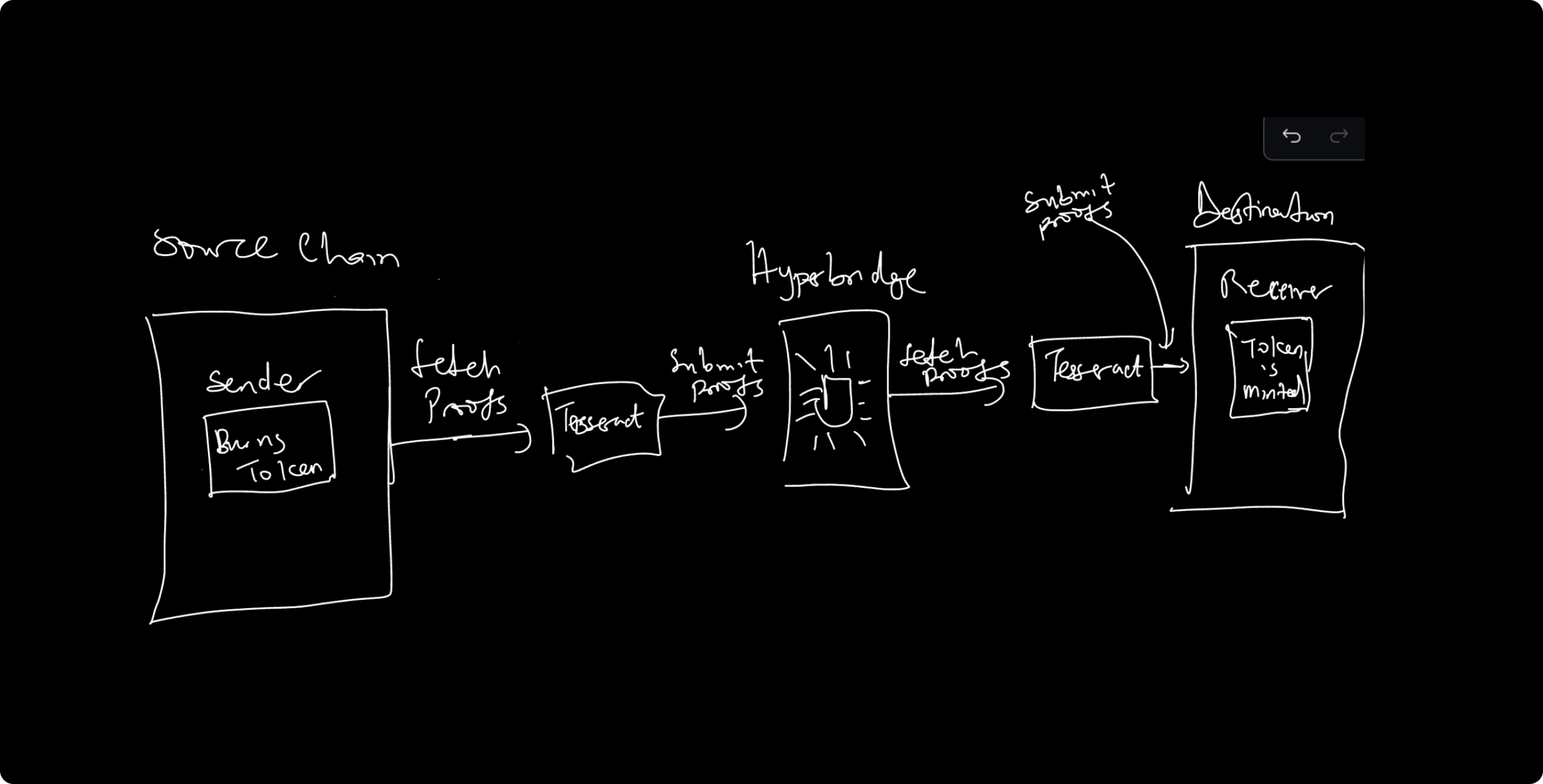
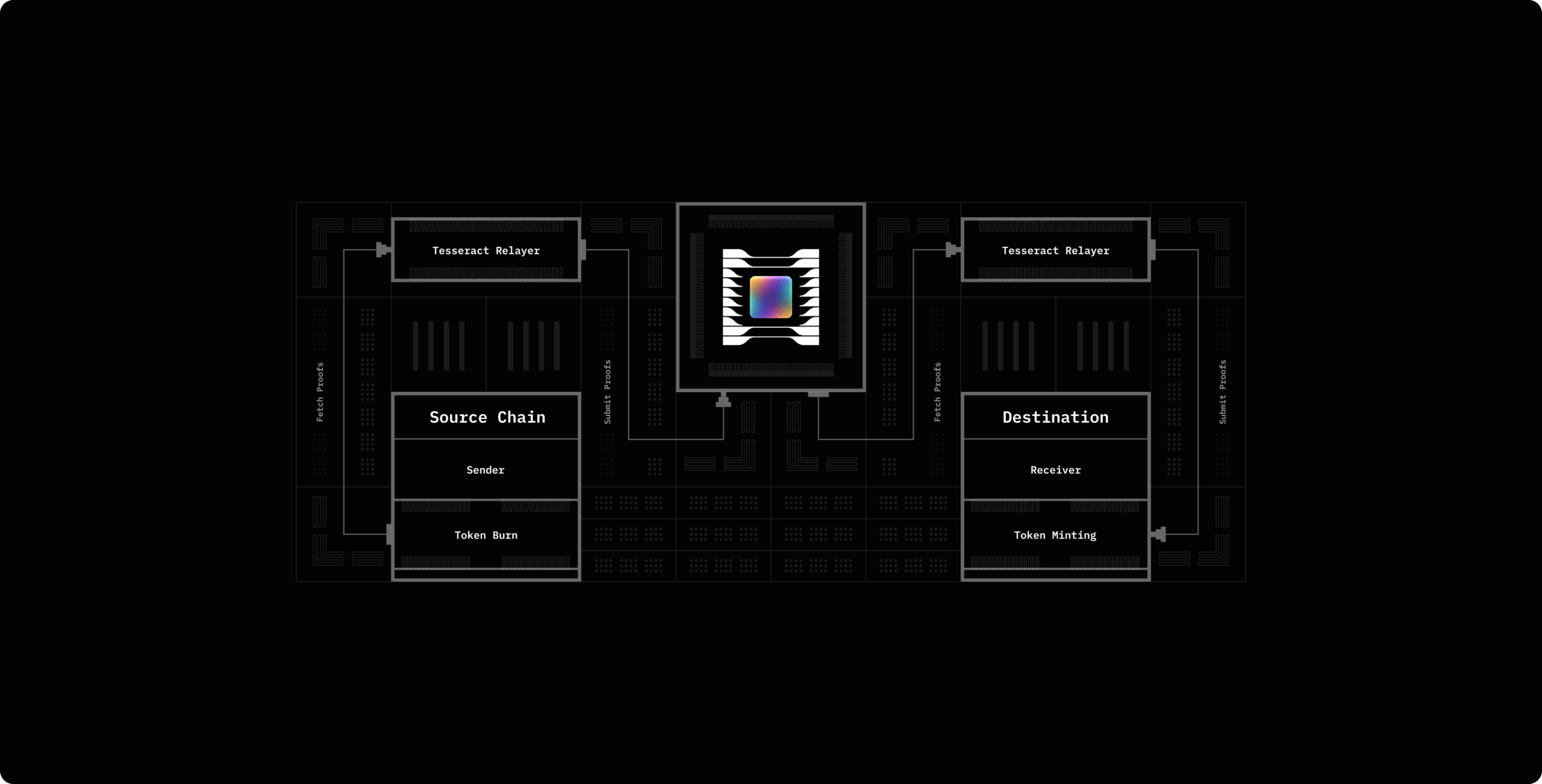
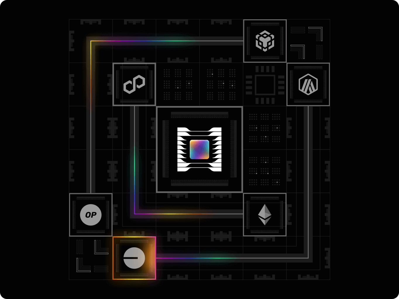
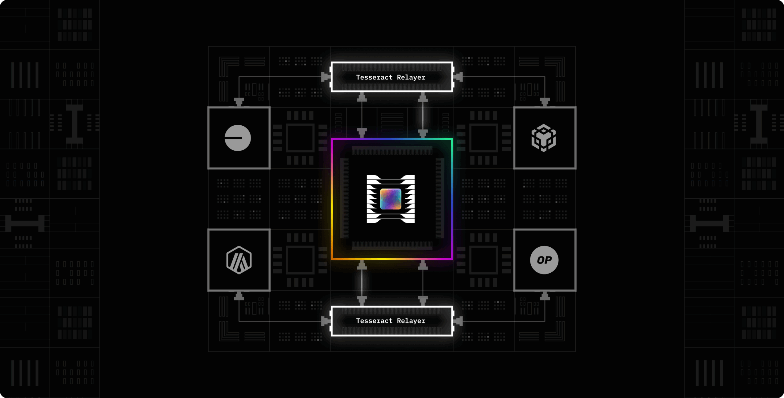
To enhance understanding of Hyperbridge’s technology, we developed a set of structured illustrations that visually explain its core mechanisms. These visuals simplify complex blockchain interactions, making the system more accessible for developers and stakeholders.
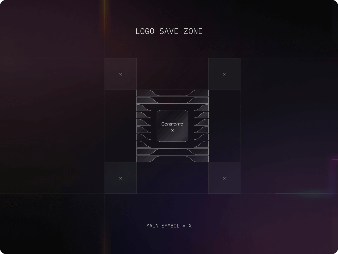
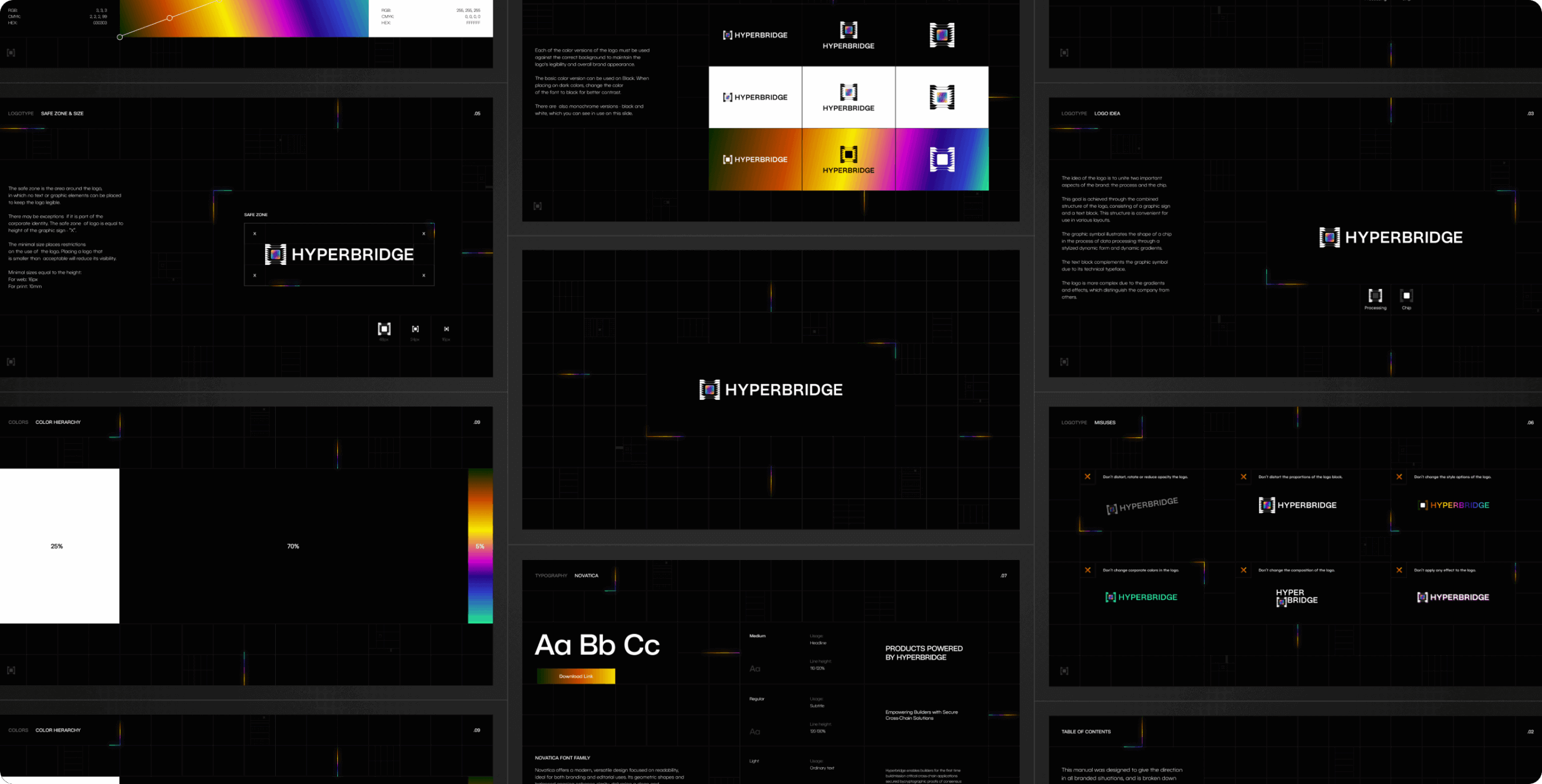
The Hyperbridge brand guidelines ensure a consistent and structured identity across all applications. They establish clear standards for visual elements, reinforcing professionalism and adaptability while maintaining brand clarity.
As a tech startup our goal was to build and obtain meaningful leads within the snow industry. We were tasked with an exciting brief to build an immersive experience that reflects the innovative nature of slope solutions.
We were tasked with an exciting brief to build an immersive experience that reflects the innovative nature of slope solutions.


 USA
USA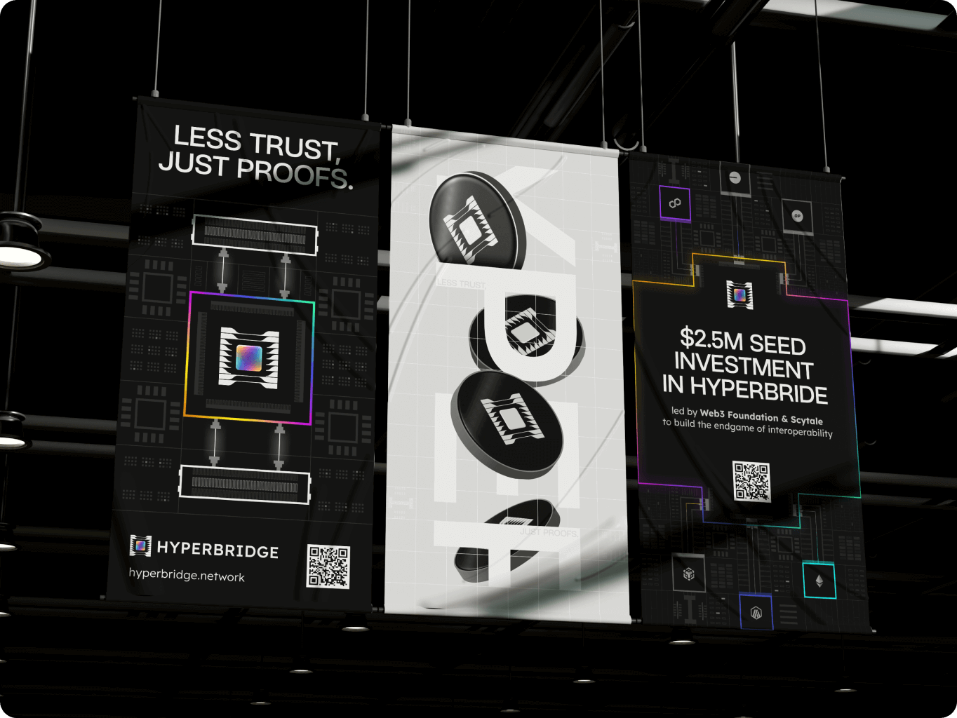



 United States
 UK
UK
 UAE
UAE
