Development
Research
Client
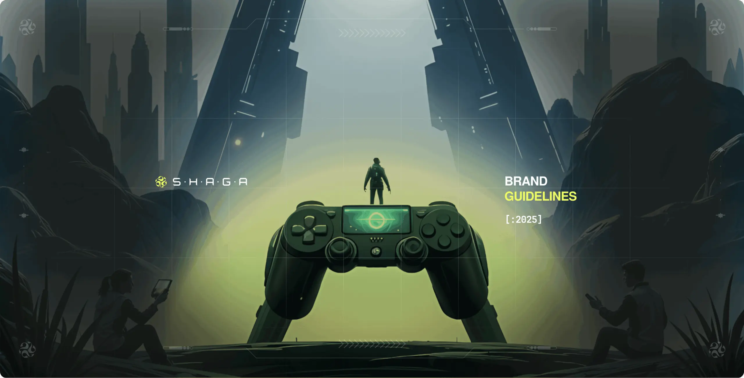
Shaga
 USA
USA
USA
Services
Phenomenon Studio helped us generate over 500,000 views on our product video, millions of impressions across all our publicly shared assets, and more than 40,000 new followers on X. With their support, we also secured $5 million in funding, gained adoption in over 170 countries, and were featured in leading publications.
Shaga approached us with the goal of refining its brand identity to better align with its vision of accessible, low-latency cloud gaming. The primary objective was to establish a strong, dynamic visual identity that reflects its innovative peer-to-peer technology, commitment to seamless gameplay, and dedication to a connected gaming community.
We took on the challenge of redefining Shaga’s brand identity to align with its vision of secure and scalable cloud gaming. Our role included developing a modern and adaptable design system, crafting a logo that embodies speed and connectivity, and establishing comprehensive brand guidelines for consistency across all platforms. By merging strategy with design, we ensured that every visual element reinforces Shaga’s technological expertise and commitment to a superior gaming experience.

We were tasked with an exciting brief to build an immersive experience that reflects the innovative nature of Shaga’s cloud gaming platform. As a tech startup, our goal was to build and obtain meaningful engagement within the gaming industry. We were tasked with an exciting brief to build an immersive experience that reflects the innovative nature of Shaga’s peer-to-peer gaming solutions.
Stages
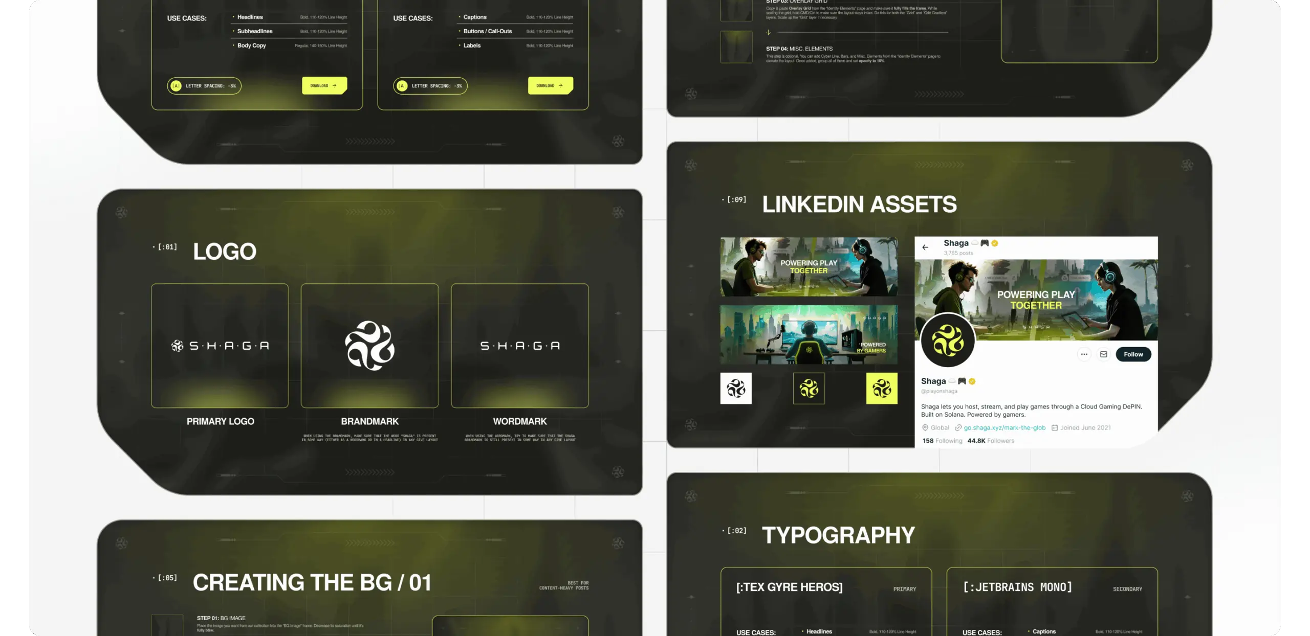
- logo design
- colors & typography
- brand assets
- brand guidelines
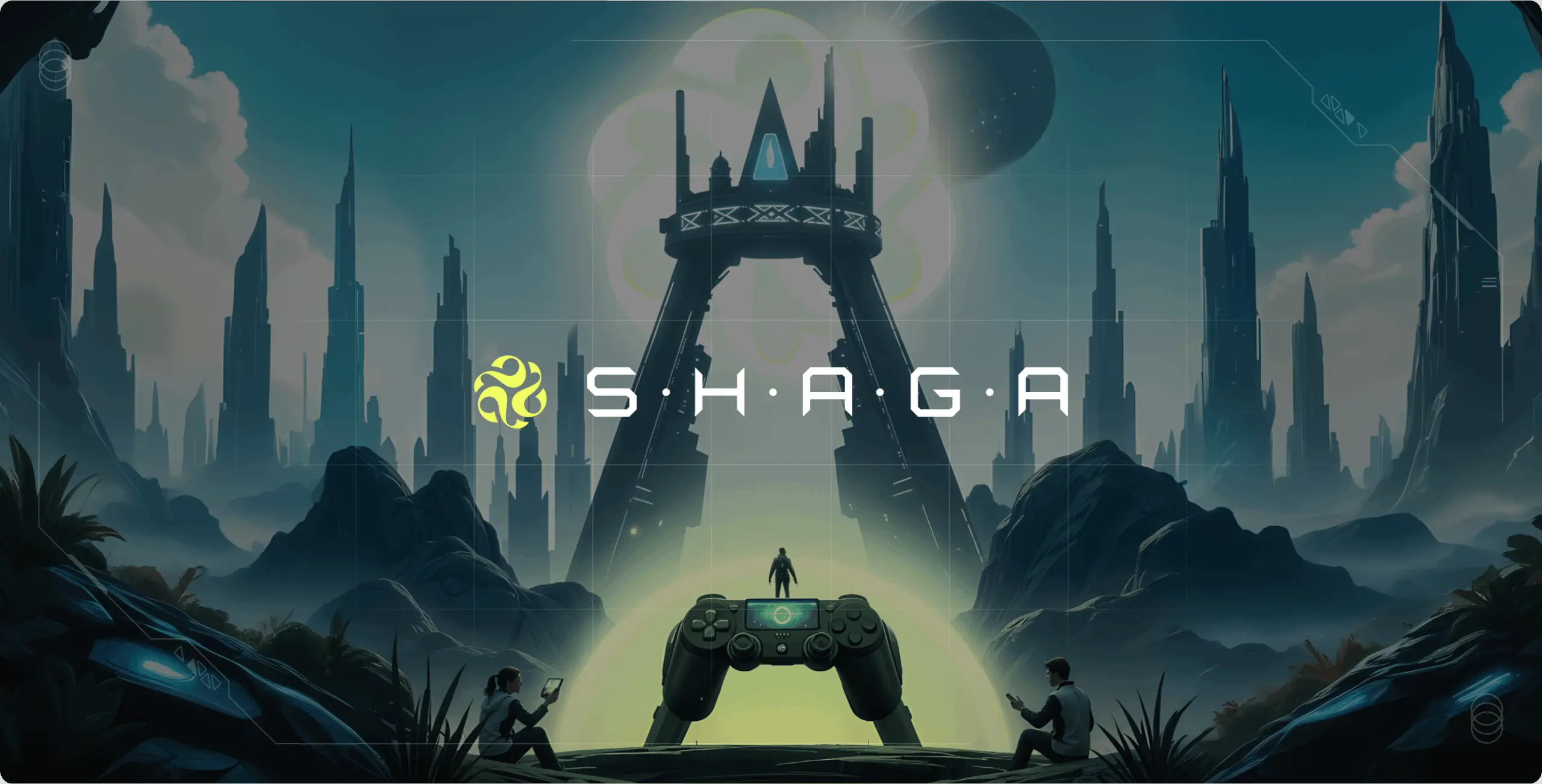
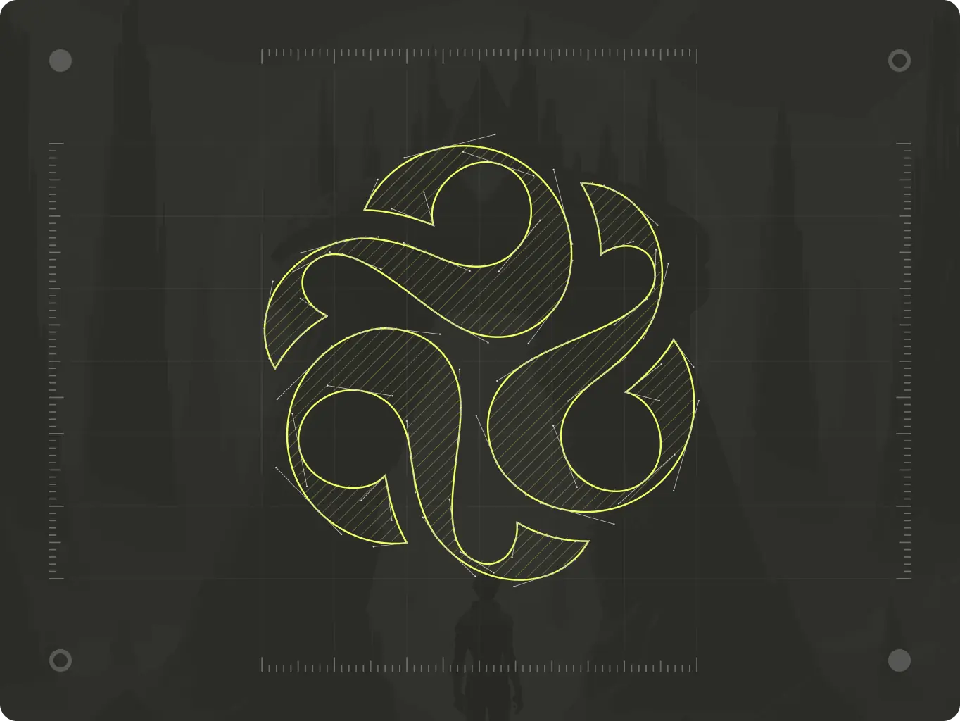
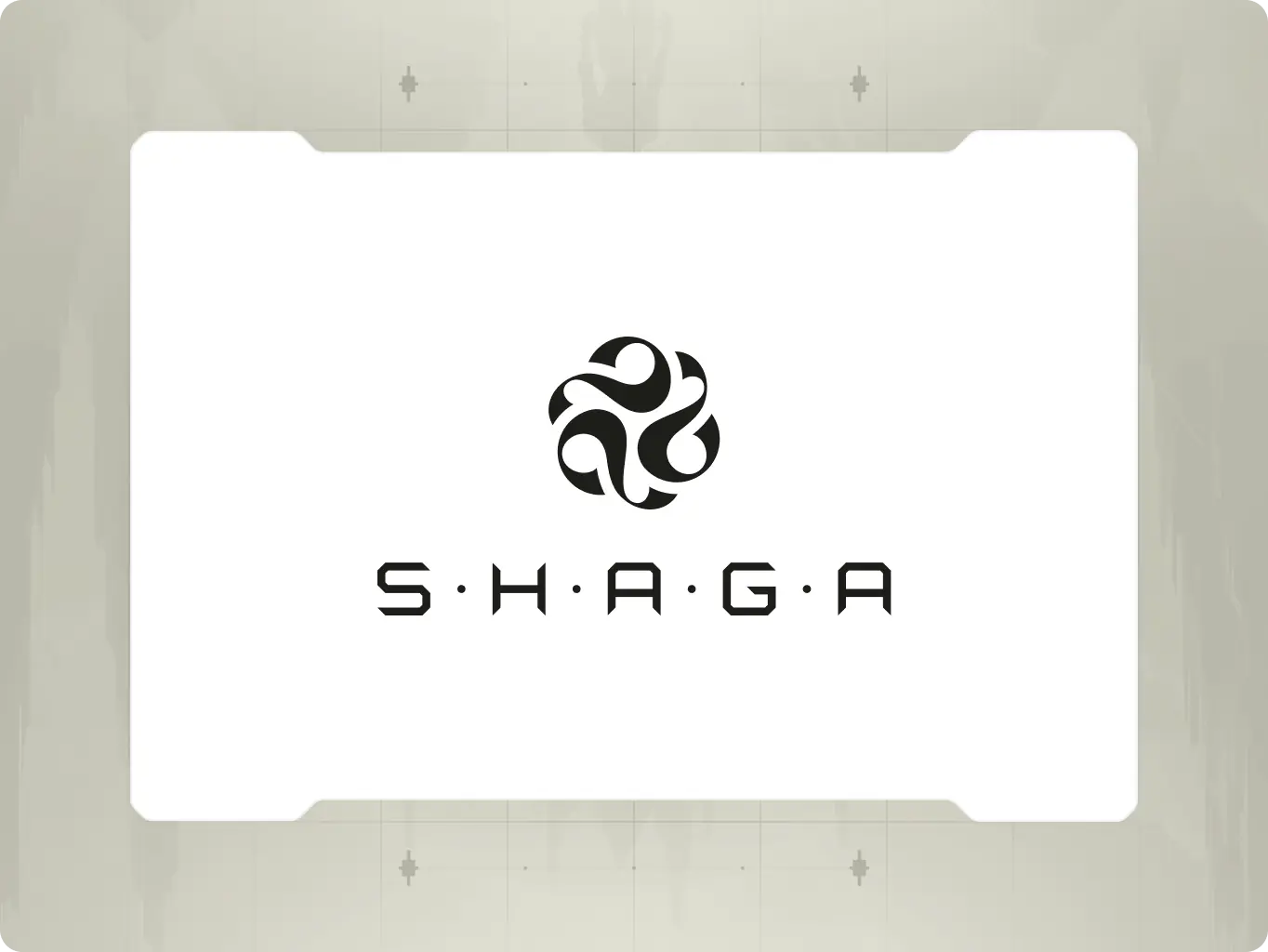
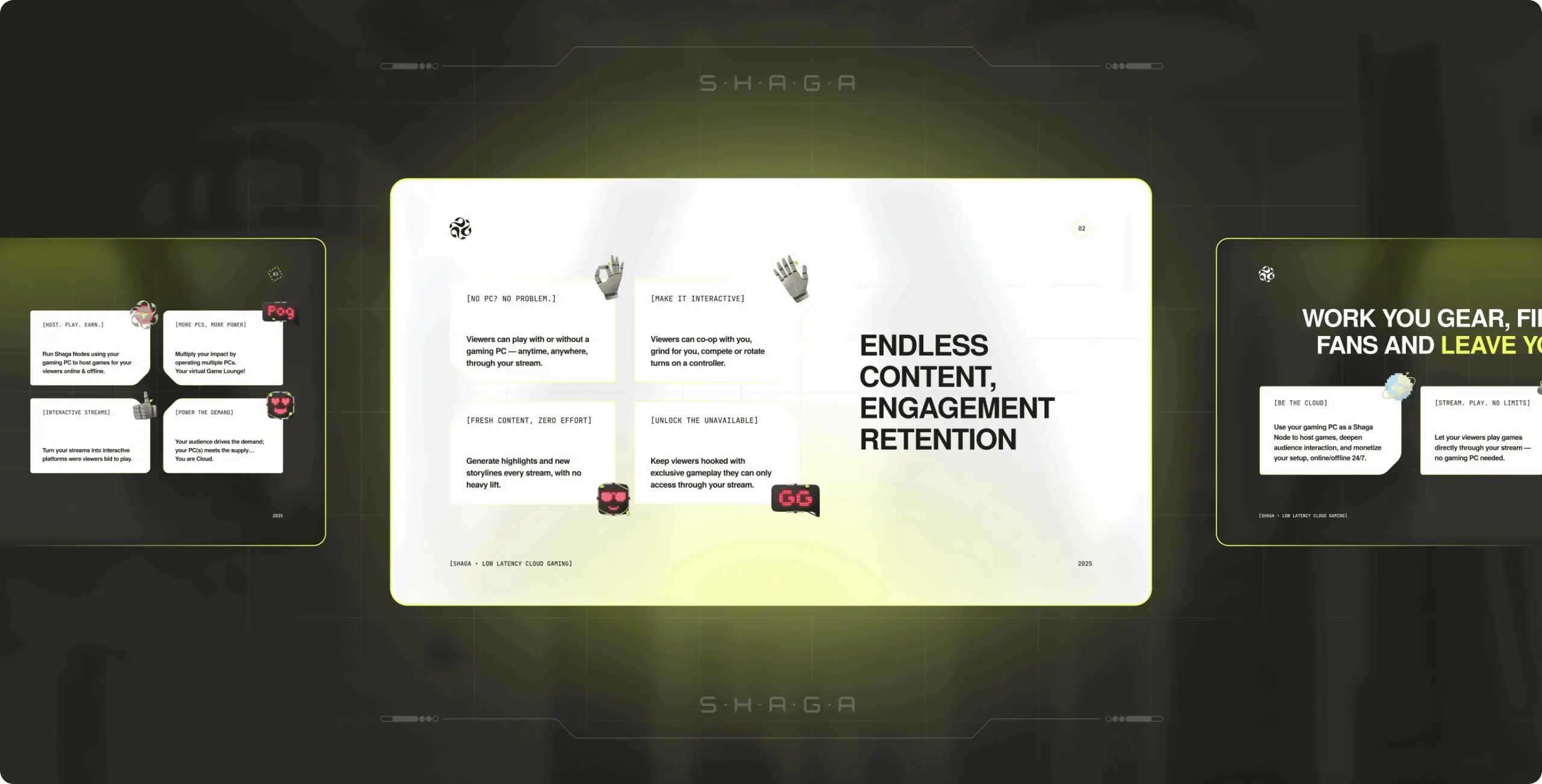
The Shaga logo unites two key aspects: speed and connectivity. The symbol represents a dynamic network in action, with its sharp, interconnected forms emphasizing movement and innovation. A modern, cyber-like typeface reinforces the brand’s identity as a cutting-edge gaming platform.
The combination of its distinct forms and clean lines makes Shaga stand out, ensuring a distinctive and futuristic presence in the cloud gaming space.
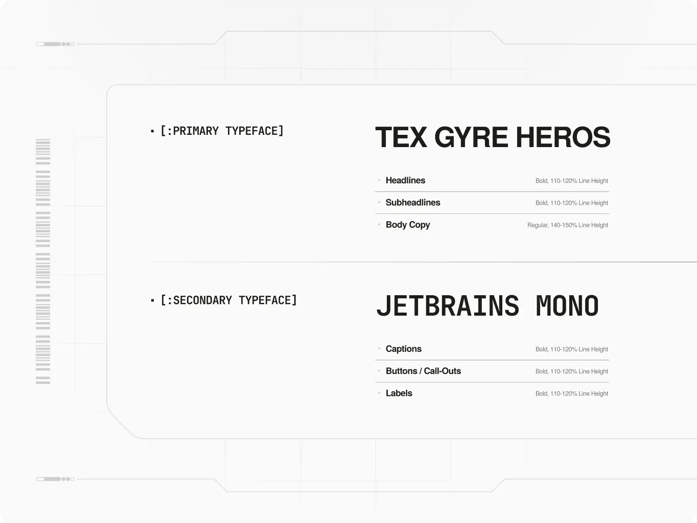
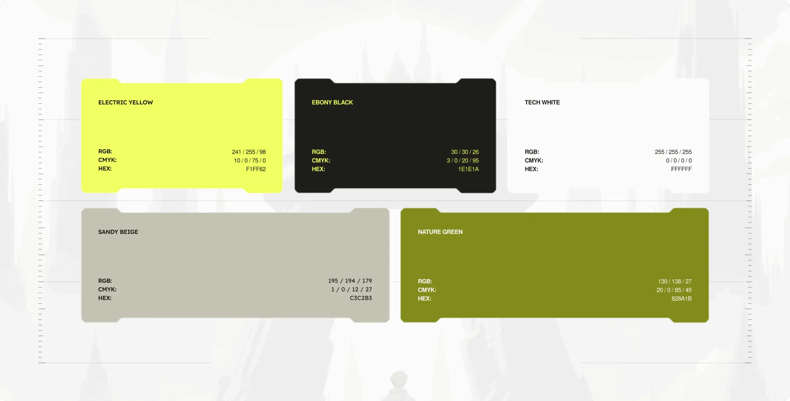
Project’s visual identity conveys a balance of speed and accessibility. The typography reinforces structure and clarity, while the color strategy enhances the brand’s futuristic gaming appeal.
The chosen typeface ensures readability while maintaining a technical and cyber-like feel. The color approach integrates deep contrasts with dynamic accents, reflecting the brand’s adaptability and cutting-edge positioning in the cloud gaming space.
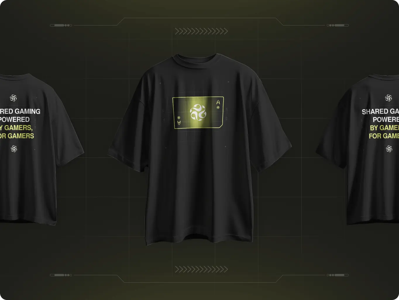
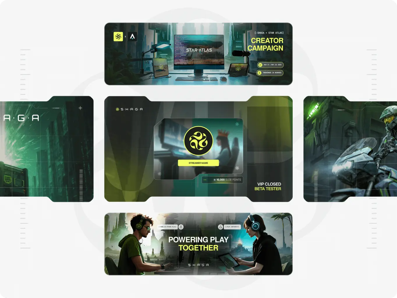
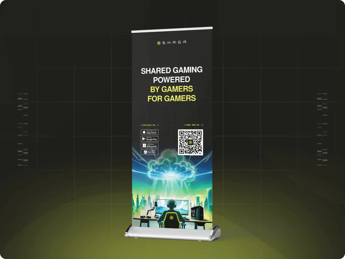
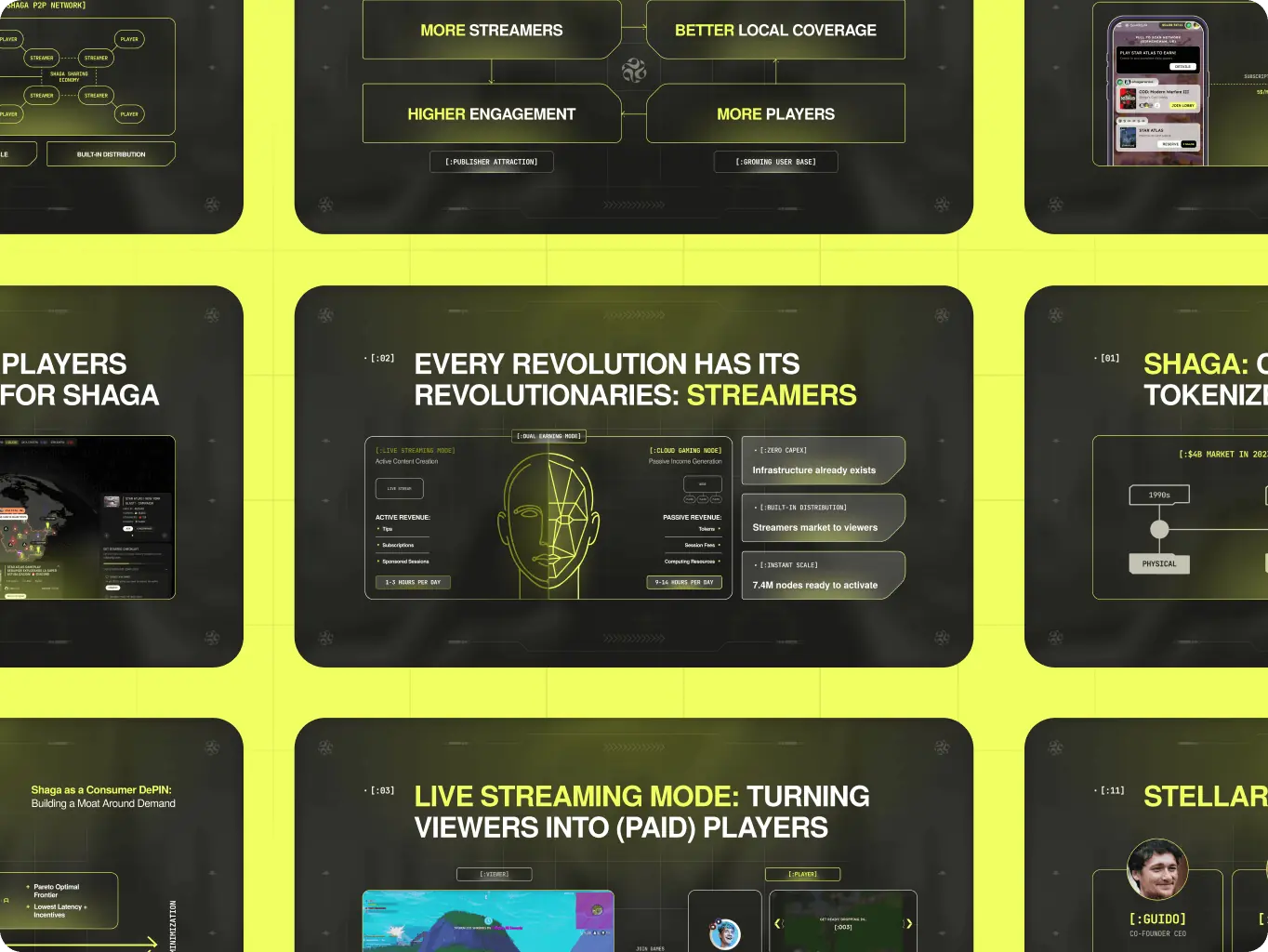
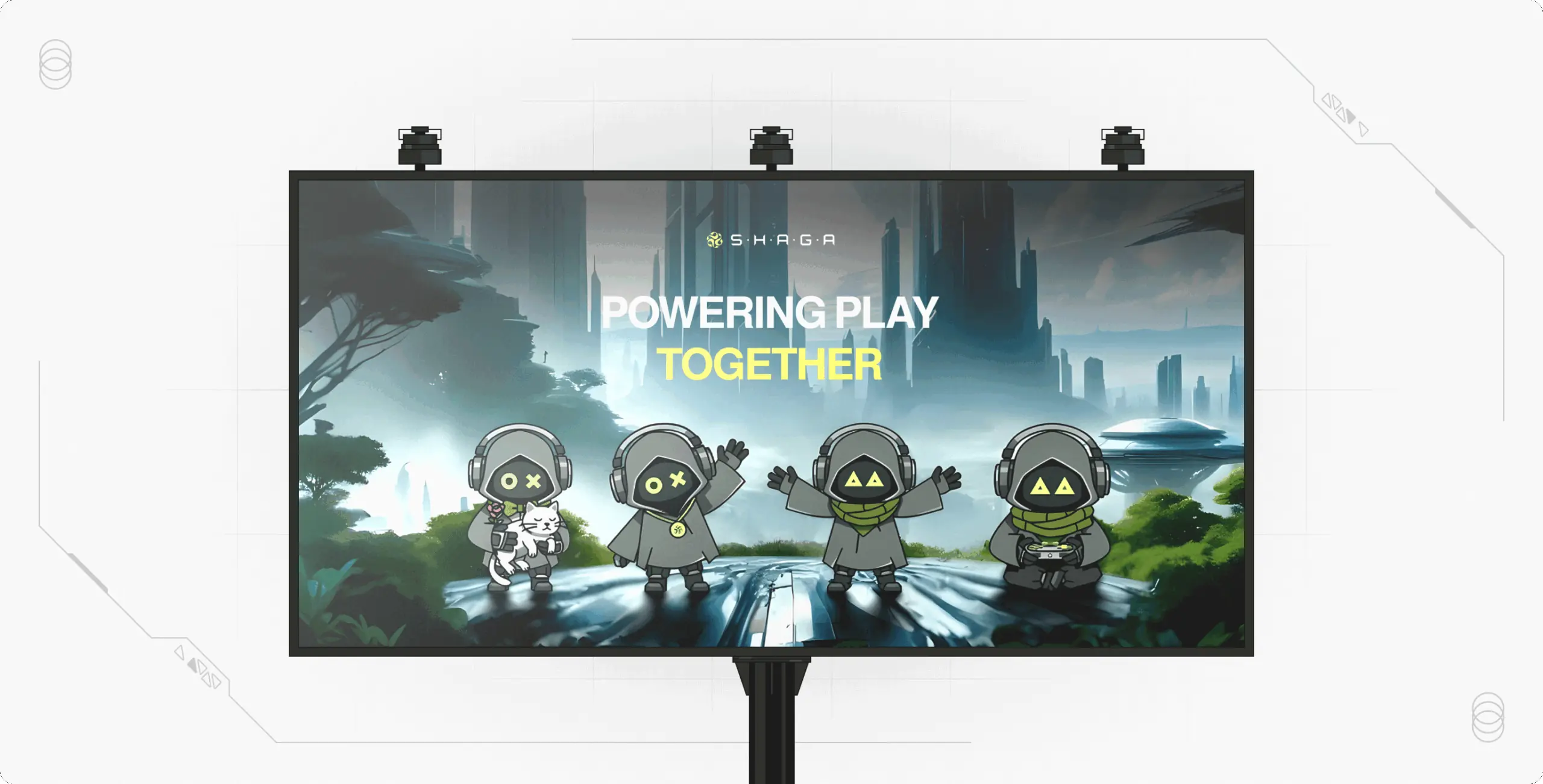
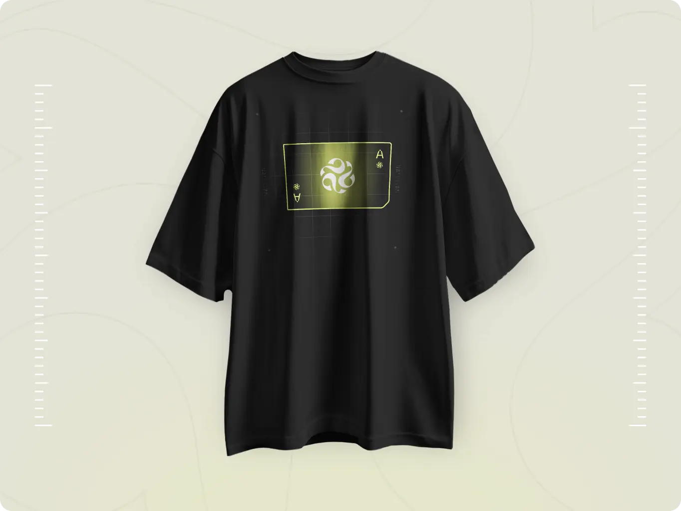
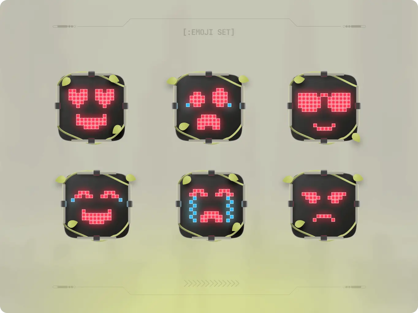
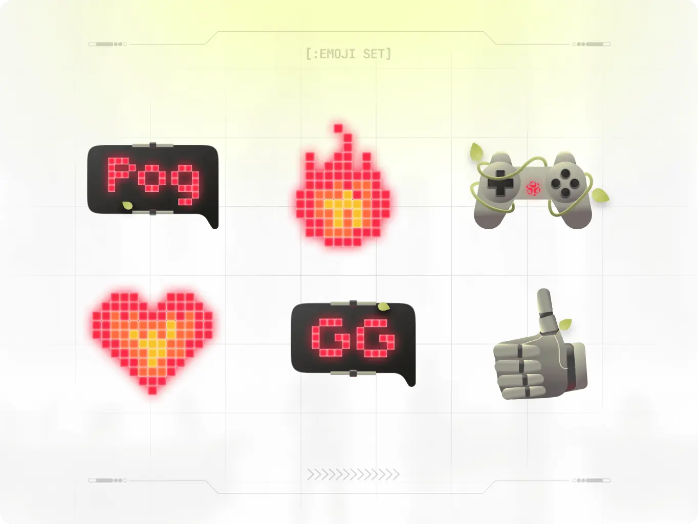
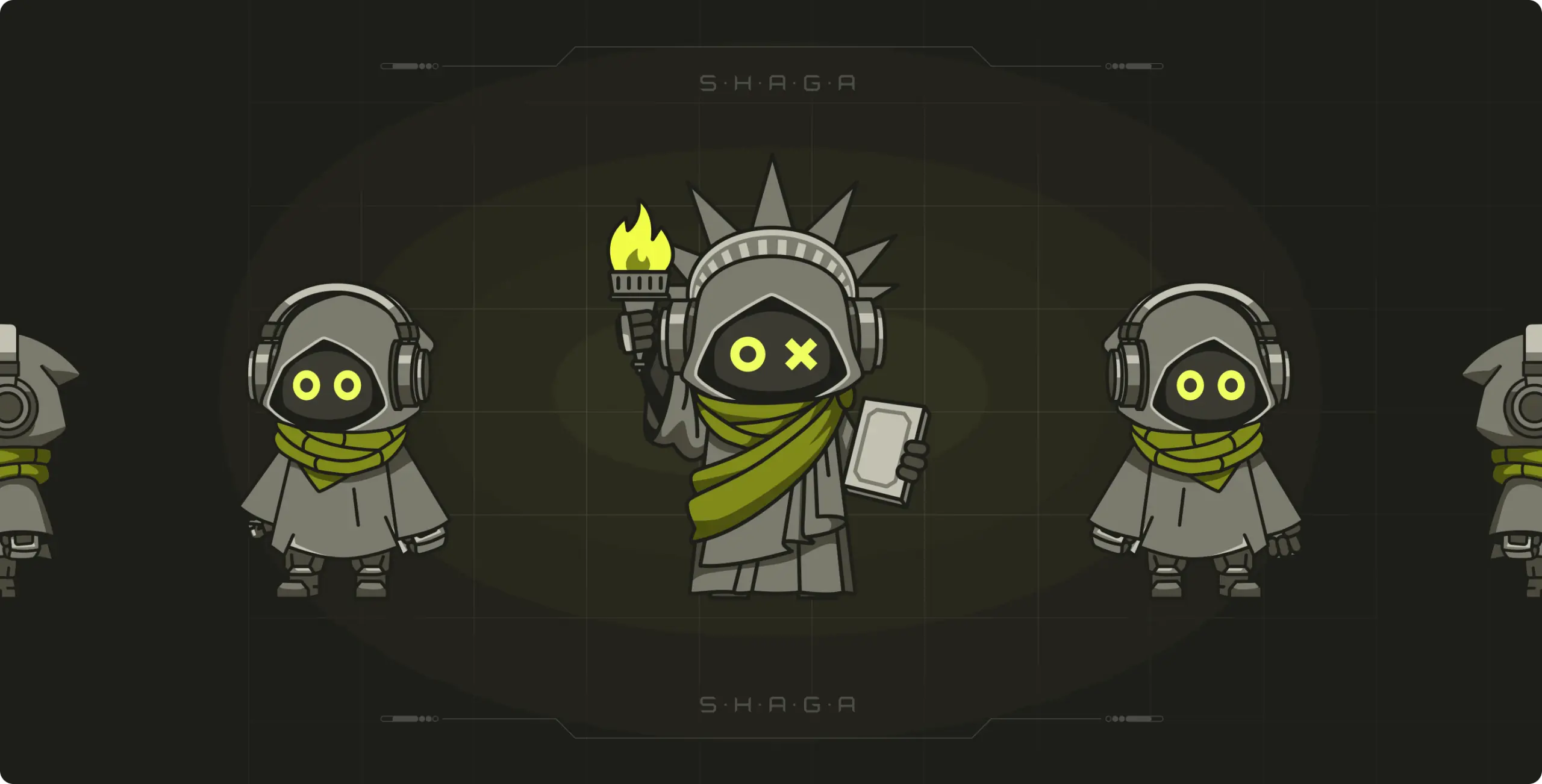
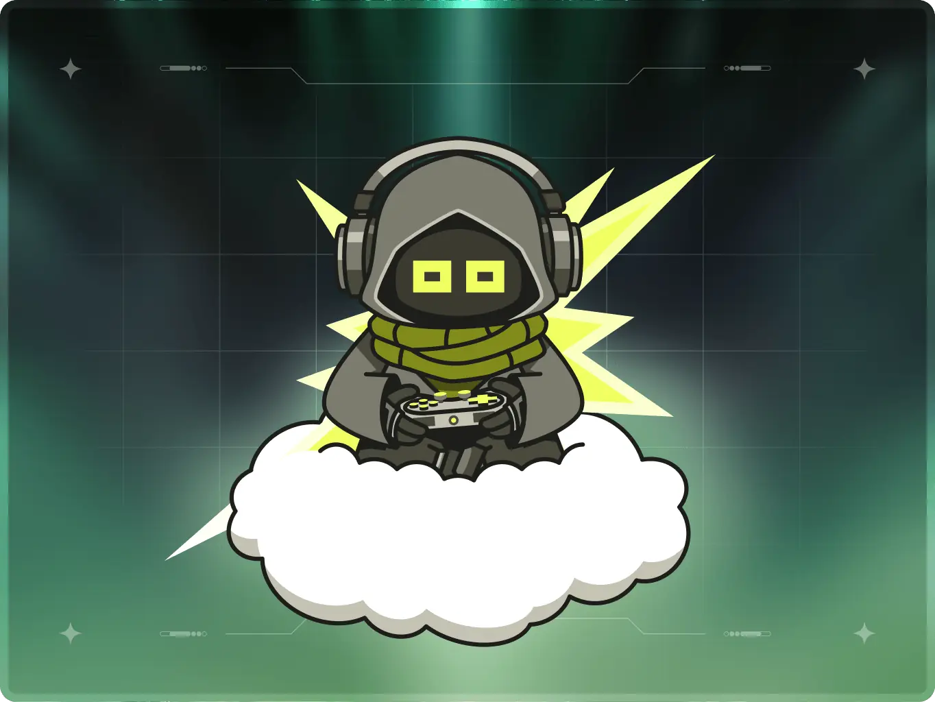
To build a cohesive brand presence across digital and physical touchpoints we made a wide range of assets. Designed for engagement and recognition, they reinforce the brand’s identity through structured visuals, dynamic elements, and a heavy use of AI-generated solarpunk imagery, specifically tailored for the fast-paced world of cloud gaming.
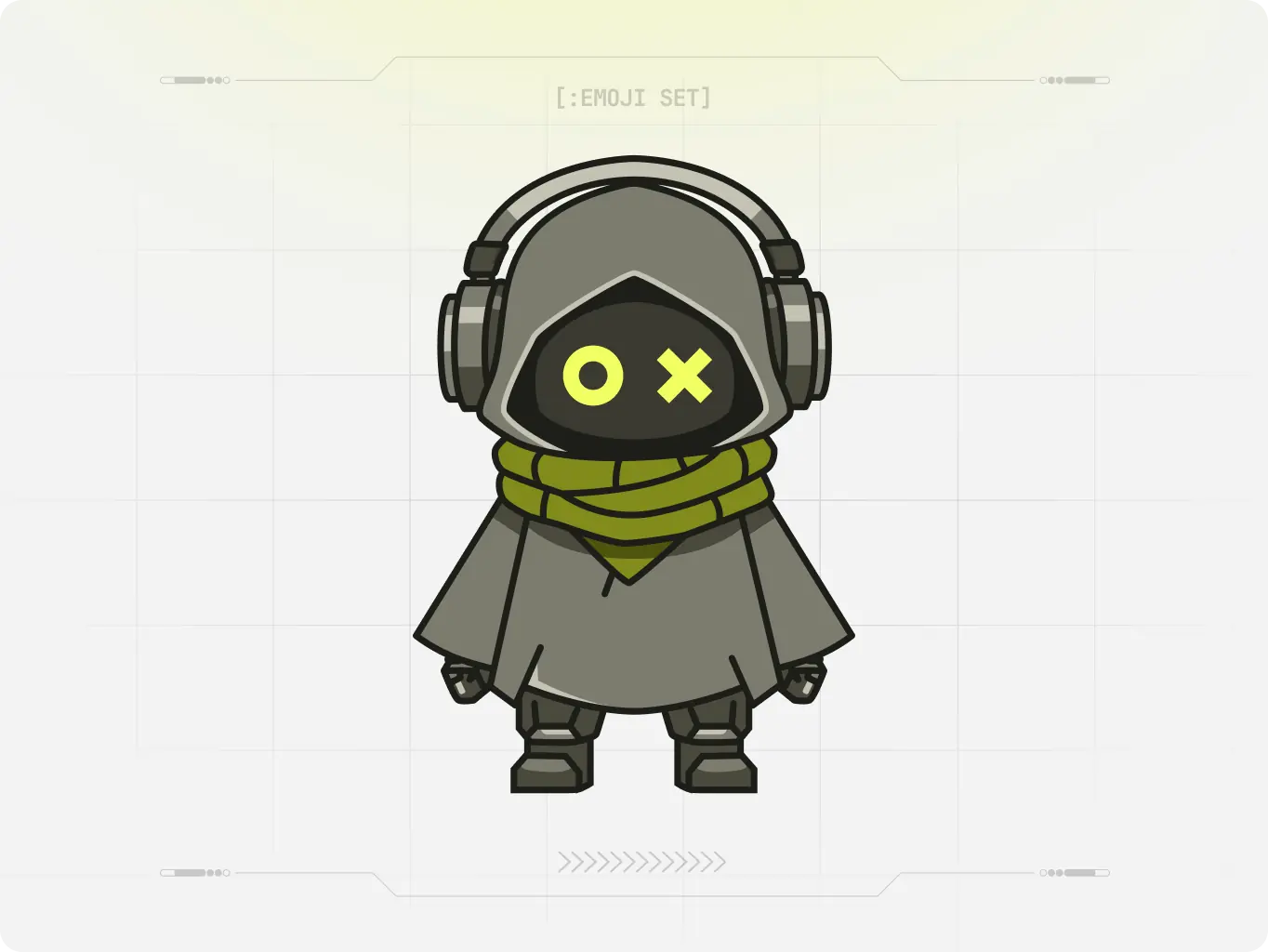
Shaga’s mascot draws inspiration from solar punk aesthetics — a vision of what a player might look like in such a world. The design remains abstract and avoids realistic body types, making the character neutral and adaptable across contexts. Mascot eyes are shaped like gaming controller symbols, to make it more playful and match with a gaming theme more deeply.
Mascot aligns seamlessly with Shaga’s style and values, reflecting the brand’s communication tone in the most attractive and effective way.
To ensure a consistent and structured identity across all applications, we prepared complete brand guidelines.
It establish clear standards for visual elements, reinforcing professionalism and adaptability while maintaining brand clarity, especially with the heavy use of AI-generated solarpunk imagery across their assets.
#branding
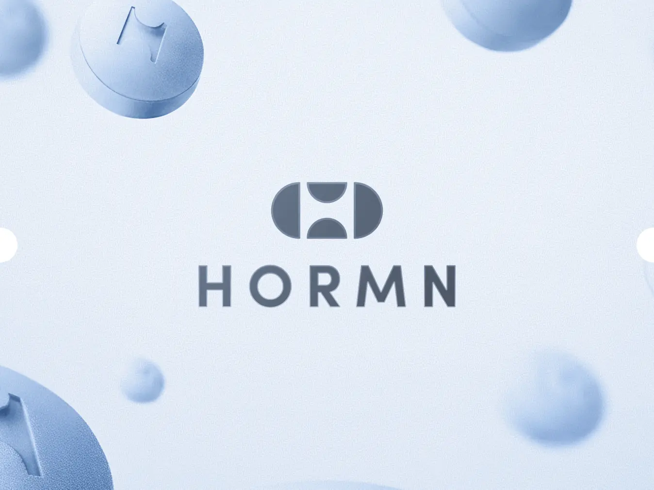
HORMN
 Australia
Australia

#Branding
Hyperscale
 USA
USA
USA
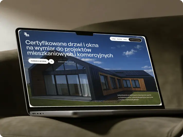
#landing page design
bm Śladewska
 poland
poland
Have a project in mind?
Let's chat
Have a project to
discuss?
discuss?

Have a partnership in
mind?
mind?
