Design
Development
Research
Launch
Evolve
Extend
Meby – meditation mobile app
Client
Meby
 USA
USA
USA
Services
Task
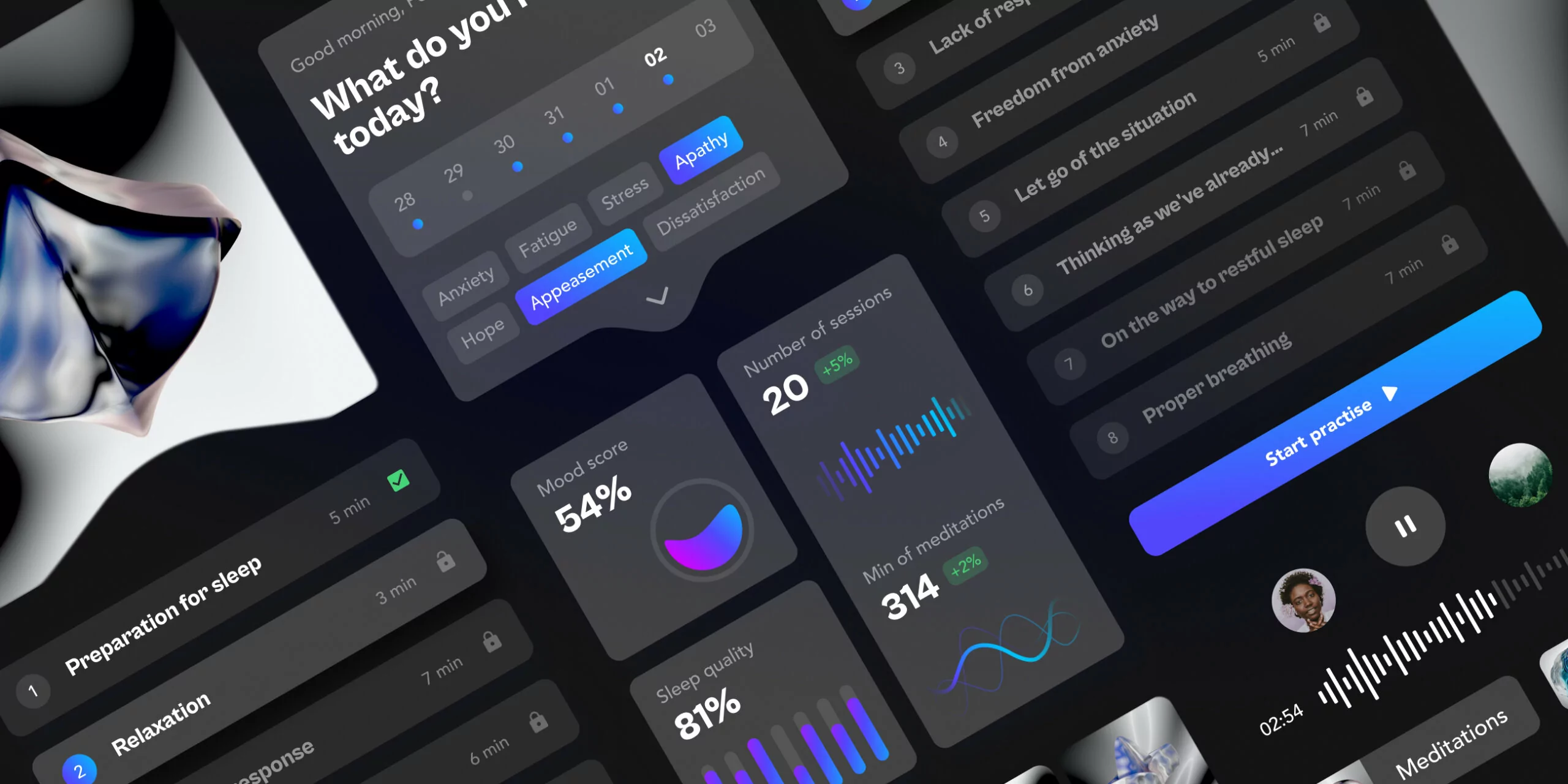
Our main task was to give people the opportunity to monitor their mental health and keep in balance through meditation courses adapted to each individually.
Solutions
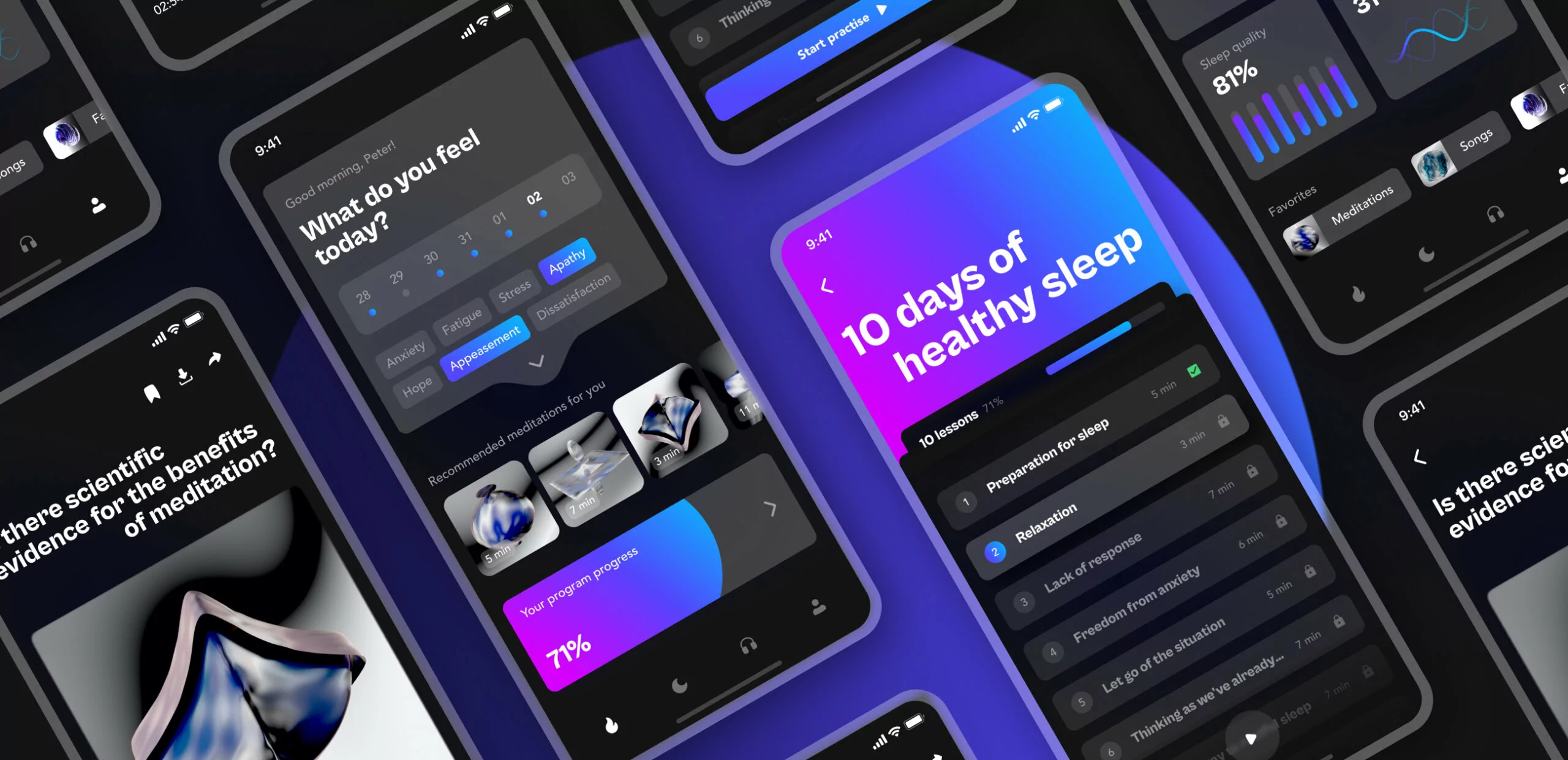
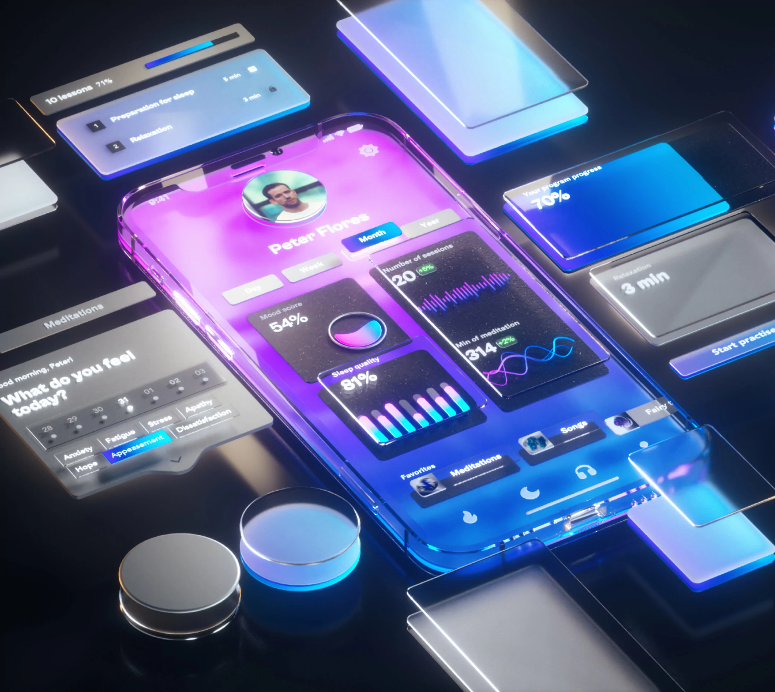
UX audit showed that the main user’s pain points when using similar applications are non-systematic passing practices and desire to quit it, because there are no plans and motivation.
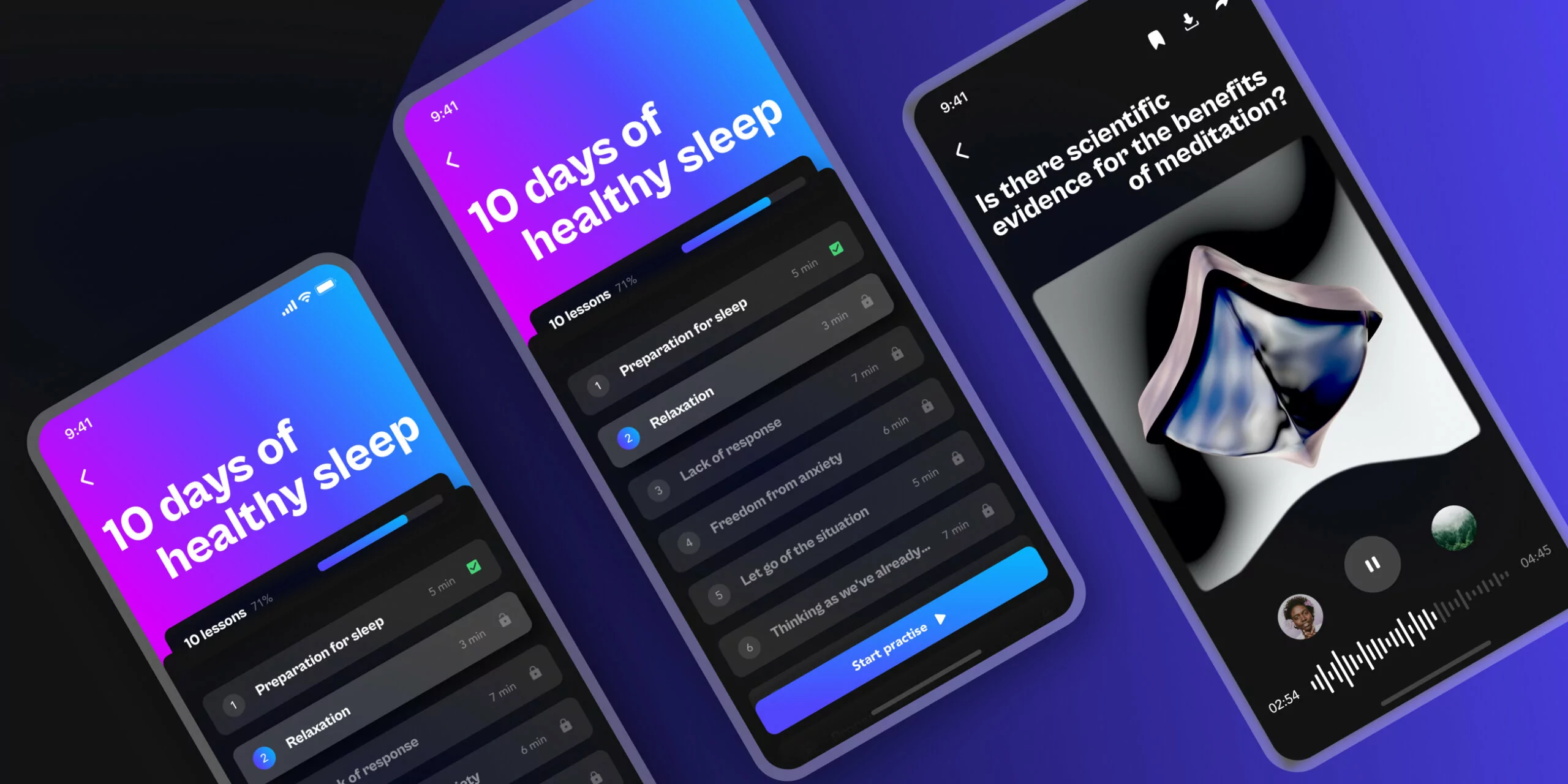
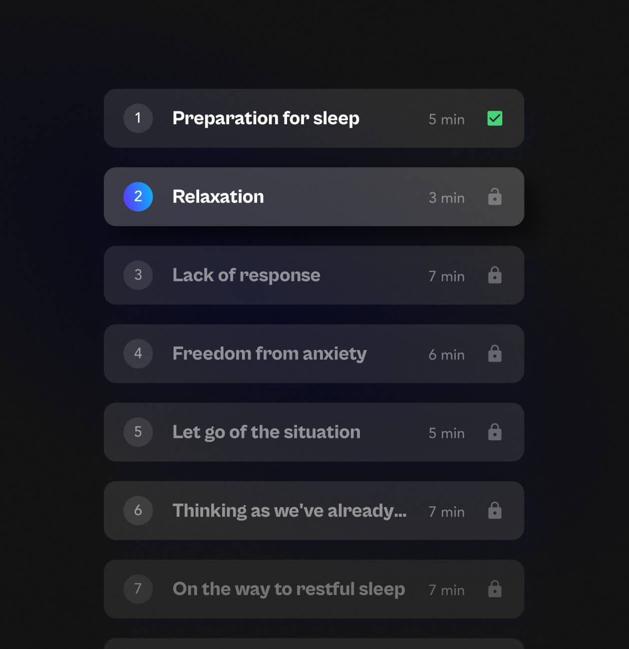
The best solution for keeping up with a plan is to offer short courses with a clear goal.
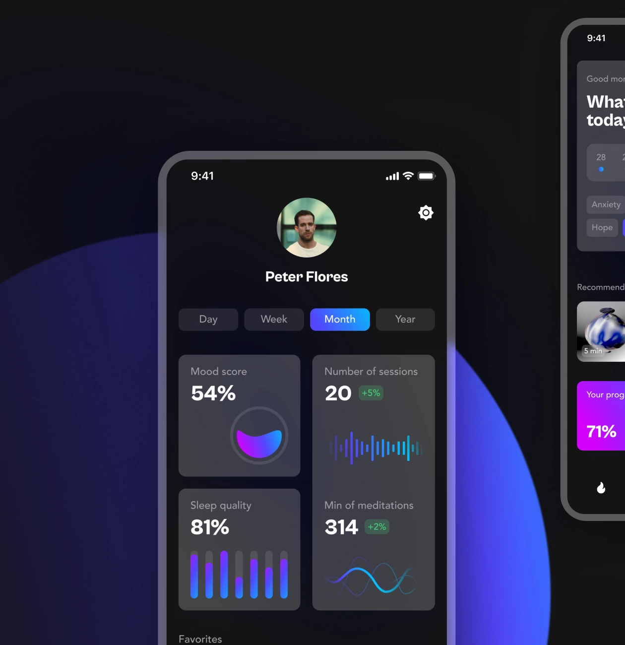
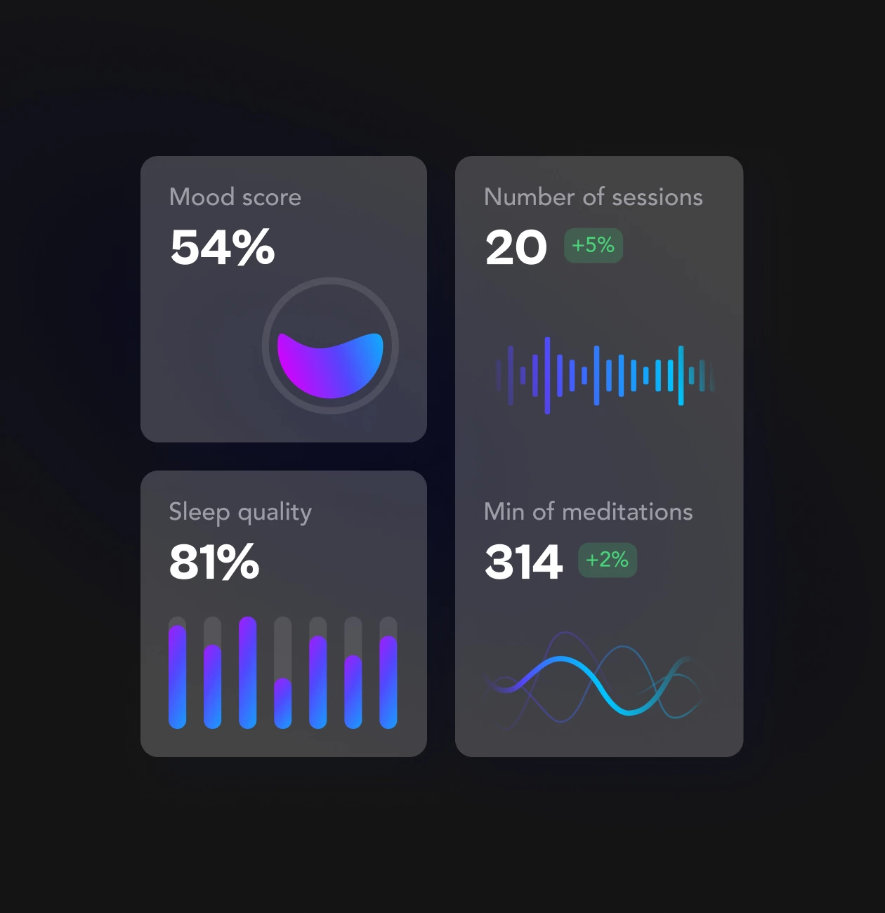
And also to motivate users, we decided to implement to track their previous test results to compare with the current. Meby app is able to give a suggestion on how to improve the next session depending on the results.
UX -research
In UX research we analyzed the main competitors, and identified their strengths and weaknesses. We understood which features can be useful in our application and which are better to avoid so that the product does not turn out to be of poor quality.
After a thorough analysis of competitors, we did research of the target audience, and found out their pains and needs. This made it clear what people lack in similar products and what we should focus on.
Reframing and Creating possible solutions
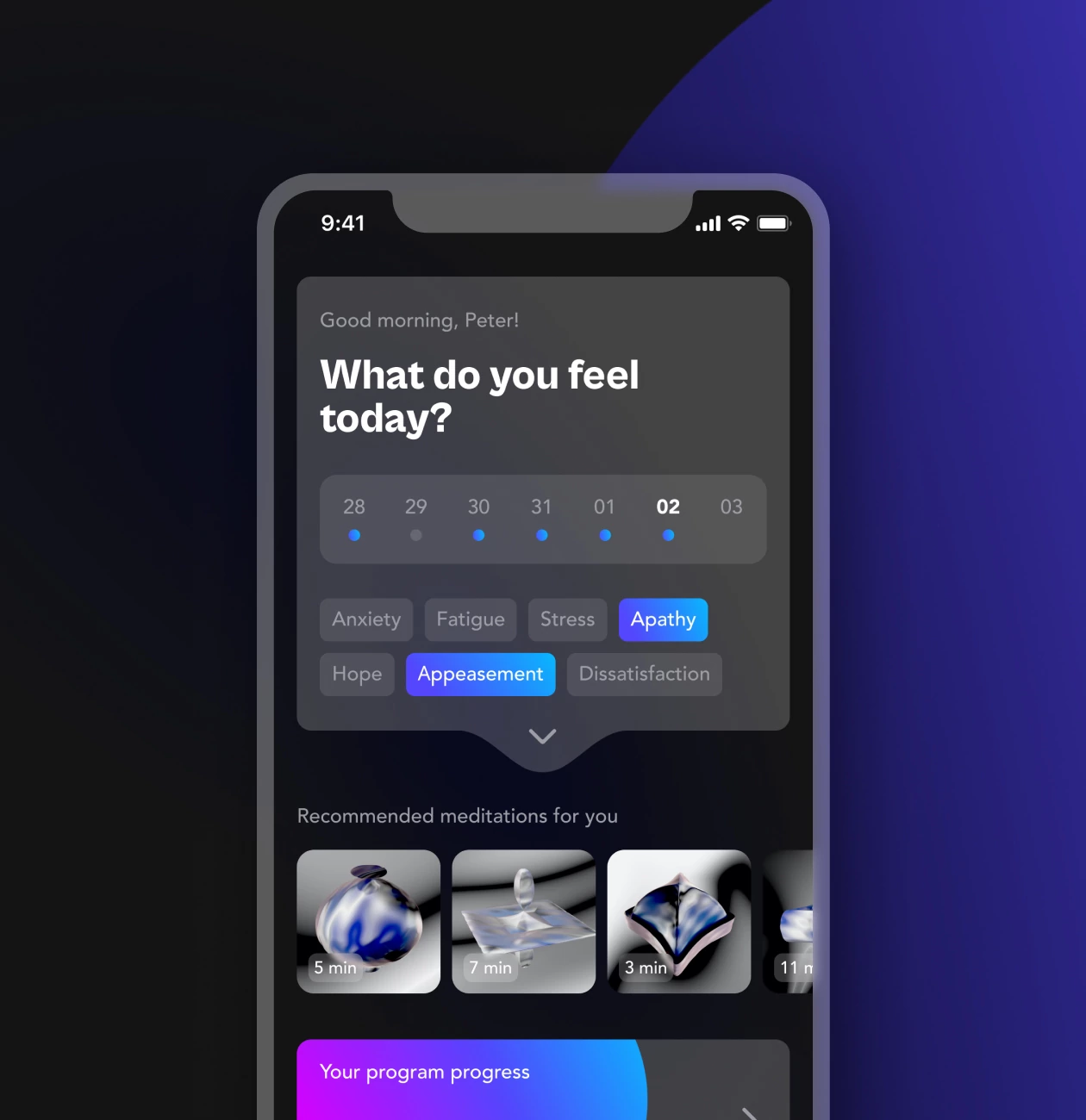
At this stage, we offered solutions to the main pains and needs of users. We settled on the solution that would make using the product as interactive and productive as possible. After thinking through all the details, we added short daily testing, progress tracking, and recommendations.
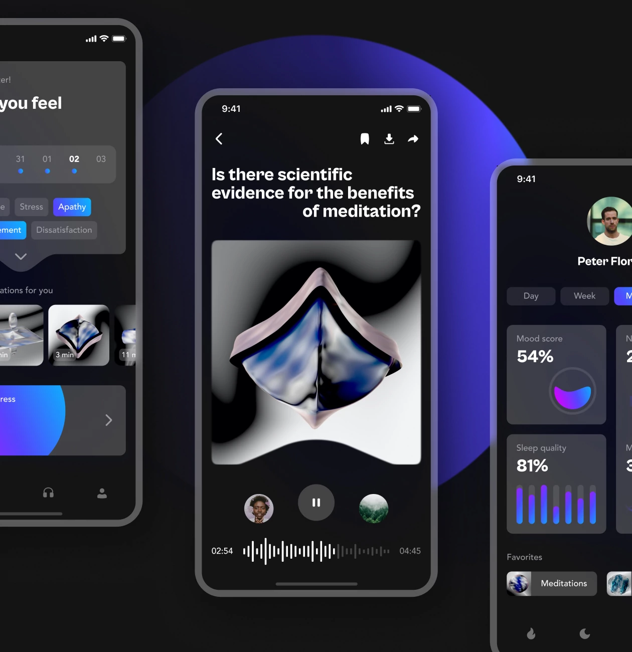
In addition to functionality and usability, the app should also be visually appealing to the user. We chose dark backgrounds, bright gradients, and abstract 3D illustrations. This style looks unusual for an app of this kind and speaks to technology and innovation. The fascinating abstract illustrations blend perfectly with the meditative atmosphere.
#Website design #website development
EVERON
 USA
USA
USA
#Website design #Website development
Philip Lewis
 Finland
Finland
#website design
Tyler Ussery
 USA
USA
USA
Have a project in mind?
Let's chat
Have a project to
discuss?
discuss?

Have a partnership in
mind?
mind?
