Development
Research
Client
herb.co
 USA
USA
USA
Services
Herb.Agency needed a brand identity that would connect seamlessly to its parent company, while still standing out. The previous solution lacked this balance, making it harder to communicate credibility and focus within such a highly regulated niche.
Beyond recognition, the team required a flexible brand system that could scale effortlessly from social media campaigns to large-format event materials, without losing consistency. Addressing these challenges was key to positioning the agency as a trustworthy partner for producers and enabling them to grow their presence in a rapidly evolving market.

Before starting the rebranding process, we conducted an in‑depth analysis of the cannabis market and the broader positioning of Herb.co. This included exploring multiple creative directions and studying competitors to understand how they communicate expertise and trust. The insights from this research helped us identify the visual and tonal cues that would best resonate with producers and ensured the new identity felt both distinctive and aligned with the parent brand.
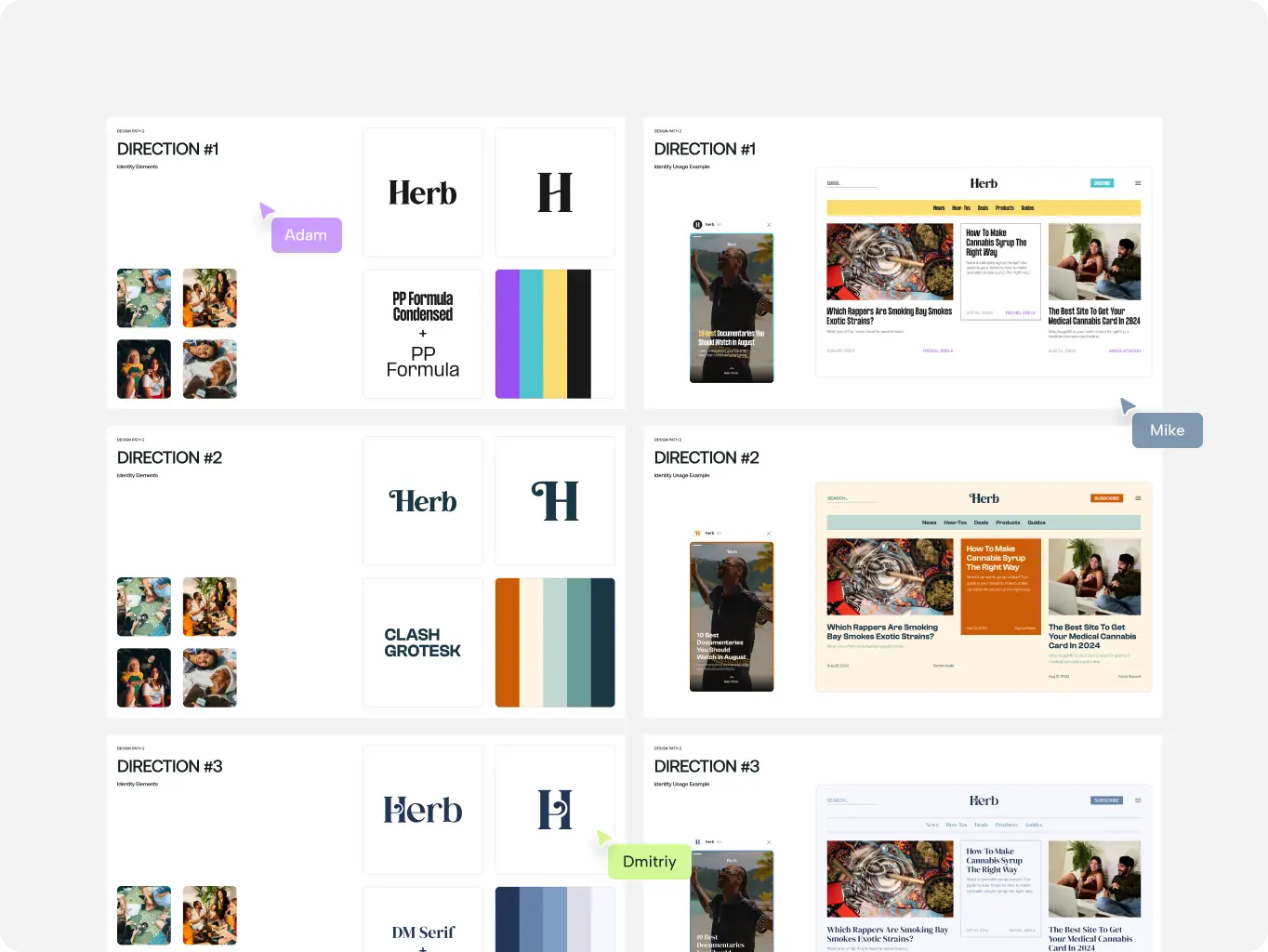
Our process combines strategic insights with creative exploration. Starting from market research, we defined the core principles that would connect the agency to Herb.co while highlighting its unique role in the cannabis space. Each stage, from concepts to the scalable brand system was focused on building an identity that felt authentic, adaptable, and ready to support the agency’s growth.
Stages
- logo design
- colors & typography
- brand assets
- brand guidelines
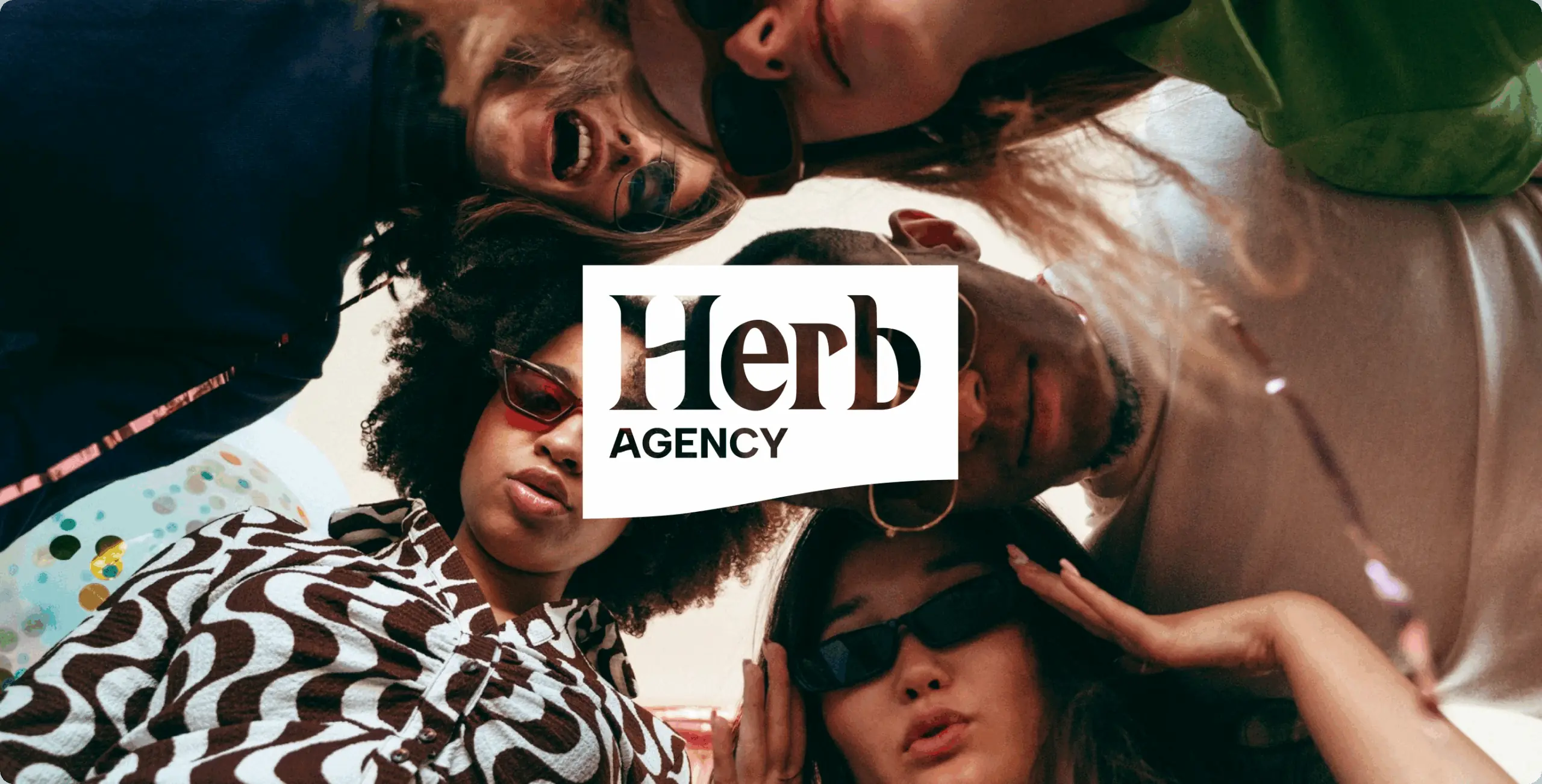
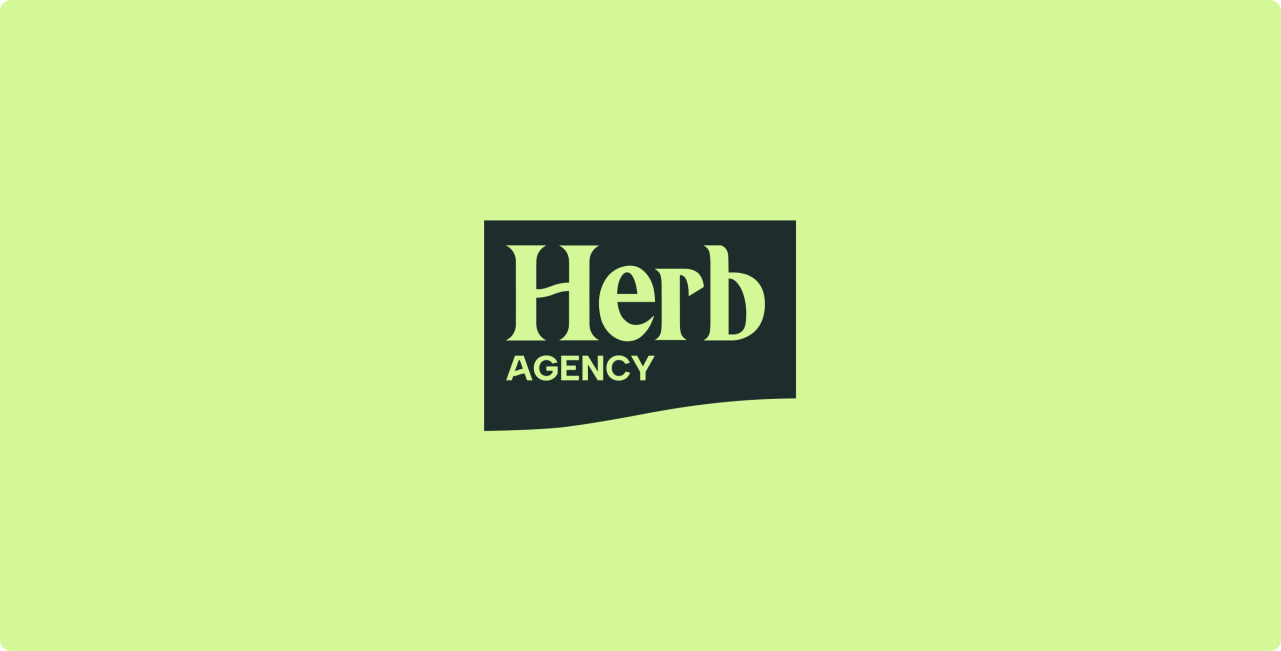
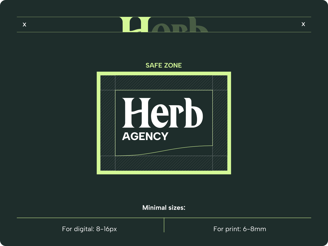
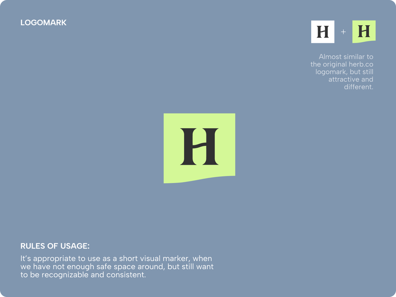
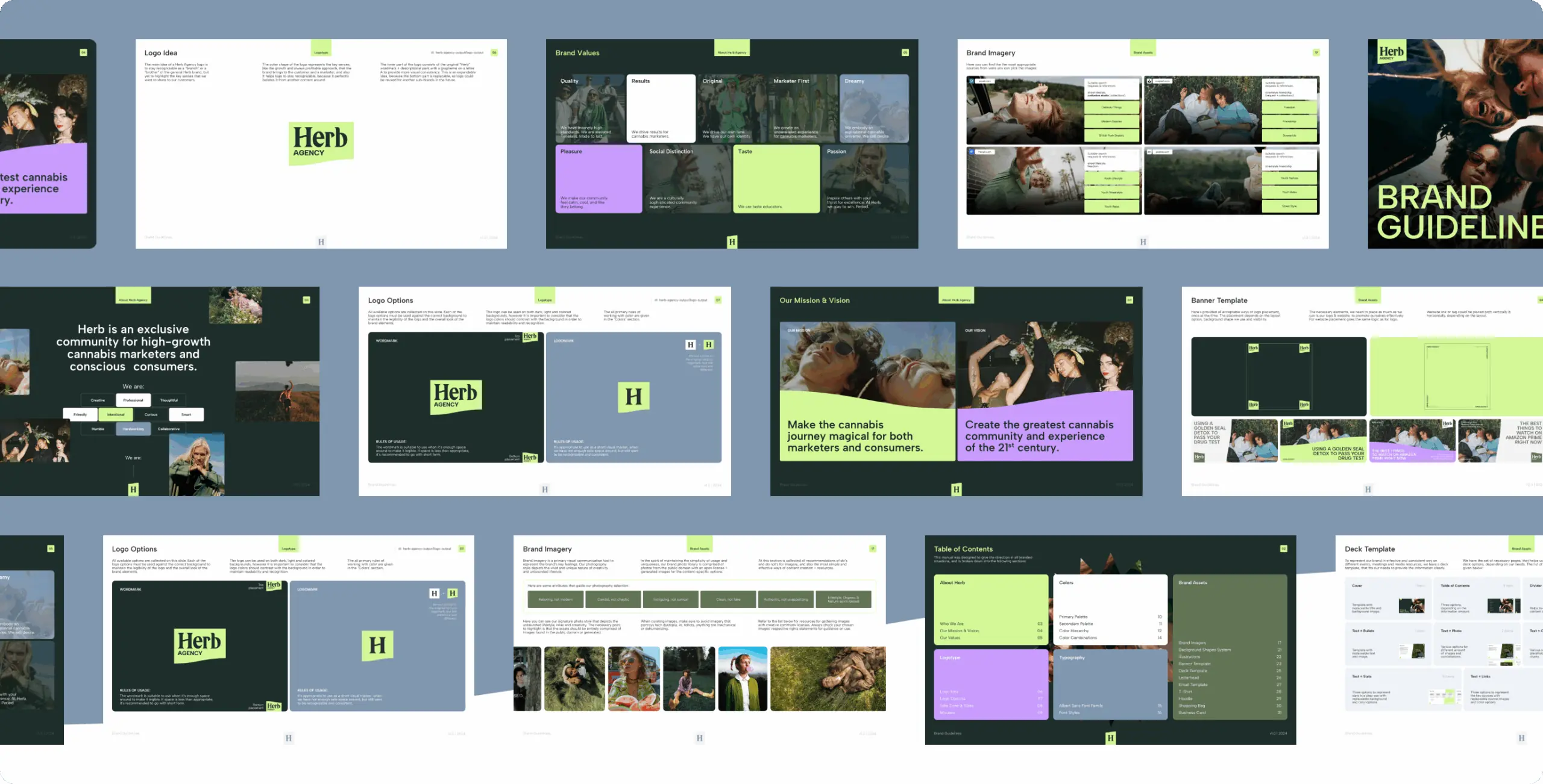
The main idea of a Herb Agency logo is to stay recognizable as a “branch” or a “brother” of the general Herb brand, but yet to highlight the key senses that we want to share to our customers.
The outer shape of the logo represents the key senses, like the growth and always profitable approach, that the brand brings to the customer and a marketer, and also it helps logo to stay recognizable, because it perfectly isolates it from another content around.
The inner part of the logo consists of the original “Herb” wordmark + descriptional park with a grapheme on a letter A to provide more visual consistency. This is an expandable idea, because the bottom part is replacable, so logo could be reused for another sub-brands in the future.
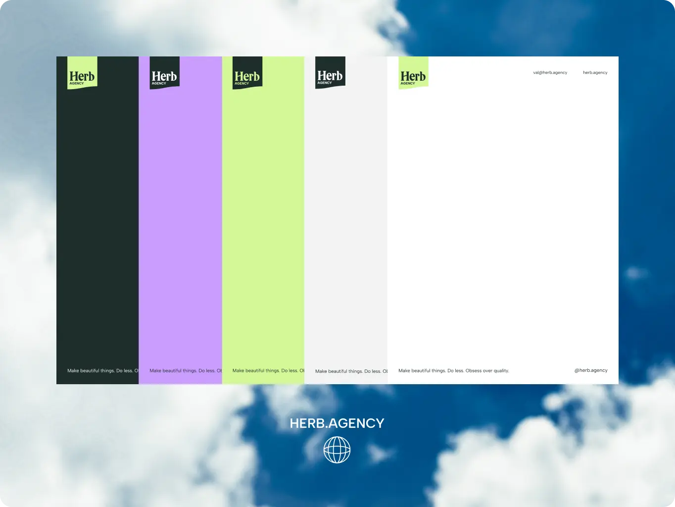
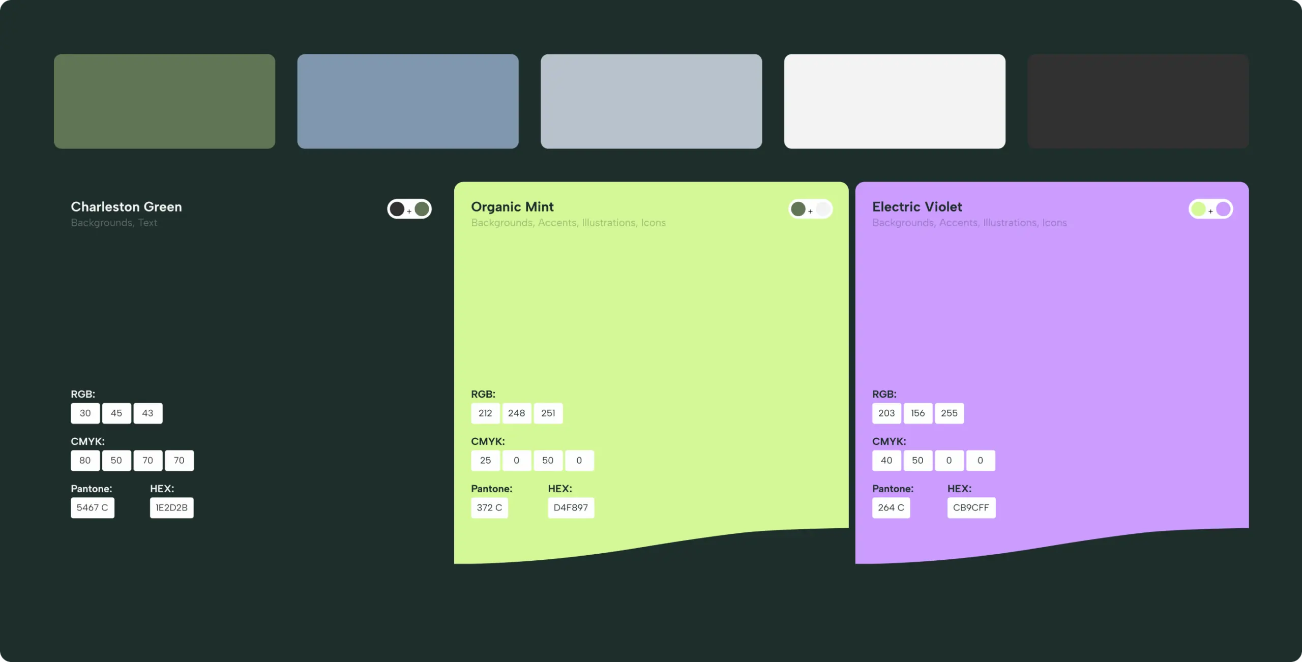
Color and typography are central to how Herb Agency expresses its refreshed identity. Every visual choice — from palettes to fonts — is designed to balance continuity with Herb.co and highlight the agency’s unique focus on medical cannabis.
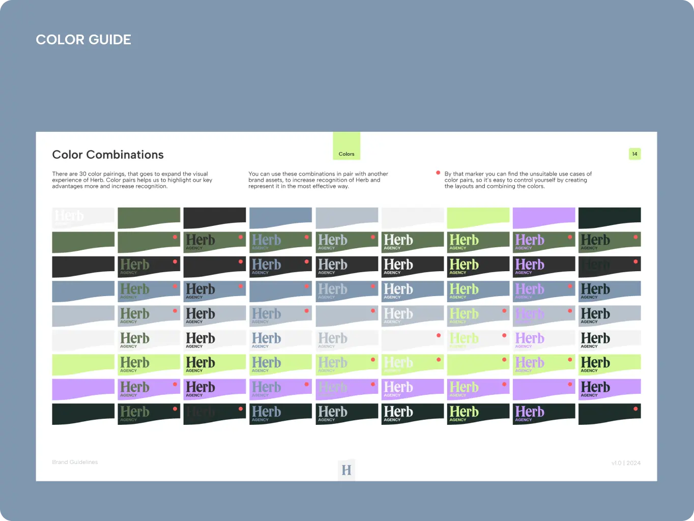
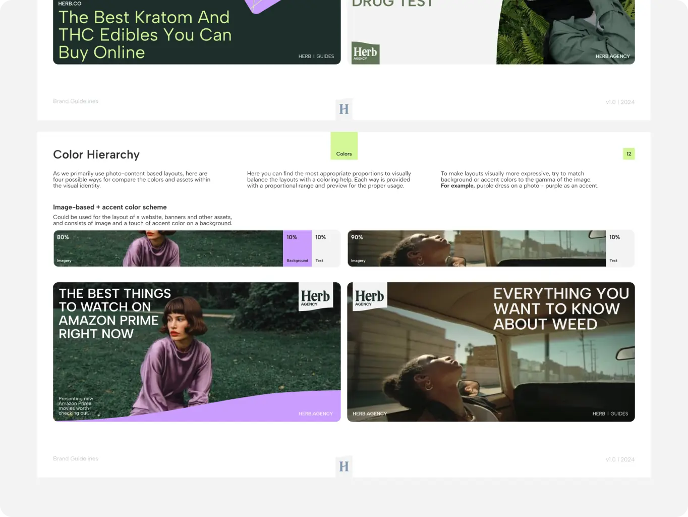
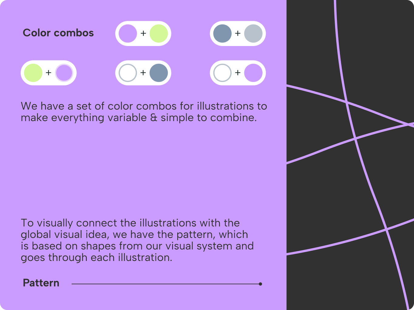
We use color strategically to convey intention and strengthen brand recognition. The primary palette ensures consistency across all touchpoints, while the secondary palette adds creative energy and enhances user experience. With photo‑driven layouts, proportional color solution help balance imagery and accents — for example, echoing a purple dress with a purple accent creates cohesion. We also developed 30 curated color pairings to expand the brand’s expressiveness and maintain recognition across platforms.
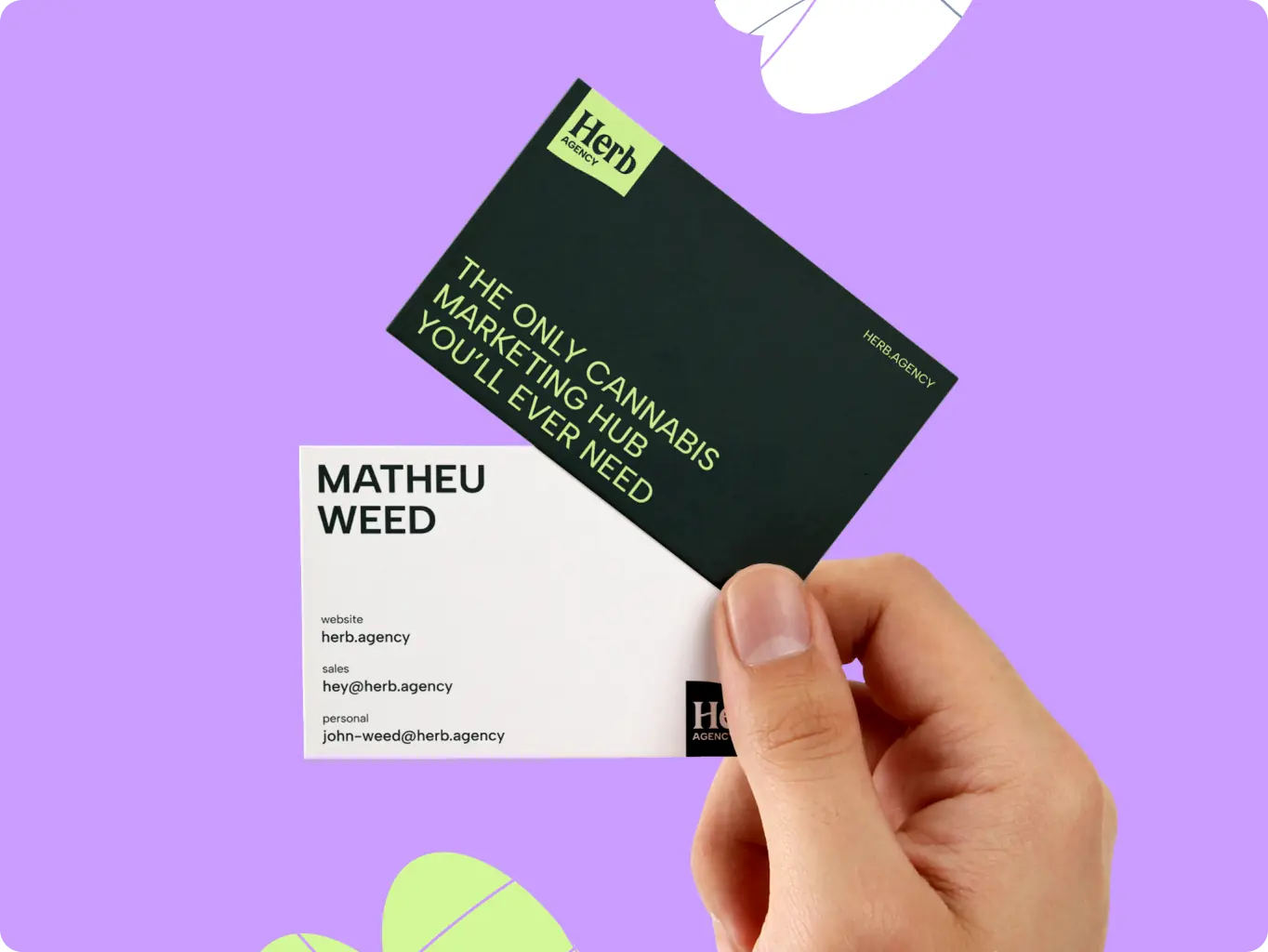
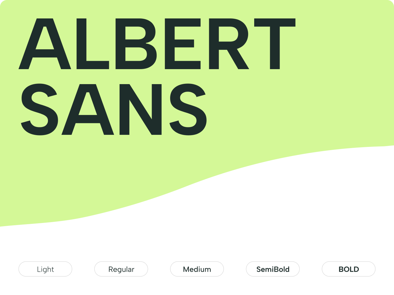
We chose Albert Sans to reflect Herb’s editorial roots while offering a contemporary feel. This typeface combines structured, newspaper qualities with clarity, making it versatile for digital and print. Its ten weights and support for over 200 languages allow the brand to scale across markets without losing identity, positioning Albert Sans as a core asset for Herb.Agency’s voice.
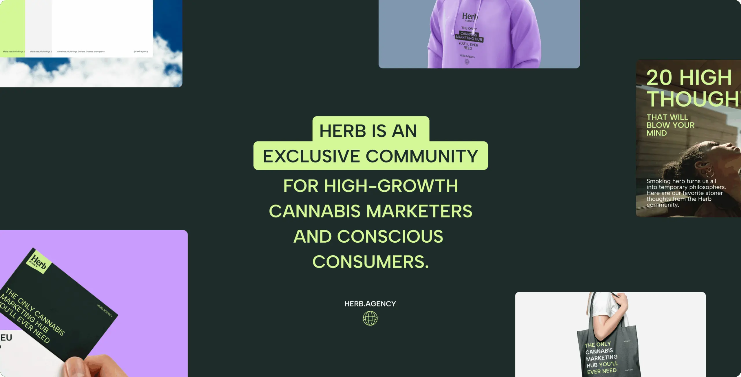
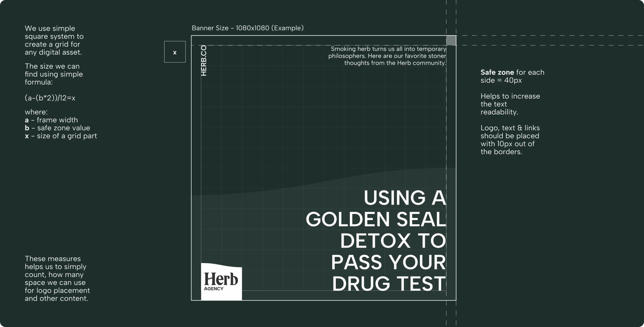
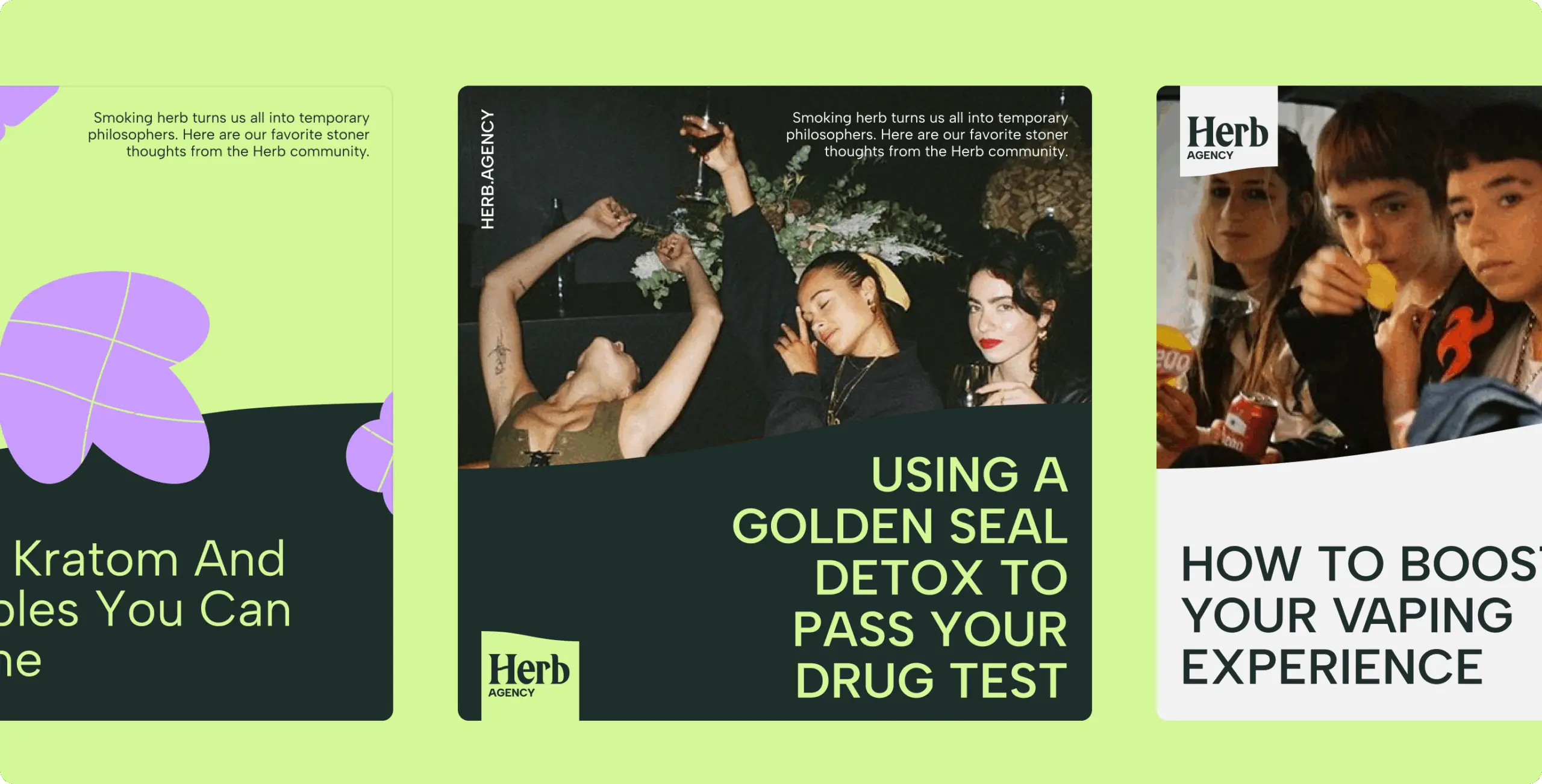
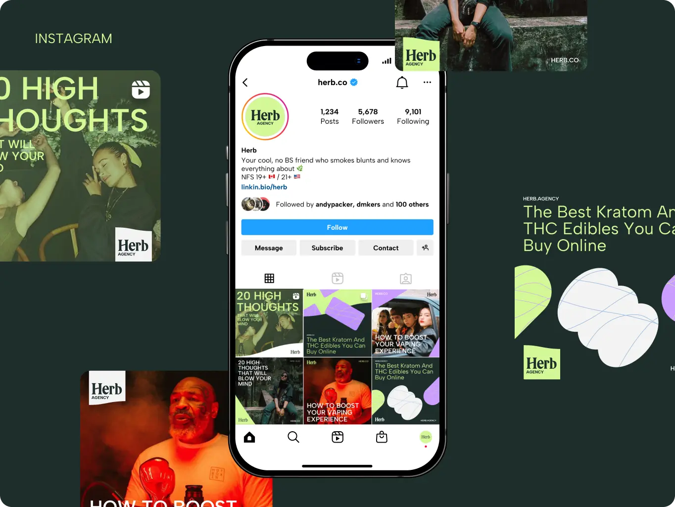
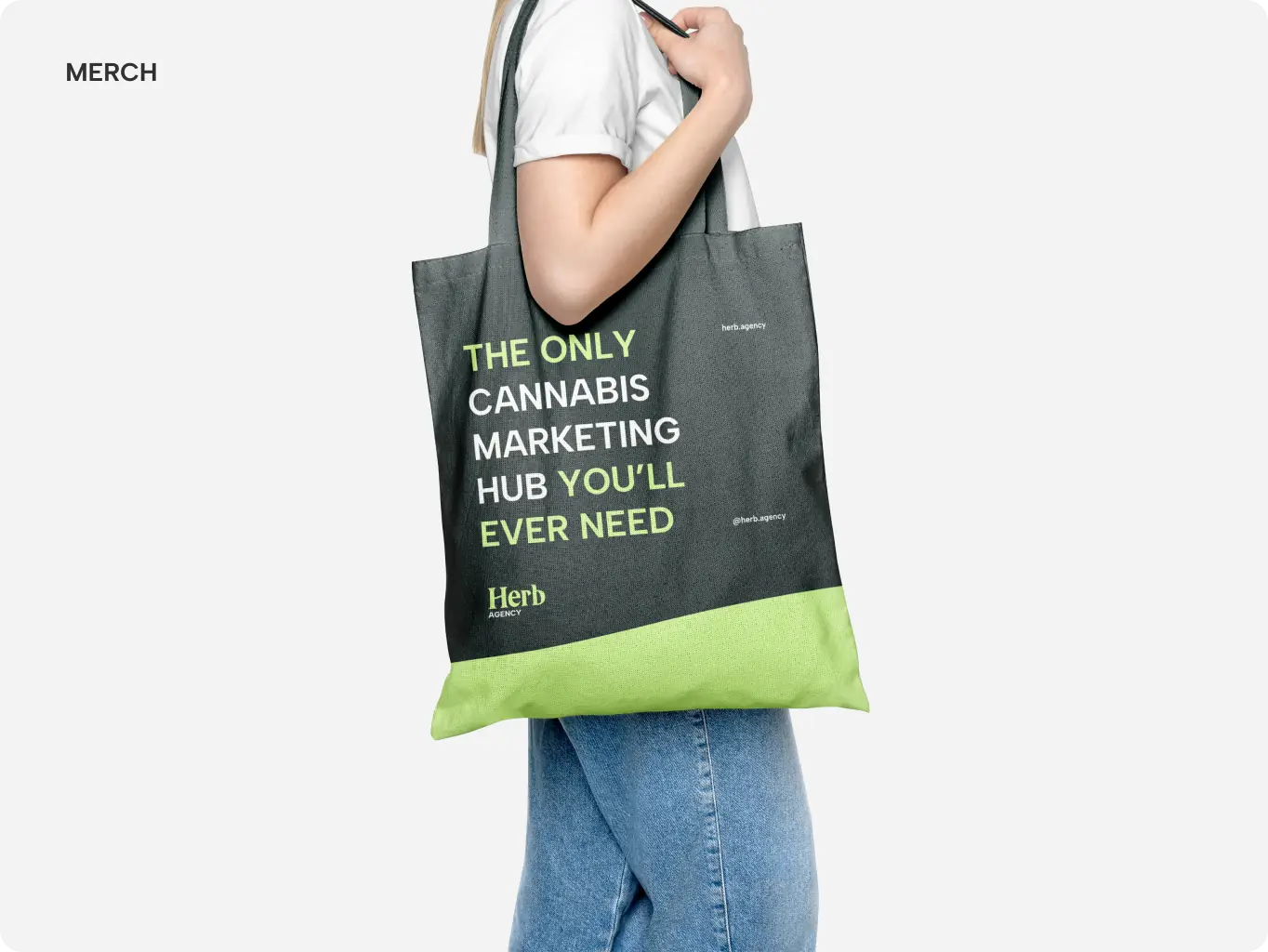
To bring the new identity to life, we developed a comprehensive set of brand assets, from adaptable layout templates and custom illustrations to merchandise and social media materials. These tools give the Herb.Agency team everything they need to create consistent, on‑brand content across any channel, making it easier to scale campaigns and maintain recognition as the brand grows.
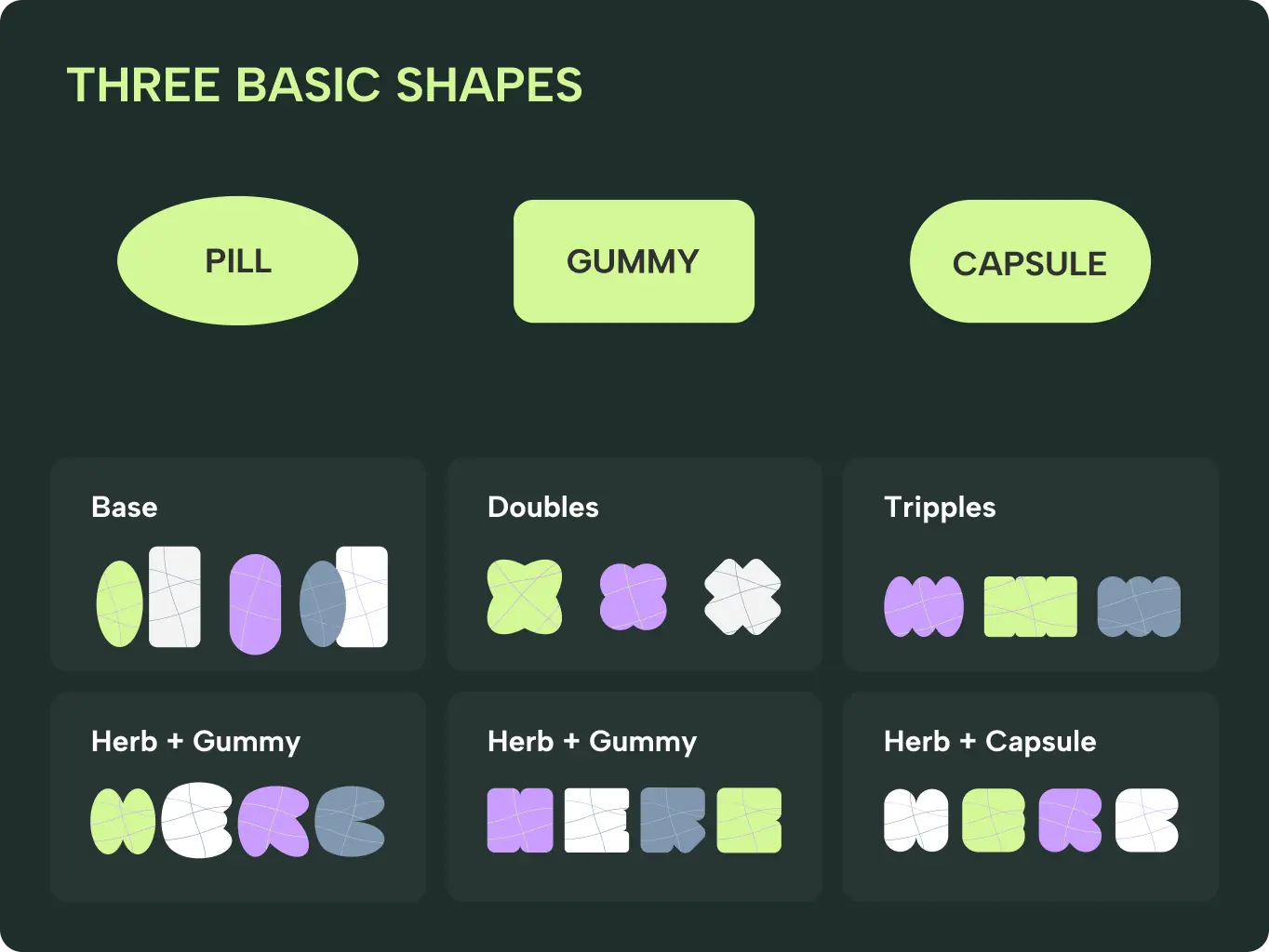
For the illustration system, we built a modular approach rooted in three basic shapes: pill, gummy, and capsule, reflecting the core products of the medical cannabis and supplement market. These simple forms can be combined in singles, doubles, or triples to create flexible compositions that adapt to different content and formats.
A curated set of color combinations keeps illustrations vibrant yet cohesive, ensuring they align with the broader brand palette. To unify all visuals, we introduced a subtle pattern derived from these same shapes, creating a consistent thread that runs across layouts and reinforces brand recognition.
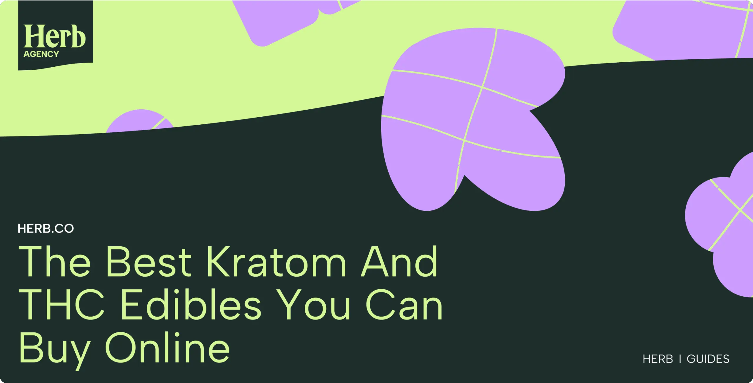
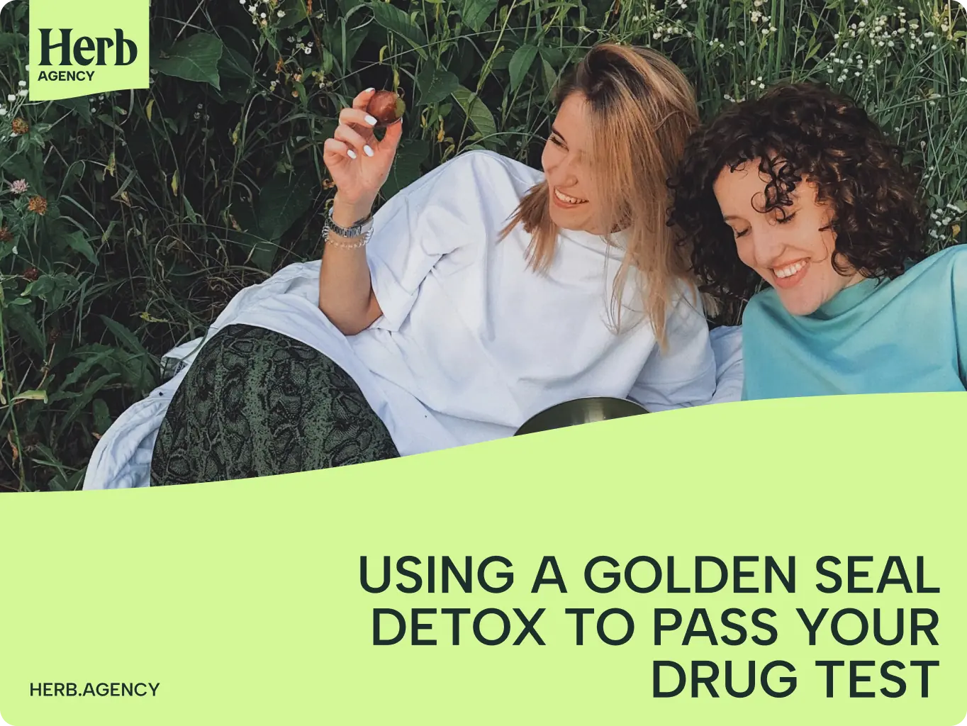
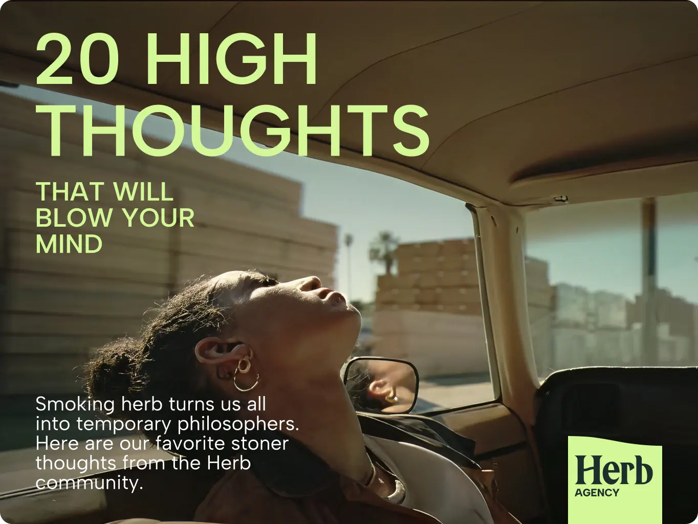
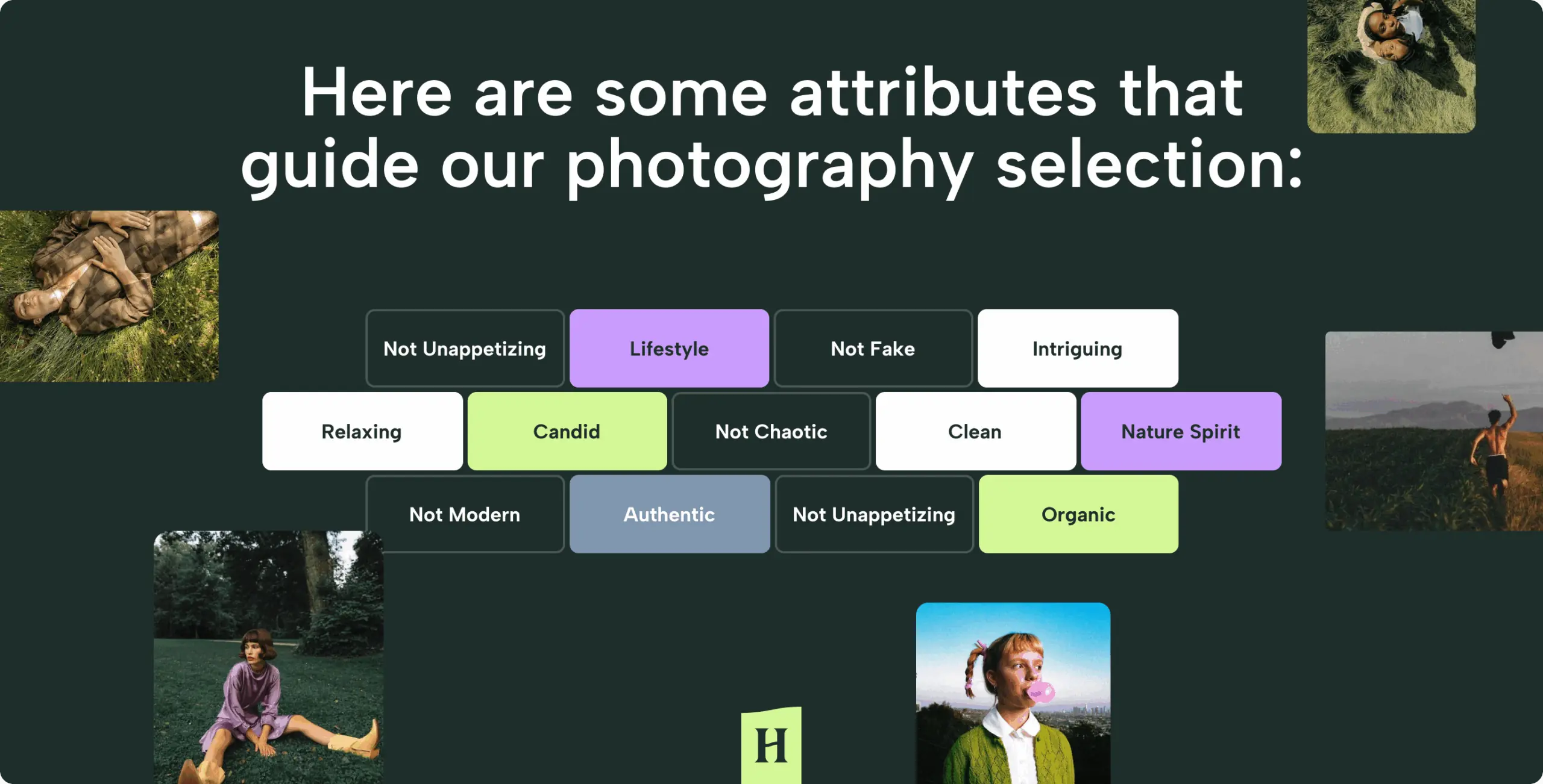
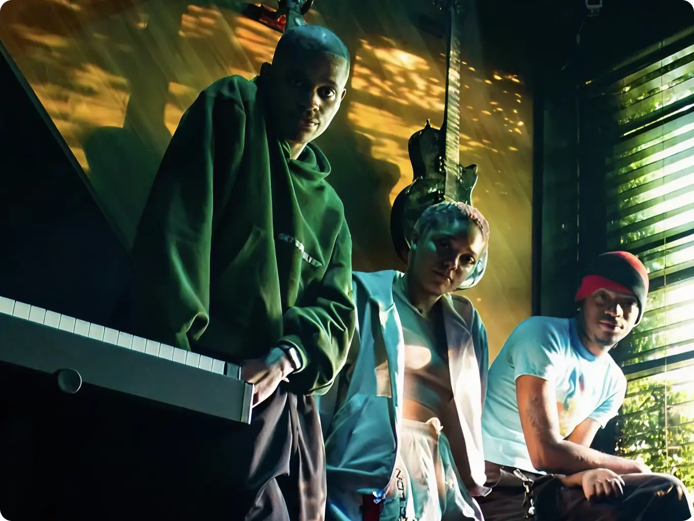
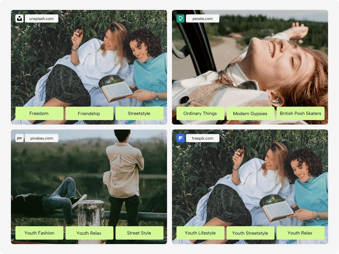
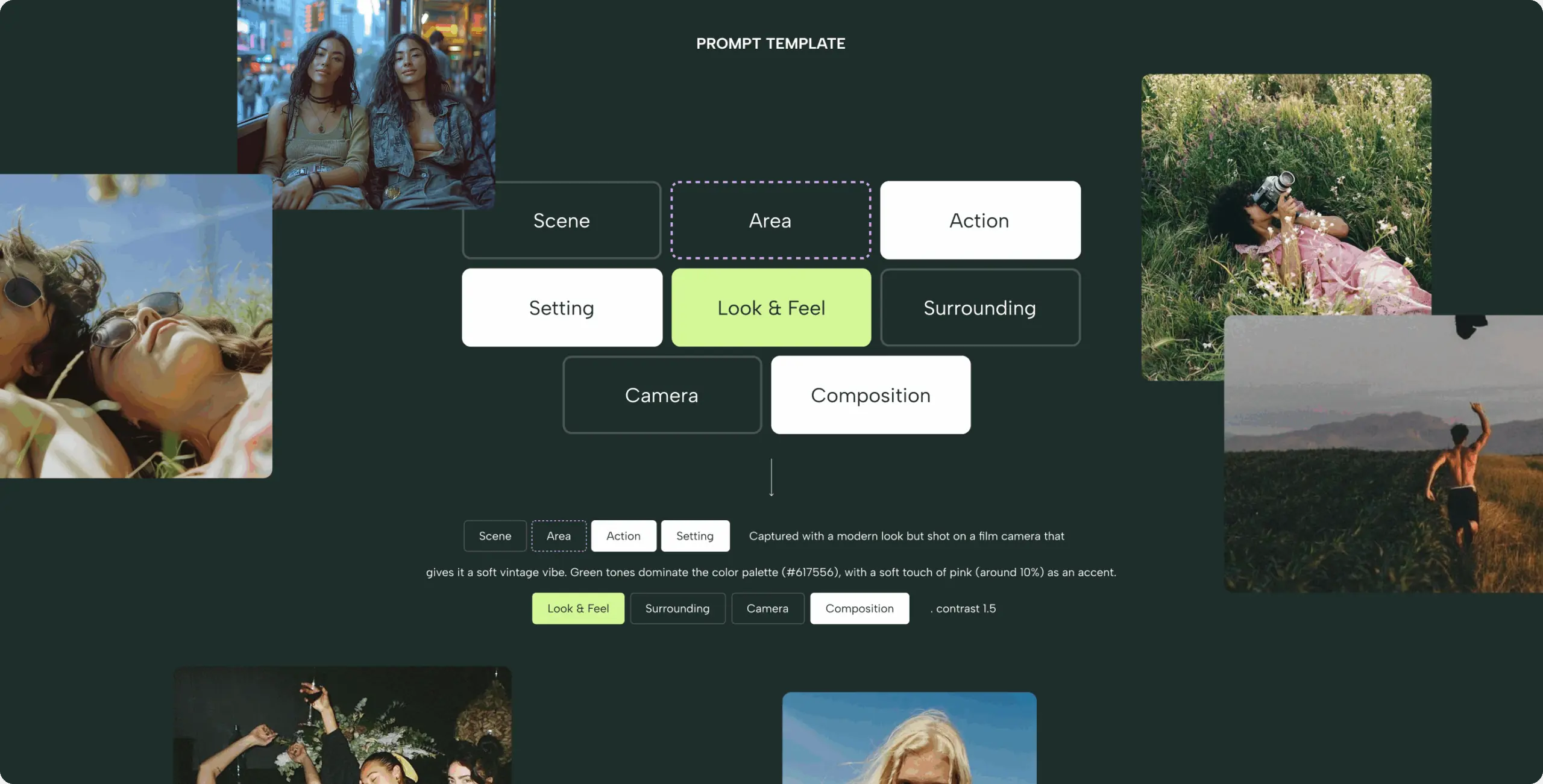
Photography plays a key role in Herb.Agency’s visual identity, centered around authentic, lifestyle‑driven images of people enjoying life. To guide this consistently, we defined clear attributes: candid, organic, and relaxing that align with the brand’s tone and positioning.
To streamline content creation, we built a prompt template and organized image collections that the client can use to generate visuals endlessly. This approach ensures every new photo feels cohesive with the brand, from mood and styling to composition, while allowing flexibility for different campaigns and channels.
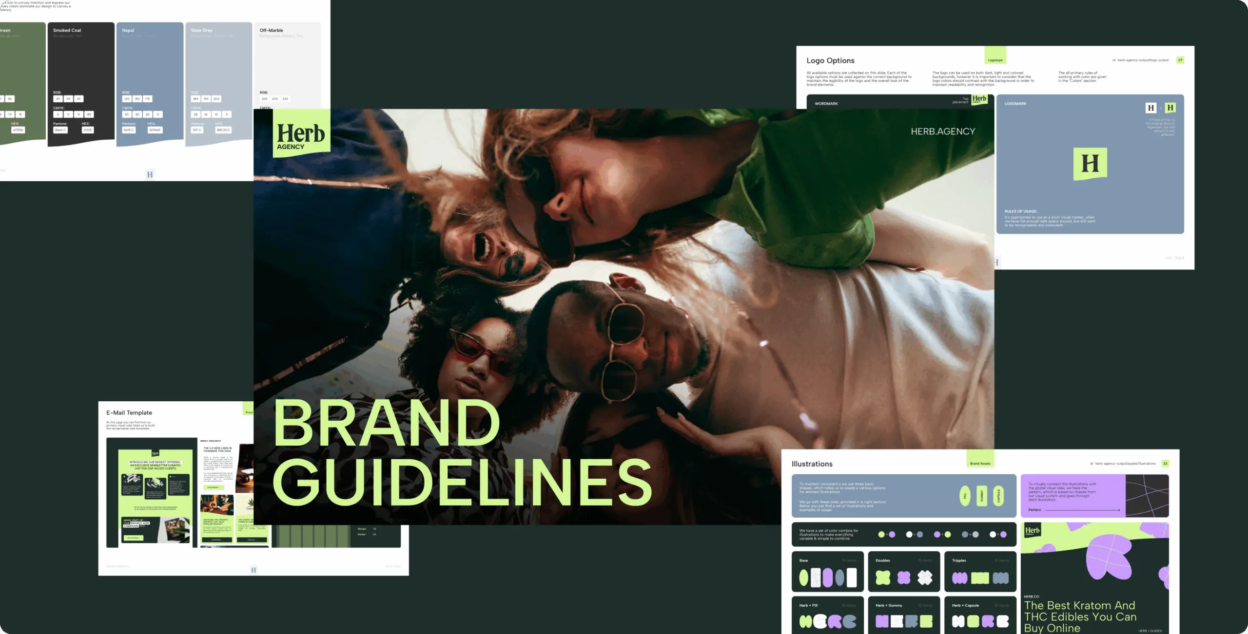
To ensure consistency as the brand scales, we developed a comprehensive set of brand guidelines covering every element of the new identity, from color palettes and typography to illustration styles, photography principles, and layout rules. These guidelines serve as a practical toolkit for the Herb.Agency team, making it easy to create new materials, maintain visual coherence across channels, and onboard partners or collaborators without losing the brand’s essence.
#branding
HORMN
 Australia
Australia

#Branding
Hyperscale
 USA
USA
USA
#landing page design
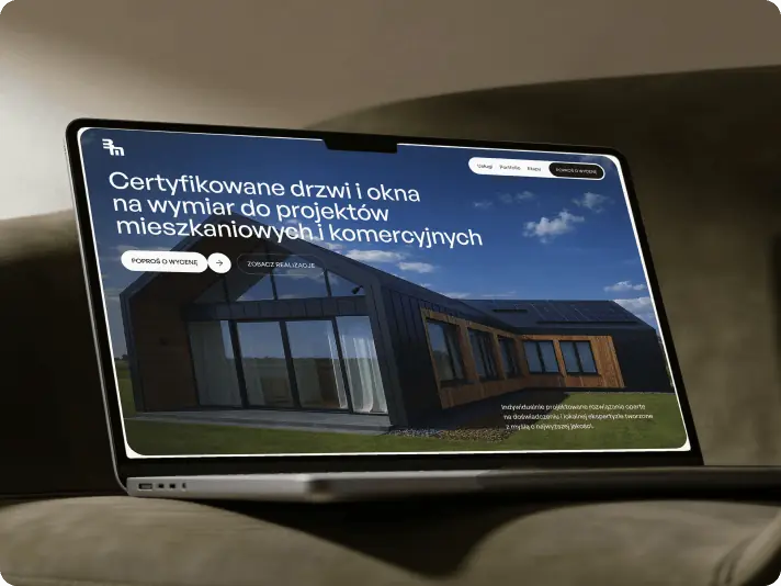
bm Śladewska
 poland
poland
Have a project in mind?
Let's chat
Have a project to
discuss?
discuss?

Have a partnership in
mind?
mind?
