Design
Development
Research
Launch
Evolve
Extend
Qurtuba – online school platform
Client
Qurtuba
 Johannesburg, South Africa
Johannesburg, South Africa
Services
Technologies
 React
React
 Auth0
Auth0
Qurtuba tasked us with modernizing their outdated platform, which suffered from poor usability, non-intuitive navigation, and limited functionality. Beyond improving the design, our goal was to simplify workflows, address key pain points, and introduce features tailored to user needs.
Our UX research revealed deeper usability issues, highlighting the need to cater to non-technical users and streamline processes. The redesign focused on creating a versatile, scalable solution aligned with Qurtuba’s vision for growth.
We focused on creating a smart, intuitive design that transformed Qurtuba’s platform into a user-centered and feature-rich solution. By revamping workflows, introducing new functionalities, and crafting a modern interface, we dramatically improved navigation and reduced friction. The result was a seamless, efficient experience that empowered users while positioning the platform for future growth.

We began by deeply analyzing the product’s functionality and understanding how users interacted with it. This involved reviewing technical specifications and user documentation, performing a UX evaluation to uncover problem areas, and reorganizing the platform’s structure for clarity. To create a more intuitive experience, we mapped user journeys to simplify complex tasks. Key features were then prioritized to ensure the solution was practical, user-centered, and effective in addressing the product’s core challenges.
Stages
- Documentation analysis
- Competitor analisys
- UX audit
- Consult (BA)
- Informational architecture
Our research began with a thorough review of the product’s documentation to gain a holistic understanding of its functionality. Designers concentrated on user-facing materials like manuals and guides to identify how the product was designed to be used. They also tested the product themselves, adopting a user-first perspective to uncover challenges and usability issues.
At the same time, developers analyzed the backend documentation to assess the technical structure and limitations of the platform. This combined approach allowed us to align user experience improvements with technical capabilities, ensuring a practical and well-rounded solution.
We conducted an in-depth competitive analysis of four key players in the industry to evaluate their strengths, weaknesses, and market positioning. This involved assessing their features, usability, and strategic approaches to highlight what delivered tangible business value and met user needs.
This detailed analysis of competitors provided valuable benchmarks and identified gaps in the market, enabling us to craft a more targeted, user-focused, and competitive strategy for the platform.
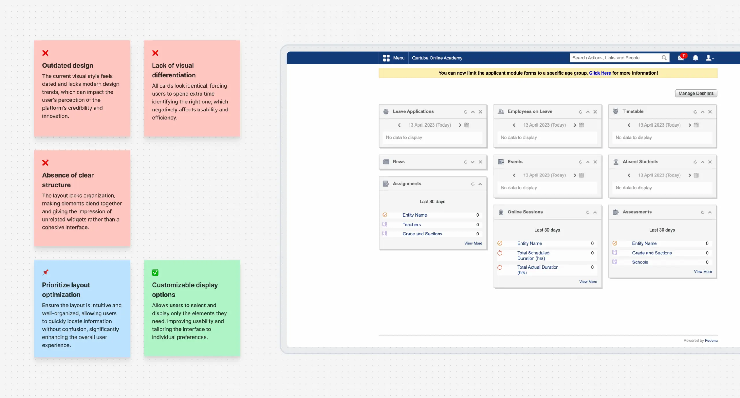
During the UX audit, we conducted a comprehensive evaluation of the platform, focusing on user experience and usability. Our analysis included the following:
- Reviewed all user flows and compared them against industry-standard UX practices and Nielsen’s heuristics.
- Incorporated client feedback to identify key usability challenges reducing product efficiency.
- Designed tailored user flows for each platform role – teachers, students, administrators, and parents – to address their unique needs.
- Proposed hypotheses for feature enhancements and design improvements to increase platform value.
- Assessed UI quality, addressing both visual and functional limitations to ensure a consistent and effective user experience across all roles.
The business analysis phase focused on defining the platform’s functionality through user stories and detailed documentation. This included analyzing the subject area, identifying challenges, and providing actionable solutions. A prioritized feature list ensured enhancements addressed critical needs while aligning with the client’s long-term goals.
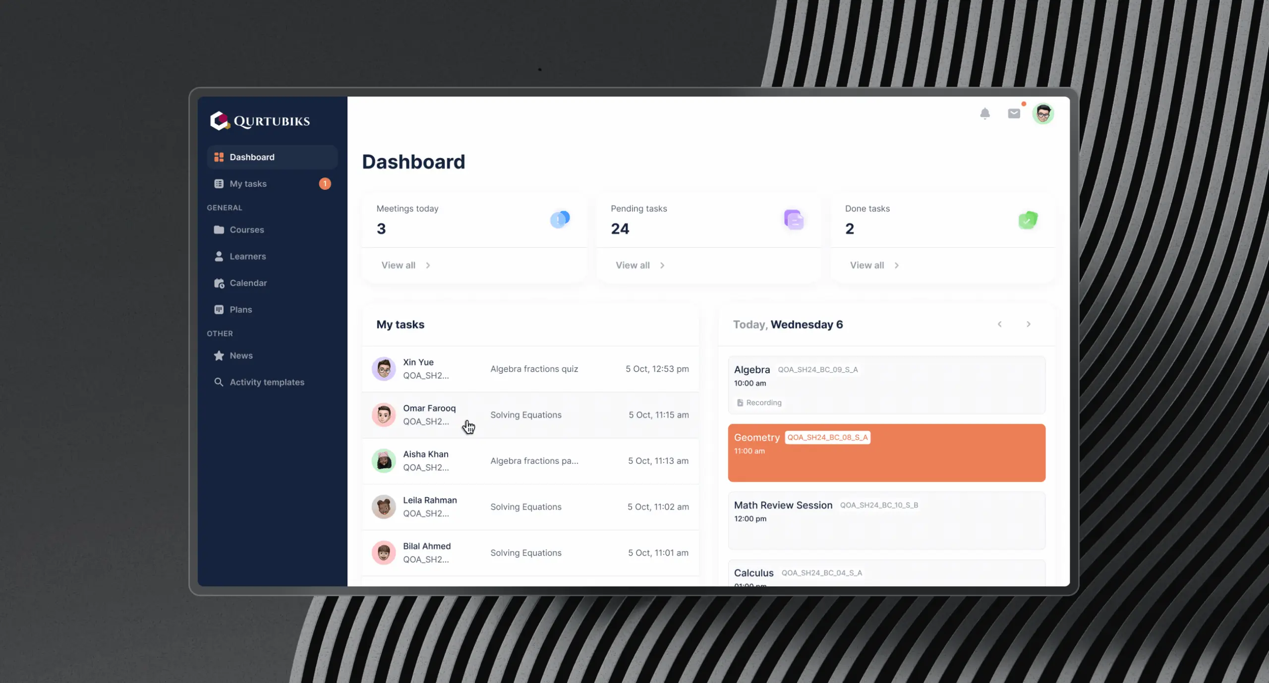
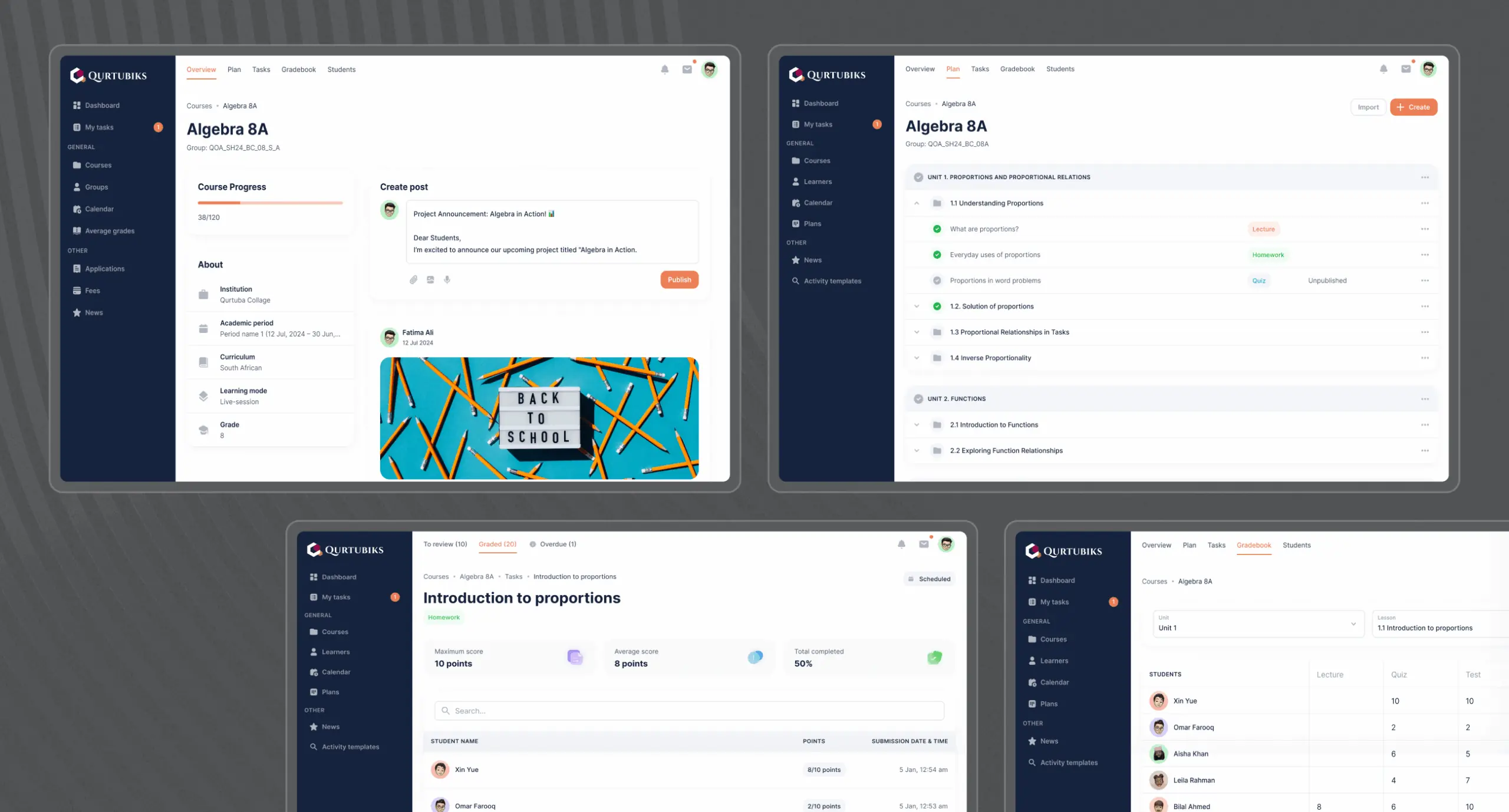
Key modules included an enrolment system (applications, payment gateways, invoicing), an online lessons tool (scheduling, attendance, recordings), and course pages for organizing content efficiently. Essential features like assessment tools (homework, gradebooks) and communication modules (messaging, notifications) were also prioritized. A centralized dashboard was proposed to unify tasks, analytics, and navigation, laying the groundwork for immediate goals and future scalability.
Using insights from the UX audit, business analysis, and client discussions, we initiated the development of a refreshed information architecture for the product. This restructured framework addressed existing issues while seamlessly incorporating and organizing new features. The architecture was designed to accommodate all platform roles—teachers, students, administrators, and parents—ensuring that each user group had a tailored, intuitive experience.
We focused on creating a logical and user-friendly structure that improved usability and streamlined the overall user experience for everyone involved.
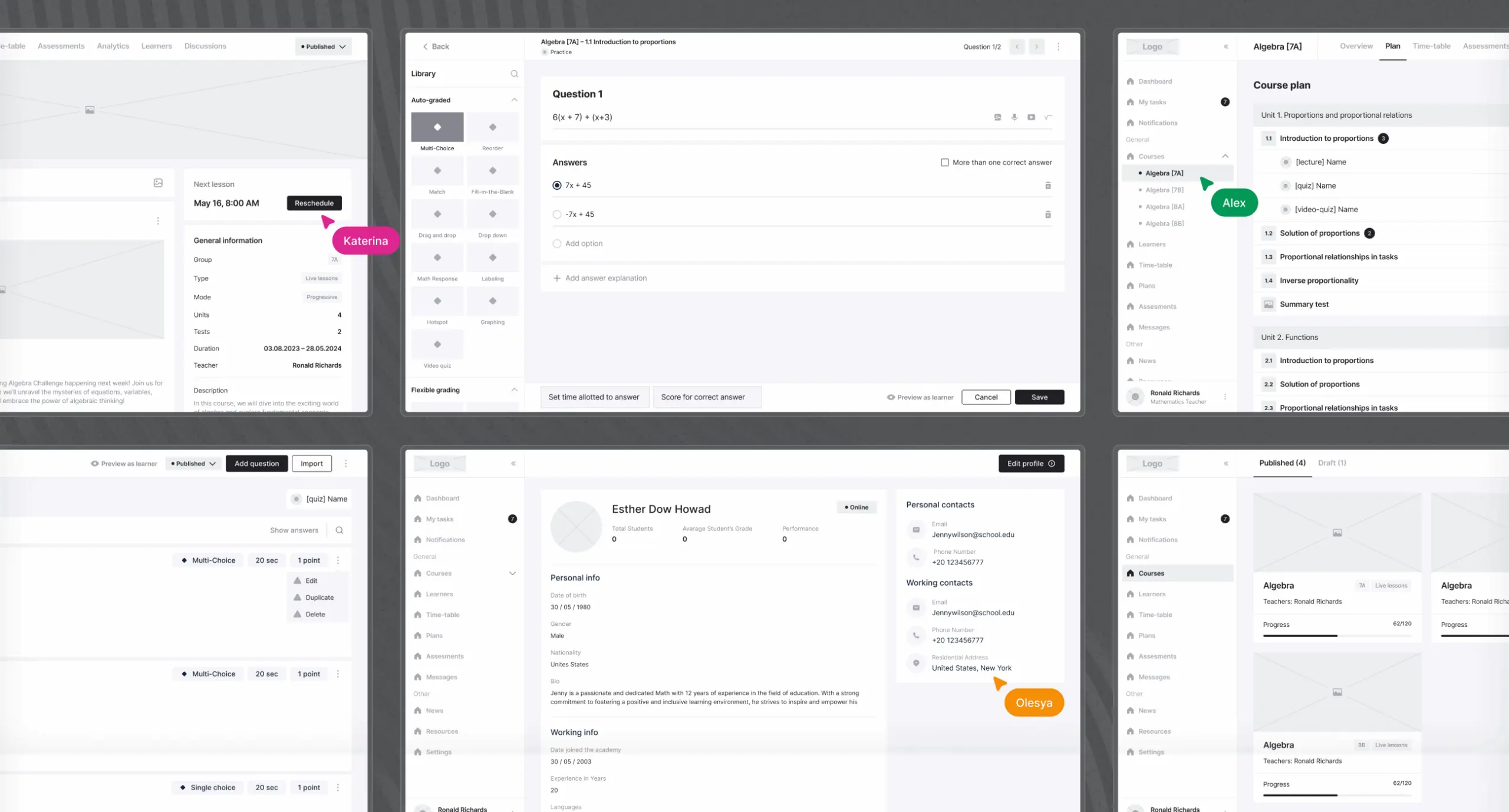
We transformed the analysis results into a user-friendly interface, adhering to usability standards and addressing user needs. Wireframes played a key role in bridging the updated information architecture with the live product, helping to visualize elements and refine user flows. This clarified the design vision early on, streamlining development and ensuring an efficient, high-quality, user-centered solution.
Stages
- Wireframe
- Design direction
- Product UI design
- Design system
We developed wireframes, essential for refining the design structure and optimizing the user journey prior to finalizing the mockup.
This phase allowed us to establish the logic and framework of the future platform. Prototypes were created and validated for each user flow, considering all screen states, determining the layout and container sizes for visuals, and ensuring each interaction was intuitive and user-friendly.
Before developing the design concept, we created several mood boards to define the visual direction. Once the client selected their preferred style, we began working on design concepts.
To speed up the process, the client requested that design and development run in parallel. To meet this need, we proposed using the Cabana design library, which helped us move faster while keeping the design consistent and developer-friendly. Designers worked with ready-made components, and developers used pre-built elements that aligned with the visual direction.
Thanks to this setup, we were able to quickly present three design concepts, giving the client options and flexibility to choose the best fit for their goals.
With the design direction established, we created interface layouts for all key screens, carefully accounting for edge cases and diverse workflows. The goal was to ensure smooth user interactions while managing the platform’s inherent complexities.
Throughout the process, we worked closely with developers to align design ideas with technical constraints identified earlier. Some solutions required adjustments to fit within backend limitations, but constant collaboration allowed us to adapt creatively while ensuring the final designs were both functional and visually appealing.
While working on the desing system, our designers simultaneously refined and expanded an existing design system, documenting updates and ensuring a cohesive workflow. Though this initial phase required extra time, it significantly boosted efficiency in later stages. For instance, tasks that would typically take over a month were ready for development within weeks.
Building on the foundation of the existing design system, the team enhanced its flexibility by introducing improvements to make it more adaptable to diverse use cases. These enhancements were carefully reviewed and discussed with the development team to ensure seamless integration. This collaborative approach not only streamlined the handoff process but also optimized the overall design-to-development workflow, resulting in faster and more efficient execution.
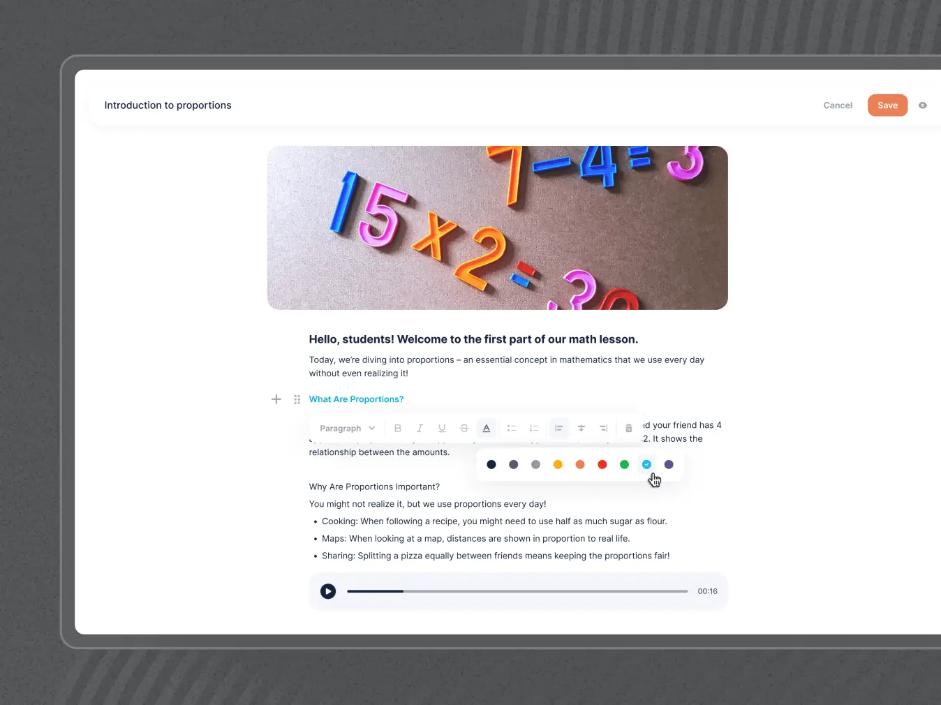
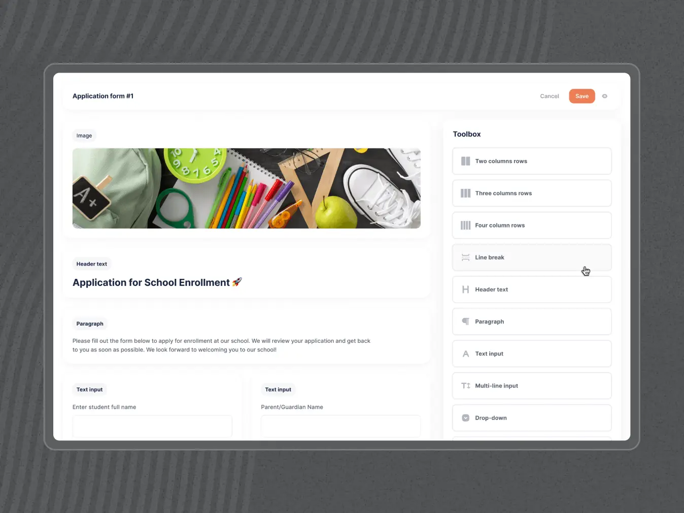
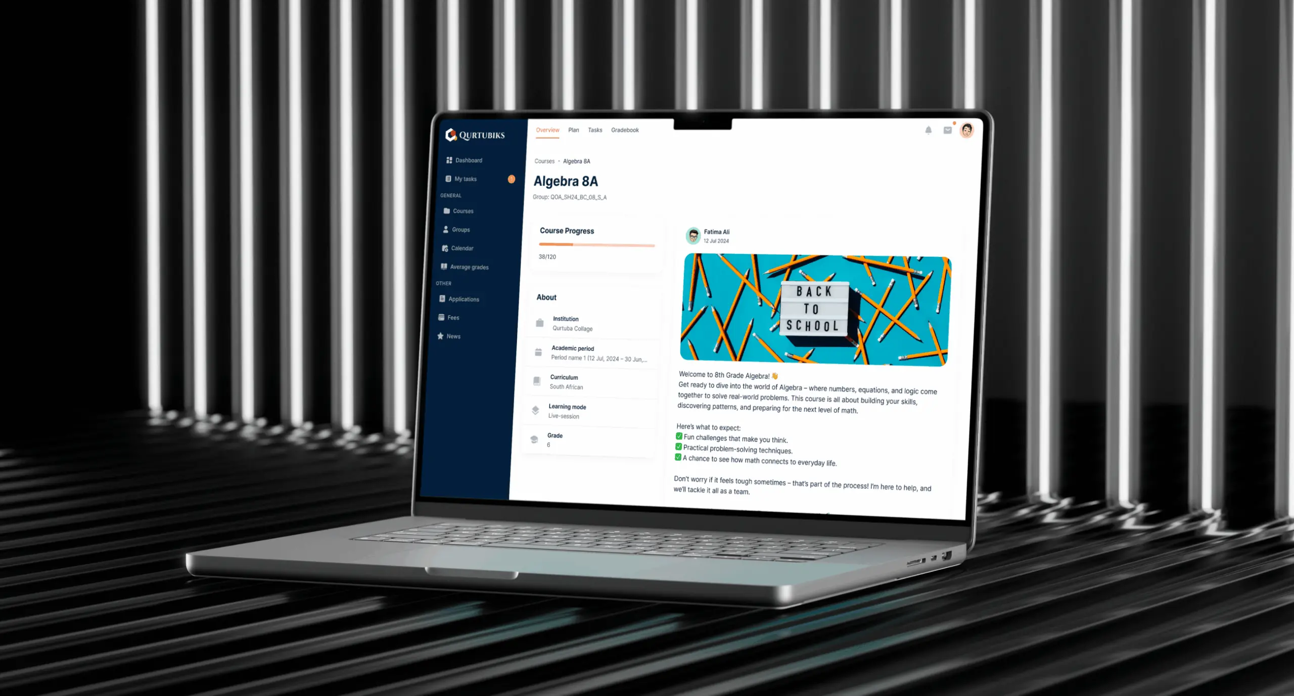
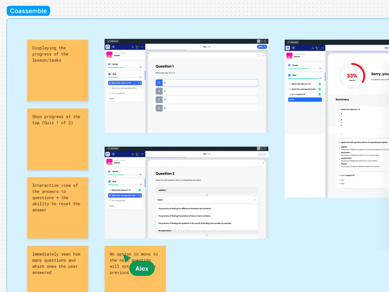
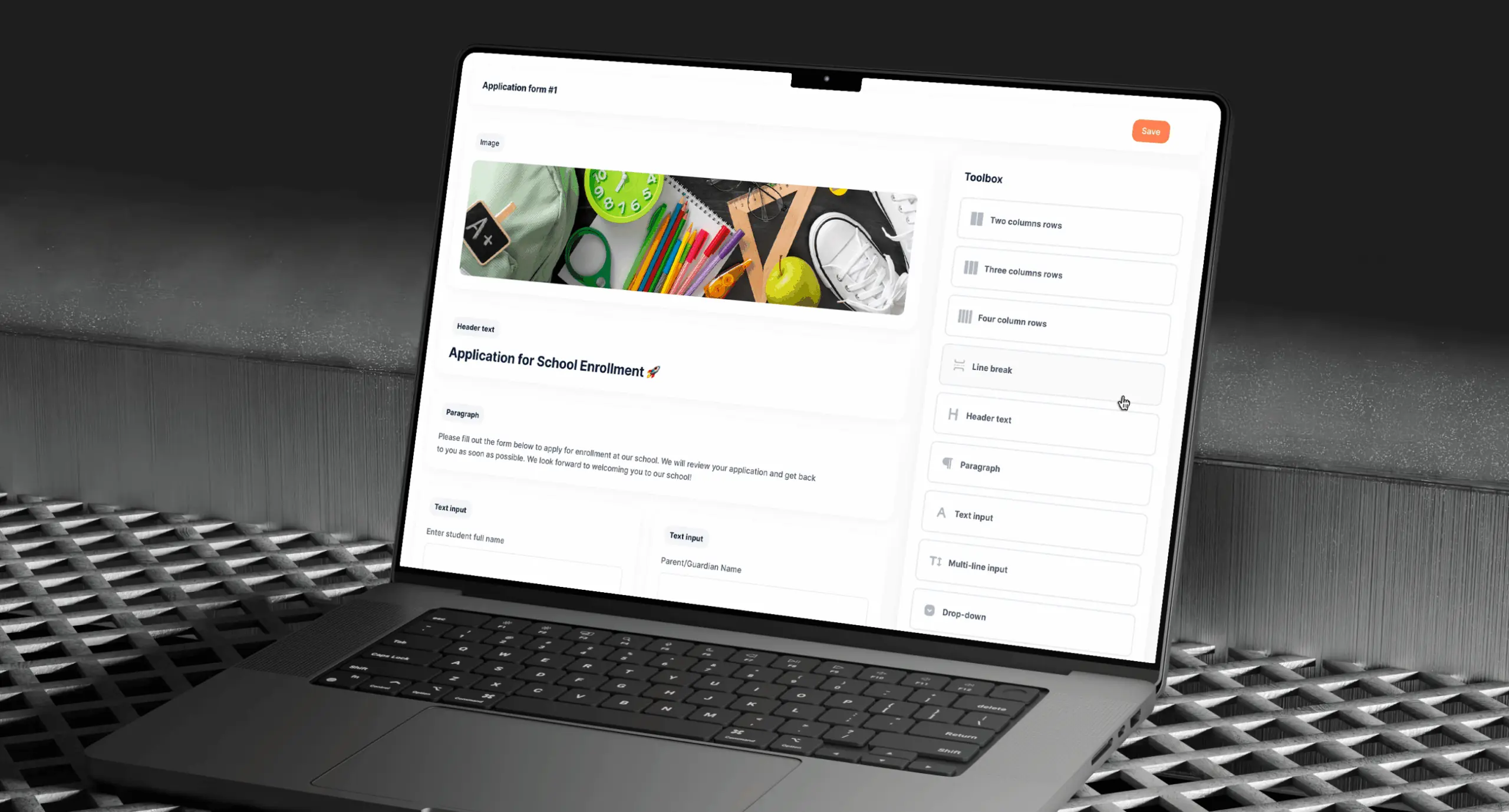
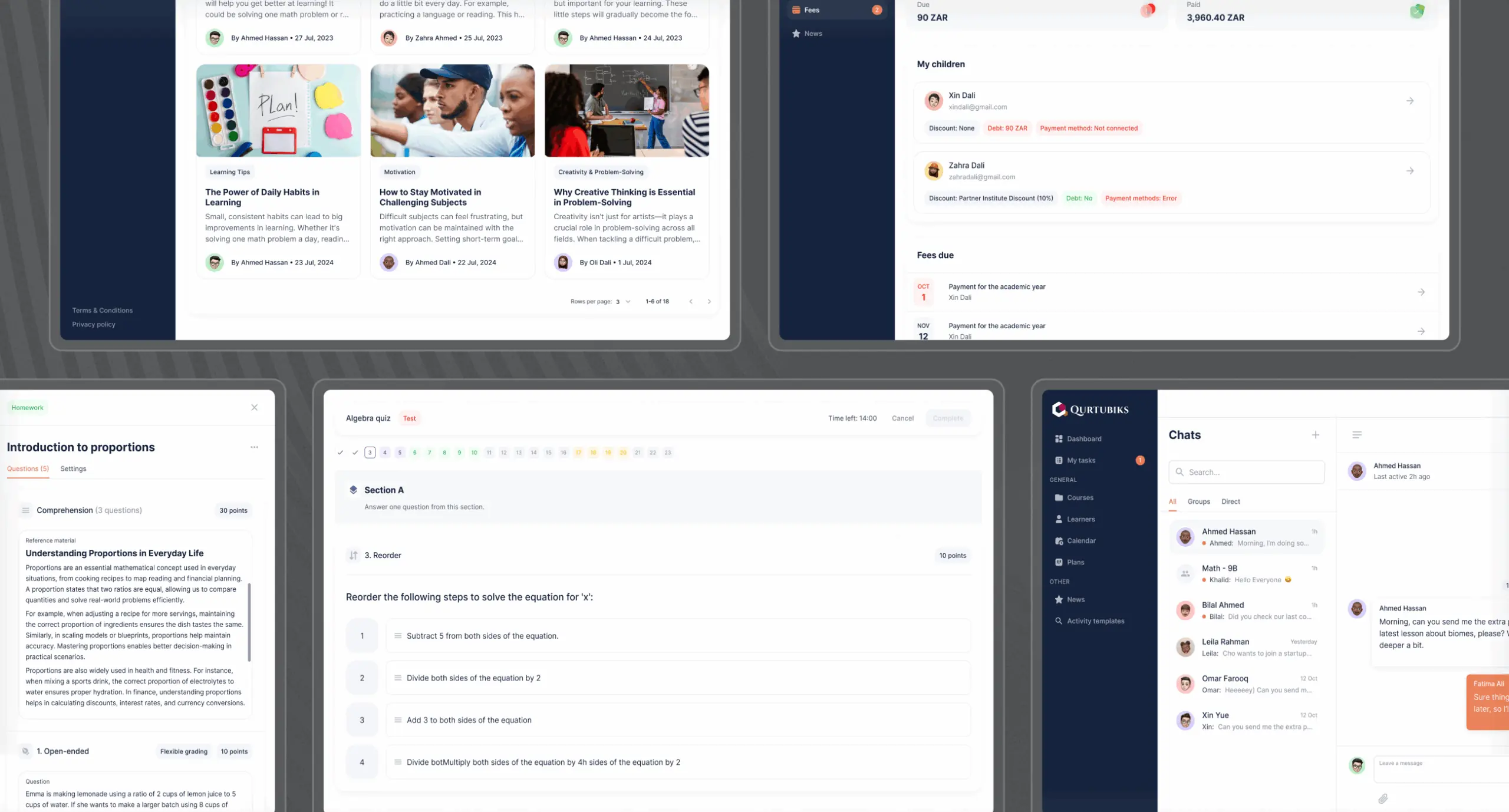
Lesson builder
Teachers needed a flexible and intuitive tool to create and organize lessons, balancing theory and practical tasks. The absence of a streamlined tool made it difficult to structure courses effectively and incorporate engaging activities.
What we’ve done:
• We designed a customizable lesson builder for seamless lecture and activity organization.
• Builder supports various content types (videos, text, audio, documents) across topics and chapters.
• Drag-and-drop features allow easy reordering of sections.
• Quizzes and practice tasks can be embedded directly into lessons for enhanced interaction.
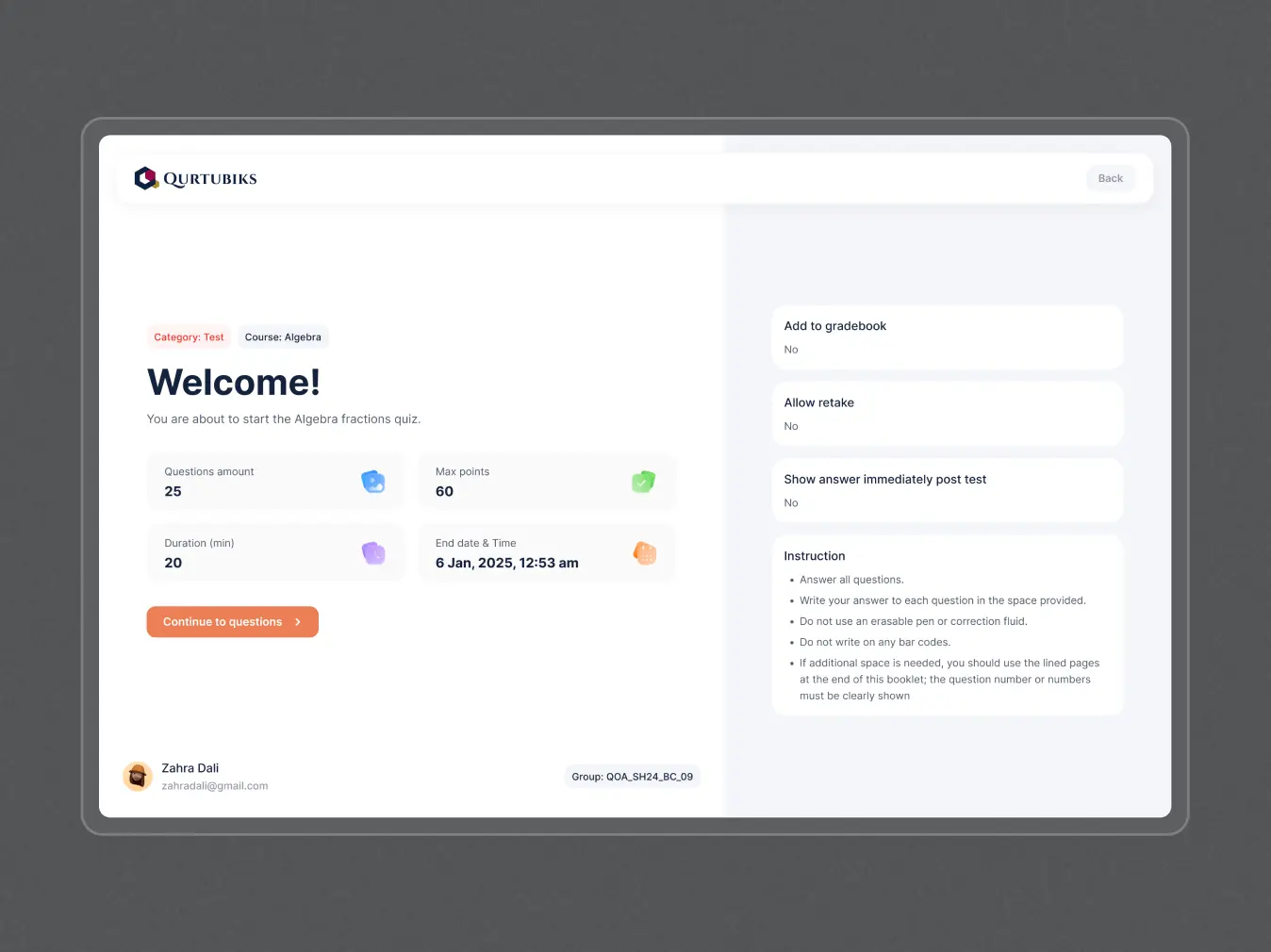
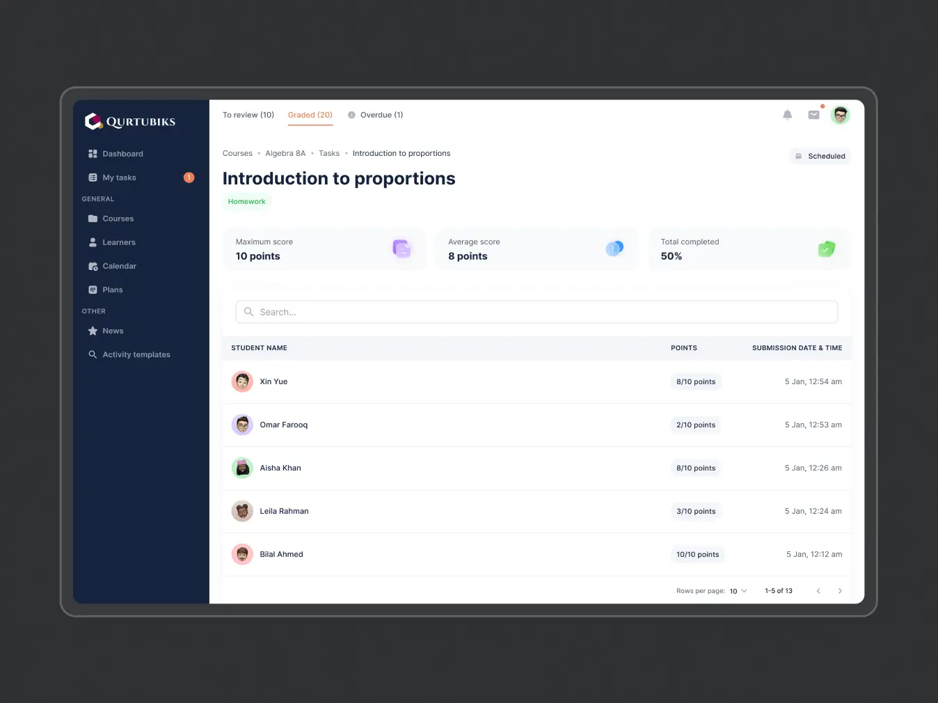
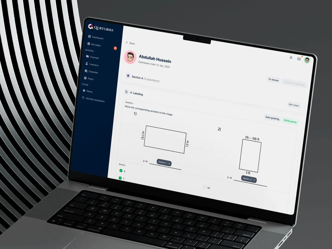
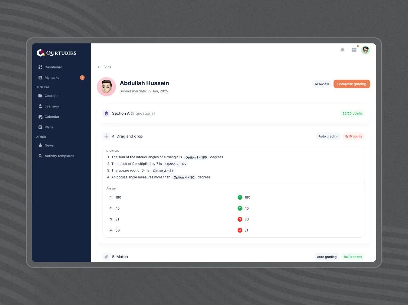
Assessments feature
Teachers faced challenges with poor user experience, data loss due to lack of warnings when canceling actions, and the need to switch to third-party platforms for functionality.
What we’ve done:
• Developed a comprehensive assessment feature for easy homework management, including attachment uploads and clear assignment guidelines.
• Improved grading features with annotations for detailed feedback, including support for hybrid assignments.
• Introduced online tests with diverse question types and automated grading for timely feedback.
• Enhanced the UX to reduce dependence on third-party platforms and ensure a cohesive experience.
• Added warnings for unsaved changes to prevent data loss when canceling actions.
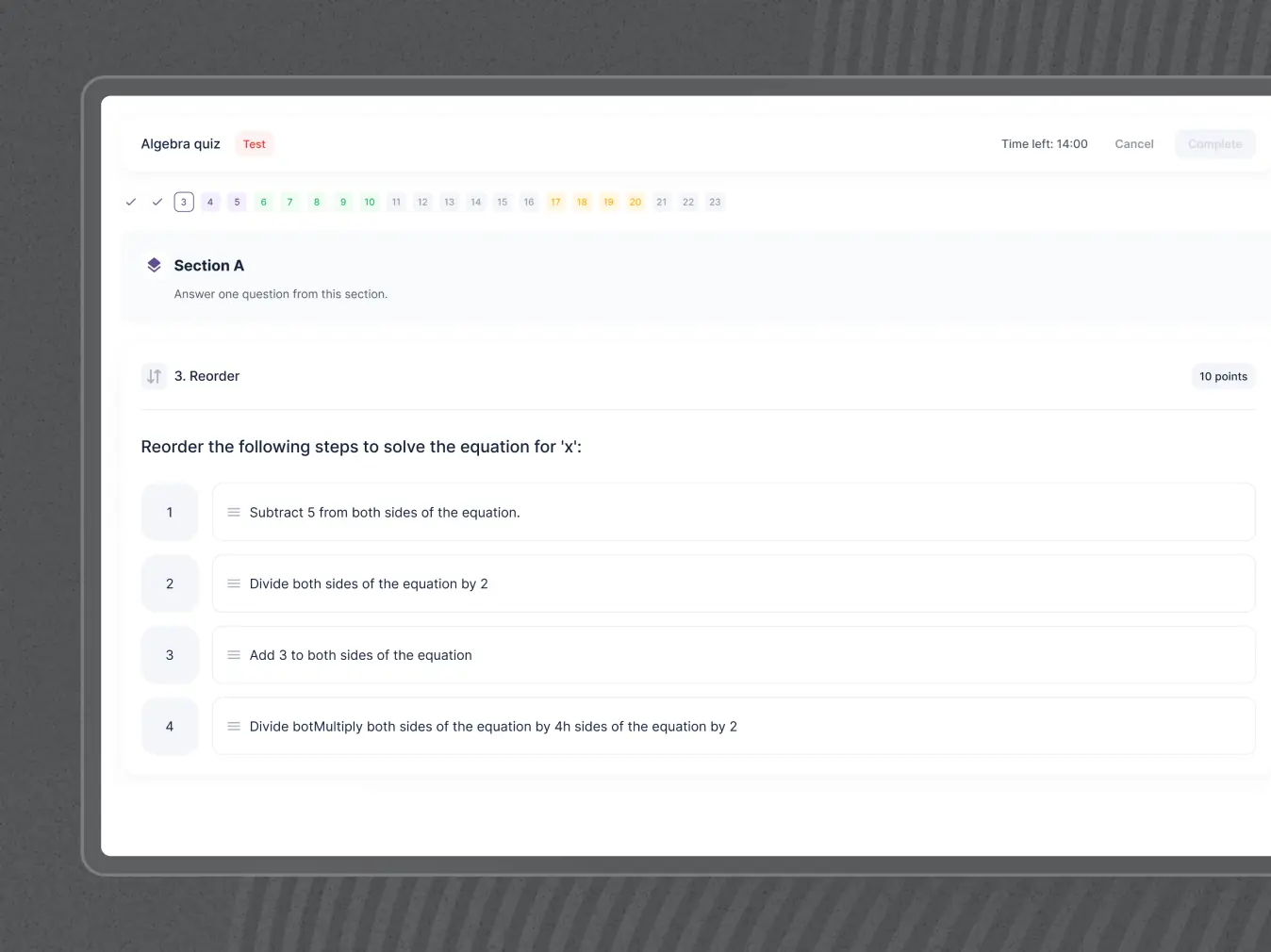
Interactive tasks feature
Homework was often monotonous and lacked engagement, making it harder for children to stay motivated. Additionally, there were challenges like unclear instructions, difficulty in tracking progress, and the need for external tools to make assignments interactive.
What we’ve done:
• Develop features with interactive exercises, gamified elements, and multimedia content to spark children’s interest.
• Enabled easy attachment uploads and step-by-step instructions for clear assignment completion.
• Added tracking features for parents and teachers to monitor progress and provide timely support.
• Introduced quizzes and challenges with diverse question types, including drag-and-drop and visual puzzles, to make learning fun.
• Improved the UX to provide a seamless, intuitive experience without relying on third-party tools.
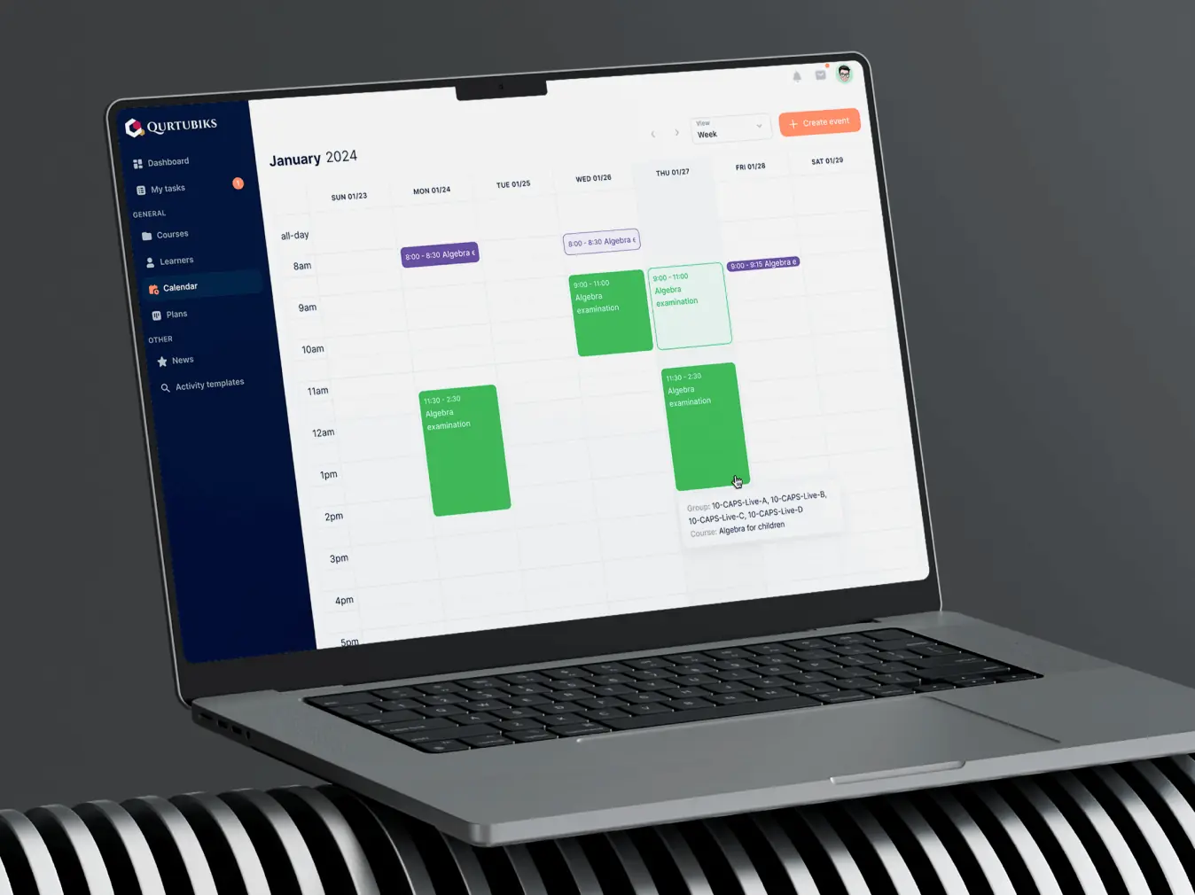
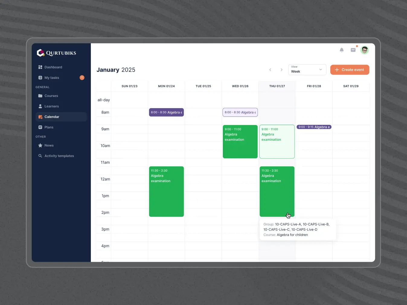
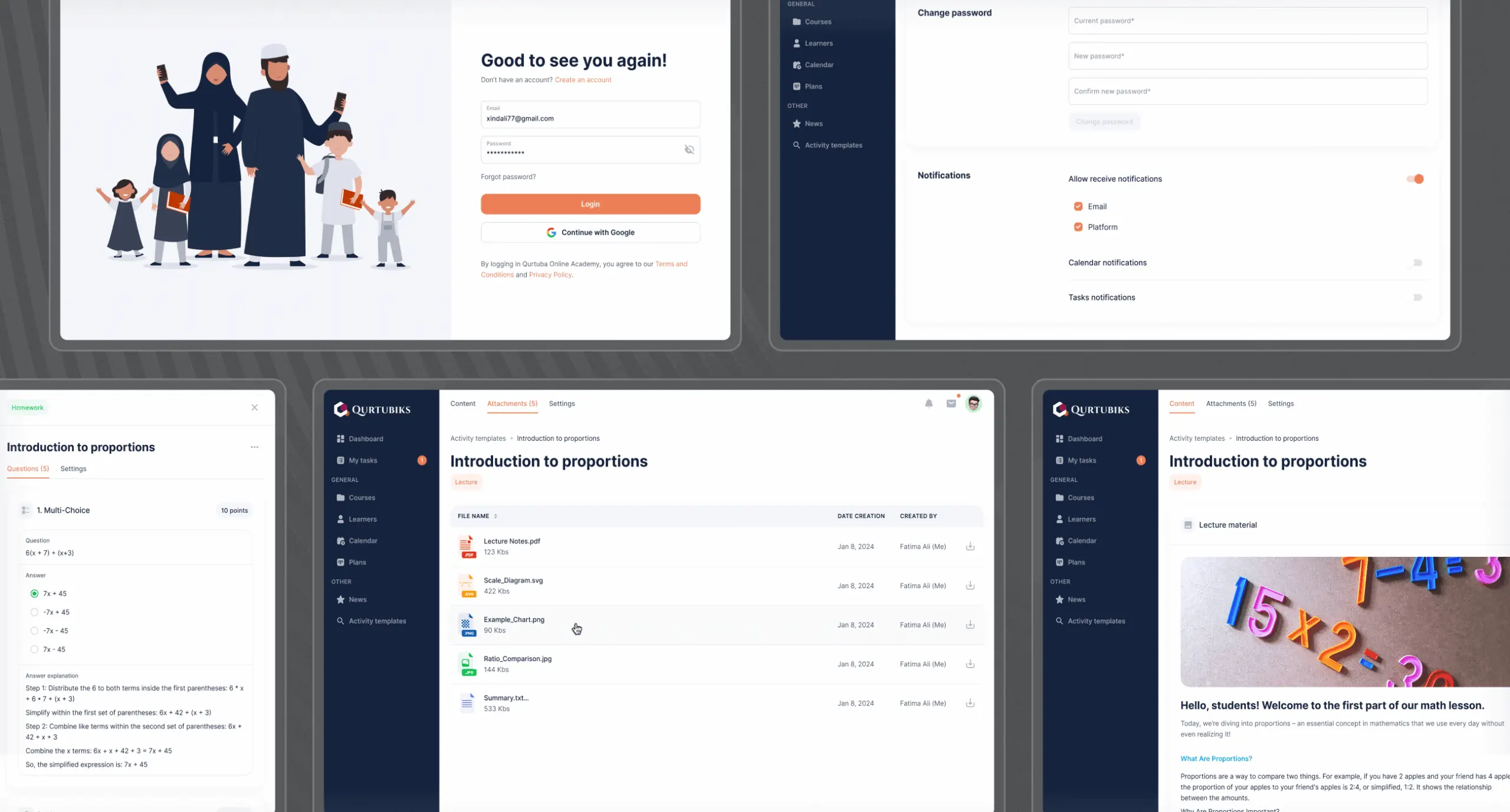
Calendar feature
Teachers and students previously faced challenges with tracking schedules, managing meetings, and keeping organized due to a lack of cohesive calendar functionality.
What we’ve done:
• Redesigned the calendar for easy viewing of schedules and clear event details for each day.
• Improved the layout to ensure information is presented clearly, enhancing usability and readability.
• Added reminders for important events and deadlines to help users stay organized.
• Enabled efficient creation and management of meetings.
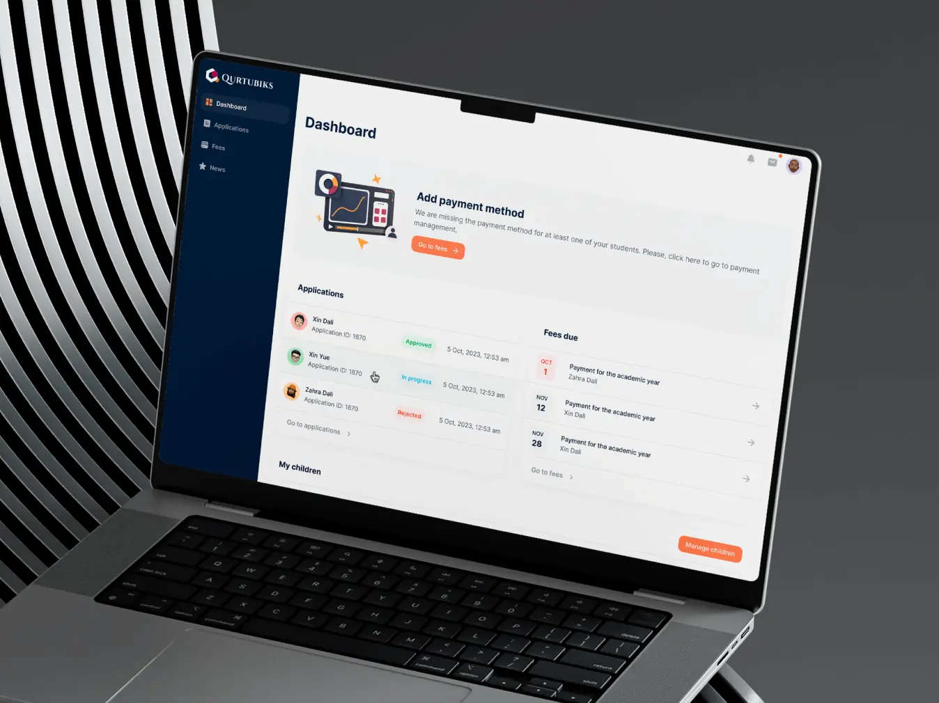
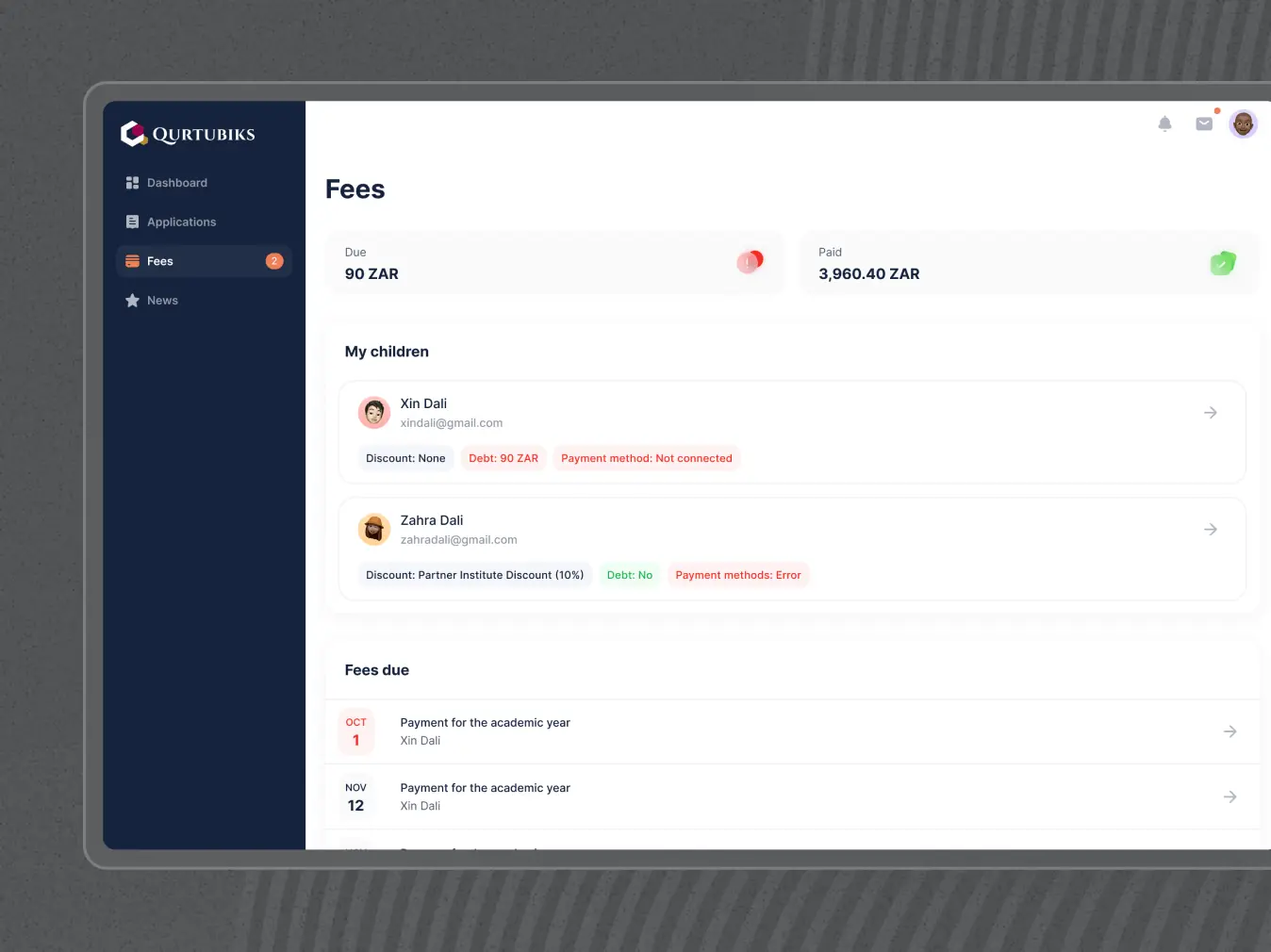
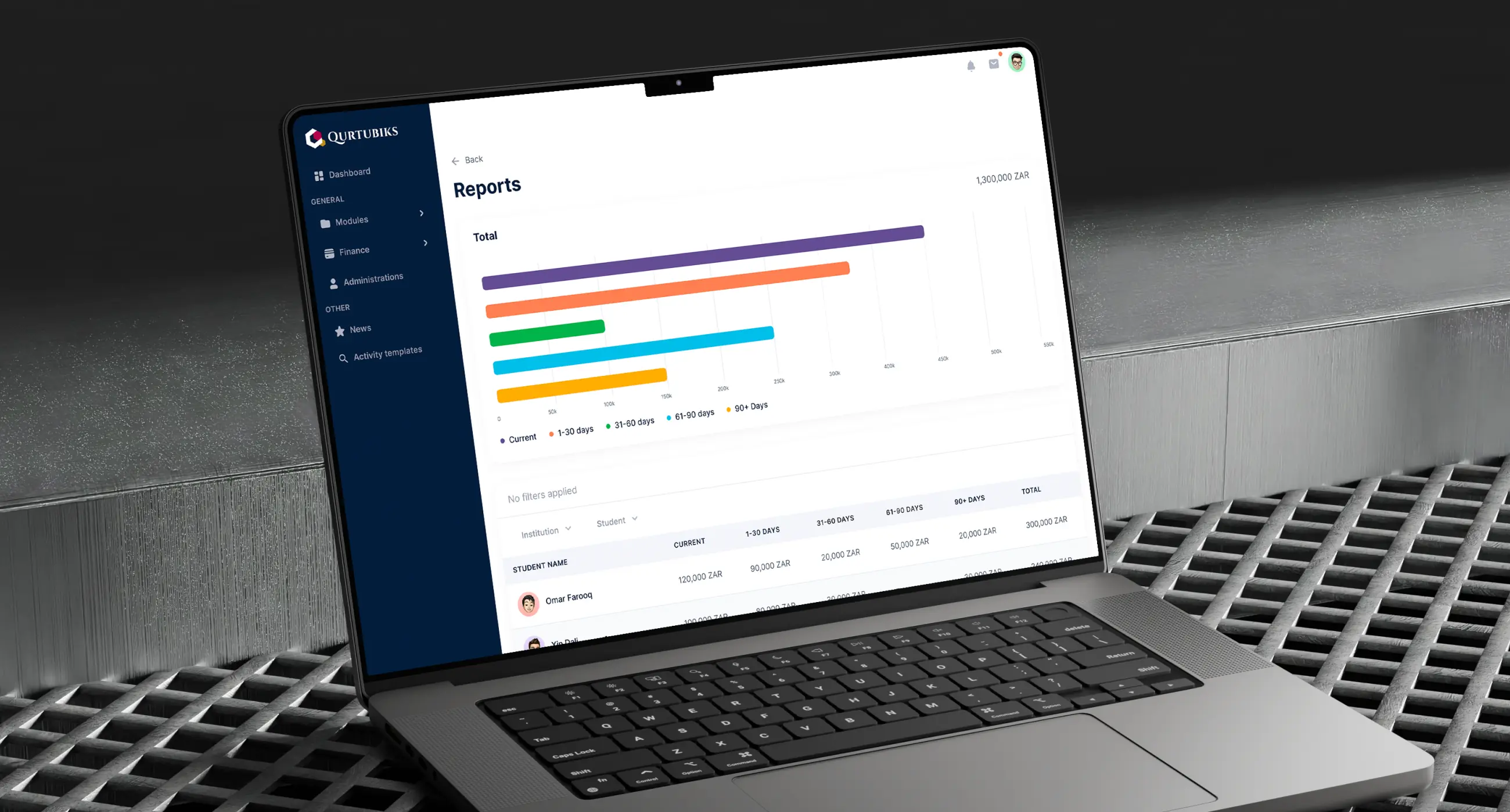
Fees module
Users struggled with fee-related tasks due to a disorganized interface and flaws in the payment system, such as allowing transactions with zero balance or invalid amounts. Additionally, payment details were displayed to children, creating unnecessary confusion.
What we’ve done:
• Redesigned the interface for better usability, hiding payment details from children to display only relevant information for them.
• Fixed payment issues by adding validation checks to ensure valid transactions.
• Integrated a payment gateway and improved workflows for invoicing, receipts, and subscriptions, making fee management faster and more efficient.
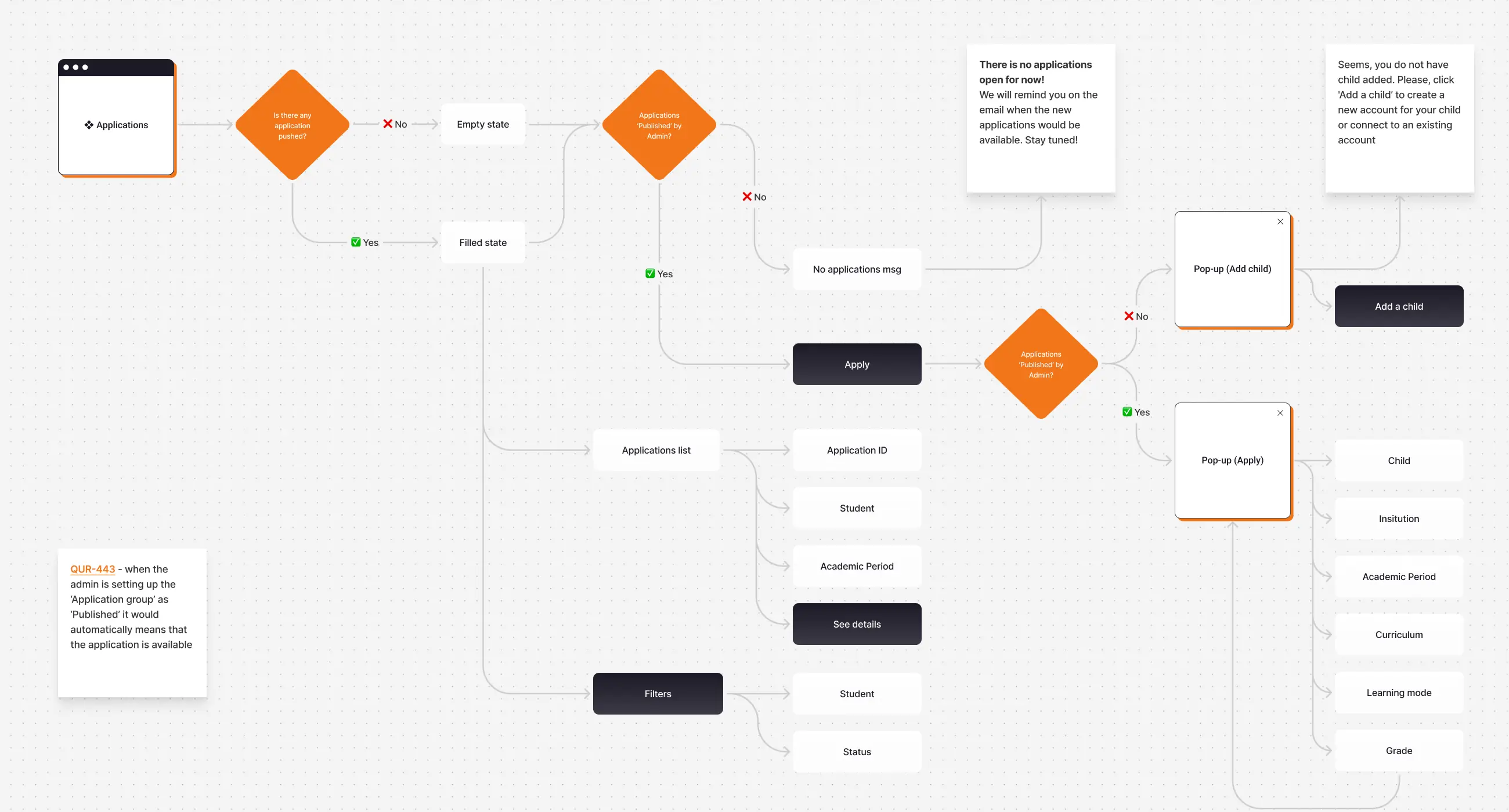
Enrolment module
Administrators faced significant challenges navigating and managing enrolment processes due to an unintuitive interface and lack of clear structure. Applications were scattered and difficult to locate, while the absence of visual prioritization made oversight and task management inefficient and time-consuming.
What we’ve done:
• Developed an application builder for creating custom enrolment forms tailored to different educational programs.
• Redesigned the interface for easy navigation and efficient task management.
• Added a centralized dashboard to provide a clear overview of applications.
• Simplified workflows, improving speed and accuracy in managing online applications and registrations.
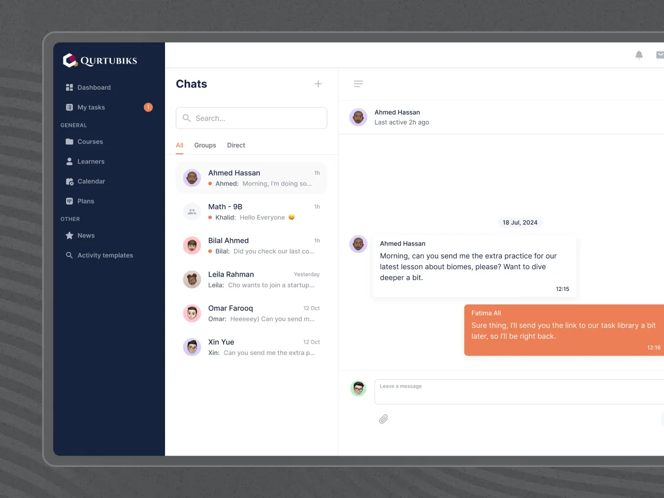
Messenger feature
Users faced challenges with the Messenger feature, including unclear message organization and ineffective search functions. Key features for admins, like the "Create Broadcast Message" button, were hidden, complicating usage. Additionally, users encountered duplicate chats for the same user.
What we’ve done:
• Added sorting options to display new messages at the top for quick access.
• Adjusted the layout to minimize accidental destructive actions.
• Improved management and implemented checks to stop users from creating identical chats.
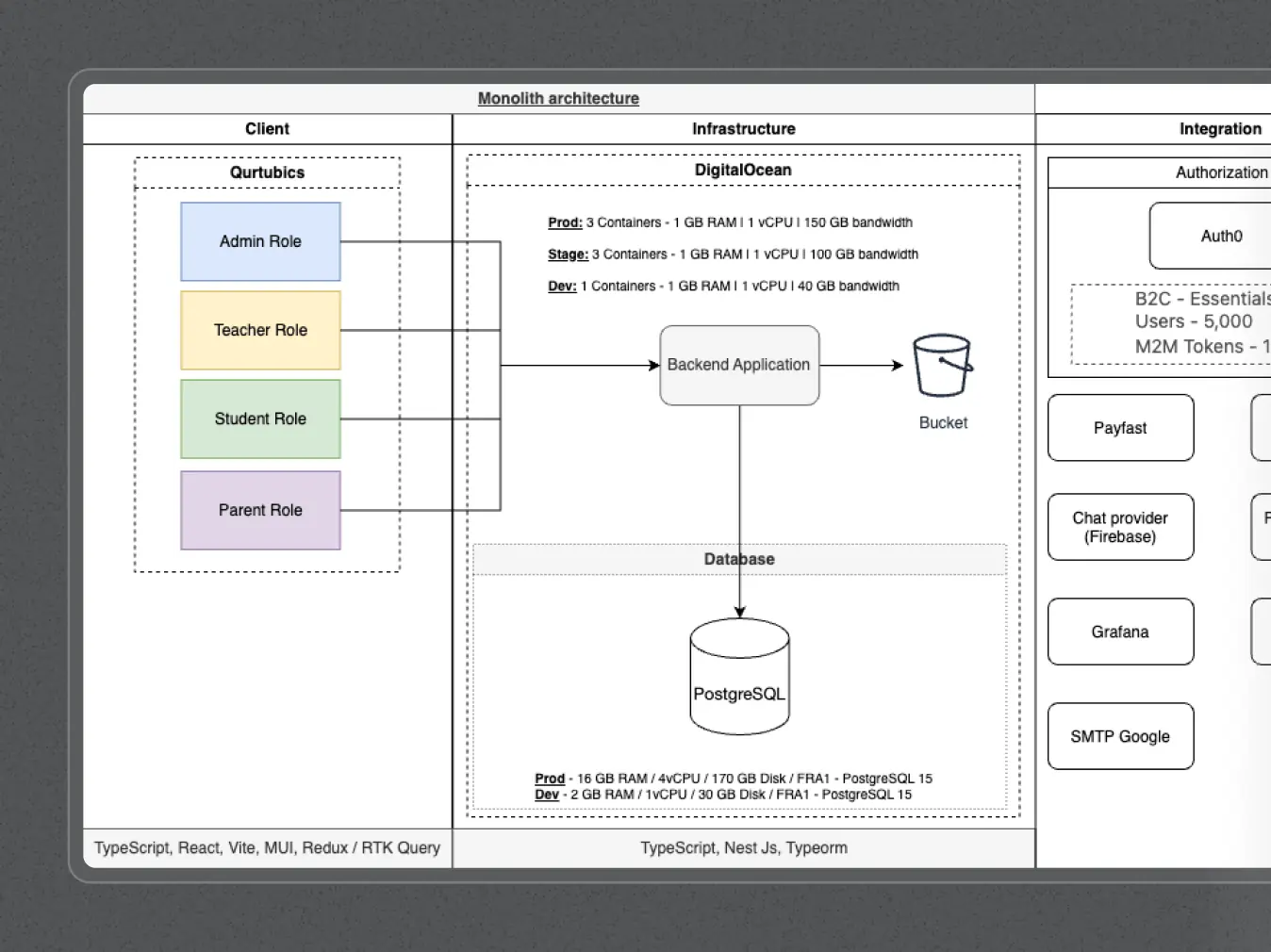
The development phase of Qurtuba prioritized precision, collaboration, and scalability. We undertook a comprehensive analysis of outdated API documentation and built a high-performance, accessible frontend using TypeScript and a range of libraries, including React, Vite, MUI, and Redux. This approach ensured the product’s reliability and longevity.
By integrating tools like Swagger and pgAdmin, we facilitated seamless interactions between the frontend and backend, which utilized Nest JS, TypeORM, and Axios. We also employed Recharts to create interactive visualizations of complex data. Challenges such as backend limitations and design adjustments were tackled with flexibility and innovative solutions, aligning the final product with both technical and design requirements.
Stages
- APIs & back-end analysis
- Front-end development
- Back-end development
At the outset of the development process, we faced significant difficulties due to the presence of outdated and incomplete API documentation. The current Redoc materials were inconsistent because the client did not have the capacity to keep them current. As a result, our developers had to go beyond the provided resources, manually exploring API endpoints to truly grasp the system’s functionalities and its interdependencies.
The project’s business logic was quite complex, featuring intricate connections among various API services. This complexity necessitated thorough investigation and practical testing to accurately chart how these services interacted. Fully understanding these relationships was crucial for creating effective frontend components and ensuring that new features, like the questionnaire builder, would integrate seamlessly into the existing backend framework.
As part of the project to develop an educational platform for students, teachers, administrators, and parents, an end-to-end system was implemented to support the entire lifecycle of interactions and management of the learning process. The platform includes functionality for education, assessment, progress tracking, communication between participants, and efficient management of administrative tasks.
To create a flexible and user-friendly system, modern technologies and tools were used:
- React & Vite – Providing a dynamic and high-performance interface.
- MUI – Enabling quick development of styled components.
- Redux & RTK Query – Managing application state and handling efficient data exchange.
- i18next – Supporting multilingual functionality for a global audience.
- react-quill – Enabling rich text content editing for seamless user interaction.
The backend was designed for scalability, security, and efficient data management using:
NestJS & TypeORM – Structuring the backend with a scalable architecture and optimized database interactions.
- Axios – Facilitating smooth and reliable data exchange between the client and server.
- Firebase – Handling authentication and real-time features.
- Crypto-js – Enhancing security and data protection.
- Fullcalendar – Integrating event management functionality.
- date-fns – Simplifying date and time operations.
- Formik & Yup – Ensuring smooth form validation and management.
Docker – Providing containerization for a stable development and deployment process.
Additionally, the backend is integrated with external systems, such as calendars, communication tools for teachers and parents, and student performance tracking systems, making the platform a comprehensive solution for educational management.
Adapting to new needs
With the growth of the business and changes in the audience, additional optimizations for new devices and platforms became essential. Elements were redesigned to enhance the experience for mobile users.
Adapting for inclusive users
With the growth of the business and the evolving audience, we prioritized adaptations for inclusivity. This included implementing features for reading accessibility, such as adjustable text size, customizable color schemes, a larger cursor for easier navigation, and a reading line to assist users in following text. These enhancements ensure that Qurtuba provides a more accessible and supportive environment for all users, catering to diverse needs in the learning experience.
#website design
Tyler Ussery
 USA
USA
USA

#Branding
Tyler Ussery
USA
USA

#Website redesign #Website development
marketsnack
USA
USA
Have a project in mind?
Let's chat
Have a project to
discuss?
discuss?

Have a partnership in
mind?
mind?
