Design
Development
Research
Launch
Evolve
Extend

Client
Hyperbridge
 USA
USA
USA


Hyperbridge approached us with several key challenges: an inconsistent brand experience, unclear site navigation, and difficulty explaining its technical architecture to a mixed audience of developers and enterprise users. The platform’s messaging felt fragmented, and the user journey lacked structure, making it hard for visitors to understand the product’s value.
They needed a design partner to rethink the website from both a strategic and visual perspective. Our goal was to simplify the experience, define clear user flows, and present complex ideas in a way that felt accessible and trustworthy — all while creating a cohesive visual identity that reflects the company’s position at the forefront of cross-chain technology.


Our research process laid the foundation for a focused and user-driven redesign. We began with a UX audit of the existing website to uncover usability issues, unclear flows, and content gaps. In parallel, we conducted a competitor analysis to understand how similar protocols communicate complex features and onboard users.
Using these insights, we restructured the website’s information architecture, clarified messaging, and mapped out key user flows. This helped us simplify navigation, reduce cognitive load, and ensure that the platform speaks clearly to both technical and non-technical audiences. The result was a design strategy grounded in real user needs and optimized for scalability.
Stages
- UX Audit
- Competitors Analysis
- Informational architecture

We started the project with a full UX audit of the existing Hyperbridge website. The goal was to identify usability issues, gaps in the user journey, and points where the interface failed to communicate the product’s value. We analyzed how users navigated key pages, how information was structured, and where friction occurred during exploration or interaction.
The audit revealed several core problems: unclear messaging, overloaded visual elements, and inconsistent layout patterns. Important technical concepts weren’t explained well, and users lacked guidance on how to engage with the protocol. Based on these findings, we redefined the site’s information hierarchy, simplified content blocks, and laid the foundation for a more intuitive and focused website experience.

In analyzing platforms like AxelarScan, LayerZeroScan, and WormholeScan, we identified recurring UX issues — including difficult transaction navigation and unclear message status updates. At the same time, we noted valuable strengths, such as well-structured dashboards and robust analytics tools that support transparency and control.
By studying both pain points and best practices, we uncovered key opportunities to improve the user experience in Hyperbridge. Our ideas focused on simplifying navigation, visualizing cross-chain transaction statuses more clearly, and building a more intuitive interface overall. These insights directly informed our design decisions, helping position Hyperbridge as a transparent, reliable, and user-friendly alternative in the cross-chain space.

During the information architecture phase, we focused on two core goals: streamlining the cross-chain transfer process and making the platform easy to understand. The website had to work as both a functional tool and an educational resource.
We organized content to guide users through actions like starting a transfer while also giving them quick access to key information — services, benefits, token details, and audience relevance. This structure ensured users could navigate confidently, complete tasks efficiently, and learn about Hyperbridge without friction.

We translated research insights into a clear design strategy, starting with low-fidelity wireframes to define content structure and user flows. This helped us quickly validate layout decisions and align with the client before moving into visual design.
Next, we developed a moodboard to set the visual direction — combining references for layout, color, typography, and illustrations. Based on this foundation, we created polished UI screens and a scalable design system that ensured consistency across the website and the core product experience.
Stages
- Wireframes
- Moodboard
- UI Design

We started the design process by creating wireframes for the entire website. This stage allowed us to define the structure of each page, organize content logically, and map out key user flows — from landing on the homepage to exploring product features and accessing documentation. The goal was to ensure clarity and usability across the entire experience.
For more complex interactions, like cross-chain transfers, we broke down actions into clear, step-by-step screens. We focused on minimizing cognitive load, grouping related inputs, and providing consistent feedback. These wireframes served as a blueprint for building an intuitive, scalable interface that meets the needs of both new visitors and experienced users.


The moodboard was based on the client’s idea of using vibrant gradients and light effects to create a futuristic, tech-driven look. This vision guided the visual direction of the platform from the start.
We selected references that combined innovation with clarity — focusing on layout, color, and illustration style. This helped us shape a cohesive design language that feels modern and expressive while remaining intuitive and easy to navigate.


During the UI and design system phase, we worked closely with the client to align the platform’s layout and interactions with their vision. We focused on building a cohesive experience across all screens and devices.
The design system was built for scale, with clear guidelines, reusable components, and detailed documentation. This ensured smooth implementation by the development team and consistency across both the website and the Bridge product. The result: a flexible interface ready to support future growth.


Multi-chain native tokens
Smoothly make and handle digital coins across many blockchains without using covered things or central dealers. The system ensures large transparency through its design. It allows users to track total token supply, blockchain connections, and wide-ranging on-chain activity in real time.
Automated liquidity bot
Optimize liquidity management with an automated bot. It dynamically balances asset pools across various networks. As a liquidity provider, you access financial rewards and governance rights on the platform. The bot watches market conditions closely. It optimizes liquidity distribution to ensure stability. This reduces slippage and maximizes capital efficiency. Unlock exclusive benefits, boost your earning potential, and help shape the platform’s future
NAND token
The NAND token provides decentralized bridge governance, liquidity, and rewards for maintaining the network. Relayers use it to aggregate cross-chain messages, and staking allows for the selection of new block producers. Trading volume, fees, and users validate the token’s activity.
Own assets creation
Easily design and deploy your own multi-chain native asset in three simple steps. Begin by defining your asset's specifications: name, symbol, total supply, and supported blockchains. This foundational step ensures your asset is clearly defined and compatible across various blockchain networks.
For Hyperbridge, we created custom illustrations based on hand-drawn sketches provided by the client. These visuals were designed to simplify complex concepts, such as cross-chain transfers, and make the platform more engaging.
We also included animations to enhance user interaction and optimized the illustrations for mobile devices, ensuring they were responsive across different screen sizes. The final result was a cohesive set of illustrations that supported the platform’s storytelling while maintaining clarity and visual appeal.


#Branding
Tyler Ussery
 USA
USA
USA
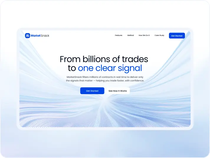
#Website redesign #Website development
marketsnack
USA
USA
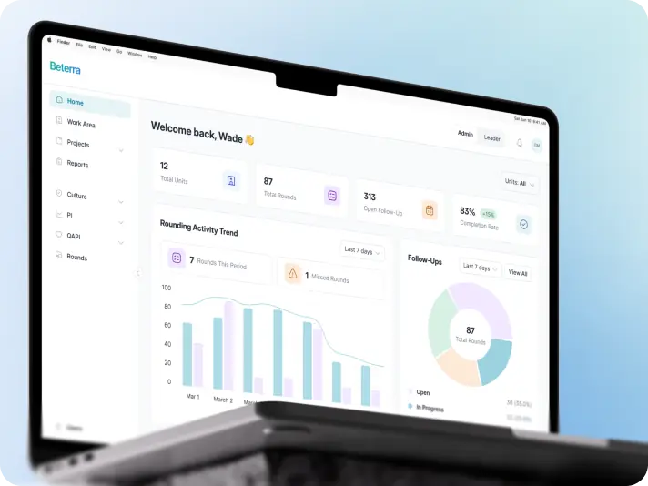
#Product redesign
BETERRA
USA
USA
Have a project in mind?
Let's chat
Have a project to
discuss?
discuss?

Have a partnership in
mind?
mind?
