Design
Development
Research
Launch
Evolve
Extend
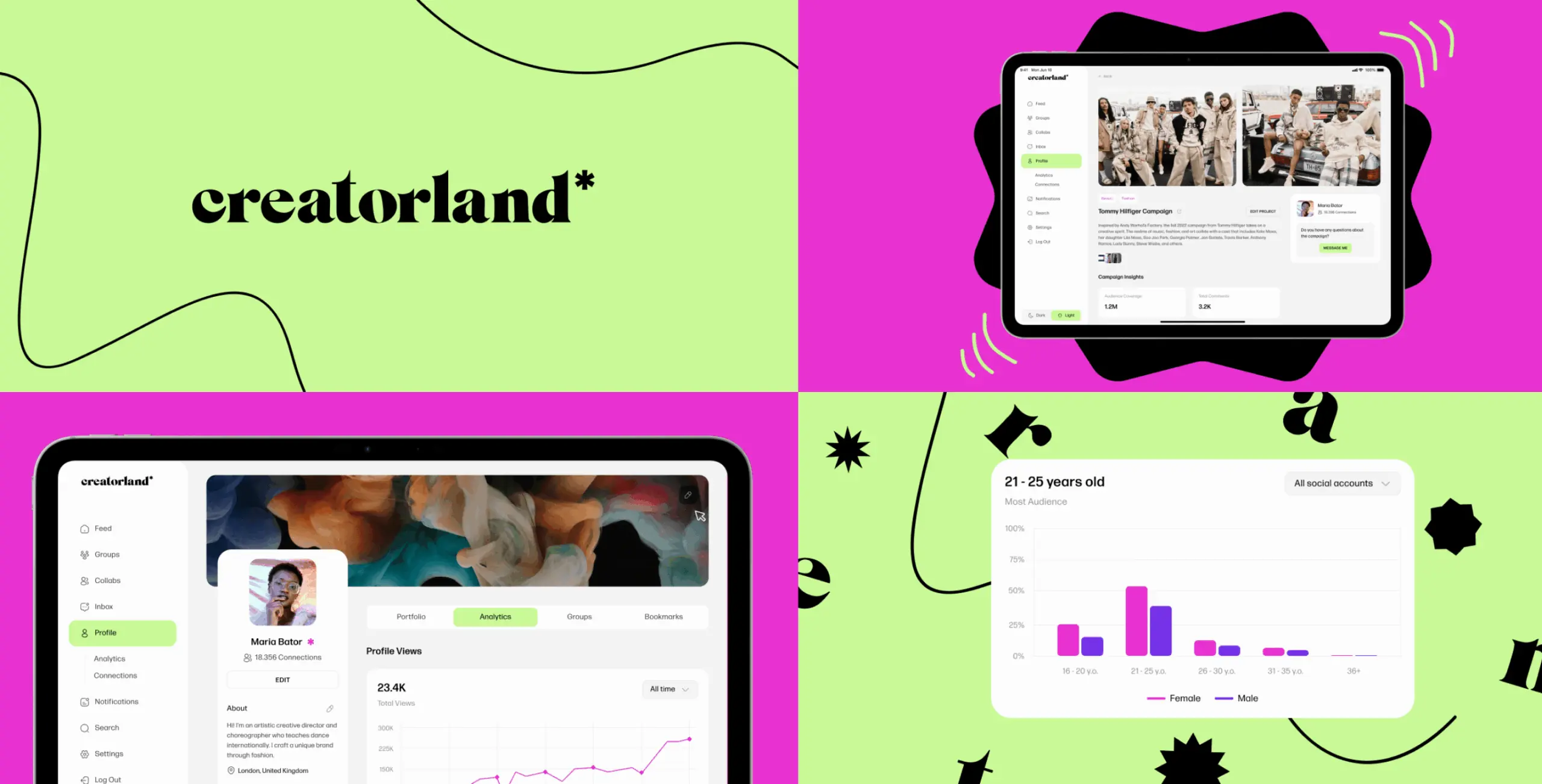
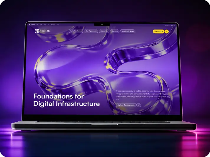
Creatorland – revolutionizing networking for Gen Z creators
Client
Creatorland
 USA
USA
USA
Services
Creatorland needed to earn the trust of a generation that’s seen through every platform that claimed to be built for them — while standing out in a market still shaped by traditional networking logic.
The mission was to redesign an existing product into something that actually felt like it belonged to that generation. Visually bold, easy to use, and honest about what it was for: helping creators turn what they make into something that sticks.
Our role
Our role was a full redesign of the existing platform — making it work better for creators, smoother for brand communication, and distinct enough to stand apart in a crowded market.
The identity question was the hardest part. Creatorland needed to feel like something new without being difficult to use. The result was a platform that gave creators room to show who they are, without burying the functionality under the aesthetic.
We started with a thorough UX audit to find where the platform was creating friction and understand how Gen Z creators actually moved through it. Their behaviour didn’t always follow the patterns the existing structure assumed — and those gaps were where the most useful findings came from.
From there we rebuilt the information architecture around how creators naturally wanted to progress through the platform, making the core features easier to reach without hunting. The research kept the design grounded in real workflows rather than what seemed logical on paper.
Stages
- Competitive Analysis
- UX audit
- Information Architecture
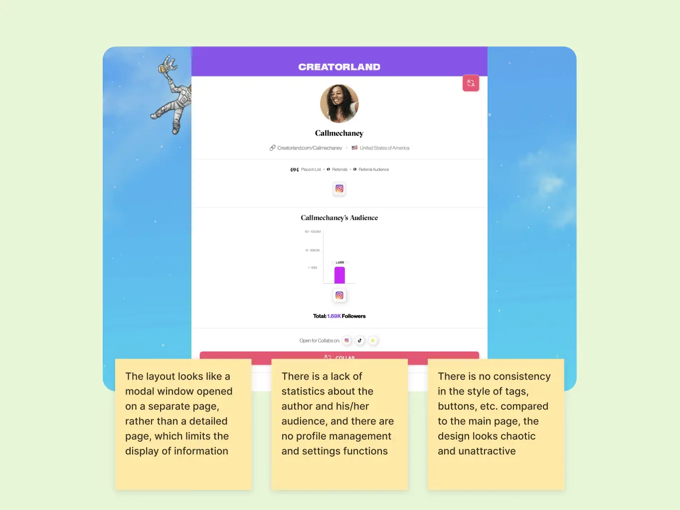
We audited the existing Creatorland platform to find where the experience was breaking down. Navigation and functionality came first — mapping the usability issues affecting portfolio creation and the networking features before moving into the harder problems.
From there we documented where creator-brand collaboration was falling apart and where resource discovery was letting people down. The clearest pattern was creators struggling to show the full range of what they did — the platform wasn’t built for multi-hyphenate talent, and it showed.
Competitor research showed where the market was falling short and where Creatorland had room to do something better.
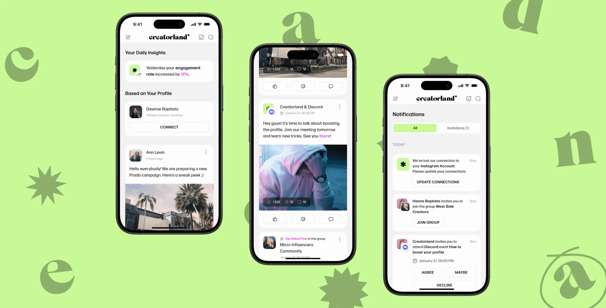
Most platforms skimp on analytics — so we built detailed engagement stats, audience breakdowns, and performance tracking directly into each creator profile rather than burying them in a separate dashboard. Collaboration tools were another weak spot: too many platforms split search and management across different logins, so we consolidated everything into one place with niche groups and a simpler onboarding flow. And because younger creators rarely check email, relying on SMS or Slack to reach them, we built in messaging and real-time notifications so communication actually reached people.
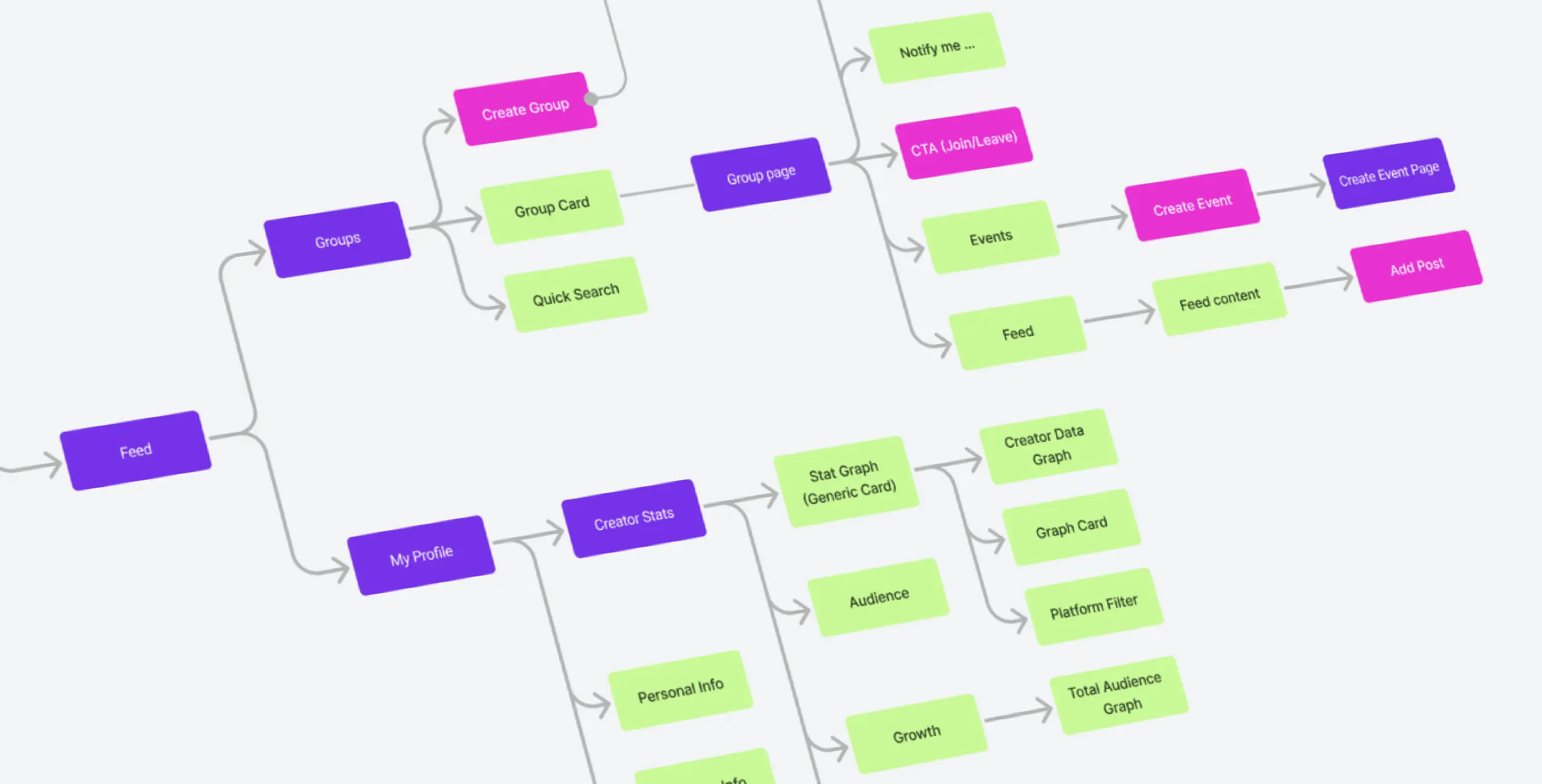
We mapped out the information architecture around how Gen Z creators actually moved through the platform rather than how the existing navigation assumed they would.
That meant evaluating where the current structure was getting in the way of portfolio discovery and networking, and tracing the journeys of emerging creators to find where collaboration opportunities were being missed. The result was a structure that got creators to the right features without making them work for it — and put relevant brand opportunities in their path naturally rather than burying them.
The design for Creatorland had one central challenge — making a platform that could handle multi-disciplinary talent without flattening it. Creators who do five different things needed a way to show all of them without the interface forcing them into a single category.
That shaped everything from how portfolios were structured to the visual language we chose. The aesthetic needed to feel native to how Gen Z creators already present themselves — not a corporate interpretation of what that looks like.
Stages
- Wireframe
- UI Design
- Mobile adaptation

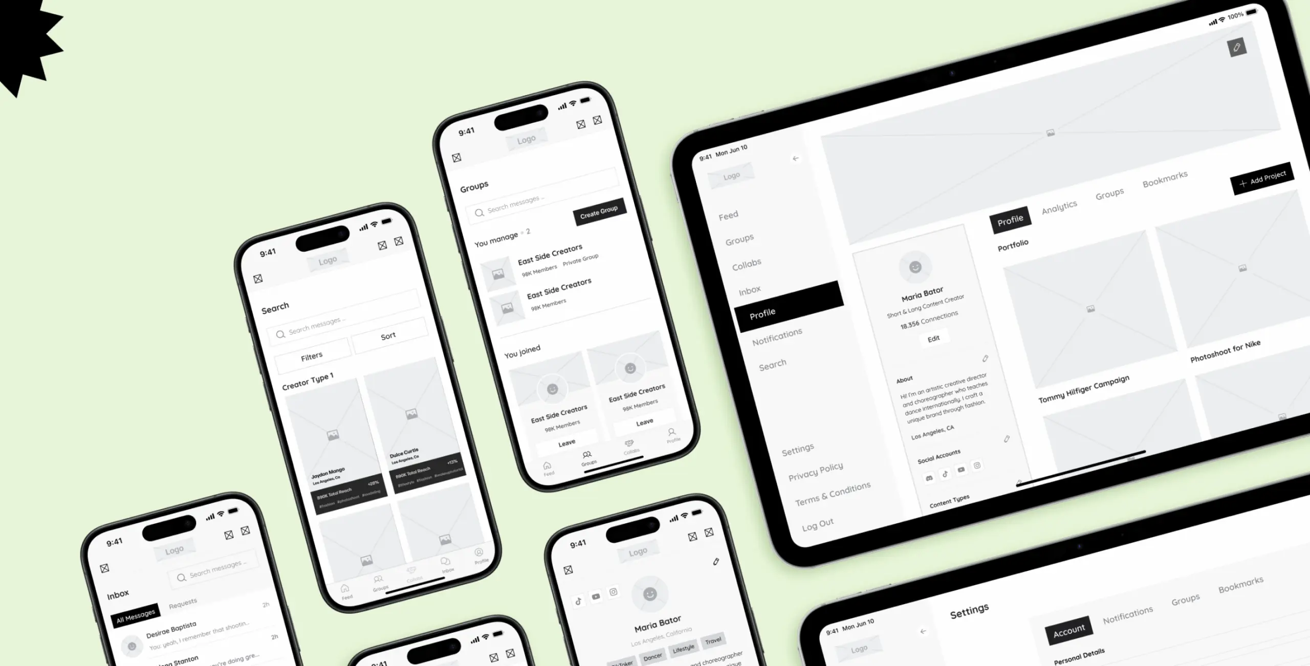
Wireframing was where the research findings turned into something testable. We reworked the navigation and user flows to address the friction points the UX audit had surfaced — working through how creators and brands would move through the platform before any visual design decisions got made.
The wireframes defined how the key features related to each other — author profiles, analytics tools, groups, and social feeds — and whether the structure actually made sense in practice. Getting that right early meant the design phase could focus on how things looked rather than relitigating how they worked.
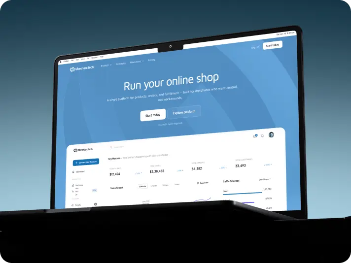
Creatorland’s interface had to work for two very different users at the same time — creators who needed to show their work compellingly, and brands who needed to find the right talent without wading through noise.
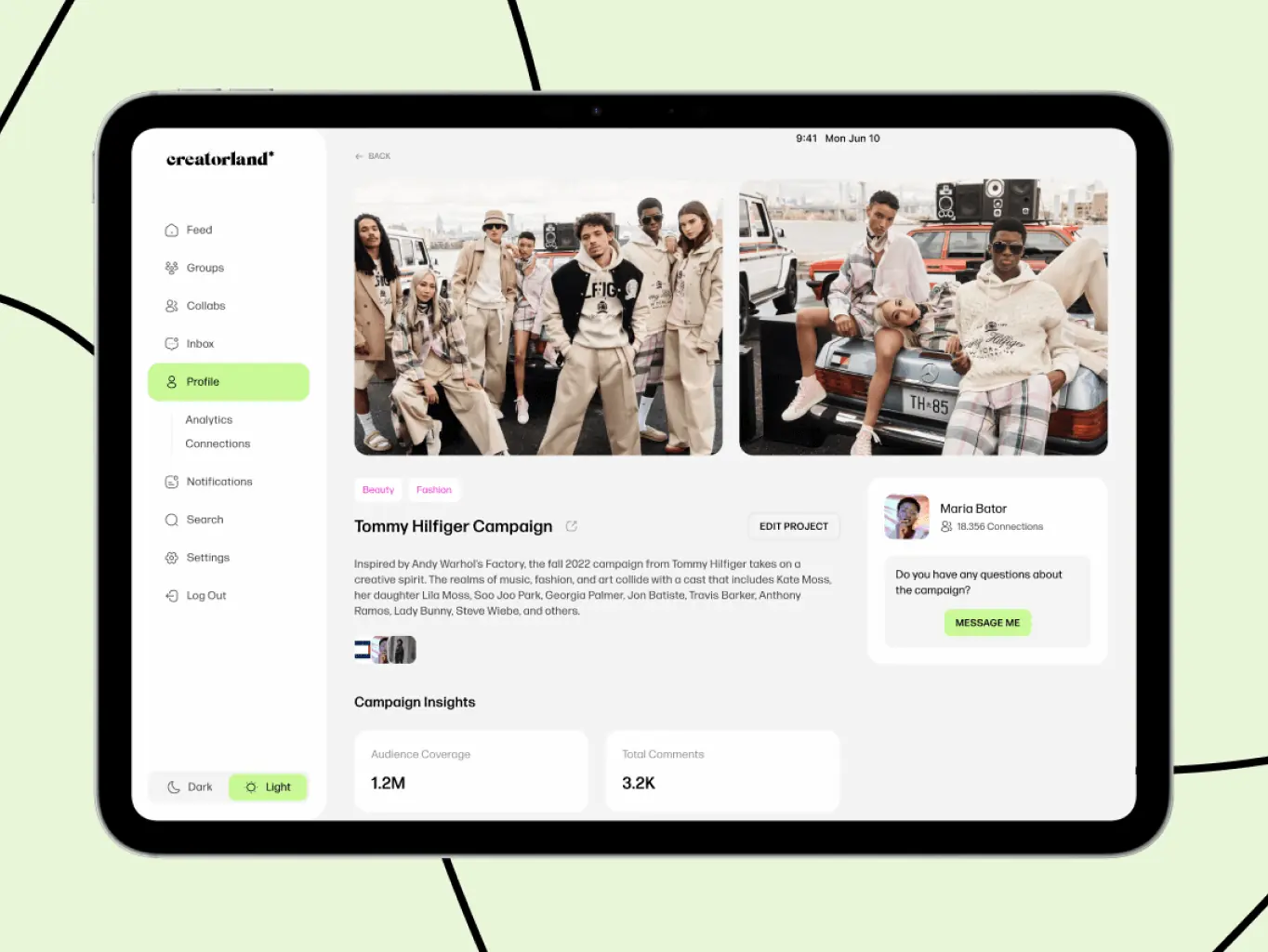
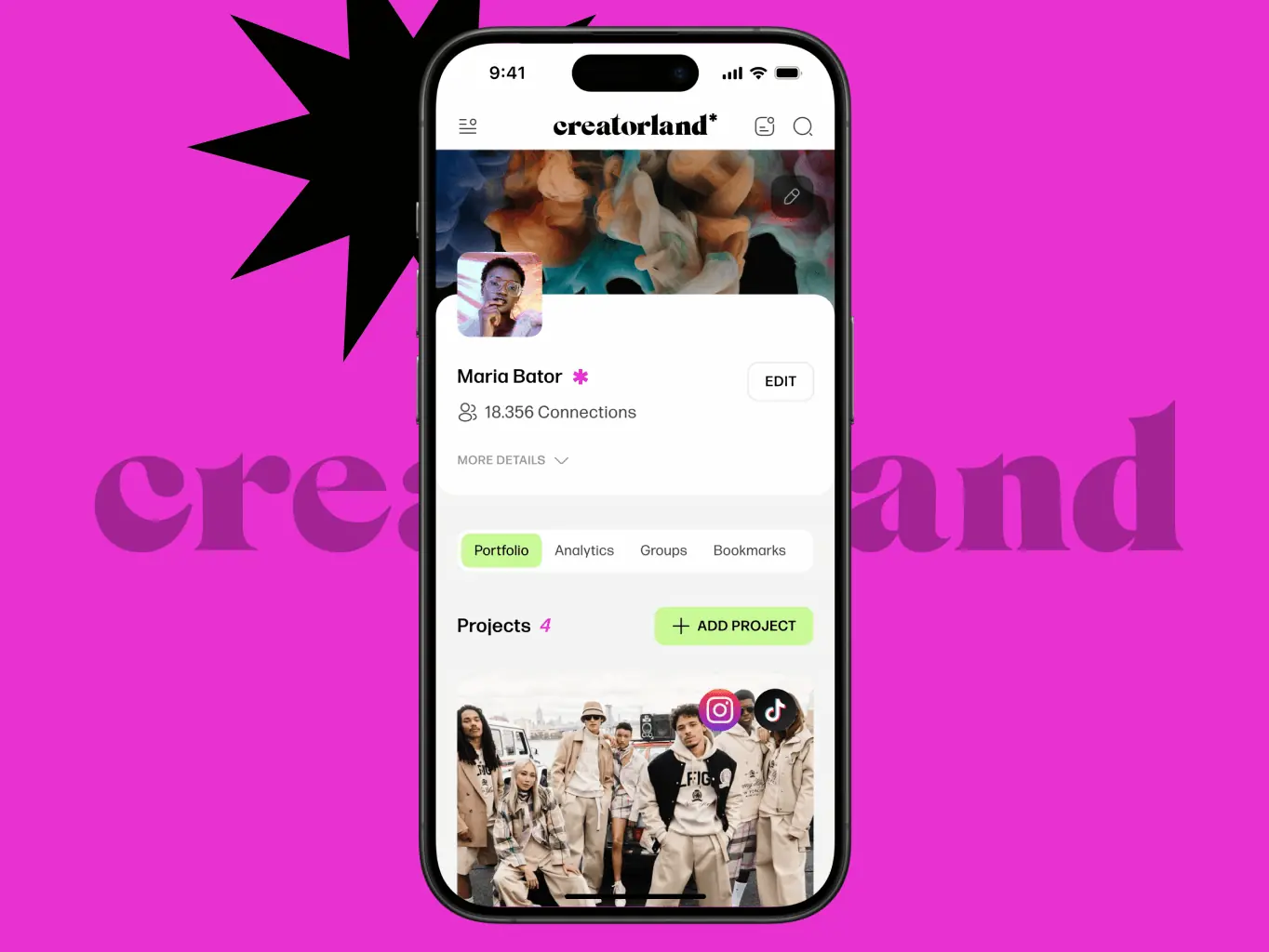
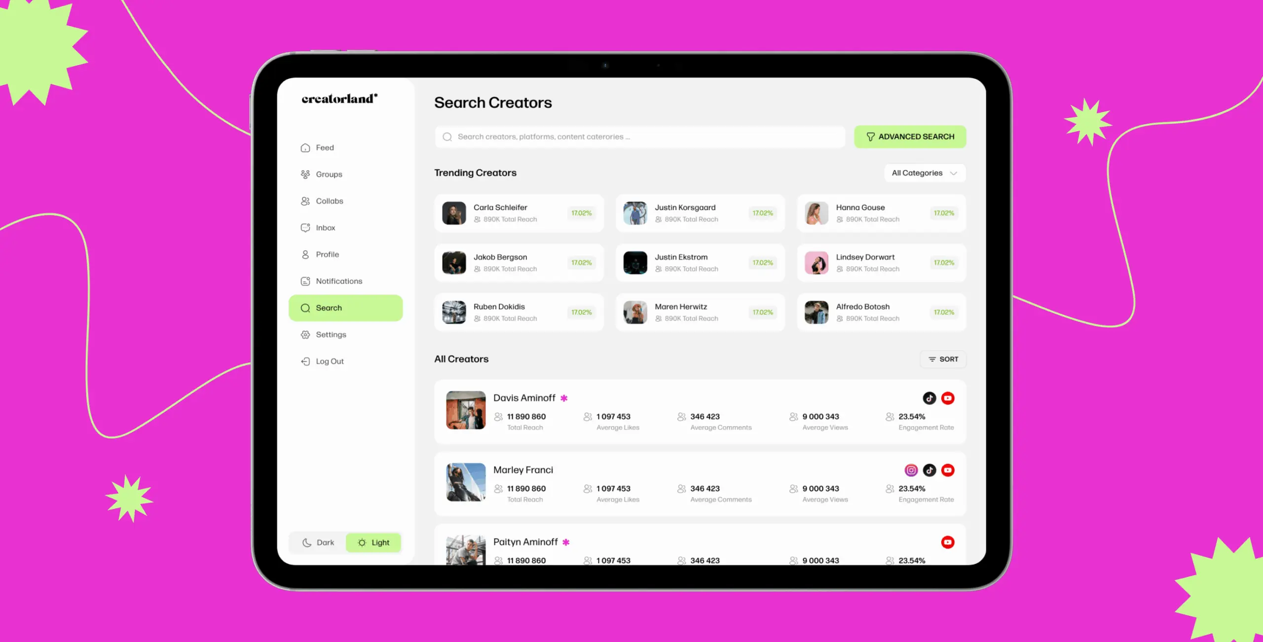
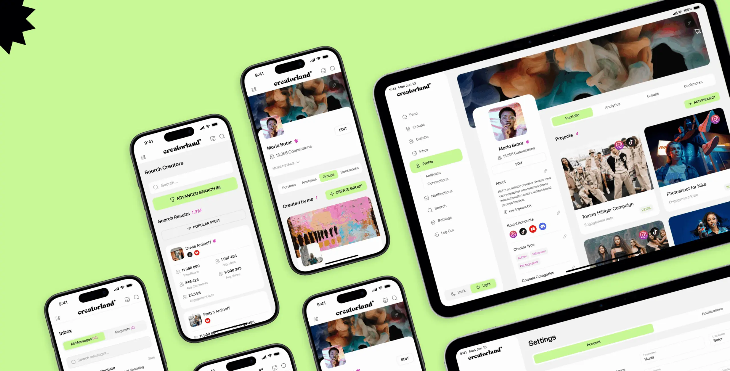
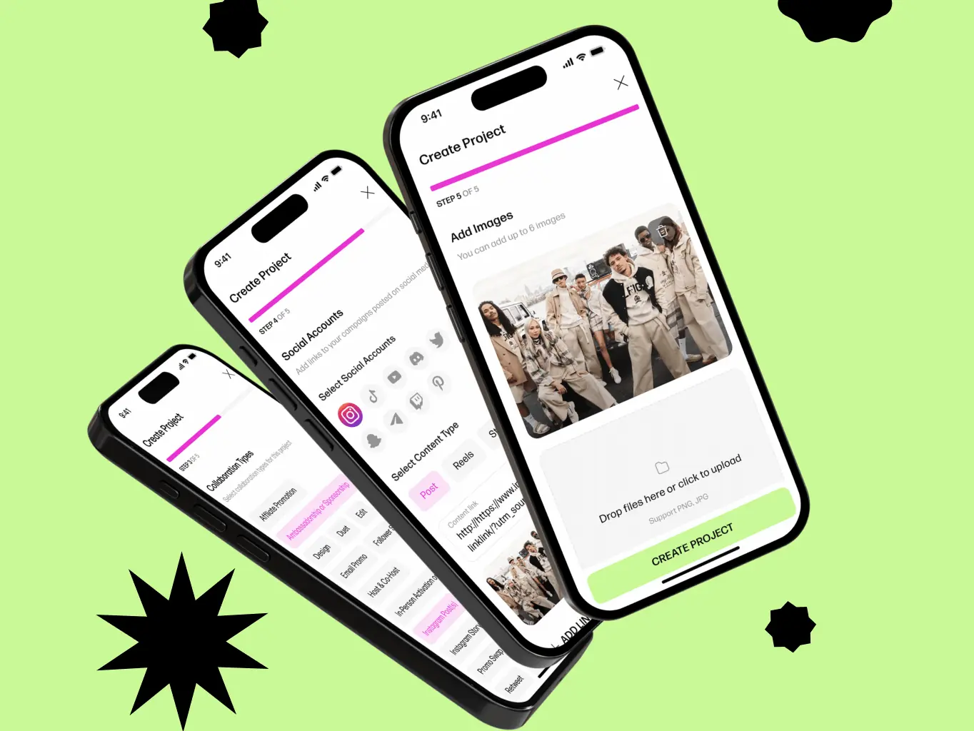
The portfolio system was the centrepiece. We built it to be visually rich and interactive, giving creators real flexibility in how they presented their work rather than forcing everything into the same template. Navigation and visual cues were designed to help creators grow their presence organically, while keeping the experience clean enough that brands could move quickly when they found someone worth pursuing.
Mobile wasn’t an afterthought — Gen Z lives on their phones, and a platform that felt clunky on a small screen would have undermined everything else.
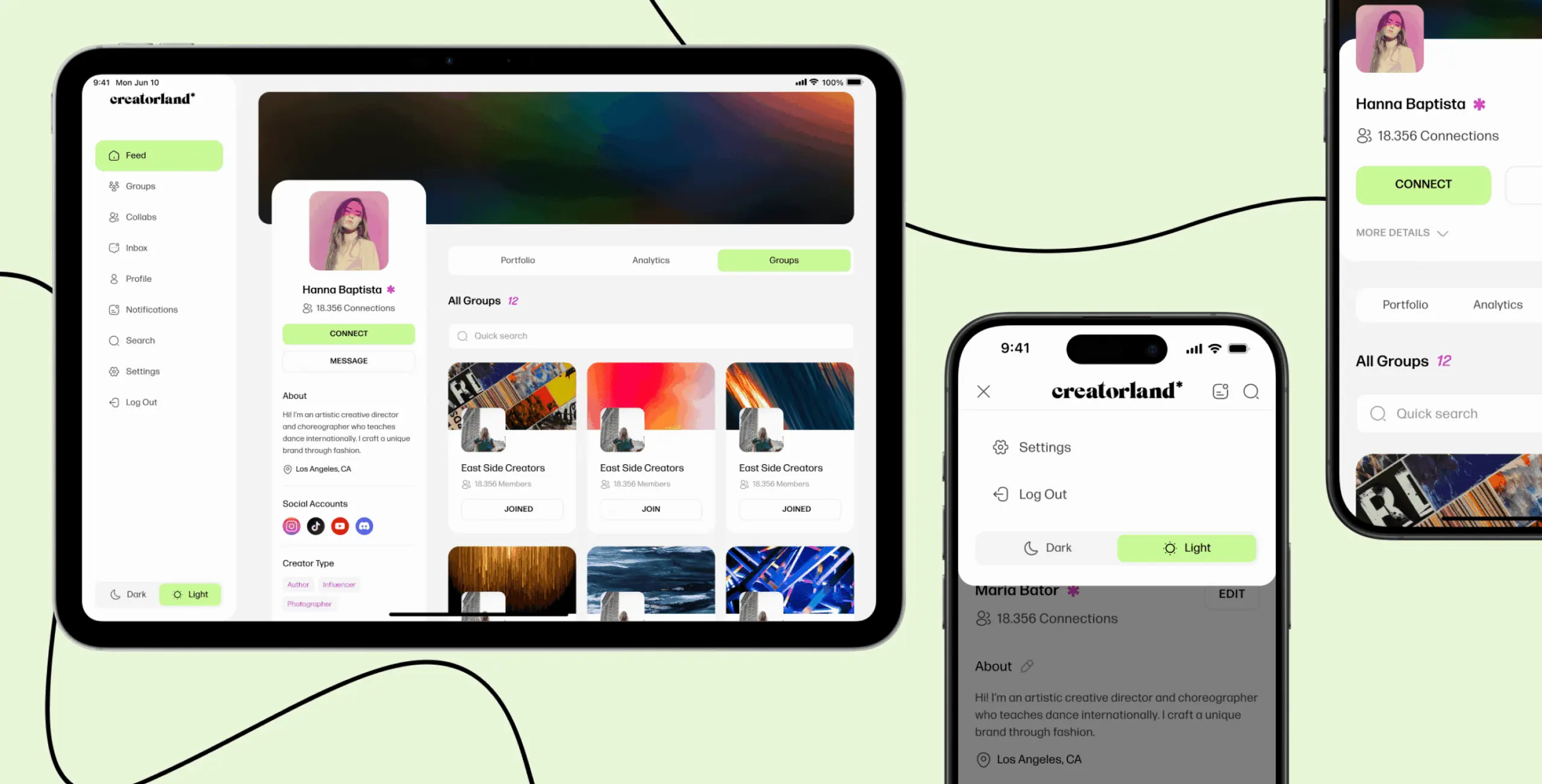
While the initial design was desktop-first, we worked through the mobile experience in parallel rather than adapting it at the end. Touch-friendly controls, adaptive layouts, and navigation that made sense with a thumb rather than a cursor meant the experience held up across devices without watering anything down.
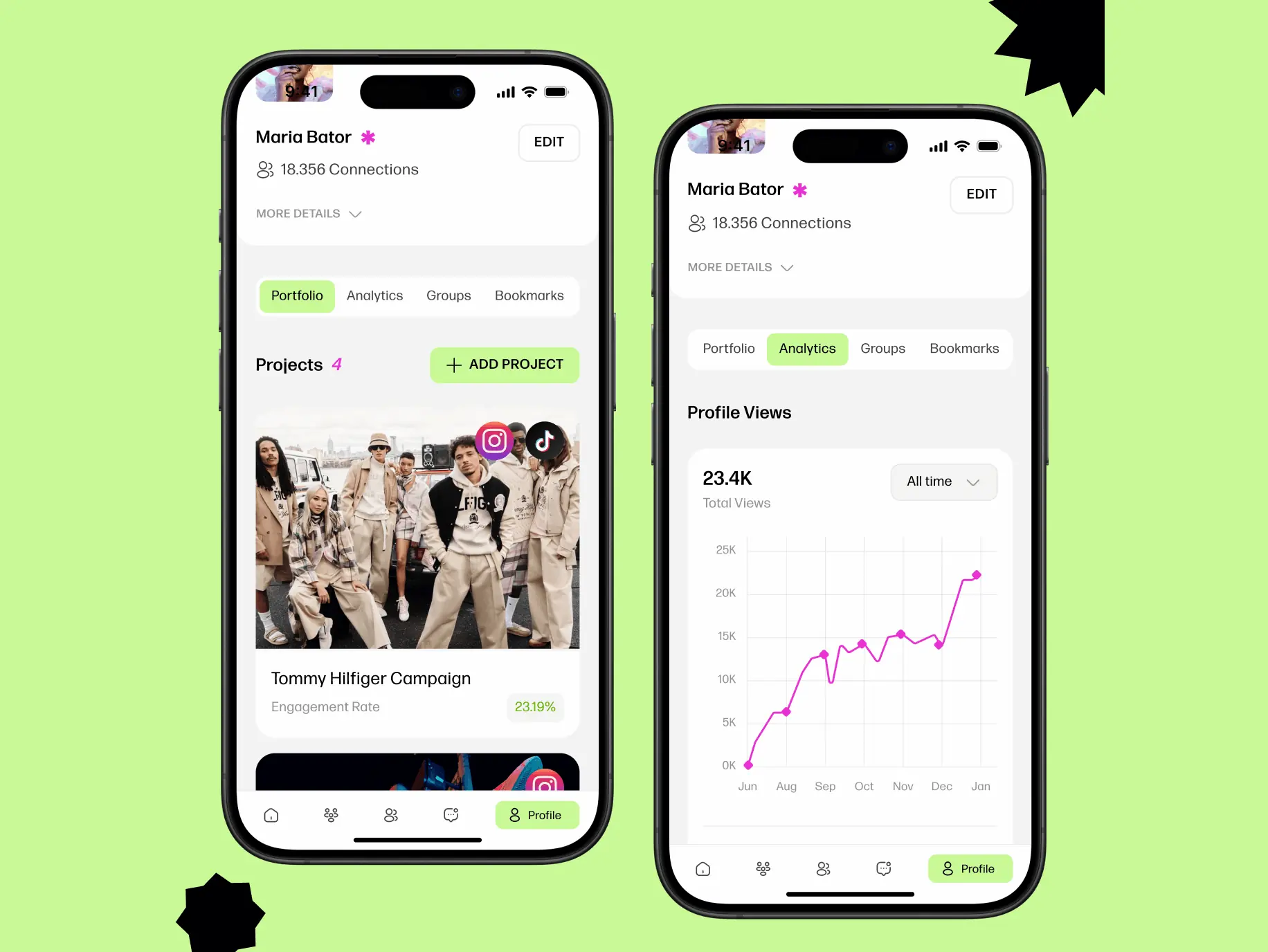
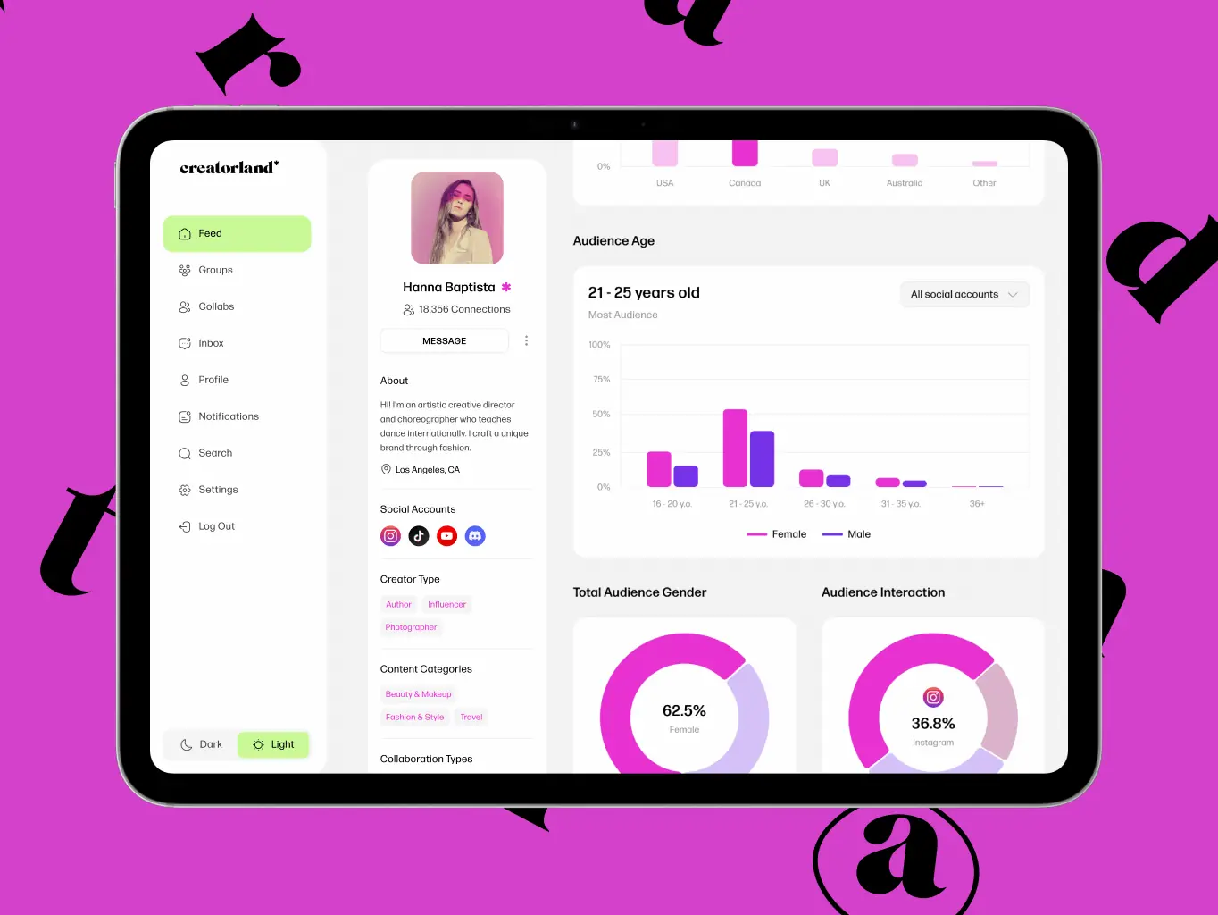
Profile insights
Creators can showcase completed campaigns and collaborations directly on their profiles — building a track record that speaks for itself when brands come looking.Built-in analytics give creators visibility into how their profiles are performing: views, engagement, and how their work is landing. Brands get the same depth on the other side, with campaign performance data that makes it easier to evaluate who to work with next. Both sides make better decisions when the numbers are actually in front of them.
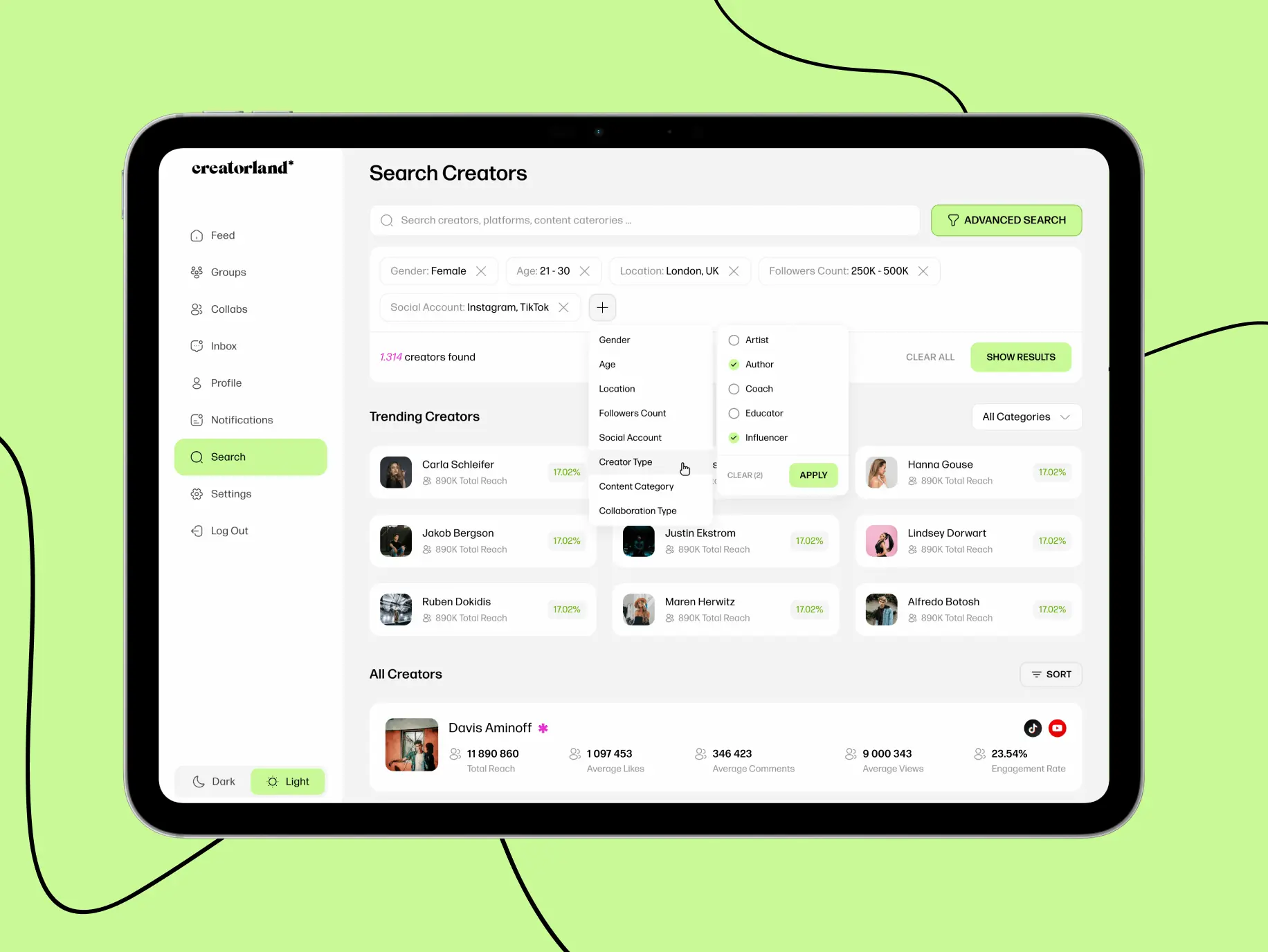
Discoverability & connections
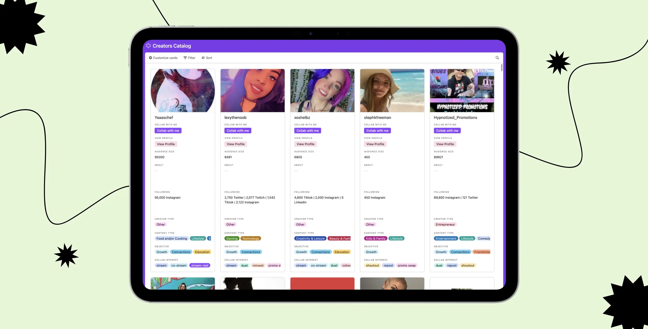
Creatorland's search and filtering tools make it straightforward for brands to find creators who actually fit what they're looking for. Filter by skills, audience demographics, and content style to narrow the field — without having to scroll through profiles that were never going to be the right match.
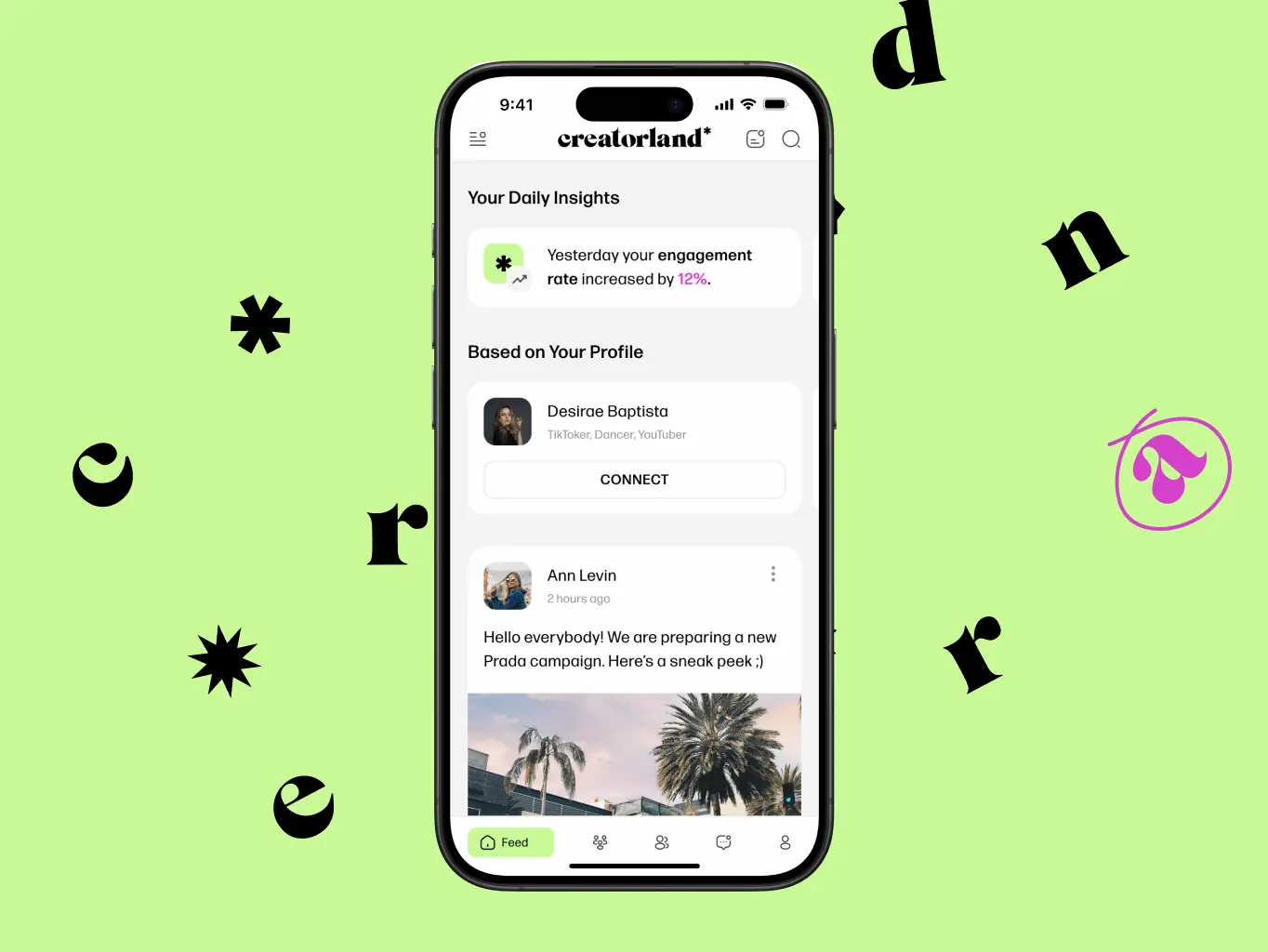
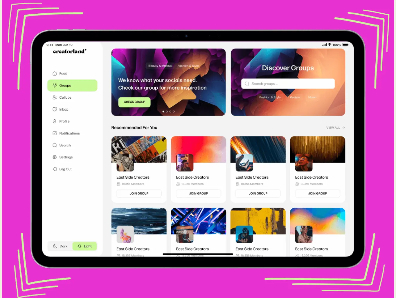
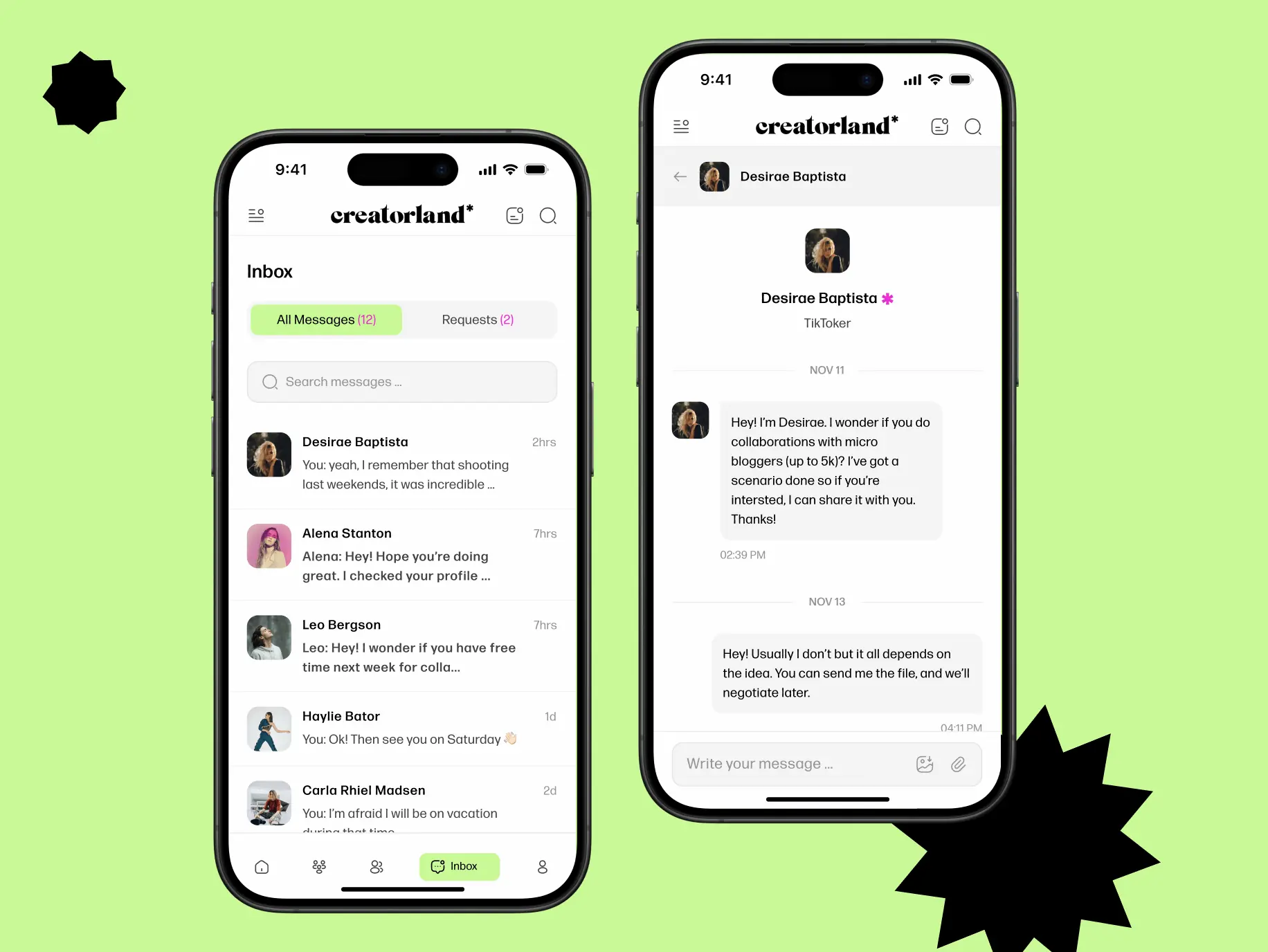
Grow your network
Creatorland gives creators a place to find others working in the same space — join interest groups, get into discussions, and build relationships with people who actually get what you do.
#Website design #website development
EVERON
 USA
USA
USA
#Website design #Website development
Philip Lewis
 Finland
Finland
#website design
Tyler Ussery
 USA
USA
USA
Have a project in mind?
Let's chat
Have a project to
discuss?
discuss?

Have a partnership in
mind?
mind?
