Development
Research
Client
Both Homes
 USA
USA
USA
Services
The client’s request was focused on creating an intuitive platform that streamlines secure and conflict-free communication between co-parents while simplifying scheduling through a user-friendly custody calendar and event tracking system. Key priorities include ensuring the app is accessible to parents with varying levels of tech-savviness and integrating robust encryption and privacy controls to safeguard sensitive information. The ultimate goal is to position Both Homes as a supportive tool that addresses co-parenting challenges and fosters a positive experience for its users.
Our role
Our role involves crafting a user-friendly interface with intuitive navigation, ensuring accessibility for co-parents with varying tech skills. We develop a cohesive visual identity, conduct user research to inform key features like scheduling and secure messaging, and create engaging prototypes tested with real users. Post-launch, we provide ongoing design support to refine and enhance the app based on feedback.

Our initial phase was dedicated to understanding the complex landscape of co-parenting. We conducted in-depth research to identify the unique challenges and needs of co-parenting families. This involved several key activities.
Stages
- Discovery
- Informationa architecture
We dove deep into existing literature and studies on co-parenting to ground our understanding in established research. Engaging with the client helped us gain a clear perspective on their vision and expectations for the app. We analyzed existing co-parenting tools and apps, benchmarking their features and pinpointing areas where Both Homes could excel.
During the discovery phase, we identified 20 common pain points faced by co-parents, providing a solid foundation for understanding their challenges. This was supported by user behavior observation, offering real-world insights into their needs and habits. Additionally, we spent some time for in-depth discussions with family counselors enriched our perspective, ensuring that our solutions align with expert guidance and real-life dynamics.
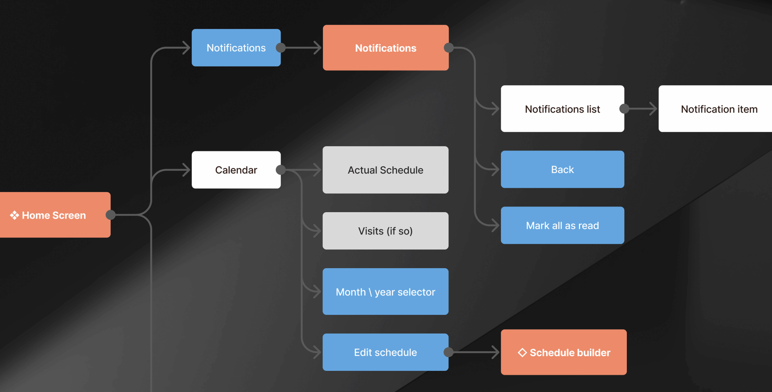
With a wealth of data in hand, we moved on to designing the app’s informational architecture. This step was crucial in ensuring that the app would be intuitive and user-friendly.
We compiled an exhaustive list of all features and content that needed to be included in the app. Conducting card sorting sessions with potential users helped us understand how they naturally organize information, which informed our structural decisions. Based on the insights from card sorting, we created a detailed map outlining the app’s hierarchical structure. This map served as the foundation for ensuring logical content organization and easy navigation.
During the informational architecture stage, we conducted four collaborative team sessions to ensure alignment with the project’s goals and vision. This phase resulted in a detailed content map and a prioritized backlog of 18 critical features to be included in the app.

We were tasked with an exciting brief to build an immersive experience that reflects the innovative nature of slope solutions. As a tech startup our goal was to build and obtain meaningful leads within the snow industry. We were tasked with an exciting brief to build an immersive experience that reflects the innovative nature of slope solutions.
Stages
- Wireframes
- Design direction
- UI Design
- Prototype
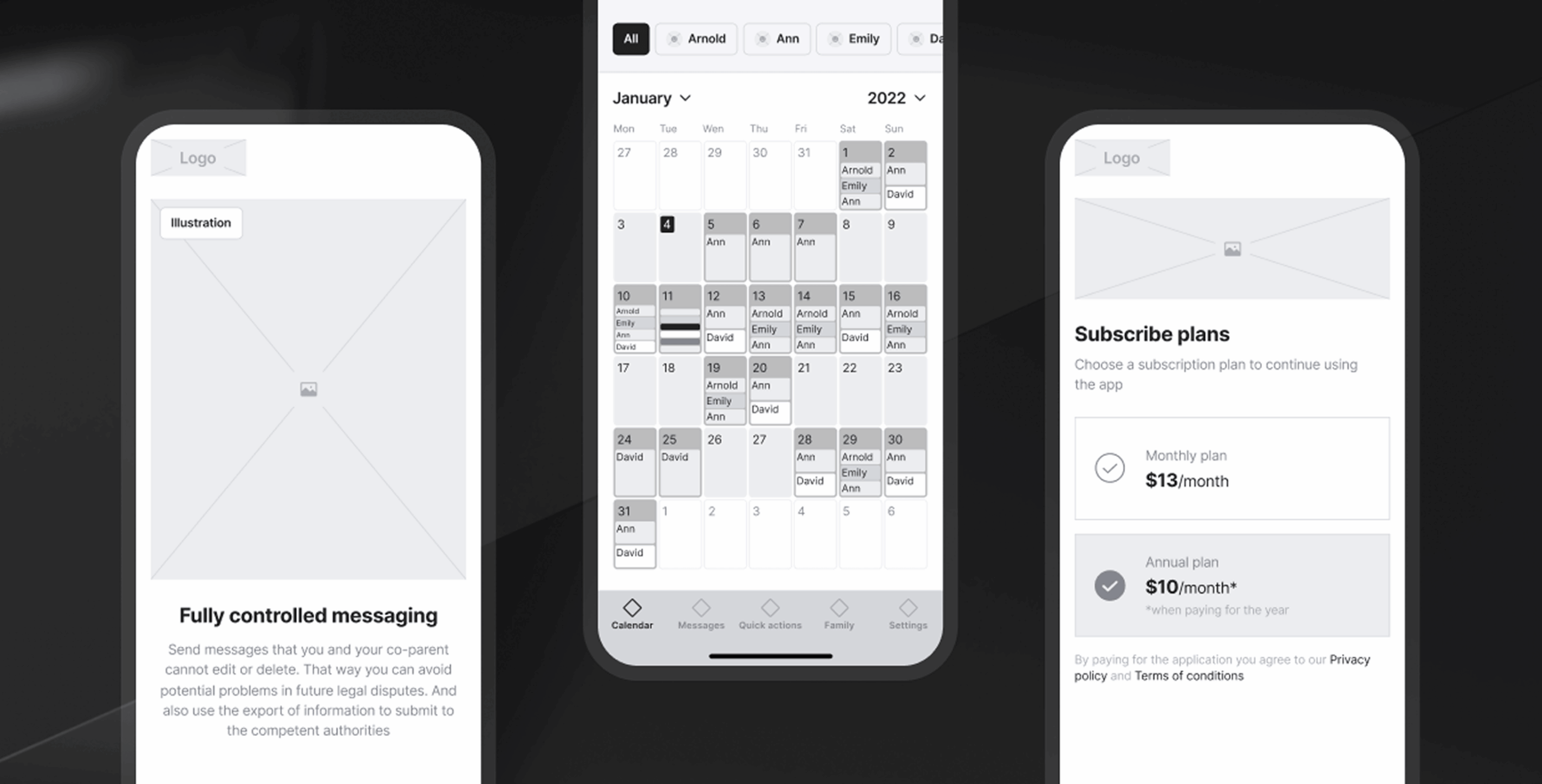
The next phase involved transforming our information architecture into tangible designs. This iterative process included several key steps. We developed high-fidelity wireframes that laid out the basic structure and layout of the app. We developed over 50 high-fidelity wireframes to define the app’s core structure and layout, providing a clear blueprint for its design and functionality.
During the this stage, we established the visual direction for the app, focusing on creating a calming, trustworthy, and approachable aesthetic tailored to co-parents. Drawing inspiration from modern, user-friendly design principles, we carefully selected colors, typography, and visual elements that reflect empathy and reliability.
The design direction was approved with the client through moodboards, and we proceeded to draw all the interface screens. This phase involved creating high-fidelity layouts that incorporated the app’s visual design and branding.
To optimize development time and resources, the design was crafted to integrate seamlessly with various platforms and third-party services. This approach ensured that the app could leverage existing technologies and minimize custom development efforts as it is a startup.
We created advanced interactive prototypes to ensure seamless functionality and provide a realistic preview of the user experience. Using them we verified final designs against user requirements and feedback to ensure all critical needs were met before proceeding to development.
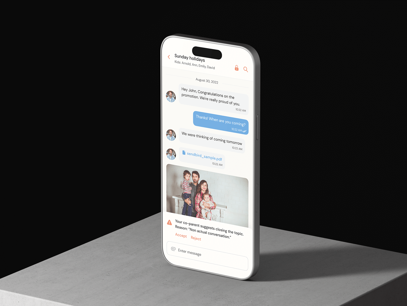
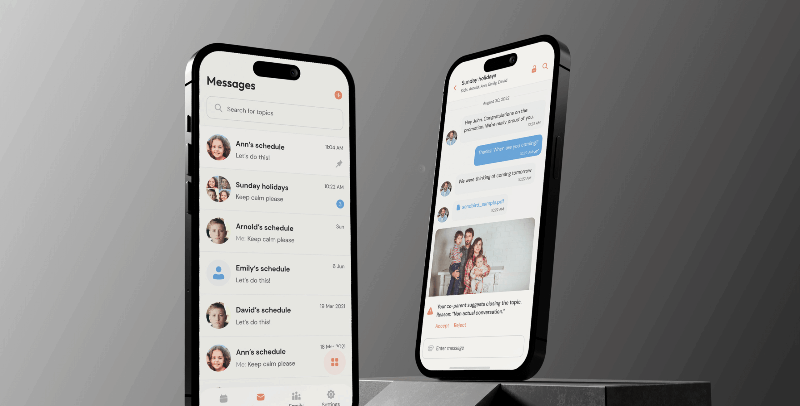
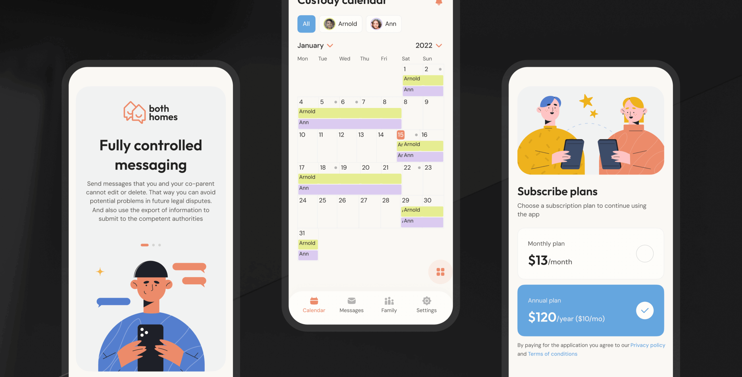
Fully controlled messaging
The messaging feature ensures that all communications between co-parents are permanent and unalterable, providing a reliable record that cannot be edited or deleted. This functionality helps prevent misunderstandings and supports accountability, particularly in scenarios involving legal disputes. Additionally, users can export message histories, enabling them to share verified information with relevant authorities when needed.
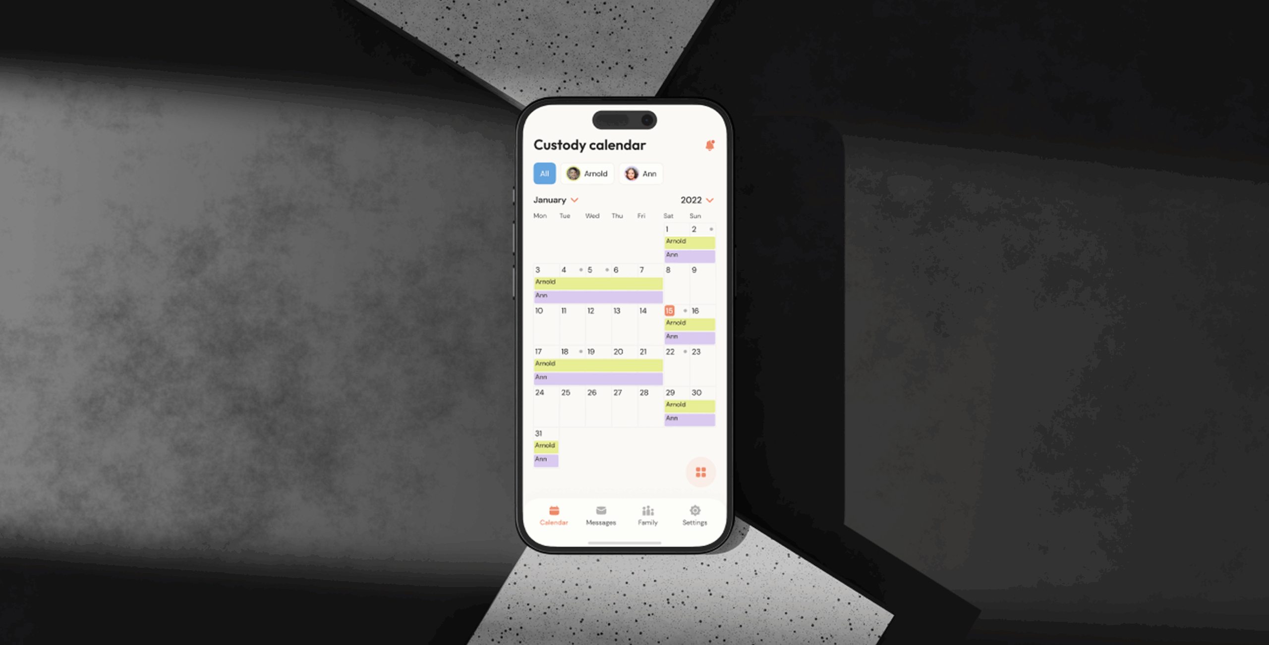
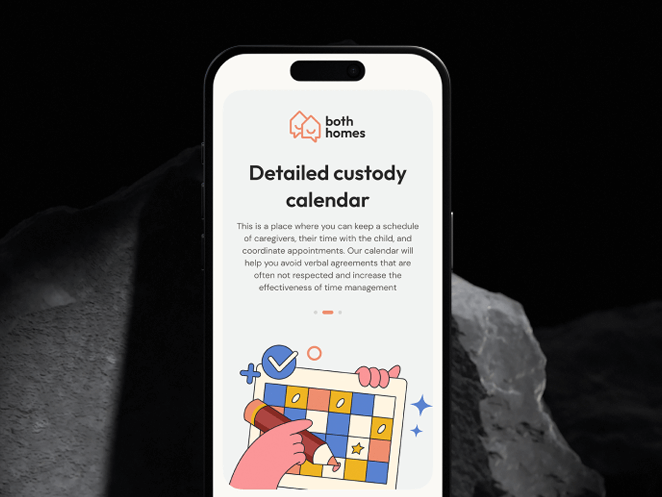
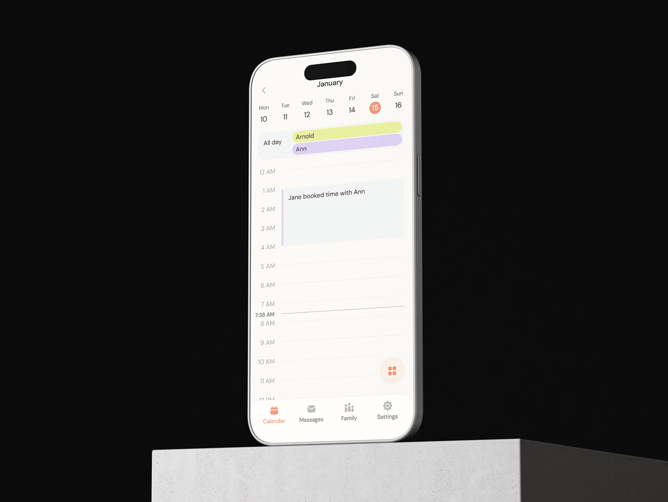
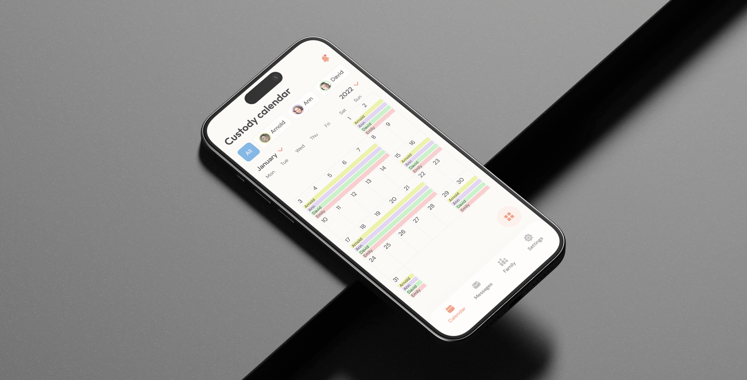
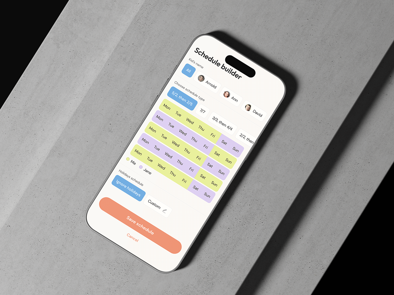
Detailed custody calendar
The app’s calendar feature allows co-parents to manage caregiver schedules, track time spent with the child, and coordinate appointments effortlessly. By providing a centralized and reliable system, the calendar reduces reliance on verbal agreements, which can often lead to misunderstandings, and enhances overall time management efficiency.
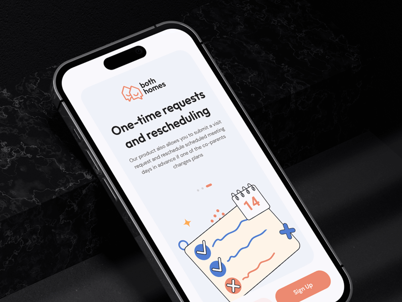
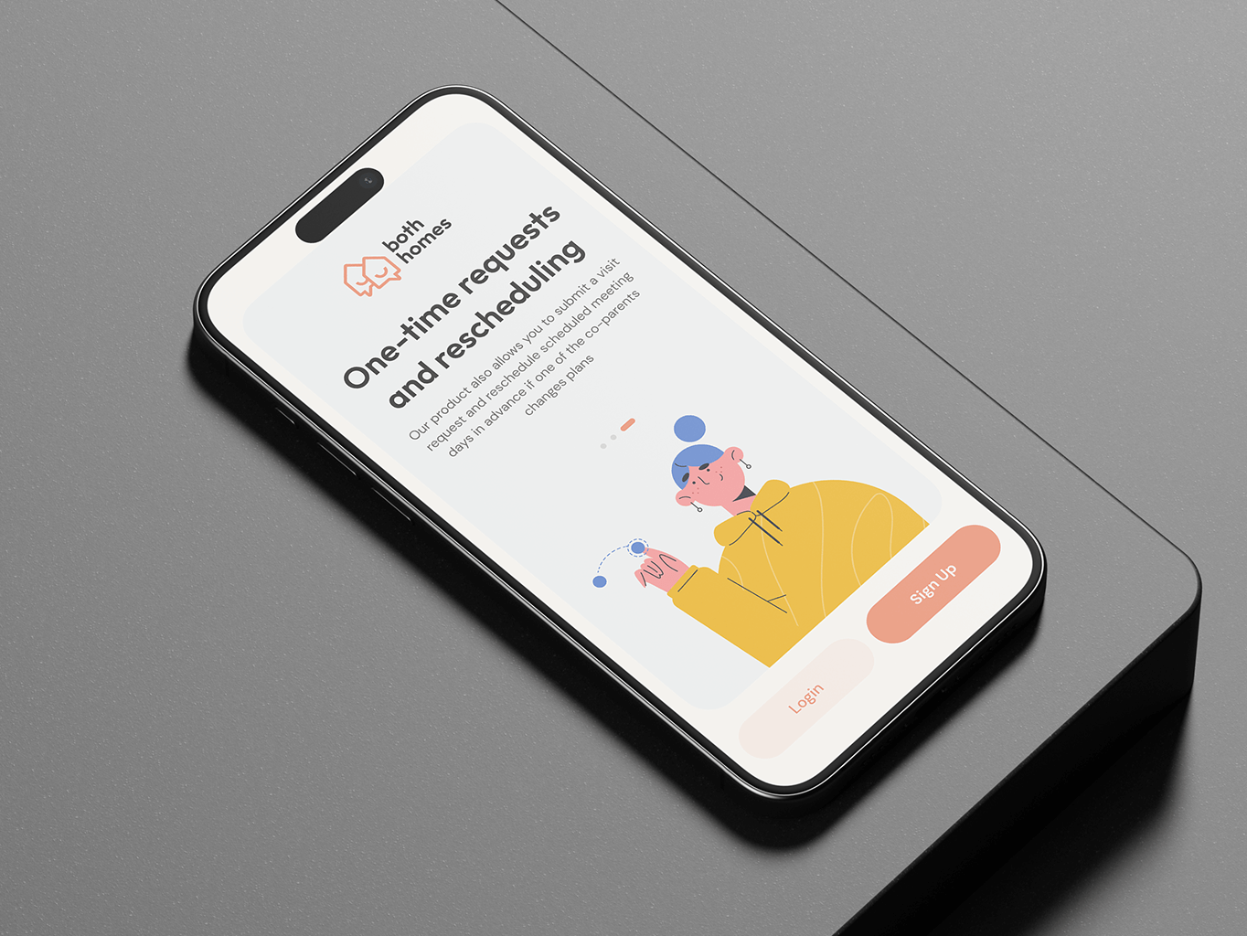
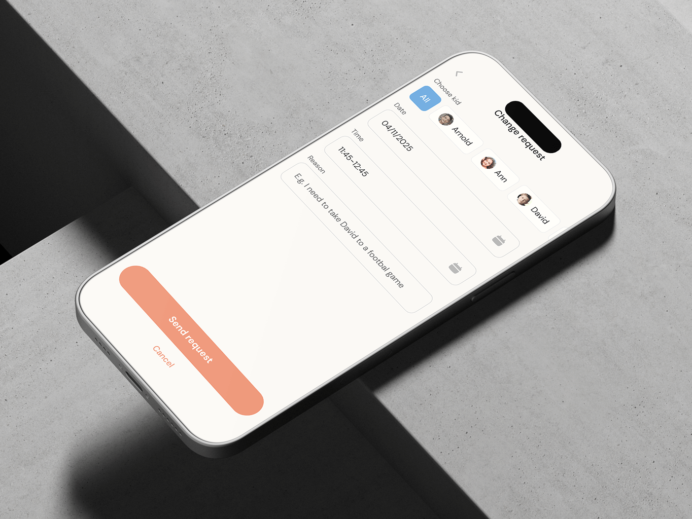
One-time requests and rescheduling
The app includes a feature for submitting visit requests and rescheduling meeting days in advance, offering flexibility when plans change. This ensures better coordination between co-parents and helps maintain a structured schedule while accommodating unforeseen adjustments.
#Mobile app design #Mobile app development
Keap, LLC
USA
USA
#Web app design #Web development
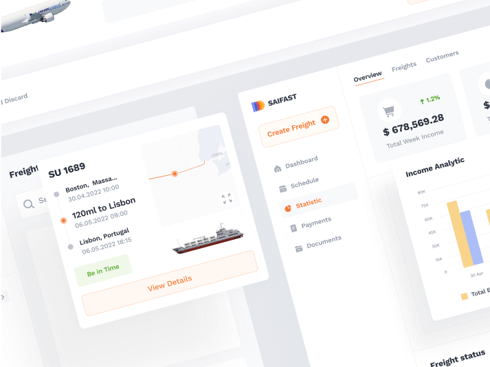
Saifast
USA
USA
#Web app design #Web development
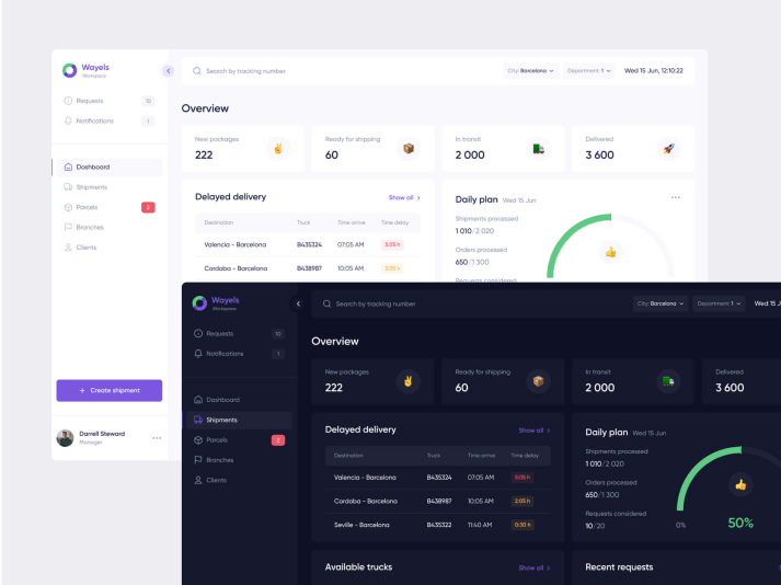
Wayels
USA
USA
Have a project in mind?
Let's chat
Have a project to
discuss?
discuss?

Have a partnership in
mind?
mind?
