Design
Development
Research
Launch
Evolve
Extend
Saifast – logistics web app
Client
Saifast
 USA
USA
USA
Services
Task
Our main task was to give Saifast employees the opportunity to manage shipments easily and intuitively. The user should be able to quickly process a freight by just providing basic information about it. Also, customers wanted to see the ability to track analytics to increase the effectiveness of the company.
Solutions
After conducting a UX analysis, we realized that the main pain point for users is too long and complicated processing of freight, as well as confusing management of freight and tracking of analytics.
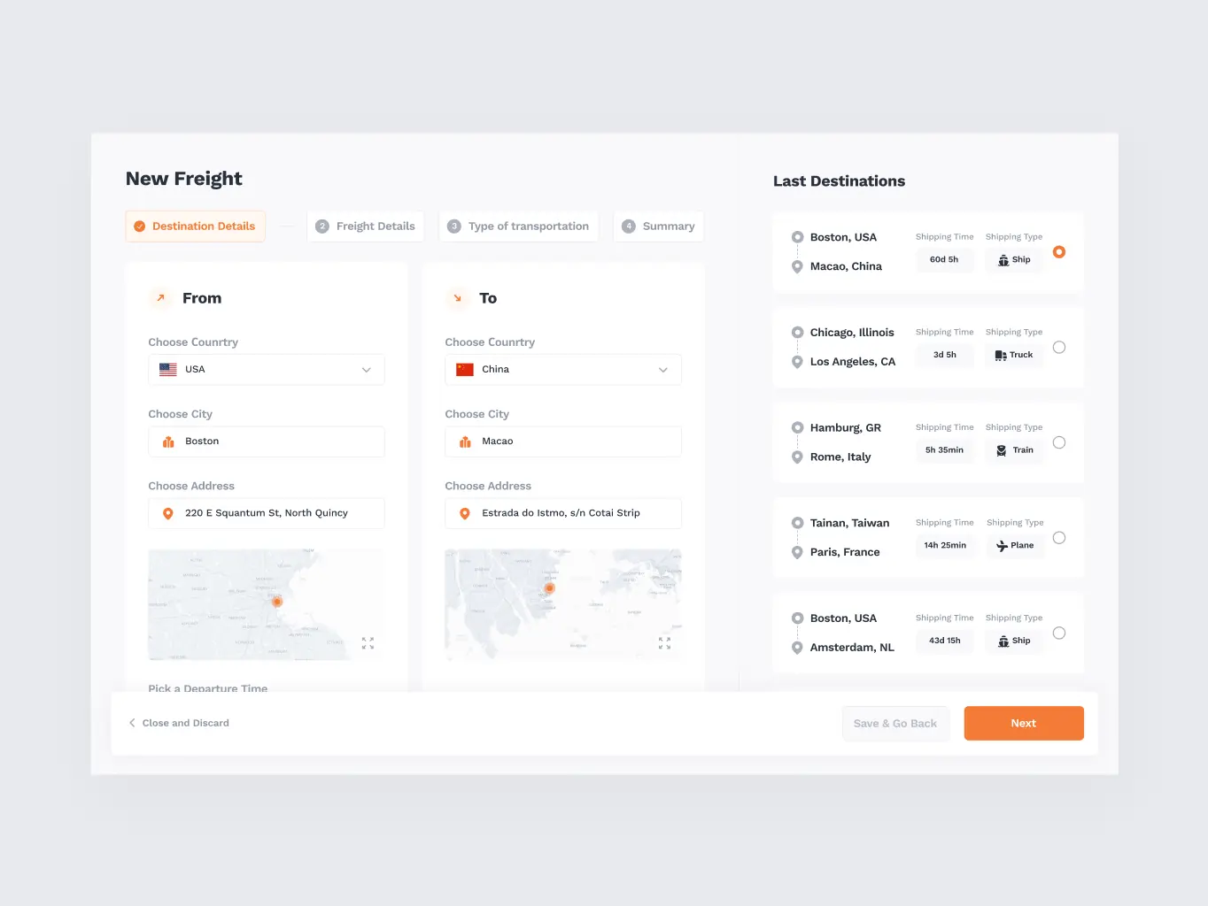
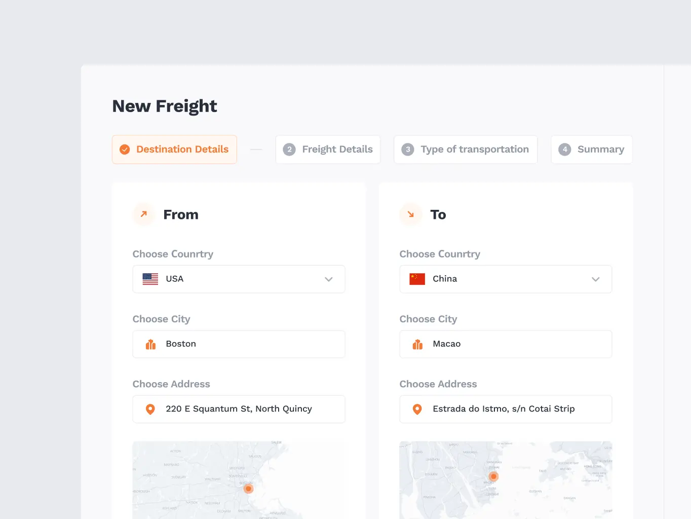
Having tested the hypotheses, we came up to the conclusion that it was necessary to simplify the processing of freight by dividing it into 3 steps:
- Information about the place of shipment and destination, where the last routes will be offered.
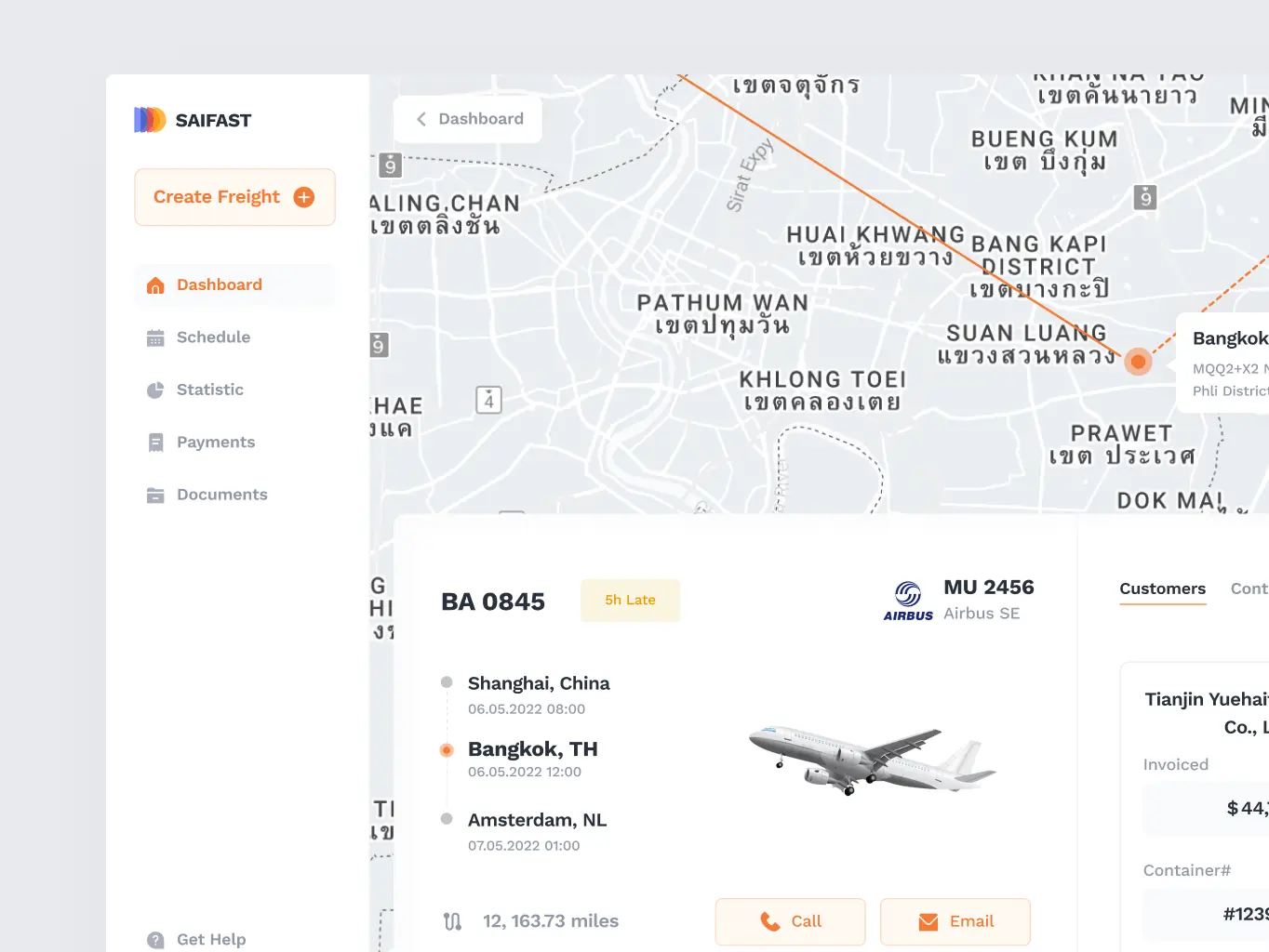
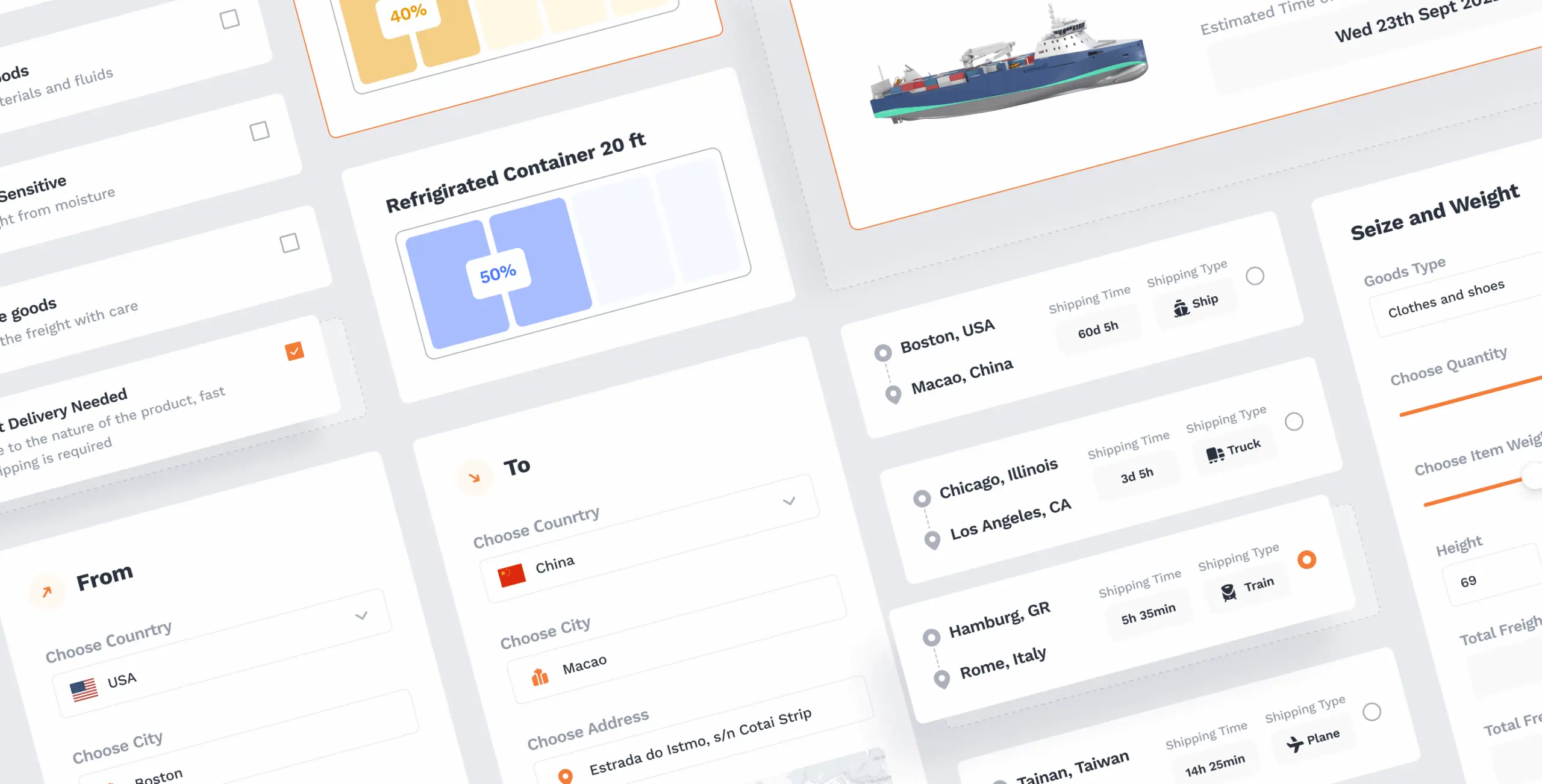
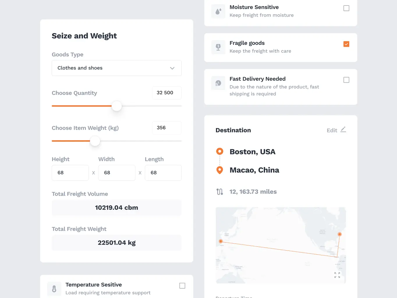
- Information about the size and weight of the freight and then selecting a container with a suggestion of the optimal container for that particular freight.
- Type of transportation.
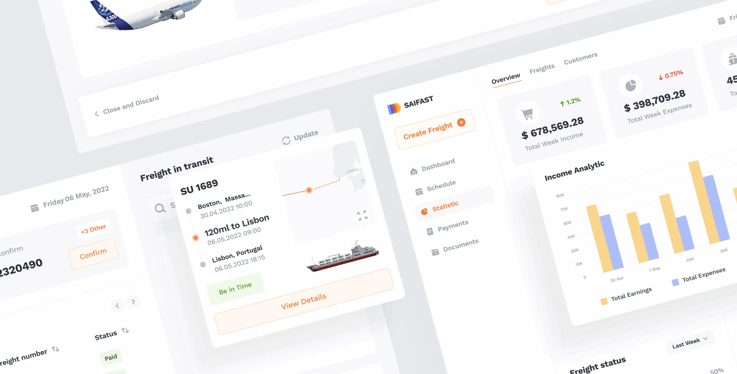
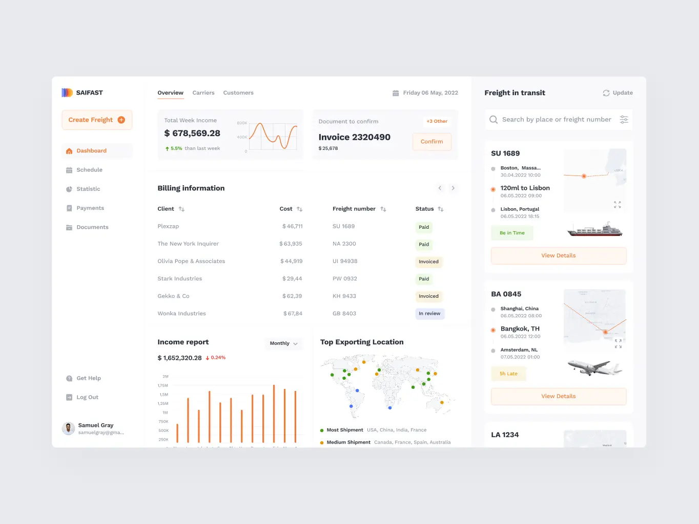
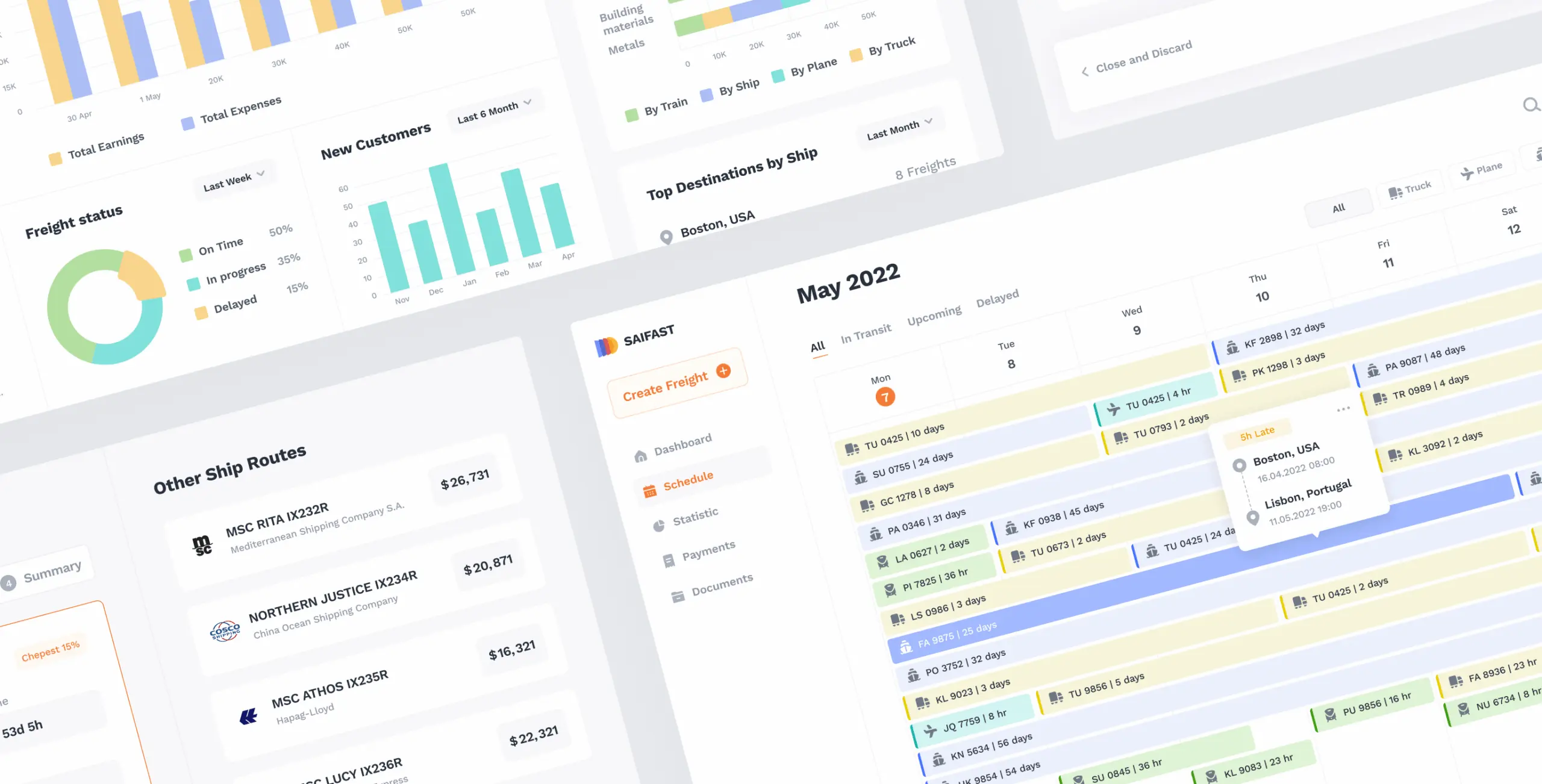
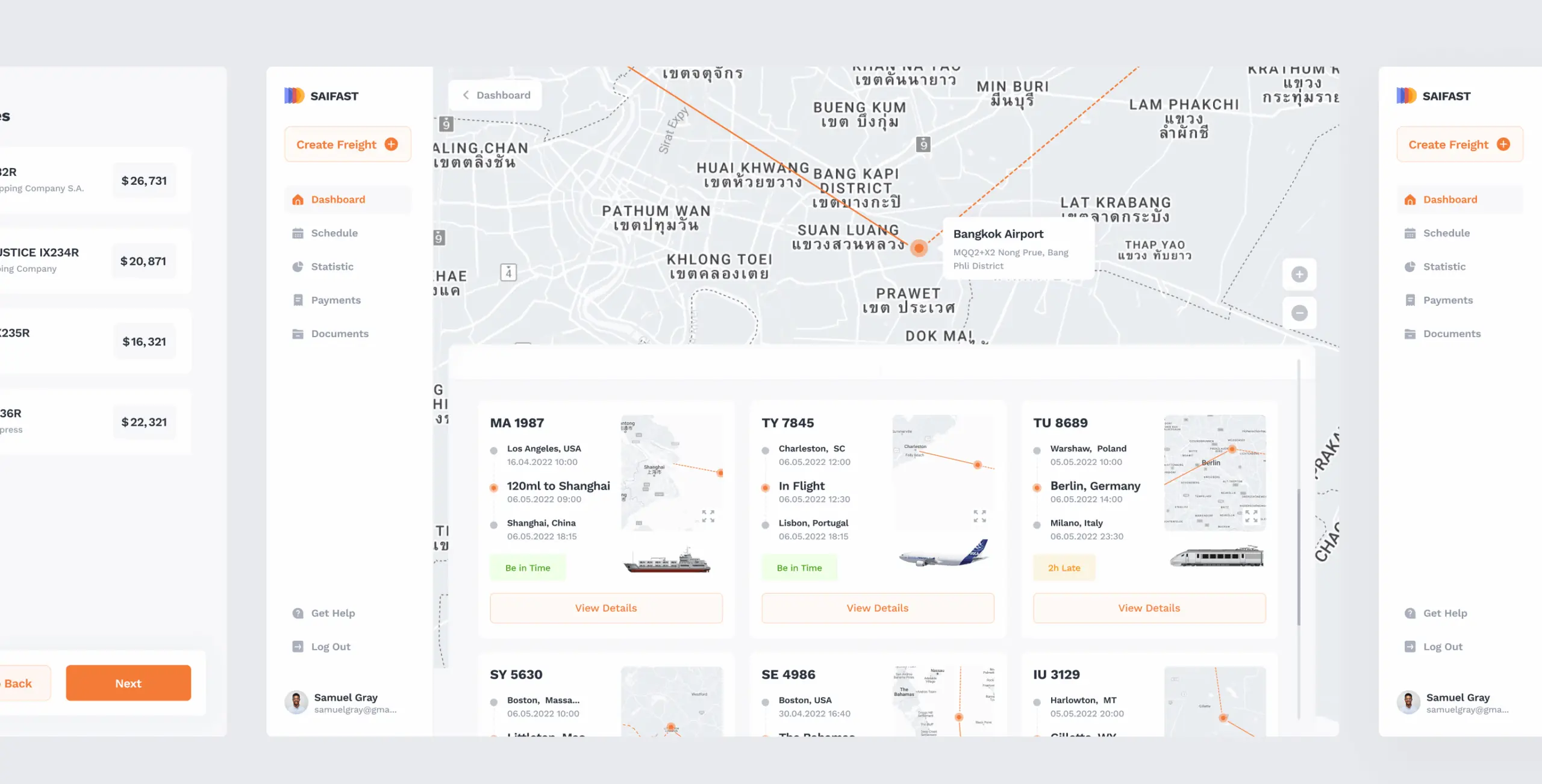
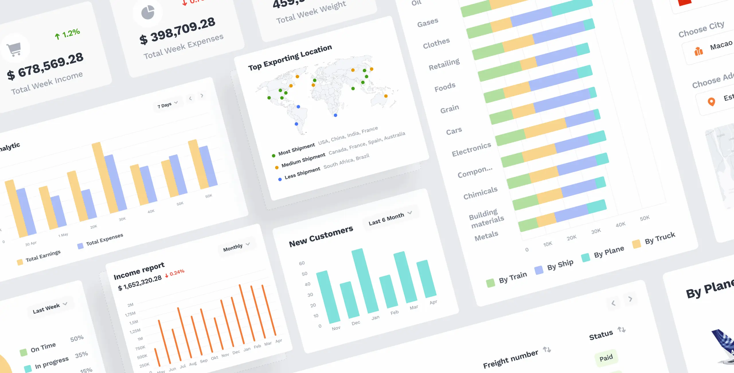
We decided that the management and tracking of the shipments should be as accessible as possible, so all shipments in transit are available on the Dashboard. We also put the main analytics on the Dashboard – now all the main summaries with charts are available on the main screen.
UX -research
We started with a SWOT analysis and analysis of the current platform, identified opportunities and threats, and discovered the strengths and weaknesses of the platform. As a result, we generated a list of hypotheses for improvement. The main problem was that the platform was too complex and confusing, the interface was overloaded, and it was hard to find the information we needed. As a result, the user wasted a lot of time and efficiency was reduced.
To gain a deeper understanding of the system and the problems faced by the user, we conducted user interviews, which helped us learn the thoughts of Saifast employees when interacting with the platform. We checked the hypotheses we identified earlier, as well as determined what details to consider when designing the interface.
Information Architecture
When we just started to design, we worked out an Informational Architecture of the whole service. It’s a simple way to look at the project with the bird-eye. Working with the IA, we reduced the number of screens and simplified user flows.
UI Design and Prototyping
The complexity of interacting with the platform also consisted in the lack of a clean and modern UI, with intelligently placed accents. We added graphical elements: icons, illustrations, and maps to enhance user perception.
We prepared a clickable prototype that we’ve tested on users. They gave us some great insightes and we reworked some features.
#Web app design #Web development
Wayels
USA
USA
Have a project in mind?
Let's chat
Have a project to
discuss?
discuss?

Have a partnership in
mind?
mind?
