Development
Research
Client
Blueheart
 UK
UK
UK
The client approached us with a clear goal — to redesign the app to make it more intuitive, supportive, and engaging. They needed a mobile-first experience that would reduce user drop-off, increase therapy completion rates, and feel safe for users dealing with sensitive, emotional issues.
Our role was to rethink the product structure, improve the user journey across different therapy modes, and craft a visual language that inspires trust and calm from the first interaction.

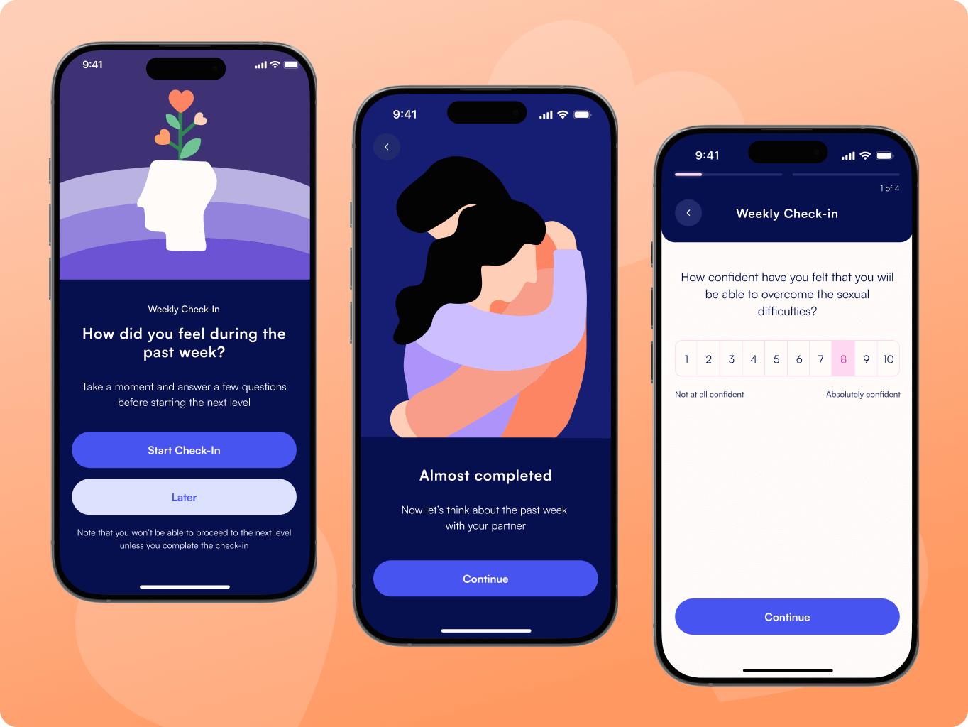
Before making any visual decisions, we ran an audit and dove deep into user behavior, motivations, and blockers. We analyzed app reviews and session data to understand what users needed, what frustrated them, and what held them back.
This insight helped us rethink the structure, improve clarity, and design flows that better match real emotional and relationship journeys.
Stages
- User flow
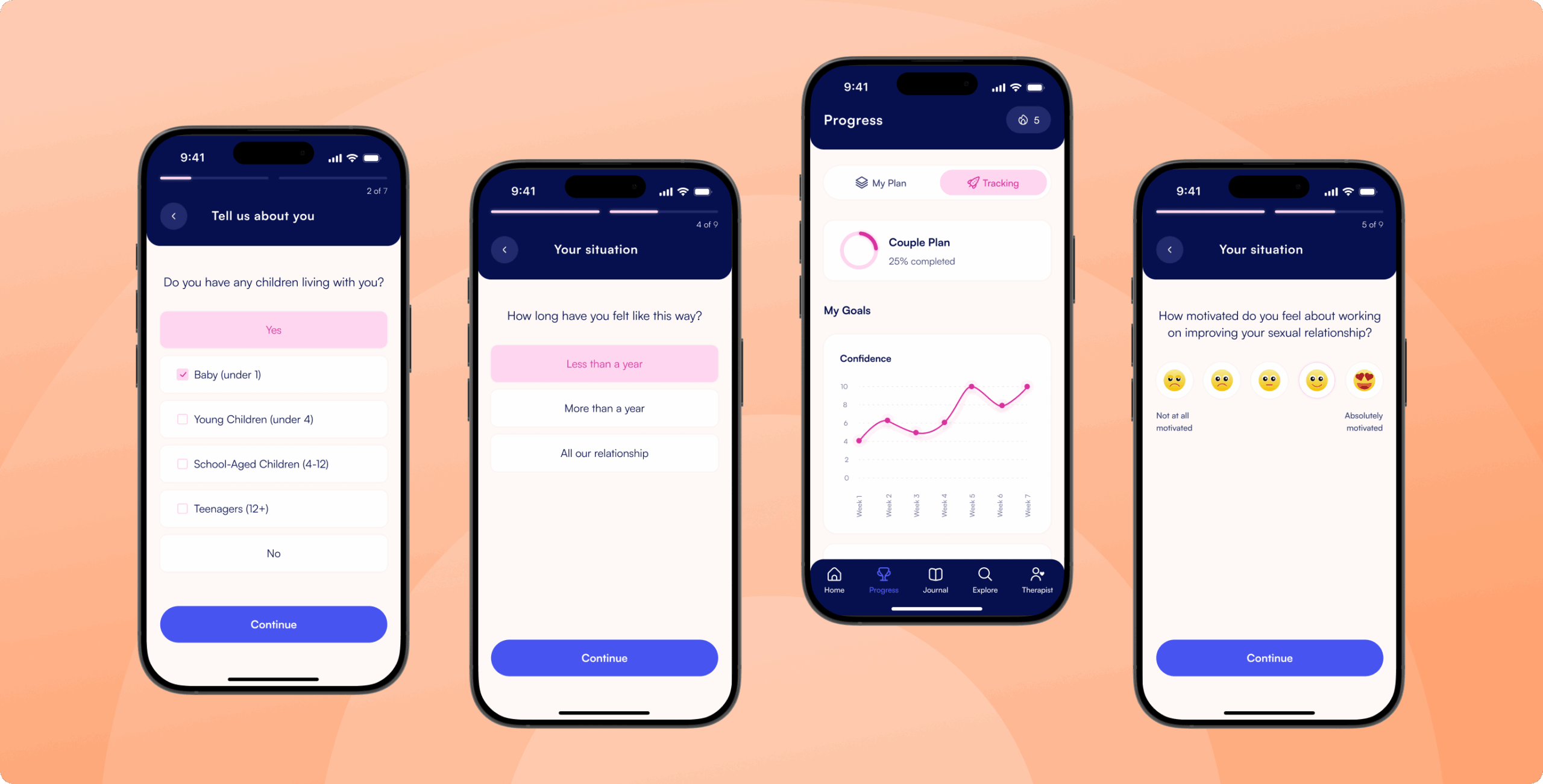
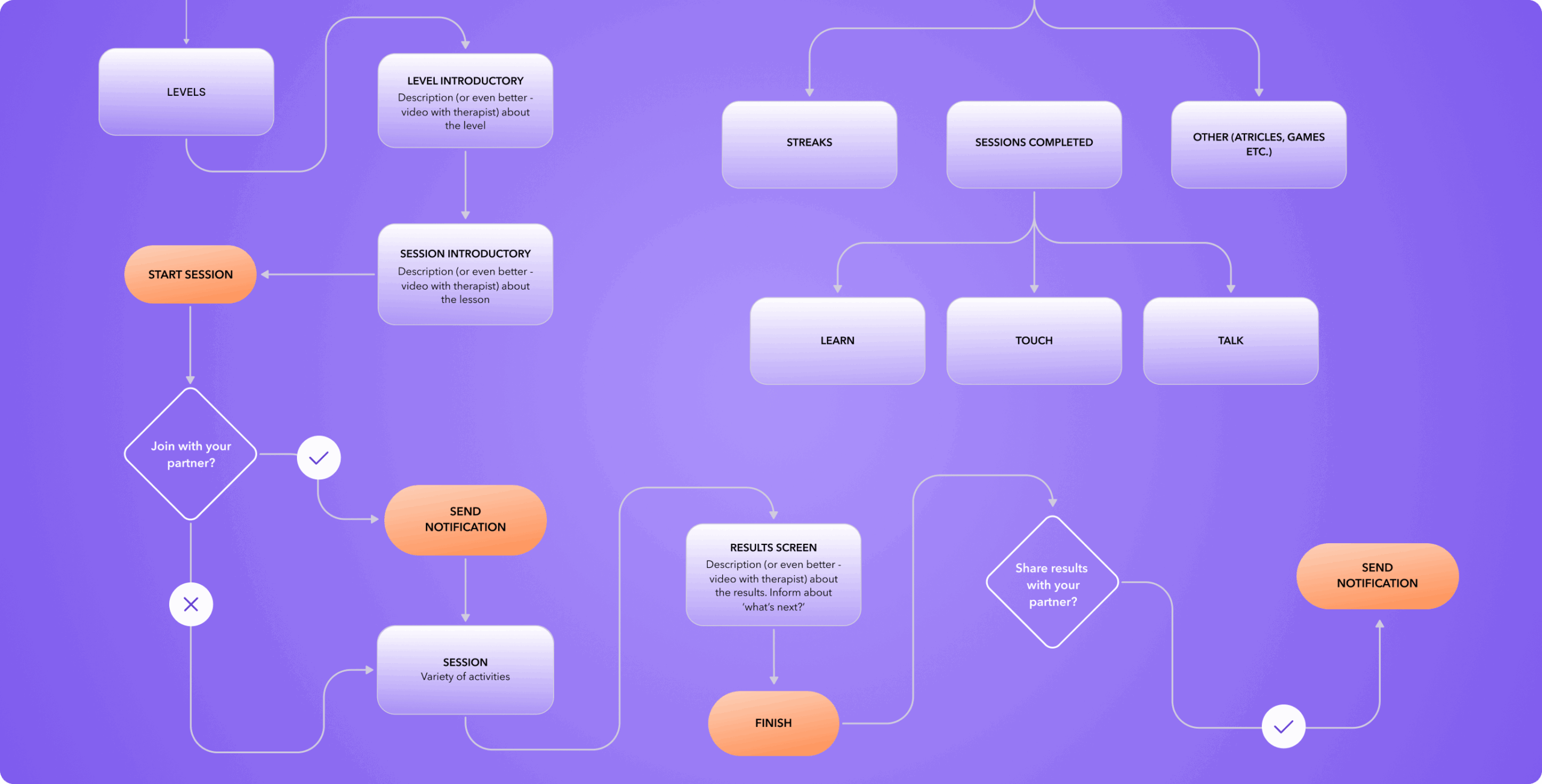
We developed a user flow that guides individuals and couples through therapy sessions in a structured yet flexible way. The flow starts with clear onboarding, then adapts based on whether the user continues alone or with a partner, allowing for easy coordination and re-entry at any stage.
Special attention was given to emotional pacing and decision points, such as whether to invite a partner or share results. Each step, including learning, activity, and reflection, was designed to feel natural and supportive while aligning with the emotional goals of the app and avoiding friction or confusion.
We started with wireframes to map out core flows and define how users would move through the app. This step helped us focus on structure and usability without being distracted by visuals.
Once the foundation was set, we created moodboards and concept directions to define the emotional tone. After aligning with the client, we applied this visual language to the interface, focusing on calm colors, soft typography, and thoughtful interactions that support a personal and sensitive journey.
Stages
- Wireframes
- Design Direction
- UI Design
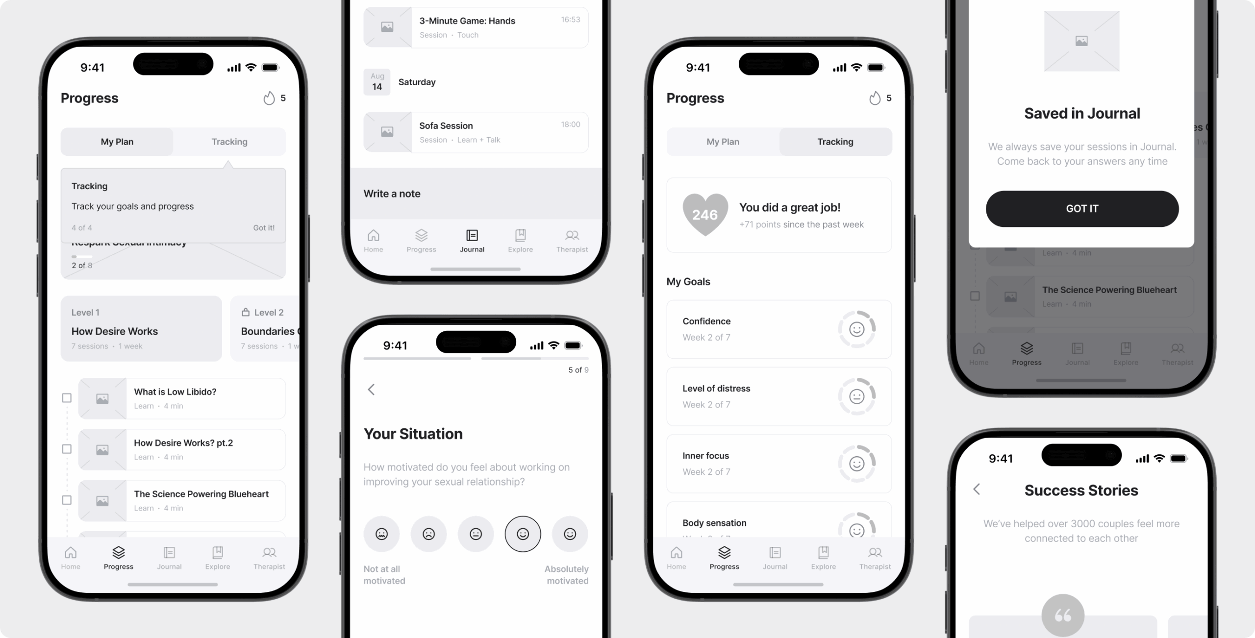
Our wireframing phase focused on clarity and structure. We explored over 60 screens to define the full user journey across both therapy modes, covering onboarding, session flow, progress tracking, and therapist interaction.
Each screen was stripped of visual styling to keep the focus on logic, usability, and user needs. This allowed us to test and iterate quickly, ensuring that every interaction made sense before investing in final visuals.
We developed several moodboard directions to explore the right balance between trust, warmth, and privacy. Together with the client, we selected a calm and minimalist visual style that avoided clinical tones but still felt credible and safe.
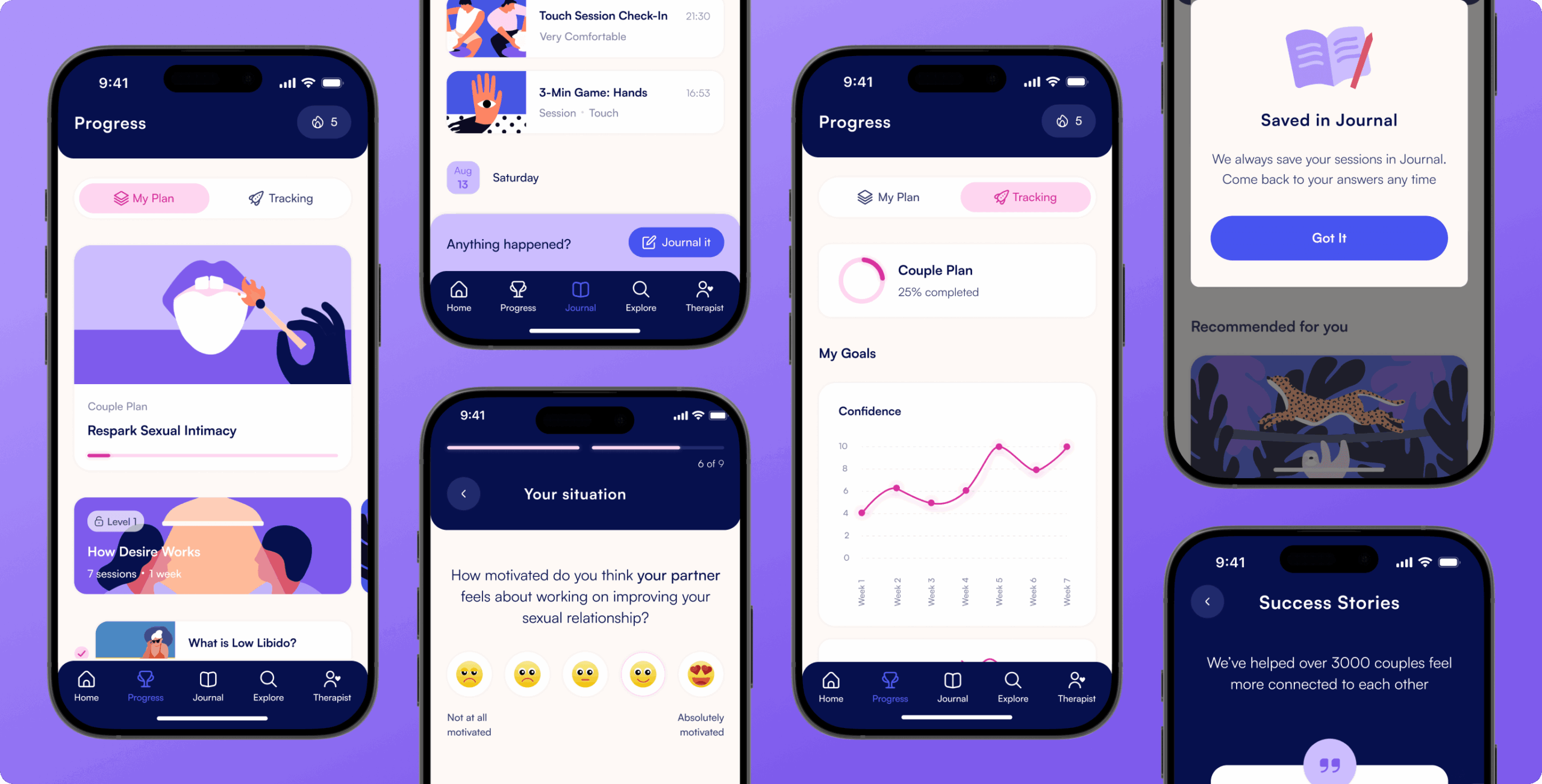
This direction shaped the design concept. We used soft gradients, rounded elements, and a muted color palette to reduce pressure and anxiety. The visual choices were guided by one goal — to help users feel supported and in control from the very first screen.
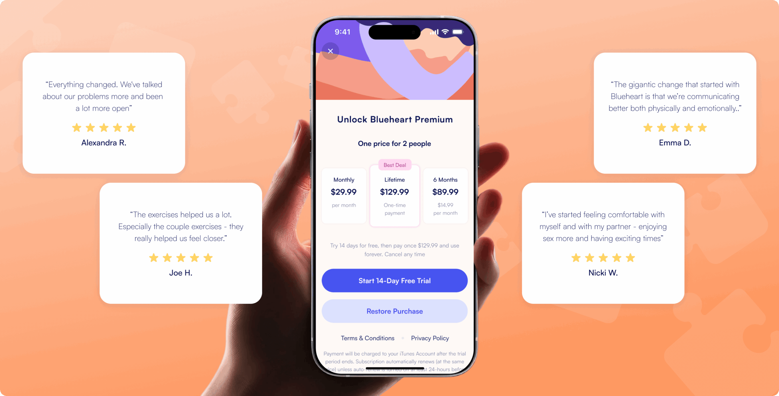
We created a calm, distraction-free interface using soft colors, clean typography, and generous spacing. This helped users stay focused on their emotional work.
One of the most complex challenges was designing the adaptive therapy flow for solo and partner modes. It took several rounds of iteration and close collaboration with the client to make sure the navigation worked smoothly in different relationship contexts. By prototyping and testing edge cases early, we arrived at a structure that offered flexibility without adding complexity, giving users full control of their journey.
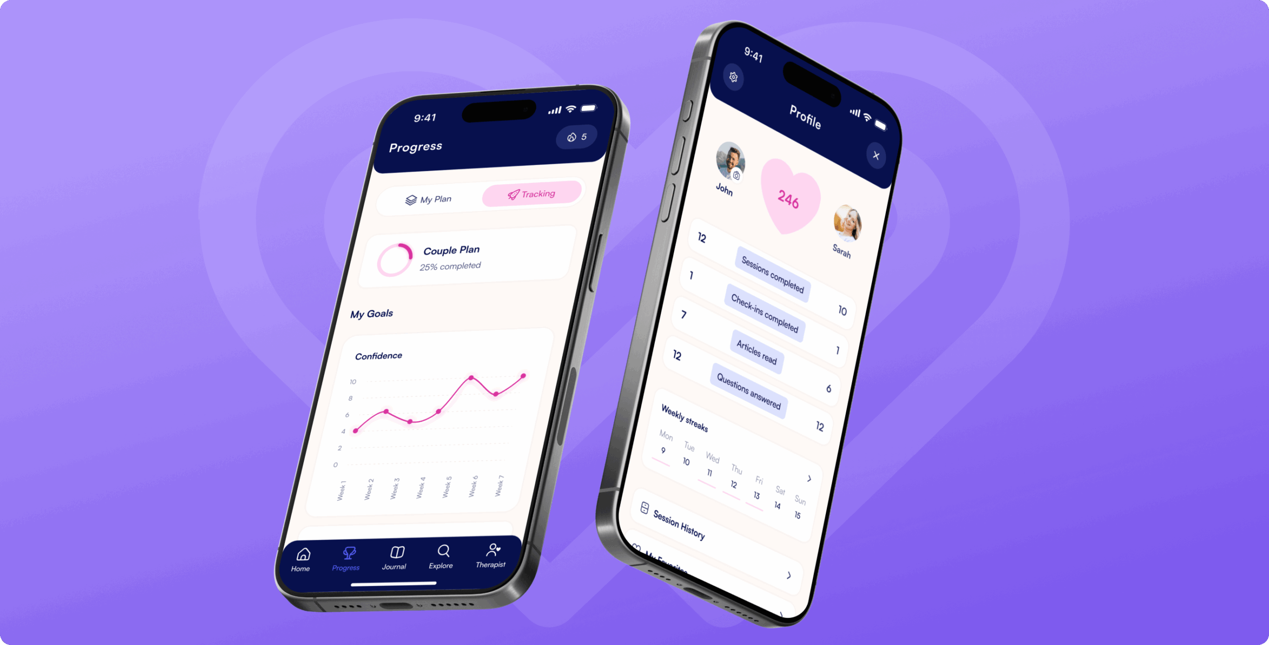
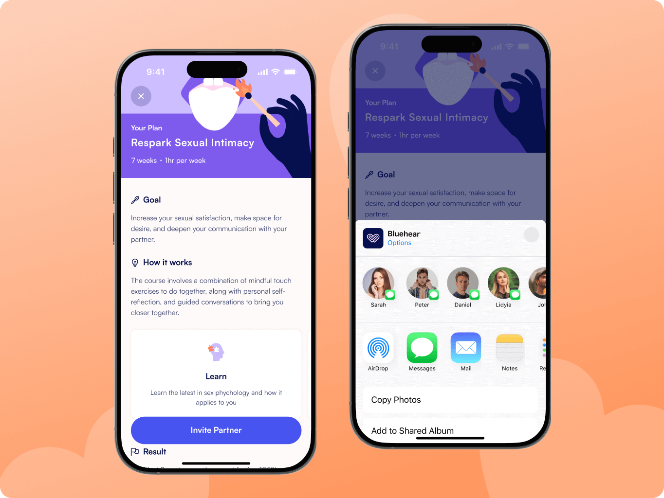
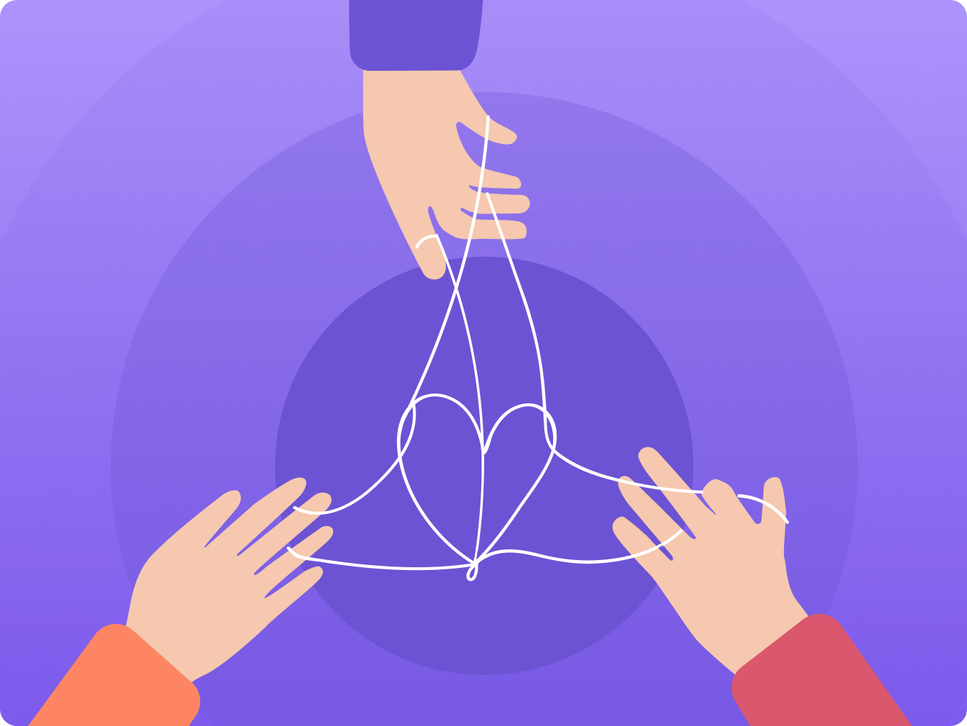
Solo and partner therapy modes
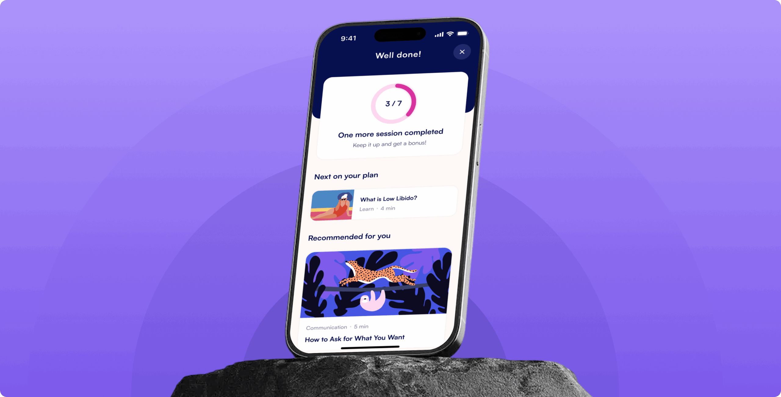
We designed two separate therapy plans to support both individual users and couples. This flexibility allows people to start alone, invite a partner later, or complete the journey together—depending on what feels right.
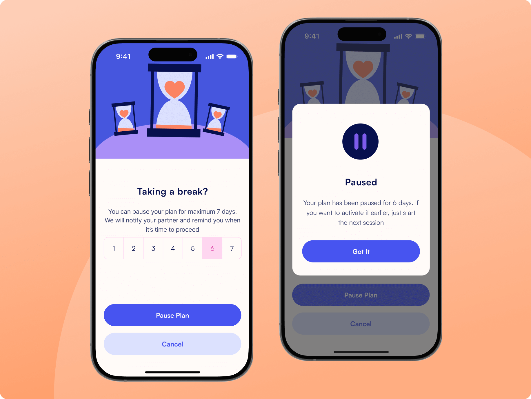
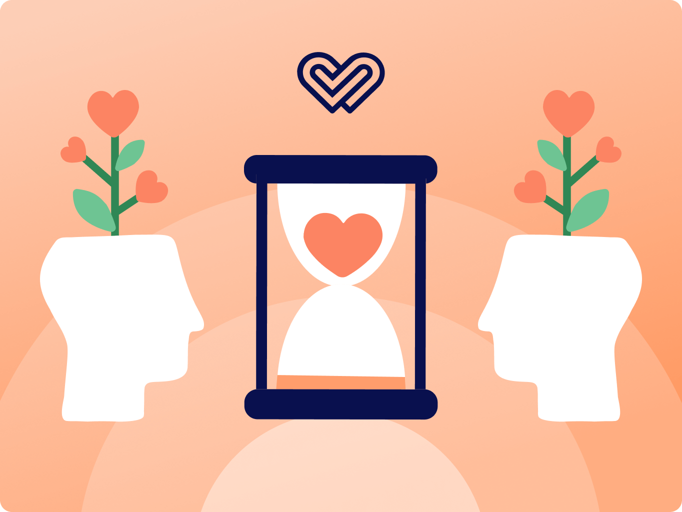
Pause when you need to
Life isn’t always predictable. That’s why we added a feature that lets users pause their plan for up to 7 days. Whether it’s travel, stress, or a need for a break, users can step away without losing progress.
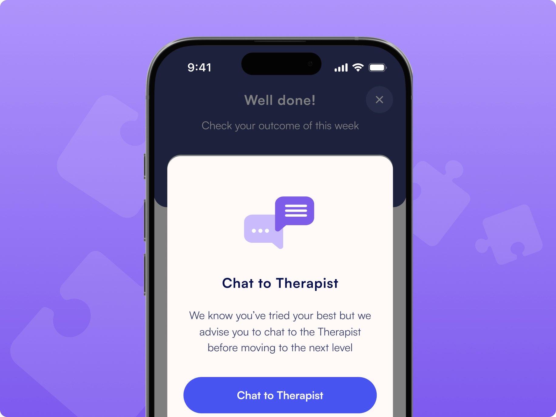
In-app therapist access
We added a feature that allows users to chat with a therapist directly within the app. This gives them a way to ask sensitive questions and receive professional guidance without leaving the experience.
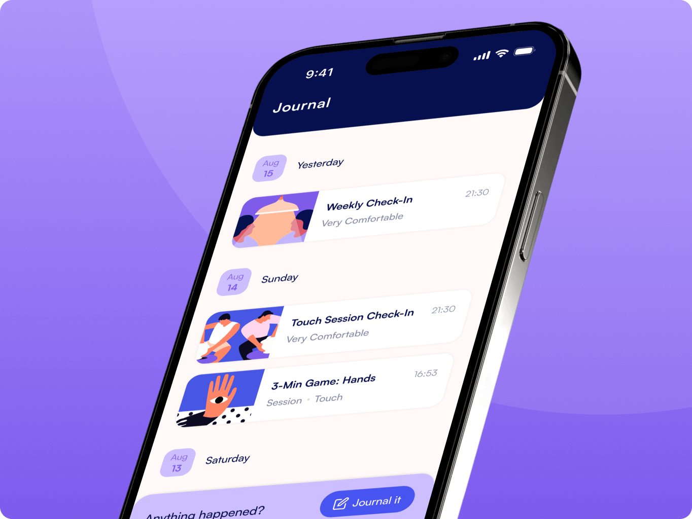
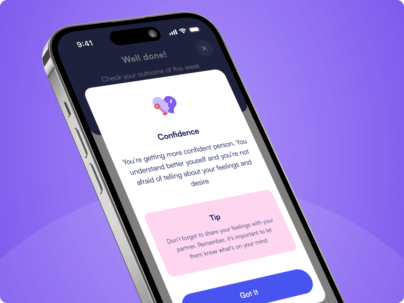
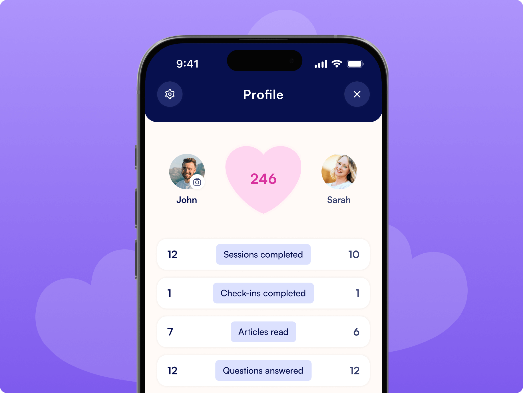
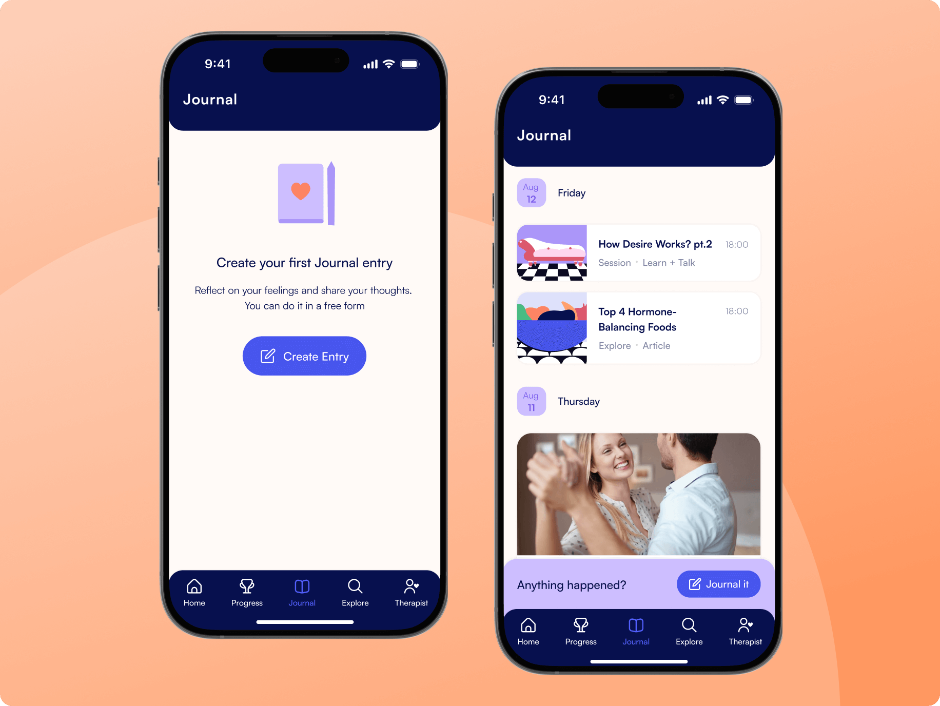
Journal to reflect, freely and privately
We introduced a private in-app journal where users can reflect on their thoughts, emotions, and experiences throughout the therapy process. Each entry is saved securely and can be revisited at any time, helping users track progress and notice patterns over time.
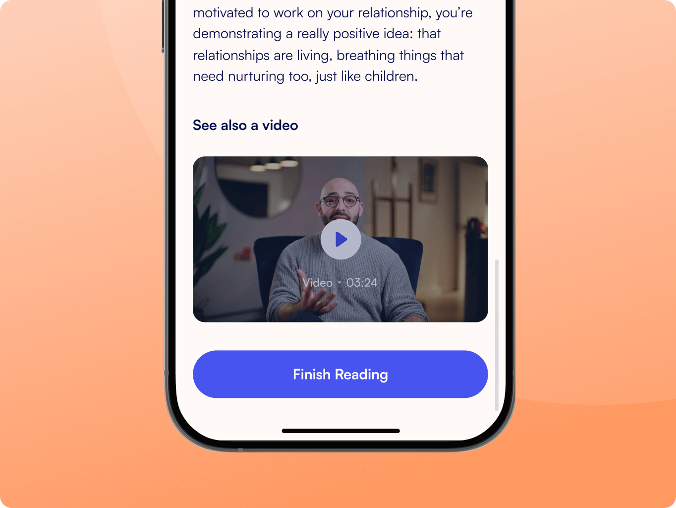
We created custom 2D and 3D illustrations to reflect the emotional nature of the experience. Each visual was designed to feel personal, soft, and inclusive — avoiding stereotypes or medical imagery.
The illustrations helped convey key ideas without using heavy language. They added warmth to the interface, highlighted important steps, and made the app feel more human. This visual layer reinforced the safe and non-judgmental tone of the entire product.
After finalizing the design, we handed over detailed UI files, design specs, and illustration assets to the client’s development team. Our role shifted to design support — we reviewed builds, answered implementation questions, and ensured the final product matched the approved vision.
Blueheart continues to evolve, and we’re proud that our work laid a clear, scalable foundation for future updates. The app is already helping thousands of users feel more confident, connected, and supported in their personal journeys.

#branding
Twinkle
 United States
United States

#branding
MIRA Systems
 UK
UK
UK

#Web app design
Taitor
 UAE
UAE
UAE
Have a project in mind?
Let's chat
Have a project to
discuss?
discuss?

Have a partnership in
mind?
mind?
