Design
Development
Research
Launch
Evolve
Extend
AIRES – AI-powered CRM for real estate
Client
AIRES
 Canada
Canada
Services
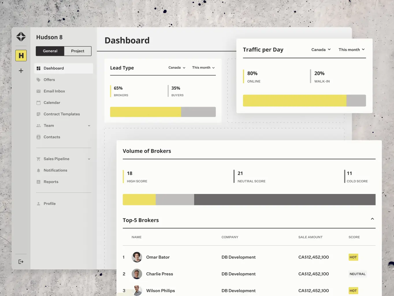
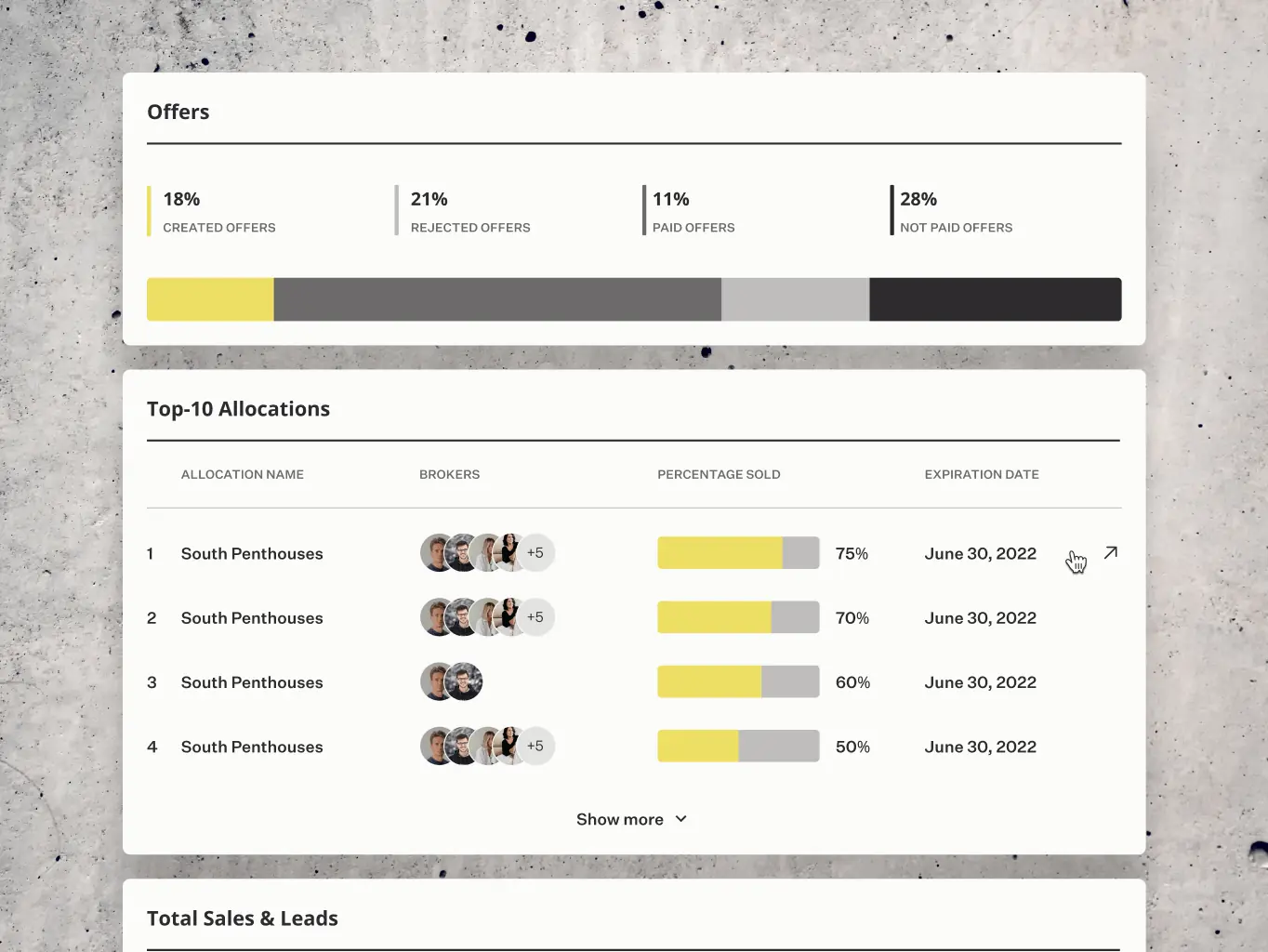
The core challenge was designing an interface that could hold a lot of data and analytics without becoming hard to use. The platform needed to work for three different people: construction developers creating projects and allocating them to brokers, brokers closing deals, and sales managers walking customers through available buildings and apartments.
Our role
We handled the full process for AIRES — wireframing, high-fidelity design, and development — with the central challenge being an interface that could display a large volume of data without becoming difficult to use.
The platform serves three different roles: construction developers creating and allocating projects, brokers closing deals, and sales managers presenting properties to clients. Getting the layouts and navigation right for all three without overcomplicating any of them was where most of the design work happened.
The research phase was where we figured out what the platform actually needed to do. We worked through the workflows and pain points of each user group — developers, brokers, and sales managers — and used that to set the feature priorities and define the structure before anything got designed.
Stages
- User Personas
- RICE Prioritization
- App Map
We built user personas for the three main groups — developers, brokers, and sales managers — mapping out their goals, pain points, and day-to-day workflows. Having those clearly defined meant design decisions had something concrete to check against, rather than drifting toward whatever seemed reasonable in the moment.
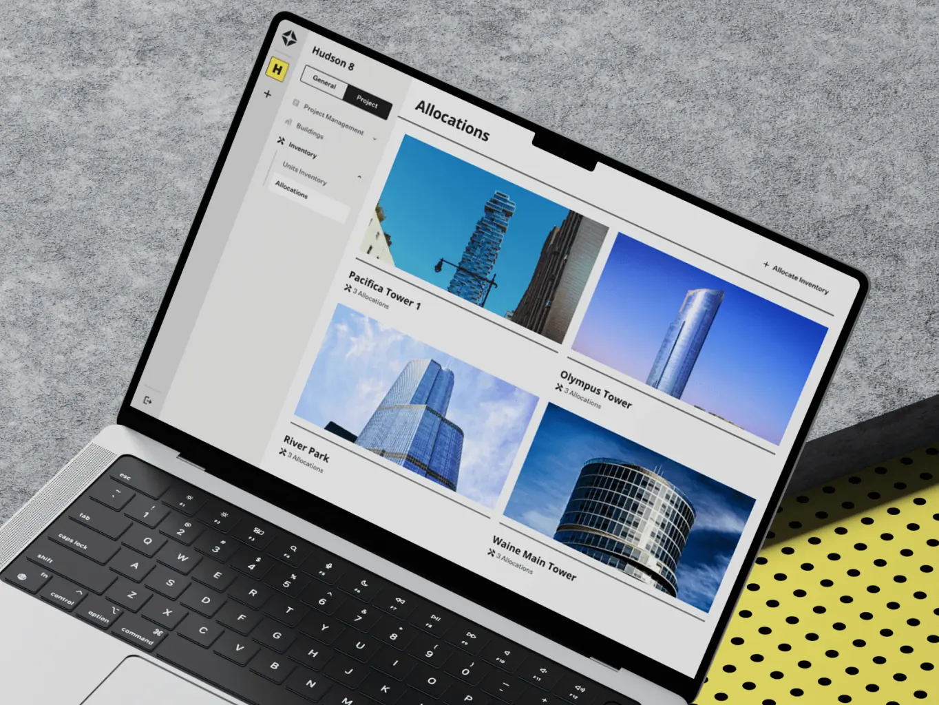
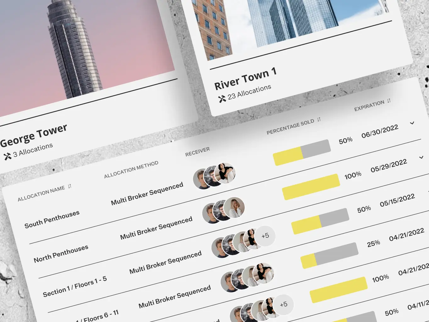
We used the RICE framework to work out which features to build first. Project creation, inventory allocation, adding brokers and sales reps, and managing unit sales and reservations came out on top. Those formed the core of the platform — enough to cover what every user needed without the scope creeping into features that would complicate things before the basics were solid.

The app map laid out the full structure of the platform — navigation flows, feature relationships, and how everything connected. It kept the logic visible throughout design and development, so decisions about where things lived and how users moved between them had something concrete to refer back to rather than being relitigated at every stage.
The design phase ran from wireframes to interactive prototypes, with three different user types to design for — construction developers, brokers, and sales managers — each with their own workflows and priorities.
The challenge throughout was keeping the interface clear and usable while the underlying functionality stayed complex. Layouts, visual style, and interactions all had to pull in the same direction to make that work.
Stages
- Wireframes
- Design direction
- Mockups design
- Interactive prototyping

We started with mid-fidelity wireframes to get the structure right before worrying about how anything looked. The focus was on mapping user flows for the core tasks — project creation, inventory allocation, and unit reservation — and making sure the navigation made sense for all three user types before anything got built.
The design concept took its cues from architecture magazines and classic graphic design — clean, structured, and deliberate. That aesthetic suited a platform carrying this much data; it needed to feel considered rather than busy. A carefully chosen color palette, refined typography, and a clear visual hierarchy kept the interface from feeling cluttered without stripping out the information density that made it useful.
The UI design phase turned the concept into something tangible. The aesthetic carried through from the earlier direction — structured and considered, with references to architectural publications that gave it a sense of craft without tipping into decorative. Custom icons, charts, and interactive components were designed to fit that style, so the data-heavy parts of the interface felt deliberate rather than just dense.
We built interactive prototypes to test the designs against real use before anything got developed. Navigation, animations, and transitions were the main things under scrutiny — the parts that are hard to judge from a static screen.
Feedback from those tests shaped the final adjustments, catching issues that would have been considerably harder to fix once development was underway.
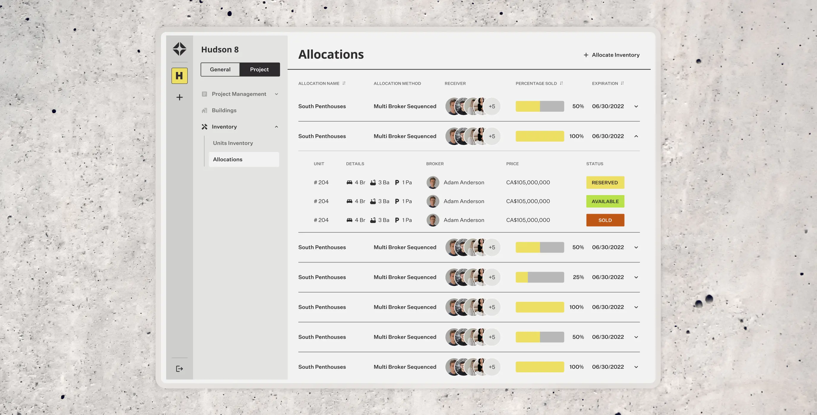
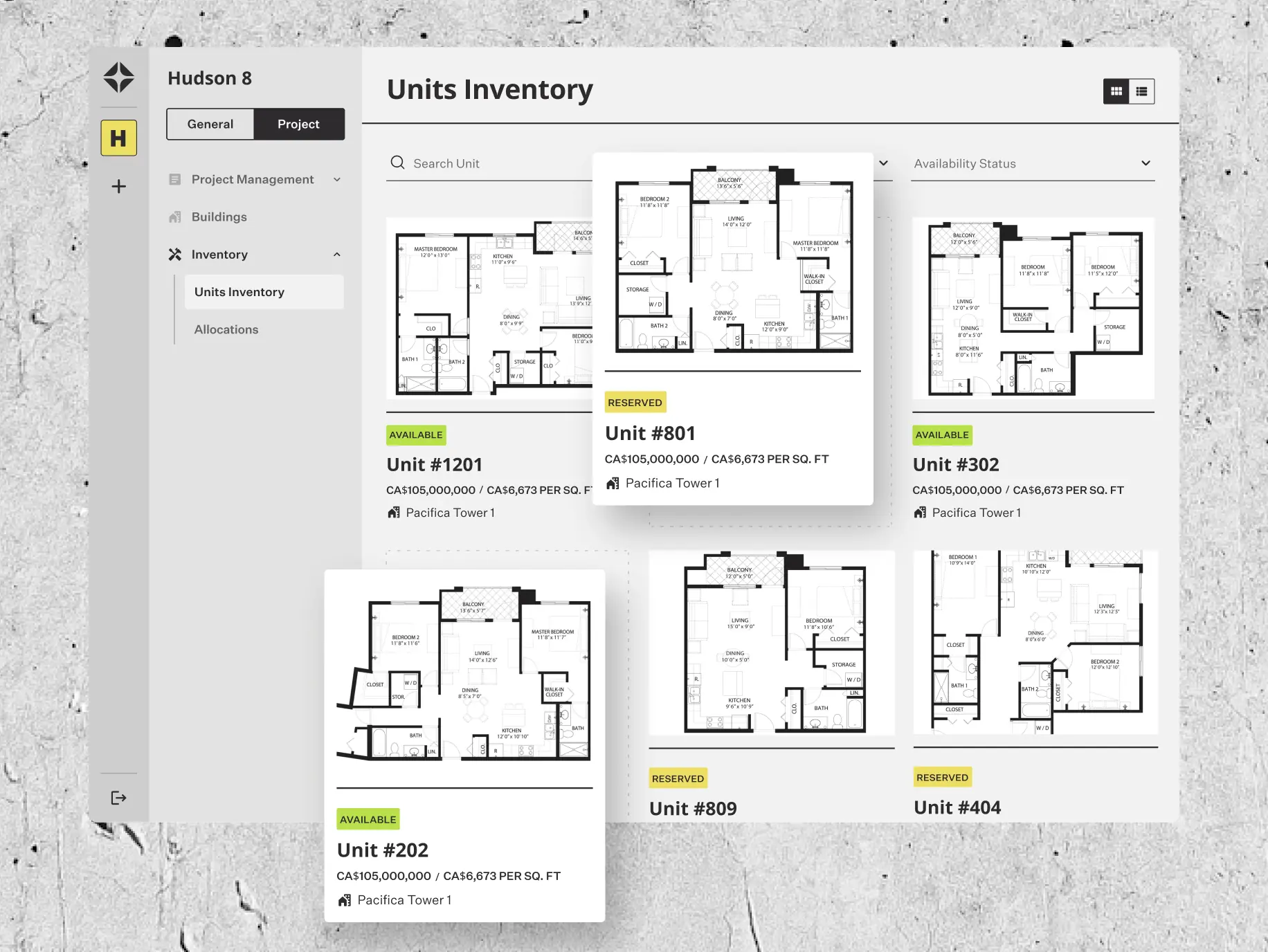
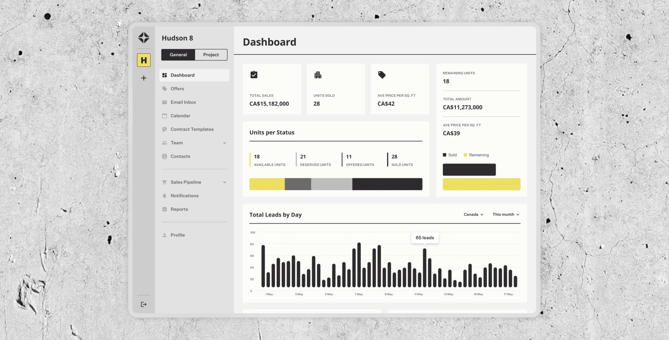
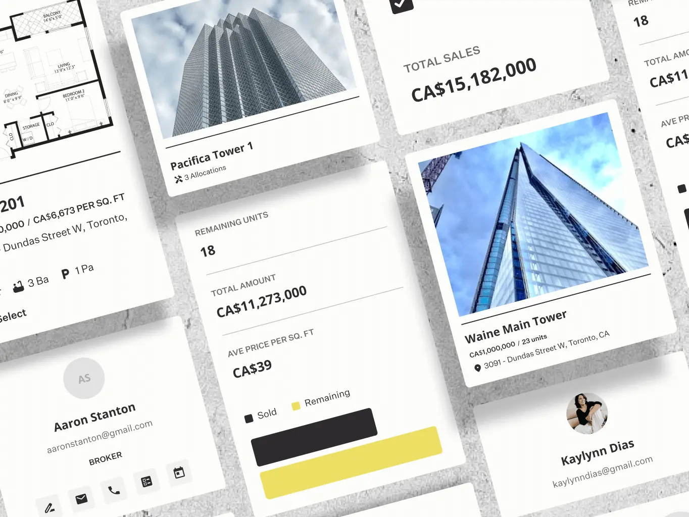
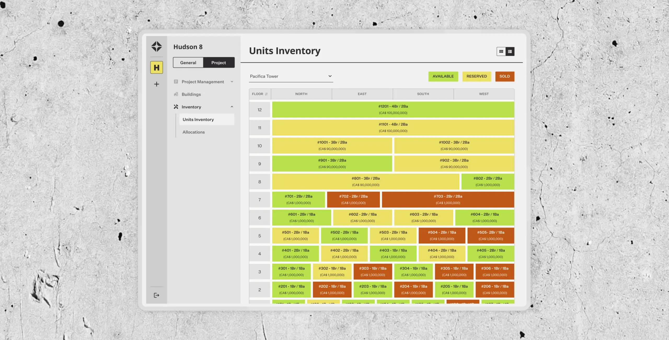
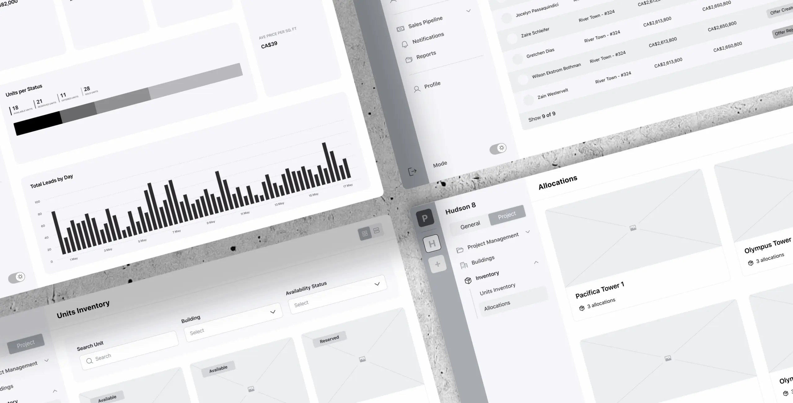
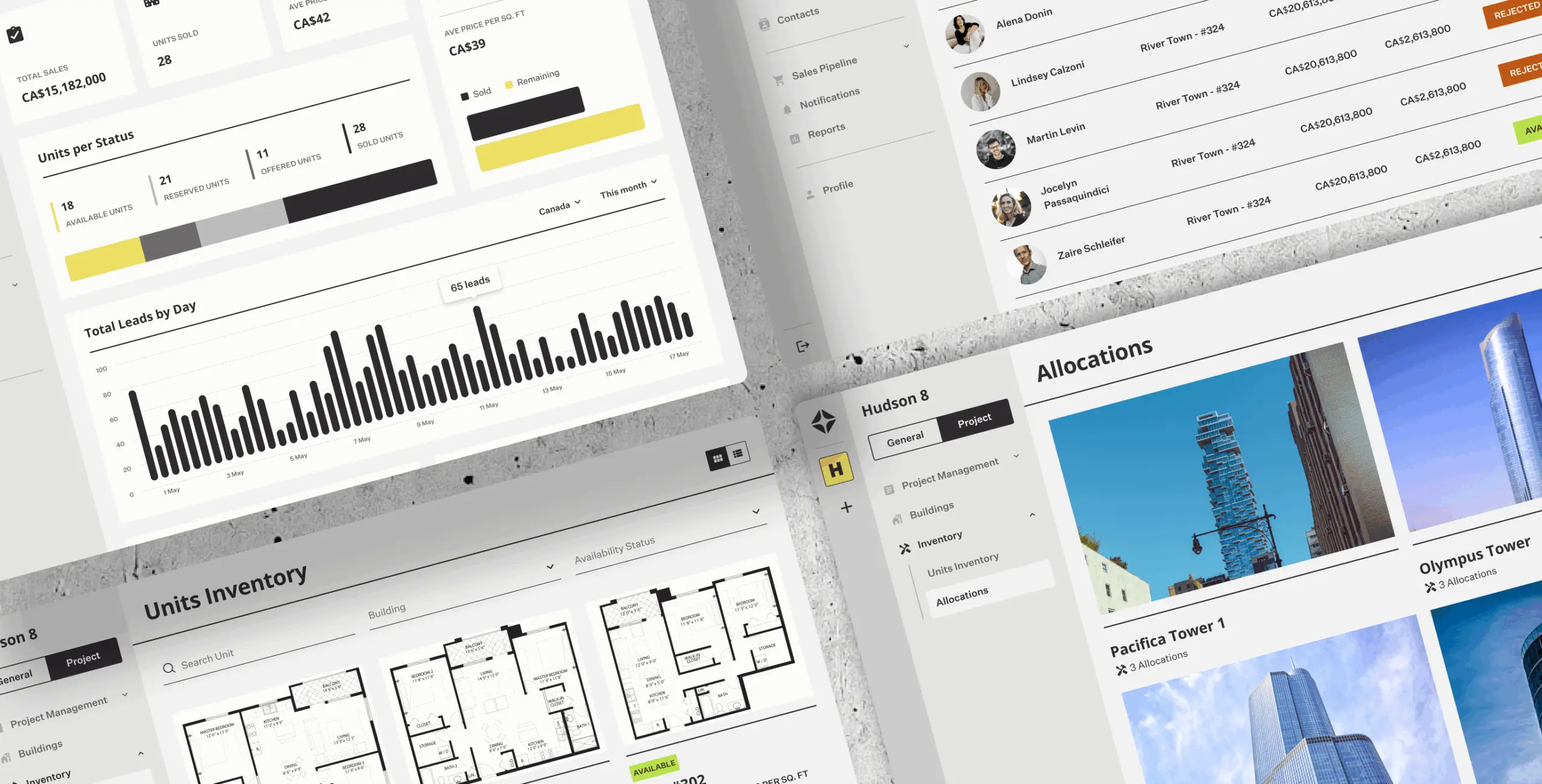
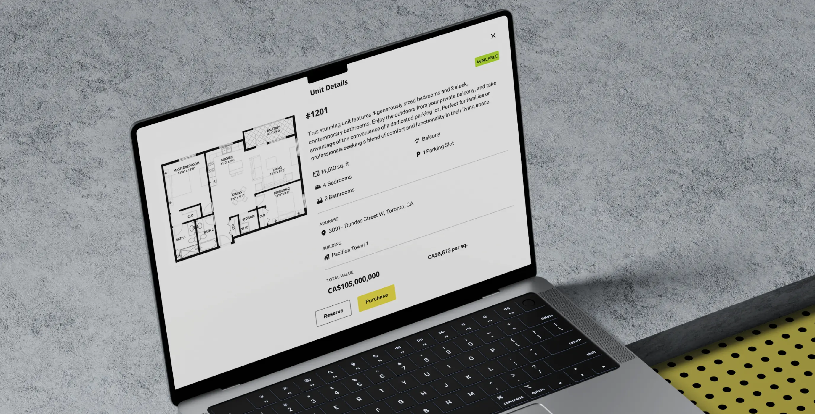
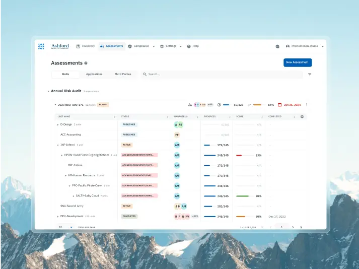
Units inventory
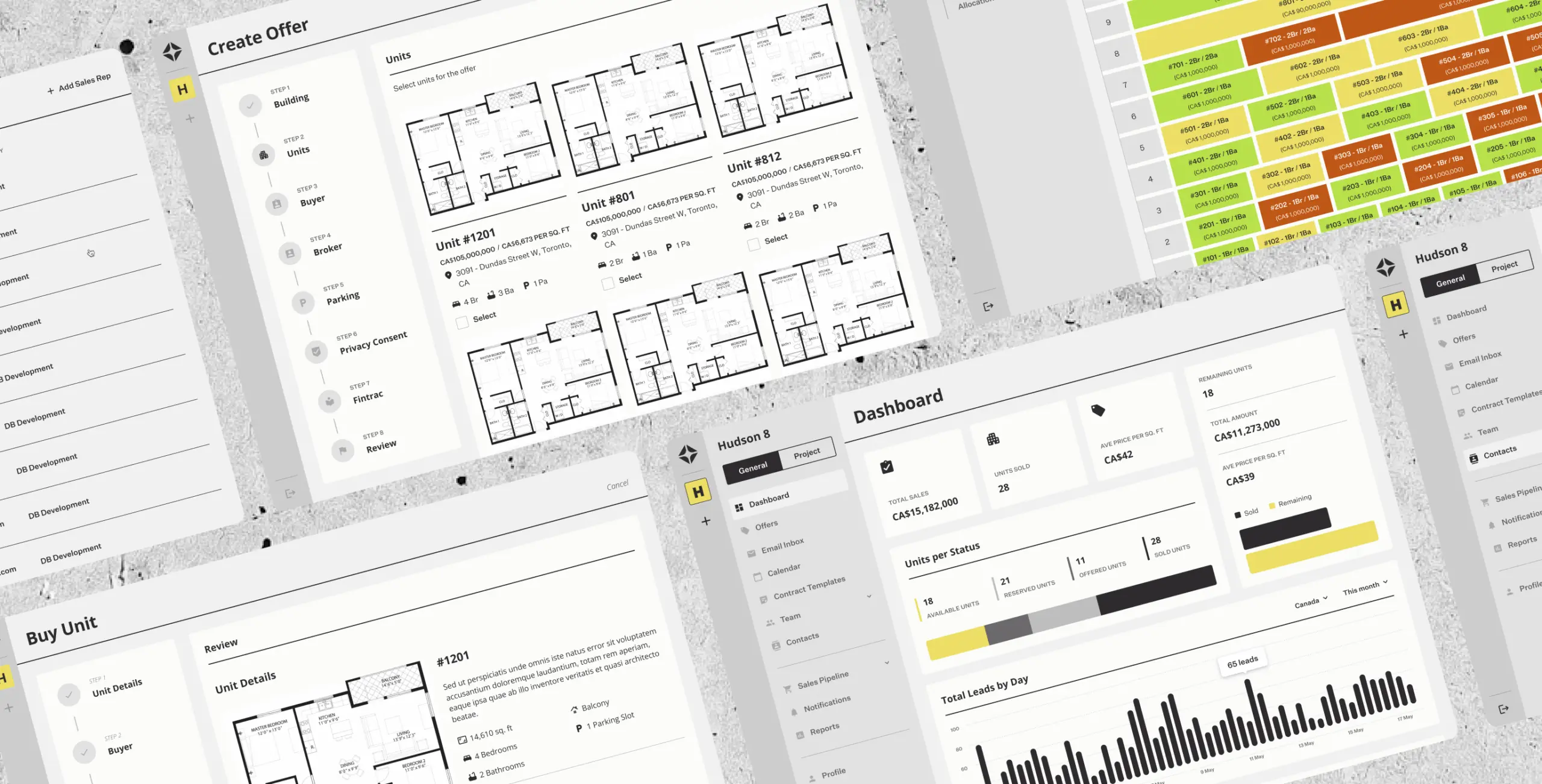
The unit inventory feature provides sales reps with a comprehensive overview of available, sold, and reserved units, enabling them to manage and track inventory effortlessly.
With detailed unit insights at their fingertips, sales reps can explore specifications, pricing, and availability, helping them make informed decisions.
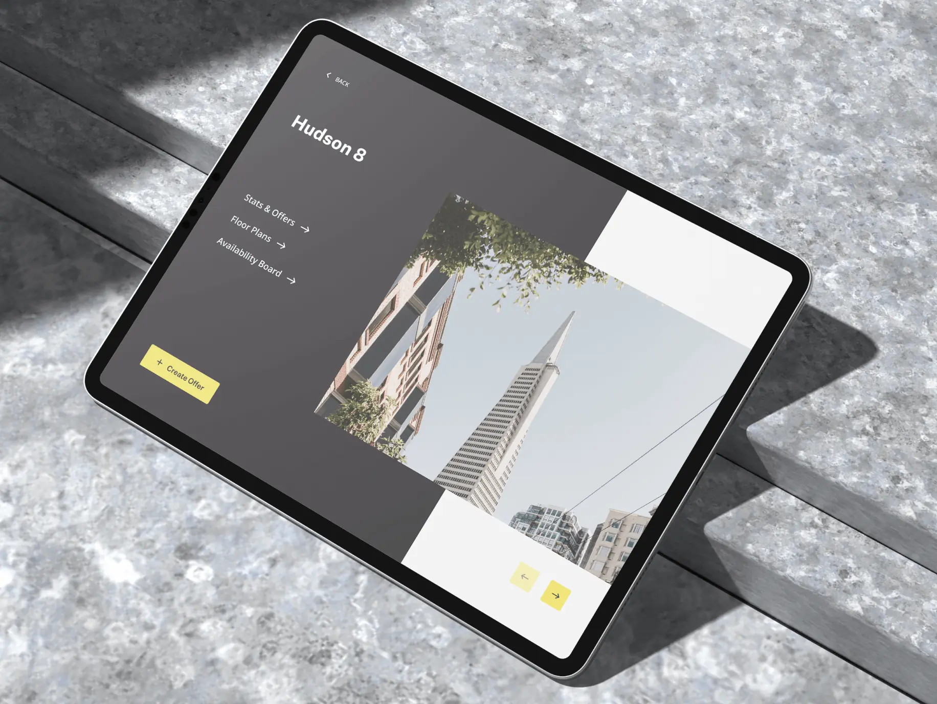
Sales presentation app
We designed a dedicated app for sales reps, optimized for tablet use, to enhance client presentations. This tool allows sales reps to showcase available units with detailed visuals, interactive floor plans, and key information, creating an engaging experience for potential clients. The app ensures sales reps can present properties professionally and effectively, no matter where they are.
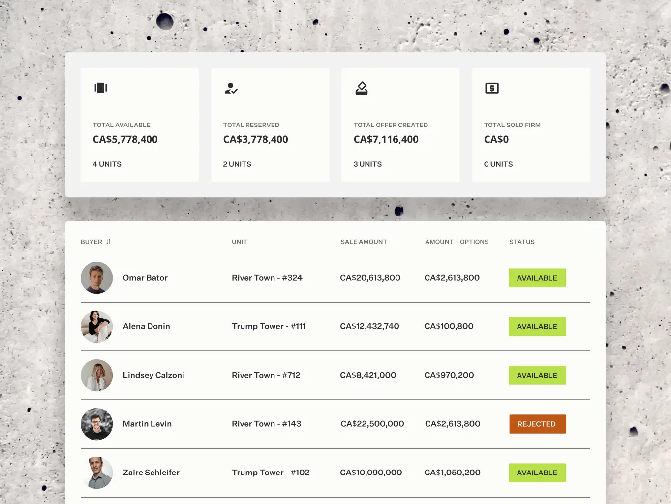
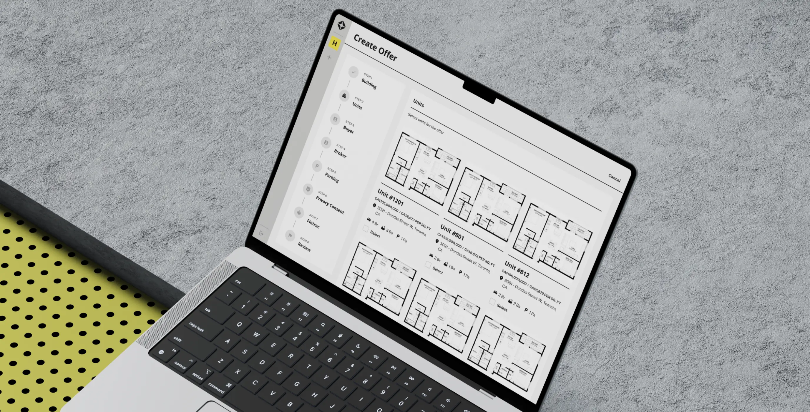
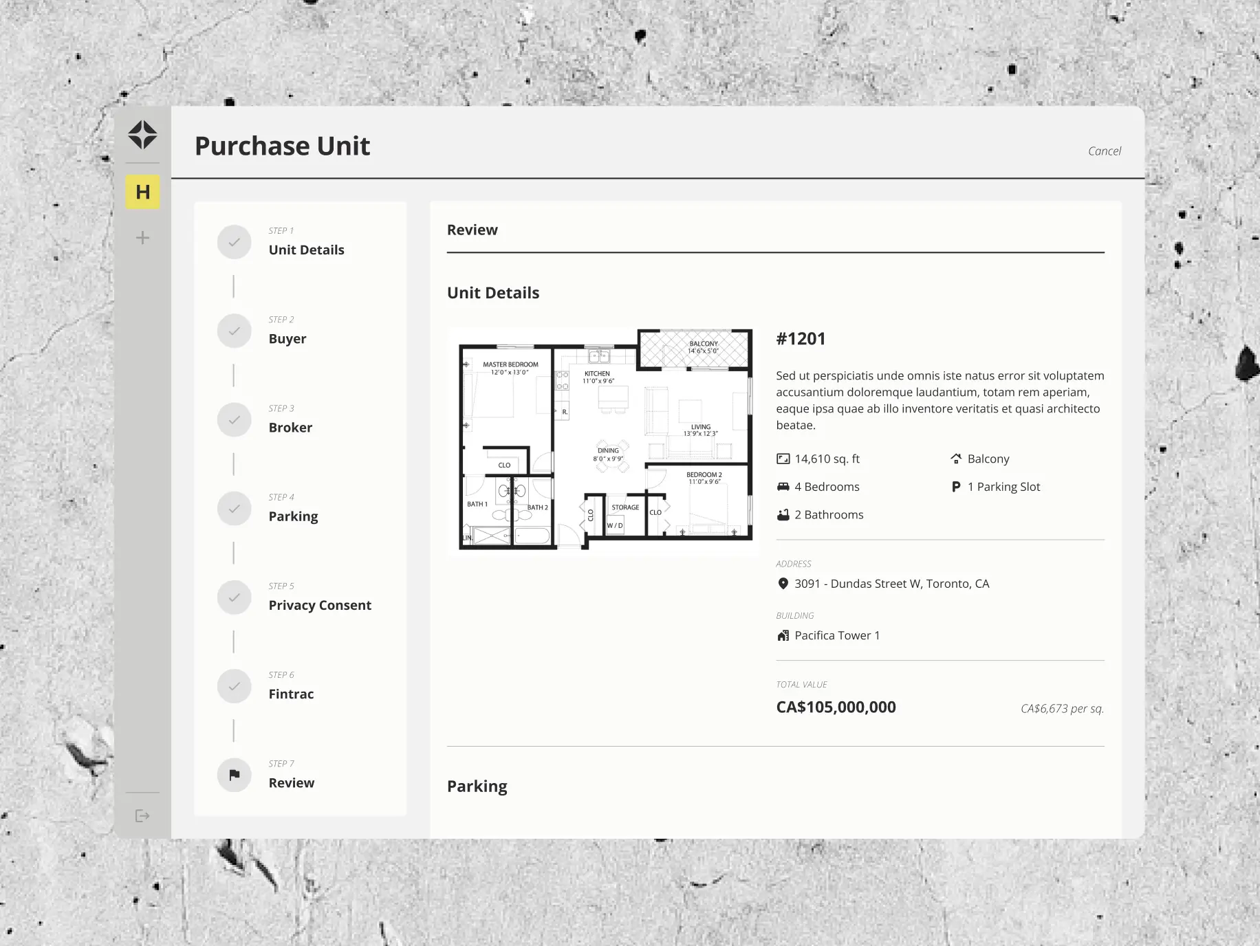
Purchase unit
The purchase unit feature streamlines the buying process. Users are guided step-by-step to provide or review essential details, including unit specifications, buyer and broker information, parking preferences, privacy consent, and Fintrac compliance. A final review step ensures accuracy before completing the transaction. This intuitive flow simplifies complex procedures, making it easy for users to confidently finalize their purchases.
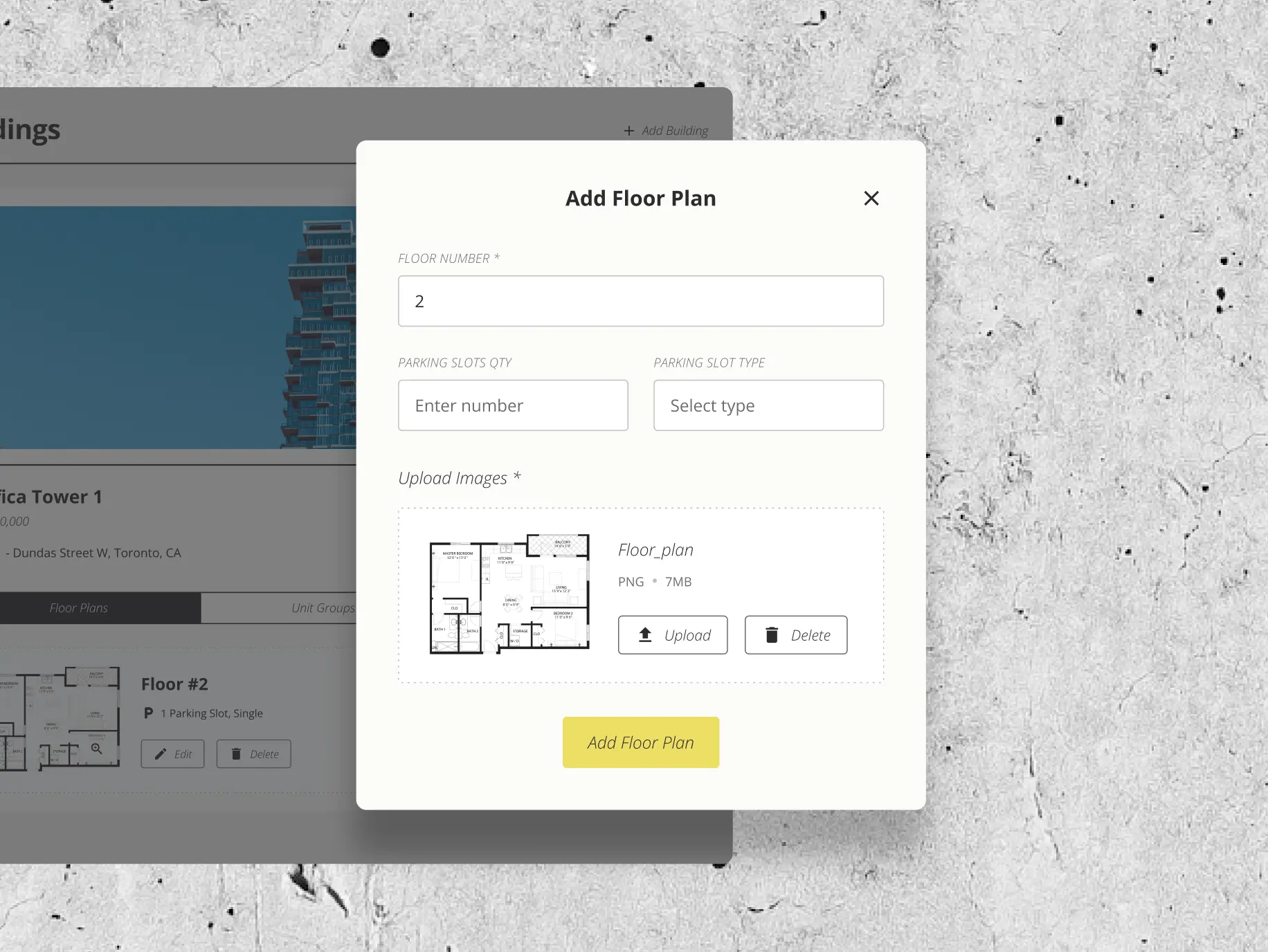
Manage Building
The manage building feature empowers users to efficiently update and maintain building information. Designed with flexibility and ease of use in mind, it ensures that construction developers and brokers can keep their project details accurate and up-to-date with minimal effort.
#Product redesign
BETERRA
 USA
USA
USA
#UX audit #Product redesign #web development
Nomupay
 New Zealand
New Zealand

Izek Lal
Country managerWe have seen a significant improvement in terms of mobile friendliness and the general flow of the system. I believe this has contributed significantly to the growth of our business. Many thanks, Phenomenon.
#UX Audit #Product redesign #Web development #Team extention
SaltyCloud
 Texas, USA
Texas, USA
Have a project in mind?
Let's chat
Have a project to
discuss?
discuss?

Have a partnership in
mind?
mind?
