Design
Development
Research
Launch
Evolve
Extend
Isora – optimizing governance, risk & compliance for top institutions
Client
SaltyCloud
 Texas, USA
Texas, USA
Technologies
 Vite
Vite
 React
React
 Typescript
 React Router Dom
 Radix Primitives
 TailwindCSS
Recharts
TailwindCSS
Recharts
 Storybook
UX Design Awards - Nomination 2024

When Isora GRC came to us, their platform was frustrating to use. Navigation was unclear, workflows didn’t match how users actually worked, and the design had fallen behind. They wanted a redesign — cleaner look, less friction for end-users.
Our audit found the problems ran deeper than aesthetics. The platform needed structural usability work to fit how non-technical users operate and to support what the business was trying to do.
Our role
We joined the client’s team to cover user-centred design and front-end development. The work went well beyond visual updates — we rethought how the product worked from the ground up. Working closely with the client, we led a full redesign that made the product easier to use and gave end-users a clearer path through processes that had previously tripped them up.
Before touching the design, we spent time understanding how the product actually worked. That meant reviewing technical and user-facing documentation, running a UX audit, and reworking the information architecture. We also mapped the user flows to find where processes were breaking down. From that we built a prioritised feature list — weighted by user impact and what the existing architecture could realistically support.
Stages
- Documentation analysis
- UX audit
- Informational architecture
- Userflow
We started by going through the product documentation — designers on the user-facing side, developers on the backend.
The designers read the manuals and guides, then tested the product themselves to see where real users would get stuck. The developers dug into the backend documentation to understand the architecture and what it could realistically support.
Running both tracks in parallel meant design decisions and technical constraints were being weighed against each other from day one.
We went through every user flow in the product, measuring each against Nielsen’s heuristics, standard UX patterns, and the feedback the client had already collected. That told us where things were breaking down and why.
We didn’t just log problems — we used the audit to generate hypotheses about what could fix them. UI quality got assessed at the same time, so visual and functional issues were handled together rather than in separate passes.
The client was involved throughout, which kept our findings tied to their actual goals rather than drifting into what we found personally interesting.
Using the audit findings and a final round of client discussions, we built out the new information architecture. The structure had to resolve existing problems while accommodating the new features being scoped in.
We mapped the user flows onto the architecture as we went rather than treating it as a separate step. That let us see how users would actually move through the product and catch structural problems before anything got built.
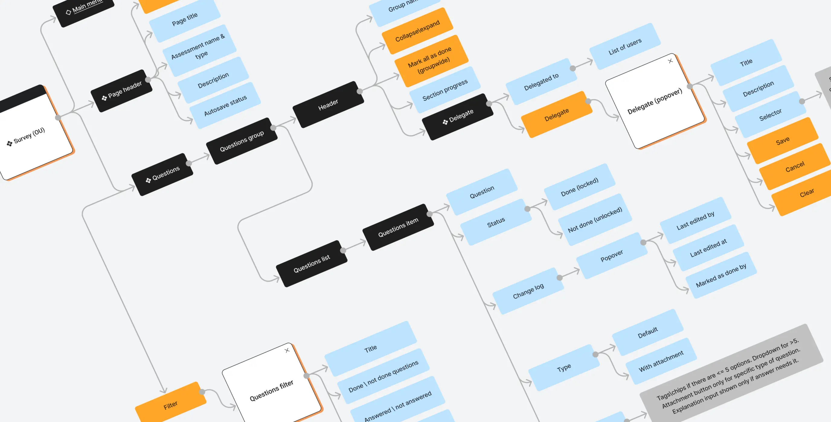
Since the redesign was mostly visual with a handful of new features, we skipped wireframes and worked directly from the live product and the new information architecture. That cut out a round of work that wouldn’t have added much here, and kept the budget pointed at things that mattered.
Stages
- Design direction
- Product UI design
- Design system
Before starting on the design, we put together a mood board and ran a short client survey to get everyone aligned on the visual direction.
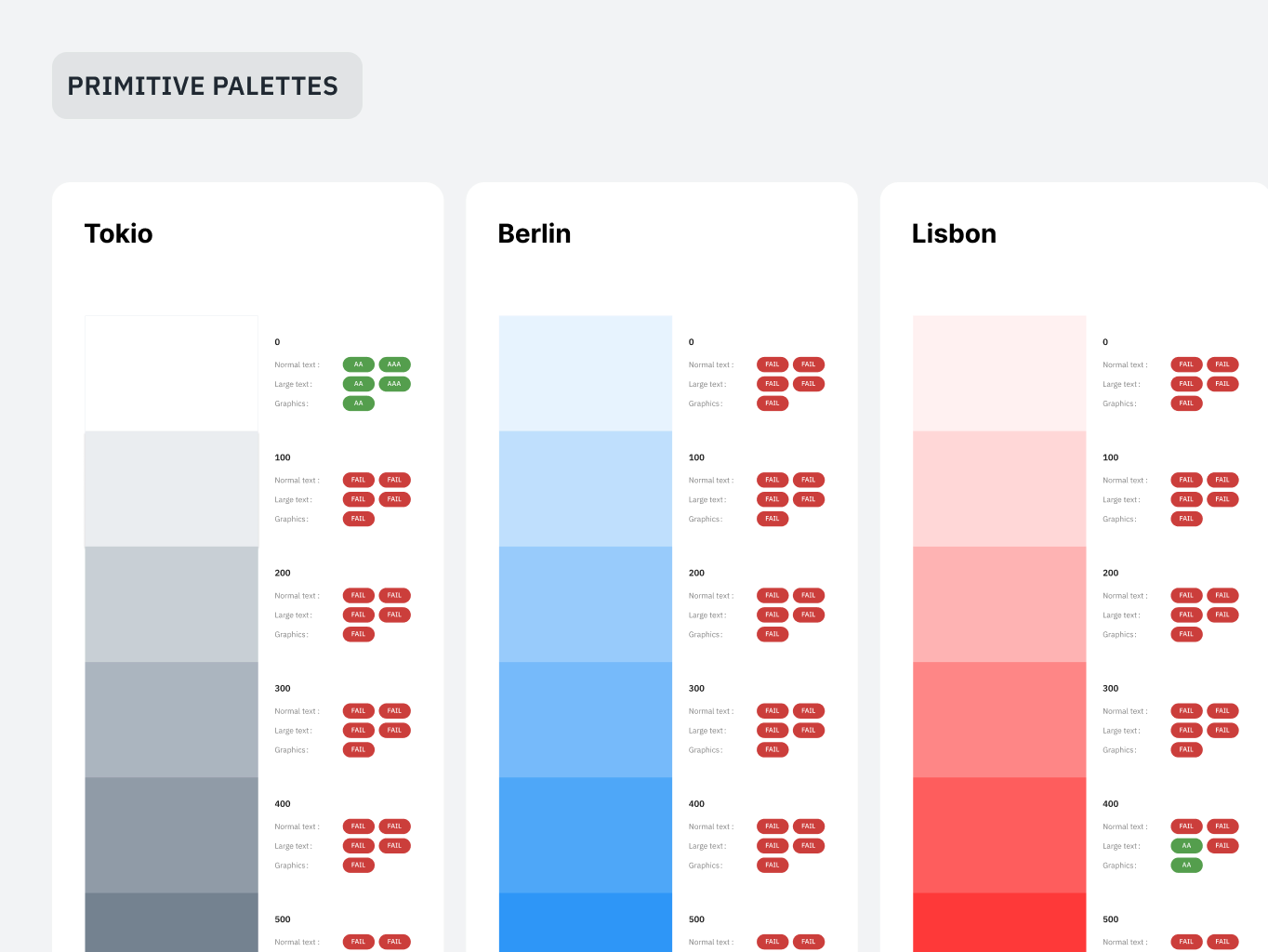
Accessibility was built in from the start rather than reviewed at the end. That ruled out some visual directions early, which actually made decision-making easier — fewer rabbit holes to go down. The constraints pushed the team toward solutions that worked for a wider range of users without needing to unpick choices later.
We designed layouts for all the key screens, accounting for edge cases and the messier workflows rather than just the happy path.
Not everything could be built within the backend constraints we’d found earlier. Designers and developers worked through those gaps together — validating ideas, adjusting when something didn’t hold up technically. That back-and-forth meant problems got caught during design rather than halfway through a build.
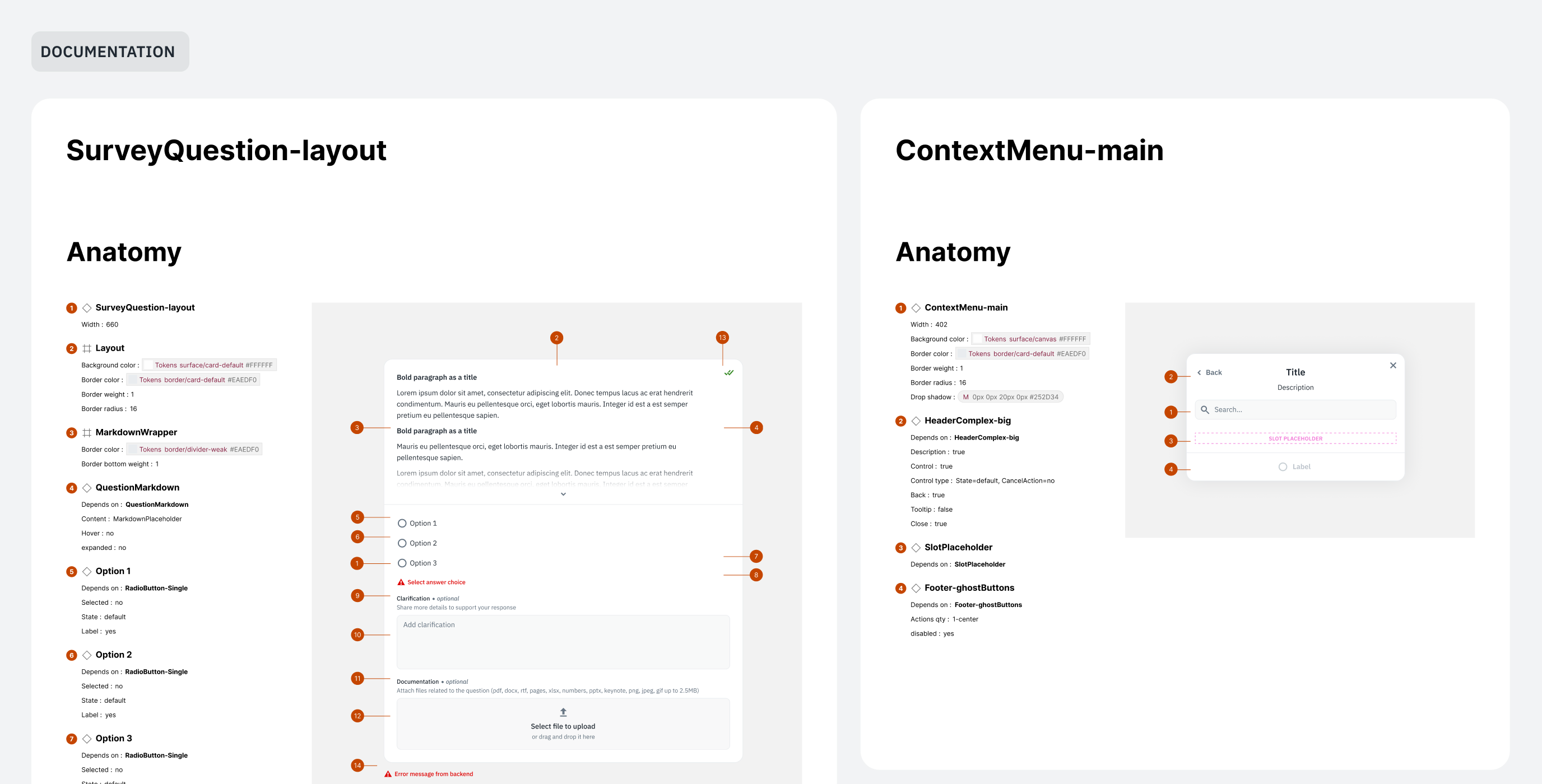
While building the mockups, the designers worked in parallel on a design system. It slowed things down early but paid back the investment fast — work that would have taken over a month could be turned around in a few weeks once the components were in place. The speed came from building atomically: smaller elements reused across screens rather than rebuilt each time.
The system didn’t stop at Figma. The development team maintained a mirrored system in Storybook, keeping design and development consistent and making handoffs straightforward.
Together, the two cut the product’s time-to-market by over 50%.
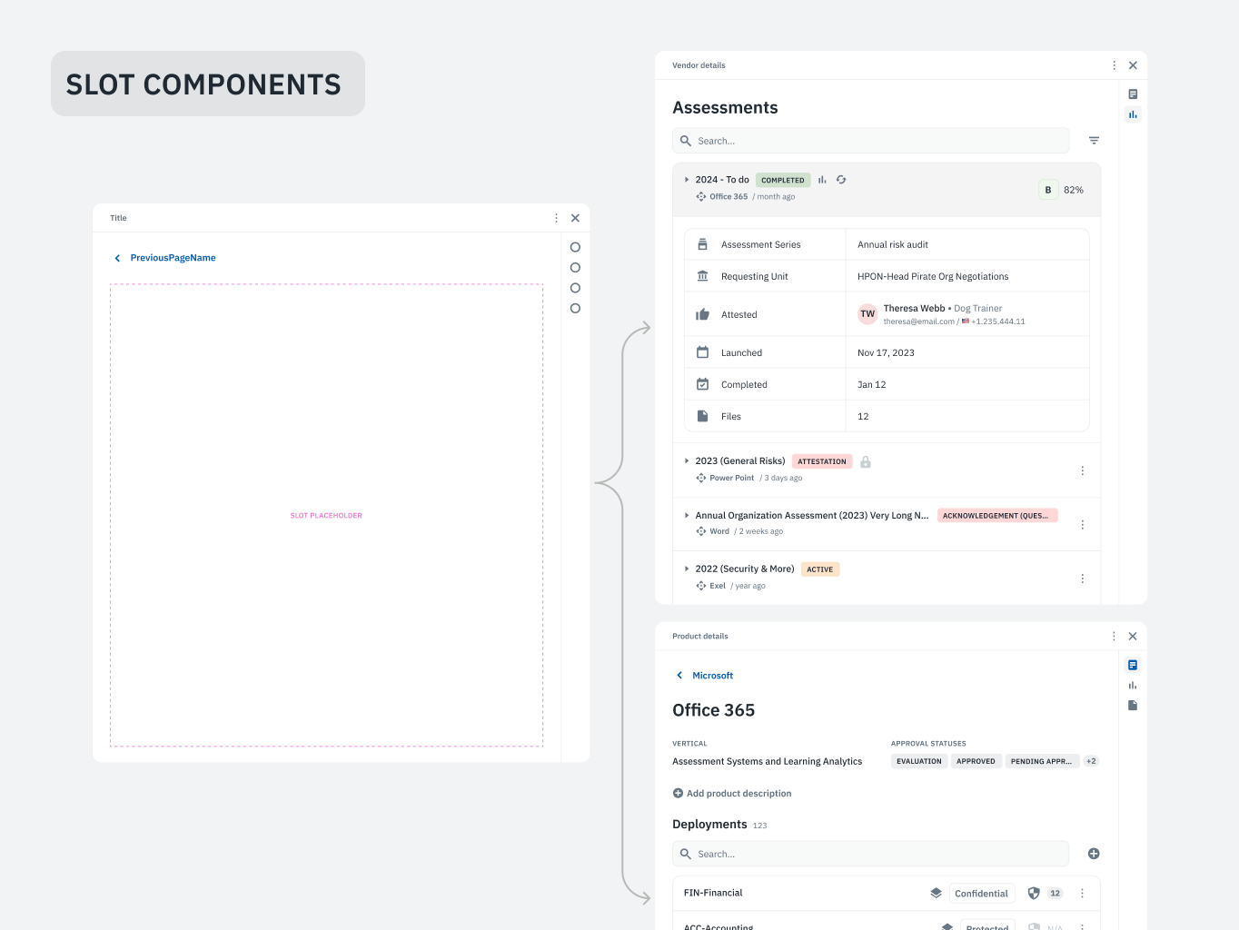
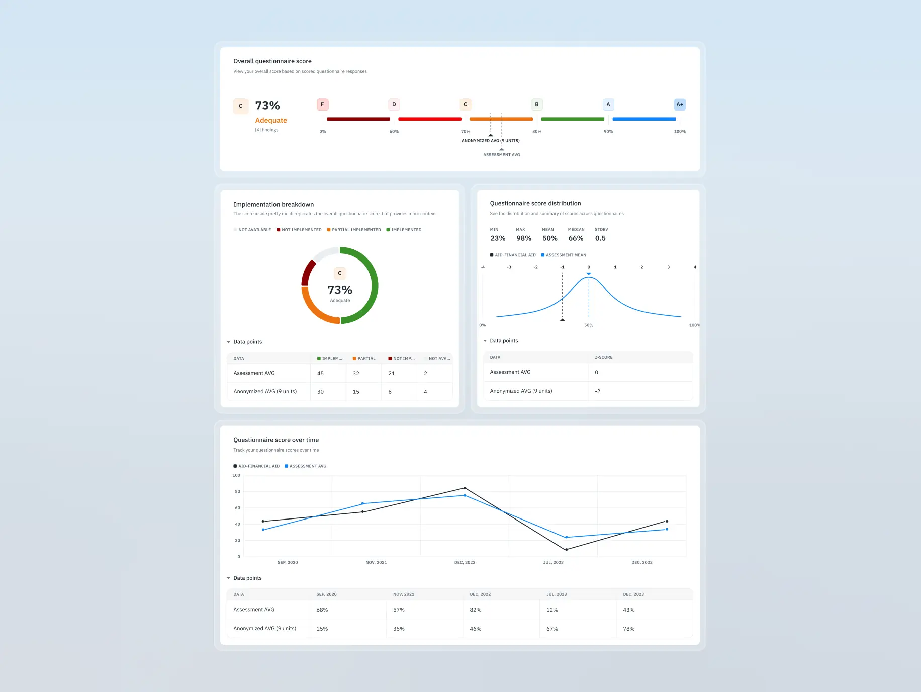
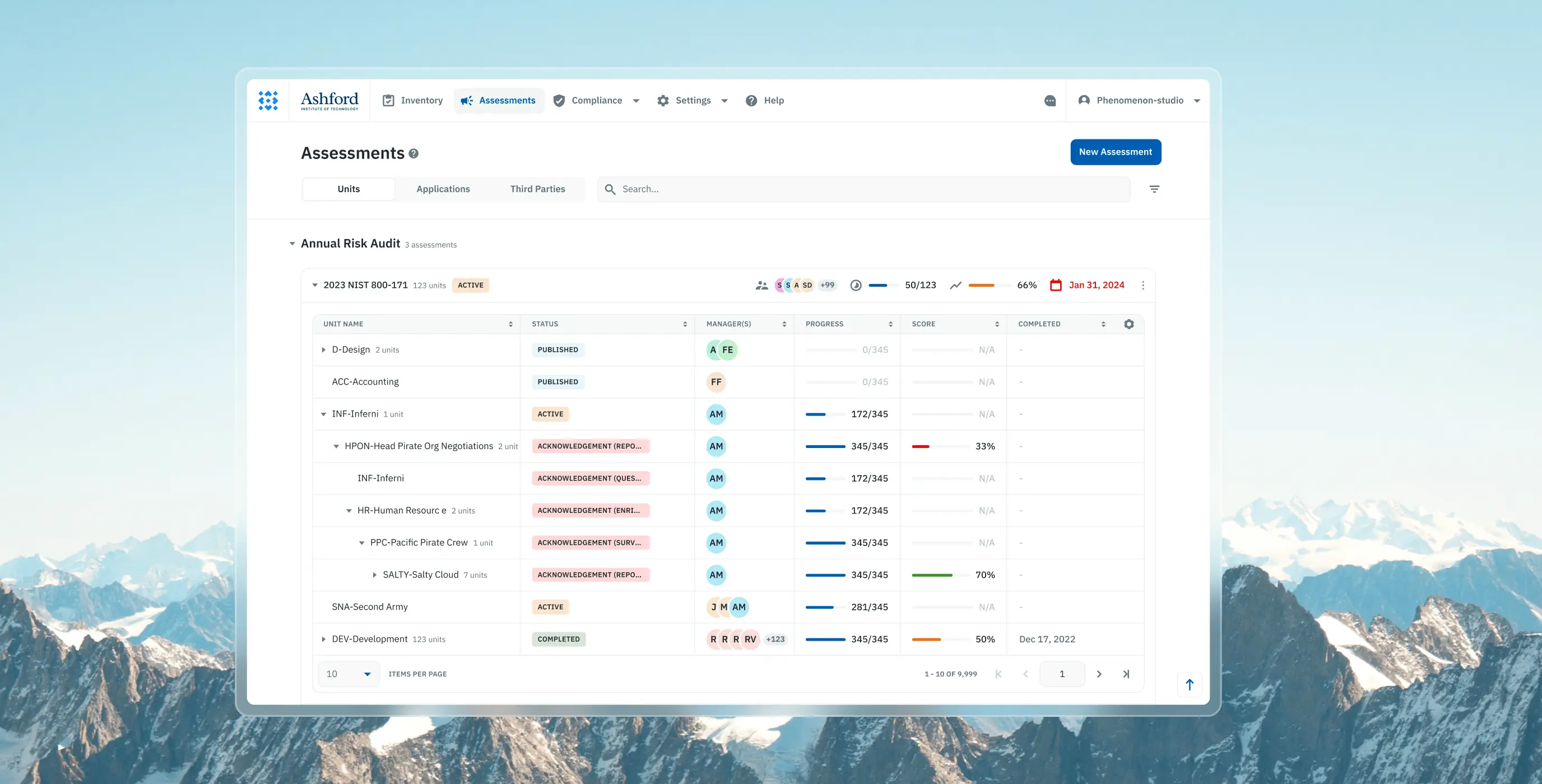
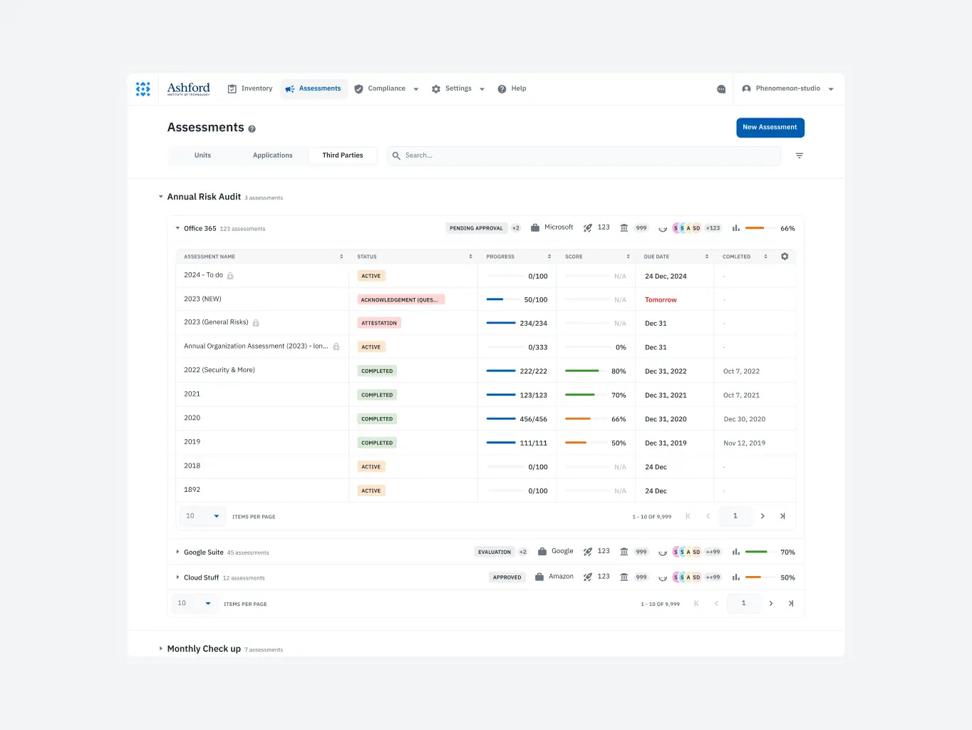
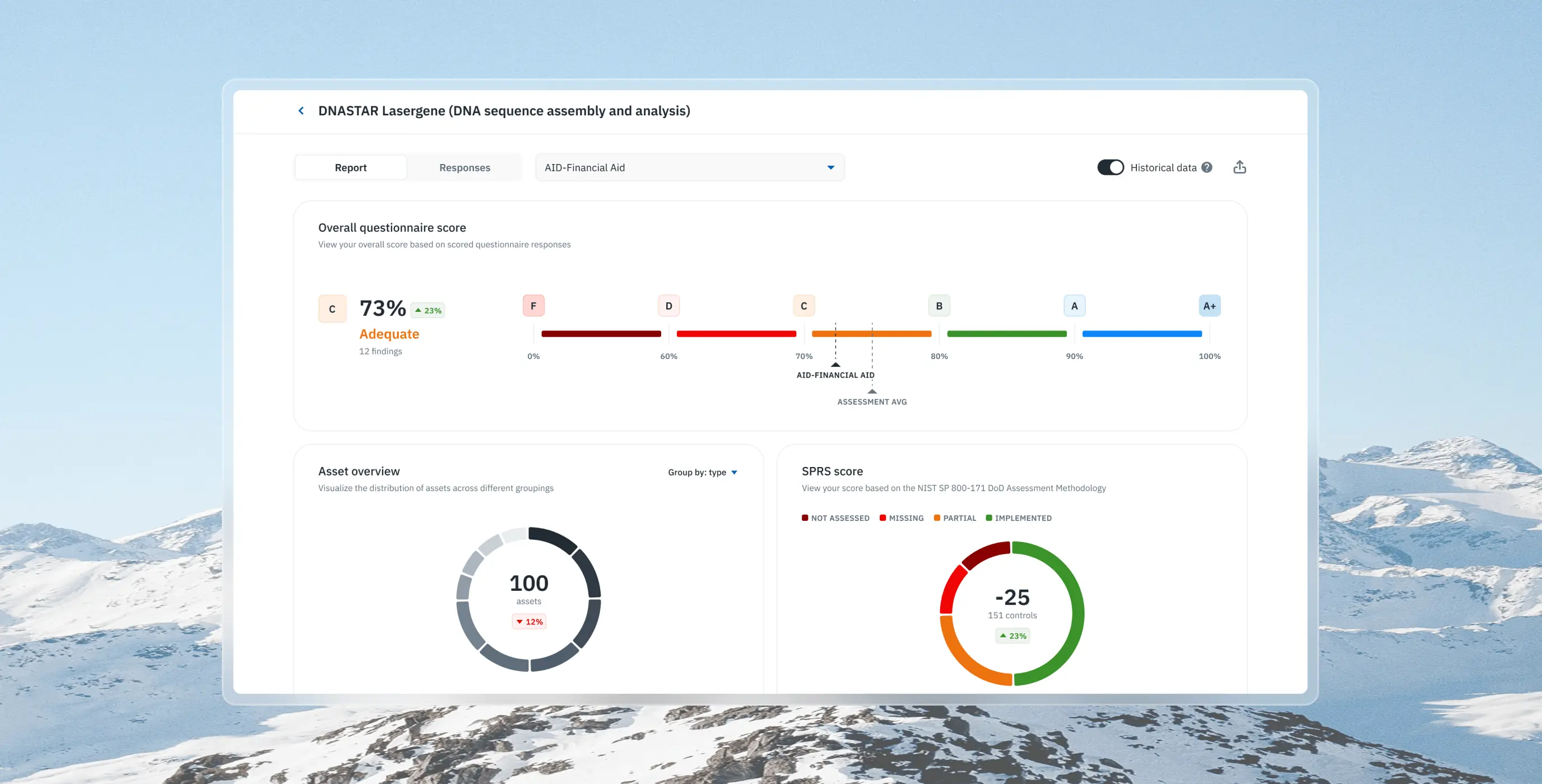
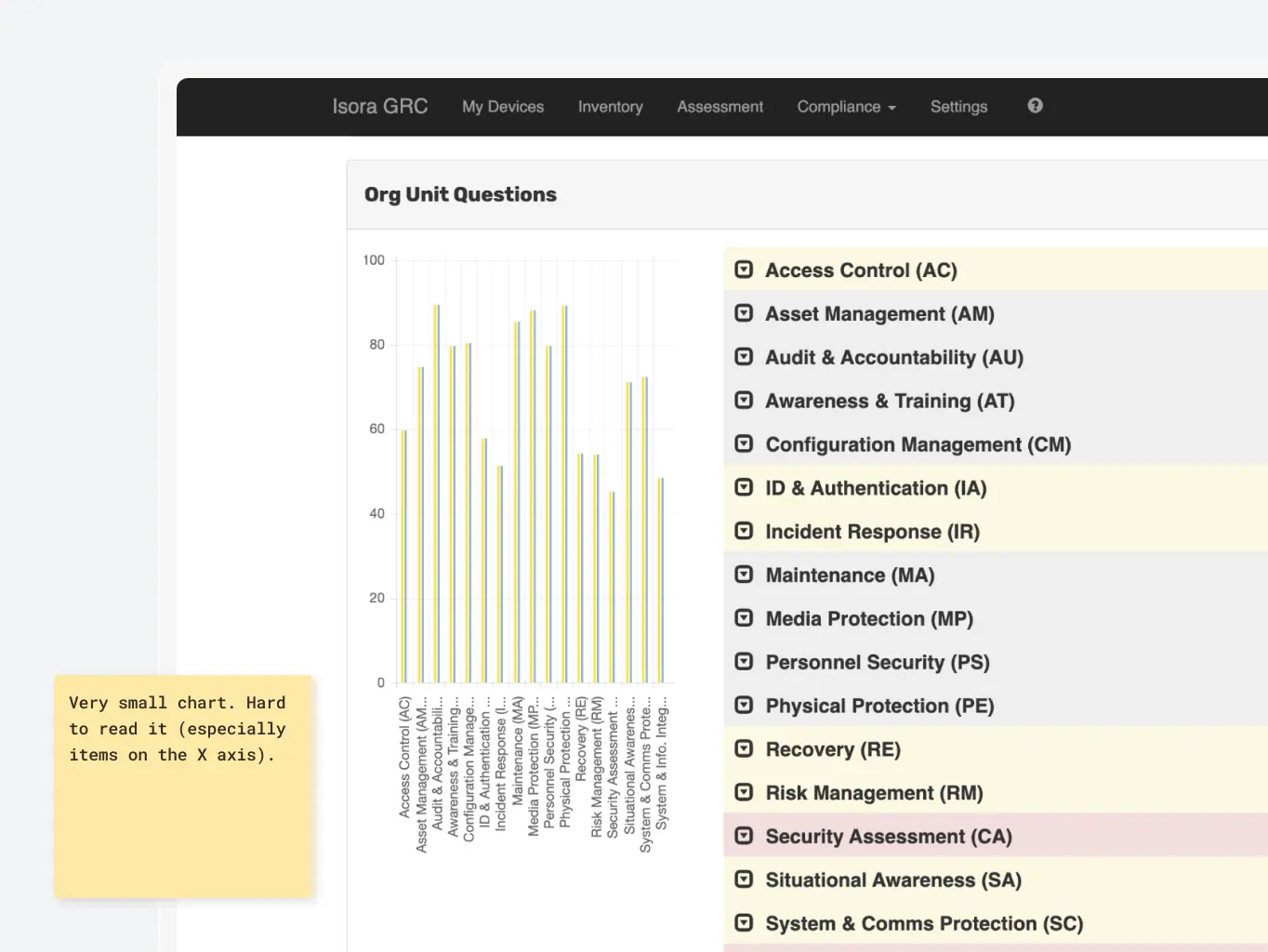
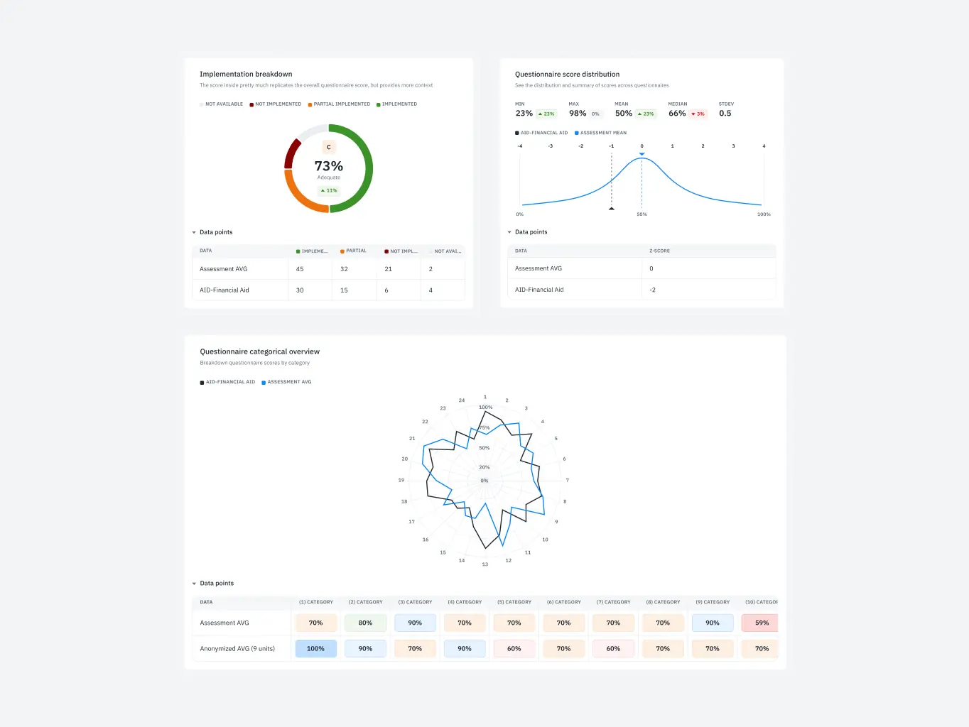
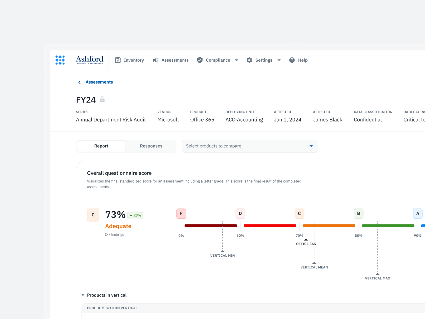
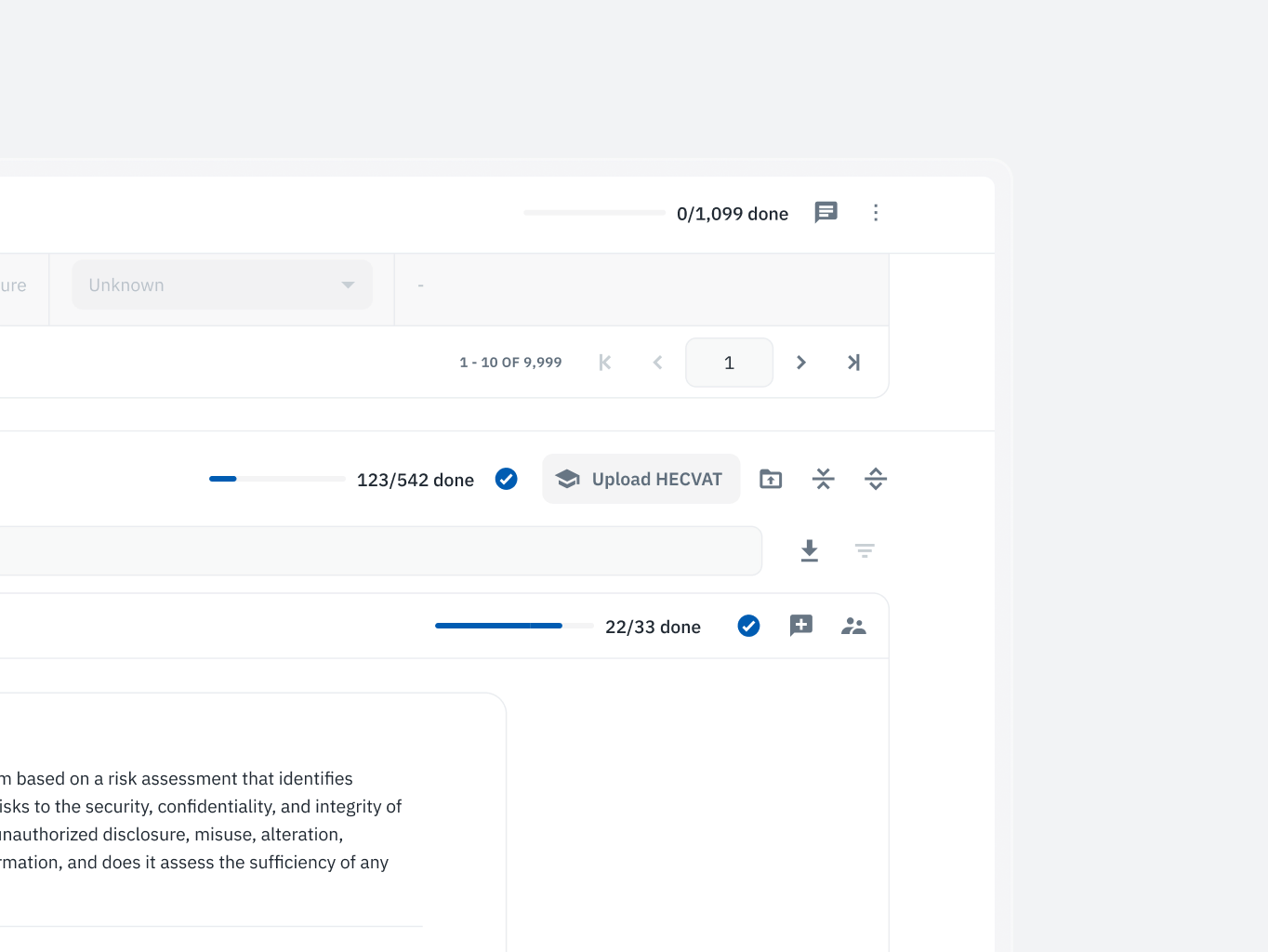
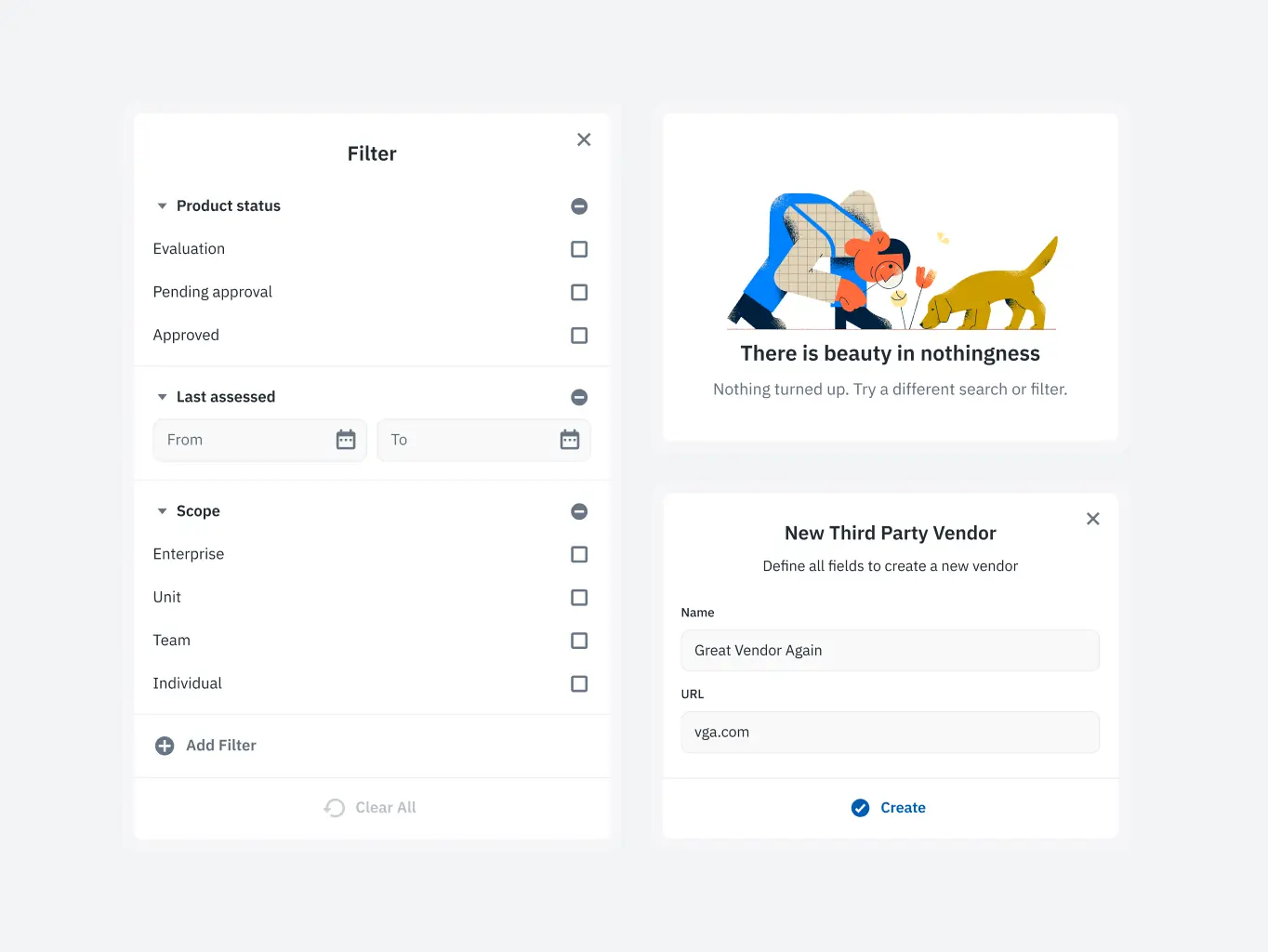
Assessment management
Users struggled with navigating and interpreting the information due to a lack of clear structure and visual prioritization, leading to inefficiencies in managing assessments.
What we’ve done:
- Introduced an intuitive layout for effortless navigation and management of assessments.
- Implemented visual progress indicators, enabling users to quickly grasp critical information.
- Improved clarity and efficiency in handling assessments by simplifying key workflows.
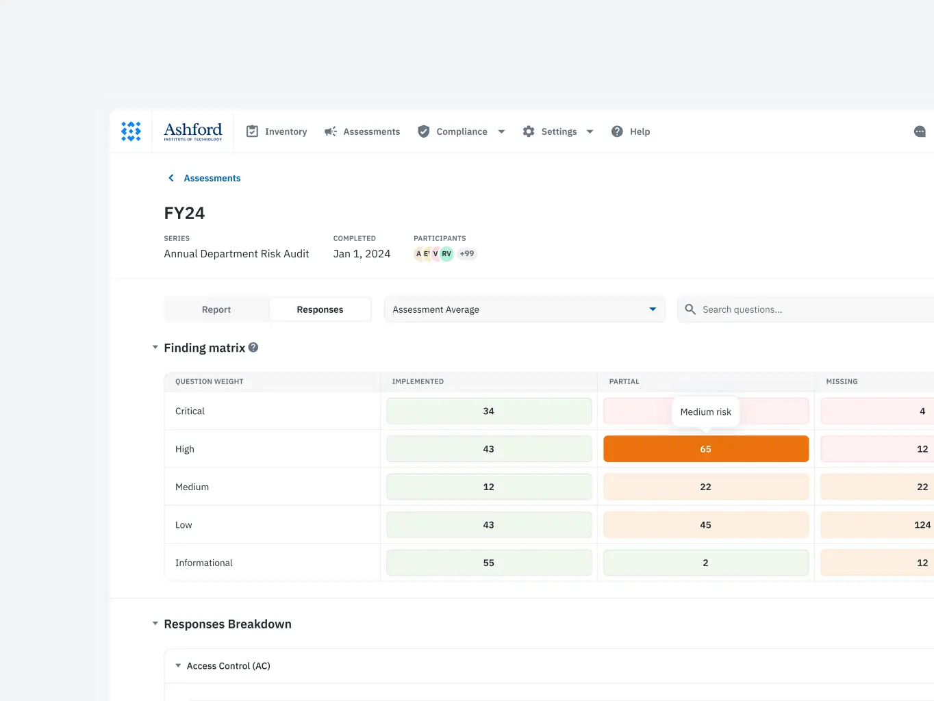
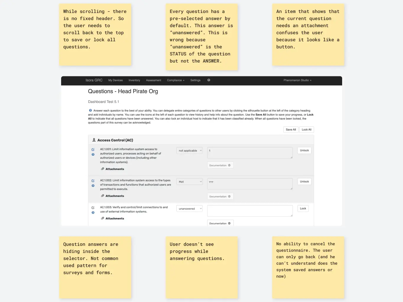
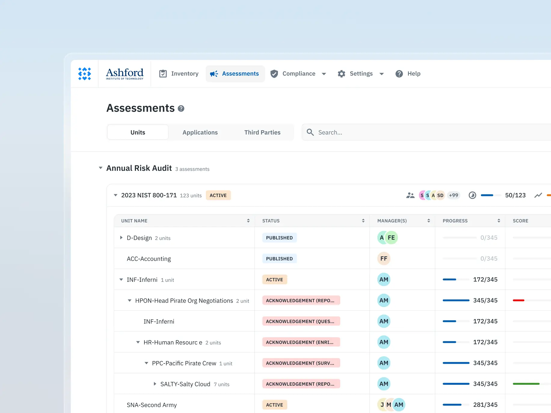
Assessment survey completion
The survey process lacked clarity and flexibility, making it difficult for users to complete tasks efficiently and understand their roles within collaborative workflows.
What we’ve done:
- Redesigned the survey process to mirror familiar tools, enhancing usability.
- Developed a step-by-step pipeline to guide users through the survey seamlessly.
- Optimized workflows for role-based permissions, ensuring smooth collaboration between distinct user roles.
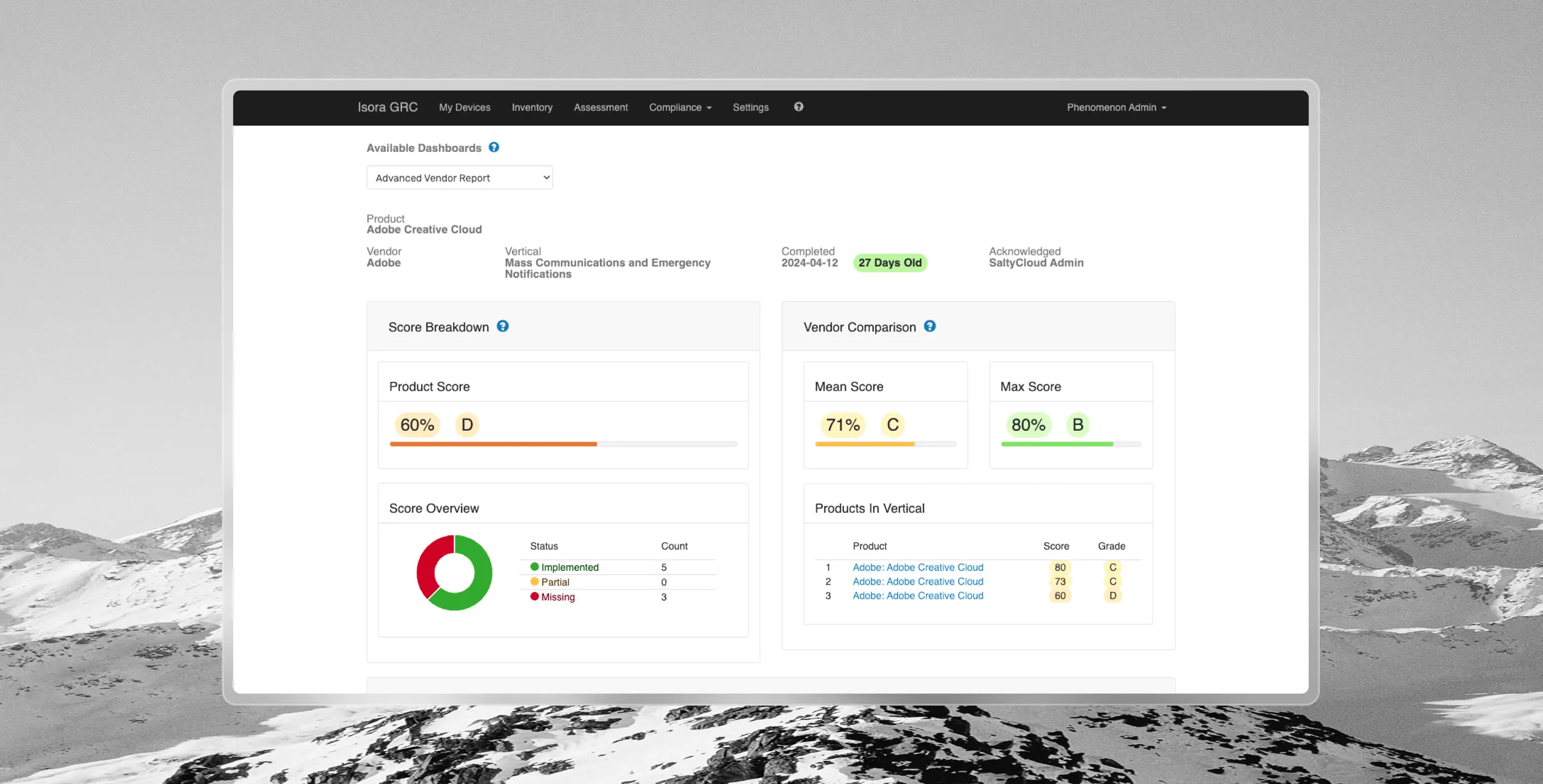
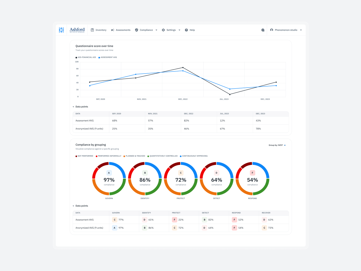
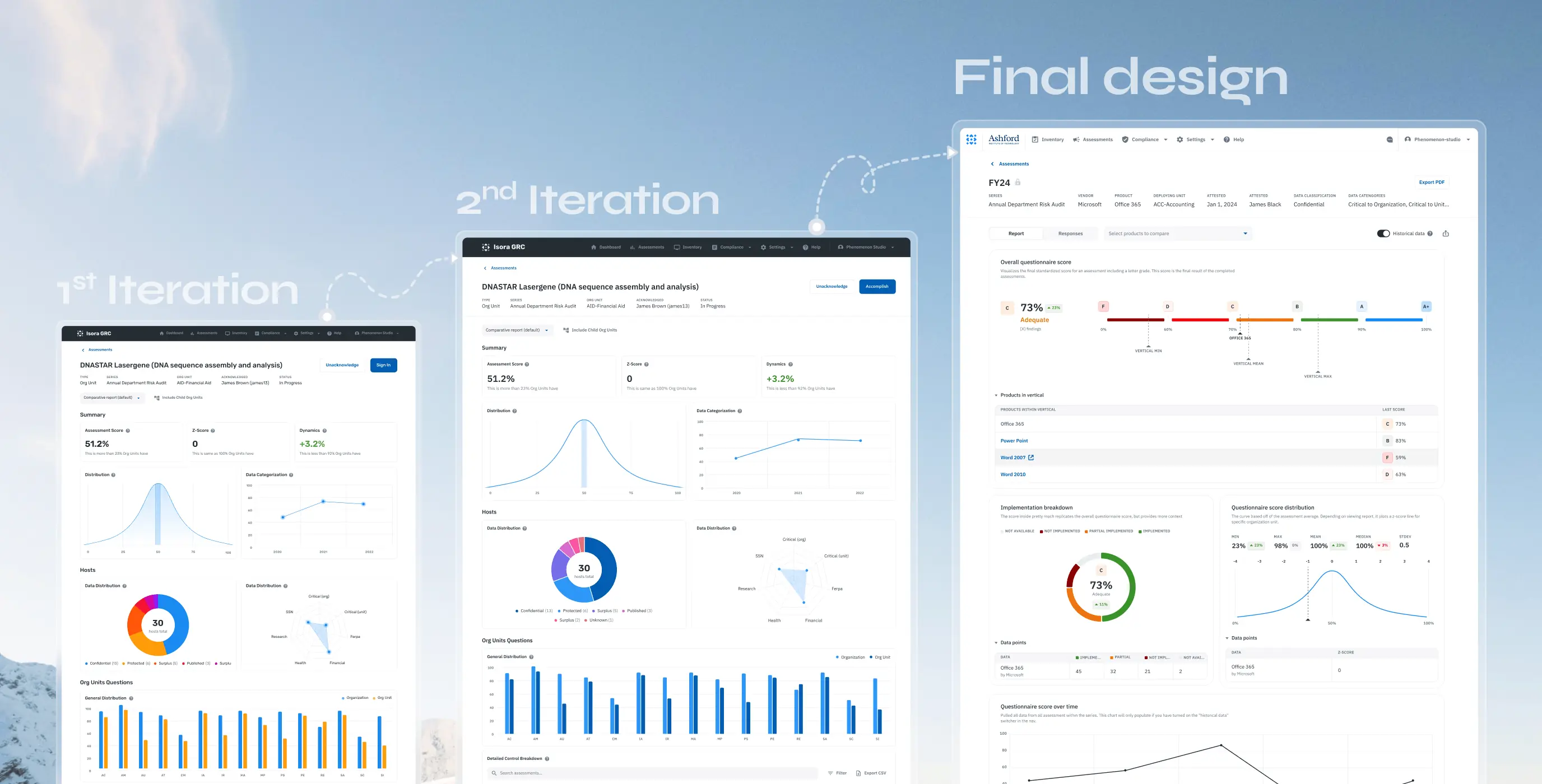
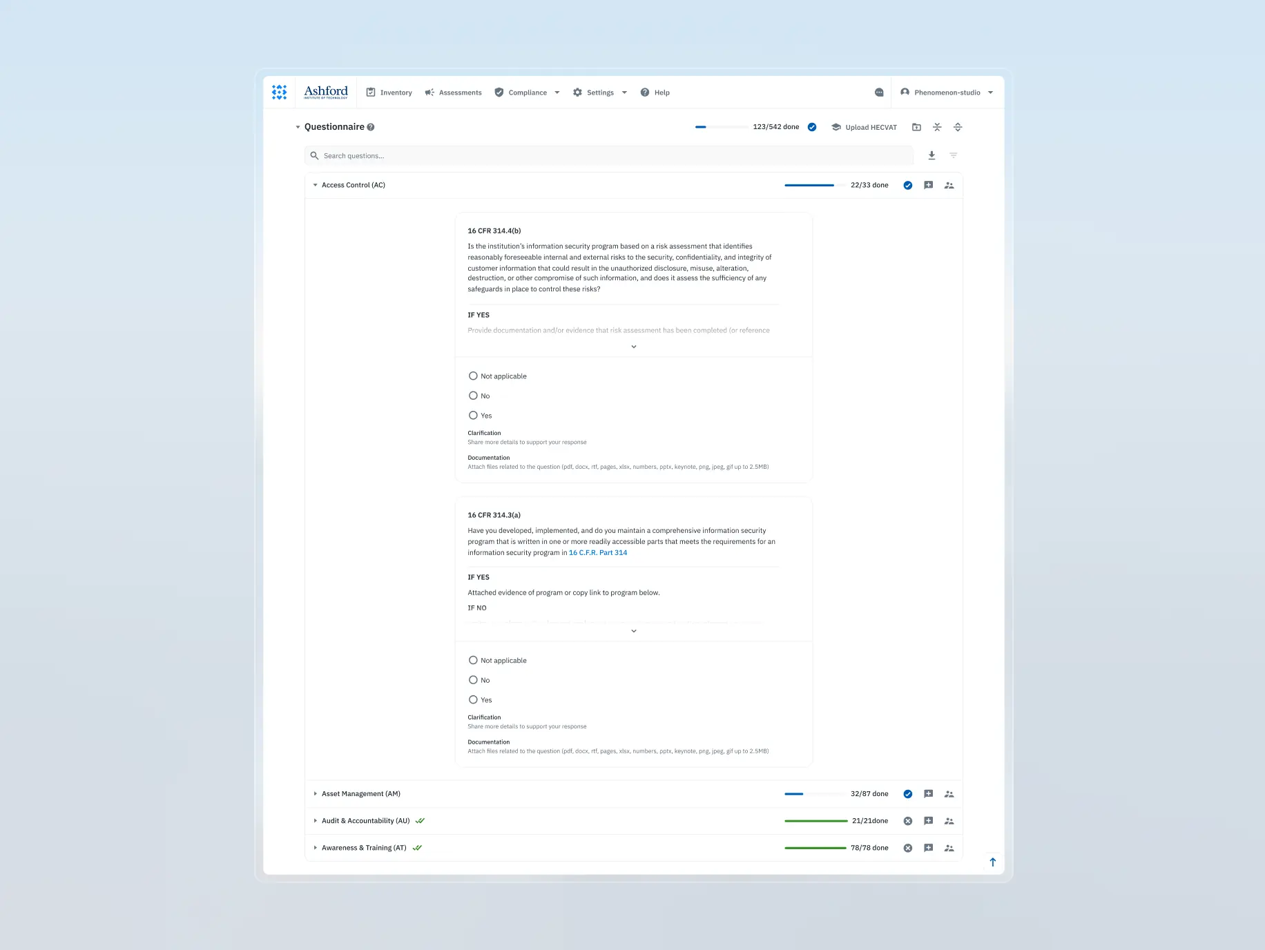
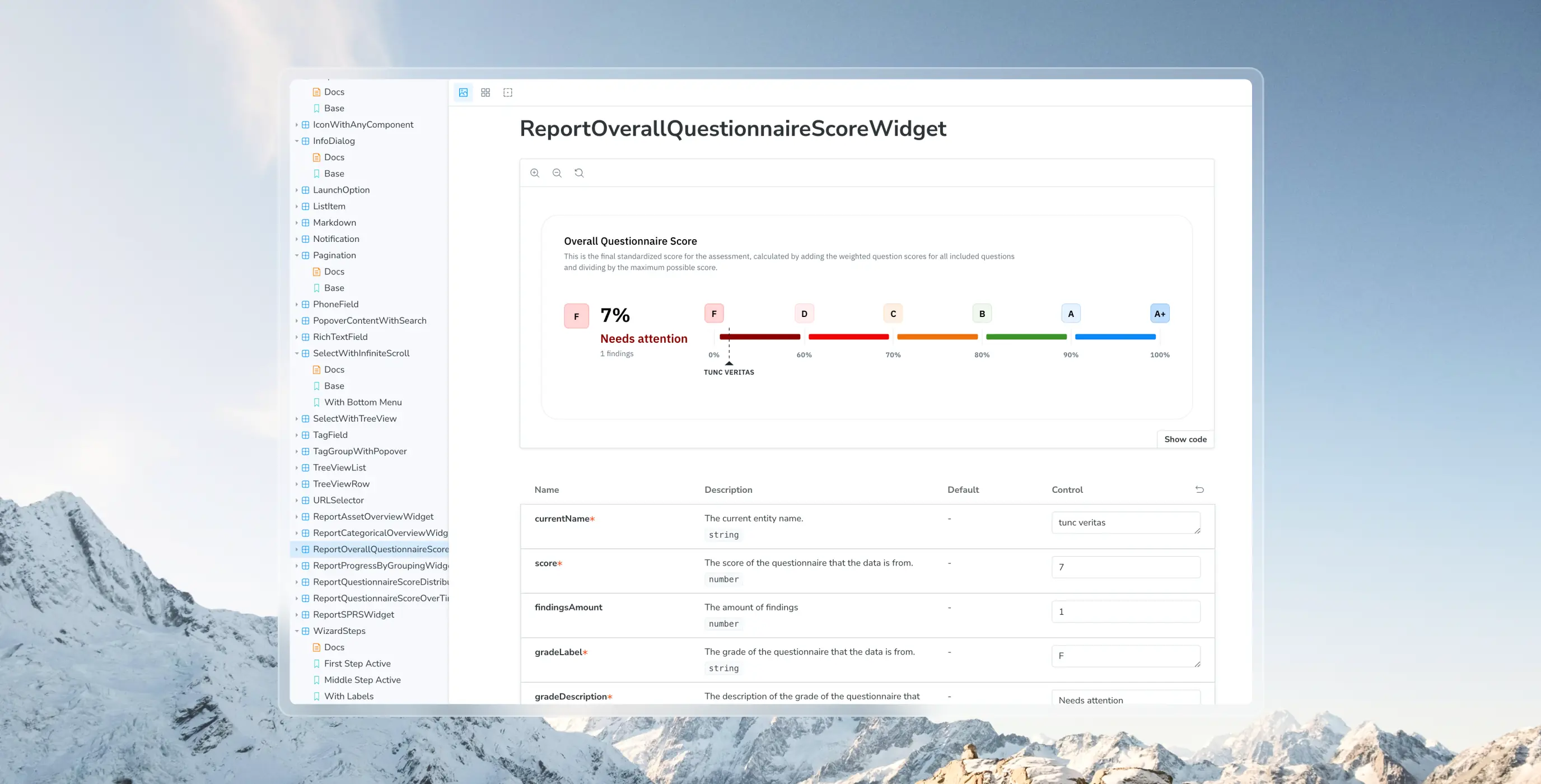
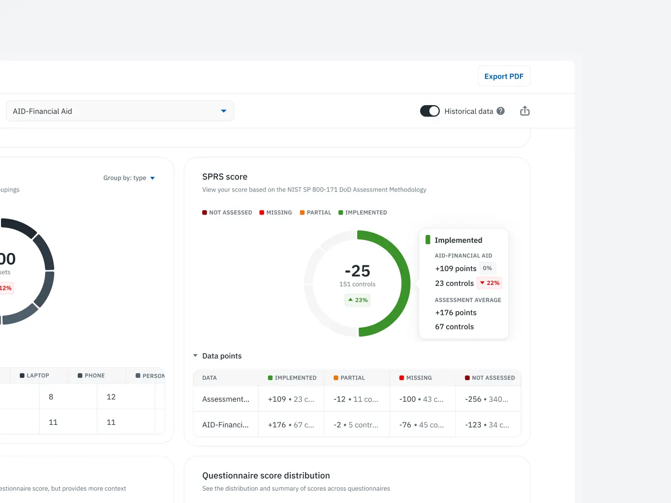
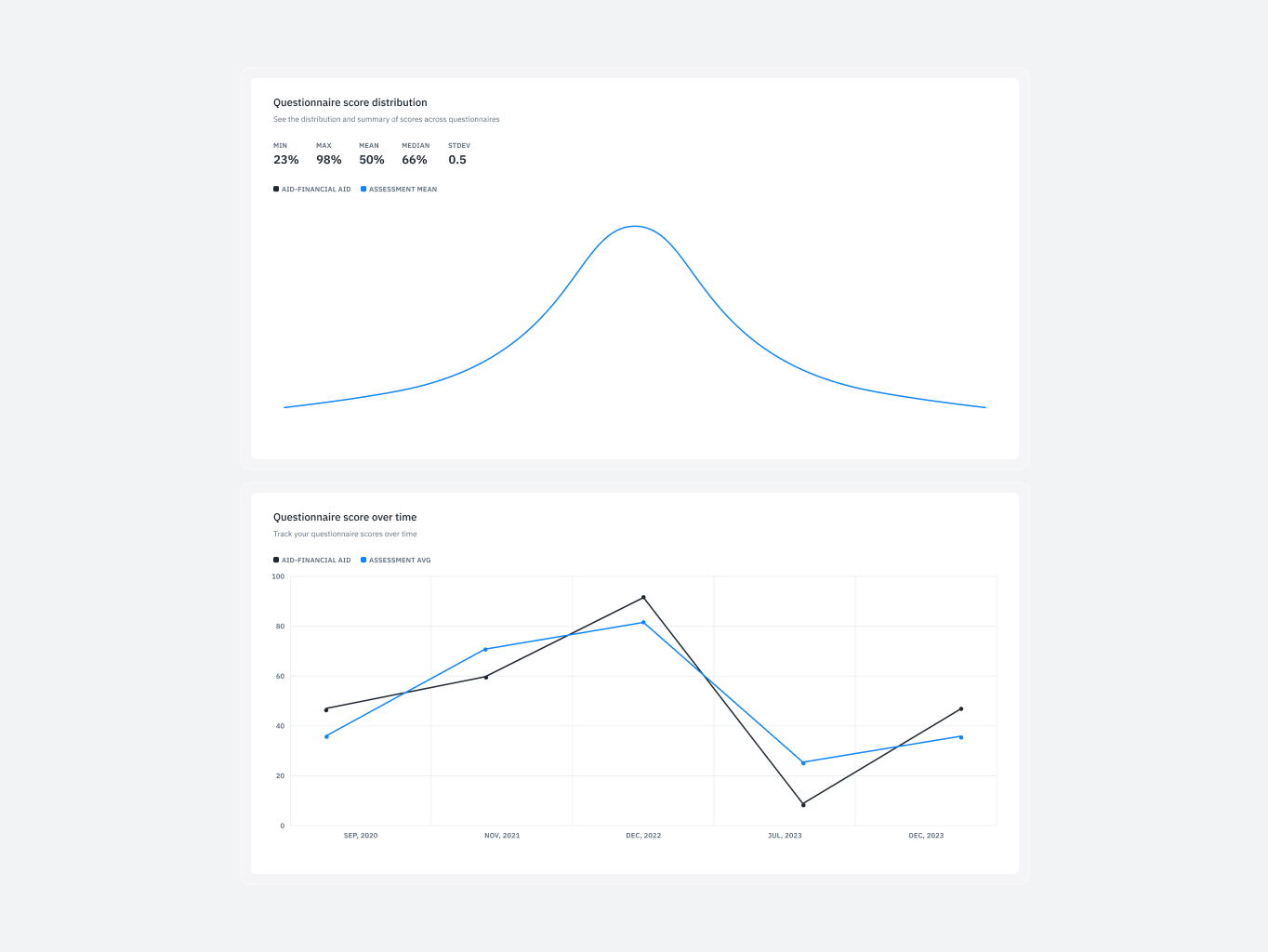
Assessment reporting
Comparing data across assessments was cumbersome and error-prone, with no intuitive way to analyze or switch between reports seamlessly.
What we’ve done:
- Enabled seamless switching between reports for improved side-by-side comparisons.
- Introduced features to streamline data analysis across organizational units and vendors.
- Enhanced decision-making by reducing reliance on manual cross-referencing.
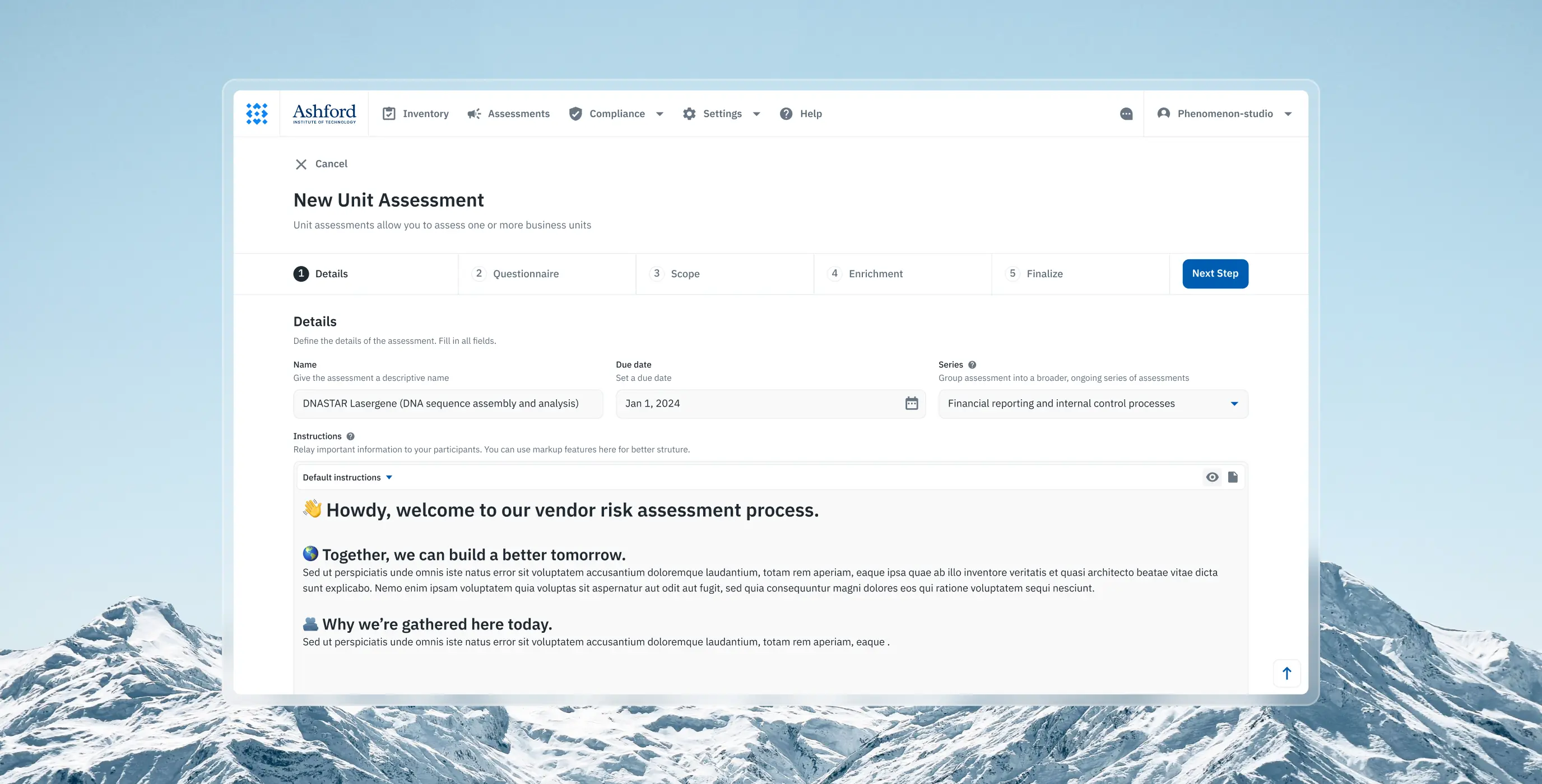
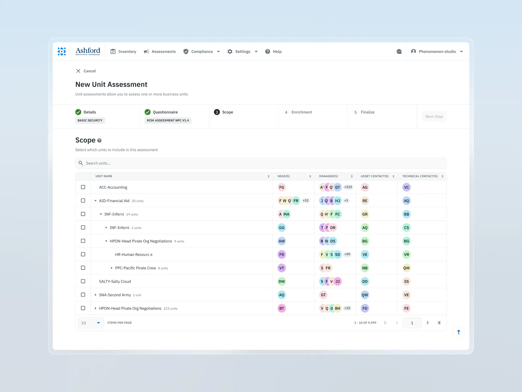
Assessment builder
Creating new assessments was overly complex and unintuitive, resulting in confusion and a steep learning curve for users attempting to set up processes.
What we’ve done:
- Transformed assessment creation into a guided, user-friendly process
- Provided contextual tips at each step to assist less experienced users
- Simplified complex workflows, improving accessibility for diverse user skill levels
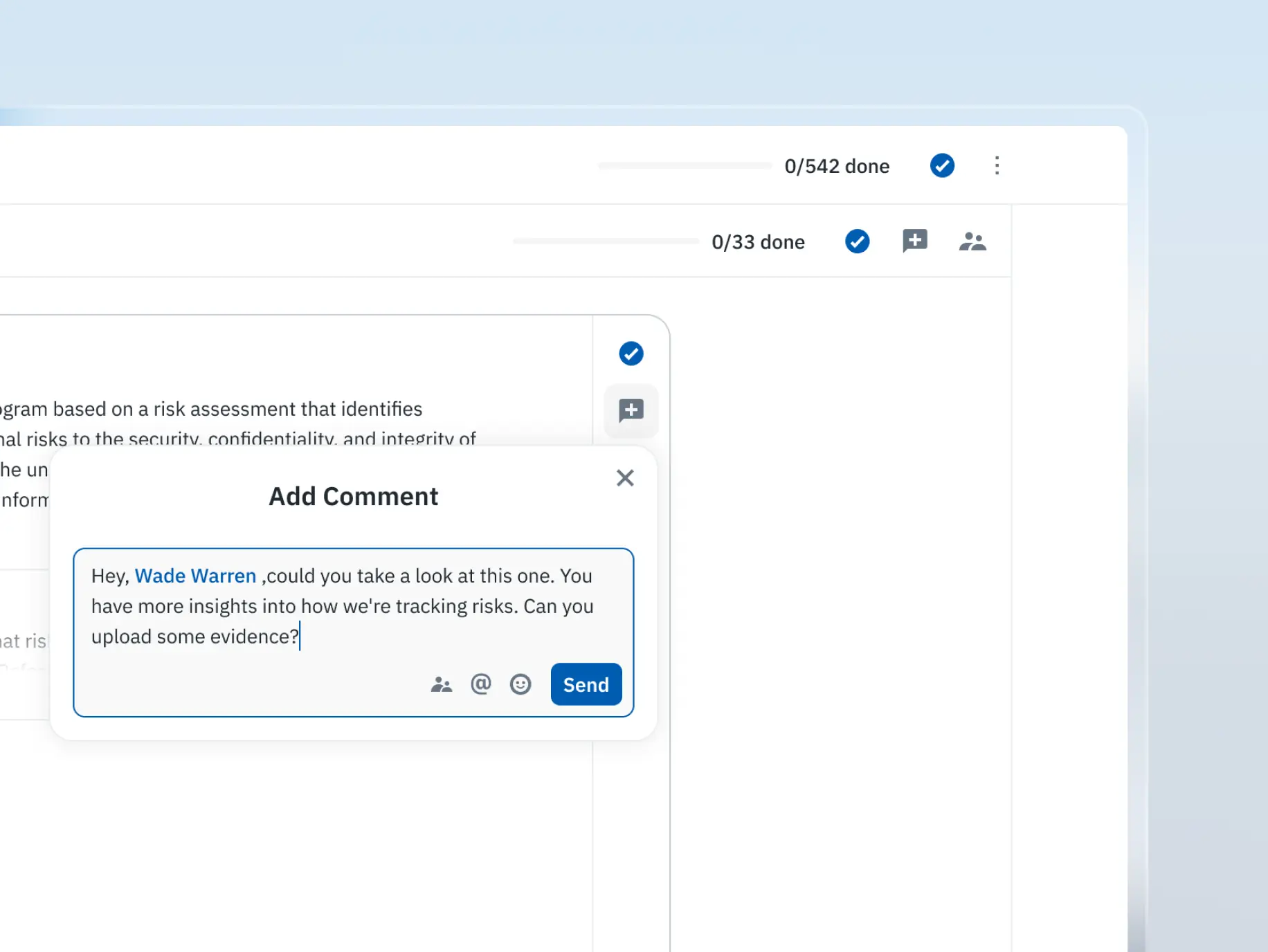
Commenting the survey
The absence of built-in collaboration tools forced users to rely on external solutions, leading to fragmented workflows and reduced team efficiency.
What we’ve done:
- Added collaboration tools allowing users to comment on specific survey sections
- Introduced threaded discussions, fostering team-based problem-solving
- Positioned the product as a collaborative tool, enhancing teamwork and communication
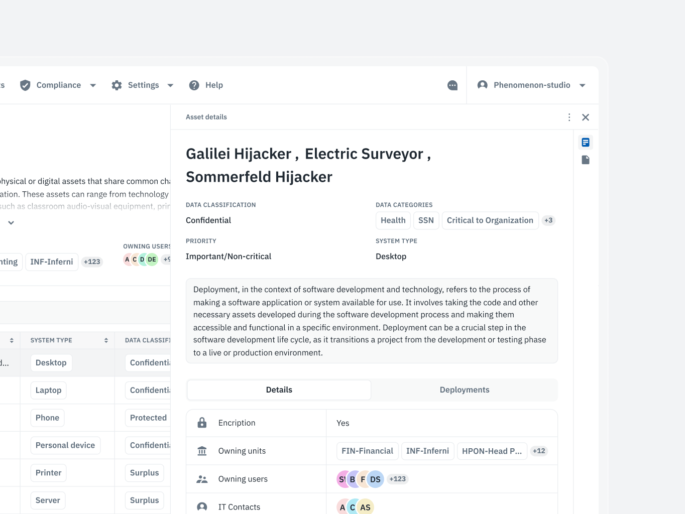
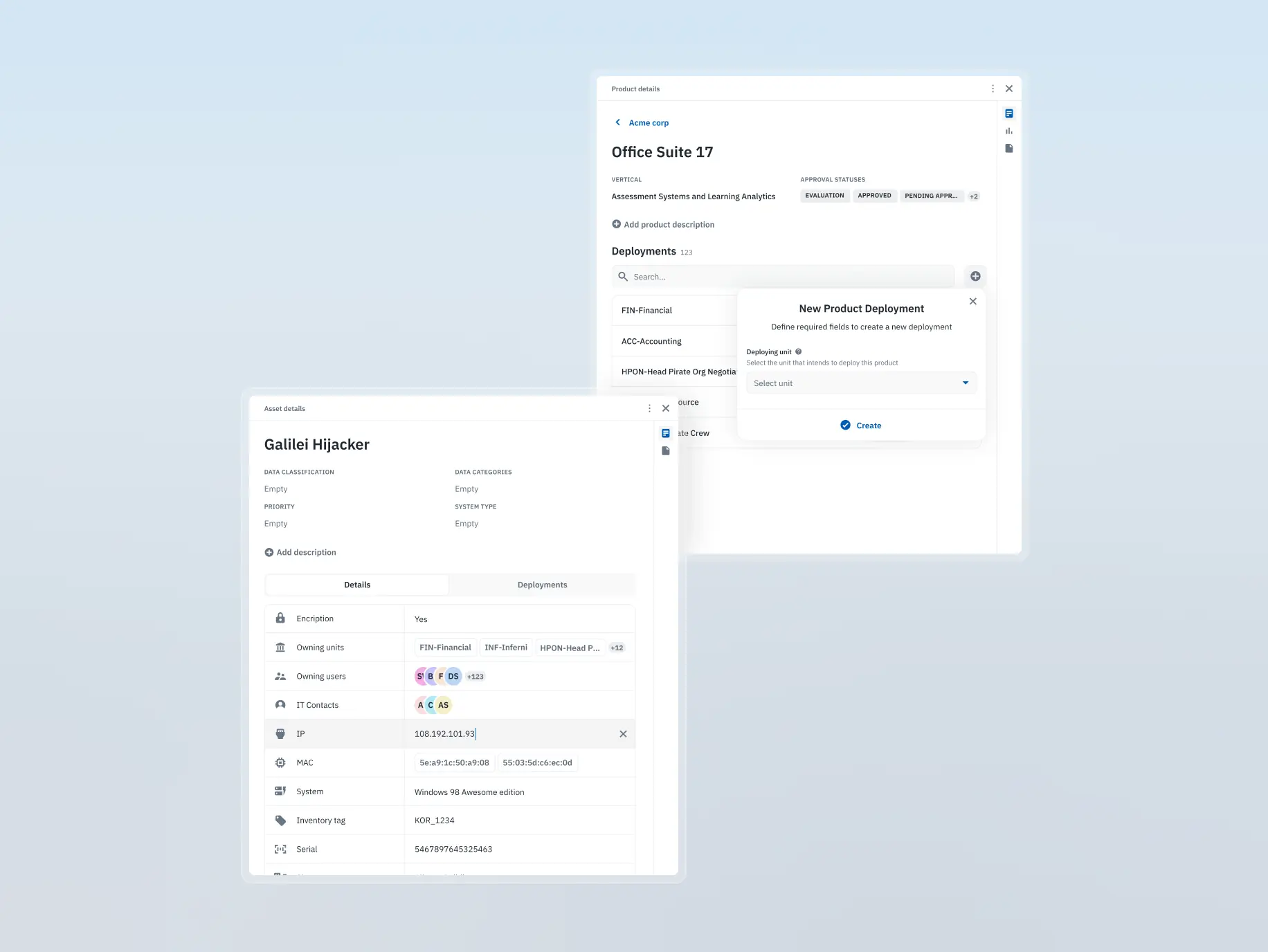
Dynamic sidebar
Users faced friction when reviewing or editing records, as the process was slow and required unnecessary steps, disrupting the overall workflow.
What we’ve done:
- Integrated a context-sensitive sidebar for quick access to record details and edits
- Streamlined workflows by enabling seamless transitions between sections without extra steps
- Enhanced productivity by eliminating friction in repetitive tasks
The development phase of Isora GRC was driven by precision, collaboration, and scalability. From dissecting outdated API documentation to building a fully interactive Storybook and crafting an accessible, high-performance frontend, every step focused on ensuring the product’s reliability and longevity.
The stack — Vite, React, and Radix Primitives — handled accessible interfaces without requiring custom solutions at every turn. Recharts took care of the data visualisations, keeping them interactive without hitting performance issues. Backend limitations and design adjustments came up throughout, and we worked through them as they arrived.
The end result was a codebase the client’s team could actually build on — without needing to unpick decisions before starting the next feature.
Stages
- APIs & back-end analysis
- Building the Storybook
- Front-end development
- Recharts integration
The API documentation was outdated and incomplete from day one. The client hadn’t had the resources to keep the Redoc docs current, so our developers couldn’t trust what was there — they had to manually inspect endpoints to understand how the system actually behaved.
The business logic added another layer. The relationships between API services were complex, and the only reliable way to map them was hands-on testing. Getting that right mattered: building solid frontend components or integrating something like the questionnaire builder into the existing backend wasn’t possible without a clear picture of how the services depended on each other.
We used Storybook for shared and ordinary components — shared being the small reusable pieces like buttons, icons, and selects, ordinary being the larger structures built from them like headers and footers.
Building it out took time upfront, but it meant every component could be previewed and tested in isolation before being dropped into the product. When discrepancies came up between Figma and the actual implementation, we caught them at the component level rather than buried inside a screen.
That gave both teams a library they could trust and refer back to throughout the project.
Frontend development ran in parallel with Storybook, keeping component design and implementation moving together. Accessibility, performance, and code quality were part of the brief from the start rather than a review at the end.
We set up linters and CI/CD workflows early to catch errors before they compounded and keep deployments predictable. The stack was Vite for bundling, React for the core, and Radix Primitives for accessible components — Radix handled accessibility standards out of the box, which removed a whole category of problems from the table.
Backend limitations occasionally forced small design adjustments mid-development. When that happened, developers and designers worked through it together to find something buildable that still felt like the original design.
We used several third-party libraries throughout the project. Recharts was the most significant.
It’s a charting library built for React, with a solid range of pre-built chart types and enough flexibility to build custom ones where needed. Isora GRC relies heavily on data — risk scores, compliance metrics, audit trails — so the visualisations had to be interactive and clear without becoming a performance problem. Recharts handled that without needing much wrestling.
The Isora GRC redesign earned more than a satisfied client — it was submitted to the UX Design Awards and secured a nomination. Having industry judges recognise the work confirmed that the improvements to usability and accessibility held up beyond the project itself.
The nomination strengthened Isora GRC’s position in the GRC market too. In a space where most products prioritise compliance features over user experience, recognition for design excellence was a meaningful differentiator — and a signal that the platform was built with room to grow.
#Website design #website development
EVERON
 USA
USA
USA
#Website design #Website development
Philip Lewis
 Finland
Finland
#website design
Tyler Ussery
 USA
USA
USA
Have a project in mind?
Let's chat
Have a project to
discuss?
discuss?

Have a partnership in
mind?
mind?