Design
Development
Research
Launch
Evolve
Extend
May 13, 2026
6 min read
summary
Discover how mobile-first fintech design, offline-first architecture, progressive KYC, and accessible UX helped Pacific Island communities reach a 54.8% completion rate.
Key Takeaways
- Mobile-first fintech design succeeds when products are built around real-world connectivity, literacy, and device constraints rather than ideal technical assumptions.
- Offline-first architecture, progressive KYC flows, and multilingual voice-guided onboarding increased application completion rates from 11.3% to 54.8%.
- Inclusive fintech experiences require designing for underserved users from day one, including support for low-end Android devices, intermittent networks, and non-English speakers.
- Social trust systems, community partnerships, and tiered identity verification can significantly improve onboarding accessibility and long-term user engagement.
- The strongest gains in financial inclusion came not from adding more technology, but from reducing friction and respecting how people actually interact with digital finance tools in emerging markets.
By Oleksandr Kostiuchenko | Marketing Manager, May 2026
Exploring the Mobile First Fintech Revolution
The Problem Nobody Was Solving
When our team first arrived in Suva, Fiji, we expected to find a population hungry for digital banking. What we found instead was a population burned by it.
Across the Pacific — from Tonga and Samoa to Vanuatu and the Solomon Islands — financial exclusion isn’t primarily caused by a lack of infrastructure. It’s caused by a failure of design. Products built for Silicon Valley workflows, exported to communities where a strong 3G signal is a luxury, where English is a second or third language, and where financial literacy curricula never made it into school. Mobile connectivity enables fintechs to reach underserved regions where smartphones are the primary internet access point.
The question we set out to answer was deliberately narrow: can we get someone with a basic Android handset, intermittent connectivity, and no prior banking relationship to successfully complete a loan or savings application — end to end — on a mobile device? In the broader financial industry, mobile-first strategies are transforming fintech by shifting the focus to app-native experiences designed for small screens and immediate action.
After 18 months of iteration, our answer became 54.8%.
Understanding the Baseline
Before we built anything, we needed to understand what “completion” meant in this context.
In traditional FinTech, completion rate measures the percentage of users who start an onboarding or application flow and finish it. Industry benchmarks hover around 30–40% globally. Among underserved populations in emerging markets, that number often collapses below 15% — not because of disinterest, but because the product fights the user at every step.
Our baseline, during a three-month pilot with a regional credit union in Samoa, was 11.3%. Of every 100 people who opened the app and tapped “Apply,” fewer than 12 reached the confirmation screen. To address these onboarding challenges, companies now prioritize mobile interfaces that allow users to open accounts and manage finances entirely from smartphones, optimizing mobile-first fintech experiences for usability and accessibility.
We ran exit interviews. The patterns were consistent and damning:
- Users abandoned during document upload steps when photo quality thresholds failed on low-resolution cameras
- Session timeouts cut off users mid-form on slow connections — and wiped their progress
- English-only interfaces created friction for ni-Vanuatu and Tongan speakers
- KYC (Know Your Customer) screens that asked for a national ID alienated unregistered community members
These weren’t edge cases. They were the core demographic.
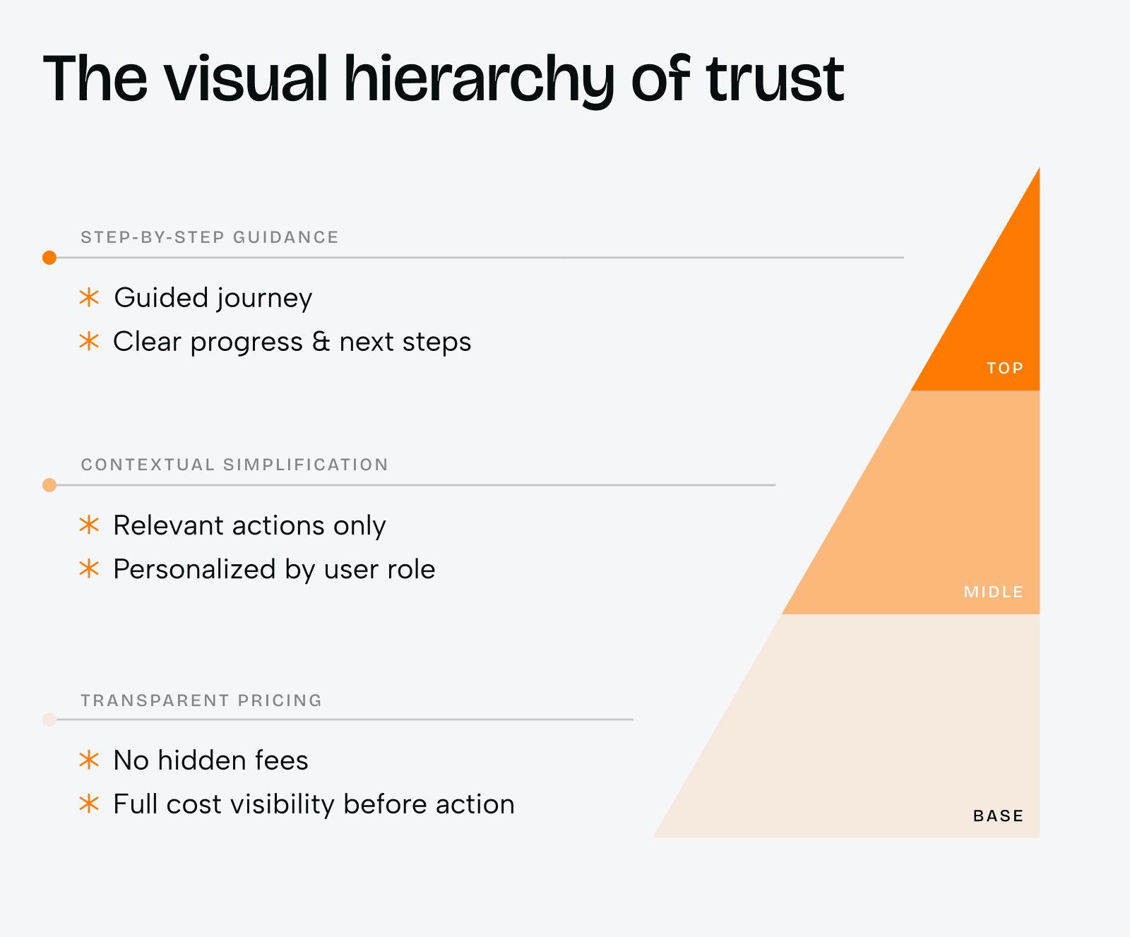
The Four Design Principles We Built Around in Fintech App Design
1. Offline-First and Mobile-First Architecture
The most impactful single technical decision we made was rearchitecting the application to treat connectivity as optional, not required.
Every form field saves state locally the instant a user taps into it. A draft is committed to the device every 30 seconds. When a session drops — and it will drop — the user resumes exactly where they left off, automatically, without a login prompt.
We also introduced what we called “dead air tolerance”: the UI never displays a loading spinner that persists longer than 8 seconds without offering the user an explicit offline fallback. On low-bandwidth networks, spinner fatigue is a leading cause of abandonment. Optimizing performance and speed is critical in mobile-first design, so we focused on minimizing load speed and compressing images to ensure smooth functionality across different network speeds, including slower connections like 2G.
This alone lifted our completion rate from 11.3% to 24.7% in the first iteration.
2. Progressive Identity Verification
One of the most exclusionary features of standard FinTech onboarding is the hard requirement for government-issued ID at the front of the funnel.
In Pacific Island nations, a significant portion of the rural population — particularly women and elderly citizens — lack formal identification documents. Requiring a national ID as step one eliminates them before the conversation starts.
We redesigned the KYC flow using a tiered trust model:
- Tier 1 (Basic Access): Phone number, village/community affiliation, and a community guarantor confirmation via SMS. Unlocks savings accounts up to FJD 500.
- Tier 2 (Verified Access): Birth certificate or voter card (both widely held), plus a short video selfie for liveness detection. Unlocks microloans up to FJD 2,000.
- Tier 3 (Full Access): National ID or passport. Unlocks full product suite.
Critically, we allowed users to start using the product at Tier 1 immediately, and prompted — never forced — upgrades when they hit limits. Over 67% of Tier 1 users voluntarily upgraded to Tier 2 within 90 days.
3. Language and Literacy Accessibility
We built the product in four languages from day one: English, Bislama (Vanuatu), Tongan, and Samoan. This was not a post-launch localization effort — it was a core architectural requirement.
But language alone wasn’t enough. In communities where financial literacy is limited, written instructions — even in the right language — can fail. We introduced voice-guided onboarding, where each screen can be read aloud in the user’s selected language by tapping an audio icon.
We also eliminated jargon entirely. “APR” became “the extra you pay per year.” “Collateral” became “what you offer to back your loan.” Every piece of copy went through a community review panel of five non-expert users before shipping. Mobile-first design methodologies, such as User-Centered Design (UCD), leverage user stories to understand user behaviors and preferences, which helps enhance user experience and create intuitive mobile interfaces.
The reading level target for all interface text: Grade 5.
4. Social Trust Integration
Digital finance is, at its core, a trust problem. And in Pacific Island communities, trust is social before it is institutional.
Rather than fight this, we designed with it. Our referral model allows existing users to vouch for new applicants — not as formal guarantors in the legal sense, but as social signals that inform (but don’t determine) credit assessments. A first-time applicant vouched for by three existing users with clean repayment records receives a slightly faster review window.
We also partnered with local church groups, women’s savings cooperatives (locally known as ROSCAs — Rotating Savings and Credit Associations), and community leaders to host onboarding events. These weren’t just marketing moments. They were product research sessions. Every event generated structured observation data that fed directly into the next sprint.
Landing Page Optimization
Landing page optimization is a cornerstone of enhancing user engagement and boosting conversion rates on mobile devices. Unlike desktop users, mobile users interact with landing pages in quick, focused bursts, often on the go and with limited attention spans. This means every element—from headline to call-to-action—must be streamlined for clarity and impact.
A successful mobile landing page prioritizes a clear, concise message that immediately communicates value. Prominent calls-to-action (CTAs) should be easily tappable, with enough spacing to accommodate touch interactions on small screens. Visual clutter is minimized, and essential information is placed above the fold to capture user attention quickly.
Analyzing user behavior through tools like heatmaps and session recordings helps businesses understand exactly how users interact with their landing pages. Are users dropping off before reaching the CTA? Are they struggling with navigation or form fields? By gathering and acting on this feedback, businesses can make targeted improvements—such as simplifying forms, optimizing button placement, or reducing load times—to enhance user engagement and drive higher mobile conversion rates.
Ultimately, a mobile-optimized landing page is not just about aesthetics; it’s about creating a seamless, intuitive experience that guides users toward action, no matter where or how they access your site.
Mobile CRO and SEO
Mobile Conversion Rate Optimization (CRO) and Search Engine Optimization (SEO) are deeply interconnected, especially as mobile usage continues to outpace desktop. A mobile site that’s optimized for both conversion and search visibility is essential for attracting and retaining potential customers.
Responsive design is the foundation—ensuring your mobile site adapts smoothly to any screen size and device. Fast load speeds are equally critical, as even a few seconds of delay can lead to lost conversions and lower search rankings. Clear call-to-actions (CTAs) must be visible and easy to interact with, guiding users toward the next step in their journey.
Google Analytics is an invaluable tool for understanding user behavior on your mobile site. By tracking key metrics such as bounce rates, session duration, and conversion paths, businesses can identify friction points and opportunities for improvement. Mobile CRO strategies like A/B testing allow for continuous refinement of the mobile experience, while user feedback highlights areas where expectations aren’t being met.
Incorporating SEO best practices—such as optimizing meta tags, compressing images for faster load times, and ensuring intuitive navigation—further boosts your site’s visibility and usability. The result is a mobile experience that not only attracts more visitors but also converts them into satisfied customers, driving sustainable growth and higher conversion rates.
What 54.8% Actually Means
By the end of the project, our completion rate stood at 54.8% — a 385% improvement over baseline.
But the number requires context.
We measured completion as: a user who initiates an application and submits it for review within 72 hours of their first session. We extended the window to 72 hours deliberately, acknowledging that in many communities, a single uninterrupted sitting to complete a form is not realistic. Users might open the app, save progress, consult a family member, and return the next evening.
The 54.8% figure excludes users who abandoned within the first 60 seconds — a deliberate choice, since many of those exits represented users who opened the app out of curiosity rather than intent.
Among users who passed the 60-second threshold, our completion rate was 71.2%.
Case Study: KlickEx Mobile-First Fintech Redesign
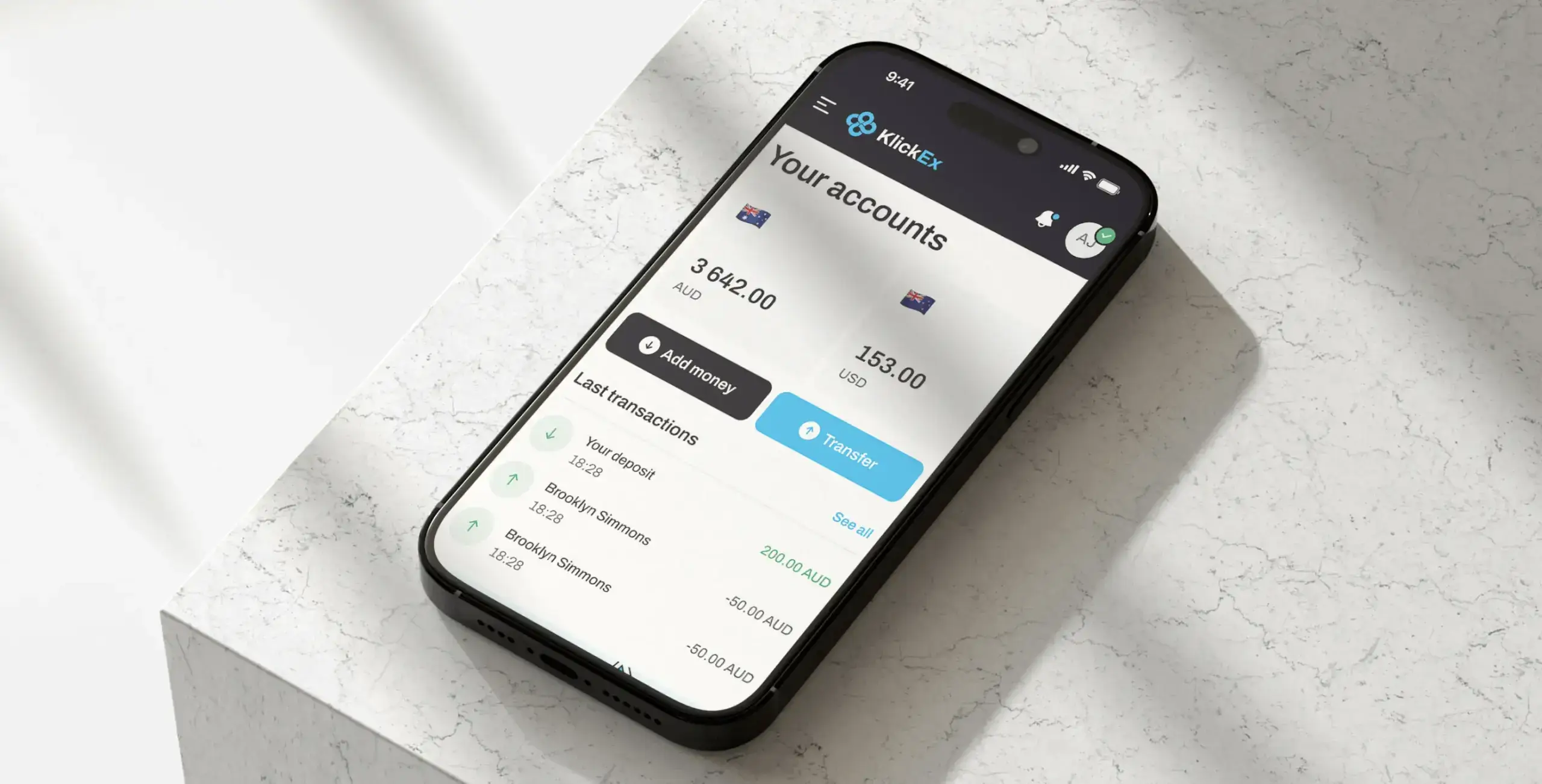
Problem:
Pacific Island communities needed a simpler way to access cross-border payments, mobile top-ups, and digital financial services. Existing fintech flows were too complex for users with limited banking experience, unstable connectivity, and mobile-first behavior. Key actions like adding money, sending transfers, and completing onboarding created friction and reduced completion rates.
Solution:
We redesigned KlickEx as a mobile-first fintech platform focused on clarity, accessibility, and trust. Starting with a UX audit and competitor analysis, we identified friction points in transaction flows, KYC verification, currency conversion, and mobile navigation.
The interface was simplified around clear step-by-step journeys for money transfers, deposits, and mobile top-ups. We introduced transparent pricing, upfront exchange-rate visibility, localized user flows, and a design system optimized for different devices and network conditions.
The platform was built with Next.js, TypeScript, React Redux, and Auth0 to ensure performance, scalability, secure authentication, and reliable financial operations across supported Pacific regions.
Result:
54.8% completion rate — mobile-first design helped users complete key application and transaction flows more successfully across devices.
30%+ conversion increase in key flows — “Add Money” improved by 35.3%, while “Money Transfer” increased by 30.7% after streamlining user journeys.
53,000 active users with steady growth — KlickEx now serves Pacific Island communities as a vital financial bridge, adding around 3,000 new users monthly on average.
What We Got Wrong (And Fixed)
Honest case studies document failure. Here are ours.
Biometric friction. Our early facial recognition liveness check failed disproportionately on darker skin tones in outdoor lighting conditions — a known, documented bias in off-the-shelf ML models that we failed to adequately test for in our specific environment. We replaced the vendor model with one trained on a more representative dataset. This also required renegotiating our KYC compliance framework with the regulator, which took four months.
Assuming smartphone penetration. Our MVP assumed Android 8.0 or higher. In parts of rural Vanuatu, the modal device was an Android 5.1 handset from 2015. We rebuilt the critical path screens to be compatible with Android 5.0+, eliminating the need for several modern APIs we’d taken for granted.
SMS reliability. Our community guarantor confirmation system relied on SMS delivery. In some island networks, SMS delivery rates for transactional messages were below 60%. We added WhatsApp as a fallback channel — which had higher penetration and more reliable delivery in these communities — after two months of watching the flow silently fail.
The Broader Lesson
The 54.8% is not a number about technology. It’s a number about respect.
Every design decision that improved our completion rate was, at its root, a decision to take the user’s constraints seriously rather than asking the user to absorb our product’s limitations. Offline-first said: we know your connection is unreliable. Tiered identity said: we know you may not have the documents we’d ideally want. Voice-guided onboarding said: we know reading a form in a second language is hard.
FinTech’s financial inclusion narrative is often told in terms of access — getting products to underserved communities. The harder, less glamorous work is designing products that those communities can actually use once they arrive.
That’s the work. And we’re still doing it.
Key Metrics for User Engagement
| Metric | Baseline | Final |
| Overall completion rate | 11.3% | 54.8% |
| Completion rate (post-60s) | ~18% | 71.2% |
| Avg. sessions to complete | 4.1 | 1.8 |
| Tier 1 → Tier 2 upgrade rate (90 days) | — | 67% |
| Language: non-English sessions | 8% | 43% |
| Avg. form completion time | 34 min | 11 min |
Data Insights and Analytics
Harnessing data insights and analytics is essential for any business aiming to excel in mobile CRO. By leveraging tools like Google Analytics and session recordings, companies gain a deep understanding of how users engage with their mobile experience—what draws their attention, where they encounter pain points, and which elements drive conversions.
Key metrics such as conversion rates, bounce rates, and average session duration provide a clear picture of what’s working and what needs improvement. Analyzing user behavior helps identify friction in the user journey, whether it’s a confusing navigation menu, a slow-loading page, or a form that’s too complex for mobile interactions.
These data-driven insights empower businesses to make informed decisions, from tweaking button placements to introducing interactive elements like augmented reality features that captivate users and encourage engagement. Session recordings offer a granular view of real user interactions, revealing subtle usability issues that might otherwise go unnoticed.
By continuously monitoring and acting on these insights, businesses can refine their mobile CRO strategies, personalize the user experience, and ultimately achieve higher conversion rates. In a landscape where user expectations are constantly evolving, a commitment to data-driven optimization is the key to staying ahead.
Future Directions in Mobile CRO
The future of mobile CRO is being shaped by rapid advancements in technology and shifting user expectations. As mobile usage becomes the norm, businesses must embrace a mobile-first mindset, designing interfaces that prioritize touch-friendly interactions and seamless experiences across multiple devices.
Emerging technologies like artificial intelligence (AI) and machine learning are enabling more personalized and predictive user experiences. For example, predictive analytics can anticipate user needs, while AI-driven chatbots and personal assistants offer real-time support and guidance. Augmented reality (AR) is opening new possibilities for interactive product demos and immersive financial insights, transforming how users interact with complex financial data on their mobile devices.
Security and convenience are also at the forefront, with biometric authentication—such as fingerprint or facial recognition—providing enhanced security for financial transactions and digital banking. Voice commands are making it easier for users to navigate apps and complete tasks hands-free, further streamlining the mobile experience.
In the realm of fintech app design and digital banking, businesses must adapt to evolving regulatory requirements and user expectations for transparency, control, and instant access to financial products. Innovative strategies, such as integrating bill payments, investment tracking, and progress tracking into a single, user-friendly interface, are becoming standard.
By staying attuned to these trends and continuously innovating, businesses can gain a competitive edge, deliver exceptional customer experience, and drive higher customer satisfaction in the mobile-first era. The journey of mobile CRO is ongoing—those who invest in user-centered design and cutting-edge technology will lead the way.
Share this opening with friends


Jun 12, 2026
8 min read
Discover what corporate website development companies in the USA actually deliver — from brand strategy and UX to custom code. Learn about pricing, timelines, and how to choose the right agency in 2026.

Jun 11, 2026
10 min read
Discover how a design system can cut development costs by 30%, accelerate time-to-market by 50%, improve product consistency, and support scalable growth.
Have a project in mind?
Let's chat
Have a project to
discuss?
discuss?

Have a partnership in
mind?
mind?
