



Aug 31, 2026
7 min read
summary
Learn how logistics UX design reduces warehouse errors, improves complex workflows, and modernizes legacy systems with role-based interfaces and UX audits.
A UX design agency reduces operational errors in complex logistics workflows by rebuilding the warehouse and order-management interfaces that frontline operators actually work in, which lowers error rates and cycle times without replacing the systems underneath.
Key Takeaways
- Manual warehouse workflows carry order error rates of 41 to 61 percent. Most of that traces back to interfaces built for reporting, not for the floor.
- Legacy logistics platforms absorb 40 to 80 percent of enterprise IT budgets, which starves the frontline UX that decides daily throughput.
- Role-based screens tuned to each floor role cut cognitive load far more than one shared interface ever does.
- An API-bridge rollout modernizes the highest-friction screens in roughly 1 to 2 months, with no downtime on core warehouse systems.
By Ruslan Vashchenko | Head of Design, August 2026
Operational errors start in the interface, not the operator
Blaming the picker who scanned the wrong pallet is the most expensive habit in enterprise logistics. The mistake usually belongs to the screen in front of them. Warehouse and order-management systems were built for backend accuracy and executive dashboards. The people moving physical goods were treated as an afterthought.
Software teams spend most of their design conversations with the managers who buy the system. They spend very little time watching the floor staff who use it. Phenomenon Studio’s logistics UX research puts that split at more than 75 percent of design talk aimed at management. Under 25 percent goes to direct field observation. The result is software that reports well and works badly.
For an operations leader, that gap surfaces as rework and missed SLAs. It shows up again as safety incidents and unplanned overtime. None of it lands on the software invoice. All of it lands in the P&L.
According to Phenomenon Studio’s logistics UX research (2026), order error rates in manual warehouse environments run between 41 and 61 percent.
The question we hear most from operations directors is blunt: we spent a fortune on this WMS, so why is my team back on paper? The honest answer is that the system was never designed for the aisle. It was designed for the report.
Where UX/UI design cuts logistics errors
Reducing errors is a design problem with a measurable ceiling. Every interface a worker touches carries a cognitive cost. Cut the wasted effort, and accuracy rises on its own.
Interface research separates the mental effort a task truly requires from the effort wasted on bad layouts. A picker calculating a route needs their attention on the aisle, not on a buried menu. Strong UX/UI design strips the screen back to the one decision that matters at that moment.
Supervisors have the opposite need. They need to read the whole floor at a glance: which dock is backed up, and which order is about to breach its deadline. The same product, designed well, gives each role a different view of the same data. Our full argument for that approach lives in our work on improving logistics products by prioritizing UX. It holds across warehouse and last-mile tools alike.
UI and UX design for role-based interfaces
One screen for everyone is the default that fails. Effective UI and UX design gives the floor picker a single linear task queue and nothing else. The storekeeper gets an audit trail with instant discrepancy flags. Supervisors get a drag-and-drop overview that surfaces bottlenecks before they spread. Each role sees less on screen and gets more done.
The best UI/UX design services for error-prone workflows
Not every design service moves the error rate. The ones that do share a pattern. They start on the floor and end in the codebase, with no handoff gap in between.
A discovery sprint and UX audit come first. Watching operators work surfaces the informal workarounds and abandoned features that no requirements document ever captures. That single step tends to reveal the handful of screens responsible for most of the mistakes.
Role-based interface design turns those findings into screens each worker can run without training. Usability issues caught at this stage cost far less to fix than the same issues found after launch. For a supply chain product measured on throughput, that difference often decides whether a rollout lands on time.
A shared design system keeps every screen consistent as the product grows. When a developer needs a component, it already exists and is already tested. That consistency is what keeps a fast rollout from turning into a pile of one-off fixes.
UI/UX design agency vs in-house patching
Most teams try to patch the interface in-house first, and it rarely holds. A dedicated UI/UX design agency brings field-research discipline and component architecture. An internal team, busy shipping features, rarely has spare time to build that. The tradeoff is real. An outside partner works best when the client has a clear product vision and budget for at least a discovery phase. Skip discovery to save a week, and the redesign comes back six months later.
How a UI/UX design firm reduces operational errors differently
A generalist agency will make the screens prettier. A logistics-focused UI/UX design firm will make them safer to use at speed, in gloves, under a warehouse’s worst lighting. The difference is not taste. It is whether the team has watched the work.
What a specialist UX & UI design agency brings
A specialist UX & UI design agency treats the physical environment as a design constraint, not a detail. Cold storage and forklift vibration change how an interface should behave. One-handed use changes it again. A team that has shipped for those conditions designs for them from the first wireframe.
How to compare a design partner for logistics software
| Selection criterion | Generalist agency | Logistics-specialist UI/UX design firm |
| Field research | Reviews screenshots and requirements | Shadows operators through a full shift before design |
| Environmental design | Standard touch and contrast | Sizes targets for gloves, vibration, and low light |
| Role-based interfaces | One layout for all users | Separate views for picker, storekeeper, supervisor |
| System integration | Frontend delivered in isolation | Interface built with developers against the live WMS |
| Rollout risk | Big-bang redesign | One high-friction screen modernized at a time |
Why UI/UX developers and designers must work as one team
The screen a designer draws and the screen an operator taps are not always the same screen. Vibration and gloves change how a target behaves in the real world. When UI/UX developers and designers sit in one team, those constraints get built in, not discovered in the field after launch.
Interface research has a well-known rule for how fast and how reliably a person hits a target on a screen. In a moving, gloved, high-pressure setting, standard touch targets sit too small and too close together. A team that designs and builds together sizes them for the real conditions. It routes barcode scans straight into the system, without the lag that drops a scan mid-shift.
Purpose-built industrial hardware, paired with software designed for it, has been shown to cut wrist motion and lift picking productivity against older pistol-grip devices.
According to Phenomenon Studio’s logistics UX research (2026), purpose-built hardware matched to software designed for it raised picking productivity by up to 14 percent versus legacy terminals.
In one data-heavy dashboard rebuild, a developer opened the shared design file mid-sprint. The widget was already specified to the pixel, so he shipped the screen that same afternoon. The component had been defined in week one and never touched again. That is what one team, one system looks like in practice.
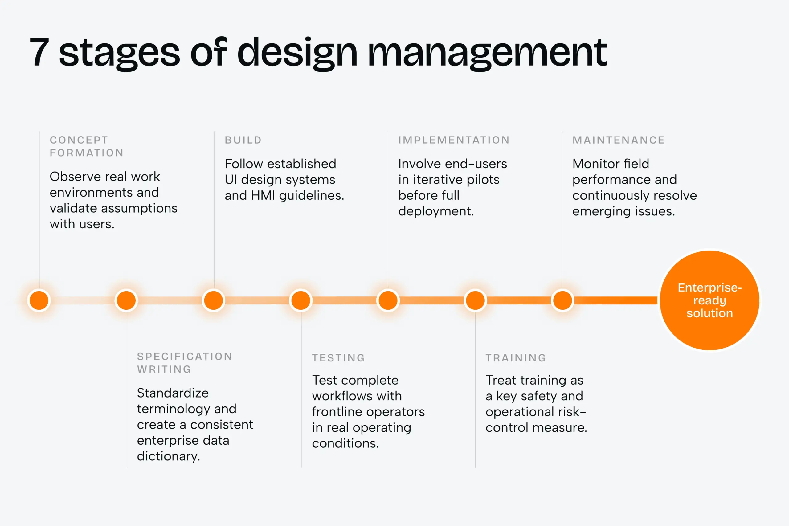
The seven stages of design management that keep errors out of production
Errors do not enter a logistics product at launch. They enter at concept, when the team guesses instead of watching. A disciplined design-management process closes that door at every stage, from the first field visit to long after go-live.
For a buyer, this is the line between a fixed-scope project and an open-ended one. Each stage below removes a class of risk before it reaches your floor.
7 Stages of Design Management
| Stage | What it does |
| 1. Concept Formation | Observe real work environments and validate assumptions with users. |
| 2. Specification Writing | Standardize terminology and create a consistent enterprise data dictionary. |
| 3. Build | Follow established UI design systems and HMI guidelines. |
| 4. Testing | Test complete workflows with frontline operators in real operating conditions. |
| 5. Implementation | Involve end-users in iterative pilots before full deployment. |
| 6. Training | Treat training as a key safety and operational risk-control measure. |
| 7. Maintenance | Monitor field performance and continuously resolve emerging issues. |
Case study: making a data-heavy interface usable (AirlineSim)
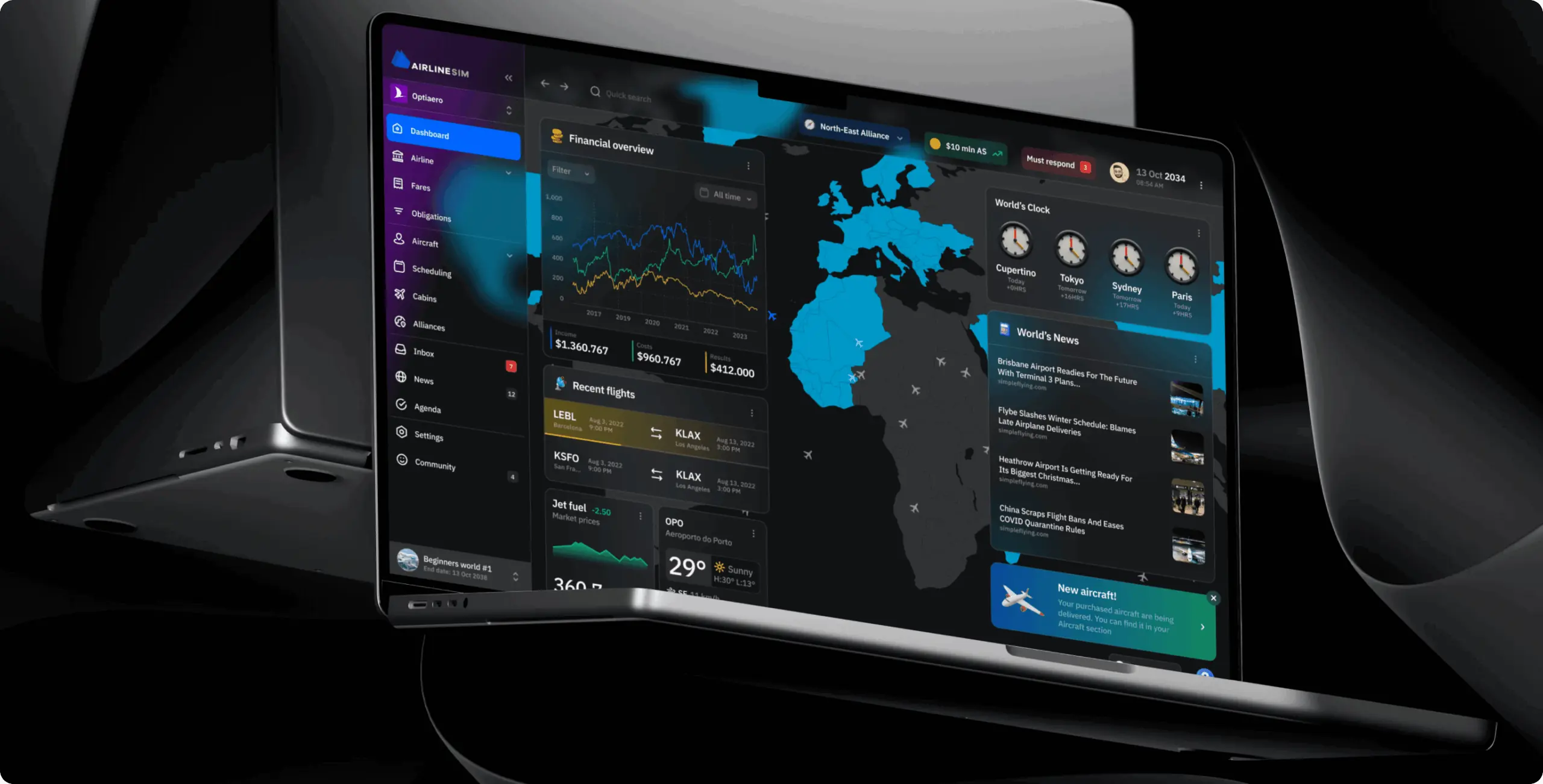
AirlineSim runs a live, multiplayer airline-management simulation. Its interface carried the same problem a warehouse control screen does. Too much operational data, packed into tables and graphs, with no clear signal for what needed attention right now. New users opened the dashboard, could not tell what to do next, and lost momentum before they reached the core of the product.
Task. The client asked Phenomenon Studio to rebuild the product as an MVP. It had to keep the depth of the simulation but make complex operations readable at a glance, with a clearer onboarding path.
Solution. Phenomenon replaced the dense table-and-graph layout with a modular, widget-based dashboard. Related data was grouped into blocks that give an at-a-glance overview while keeping full detail one tap away. A prioritized notification system flagged urgent events so nothing critical got missed. Maps and radar views were kept only where they add operational value.
Result. Phenomenon delivered a working AirlineSim MVP redesign within a month, letting the client enter the market quickly and build early traction. The flexible architecture left room to add features without a rebuild. Grouping data into a clear command-center view deepened engagement by giving players a product they could read rather than decode.
What logistics UX design costs and how long it takes
Cost depends on scope, but the shape is predictable. A focused redesign of the highest-friction screens is a different budget from a full product rebuild, and most operations teams should start with the former.
The lowest-risk path modernizes one touchpoint at a time. An API bridge wraps the legacy system and delivers a modern interface to the devices that need it most. A picker’s terminal screen can be replaced in roughly 1 to 2 months, with no downtime on core warehouse services. The old system keeps running. The floor gets a better screen.
A typical engagement runs with a small senior team, usually four people:
- A product designer who owns the interface
- A UX researcher who runs the field work
- A frontend developer who builds against the live system
- A delivery lead who keeps scope honest
Phenomenon Studio works with over 70 mid-to-senior in-house specialists and runs design and development under one roof. That removes the handoff delays that stretch timelines and reintroduce errors.
For budgeting, expect a discovery and UX audit phase to price separately from build. It protects the far larger development spend that follows. Skipping it is the most expensive saving in the project.
Phenomenon Studio holds a 5.0 rating on Clutch across more than 50 verified reviews. The studio is HIPAA-compliant, independently assessed by Compliancy Group in August 2026.
“The teams that cut errors fastest are the ones that let us watch a full shift before we draw a single screen. The floor tells you in an hour what a requirements document hides for months.”
If operational errors keep landing on your team instead of the software that caused them, the fastest fix is to look at the screens first. Phenomenon Studio runs a short discovery and UX audit that maps where your workflow is leaking time and accuracy, with no obligation to continue. Bring your current interface and one shift’s worth of problems, and we will come back with a read on what to fix first.
Bibliography
- Phenomenon Studio. Logistics UX research and analysis, including the seven-stage design-management model (2026).
- Phenomenon Studio. AirlineSim MVP redesign case study. https://phenomenonstudio.com/projects/airlinesim-realistic-online-airline-management-simulation/
- Phenomenon Studio. Improving logistics products by prioritizing UX. https://phenomenonstudio.com/article/how-to-improve-logistics-products-by-prioritizing-ux/
- Sweller, J. Cognitive Load Theory (intrinsic, extraneous, and germane load).
- Endsley, M. R. Situational Awareness model: perception, comprehension, projection.
- Fitts, P. M. Fitts’ Law of human movement and target acquisition.
- Clutch. Phenomenon Studio verified reviews profile. https://clutch.co/profile/phenomenon-studio
Share this article with friends



Sep 29, 2026
6 min read
B2B website redesign without losing traffic: A complete b2b website redesign guide covering UX audits, 301 redirect mapping, and metadata preservation. Partner with a top b2b website redesign agency that boosts conversions while protecting your organic rankings.

Sep 29, 2026
8 min read
Small business web design services that fit your budget. Get affordable small business website design from one of the best website design companies for small business — with transparent pricing and no hidden fees.
