



Nov 11, 2026
7 min read
summary
Discover when and why FinTech, SaaS, healthcare, EdTech, and logistics companies need strategic branding to build trust, stand out, and support business growth.
Branding is often one of the last things companies in FinTech, SaaS, healthcare, EdTech or logistics see as a priority. If the product works, customers are coming in and the sales team can explain the offer, the existing brand may seem good enough.
That usually changes as the business grows. New markets, larger clients, additional products and a more crowded competitive landscape put more pressure on how clearly the company presents itself. What once felt like a minor communication issue can start influencing how customers understand and evaluate the business.
Many of these industries are highly innovative, but their buying environments tend to be cautious. Decisions around money, health, sensitive data, infrastructure or business-critical systems naturally involve more scrutiny and more people. Customers want to understand who they are dealing with before committing, which makes brand perception more important than it may seem at first.
The higher the risk, the more signals people look for
Choosing an enterprise platform usually involves a more complex decision than choosing a small productivity tool. Technical teams, procurement, management and legal may all be part of the process, each looking at the company from a different perspective.
In that context, clear positioning and consistent communication make the business easier to evaluate. A coherent website, product experience and sales materials help buyers understand what the company offers, how mature it is and whether it feels like a credible choice. The more risk there is in the decision, the more these signals tend to matter.
Most companies notice the symptoms before they notice the brand problem
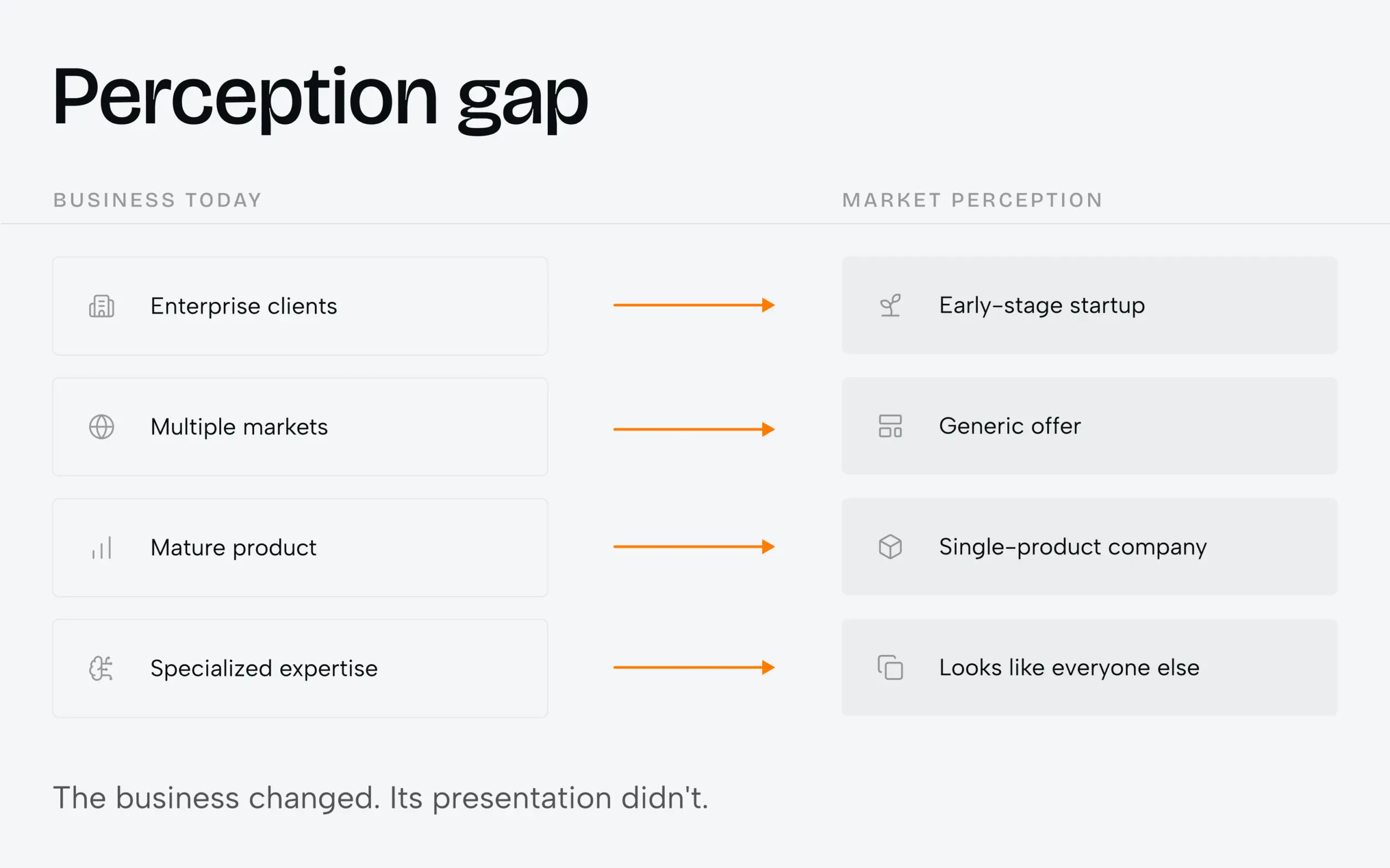
Companies rarely start a branding project because they have identified a positioning problem. More often, the signs are practical: the website feels outdated, the sales deck no longer reflects the product, marketing keeps creating new visual approaches, or the company is selling to enterprise clients while still looking like an early-stage startup.
Over time, these inconsistencies start to add up. They usually signal that the business has evolved, while the brand has stayed more or less where it was. At that stage, updating a logo or redesigning a single page may improve the surface, but it does not address the wider mismatch.
“Trustworthy” means very different things in different markets
Trust can mean different things depending on the market. In FinTech, it is often tied to control, transparency and security. In healthcare, clarity, responsibility and empathy can matter just as much as technical competence. Enterprise SaaS needs to show that it understands how businesses actually operate, while EdTech often has to speak to several audiences with different expectations. In logistics, visibility, consistency and predictability tend to play a major role.
A useful strategy makes those expectations more specific. It helps define what customers are actually concerned about, what gives them confidence in a provider and which strengths the company can support with real evidence.
Looking like the category is useful. Until everyone looks the same.
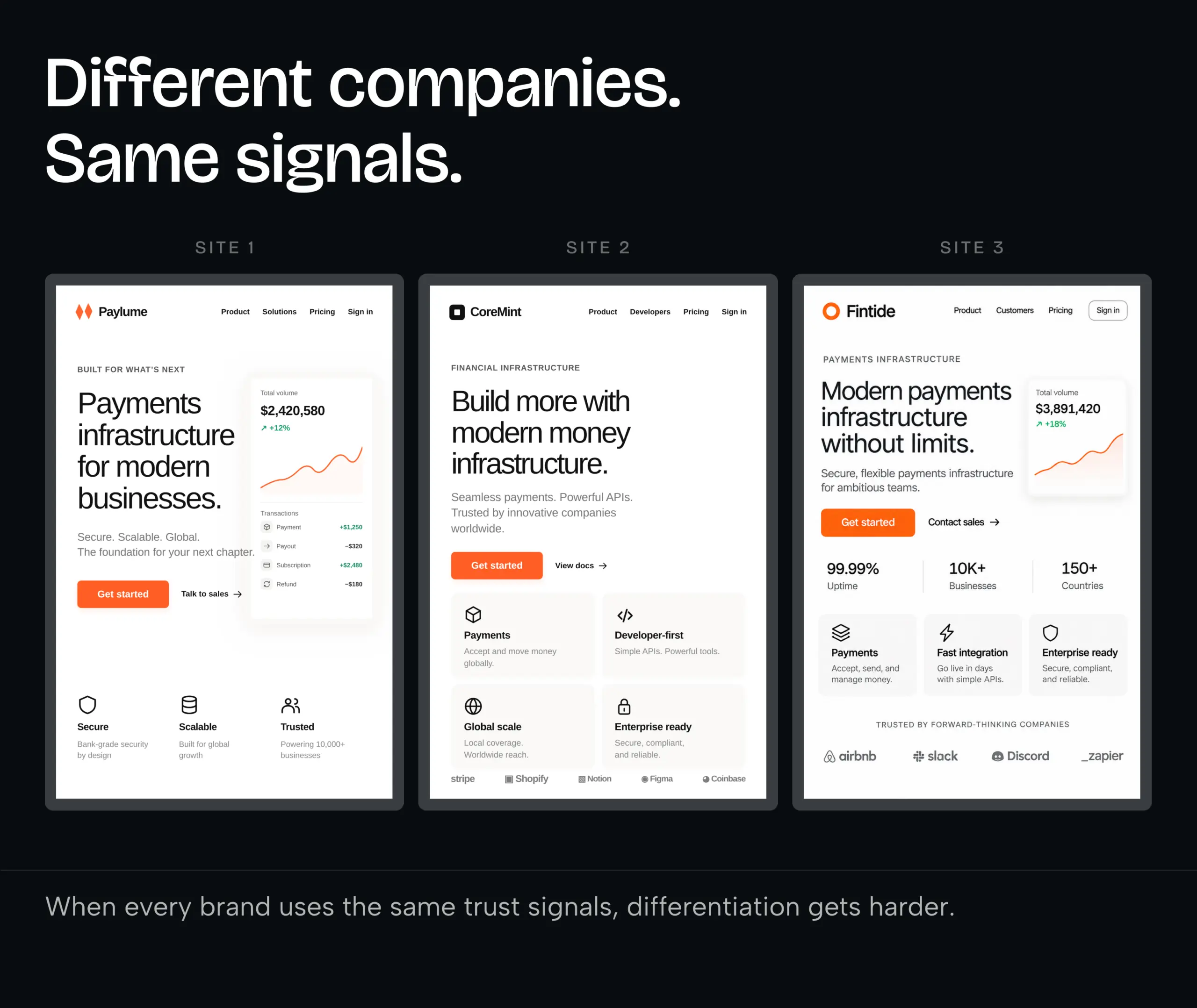
Companies in the same industry naturally develop similar visual habits. FinTech often leans on dark interfaces, gradients and data-driven graphics.
Healthcare tends to use cleaner layouts and softer palettes. SaaS is full of floating dashboards and feature cards, while logistics frequently uses maps, routes and movement.
These conventions are useful because they help audiences quickly recognise the category. But when too many brands rely on the same signals, they start to blur together. Put several competitors side by side and the pattern becomes obvious: different logos, but very similar language, layouts and promises around being secure, seamless, scalable or innovative.
That makes differentiation harder. The more useful question is which category signals still help build credibility, and where the brand can develop something more ownable and specific.
We try to resolve the important questions before visual exploration
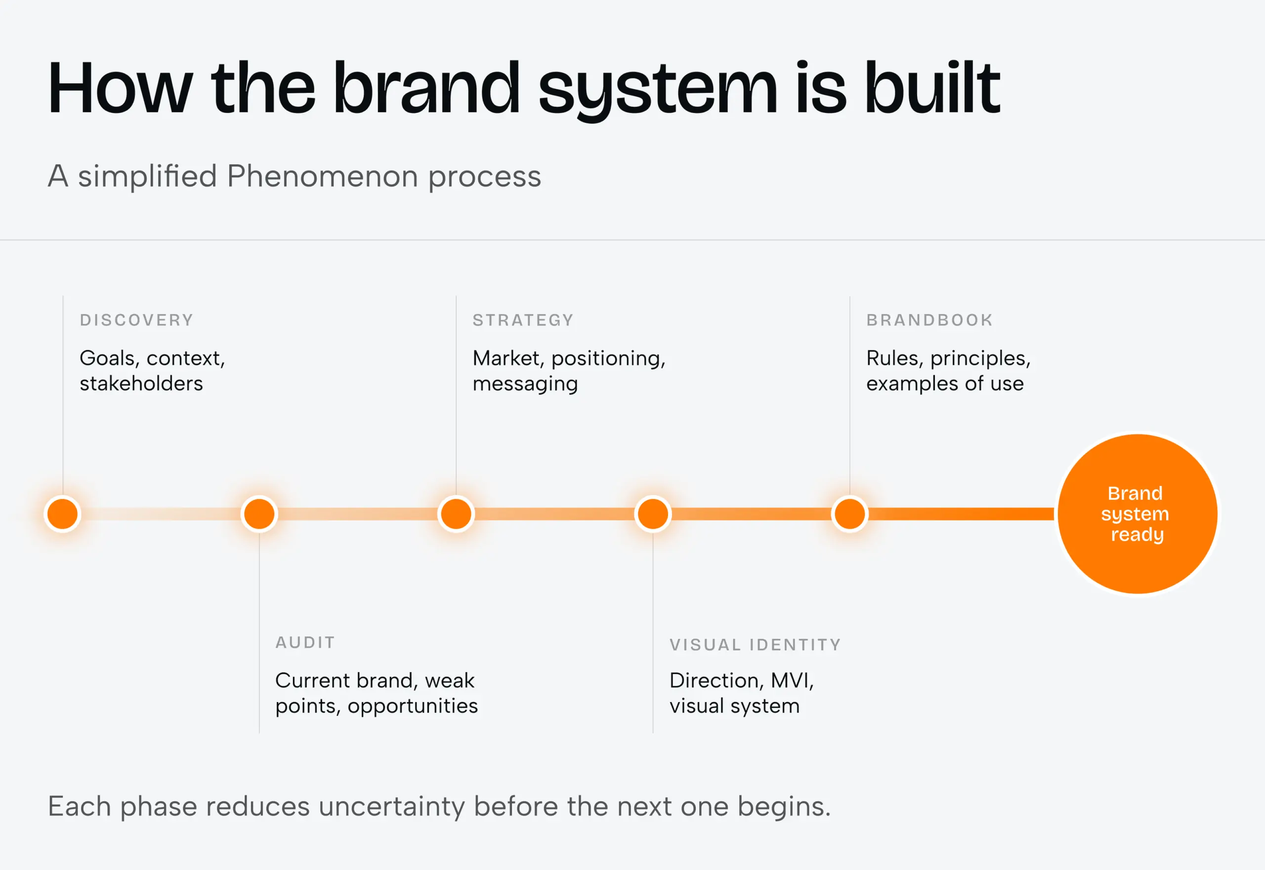
At Phenomenon, we usually spend time understanding the business before moving into visual exploration. We look at what has changed, why the company is revisiting its brand, which audiences matter most and which parts of the existing identity are still doing their job.
The process varies from project to project, but the main stages stay fairly consistent. Depending on the scope, that can include discovery, a brand audit, market and competitor research, audience analysis, positioning and messaging before visual directions are developed.
By that point, design decisions have more context behind them. Questions like whether a direction feels too bold, too restrained or too premium become easier to discuss because there is a clearer sense of what the brand needs to communicate and where it needs to sit in the market.
Moving upmarket is where brand problems often become much more obvious
Early-stage companies can often rely on people to fill in the gaps. Founders are closely involved in sales, early customers already understand the problem, and a small team can explain anything the website leaves unclear. As the company grows, more of that context has to come from the brand itself.
A prospect may decide whether to book a call after a short visit to the website. A sales deck can be forwarded internally without anyone there to explain it. Procurement may encounter the company for the first time through a proposal or PDF. At that stage, the brand starts carrying information that used to be delivered in conversation.
This is often when perception starts to lag behind the business. A company may have a mature product and years of expertise, while still looking smaller, less established or more generic than it really is. The brand needs to reflect the level the business has already reached.
When strategic branding becomes useful
Not every branding issue requires a full rebrand. In some cases, the main problem is messaging; in others, the visual system needs more flexibility, or the website no longer represents the business well enough.
A broader branding project becomes useful when the company is moving upmarket, entering a new market, adding products or finding it harder to explain what makes the business different. Another common signal is when teams keep creating new visual solutions for every campaign because the existing identity does not give them enough structure to work with.
Complex products need a clear way into the story
Technology companies often know their products in far more detail than their customers ever will. Internally, every feature, use case and distinction feels important, while someone encountering the product for the first time has much less context.
Positioning helps organise that information. It gives the audience a clearer entry point, makes it easier to understand what matters first and leaves the supporting detail for later. This is especially useful for businesses with several products, audiences or use cases, where complexity can easily turn into unclear communication.
The identity only works if it survives contact with the real product
For digital companies, brand and product experience are closely connected. If a SaaS company talks about simplicity, users will expect to feel that in the product. If a FinTech company presents itself as precise and reliable, an inconsistent interface can quickly weaken that impression. The same applies to healthcare: clear, accessible communication on the website should carry through into the actual experience.
At Phenomenon, brand, digital design and development are usually considered as parts of the same system. The strategy has to hold up across the website, product and other digital touchpoints, so the experience feels consistent wherever someone interacts with the company.
Being distinctive does not mean being loud
Companies in high-trust industries are often cautious about changing how they present themselves. A healthcare company still needs to feel reassuring, financial infrastructure has to communicate stability, and an enterprise platform should look progressive without losing the sense of reliability customers expect.
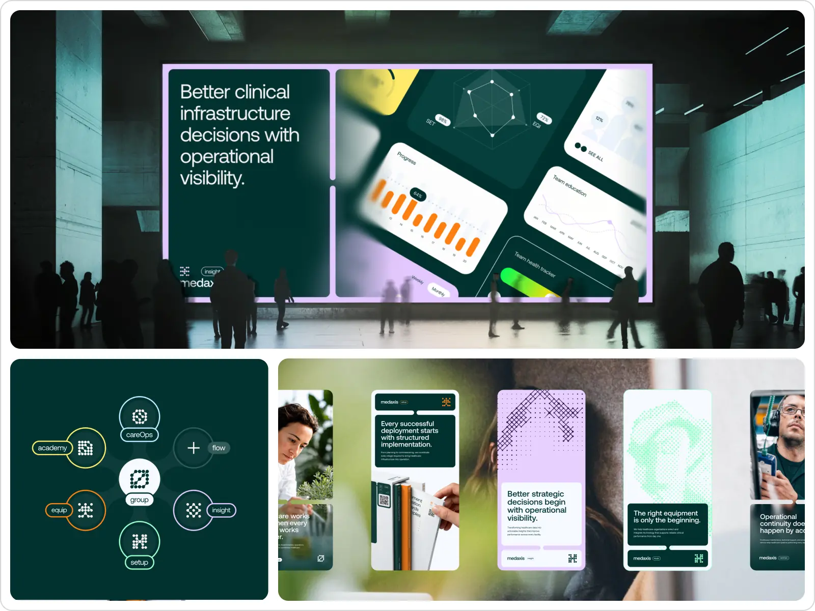
In many cases, the most effective changes are fairly restrained: clearer messaging, stronger hierarchy, more recognisable typography, a better image system or more deliberate use of colour. These adjustments can make the brand more distinctive while still feeling appropriate for the market.
A brand system should make future decisions easier
A new identity really gets tested after launch, when different teams start creating landing pages, presentations, campaigns, product updates and other content. If the system is too dependent on the original brand presentation, consistency becomes harder to maintain as more people begin working with it.
Clear guidelines help teams understand how the brand should work in practice. Alongside typography, colour and logo rules, they can cover positioning, personality, tone of voice, visual principles and real examples, giving teams a shared reference for future work.
So, does a conservative industry really need more branding?
For many companies, the underlying issue is clarity. A strong product can still be difficult to explain, and years of experience do not automatically make a business easy to recognise or differentiate.
For companies in FinTech, SaaS, healthcare, EdTech and logistics, strategic branding can help organise that complexity, align how different teams talk about the business and bring external perception closer to the company’s actual level of maturity. In practice, that makes branding part of how the business explains its value, not just how it presents itself.
Share this article with friends



Oct 31, 2026
9 min read
Webflow Enterprise or a custom Next.js build? Compare 2026 pricing, 24-month TCO, launch timelines and hard limits before you choose your enterprise stack.


Oct 31, 2026
8 min read
Compare 2026’s top US healthcare web development agencies by compliance and rates, with real cost ranges and a checklist for picking a partner.
