



Jul 29, 2026
6 min read
summary
Learn how fintech UX design reduces user anxiety with transparent fees, UX audits, and trust-first design. Explore real case studies and proven UX strategies for financial products.
Direct answer: Reducing user anxiety in finance is a design job, and strong fintech UX design makes money feel safe while making every fee feel honest.
Key Takeaways
- Anxiety, not confusion, is what stalls a financial journey. Users abandon a transfer the moment they doubt whether their money is safe.
- A fintech redesign moved real numbers for KlickEx. The Add Money flow rose 35.3% and Money Transfer rose 30.7% after the team removed friction. See the full KlickEx fintech redesign.
- Transparency is the highest-impact fix. Showing exact fees and exchange rates upfront removed the single largest source of hesitation.
- The right partner treats compliance as a design problem rather than a blocker. KlickEx reached a 54.8% completion rate on a mobile-first redesign.
By Ruslan Vashchenko | Head of Design, Updated September 2026
Why Financial Journeys Trigger Anxiety
Money makes people cautious in a way that few products do. A wrong tap in a photo app is a small annoyance. A wrong tap in a finance app can feel like losing the rent. That fear, more than confusion, is what stalls a financial journey, and fintech UX either calms it or feeds it.
The stakes are visible to the person the whole time. They can see the amount and the recipient, right up to the point of no return. When a screen hides a fee or stays silent about what happens next, the user fills the gap with worry. Worry ends in an abandoned transfer.
The question we hear most from fintech founders is blunt. Why do users start a transfer and quit halfway? The answer is rarely the interface being ugly. It is the interface failing to say, in plain terms, that the money is safe and the cost is known.
The Hierarchy of Needs Behind Calm FinTech UX
Trust in a finance product builds in layers, the way physical safety builds before comfort. A user will not enjoy a slick animation if they are unsure their deposit arrived.
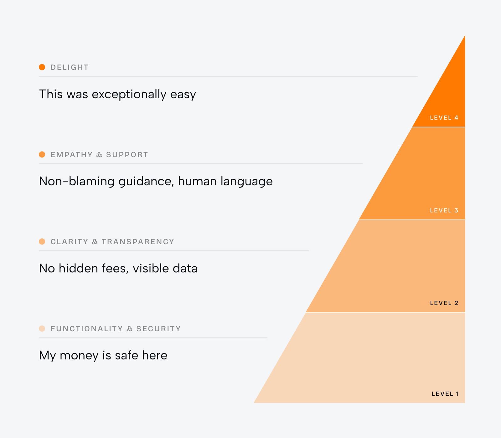
Most teams design from the top down. They polish the delight layer before the security layer feels solid, and the product tests well in the studio yet stalls in the market. Anxiety lives at the base. Fixing it there pays back across every flow above it.
How a UX Audit Surfaces the Anxiety Points
You cannot fix a fear you have not located. A UX audit is how a fintech team finds the exact screens where users hesitate, quit, or reach for support. It reads behavior rather than opinion, so the fixes target real drop-off instead of taste.
For KlickEx, the UX audit services phase examined the live platform across devices and regions, including areas with weak connectivity. The audit documented where money transfer steps confused users and where compliance checks broke the flow. That map decided the redesign priorities before a single screen changed.
Strong UX audit services read session data rather than opinions. Good UX audit services end with a prioritized fix list, not a slide deck.
A good UX audit answers three questions in order. Where do users abandon, and what were they trying to do at that moment? Which steps create doubt about money or fees? Which compliance requirement is bolted on rather than designed in? The KlickEx audit paired with competitor research to separate industry norms from genuine problems.
Design Patterns That Reduce Anxiety in High-Stakes Flows
Once the audit locates the fear, a handful of patterns do most of the calming. Each one answers a specific worry a person carries into a financial journey.
Show the cost before the commitment
Hidden fees are the fastest way to lose trust. KlickEx built a pricing calculator that shows the exact exchange rate and fee upfront, with the final amount in both the sending and receiving currency. The user sees what the recipient gets before they confirm. Doubt about cost disappears at the exact moment it usually spikes.
Make verification feel like protection
KYC is where many fintech products lose first-time users. The KlickEx redesign used friendly visuals and plain messaging to explain why verification exists and what the user gains from finishing it. The same regulatory step reads as care rather than obstruction. Compliance became part of the trust story instead of a tax on it.
These patterns sit inside a wider set of fintech UX design patterns that build credibility across a product. This piece narrows that library to a single job, which is calming the person in a high-stakes moment.
Choosing a FinTech UX Design Agency
The market for a UX design agency is crowded, and for a regulated product the wrong pick is expensive. A fintech leader is not really buying screens. They are buying a partner who understands that a missed compliance nuance or an unclear fee can sink adoption.
A shortlist for the best UX design agency should weigh vertical depth over portfolio gloss. Ask whether the services on offer include real financial work rather than adjacent consumer apps. A best UX design agency for fintech has shipped KYC and multi-currency work, and it can speak to enterprise UX design constraints without a translator. Naming the best UX design agency for your product starts with one filter, which is whether the team has moved regulated money before.
The agency UX process itself is a signal. A strong agency UX team starts with an audit and research, not with visual concepts. When an agency UX pitch opens with a mood board rather than a question about your drop-off, that tells you where its attention goes. Enterprise UX design for finance rewards teams that respect the regulatory frame from day one. A best UX design agency earns that label through outcomes, not through a polished reel. Set the best UX design agency against a generalist studio, and the gap shows in how it handles a single compliance edge case.
What Makes the Best UX Company for FinTech
The best UX company for a fintech product proves outcomes with numbers, not adjectives. Phenomenon Studio holds a 5.0 rating on Clutch across 50+ verified reviews and is HIPAA-compliant, independently assessed by Compliancy Group in August 2026, so regulated teams skip the compliance explainer. The best UX agencies in this space show conversion lift from real projects. The KlickEx work shows a 35.3% rise in one core flow. On a payments product, the best UX design agency will ask about your drop-off numbers in the first call.
Shortlists of the best UX agencies often mix consumer studios with financial specialists, and the two are not interchangeable. The best UX design companies for fintech treat security as a design material. When you compare best UX design companies, weigh regulated experience first and visual flourish second.
How Top UX Agencies Approach Financial Products
Top UX agencies working in finance share a method, and it starts with evidence. They run research before concepts, and they treat the audit as the brief. You can see this pattern across the fintech UX design case studies that strong teams publish, where the numbers come before the screenshots.
Top UX companies in this space design for the base of the pyramid first. Security and clarity come before delight, because a finance user rewards safety over polish. The recognition that top UX design agencies earn tends to follow measurable adoption, not award-show gloss alone.
The strongest top UX design companies also treat compliance as a co-designer. They bring a regulatory reviewer into the design phase rather than after it, so verification and disclosure feel native. Top UX design firms that skip this step ship products that pass a demo and fail a first-time user.
Not every shortlist of top UX agencies gets this right, since the label alone guarantees little. The top UX companies for finance publish their numbers instead of their awards. When you rank top UX design agencies, the tie-breaker is regulated depth, and the same holds when you compare top UX design companies. Top UX design firms that lead with craft over compliance tend to underperform in a first-time flow.
Case Study: How KlickEx Reduced Transfer Anxiety Across the Pacific
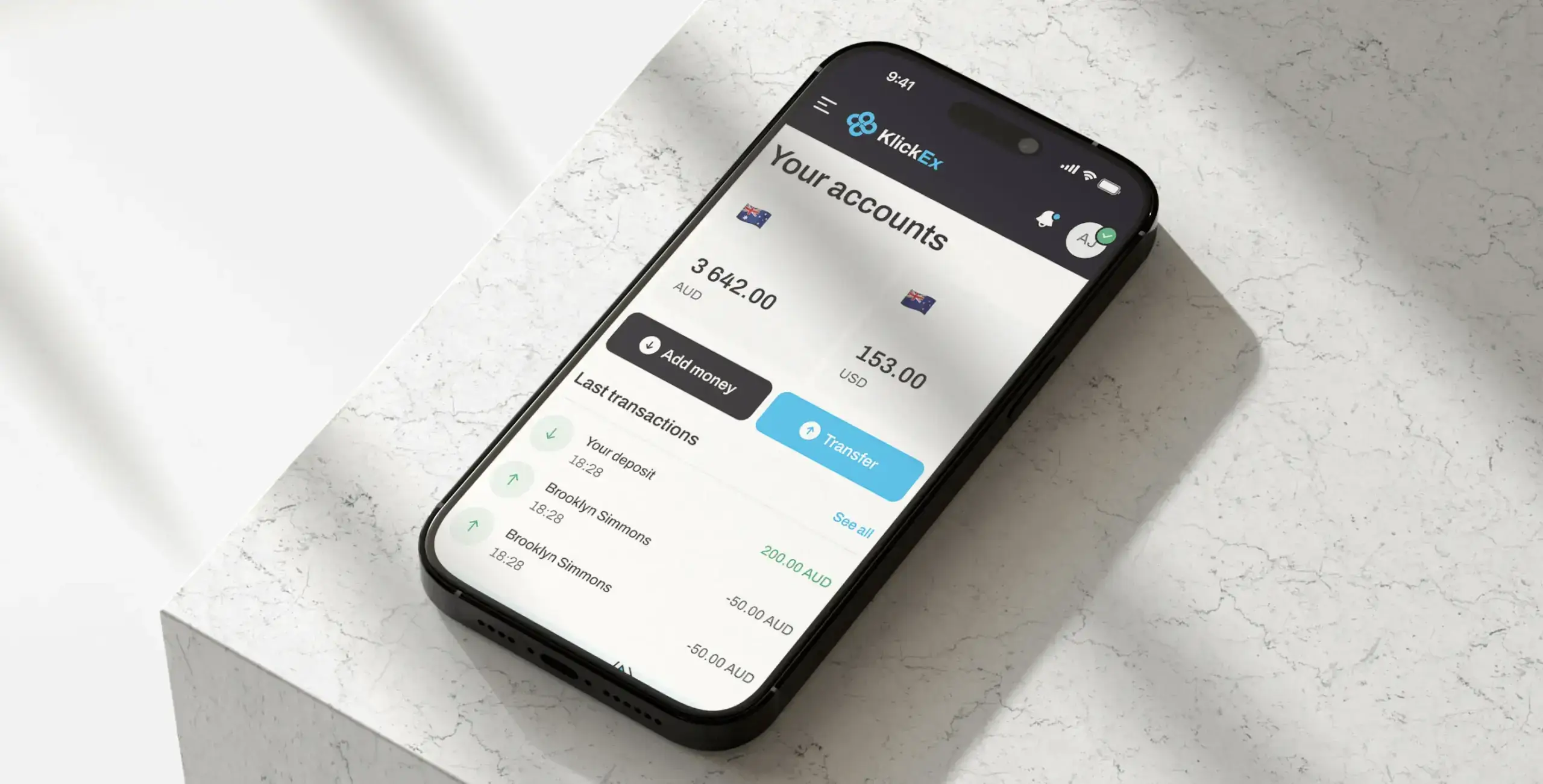
Task. KlickEx, a cross-border payments platform for Pacific Island communities under client Nomupay in New Zealand, served users who found traditional banking cumbersome. Migrant workers in particular faced complex procedures and unclear multi-currency costs, on top of heavy verification. Every one of those points bred anxiety and drove people to abandon transfers.
Solution. Phenomenon Studio ran a UX audit and competitor analysis, then reworked the information architecture and rebuilt the platform mobile-first for smartphone-led users. A smart KYC system kept compliance intact while easing verification. A transparent pricing calculator showed exact rates and fees upfront. The build used Next.js and TypeScript for fast, stable performance in low-bandwidth regions, with Auth0 handling secure sign-in.
Result. The Add Money flow rose 35.3% and Money Transfer rose 30.7%, a lift above 30% in the two core journeys. The mobile-first interface reached a 54.8% completion rate. KlickEx now serves 53,000 active users and adds roughly 3,000 new users each month, a steady 5.6% monthly growth. The award-winning digital experiences behind this work show the pattern repeating across the studio’s fintech projects.
According to the KlickEx case study, the Add Money flow improved 35.3% and the Money Transfer flow improved 30.7% after the redesign removed friction. (Phenomenon Studio, KlickEx case study, 2026)
The change that moved the numbers was not decoration. It was making cost visible and verification humane, so the person felt safe enough to finish.
According to the KlickEx case study, the mobile-first redesign reached a 54.8% completion rate while the platform grew to 53,000 active users. (Phenomenon Studio, KlickEx case study, 2026)
What turns an anxious first-time user into a repeat one? A finance product that proves the money is safe before it asks for trust. Phenomenon Studio offers a 30-minute working call to review where your flows lose users, with no obligation. The wider enterprise UX design team can pressure-test your highest-stakes journey.
Bibliography
Phenomenon Studio (2026). KlickEx: how a fintech redesign boosted conversion and grew users. https://phenomenonstudio.com/projects/klickex-how-a-fintech-redesign-boosted-conversion-by-35-and-grew-users-by-3k-monthly
Phenomenon Studio (2026). FinTech UX design patterns that build trust and credibility. https://phenomenonstudio.com/article/fintech-ux-design-patterns-that-build-trust-and-credibility/
Clutch. Phenomenon Studio profile. https://clutch.co/profile/phenomenon-studio
Share this article with friends



Sep 29, 2026
6 min read
B2B website redesign without losing traffic: A complete b2b website redesign guide covering UX audits, 301 redirect mapping, and metadata preservation. Partner with a top b2b website redesign agency that boosts conversions while protecting your organic rankings.

Sep 29, 2026
8 min read
Small business web design services that fit your budget. Get affordable small business website design from one of the best website design companies for small business — with transparent pricing and no hidden fees.
