Development
Research
Client
UVER, LLC
 UK
UK
UK
Services
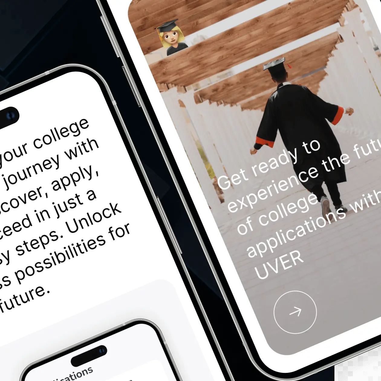
The client requested a promotional website for the UVER app, designed to attract early users and introduce the app’s university search and application features.
The brief highlighted the need for a user-friendly interface and a responsive design that adapts to multiple devices. It also emphasized clear communication of the app’s benefits. Additionally, the brief required the inclusion of testimonials and SEO-optimized content to enhance trust and visibility, all while maintaining alignment with the UVER brand identity.
Our role
Our role in the project was to design and develop the promotional website for the UVER app, focusing on user experience, visual design, content creation, and technical development to ensure the site effectively communicated the app’s value proposition and encouraged early adoption.
In the research phase for the UVER project, our approach included a detailed competitor analysis to identify unique positioning opportunities for UVER, consultations with marketing experts to align with current ed-tech trends, and website mapping to ensure an intuitive and user-friendly site structure. This comprehensive methodology was crucial in developing UVER’s strategic presence in the market.
- Competitor Analysis
- Consulting
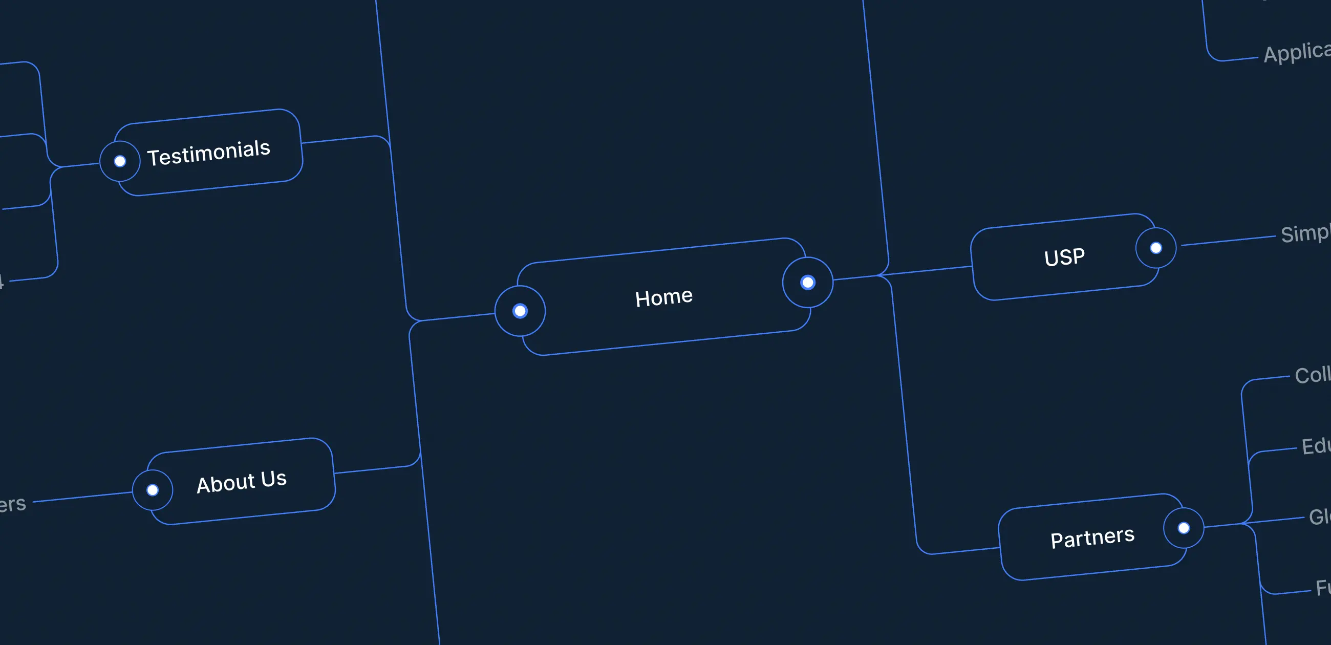
- Website Map
The goal of the competitor analysis was to systematically evaluate and understand the offerings, strengths, weaknesses, and strategies of existing websites for university search and application.
This critical step informed our strategy for marketing and website design, ensuring that UVER could effectively stand out in a competitive landscape.
What we’ve done
We conducted an in-depth examination of competing university search and application app websites. This included assessing their features, USPs, marketing strategies, and user reviews. Our goal was to identify gaps in their offerings and areas where UVER could excel or offer something unique.
We needed to leverage marketing specialists’ expertise in developing a robust and effective marketing strategy.
Their insights were crucial for crafting a marketing approach that not only resonated with potential users but also distinguished UVER in a competitive ed-tech landscape.
What we’ve done
We engaged with marketing experts to gain insights into the latest trends in digital marketing, particularly in the ed-tech sector. This helped us understand the most effective ways of messaging USP to the target audience. The consultants also provided valuable advice on branding, positioning, and customer engagement tactics.
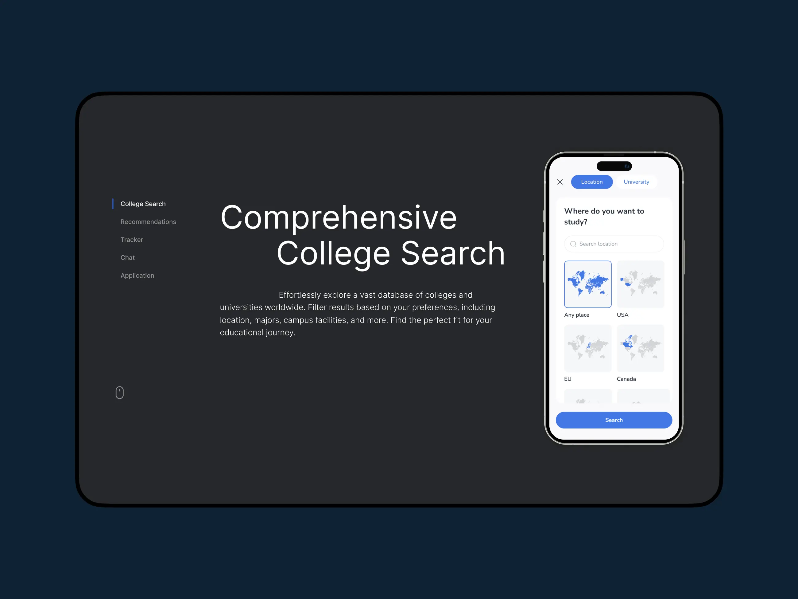
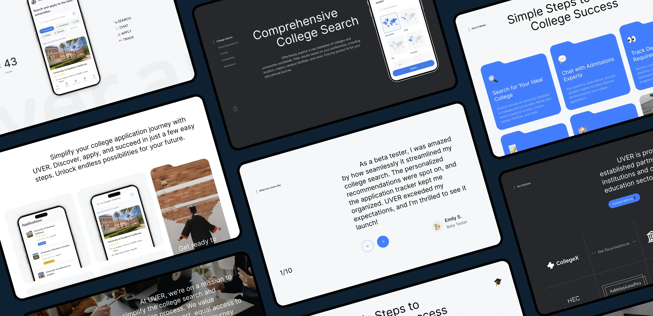
We focused on creating a structured, user-friendly website layout that would enhance user experience and facilitate easy navigation.
In the design phase, our focus was on creating an aesthetically pleasing and functional website that aligned with the app’s branding and user experience goals. We followed a structured approach, beginning with wireframes to outline the basic structure and layout. This progressed to a refined visual design, incorporating interactive elements to ensure a seamless and engaging user experience.
- Wireframe
- Moodboard
- Design Concept
- UI Design
In the wireframes stage, we crafted basic blueprints of the landing page, focusing on a layout that would support our client’s goals. This involved strategically organizing content and navigation to optimize user engagement and conversion paths, setting a solid foundation for the visual and interactive design elements to follow.
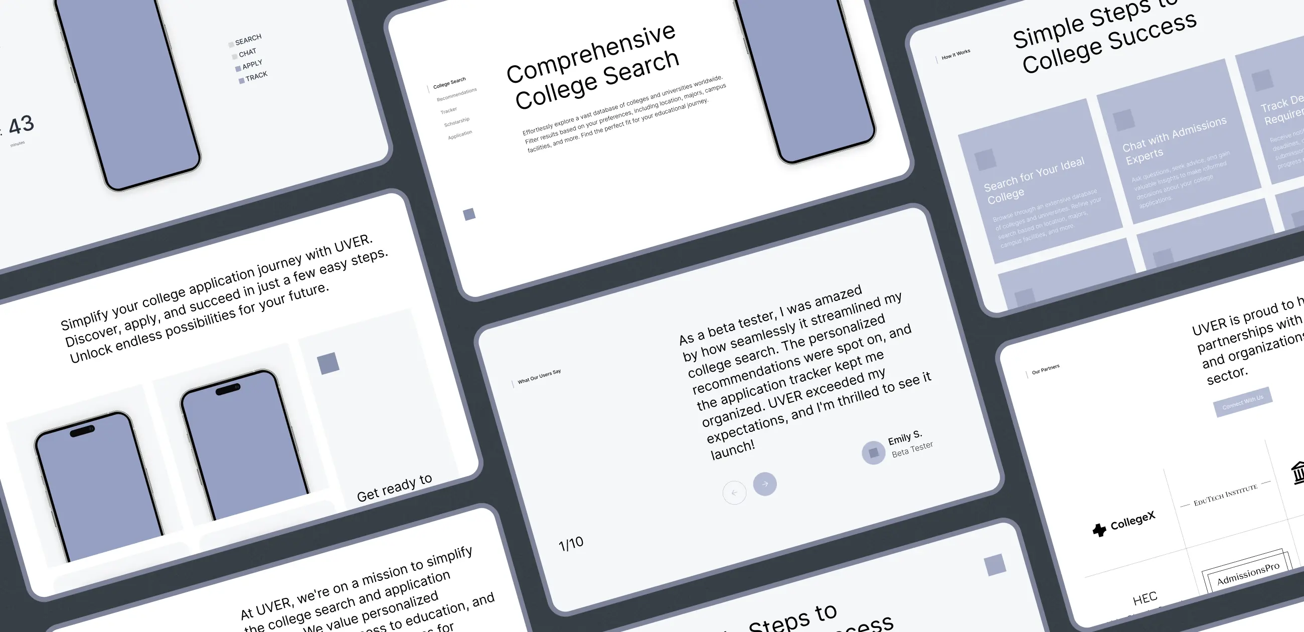
We established the visual theme, choosing blue, white, and black as main colors. Blue was selected for its connotations of trust and intelligence, essential in education, while white and black provided clarity and contrast for readability and sophistication. This color scheme was key in shaping the project’s visual identity, aligning with the app’s branding and user engagement goals.
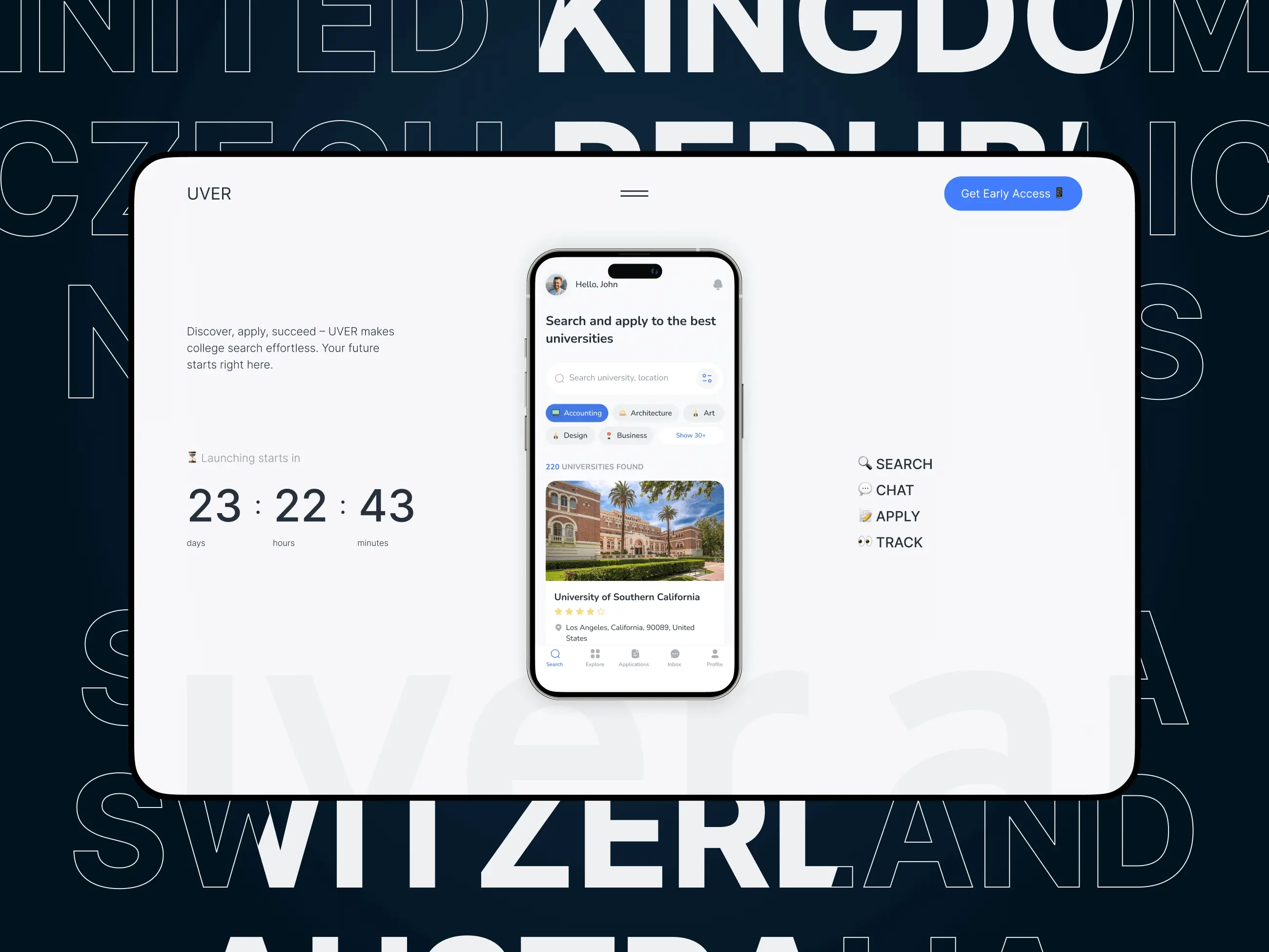
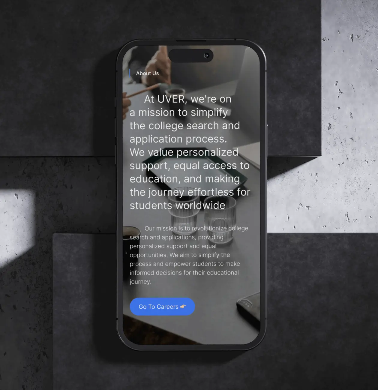
This stage was the culmination of previous efforts. We focused on creating a cohesive, user-friendly interface, with special attention to a responsive design that worked seamlessly across all devices, including an optimized mobile version. This stage brought together all the elements to form a visually appealing and practical user interface.
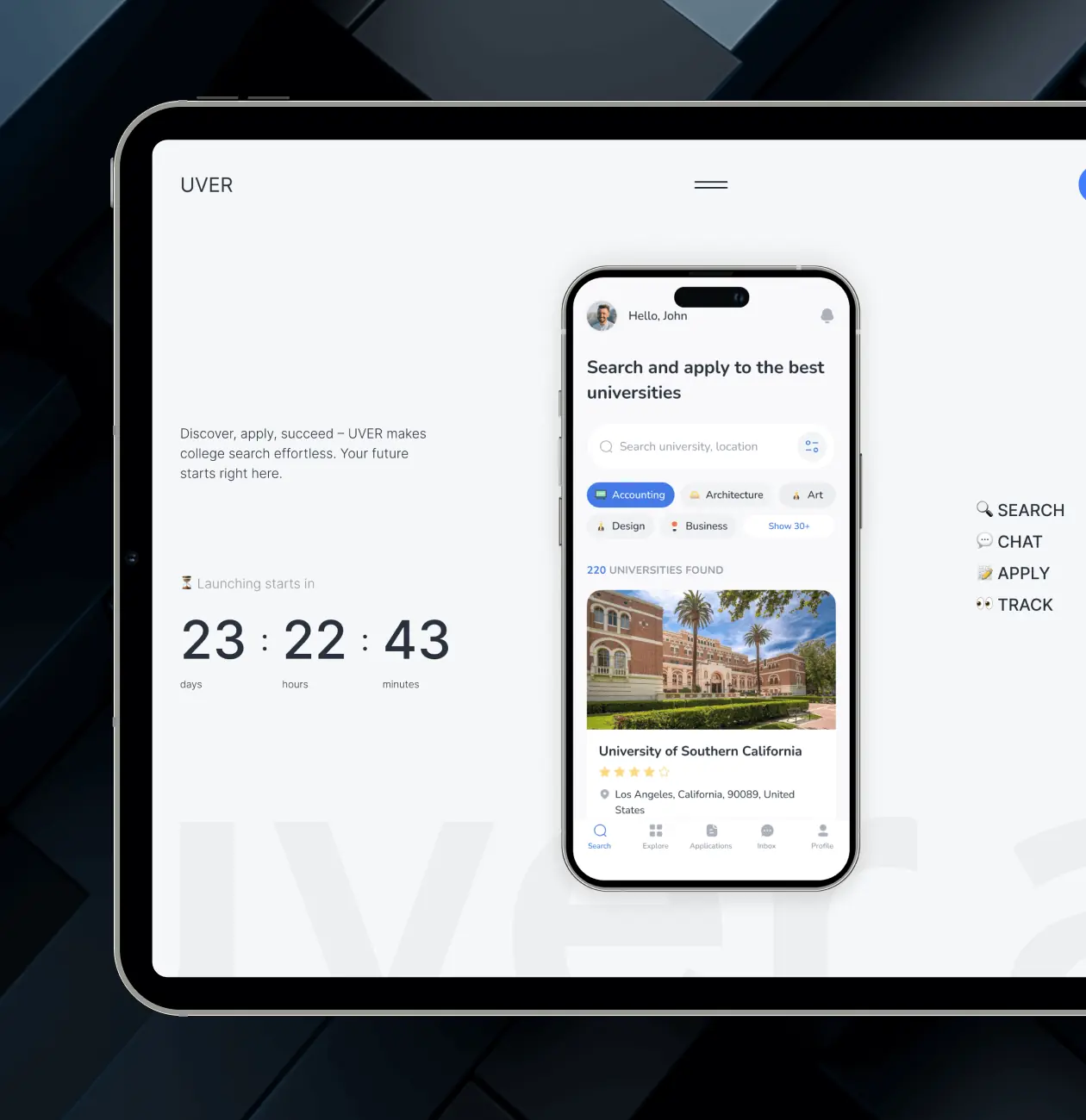
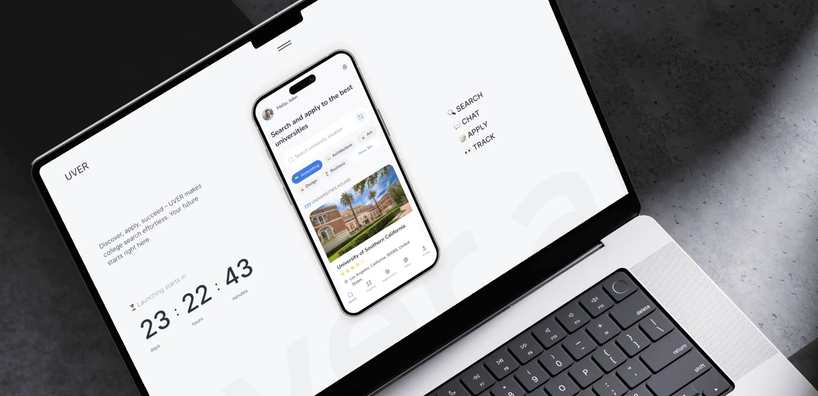
Time Countdown
This feature helps in building excitement among potential users and encourages them to take action, such as signing up for early access or staying engaged with the site. It serves as a constant reminder of the upcoming launch, keeping the app top of mind for visitors.
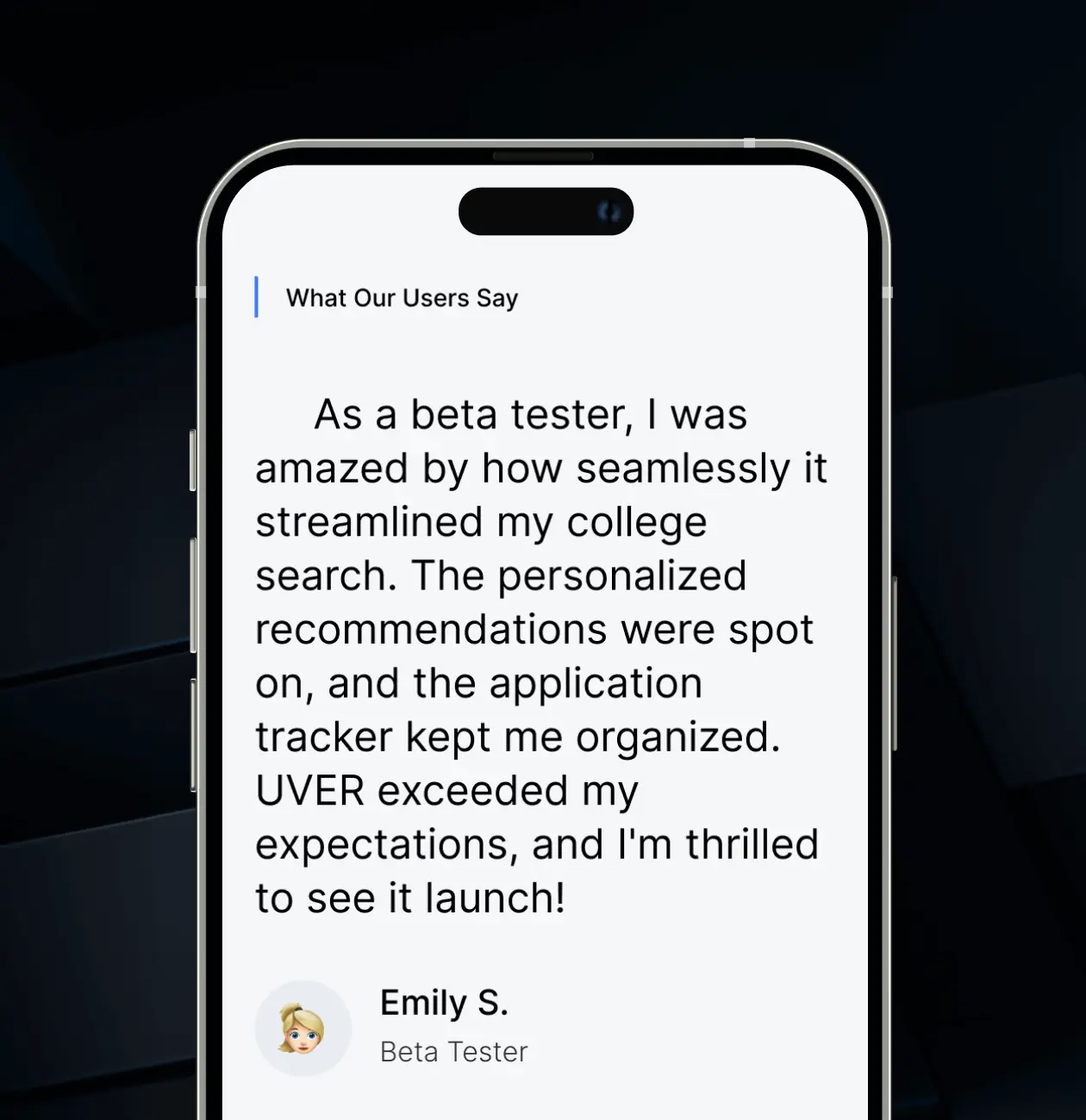
Beta Testers Testimonials
Testimonials from beta testers are great helpers to build trust and credibility. These firsthand accounts provide social proof, demonstrating the app's effectiveness and user satisfaction, which can significantly influence potential users' decision to engage with and adopt the app.
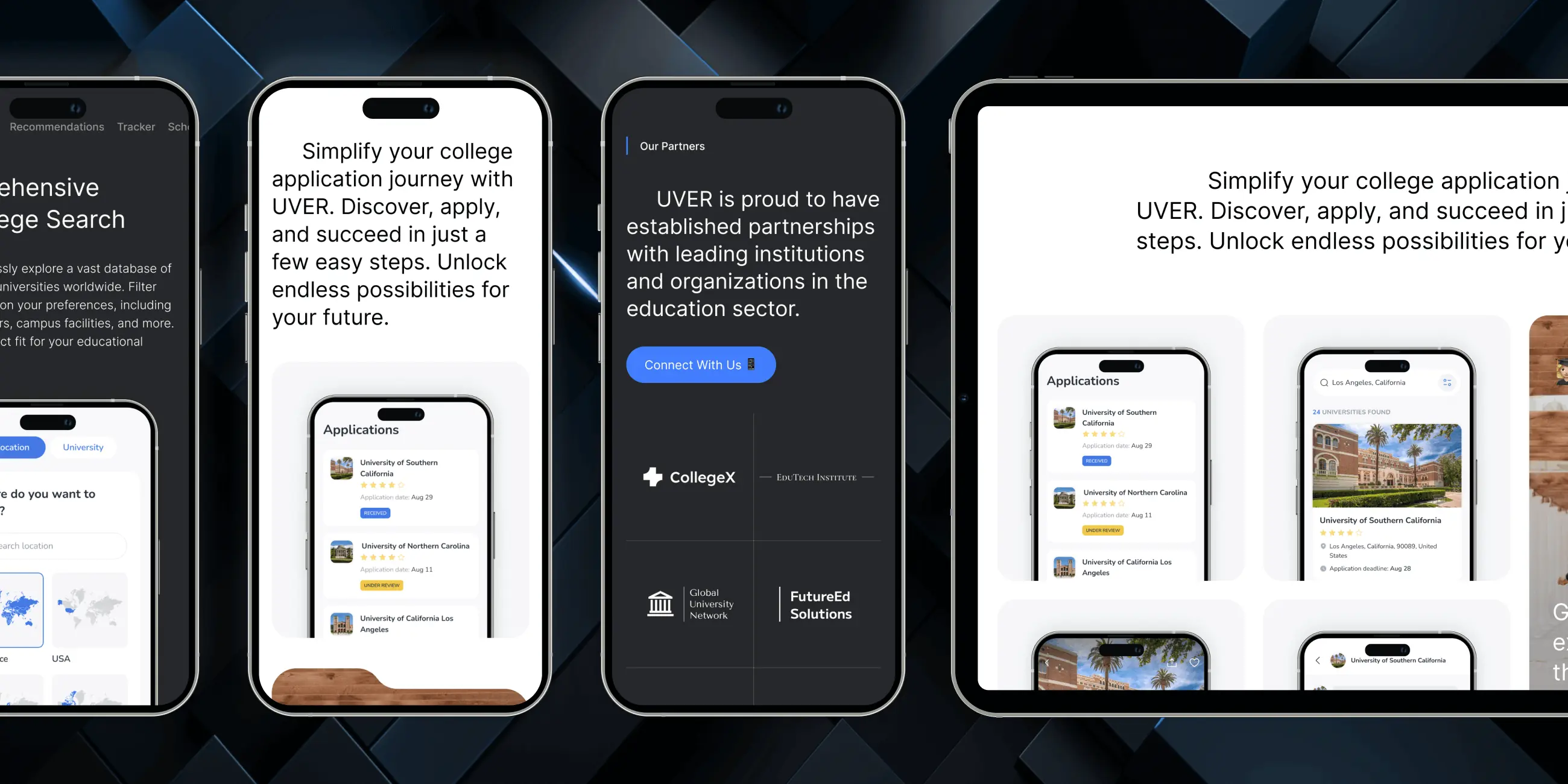
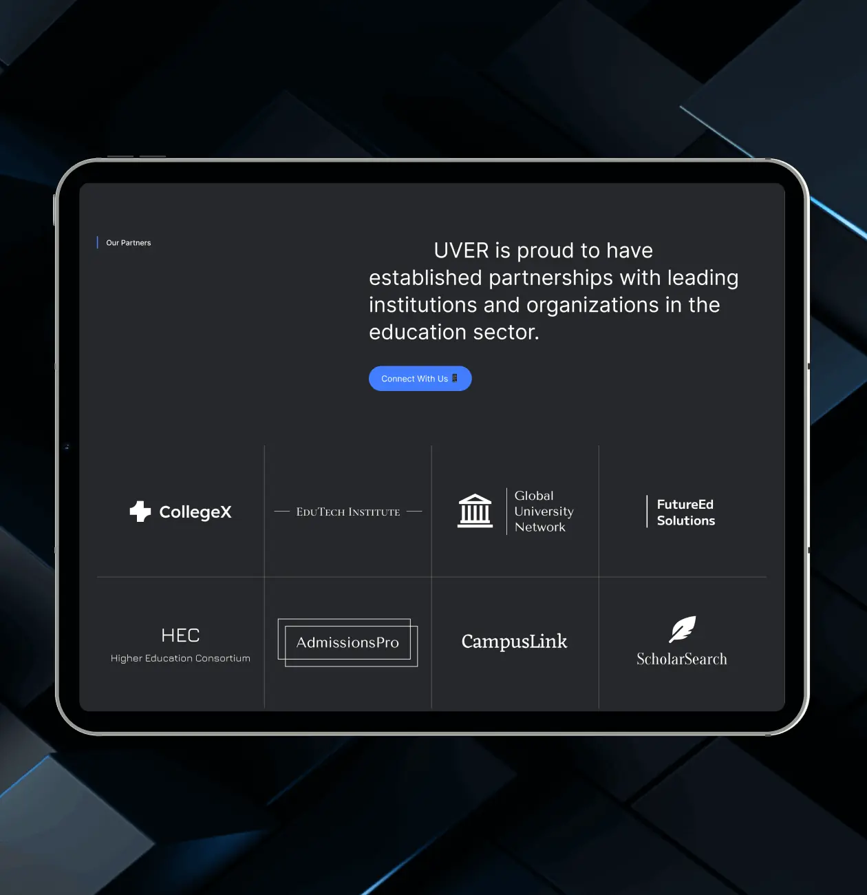
Partners
We implemented a partners block on the landing page to enhance credibility and trustworthiness. Showcasing partnerships adds a level of validation and professionalism to the app, reassuring potential users of its legitimacy and value. This can be quite influential for those new users considering the app.
#web app design #web development
Core Developer
 USA
USA
USA
#Design prototype #Web app design
Eduwerks LLC
USA
USA
Have a project in mind?
Let's chat
Have a project to
discuss?
discuss?

Have a partnership in
mind?
mind?
