Design
Development
Research
Launch
Evolve
Extend
Core Developer – the platform for learning how to program
Client
Core Developer
 USA
USA
USA
Services

The client’s request implied a lot of work, which began with the Discovery phase and continued with various tasks.
The Core Developer team tasked us with designing a convenient and easy-to-use learning platform with two different sets of functionality for students and teachers as well as a promo website design.
Our role
Our responsibility was not only the implementation of some solutions but also finding them. The main point was to find these solutions during the UX research, competitors, and business analysis. Solutions such as choosing the best technologies, integrations, and even a better way for internal fees to be paid for additional monetization of the platform were incorporated.
We analyzed the best competitors in the education field using a SWOT analysis. Additionally, a business analysis was conducted to find the best way to implement features correctly and bring profit to the product.
Stages
- SWOT analysis
- Business analysis
- Map
- User Flow
The main goal of this platform’s SWOT analysis was to identify competing platforms’ weaknesses and transform them into our strengths.
What we did
During the SWOT analysis, we found the following problems:
- Limited social interaction between students and teachers
- Lack of discipline on the part of students
- Scattered and unorganized teaching tools
So, we were able to optimize online learning and add such key features as all the necessary tools for learning in one place, new methods of motivation for students through setting goals and tracking their progress, as well as online support and communication with teachers.
Business Analysis
The main goal of the BA for this platform was to describe the functionality through the user story and documentation of each function through
- Analysis of the subject area
- Identification of current problems and their solutions
- Recommendations and advice on solution implementation
- Prioritized feature list
What we did
During the BA, we explained to the client the characteristics of the solutions we collected, outlining their benefits and risks.
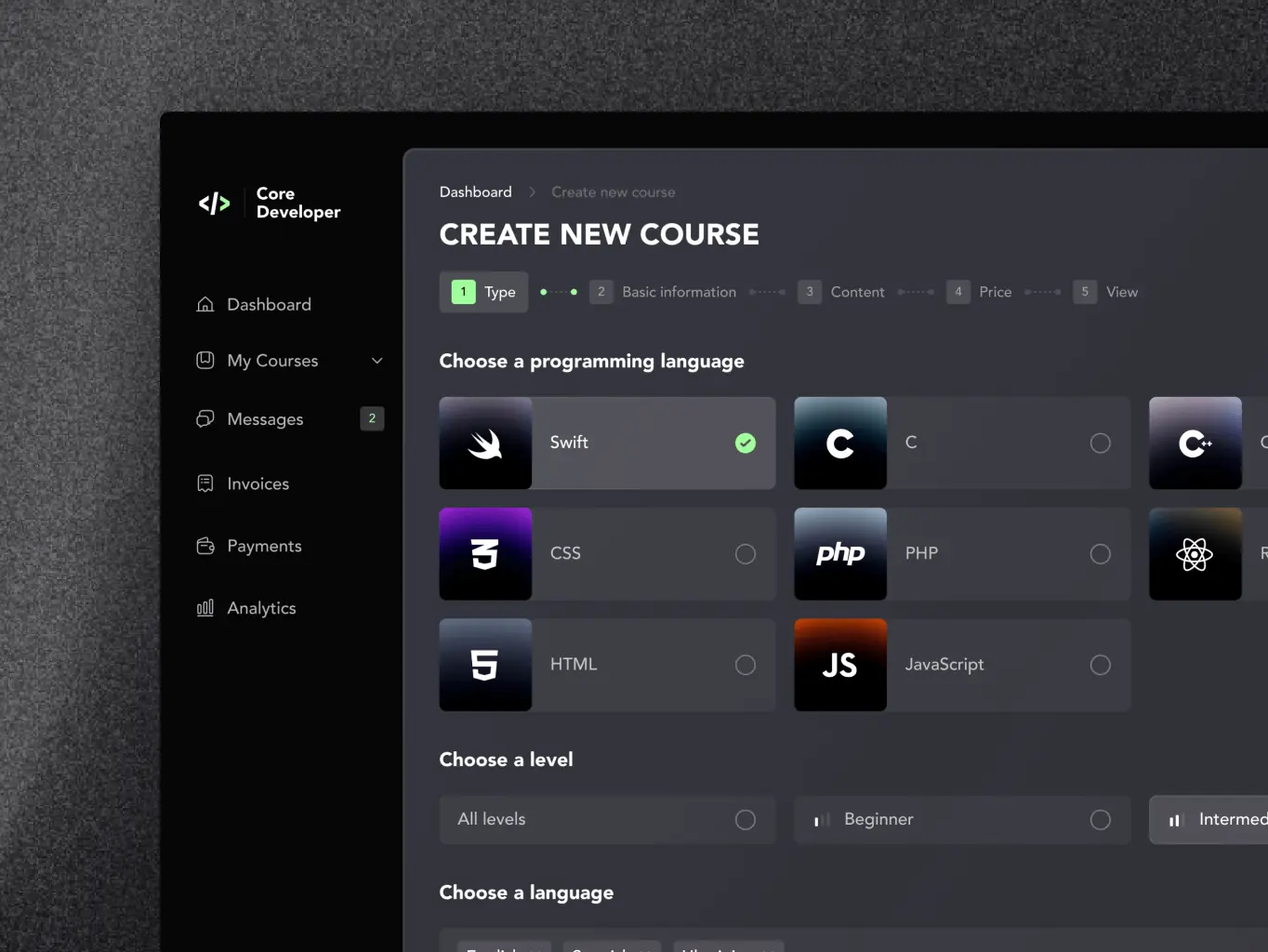
- The priority feature was integrating coding tools with our platform, a unique feature. During the analysis, we encountered the problem that full integration is not yet possible, and therefore we did an estimate to add basic functionality. Initially, our team integrated three tools: Swift, HTML, and CSS. We did it as an MVP to make the platform known in the market and gain the minimum audience.
- Uploading content was decided to be made in the form of a constructor so that course owners can conveniently customize it for themselves. It was decided to divide the process into steps and estimate each step separately since each has distinctive characteristics and nuances.
- Monetization of the MVP initially consisted of only two options: subscription and one-time purchase. However, two more payment methods were added (free and payment plan) after collecting feedback from the first users. Also, in the beginning, there was an estimation only for payment by card. Later we added payment through cryptocurrency, as well as a referral program.
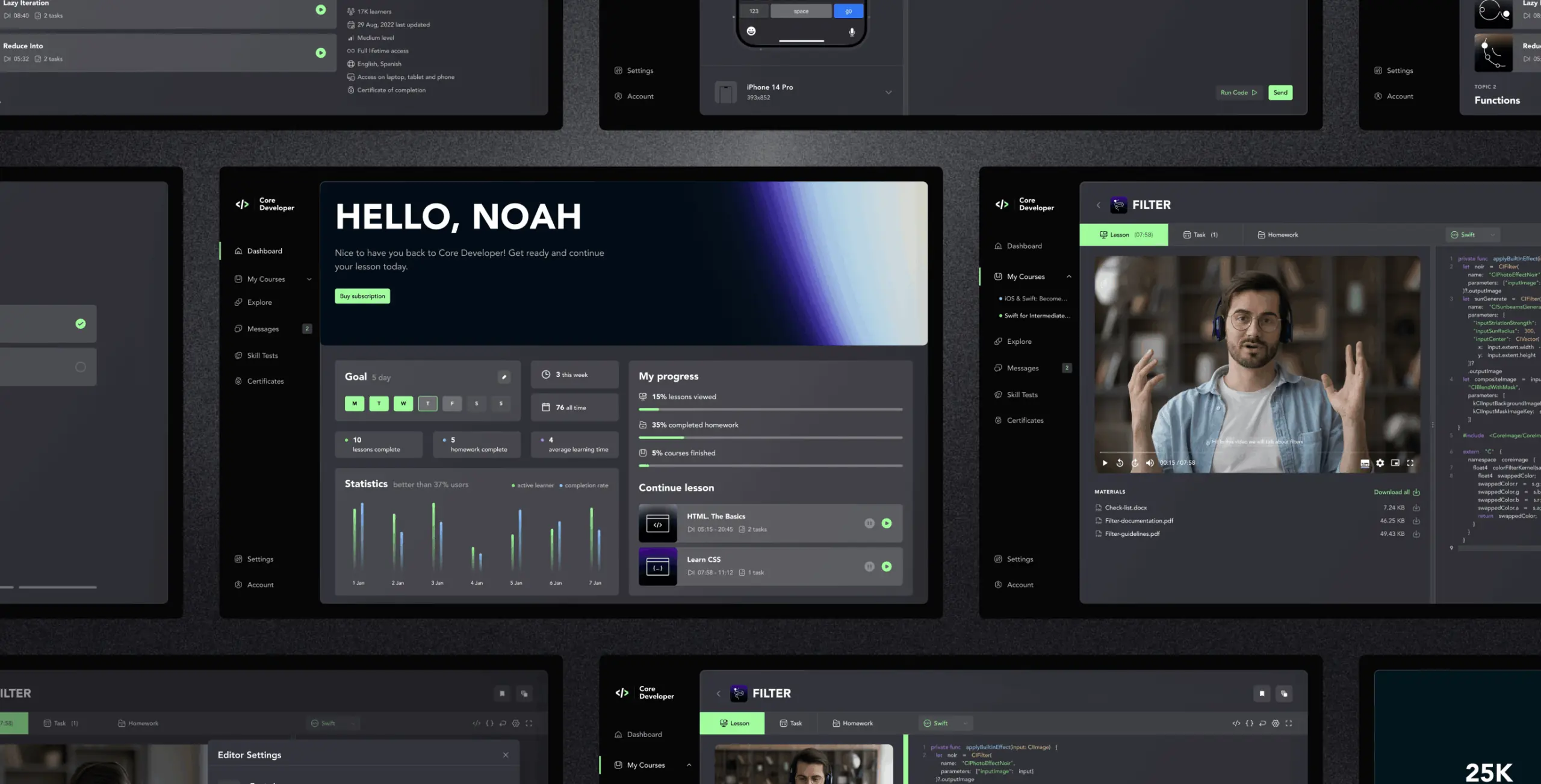
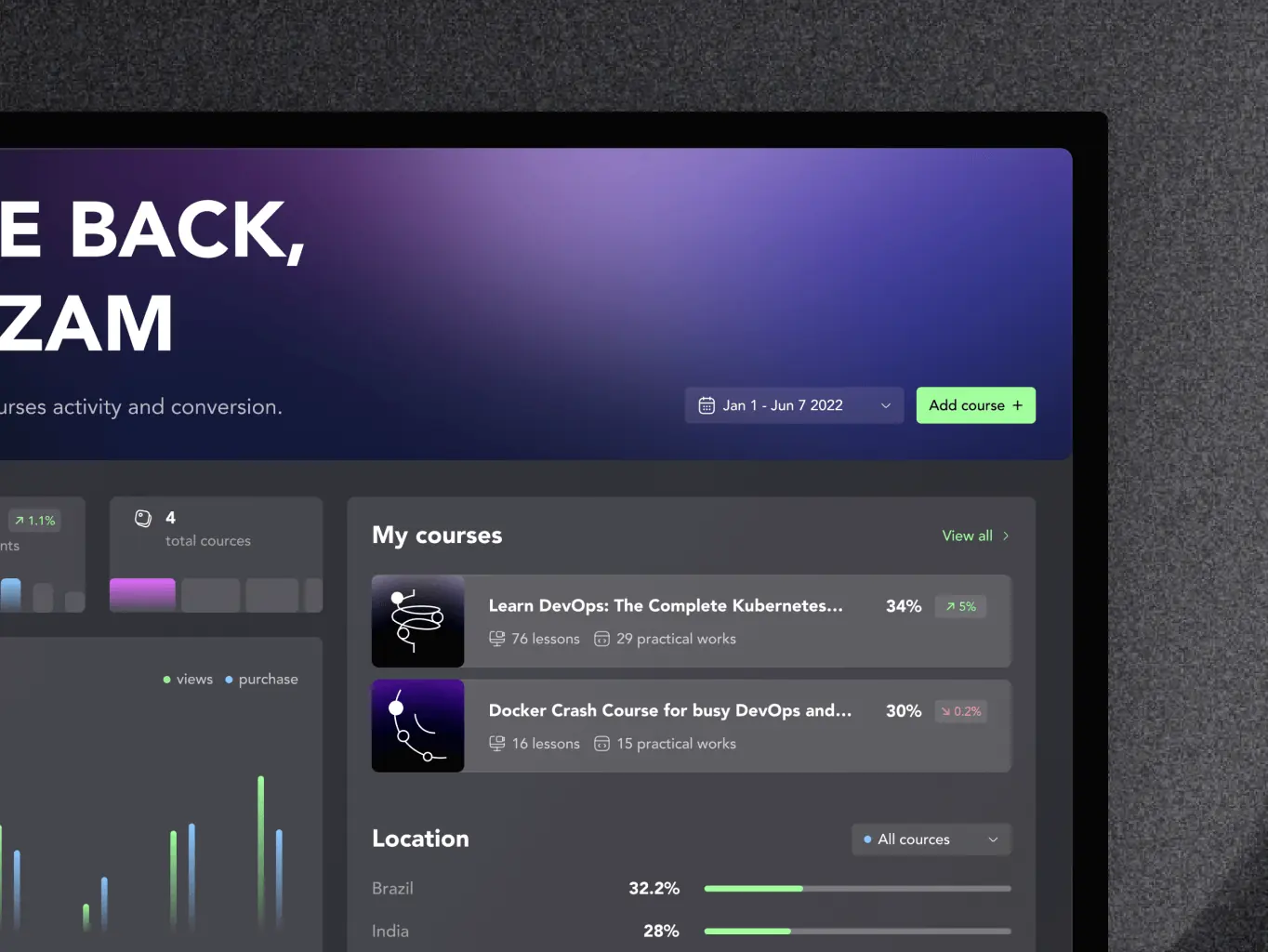
- We decided to work with the analytics mechanisms built into the platform to obtain data on user activity. To do this, we created our graphs with student performance statistics, goal setting, and conversion analysis for course owners and their student localization.
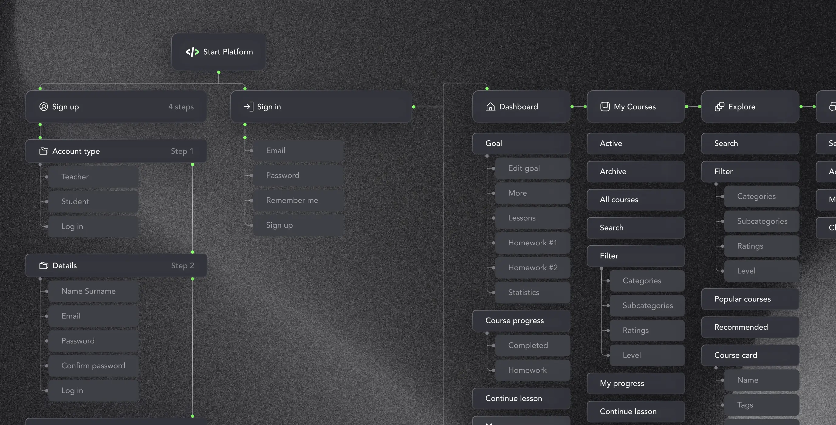
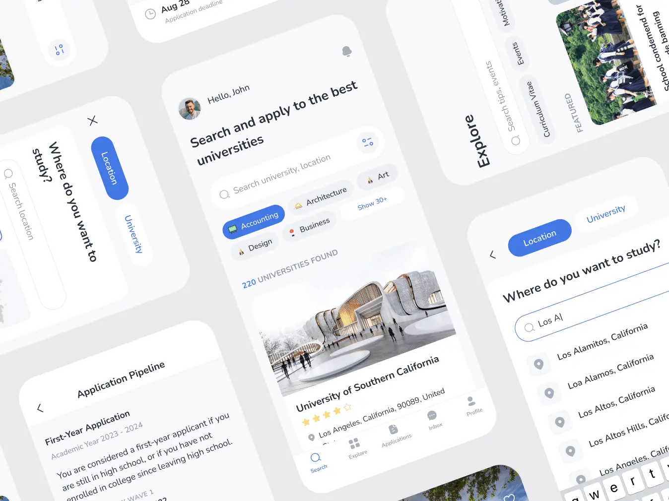
Map
Based on the data from our client and the results obtained during the research, we created an Informational Architecture for the platform.
Through a series of iterations and diving deep into the exploration sessions, we clarified the vision for the platform, allowing us to work through the details together. This included adding the integration of software tools for writing code of various programming languages together with our platform, built-in messenger, and an online chat with technical support, flexible daily, weekly and monthly goal builder, as well as separate functionality for two types of users. As a result, we arrived at seven main flows. We continued to evolve: authorization, uploading a course / taking a course, checking/doing homework, analyzing and viewing statistics, communication via chat, writing and passing skill tests, and payment options were added.
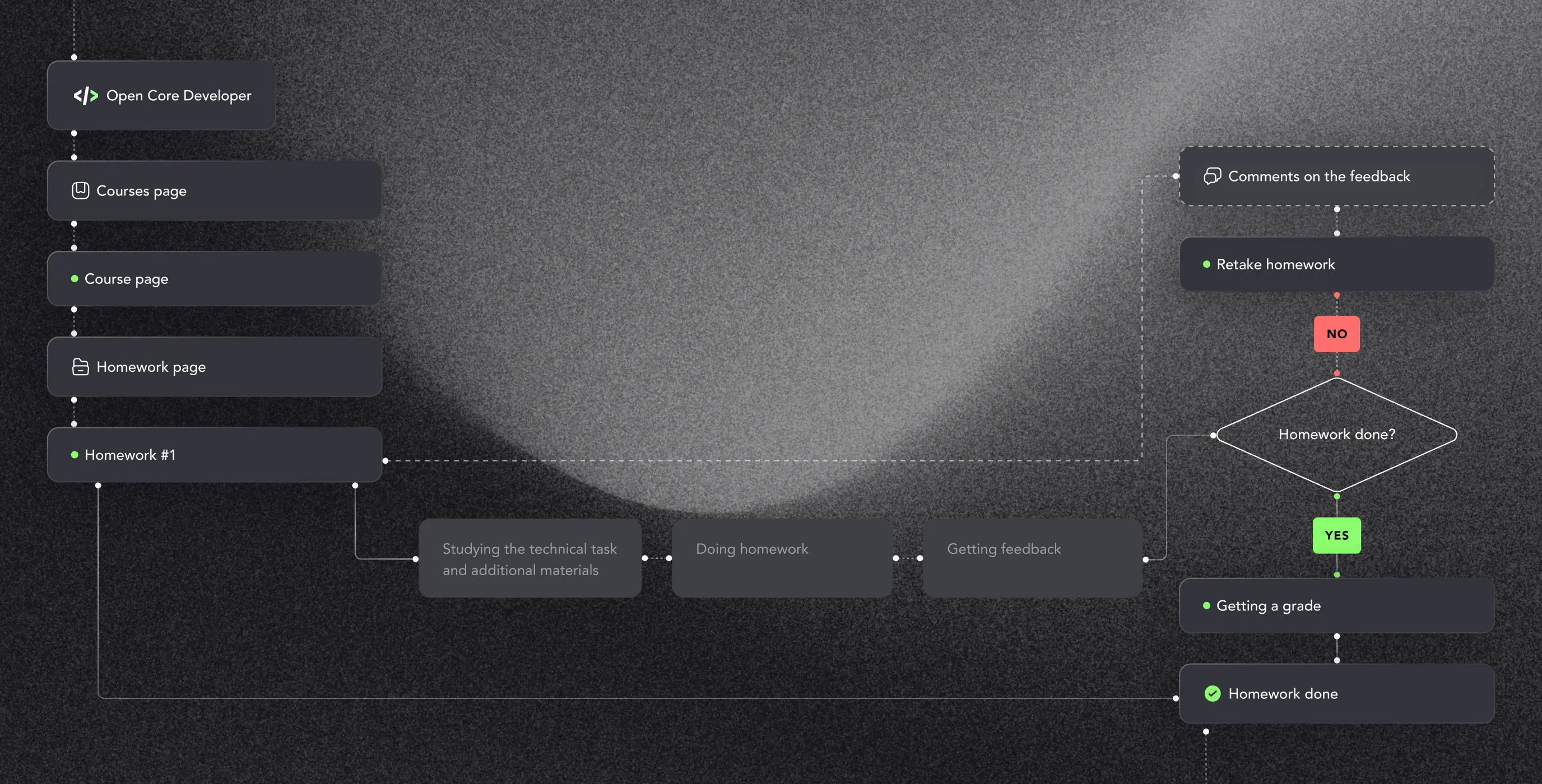
User flow
User flow is a visual representation of the sequence of actions the user performs to achieve his goal. Our team built future steps and further worked on the interface to determine how users achieve the goal, calculating positive and negative scenarios. The diagram below is an example that shows how we were able to simplify the process of handing in homework. During homework, students can leave comments, the answers to which will be received within 1 working day. They can also move on to the next lesson to save time while waiting for an answer to their questions.
Turn the analysis results into a user-friendly interface that complies with generally accepted usability rules, solves users’ needs, and makes their journey as smooth as possible.
Stages
- Wireframe
- Moodboard
- Design Concept
- UI Design
We created wireframes and clickable prototypes, which are integral to working on the design structure, testing, and improving the user journey before proceeding to the final mockup design.
This stage helped us understand the logic and structure of the future service. We created and approved prototypes for each flow, where we worked out all possible states for each screen, decided on the size and number of containers for illustrations, and checked the convenience and clarity of each flow.
To determine the visual direction and style of the interface, our team created a moodboard and coordinated it with the client. It allowed us to choose the most suitable solution in the earlier stages.
Based on the research and the direction chosen in the moodboard, our team created the first visual concept of the site, which demonstrated the chosen style in real conditions before creating the finished UI design. The moodboard helped us decide that the platform should be in dark colors, emphasizing typography and bright gradients, to stand out from competitors who mainly use light/blue tones and calmer, more restrained fonts.
Our initial take was a more subdued concept with flat illustrations and a blue accent. Still, we noticed a similarity to Facebook’s design and decided to drastically change the concept to use bright green and abstract line illustrations as an accent. The green color is considered quite calm, does not irritate the eyes, and symbolizes prosperity and new beginnings. Bright gradients and minimalistic illustrations complement and dilute the interface.
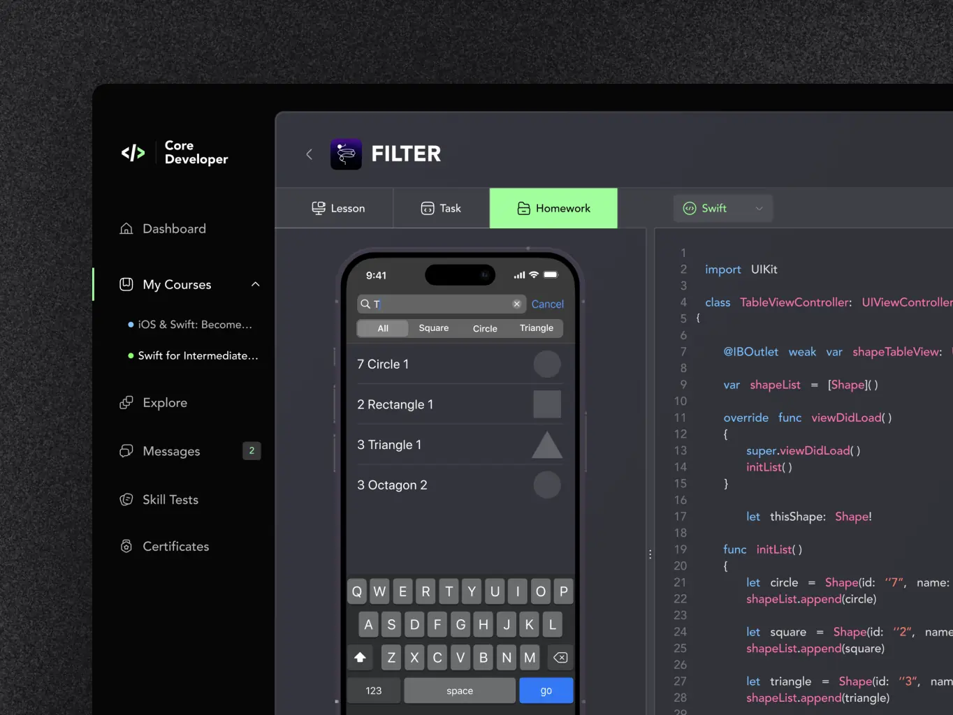
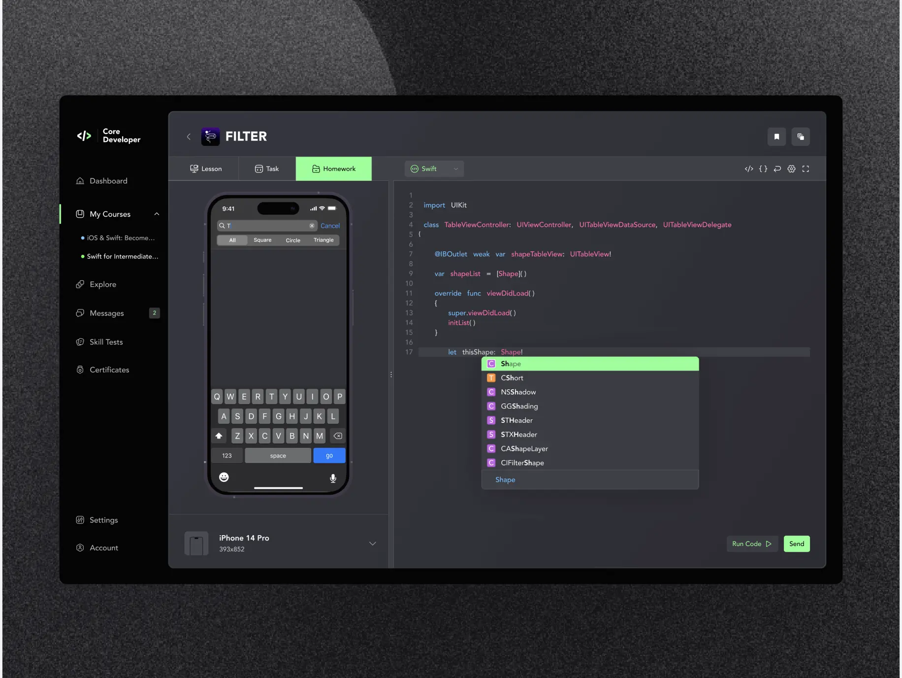
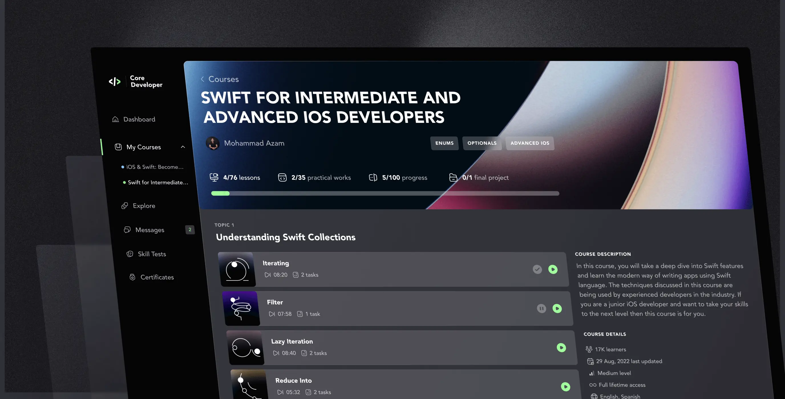
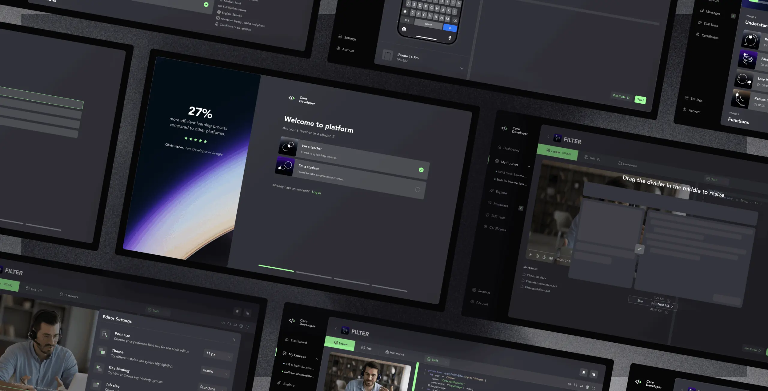
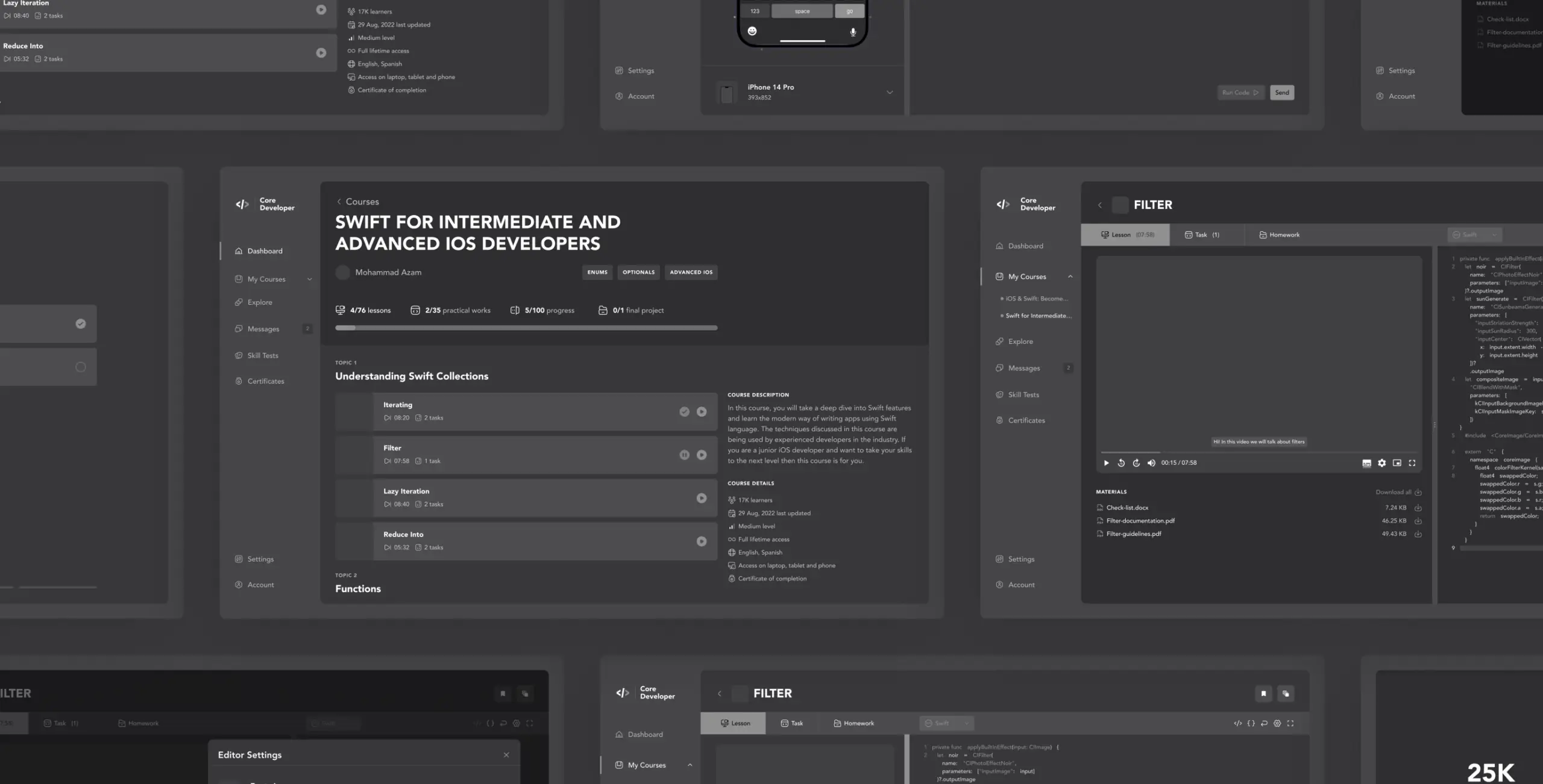
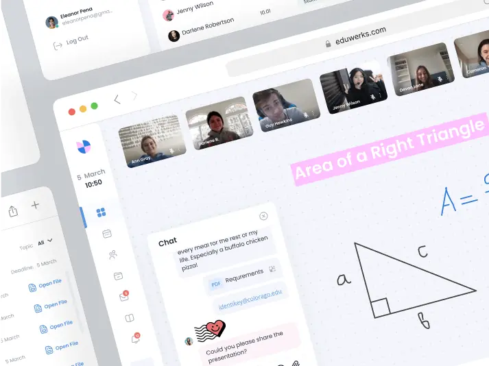
Working area
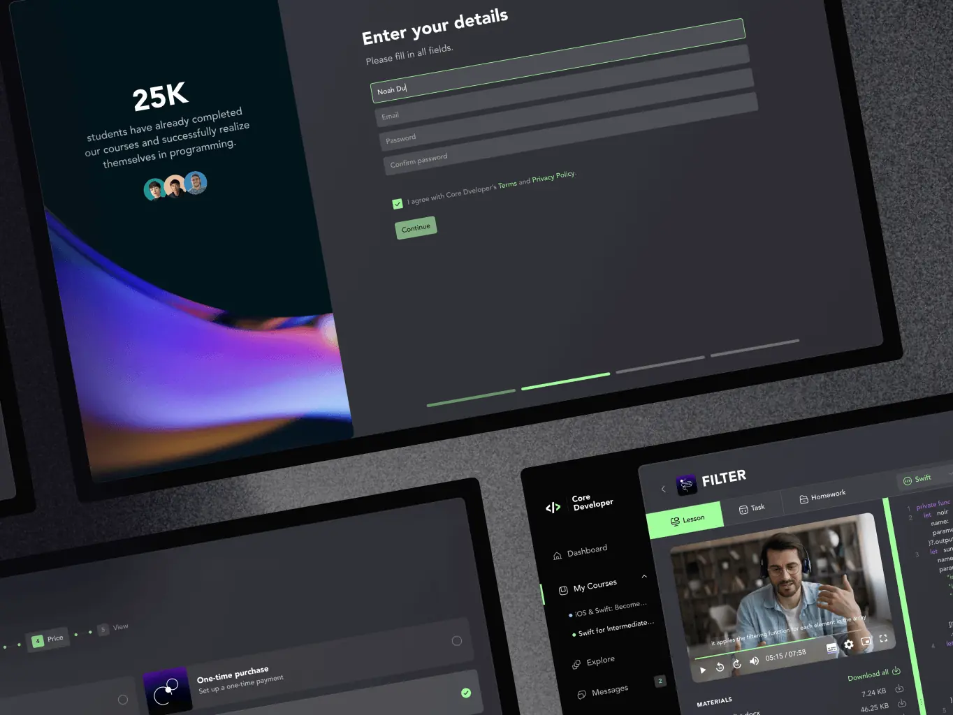
The ability to adjust the desired and comfortable size of the workspace, settings, and choice of programming language for a specific course or lesson allows the platform to be flexible and comfortable for learning. When viewing educational materials, the user can simultaneously code and pry the shortcuts he needs for faster typing. The special slider in the middle separates the area with training materials and the working area for writing code.
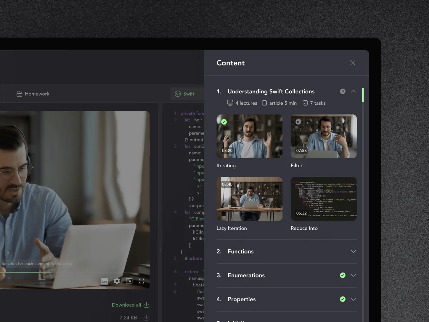
Testing the code on a real device
When doing homework, the student can see and test his code on the platform. For example, if a student is taking a course on developing an application for iOS, he can choose the iPhone model he needs and see how his code works on an actual device.
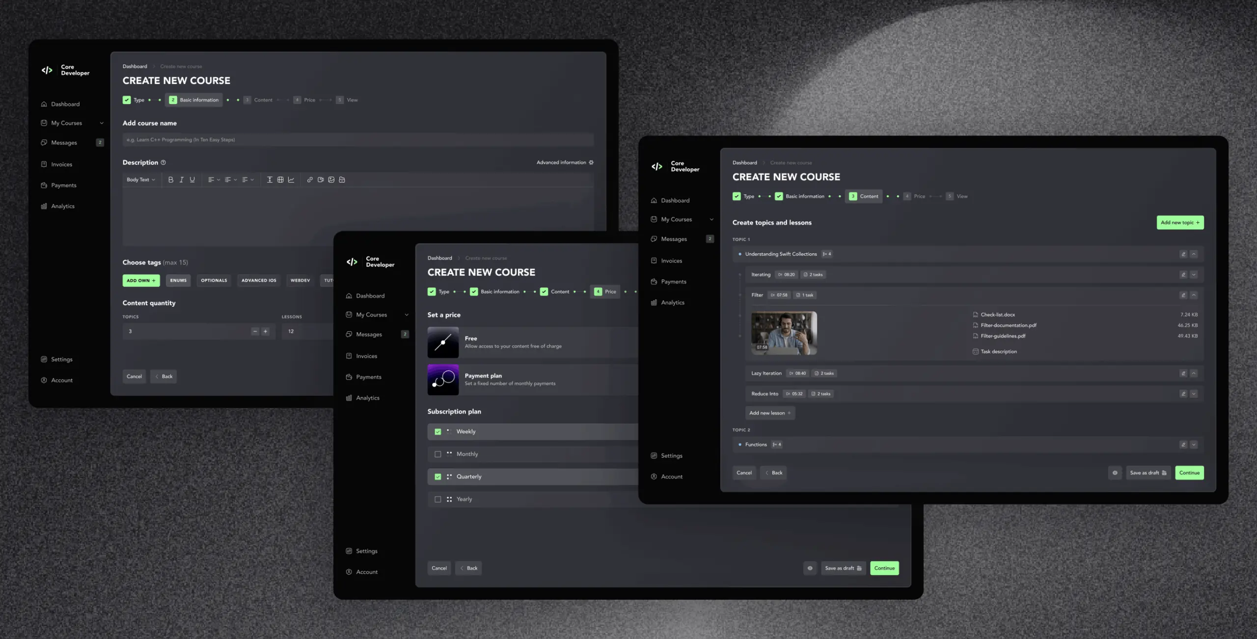
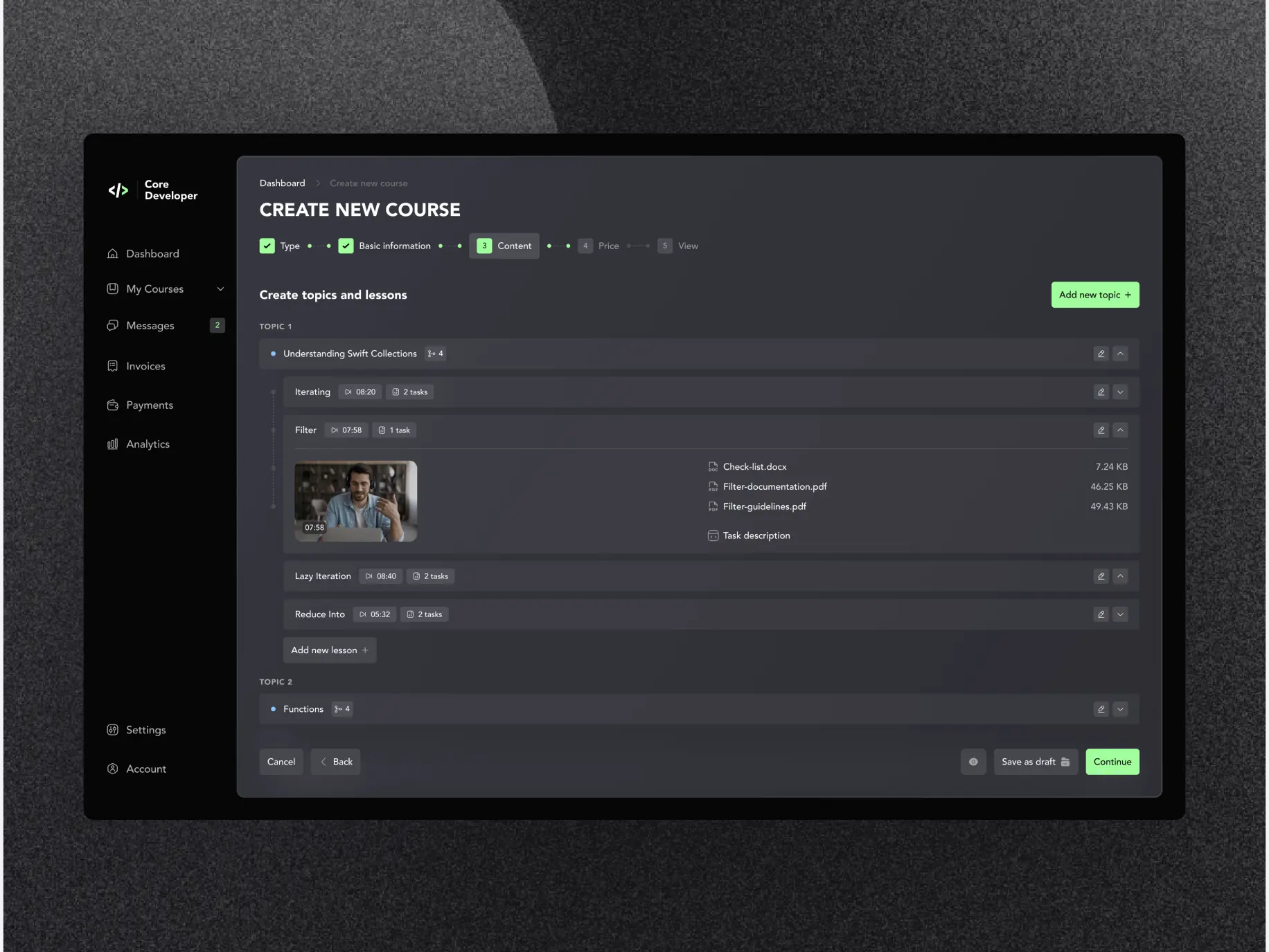
Content uploading
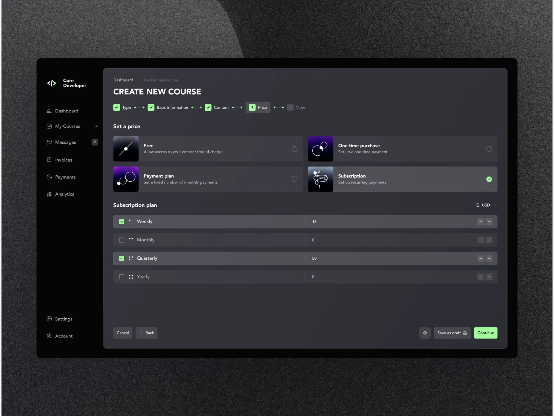
The course uploading process consists of 5 steps: type, basic information, content, price, and view. The material uploading functionality has a constructor form where the course owner can create topics and lessons, upload materials, and drag and drop training blocks in the order he needs.
Subscription
Users do not need to pay for each course separately. On the platform, it is possible to sign up for a trial subscription, take an introductory course, and then choose one that suits them best. When uploading a course, an owner can choose one of four payment options: free, one-time purchase, payment plan, or subscription. Thus, the platform is as flexible as possible in terms of payment for both students and teachers.
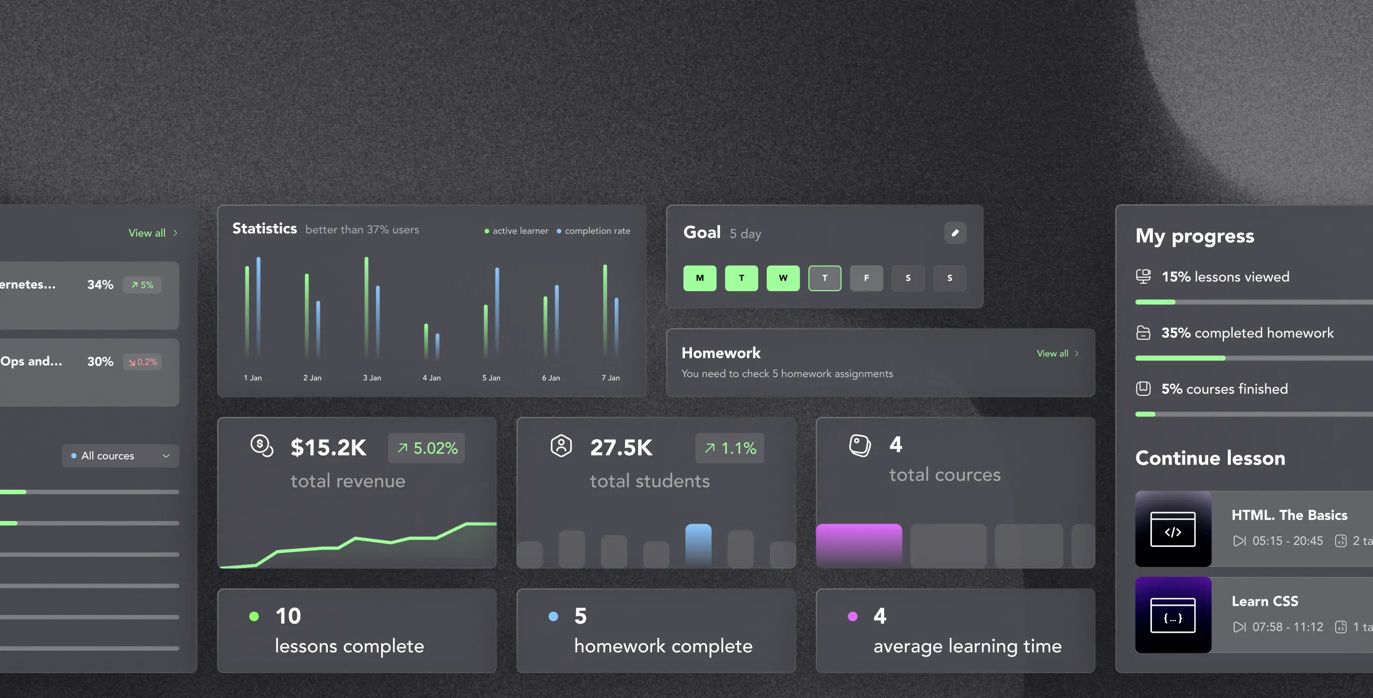
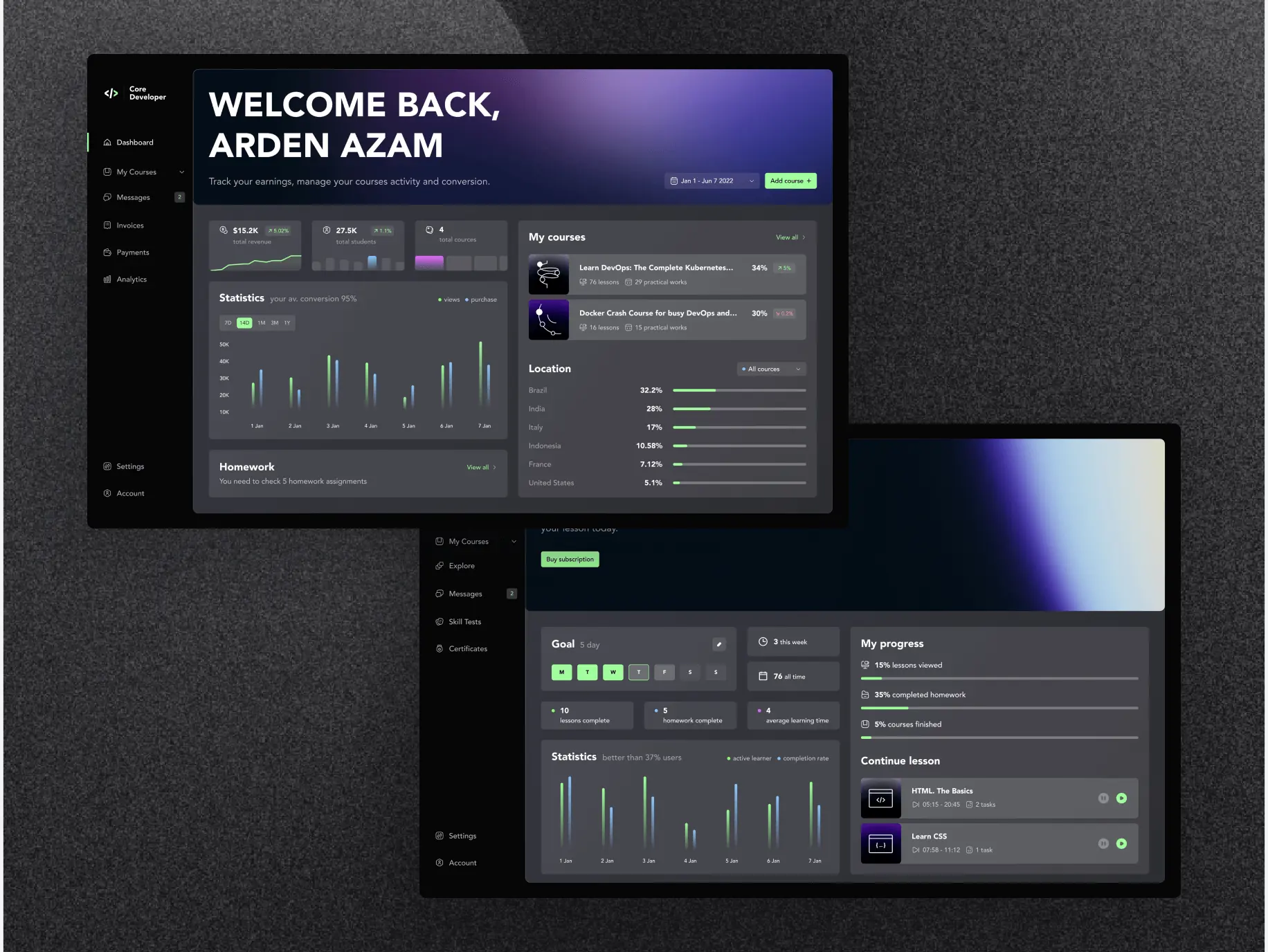
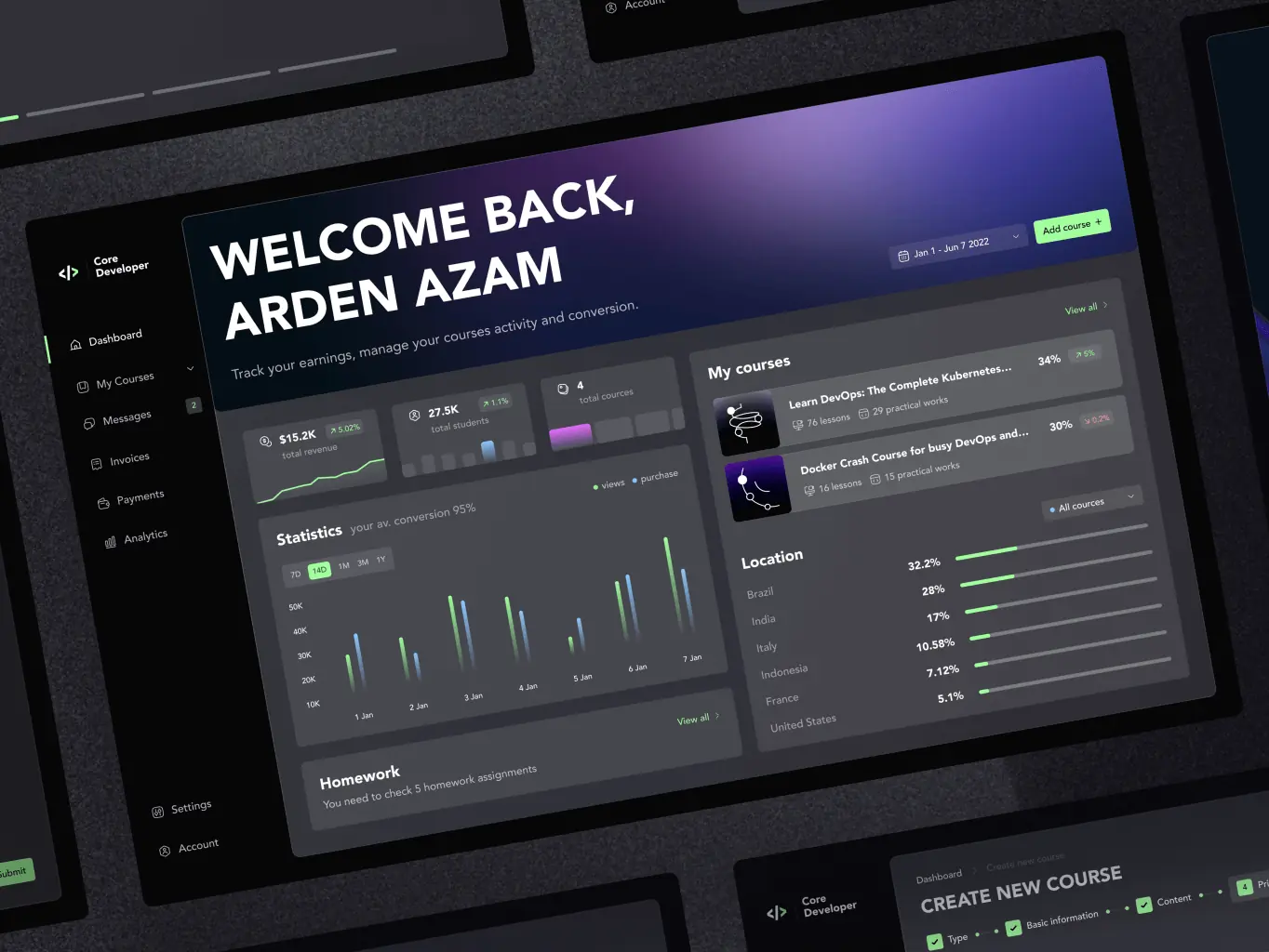
Dashboard
Both types of users can view their analytics and statistics on the Dashboard tab. Only the data will be different. The course owner can track the conversion of views and purchases of their courses, homework to be checked, and course statistics, including localization. The student can track their activity, set a goal, view progress, and jump directly to the lesson he started.
#Design prototype #Web app design
Eduwerks LLC
USA
USA
#Mobile app design #Mobile app development
Uver LLC
 UK
UK
UK
Have a project in mind?
Let's chat
Have a project to
discuss?
discuss?

Have a partnership in
mind?
mind?
