Design
Development
Research
Launch
Evolve
Extend
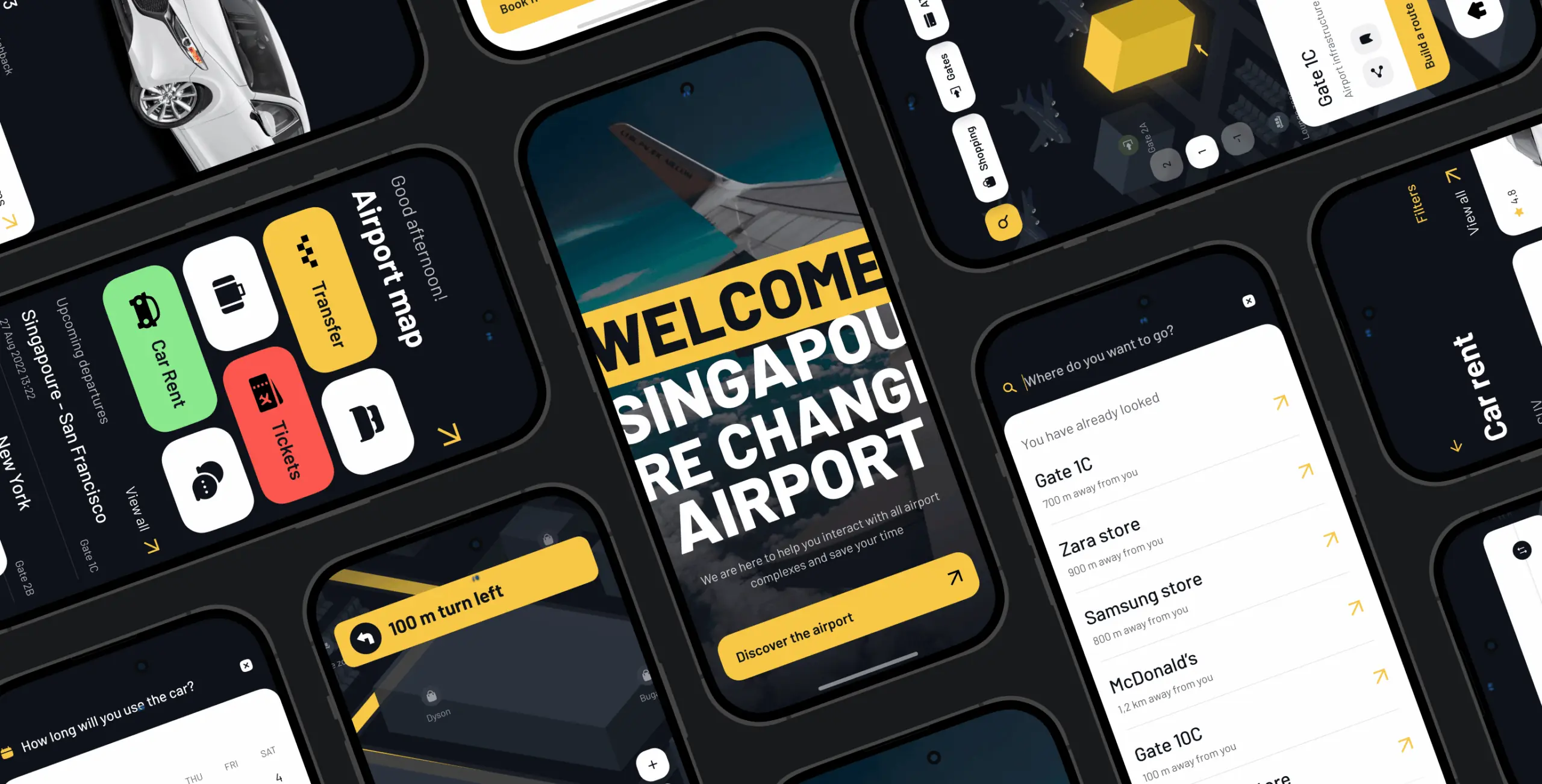
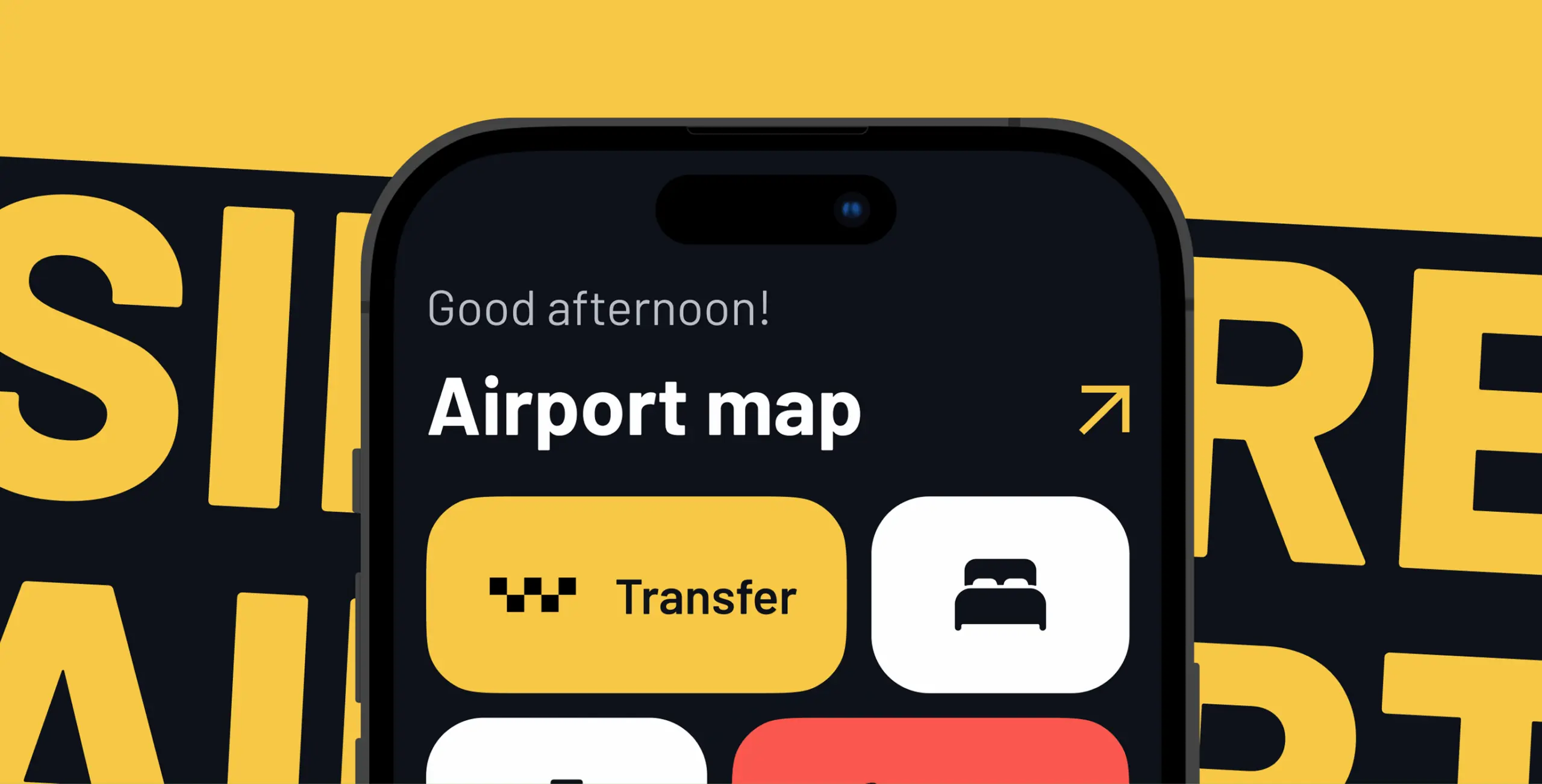
Sinport – Singapore Airport navigation app
Client
APNAVS
 Singapore
Singapore
Services
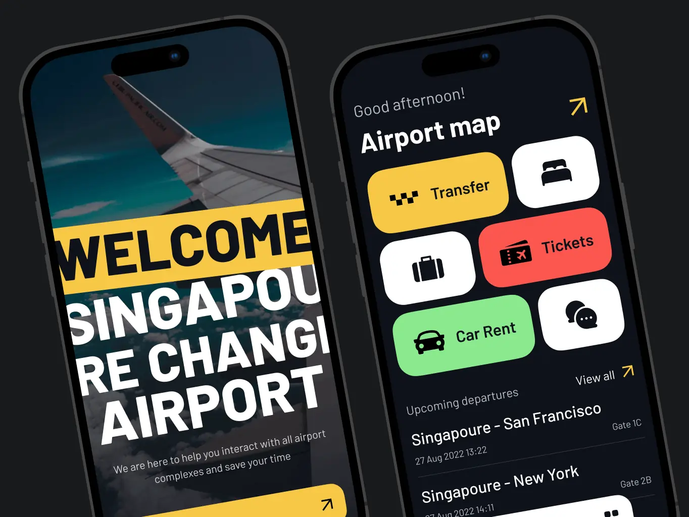
The client sought to create a user-friendly, intuitive app to navigate Singapore’s vast airport infrastructure. As one of the largest airports in the world, it had relied solely on offline navigation until now. The app needed to simplify the user experience, enabling travelers to find necessary locations and access a wide range of airport services effortlessly.
Our role
Our role was to transform the client’s vision into a seamless digital solution. We began by analyzing user behavior, market trends, and competitor offerings to inform the app’s structure and functionality. This research guided the creation of wireframes that mapped out user flows and core functionalities.
Next, we designed mockups that incorporated visual branding and interactive elements, refining them iteratively based on user feedback. The process ensured that the final design delivered a polished, intuitive experience, ready for development, and set the foundation for a scalable solution applicable to other airports globally.
In developing the Sinport Navigator app, we prioritized understanding the real-world challenges faced by travelers navigating the complex Singapore Airport. Our research approach was designed to uncover user pain points, identify gaps in current solutions, and establish a solid foundation for creating a more intuitive and user-friendly experience.
- UX research
- Information architecture
The first step in developing the Sinport Navigator app was conducting comprehensive UX research to uncover the unique challenges and needs of travelers at Singapore Airport. Recognized for its vast infrastructure, the airport posed significant navigation hurdles, making this phase crucial to the project’s success.
Our team began by assessing the existing wayfinding systems, including physical signage and available digital tools. This evaluation identified critical gaps, such as inconsistencies in signage and the absence of a cohesive digital navigation solution.
Through a combination of quantitative and qualitative research methods, we gathered insights into traveler behavior patterns, common frustrations, and key areas where digital navigation could transform the airport experience. These findings served as the foundation for designing a solution that addressed user pain points, streamlined navigation, and elevated the overall traveler journey.
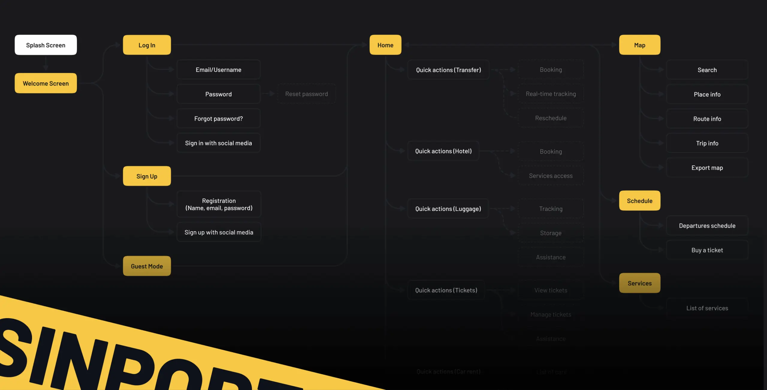
Establishing a robust and scalable information architecture was a critical step in the development of the Sinport Navigator app. We began by compiling a comprehensive inventory of the app’s content and features, ensuring that every element necessary for a seamless user experience was accounted for.
To better understand how users naturally organize information, we conducted card sorting exercises with potential users. These sessions provided valuable insights into user preferences, highlighting the most intuitive ways to structure and present information.
Using these findings, we created a detailed map to visualize the app’s hierarchical structure, ensuring logical organization and effortless navigation. This foundational work established a clear path for future design and development, ensuring the app remained user-friendly and aligned with the needs of travelers.
The design phase of the Sinport Navigator app was centered around creating an intuitive, user-friendly interface that aligned with the research insights.
The process began with developing wireframes that outlined the app’s structure and user flow, forming a solid foundation for further design iterations.
- Wireframes & prototyping
- Mockups & testing
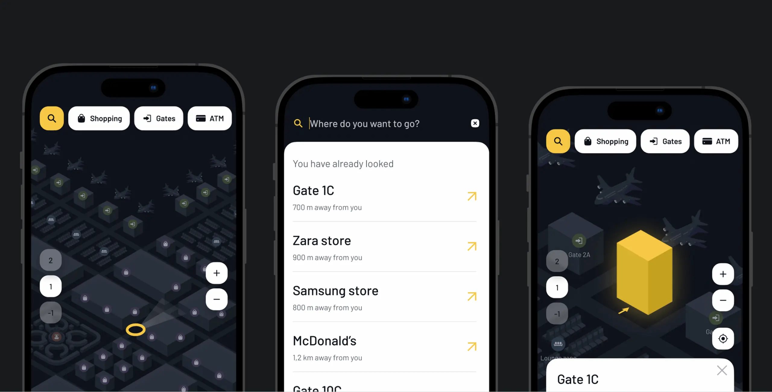
In the wireframing stage, we focused on two key aspects: designing the search and route creation flow and optimizing the mobile interface.
The search flow allowed users to locate services like stores and restaurants and plan multi-stop routes with ease. The interface emphasized simplicity, featuring large buttons and clear actions. For mobile users, we optimized controls with larger touch zones and minimal data entry, catering to those needing quick access to information.
Interactive prototypes were created to test real-world scenarios, accommodating users’ dynamic behavior while on the move. Feedback from these tests was used to refine the designs, ensuring a seamless and user-friendly experience.
The final UI design focused on simplifying navigation for Singapore Airport, one of the world’s largest and busiest travel hubs. Collaborating closely with the client, we created tailored visual solutions for key user flows, ensuring clarity and ease of use.
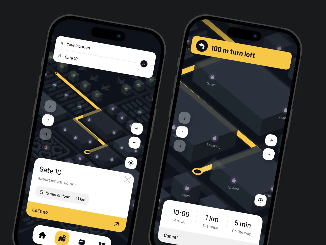
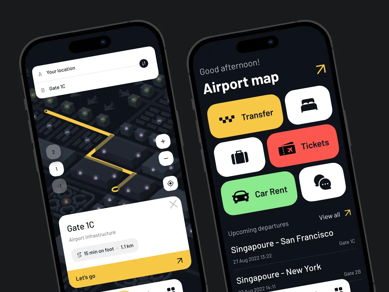
For the interactive airport map, the client initially wanted all services displayed in a single view. However, our research showed this approach could overwhelm users. Guided by UX best practices and competitor analysis, we proposed a simplified map with clear navigation, allowing users to easily locate terminals, gates, and lounges.
To address the challenge of limited internet access, we suggested a feature enabling users to download the map for offline use, ensuring smooth navigation even in low-connectivity areas.
We developed a consistent design system adaptable to all devices, prioritizing mobile interactions for on-the-go users. Rigorous testing for accessibility ensured the final design provided an intuitive and inclusive experience for all travelers
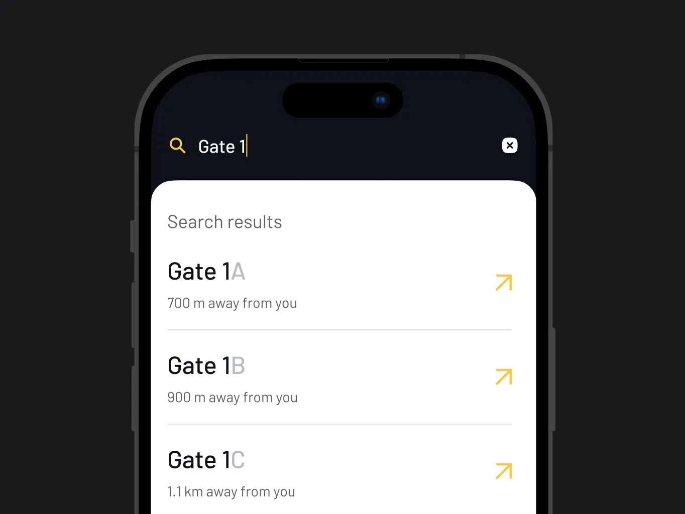
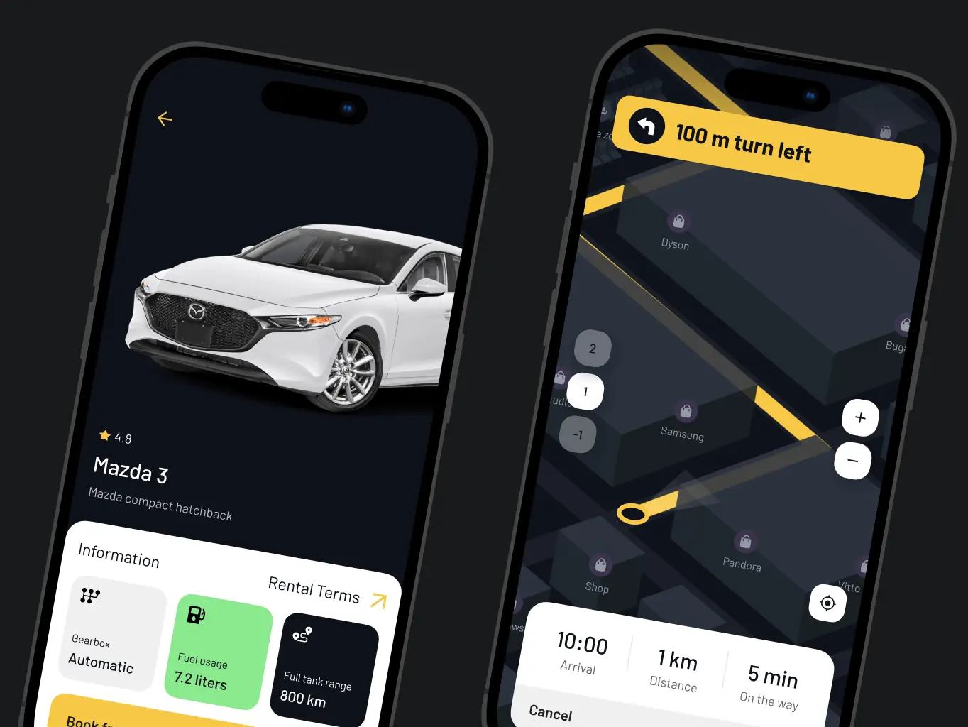
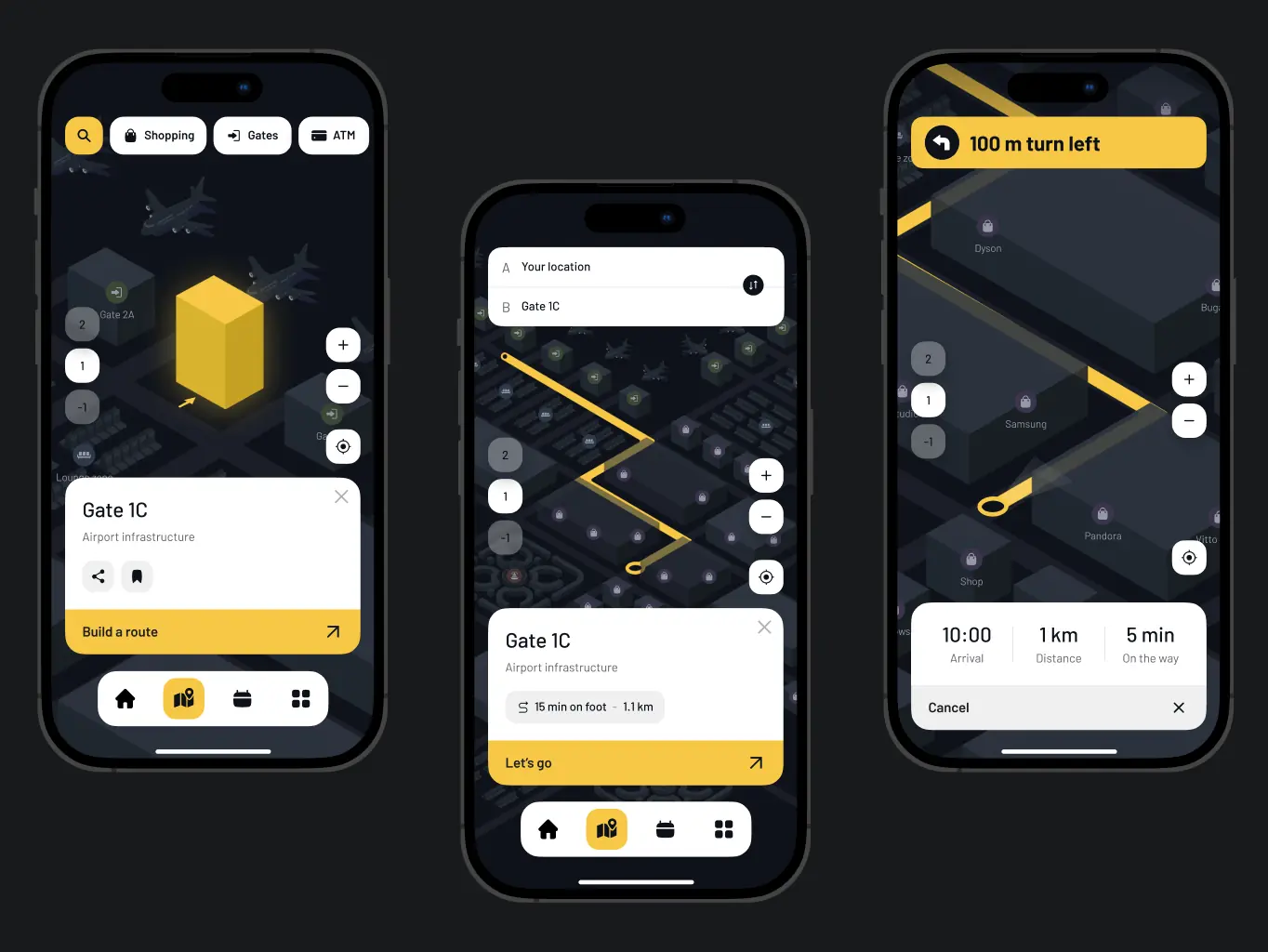
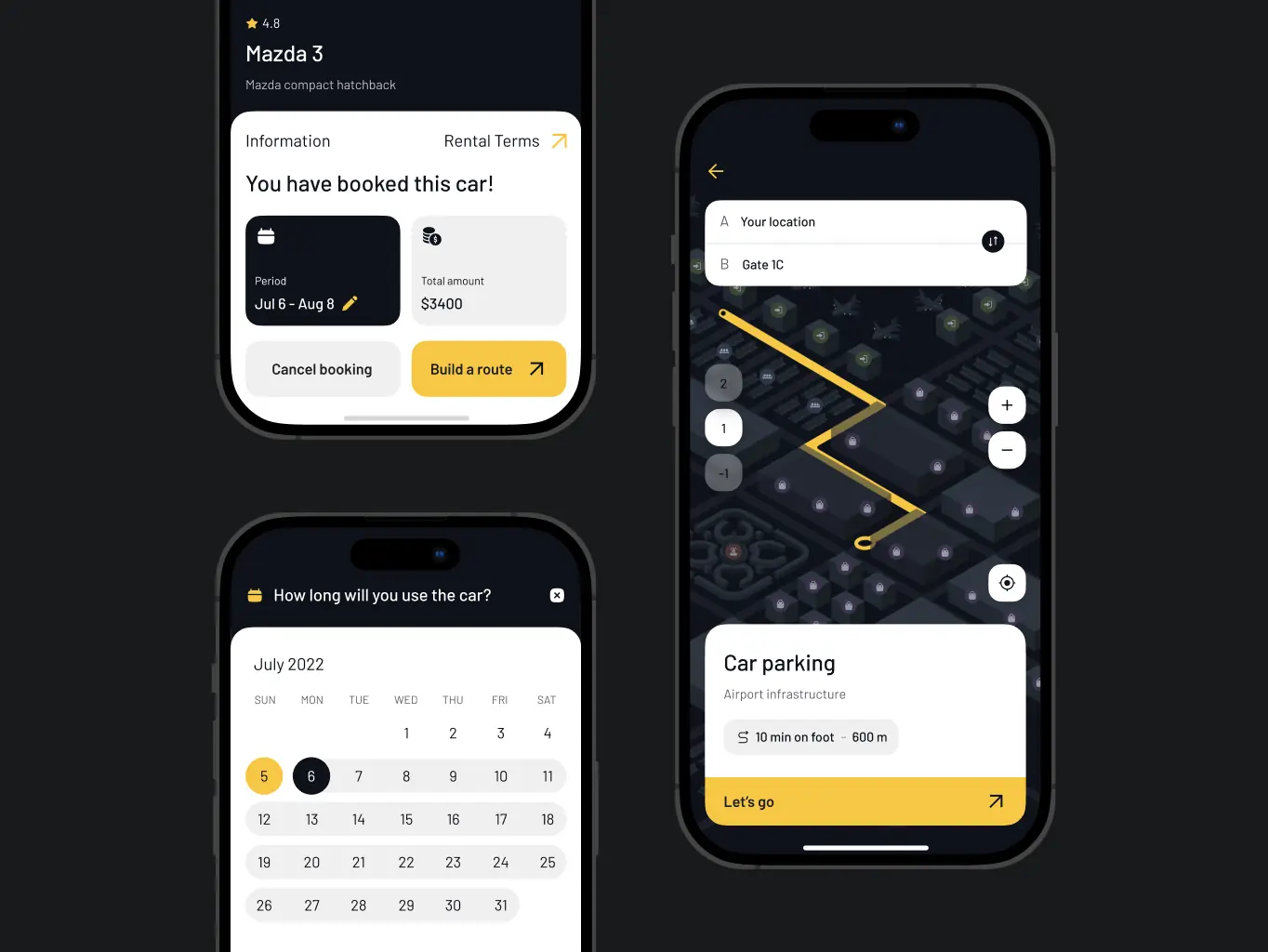
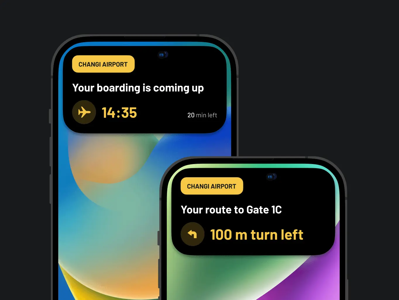
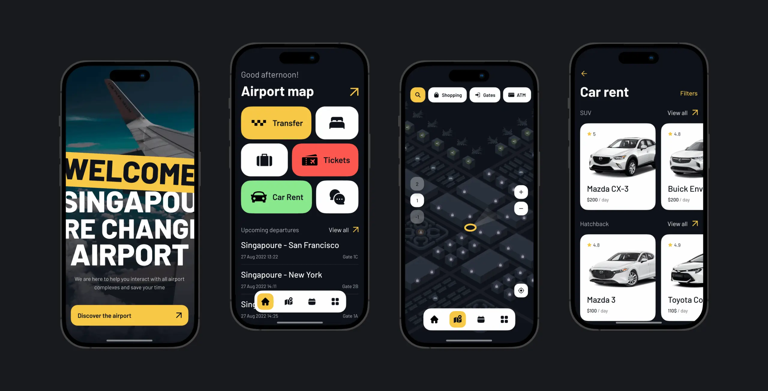
Interactive airport map and navigation
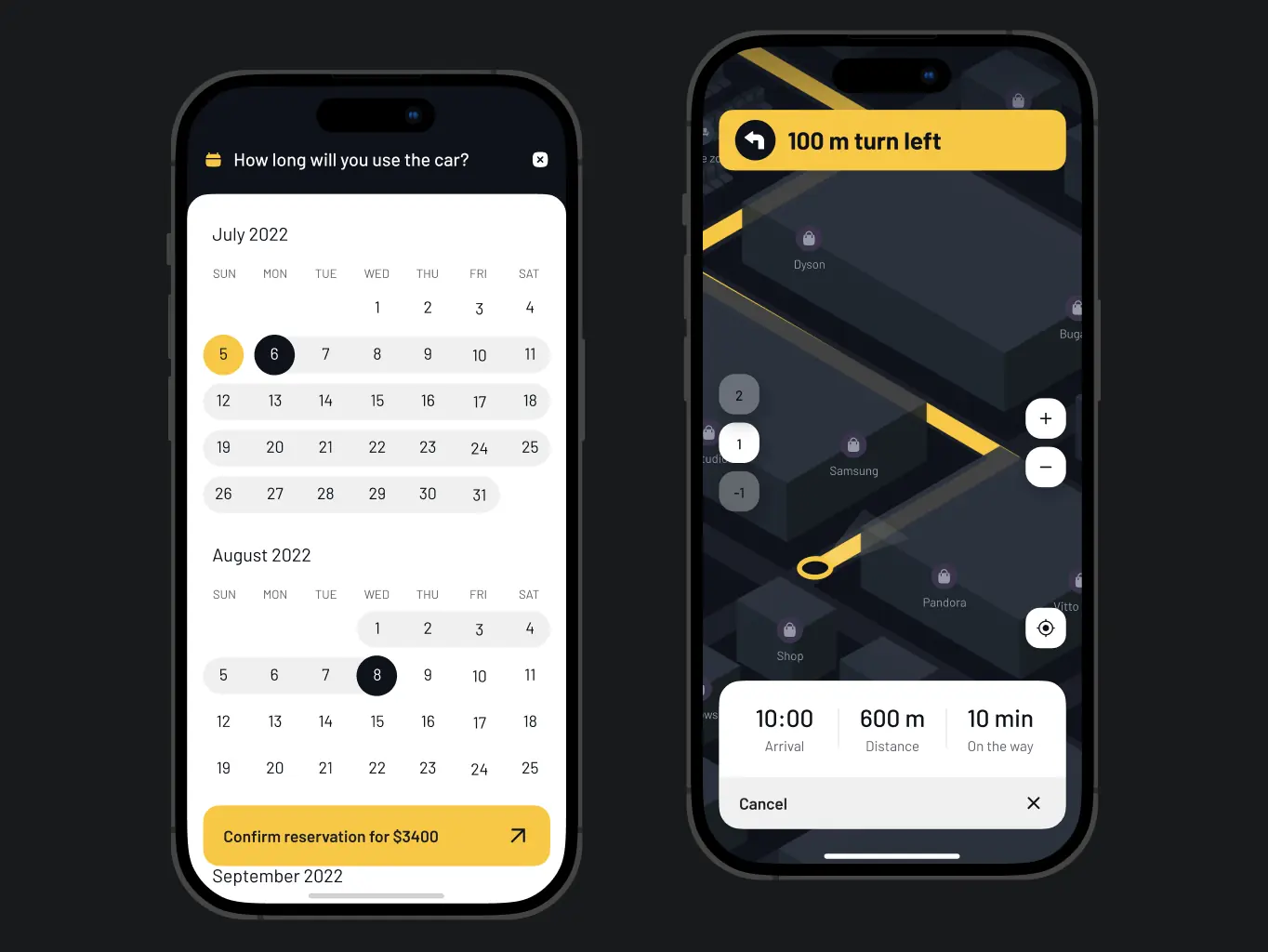
We implemented an interactive map that helps users navigate Singapore Airport with ease. It displays key locations like terminals, gates, and lounges, and allows users to create custom routes. The app provides distance, directions, turns, and helpful navigation tips to guide travelers seamlessly.
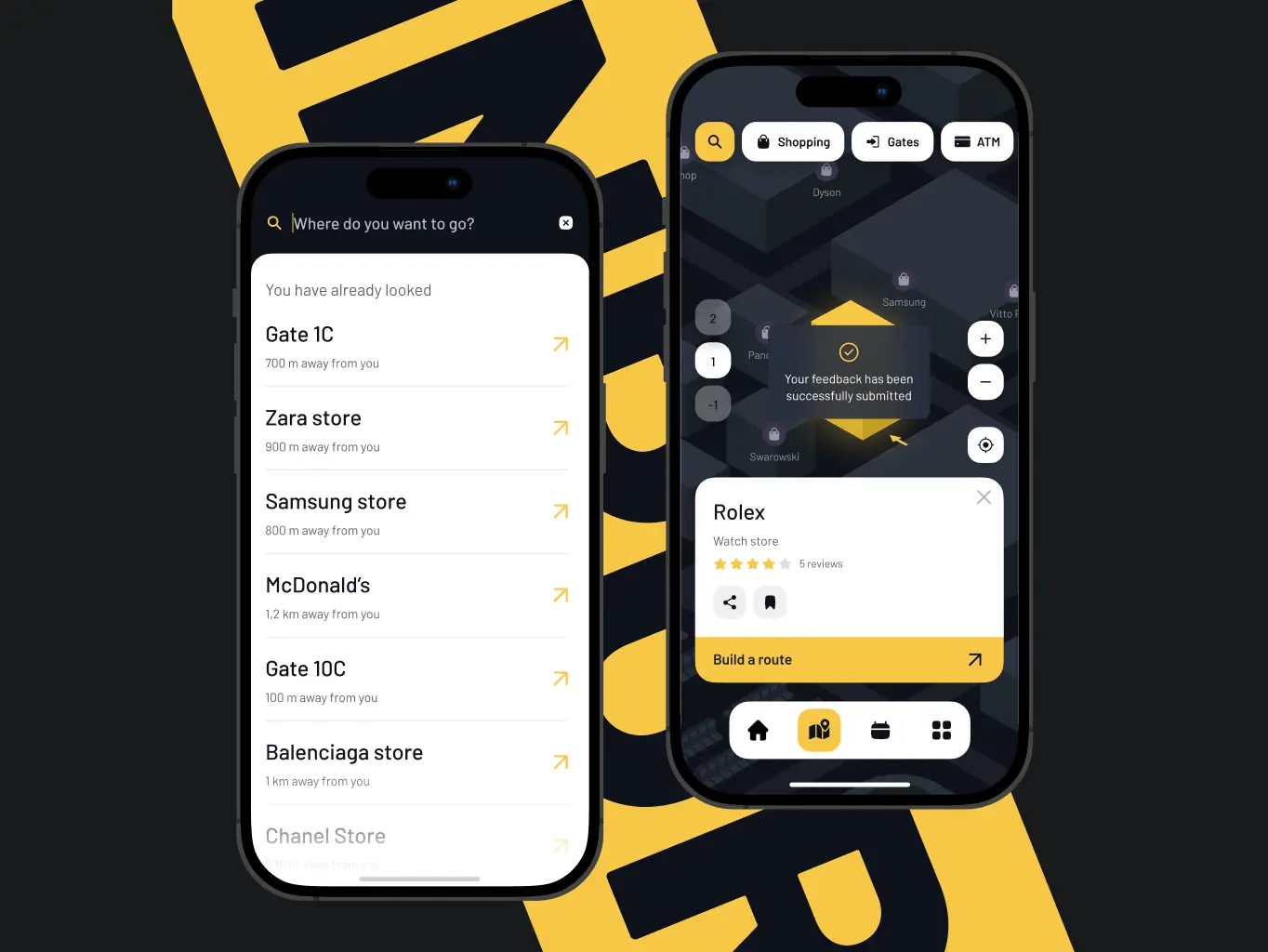
Explore Airport Services & Stores
Users can search for various airport facilities and stores, with additional details like ratings, prices, and available services. This feature ensures that travelers can easily find what they need, from dining options to shopping, with a few taps.
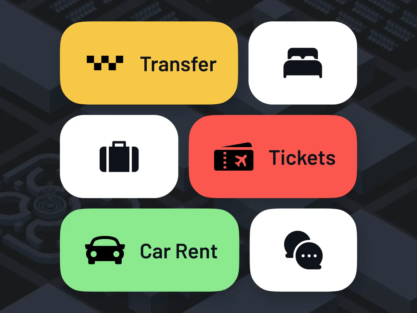
Car rent
The app simplifies booking airport-related services like car rentals. By integrating various rental agencies, users can easily compare prices, check availability, and reserve a vehicle directly within the app, streamlining their travel experience.
#UX Audit #Website design
 UK
UK

Oliver Ahad
CMO, AirportrPhenomenon Studio has demonstrated great work. The visual look and feel of the new site architecture conveys a mature and professional aesthetic.
#Branding #Website design #Website development
Copper Rock
 USA
USA
USA
Jason Timpson
Marketing Director, Copper RockI was impressed at their knowledge and skillset in bringing to life every idea we had.
Have a project in mind?
Let's chat
Have a project to
discuss?
discuss?

Have a partnership in
mind?
mind?
