Design
Development
Research
Launch
Evolve
Extend
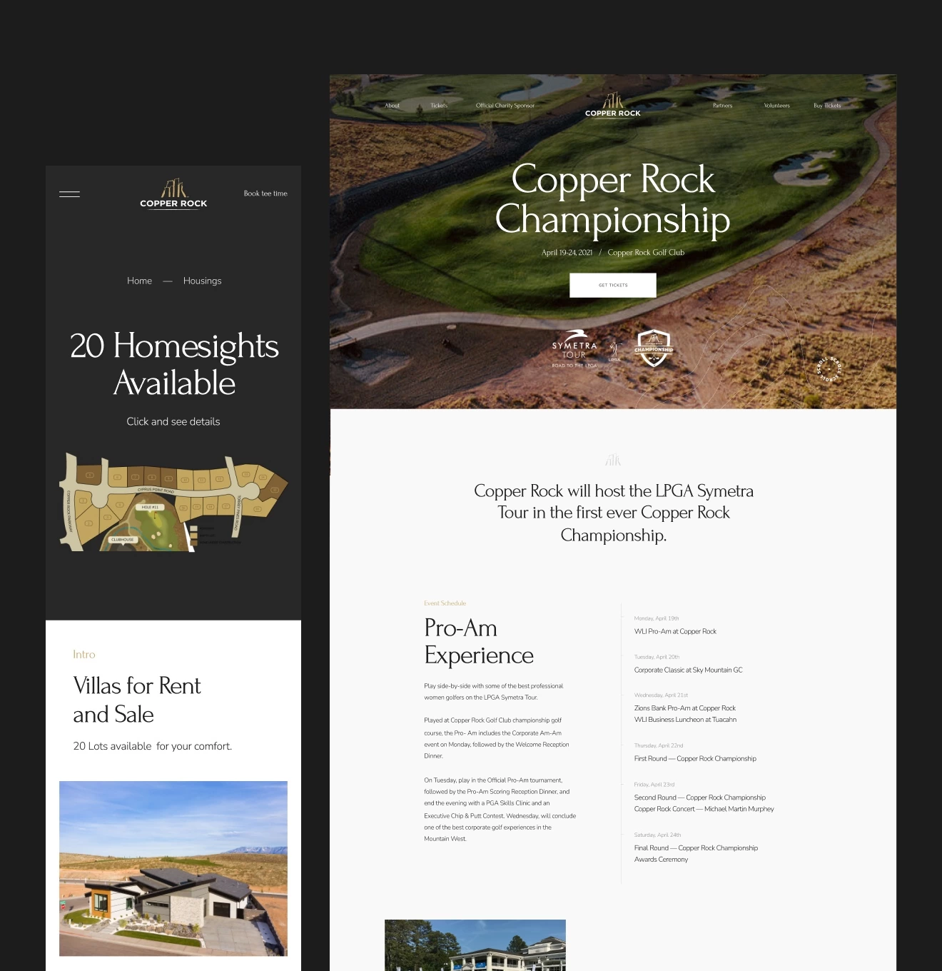
Copper Rock – golf community booking website
Client
Copper Rock
 USA
USA
USA
Services
Tasks
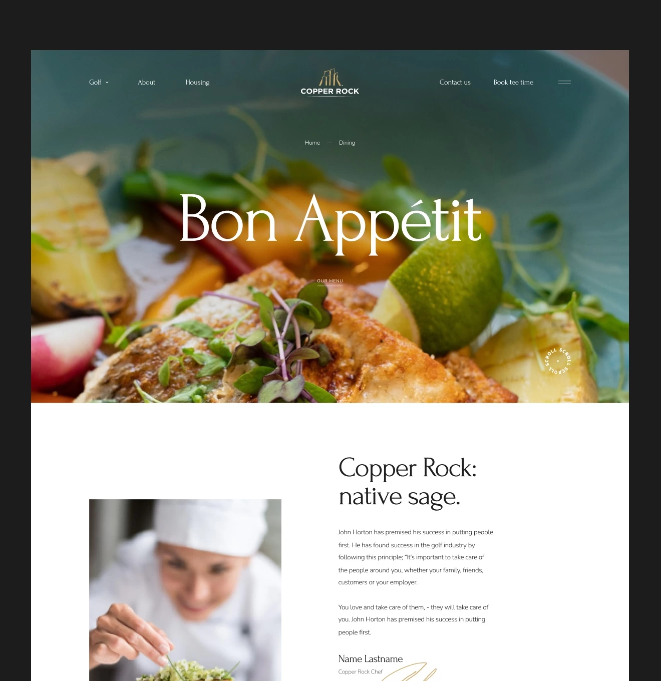
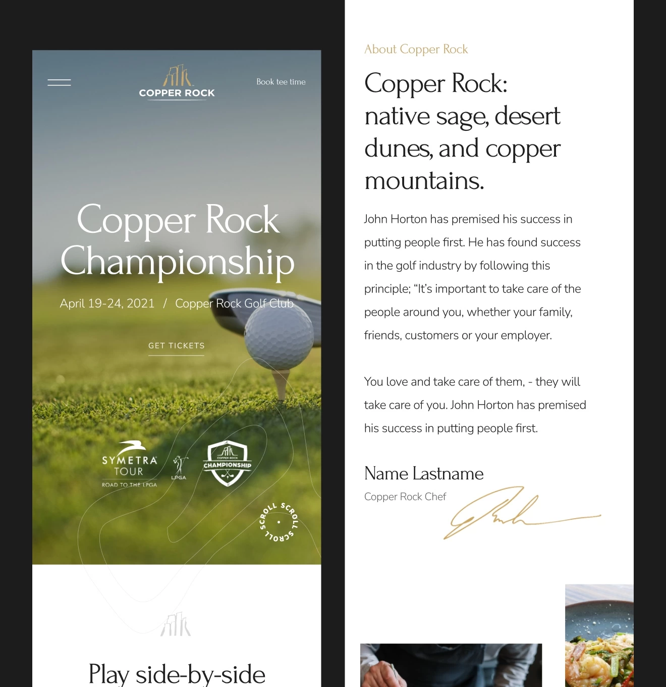
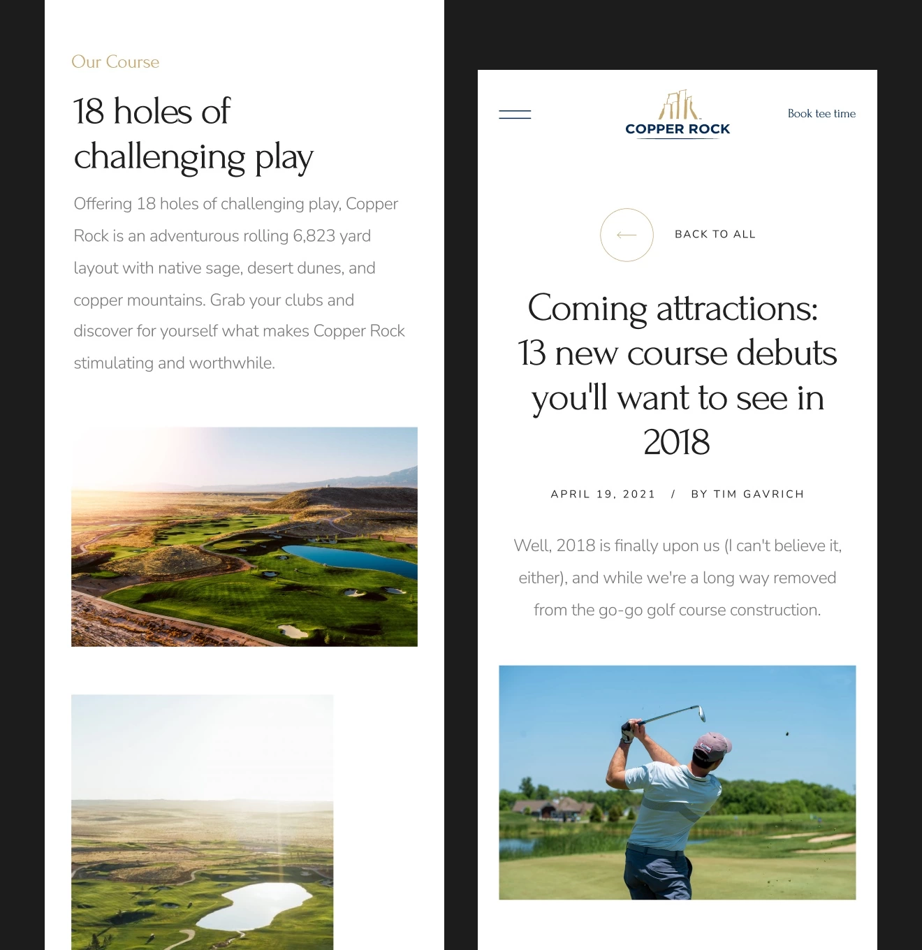
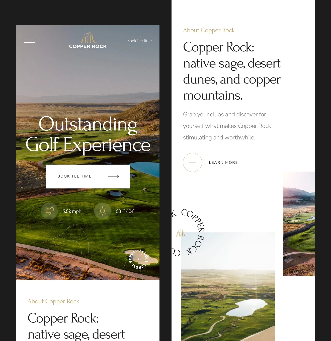
The point was to create a design that would fully satisfy two important things: display the entire list of services provided by the company (renting golf fields, participating in golf competitions, a restaurant, plot rentals/buying), and conveying the atmosphere of a rich, high-quality rest that the website audience is used to. An important goal is a user-friendly and well-designed display of courses, holes, and rates.
Solutions
To meet those two things, we have carried out an extensive analysis of the existing golf club promo-websites and analyzed the highlights, approaches, and solutions. We also identified the pros and cons of each of them.
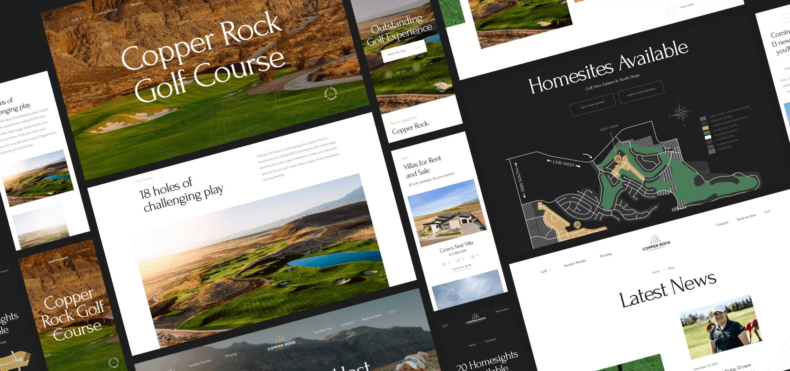
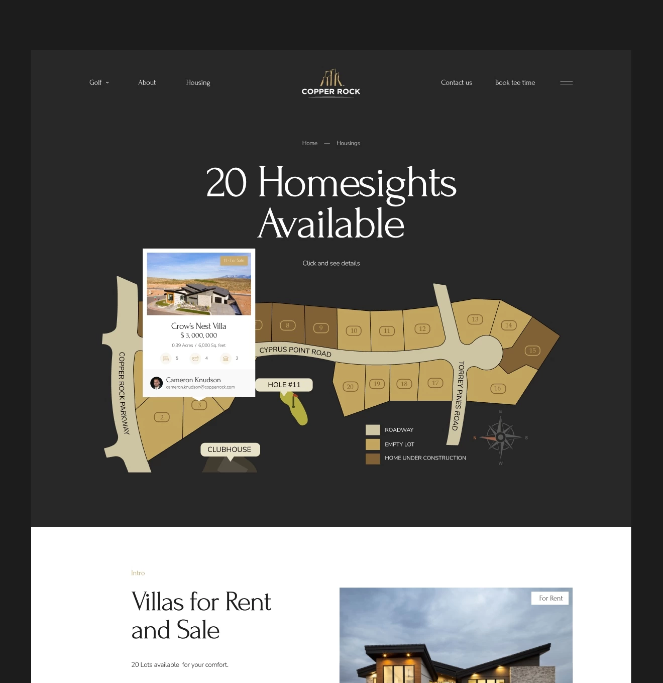
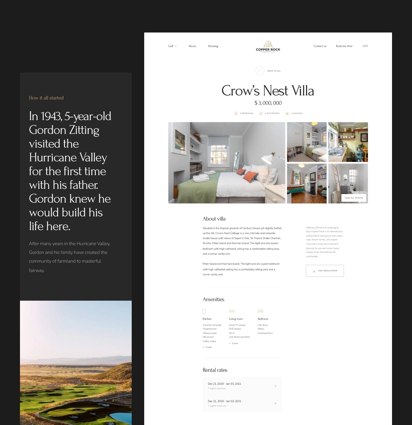
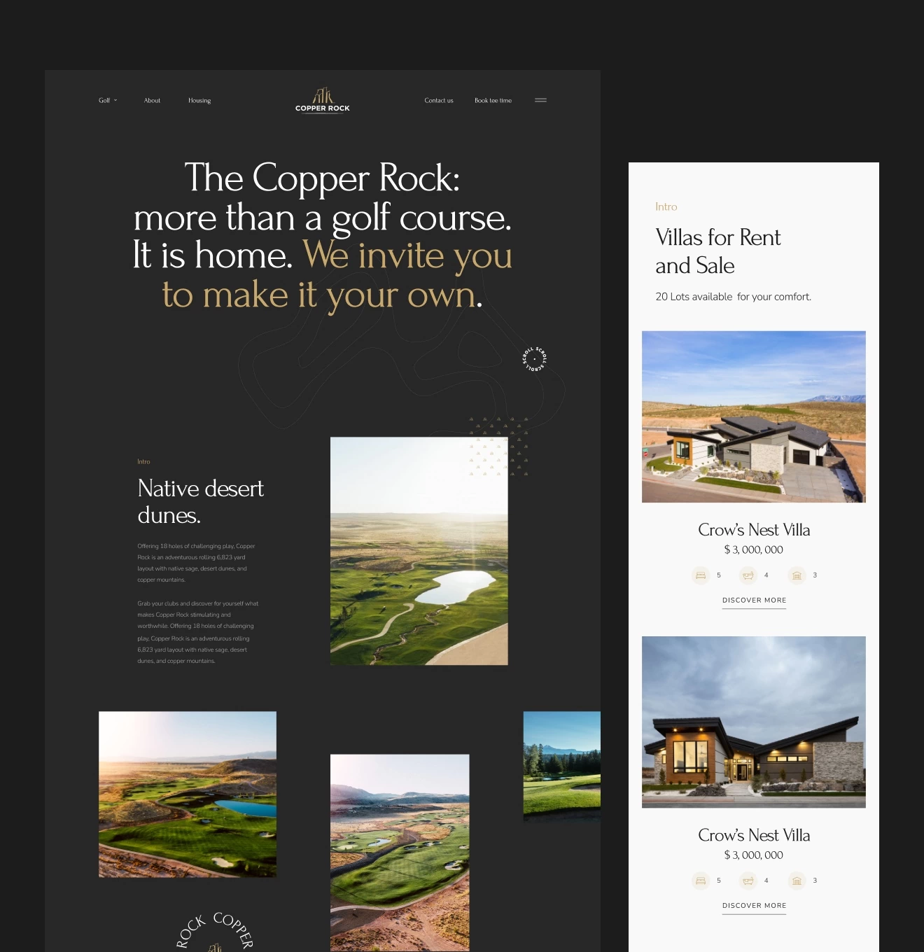
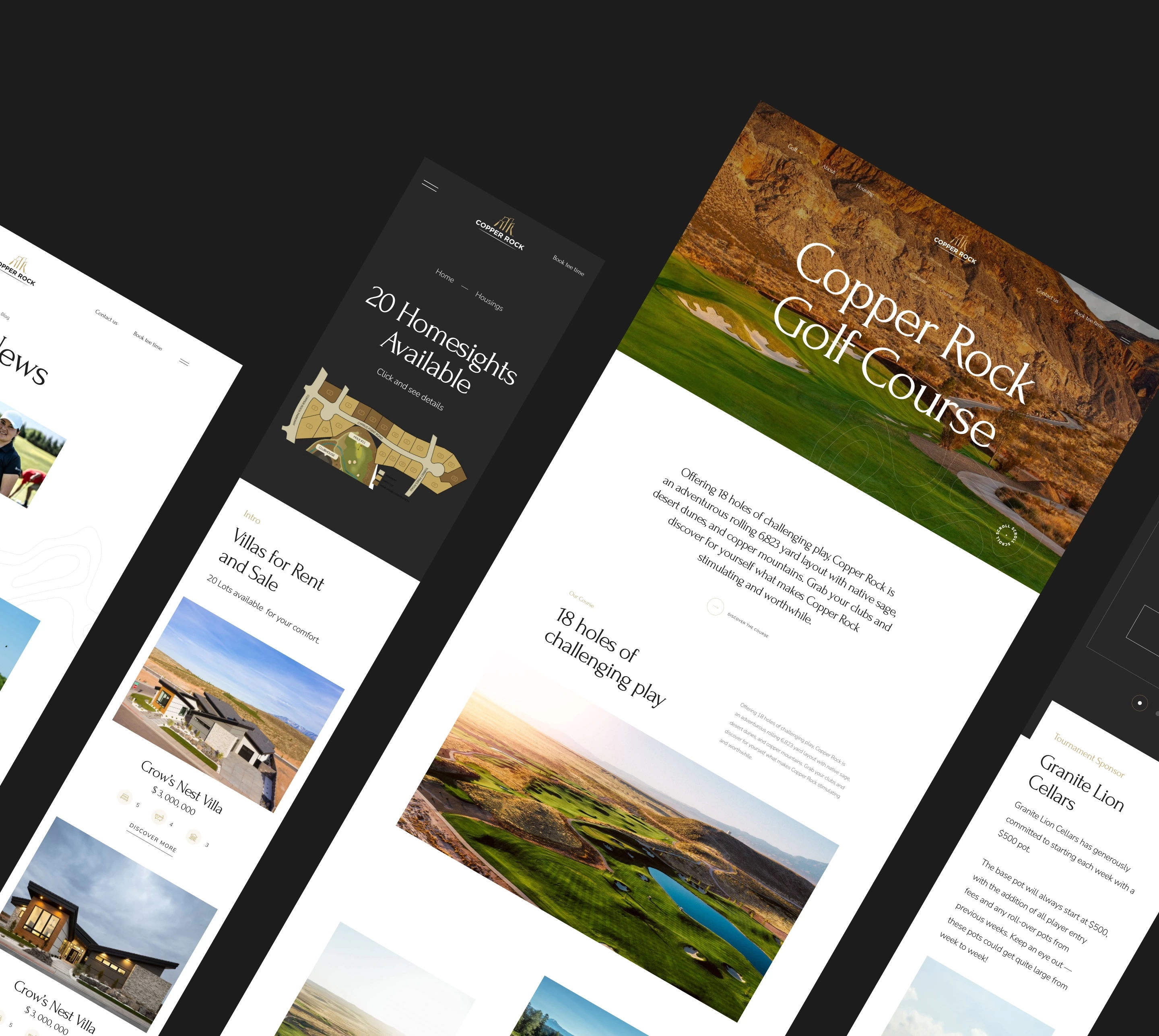
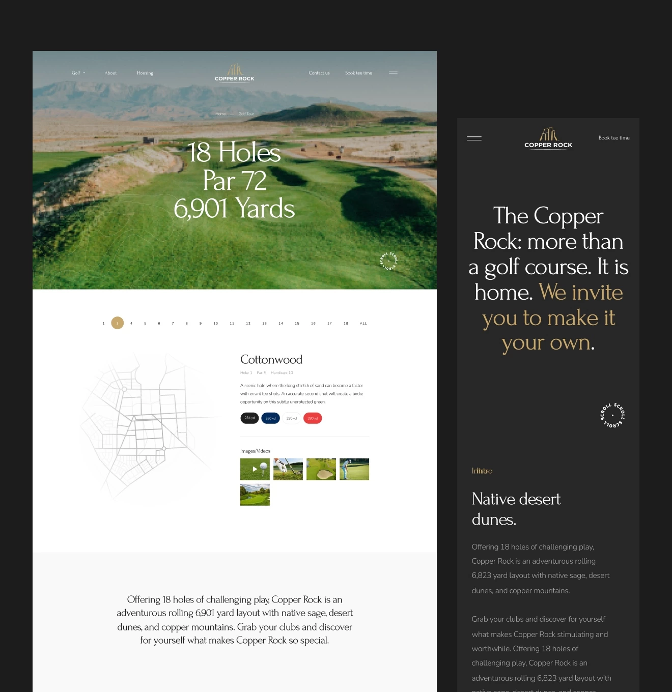
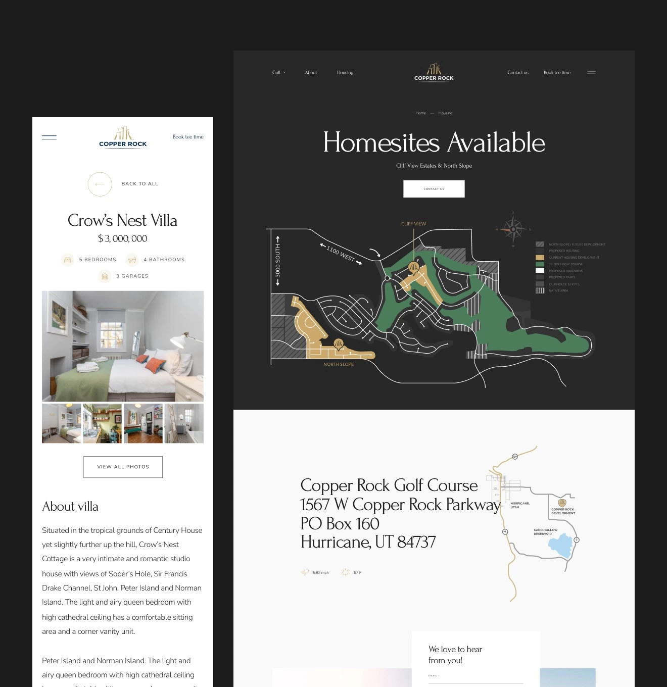
As a result of the UX-research, we concluded that the best solution would be a detailed display of each service in the form of separate pages, which will be easily accessible through the main menu, and a clear structural delineation depending on the service category. We have totally redesigned one of the most important aspects of the website, particularly, the block with fields and distances between holes. We have drawn up illustrations of the appropriate style. So, now we have nice linking between the golf holes on the page.
Research
An important part of the work was to do research on Copper Rock competitors inside the state and beyond among the companies providing similar services. We have analyzed the highlights, approaches, and solutions and identified the pros and cons of each of them.
We proceeded to develop a sitemap after we got acquainted with the project goals and UX-research.
Wireframing
To clearly understand the structure of the pages and approve the necessary blocks and sections, we have wireframed each page in detail. Some of the pages that already existed on the old website have been completely redesigned in terms of user experience.
UI Design, brand illustrations
After we approved the wireframes, we got to the next stage, i.e. the design and the website’s design system development. Besides the web version of the platform, we also developed a version for mobile browsers. Design components have been added to the UI Kit that can be used by developers.
During our work on the website, we have also drawn up illustrations of fields, maps, and holes. Their style matches the atmosphere of the website, with a similar color scheme.
Development and support of the site
The last thing was the website development by our team based on the prepared layouts and UI-kit. This is a WordPress-based website including SEO optimization developed by a team of frontend, backend developers and DevOps. The final point was QA testing before the website became available to the public. To pass the information on animations of the website interface, we created a separate specification in order to transfer it all to the developers.
We also provide website support after the launch, since the company often releases updates and adds new events, which can be viewed on the website.
I was impressed at their knowledge and skillset in bringing to life every idea we had.
#MVP building
APNAVS
 Singapore
Singapore
#UX Audit #Website design
 UK
UK

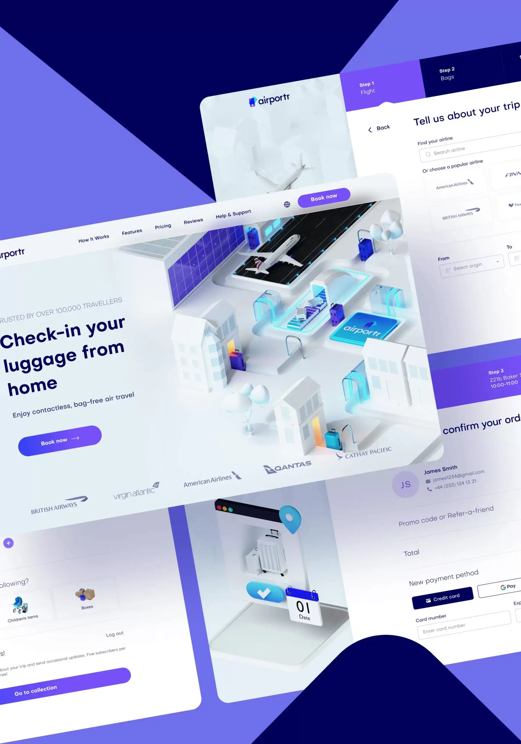
Oliver Ahad
CMO, AirportrPhenomenon Studio has demonstrated great work. The visual look and feel of the new site architecture conveys a mature and professional aesthetic.
Have a project in mind?
Let's chat
Have a project to
discuss?
discuss?

Have a partnership in
mind?
mind?
