Have an idea?

Rapida – Branding for the Delivery Service

Rapida – Branding for the Delivery Service - Website Development - Photo 1
Clearer brand positioning

Developed a cohesive branding that aligned with new market goals, resulting in a 28% boost in lead generation through targeted advertising

Packaging as a strategic communication tool

Packaging transformed into a dynamic communication tool, embedding brand values and messaging to enhance customer engagement and create memorable delivery experiences

Customer loyalty and trust

Established a strong, memorable brand presence that increased customer recognition by 22%

Overview

Delivery Service with Personalized Approach

Rapida is a modern delivery service that uses advanced technology to provide affortable and reliable delivery services. They offer a personalized approach to each order, with a range of delivery options to suit customer needs. Rapida also prioritizes customer satisfaction, with 24/7 customer service support and personalized communication model.

Client
Rapida
Services
Brand identity Branding guidelines Package design Marketing assets design Motion design
Business needs

Client’s request

The idea was to create a service for delivering products and goods. The service would make modern technology accessible to everyone, offering solutions for different budgets and target audiences. Since our market is the traditional Italian one, it makes sense to use a clever and spirited design that will resonate with the chosen target audience.
Rapida trusted us with the development of brand identity and communication model. We’re very excited to share the results.

Scope of work
  • Logo design
  • Marketing assets for advertising and promotion campaigns
  • Guideline for consistent usage of brand elements
  • Marketing communication solution
Working process

Logo & primary brand assets

Logo idea and execution

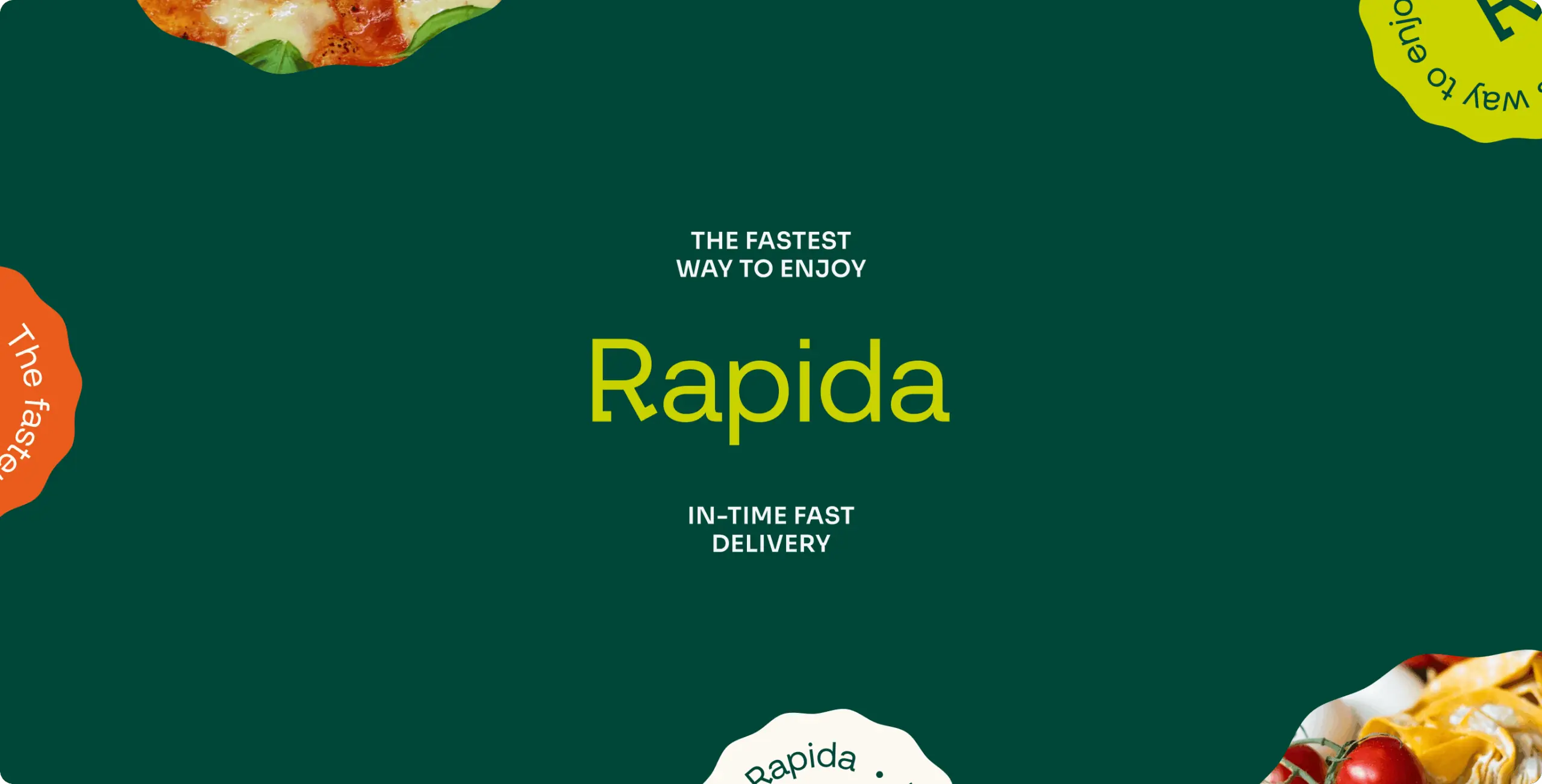
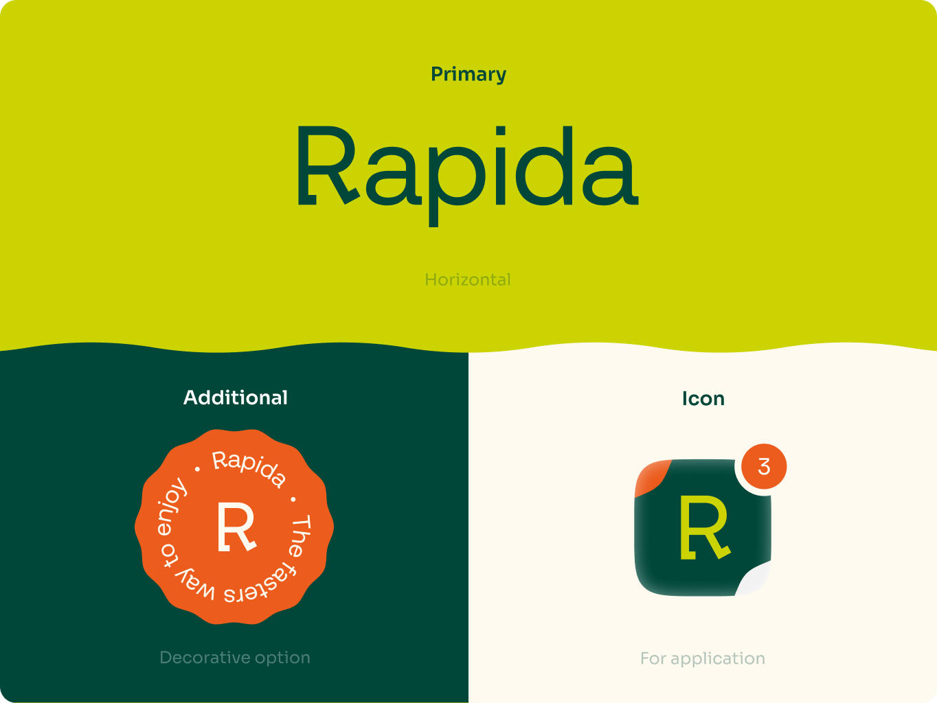
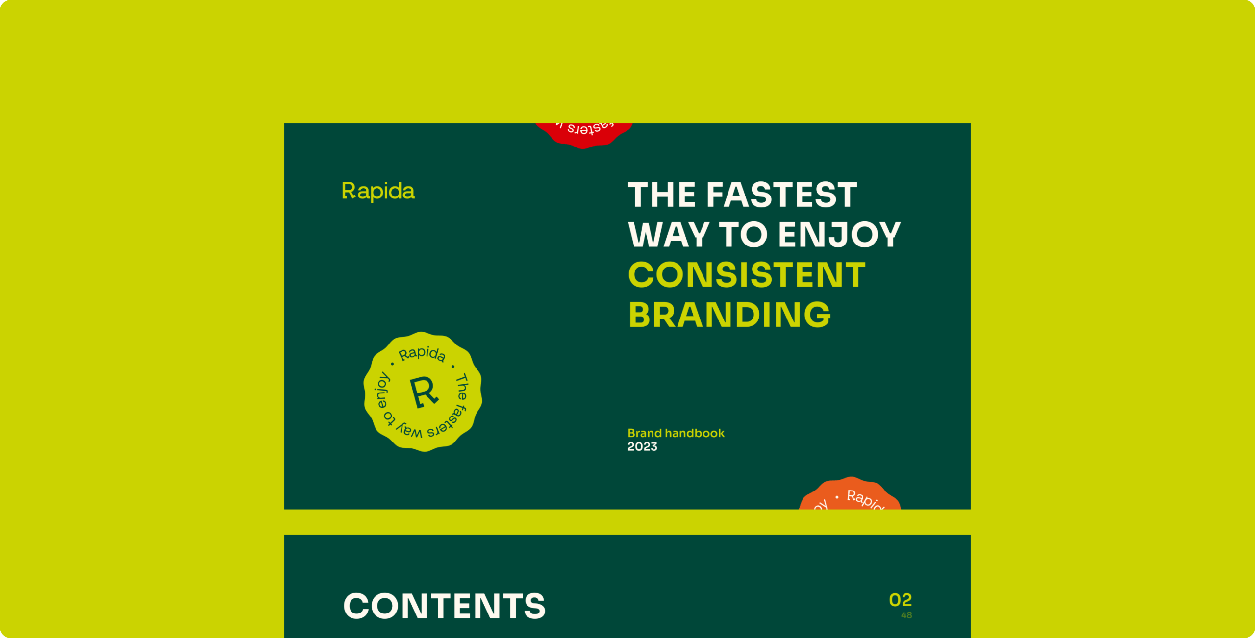
The idea of the logo is to show the accessibility of delivery for everyone and to emphasize the main advantages and philosophy of the company. The main visual image is a grapheme – the walking letter R. This metaphor embodies accessibility and openliness. Dynamic forms allows brand visuals to underline the rapidity, creativity and uniqueness of the service.
We have provided a wide range of layout options for the logo to cover all possible ways of placing the logo. This will make it recognizable and memorable.

Rapida – Branding for the Delivery Service - Website Development - Photo 4
Brand colors

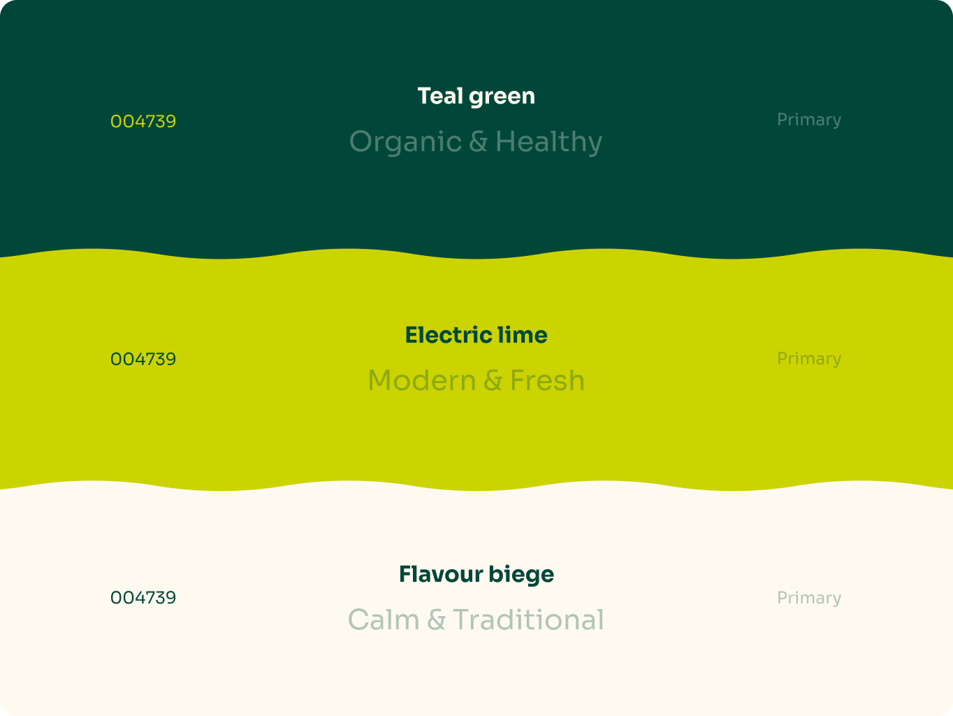
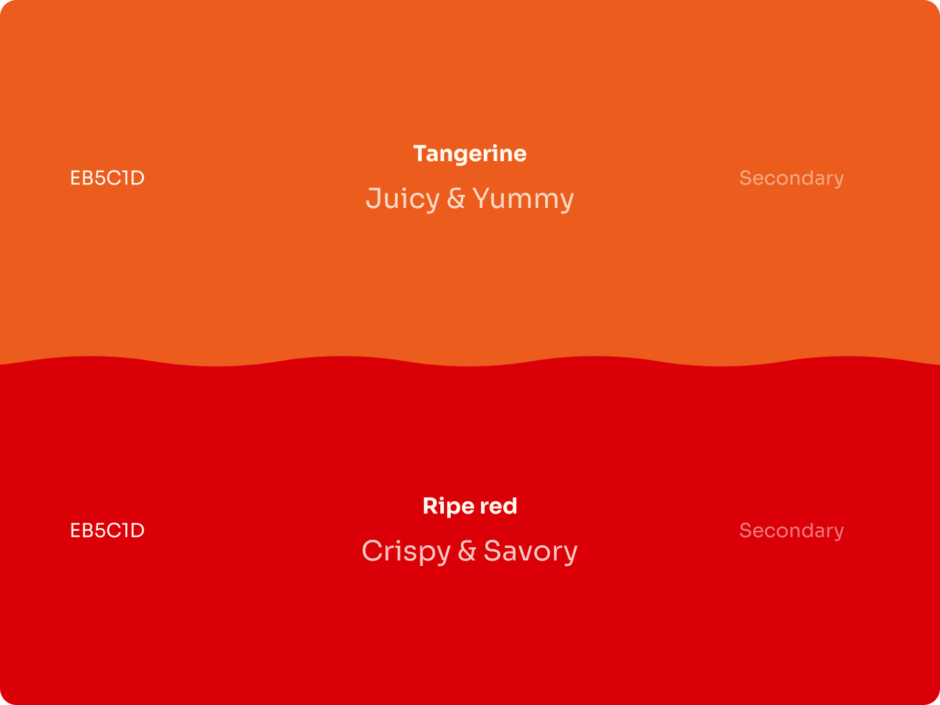
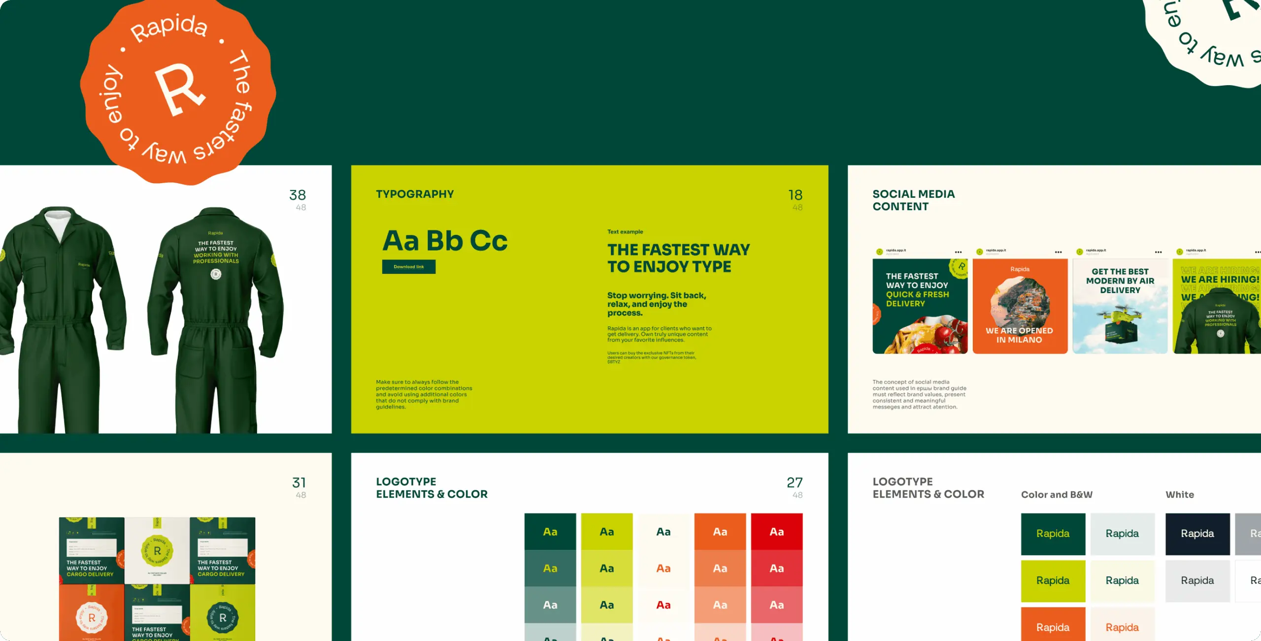
Color palette is an essential tool for identifying a brand because it helps to convey the feel and personality of a brand.
The main idea of the tone of the brand is to bring joy and pleasure to the customers by using the delivery service. To reinforce this effect, we created a palette that reflects a feeling of balance between modern and traditional, passionate and original.

Typography solution

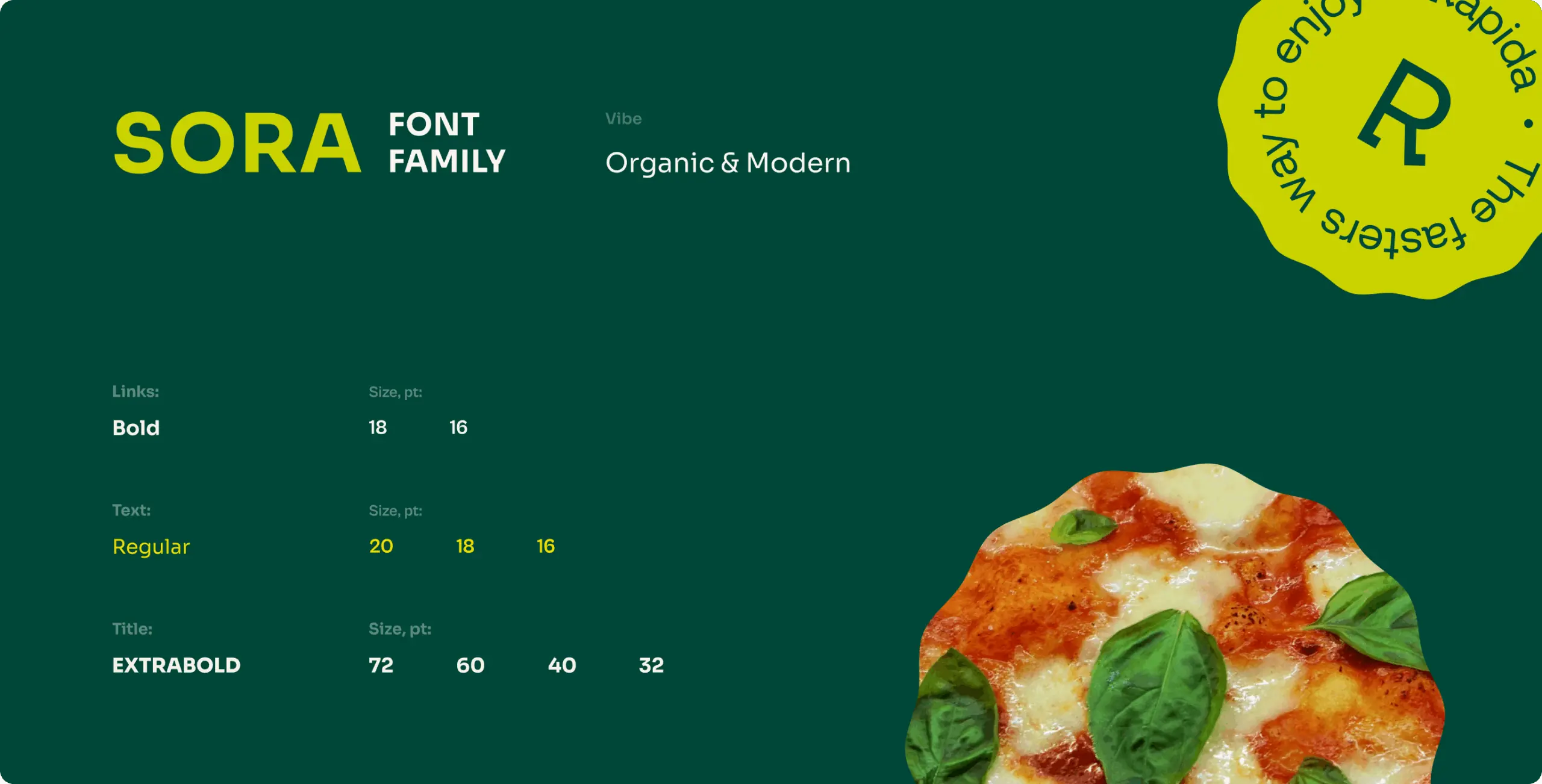
Brand typography is another important aspect of branding. It helps organize written content and aligns it with the message the brand wants to communicate to customers.
Our choice of typeface was based on affordable solutions and simple, clean grotesque fonts. This allowed the brand to communicate in the right tone and convey key meanings such as freshness, organicity, as well as modernity and accessibility.

Rapida – Branding for the Delivery Service - Website Development - Photo 8
Rapida – Branding for the Delivery Service - Website Development - Photo 9
Rapida – Branding for the Delivery Service - Website Development - Photo 10
Branding

Delivery package

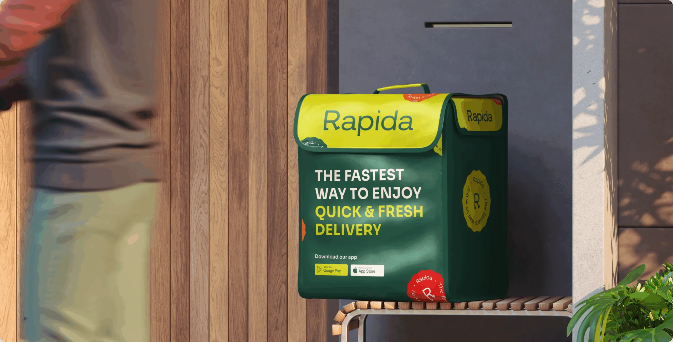
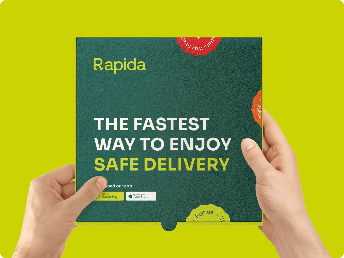
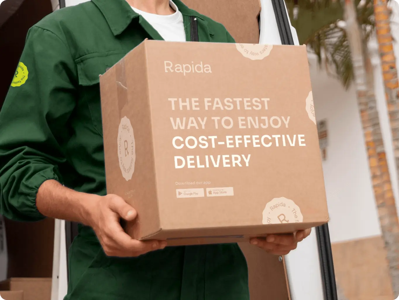
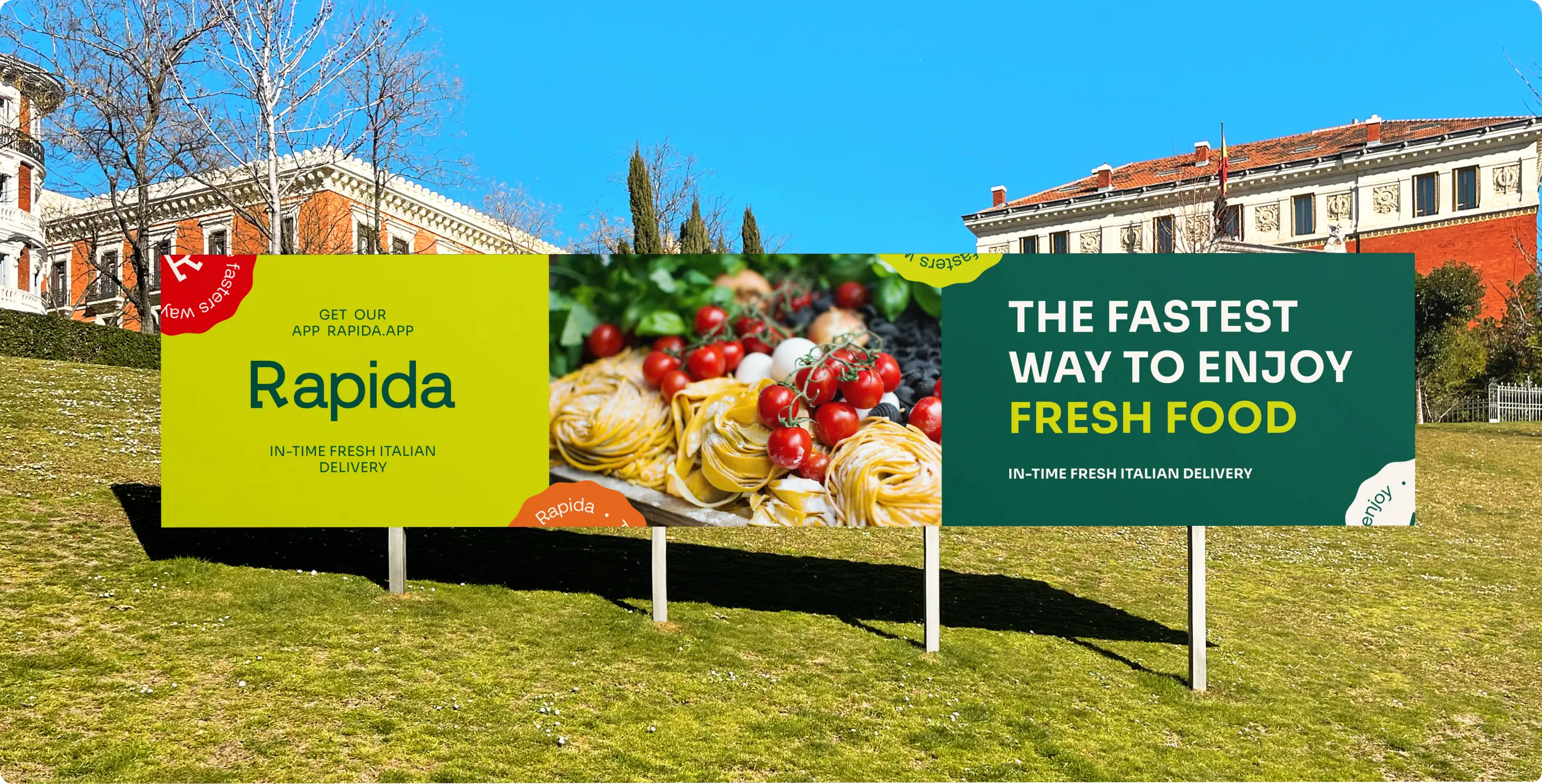
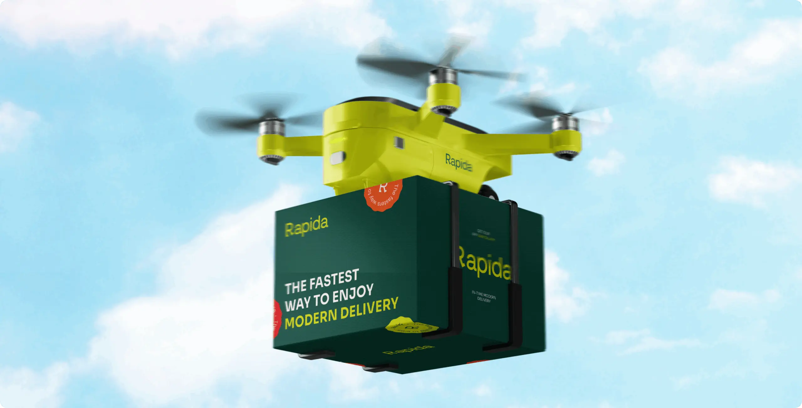
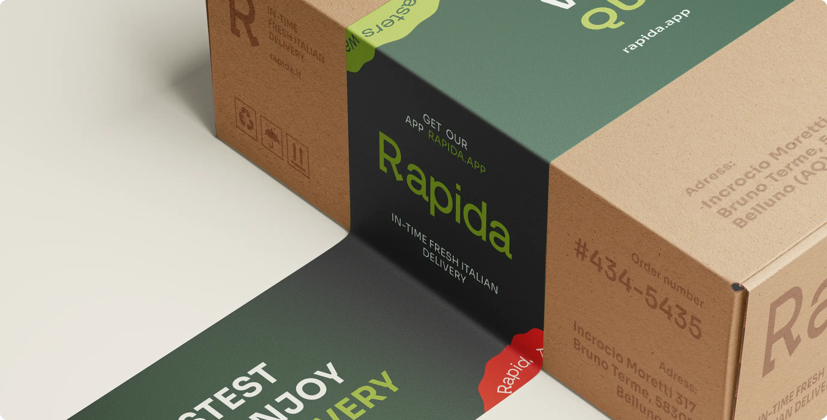
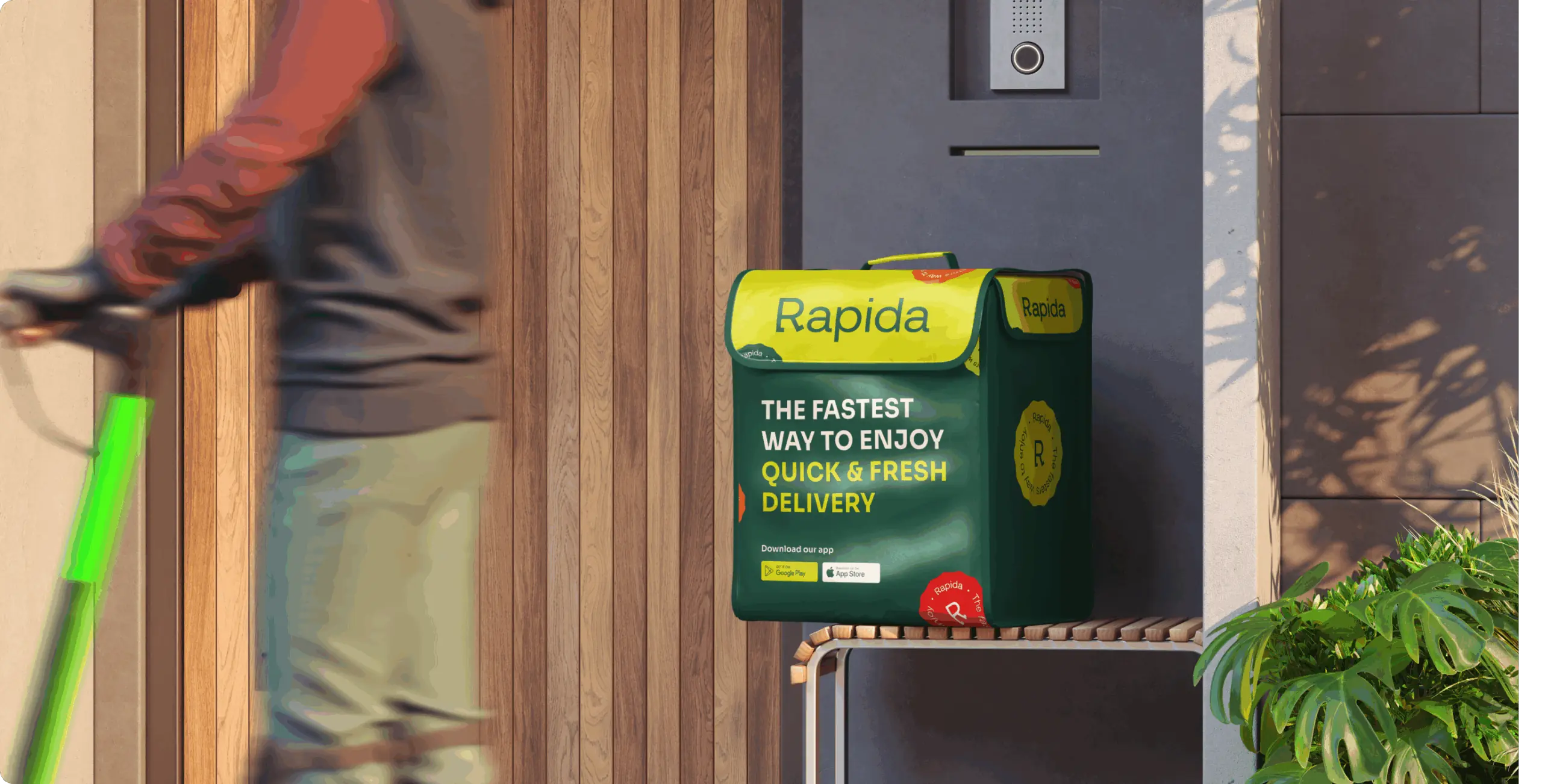
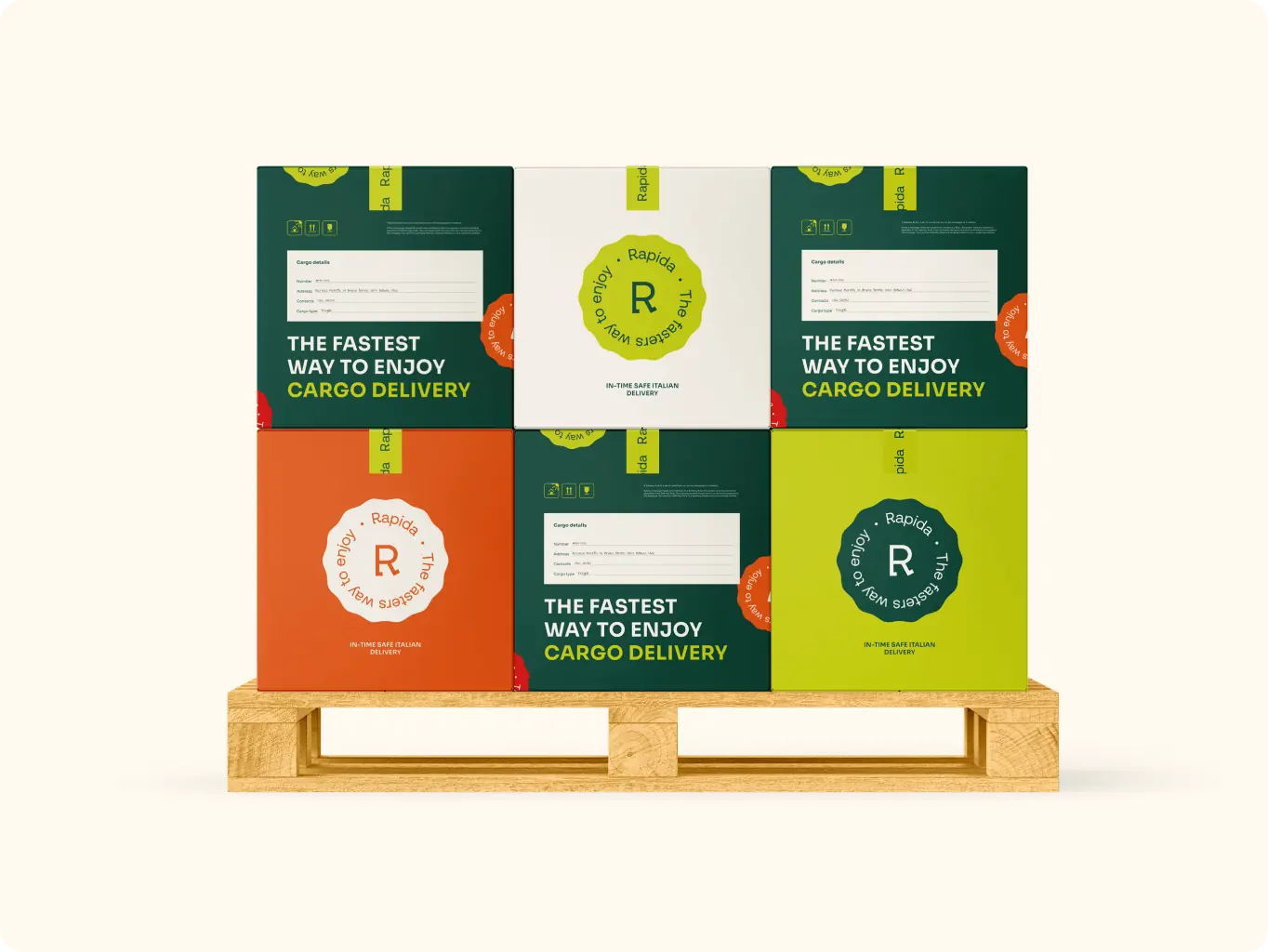
Considering that the packaging is the main attribute of the delivery service, we decided to turn it into a marketing tool that would allow us to communicate with the target audience and make them feel our values. We offered a wide range of packaging and delivery options. Our slogan became the main element of the packaging design with the addition of different content parts depending on the advantage of our delivery that we want to highlight.
In this way, the packaging has become a powerful, convenient and effective communication tool.

Rapida – Branding for the Delivery Service - Website Development - Photo 11
Rapida – Branding for the Delivery Service - Website Development - Photo 14
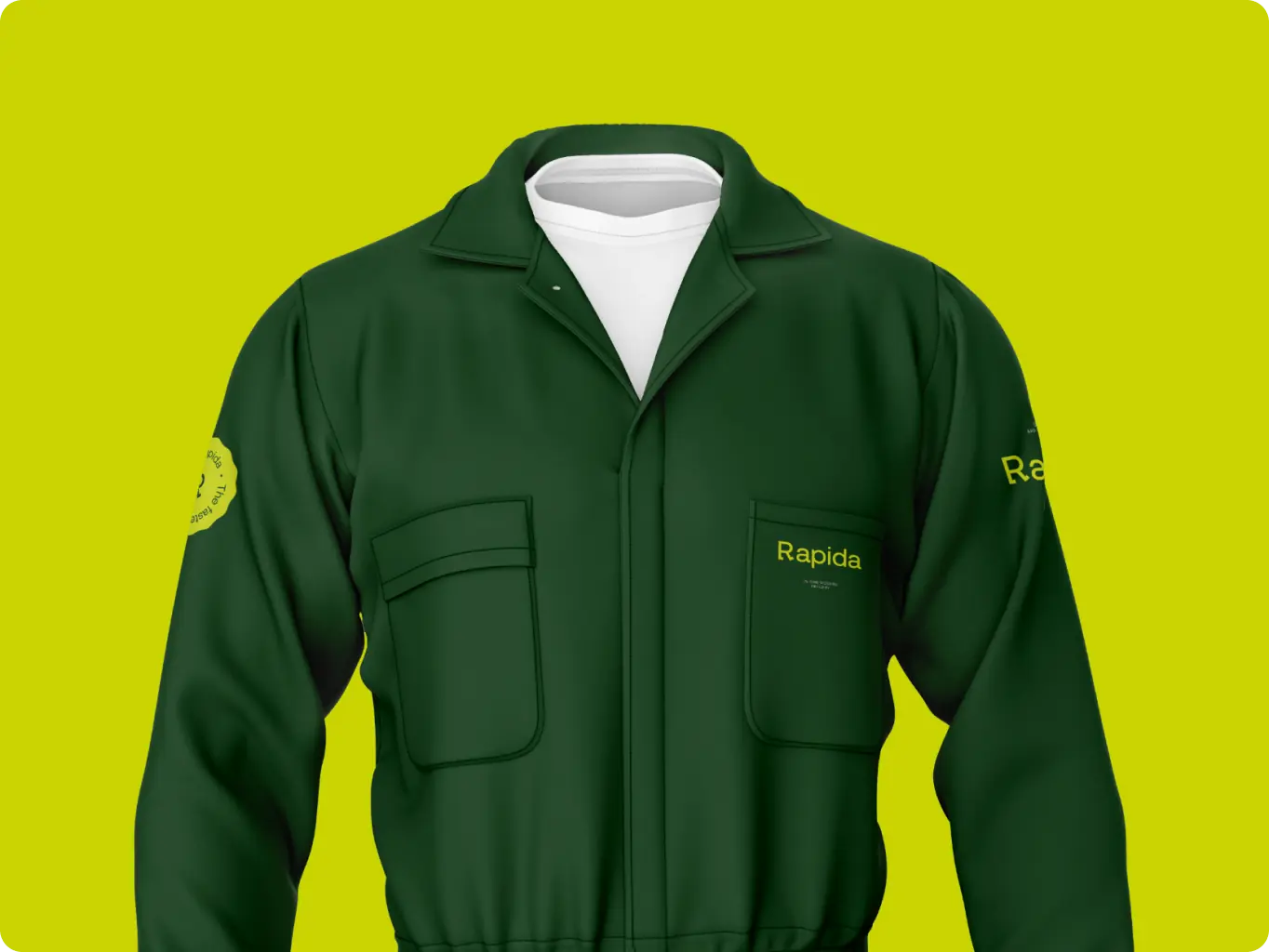
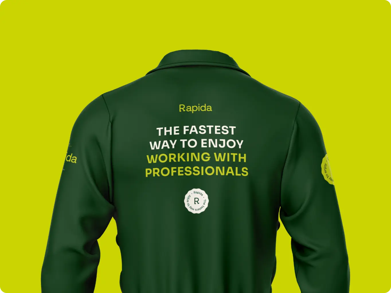
Outfit

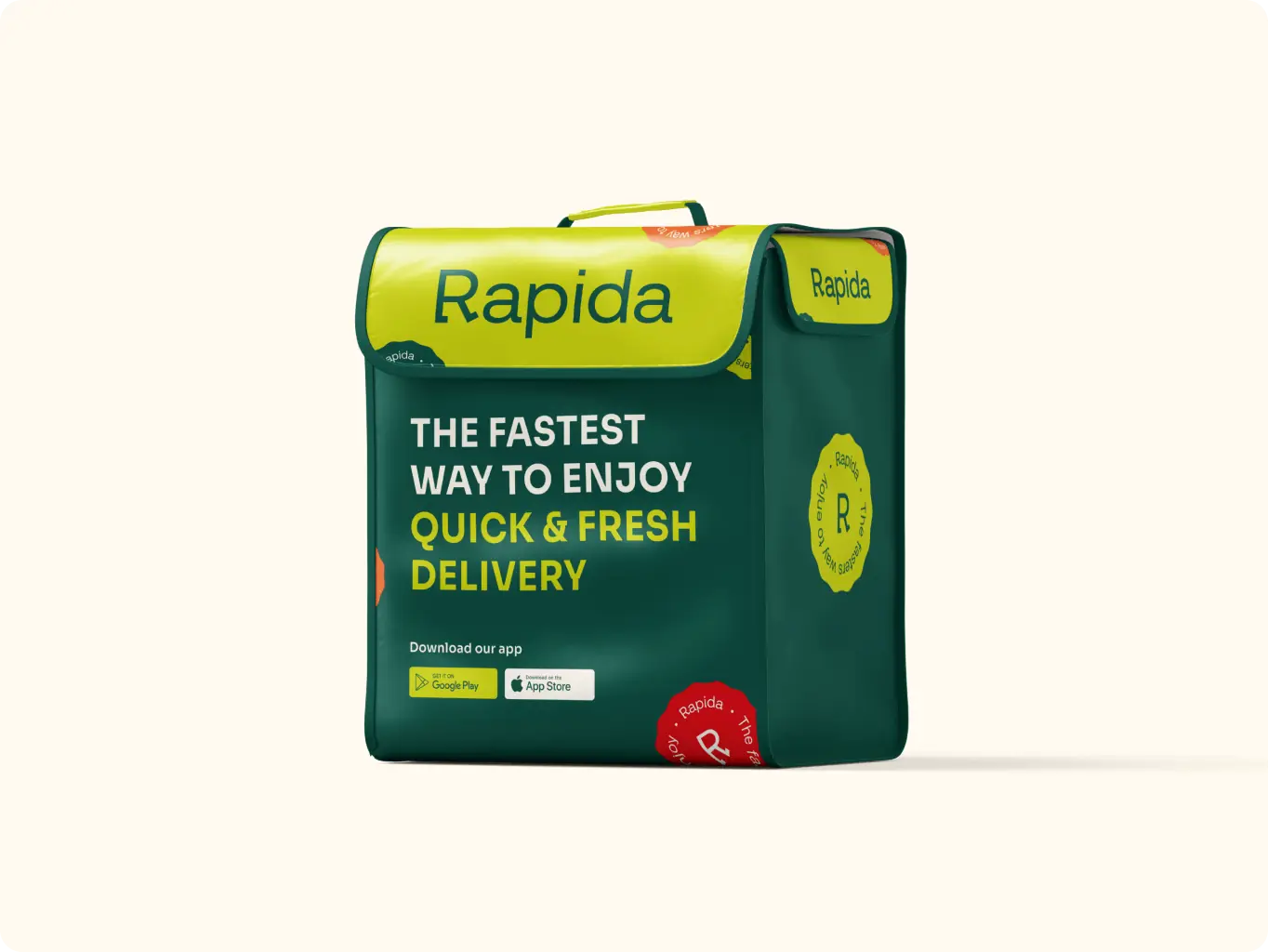
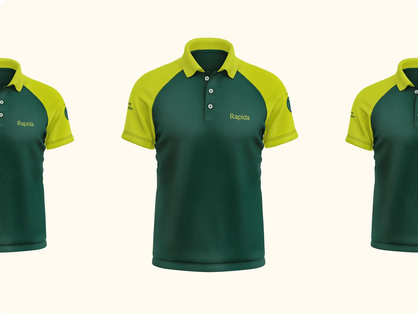
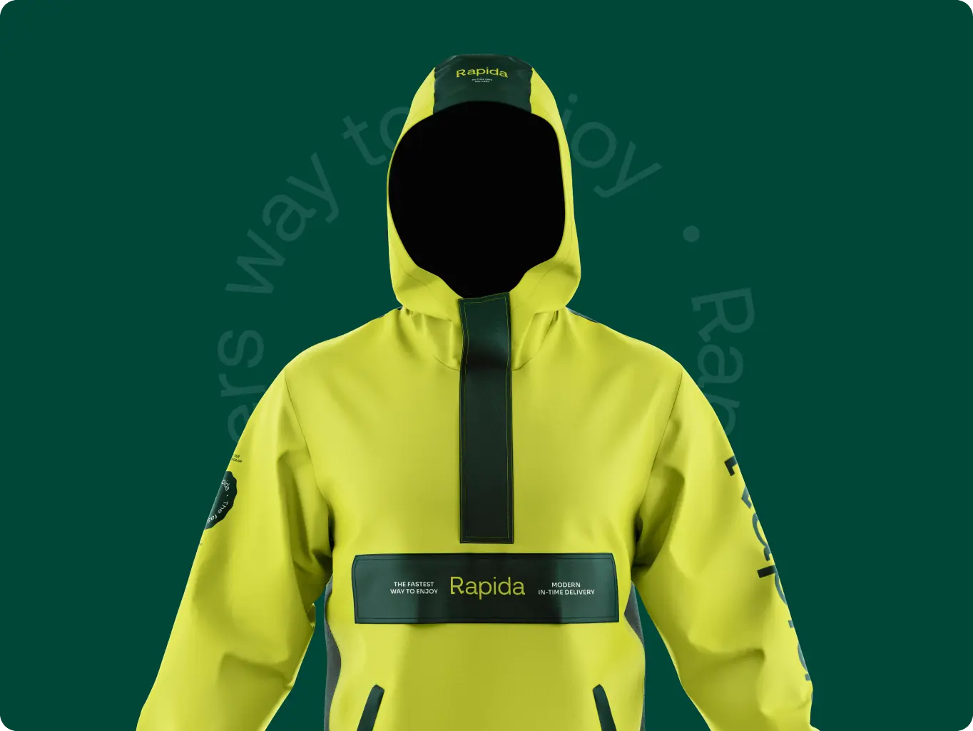
We take care of our employees, so we have provided a lot of options for uniforms for different types of weather conditions.
We provided a communicative model into a uniform to create a crew spirit in the team and make it more coherent, because the loader is a team work.

Rapida – Branding for the Delivery Service - Website Development - Photo 19
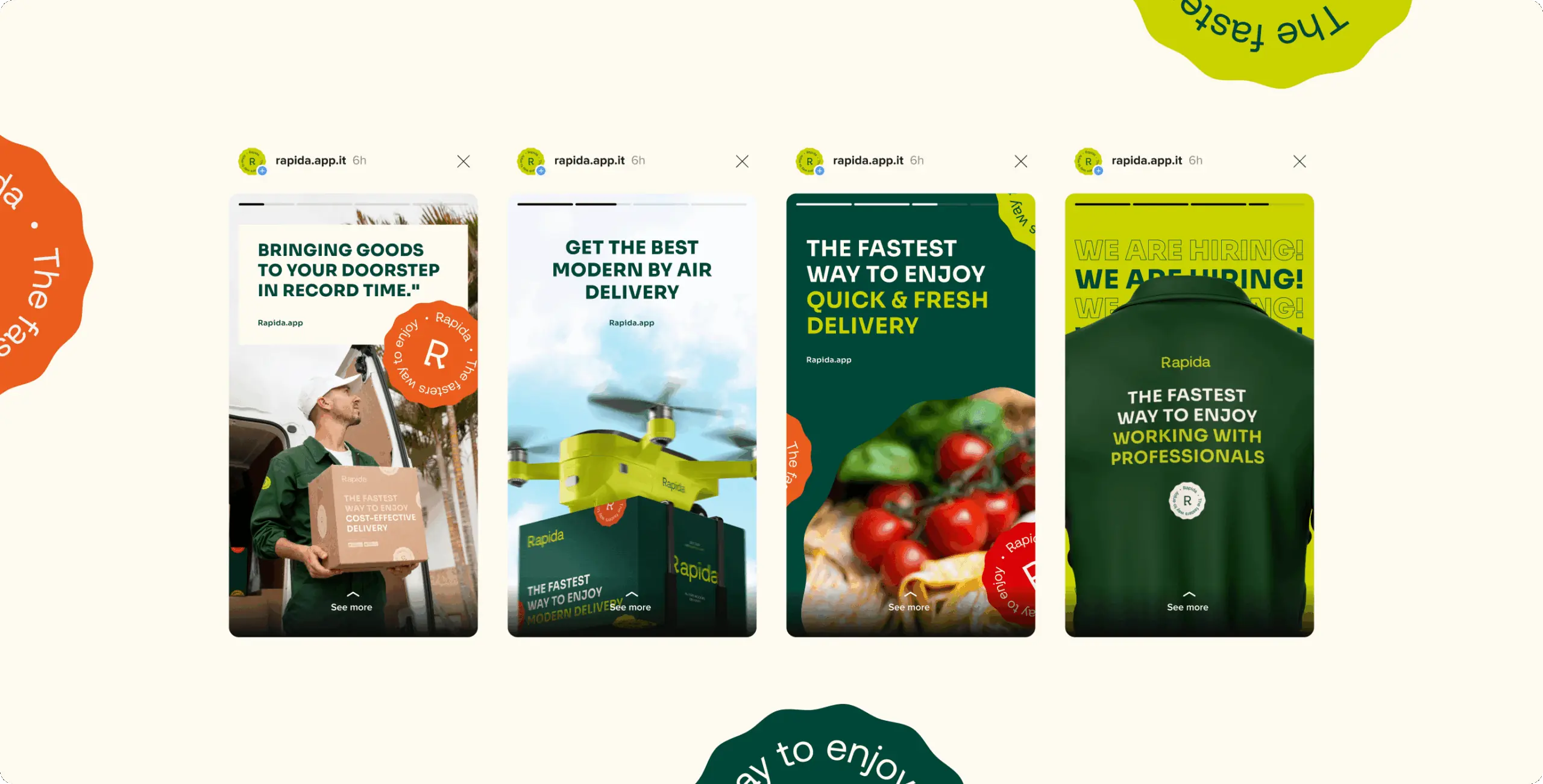
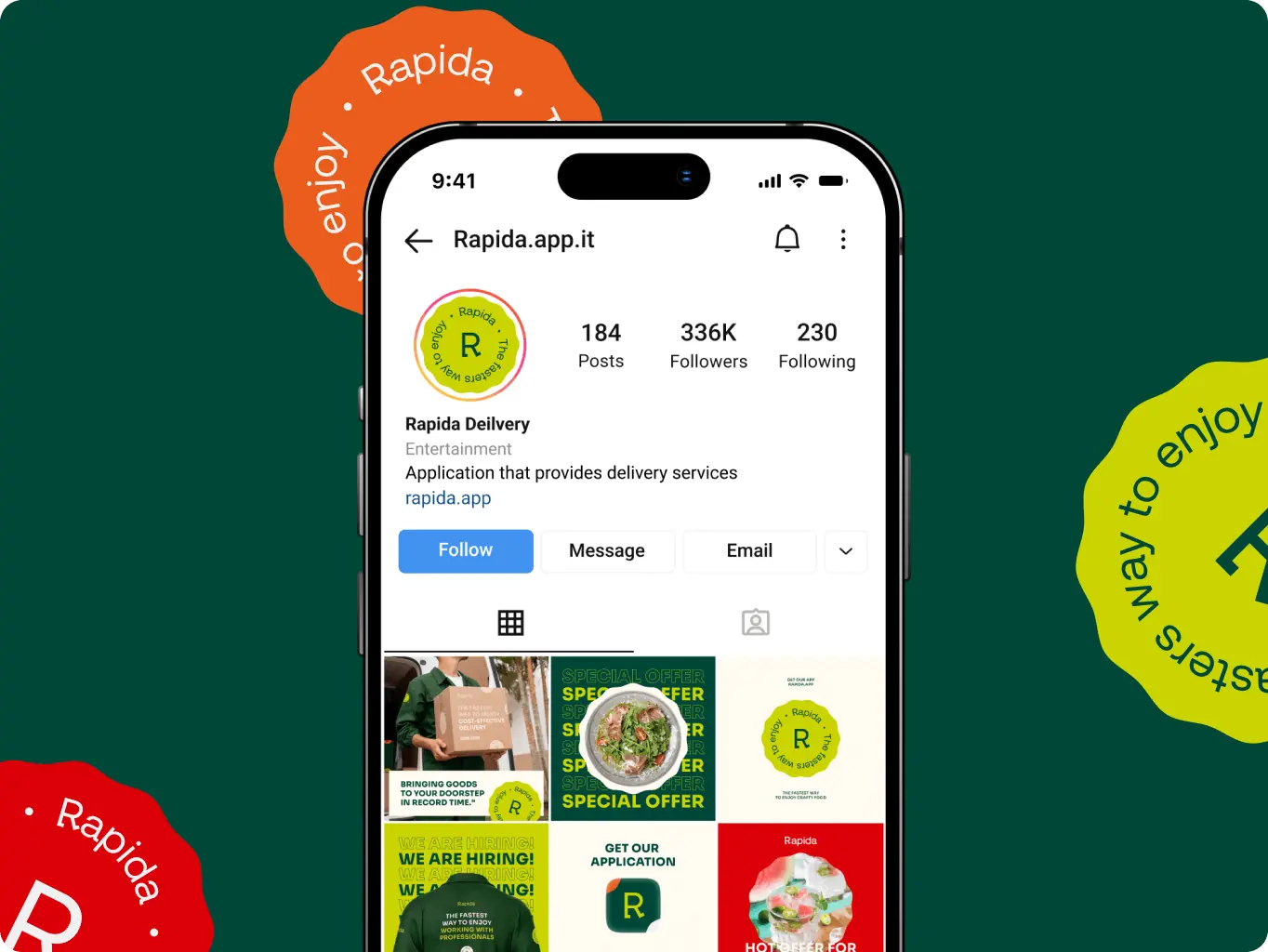
Social media

Instagram

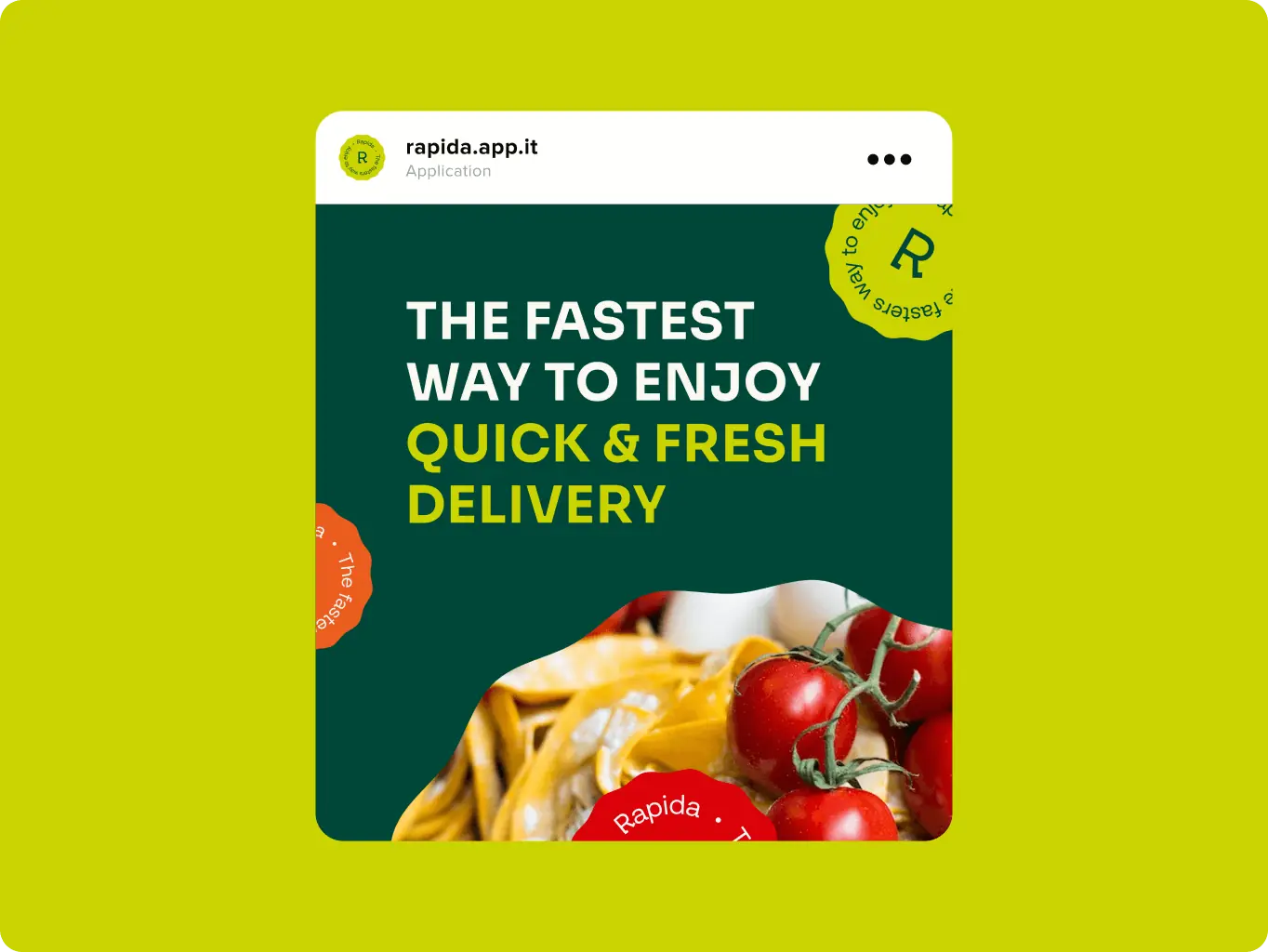
It is difficult for now to imagine effective digital branding without social media. We developed a consistent brand language, that made the brand recognizable and improved the memorability of the brand style.

Rapida – Branding for the Delivery Service - Website Development - Photo 20
Guideliness

Essential guidelines for proper usage

To ensure that the brand identity will be used correctly, we created extended brand guidelines that clarify the appropriate usage of the logo, color palette, typography, and other graphic elements, and collected them in a complete folder of all brand assets for easy access.

Rapida – Branding for the Delivery Service - Website Development - Photo 23
Rapida – Branding for the Delivery Service - Website Development - Photo 24
Conclusion
Results

The branding of Rapida established a vibrant, user-focused identity that perfectly captures the company’s mission of delivering accessibility, speed, and customer satisfaction. Through a dynamic and spirited design approach, we developed a cohesive visual language that resonates with Rapida’s traditional Italian market while embodying modernity and creativity.

Additionally, we transformed essential touchpoints like delivery packaging into strategic communication tools, embedding the brand’s values directly into the customer experience. To guarantee longevity and adaptability, we provided comprehensive brand guidelines, enabling Rapida to maintain a professional and memorable presence across all platforms.

Clearer brand positioning

Developed a cohesive branding that aligned with new market goals, resulting in a 28% boost in lead generation through targeted advertising

Packaging as a strategic communication tool

Packaging transformed into a dynamic communication tool, embedding brand values and messaging to enhance customer engagement and create memorable delivery experiences

Customer loyalty and trust

Established a strong, memorable brand presence that increased customer recognition by 22%

More cases
We have dozens of products and hundreds of websites developed by our studio. We're happy to share the results with you!
Sinport – Singapore Airport navigation app - Website Development - Photo

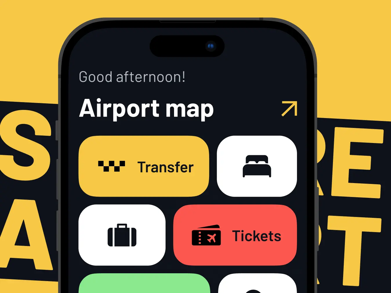
Sinport Navigator is a mobile app for navigating around Singapore Airport.

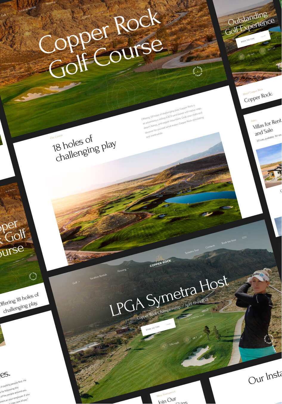
Copper Rock – golf community booking website - Website Development - Photo

Website for a golf club in Utah, USA, where you can not only play golf, but also buy or rent a house.

Contact us

Ready to bring

your idea to life?
Ready to
bring
 your
idea to life?

You can upload maximum 5 files
Some of your file not loaded, because maximum file size - 5 mb
What is your budget for this project?
How did you hear about us? (optional)
Project Talk - Kseniia Shalia
Account Executive
Partnership - Polina Chebanova
Co-Founder