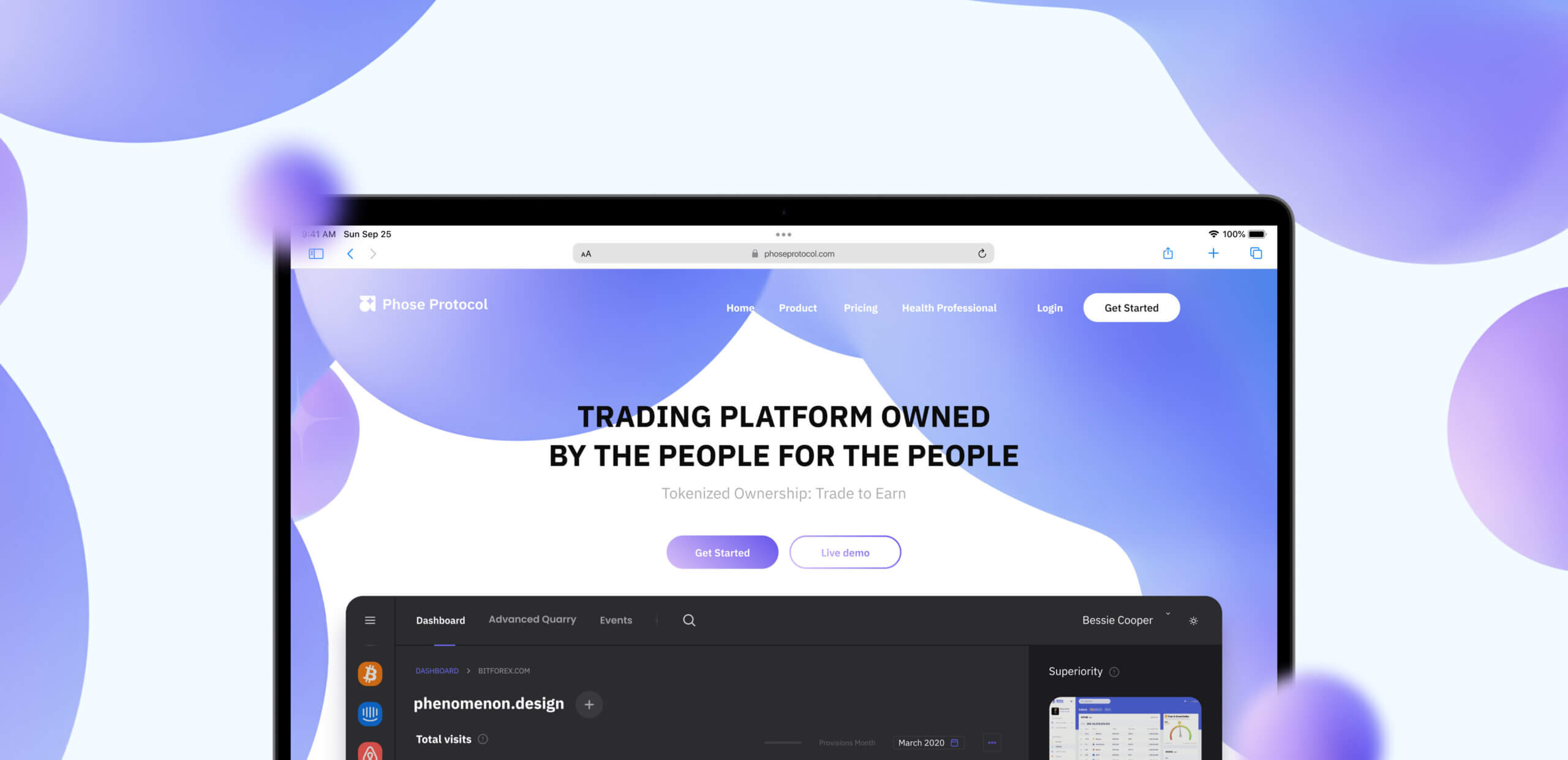
Phose Protocol tasked us with designing an innovative trading platform that authentically reflects their philosophy, values, and mission, while delivering an immersive visual experience tailored for their audience. They needed a clean, intuitive application that not only showcased their cutting-edge solutions but also elevated their brand identity.
With full trust placed in Phenomenon Studio to develop both the platform and brand system, their goal was clear: to launch a cohesive, engaging tool that merges seamless usability with compelling visual storytelling.
Logo idea and execution
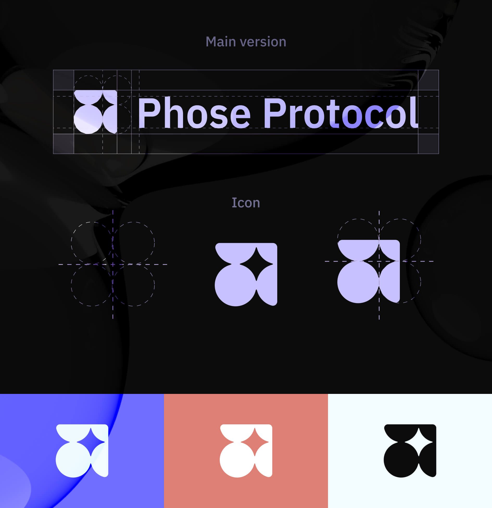
The main idea of the logo is to to convey a sense of stability, trust, and security. A bubble shape in a logo represents a protected and secure environment, implying that the company takes care of its customer’s finances.
Additionally, bubble shapes are also represent growth and expansion, which is another desirable trait in finance. Just like bubbles, that grow larger and larger, a company can help customers grow and expand their financial portfolios.
Brand colors
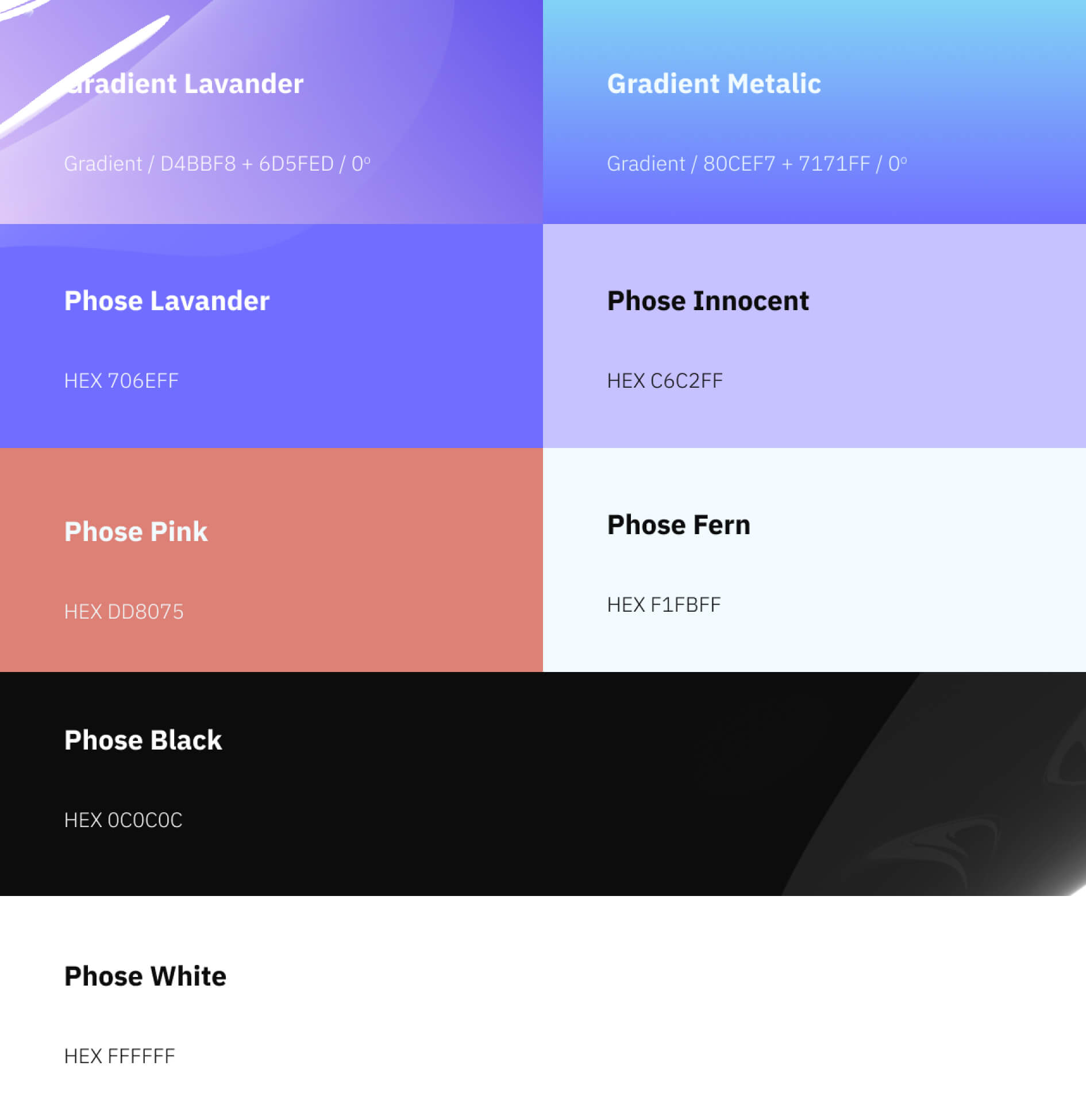
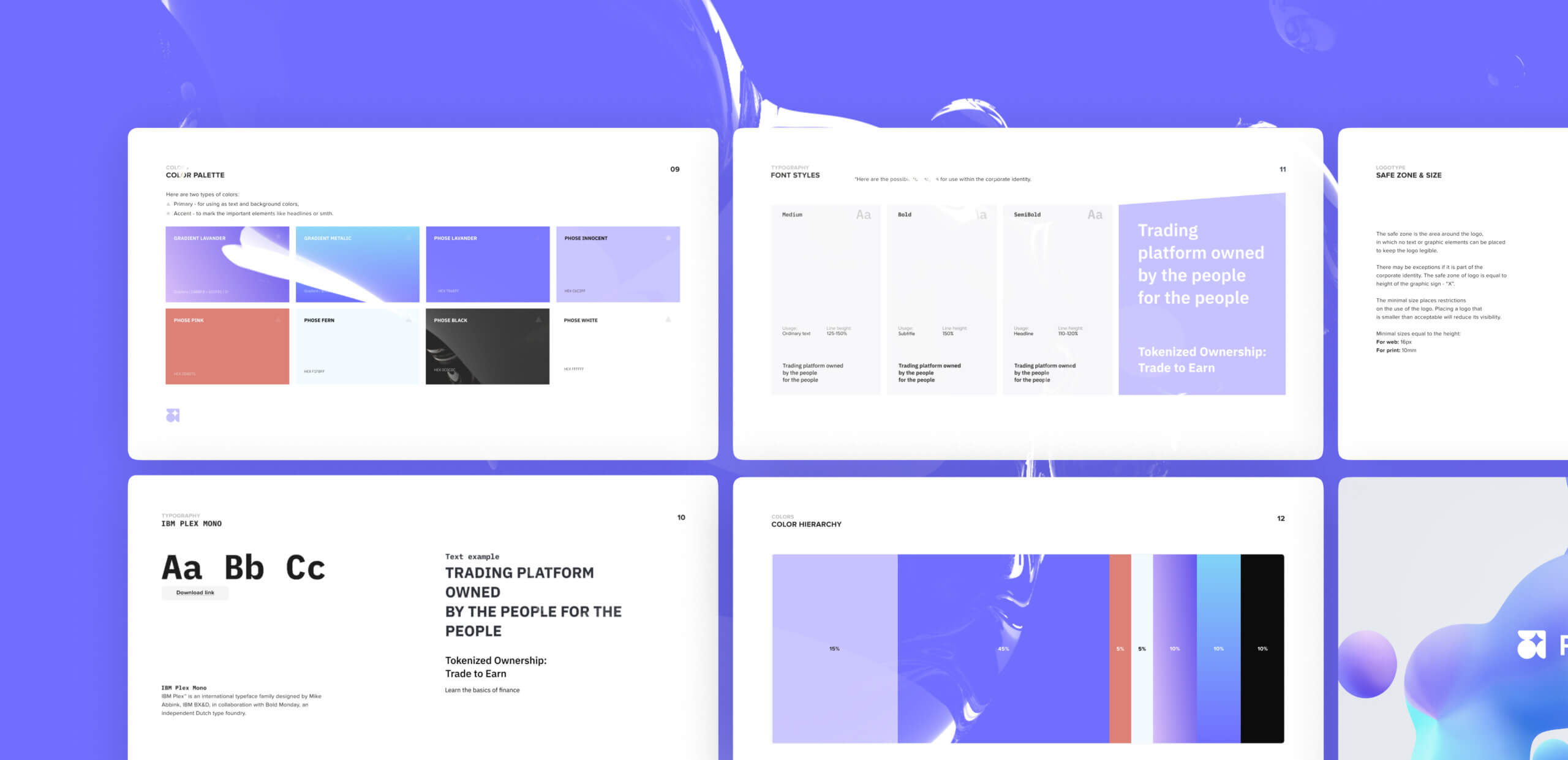
Using a color palette is crucial in establishing a brand identity since it communicates the brand’s character and personality.
In this case, our brand’s main concept is centered on the idea of effortless and enjoyable usage of the trading platform. To reinforce this message, we designed a color palette that conveys feelings of security, stability, and growth, instilling a sense of trustworthiness and appeal to customers in the financial industry.
Typography solution
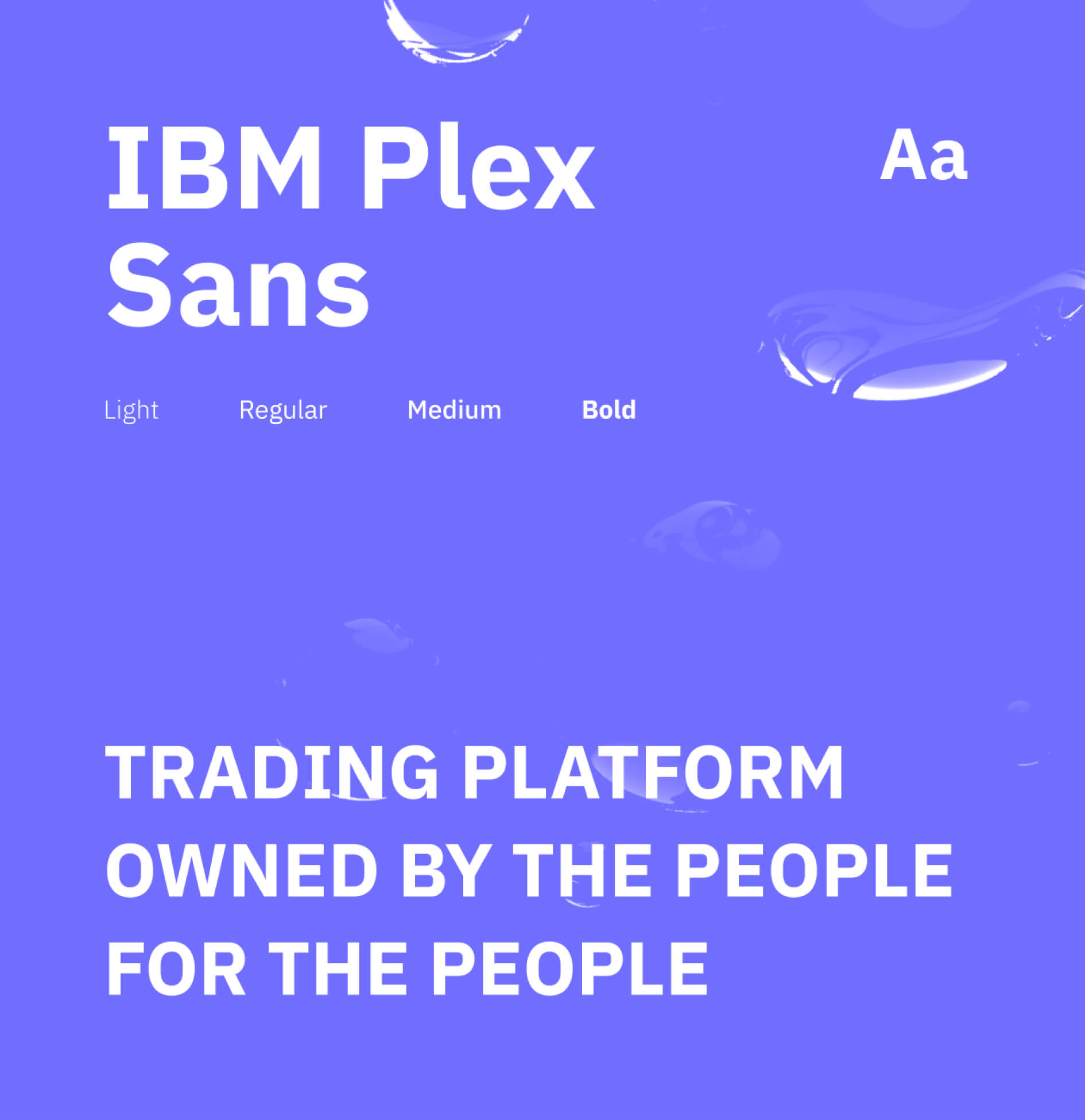
Typography is another impostant visual element, that helps to organize written content while effectively communicating the brand’s message to customers.
Choosing the font family for Phose Protocol, we prioritized consistency and alignment with the brand’s values and tone. Additionally, we wanted to make the brand attributes simple and accessible, that’s why we chose a free font family solution to eliminate any financial barriers.
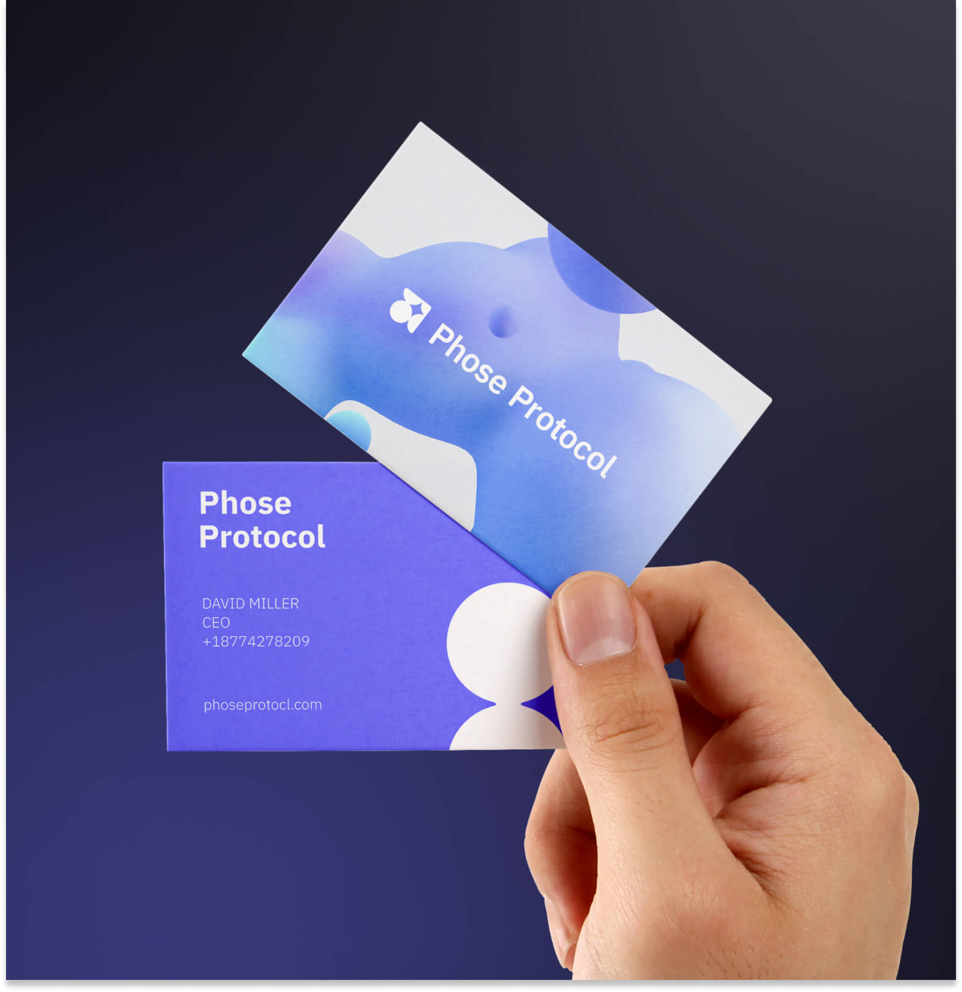
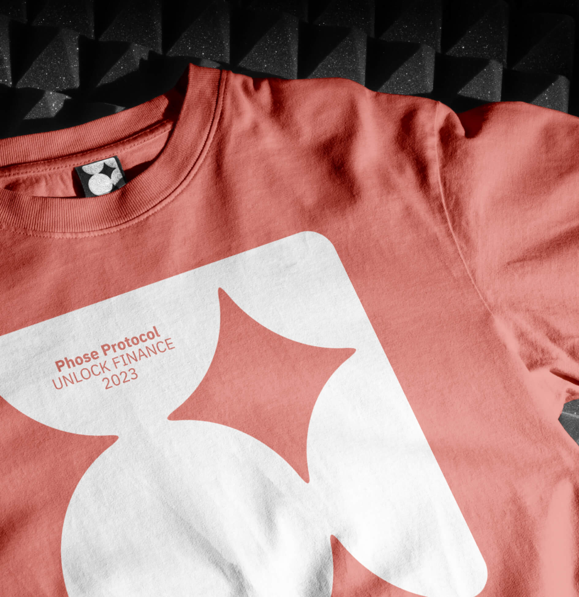
We always consider the various types of brand assets in advance, from the digital sphere to material things. That’s why we have created the brand assets that cover the most important types of communication areas to represent the brand in the most appropriate way.
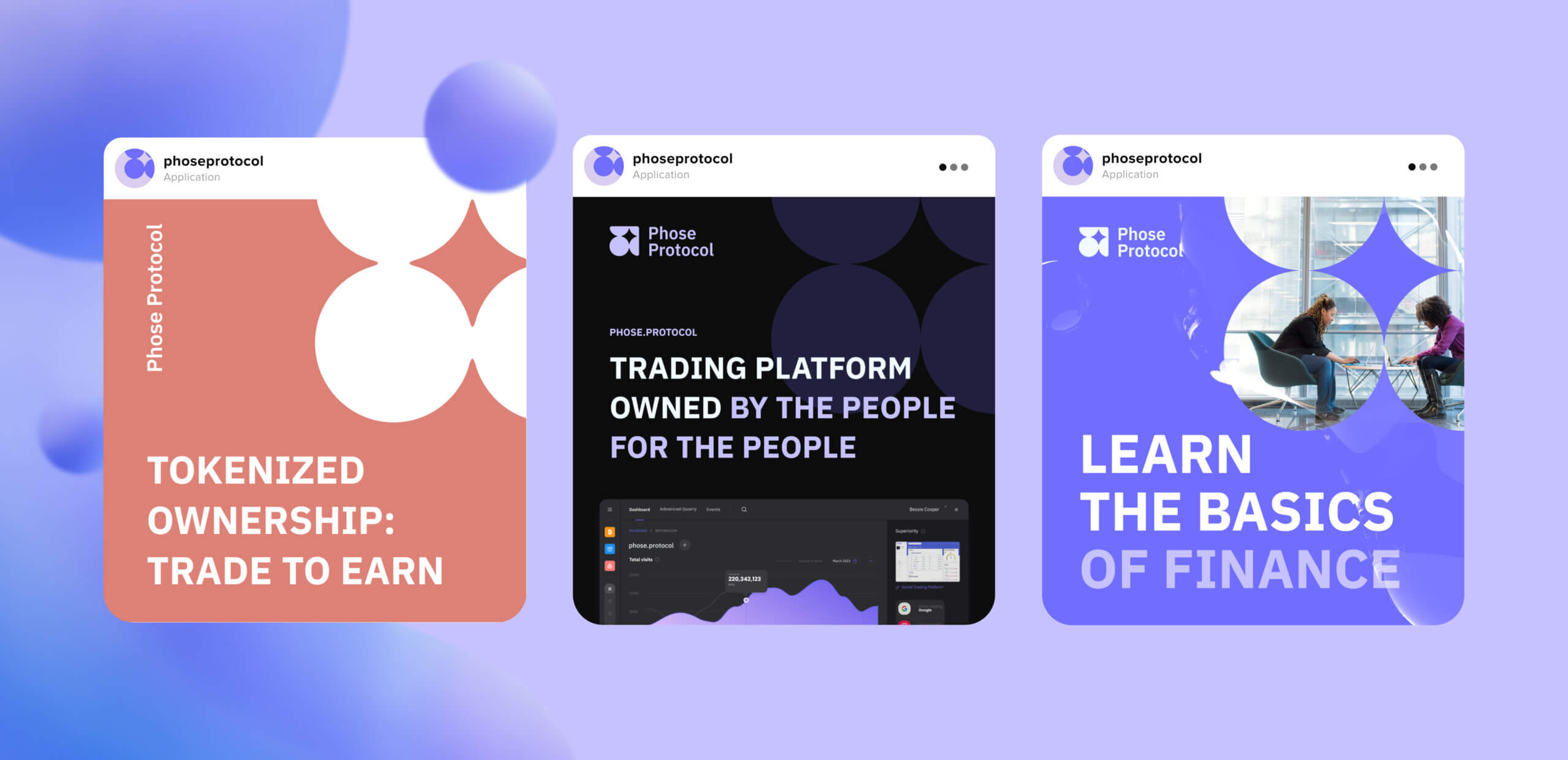
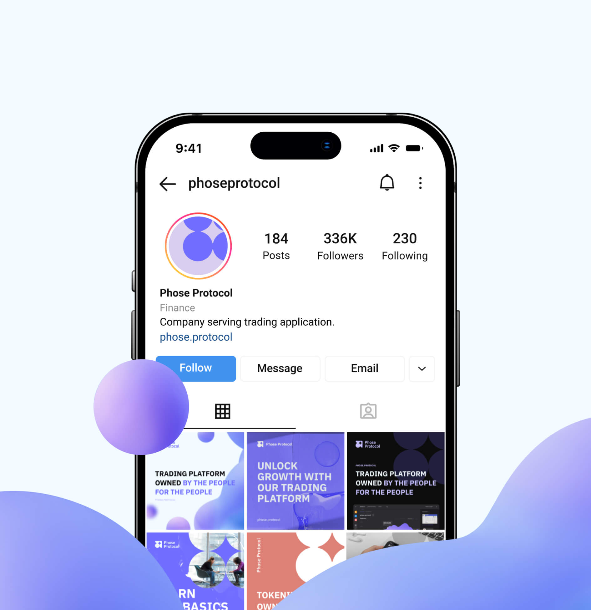
A brand establishes a clear and consistent tone that aligns with its overall message and identity by creating a visual voice for social media with unified design assets. This helps create a sense of personality and authenticity for the brand, making it more relatable and engaging for social media followers.
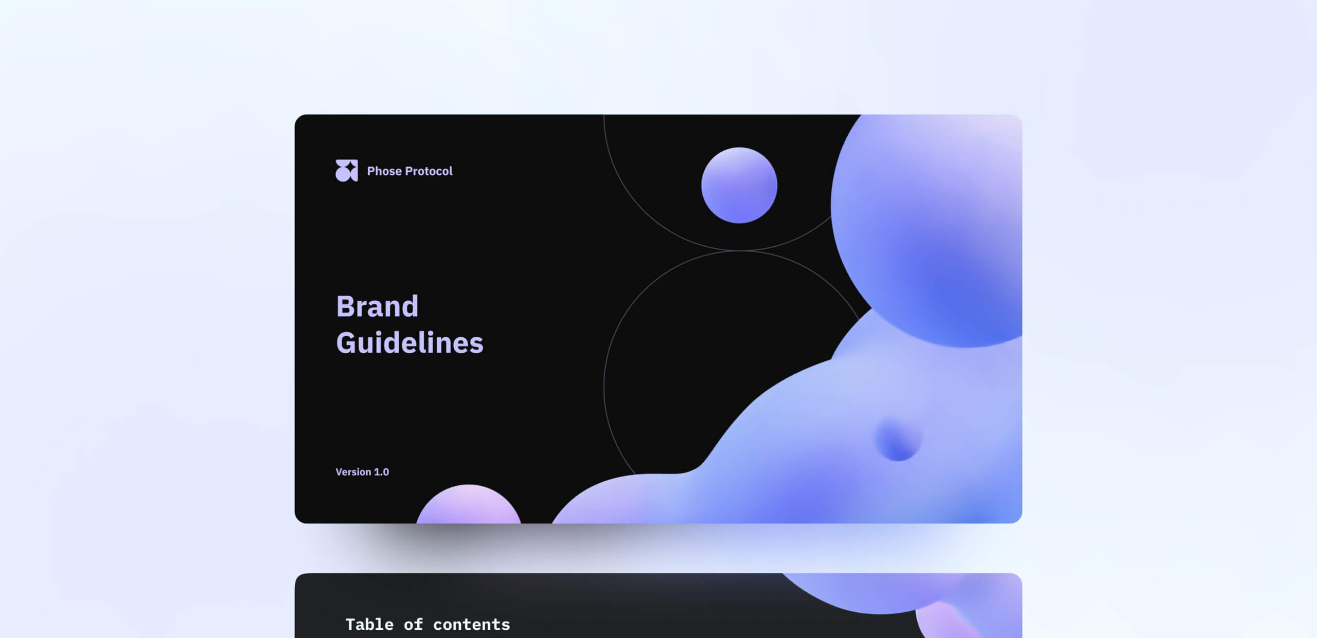
To ensure the brand’s proper usage, we created basic brand guidelines that clarify the appropriate use of logo, color palette, typography, and other graphic elements, collected in a complete folder with all brand assets, readily available for use.


 USA
USA





 Switzerland
