


Ocean Crest Yacht Club — a website that turns regatta interest into race entries and membership applications
 France
Ocean Crest depends on two things: new members and full races. Both stall at the same point — a visitor who can’t find answers before getting in touch. A prospect who can’t see what membership includes won’t apply, and a private club that shows no history and no people gives them little reason to trust it.
For races, a sailor who can’t see which races run where, and how to enter, has to contact the club first — and every extra step costs entries. Opening entry to the public carries its own risk: the club still needs to decide who races.
The club needed a website, built from scratch, that answers these questions before a visitor gets in touch, and turns interest into membership applications and race requests the committee can review.
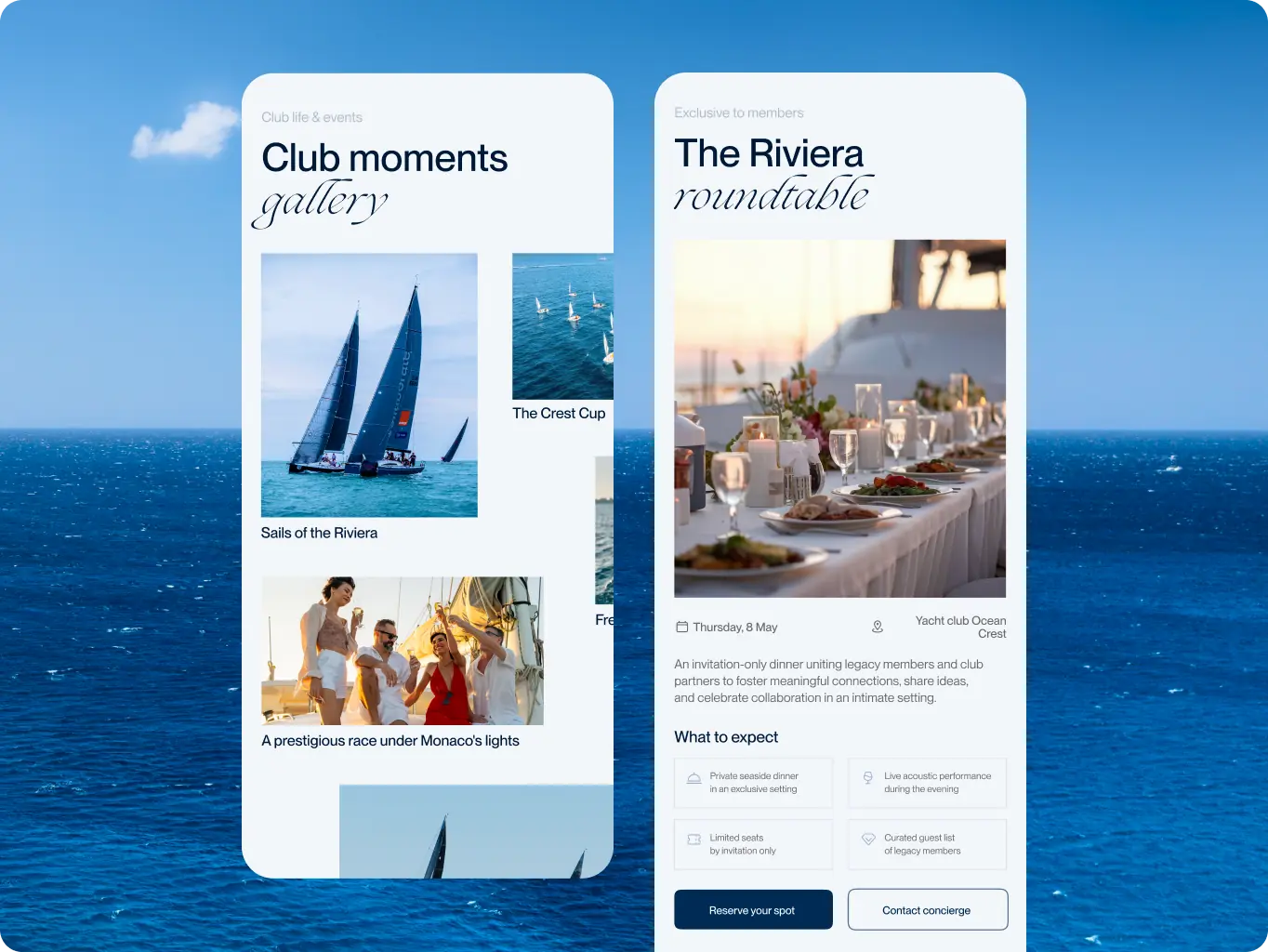
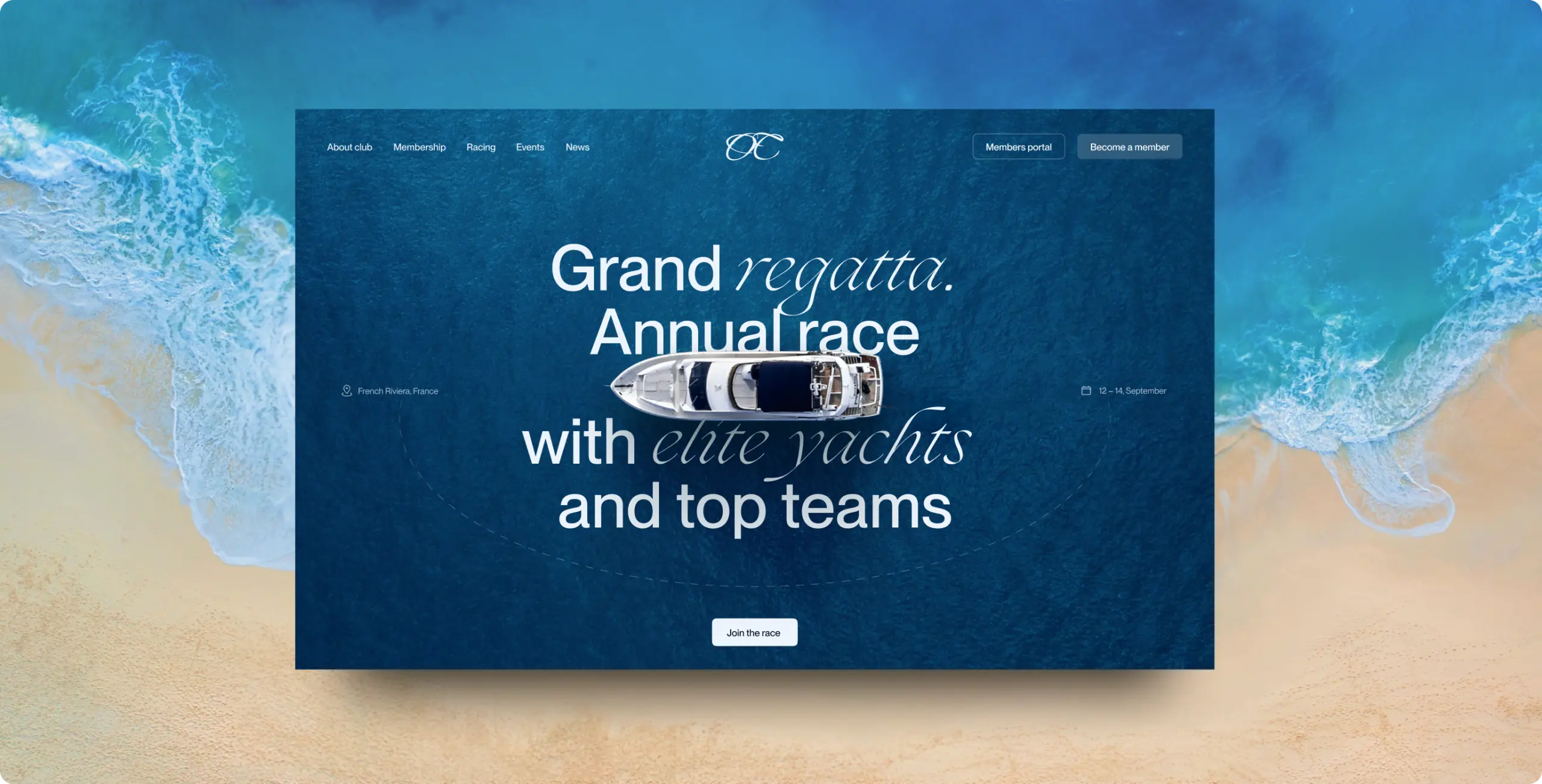
The site serves two visitors with different questions. A sailor wants to know which races run where and how to enter. A prospect wants to know what membership includes and who runs the club. Both pages are ordered around those questions, in the sequence visitors ask them.
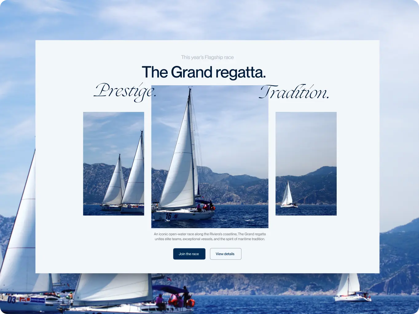
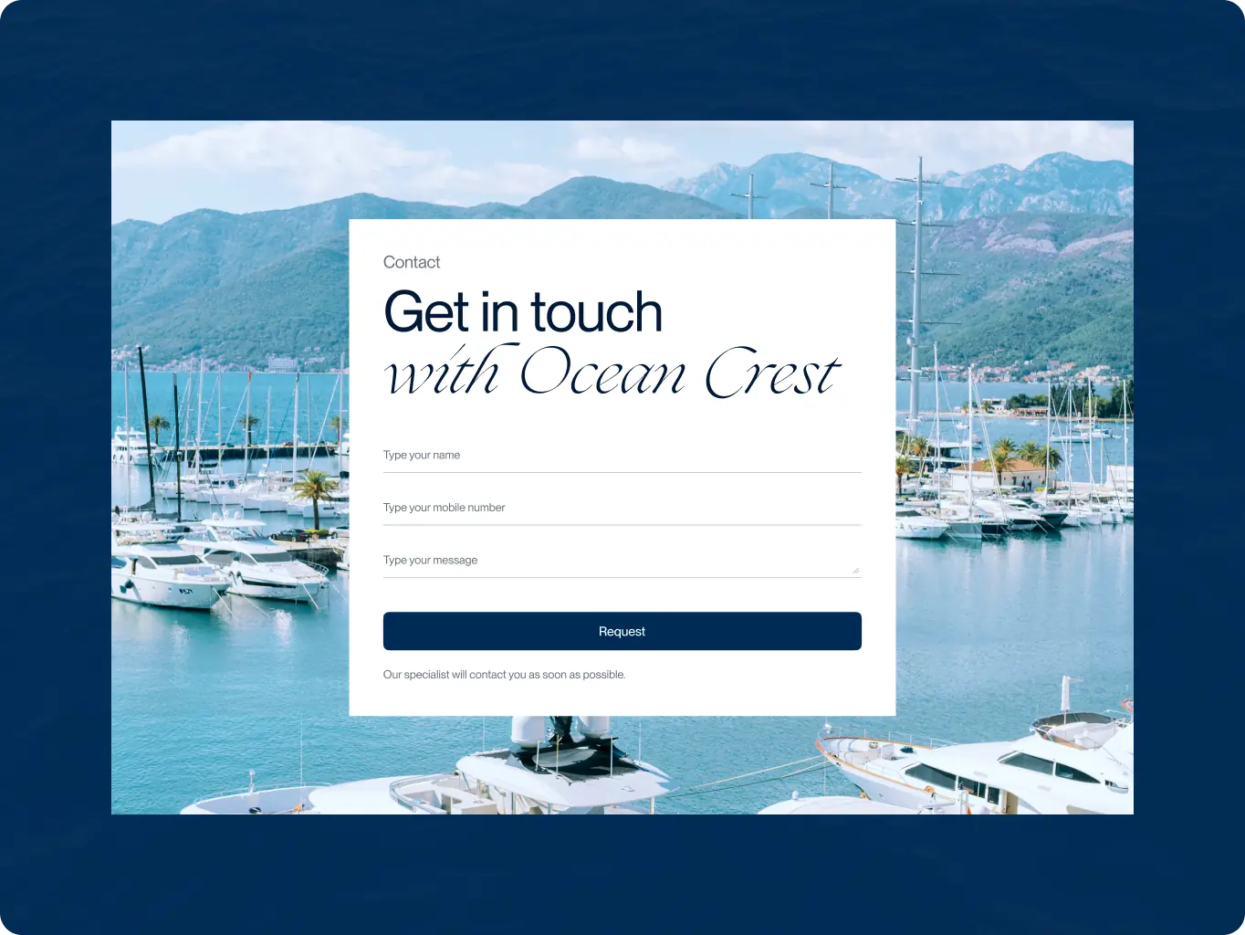
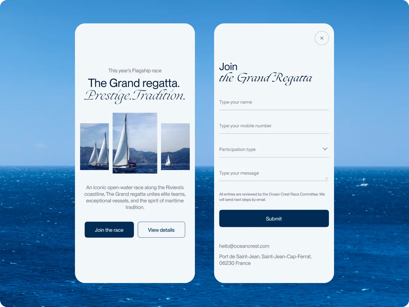
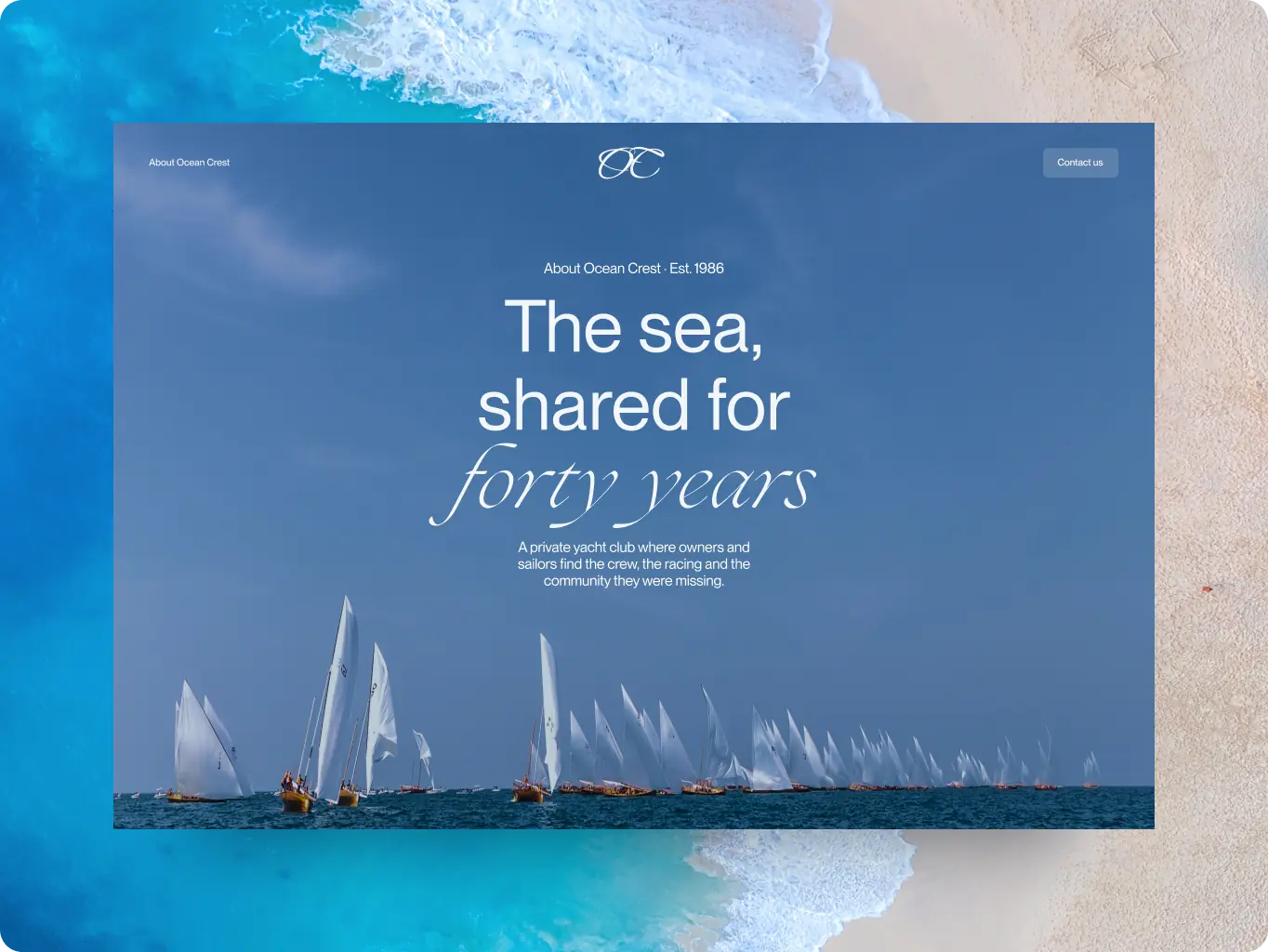
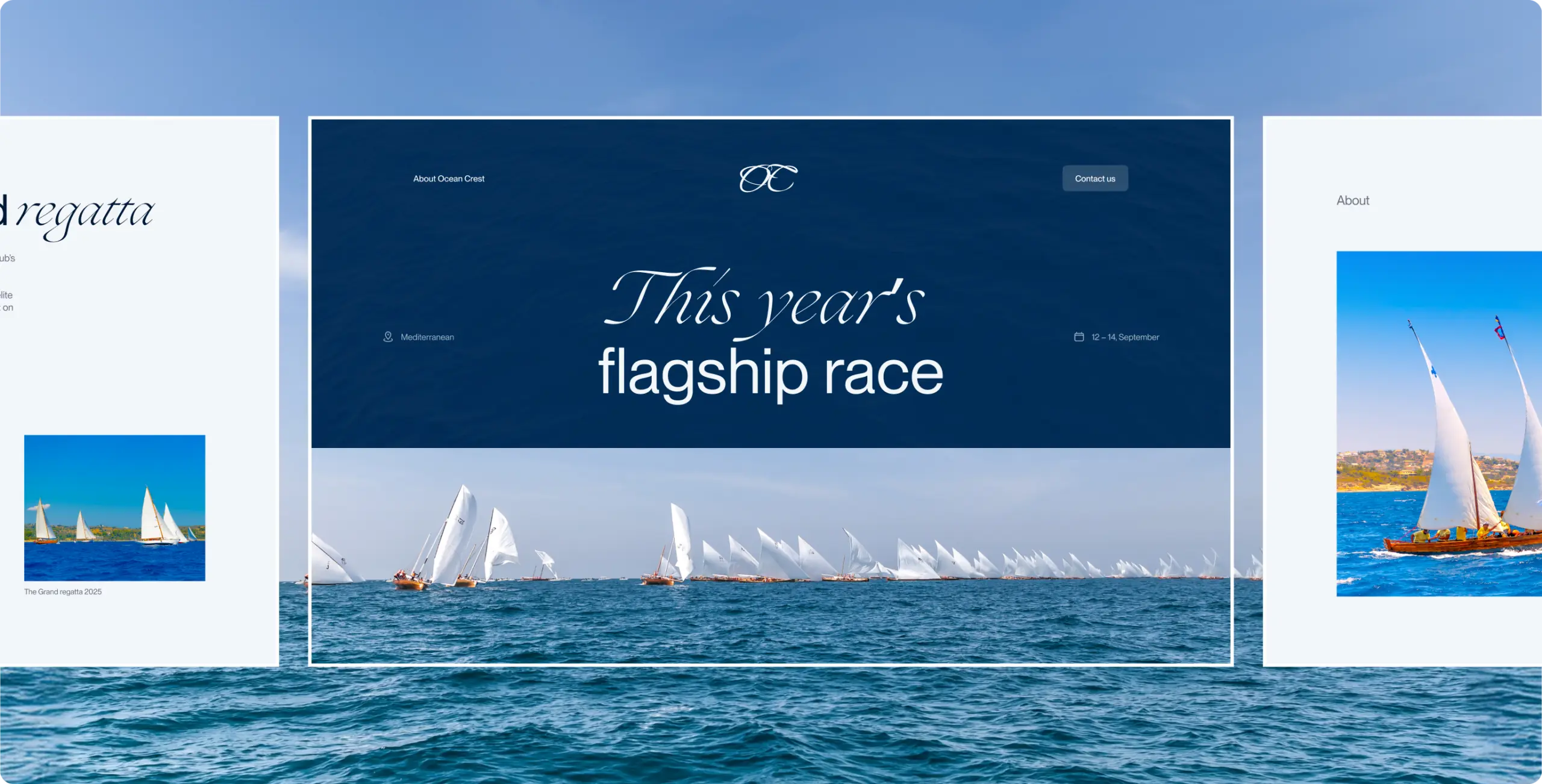
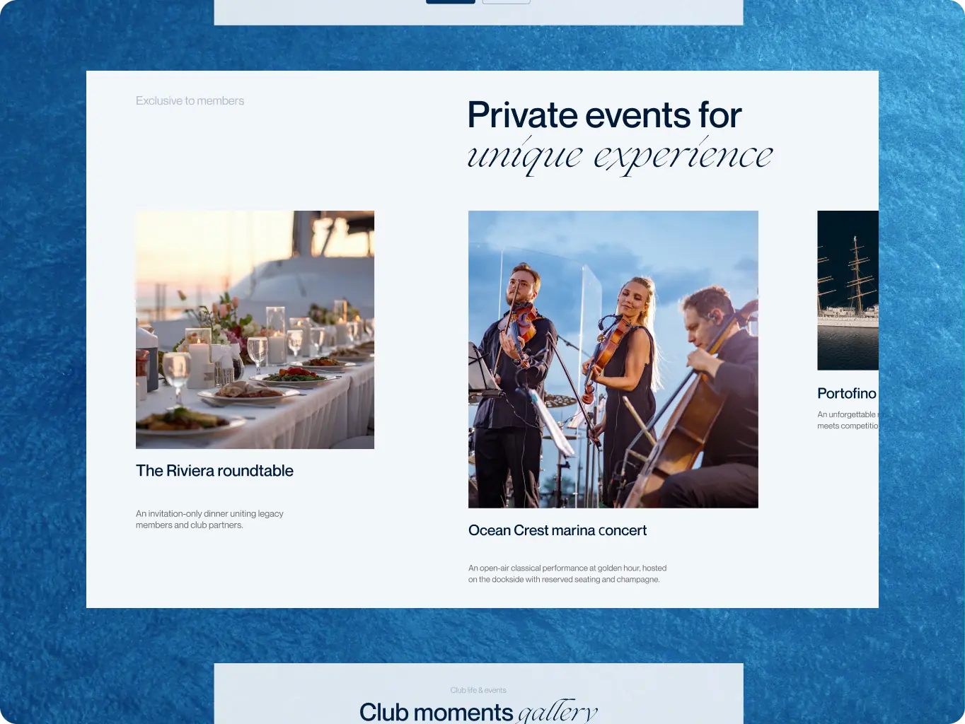
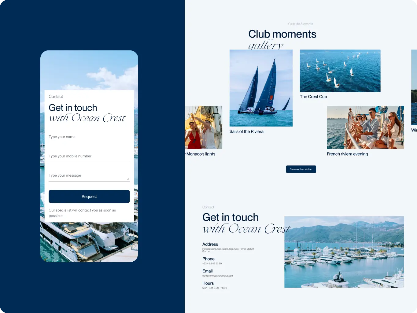
The home page opens with the annual Grand Regatta — the club’s strongest reason to look further — then moves to the destinations map, race details, and the entry form. Membership benefits and members-only events follow, with contact options at the end. A sailor can stop at the race entry; a prospect keeps going toward membership.
The About page does the trust work a private club needs: 40 years of history, values, leadership, and community. The joining form comes after that, so a visitor applies once they know who they would be joining.
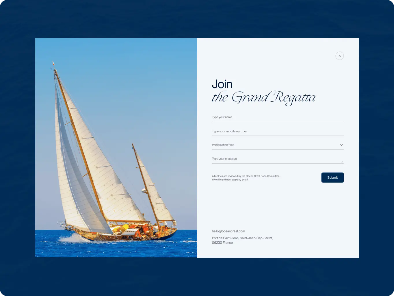
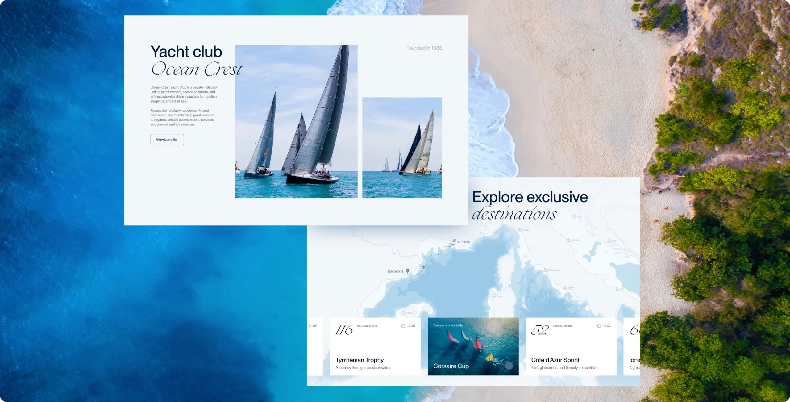
Interactions keep visitors in place instead of adding steps. Hovering a race card previews its details, the map traces each route, and the entry form opens as an overlay, so a sailor never loses the race they were looking at.
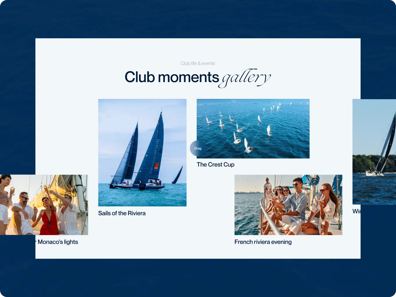
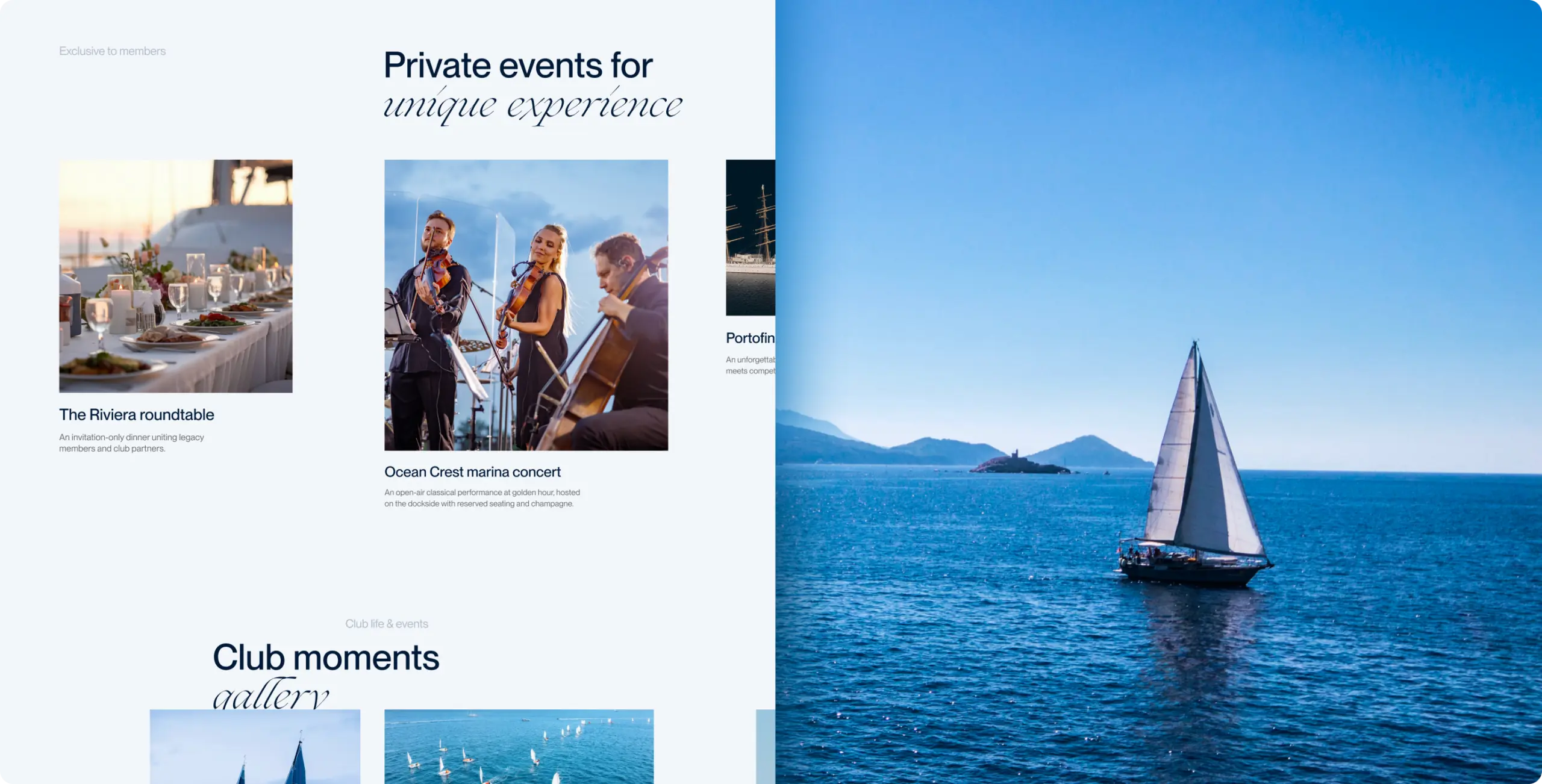
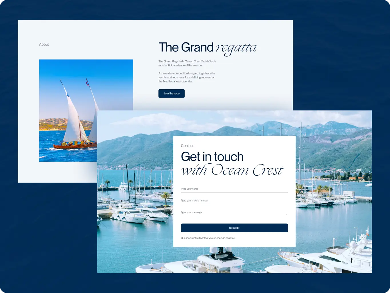
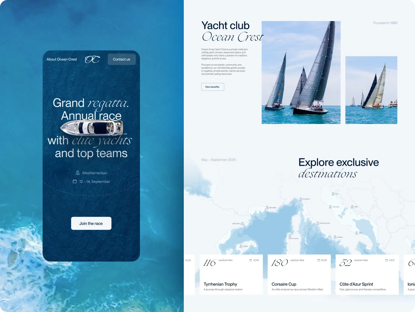
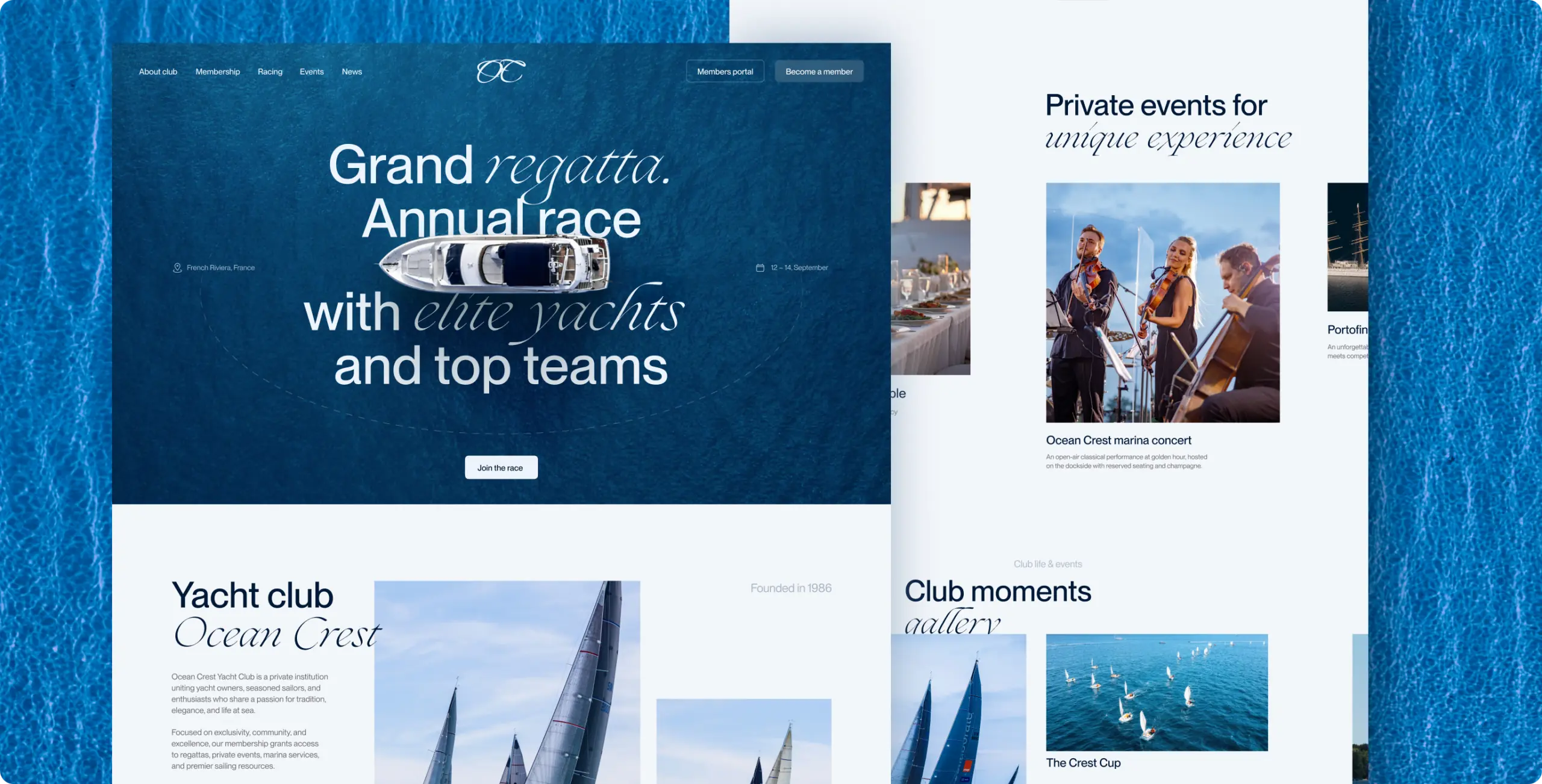
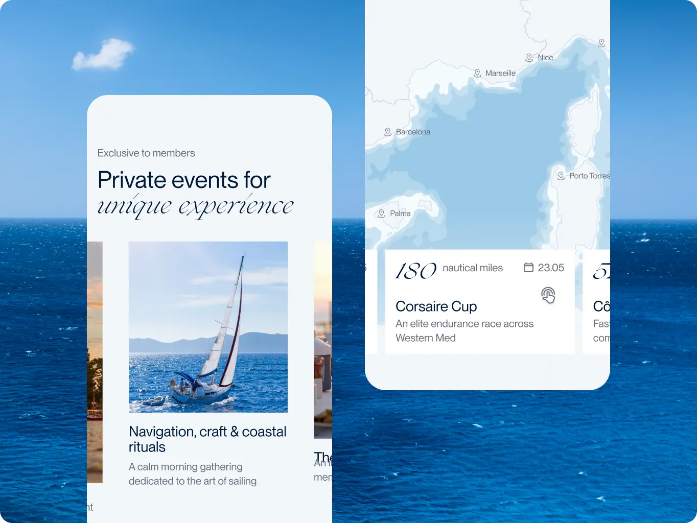
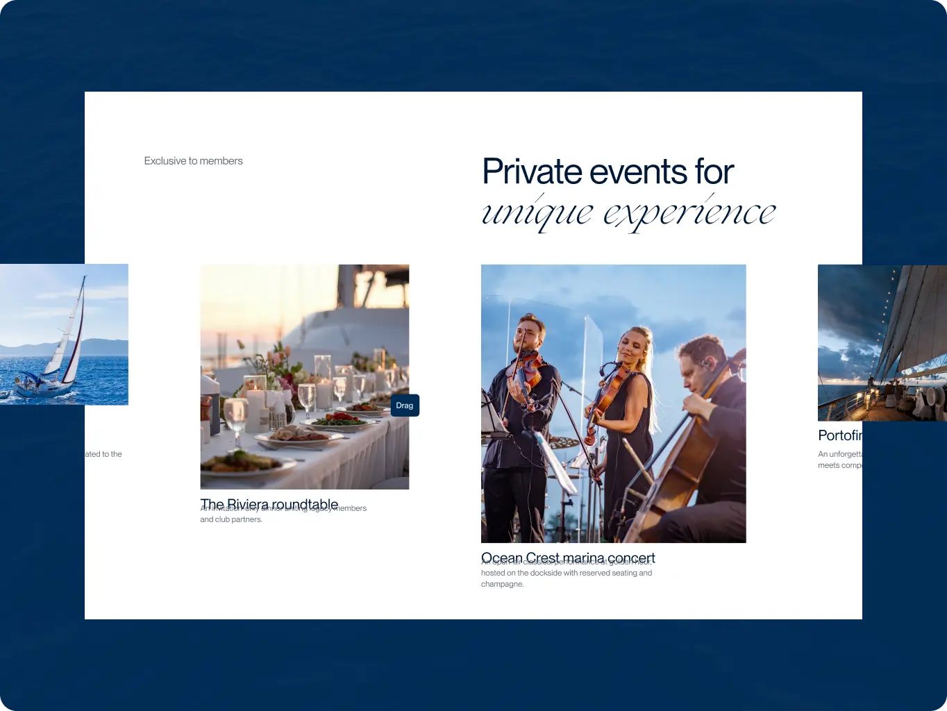
The club’s content changes with the sailing season — new regattas, events, news, and galleries. The build had to let the club publish all of it on its own and reproduce the designed interactions exactly.
Events, blog posts, and galleries are Webflow CMS collections. A new regatta or a gallery from the last race goes live by adding an entry — no page layouts touched, no developer in the loop — so the site keeps pace with the season.
The race-card hover preview and the animated map routes were each documented as a separate spec — trigger, sequence, end state — before development started. The build follows the spec, so the interactions behave the same on every card instead of drifting from the design.

Webflow
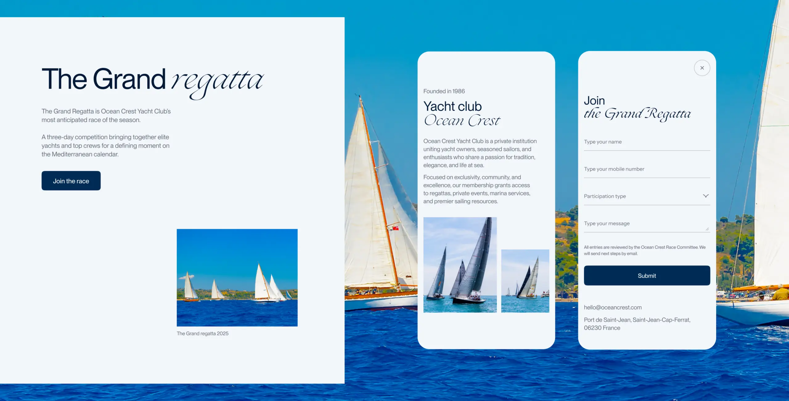
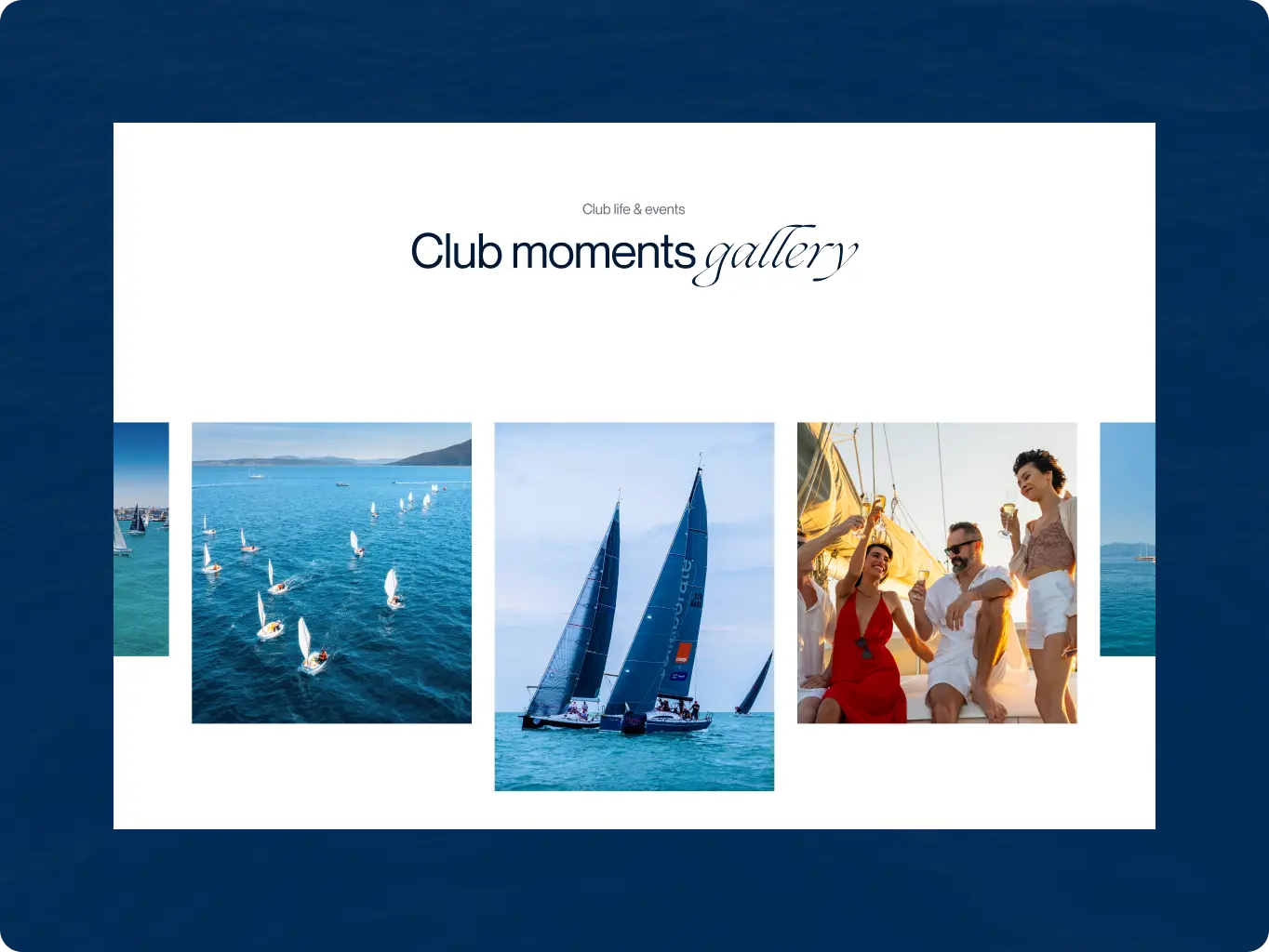
#Website redesign #Website development
Ama Earth
 USA
USA
#Website redesign
Effortless Technologies
 Malta
Malta

Valeria Ceci
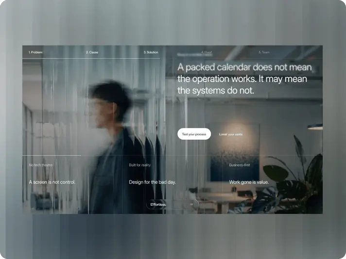
CEO, FounderThe final result reflects exactly what we wanted for Effortless — our personality, tone of voice, visual language, and the human element that is so important to our brand. The Phenomenon team was fast, professional, and highly responsive throughout the project.
#Website design #Website development
Bloom
 USA
USA
