


Ama Earth — a website redesign that moved an AI compliance platform from eco branding to enterprise credibility
View Website

After our project was completed, the design was modified by the client to meet new business needs
 USA
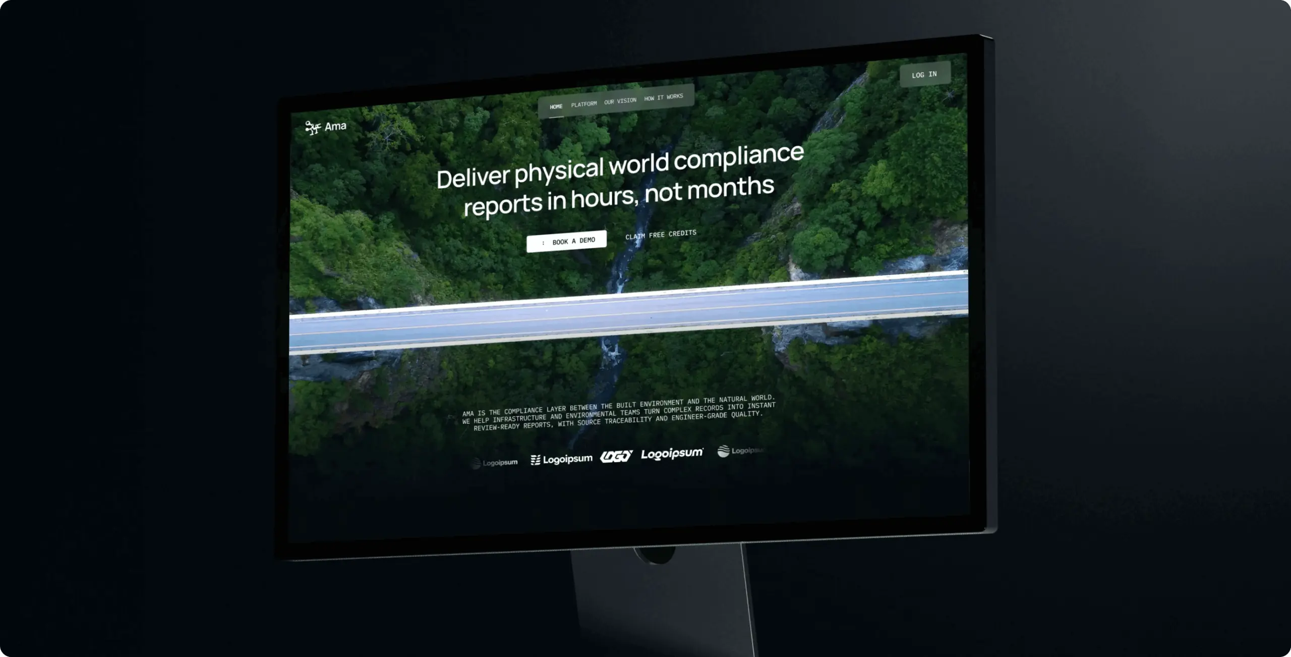
Ama had outgrown its own website. The product had moved toward enterprise infrastructure work, but the brand still looked built for an environmental audience: soft, green, and closer to advocacy than to engineering. For engineers and infrastructure companies, a site that looks decorative raises doubts about the product behind it before a single feature is read.
The timing made the gap urgent, because the new site had to be live for the public announcement of Ama’s investment round. Ama needed a website that speaks the language of the enterprise sector and makes the time savings tangible. It also had to keep the core of the brand, including the name itself: “Ama” means “river,” and the platform’s work is the physical world.
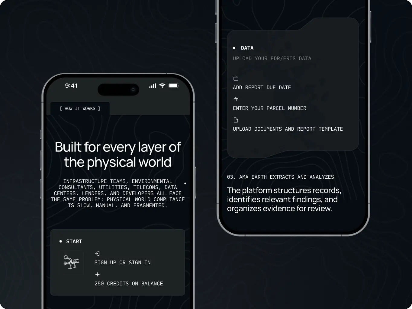
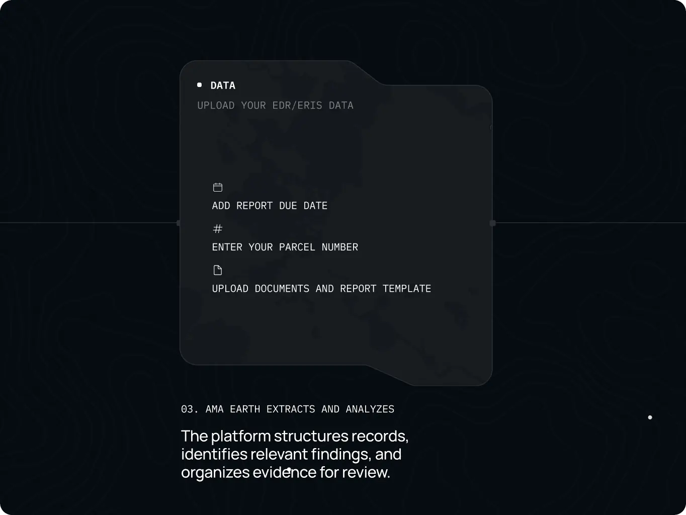
We analyzed competitors in compliance tech and B2B infrastructure software to see where the category looks generic and where Ama could stand apart. In parallel, we mapped the site structure around the questions a skeptical professional asks: what Ama does, who it is for, how the work gets done, and what happens next.
The findings went into a design point of view that set the brief: build trust with precise, detail-oriented readers through short sections, direct language, and time savings shown at every step. It also proposed visual directions that keep the brand’s natural root while reading as enterprise.
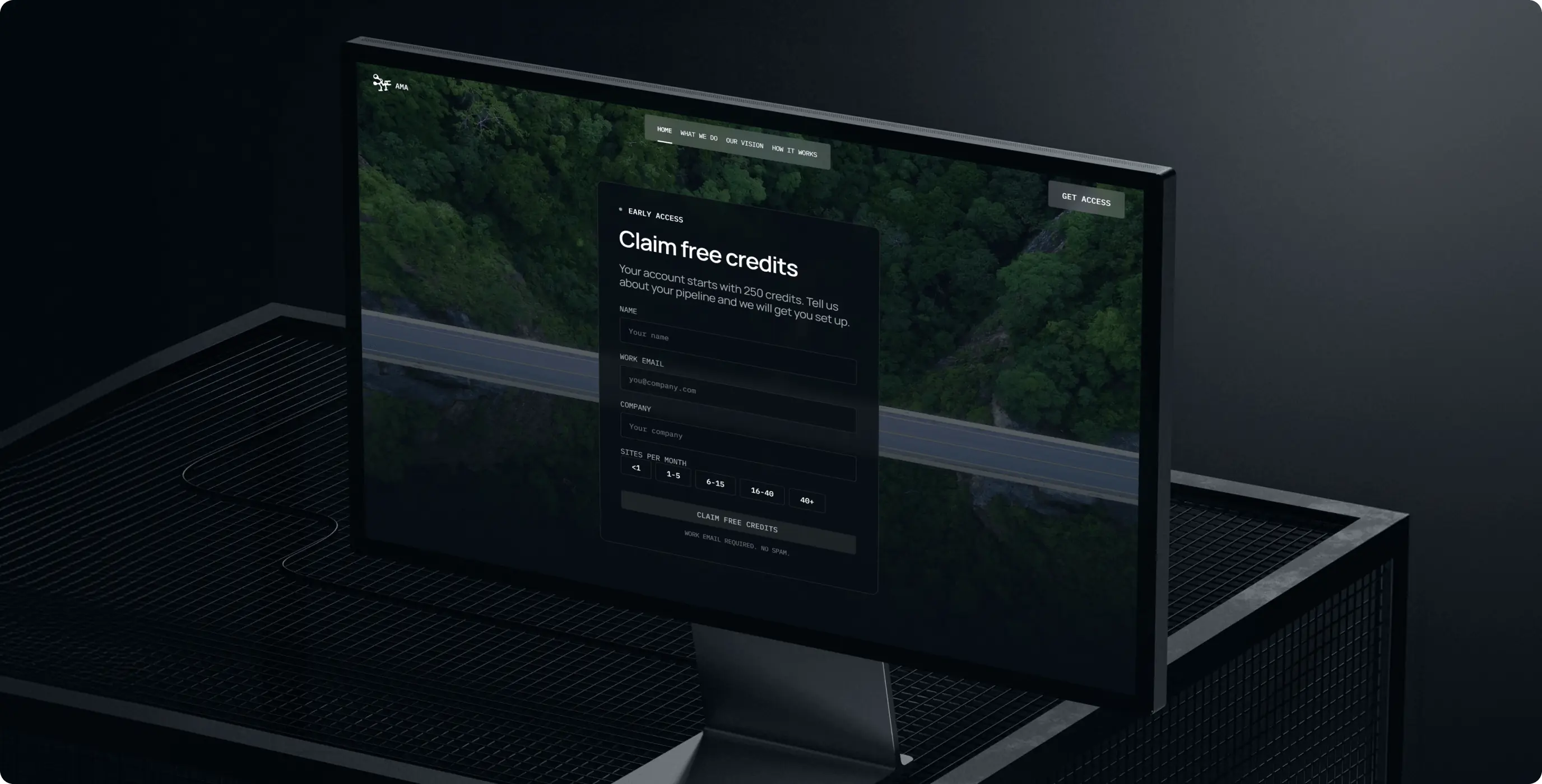
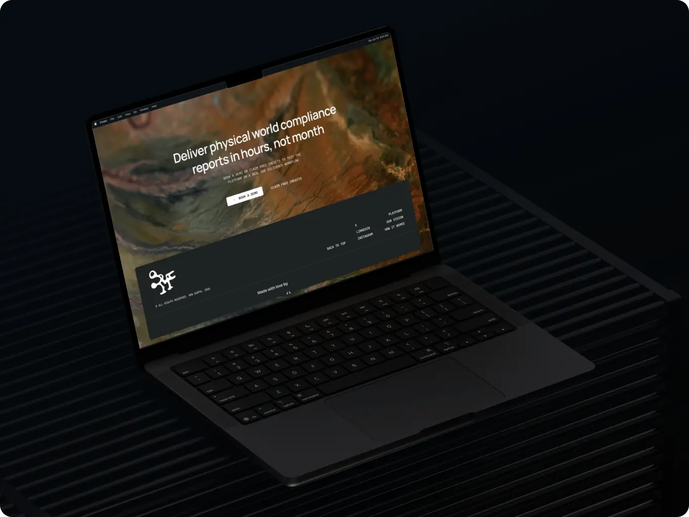
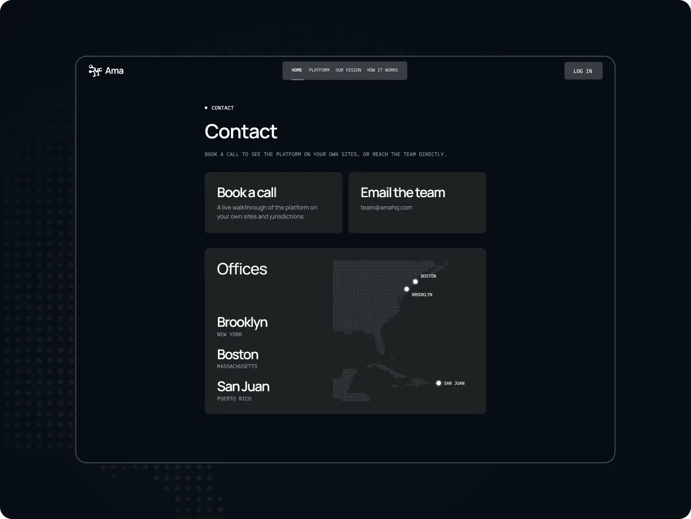
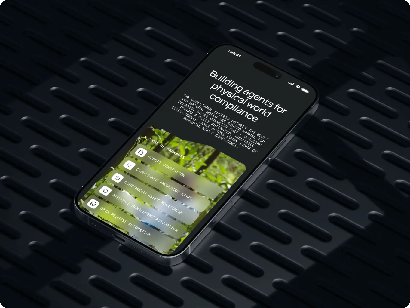
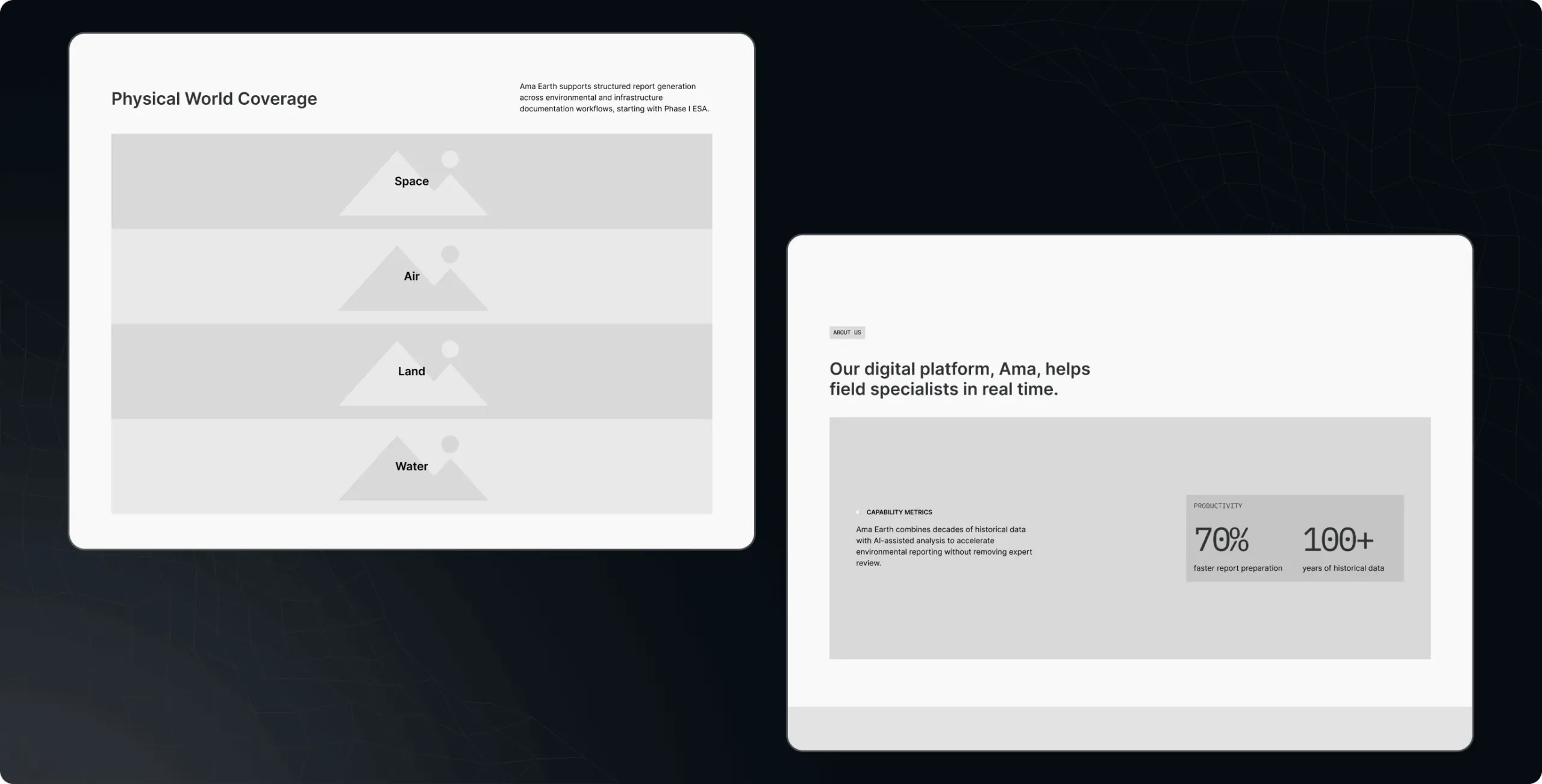
The chosen direction draws on the natural layers Ama works with — land, water, air, and space — and shows each through a technical lens. A neutral dark base with atmospheric gradients and sun accents sets the mood, and IBM Plex Mono paired with a sans-serif typeface brings the precision of an engineering document. Eco clichés and decorative nature imagery were ruled out early, because either would undercut credibility with the audience Ama sells to.
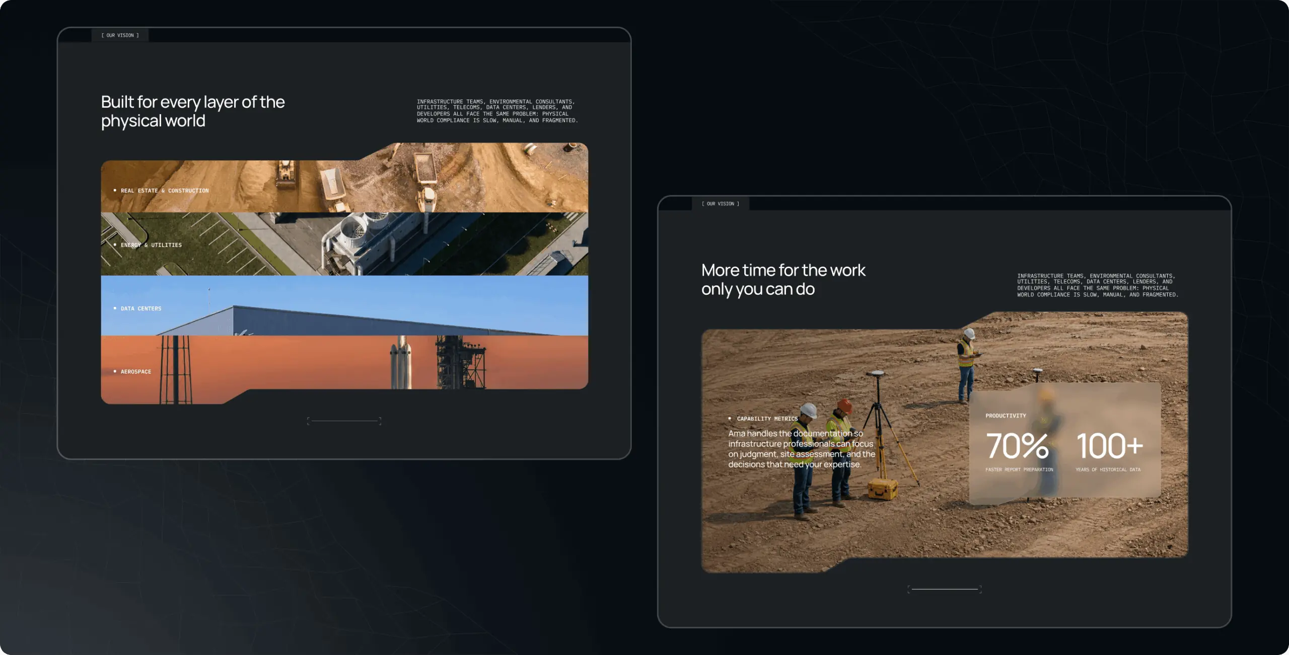
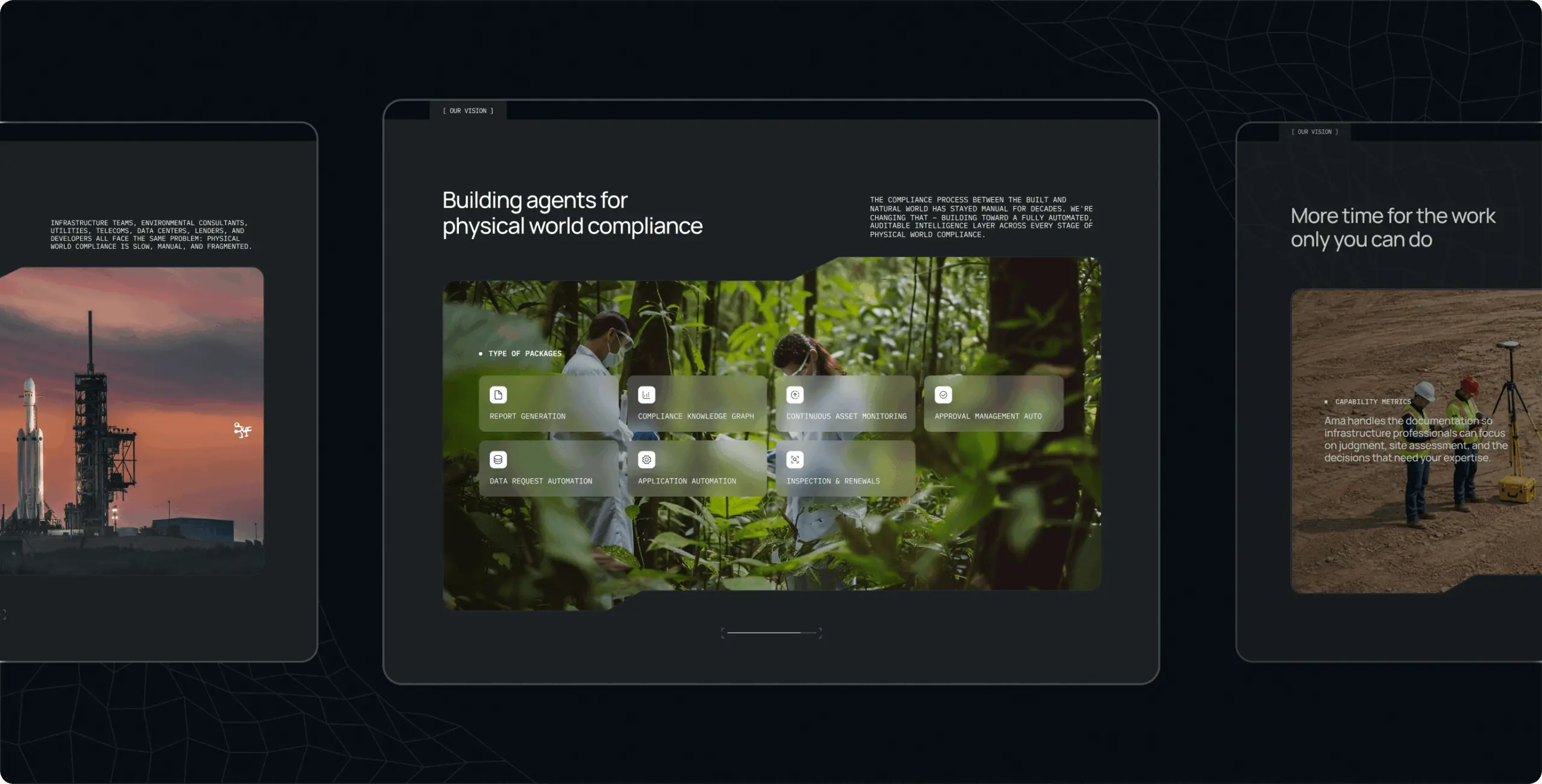
On the homepage, every natural element is paired with a technical one: the hero’s animated grid scans the terrain beneath it, and the vision section moves through industries on horizontal scroll. The visuals explain what the product does before the copy does, and every section ends in a demo booking or free credits.
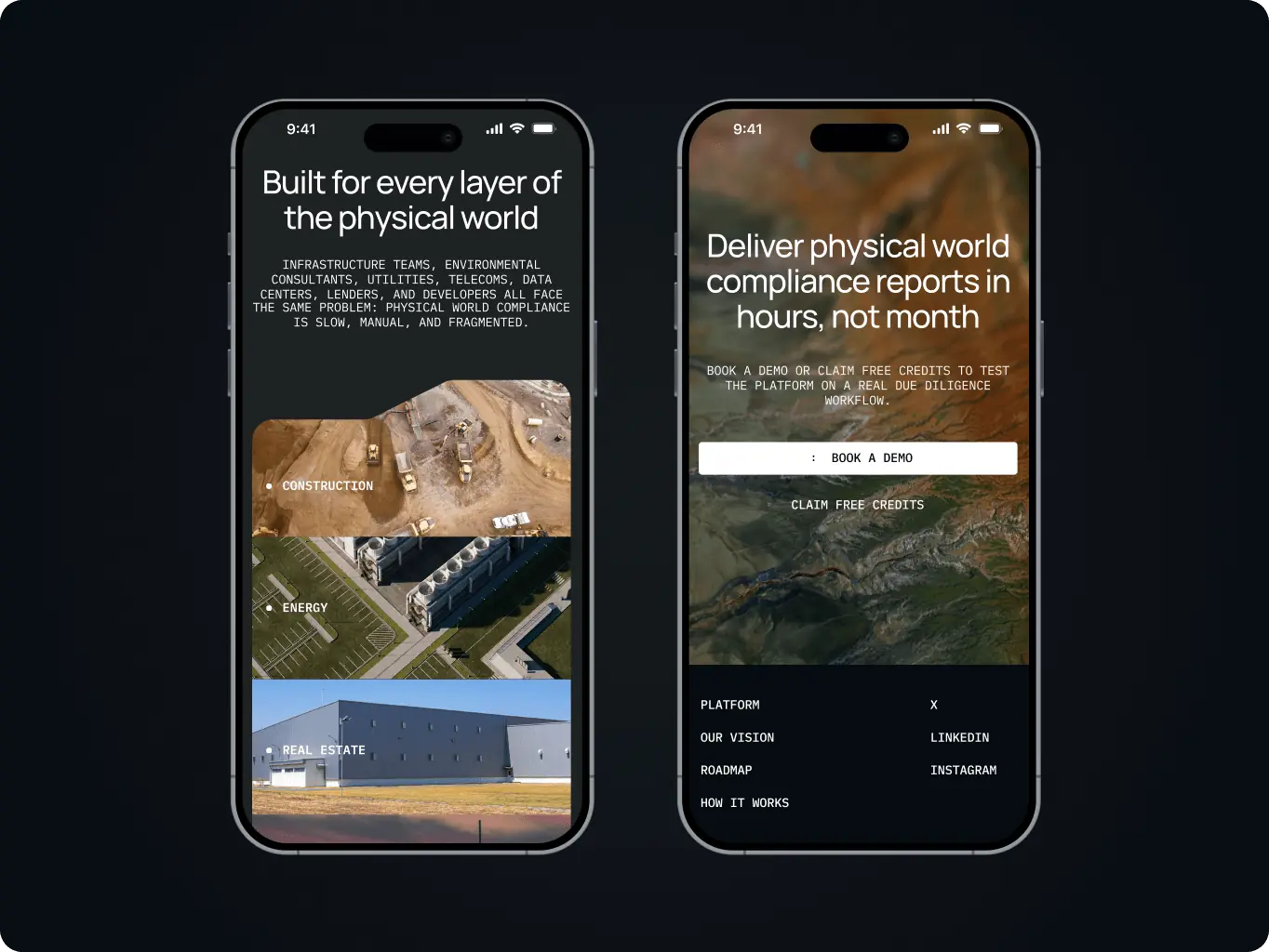
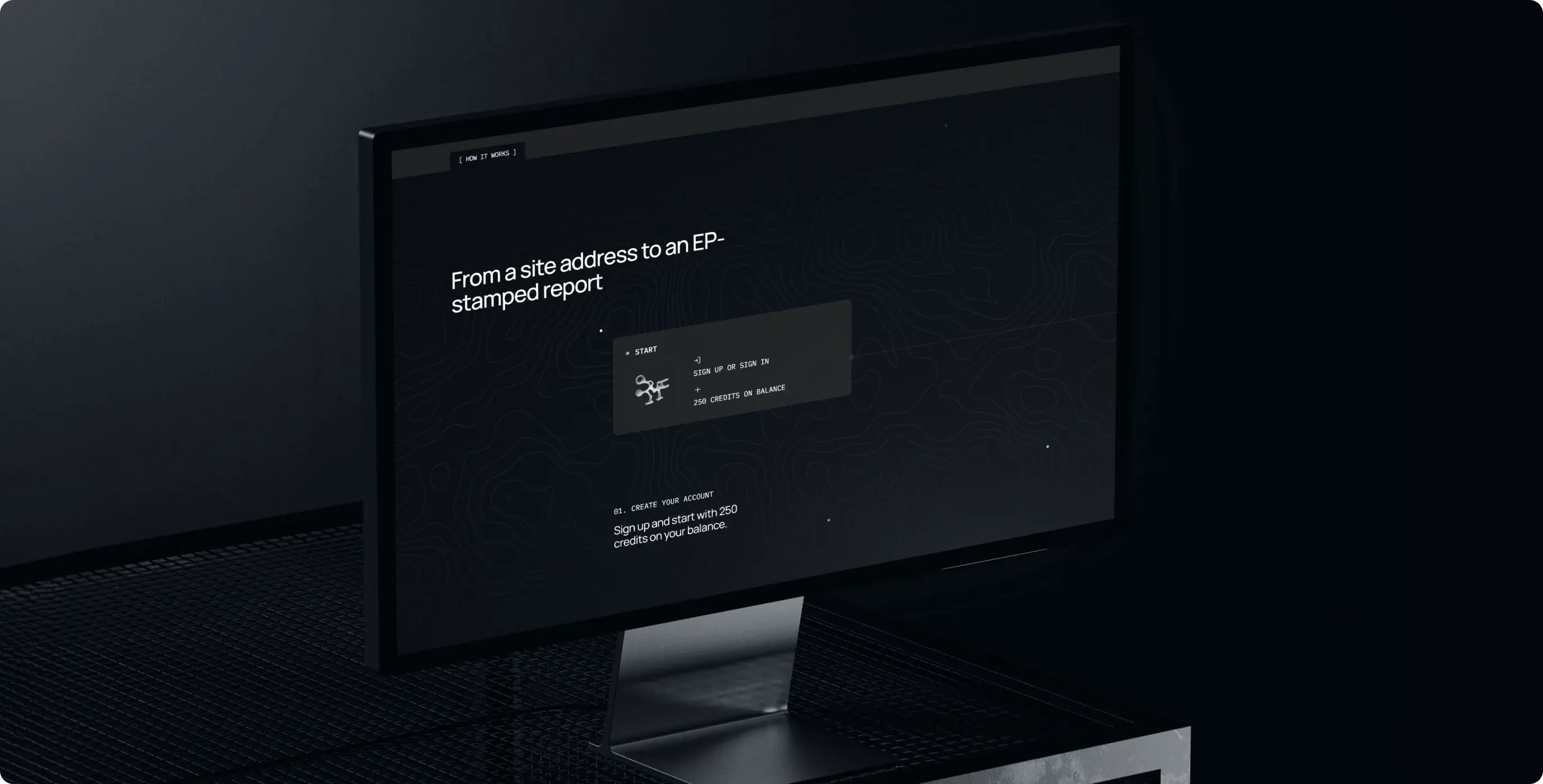
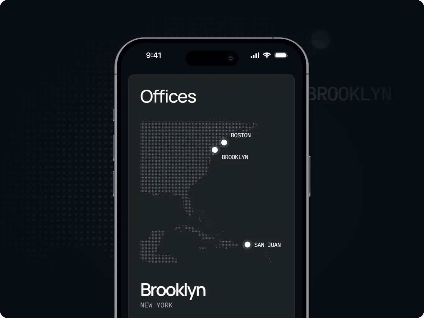
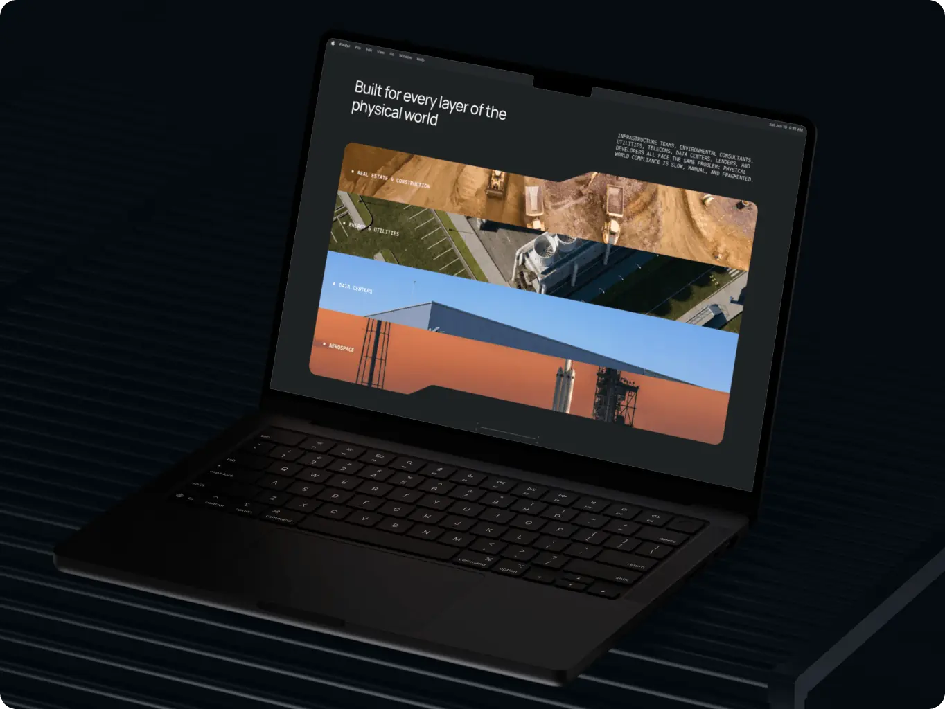
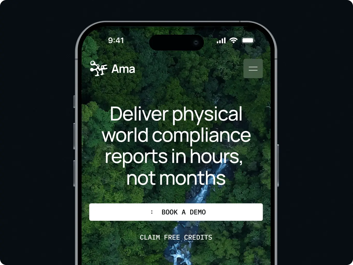
We built the front end in Next.js and React and handled QA; Ama’s team managed deployment. The task was to keep the motion faithful to the design on desktop and mobile without slowing down reading.
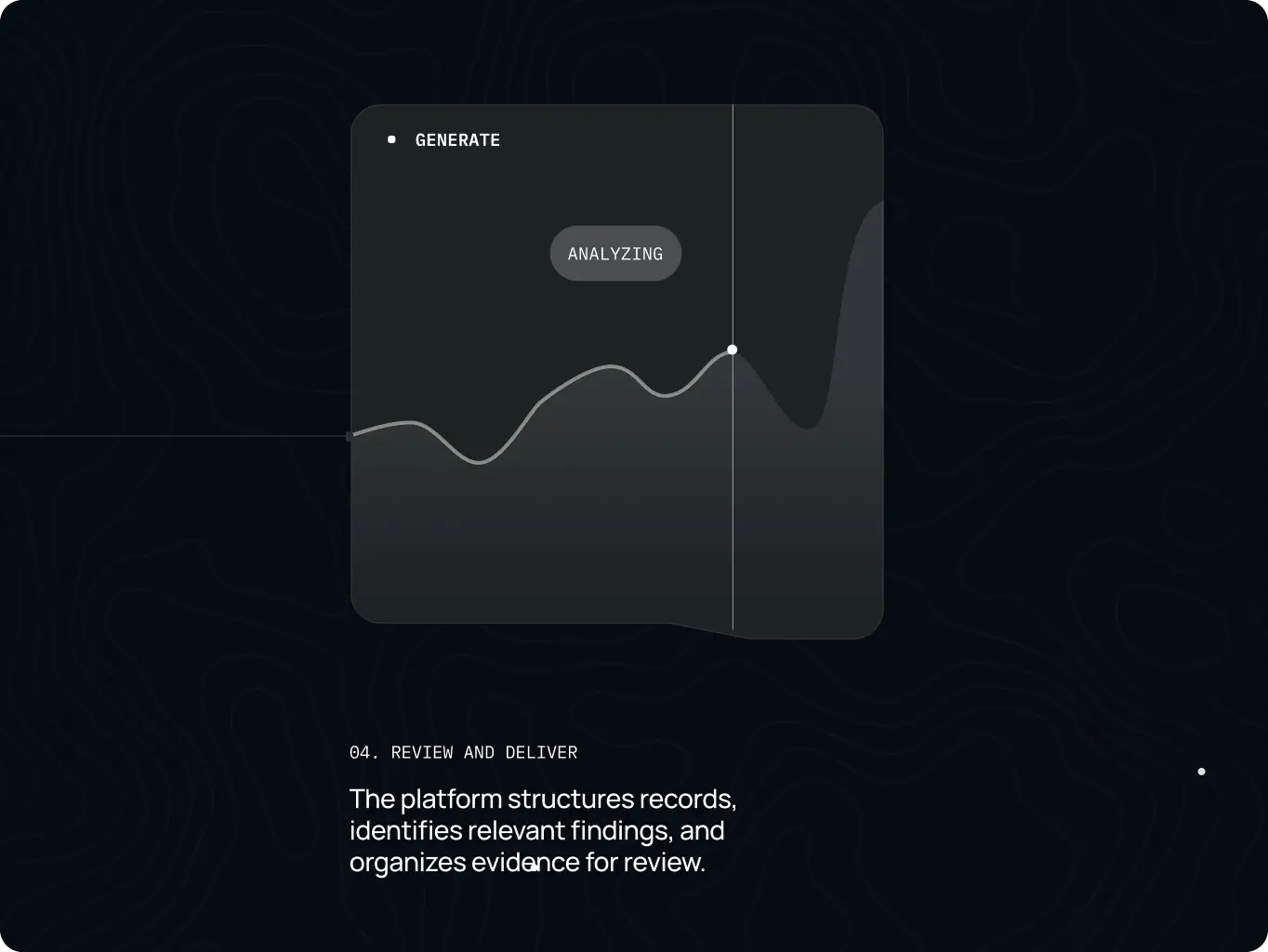
The “analysis” effect is implemented in code on top of our graphic designer’s visual foundation, so the scan runs as part of the page itself rather than as a decorative layer on top of it.
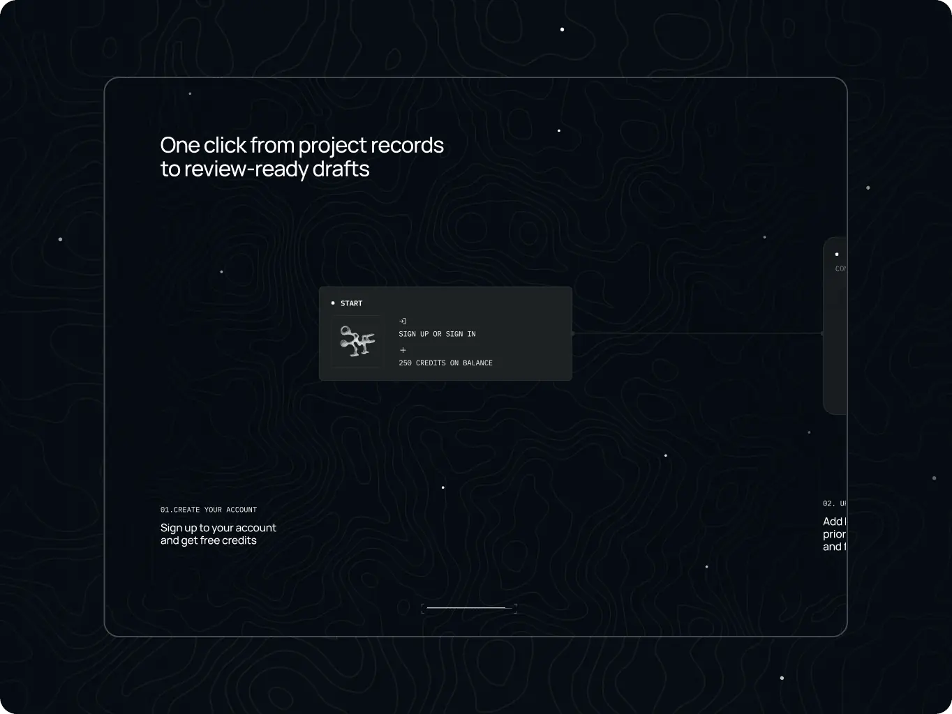
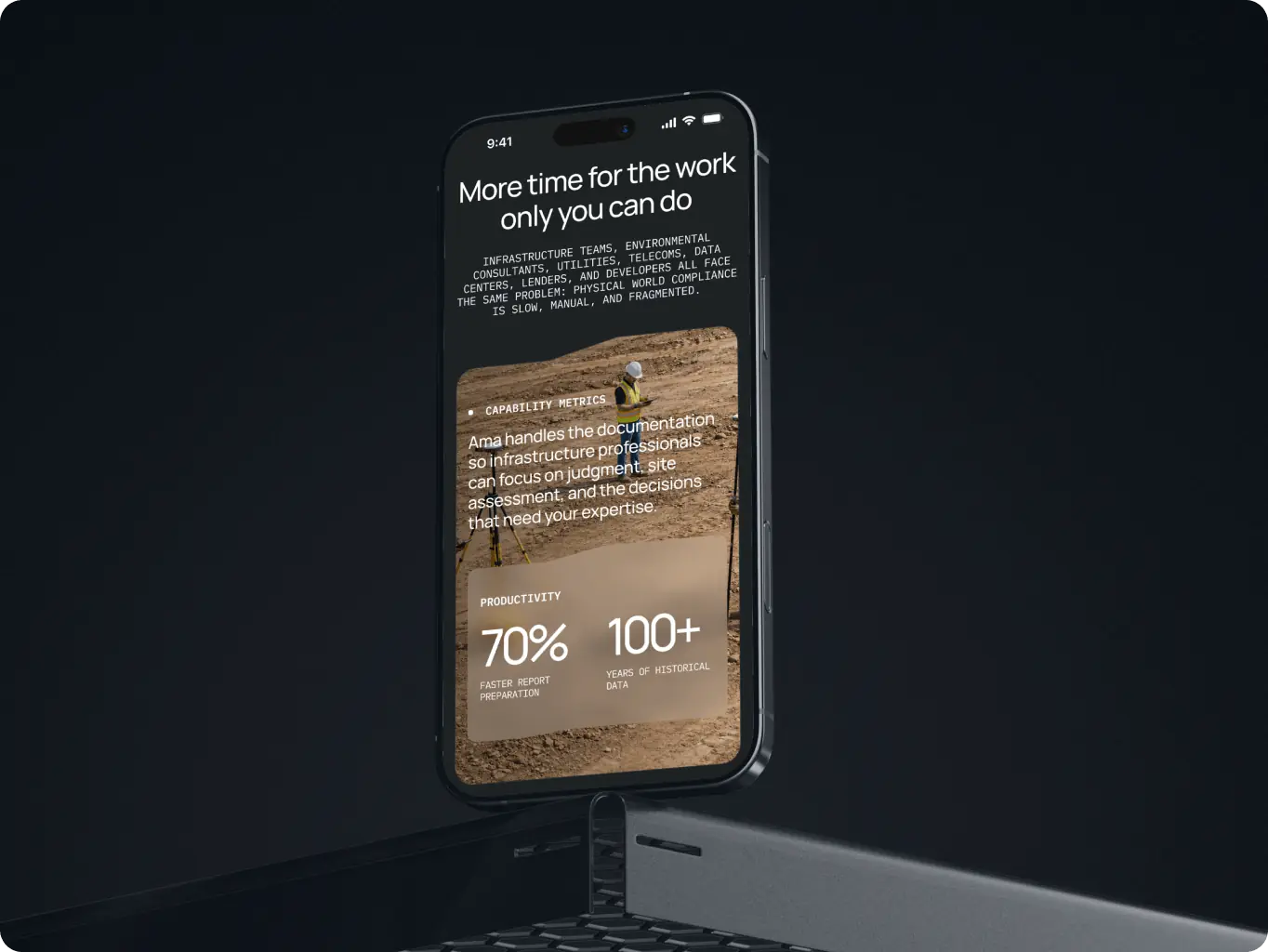
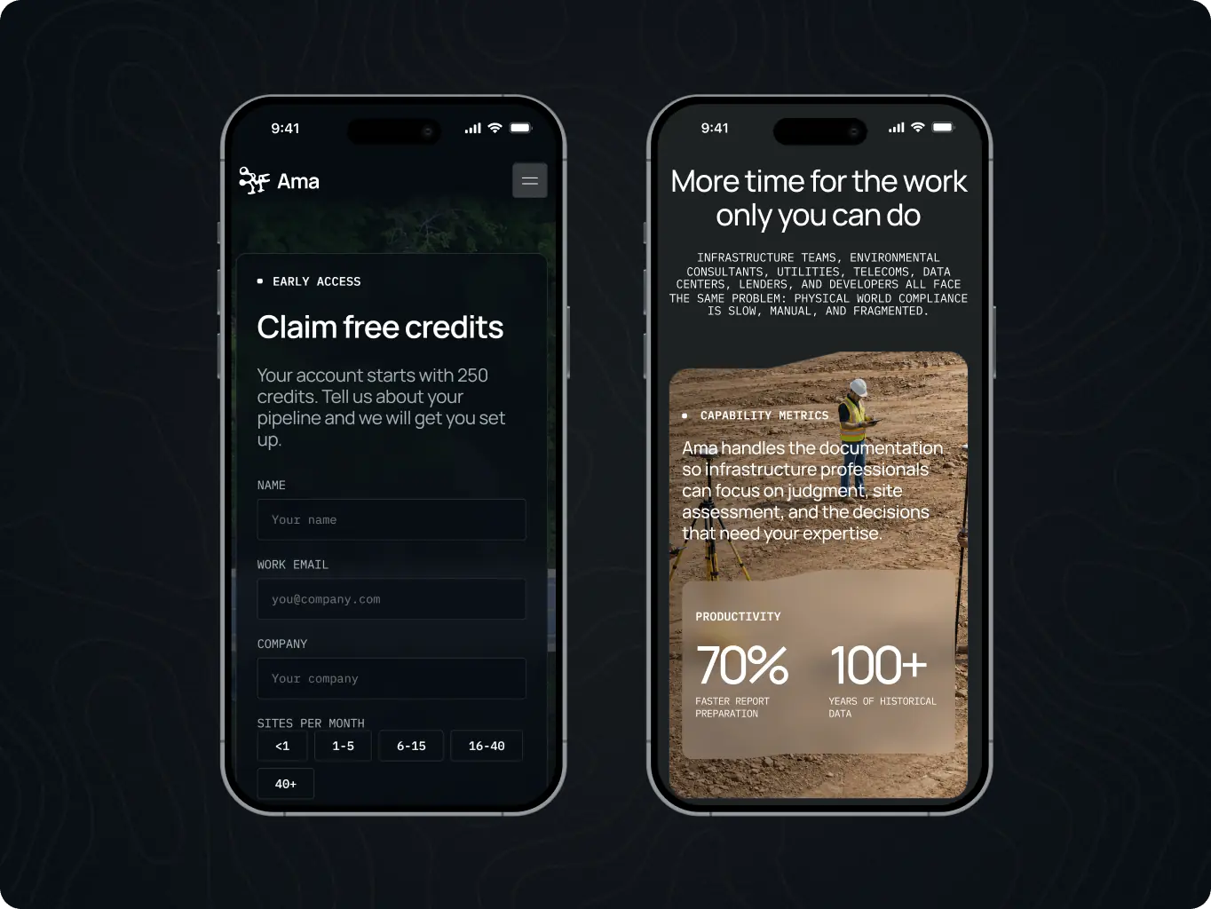
“Our vision” and “How it works” run as horizontal sequences on both desktop and mobile, which keeps two content-heavy sections compact on a phone screen.

Next.js

Next.js
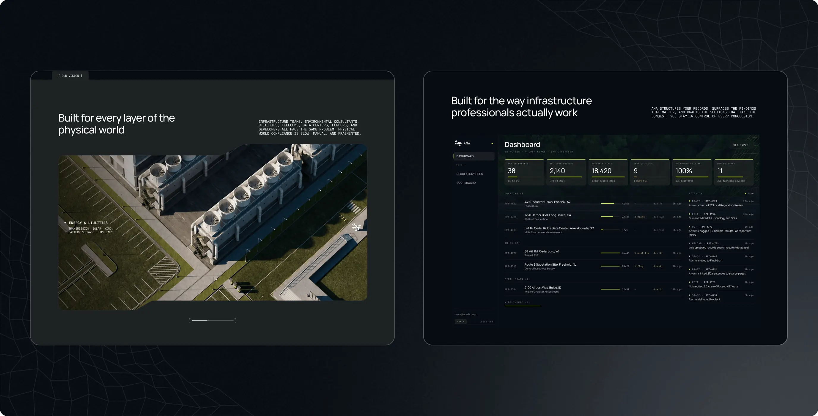
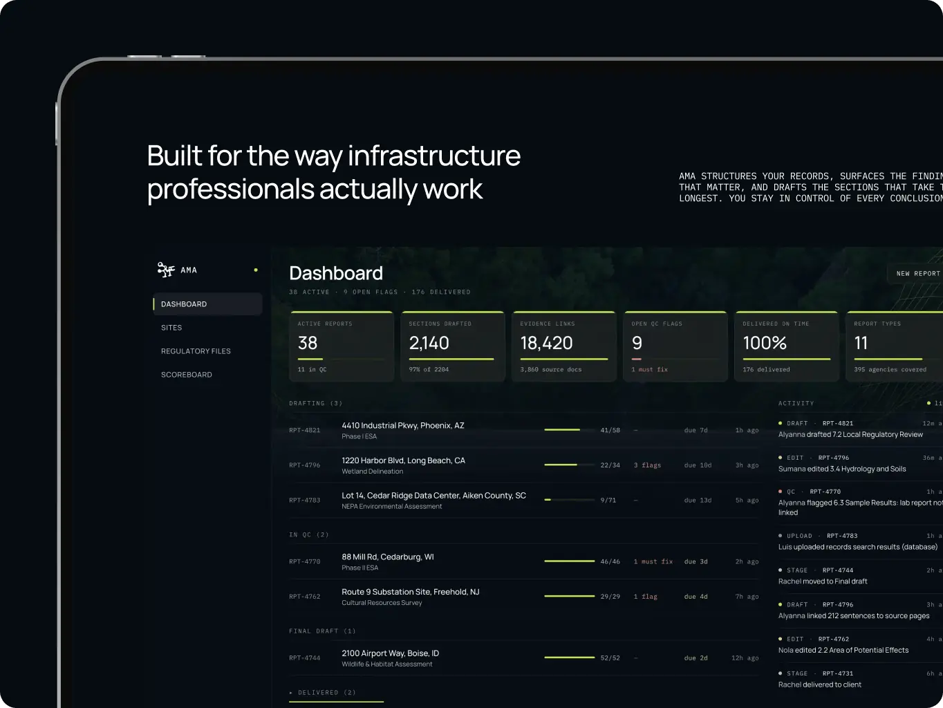

After our project was completed, the design was modified by the client to meet new business needs
#Website redesign
Effortless Technologies
 Malta
Malta
#Website design #Website development
Bloom
 USA
USA

#Website design #Website development
Nova Dental
USA
USA
