Effortless Technologies — a corporate website redesign built for the visit after the first meeting

Effortless Technologies — a corporate website redesign built for the visit after the first meeting - Website Development - Photo 1
Referrals that hold up on the website

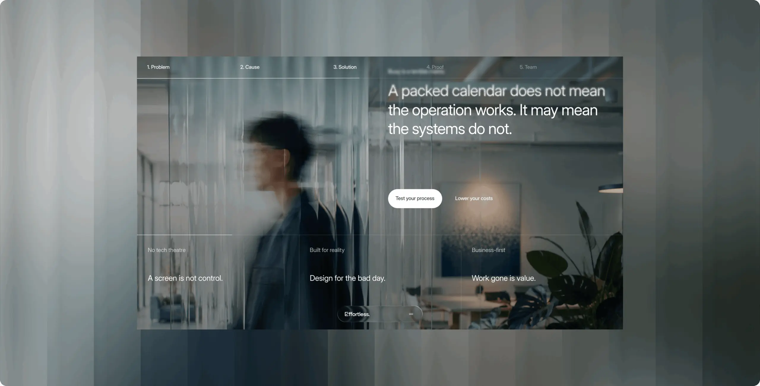
In the first scroll, a referred executive sees an operations partner, not another AI agency — who Effortless helps and which problems it fixes. The website confirms the founders' pitch instead of putting the next call in doubt.

Inquiries that start with the bottleneck

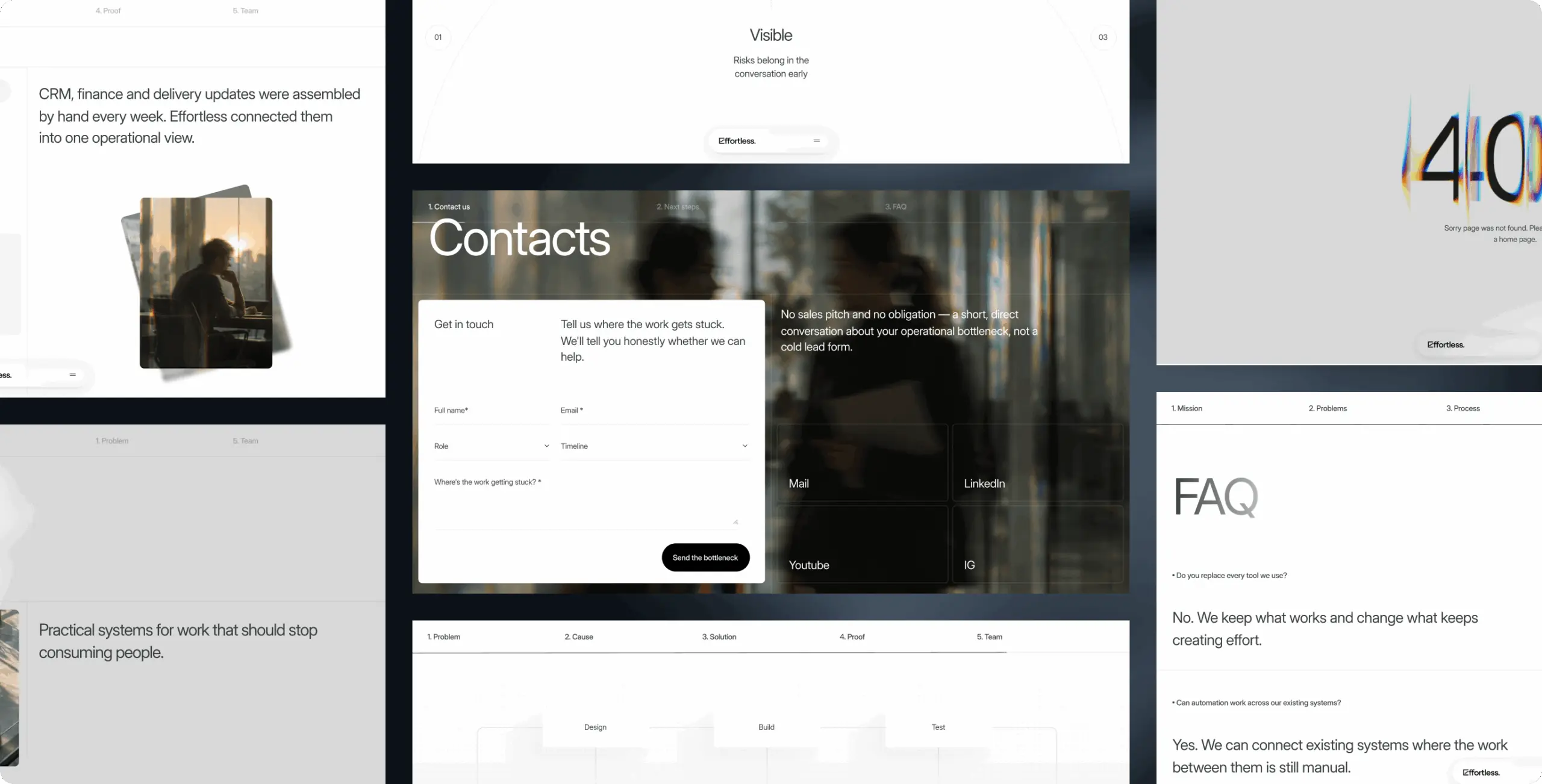
The call to action offers a diagnostic, not a sales pitch, and the form asks where the work gets stuck, the visitor's role and timeline. Leads qualify themselves before contact, and the founders open the first call already knowing what to dig into.

Light that points to the argument

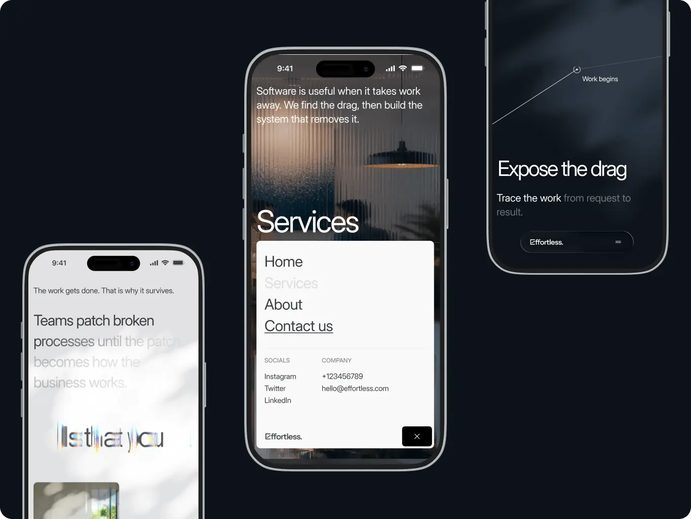
Light appears only where the case is made — the key claim, the shift from problem to fix, the proof. A skimming executive's eye lands on the argument first, so the visual language carries the message instead of decorating it.

Overview
Effortless fixes how work runs for companies that grew faster than their operations

Effortless Technologies builds AI, business process automation and custom software for teams living with manual reporting, duplicate data, broken handoffs and tools people work around. Most of its clients arrive through referrals. They meet the founders first, then open the website to check whether what they heard holds up.

The old website failed that check. Its gradient-heavy visuals read as generic tech, the hero and the rest of the page looked like two different websites, and nothing on the page named the operational problem Effortless solves. A CEO who had just heard a sharp pitch found a site that looked like every other AI agency — which put referred leads at risk at exactly the step where trust should have been easiest to earn.

Client
Effortless Technologies Icon - fi_4628635Malta
Review
What client says
Image - Rectangle 34624328
Valeria Ceci
CEO, Founder
The final result reflects exactly what we wanted for Effortless — our personality, tone of voice, visual language, and the human element that is so important to our brand. The Phenomenon team was fast, professional, and highly responsive throughout the project.

What stood out most was how they handled feedback. When we needed to reconsider the initial direction, the team approached it in an incredibly constructive and collaborative way, quickly realigning with our vision and coming back with work that really impressed us. The whole experience felt professional, capable, and solution-oriented, and we would definitely consider Phenomenon as a partner again.

Business needs
Client request & business goals

Effortless grows through founder meetings, warm introductions and client referrals. The website acts as a second opinion for executives deciding whether to take the next call — and they give it only a few seconds.

The new website had to prove that difference within 5–10 seconds: who Effortless helps, which problems it solves and why that matters — while carrying advanced technology with a human, premium feel.
Challenge
Challenges & solutions
Challenge
The old site spoke in tech slogans, so a referred executive had no way to connect it to their own problems. Without that recognition, a warm referral cooled into “another AI agency.”
Solution
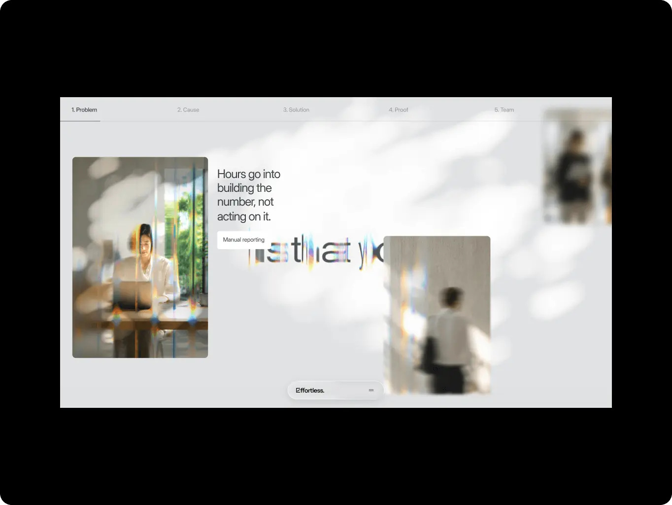
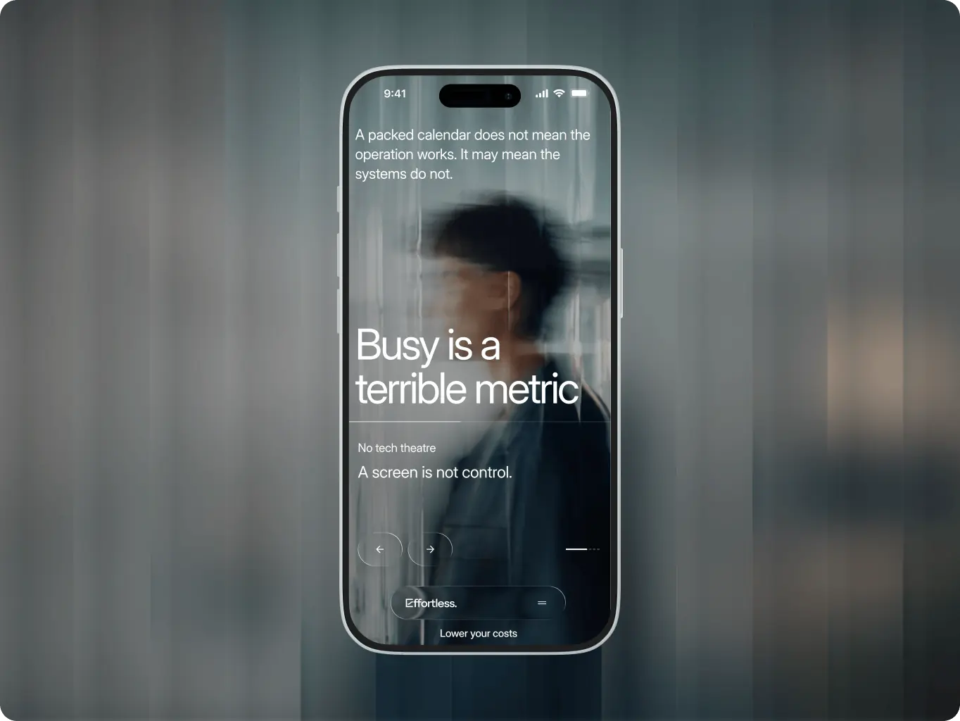
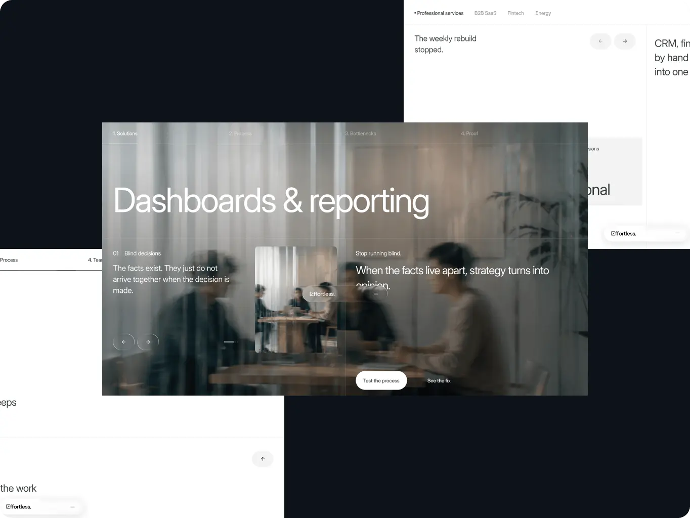
The hero opens on the reality — the company grew faster than its operations — and the next section names the friction operators live with. Visitors recognize their own situation before they read about services, so the referral stays warm into the next call.
Challenge
An executive doesn't shop for "AI agents" or "data pipelines" — they know a report gets rebuilt every week or a handoff keeps breaking. Services described in technology categories make them translate their problem into the vendor's vocabulary, and a skimming reader won't do that work.
Solution
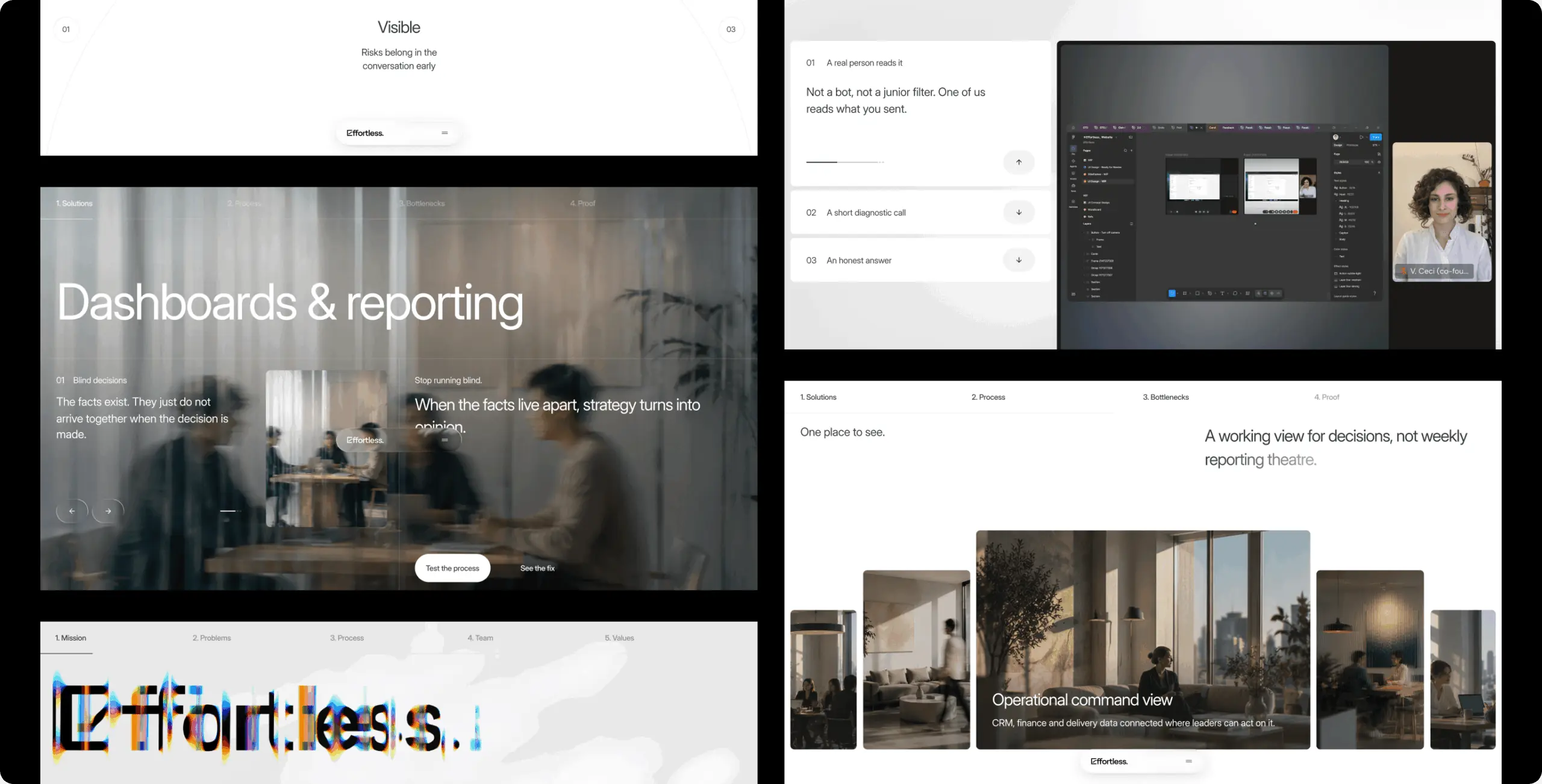
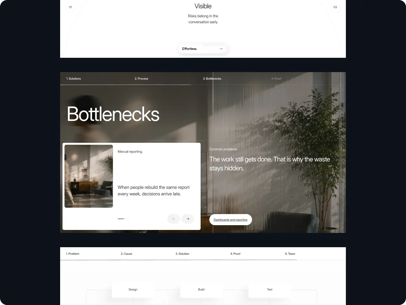
Service pages open with symptoms — manual reporting, duplicate data, broken handoffs — before the process or the stack. Visitors confirm a service fits their situation before they read how it works.
Challenge
Every firm in the category claims AI expertise and transformation. A referred executive has no way to tell who has actually fixed an operation like theirs — so the founders' pitch stays an unverified claim.
Solution
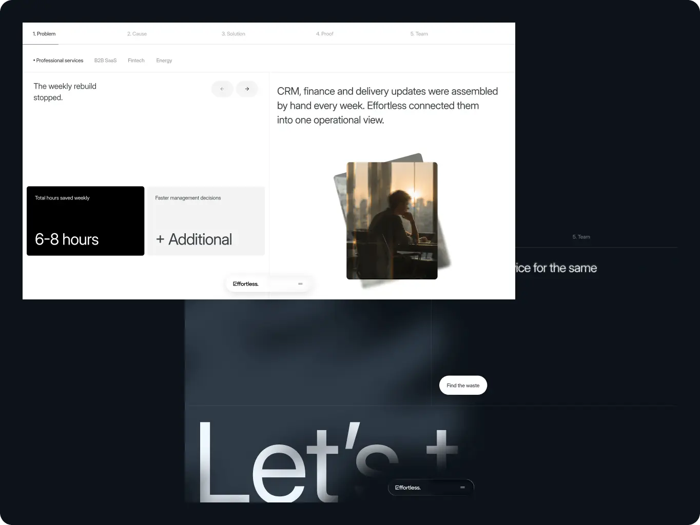
Proof sits next to the claim on key pages: a named before-and-after with hours saved weekly, and the senior people who do the work. The visitor checks the pitch against evidence, not adjectives.
Research
Defining what a referred executive needs to see in the first 10 seconds

Effortless competes in a category where most websites sound alike: AI expertise, transformation, end-to-end delivery. Before designing anything, we needed to know where that sameness leaves an opening and what a busy C-level visitor has to find on the page to trust a referral.

Research had 2 jobs. First, map how comparable firms position themselves and where they lose a skimming reader. Second, turn those findings into a page structure for 5 key pages, with every block prioritized — so design started from an agreed argument rather than a blank canvas.

Stages

  • Competitor matrix
  • Information Architecture
Effortless Technologies — a corporate website redesign built for the visit after the first meeting - Website Development - Photo 6
Stage 1
Competitor matrix

Analyzed 6 competitors — We Are Brain, Bima, Ignyte Group, TSH, 2DIGITS and steer73 — across navigation, differentiation and trust, visual design and tone, hero messaging, storytelling, conversion flow, content strategy and interactivity. The comparison showed which position was still open: an operations-first partner that understands how work runs before deciding what to build.

The matrix also set the rules the rest of the project followed. Navigation stays lean: what we fix, how we work, proof, industries, contact. Trust comes from specific proof — cases, outcomes, team credibility — not from claims. The call to action is diagnostic rather than sales-led, because referred visitors want confidence, not a cold pitch. Interactivity earns its place only where it explains complexity.

We also took what works elsewhere and adapted it: Bima’s pain recognition, made specific to operations, and TSH’s named program structure, rebuilt around Effortless’s own stages.
Effortless Technologies — a corporate website redesign built for the visit after the first meeting - Website Development - Photo 9
Stage 2
Information architecture

We structured 5 pages — Homepage, Services, Service Detail, About Us and Contact — and prioritized each block as must-have, should-have or could-have to keep the first release focused.

Service pages lead with problems and symptoms, helping visitors assess relevance before exploring the process. The contact form captures the bottleneck, timeline and role, making the first call more focused. Industries are prioritized by shared operational challenges, starting with professional services and enterprise SaaS, followed by fintech, ecommerce, energy, media, agritech and automotive.
Design
People in front, technology behind — one idea held from hero to footer

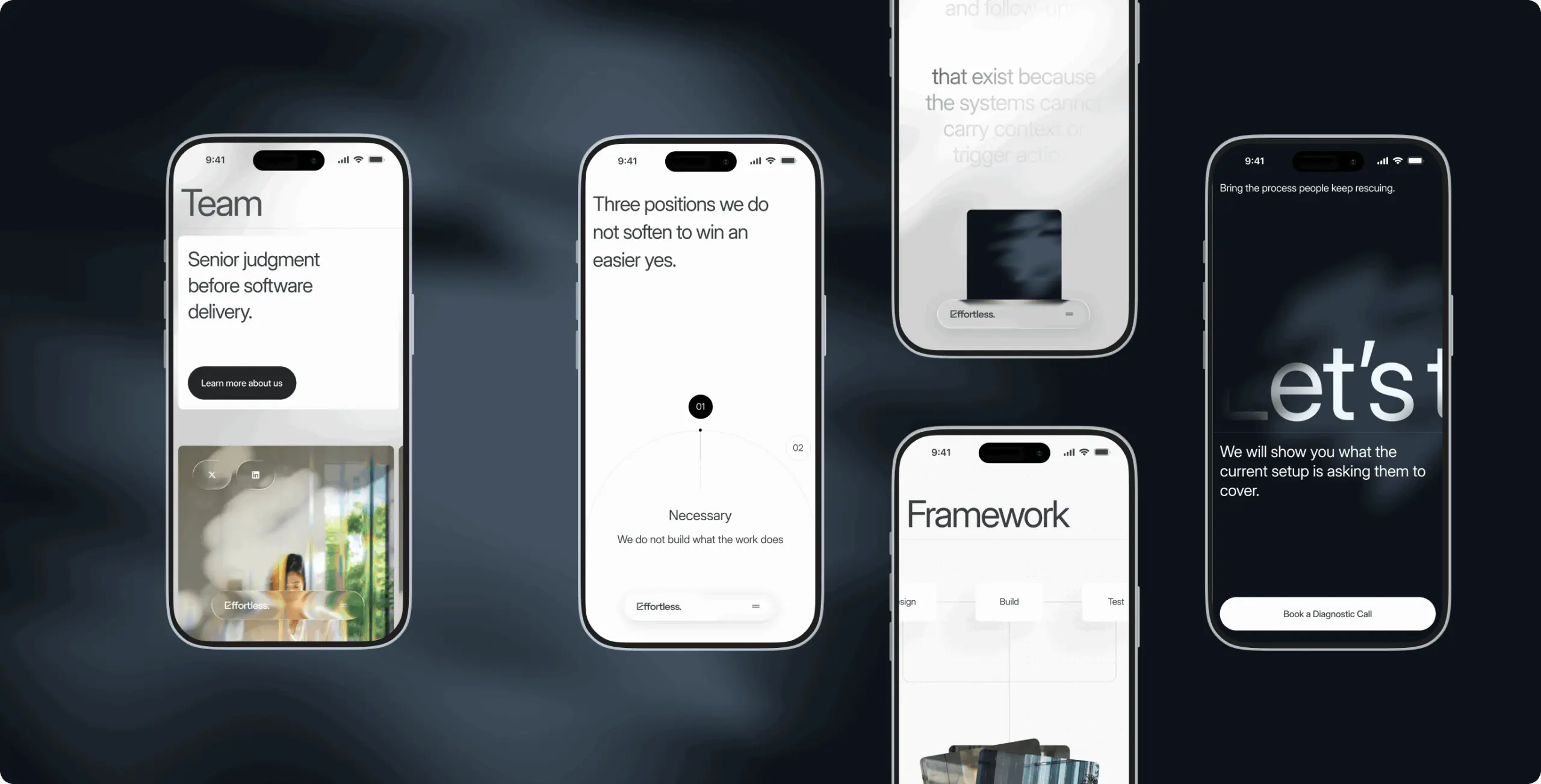
Effortless sells technology, but its clients buy clarity. The design phase had to find one idea that holds both — one that every color, animation and headline could be checked against. We reached it through several rounds of direction, each shifting the balance further from the digital toward the human, until technology settled into a supporting role and people came forward.

Each round was tested against the founders’ references and the brand’s core — advanced technology delivered in a human way — and the final direction was agreed with the founders at a workshop. In the interface, it became warm light on a precise structure, real people next to restrained digital accents, and motion that guides attention rather than entertains.

Stages

  • Point of view
  • Visual direction
  • Mockup design
Effortless Technologies — a corporate website redesign built for the visit after the first meeting - Website Development - Photo 12
Stage 1
Point of view

Formulated 3 through-line hypotheses for what the site should stand for: “Order from chaos,” “Revealing the invisible” and “Futuristic space that feels organic.” Each was a position, not a style — a way to say what Effortless does for a client before deciding how it looks.

At the workshop, the founders’ references were mapped to the hypothesis they supported and moved when their technique fit another idea better. The point was to pin down what exactly works in each reference — the technique, the feeling, the structure — not that it looks good. This step was missing from the first round, and it’s what turned “we like this” into a direction the founders could defend.
Stage 2
Visual direction

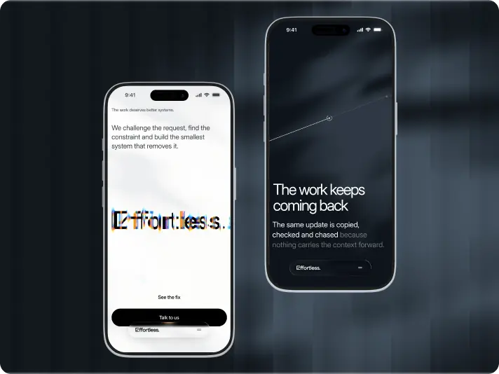
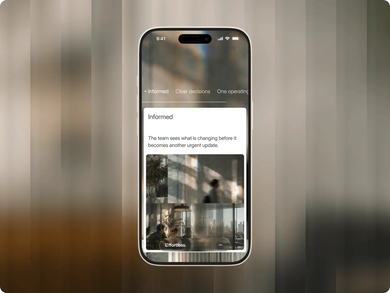
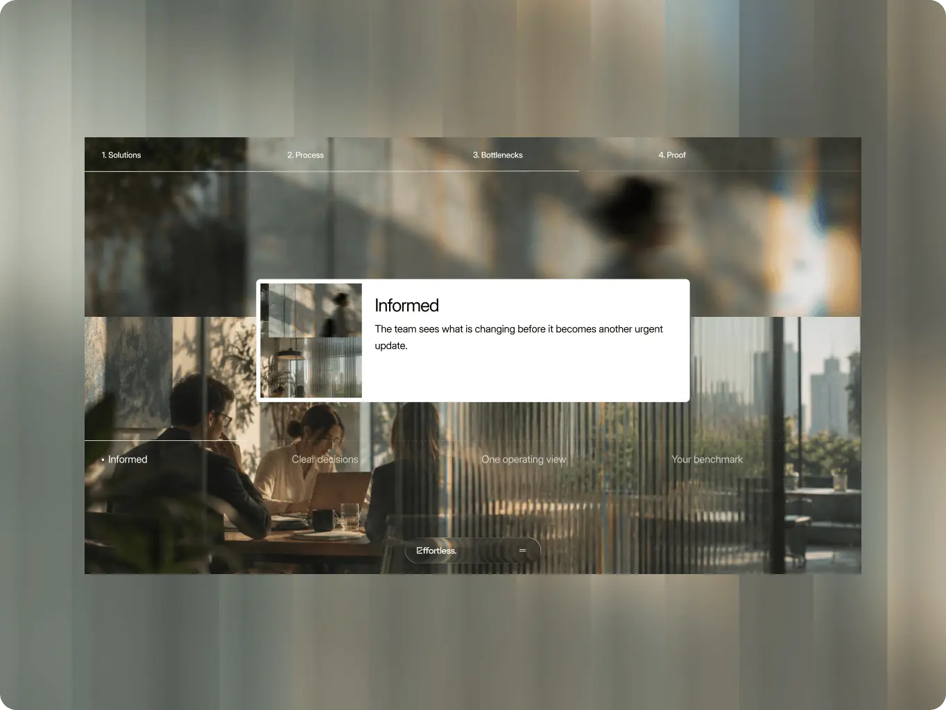
Defined the through-line the site is built on: technology steps back, people and clarity come forward. The visual reference is a subtle nod to Interstellar — cold structure and warm light in one frame, the digital and the human side by side.

The direction also fixed what “light” means for Effortless, because left vague it defaults to gradient and glow — exactly what didn’t work before. Light became a tool for meaning: it reveals what matters, leads the eye from unclear to clear and marks moments of insight. That rule protects the site from slipping back into decoration.
Effortless Technologies — a corporate website redesign built for the visit after the first meeting - Website Development - Photo 17
Stage 3
Mockup design

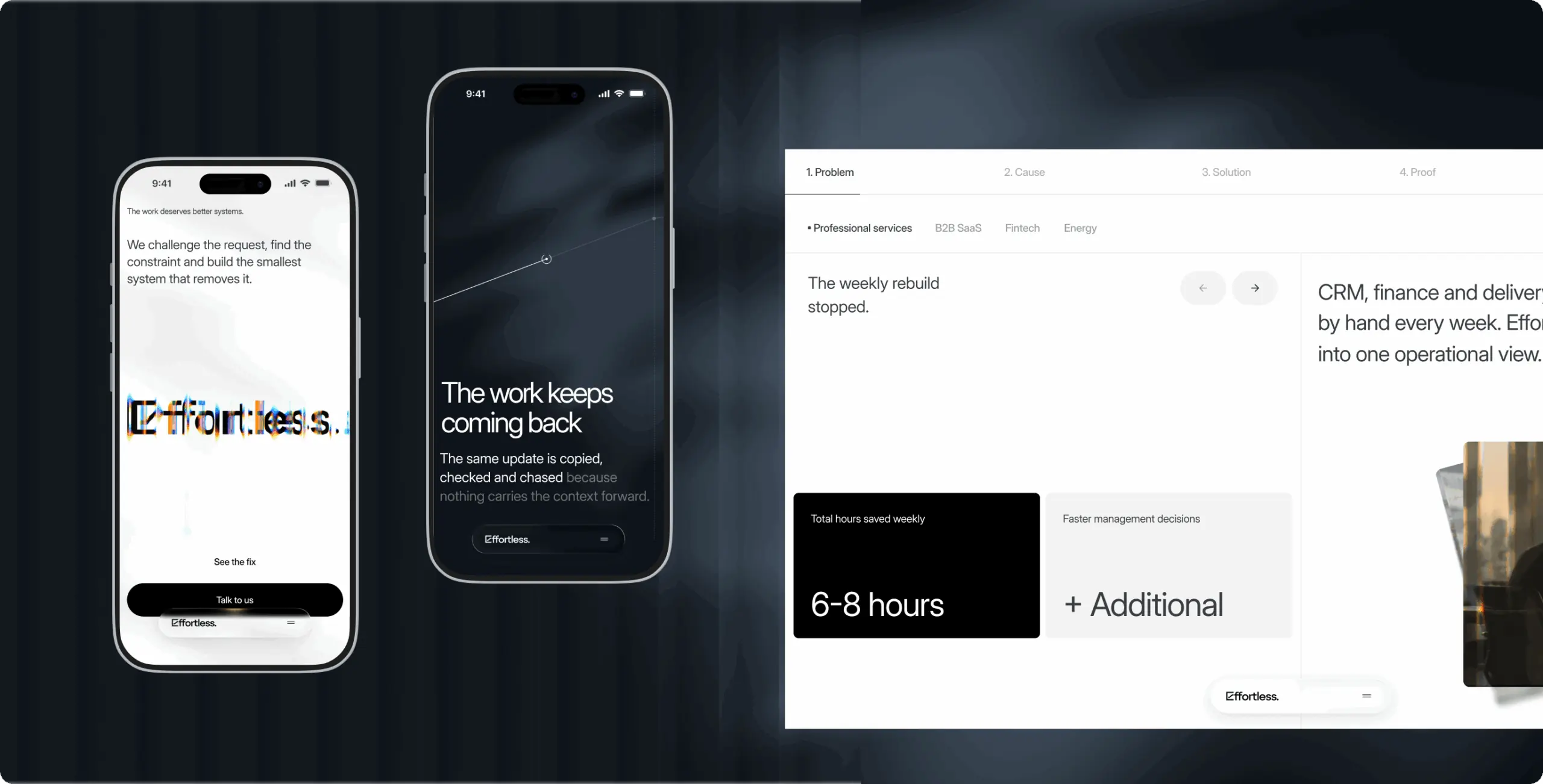
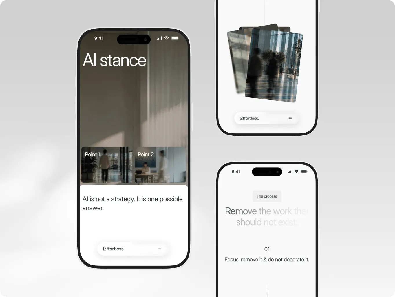
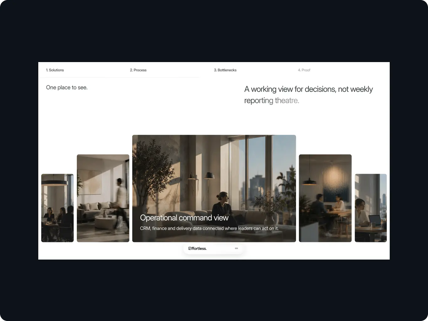
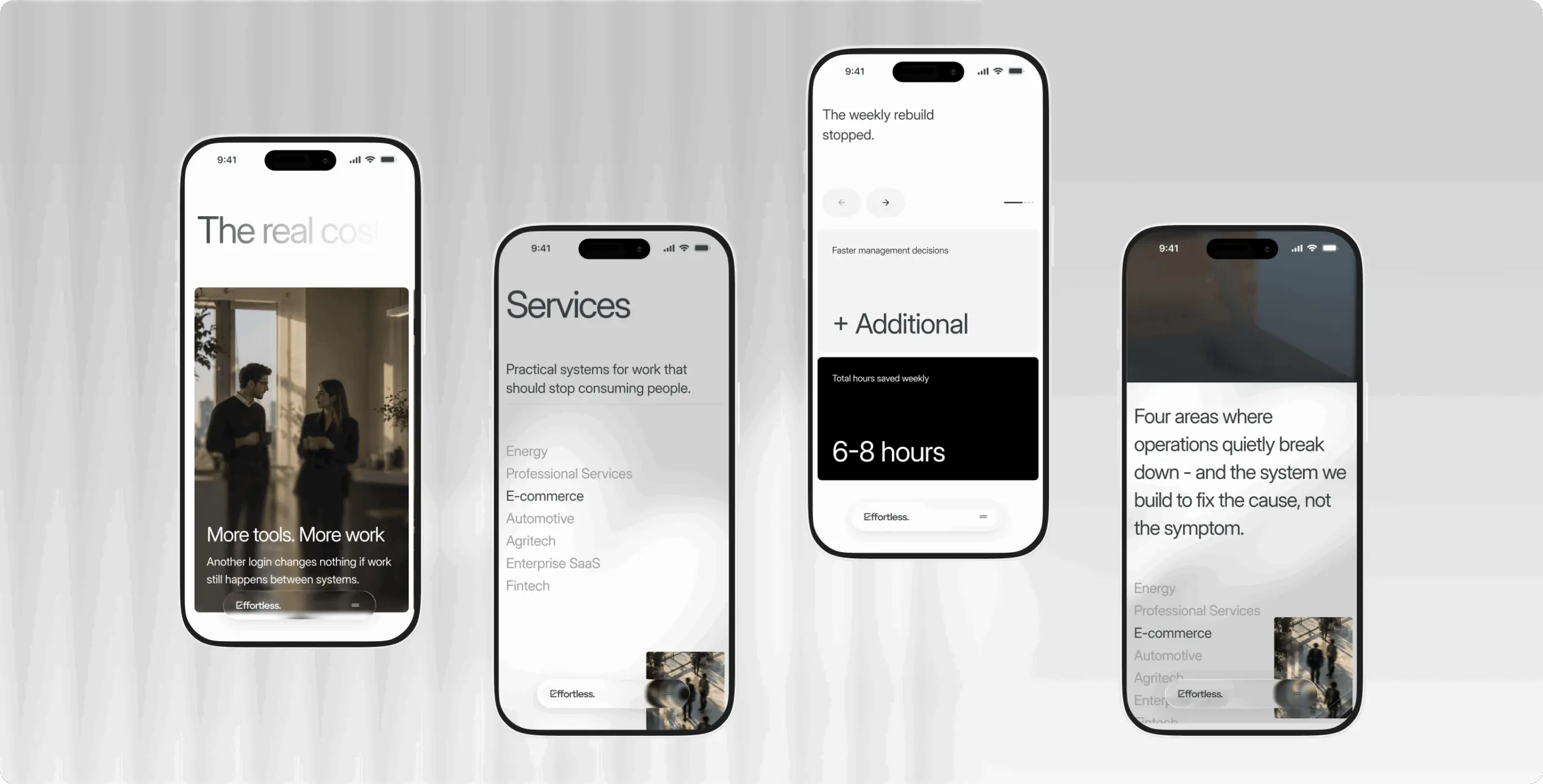
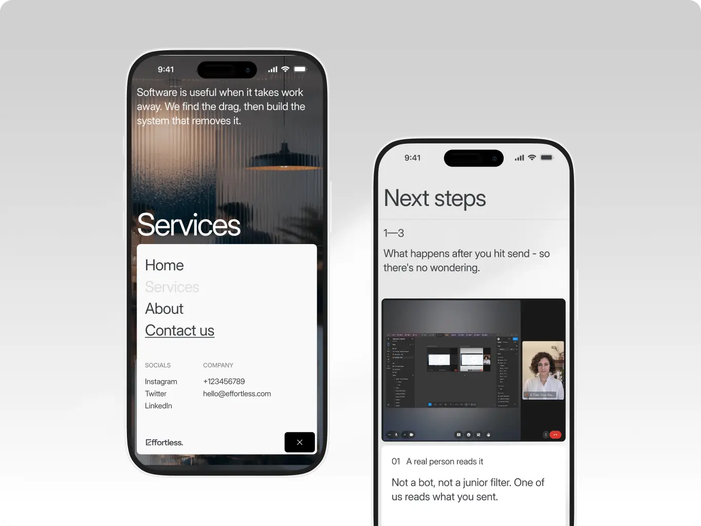
Translated the visual direction into screens, with each effect assigned a job. Sun glows and rays mark the key claim on each screen. Glitch typography keeps a digital edge inside a human-first layout, and interactive shadows show what responds to the cursor. Glassmorphism panels let interface elements sit over photography of real people without hiding them.

Readability was built into the visuals from the start. Blur and darkening overlays keep text legible over photography and textures, while distinct transitions separate sections and guide visitors through the page. Each interaction was documented or prototyped in custom HTML to give development a clear specification.
Effortless Technologies — a corporate website redesign built for the visit after the first meeting - Website Development - Photo 18
Results
From generic tech visuals to a website that backs up the founders' first meeting
Referrals that hold up on the website

In the first scroll, a referred executive sees an operations partner, not another AI agency — who Effortless helps and which problems it fixes. The website confirms the founders' pitch instead of putting the next call in doubt.

Inquiries that start with the bottleneck

The call to action offers a diagnostic, not a sales pitch, and the form asks where the work gets stuck, the visitor's role and timeline. Leads qualify themselves before contact, and the founders open the first call already knowing what to dig into.

Light that points to the argument

Light appears only where the case is made — the key claim, the shift from problem to fix, the proof. A skimming executive's eye lands on the argument first, so the visual language carries the message instead of decorating it.

Effortless started with a website that looked like the rest of its category and said little about what the company does. Now the site makes one argument from hero to footer — the problem, the diagnosis, the system change, the proof — in a visual language where people lead and technology supports.

For a referred executive, the website now confirms the pitch instead of competing with it. See how it reads in practice.

More cases
We have dozens of products & hundreds of websites developed by our studio. We're happy to share the results with you!
#Website design #Website development
Bloom — a booking-ready front door for a mental health clinic that hadn’t launched yet
Bloom Icon - fi_4628635 (12)USA
Tech Stack

Webflow

Timeline

4 months

Results

Specialist credibility visitors can verify

Booking flow closed in one screen

Complete service-to-booking system

#Website design #Website development
Nova Dental — booking, trust, and education working together to change what visiting feels like
Nova Dental Icon - fi_4628635 (12)USA
Results

Booking cut to three steps

Trust signals moved into the booking decision

Content the clinic can publish without a developer

#website design #website development
Atelier Meridian – how a digital exhibition space builds collector trust before a single physical show opens
atelier meridian Icon - fi_4628635 (12)USA
Results

Provenance a collector can check remotely

Filtered discovery instead of a flat list

One step from art to inquiry