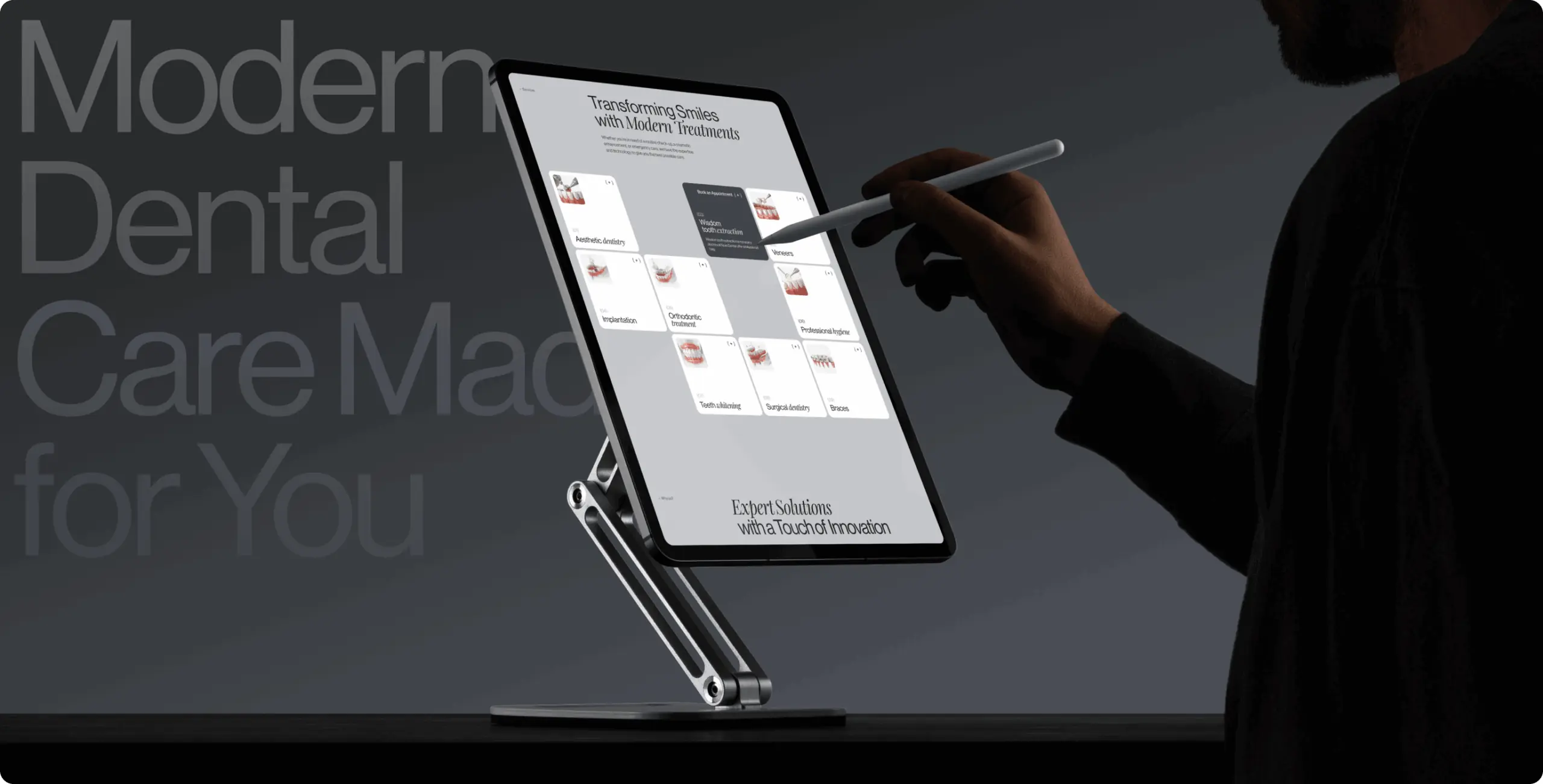
Nova Dental — booking, trust, and education working together to change what visiting feels like

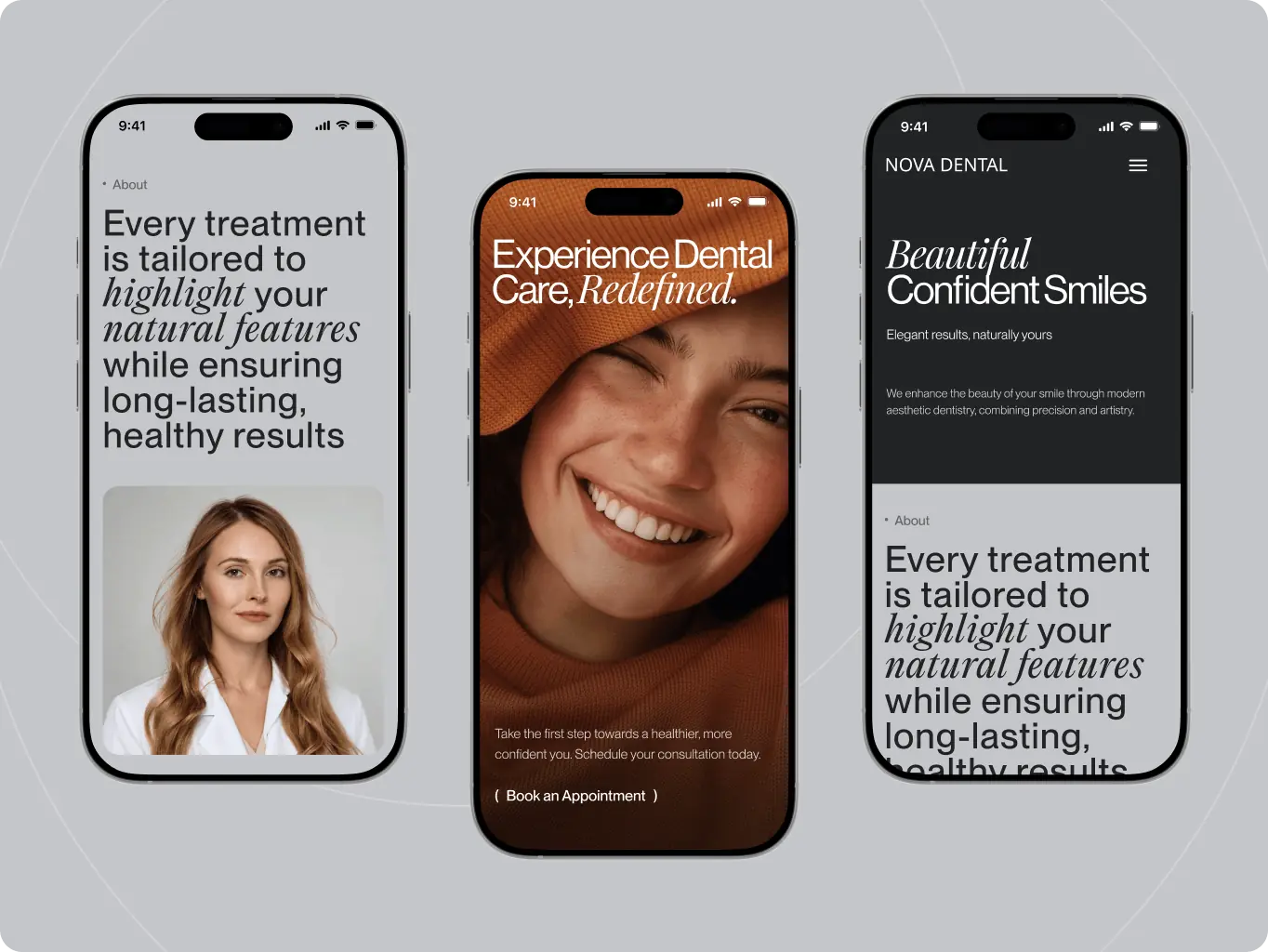
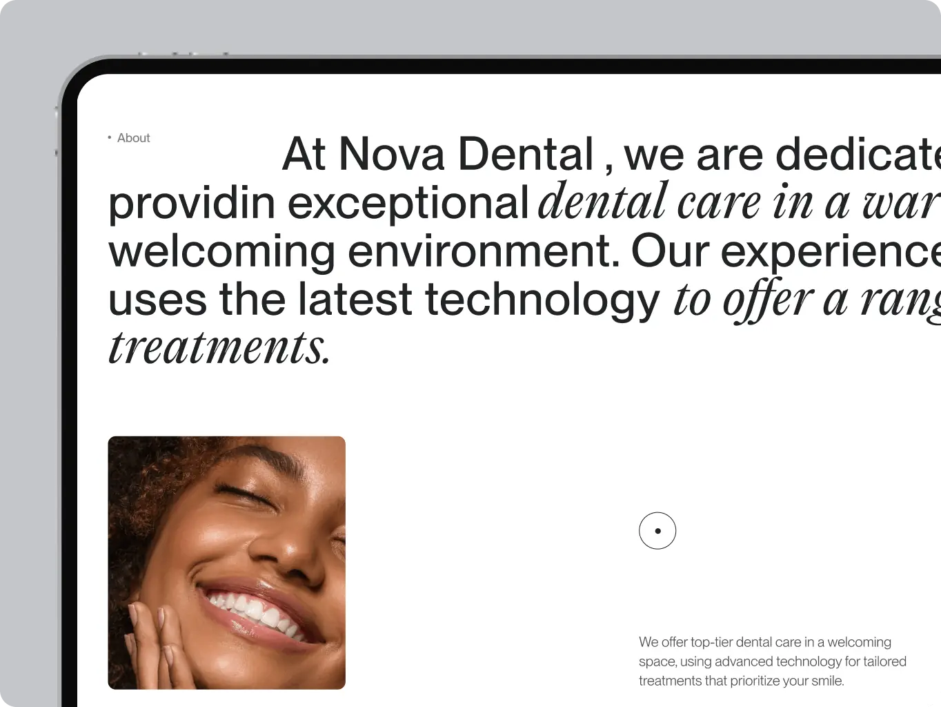
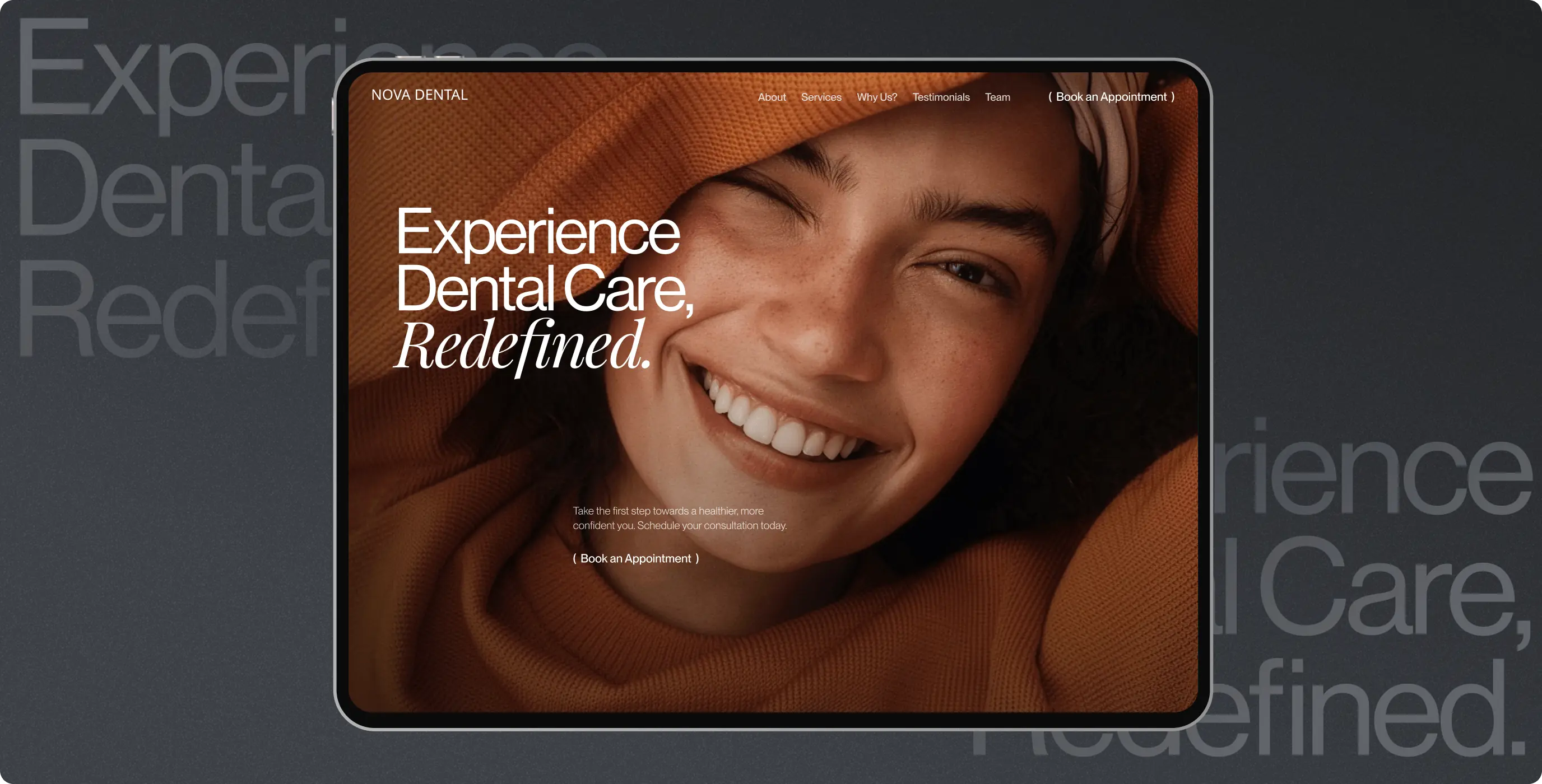
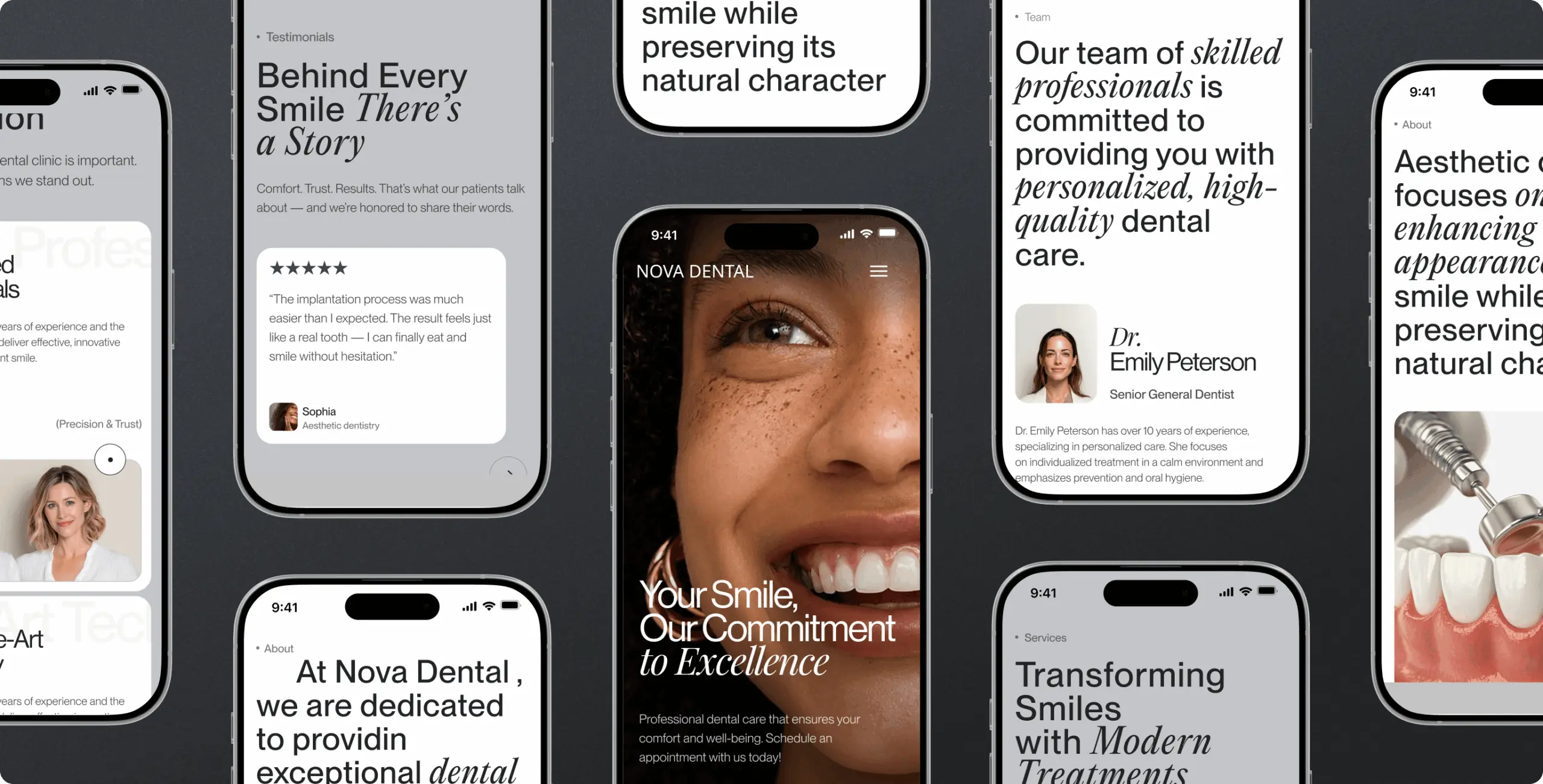
Nova Dental — booking, trust, and education working together to change what visiting feels like - Website Development - Photo 1
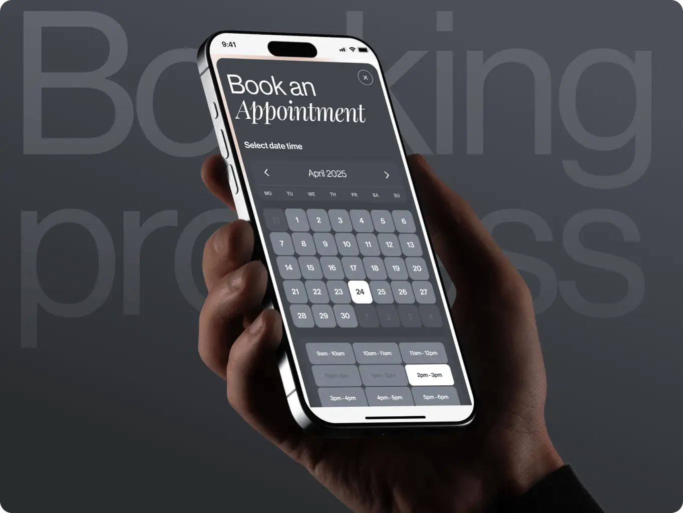
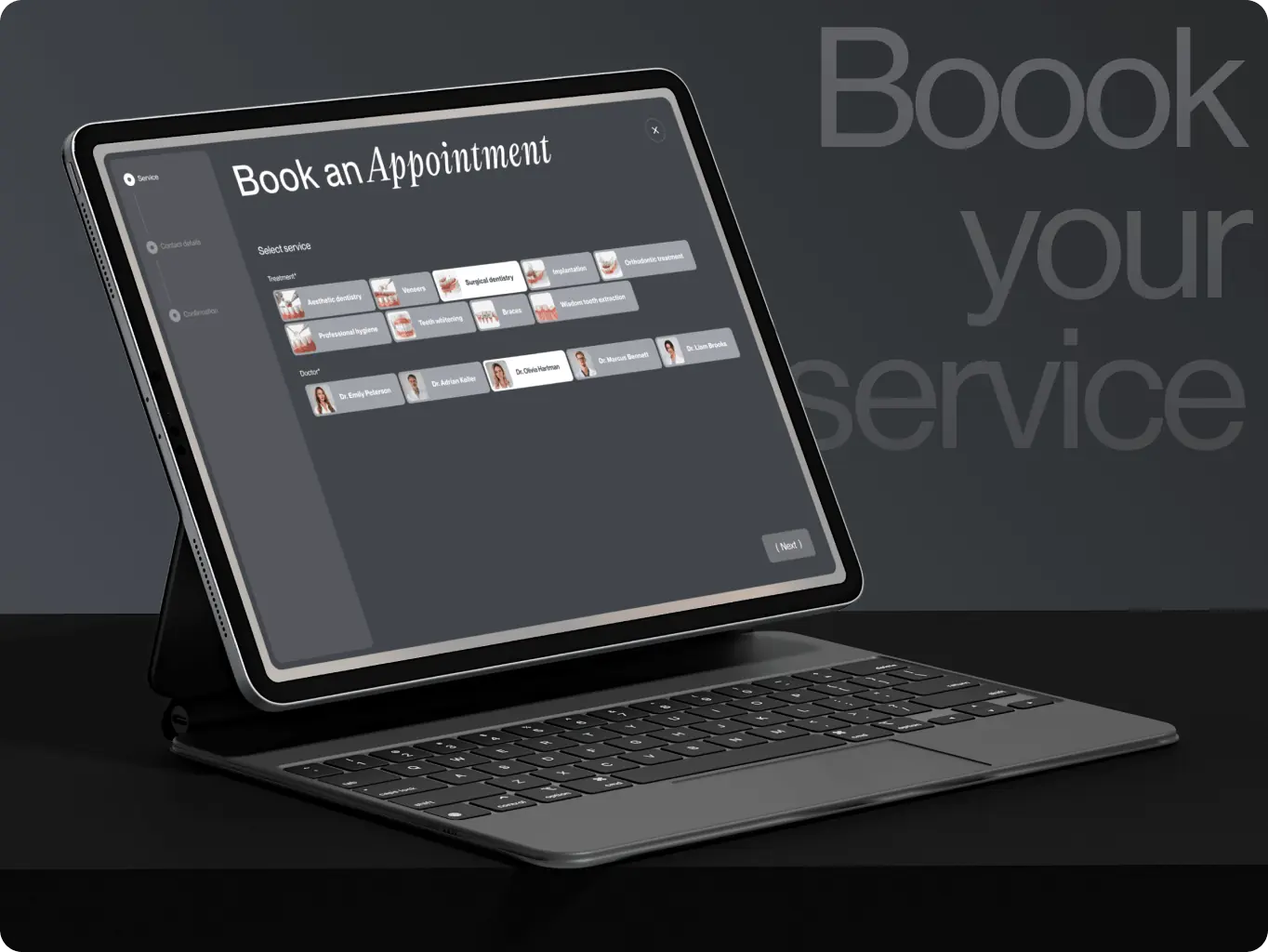
Booking cut to three steps

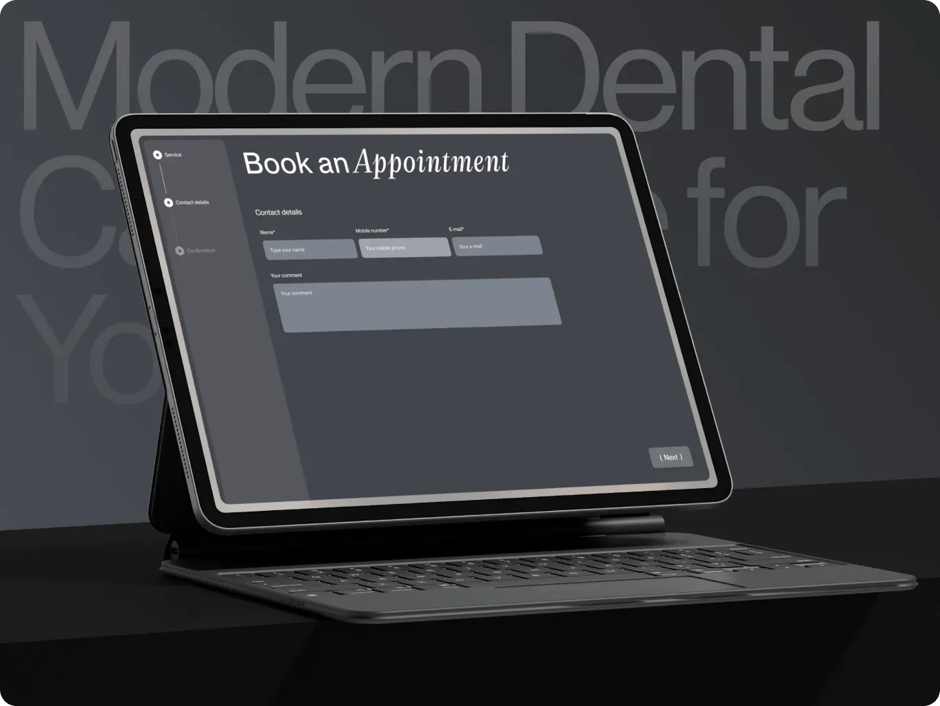
Choosing a service, entering contact details, and confirming an appointment happen in one connected flow instead of a multi-page form.

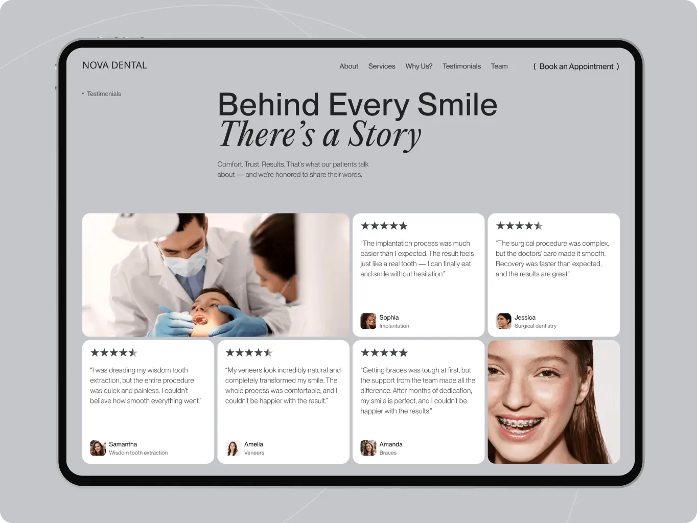
Trust signals moved into the booking decision

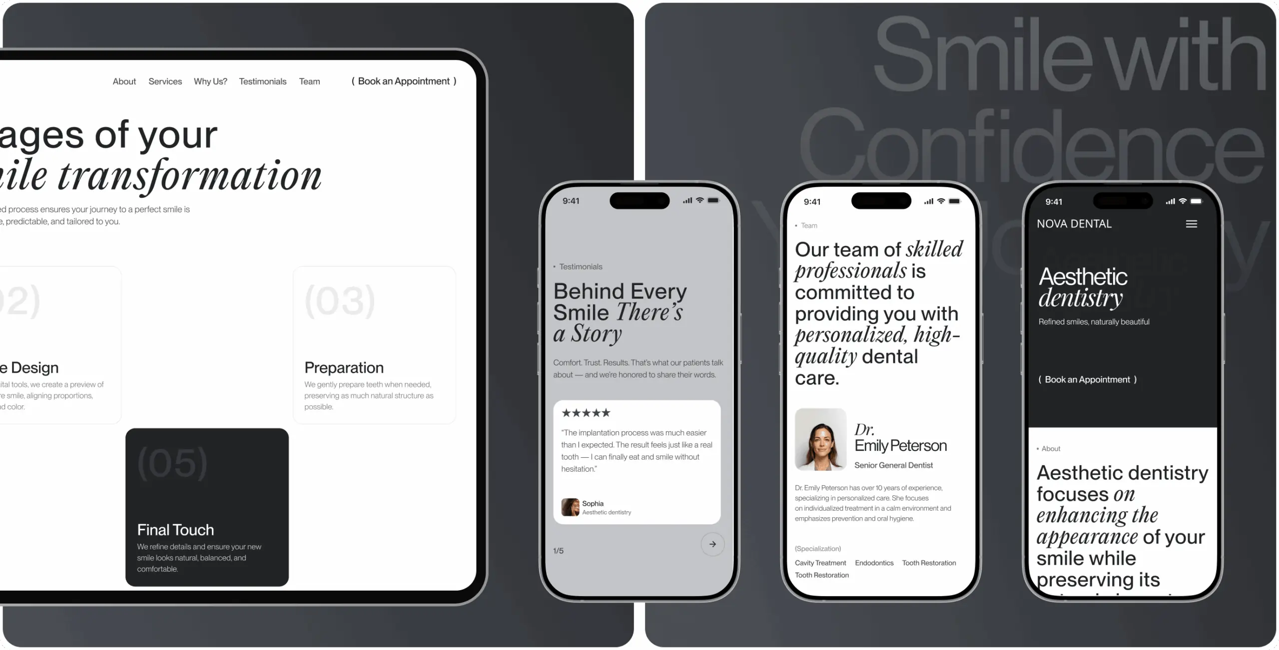
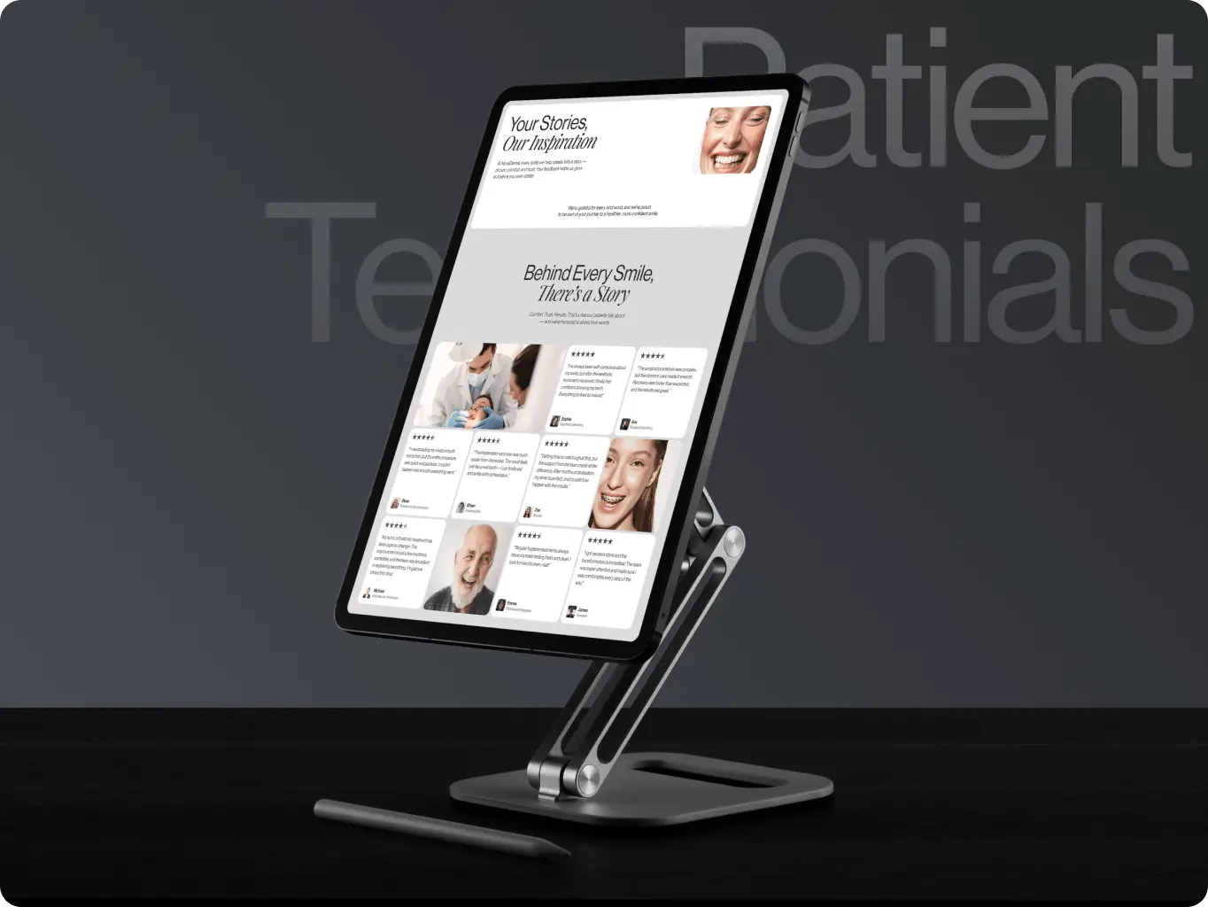
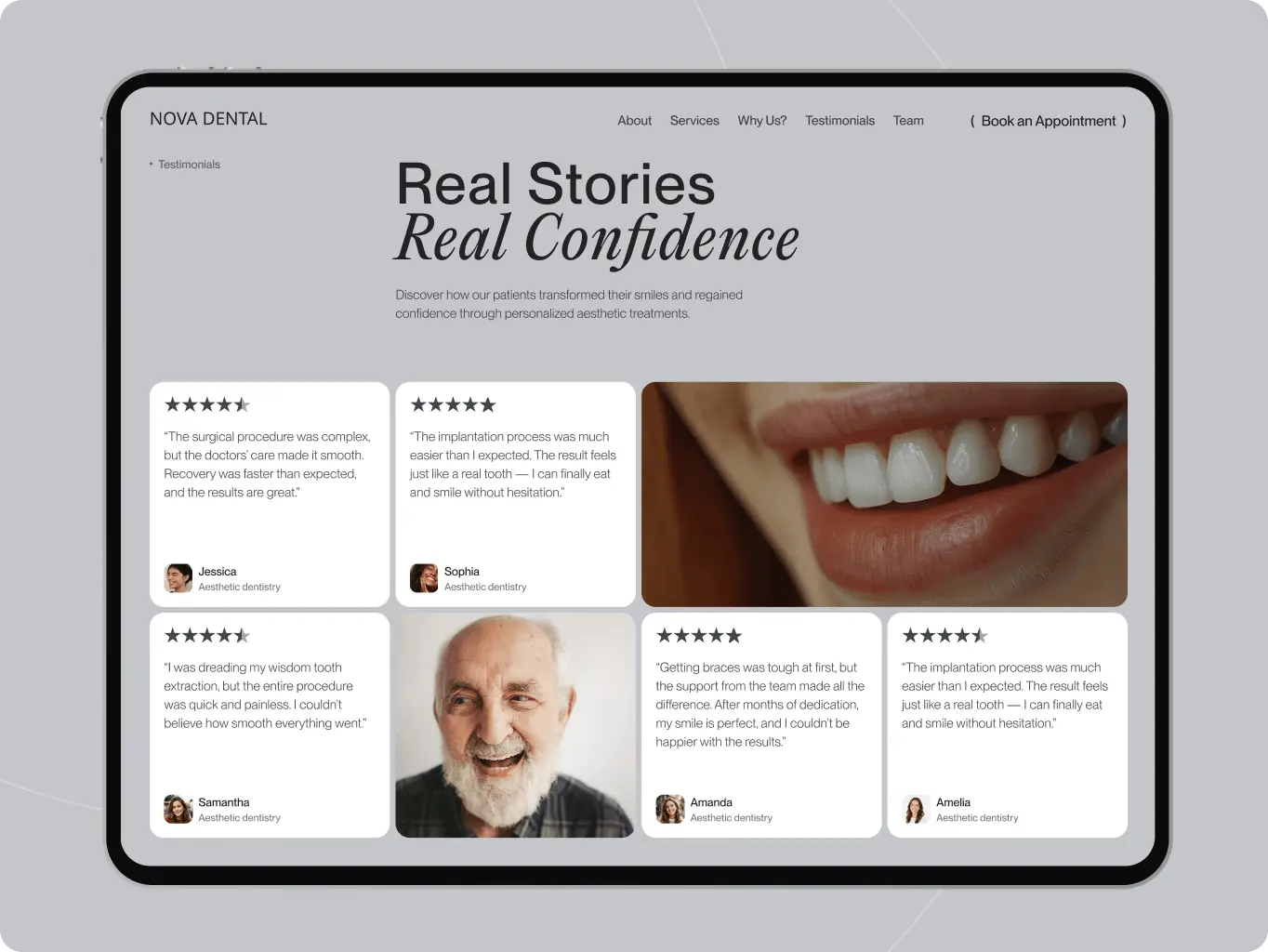
Patient reviews sit beside the booking flow, so visitors see proof of quality at the moment they decide to commit.

Content the clinic can publish without a developer

Procedure explainers and articles live in an editable structure, so the Education Center stays current without a development request per post.

Overview
Redefining what a visit to the dentist can feel like

Dental sites default to one of two failure modes: a directory of services with no explanation, or a booking form long enough that a hesitant visitor abandons before finishing it. Nova Dental was built to be neither — a practice meant to change how a visit feels, starting before the patient ever walks in.

A site that behaved like the category default would have worked directly against that positioning: no way to explain procedures to a nervous first-time visitor, no visible proof from other patients, no path from “interested” to “booked” that didn’t run through a phone call.

Client
Nova Dental Icon - fi_4628635 (12)USA
Technologies
Icon - WebflowWebflow
Business needs
Client request & business goals

Nova Dental was preparing to launch as a new-generation dental practice — one built on trust, technology, and patient comfort — without a website able to carry that positioning. Without one, the practice had no way to turn the trust its brand promised into an actual booked appointment: no education content to answer a hesitant patient’s questions, no visible proof from other patients, and no path from “interested” to “scheduled” that didn’t run through a phone call during office hours.

Left unaddressed, that gap meant losing exactly the patients most worth capturing early — families and professionals comparing several practices before committing to one. Nova Dental needed a site that did the reassuring and the converting in the same visit.

Challenges
Challenge & solutions
Challenge
Comparable dental sites bury booking under multi-step forms. A hesitant visitor abandons before reaching confirmation — and the clinic never learns they were interested.
Solution
We reduced the flow to three linked steps — service, contact details, confirmation — running the same structure on desktop and mobile, so booking reads as one continuous decision instead of a multi-page task.
Challenge
A first-time visitor has no way to judge a dental practice before walking in, and proof of quality usually sits on a separate reviews page they have to go looking for — most don’t, and leave instead.
Solution
We placed real patient reviews directly beside the booking flow, so trust and the decision to book happen in the same view instead of two separate visits to the site.
Challenge
Education content that could turn a hesitant visitor into a confident patient is expensive to keep current if every new article needs a developer — most clinic sites let it go stale within months.
Solution
We structured the Education Center as editable content the clinic’s own team can publish, so new procedure explainers and articles keep appearing without routing through development.
ux/ui design
Structuring the site so a patient trusts the practice before they reach the appointment form

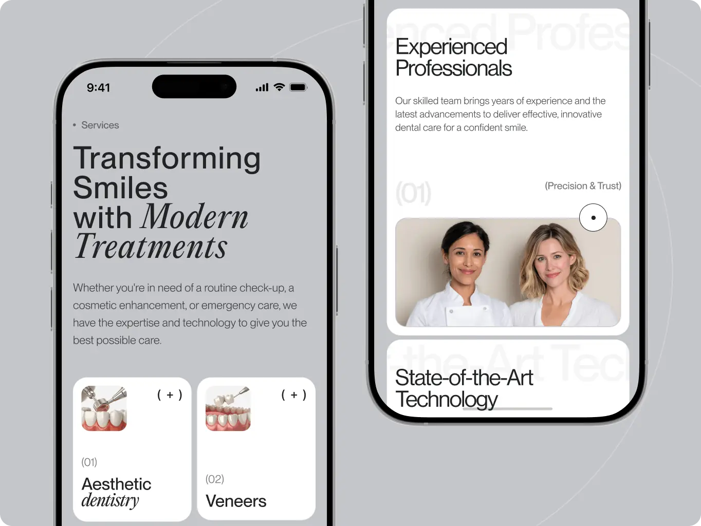
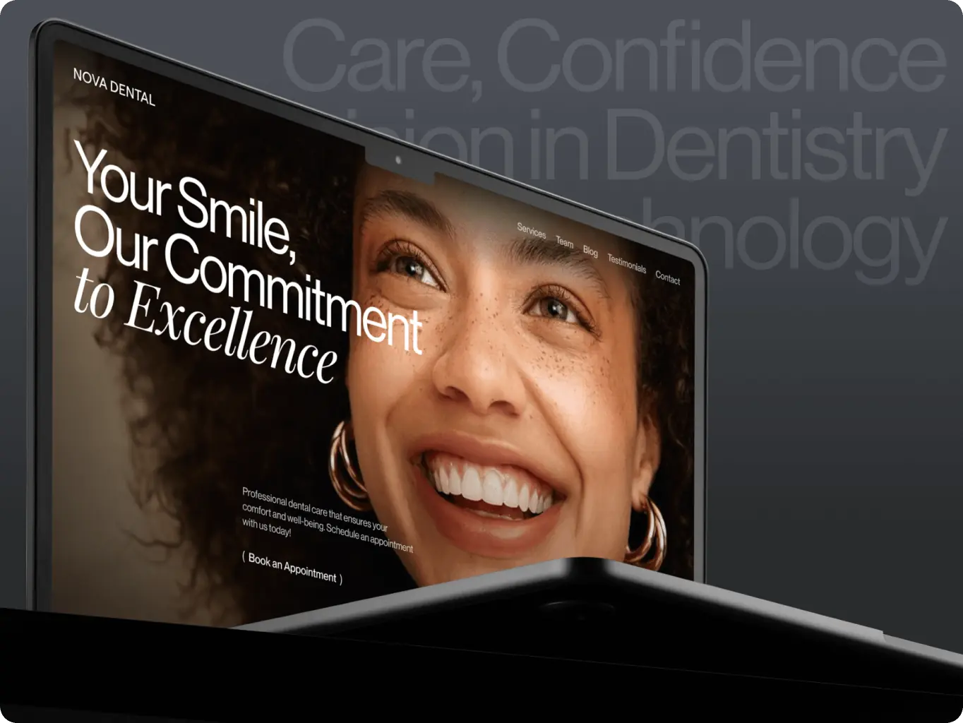
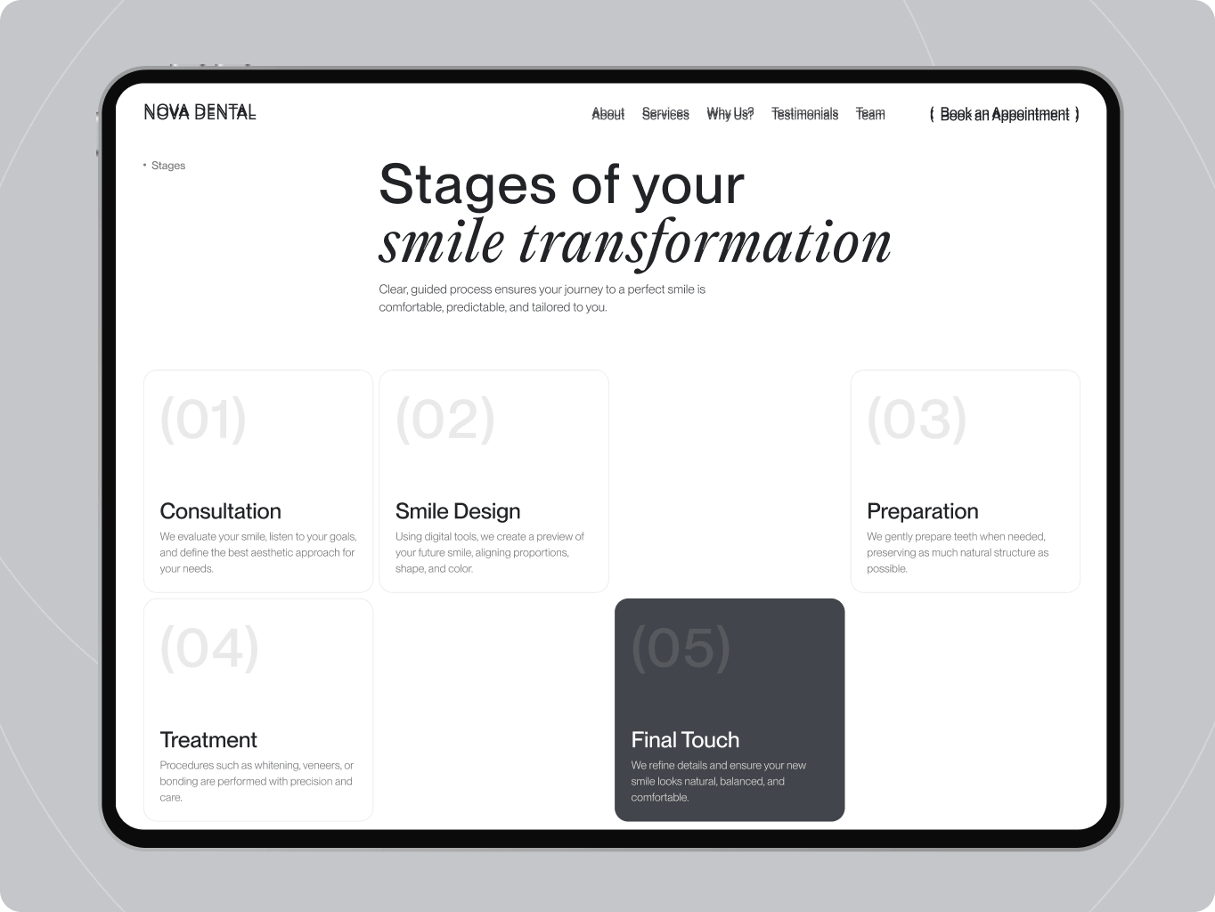
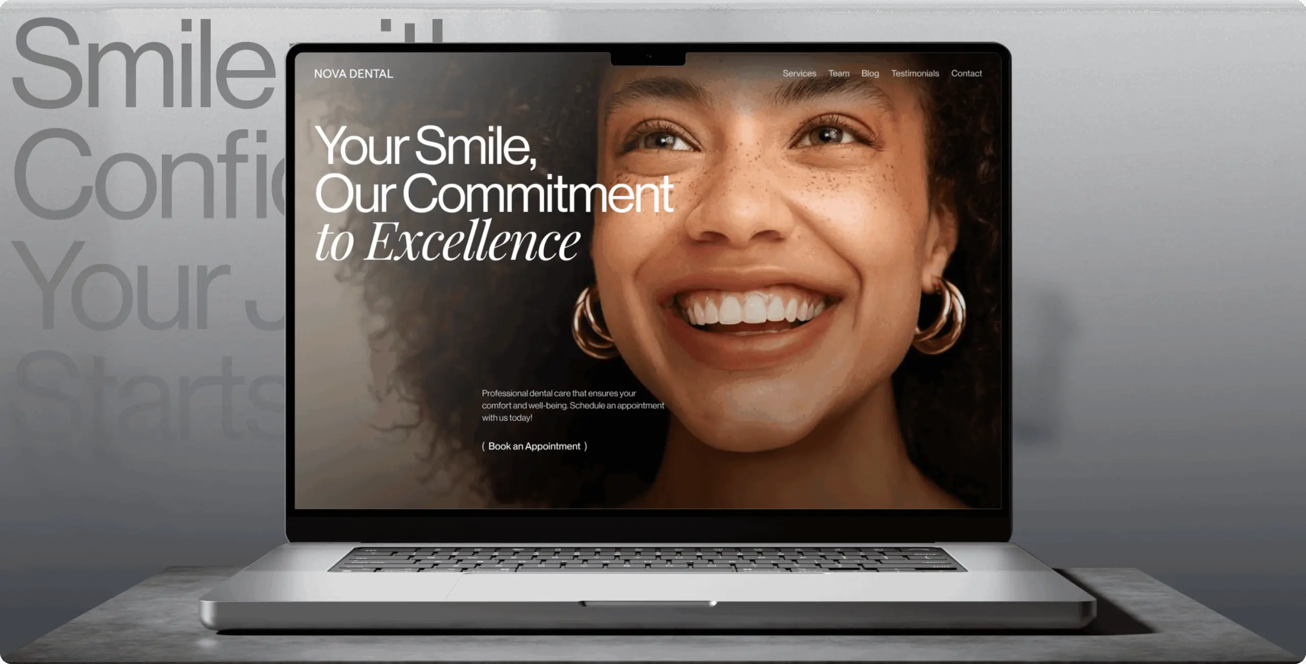
The site was structured around four goals: clear navigation, a distinct brand, expertise, and conversion. Each stage builds on the previous one — helping visitors understand the clinic, explore treatments, see trust signals, and feel ready to book.

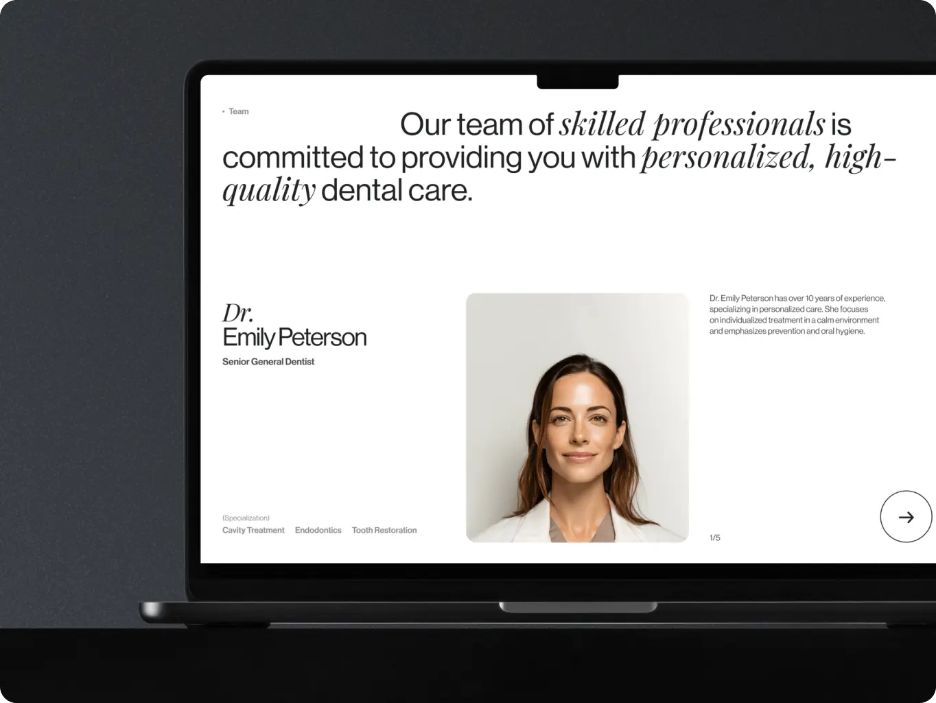
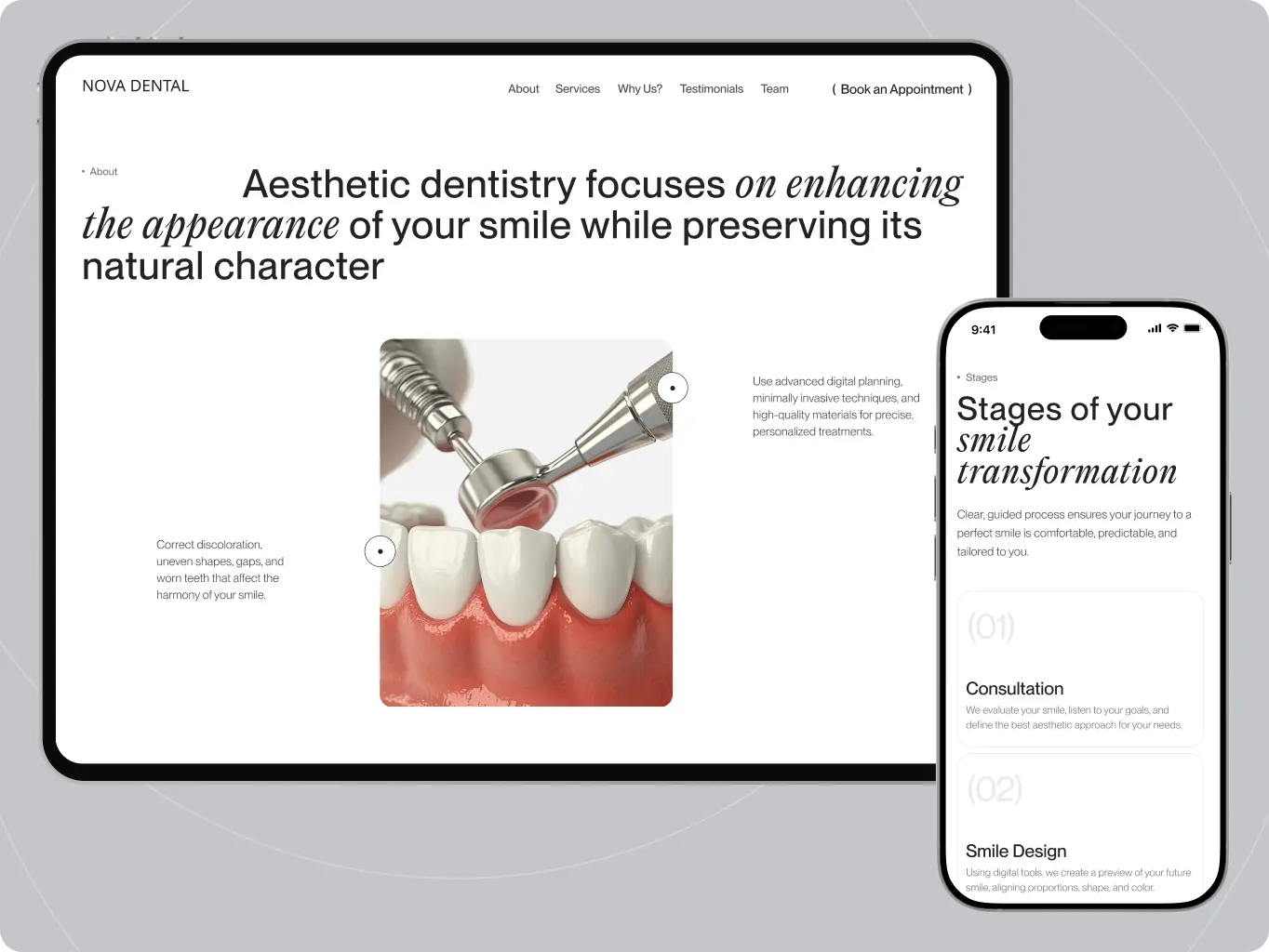
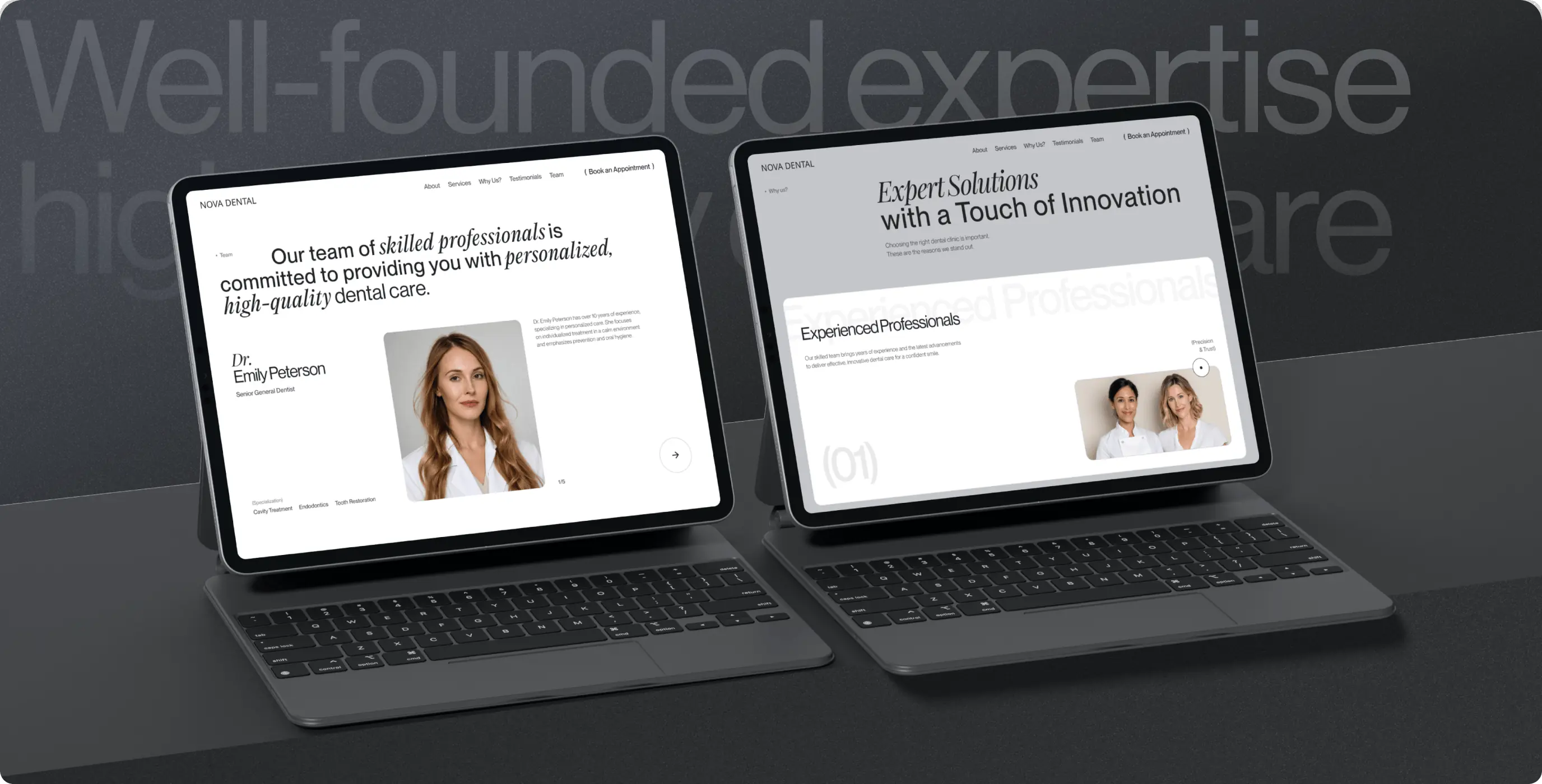
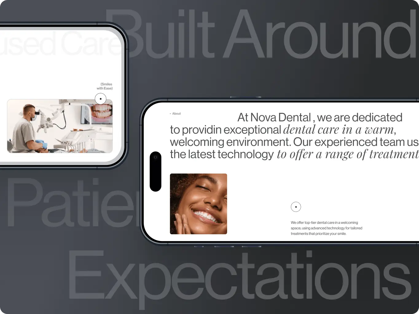
The Services & Education Center builds authority through procedure explanations and articles, while the Team section combines credentials with personal introductions to make the practice feel more familiar.

Trust is reinforced throughout the journey with reviews, ratings, and a “Why Us” section focused on comfort, clarity, and patient experience. Bold typography and minimal visuals keep the message direct.

Booking comes last, with a simple three-step flow — service, contact details, confirmation – consistent across desktop and mobile.

Nova Dental — booking, trust, and education working together to change what visiting feels like - Website Development - Photo 6
Nova Dental — booking, trust, and education working together to change what visiting feels like - Website Development - Photo 9
Nova Dental — booking, trust, and education working together to change what visiting feels like - Website Development - Photo 12
Development
Webflow build structured so the clinic can keep the Education Center current

Articles, procedure explainers, and video content are structured as editable content rather than hard-coded pages, so the clinic’s team can publish new oral health content without a developer for each post. That matters directly for the Authority & Education goal in the brief — the Education Center only keeps making the case for the clinic’s expertise if new content keeps appearing, and that only happens if publishing it doesn’t require an engineering request every time.

Technologies
Selected technologies
Icon - Webflow
Webflow
Nova Dental — booking, trust, and education working together to change what visiting feels like - Website Development - Photo 15
Nova Dental — booking, trust, and education working together to change what visiting feels like - Website Development - Photo 18
Results
Structuring the site to build trust before booking
Booking cut to three steps

Choosing a service, entering contact details, and confirming an appointment happen in one connected flow instead of a multi-page form.

Trust signals moved into the booking decision

Patient reviews sit beside the booking flow, so visitors see proof of quality at the moment they decide to commit.

Content the clinic can publish without a developer

Procedure explainers and articles live in an editable structure, so the Education Center stays current without a development request per post.

Nova Dental set out to be a practice that changes what a dental visit feels like — and needed a site that made that case before a patient ever sat in a chair. The result isn’t just a shorter booking form: it’s three separate points of friction and hesitation — a confusing path to booking, no visible proof of quality, and no way to arrive informed — addressed together, so a visitor moves from uncertain to booked without hitting any of the usual reasons to leave.

A first-time visitor can now learn what a procedure involves, see how other patients rate their experience, and book an appointment in three steps, all without picking up the phone. A returning patient gets the same flow, minus the hesitation. And the clinic keeps the Education Center — the part of the site doing the most to build trust before a visit — current on its own, without depending on a developer for every new article.

More cases
We have dozens of products & hundreds of websites developed by our studio. We're happy to share the results with you!
#Website design #website development
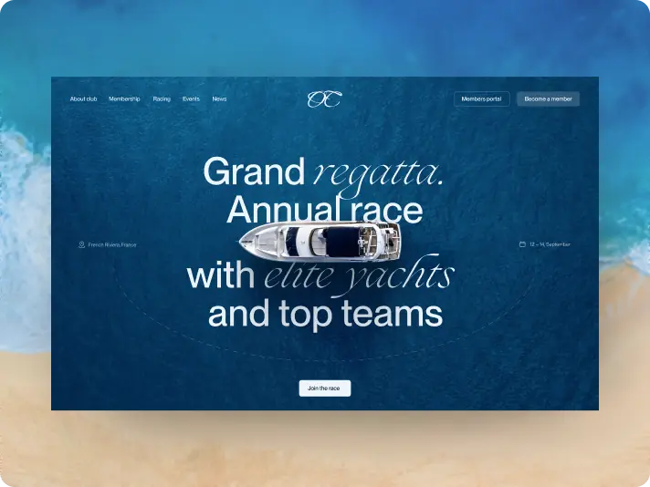
Ocean Crest Yacht Club — a website that turns regatta interest into race entries and membership applications
ocean crest Icon - fi_4628635-3France
Tech Stack

Webflow

Timeline

5 months

Results

Qualified applicants

Shorter path to race entry

Selection stays with the club

#Website redesign #Website development
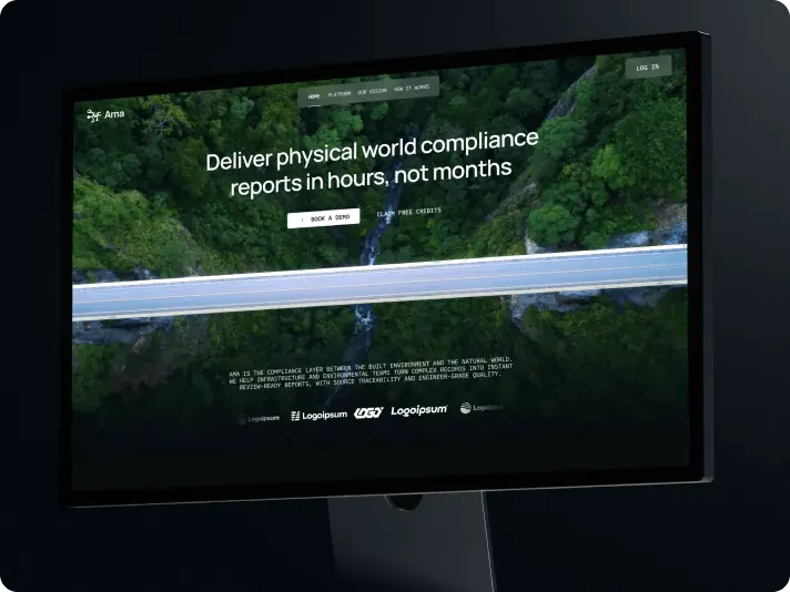
Ama Earth — a website redesign that moved an AI compliance platform from eco branding to enterprise credibility
Ama Earth Icon - fi_4628635 (2)USA
Tech Stack

Next.js, React

Timeline

6 months

Results

Credibility before the first call

A public face ready for the investment round

A direct path to a trial

#Website redesign
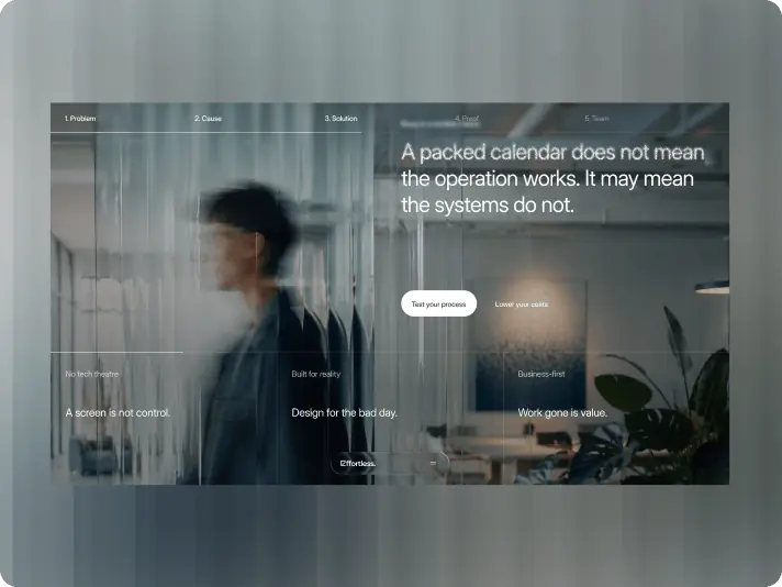
Effortless Technologies — a corporate website redesign built for the visit after the first meeting
Effortless Technologies Icon - fi_4628635Malta
Results

Referrals that hold up on the website

Inquiries that start with the bottleneck

Light that points to the argument

Image - Rectangle 34624328 (2)

Valeria Ceci

CEO, Founder

The final result reflects exactly what we wanted for Effortless — our personality, tone of voice, visual language, and the human element that is so important to our brand. The Phenomenon team was fast, professional, and highly responsive throughout the project.