Navify — how a working campus navigation POC took less time than a clickable prototype

Navify — how a working campus navigation POC took less time than a clickable prototype - Website Development - Photo 1
A working app in ~33% less time than a prototype

Design went straight into code through AI-assisted development, with no separate prototyping step. About 80 hours produced a working app; design and a clickable prototype of the same flows take ~120.

250 rooms managed as data, not code

20 buildings and 58 floors live in a database, so a new building goes live without an app release. The demo can be extended for a specific campus without a development cycle.

1–2 taps from the next class to a room-level route

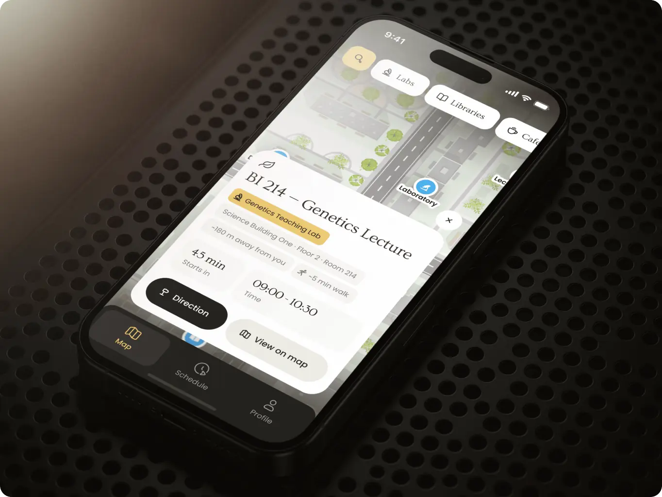
Students see their next class on the map and follow a route to the floor and room. Navify’s core promise can be put in front of students and universities, not described on a slide.

Overview
Indoor navigation for large university campuses

Large university campuses span dozens of buildings and floors, and their maps usually exist as static PDFs. Standard map apps stop at the building entrance, while a student between classes needs the floor and the room.

For Navify, that gap is the product. Universities buy what they can try on their own buildings, and a deck or a clickable mockup can only promise that a route reaches the room. A full production build would prove it — but only after a production budget was committed to an idea nobody had seen work.

Client
Navify Icon - fi_4628635 (2)USA
Services
#Design prototype
Technologies
Icon - image 297 (5)Claude Code Icon - SwiftSwiftUI Icon - image 297-2 (2)MapLibre Icon - image 297 (4)Firebase Icon - AWS-3AWS
Business needs
Client request & business goals

Navify needed to prove that an app with custom indoor maps and a personal schedule works on a real campus, before any university was asked to commit. A proof of concept only proves something if it works. A clickable mockup shows the idea but can’t show that maps, floor plans, routing and schedules hold together in one product.

So the POC had to be fully functional and run on real campus data, to be judged on actual buildings rather than sample screens. It also had to look like the product Navify would sell, not a technical demo — a university decides on what it can see and try. The budget and timeline were those of a POC, and the result had to answer one question: can an app with full map integration handle the specifics of a university campus?
Challenge
Challenges & solutions
Challenge
Map apps stop at the building entrance, while students between classes need the floor and the room. Without indoor routing, Navify would be one more campus map.
Solution
Routes run on the floor plans universities already publish, from the campus map down to the room — with no hardware or university involvement.
Challenge
An empty schedule gives the app nothing to route to, and manual entry is where students give up before seeing any value.
Solution
Classes go into fixed weekly slots with the room picked on the map, so 2 fields turn every class into a route.
Challenge
A clickable prototype shows screens, not whether maps, floor plans and routing work together on real data.
Solution
AI-assisted development turned the custom design into a working app on real campus data in about 80 hours.
Research
Deciding what to build and what to simulate

Research fixed the scope before any design time was spent, which matters most when a POC has a tight budget. We studied how leading map products handle outdoor and indoor views and mapped the student scenarios the app had to cover, from opening the app to reaching a room.

The map stack was decided here too, because it defines what the design can promise. Google Maps Indoor and HERE Indoor were ruled out, since both need the building owner to upload floor plans. MapLibre took the outdoor map, and indoor routes were drawn on the floor plans universities already publish instead of relying on BLE beacons. Navify got indoor navigation in the POC and a clear path to live positioning later.

Stages

  • Competitor analysis
  • User flow
Navify — how a working campus navigation POC took less time than a clickable prototype - Website Development - Photo 6
Stage 1
Competitor analysis

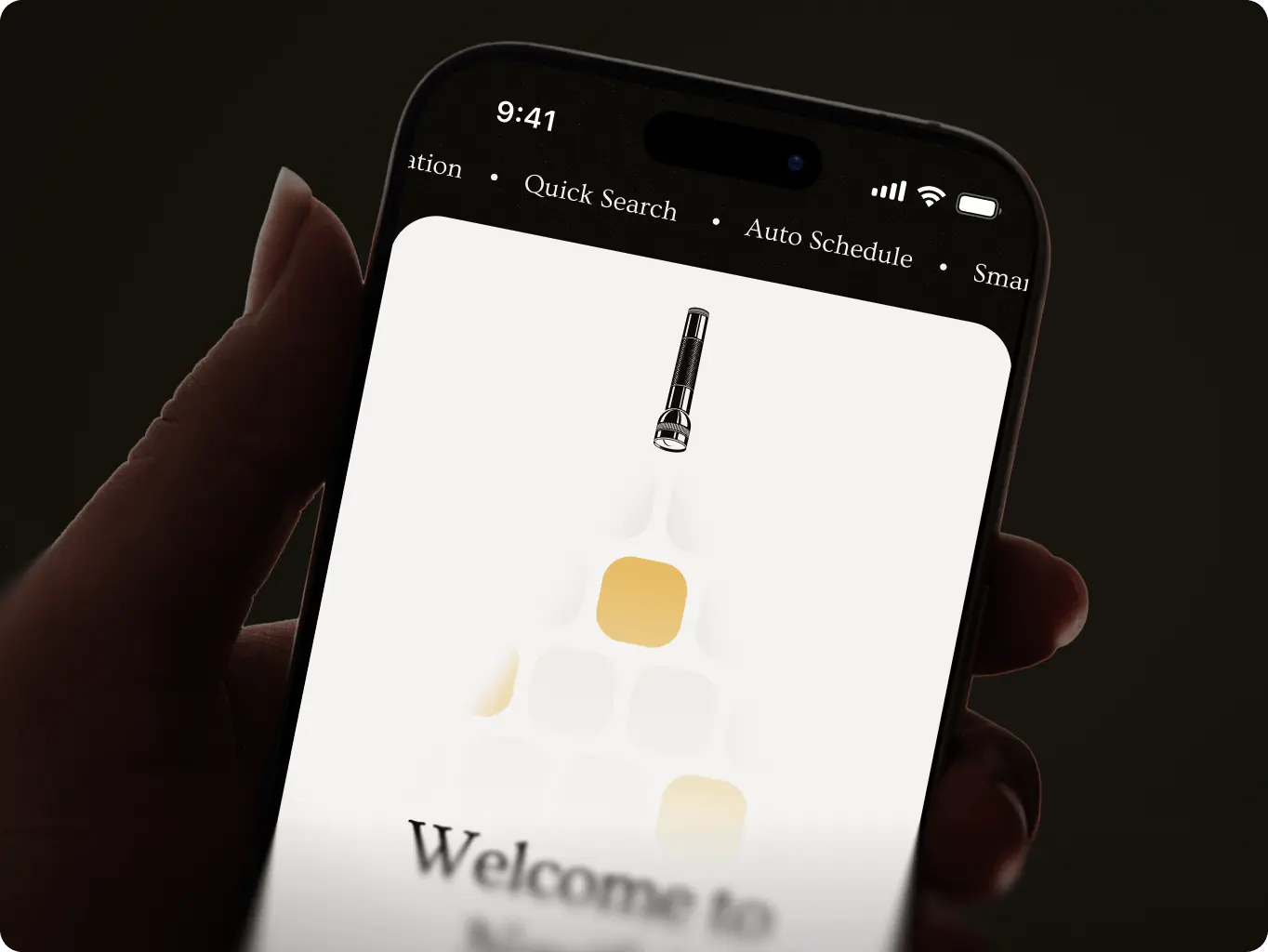
Positioned Navify as one product where the schedule and the map work together, instead of two separate tools. 2GIS set the bar for moving from the street into a building and across its floors, while Campus Maps and Firefield U set the bar for what students need between classes.

This gives Navify a pitch a university understands in one sentence: the schedule knows where you need to be, and the map takes you there.
Stage 2
User flow

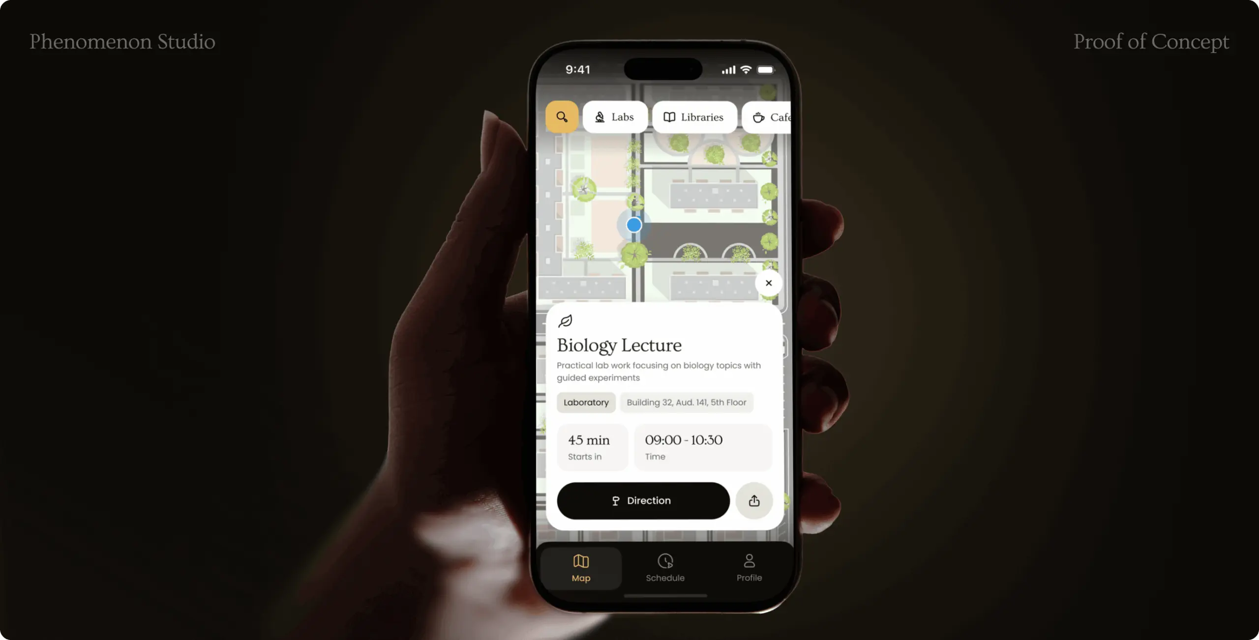
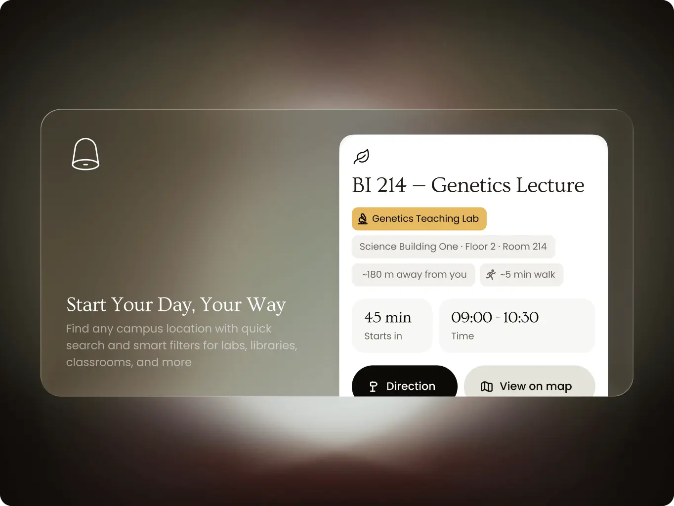
Made the map the center of the app, so every scenario, from a search to a class in the schedule, ends in a route without switching screens. Students get from intent to directions in 1–2 taps.

A short path to the route is what turns a campus map into a daily tool. For Navify, a focused structure also kept the POC buildable in about 80 hours without cutting any scenario it had to demonstrate.
Navify — how a working campus navigation POC took less time than a clickable prototype - Website Development - Photo 9
Design
Custom product, designed straight into working code

We decided to set the visual direction by hand and build the interface directly in code. A POC is judged by what people can try, so the shortest way from idea to proof was a working product, not a stack of static screens waiting for development.

Keeping the direction human-made protected the custom design, and building in code removed the handoff where designs usually get simplified. Navify got one artifact that is both the design and the working POC.

Stages

  • Visual direction
  • UI design
  • Working build
Navify — how a working campus navigation POC took less time than a clickable prototype - Website Development - Photo 10
Stage 1
Visual direction

Produced quick concepts in Figma before any code, to settle a look of Navify’s own: a warm palette, a yellow accent, serif headings and a color per building category. We started by hand because a direction defined by a designer keeps the product away from the generic, AI-generated look of most map apps.

The result is an identity a university can put its name on, and category colors that work as wayfinding: a student recognizes a lab or a library by color before reading its name.
Stage 2
UI design

Translated the user flows and the visual direction into a working interface, with AI-assisted development in place of static screens. It started with a design system — color tokens, a type scale, spacing, radii and motion timings — so every screen draws from one source.

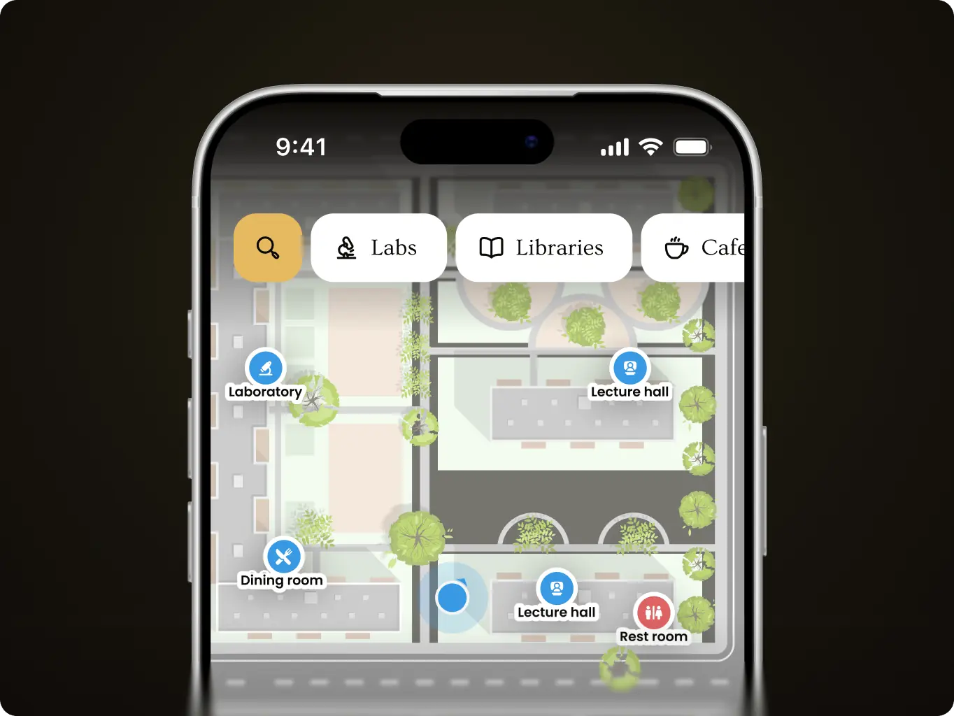
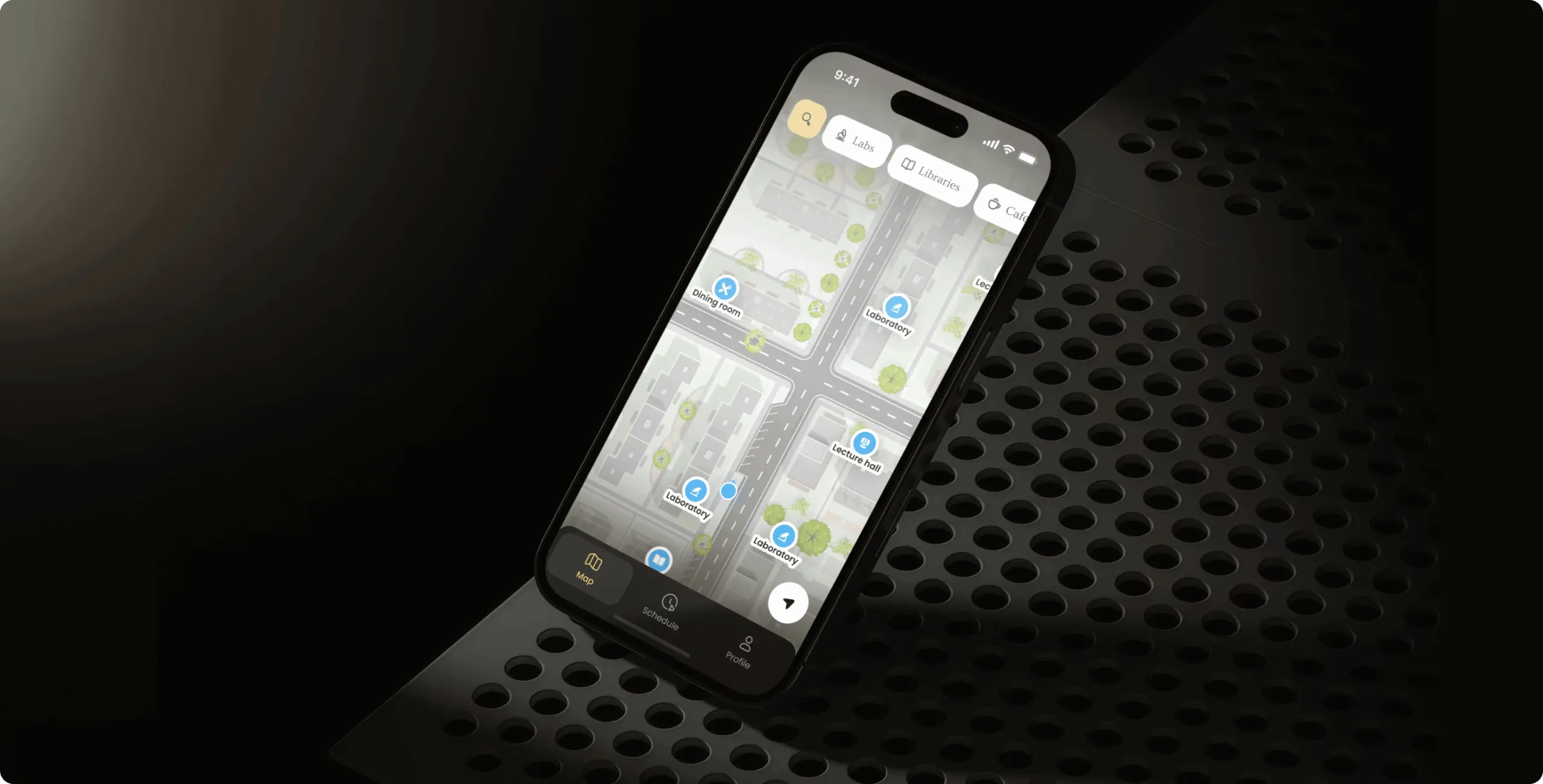
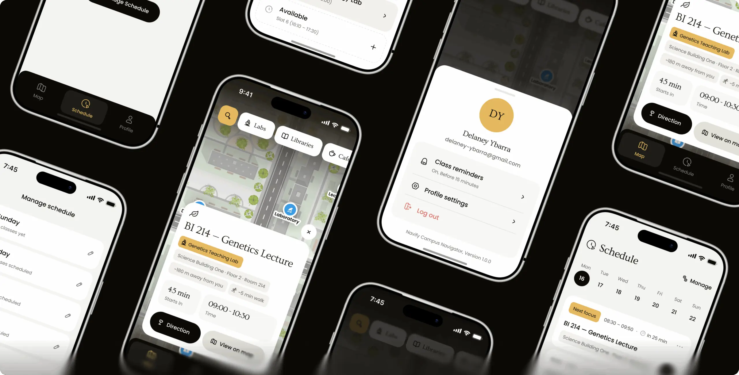
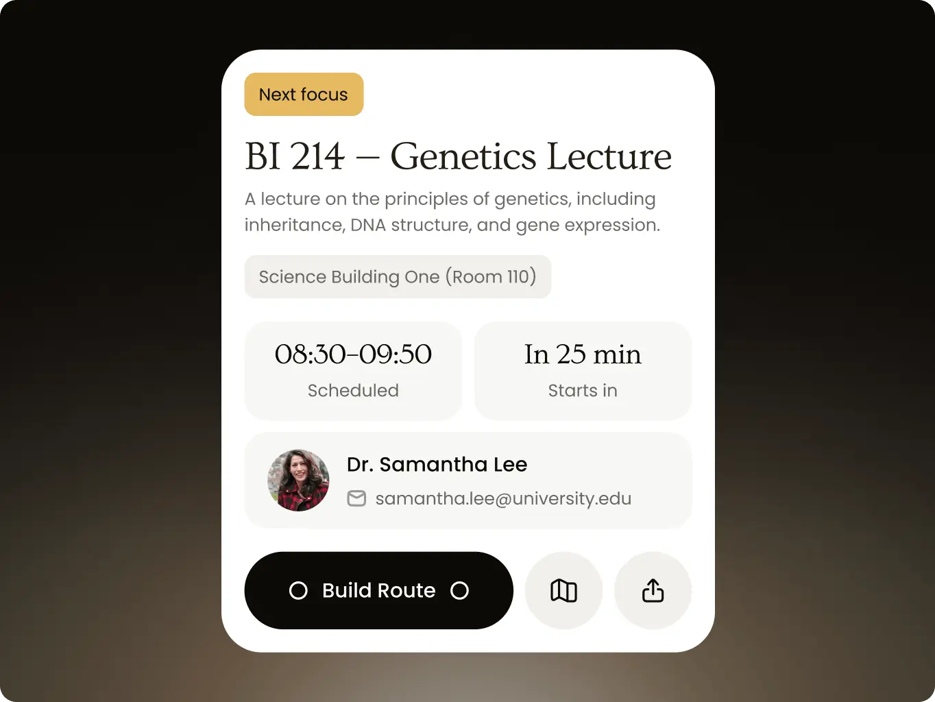
The interface follows a map-first principle: the map stays under every screen, and actions open in sheets on top of it, so students never lose their place on campus. Category colors read the same on filters, pins and class cards, and every route starts from wherever the student already is.
Stage 3
Working build

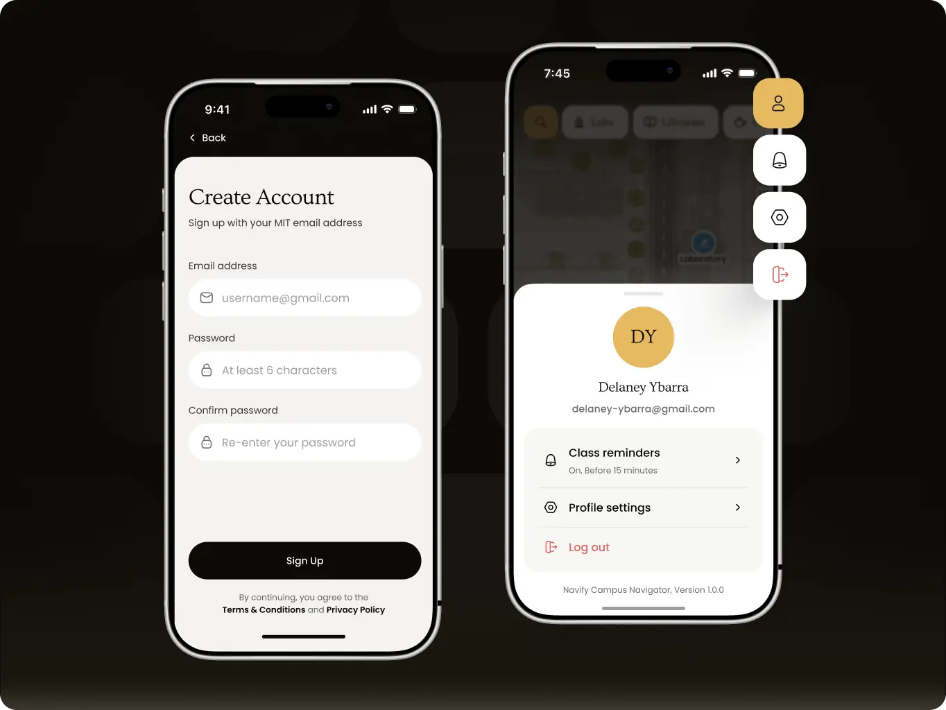
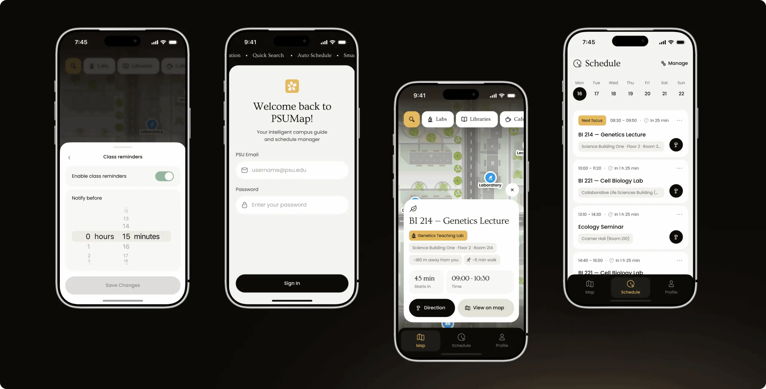
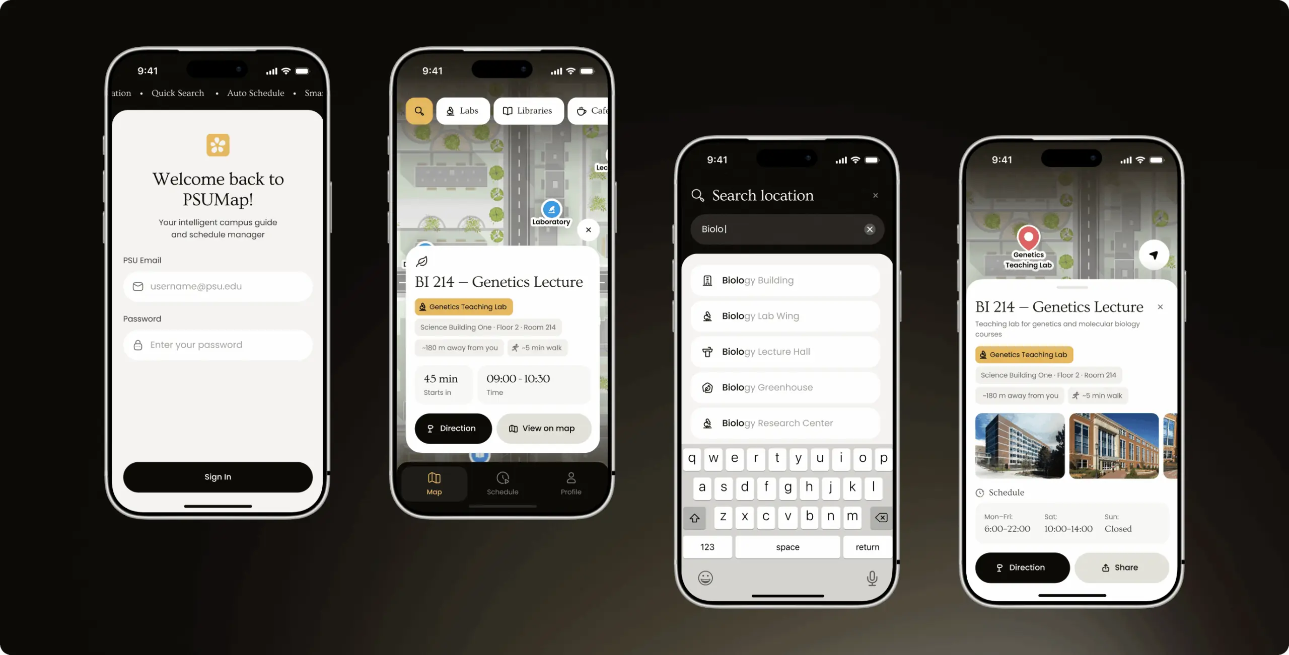
Connected the interface to a live Firebase backend and built it for a real phone. Students sign in once and see only their own schedule, and campus data, from buildings to floors and rooms, lives in the database.

Navify tests the POC on a device with real accounts instead of a demo link.
Navify — how a working campus navigation POC took less time than a clickable prototype - Website Development - Photo 15
Features
Project’s core features
Navify — how a working campus navigation POC took less time than a clickable prototype - Website Development - Photo 18
Navify — how a working campus navigation POC took less time than a clickable prototype - Website Development - Photo 19
Navify — how a working campus navigation POC took less time than a clickable prototype - Website Development - Photo 20
Navify — how a working campus navigation POC took less time than a clickable prototype - Website Development - Photo 21
Navify — how a working campus navigation POC took less time than a clickable prototype - Website Development - Photo 22
Navify — how a working campus navigation POC took less time than a clickable prototype - Website Development - Photo 23
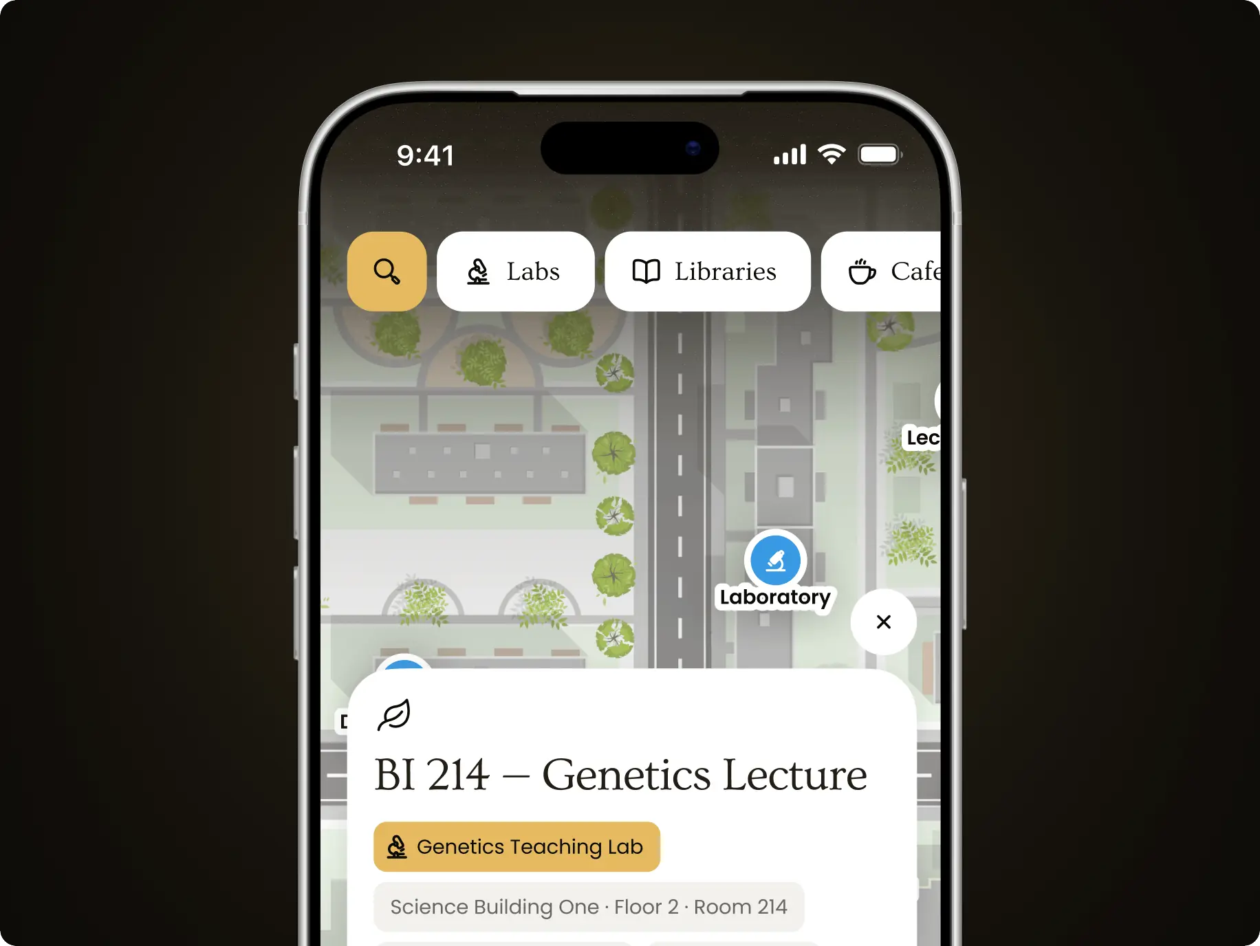
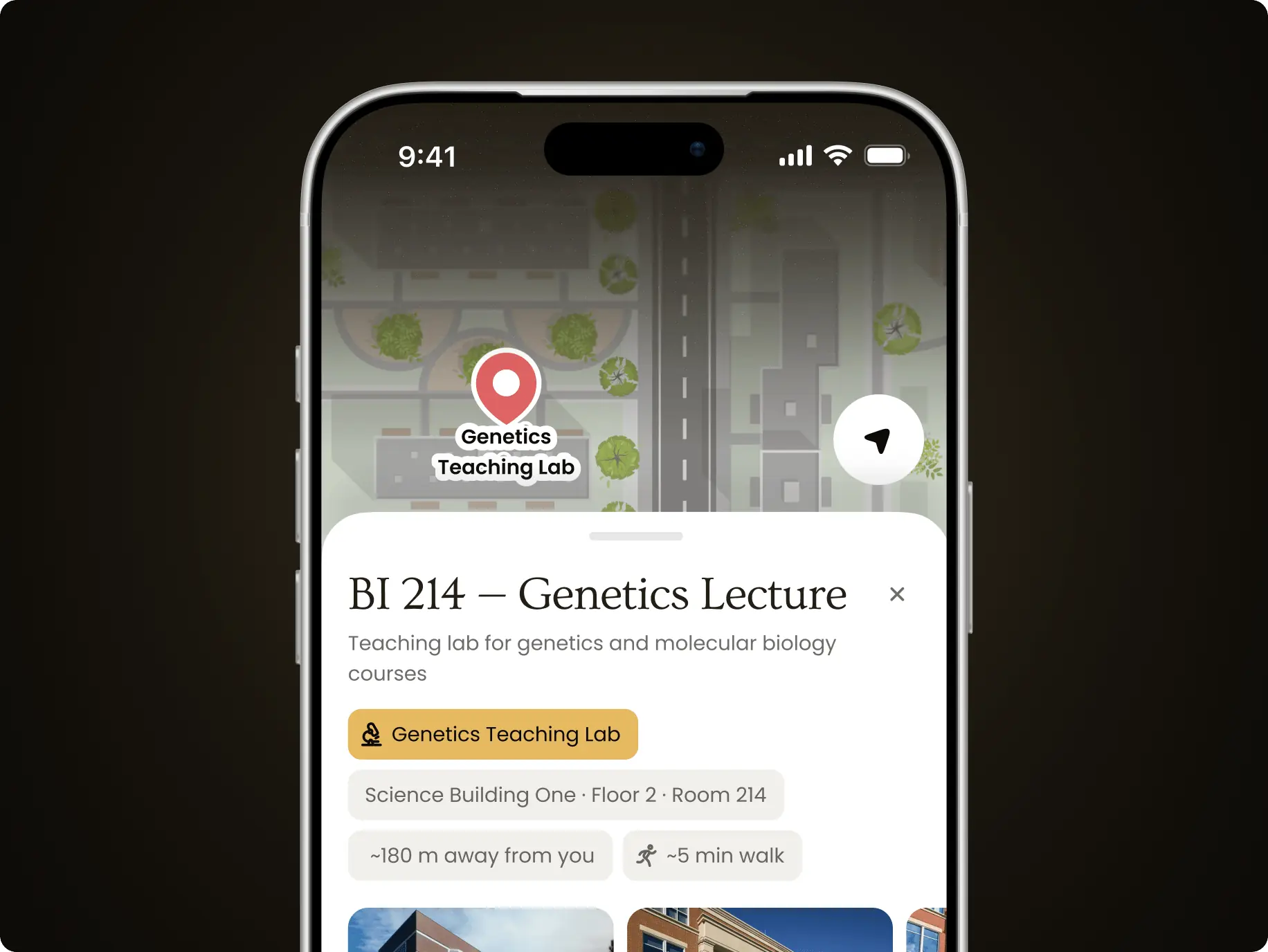
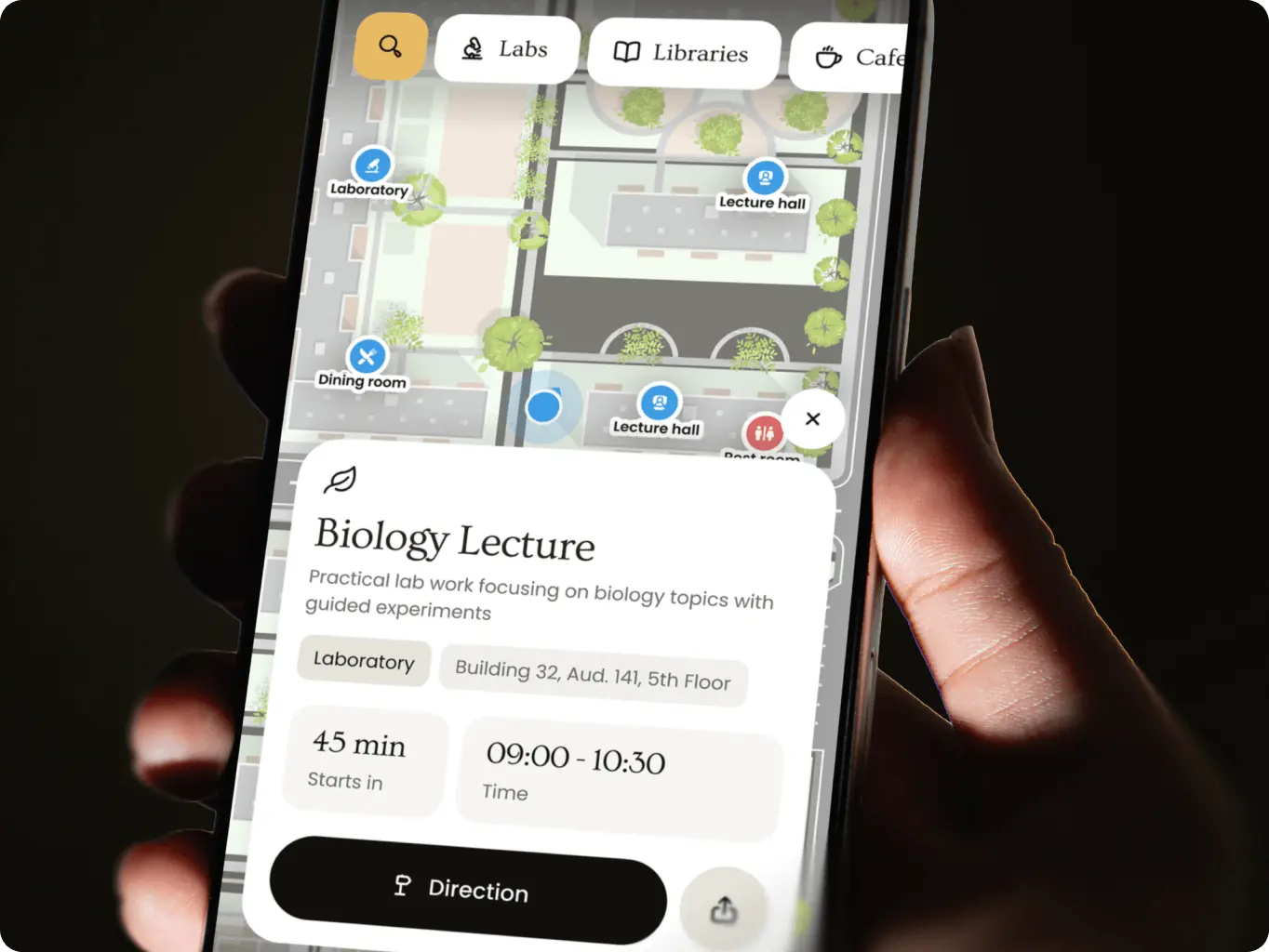
Campus map with category filters

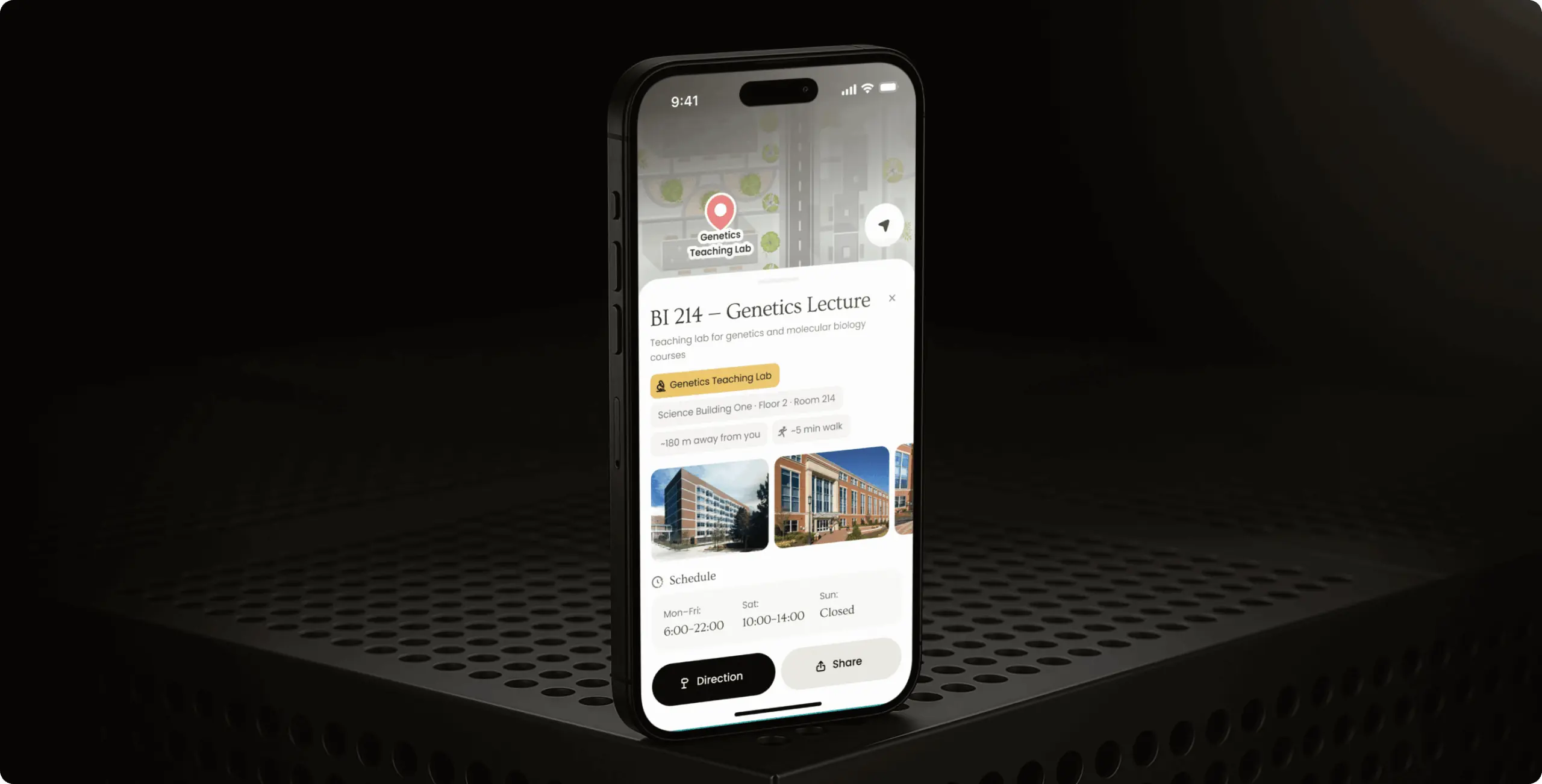
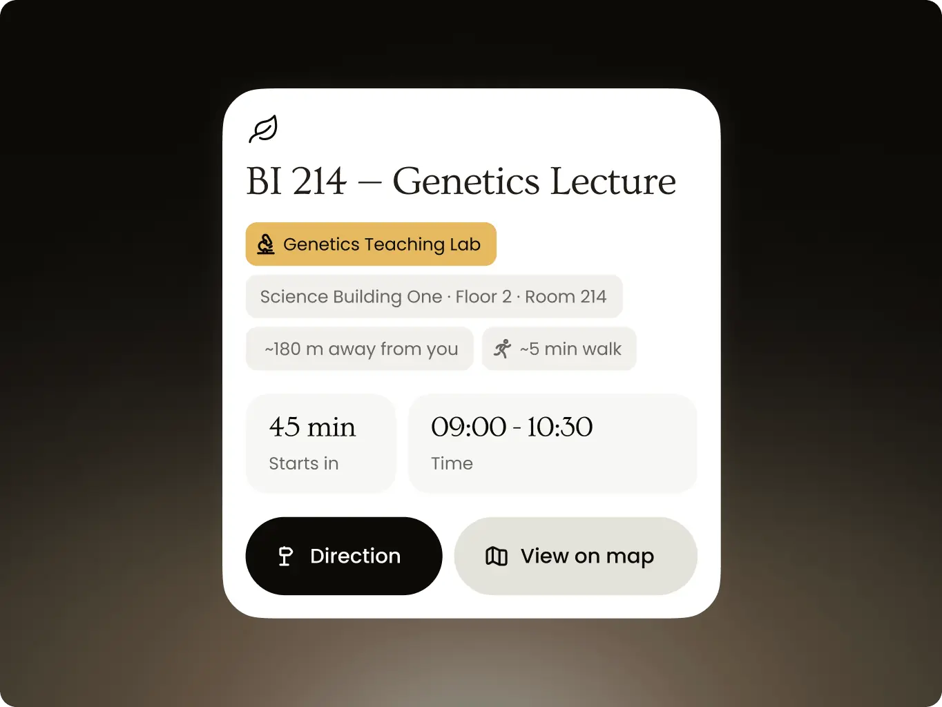
Students filter the map by lecture halls, labs, libraries and cafeterias, and a building card shows the floor, room and opening hours. Whether a place is open is clear without leaving the map.

Navify — how a working campus navigation POC took less time than a clickable prototype - Website Development - Photo 24
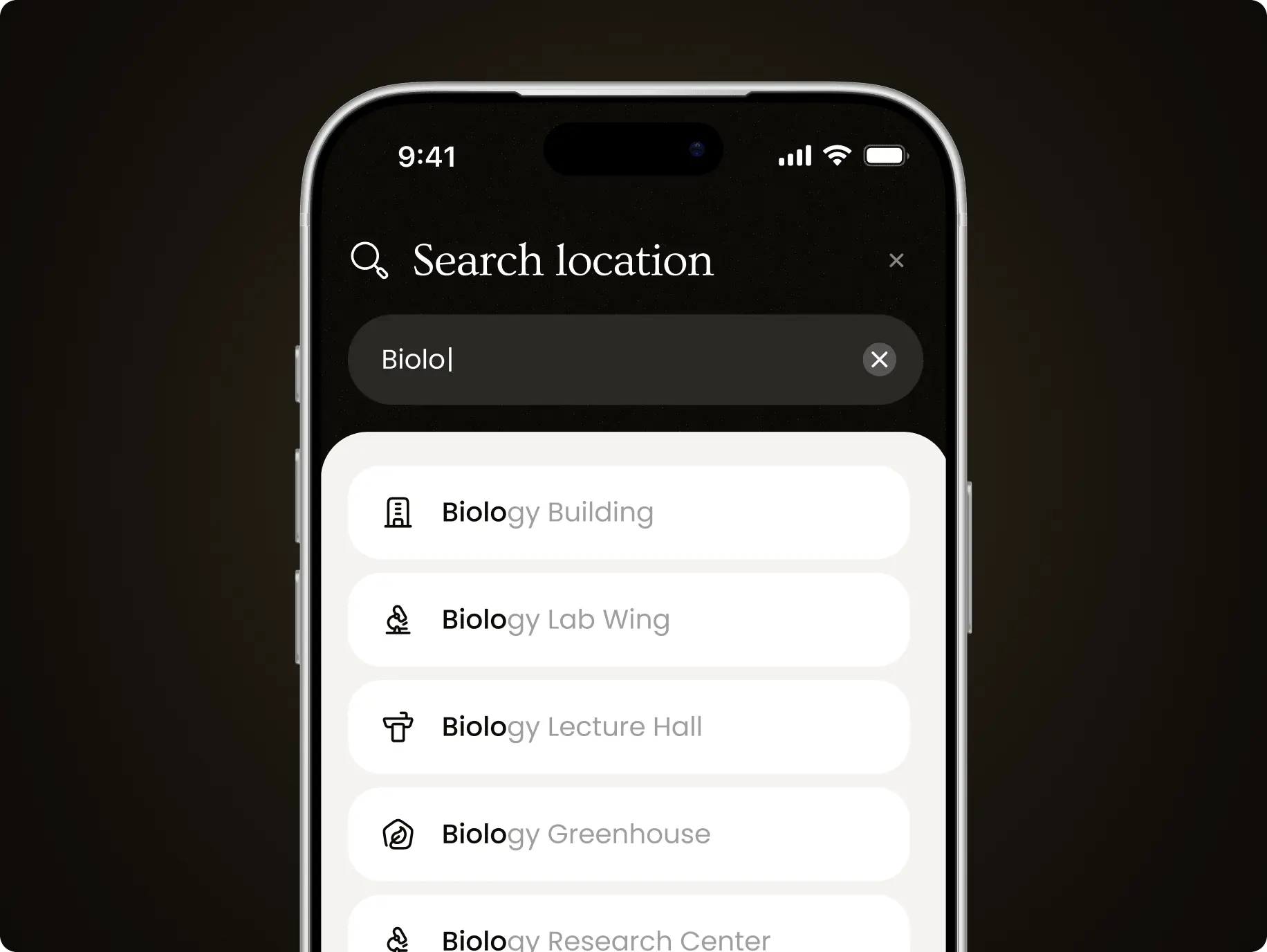
Search with live suggestions

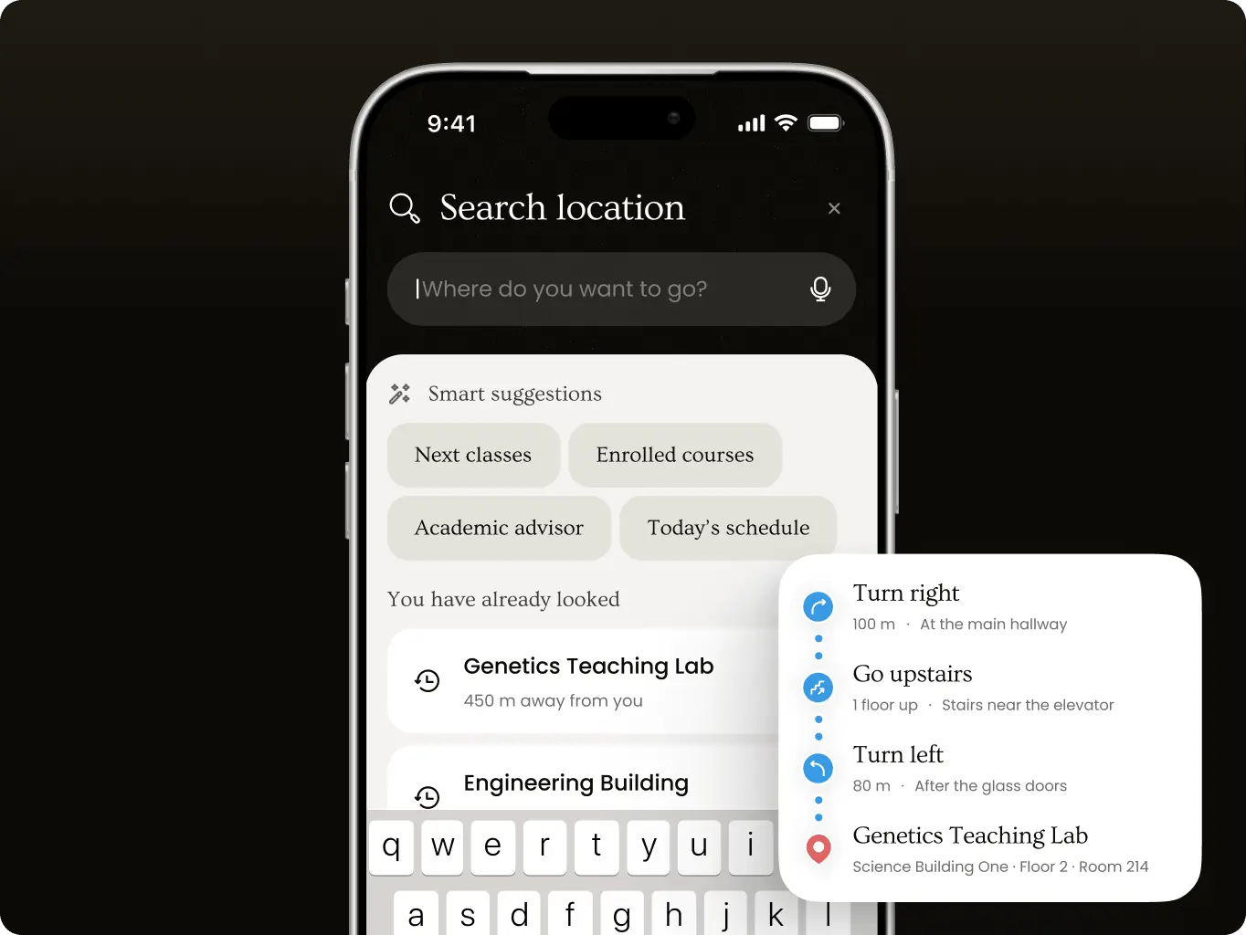
Between classes, students search by room number or building name, and results appear as they type. Recent searches return when the field is empty, so the rooms they use most stay at hand.

Navify — how a working campus navigation POC took less time than a clickable prototype - Website Development - Photo 25
Route down to the room

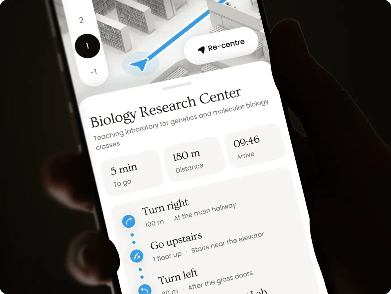
From the student’s location to the building, then step by step inside it: turns with distances, landmarks like the glass doors, and which stairs lead to the right floor. The route ends at the room, not at the entrance.

Navify — how a working campus navigation POC took less time than a clickable prototype - Website Development - Photo 26
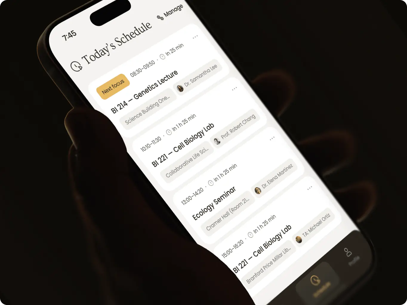
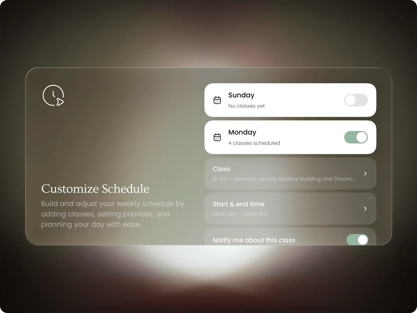
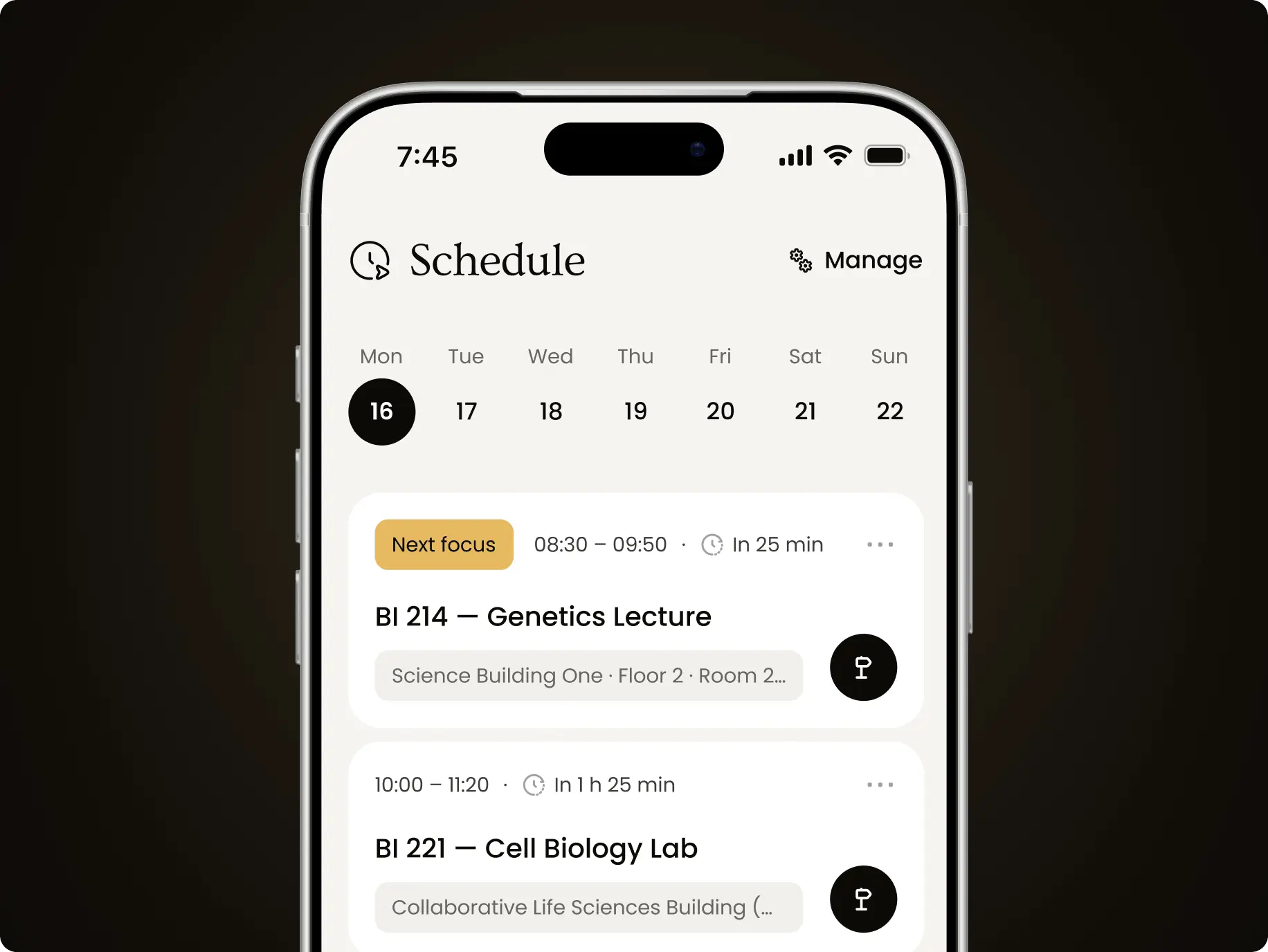
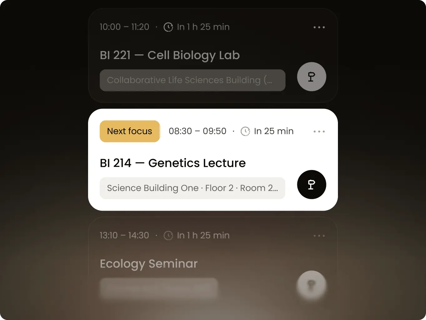
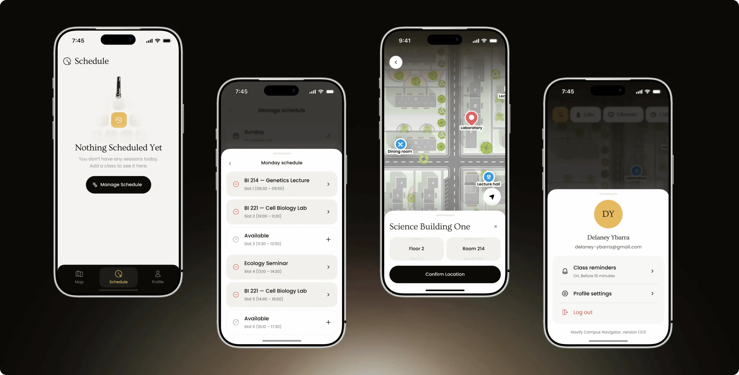
Schedule in fixed slots

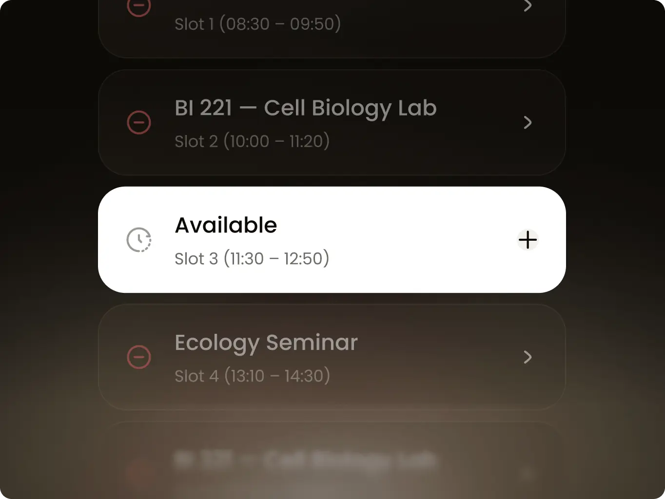
A weekly view shows each day’s classes in fixed time slots. Adding a class means picking a slot and choosing the room on the map, and the next class always waits on the home screen.

Navify — how a working campus navigation POC took less time than a clickable prototype - Website Development - Photo 27
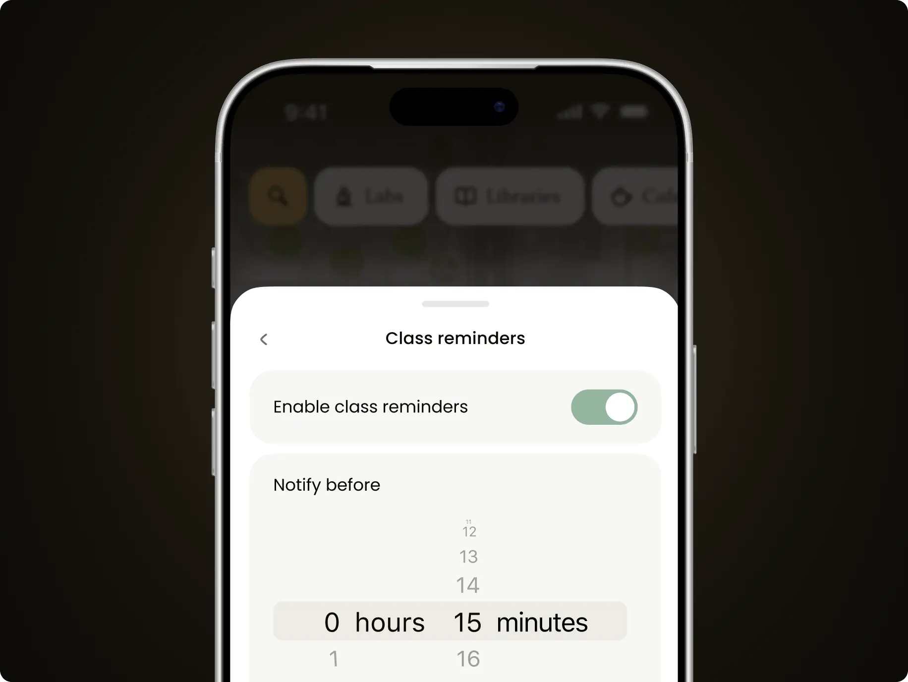
Class reminders

Students turn reminders on and set how early to be notified, in hours and minutes before class. The reminder arrives in time to cross the campus, not when the class is already starting.

Development
A working build, scoped to what the POC had to prove

Development ran on AI-assisted coding with Claude Code, working from the design system set at the UI stage. Every screen draws from the same tokens and components, so the custom design holds across the map, the schedule and the profile. SwiftUI runs the app, MapLibre the campus map, and Firebase keeps accounts, schedules and campus data.

The build was scoped to what a POC has to prove: real data, real accounts and routes that reach the room. Code structure and test coverage stayed at POC level on purpose, because the production version is a separate build.
Navify — how a working campus navigation POC took less time than a clickable prototype - Website Development - Photo 28
Technologies
Selected technologies
Icon - image 297 (5)
Claude Code
Icon - image 297 (4)
Firebase
Icon - image 297-2 (2)
MapLibre
Icon - image 297-3 (2)
SwiftUI
Icon - image 297-4 (2)
AWS
Navify — how a working campus navigation POC took less time than a clickable prototype - Website Development - Photo 29
Results
One question answered with a working app, not a slide
A working app in ~33% less time than a prototype

Design went straight into code through AI-assisted development, with no separate prototyping step. About 80 hours produced a working app; design and a clickable prototype of the same flows take ~120.

250 rooms managed as data, not code

20 buildings and 58 floors live in a database, so a new building goes live without an app release. The demo can be extended for a specific campus without a development cycle.

1–2 taps from the next class to a room-level route

Students see their next class on the map and follow a route to the floor and room. Navify’s core promise can be put in front of students and universities, not described on a slide.

Navify shows it can. An idea that would have gone to universities as a deck now runs on a phone — with indoor routes, a weekly schedule and campus data in a live database.

Navify can now put a working product in front of the people who decide, and start production with flows already tested on real data.

Future plans
What happened next?

A POC is built to prove the concept, not to be the product. The production version follows our standard development process with the engineering team — and starts from flows already tested on real campus data, a finished custom design and campus data collected for 20 buildings.
More cases
We have dozens of products & hundreds of websites developed by our studio. We’re happy to share the results with you!
#Web app design #Web app development
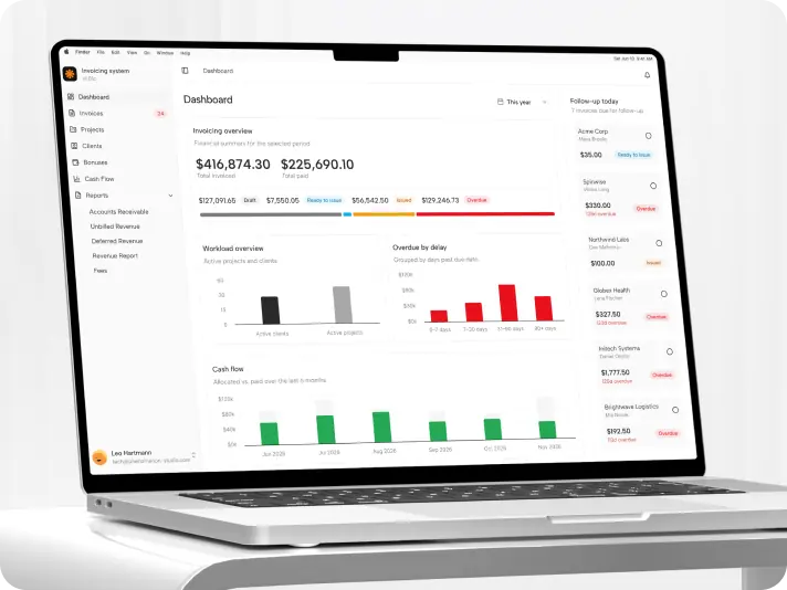
Internal invoicing system — a production billing platform built in 3 months by an AI-assisted team
Phenomenon Studio (internal product) Icon - fi_4628635 (2)USA
Tech Stack

React, TypeScript, TanStack, Tailwind CSS, Zod

Timeline

5 months

Results

30% faster month-end close

2× faster invoice preparation

40% shorter delivery

#Website design #website development
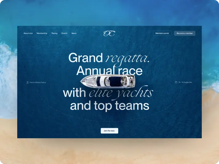
Ocean Crest Yacht Club — a website that turns regatta interest into race entries and membership applications
ocean crest Icon - fi_4628635-3France
Tech Stack

Webflow

Timeline

5 months

Results

Qualified applicants

Shorter path to race entry

Selection stays with the club

#Website redesign #Website development
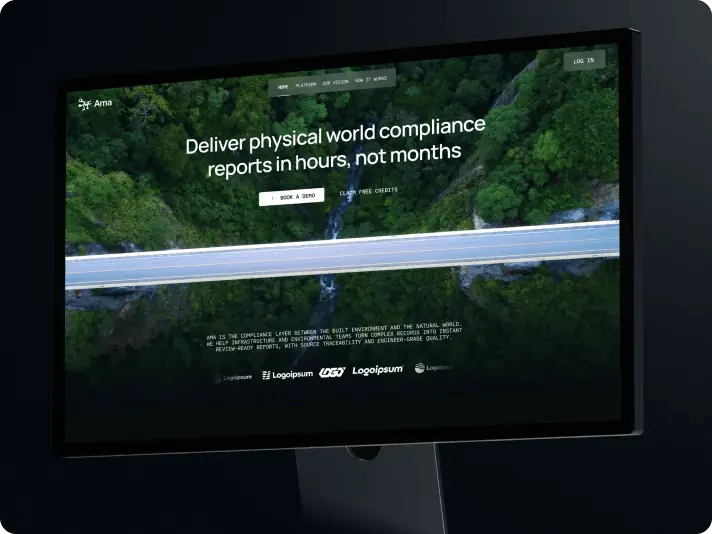
Ama Earth — a website redesign that moved an AI compliance platform from eco branding to enterprise credibility
Ama Earth Icon - fi_4628635 (2)USA
Tech Stack

Next.js, React

Timeline

6 months

Results

Credibility before the first call

A public face ready for the investment round

A direct path to a trial