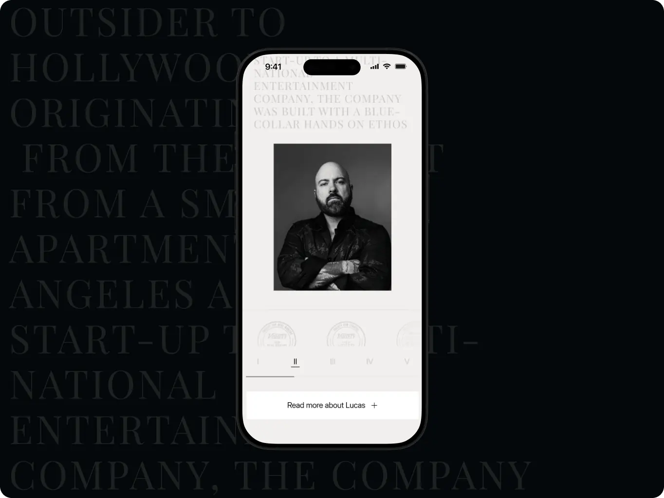
Milk & Honey turning a scattered multi-page site into one story a visitor can follow start to finish

Milk & Honey — turning a scattered multi-page site into one story a visitor can follow start to finish - Website Development - Photo 1
The site finally reads like the company it represents

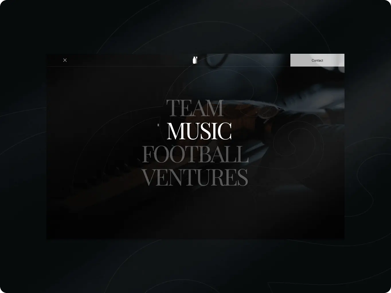
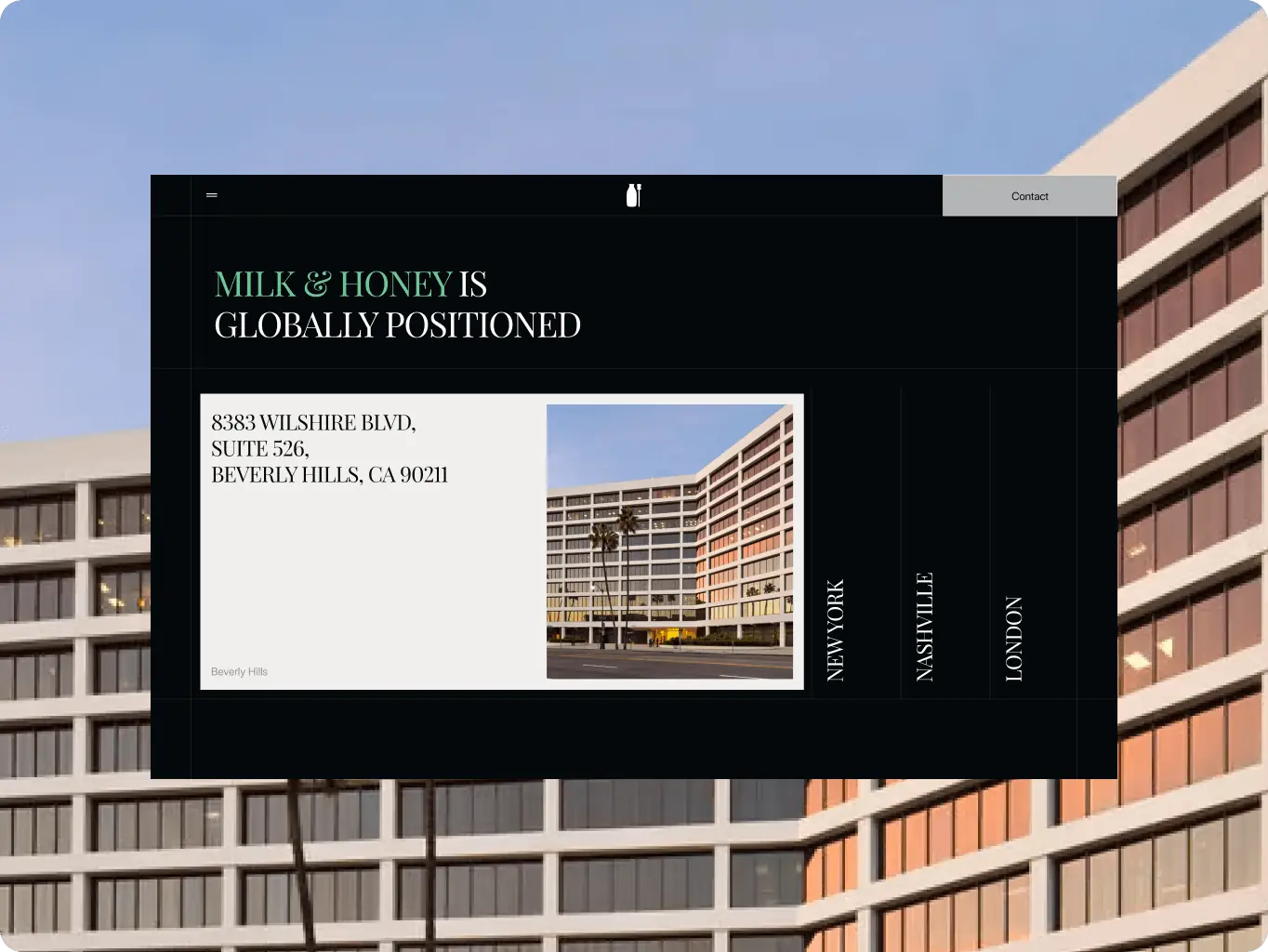
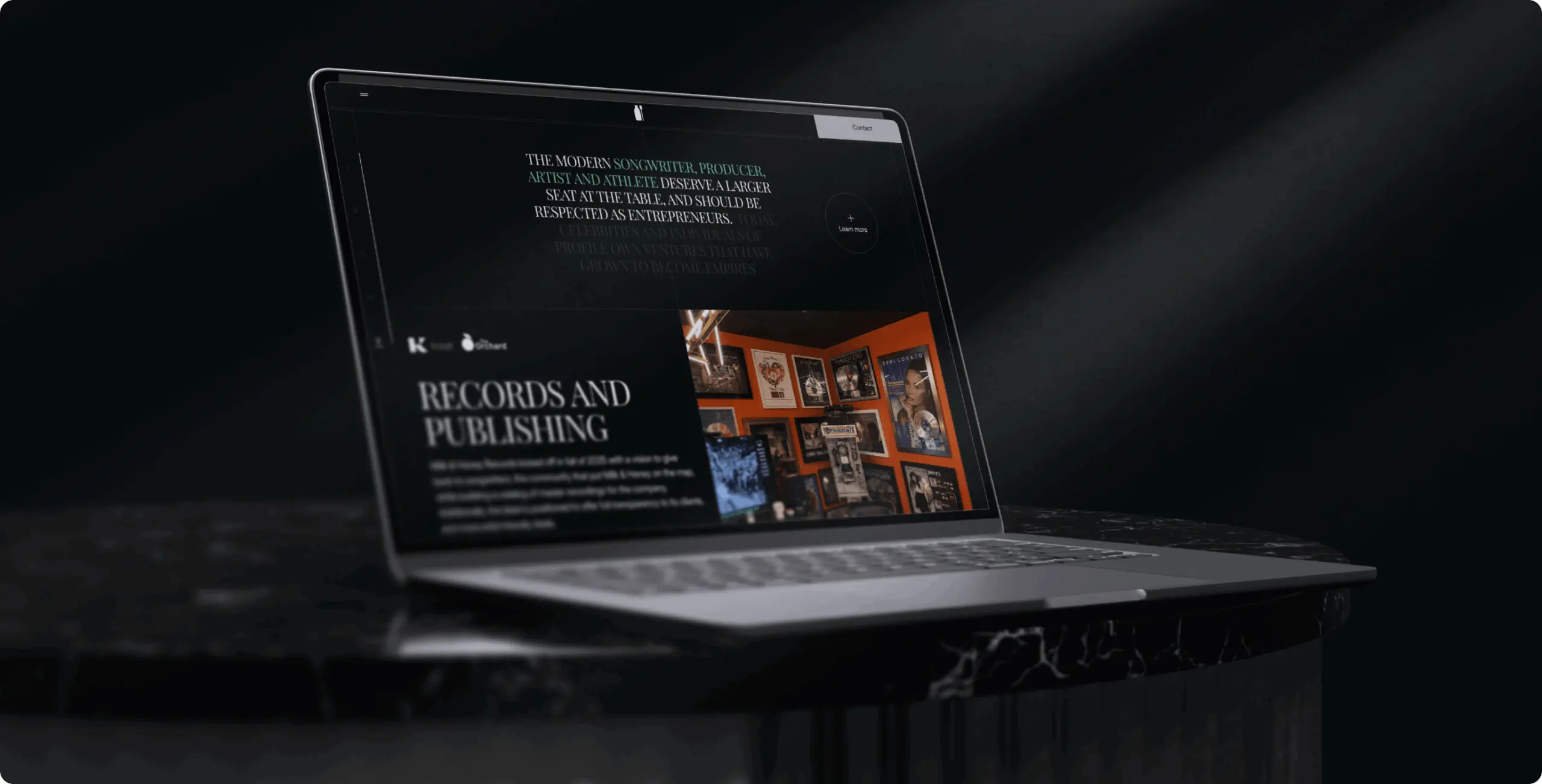
The three-division story, once split across separate pages and third-party redirects, now runs as a single landing page with modals for depth.

Visitors keep scanning dense content instead of dropping off

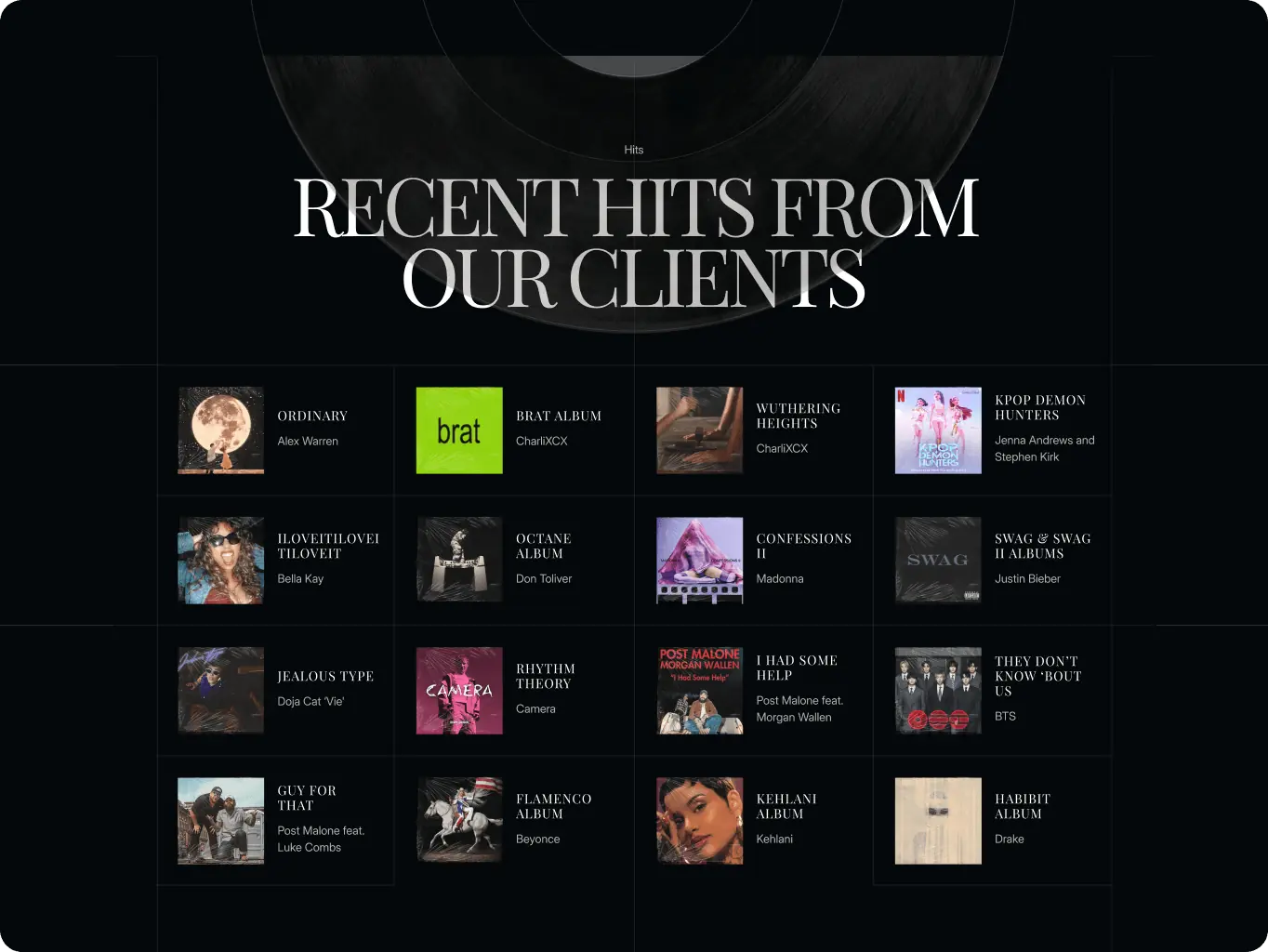
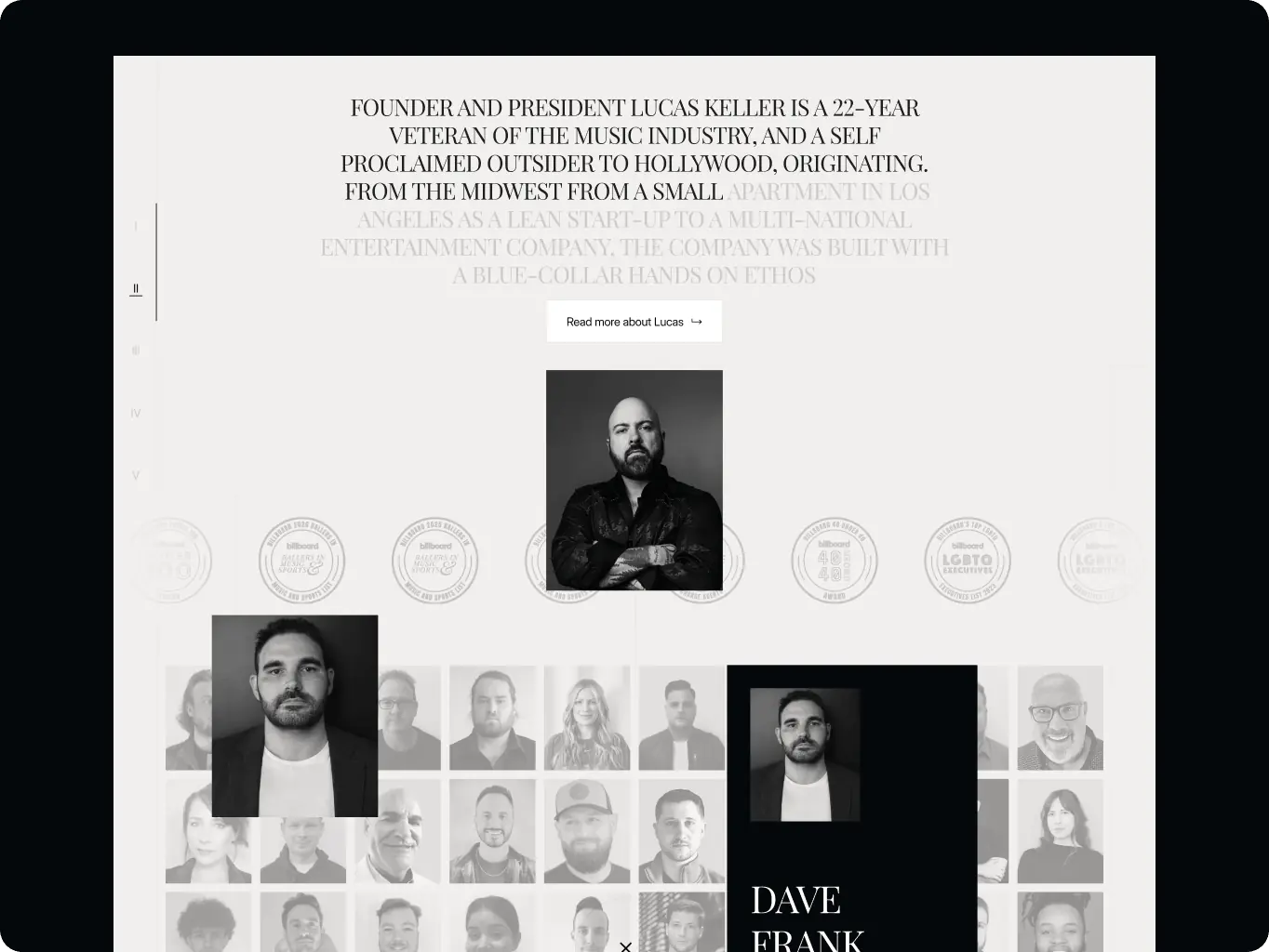
A progress bar tracks position through the full page, so a referral checking one division's roster doesn't lose their place scanning dense roster and release content.

Independent updates without a developer

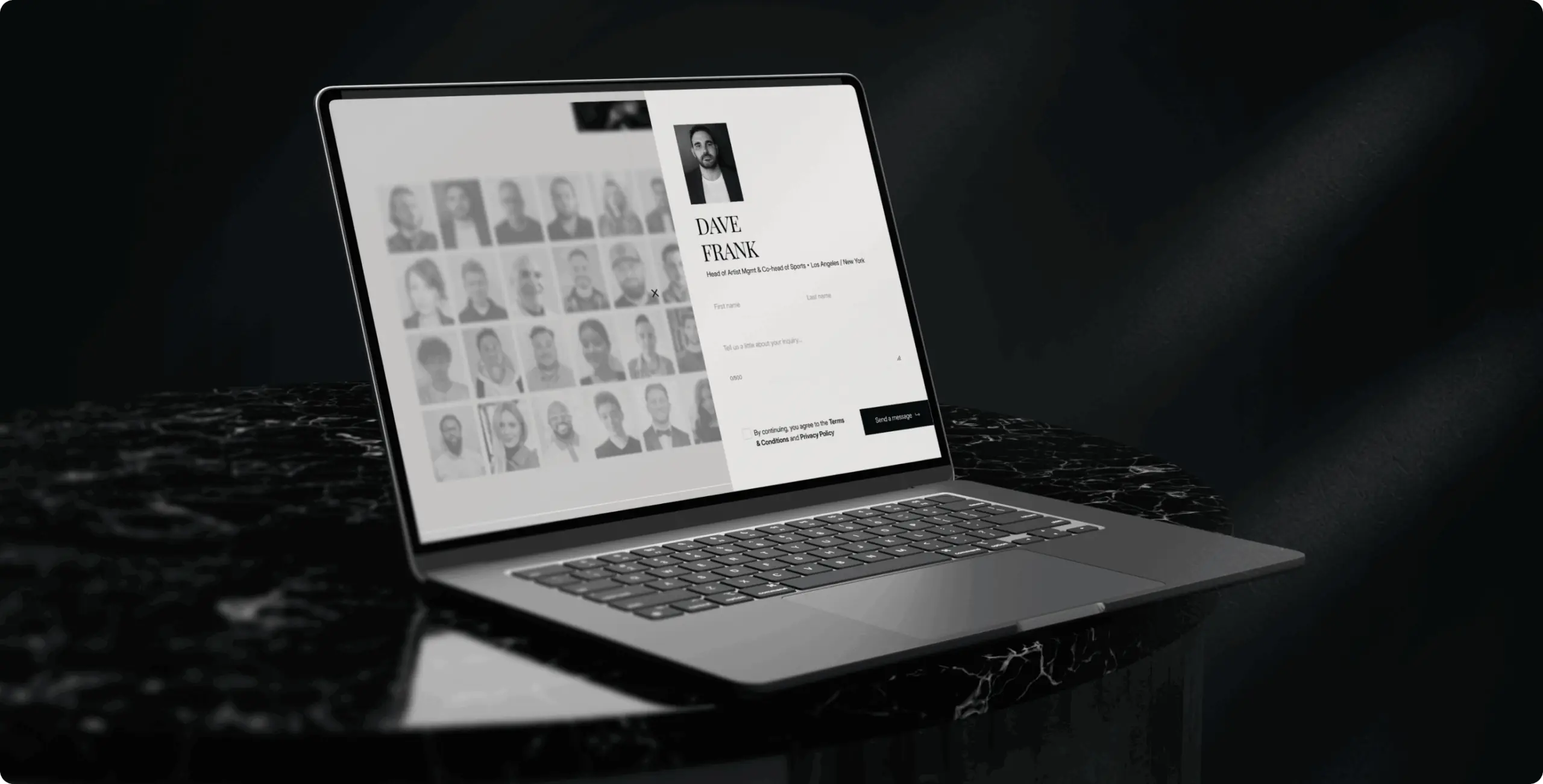
Moving from WordPress to Webflow lets the internal team manage roster entries, releases, news, and offices on their own.

Overview
Three divisions, one credibility story that visitors had to assemble themselves

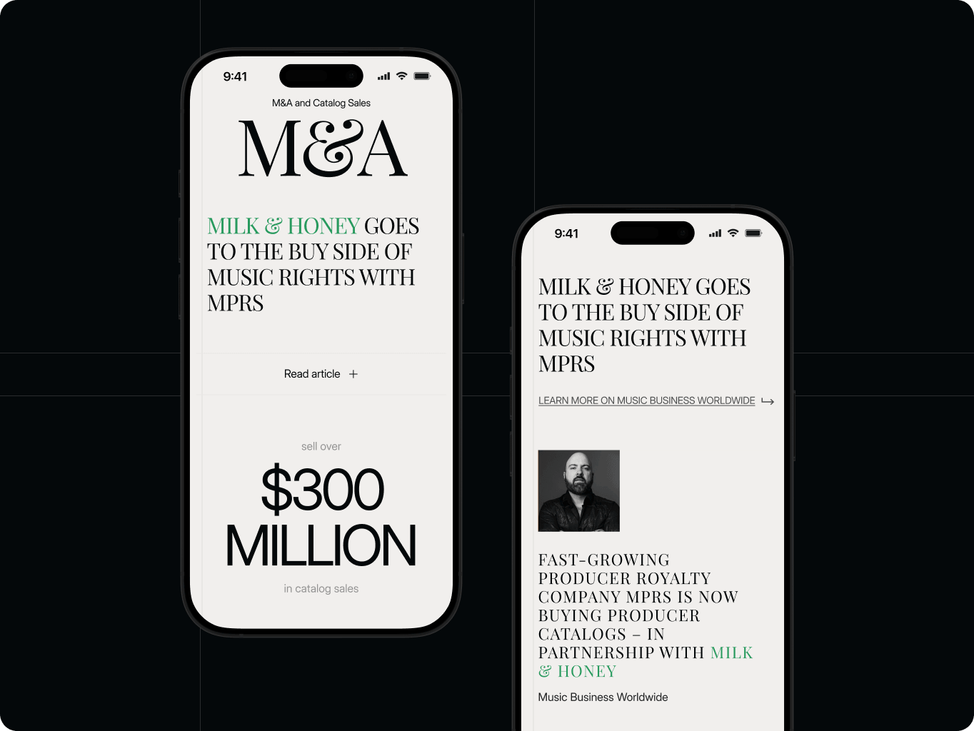
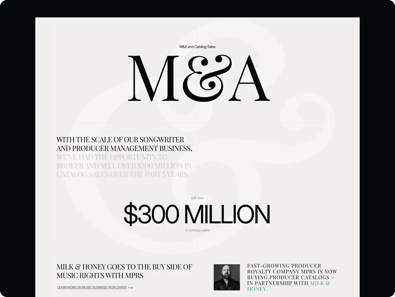
Milk & Honey operates three divisions – Music, Sports, and Ventures, plus a music M&A practice with over $300 million in brokered catalog sales. Its previous website presented that scope as separate WordPress pages, stitched together with outbound redirects to third-party resources.

A visitor arriving to confirm the company’s credibility (the site’s actual job, since traffic comes from referrals rather than search) had to piece the three-division story together themselves, and updating any of it – a new signing, a new deal, a new office -required a developer.

Client
Lucas Keller Icon - fi_4628635 (12)USA
Technologies
Icon - WebflowWebflow
Business needs
Client request & business goals

The brief started as a like-for-like rebuild of the existing multi-page structure. Three separate problems were driving it: the site’s presentation no longer reflected the company’s actual standing – a firm representing Grammy-nominated songwriters, NFL athletes, and M&A practice was showing up online looking smaller than it operated; the WordPress build made every update a developer task, at odds with a roster that changes every time a deal closes; and the site’s technical performance was weak enough to undercut the impression the rest of the content was trying to make, especially on mobile.

The goal shifted to consolidating everything the old site said – across all its pages – into a single landing page, rebuilt on infrastructure the internal team could run themselves, without losing any of the content the client wanted visitors to see.

Challenge
Challenge & solutions
Challenge
The three-division story was split across separate pages with redirects to third-party resources, so a visitor had to navigate multiple stops before understanding what Milk & Honey does and who it represents.
Solution
The multi-page content was grouped into one landing page, with modals absorbing the material that used to live on separate pages — the full story now runs in a single continuous scroll.
Challenge
Nine sections' worth of roster cards, releases, and division content risked burying the roster names that research showed were the site's strongest credibility signal.
Solution
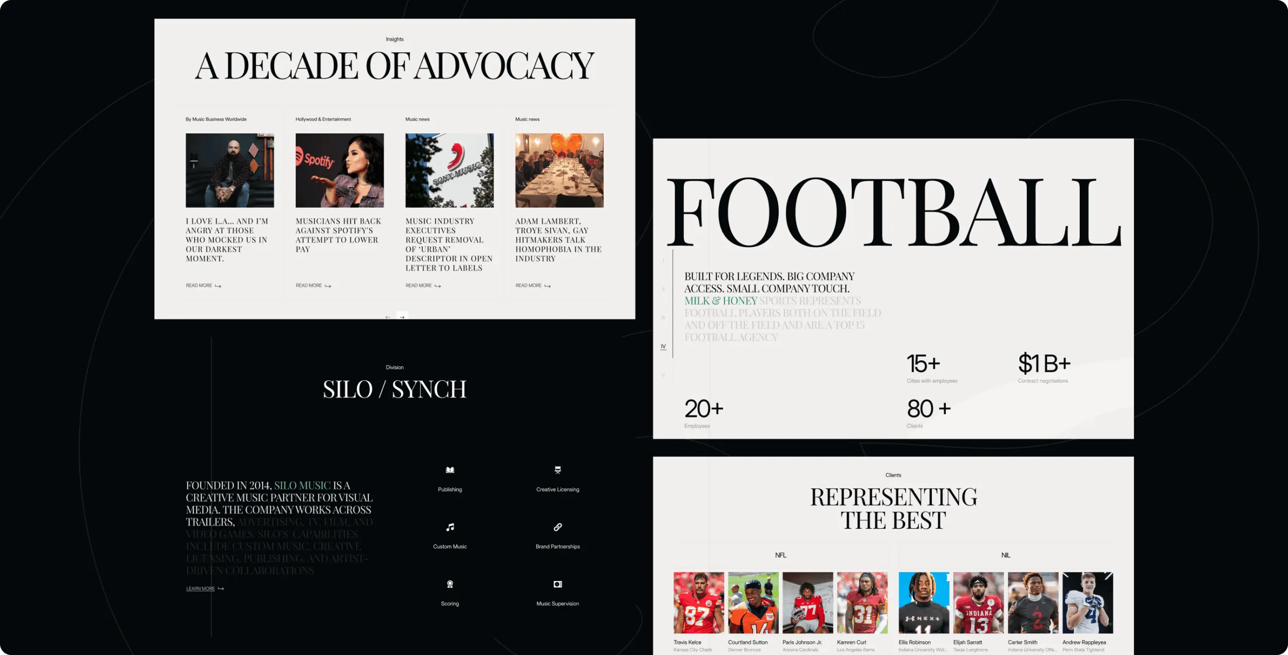
Each division got its own visual identity and a compact release-card system that keeps roster names visible instead of buried in dense content, with a progress bar keeping visitors oriented across all nine sections
Challenge
WordPress meant every roster addition, deal, or office update required a developer - at odds with a roster that changes as fast as deals close.
Solution
The site was rebuilt on Webflow, moving roster, releases, news, and office content into editable collections the internal team owns directly.
Icon - process-1
Wondering about the price? We’ll help you find the best solution!
Research
Reading nine sections of content the way a referral-driven visitor actually scans

Before wireframing, the studio needed to understand what visitors see when evaluating a company like Milk & Honey. Since traffic comes mainly from referrals, the site had to establish credibility immediately.

A competitor matrix compared Roc Nation, WME, Interscope, and Silent House across navigation, messaging, differentiation, visual identity, conversion, and mobile performance. The research revealed a clear gap: strong visuals, but vague messaging, unclear company scope, and no distinct visual identity for different business lines.

This reframed the brief from a conventional multi-page rebuild to a single-page experience that communicates scope and credibility instantly, while giving each division its own identity at a glance.

Milk & Honey — turning a scattered multi-page site into one story a visitor can follow start to finish - Website Development - Photo 6
Design
Trading nine pagesfor one scroll

With the research findings in hand, the central decision was format: rather than rebuild the old multi-page structure, the studio and client converged on a one-page landing with modals absorbing secondary content, so the site could lead with scope and credibility above the fold instead of burying it in an About page.

Stages

  • Wireframes
  • Design direction
  • UI design
Milk & Honey — turning a scattered multi-page site into one story a visitor can follow start to finish - Website Development - Photo 9
Stage 1
Wireframes

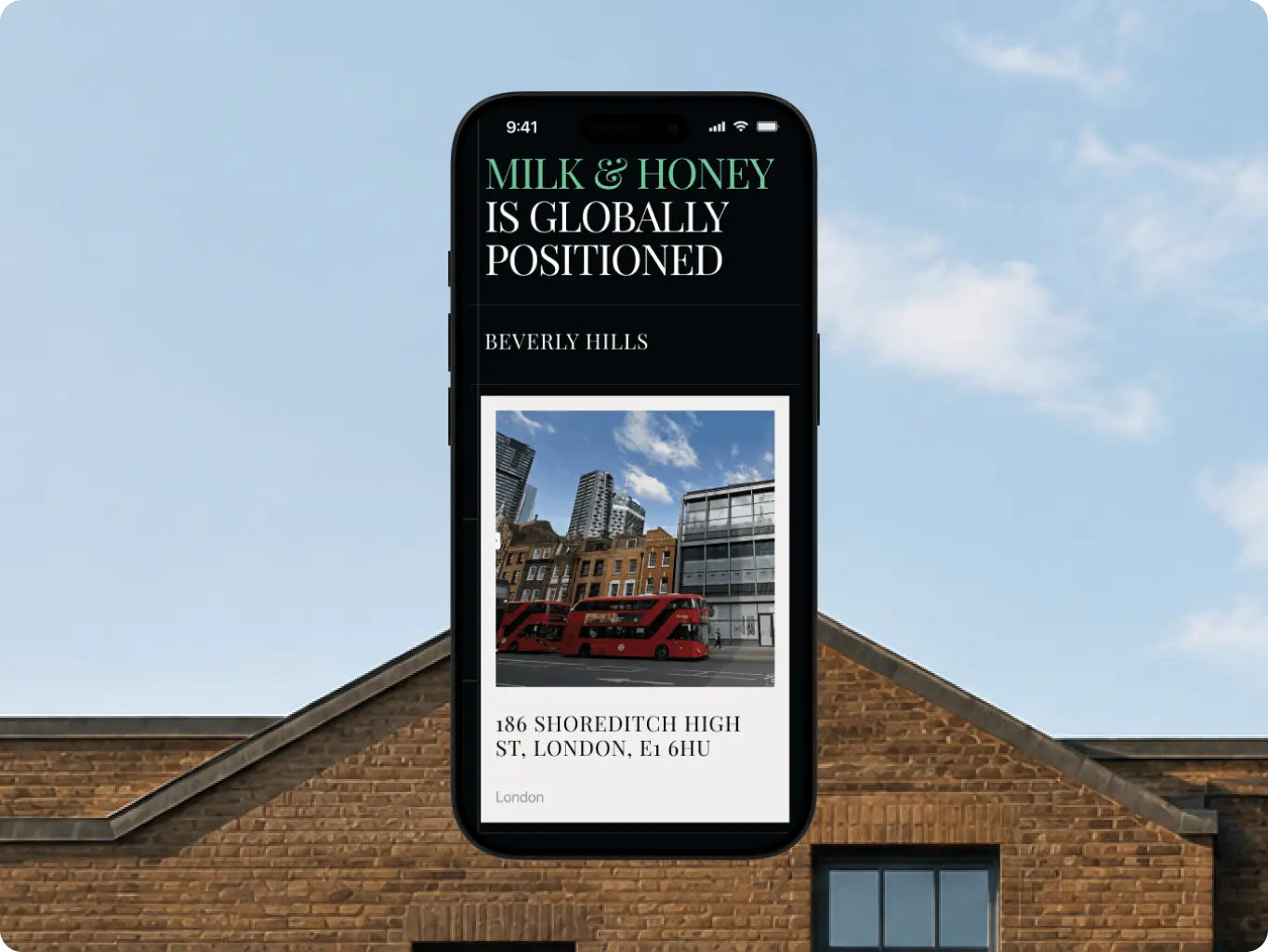
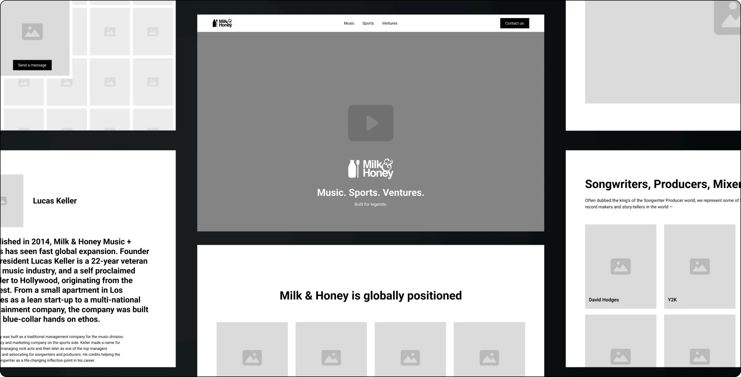
Established the page’s structural skeleton: the sequence of all nine sections, where the progress bar would sit relative to content, and which points in the flow would open into modals rather than separate pages. This confirmed early – before any visual investment – that a single scroll could actually carry everything the old multi-page site held, including the content slated to move out of third-party redirects.
Milk & Honey — turning a scattered multi-page site into one story a visitor can follow start to finish - Website Development - Photo 10
Milk & Honey — turning a scattered multi-page site into one story a visitor can follow start to finish - Website Development - Photo 11
Stage 2
Design direction

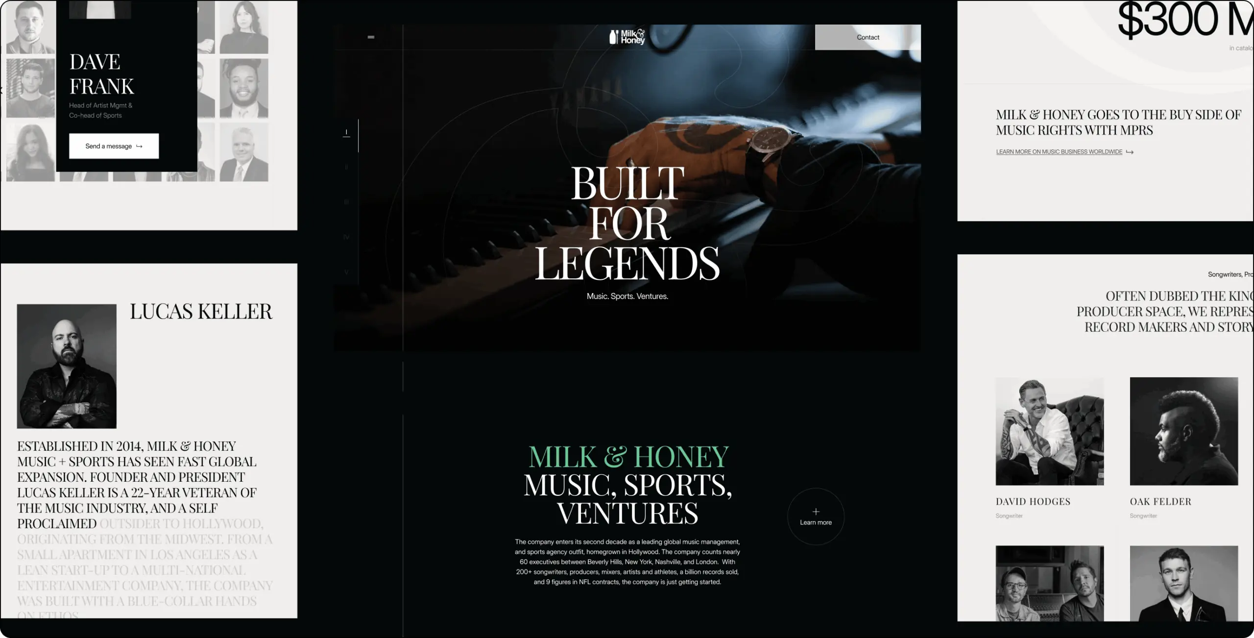
Locked in the page’s motion and structural language: a custom cursor built around the brand’s jug-and-dipper mark, scroll-triggered reveals for each section, and a single grid system applied across the entire page to keep it visually consistent end to end.

Because the grid touched every section, this stage carried the highest cost of change later — a trade-off accepted in exchange for a page that reads as one coherent system rather than nine loosely related sections.
Stage 3
UI design

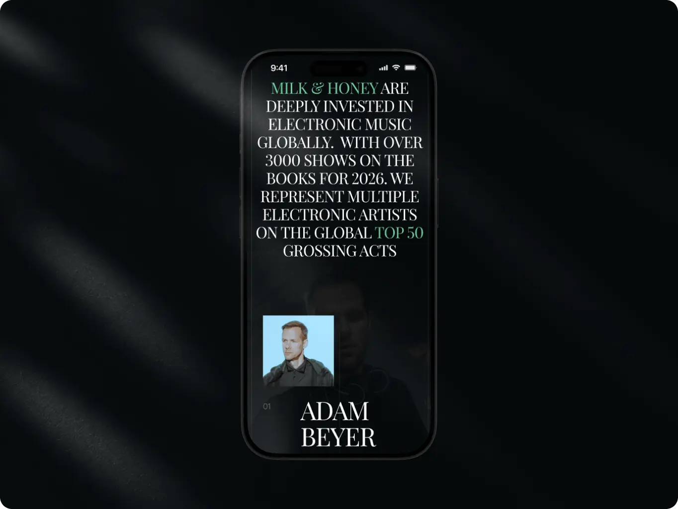
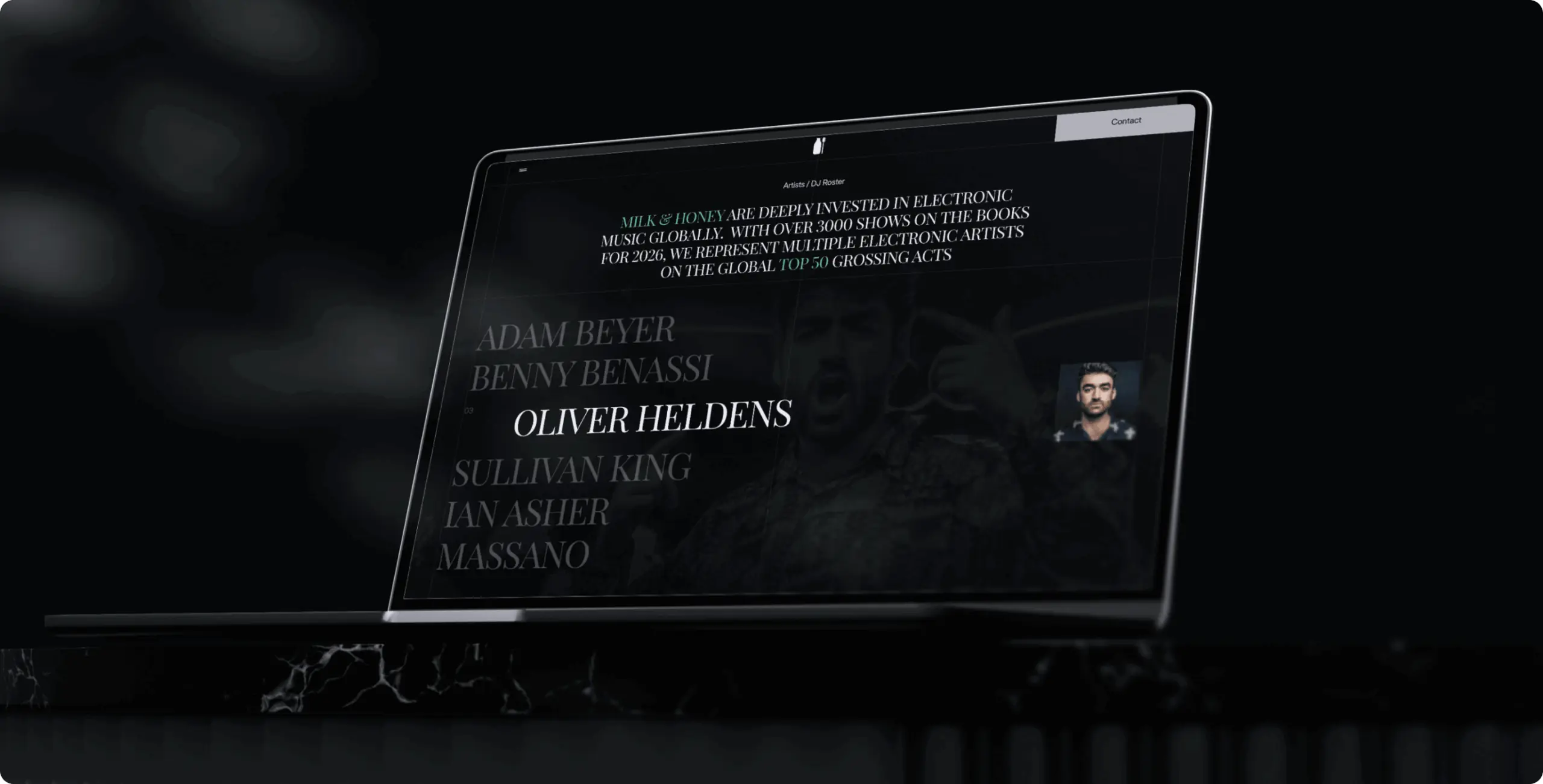
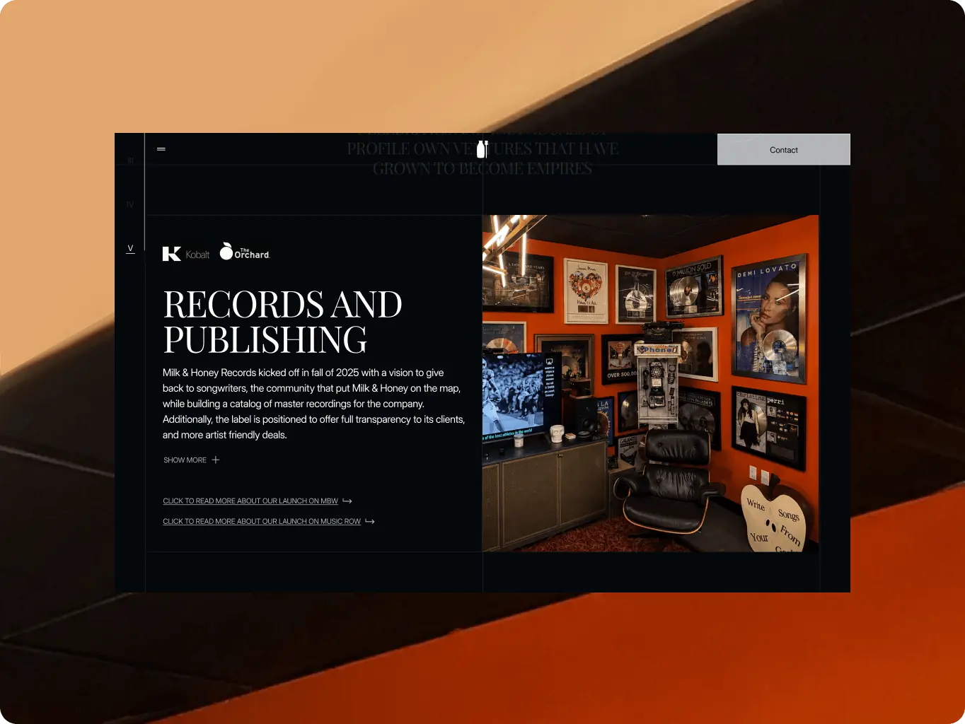
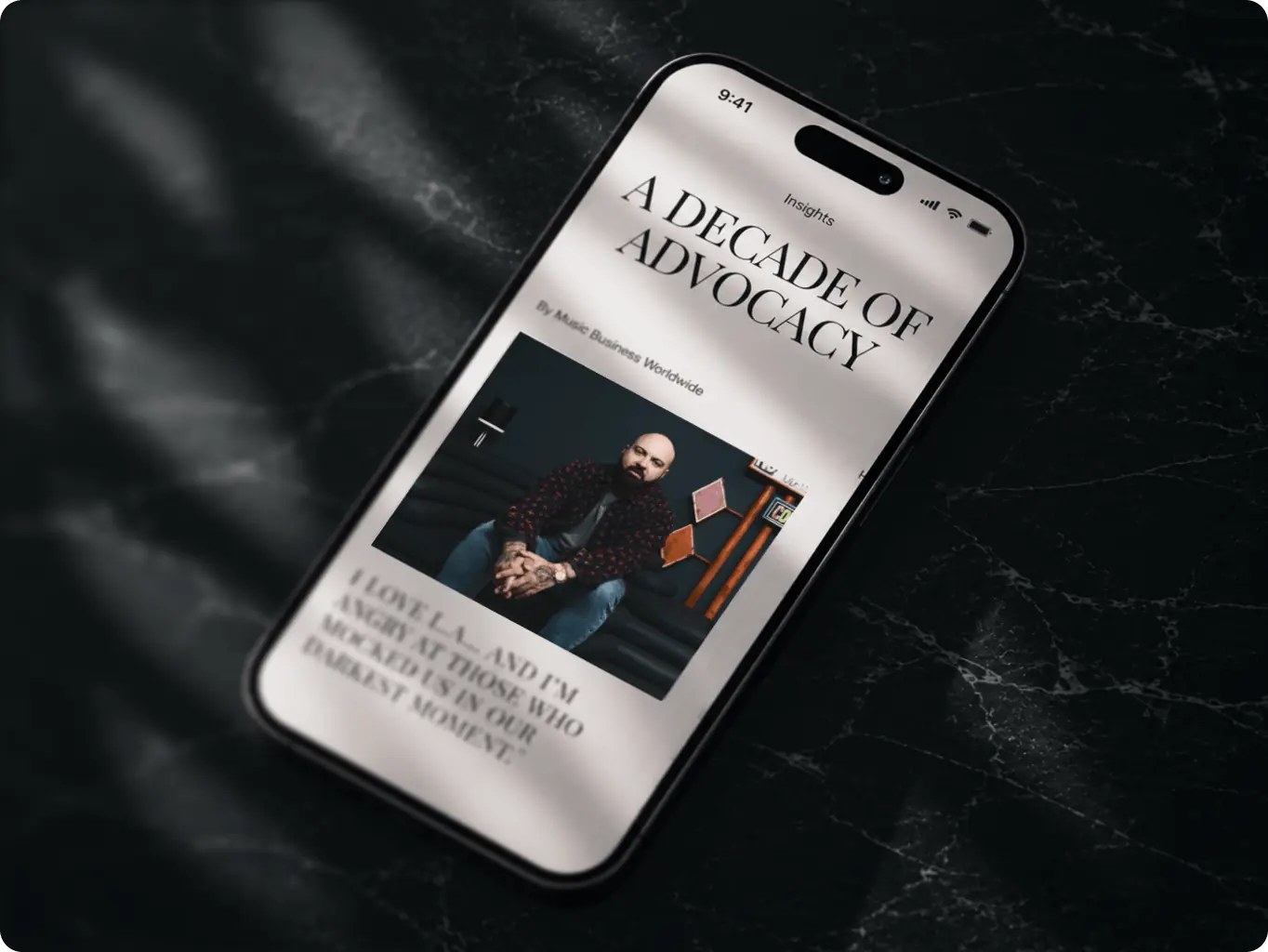
Delivered production-ready screens: the compact card system for releases and players, the roster layout built to keep artist and athlete names — the site’s strongest credibility signal — visible rather than buried under content density, and the hero messaging positioned to state who Milk & Honey is and which divisions it runs within the first few seconds. Archival press photography was cleaned up with AI-assisted image processing to bring older assets to a consistent standard alongside newer photography.
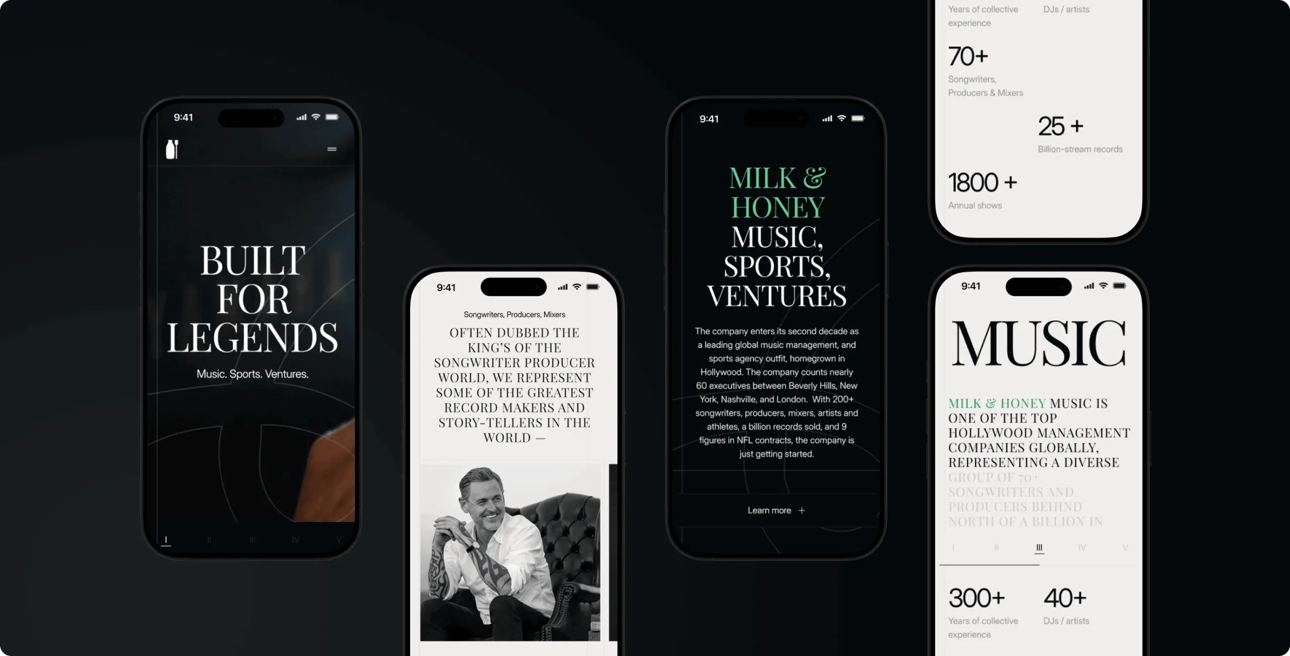
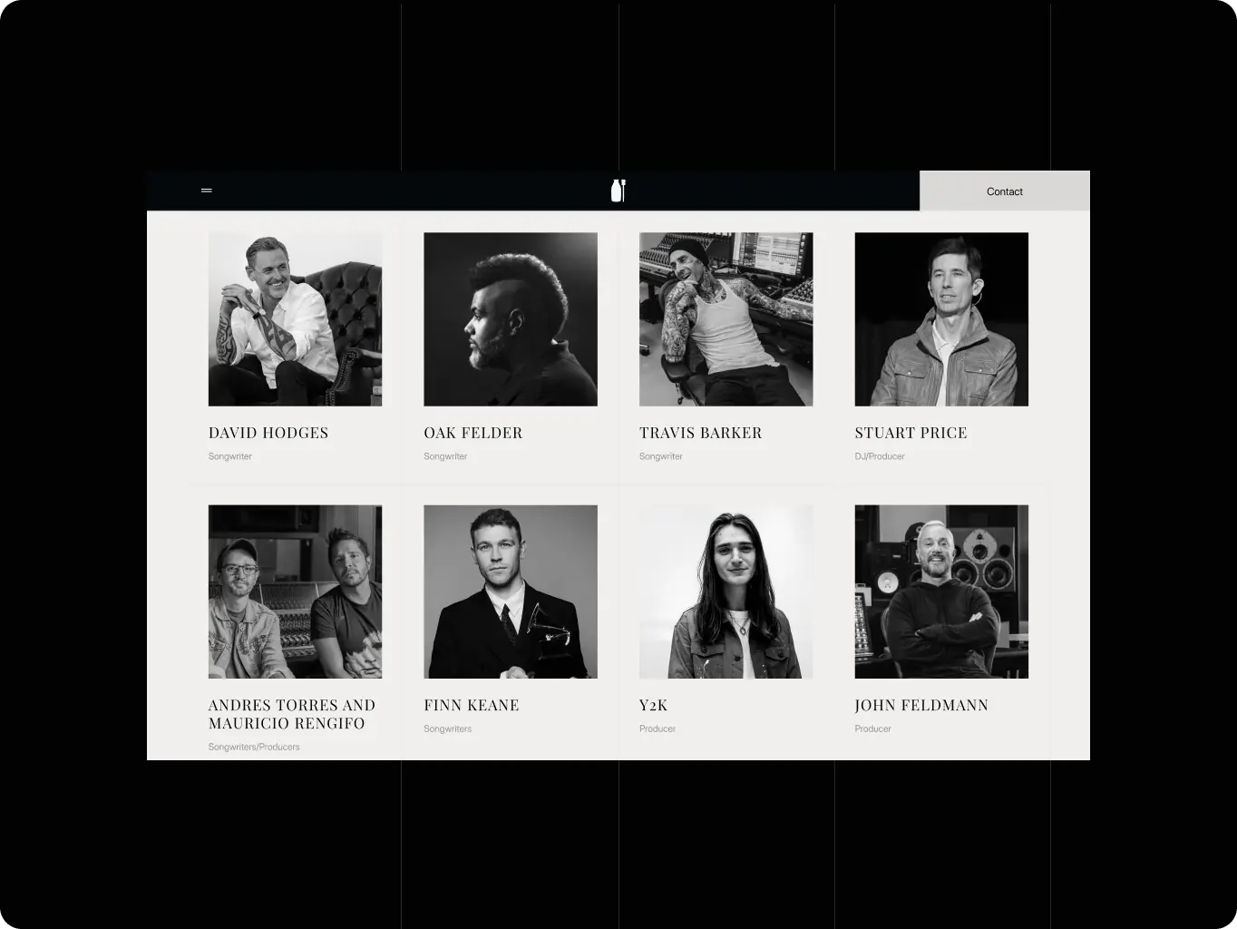
Milk & Honey — turning a scattered multi-page site into one story a visitor can follow start to finish - Website Development - Photo 14
Icon - process-1
Wondering about the price? We’ll help you find the best solution!
Development
CMS the team can run without engineering, on a layout that holds at any zoom

Development focused on two priorities: replacing WordPress with Webflow so the internal team could manage rosters, releases, news, and offices independently, and ensuring consistent layouts from 1280px to 2560px+ across 75–150% browser zoom. A fluid system using clamp (CSS) typography and percentage-based spacing maintained visual consistency across screen sizes, while GPU-friendly animations and lazy-loaded media supported mobile performance.

Design QA ran alongside development, catching spacing, interaction, hover, and scroll-trigger issues before launch.

Technologies
Selected technologies
Icon - Webflow
Webflow
Milk & Honey — turning a scattered multi-page site into one story a visitor can follow start to finish - Website Development - Photo 17
Icon - process-1
Wondering about the price? We’ll help you find the best solution!
Results
A site that finally reads like the company Milk & Honey runs
The site finally reads like the company it represents

The three-division story, once split across separate pages and third-party redirects, now runs as a single landing page with modals for depth.

Visitors keep scanning dense content instead of dropping off

A progress bar tracks position through the full page, so a referral checking one division's roster doesn't lose their place scanning dense roster and release content.

Independent updates without a developer

Moving from WordPress to Webflow lets the internal team manage roster entries, releases, news, and offices on their own.

Milk & Honey started with a WordPress site that told its three-division story in fragments, spread across separate pages and outbound redirects, with every roster or news update routed through a developer. The rebuild consolidates that story into one Webflow-built landing page: Music, Sports, Ventures, and the M&A practice now read as a single continuous scroll, each division carrying its own visual identity, with a progress bar keeping visitors oriented across all nine sections.

The internal team now adds new signings, releases, and office updates directly, without waiting on engineering — a site built to stay current as fast as the company itself moves.

More cases
We have dozens of products & hundreds of websites developed by our studio. We're happy to share the results with you!
#branding
Veridian brand identity for the infrastructure behind enterprise finance
veridian Icon - fi_4628635 (12)USA
Results

Infrastructure, not a fintech app

System-first design approach


Clarity in complex systems

#branding
MedAxis Group connecting every layer of healthcare infrastructure
medaxis Icon - fi_4628635 (12)USA
Results

Supports future growth

Builds trust faster

Reduces buying complexity

#Website design #website Development
DoubleZero how an existing brand became a launch-ready lead-generation site in one month
Hovin Wang, Hall Hoyt Icon - fi_4628635 (12)United States
Tech Stack

next.js

Timeline

5 month

Results

The network explained without a sales call

From Figma identity to live site

Full site live in one month

Contact us

Have a project in mind?
Let's chat

Your Name

Enter your name *

Your Email

Enter your email *

Message

Tell us about your project

You can upload maximum 5 files
Some of your file not loaded, because maximum file size - 5 mb
Your budget for this project?

By clicking this button you accept Terms of Service and
Privacy Policy

Icon - circle-check-svgrepo-com 1
Thanks for taking time to reachout!
Stay connected with us by subscribing to our LinkedIn account. By following, you’l be the first to hear about our latest updates, news, and exciting development. We look forward to sharing our journey with you!
Icon - circle-check-svgrepo-com 1
Thanks for taking time to reachout!
We’d love to hear more about your project! Feel free to schedule a call using the link provided. This will help us better understand your vision and ensure we’re aligned on all the details.
Have a project to
discuss?
Image - ksenia
Kseniia Shalia
Account Executive
Have a partnership in
mind?
Image - polina
Polina Chebanova
Co-Founder & CPO