Design
Development
Research
Launch
Evolve
Extend
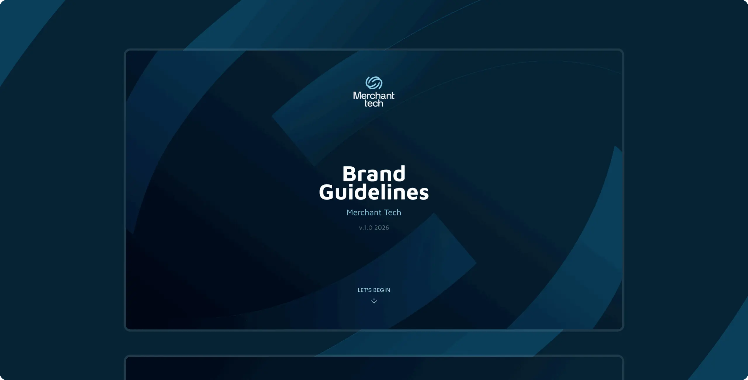
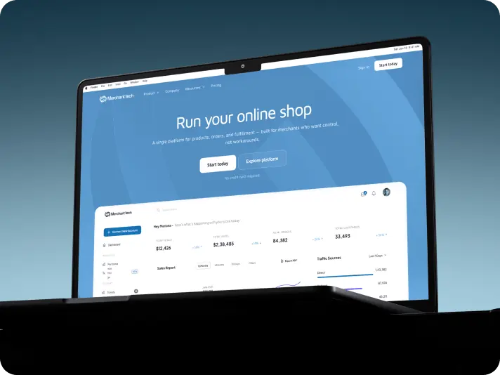
Merchant Tech – brand identity for
a platform that turns operational complexity into control

Client
Tyler Ussery
 USA
USA
USA
Services
Merchant Tech came to us at a pivotal moment: the product was mature, but the brand had not caught up. There was no clear visual identity, no consistent language, and nothing that communicated the platform’s real value to operators evaluating B2B tools.
The goal was to build a brand system from the ground up. One that reflects operational precision, earns trust with business owners, and scales across product UI, marketing, and physical touchpoints.

Our work on Merchant Tech began with an analysis of the B2B e-commerce landscape: how competing platforms position themselves, what visual patterns dominate the space, and where a clear gap exists for an operator-focused brand.
That research shaped every design decision that followed. From the logo concept to typography choices, each element was grounded in a single principle: the brand should feel as structured and reliable as the platform itself.
The branding process was structured around one goal: make complexity feel simple. Every stage, from the logo mark to the final guidelines, was designed to give Merchant Tech a visual language that operators immediately recognize as purposeful and trustworthy.
We moved through four focused stages, each building on the last, to produce a system that holds together across every format and context.
Stages
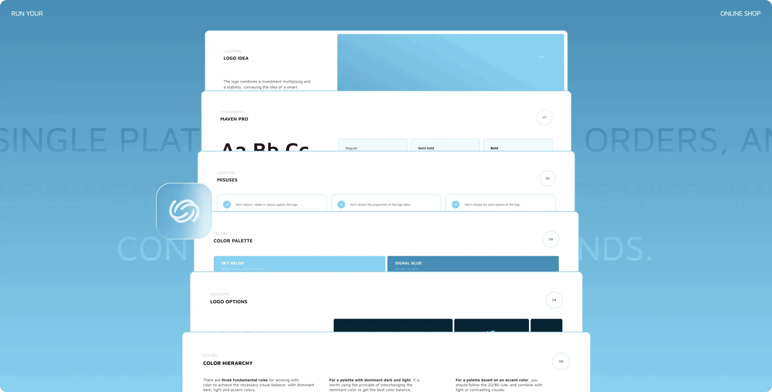
- logo design
- colors & typography
- brand assets
- brand guidelines
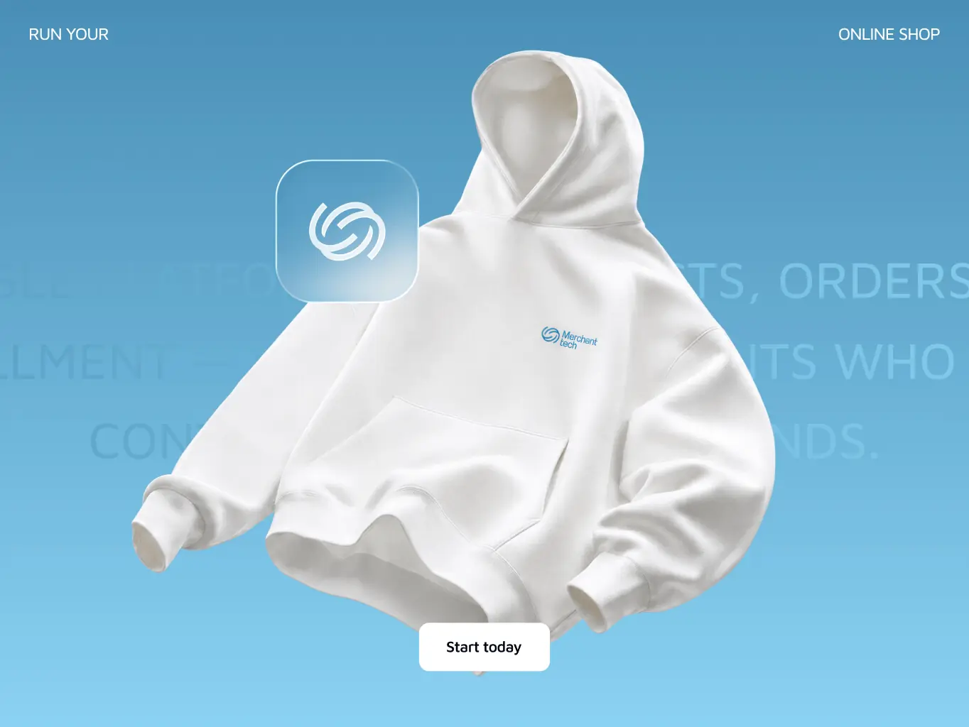
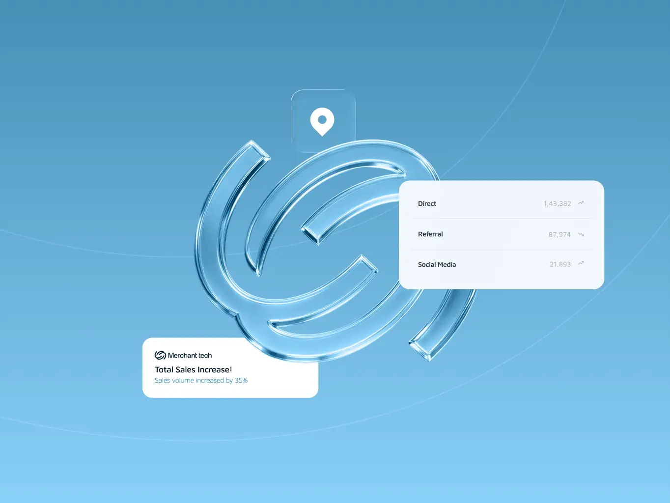
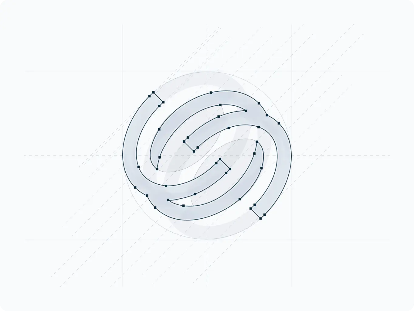
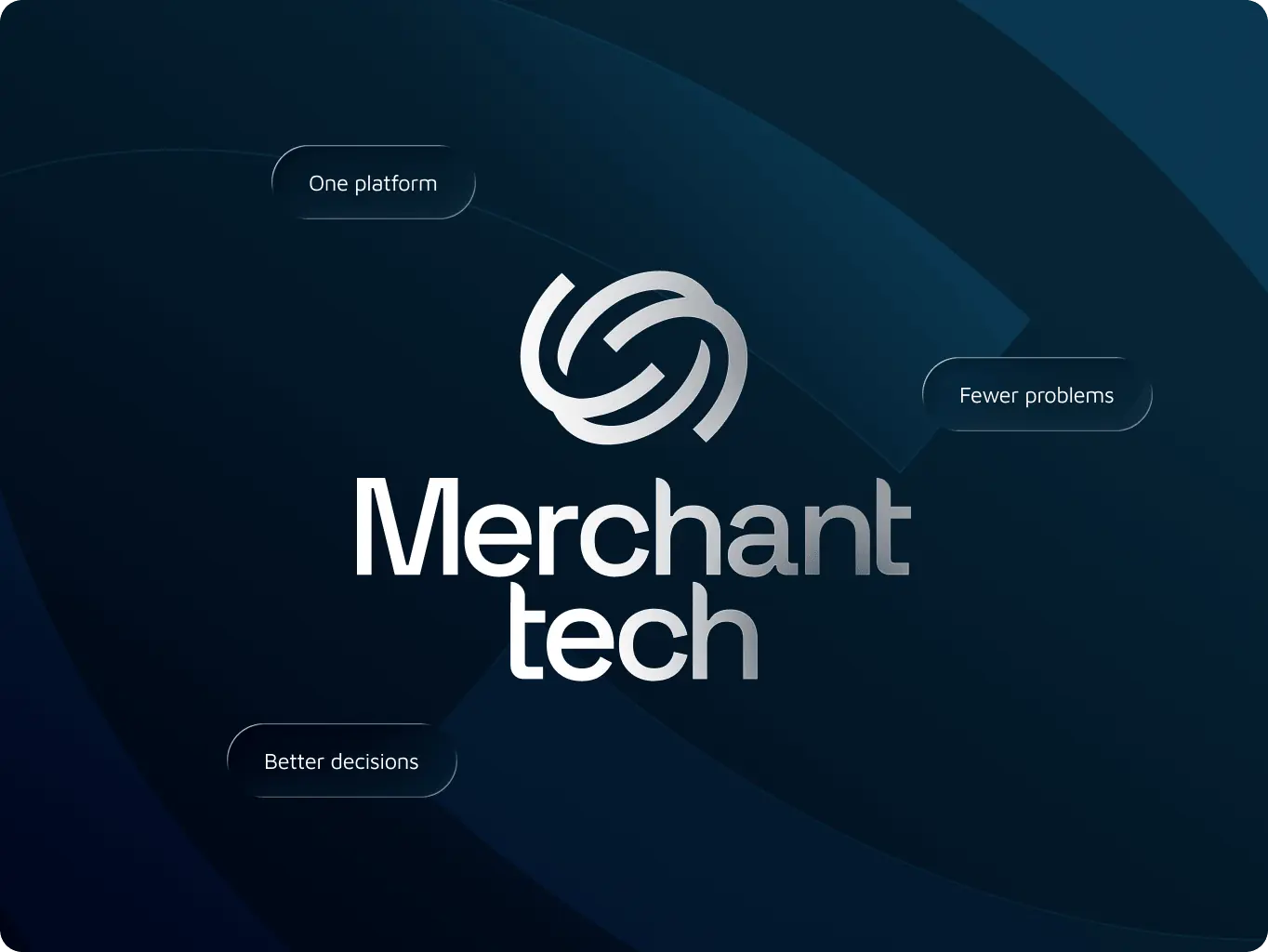
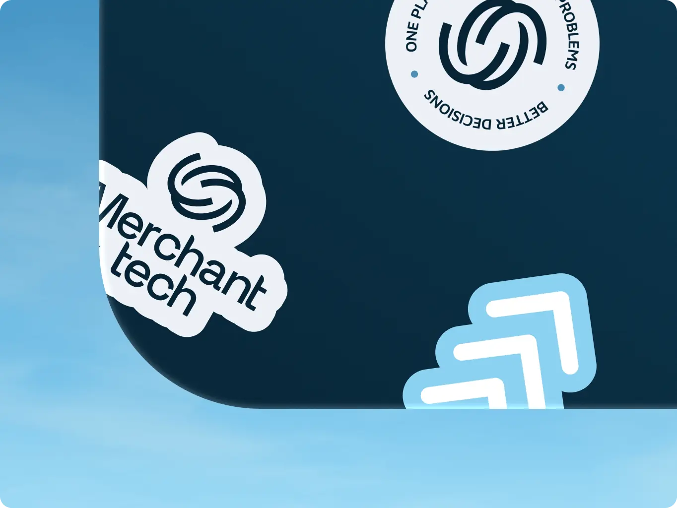
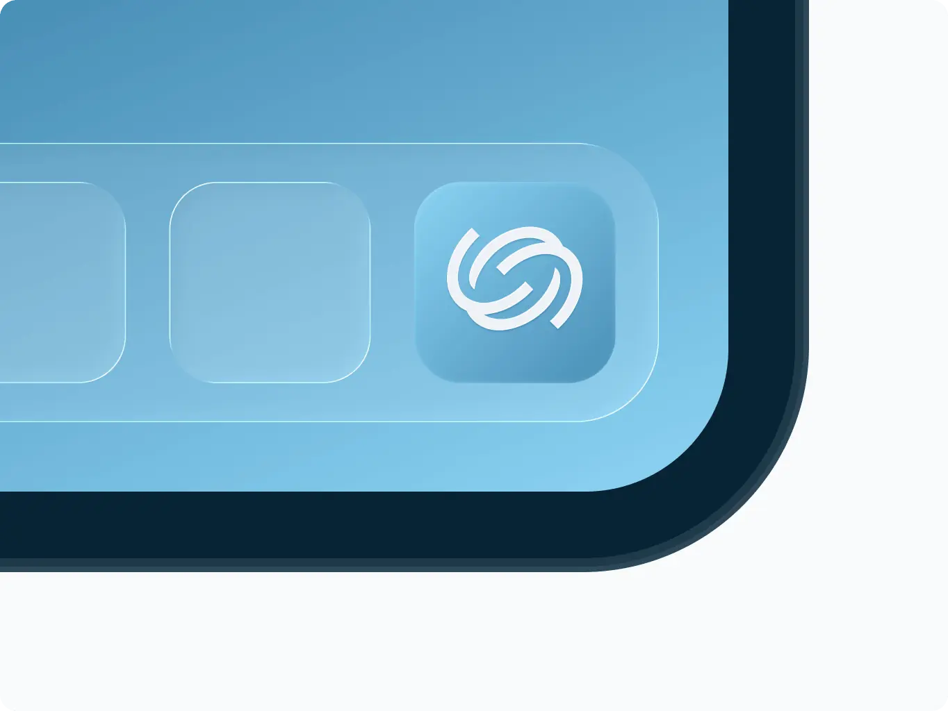
The logo mark is built around the idea of organized complexity. A circular segmented symbol where interconnected arcs represent the many moving parts of a merchant’s operation, all flowing together as one continuous system.
The form carries dual meaning: an endless loop suggesting reliability and rhythm, and a structured geometry that signals control. The symbol works equally as a standalone graphic element, applied as pattern, texture, or fill across any brand surface.
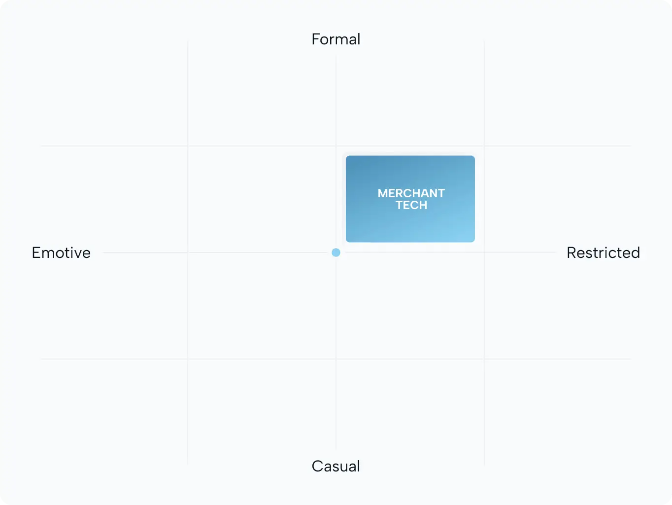
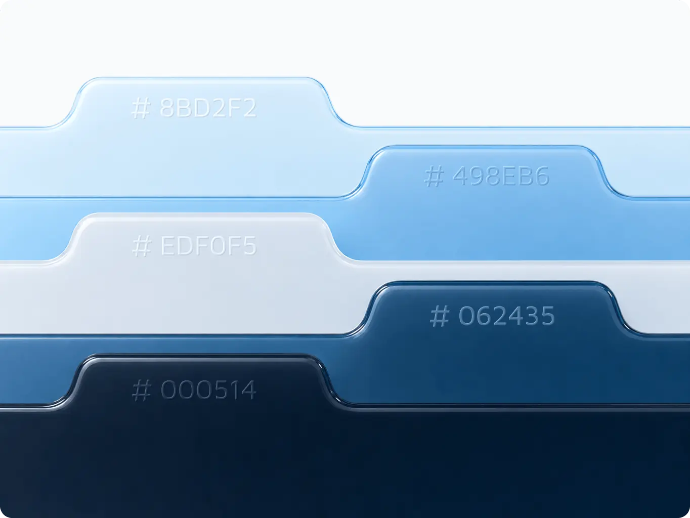
The color system is built on a dark navy and blue gradient palette. Deep, composed tones that communicate stability and authority without feeling cold. The gradient introduces depth and motion, reflecting the idea of a platform that keeps things moving.
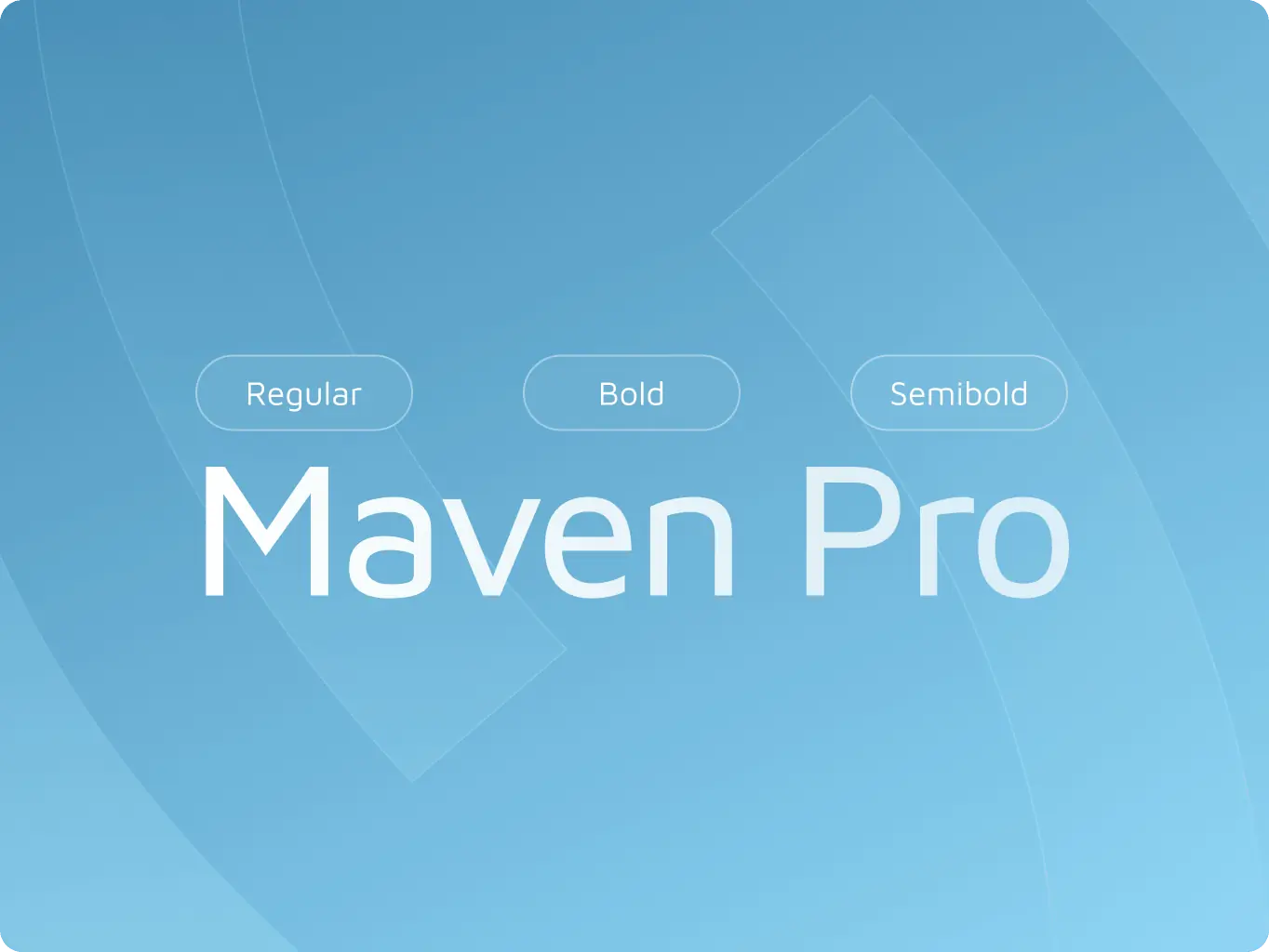
Typography follows the same logic: clean geometric sans-serif with clear hierarchy. No decorative weight, no unnecessary contrast. Every typographic decision reinforces the brand’s core register: formal, restrained, and built for operators who read fast and decide faster.
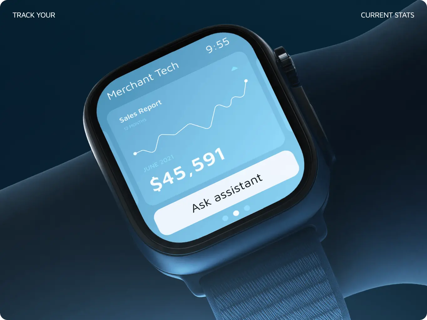
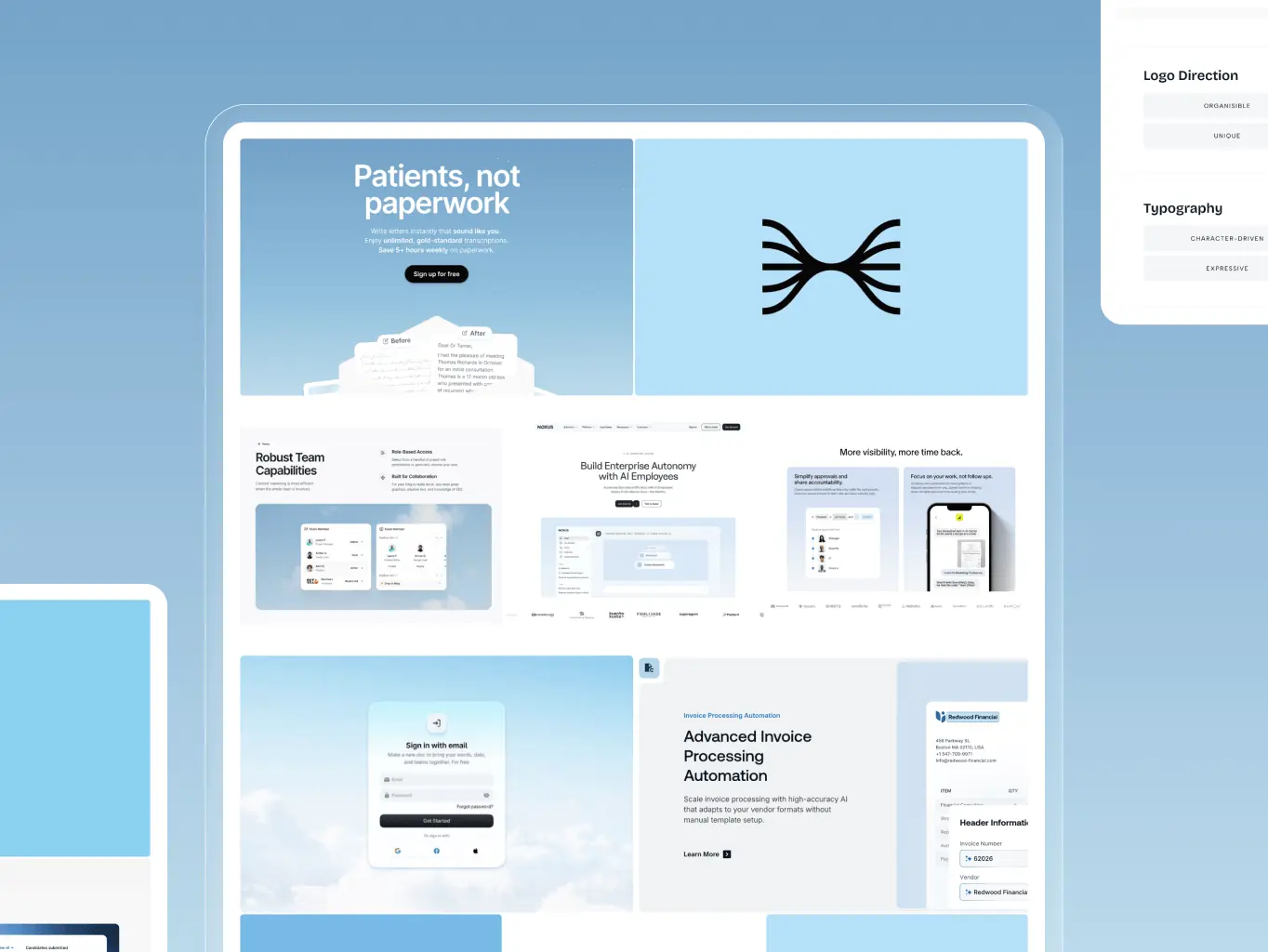
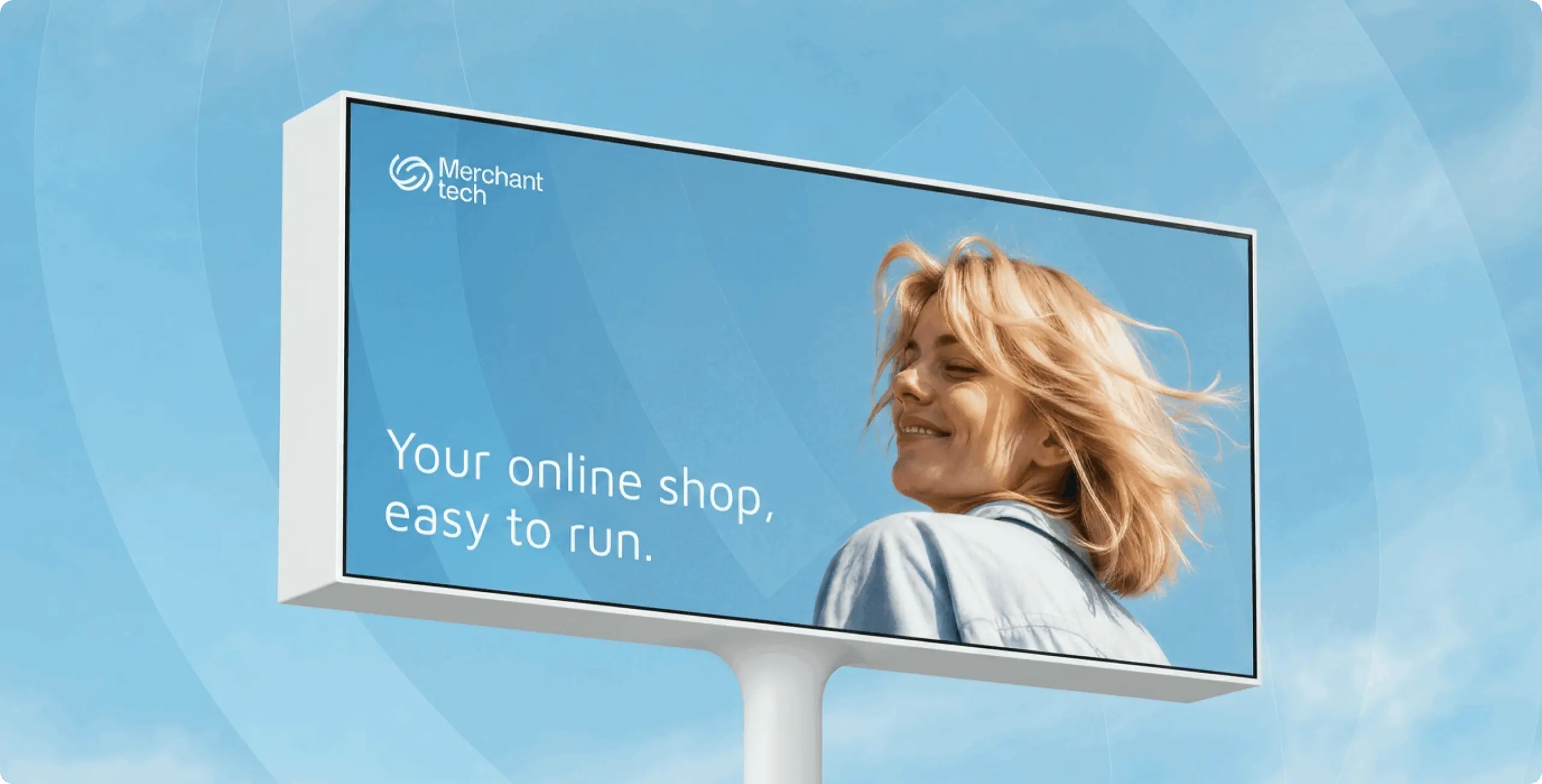
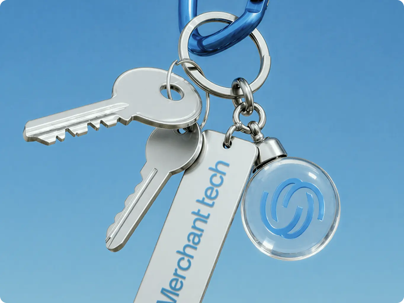
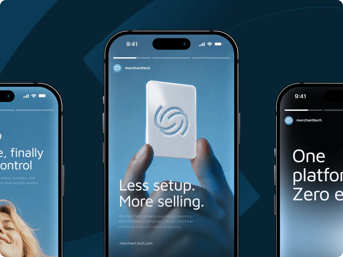
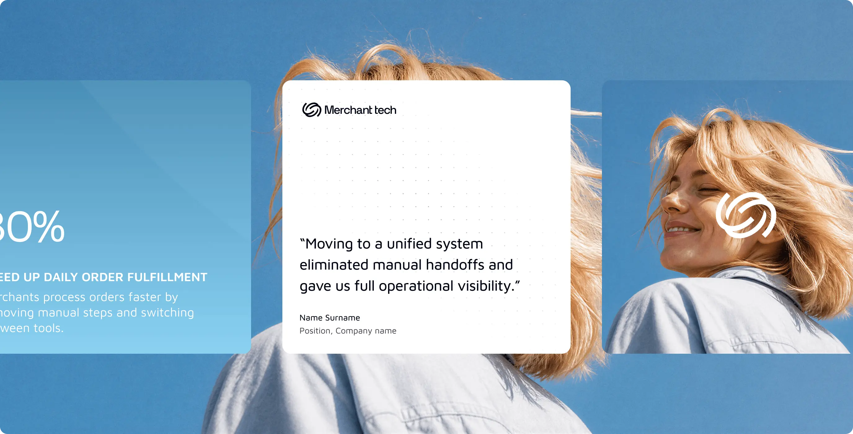
With the core identity in place, we extended the system into real-world applications. Landing page layouts, marketing banners, and merchandise mockups were developed to test how the brand performs across formats.
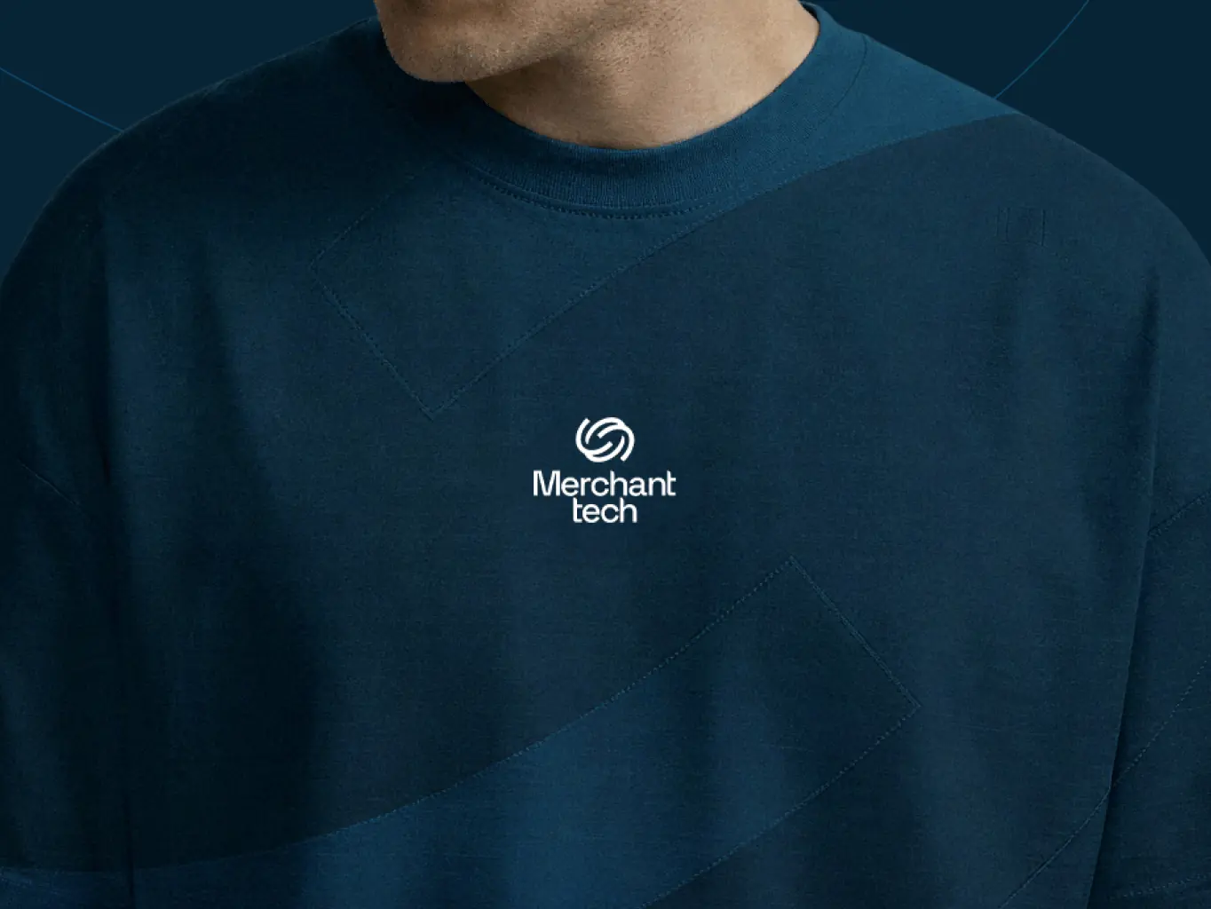
The logo symbol proved flexible as a graphic element: used as a repeating pattern on apparel, as a large-scale background texture on banners, and as a standalone mark on digital surfaces. Each application reinforces the same visual logic without feeling repetitive.
The final deliverable was a complete set of brand guidelines covering every element of the system: logo usage and clearance rules, color hierarchy, typography scale, and asset application across digital and physical formats.
The guidelines are built for a growing product team. Clear enough that anyone applying the brand gets it right, flexible enough to support new touchpoints as Merchant Tech scales.
#Website design #website development
EVERON
 USA
USA
USA
#Website design #Website development
Philip Lewis
 Finland
Finland
#website design
Tyler Ussery
USA
USA
Have a project in mind?
Let's chat
Have a project to
discuss?
discuss?

Have a partnership in
mind?
mind?
