


DoubleZero – how an existing brand became a launch-ready lead-generation site in one month
View Website

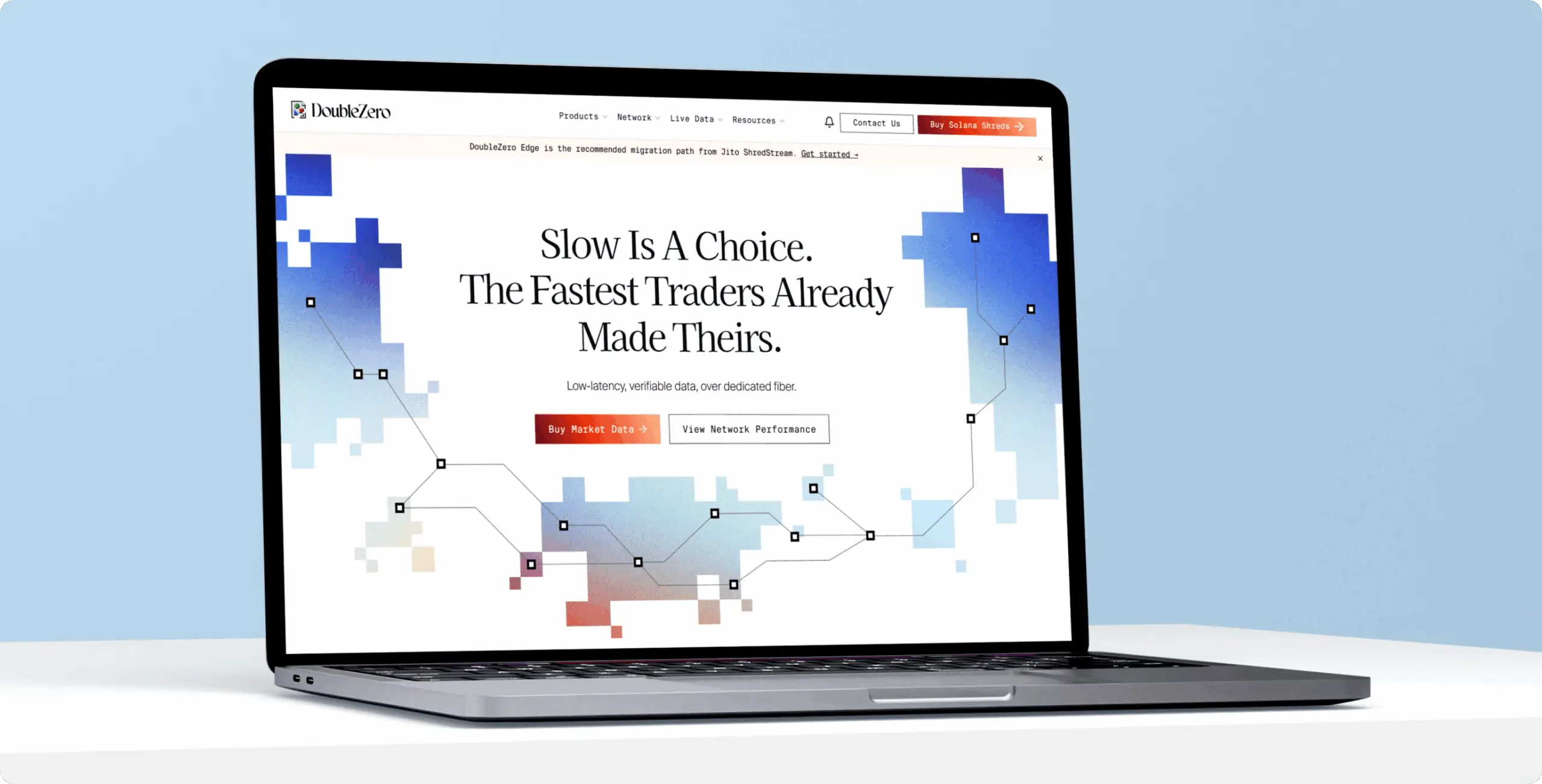
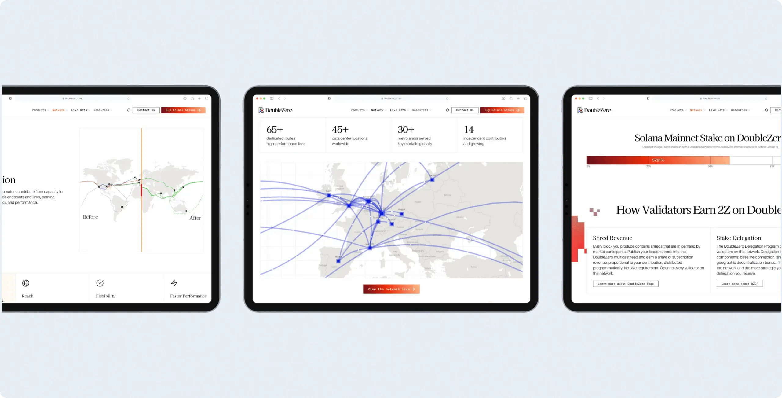
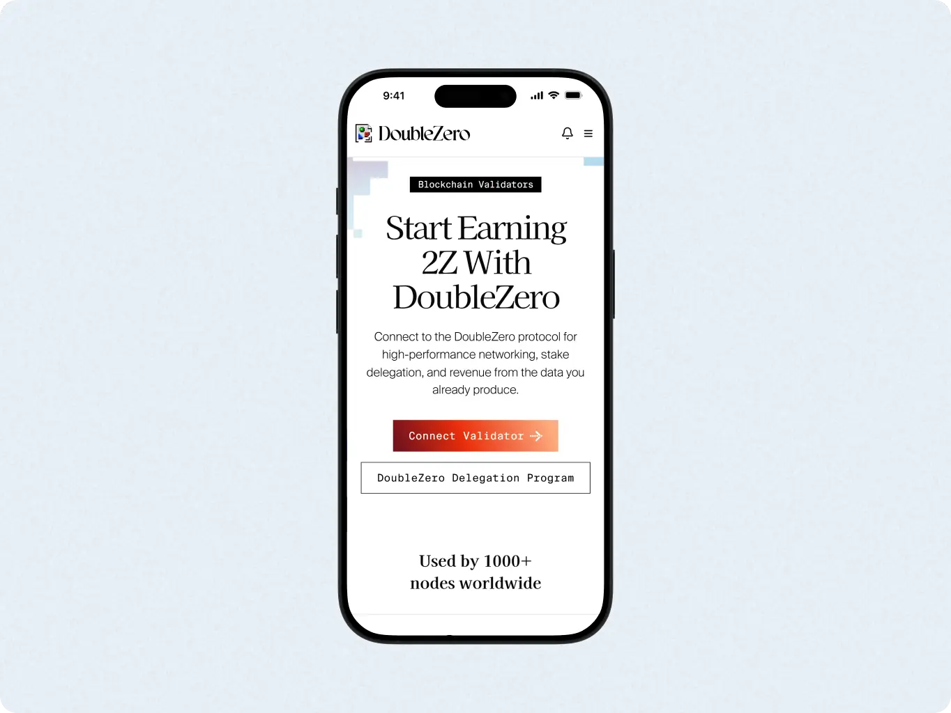
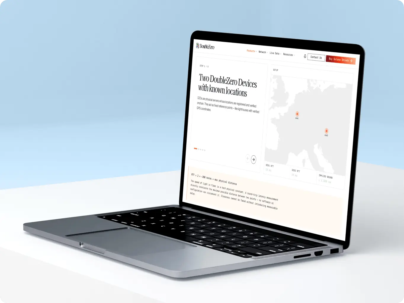
After our project was completed, the design was modified by the client to meet new business needs
Client
Hovin Wang, Hall Hoyt
 United States
United States
Services
Technologies
 next.js
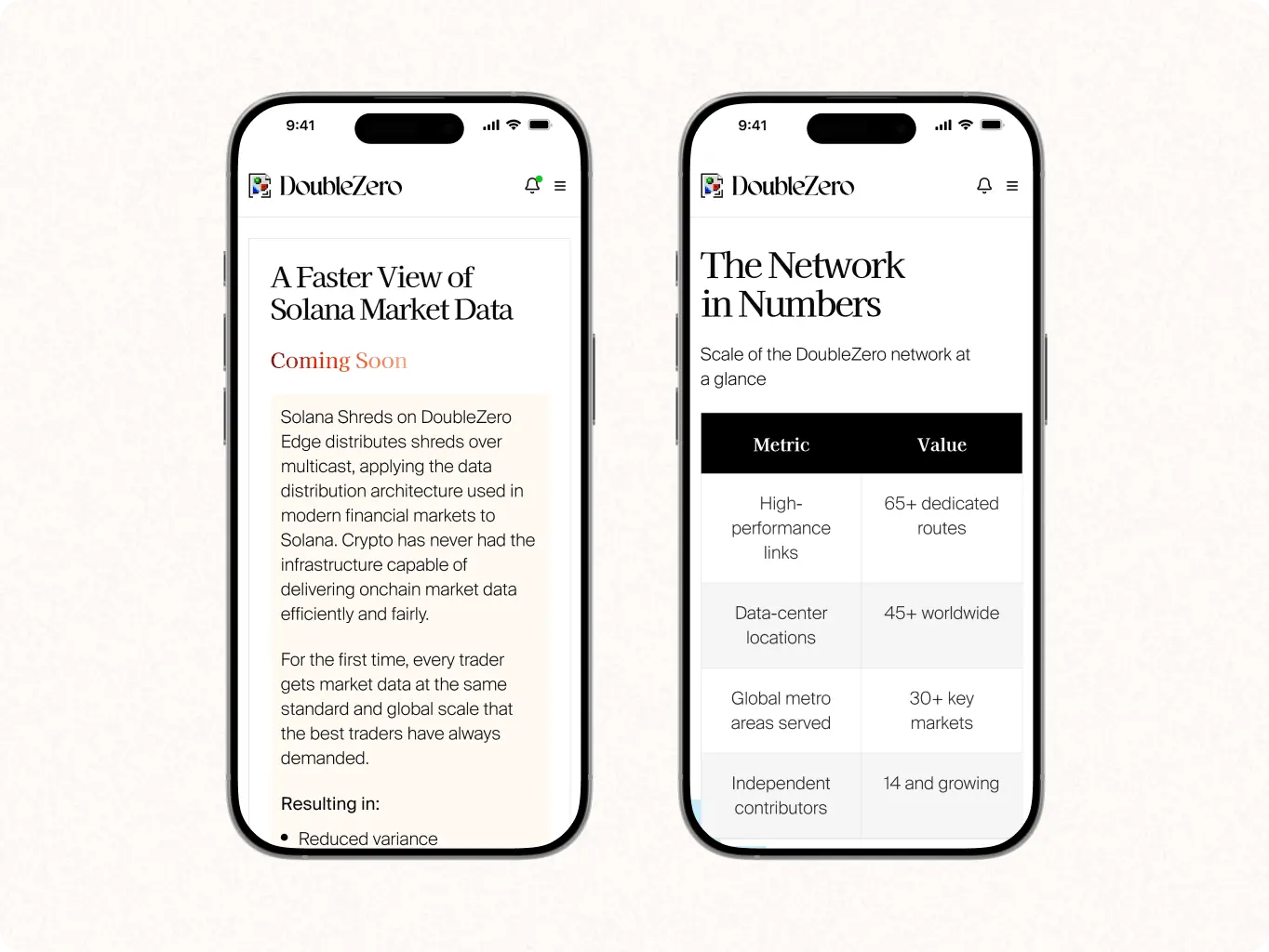
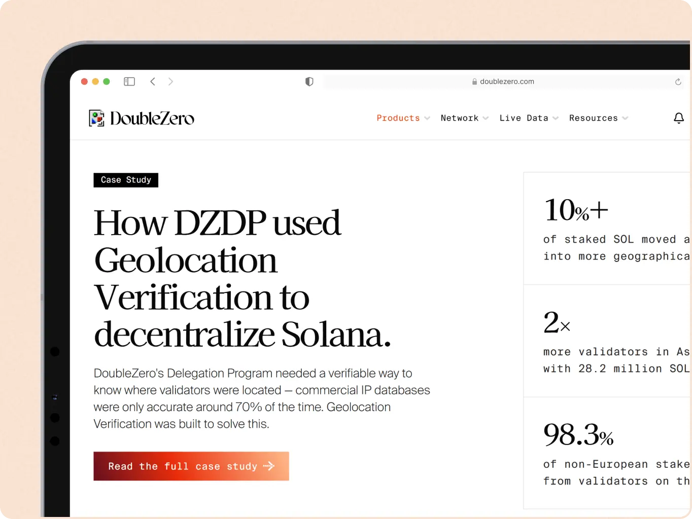
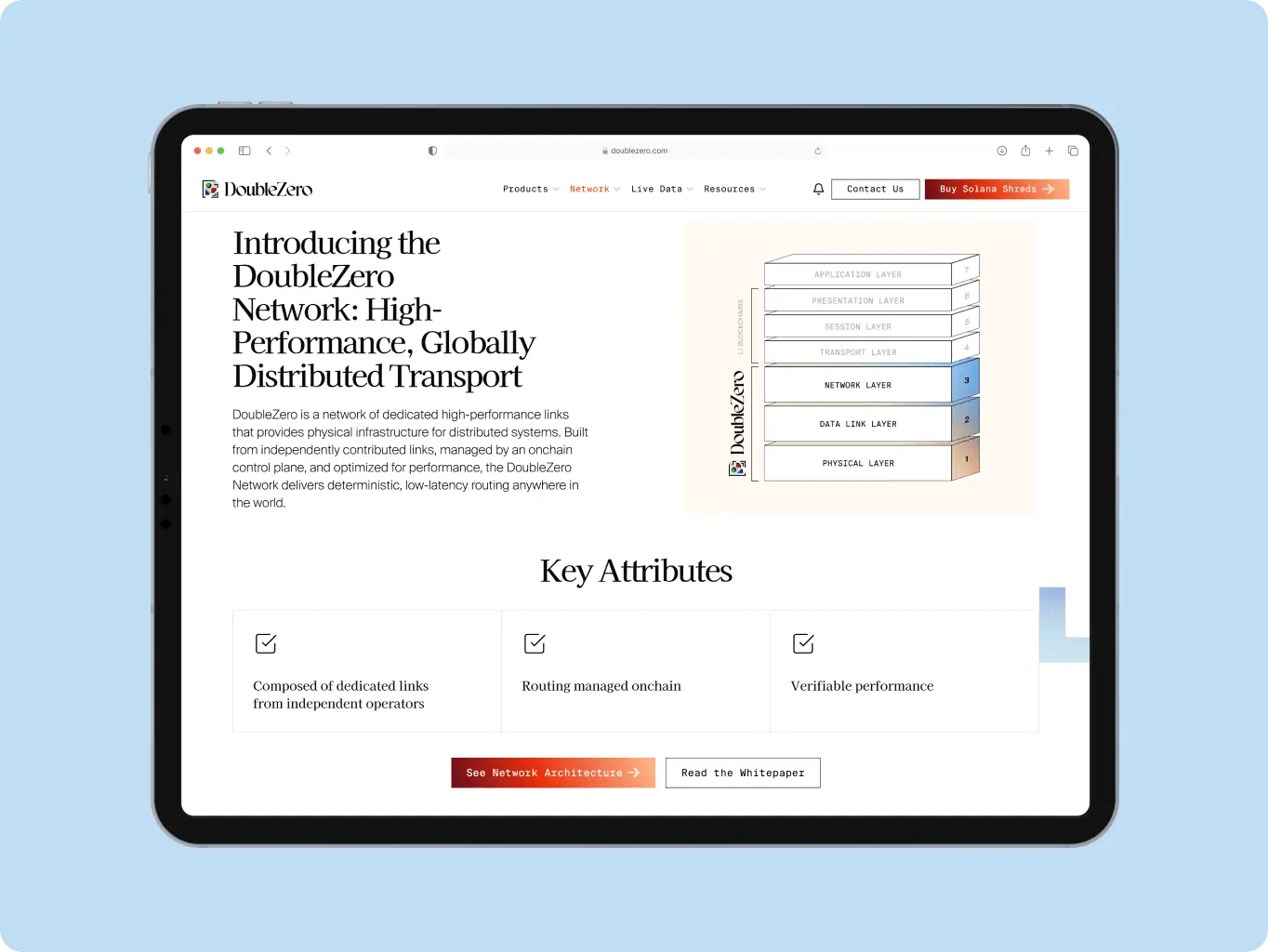
DoubleZero already had a strong brand identity in Figma, but no website to present it. The challenge wasn’t creating a visual language – it was turning that identity into a functional product that could explain complex networking concepts, diagrams, and technical architecture while building trust and generating leads.
That’s the tension the client named going in – in their own words, “how we’re going to marry that between UX functionality without it overpowering the purpose of the site.” Two extremes to avoid: a dry, templated layout, or a “redecorated” site where the brand buries the message. Getting that balance right, inside a one-month deadline, was the real problem to solve.
The team moved through concept and design without long delays, staying on schedule — and the client’s satisfaction with the process led to a second scope of work.
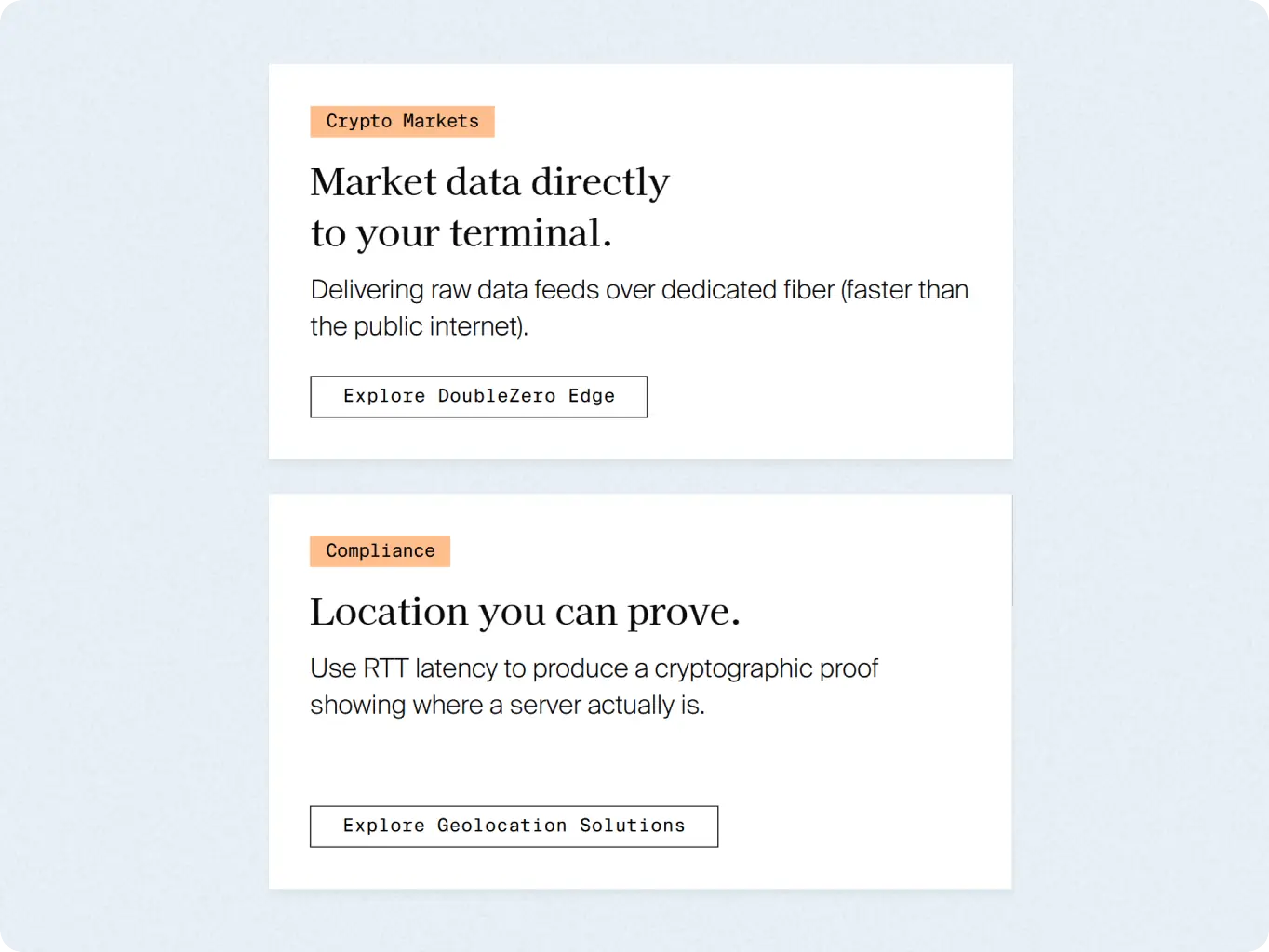
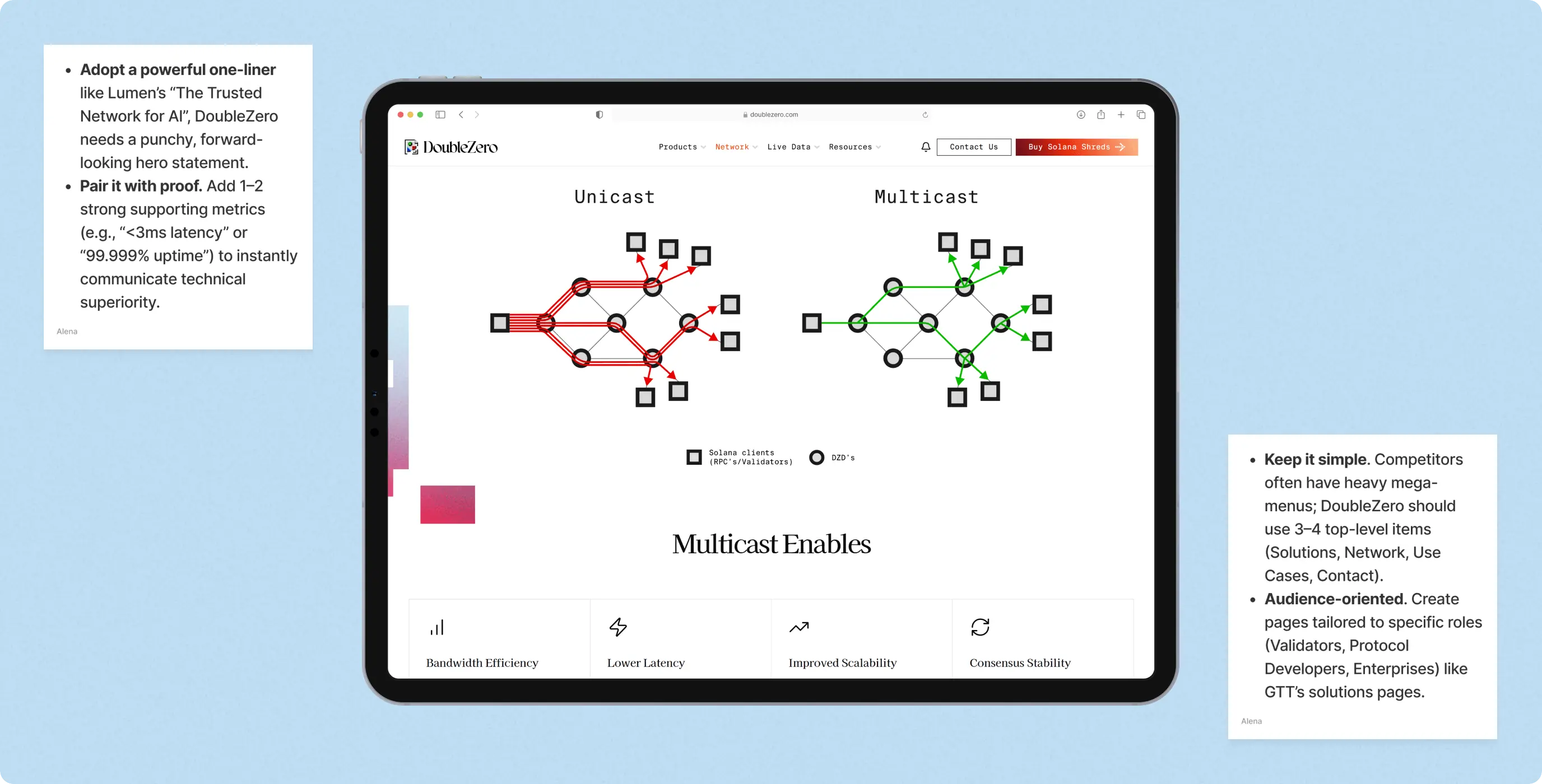
Before any screen was built, the team studied how direct competitors – Lumen, GTT, Arelion, Tata Communications – build trust and structure their sites: positioning, hero messaging, visual style, CTAs, differentiation, and navigation. The goal was to find where those approaches left a gap DoubleZero could fill, rather than start designing from a blank brief.
The analysis showed a consistent pattern: broad Tier-1 enterprise positioning, corporate visual language, and trust built through partner logos and case studies — none speaking directly to validators, dApp teams, or blockchain protocols, and none using performance data itself as proof. That gap became the brief for every design decision that followed.
The brand – illustration set, look and feel – already existed before this project and wasn’t up for redesign. The design stage’s job was narrower and harder: place that identity around diagrams, schemes, and dense text so it reads as built for a Web3 audience, without the decoration burying the content or the content flattening into a dry, templated layout.
Structure was locked first, before any visual exploration began, so information density and hierarchy were solved independently of styling. Visual direction and a UI kit extended the existing brand into components built specifically for technical content — chart styles, data cards, diagram layouts — so the same system could scale across every content-heavy page without new brand decisions per page.
Stages
- Wireframes
- Visual direction
- UI Kit
- UI Design
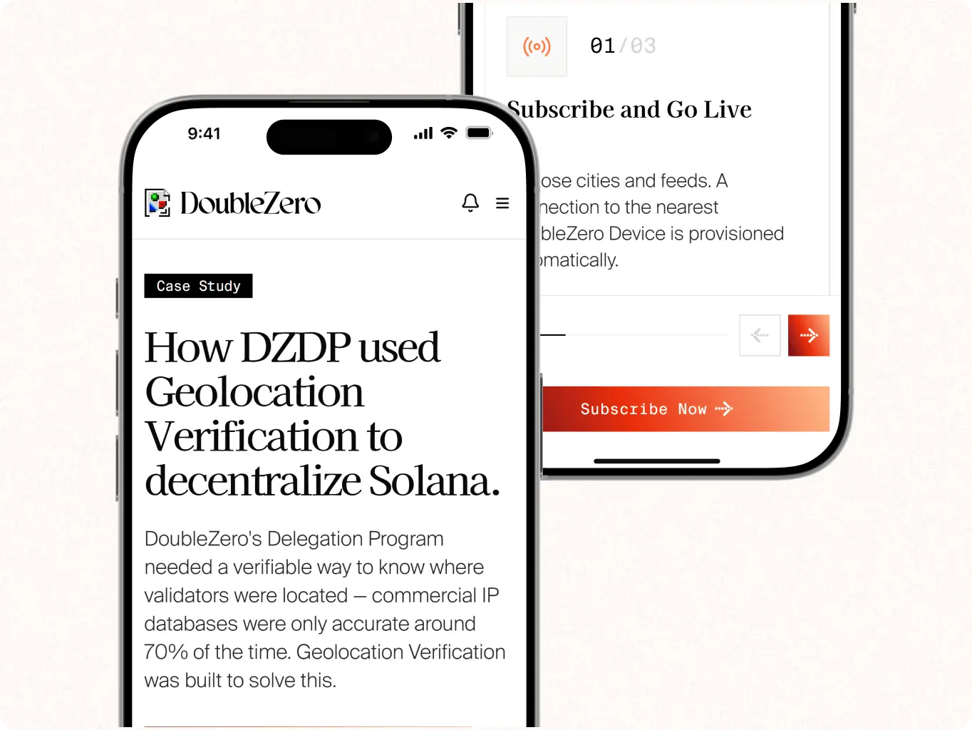
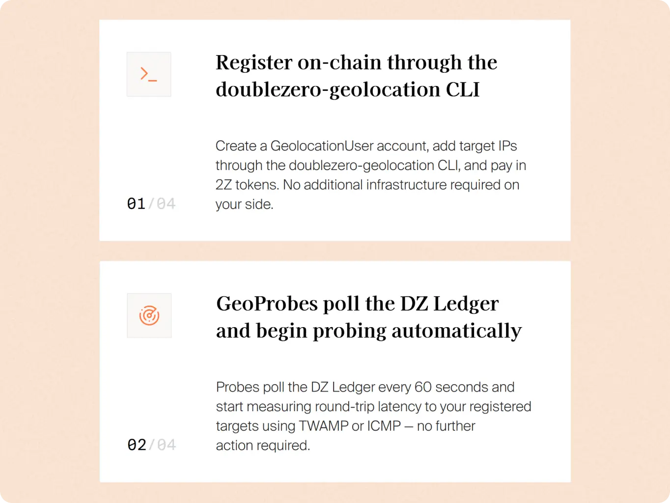
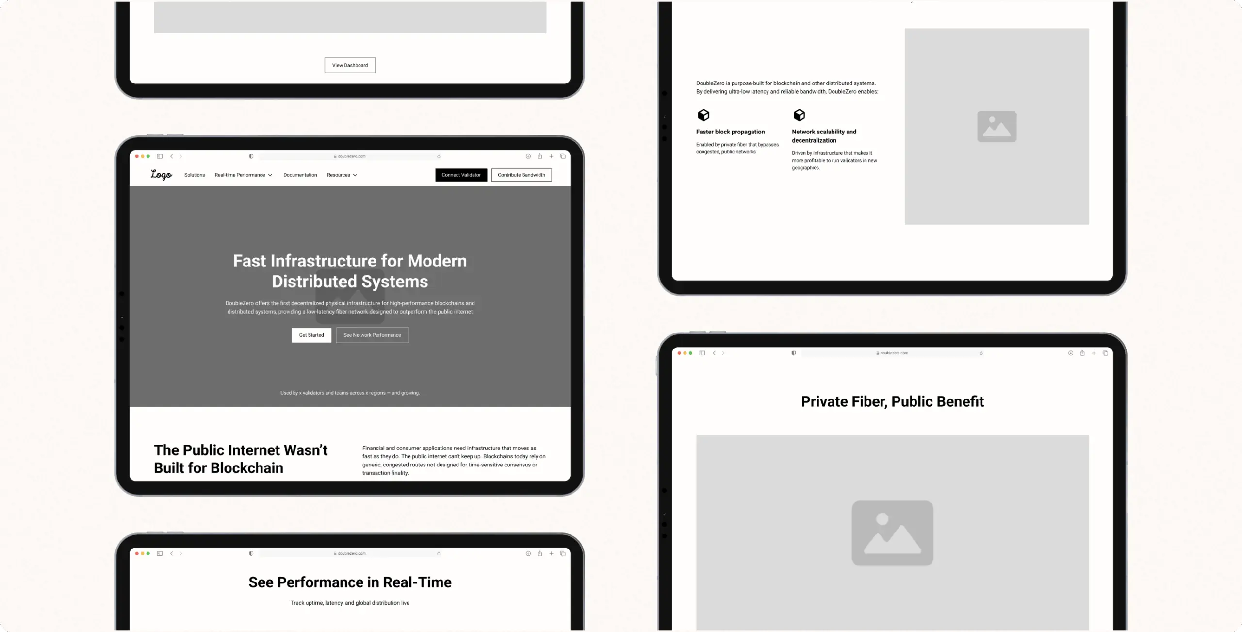
Structured each page around content density and reading order before any visual styling began – deciding where a diagram leads, where supporting text follows, and where a CTA sits relative to both.
This closed the risk of visual decisions being made before the information hierarchy was solved, which is what causes dense technical pages to read as cluttered. The result was a locked skeleton the brand could be applied to without renegotiating structure later.
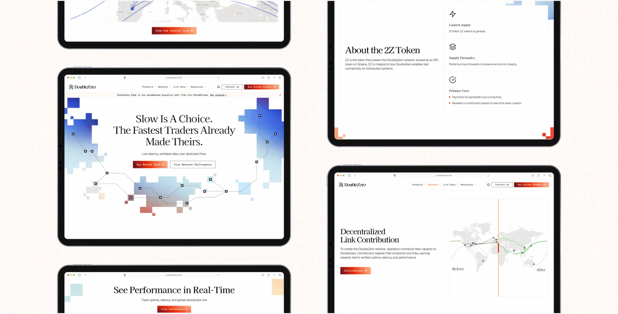
Defined how the existing brand – illustration style, color, tone -should feel on a site built for validators and developers, rather than the general audience the identity was originally designed around. This addressed the client’s exact concern: leaning too far toward the brand’s decorative side risked overpowering the content, while playing it safe risked a dry, templated feel. The direction set explicit boundaries for where illustration carries a page and where it steps back for data.
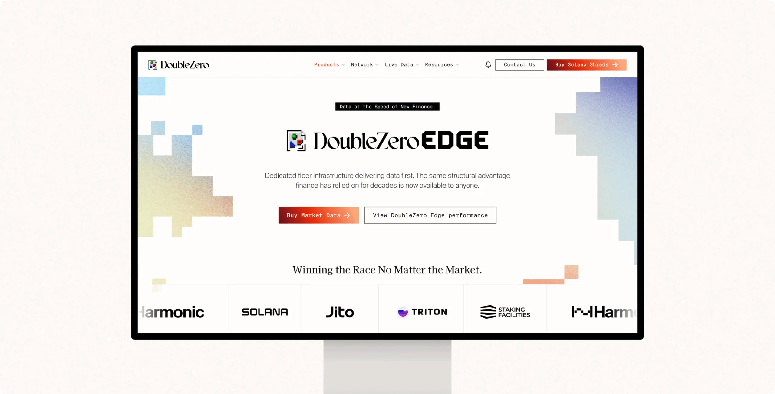
Built a reusable component system – chart styles, data cards, diagram frames, layout patterns – extending the existing brand into a form it had never needed before: one that stays legible across dense, chart-heavy pages. This solved the risk of every content-heavy page needing a one-off design decision, which would have threatened the one-month timeline. It gave the team a fixed toolkit to apply consistently across the full site.
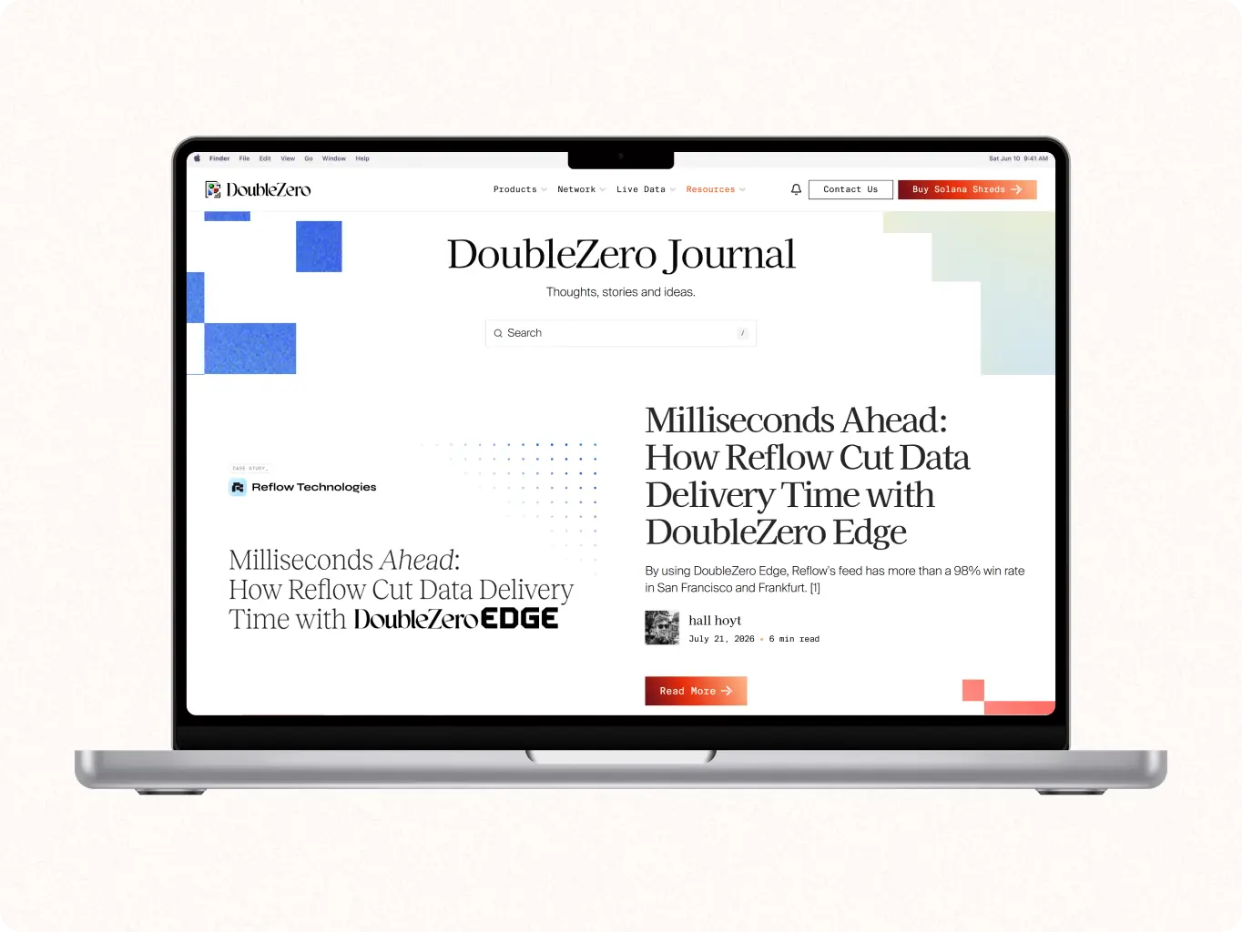
Applied the visual direction and UI kit across every page, keeping diagrams and schemes central while the brand frames rather than competes with them.
This is where the “marry branding with UX functionality” problem was resolved in practice – content stays legible, and the identity is still clearly present. The result is a site that reads as DoubleZero’s brand without ever costing the visitor’s grasp of the network itself.
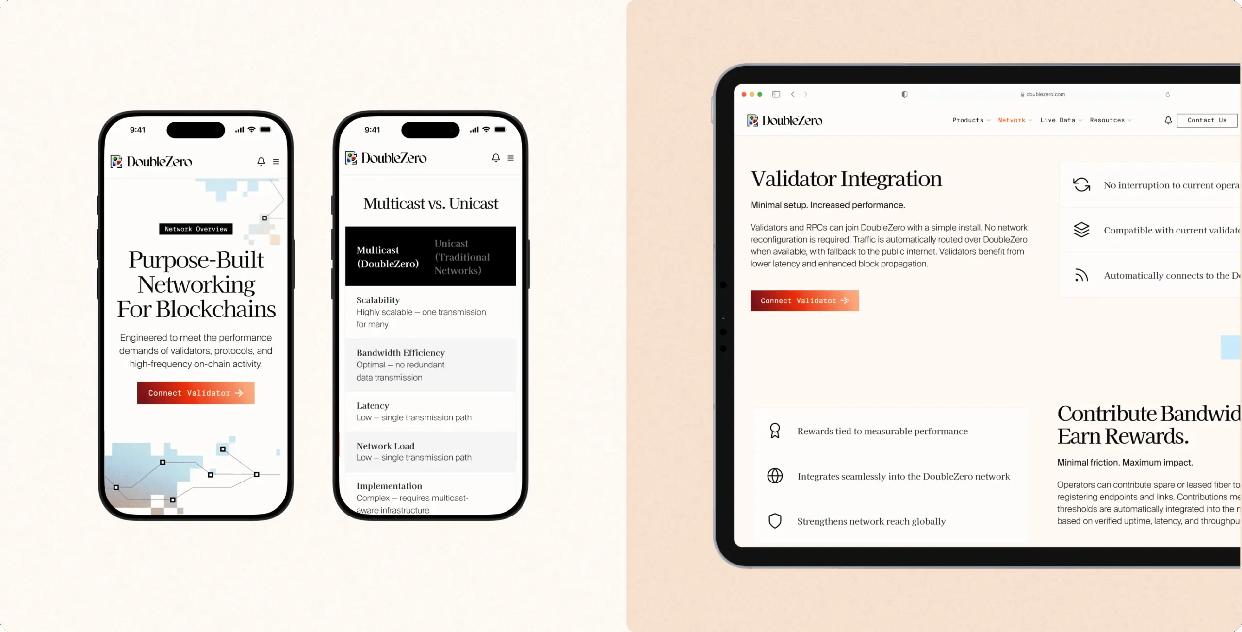
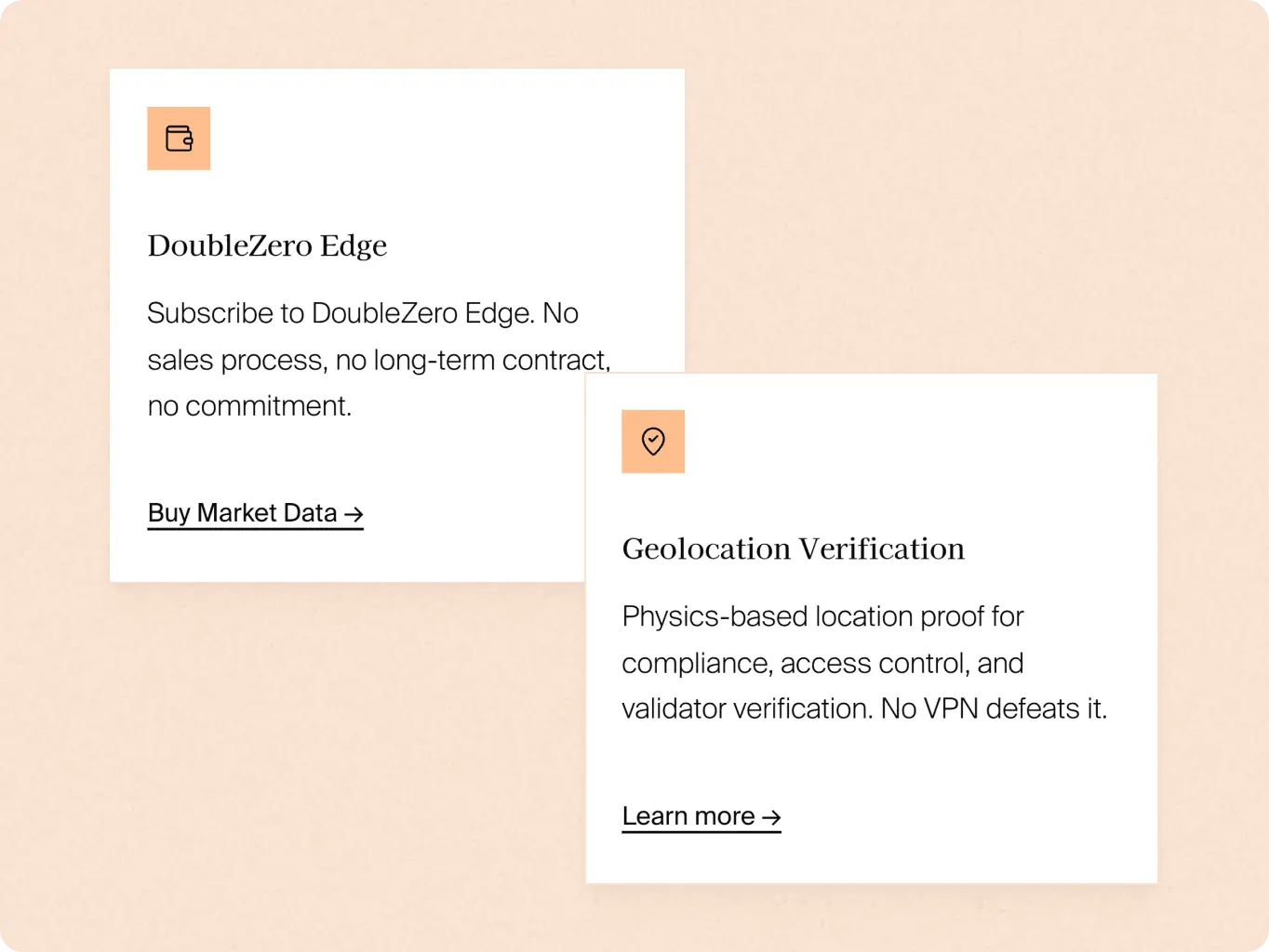
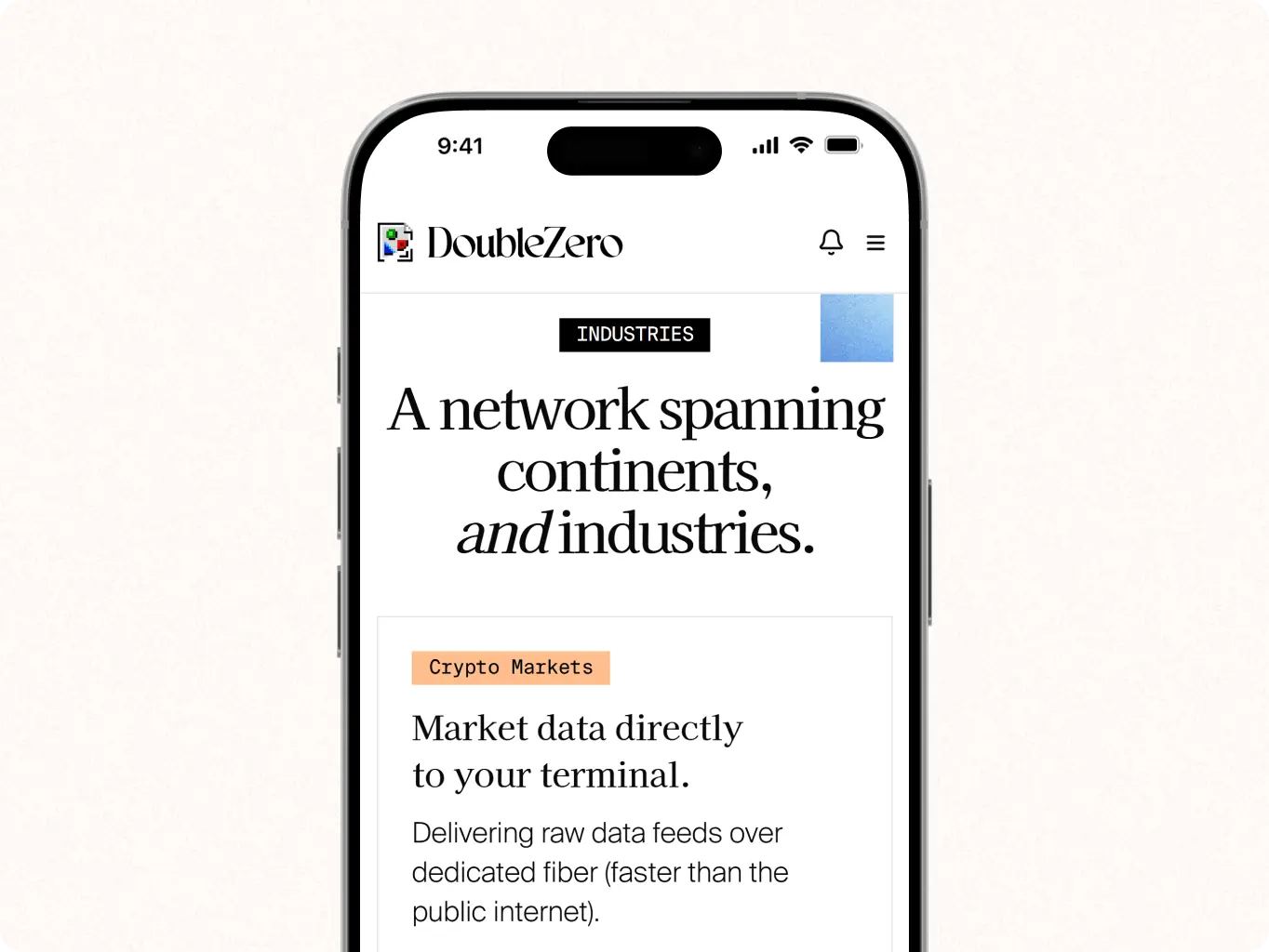
Development followed a standard build process rather than a technical differentiator in itself. Each page was designed against an approved wireframe, built in Next.js by the studio’s front-end developer, then handed to DoubleZero’s team for QA.
Bugs were reported back and fixed before sign-off; from there, DoubleZero’s own team built and connected the backend. That split kept backend architecture and infrastructure decisions in the client’s hands throughout, while the studio delivered a production-ready front end on schedule for the one-month phase.

Next.js

After our project was completed, the design was modified by the client to meet new business needs
#website design #website development
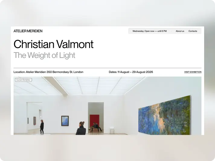
atelier meredian
USA
USA
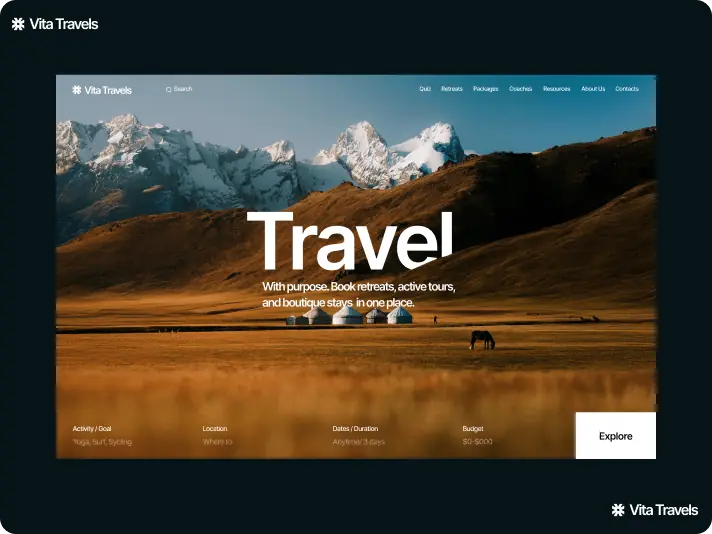
#Website design #website development
vita travels
USA
USA
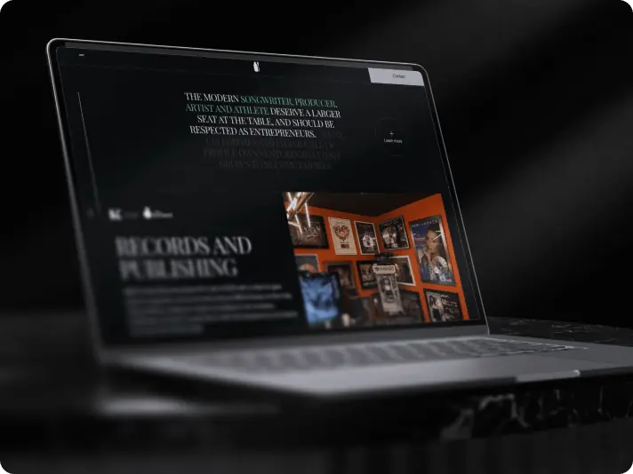
#Website design #Website development
Lucas Keller
USA
USA
