


MedAxis Group – connecting every layer of healthcare infrastructure
Client
medaxis
 USA
USA
USA
Services
As MedAxis added equipment, implementation, operations, training, analytics, and compliance to its offer, the business grew faster than the brand could explain it. The services were connected operationally, but the brand didn’t show that.
MedAxis asked us for a brand strategy, architecture and identity system that could unify the service lines, make the role of each one clear on its own, and leave room for more extensions without starting over.
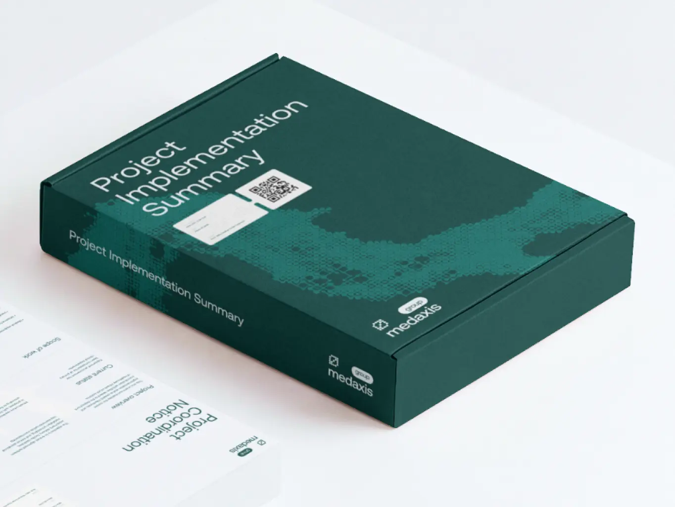
We mapped MedAxis against the full healthcare infrastructure lifecycle instead of looking at each service in isolation. The finding: clients didn’t choose MedAxis for equipment, software, or analytics alone – they chose it because those pieces reduced operational risk together.
That reframed MedAxis as an infrastructure partner, not a vendor list. We structured the portfolio into a connected ecosystem of sub-brands and built a visual language around precision, connection, and operational clarity – carried consistently across physical, digital, and communication touchpoints.
Stages
- brand strategy & architecture
- visual identity
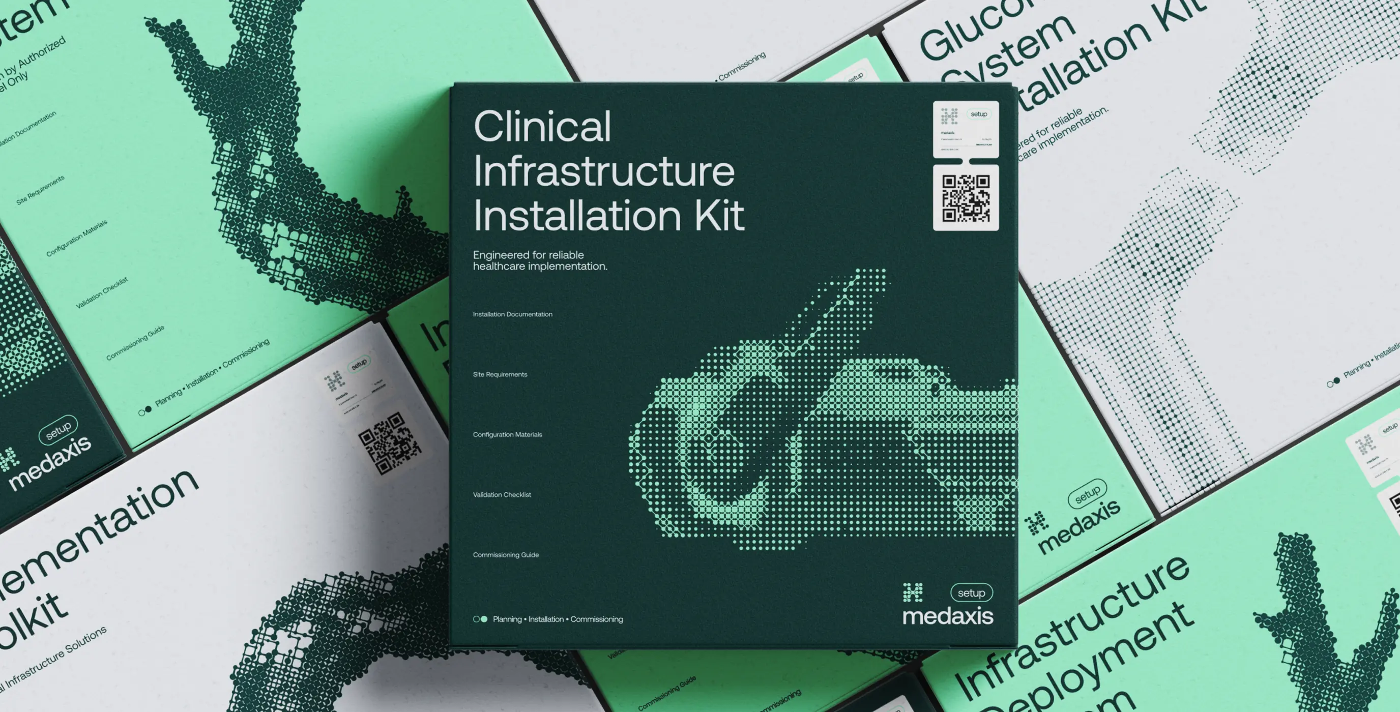
We looked at market context, buyer priorities, and competitive positioning to find where MedAxis could differentiate, not just describe what it does.
MedAxis already covered several critical layers of healthcare operations; the problem was that their combined value wasn’t legible from outside. The strategy connects those layers into one system, gives each specialized offering its own clear identity, and gives the MedAxis master brand a sharper claim: one ecosystem, specialized expertise.
Stages
- research
- Positioning
- Messaging & Tone of voice
- brand architecture
Before setting direction, we needed to know what was actually true about the market, the business, and the buyer, not assume it. We ran stakeholder interviews across leadership and sales, and talked to enterprise healthcare clients directly. On the market side, we audited 12 category competitors and reviewed industry reports and analyst coverage.
We reviewed healthcare infrastructure providers: their positioning, service portfolios, messaging and brand architectures to find where the category said the same thing and where MedAxis could say something different. Then we mapped MedAxis’s own capabilities and customer journeys, and found the real internal picture: the business had scaled well past what its communication could explain.
On the buyer side, we looked at what actually gets an enterprise healthcare decision-maker to sign, not what they say in a pitch meeting.
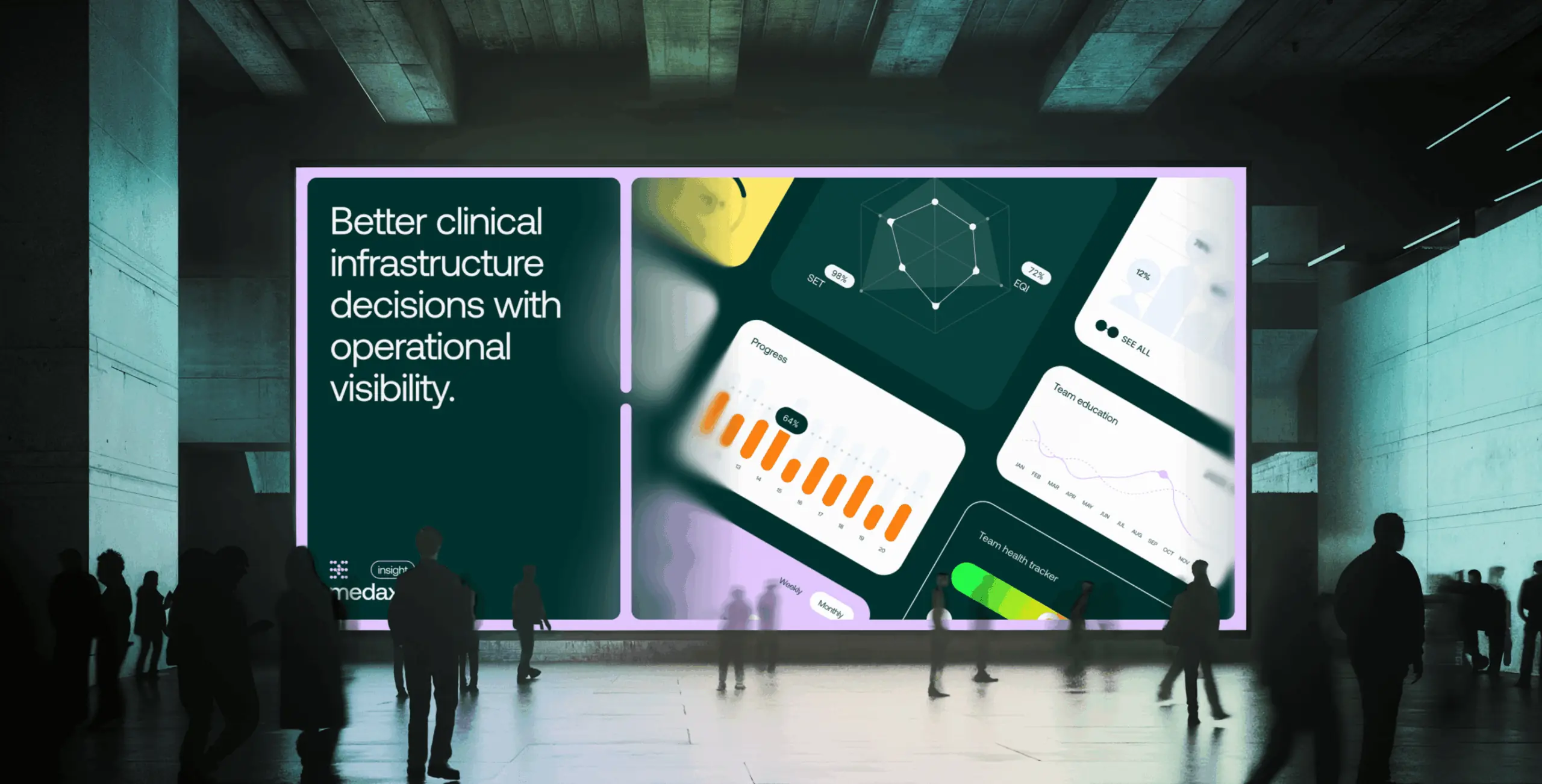
The most important outcome of the strategy phase was redefining what MedAxis actually is in the market.
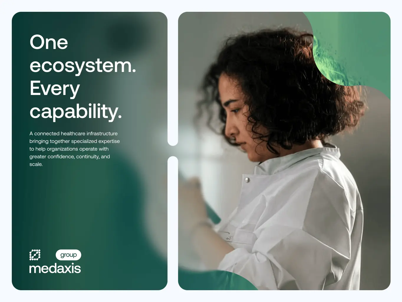
Instead of a collection of specialized services, we positioned MedAxis as a unified healthcare infrastructure partner, where equipment, implementation, operations, intelligence, and workforce enablement, working as one connected offer. One ecosystem, specialized expertise: that’s the line every other brand decision had to hold up against.

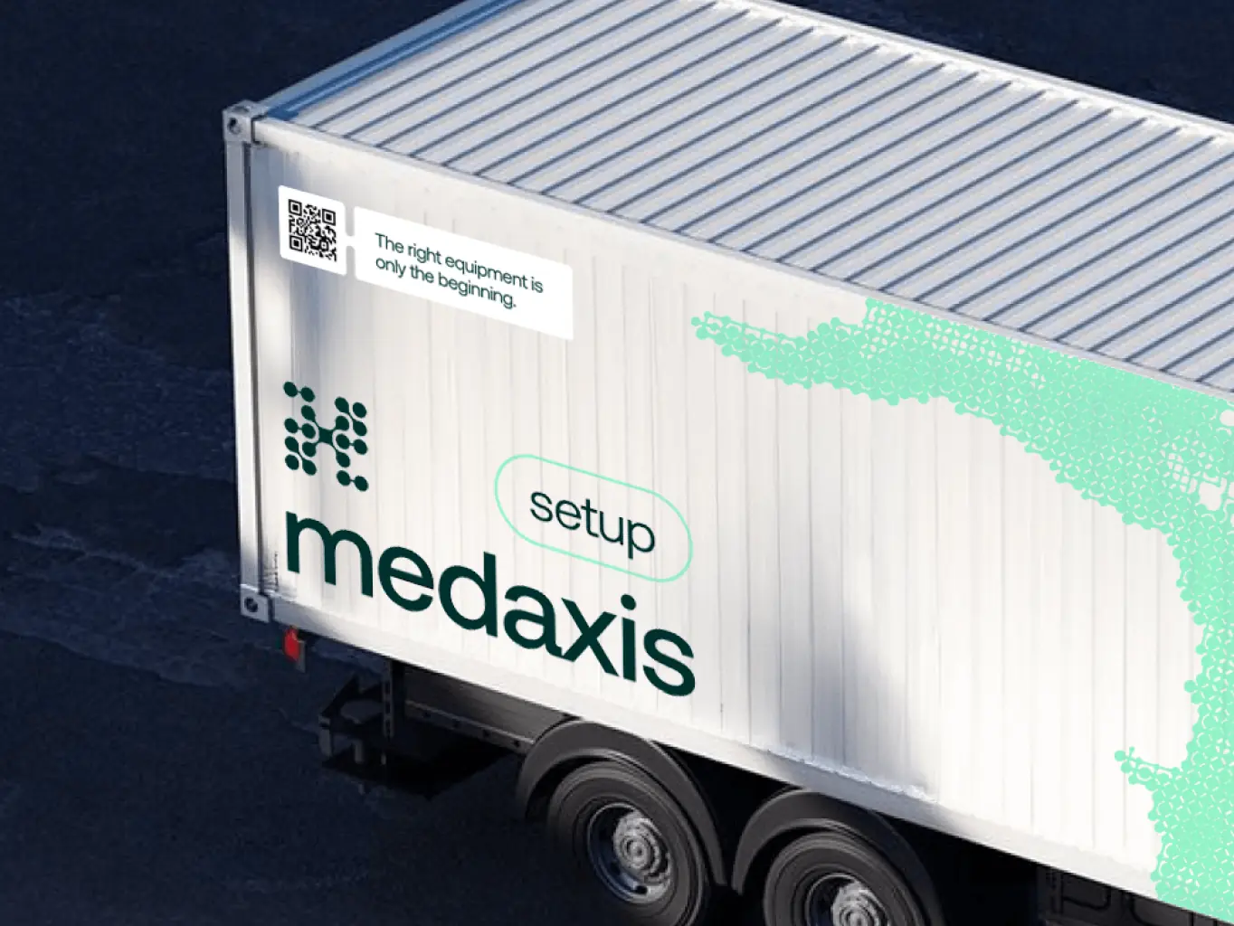
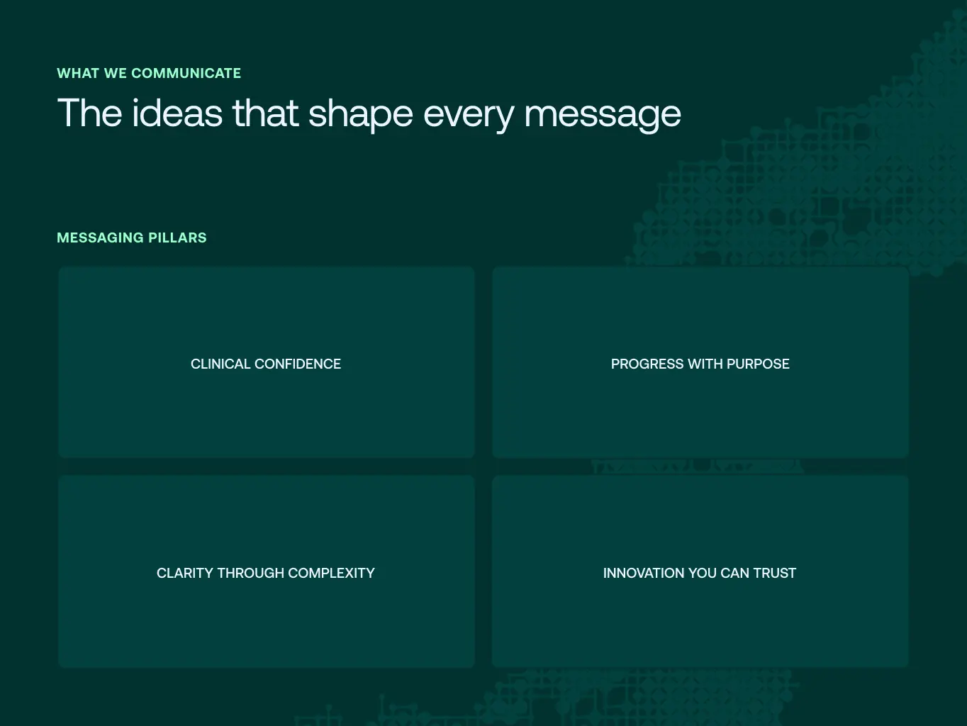
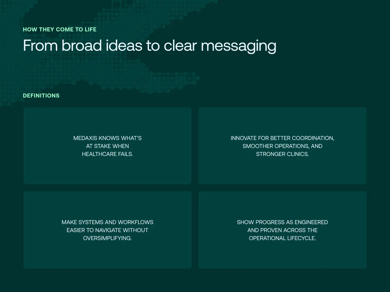
The messaging shifts focus from individual services to what the ecosystem does operationally, not what each piece is, but what happens when they work together.
Four pillars carry that message: clinical confidence, progress with purpose, clarity through complexity, and innovation you can trust.
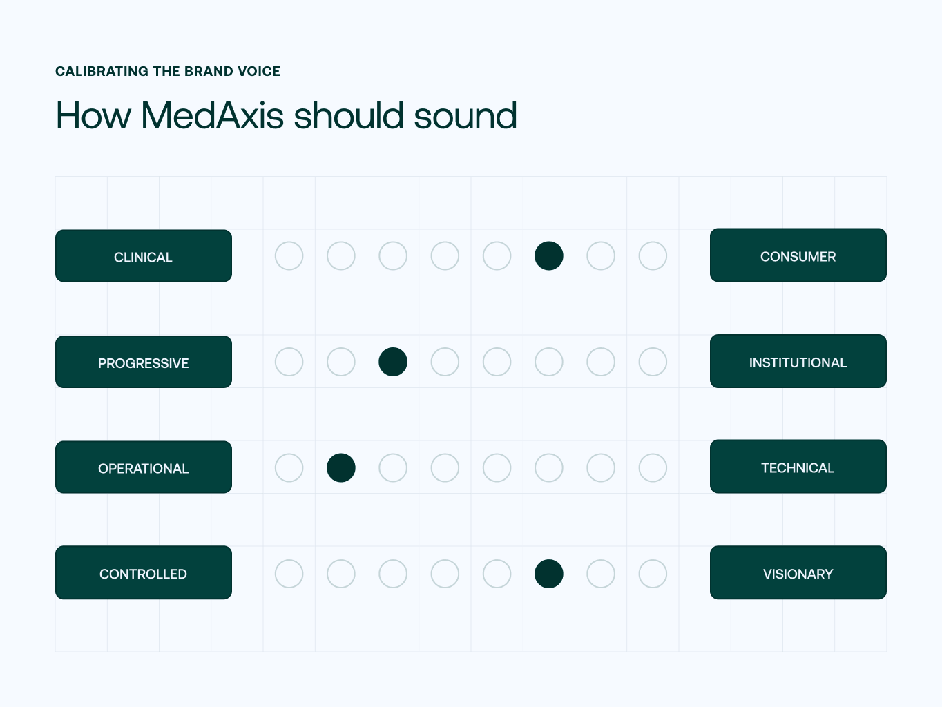
The tone is precise and calm: MedAxis explains complex ideas in plain, structured language instead of reaching for scale words or startup energy.
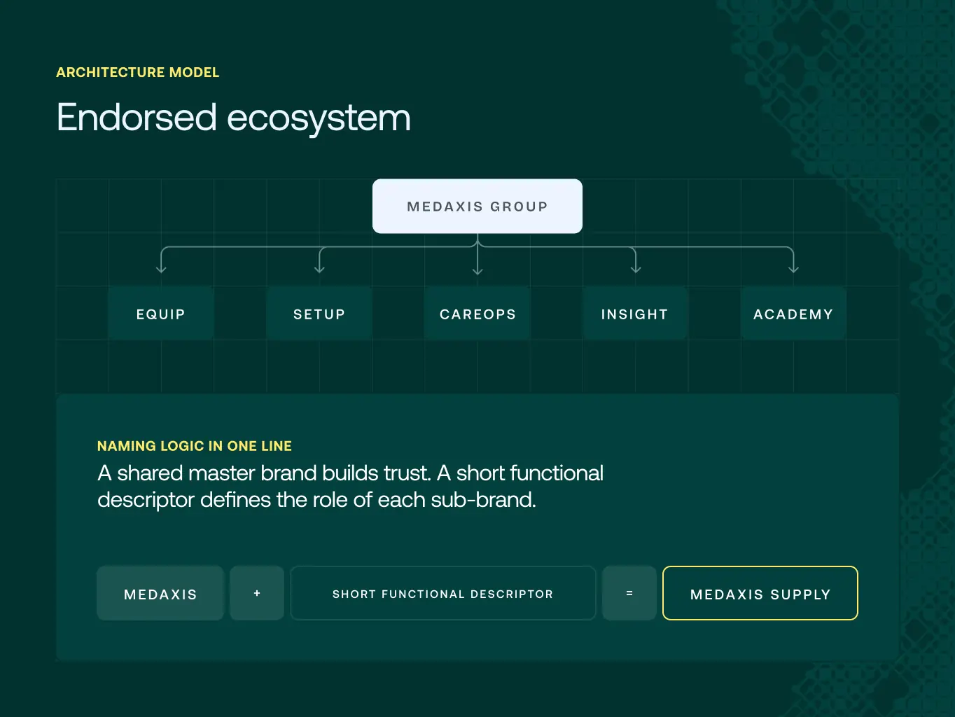
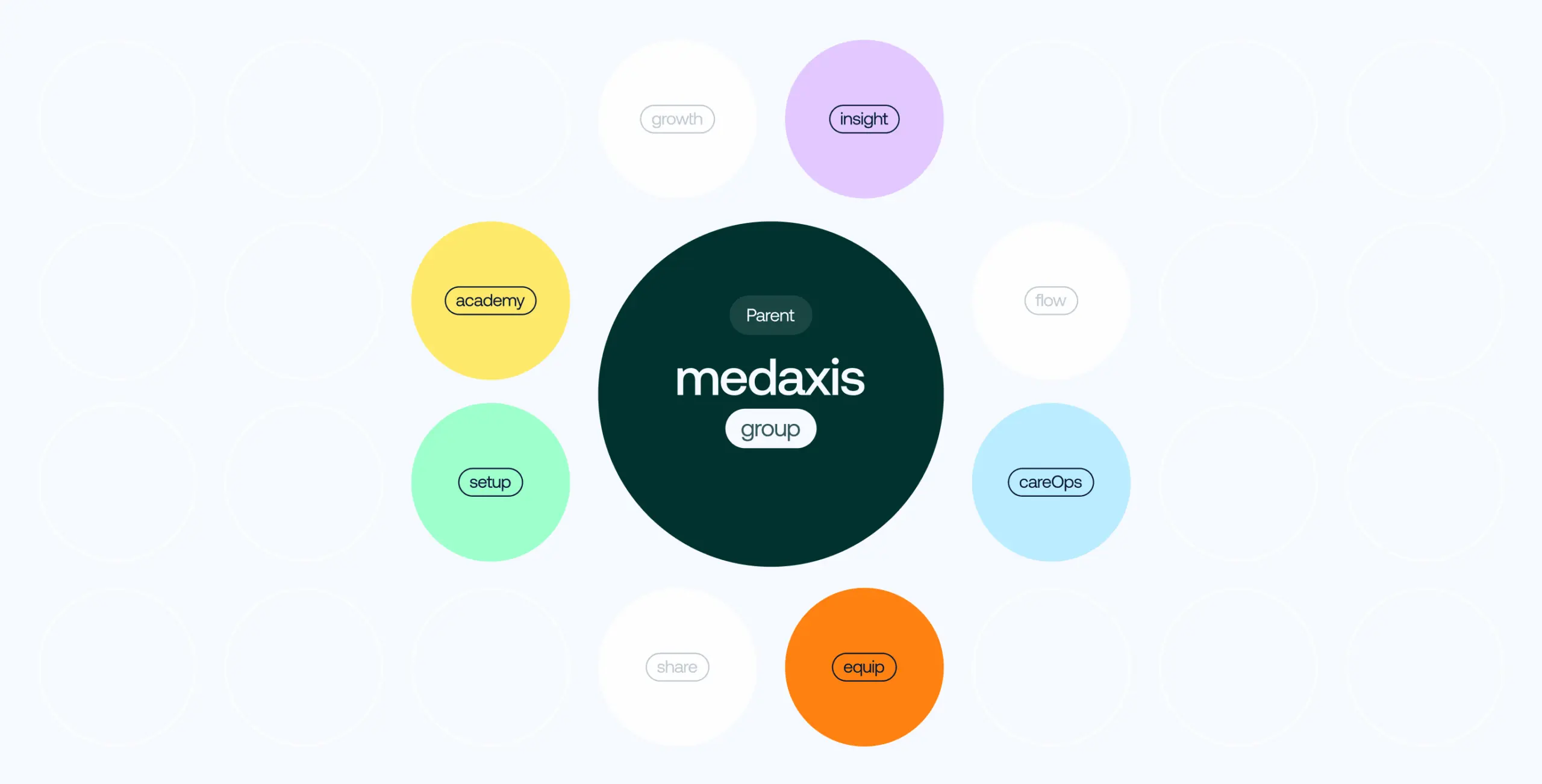
We chose an endorsed model: each capability keeps a clear role and market presence without breaking away from the master brand.
Each sub-brand covers a distinct part of the healthcare operational lifecycle. MedAxis carries the trust and recognition behind all of them, so specialized offerings can grow on their own terms and still read as one infrastructure.
New capabilities can be added later through the same naming and endorsement logic: without a rebrand, and without diluting MedAxis itself.
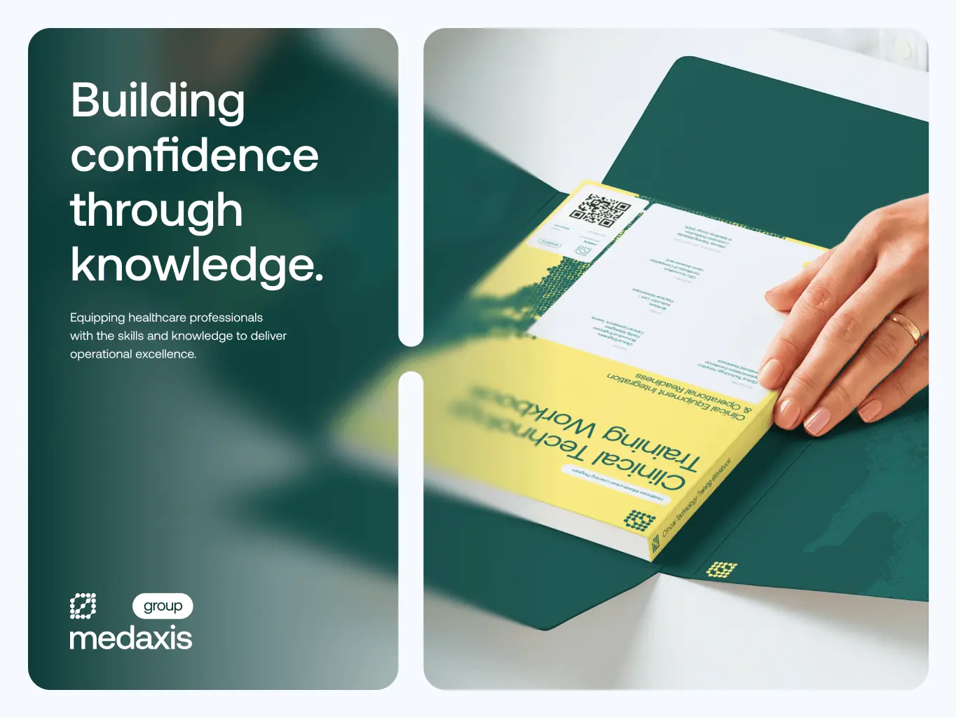
The identity had two jobs at once: read as a credible enterprise partner, and give each specialized capability enough distinction to explain its role at a glance.
Instead of endless separate identities, we built one shared system – typography, composition, imagery, and graphic behavior – that adapts across equipment, implementation, operations, analytics, and education. The rules stay constant; only the expression shifts per sub-brand.
The hard part was designing one system flexible enough to hold many sub-brands without any of them looking like an afterthought. Every rule had to work both ways: specific enough to give each sub-brand its own voice, consistent enough that the whole thing still reads as one brand at a glance.
Stages
- Visual direction
- Sub-brands hierarchy
- Visual system principles
- brand assets
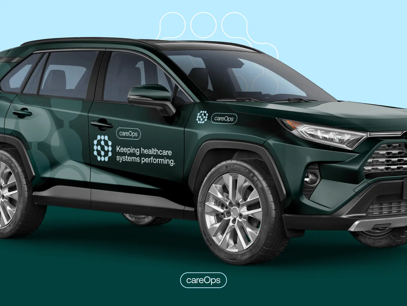
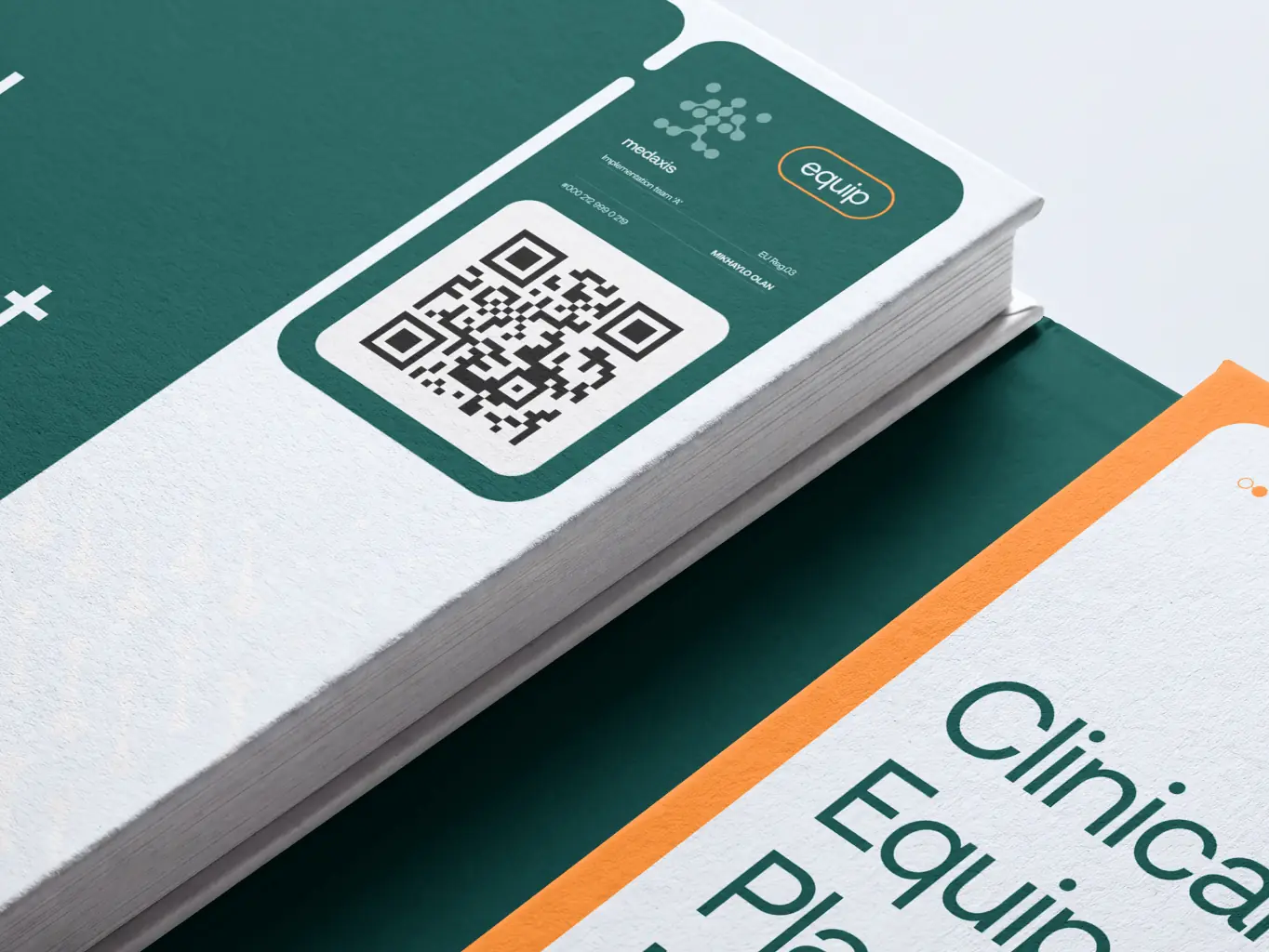
The visual identity reinforces MedAxis’s positioning as a connected healthcare infrastructure partner.
Rather than build a separate visual language for each capability, we designed one modular identity system that expresses specialization and unity at the same time.
The logo carries that idea directly: interconnected nodes stand for each area of expertise, held inside one enclosing form. It’s built to hold up as MedAxis adds services or capabilities – without a redesign each time.

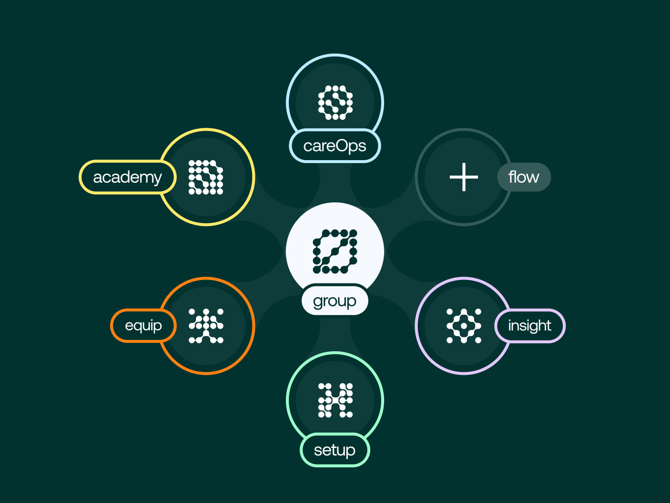
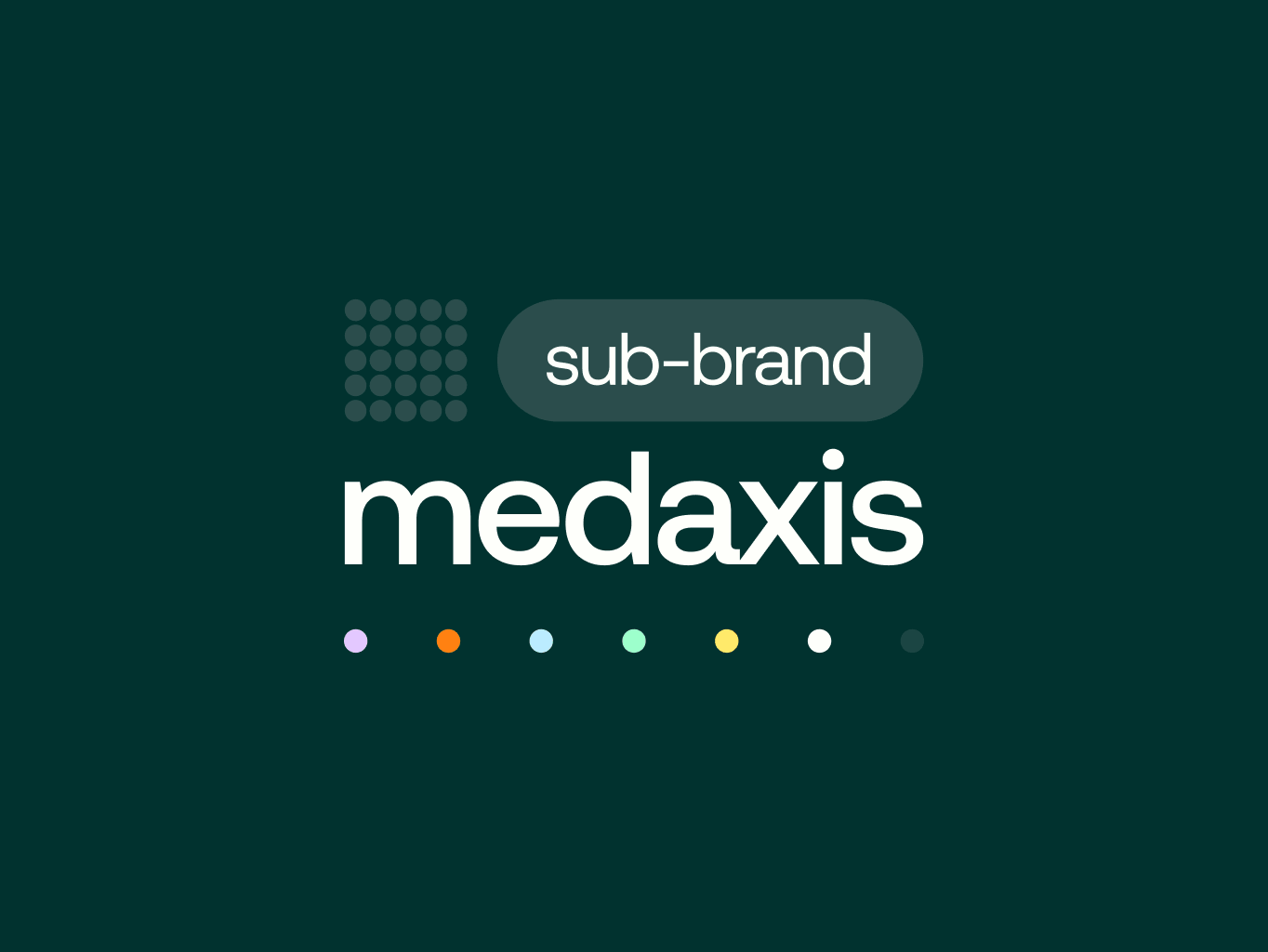
Every sub-brand shares the same logo structure, typography, and graphic language. What changes is color coding and naming, and that’s what makes each one distinct. That consistency is what makes the MedAxis master brand recognizable at a glance, while each capability still speaks in its own context.
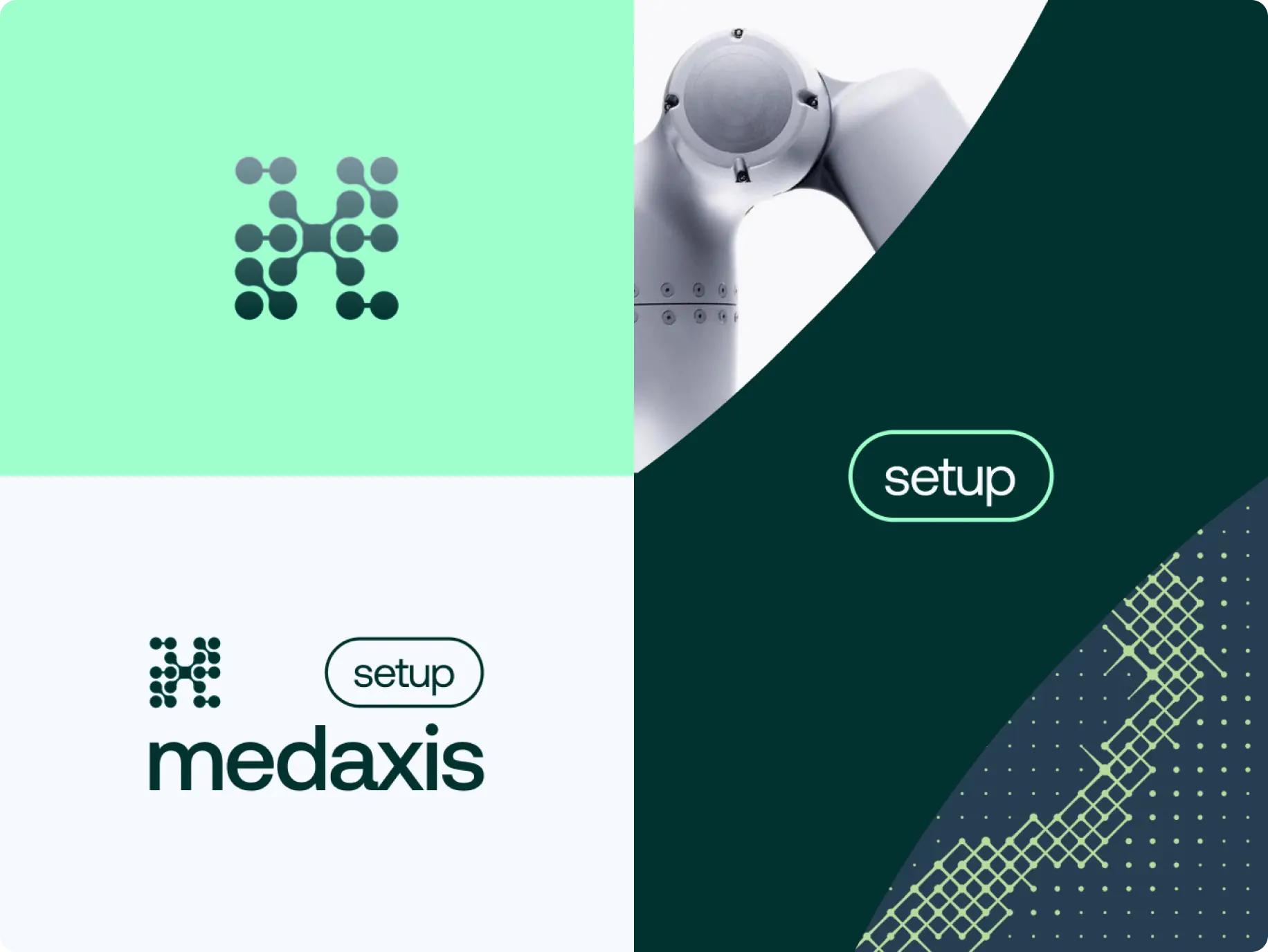
Setup
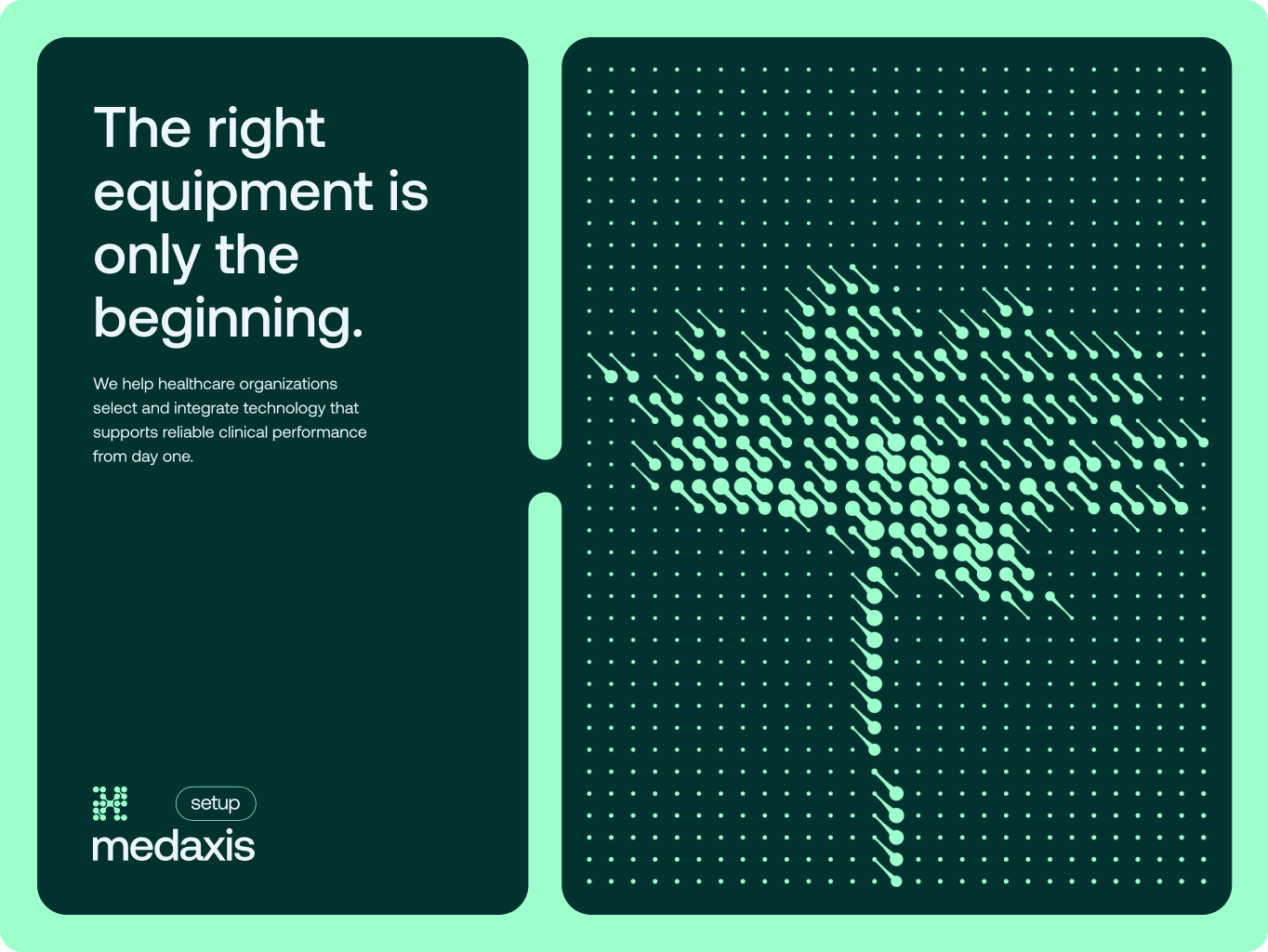
Setup is the sub-brand a client sees most before MedAxis has delivered anything - during planning, installation, and handoff. That's the highest-risk moment for trust, so the mark stays open and branching: it reads as a rollout in progress, not a finished system.
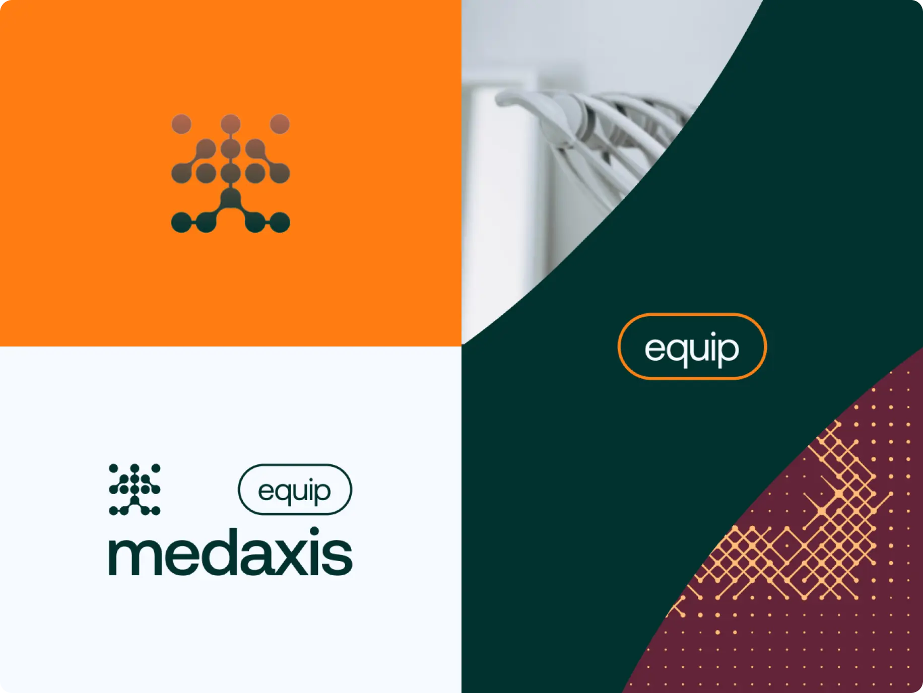
Equip
Equip covers the physical hardware, the part clients can actually touch and audit. The mark narrows to a single point at its base, like weight resting on a foundation: equipment credibility comes from engineering, not styling, and the mark doesn't try to look decorative.
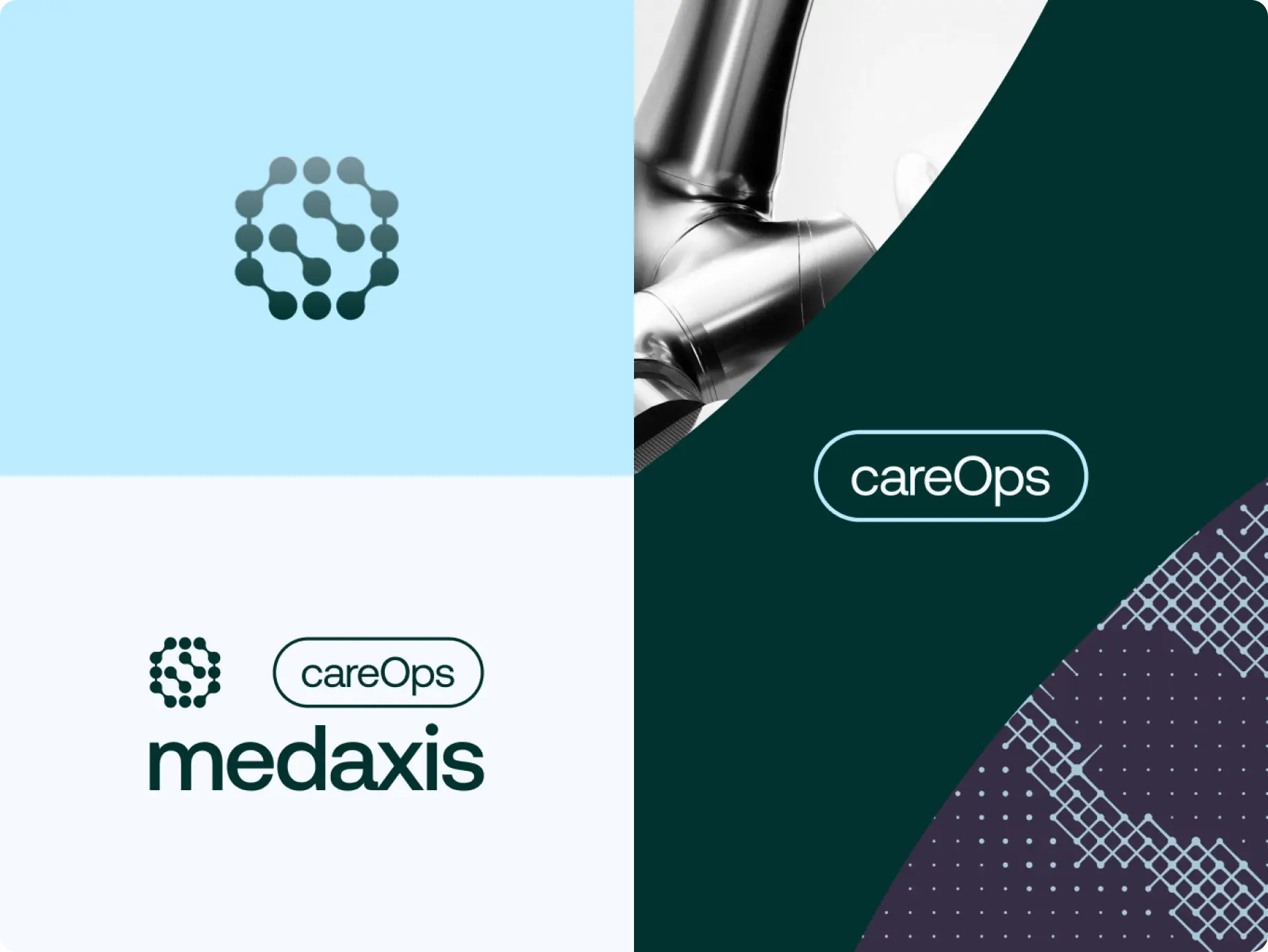
CareOps
CareOps is the relationship MedAxis holds the longest - everything that keeps a client's infrastructure running after go-live. It's the only mark in the system that closes into a full ring instead of branching outward: this sub-brand's job never really ends, and the identity doesn't pretend otherwise.
Insight
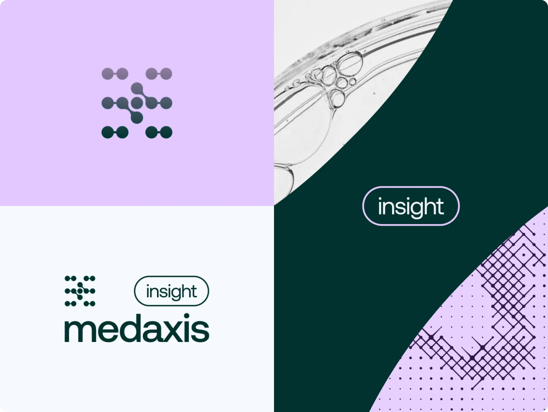
Insight turns operational noise into something a decision-maker can act on. Its mark is the most open and asymmetric of the five - deliberately less gridded than Academy or Equip, because raw data doesn't arrive pre-organized, and the identity doesn't fake that it does.
Academy
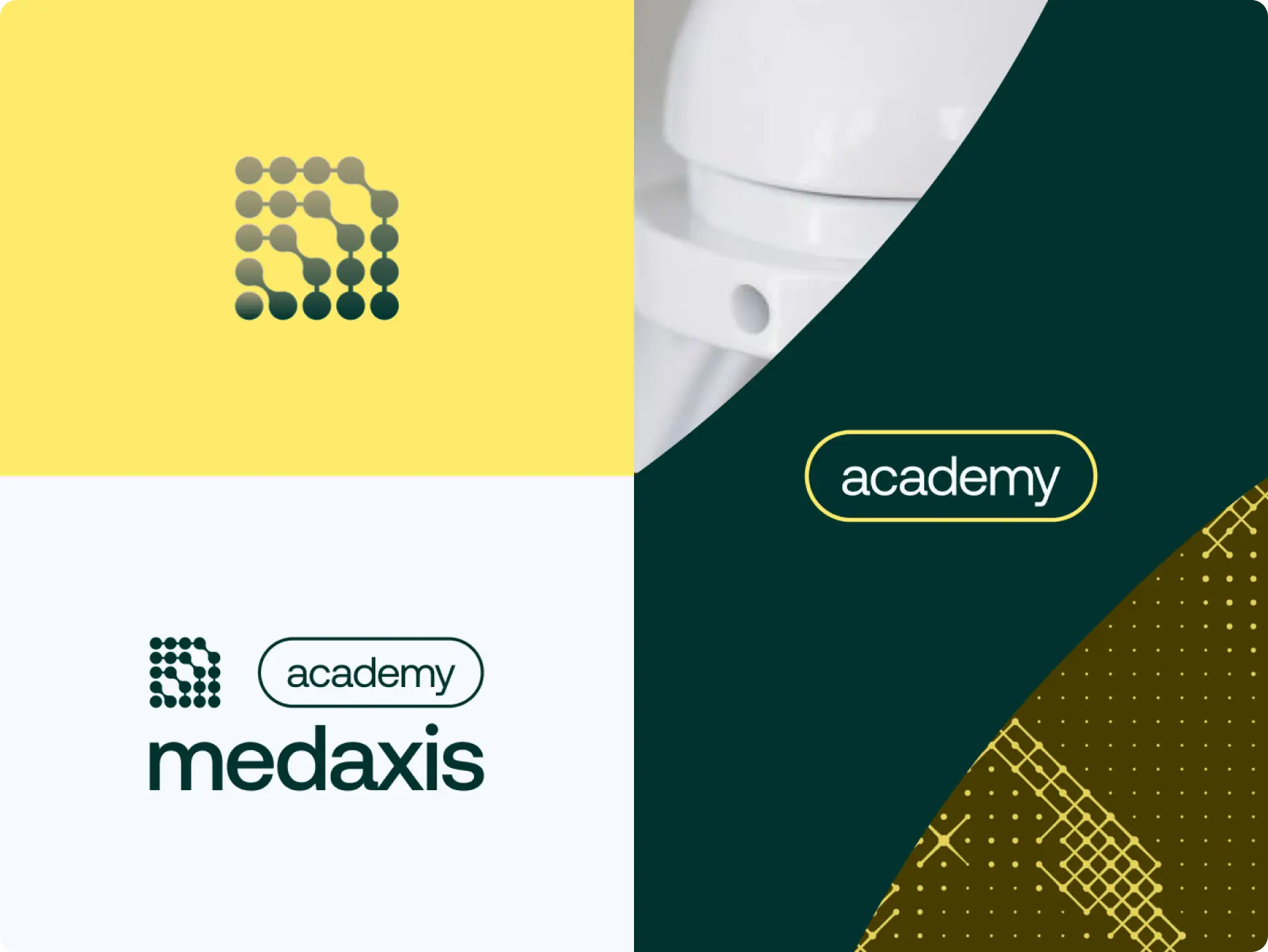
Academy is what makes the rest of the system usable: training the people who run MedAxis infrastructure day to day. Its mark is the densest, most tightly gridded of the five: knowledge compounds and layers, and the identity is built to look accumulated, not brand new.
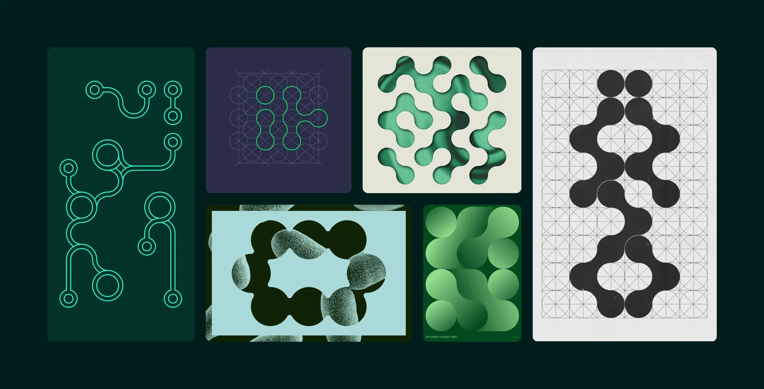
We set 5 visual principles that guide every brand application: modular grids, a shared typographic hierarchy, controlled color usage, graphic components, and consistent image treatment. Together they keep the system recognizable – from the master brand down to each specialized business unit.
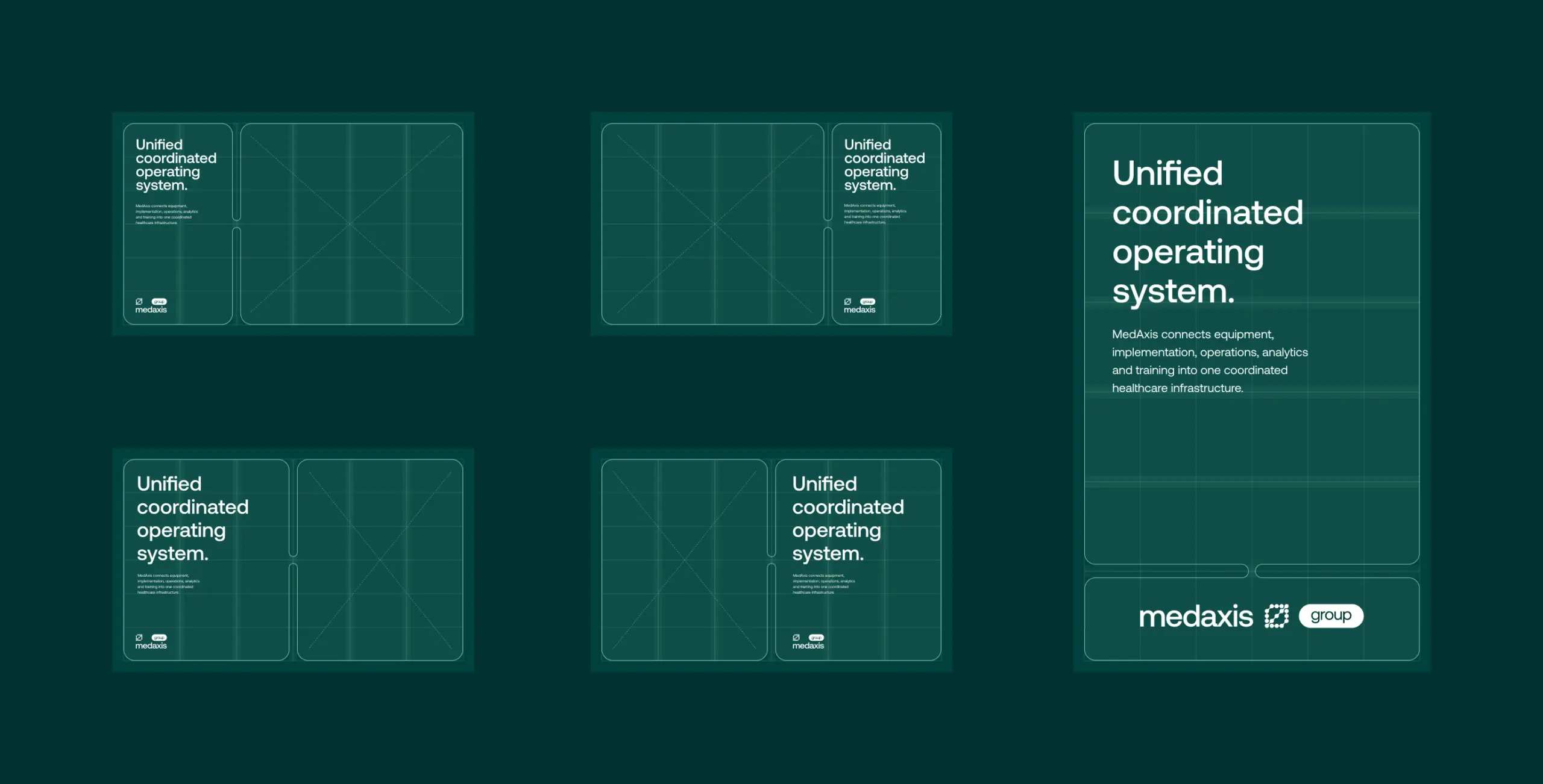
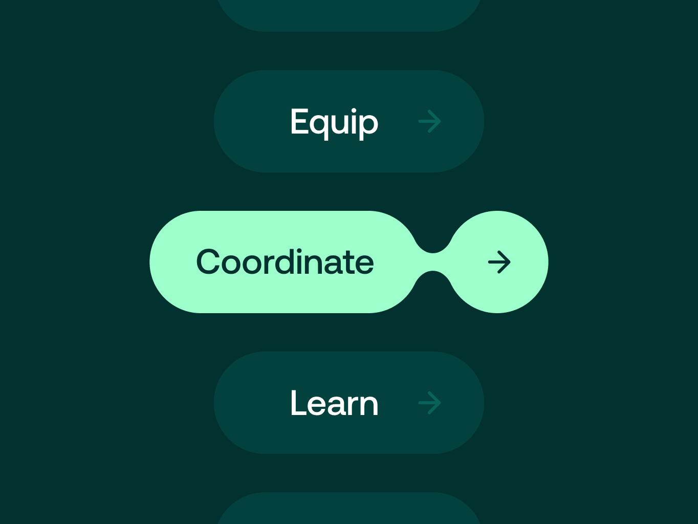
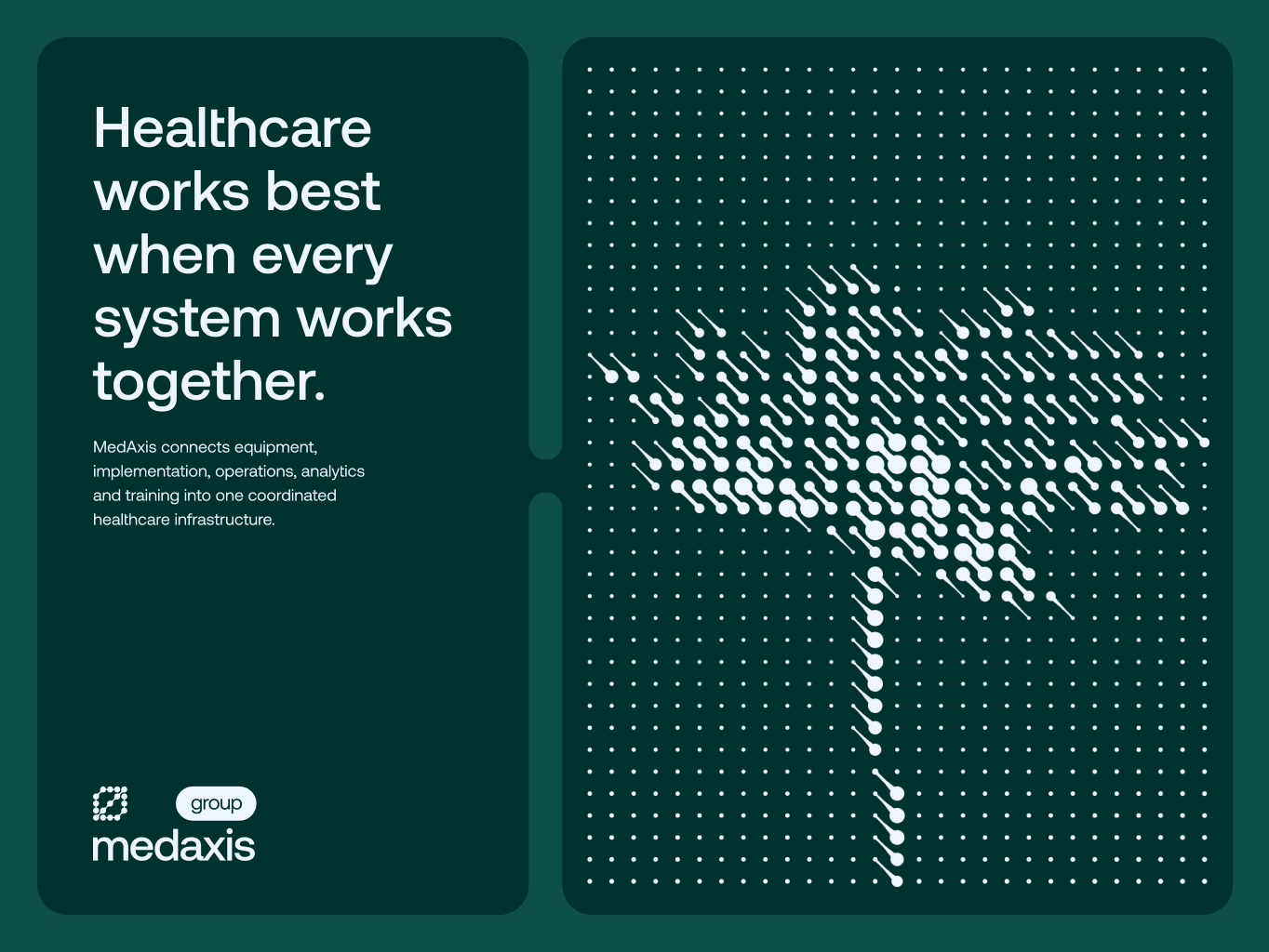
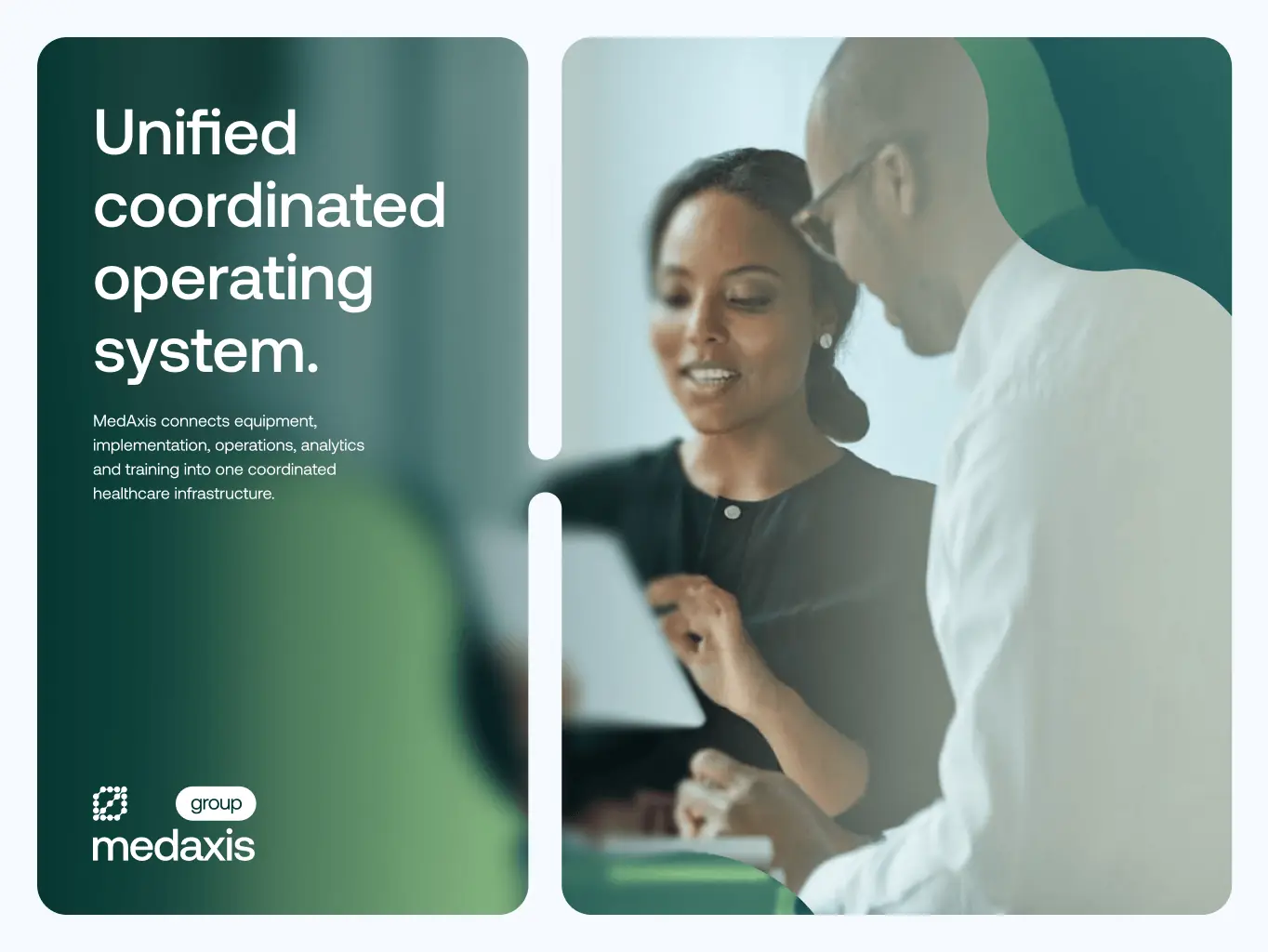
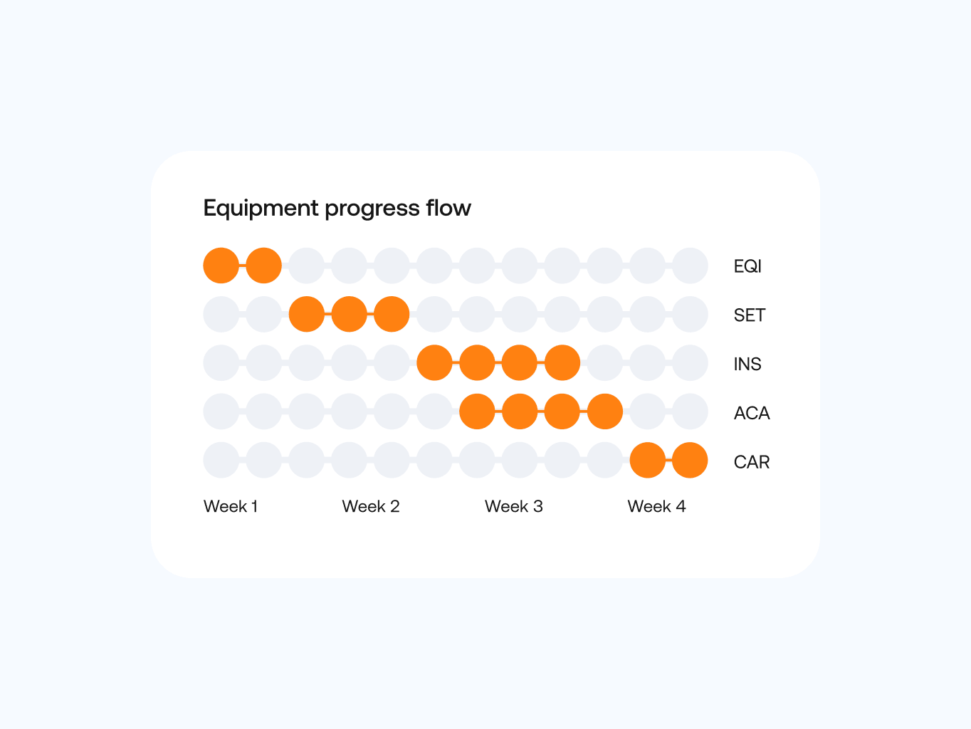

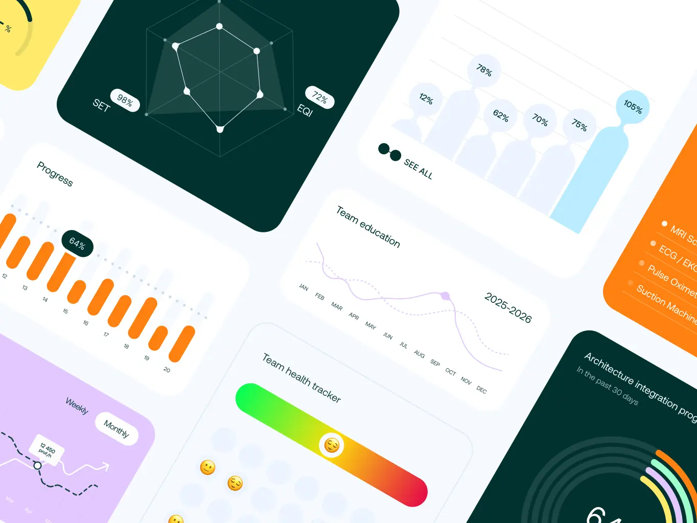
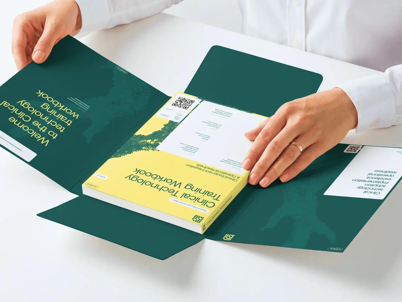
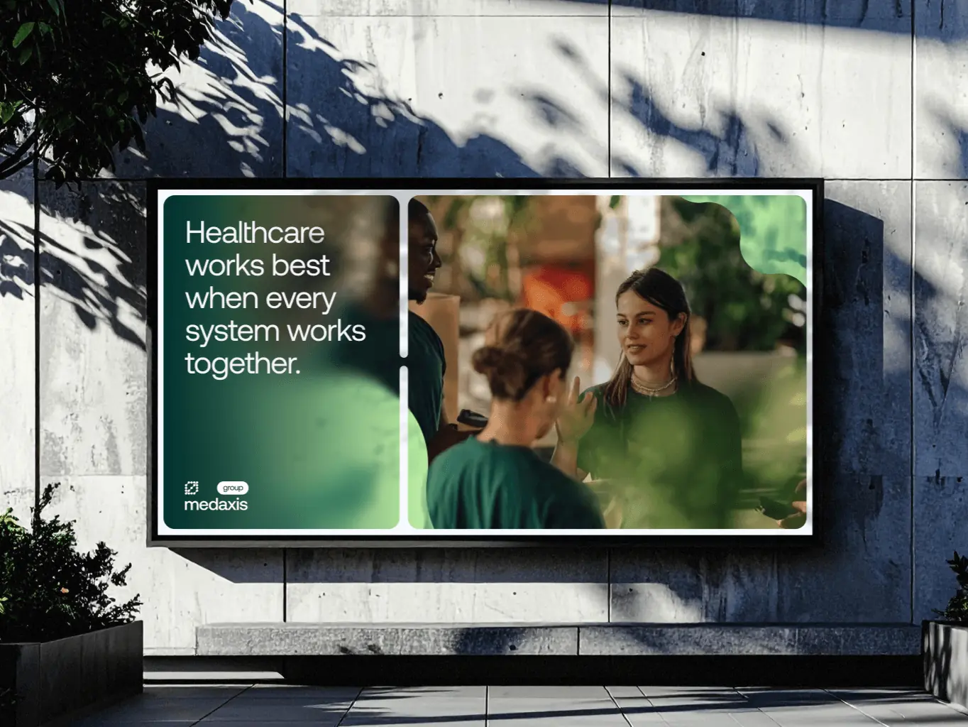
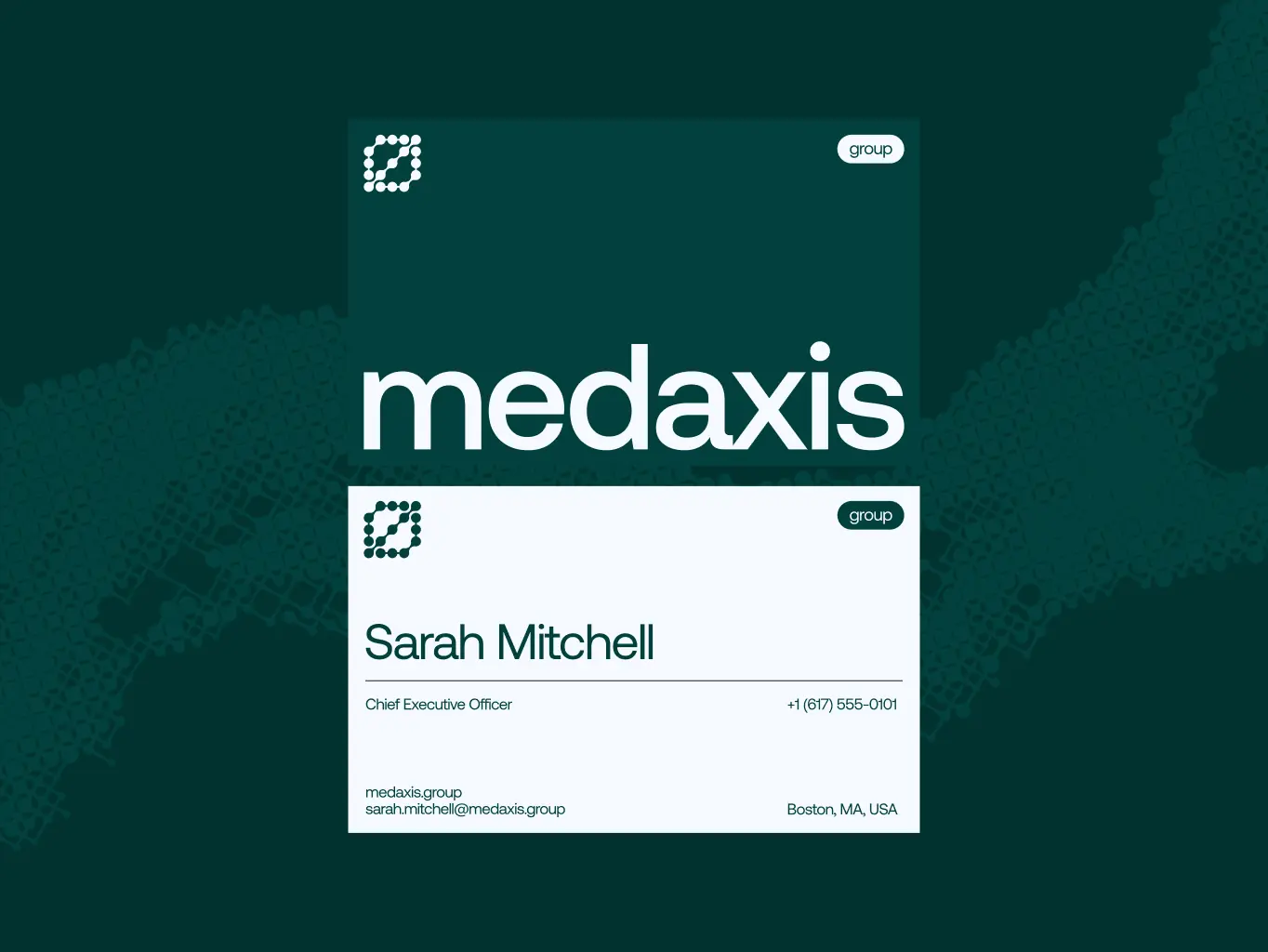
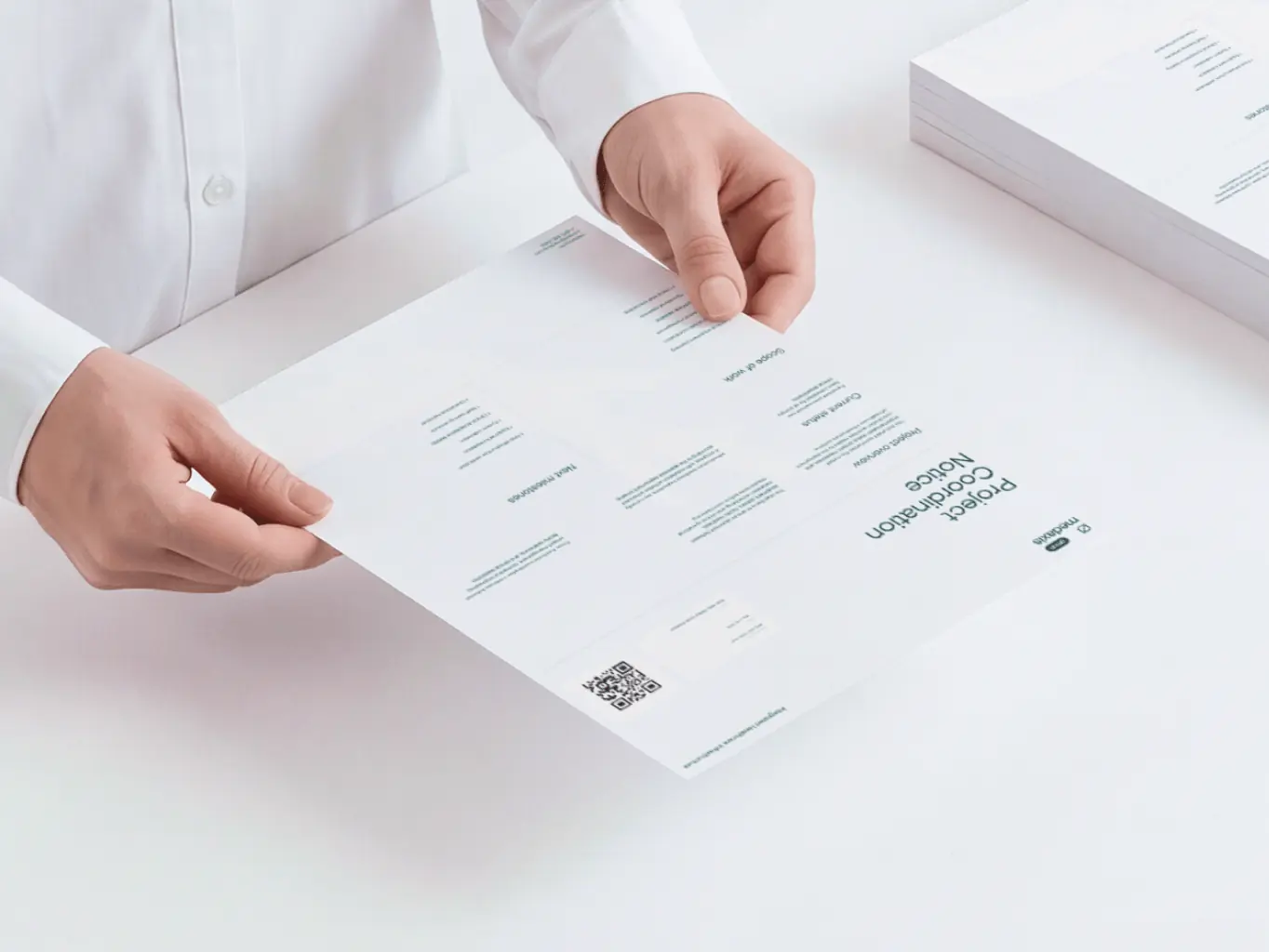
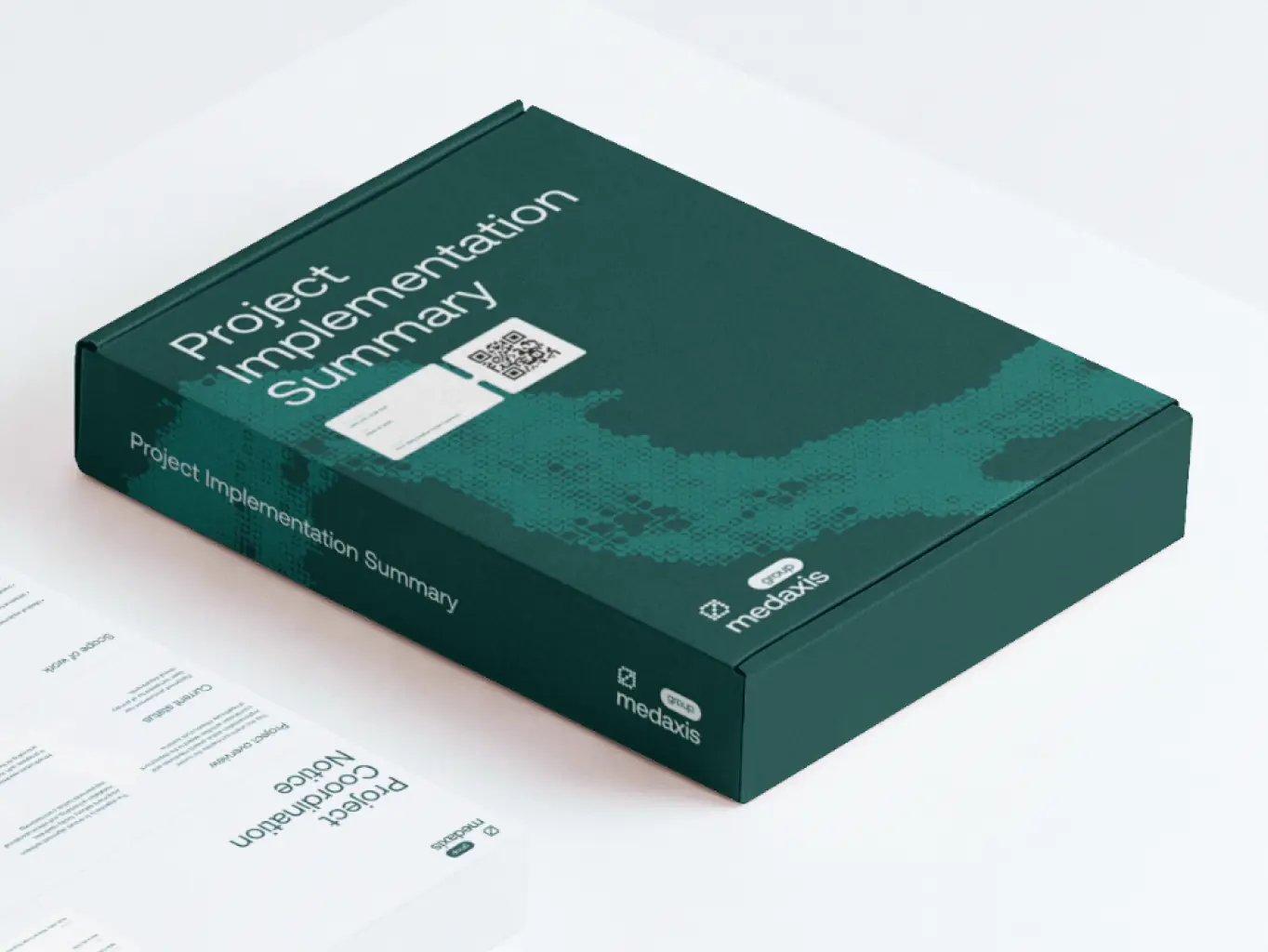
The identity carries the same design principles across every touchpoint: corporate communications, operational materials, environmental graphics, digital interfaces – each one adapted to its purpose, all recognizably MedAxis.
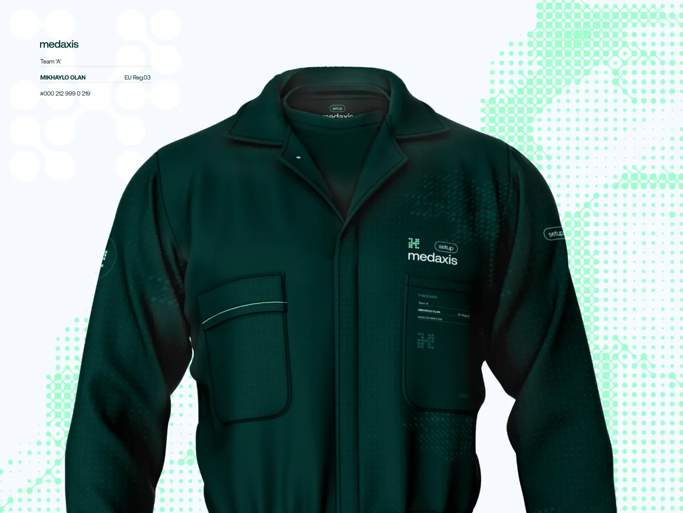
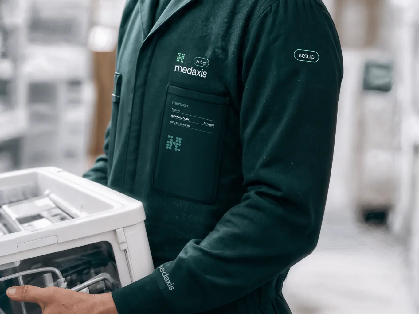
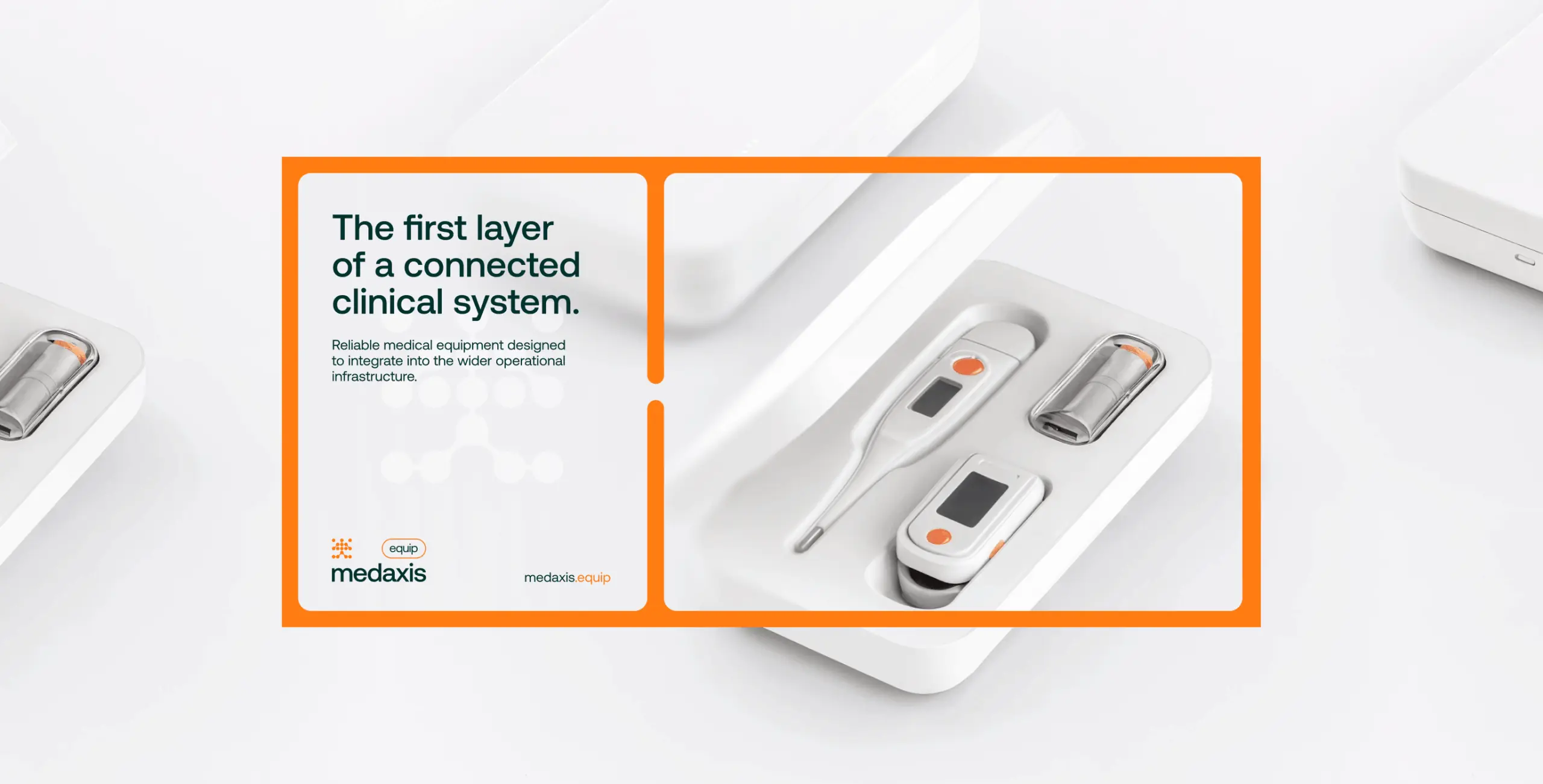
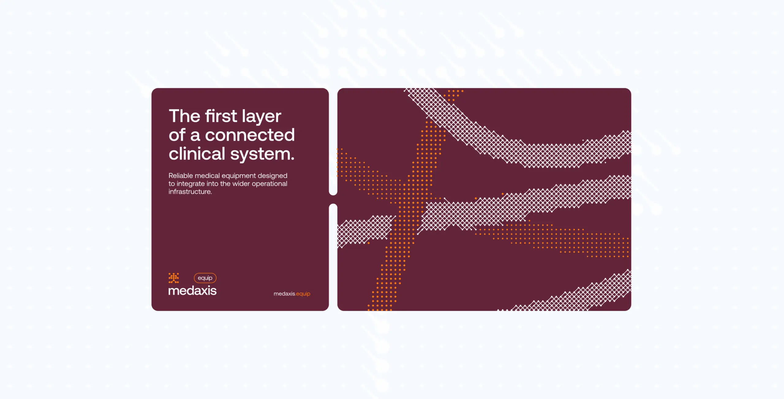
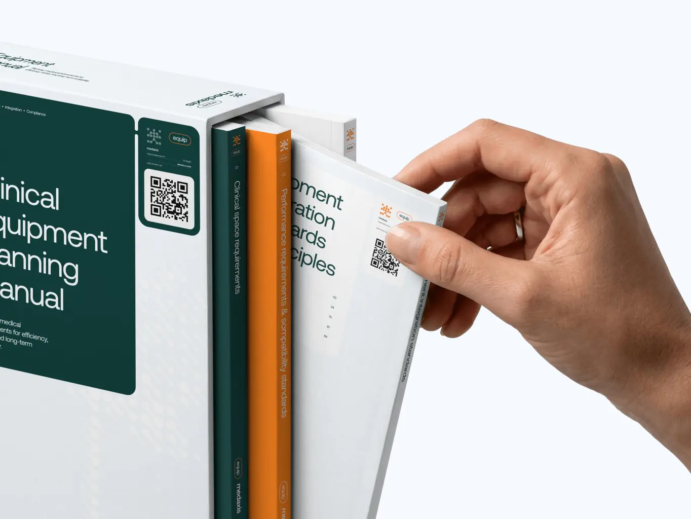
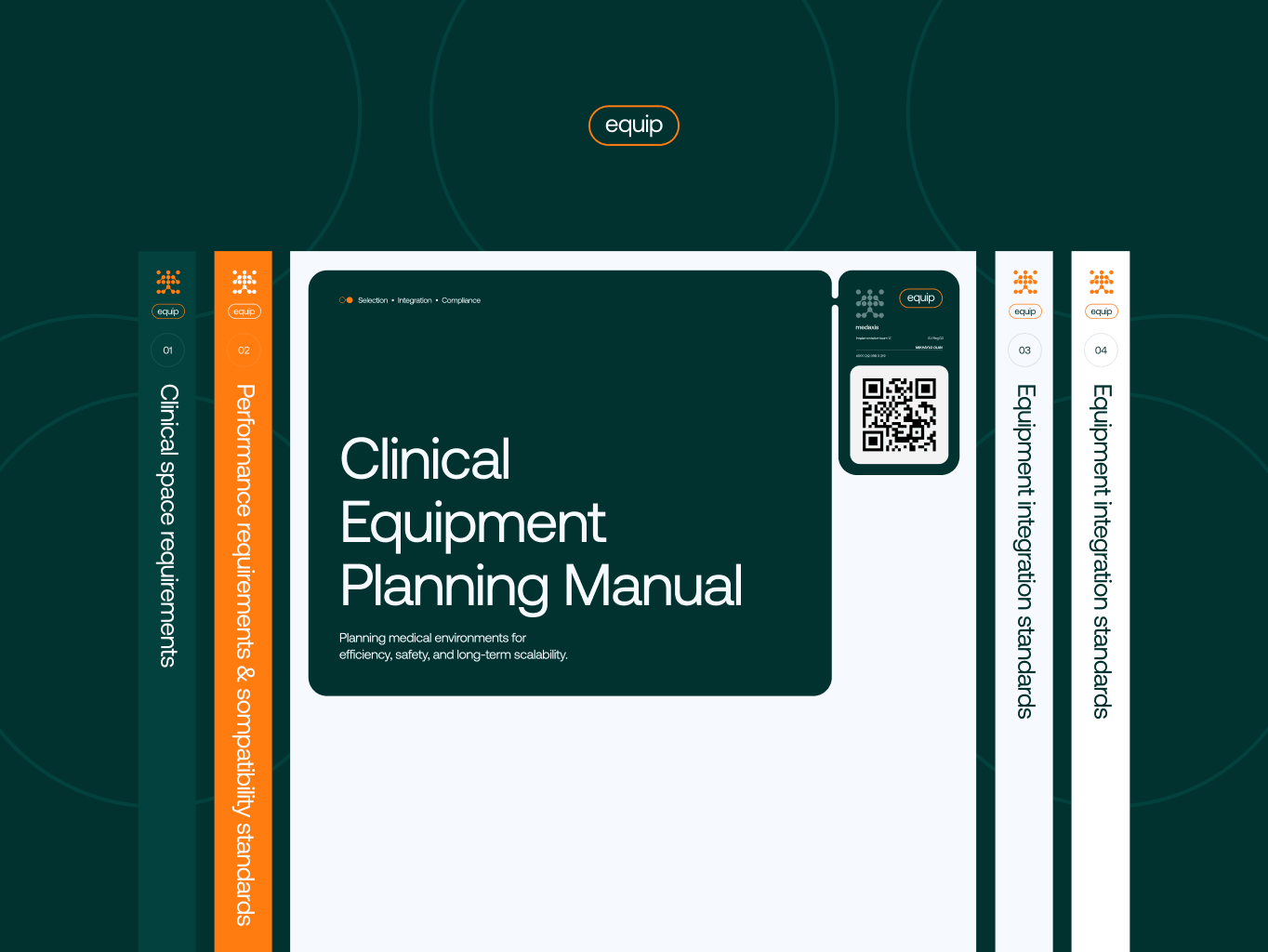

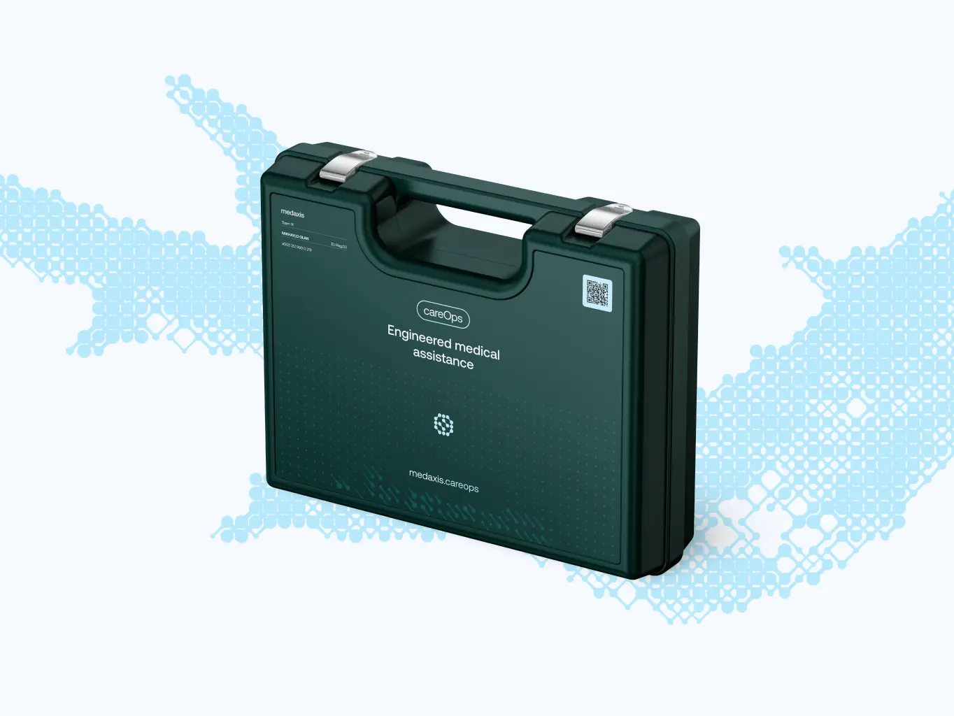
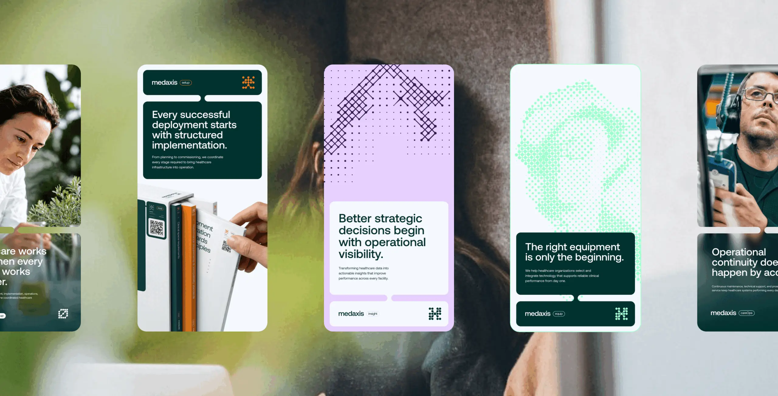
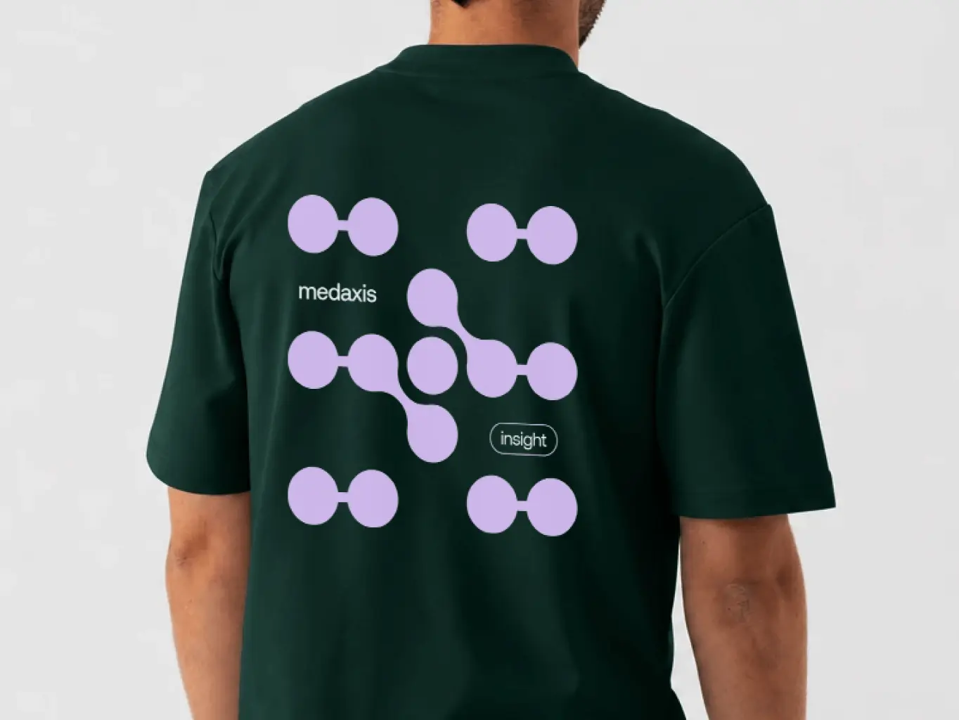
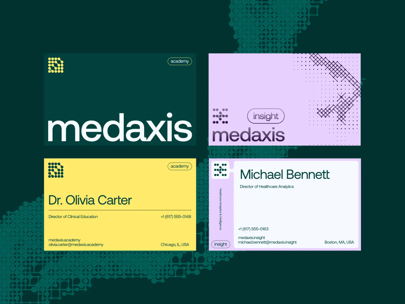
MedAxis has provided comprehensive brand guidelines and practical tools designed for everyday use, ensuring they are not just reference documents that go unused. Both internal teams and external partners can consistently apply the brand identity across all offline and online touchpoints without needing to consult us for every asset.
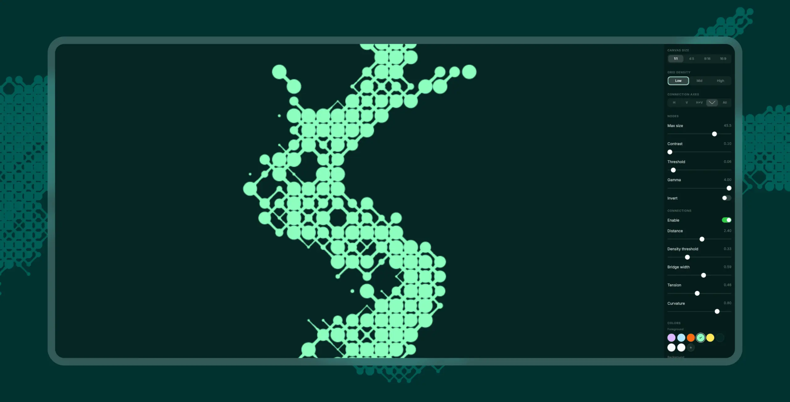
The delivery package goes beyond documentation. Alongside the detailed brand guidelines, we created tools that empower teams to produce branded graphics while maintaining consistency in future communications. These resources effectively transform the brand identity from a static asset into a dynamic system, ready for long-term implementation.
#Website design #website development
vita travels
USA
USA
#Website design #Website development
Lucas Keller
USA
USA
#branding
veridian
USA
USA
