


Veridian — brand identity for the infrastructure behind enterprise finance
Client
veridian
 USA
USA
USA
Services
Veridian’s existing presence read closer to a consumer fintech app than an infrastructure platform – the visual language leaned toward generic innovation imagery and lacked the precision enterprise buyers use to judge trust. That gap made it harder to close deals at the scale the platform was built for.
We were tasked with building a brand strategy and identity precise enough to read as infrastructure: calm, structured, and confident, without slipping into consumer fintech clichés or banking-industry visual tropes.
For an infrastructure brand, the identity has to do real work – read as dependable before a single feature gets explained. That meant treating branding as a system, not a standalone visual layer: positioning, principles, and voice defined first, design built to carry them, not the other way round.
From there we built the identity and turned that strategy into a flexible design system: precise enough to stay recognizable at enterprise scale, and modular enough for the Veridian team to extend it without us.
Stages
- brand strategy
- visual identity

Before any visual direction was chosen, 3 questions had to be answered: what Veridian’s market actually looked like, what the brand needed to say inside it, and exactly how it should sound saying it. Skipping any one of them tends to produce a brand that looks confident but says nothing an enterprise buyer can actually act on.
Each question became its own stage: research, positioning, and messaging, building on the one before it.
Stages
- research
- positioning
- messaging & tone of voice
We mapped the market Veridian actually competes in: not one category, but 5: financial operations (SAP, Oracle, NetSuite), payments and treasury (Stripe, Adyen, Checkout.com), risk and compliance (OneTrust, Workiva, MetricStream), data and intelligence (Power BI, Tableau, Looker), and connectivity (Plaid, MuleSoft, Boomi). Each has strong, established players. None of them is the same brand as any other.
We then plotted every one of them on 2 axes: traditional to progressive, execution-led to intelligence-led to see where the market actually sat, not where it claimed to sit.
The white space was clear on both maps: no competitor owned financial operations, payments, risk, data, and connectivity as one system and none of them sat in the progressive, intelligence-led quadrant either.
That defined Veridian’s position: a progressive, intelligence-led financial infrastructure brand that connects data, operations, and technology, turning financial complexity into confident, real-time decisions.
6 principles carried that position through every decision that followed: clarity, control, reliability, scalability, precision, and operational confidence – the qualities enterprise buyers use to judge whether a system is worth building on.

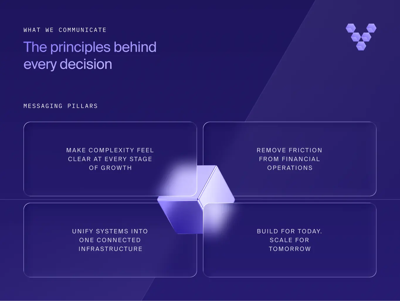
The position needed rules a copywriter could apply on day one, not a mood board. 4messaging pillars did that: make complexity feel clear at every stage of growth, remove friction from financial operations, unify systems into one connected infrastructure, and build for today while scaling for tomorrow.
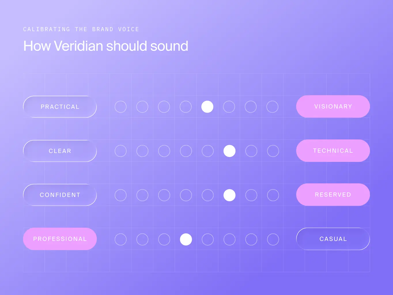
We then calibrated the voice across 4 dimensions, so the target was explicit rather than a matter of taste: practical over visionary, precise enough for a technical audience without losing clarity, confident but understated rather than assertive, and fully professional, never casual. Every piece of Veridian copy gets checked against that calibration, not a list of adjectives.
Veridian’s identity needed to reflect the role it plays in enterprise finance: organizing complex operations without adding visual noise.
Financial brands tend to default to one of two extremes: dated corporate imagery – coins, bank buildings, shields or the flashy, crypto-adjacent visuals consumer fintech leans on. Neither reads as both progressive and trustworthy, which is exactly where Veridian needed to sit.
Every touchpoint like product visuals, internal communications or brand assets needed to read as one disciplined system, not a set of separate decisions. We built that from modular geometry, precise typography, and a controlled color palette.
Stages
- Visual direction
- Visual system principles
- brand assets
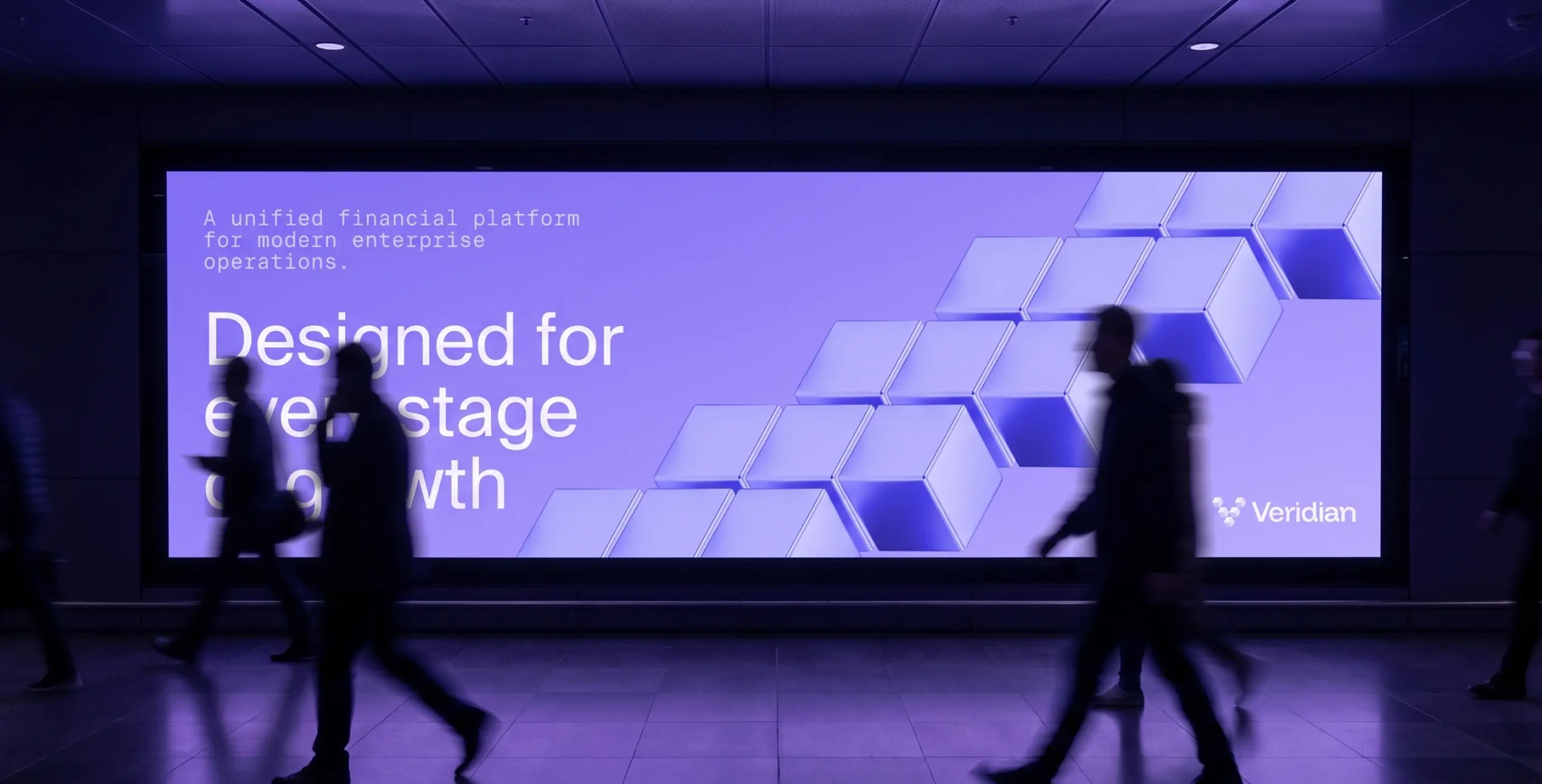
Veridian needed to read as structured, connected, and dependable at a glance before anyone reads a word of copy.
We built that from modular geometry, measured spacing, and controlled contrast: a system that keeps complex financial relationships visually ordered instead of merely decorated. That precision carries an editorial rhythm, not clinical starkness, so the brand holds the same weight in a product screen, an investor deck, or a printed application.
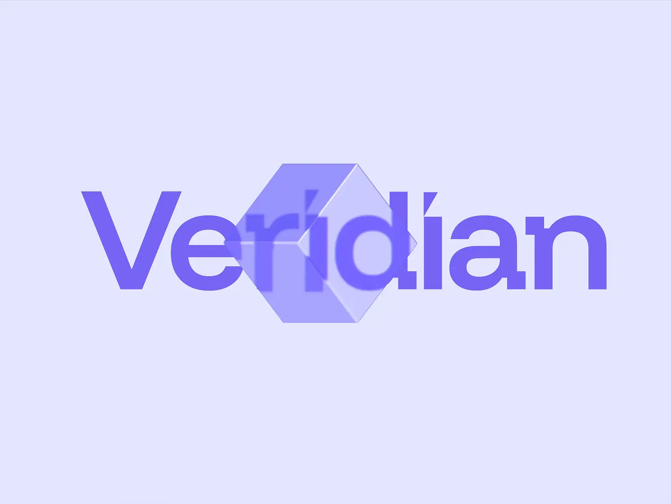
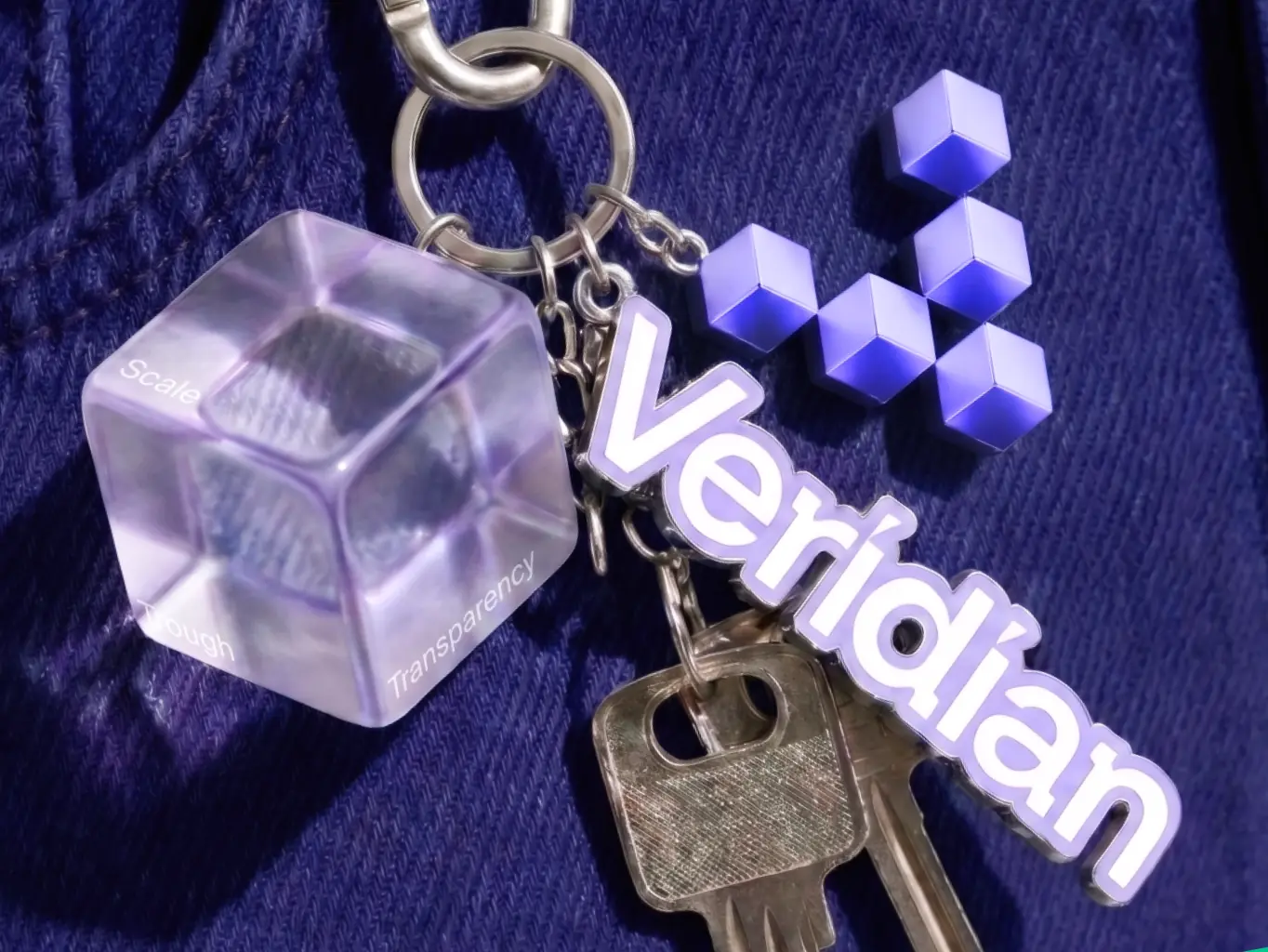
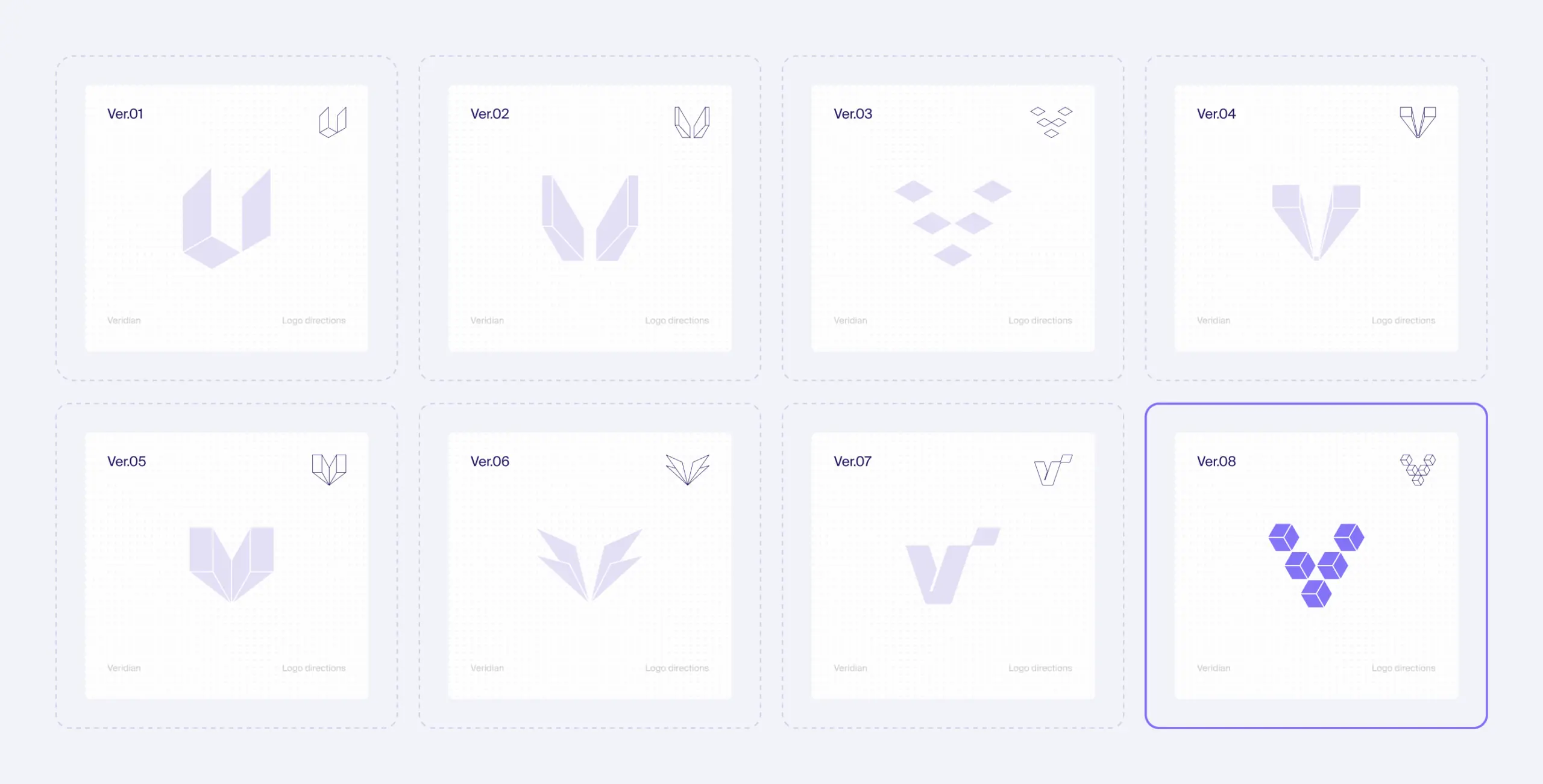
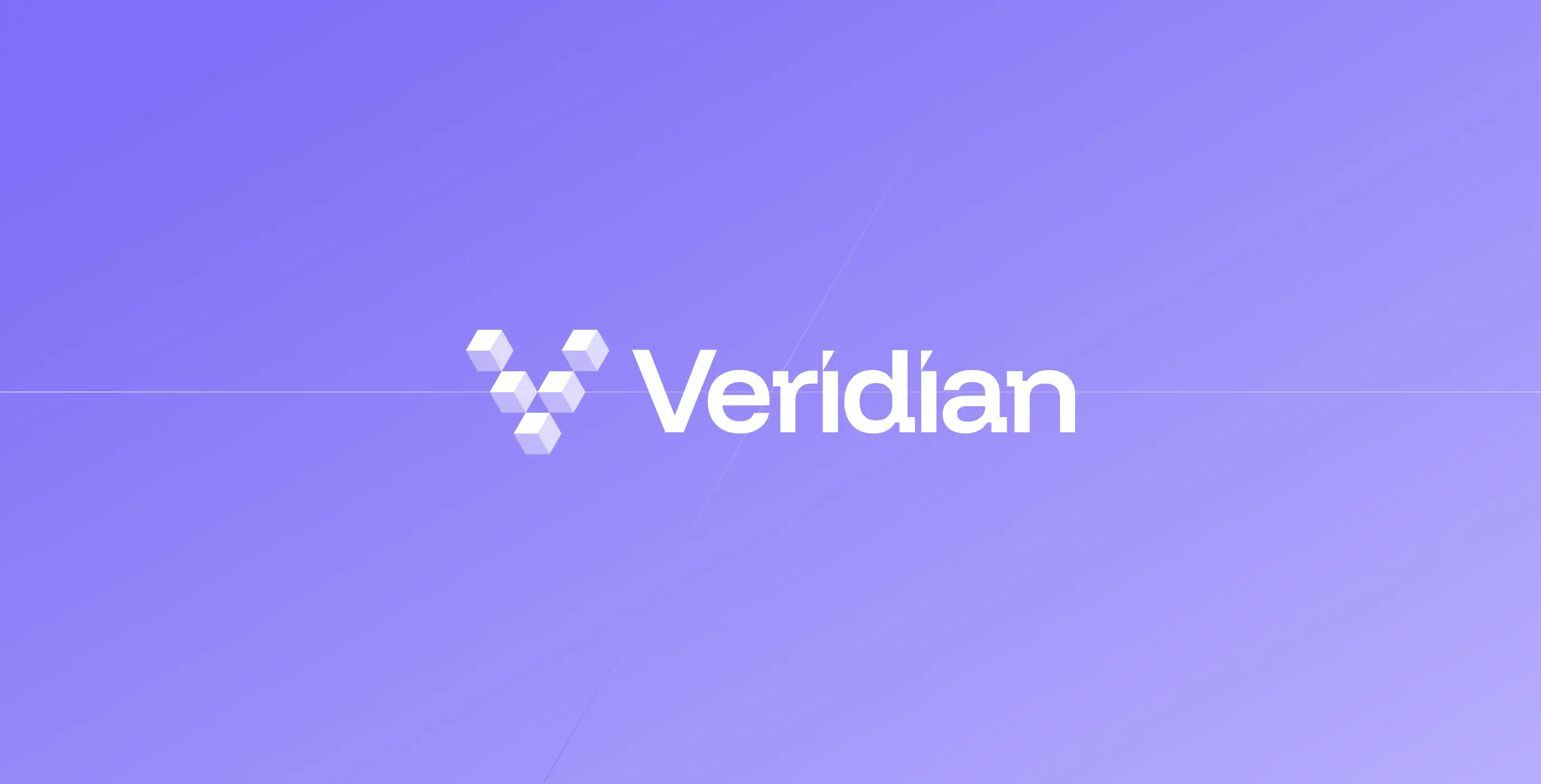
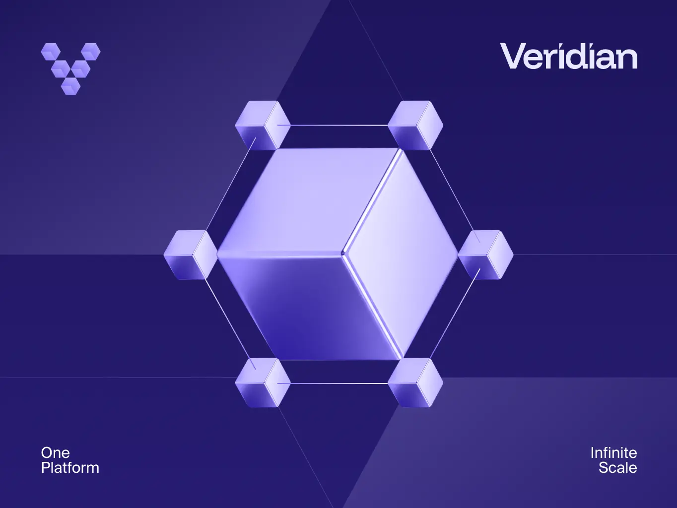
The logotype is where that geometry had to prove itself first. Each facet is its own module — a distinct financial function, self-contained — and together they lock into a single connected form, the same idea as the messaging pillar “unify systems into one connected infrastructure,” made visible instead of stated. It’s the kind of detail an enterprise buyer registers as rigor before they’ve read a line of copy.
The isometric rendering gives it dimension and engineering precision instead of the flat, decorative shapes most fintech marks default to, and the resulting form reads as a V for Veridian without needing a literal letterform. That same geometry carries into the wordmark, too – the dot on the “í” is a diamond, deliberate link between the symbol and the type beside it.
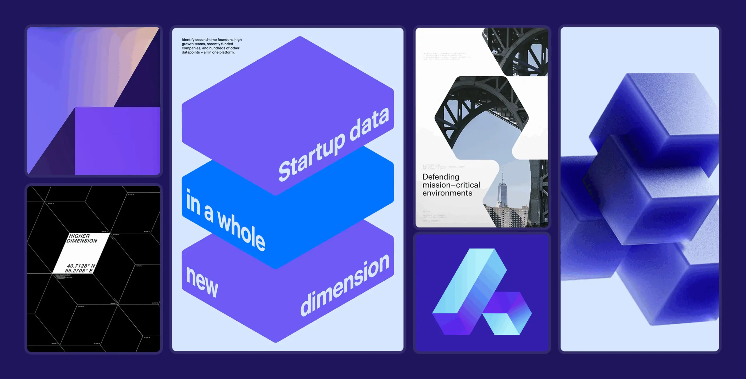


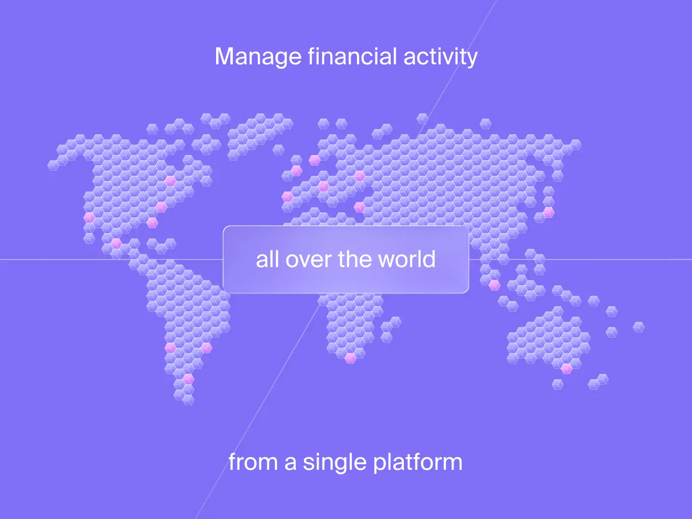
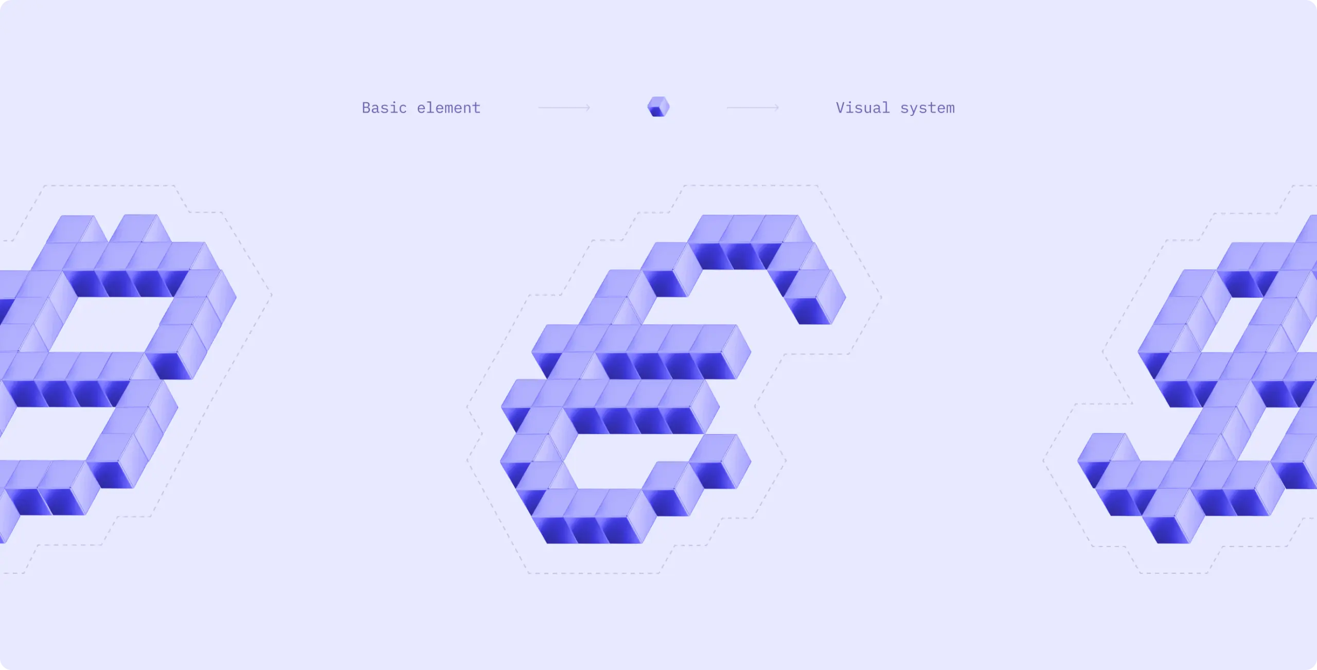
The identity couldn’t just supply a logo and a color palette, it had to supply a building block the Veridian team could reuse without waiting on us for every asset. The hardest part was making that work without the system reading as one trick repeated: lean on a single geometric module too many times and it stops looking like engineering and starts looking like wallpaper. The same hexagonal cube unit from the logotype had to carry that weight instead, repeating across the system at any scale, in any composition, without collapsing into decoration.
That module is flexible enough to become almost anything: arranged into custom numerals and glyphs for campaign stats, into directional framing devices for photography, into backgrounds that read as Veridian without a logo in sight.
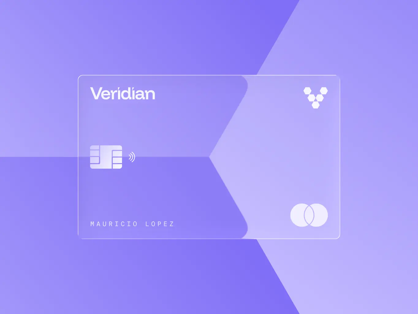
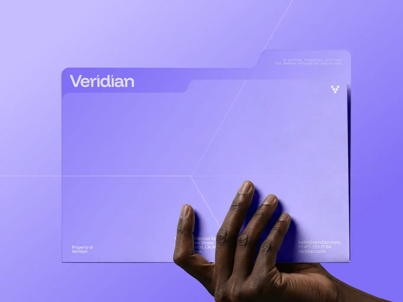
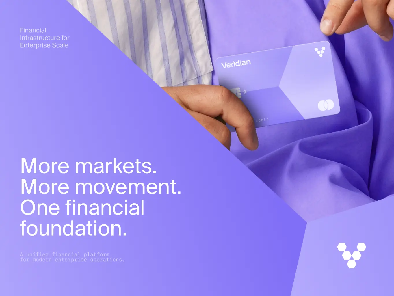
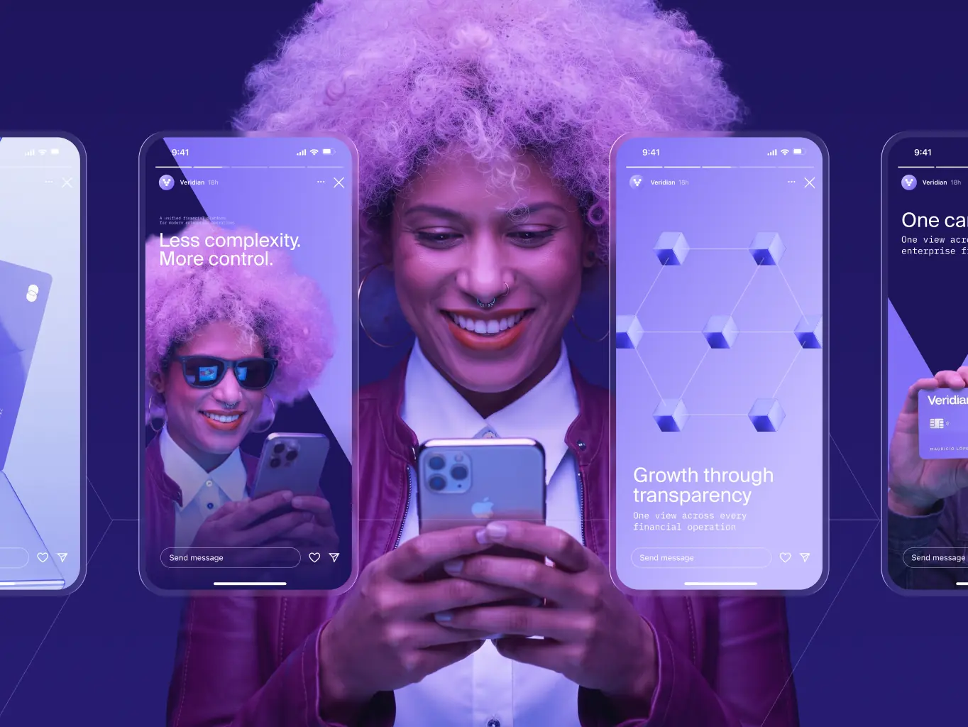
The same logic carries across every format, from social content and enterprise cards to campaign banners, so each new piece stays recognizably Veridian without repeating the same layout twice, and without a designer redrawing it from scratch.
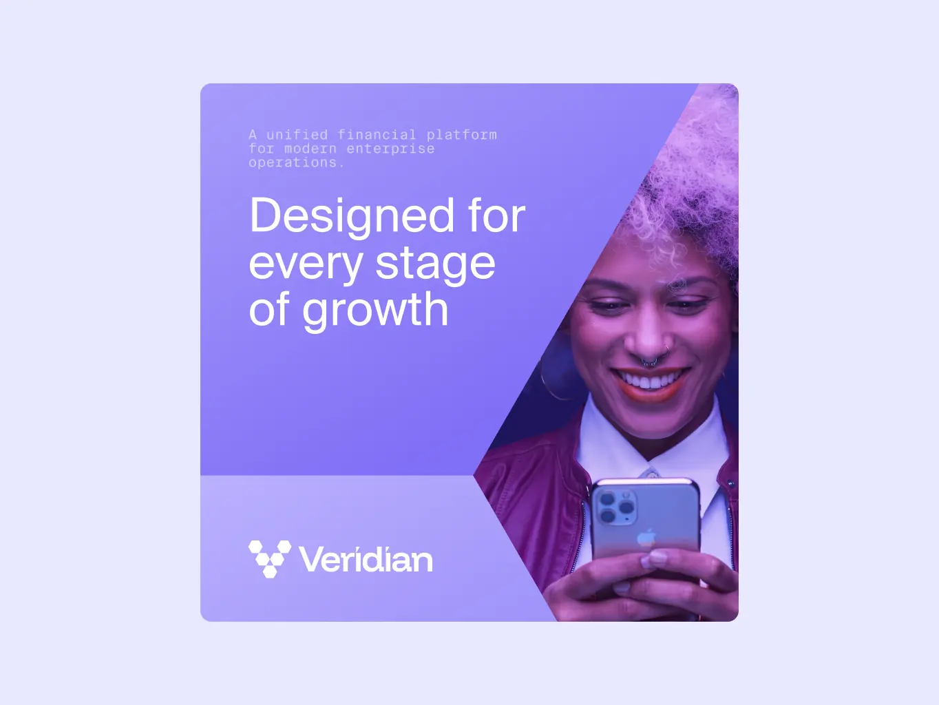
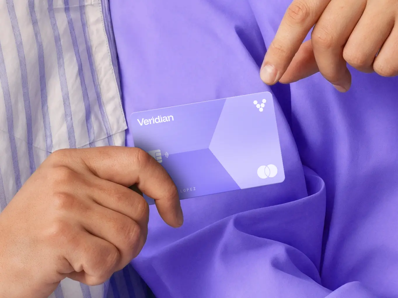
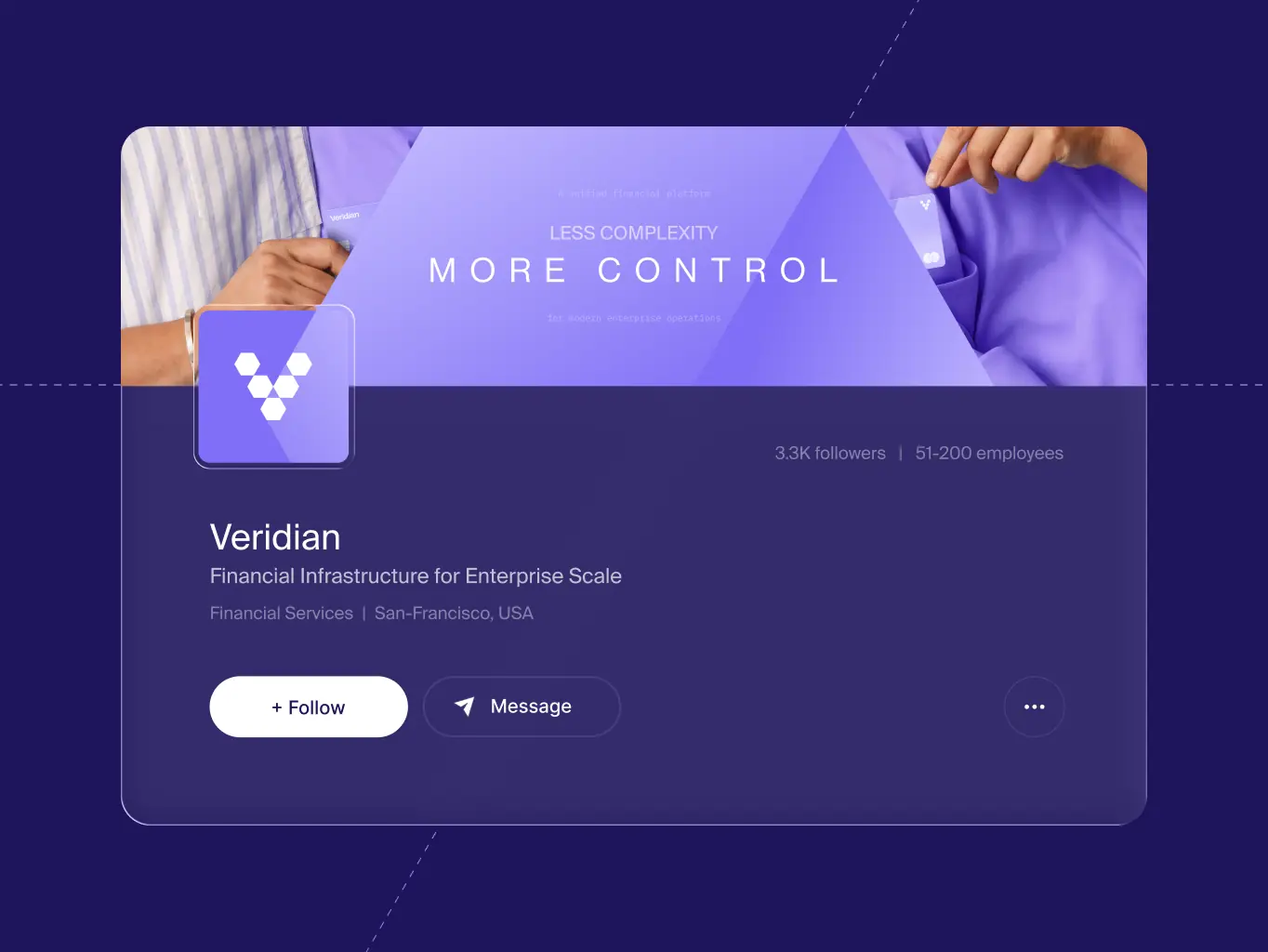

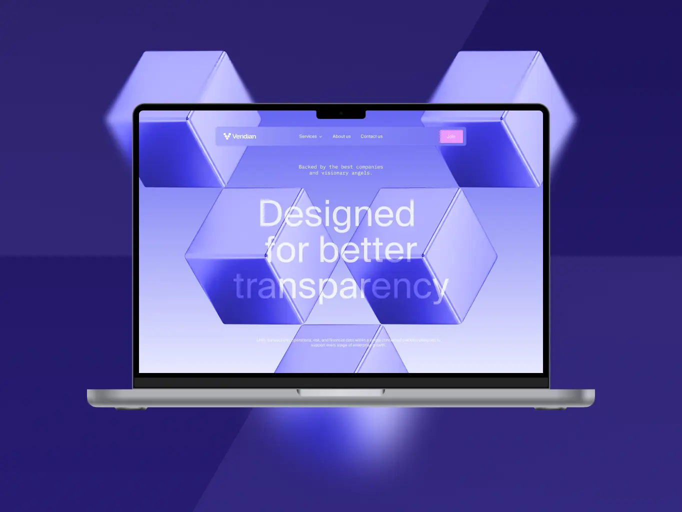
The system had to prove itself outside the deck too, on a phone screen, in a social feed, as an app icon at 48 pixels. We extended the identity across mobile interfaces, social content, app icons, and the website, each one built from the same geometry, typography, and color logic.
That consistency holds at small scale and across very different formats, like a product icon and a campaign banner still read as the same brand without every application looking identical to the last.
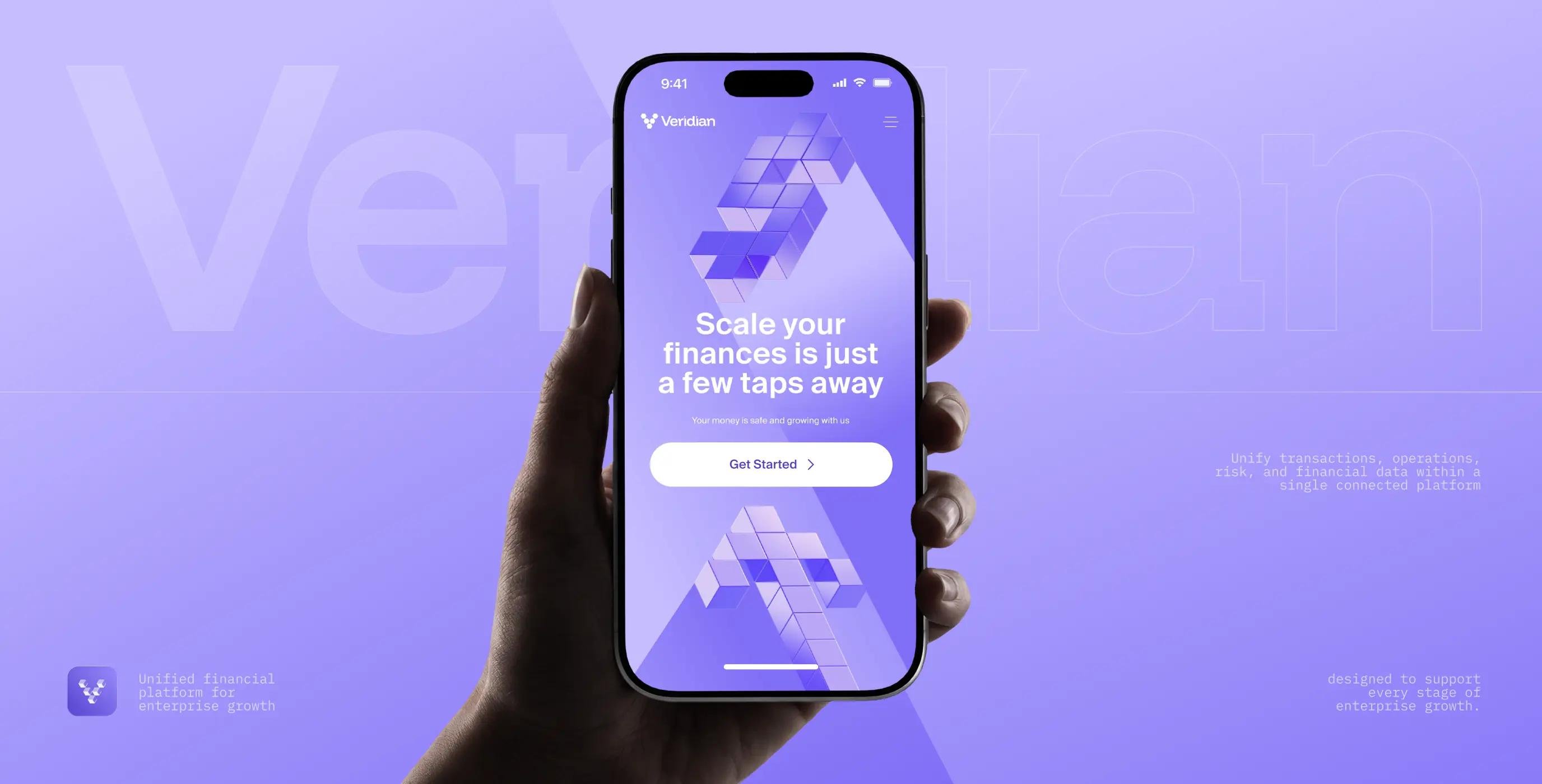
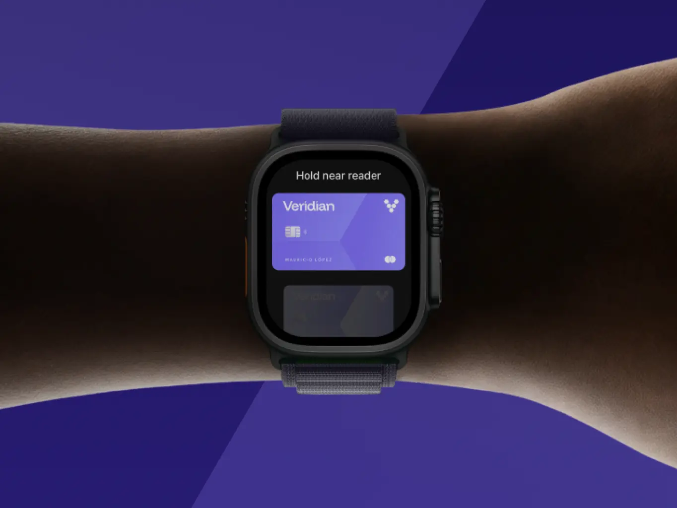

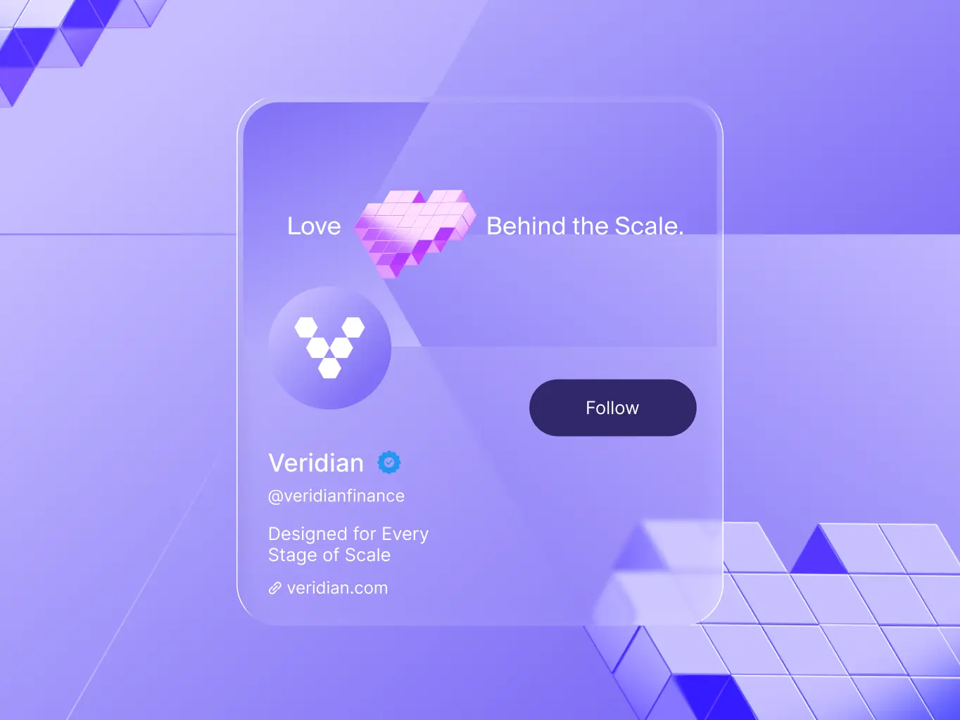
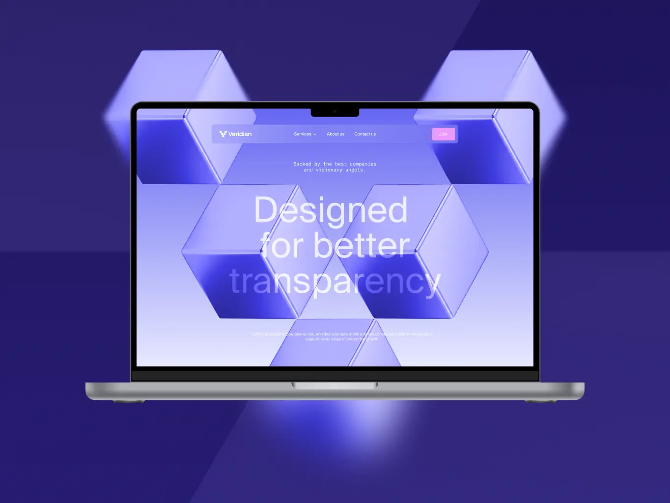

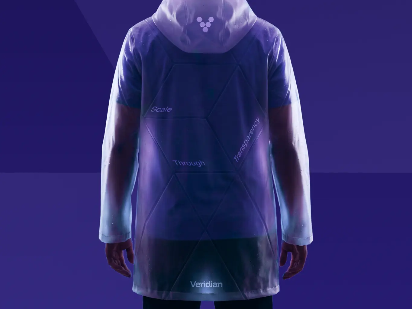

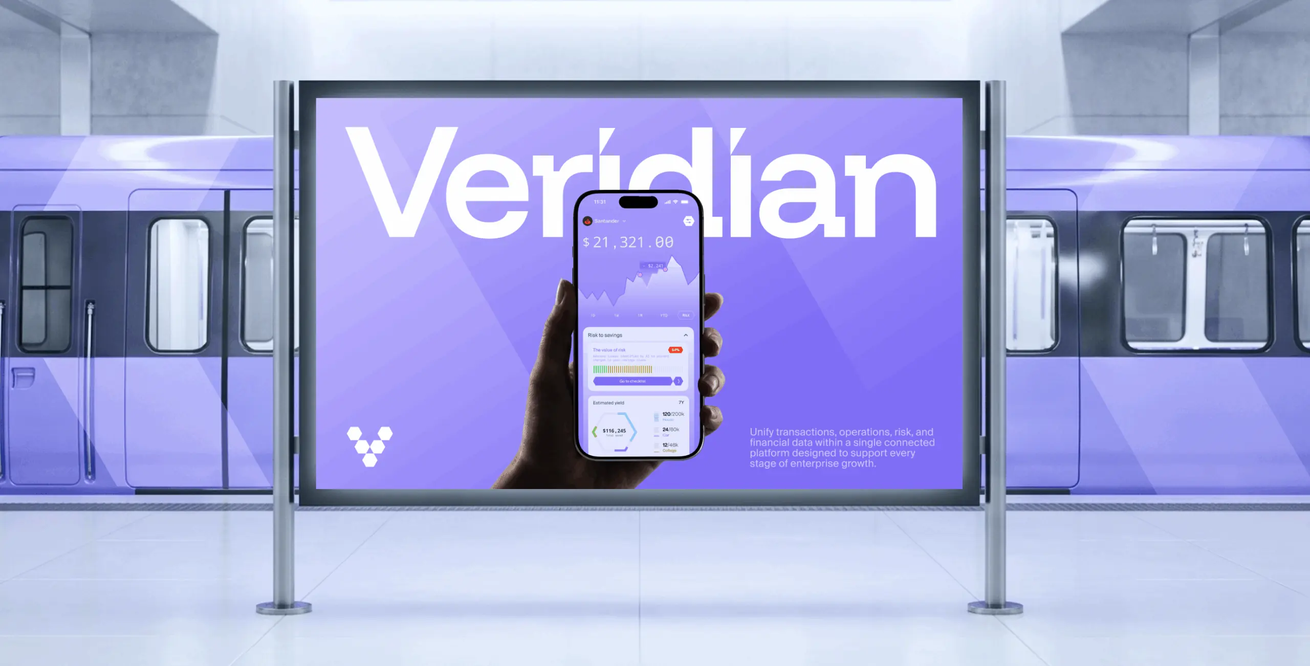
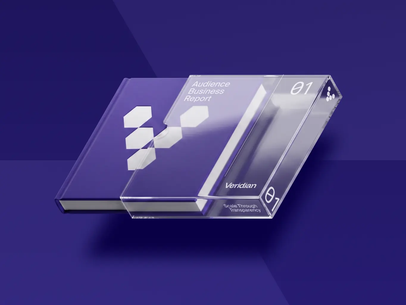

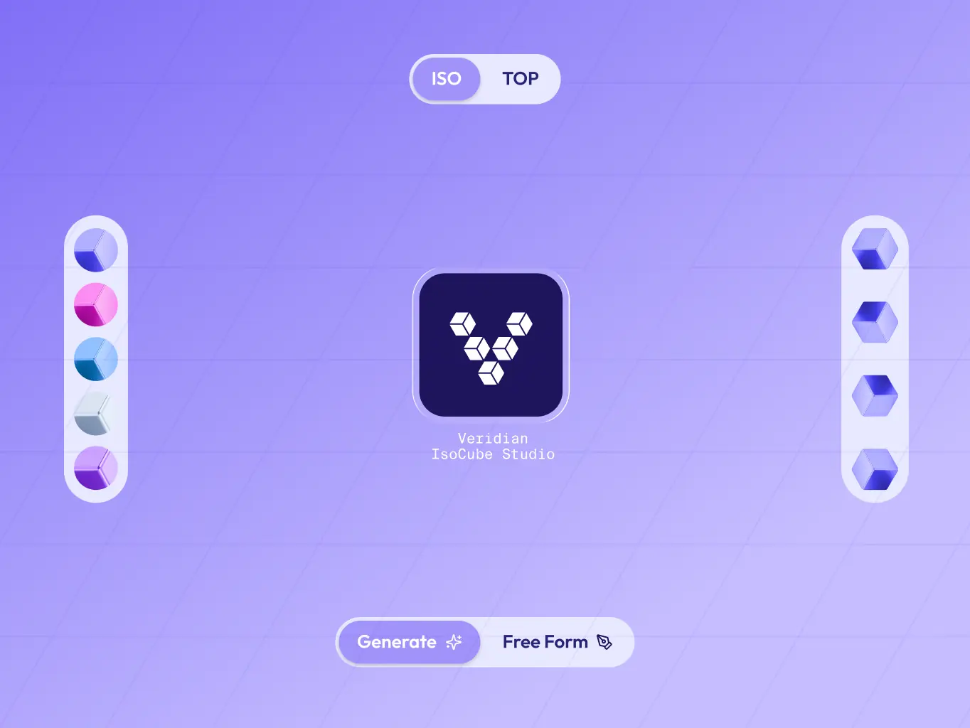
The handoff wasn’t a guideline the Veridian team would eventually stop opening. Alongside the logo, typography, color, and layout principles, we built IsoCube Studio – a working tool, not a document, that generates new brand assets from the identity’s core module.
Type a prompt or build manually, and it assembles new isometric compositions, like currency symbols, icons, custom shapes from the same cube module the whole identity is built from, already in the brand’s palette and ready to export. That cuts the time to produce a new asset by 40% and gives anyone on the team the tooling to build custom, on-brand work without learning the system’s underlying geometry rules first.

#Website design #website development
vita travels
USA
USA
#Website design #Website development
Lucas Keller
USA
USA
#branding
medaxis
USA
USA
