Development
Research
Client
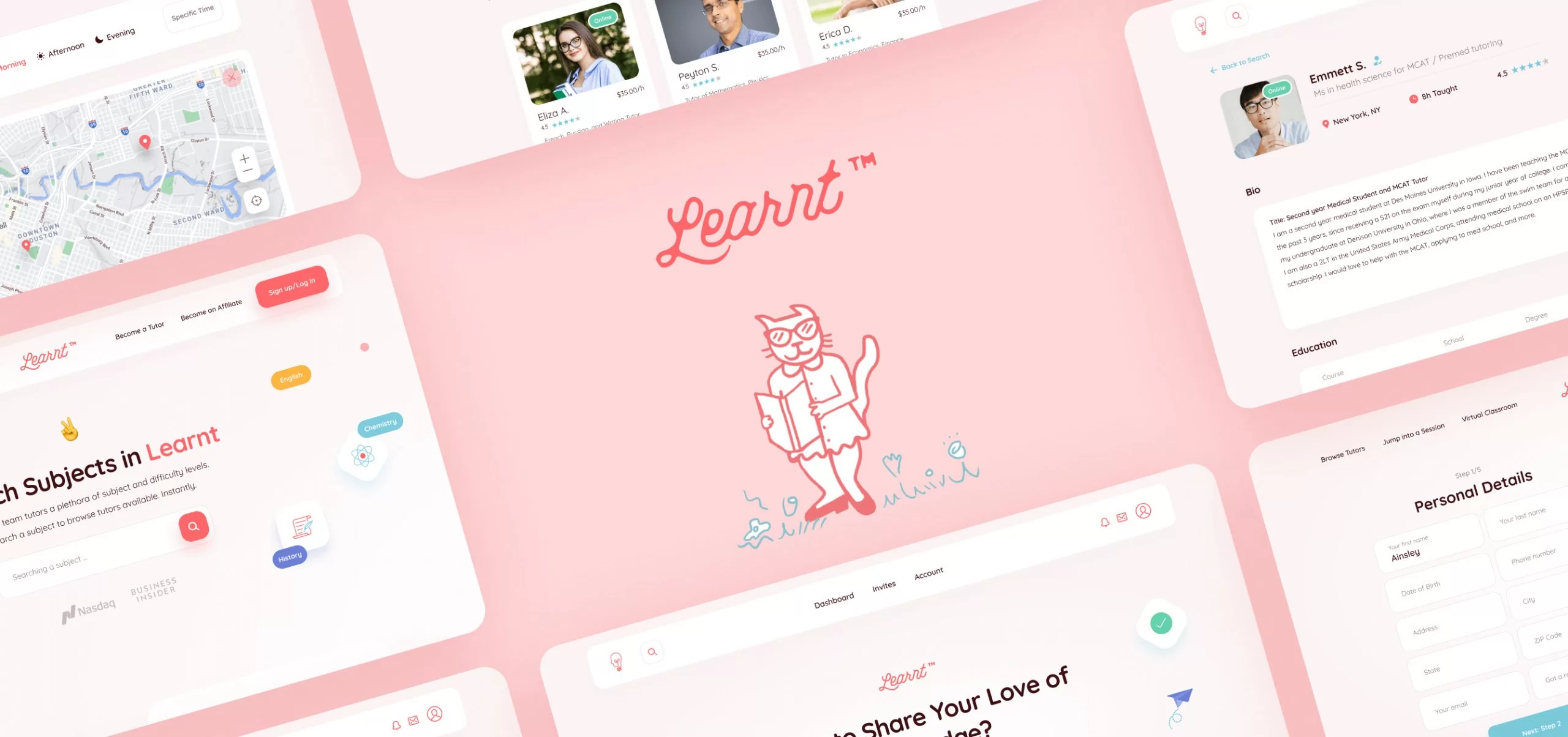
Learnt
 USA
USA
USA
Services
Tasks
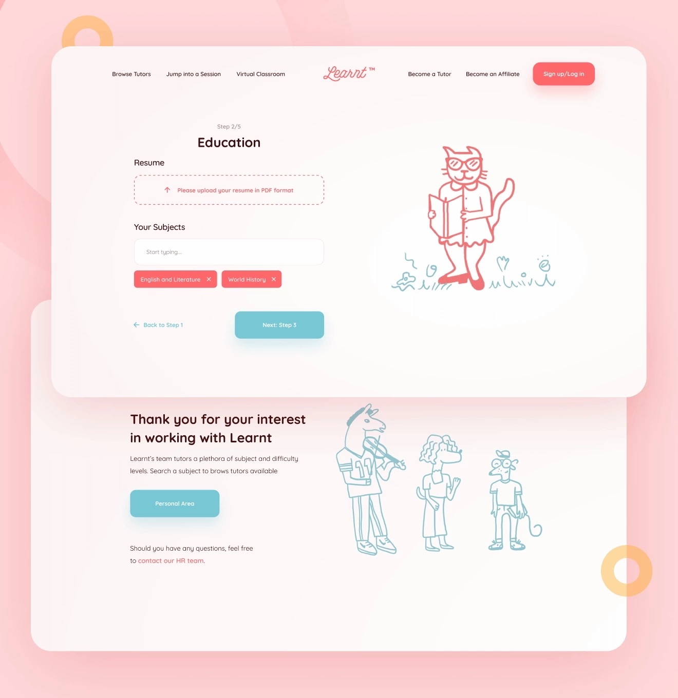
Our team’s task was to make a full-fledged redesign of the entire website, as well as to add new pages for new features. The redesign should make the website visually impressive for the user, as well as easy for finding the right teacher and for the online learning itself. We have set goals and criteria which can help us to simplify and speed up the search engine, and improve online classes so that a basic user can get straight to studying without spending too much time exploring the platform.
Solutions
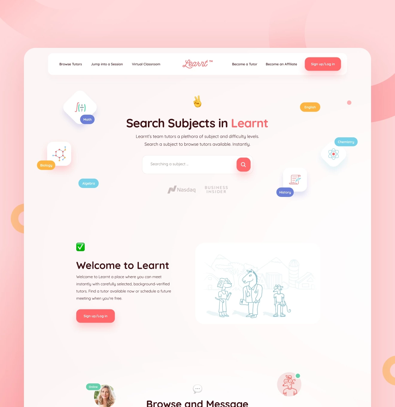
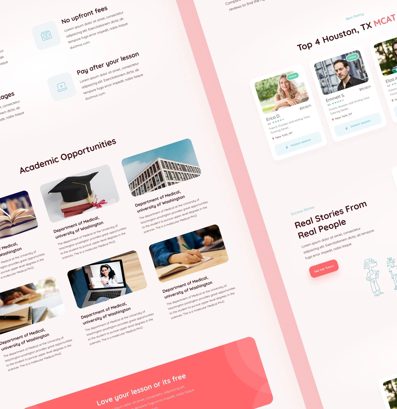
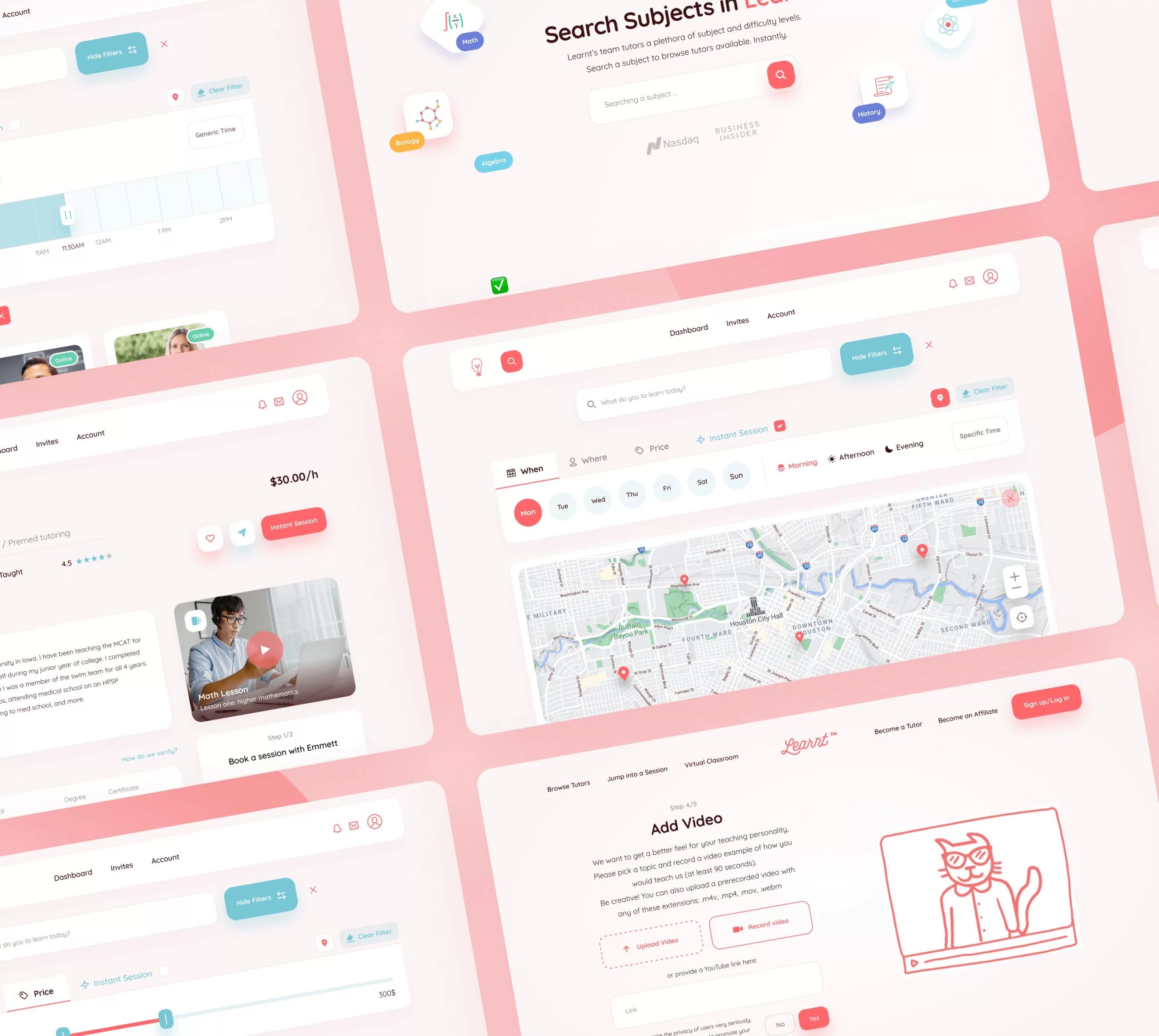
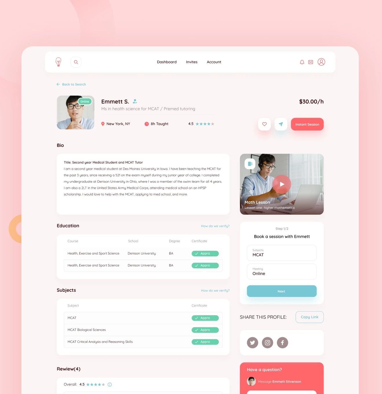
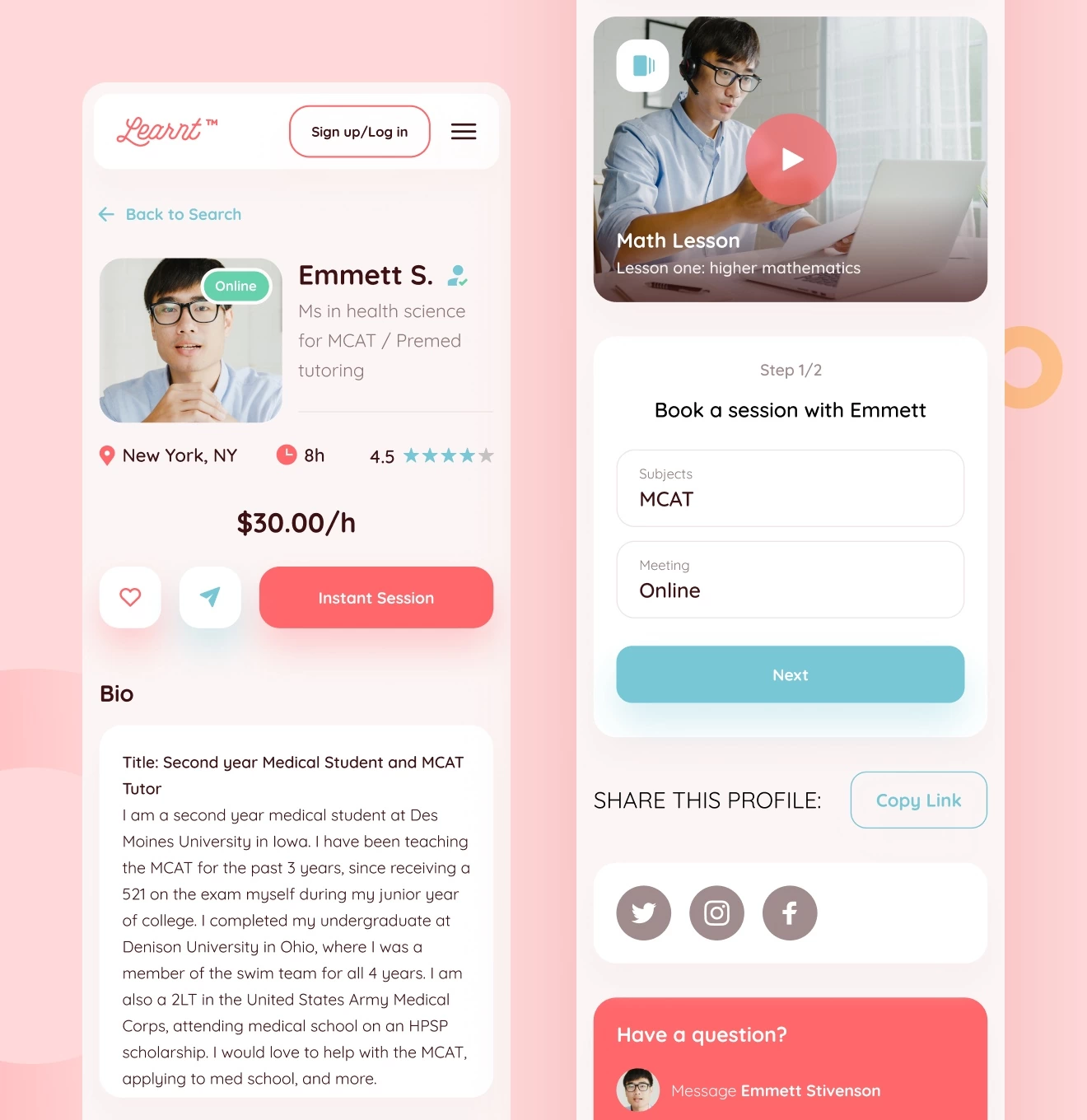
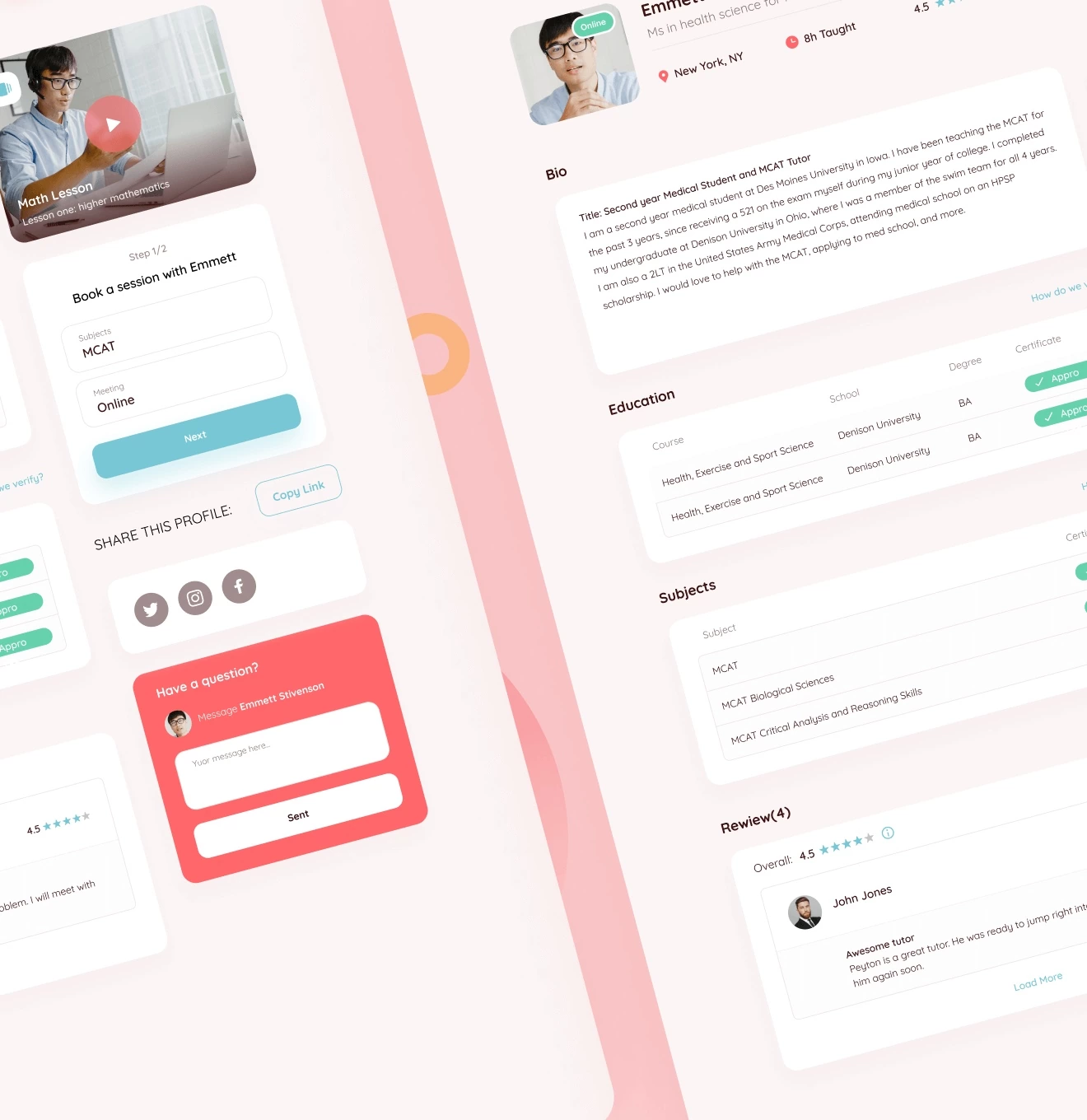
First of all, the user is unwilling to be overloaded with unnecessary, complex information when searching for a subject and choosing a tutor. Our team simplified the information architecture of the website, which helped make the interaction between tutors and students more convenient. All text information is supported by appropriate illustrations and icons so that any user can easily start studying or teaching with Learnt.
UX Research
The first stage of the project was UX research. We have identified competitors in the niche and the target audience for which the product will be developed and what are its features in terms of information perception. Thus, we can get an understanding of what users lack in similar products and what should be improved.
Information Architecture
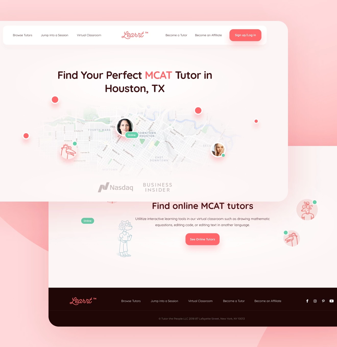
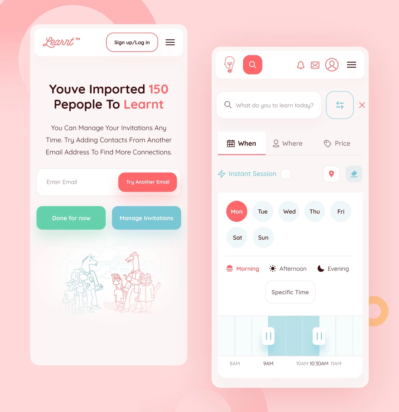
When we just started to develop the design, we worked out a sitemap with branches of all pages for a full understanding of the entire user experience in the first place. Further in the wireframes, we worked out the structure of each page based on the findings of the UX research. Now it has become much more convenient to search for tutors and subjects thanks to the advanced filter with all the necessary parameters in one place. All stages that could cause misunderstanding or trouble are now accompanied by tips and illustrations to attract more attention.
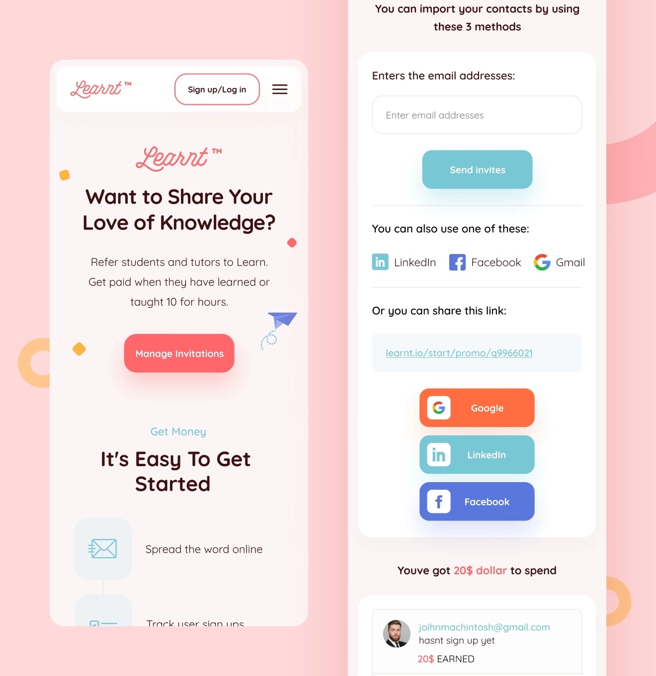
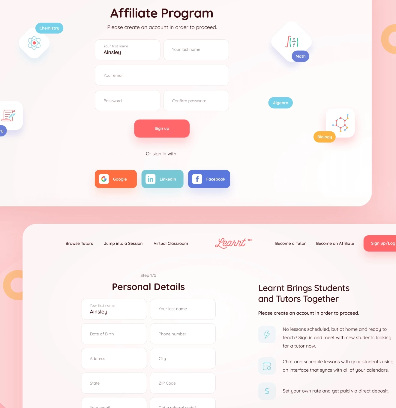
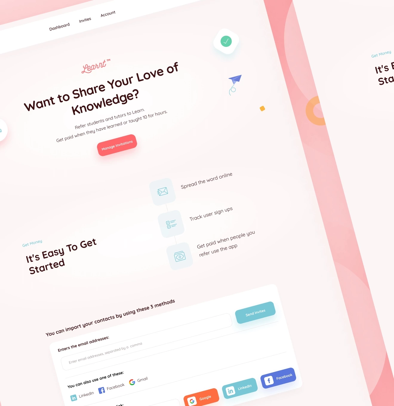
Also, we added a referral system, according to which students can receive additional income from inviting their friends or tutors to the platform. This is an extremely important aspect in expanding the platform audience.
UI & Branding
Considering the fact that the platform was already on the market and had active users, we analyzed the current situation of the brand and tried to preserve certain elements of the identity for product recognition and develop it further.
The website is made in warm colors and has a slightly playful design. Thanks to this, students are in the right mood and don’t feel like being on another boring website, where you have to study tons of information. Education is not the easiest process and for many people it can be psychologically pressing: you want to take your mind off it over and over again and put it all off till another time. Therefore, we tried to do as much as possible to bring a relaxed atmosphere into the design instead of boring classes with a stern teacher.
Responsive design
The web is now mainly accessed from mobile devices, so we made sure that the website content is properly displayed on them.
We developed alternative versions of tables to avoid horizontal or vertical scrolling on smartphones. We also reduced the number of illustrations and GIFs to make the pages shorter.
Their execution is splendid and their excellent communication keeps everybody aligned. It's super easy to engage with the team at Phenomenon. Regular communication via Slack made it easy to stay on the same page about timelines and updates.
#Website design #Website development
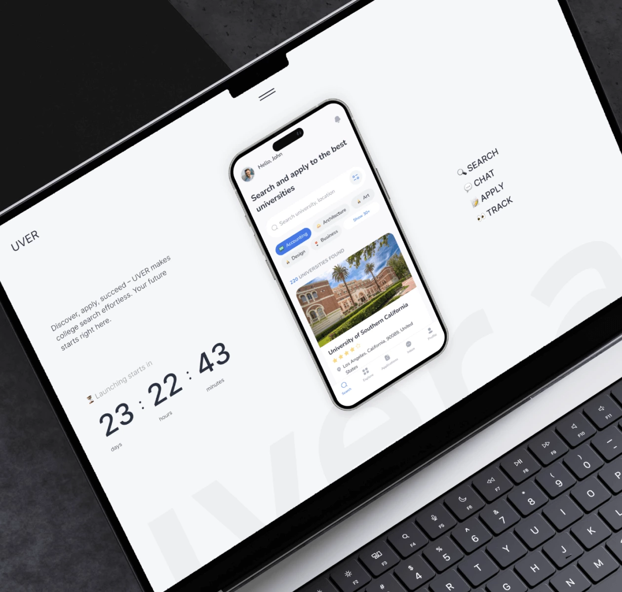
UVER, LLC
 UK
UK
UK
#Design prototype #Web app design
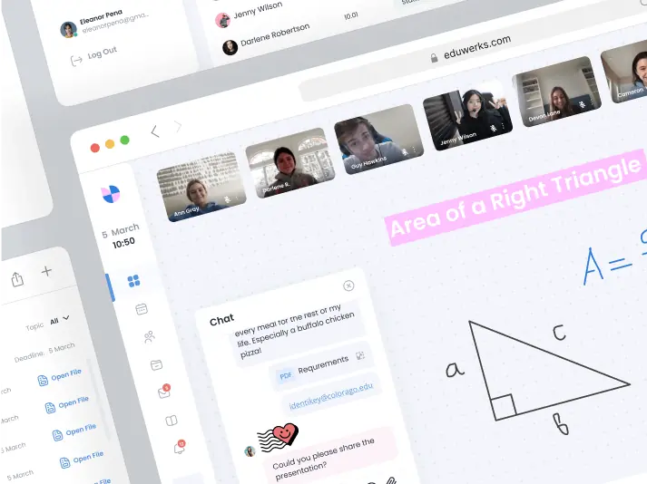
Eduwerks LLC
USA
USA
Have a project in mind?
Let's chat
Have a project to
discuss?
discuss?

Have a partnership in
mind?
mind?
