Design
Development
Research
Launch
Evolve
Extend
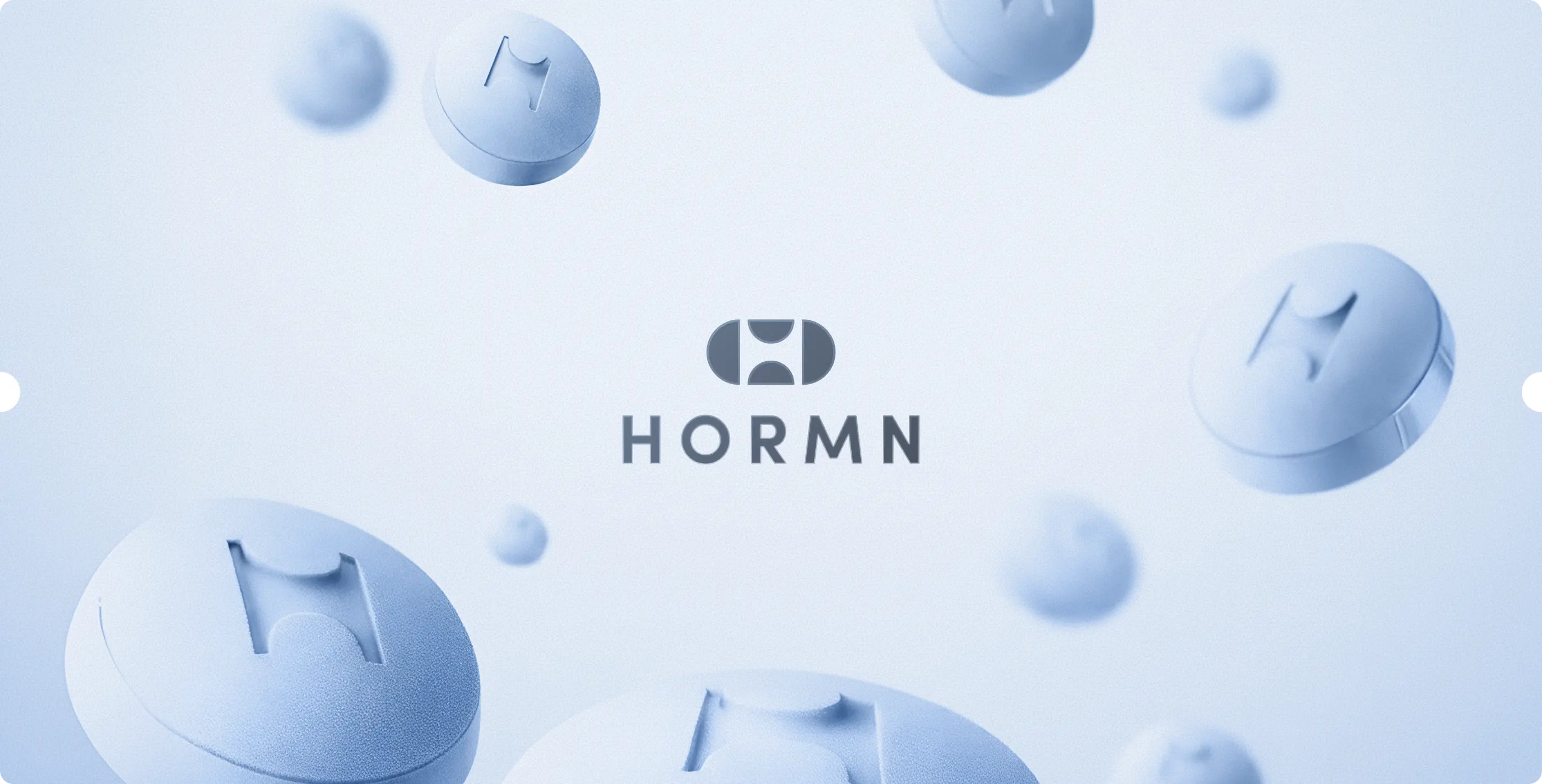
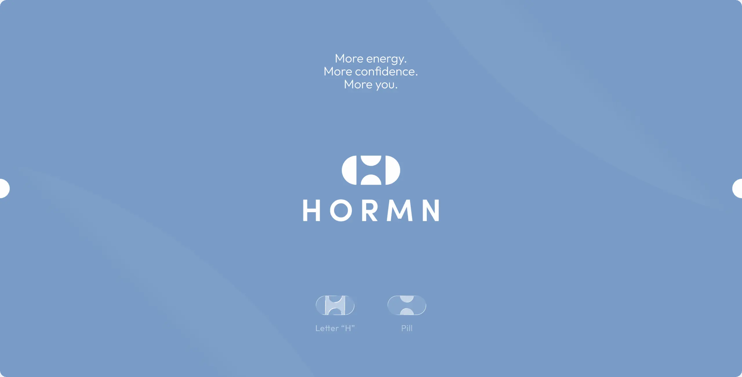
HORMN – an identity built to connect every HORMN touchpoint
Client
HORMN
 Australia
Australia
Services

HORMN approached us with the need for a stronger and more cohesive brand presence that could align with its website and application experience. With the product already taking shape, the next step was to create an identity system that would elevate perception, improve consistency, and support long-term growth.
The business goal was to build a brand that feels credible, modern, and scalable across all digital touchpoints. Beyond recognition, the identity needed to reinforce trust, clarify the service offering, and provide a solid foundation for future expansion.
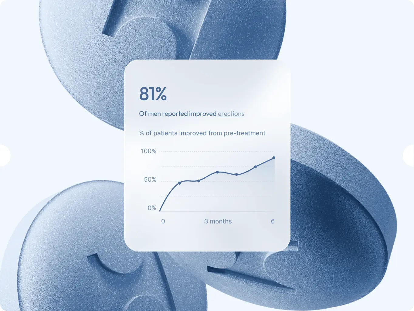

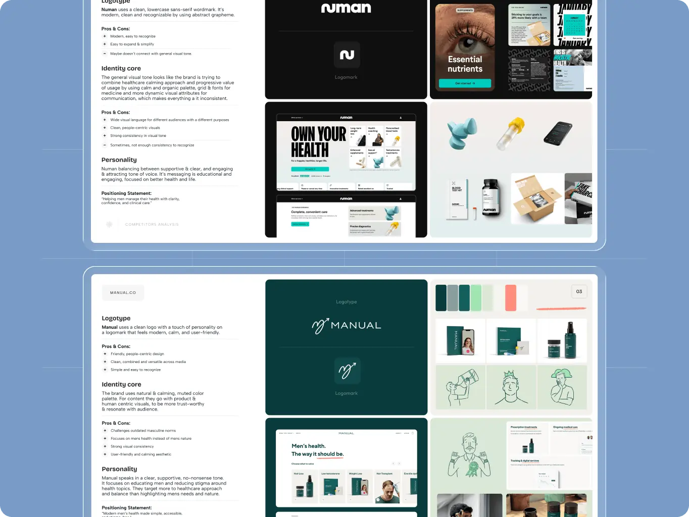
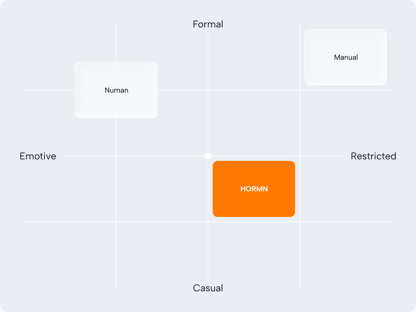
Our discovery phase began with a review of the competitive landscape to understand how men’s health brands position themselves visually and emotionally. We explored ways to communicate care, confidence, and medical credibility without leaning into overly masculine or stereotypical codes.
This research helped us define a more balanced direction for HORMN, one that feels modern, supportive, and trustworthy. The goal was to create a brand presence that speaks to men’s health in a clear and confident way, while remaining approachable, refined, and emotionally aware.
The branding process focused on building a clear and scalable identity system for HORMN across every key touchpoint. From the logo and visual language to typography, color, and supporting assets, each stage was designed to create a brand that feels trustworthy, modern, and consistent in digital use.
We aimed to develop not just separate elements, but a cohesive foundation that could support the website, app, and future brand communication with the same level of clarity and recognition.
Stages
- logo design
- colors & typography
- brand assets
- brand guidelines
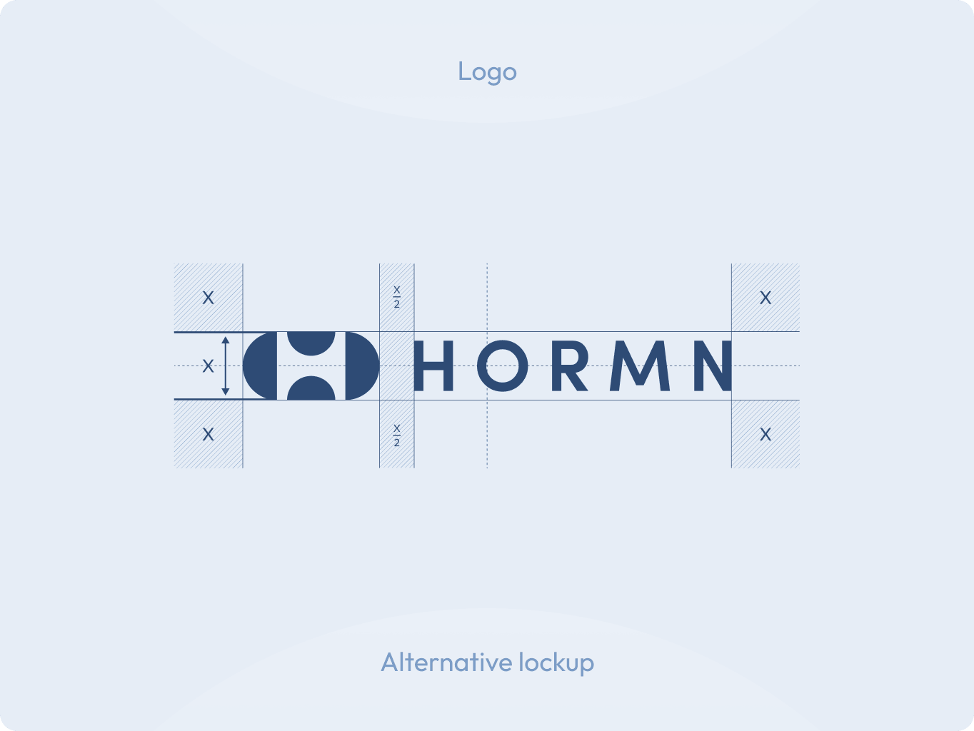
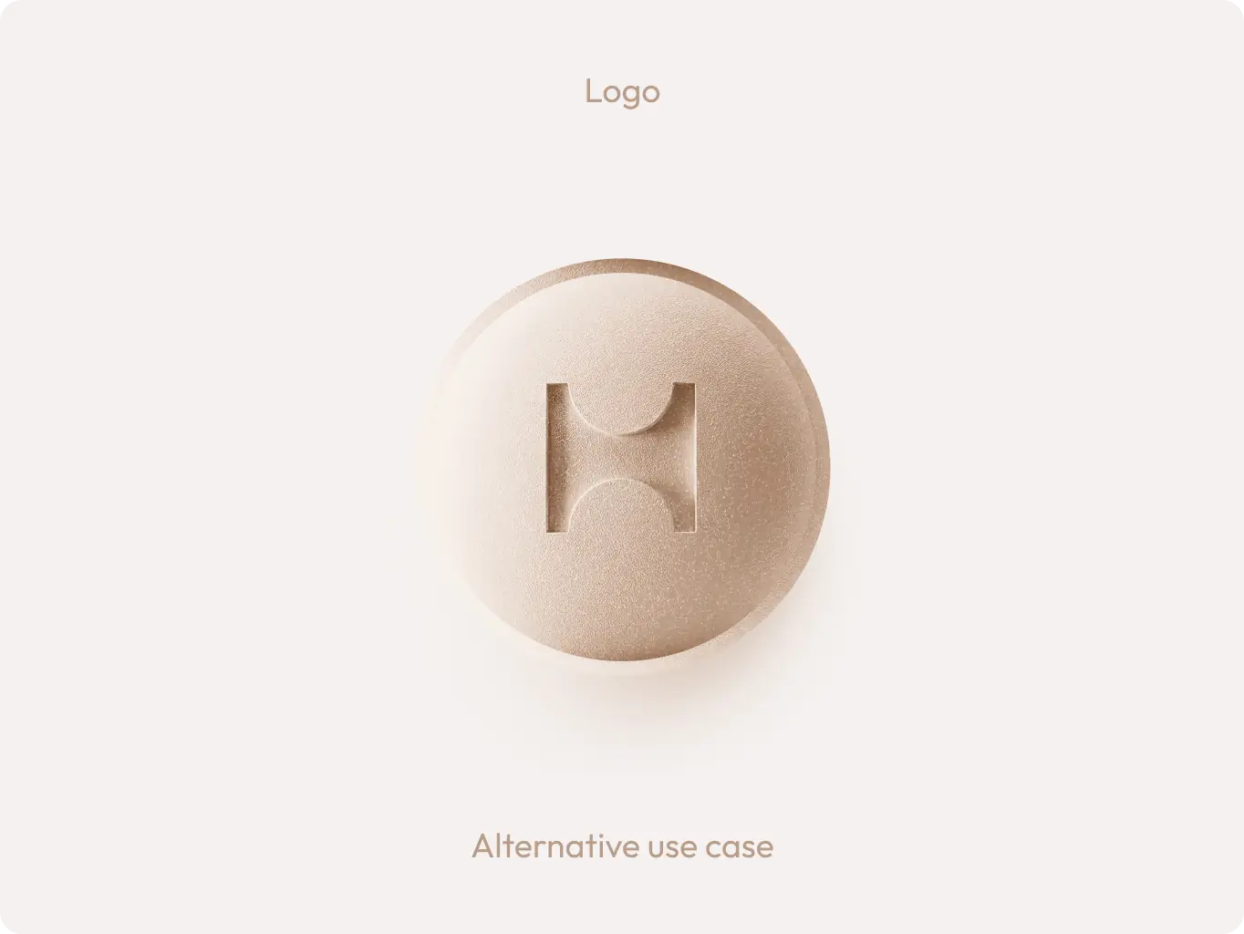
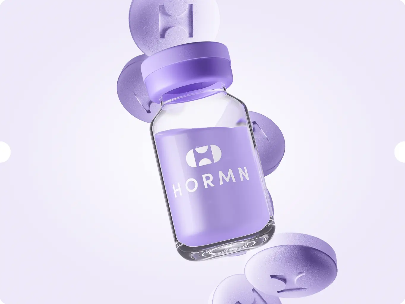
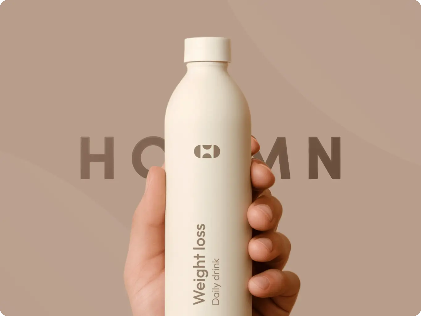
We designed the logomark as a simple yet distinctive symbol built around two clear core references: the letter “H” and the shape of a pill. This combination allowed us to create a mark that feels directly connected to the brand’s category while remaining clean, modern, and recognizable.
Its geometric construction makes the logo highly flexible and scalable across different touchpoints. Whether used in the full lockup, as a standalone icon, or integrated into digital and physical brand assets, the mark retains clarity and consistency while adapting naturally to different sizes, formats, and applications.
To complement the logo geometry, we selected a clean geometric typeface that reinforces the brand’s modern, structured, and approachable character. Its clarity and balanced proportions helped create a consistent visual rhythm across the identity, while pairing naturally with the simple geometry of the mark.
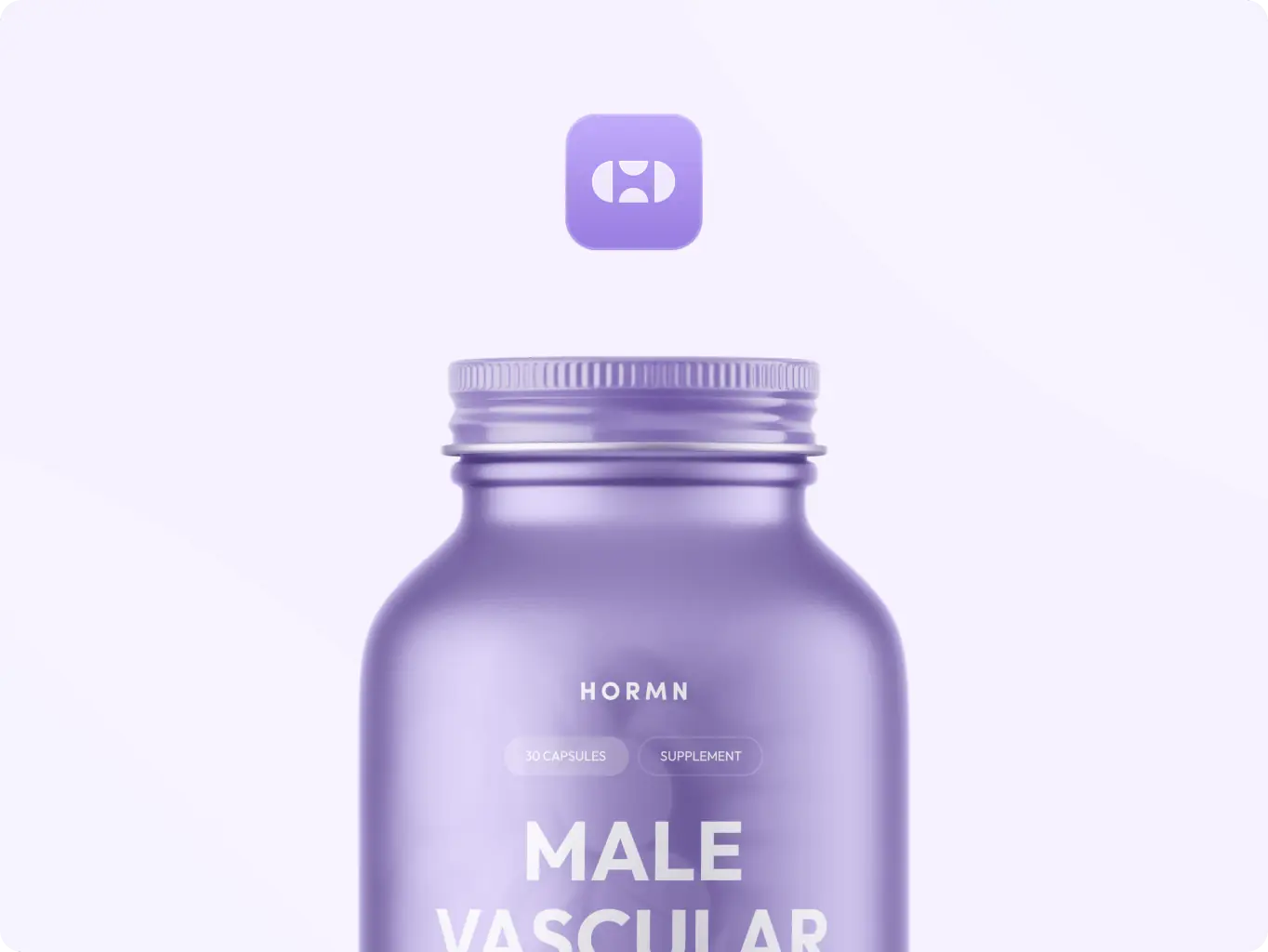
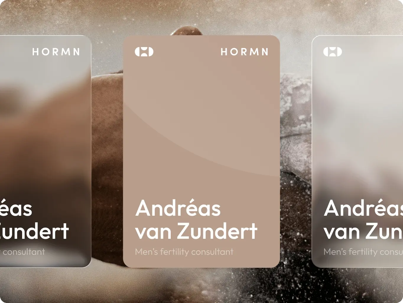
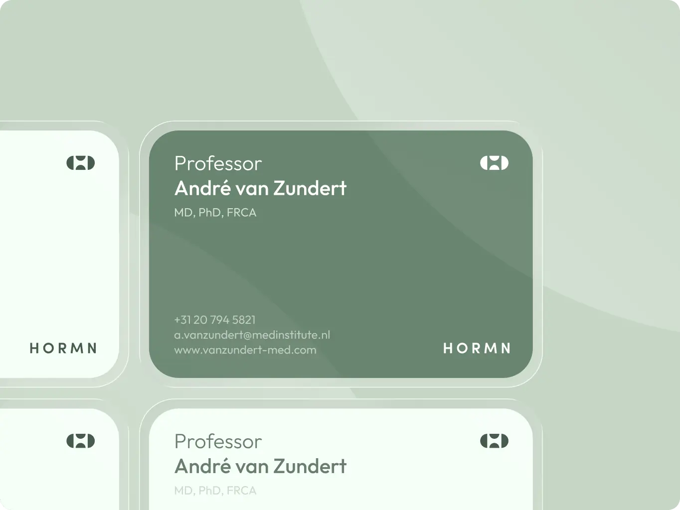
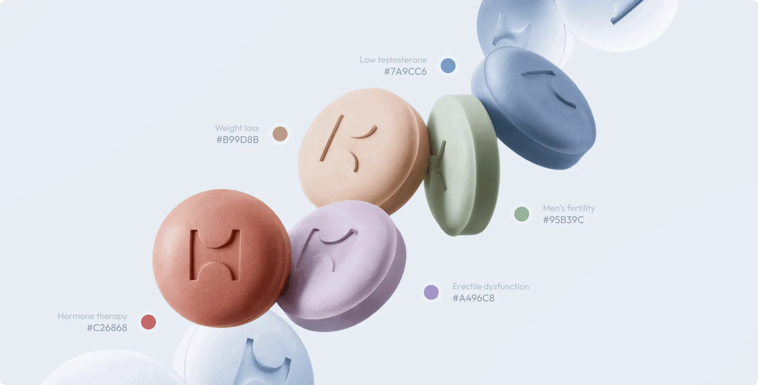
For the color system, we introduced a soft-coded palette to distinguish HORMN’s key areas of expertise while keeping the overall feel calm and trustworthy. Instead of using aggressive or overly clinical tones, we built a more supportive and refined set of colors that helps organize communication, improve recognition, and make the brand feel more human.
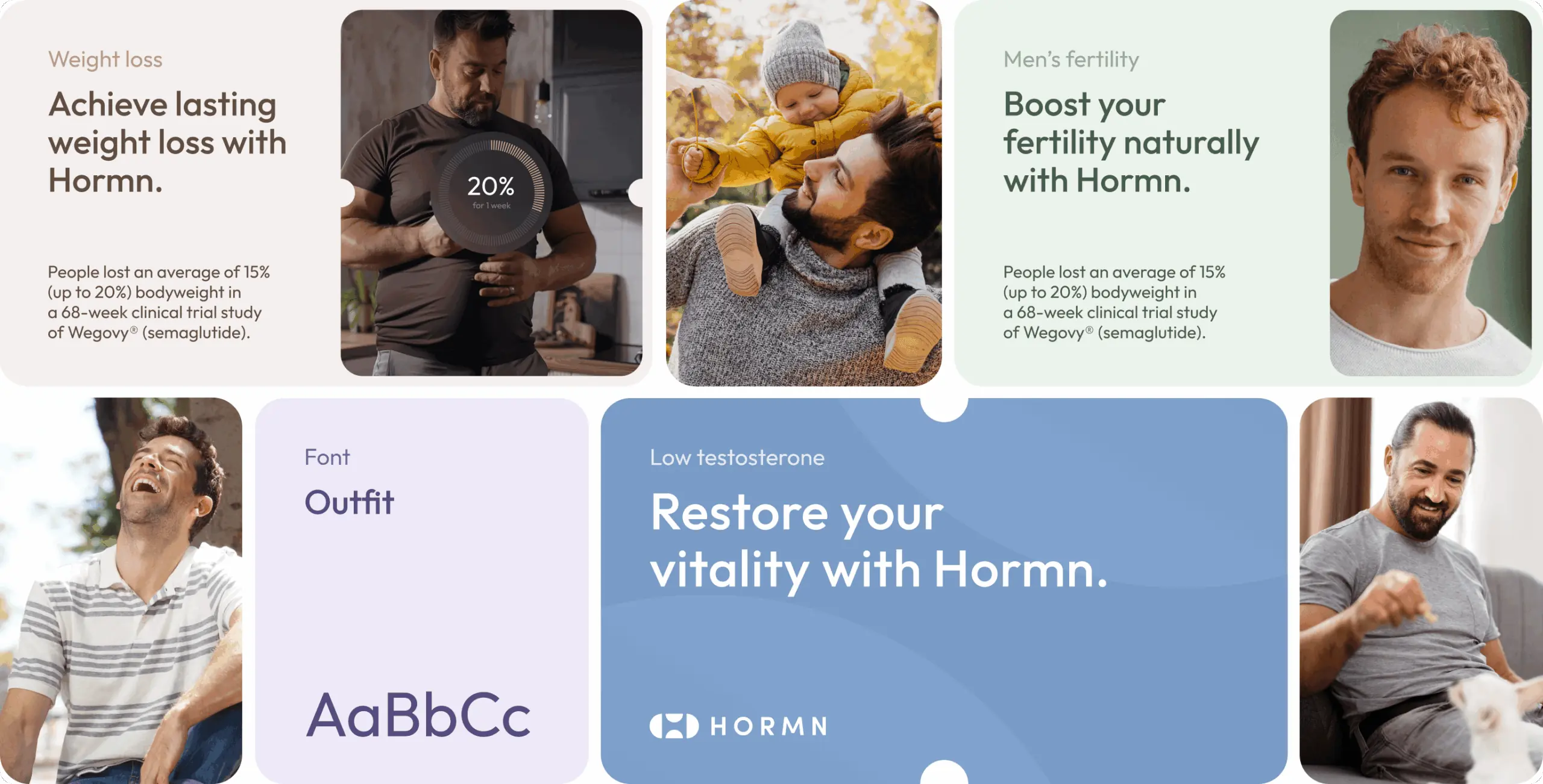
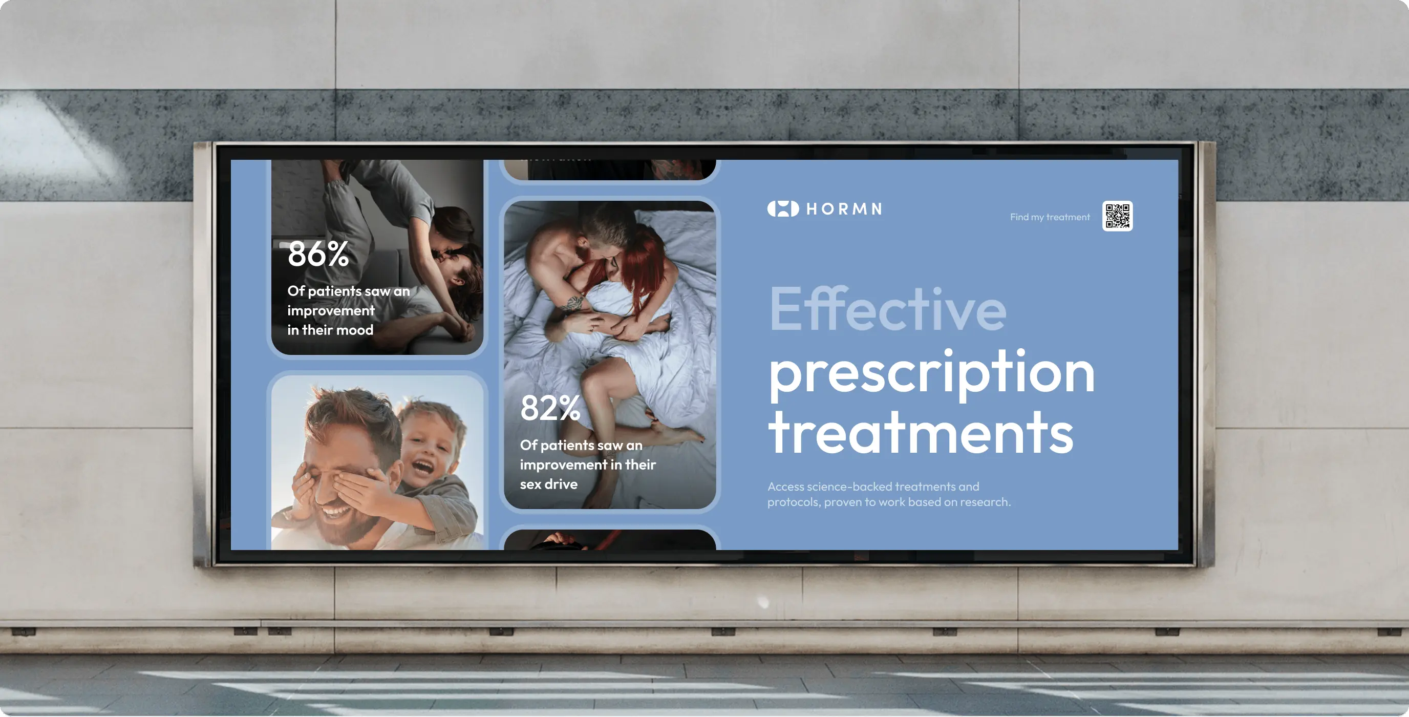
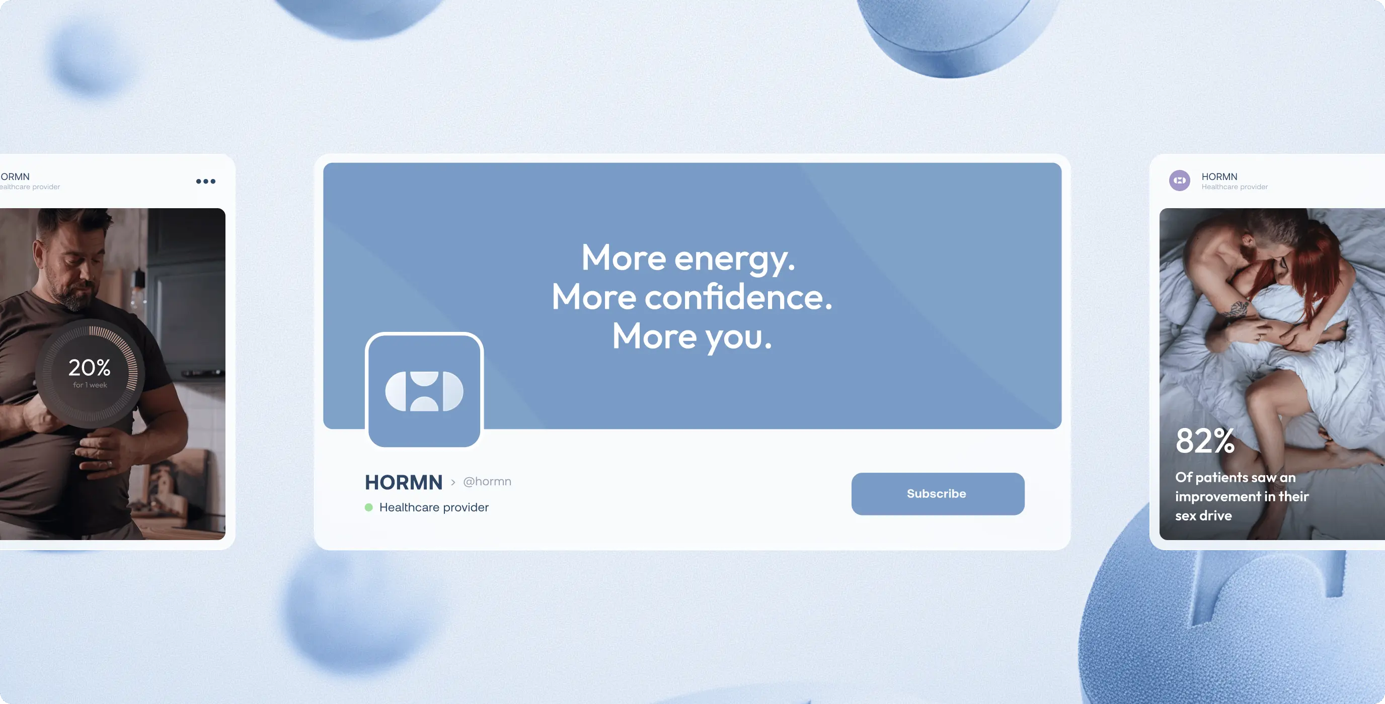
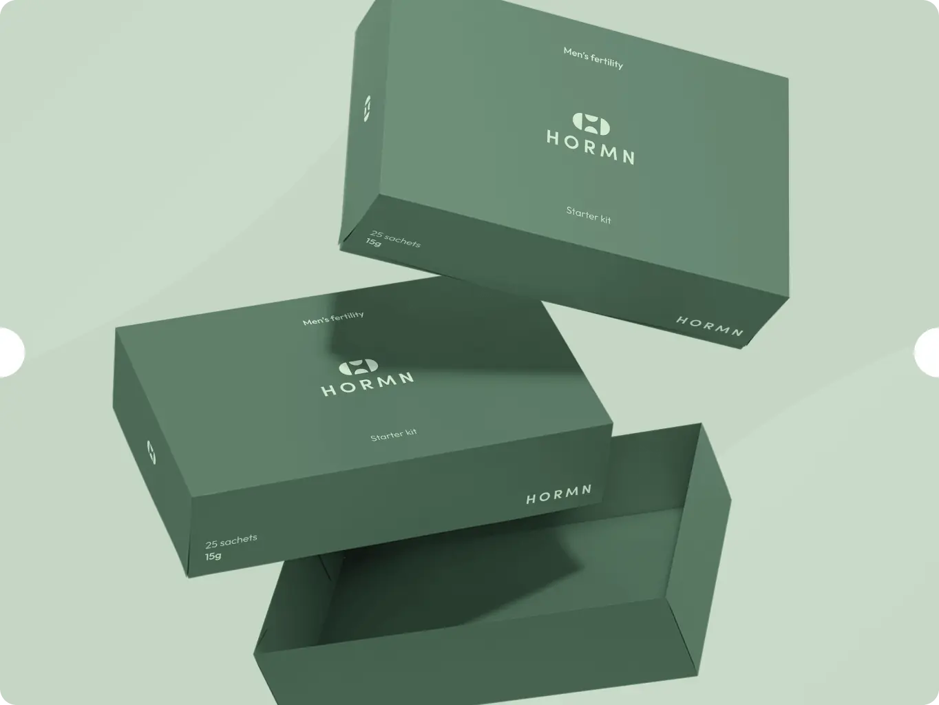
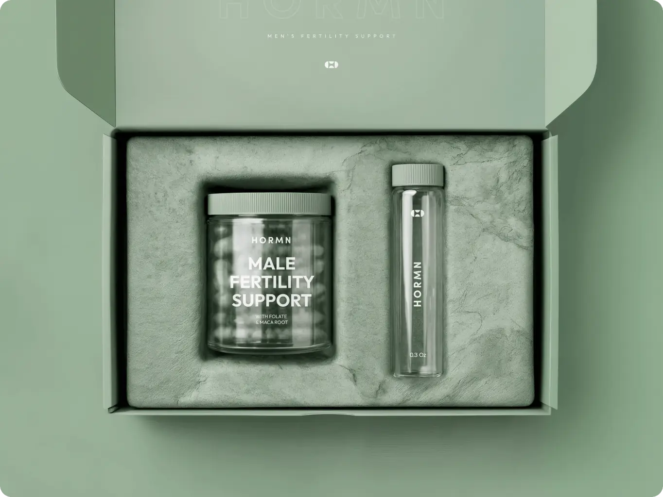
We developed a flexible visual system that could extend seamlessly across HORMN’s growing set of brand assets. From product packaging and campaign materials to social content and digital communication, the identity was built to stay coherent while adapting to different contexts, formats, and messages.
By balancing structure with versatility, the system gives the brand room to evolve without losing recognition. Each asset feels like part of the same ecosystem, helping HORMN maintain a consistent, scalable, and distinctive presence across every touchpoint.
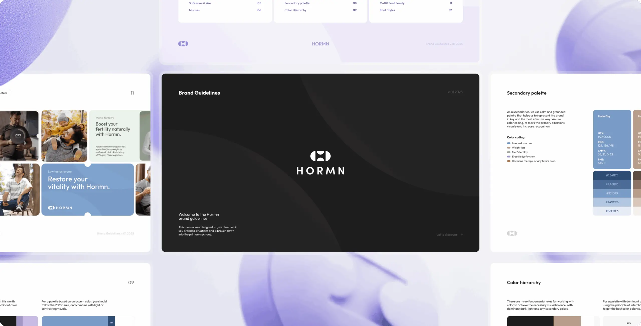
The final stage focused on documenting the identity as a clear and practical set of brand guidelines. This ensured that every element of the system, from logo usage and typography to color application and supporting assets, could be applied consistently across future touchpoints.
More than a visual reference, the guidelines became a tool for scalable brand management. They gave HORMN a solid framework for maintaining clarity, consistency, and recognition as the brand continues to grow across product, marketing, and communication.
#Branding
Tyler Ussery
 USA
USA
USA
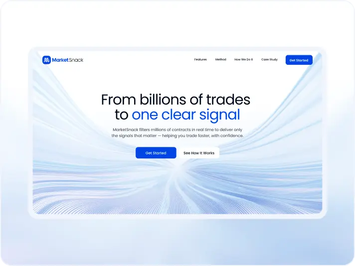
#Website redesign #Website development
marketsnack
USA
USA
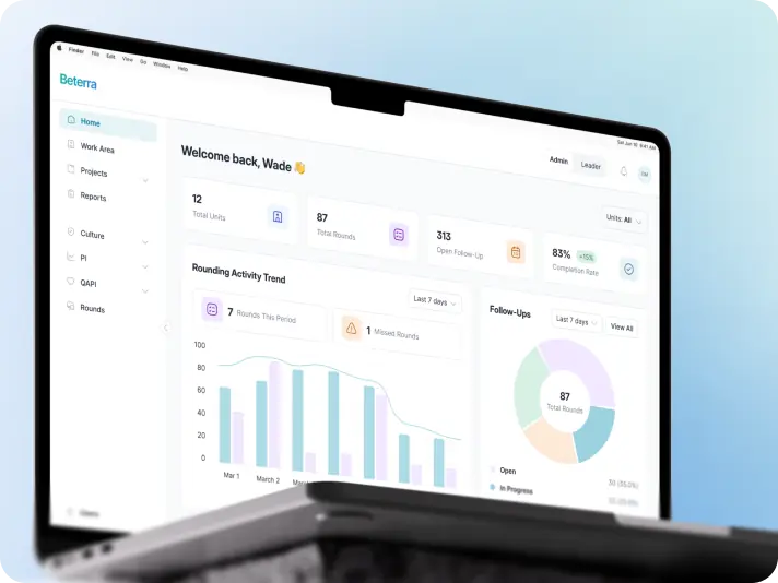
#Product redesign
BETERRA
USA
USA
Have a project in mind?
Let's chat
Have a project to
discuss?
discuss?

Have a partnership in
mind?
mind?
