SuperAntiSpyware how redesign turned a dated scanner into a tool audience can navigate without help

SuperAntiSpyware – how redesign turned a dated scanner into a tool audience can navigate without help - Website Development - Photo 1
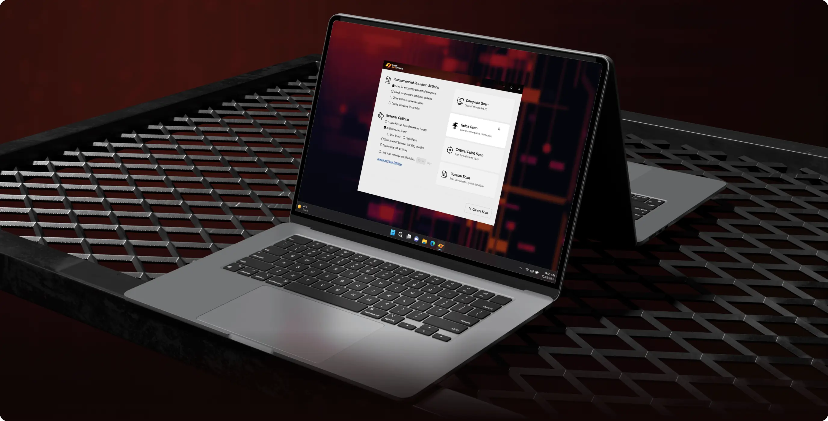
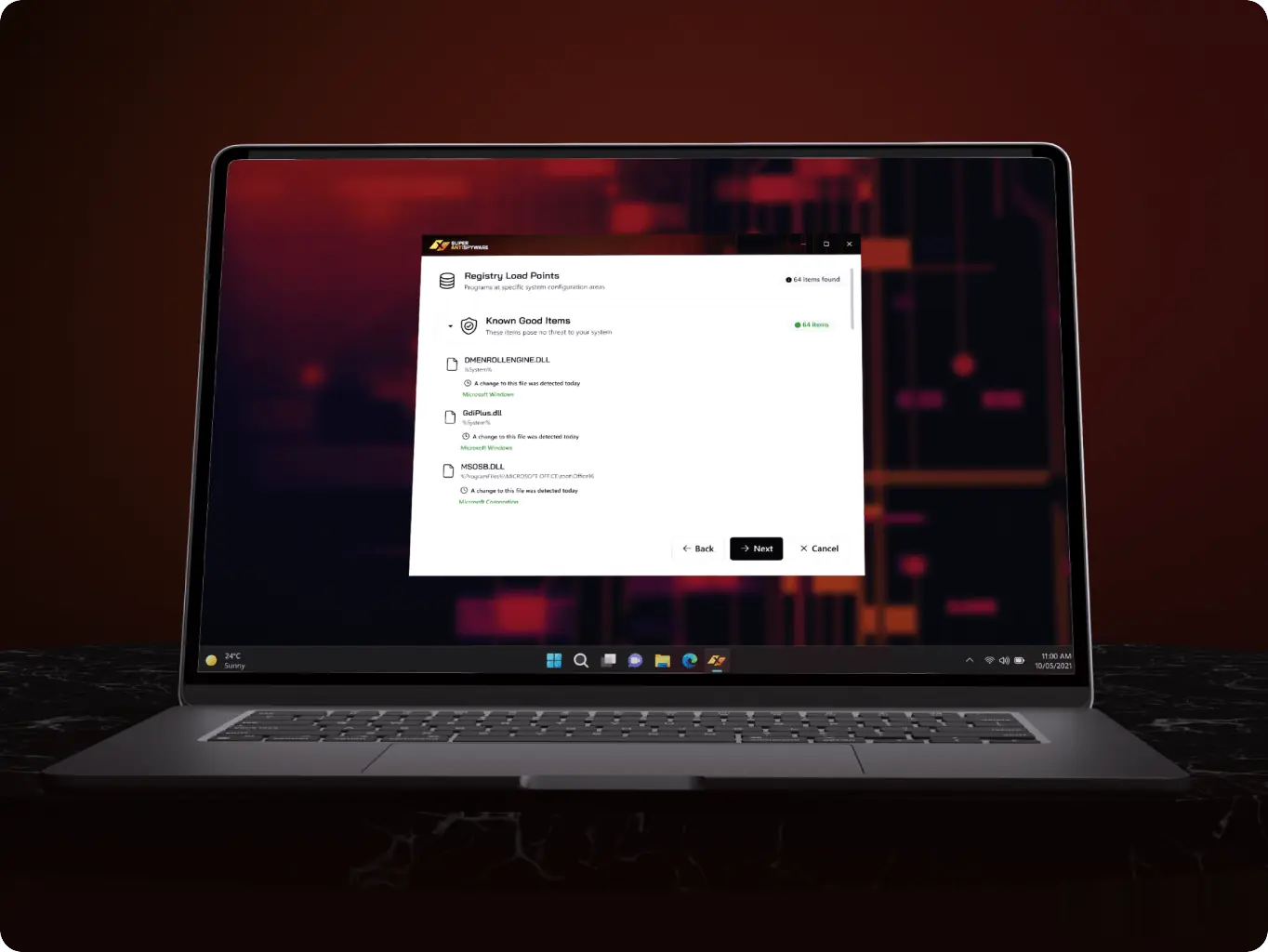
Consistent product from site to app

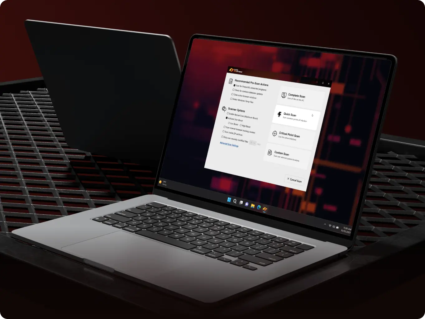
The desktop app now reads as the same product users saw on the website — not a separate tool that looked years behind the page that sold it — closing the trust gap between what people see before downloading and what they install.

A clearer first run

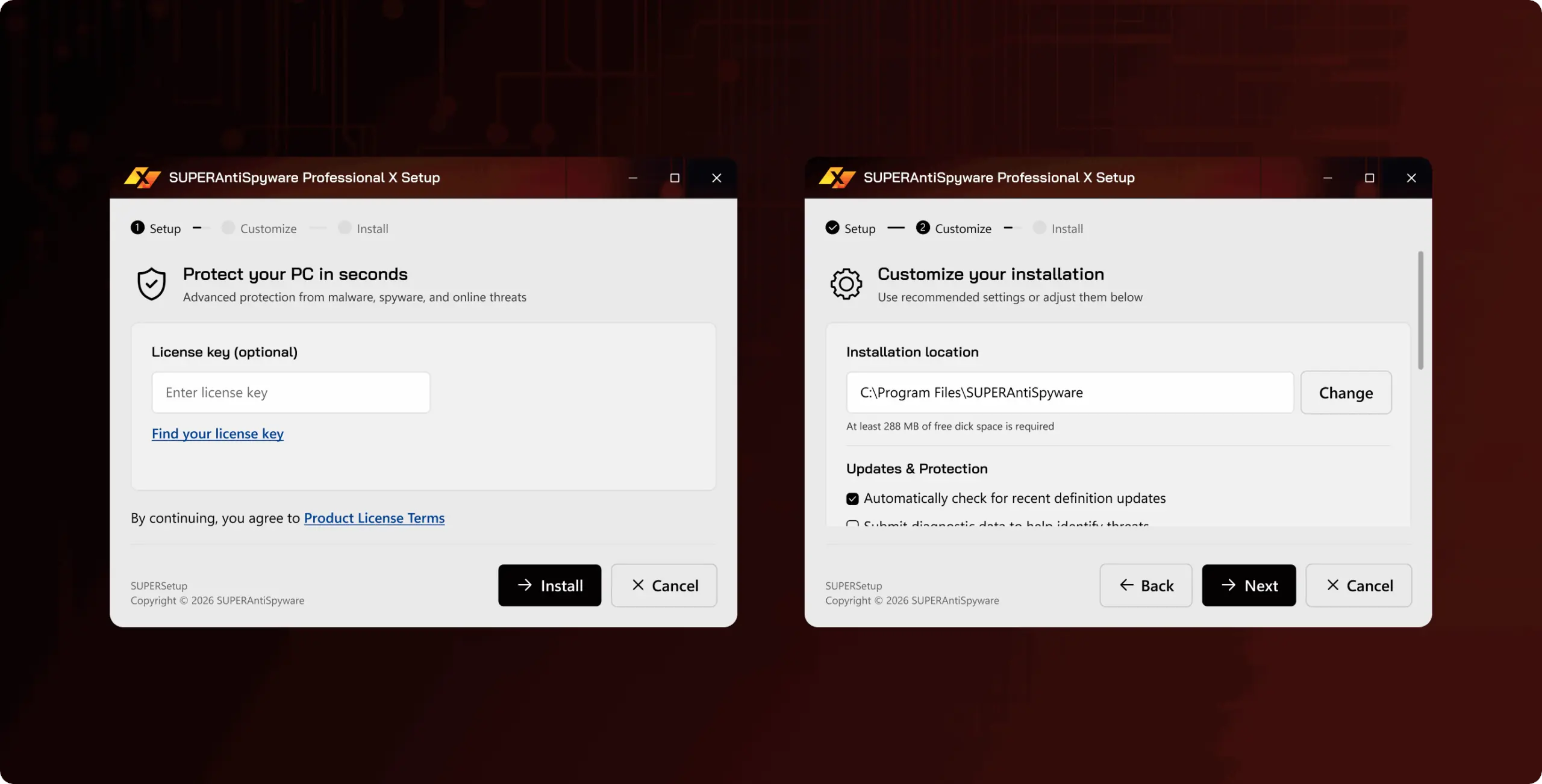
The install and registration screens were reorganized to cut clutter and make each next step easier to find — reducing friction at the first run, the point where a new user decides whether the product feels reliable.

A component library that speeds up future screens

New screens can be assembled from a shared Fluent-based component library instead of built from scratch — cutting the design time needed for anything the team adds next.

Overview
SuperAntiSpyware provides an extra layer of protection when a primary antivirus isn't enough

Specialized scanner for adware, spyware, rootkits, trojans, and worms, the app’s job is to be trusted in the moment a user suspects something is wrong on their machine — and trust starts with how the interface reads, not just what it detects. The existing UI hadn’t kept pace with the brand on the website, and for an audience that’s often 40 and older, an outdated, inconsistent layout read as outdated protection, not a reliable second line of defense.

We were brought in to rebuild the interface on a Fluent-based design system, carry the site’s identity into the desktop app, and simplify the flows that mattered most for a security tool used under stress.

Client
superantispyware Icon - fi_4628635usa
Business needs
Client request & business goals

As a security utility competing for a slot next to a user’s main antivirus, the app needed an interface that signaled the same reliability as the brand on superantispyware.com — instead, the desktop UI looked disconnected from it, which weakened trust at the exact moment a worried user opens the app to run a scan.

The team needed a UI Kit that could carry that identity consistently across every screen, plus a registration and Real-Time Protection layout where the key action was obvious instead of lost in clutter. For the Install Wizard specifically, the goal was a clearer, less cluttered first run — since a confusing setup is often a 40+ user’s first and only impression of the product.
Challenge
Challenges & solutions
Challenge
The interface looked outdated next to the website, so first-time users couldn't tell at a glance whether the desktop app belonged to the same trustworthy brand they'd just downloaded from.
Solution
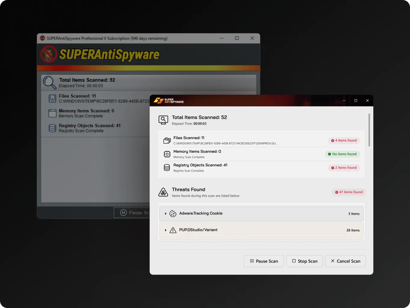
We rebuilt the main screens on a Fluent-based design customized to the brand's colors and type, so the app now reads as the same product the user trusted enough to install.
Challenge
The registration sequence and the Real-Time Protection screen buried their key actions under visual clutter, so users had to hunt for the one thing they came to do — even though the underlying steps were fine.
Solution
We kept the existing flow and functionality intact and reworked the layout — surfacing the key action on registration and Real-Time Protection with less clutter around it.
Challenge
Without a shared component system, every new or revised screen risked introducing its own visual inconsistencies, undermining the brand alignment the redesign was meant to fix.
Solution
We packaged that design as a single UI Kit — one source of components every screen draws from, main or secondary — so new and revised screens stay consistent instead of being styled independently.
Icon - process-1
Wondering about the price? We’ll help you find the best solution!
Design
System built to make the app look, and behave, like one product with the website

Once the direction was approved, the redesign moved from concepts to a reusable system: we explored multiple design concepts, settled on a single design direction grounded in Fluent design, then built a UI Kit that carried the brand’s identity – colors, typography, component behavior – into every screen rather than into a one-off layout.

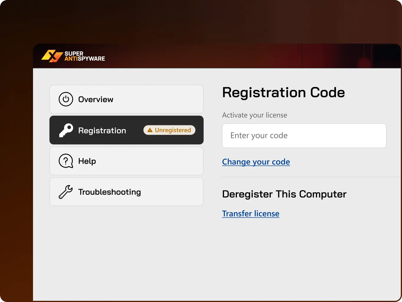
Then we applied that system across the app’s main screens and, where the brief called for it, into new screens and copywriting that hadn’t existed before, with registration receiving the most attention since it was the flow users struggled with most.

Stages

  • Design direction
  • UI Kit
  • UI screens
SuperAntiSpyware – how redesign turned a dated scanner into a tool audience can navigate without help - Website Development - Photo 6
Stage 1
Design direction

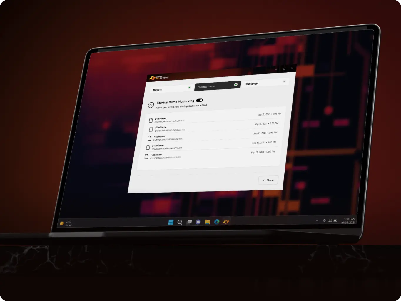
Explored multiple directions for translating the website’s identity into a desktop interface, since the existing app had drifted visually from the brand users recognized online. This stage gave the team a shortlist to validate with the client before committing design effort to a single direction.

Selected and locked the concept that best balanced Fluent design conventions with the brand’s existing visual identity, closing off further exploration so the UI Kit and screen work could move forward on stable ground.
SuperAntiSpyware – how redesign turned a dated scanner into a tool audience can navigate without help - Website Development - Photo 9
SuperAntiSpyware – how redesign turned a dated scanner into a tool audience can navigate without help - Website Development - Photo 10
SuperAntiSpyware – how redesign turned a dated scanner into a tool audience can navigate without help - Website Development - Photo 11
Stage 2
UI Kit

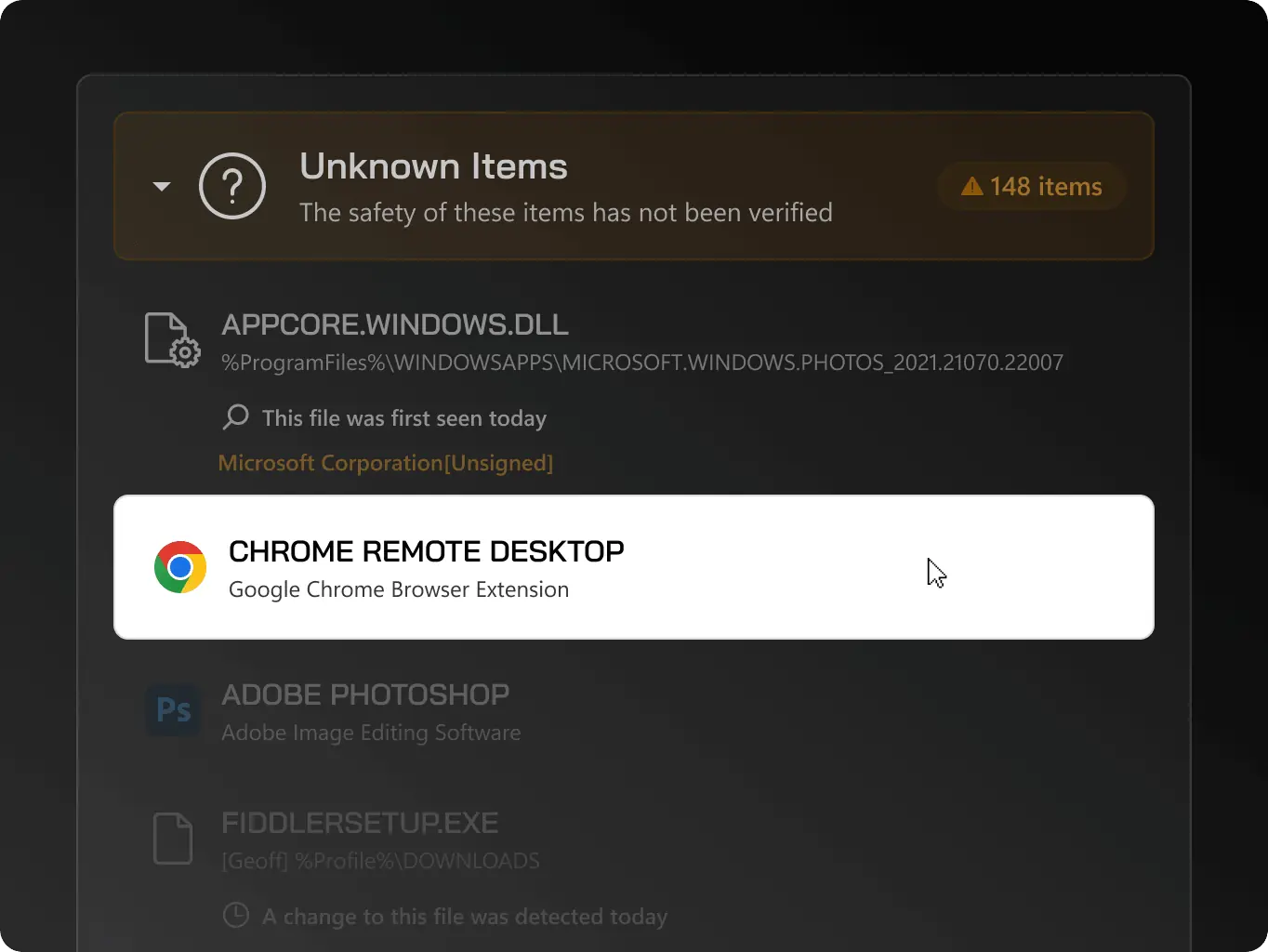
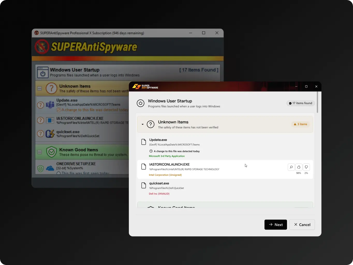
Built a component library based on Fluent design, customized with the app’s own colors, typography, and element styling rather than left as a generic Fluent implementation.

This gave every subsequent screen – main or secondary – a consistent set of building blocks instead of one-off styling decisions per screen.
Stage 3
UI screens

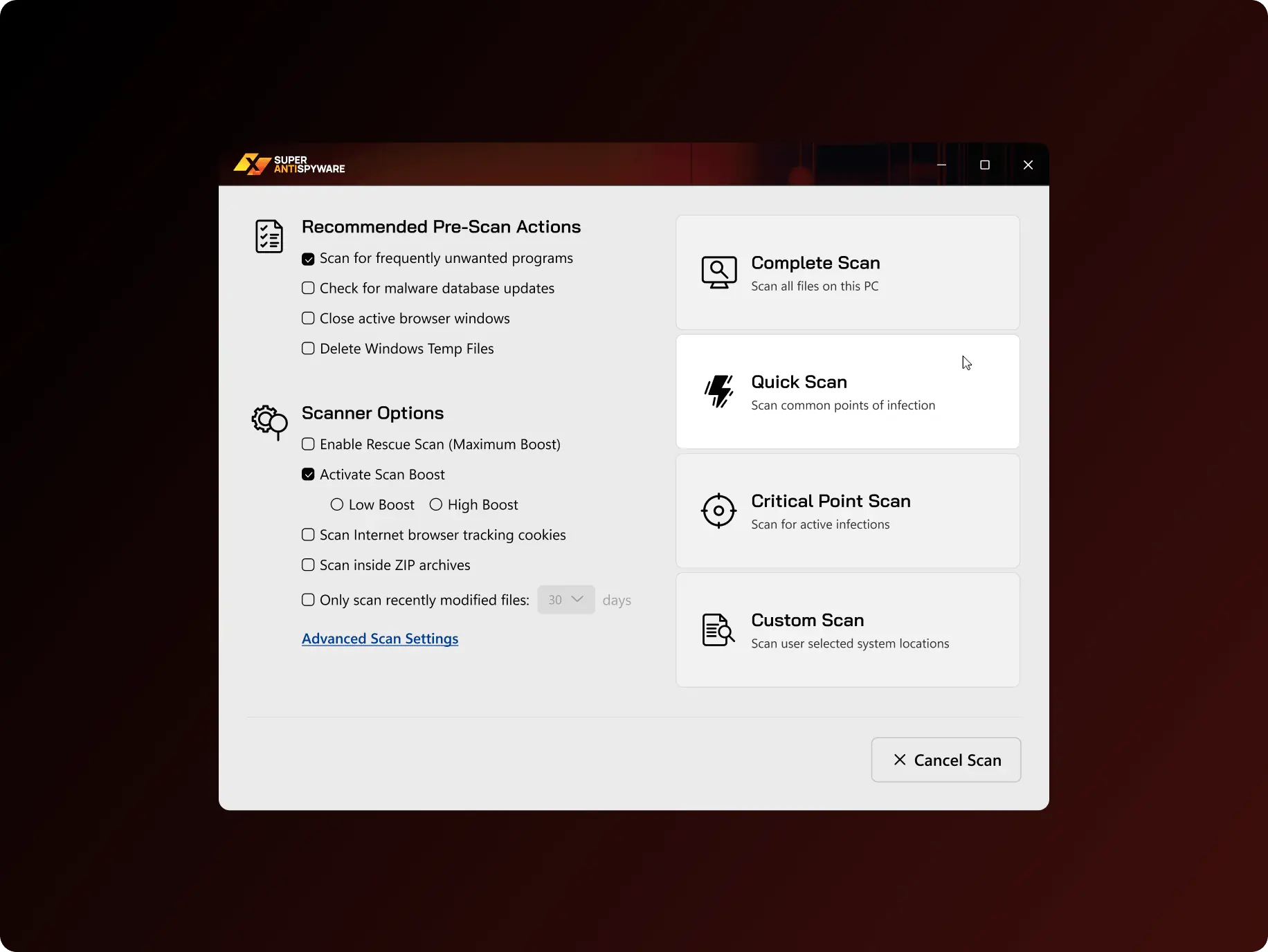
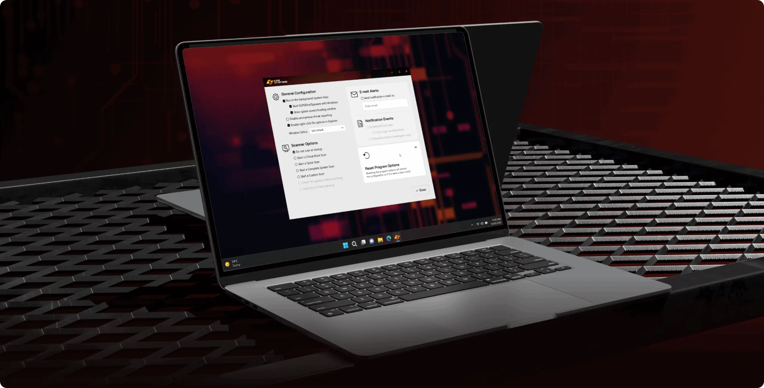
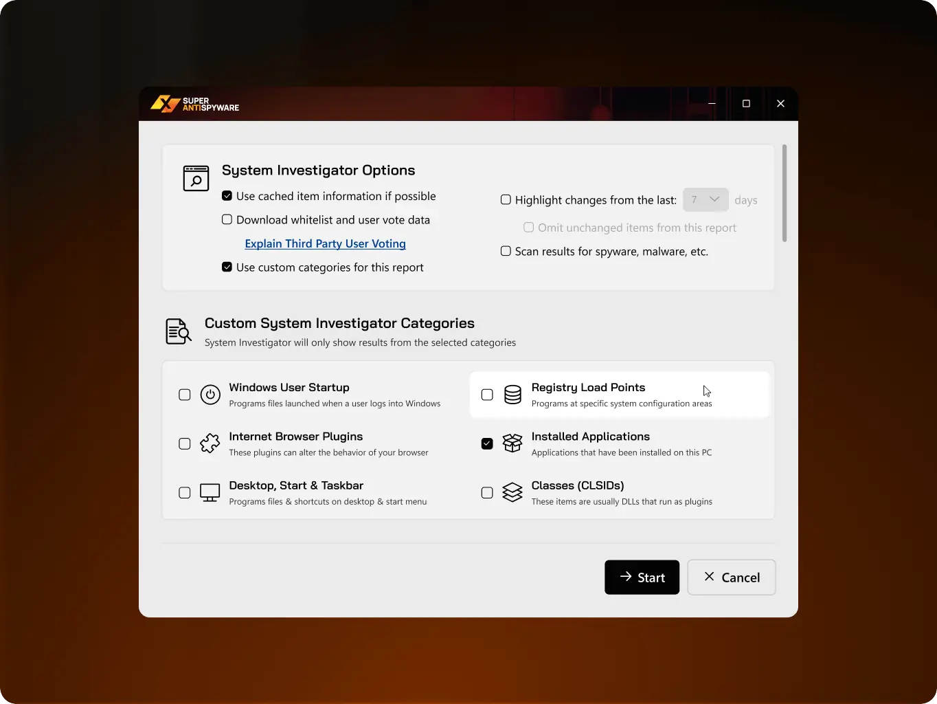
Applied the UI Kit across the app’s main screens and, where the project called for new screens or revised copy, extended the system rather than treating those as exceptions.

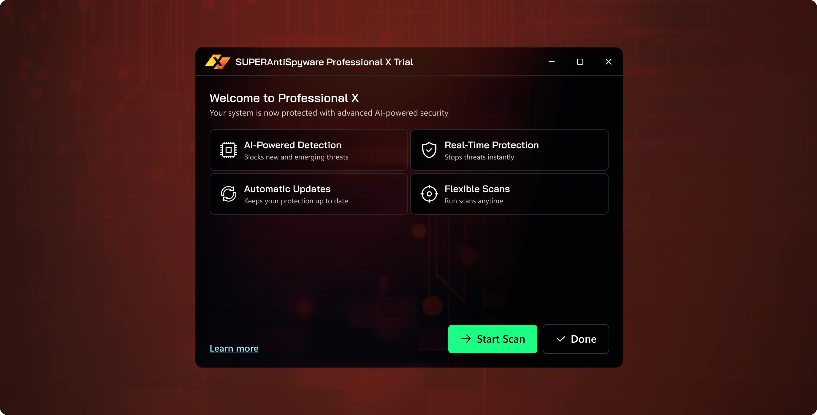
Registration and the install experience got the closest attention: the layout was reorganized to surface each next step, and the UX writing was reworked alongside it — since for a 40+ audience the wording carries as much of the first impression as the visuals. The existing flow stayed intact; the goal was a clearer read of the steps already there, not a new process.
SuperAntiSpyware – how redesign turned a dated scanner into a tool audience can navigate without help - Website Development - Photo 14
Icon - process-1
Wondering about the price? We’ll help you find the best solution!
Screens
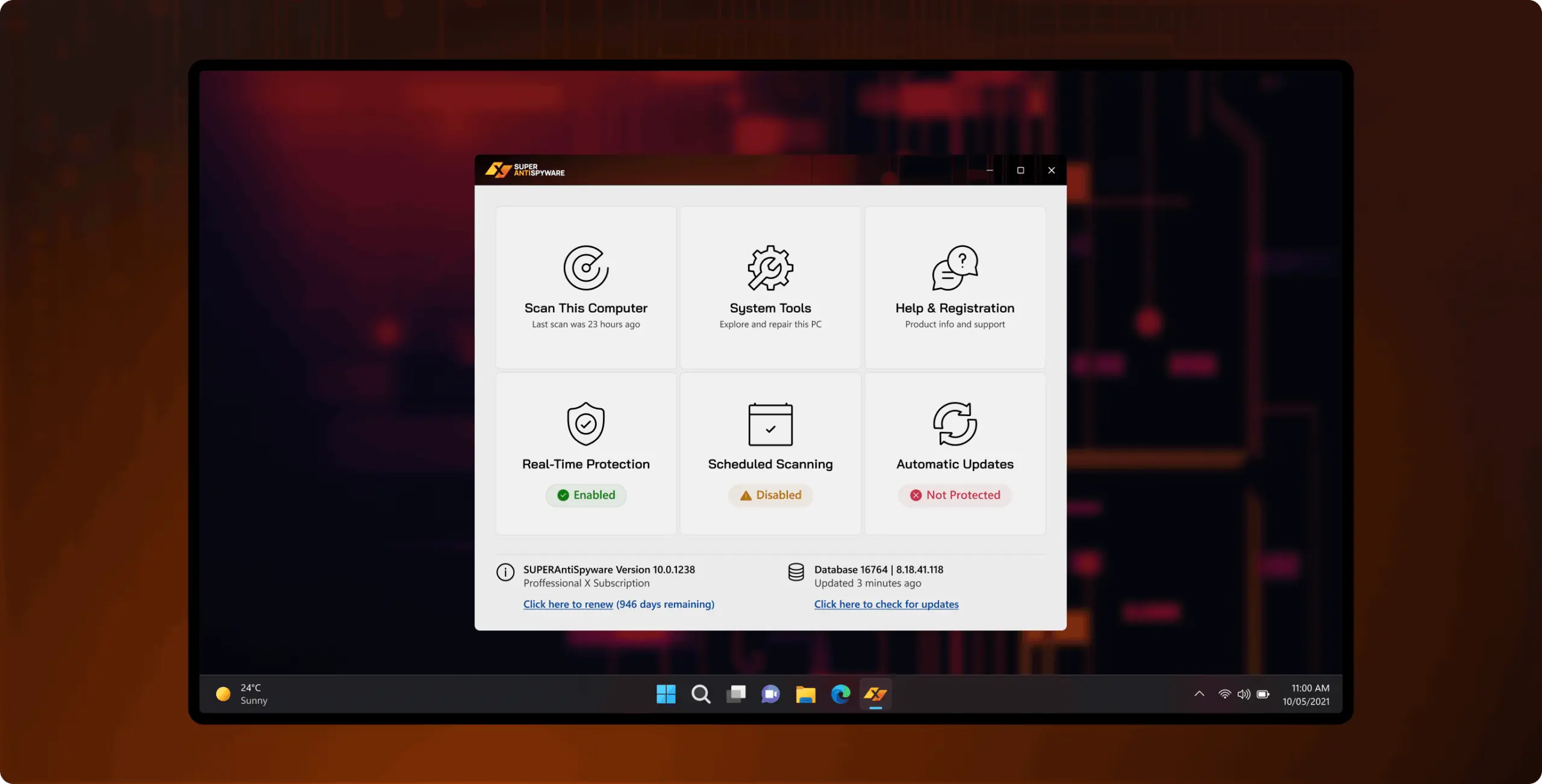
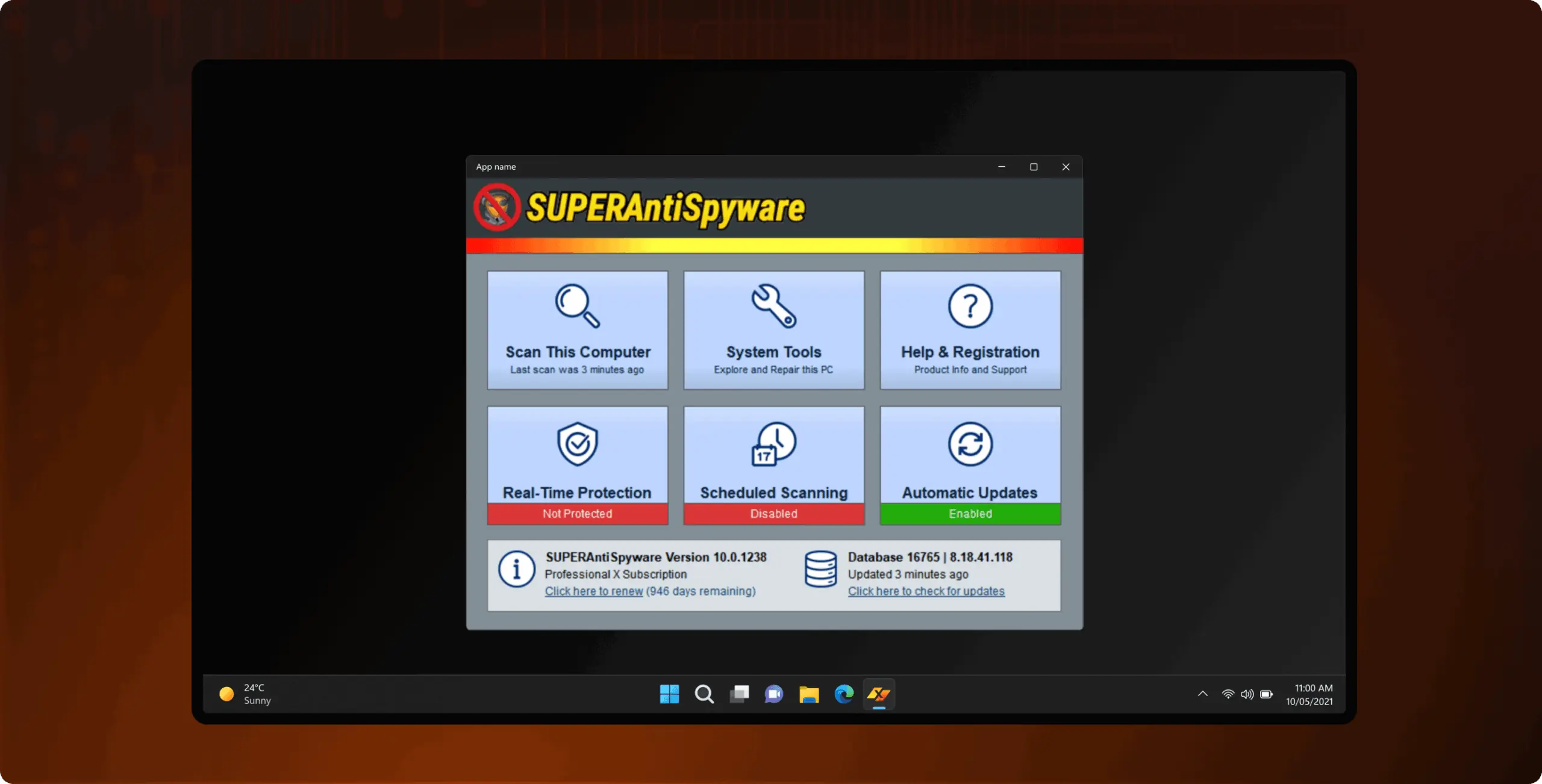
Every core screen, redrawnto read as one product
SuperAntiSpyware – how redesign turned a dated scanner into a tool audience can navigate without help - Website Development - Photo 17
SuperAntiSpyware – how redesign turned a dated scanner into a tool audience can navigate without help - Website Development - Photo 18
SuperAntiSpyware – how redesign turned a dated scanner into a tool audience can navigate without help - Website Development - Photo 19
SuperAntiSpyware – how redesign turned a dated scanner into a tool audience can navigate without help - Website Development - Photo 20
SuperAntiSpyware – how redesign turned a dated scanner into a tool audience can navigate without help - Website Development - Photo 21
SuperAntiSpyware – how redesign turned a dated scanner into a tool audience can navigate without help - Website Development - Photo 22
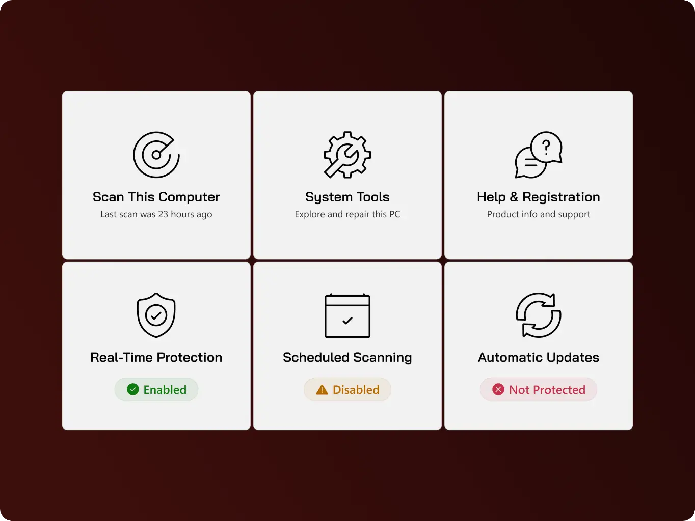
Scan this computer

Lets users run a scan to detect adware, spyware, rootkits, trojans, and worms on demand, giving them a direct way to act the moment they suspect something is wrong with their machine.

SuperAntiSpyware – how redesign turned a dated scanner into a tool audience can navigate without help - Website Development - Photo 23
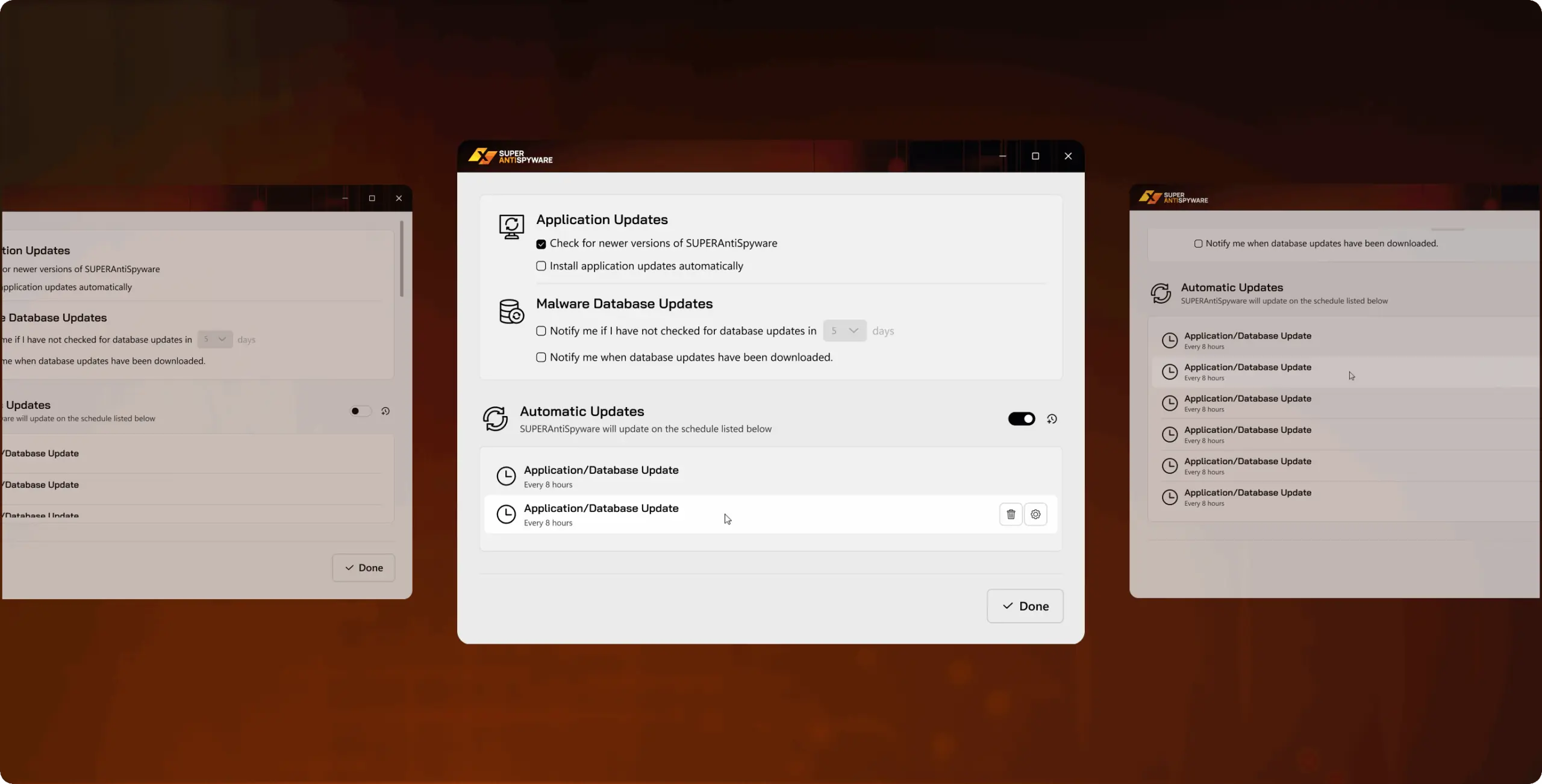
Automatic updates

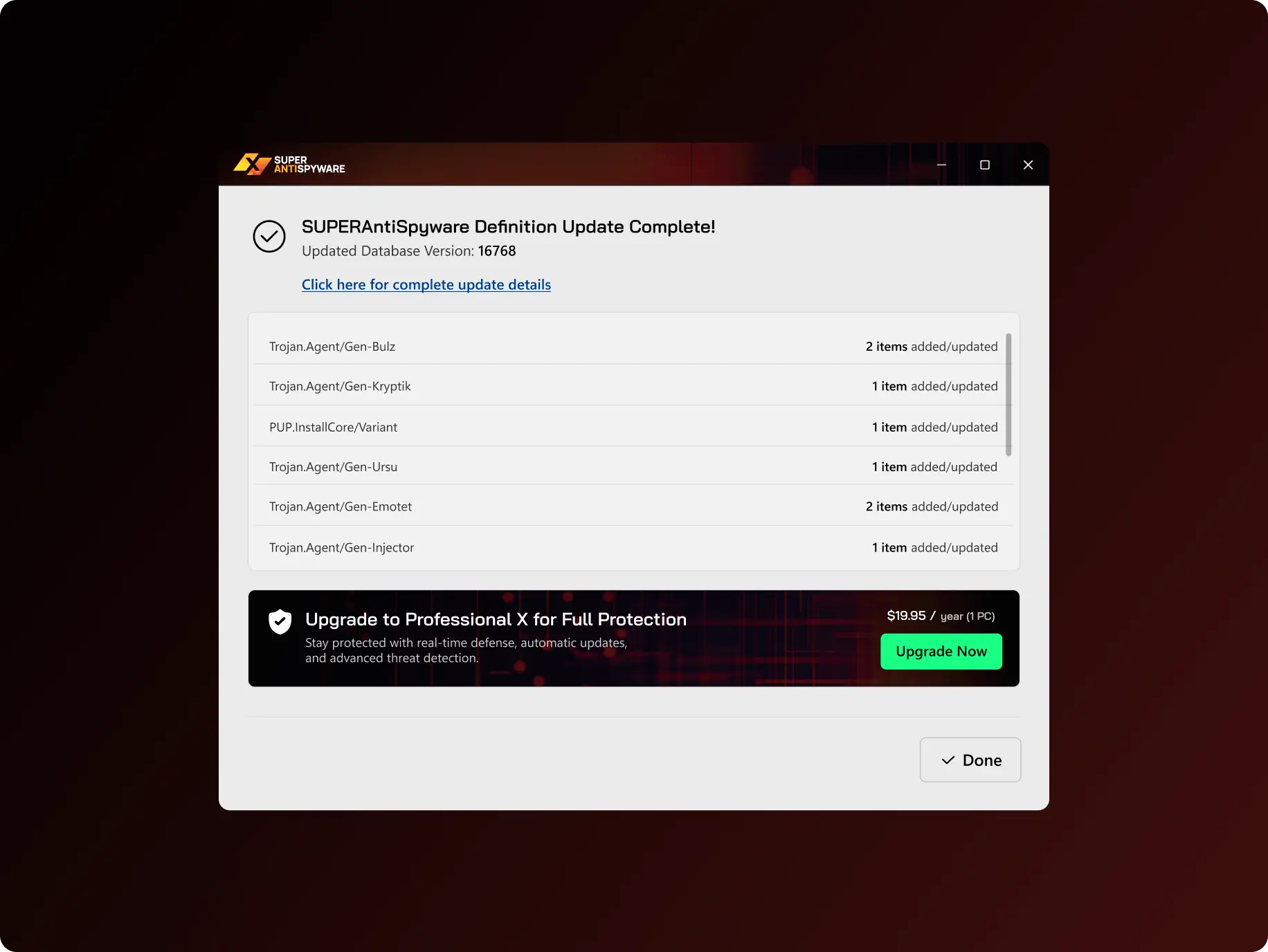
Keeps threat definitions current in the background without requiring the user to check for or install updates themselves, so detection stays effective against newly identified threats by default.

SuperAntiSpyware – how redesign turned a dated scanner into a tool audience can navigate without help - Website Development - Photo 24
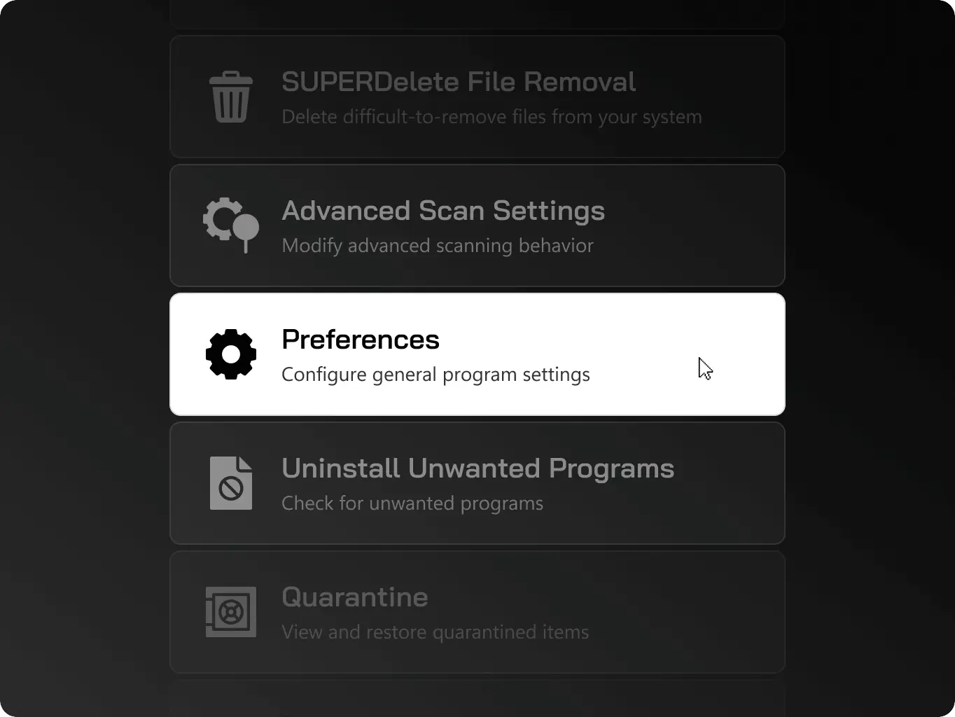
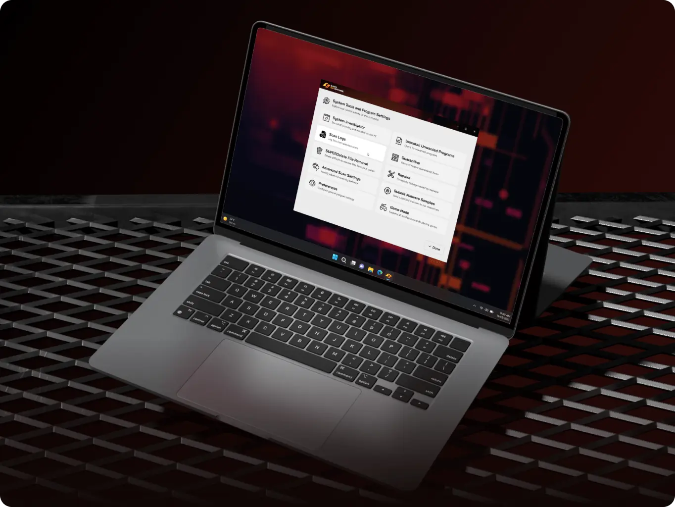
System tools

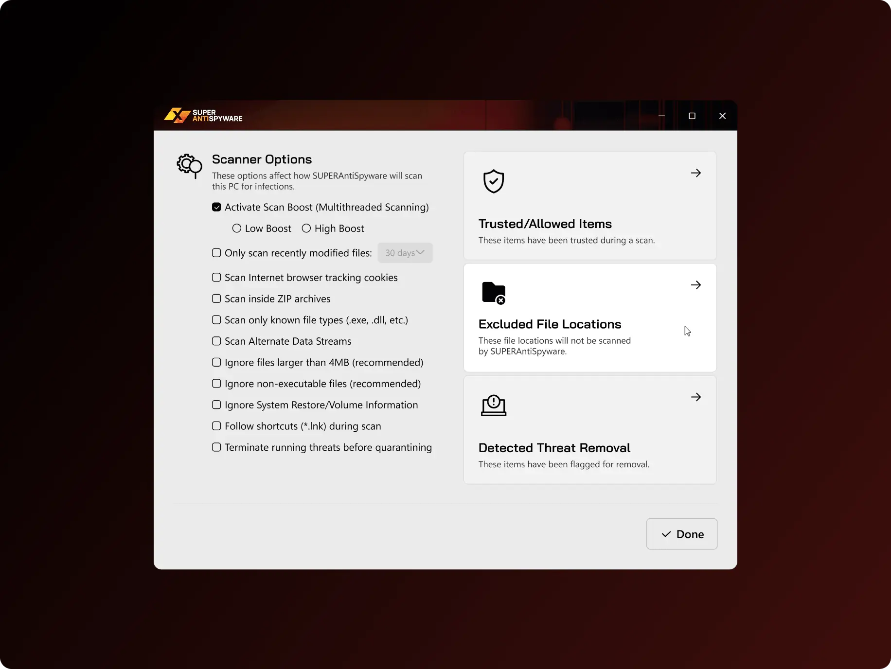
Gives users access to the app's supporting utilities in one place, so maintenance and configuration tasks don't require hunting across separate menus.

SuperAntiSpyware – how redesign turned a dated scanner into a tool audience can navigate without help - Website Development - Photo 25
Scheduled scanning

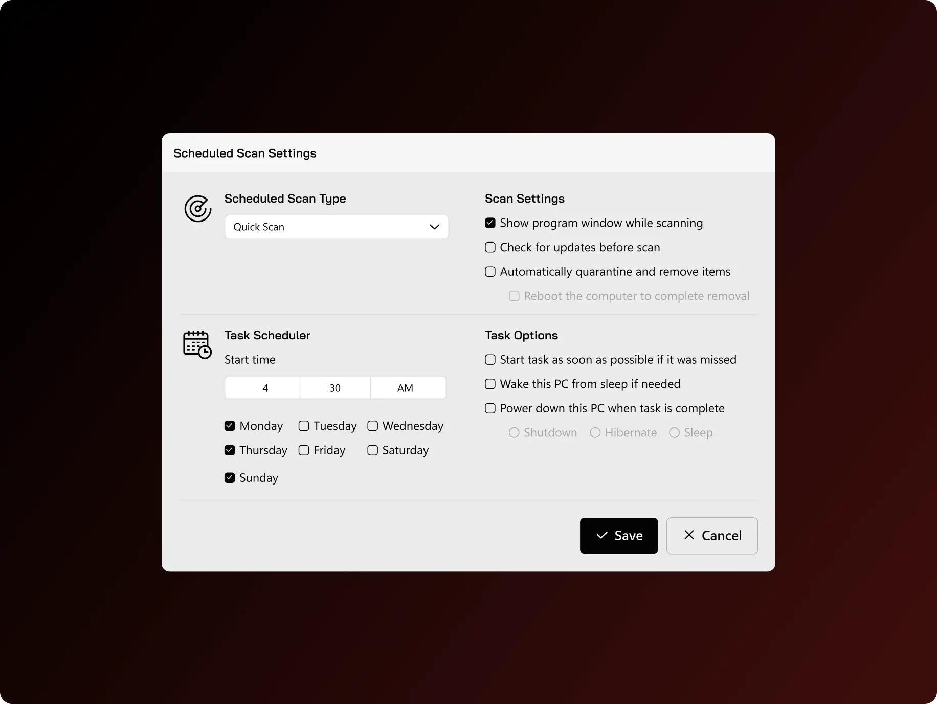
Lets users set scans to run automatically at chosen times, so protection doesn't depend on remembering to scan manually.

SuperAntiSpyware – how redesign turned a dated scanner into a tool audience can navigate without help - Website Development - Photo 26
Real-time protection

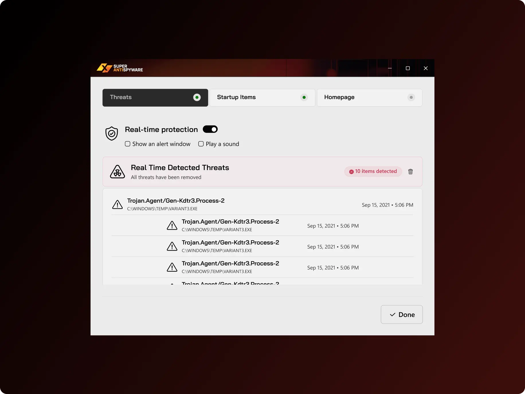
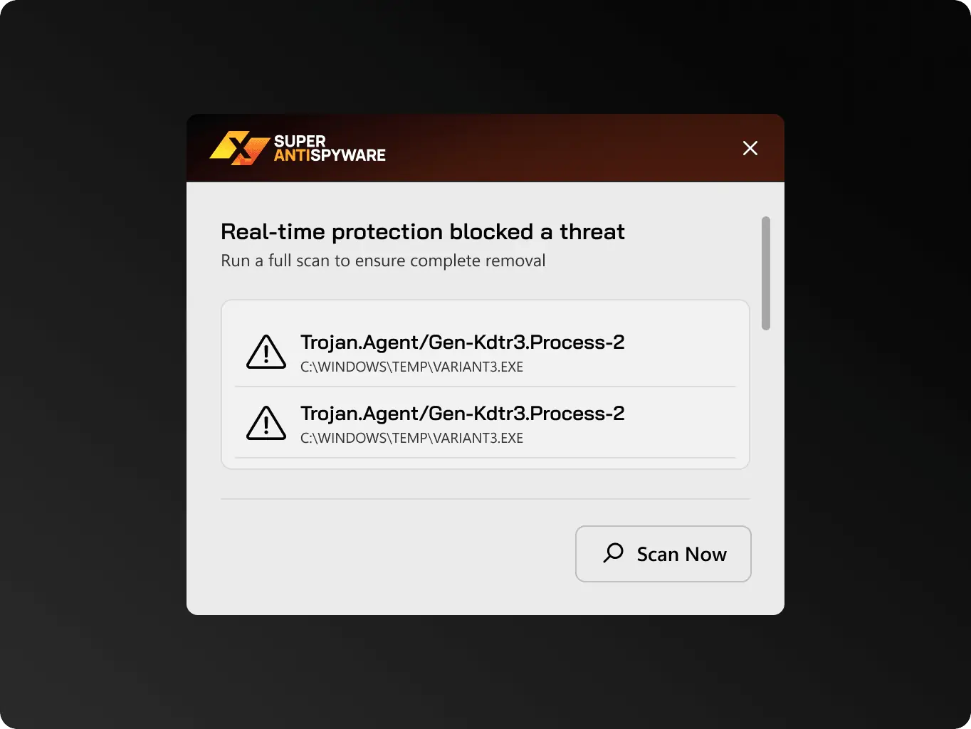
Lets users keep continuous background scanning active, with its layout restructured during the redesign to surface its status and key actions more clearly, without changing how the feature itself works.

Hand off
Handing off screens ready to build, not mockups to reinterpret

This phase added no new functionality — the engagement was a visual redesign of the existing app, so the work here was about how the new screens reached the client’s engineers, not about architecture. SuperAntiSpyware is a Windows desktop product that the client’s own team builds and maintains, and that team is set up to pick up design as web screens rather than flat files. We delivered the redesigned screens as static pages in Webflow to fit the process they already run.

Handing off this way — a working web layout instead of a static mockup — meant the client’s developers ported spacing, states, and component structure that were already resolved, not reinterpreted from an image, before rebuilding them in the desktop app. That narrows the gap between the approved design and what ships, and leaves the same components in place for screens the team adds on its own later.
SuperAntiSpyware – how redesign turned a dated scanner into a tool audience can navigate without help - Website Development - Photo 27
Icon - process-1
Wondering about the price? We’ll help you find the best solution!
Results
An outdated scanner interface turned into a desktop app that matches its own website
Consistent product from site to app

The desktop app now reads as the same product users saw on the website — not a separate tool that looked years behind the page that sold it — closing the trust gap between what people see before downloading and what they install.

Support-free onboarding

First-time installation is now clear enough to finish without a support article. That cuts setup friction at the first run and the support requests that used to come with it.

A component library that speeds up future screens

New screens can be assembled from a shared Fluent-based component library instead of built from scratch — cutting the design time needed for anything the team adds next.

The app started as a tool whose interface no longer matched the trust signals on its own website, with an install and registration sequence that asked an older audience to work harder than it should have.

It’s now built on a Fluent-based system that carries the brand consistently across every screen, with a simplified registration flow and an install process that no longer needs a support article to get through.

Future plans
What happened next?

The redesign introduced a Fluent-based design system and a simpler registration and installation experience, creating a strong foundation for future updates.

Next steps include extending the new patterns across the remaining screens and introducing dark mode, using the existing UI Kit to ensure consistency as the product evolves.
More cases
We have dozens of products & hundreds of websites developed by our studio. We're happy to share the results with you!
#Website design #website Development
DoubleZero how an existing brand became a launch-ready lead-generation site in one month
Hovin Wang, Hall Hoyt Icon - fi_4628635 (12)United States
Tech Stack

next.js

Timeline

5 month

Results

The network explained without a sales call

From Figma identity to live site

Full site live in one month

#Web app design #web development
ZeBeyond how redesigning the onboarding flow cut the trial-to-paid activation time
zebeyond Icon - fi_4628635-1Germany
Tech Stack

Node.js, Nest.js, React

Timeline

6 month

Results

Activation in days, not months

Sales hours redirected to revenue

Compliance risk designed out

#Website design #website development
From fragmented websites to a unified experience: improving clarity, trust, and conversion across 10 brands
EVERON Icon - fi_4628635USA
Results

Raising the market standard across 10 brands

Faster launch of new websites reduces time-to-market

One design system. Ten products. Lower maintenance cost

Contact us

Have a project in mind?
Let's chat

Your Name

Enter your name *

Your Email

Enter your email *

Message

Tell us about your project

You can upload maximum 5 files
Some of your file not loaded, because maximum file size - 5 mb
Your budget for this project?

By clicking this button you accept Terms of Service and
Privacy Policy

Icon - circle-check-svgrepo-com 1
Thanks for taking time to reachout!
Stay connected with us by subscribing to our LinkedIn account. By following, you’l be the first to hear about our latest updates, news, and exciting development. We look forward to sharing our journey with you!
Icon - circle-check-svgrepo-com 1
Thanks for taking time to reachout!
We’d love to hear more about your project! Feel free to schedule a call using the link provided. This will help us better understand your vision and ensure we’re aligned on all the details.
Have a project to
discuss?
Image - ksenia
Kseniia Shalia
Account Executive
Have a partnership in
mind?
Image - polina
Polina Chebanova
Co-Founder & CPO