Design
Development
Research
Launch
Evolve
Extend
AdFlux – redesigned marketing platform
Client
AdFlux Co.
 USA
USA
USA
Services
Technologies
 Vite
Vite
 React
React
 TypeScript
 Zustand
 Tanstack Query
 React Router DOM
 i18next
The project was a UX redesign of an existing platform. The client wanted to make three things genuinely better: campaign creation, performance tracking, and audience targeting.
On the business side, the goal was a platform marketers could move quickly in — launching and managing campaigns without the usual back-and-forth, with real-time data and enough automation to stop spend going to waste.
Our role
We led the full redesign of the platform, working directly with the client to understand where the existing product was falling short. That meant a detailed UX analysis, a look at the market, and honest conversations about what actually needed fixing. Campaign creation and navigation were the clearest problems. Automation and real-time performance tracking were the biggest gaps.

We started the redesign by going through the existing product in detail — mapping pain points, spotting where things broke down, and working out where the real opportunities were. That gave us something concrete to build a design strategy around rather than starting from assumptions.
We also ran a competitor analysis to understand where the market was heading and where AdFlux could differentiate. From that we developed a user flow that mapped the most direct path through the system, cutting out steps that added friction without adding value.
Stages
- Competitors analysis
- User flow
We looked at how leading platforms handled the problem — HubSpot, Mailchimp, Google Ads — focusing on their features, interfaces, and what users were actually complaining about. Fragmented campaign management and the lack of real-time data came up consistently as frustrations across all of them.
That told us where AdFlux could do something different. The clearest opportunity was an all-in-one solution for multi-channel campaign management with analytics built in rather than bolted on — something none of the platforms we reviewed handled cleanly.
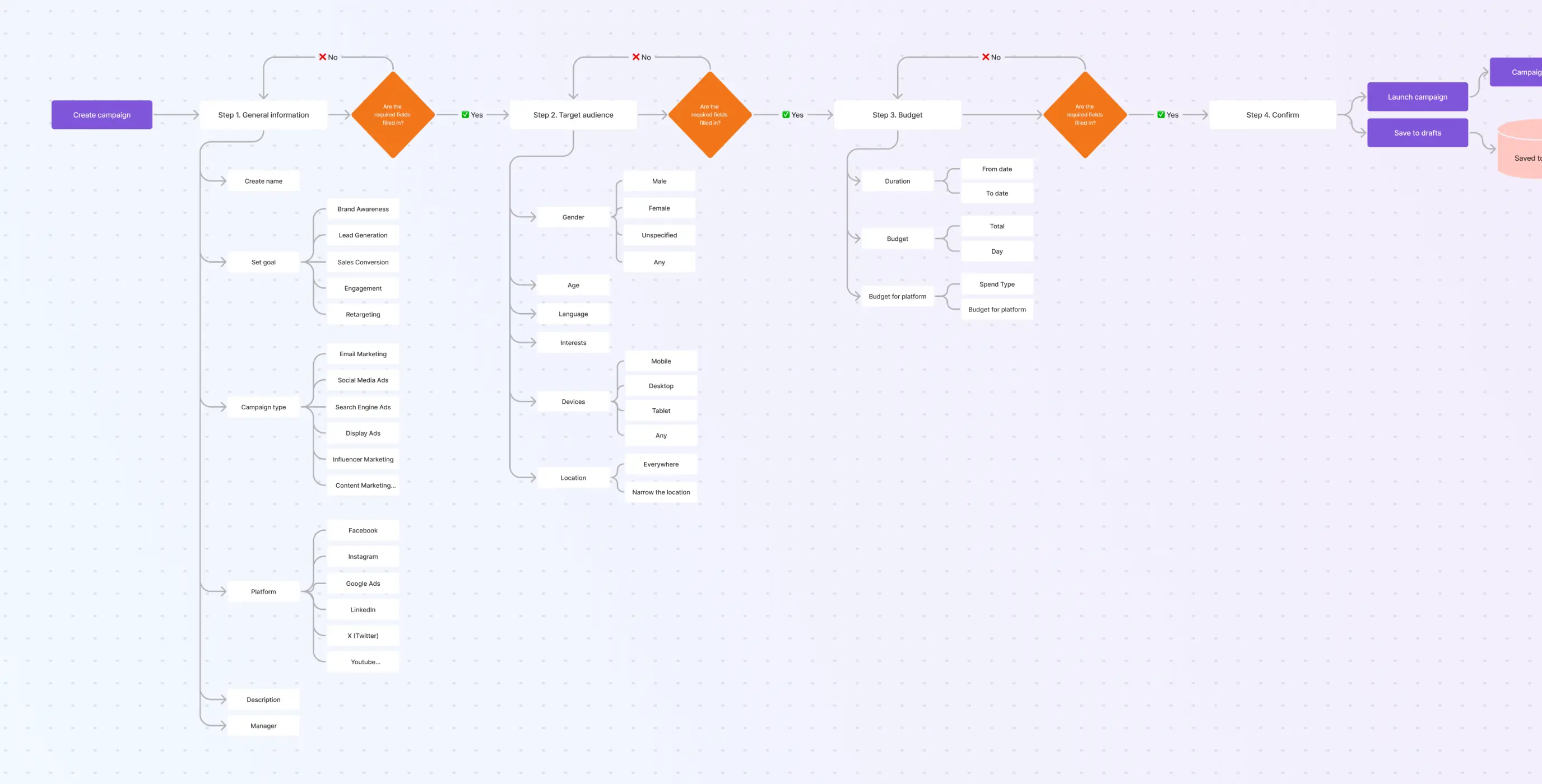
We mapped out the full user flow — from onboarding through to campaign management — to get a clear picture of where users were likely to hit friction or get confused. Working through each step made the problem areas visible in a way that reviewing the interface alone wouldn’t have.
Those findings fed directly into the redesign, shaping which interactions needed rethinking and in what order.
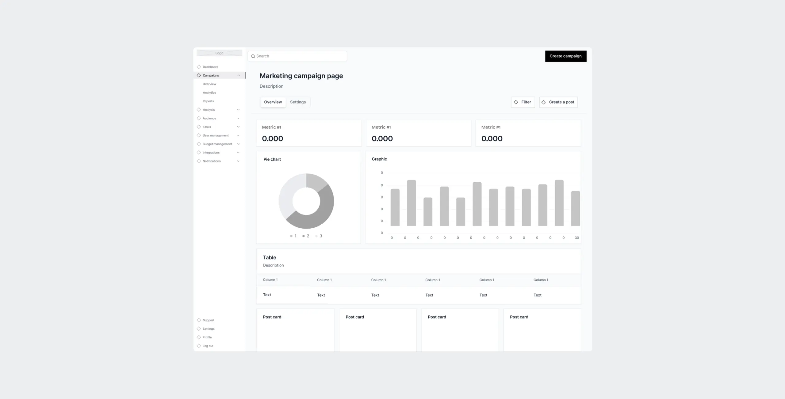
The design phase focused on making complex marketing workflows feel manageable. We worked from wireframes through to final UI, keeping layouts clean and navigation straightforward throughout.
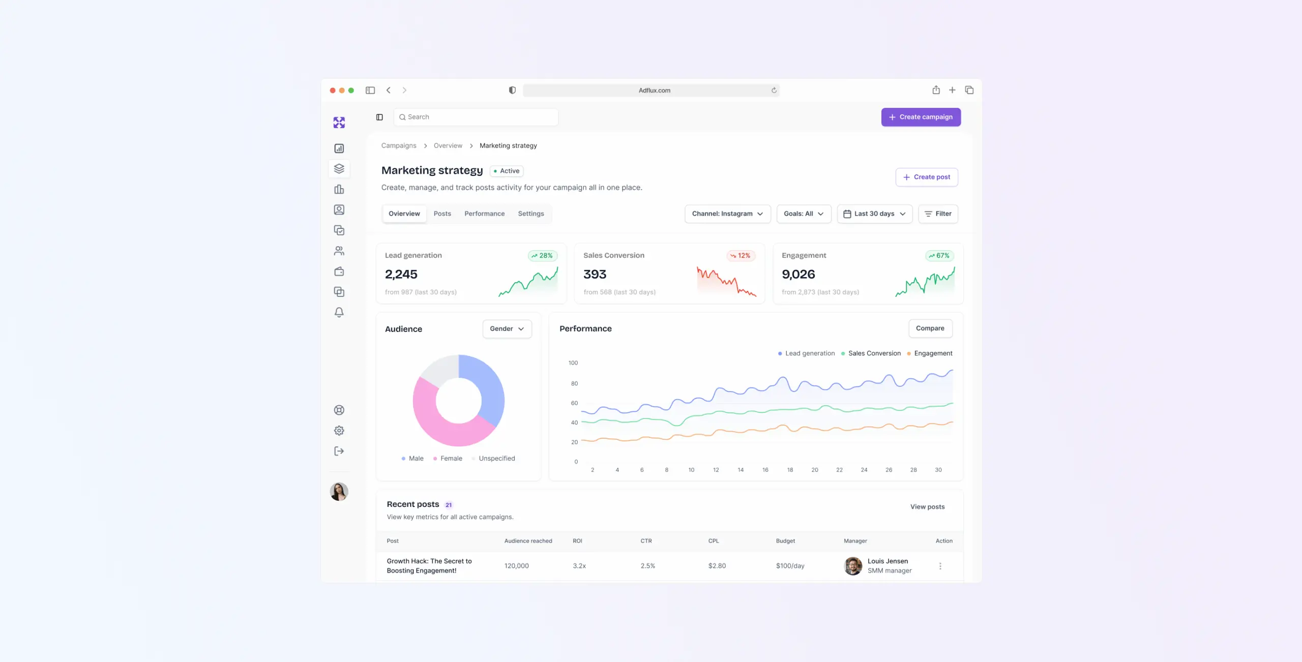
The purple color scheme was a deliberate choice — distinct enough to give AdFlux its own identity without tipping into something that felt more like a brand exercise than a working tool. The overall balance was a platform that looked capable without feeling overwhelming.
Stages
- Wireframes
- Moodboard
- UI design
Wireframing focused on two things.
The first was structure — getting the core navigation and user flows right, simplifying interactions that had been causing friction, and making sure key actions like campaign creation didn’t require unnecessary steps to reach.
The second was content hierarchy. Critical information needed to be visible without hunting for it, so we worked through spacing, contrast, and element placement until the layout made the right things obvious. That same thinking carried through to how the wireframe held up across different devices.
We put together two moodboard directions — one minimalist with a light color palette and subtle textures, and one with bolder colors and more energy.
The client went with the minimalist version. It suited the platform better — a tool built around simplicity and efficiency needed a visual language that said the same thing.
UI design threw up a couple of problems worth mentioning.
The first was building the design system on MUI. Used well, MUI’s components and styling capabilities gave us a scalable, consistent foundation across the platform. The work was in shaping it to fit AdFlux rather than letting the defaults drive the design.
The second was a trickier navigation problem. Detailed asset, campaign, and content information was sitting in a sidebar that didn’t load as a separate page — which meant sharing a direct link to a specific item broke the display and confused the navigation. We fixed it by keeping only main pages in the sidebar and leaving analytics and campaign detail out of it. Shared links worked cleanly, and the structure stayed navigable.
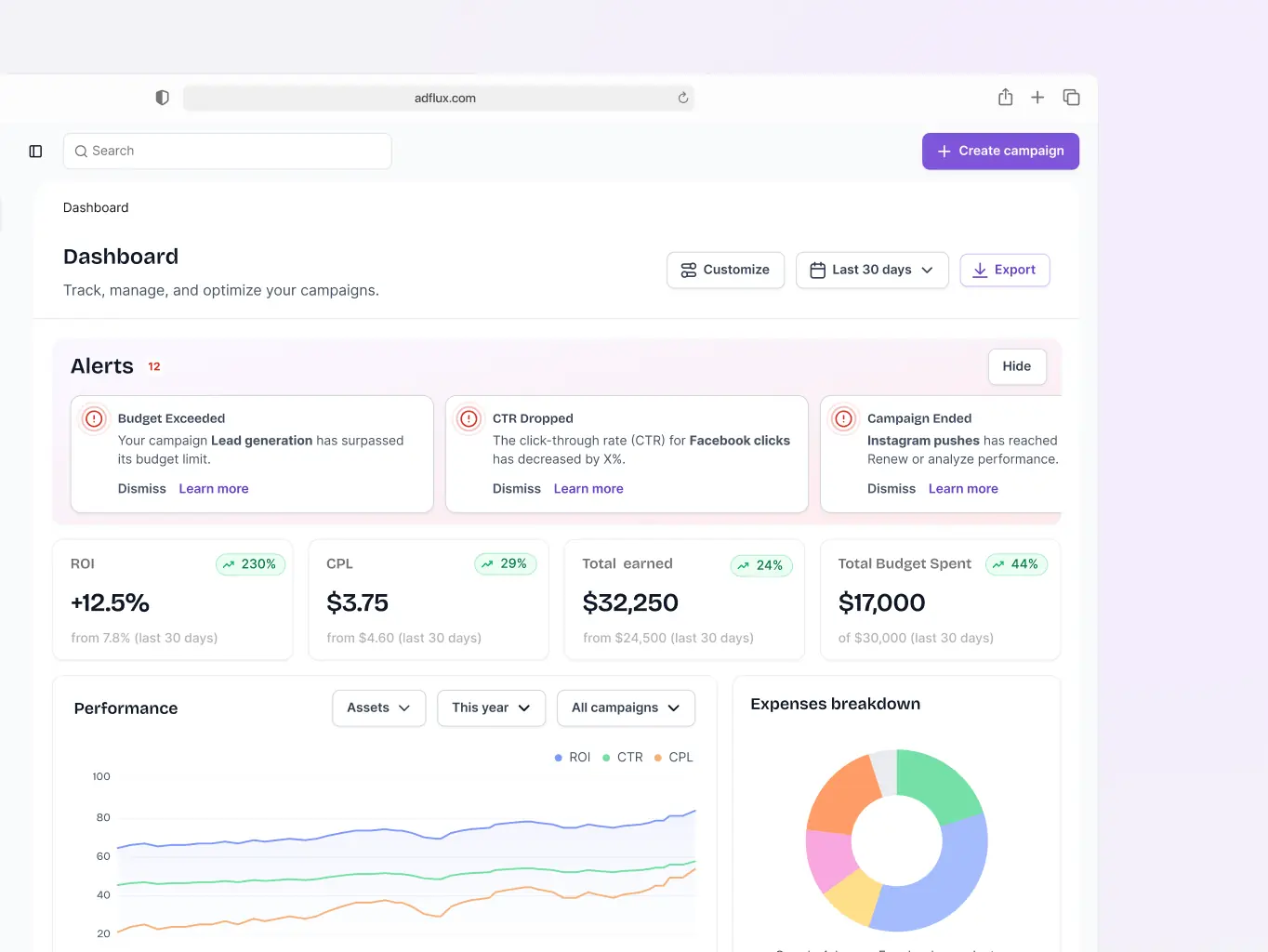
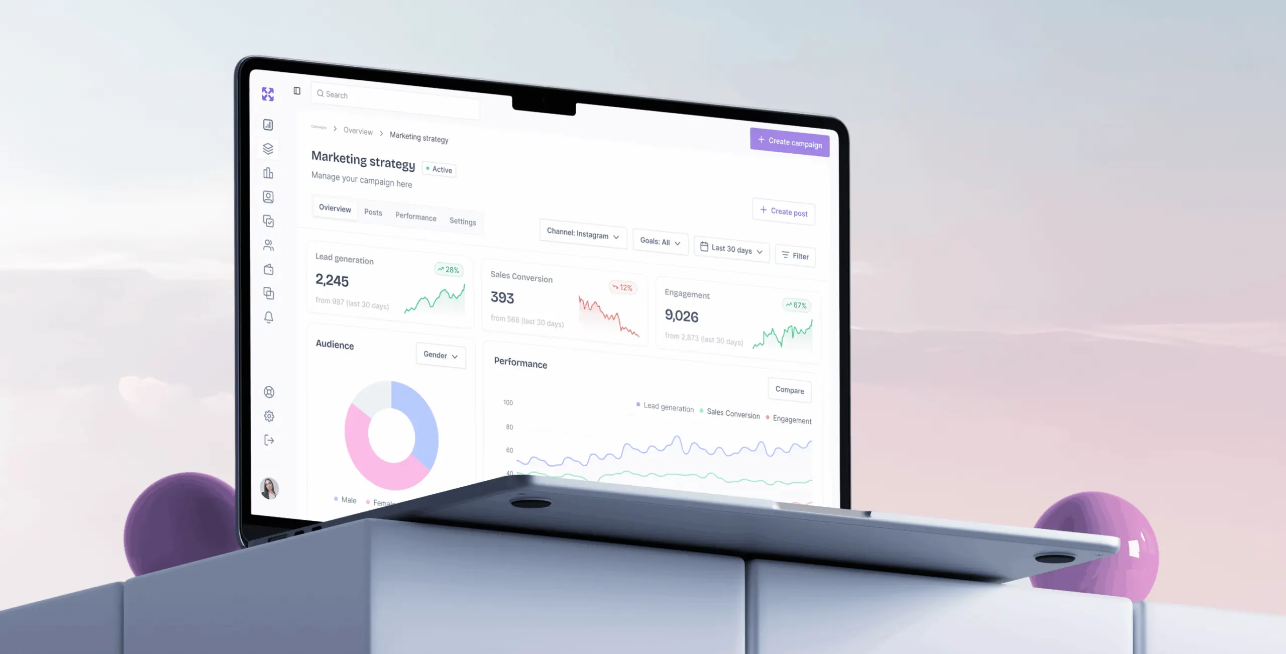
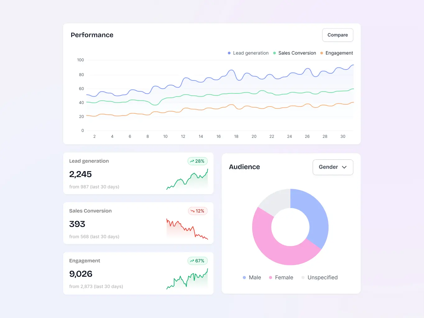
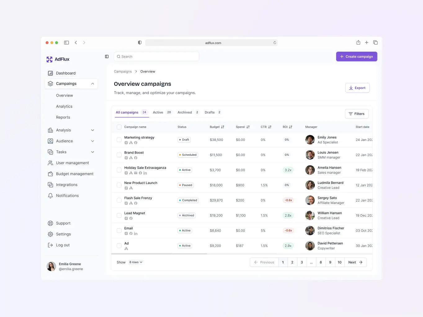
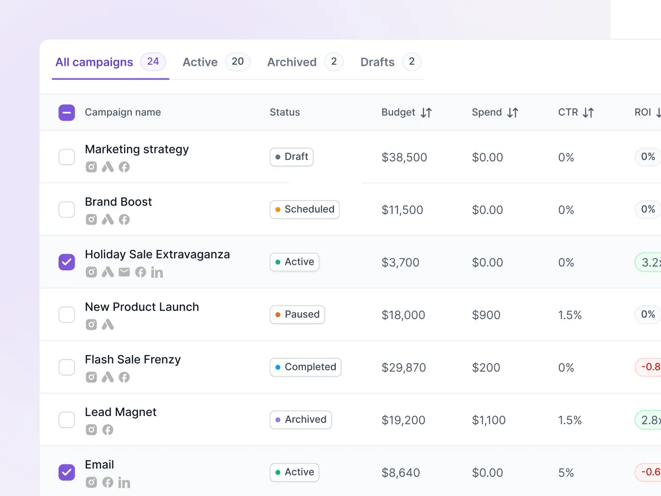
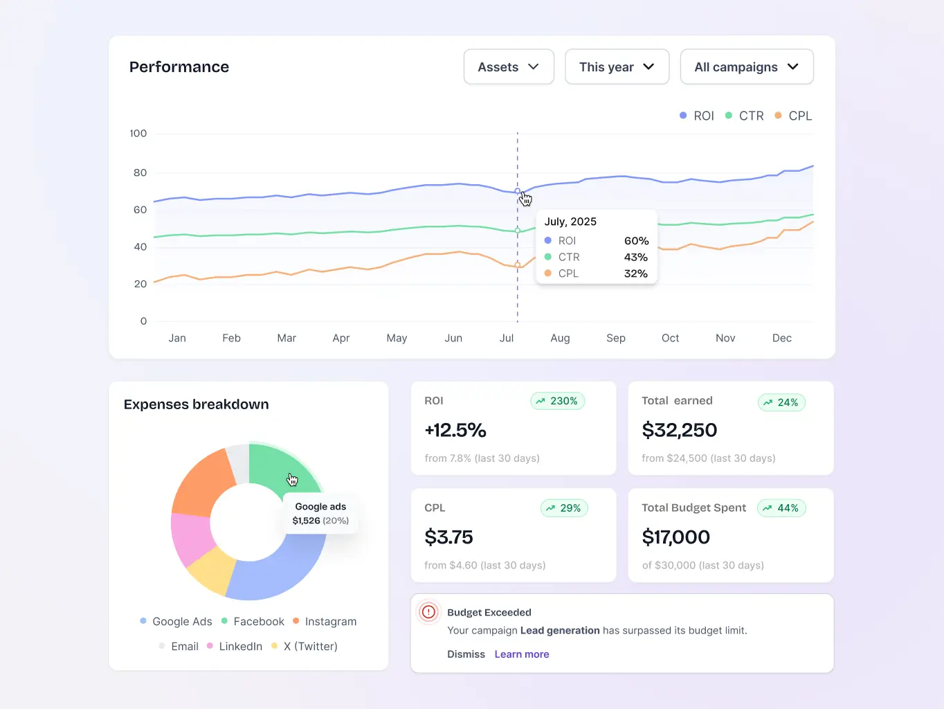
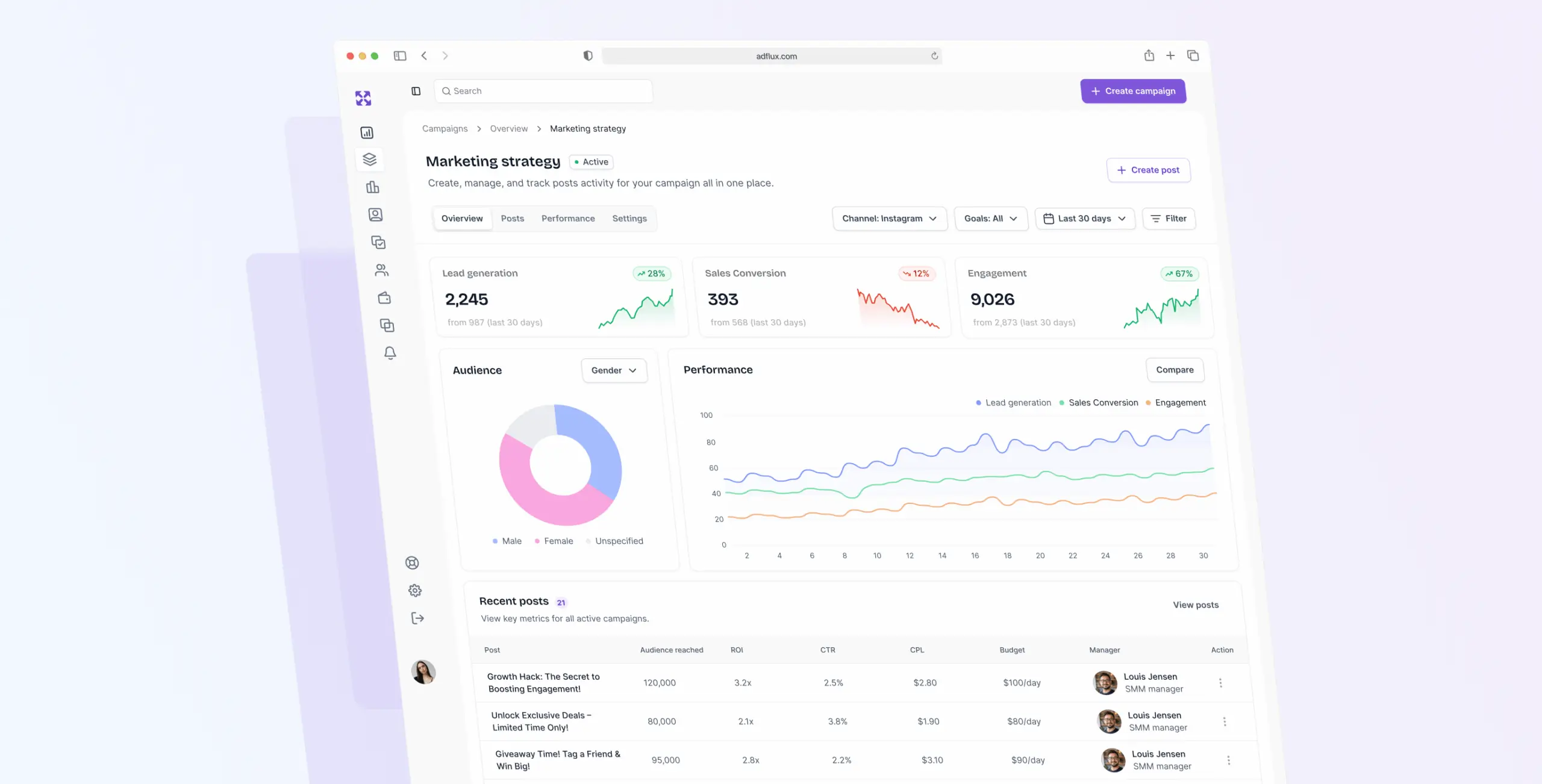
Analytics overview
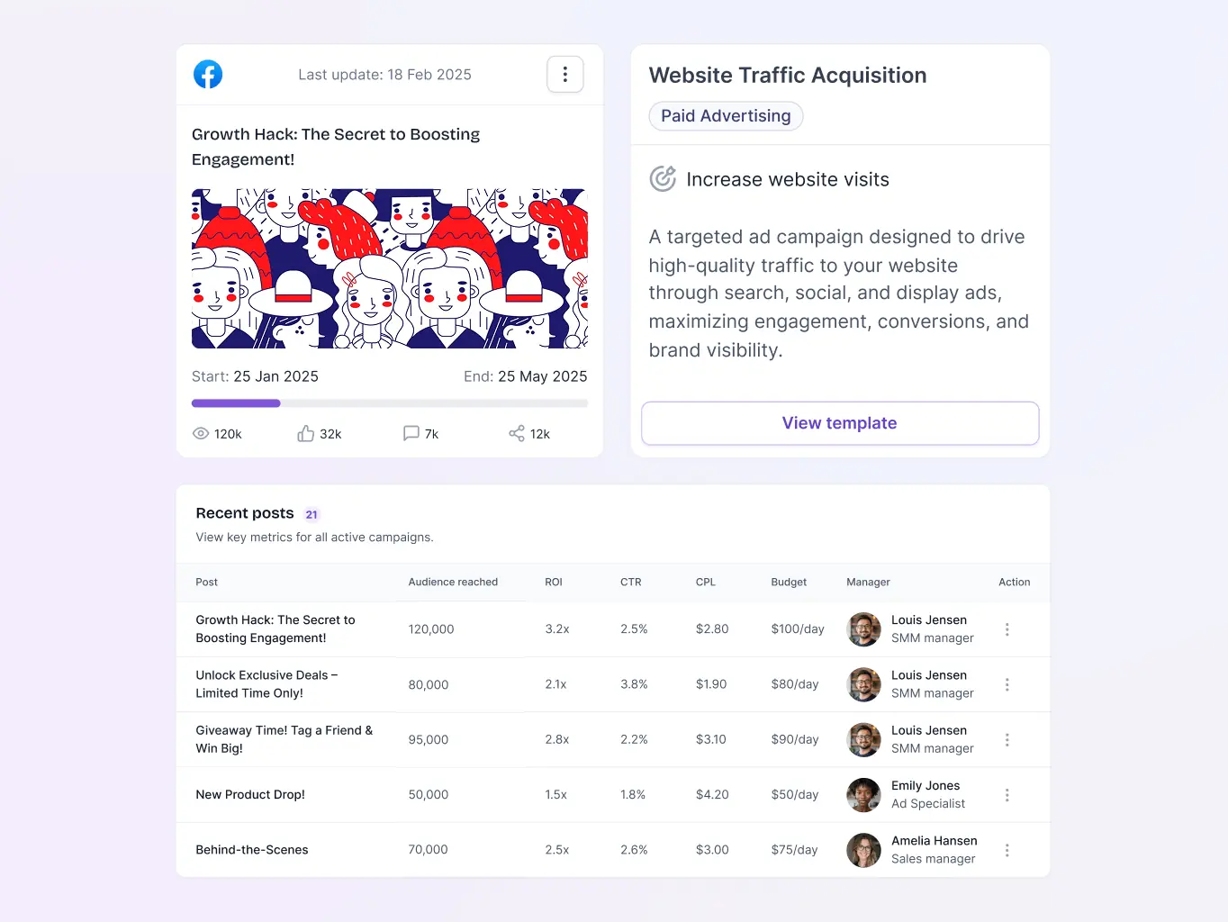
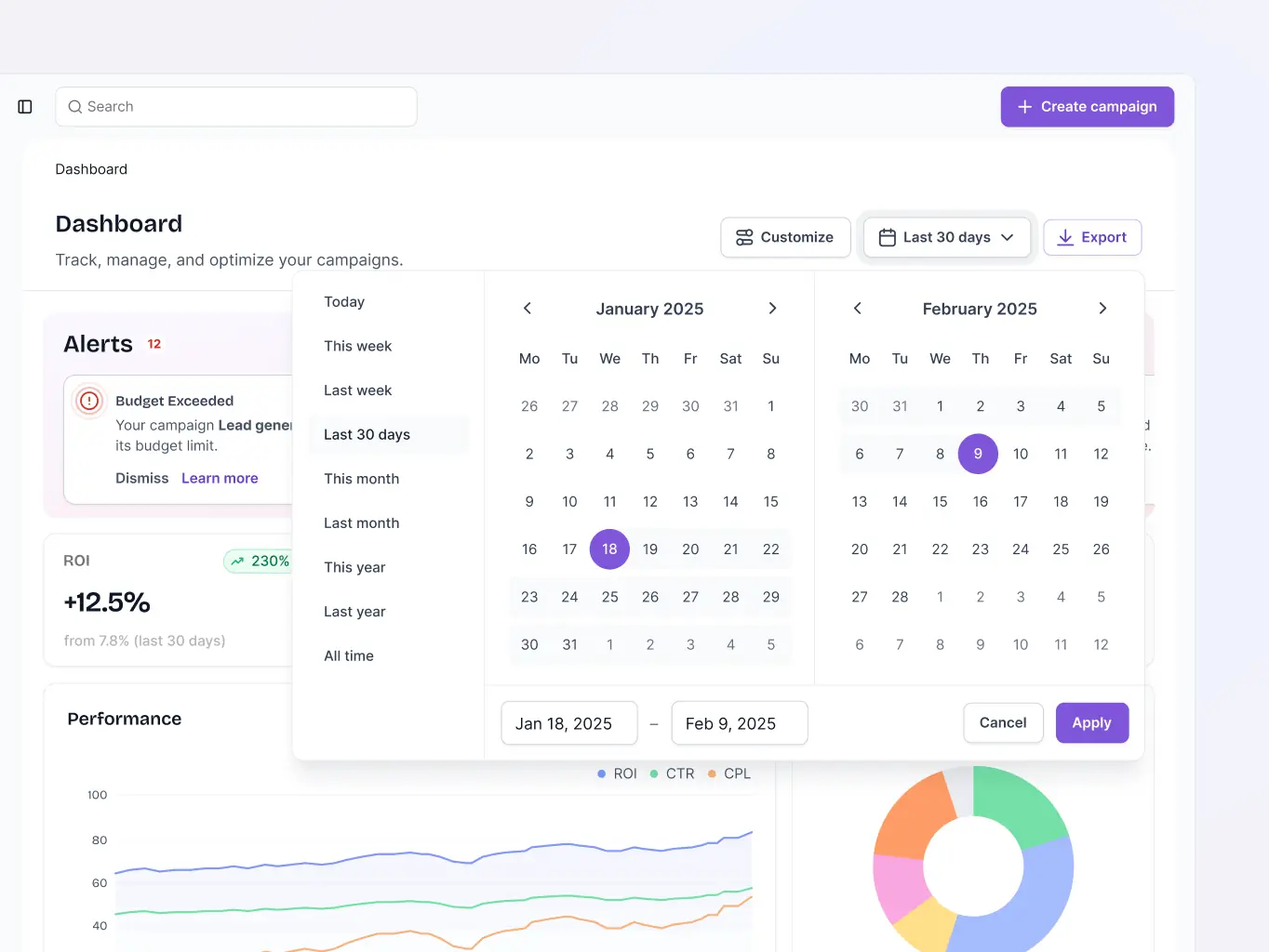
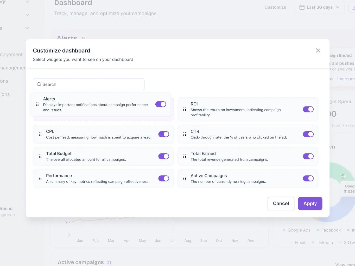
The Analytics Dashboard pulls together the numbers marketers actually need — expense breakdowns, performance across assets, campaigns, and data sources, and a view of what's currently active. It surfaces impressions, clicks, and CTR alongside the top-performing segments and content, and flags specific tips for campaigns that could be doing better. Having everything in one place means marketers can read the situation and act on it without jumping between screens.
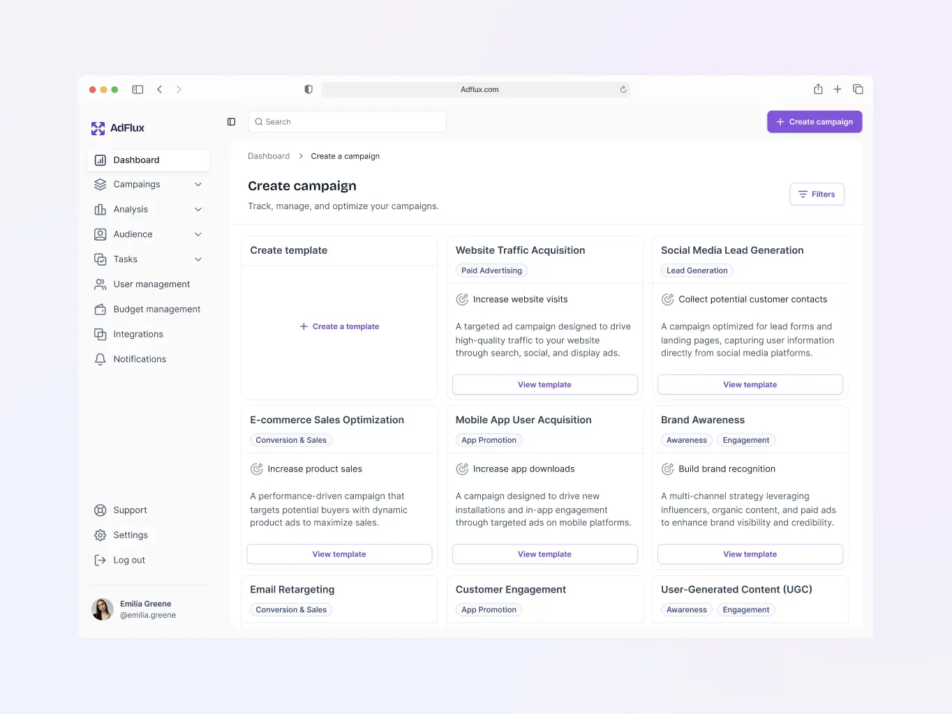
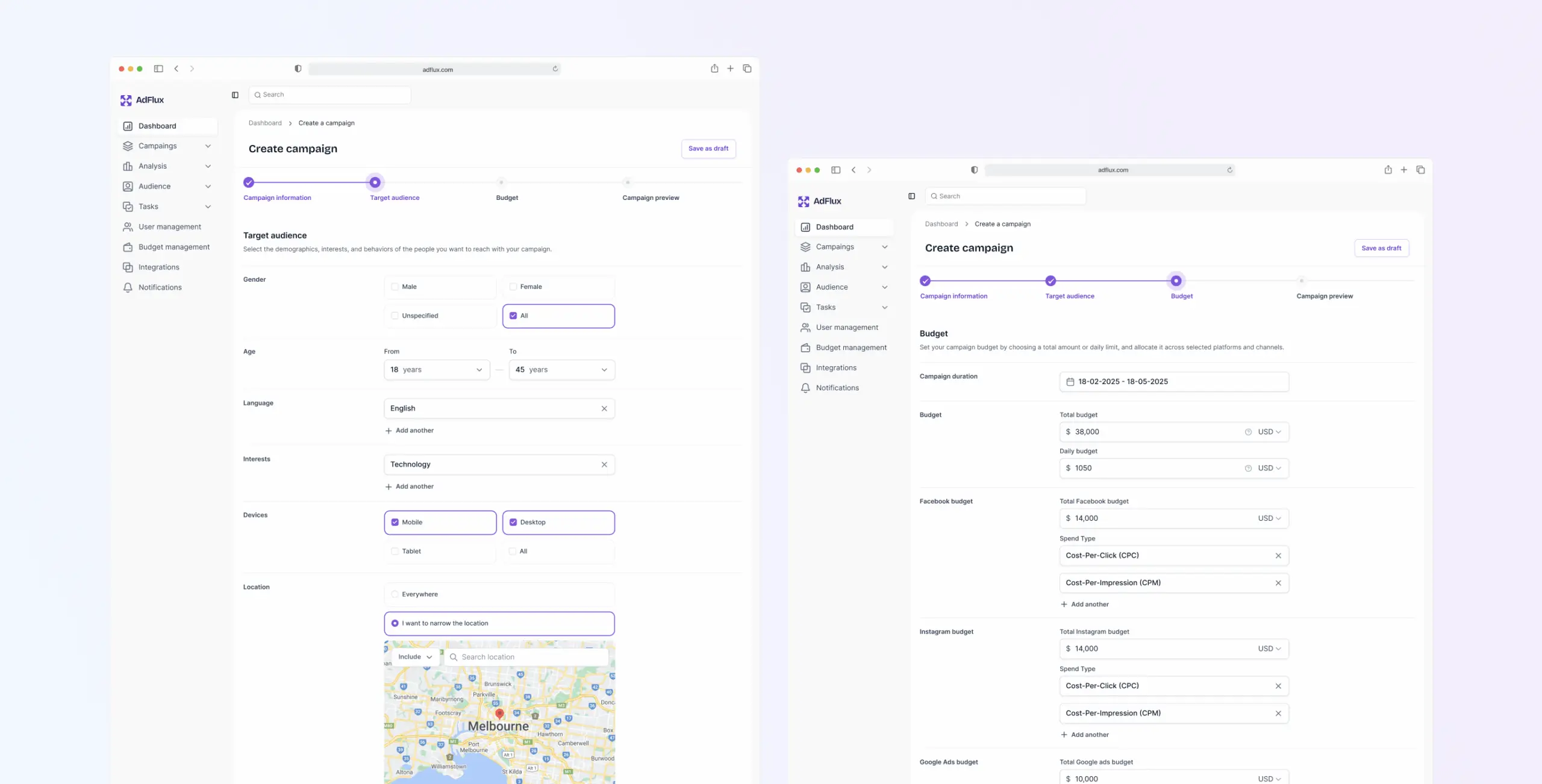
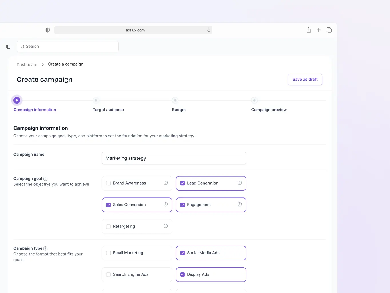
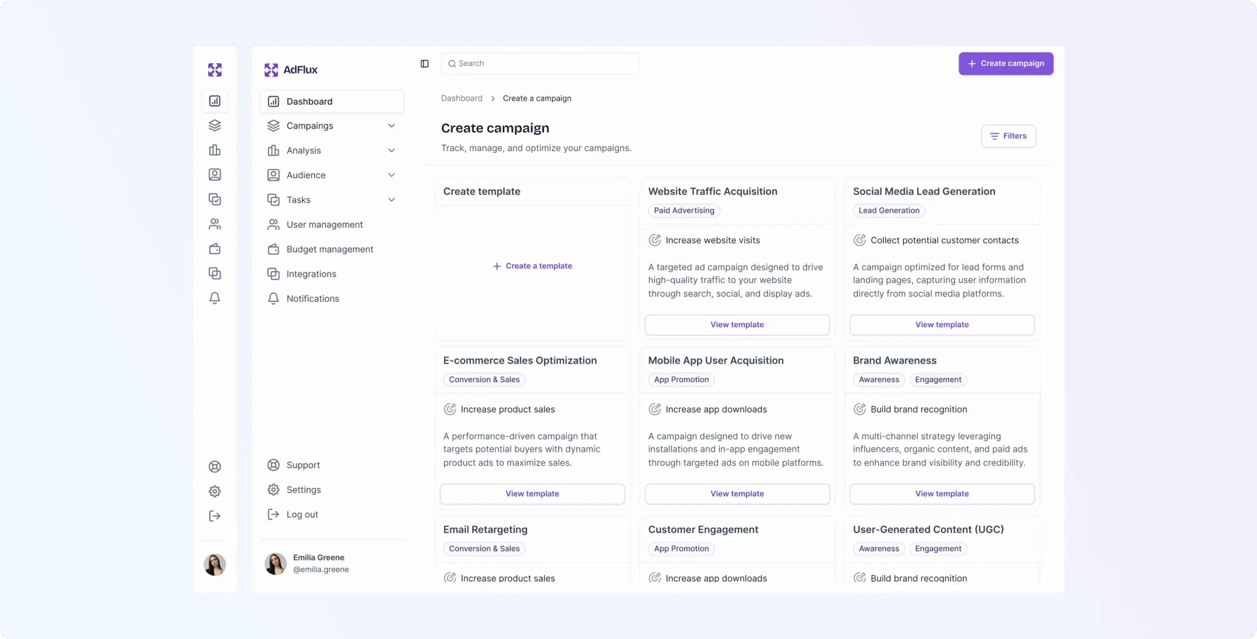
Campaign creation tool
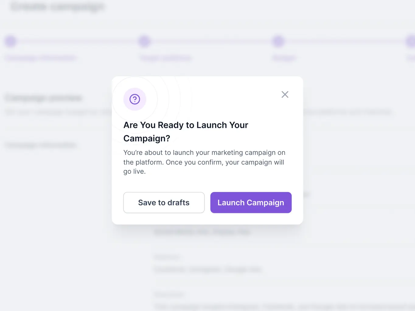
The Campaign Creation Tool walks marketers through setup from start to finish — objectives, target audiences, budgeting — without the usual back-and-forth. The whole process is short enough that campaigns can go from idea to live in a single sitting.
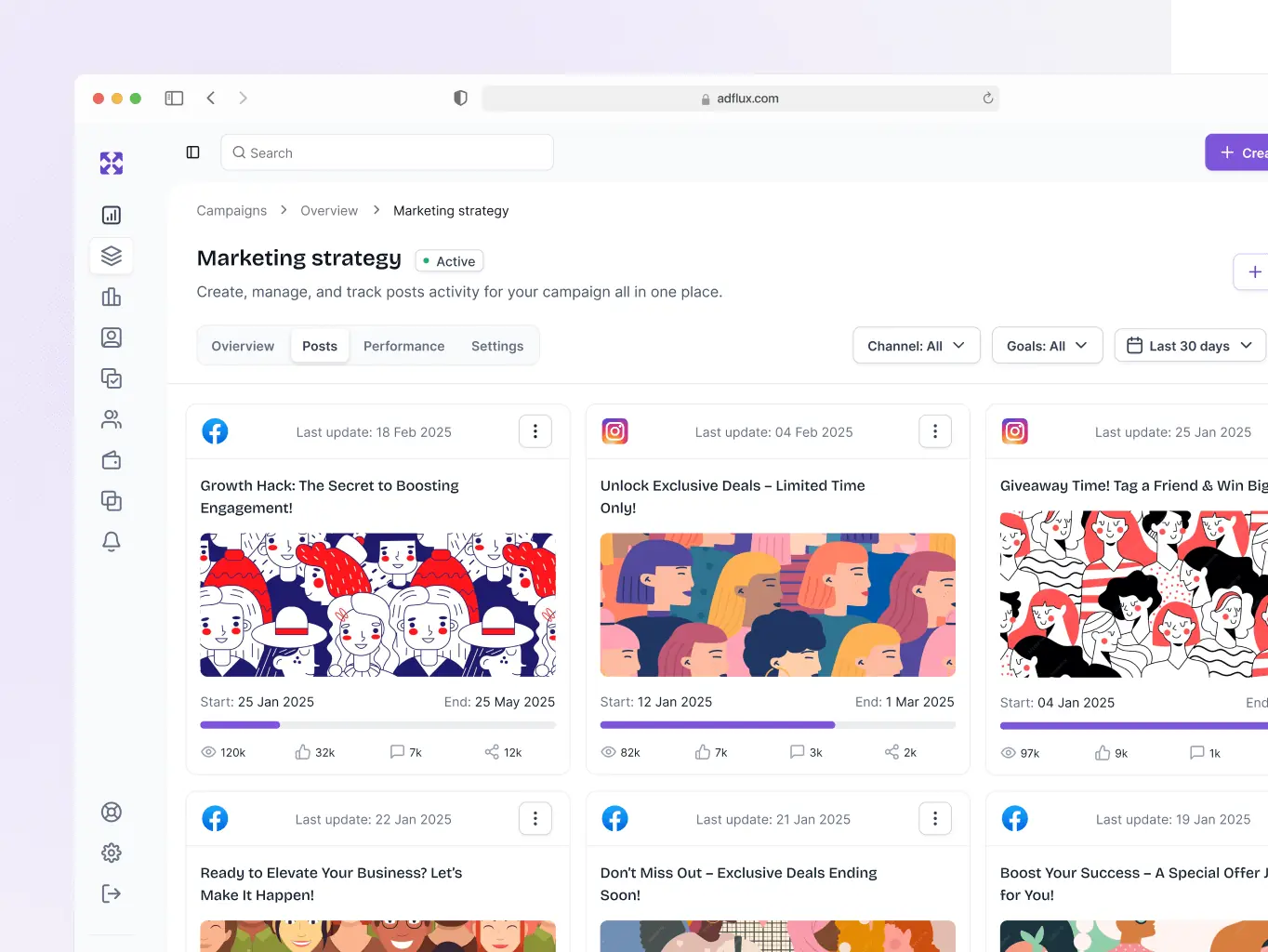
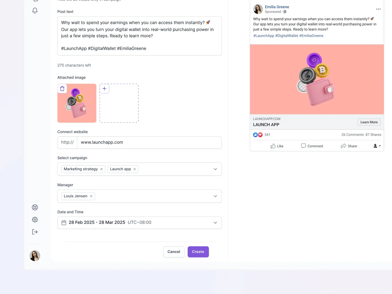
Post creation & scheduling
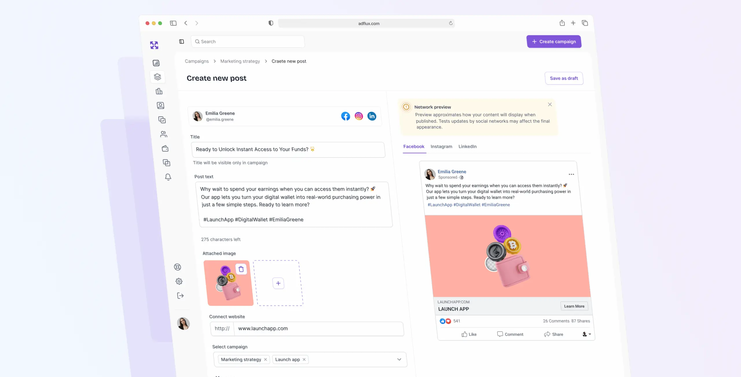
The Post Creation feature lets you draft, customize, and preview content for multiple platforms from one place. Write once, adjust for each platform, check how it'll look, then schedule — no jumping between tools to manage the same post in five different places.
The stack was chosen for practical reasons. Vite keeps development fast; React and TypeScript make the codebase easier to maintain over time. React Router DOM handles navigation cleanly, and MUI gave us a consistent UI foundation without having to build components from scratch. i18next covers localization, Tanstack Query handles data fetching, and Zustand keeps state management simple. Recharts took care of data visualizations without adding performance overhead.

Vite

React

Zustand
Tanstack Query

TypeScript

React Router DOM

i18next
We connected the frontend to the backend API to keep data exchange reliable and functionality consistent across the platform.
We also brought in i18next for localization, so the platform can support multiple languages without needing significant rework for each new market.
#UX Audit #Product redesign
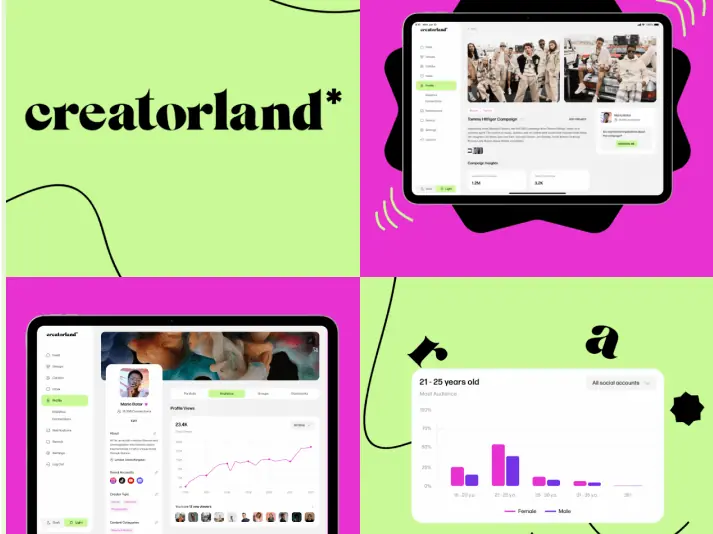
Creatorland
USA
USA
#Product design
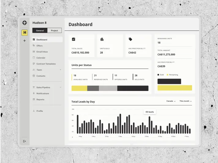
AIRES
 Canada
Canada
#UX Audit #Website design #Website development
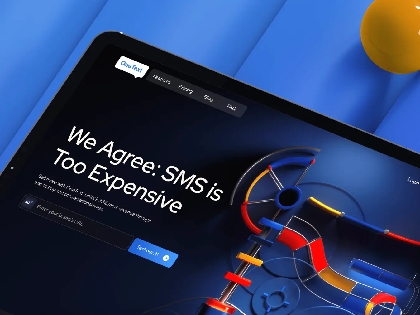
OneText
USA
USA
Have a project in mind?
Let's chat
Have a project to
discuss?
discuss?

Have a partnership in
mind?
mind?
