Design
Development
Research
Launch
Evolve
Extend





and more
phenomenon studio IN NUMBERS
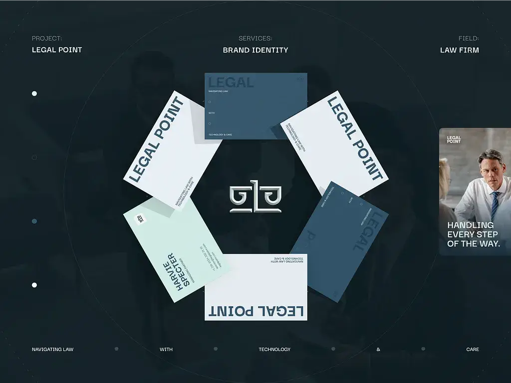
FROM LOGO DESIGN DELAWARE TO THE FULL ASSET KIT

Primary wordmark
The core mark, drawn so that it holds firm at any given size.

Monogram & symbol
The compact cousin, made for avatars, app tiles, and stamped surfaces.

Logo lockups
Every approved arrangement, so nobody improvises one late on a Friday.

Colour system
Core, extended, and accessible pairings, all specified for any format.

Type hierarchy
A ranked system from the headline down to the legal fine print.

Layout grid
The underlying structure that holds every single asset together.

Iconography set
A drawn icon family, consistent in both weight and style.

Illustration style
A drawn language that is purely yours, with no stock library close by.

Photography direction
Clear rules for briefing any photographer that you might hire.
Motion principles
How the identity enters, holds, and exits across a screen and a video.

Stationery suite
Cards, letterhead, envelopes, and the signature files your IT deploys.

Presentation template
A deck system your whole team fills in and extends without calling us.

Social & ad frames
Editable templates cut to every channel you run, and to any ratio too.

Signage & wayfinding
Environmental work drawn to full production spec, priced and quotable.

Brand guidelines
The document that turns a folder of loose files into one clean system.

React

Next.js

Solid.js

Astro

TypeScript

Node.js

Express.js

Nest.js

PHP

Laravel

TypeScript

WordPress

Webflow

Amazon web services

Digital Ocean

Cloudflare

Docker

Gitlab / Github CI / CD

Kubernetes

Swift

Kotlin
React Native

Flutter

FlutterFlow

Bubble
Webflow

Shadcn

Radix

MUI

And design

PrimeReact

Carbon Design System

Chakra UI
BRAND IDENTITY DESIGN TRENDS
01
Adaptive identities
One logo that holds up on a phone screen, a lobby sign, and an email signature. Best for brands that turn up in dozens of places at once.
02
Bold typography
Custom fonts doing the work the logo used to do. Consultancies and software firms get the most from it, having plenty to say and few images.
03
Motion-first branding
How the mark moves and sounds, decided alongside how it looks. Comes into its own once your brand lives inside a product, a video, or an ad.
04
Purpose-led minimalism
Simple systems with a clear idea underneath. Our usual advice for legal, financial, and advisory firms, where restraint is read as competence.
05
Humanized AI aesthetics
AI-made visuals softened with hand-drawn detail. It suits tech brands that want to look current without looking machine-made.
06
Neo-nostalgia
Retro styling, done with modern polish. Hotels, restaurants, and consumer apps wear it well because atmosphere is what they are selling.

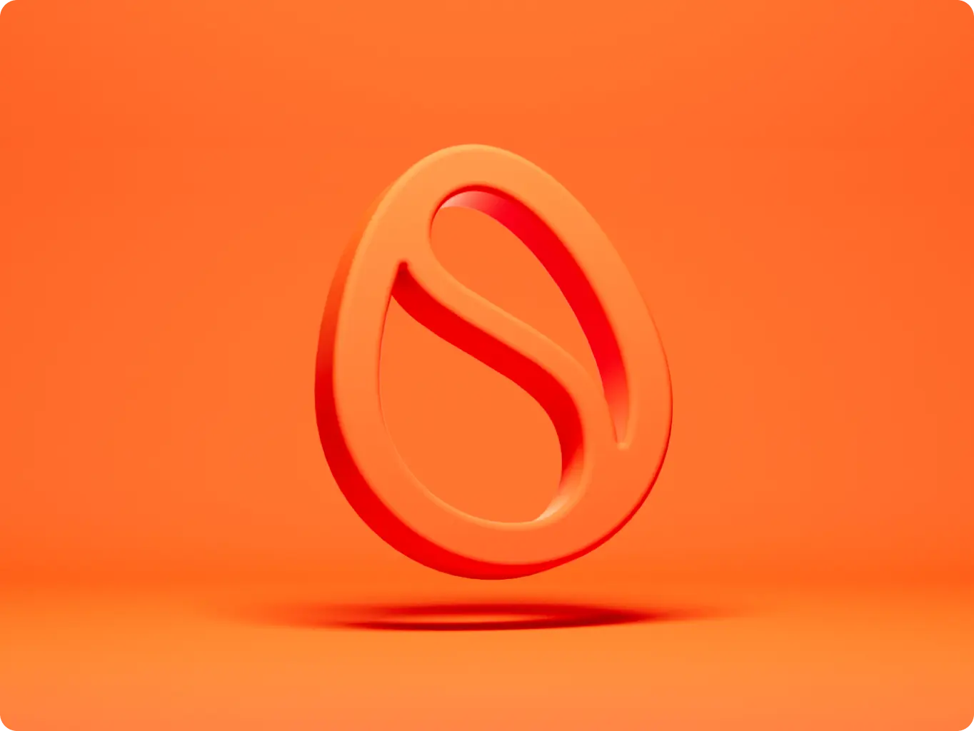
#branding
Scrambly
 Italy
Italy
Italy

Illia Frantsevskyi
CTO & Co-FounderThey demonstrated a high level of expertise and efficiency in every phase of the project.
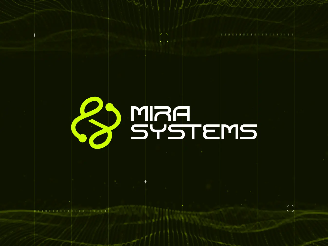
#Branding
MIRA Systems
 UK
UK
UK
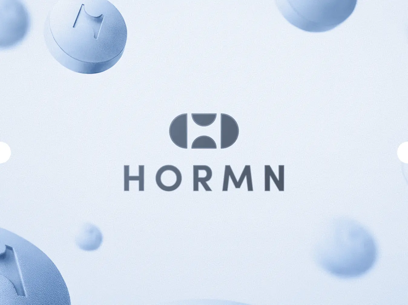
#branding
HORMN
 Australia
Australia


Craig Tortolani
CPO at Dekryption Labs
Ash Bryant
Founder of HormnThe design team is truly world-class, excelling in both user interface design and creating solutions optimized for conversion.

KlickEx Team

George Fry
Founder at NeapThe quality of the designs is fantastic. Phenomenon Studio works at speed and is extremely punctual with timelines. They deliver top-notch outcomes with exceptional designs.
Andre Guerra
Co-Owner at RADCAT Design
Kevin Alvarez
Founder & General Partner, PredictivePhenomenon Studio's ability to translate concepts and rough design mock-ups into high-fidelity assets, designs, and visuals was very impressive. The goal was to maintain simple elegance in the design aesthetic, and they did it very well.




32+
others
others
Have a project in mind?
Let's chat
Have a project to
discuss?
discuss?



Have a partnership in
mind?
mind?