Design
Development
Research
Launch
Evolve
Extend
MIRA Systems – designing intelligent systems with presence
Client
MIRA Systems
 UK
UK
UK
Services
MIRA Systems approached us with the goal of establishing a brand identity that reflects their unique position in the AI landscape.
The primary objective was to create a distinctive identity that would resonate with their target audience — creators, founders, and researchers who value ethical AI, personal sovereignty, and meaningful human-machine collaboration.
We took on the challenge of translating MIRA’s vision into a comprehensive brand identity. Our role included developing a memorable logo that embodies consciousness and connection, establishing a vibrant color system that breaks AI industry conventions, selecting typography that balances technical precision with approachability, and creating comprehensive brand guidelines for consistency across digital and physical applications.

Our work for MIRA began with a careful analysis of adjacent studios and AI-driven platforms to understand prevailing patterns, expectations, and gaps in the space. This research informed the design of MIRA’s brand and digital system, allowing us to define a clear structure that supported their business goals while creating a calm, focused experience for founders and creators.
To express MIRA’s vision of calm intelligence and human-centered technology, we structured the branding process into clear, considered stages. From refining the wordmark and defining the typographic system to establishing a restrained color palette and modular visual language, every decision balanced technical precision with presence and restraint. The result is a cohesive, scalable identity that feels thoughtful, contemporary, and deeply aligned across digital systems, tools, and communications.
Stages
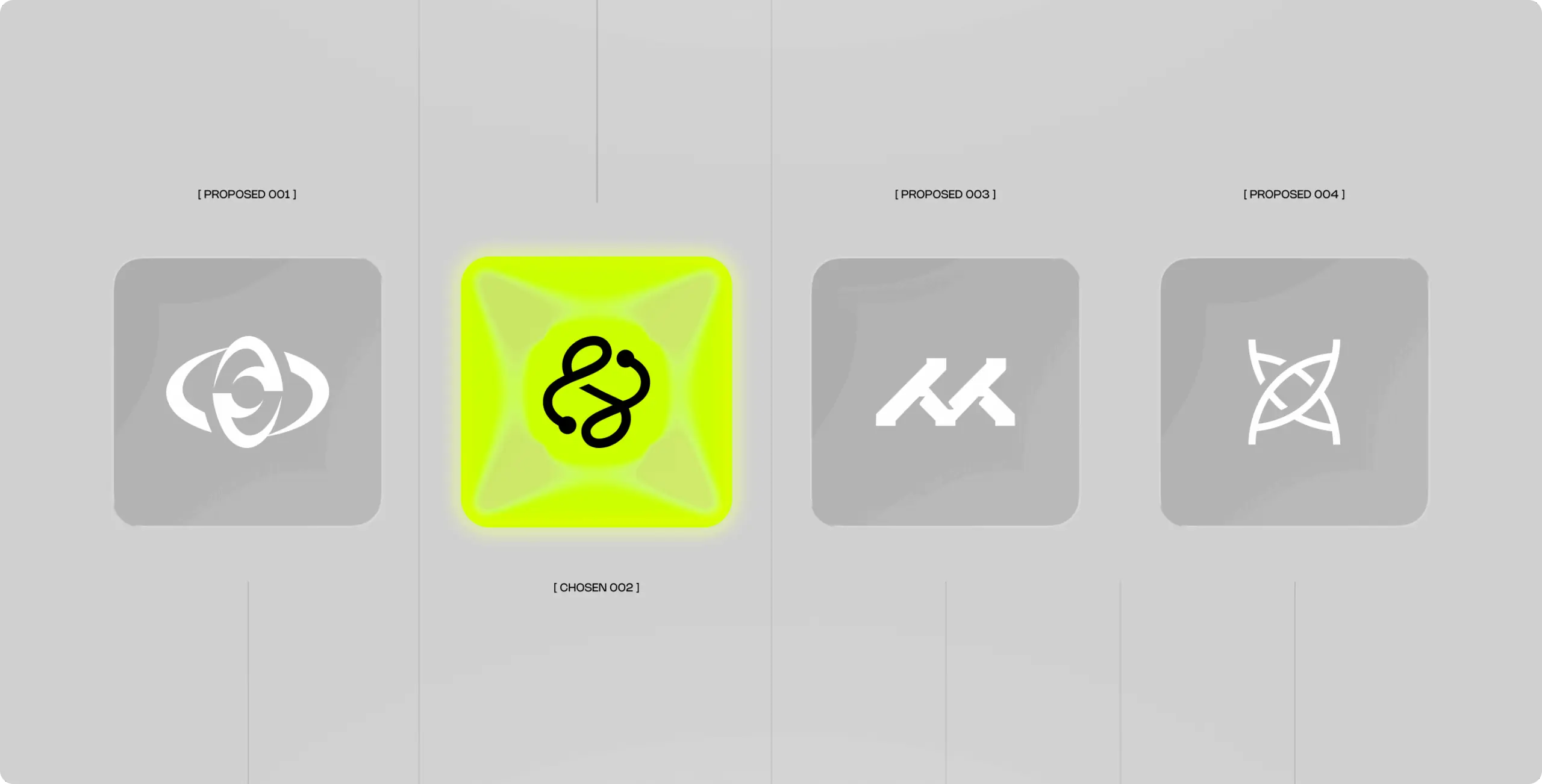
- logo design
- colors & typography
- brand assets
- brand guidelines
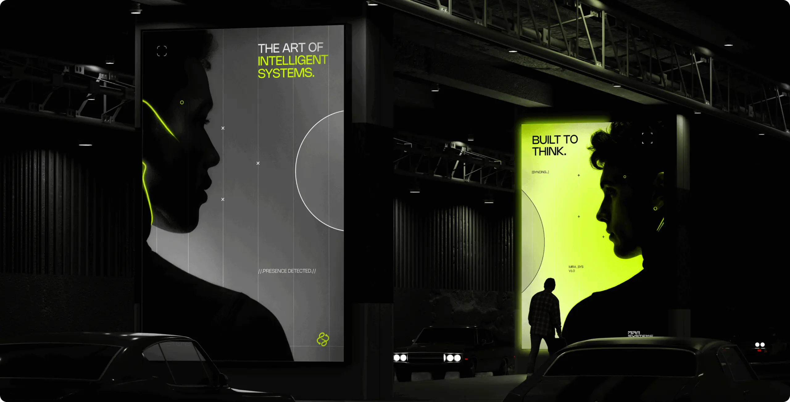
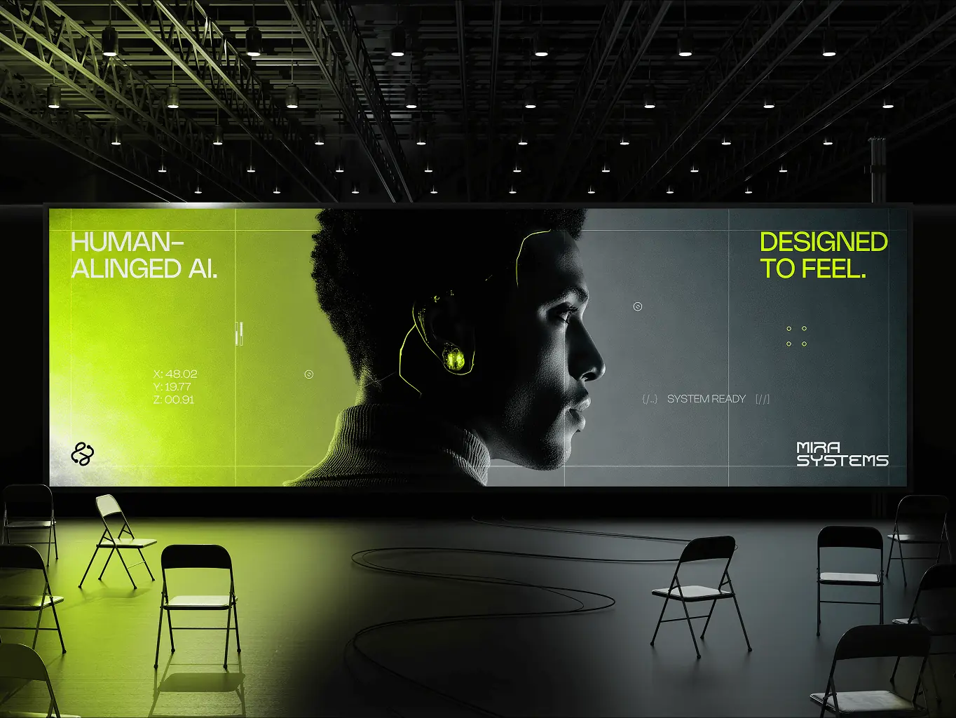
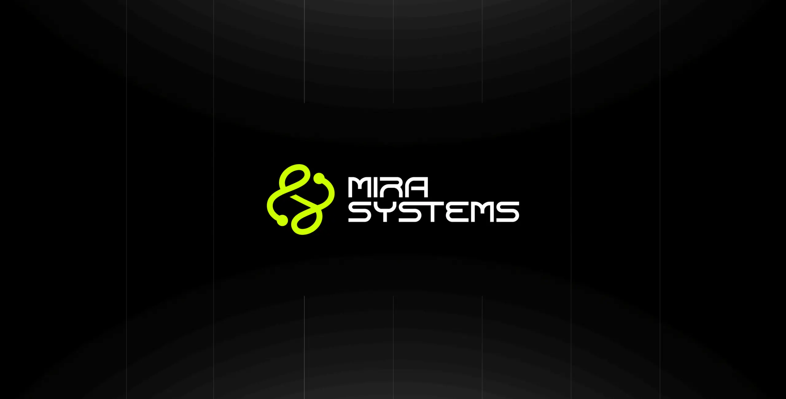
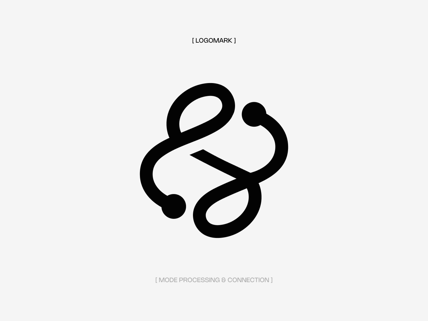
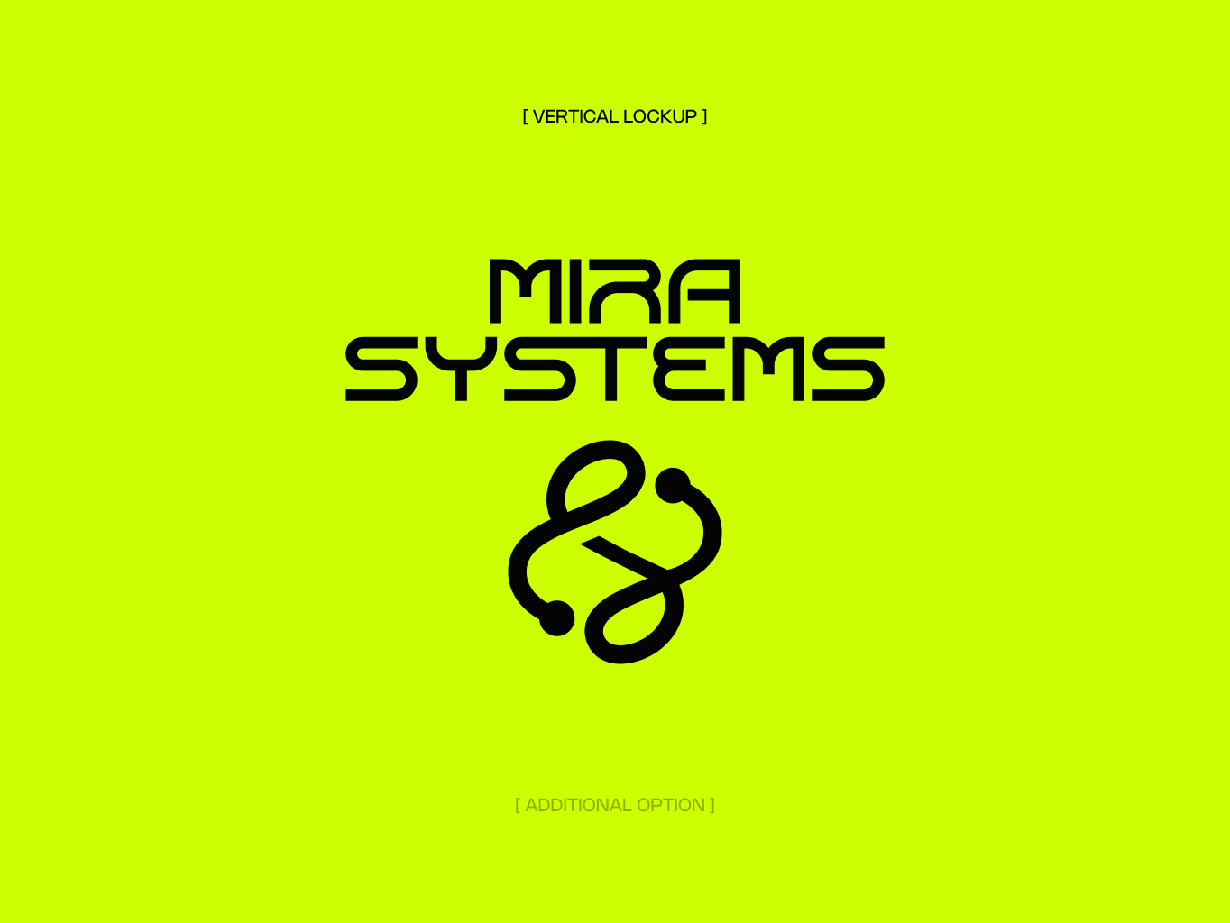
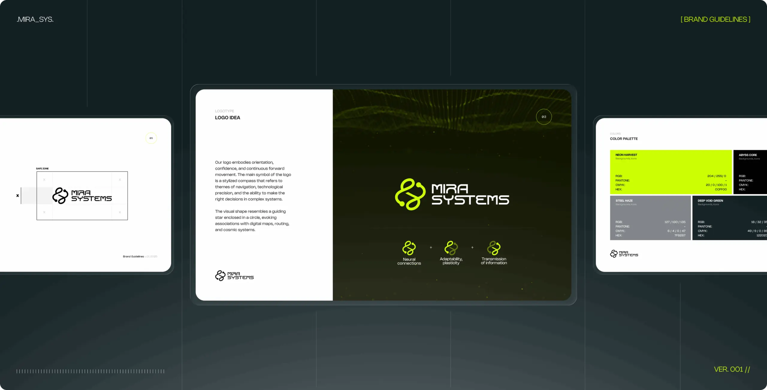
The MIRA Systems logo represents the continuous loop of thought, learning, and evolution — the cognitive cycles that define both human consciousness and intelligent systems.
The symbol is an organic, flowing form that suggests neural pathways, feedback loops, and interconnection. Unlike rigid geometric marks common in tech branding, this shape feels alive — it breathes and moves. The rounded terminals suggest nodes or connection points, referencing both biological and computational networks.
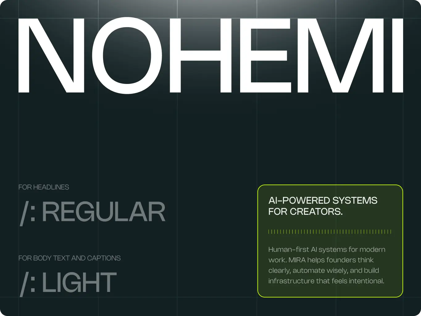
The wordmark uses a technical sans-serif typeface, providing structural contrast to the organic symbol. This duality reinforces the brand’s core message: human warmth meets technological precision.
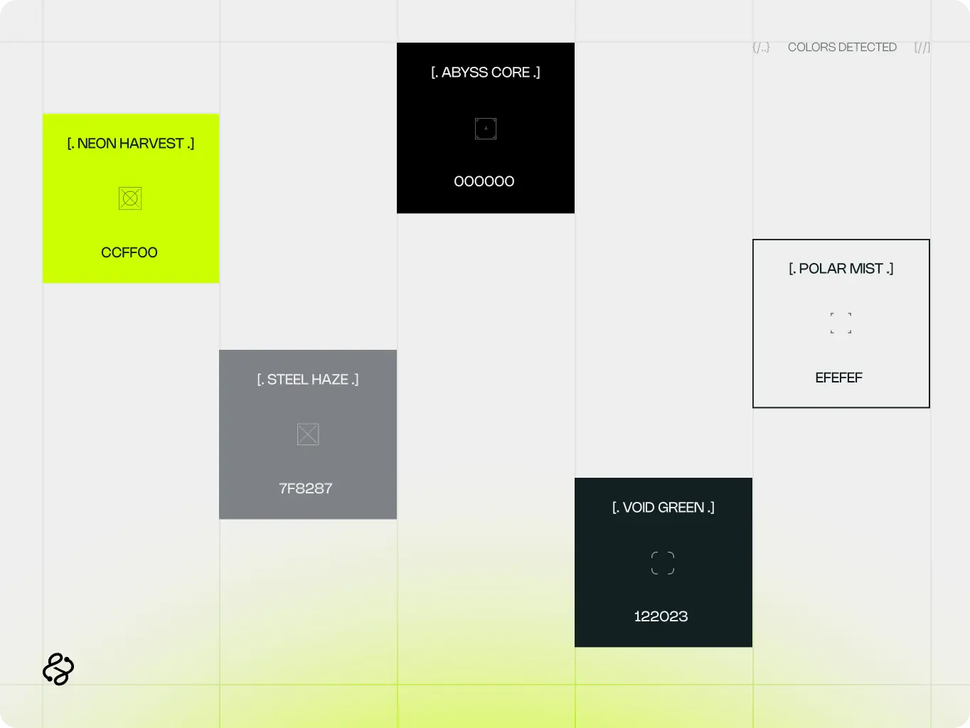
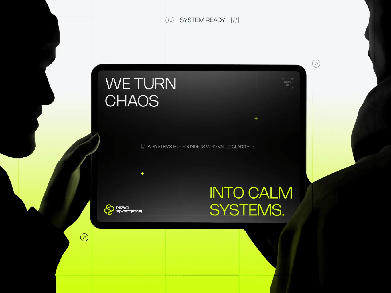
MIRA’s visual identity breaks away from conventional AI aesthetics through its bold use of electric lime green—a color that commands attention and suggests energy, growth, and vitality rather than cold calculation.
The typeface was selected for its geometric precision and contemporary feel. It bridges technical credibility with approachability. This typographic system ensures clarity across all applications while maintaining the brand’s distinctive personality.
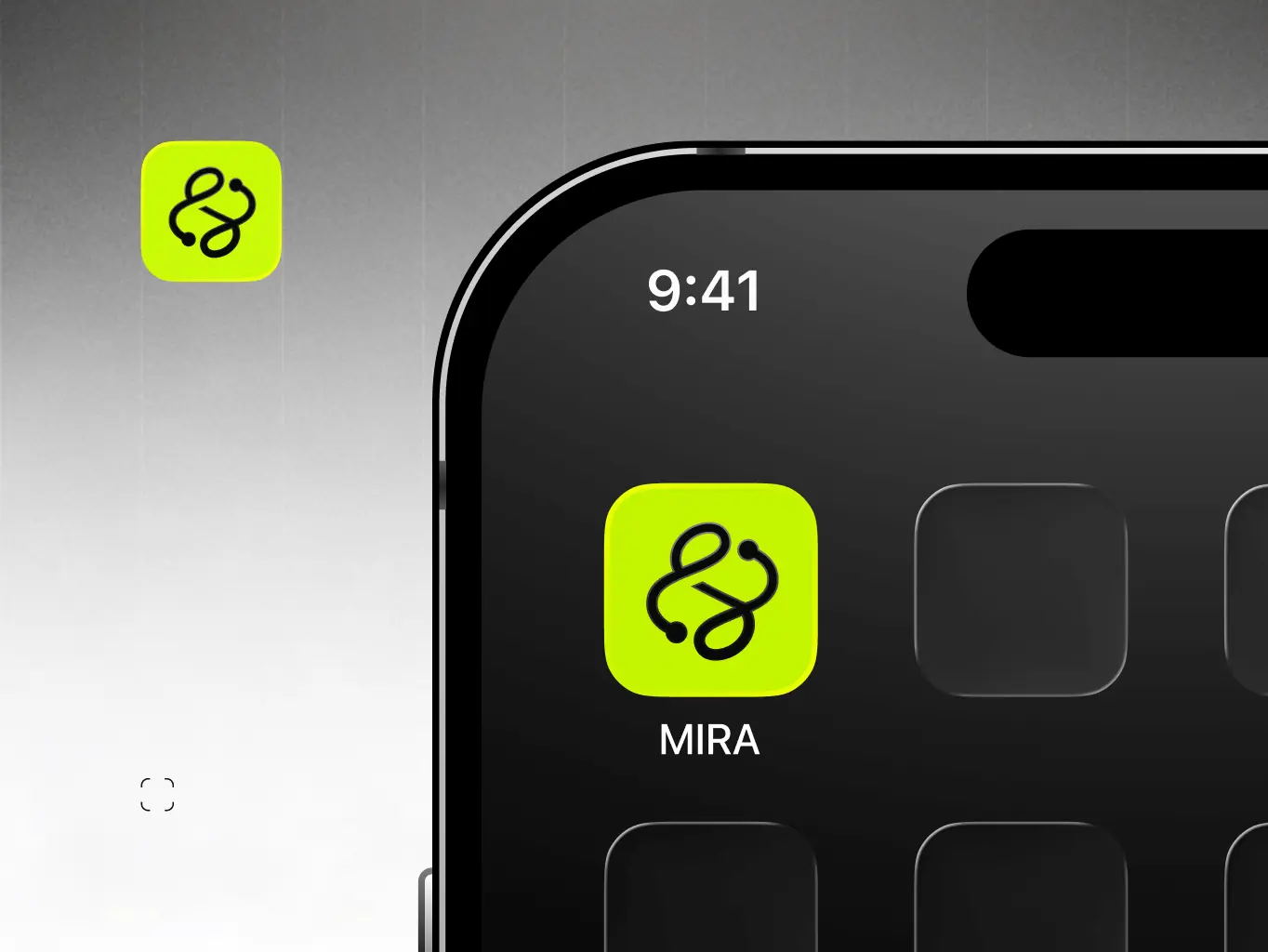
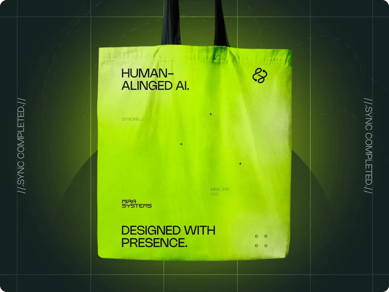
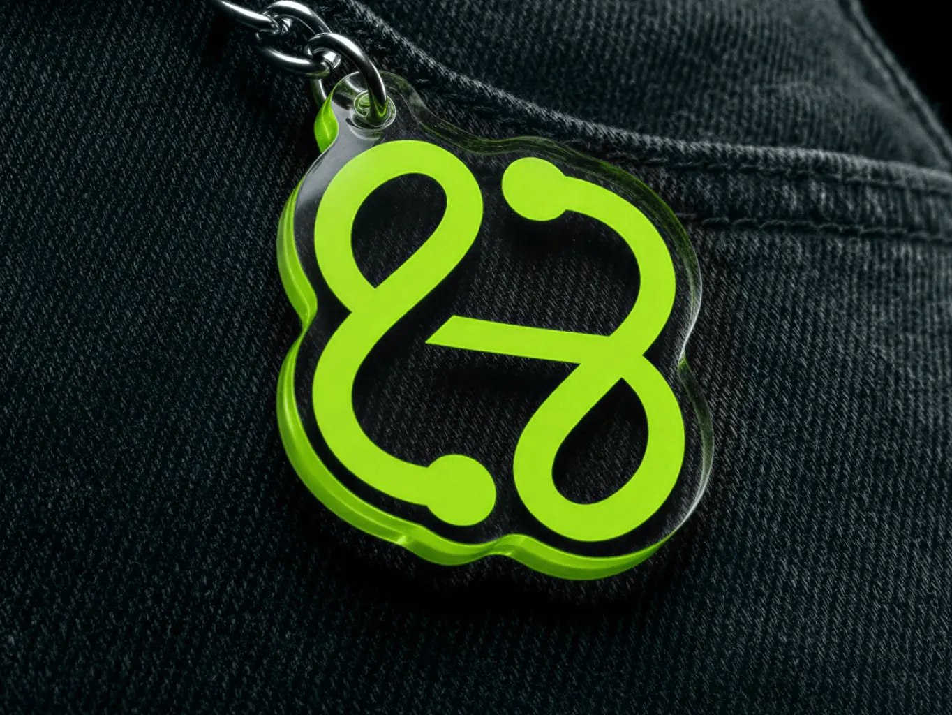
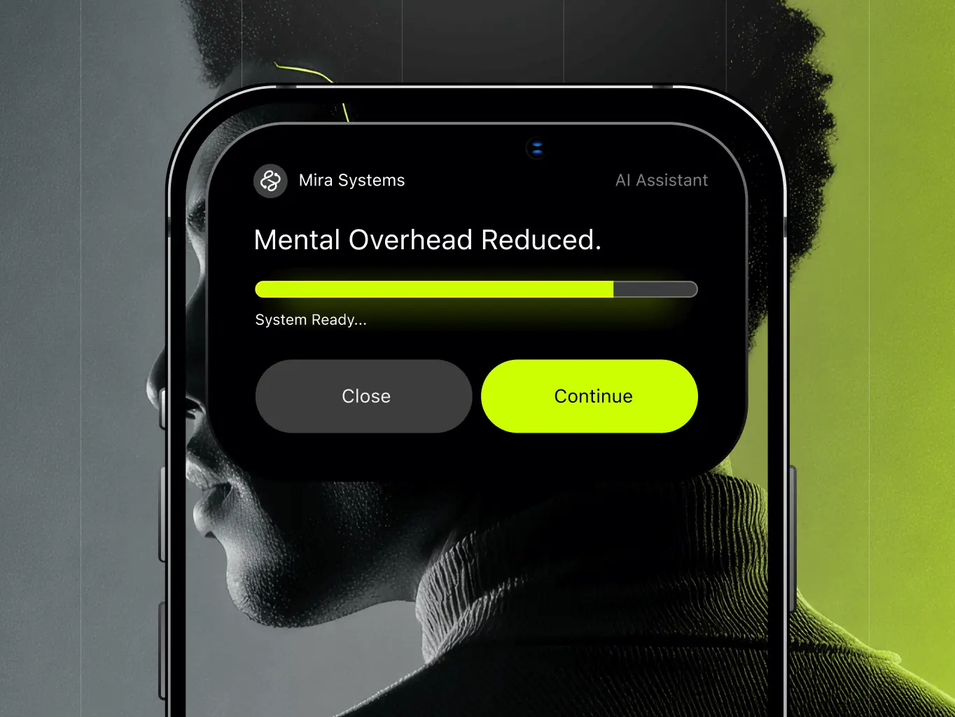
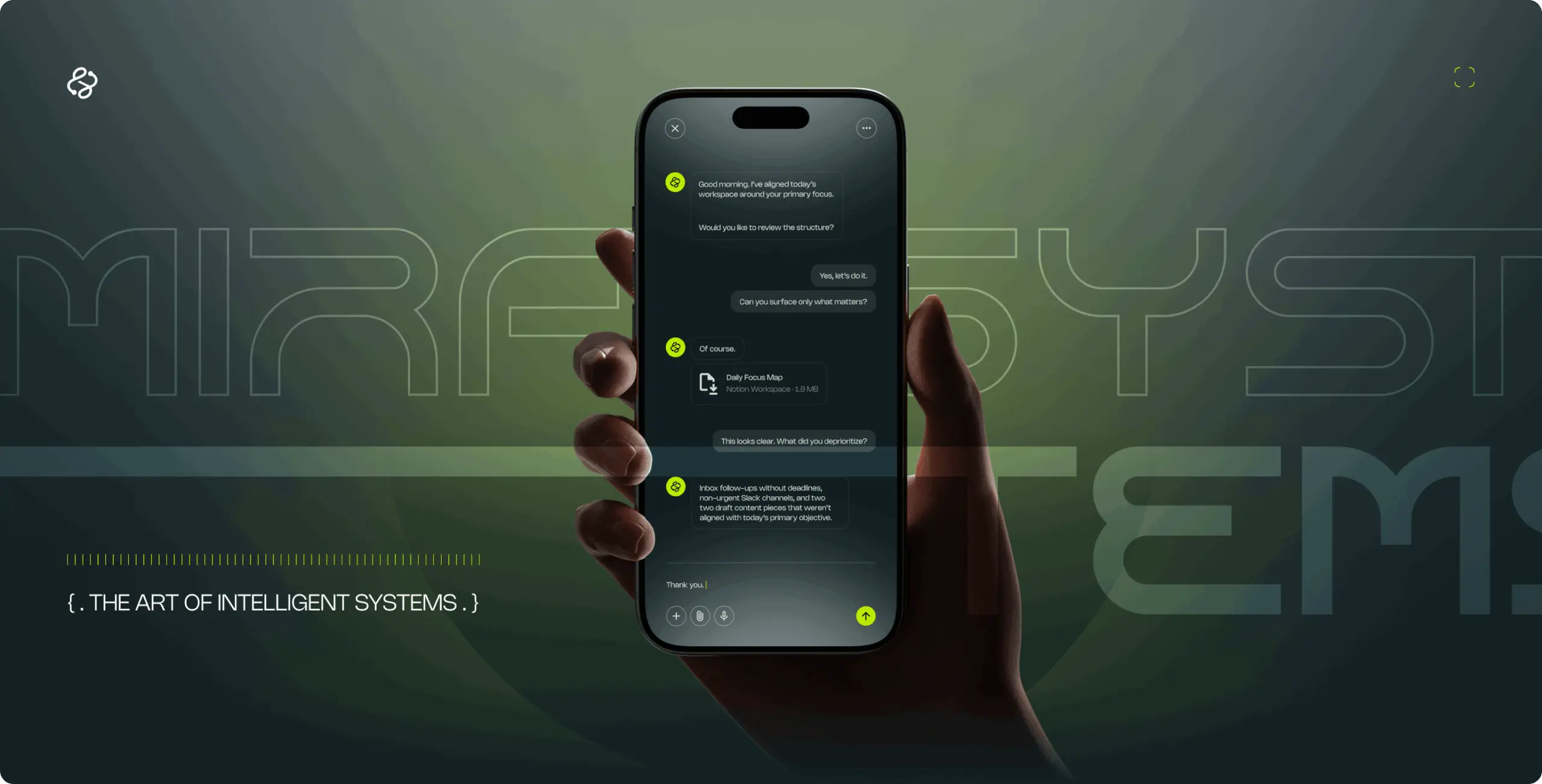
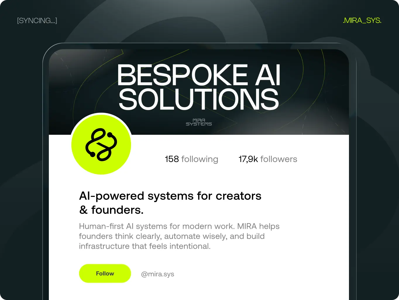
MIRA’s brand assets establish a cohesive visual ecosystem across physical products, digital interfaces, and social platforms. The design approach creates immediate recognition while allowing flexibility for different contexts and applications.
This asset system ensures MIRA communicates consistently whether appearing on wearable merchandise, social media profiles, or actual AI product interfaces. Each application reinforces the brand’s positioning as thoughtful, present, and distinctly human-centered.
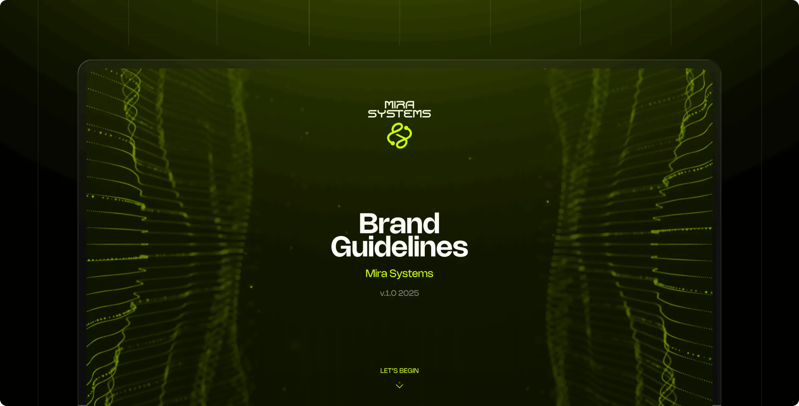
The MIRA Systems brand guidelines establish clear standards for all visual communications, ensuring consistency as the company scales.
The guidelines ensure that whether MIRA is creating a social post, designing a presentation, or developing a product interface, the brand maintains its distinctive presence and professional consistency.
With the brand foundation established, MIRA Systems is positioned to expand their service offerings and build recognition in the AI R&D space. The next phase includes launching their website, developing case studies of client implementations, and exploring partnerships with aligned organizations.
The brand system is built to scale—whether MIRA is creating educational content, launching new product lines, or expanding into new markets, the visual identity will maintain consistency and impact.

#website design
Tyler Ussery
 USA
USA
USA
#Branding
Tyler Ussery
USA
USA

#Website redesign #Website development
marketsnack
USA
USA
Have a project in mind?
Let's chat
Have a project to
discuss?
discuss?

Have a partnership in
mind?
mind?
