Development
Research


and more
phenomenon studio IN NUMBERS
TYPES OF DASHBOARDS WE DESIGN
01
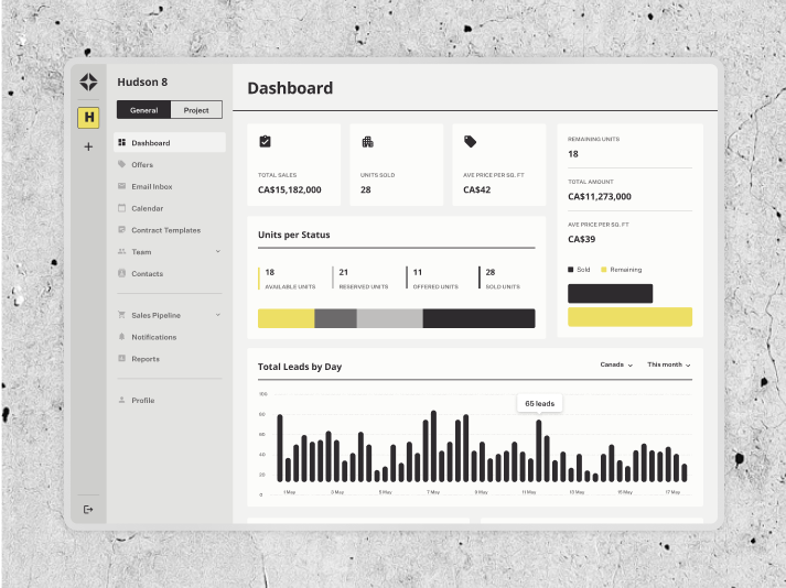
Operational dashboards
Dashboards built for day-to-day internal teams, streamlining processes, surfacing task-critical data, and enabling fast action.
Operational dashboards
Ideal for ops managers, support teams, logistics coordinators, and internal tool users.
Ideal for ops managers, support teams, logistics coordinators, and internal tool users.
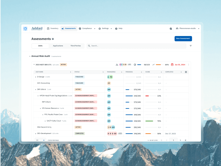
02
Analytical dashboards
Help users drill into trends, compare metrics, and generate insights from structured datasets or user activity.
Analytical dashboards
Best for analysts, marketers, finance teams, and product managers.
Best for analysts, marketers, finance teams, and product managers.
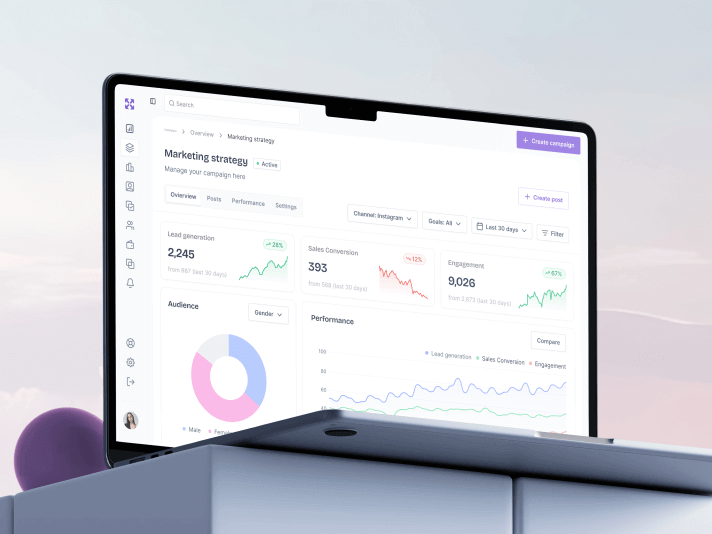
03
Executive dashboards
Summarize high-level KPIs, forecasts, and performance metrics for leadership teams in a single clear view.
Used by CEOs, founders, investors, and department heads.
04
Admin dashboards
Control access, manage users, and monitor backend settings with workflows designed for system owners and managers.
Admin dashboards
Preferred by SaaS admins, platform owners, compliance managers, and system integrators.
Preferred by SaaS admins, platform owners, compliance managers, and system integrators.
05
Customer dashboards
Interface dashboards for your customers to track usage, activity, payments, or outcomes within your product.
Customer dashboards
Best for B2B SaaS, crypto/web3 platforms, health/education portals, and subscription tools.
Best for B2B SaaS, crypto/web3 platforms, health/education portals, and subscription tools.
06
Monitoring dashboards
Dashboards designed for real-time system health, alerts, and status monitoring across high-frequency environments.
Monitoring dashboards
Ideal for DevOps teams, fleet/logistics ops, cybersecurity analysts, and trading platforms.
Ideal for DevOps teams, fleet/logistics ops, cybersecurity analysts, and trading platforms.


Role-based dashboards
Customizable dashboard interface layout by user role—from admins to field reps—for clear priorities and faster workflows.

Data visualization & KPI blocks
Smart grouping, trend indicators, and visual hierarchy for metrics that drive decision-making.

Advanced filtering & search
Persistent filters, saved views, and quick queries for locating key records without reloading.

Interactive data tables
Sortable, filterable, and expandable tables designed for speed, accuracy, and reduced scroll fatigue.

Modular widgets & layouts
Drag-and-drop components and resizable blocks for creating an adaptable web page dashboard.

Alerts & notifications
Context-aware alerts with action buttons, grouped by urgency and role relevance.

Multi-device optimization
Responsive dashboard layouts for desktops, tablets, and mobile—no feature loss on smaller screens.

Access & permissions
Granular dashboard web design with tiered permissions for security and role alignment.

Integrations & APIs
Connect dashboards to CRMs, ERPs, analytics platforms, or IoT systems with custom API logic.

Collaboration tools
Inline commenting, task assignment, and shared views for faster team alignment.

Reporting & exporting
Custom reporting dashboards with downloadable formats and scheduled email summaries.

Empty & error states
Guided recovery flows and helpful messaging when data is missing or an error occurs.

Drill-down & detail views
Click through KPIs or list items to view underlying data, related actions, and contextual insights.

Automated data refresh & sync
Real-time or scheduled updates so users see current data without manual reloads or sync errors.

Customizable dashboards by department
Let sales, finance, and operations teams tailor layouts without breaking core dashboard interface design logic.

React

Next.js

Solid.js

Astro

TypeScript

Node.js

Express.js

Nest.js

PHP

Laravel
TypeScript

WordPress

Webflow

Amazon web services

Digital Ocean

Cloudflare

Docker

Gitlab / Github CI / CD

Kubernetes

Shadcn

Radix

MUI

Ant design

PrimeReact

Carbon Design System

Chakra UI

#Product redesign
AdFlux Co.
 USA
USA
USA
#UX Audit #Product redesign #Web development #Team extention
SaltyCloud
Texas, USA
Texas, USA
#Product design
AIRES
 Canada
Canada


Craig Tortolani
CPO at Dekryption Labs
Ash Bryant
Founder of HormnThe design team is truly world-class, excelling in both user interface design and creating solutions optimized for conversion.

KlickEx Team

George Fry
Founder at NeapThe quality of the designs is fantastic. Phenomenon Studio works at speed and is extremely punctual with timelines. They deliver top-notch outcomes with exceptional designs.

Andre Guerra
Co-Owner at RADCAT Design
Kevin Alvarez
Founder & General Partner, PredictivePhenomenon Studio's ability to translate concepts and rough design mock-ups into high-fidelity assets, designs, and visuals was very impressive. The goal was to maintain simple elegance in the design aesthetic, and they did it very well.
01
Role complexity & logic
Good dashboard design for multiple user roles needs deeper mapping and testing.
02
UI design scope for dashboards
Creative dashboard design with advanced visuals or interactivity adds design and QA time.
03
Legacy platform limits
Updating an application dashboard design on outdated systems slows progress.
04
Compliance & accessibility
Regulated sectors require extra checks for a modern dashboard design.
05
Scalability needs
Preparing an app dashboard design to evolve into a larger site dashboard design expands the scope.
06
Stakeholder alignment
More voices mean more iterations for dashboard designers.


32+
others
others
Have a project in mind?
Let's chat
Have a project to
discuss?
discuss?

Have a partnership in
mind?
mind?
