



May 27, 2026
9 min read
summary
Discover why UI redesigns often fail to improve conversions and how UX-focused redesigns increase user efficiency, retention, and revenue. Learn from real SaaS redesign case studies by Phenomenon Studio.
“We need a reskin. The interface looks dated – our users keep mentioning it. Can you modernize the look?”
The request came to us from Isora, a governance and compliance platform used by over 20% of major U.S. research universities. They wanted to improve the aesthetics.
But when our team reviewed the platform, something felt off. We pushed for a UX audit first.
The audit revealed that the platform had been built by developers without UX principles. That’s why non-technical users, such as compliance officers, administrators, and auditors, struggled daily with tasks that should have been simple.
The client took time to think and came back with a decision for a full redesign. We completed it in 12 months and delivered: 2x increase in user efficiency, 50% reduced time-to-market, and a UX Design Award nomination.
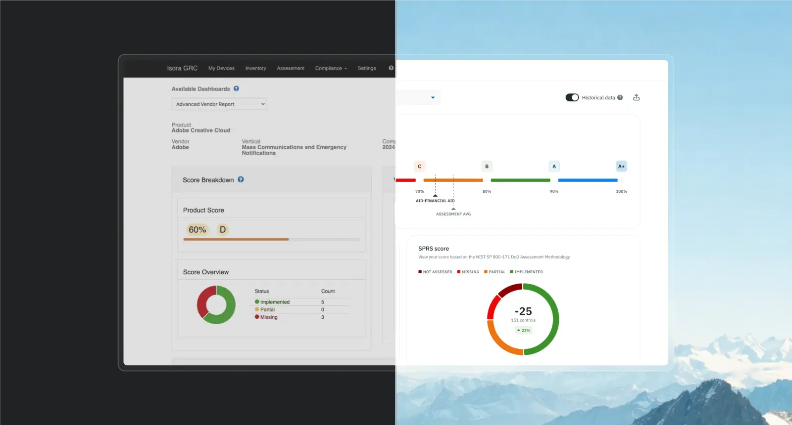
Why are we telling you this? Because we’re worried you might be making the same mistake Isora almost made.
The main mistake founders make with redesigning their products
You see your product. It looks dated compared to competitors. Users mention that the design feels old. Your team starts talking about a “refresh” – new colours, modern typography, cleaner layouts.
And you think: “If we make this look professional, conversion will improve. Users will trust us more. We’ll finally hit our targets.”
Here’s what actually happens after most visual-only redesigns: Users say, “Oh, this looks nice.” Perception ticks up slightly. Maybe conversion improves 5-8% from the aesthetic boost alone.
Then it plateaus.
Because the same users still struggle with the same:
- Flow problems: Too many steps, unclear sequences, dead ends where users get stuck
- Logic gaps: Features that don’t connect properly, actions that don’t lead where users expect
- Cognitive overload: Information presented poorly, unclear priorities, decision fatigue
- Edge cases: Error states, empty states, unusual scenarios that break the experience
- Structural issues: Navigation that doesn’t match mental models, information architecture that creates confusion
The fundamental problems – the ones actually blocking conversions and costing you revenue – remain completely untouched. You’ve just made them prettier.
Ruslan Vashchenko, our Head of Design, sees this pattern constantly:
“Some clients think that by creating a good UI, they’ll improve metrics. Metrics will improve a bit, yes – because there’s a rule: ‘Everything that seems beautiful to people also seems more convenient.’ But a real jump in metrics happens when you improve the actual user experience, not just their visual perception of the product.”
Visual polish creates the illusion of progress. We created this blog specifically to protect you from falling into this trap.
How we diagnose what’s broken (before we touch any pixels)
When clients come to us for a redesign, we don’t start with mood boards or colour palettes. We start with diagnosis.
Every conversion, every completed task, every revenue dollar depends on users moving through flows successfully. When user flows break – too many steps, unclear logic, confusing navigation – users abandon. Conversion drops. Revenue suffers.
Ruslan puts it clearly: “Visual redesign doesn’t impact metrics as much as a full redesign. And metrics are what bring money to the founder.”
Here’s our process for finding where user flows break:
1. Analyze metrics (if available)
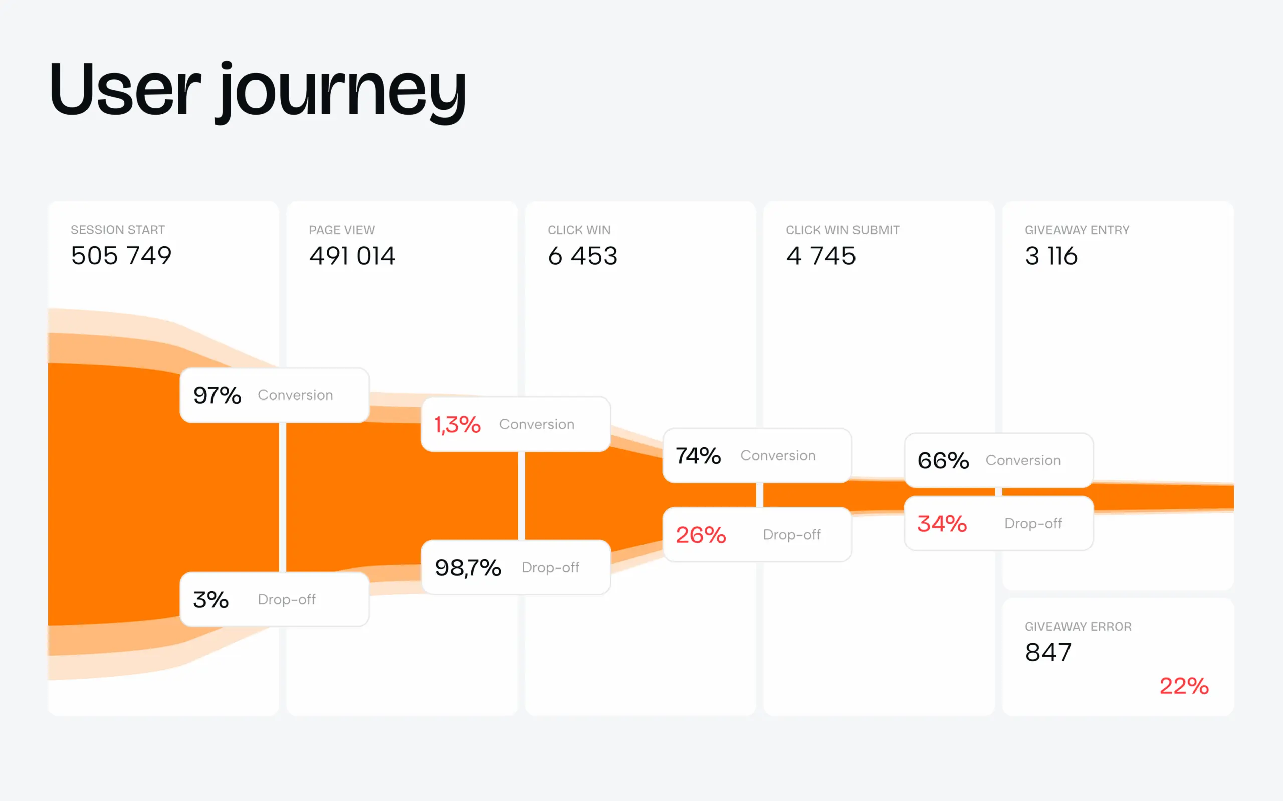
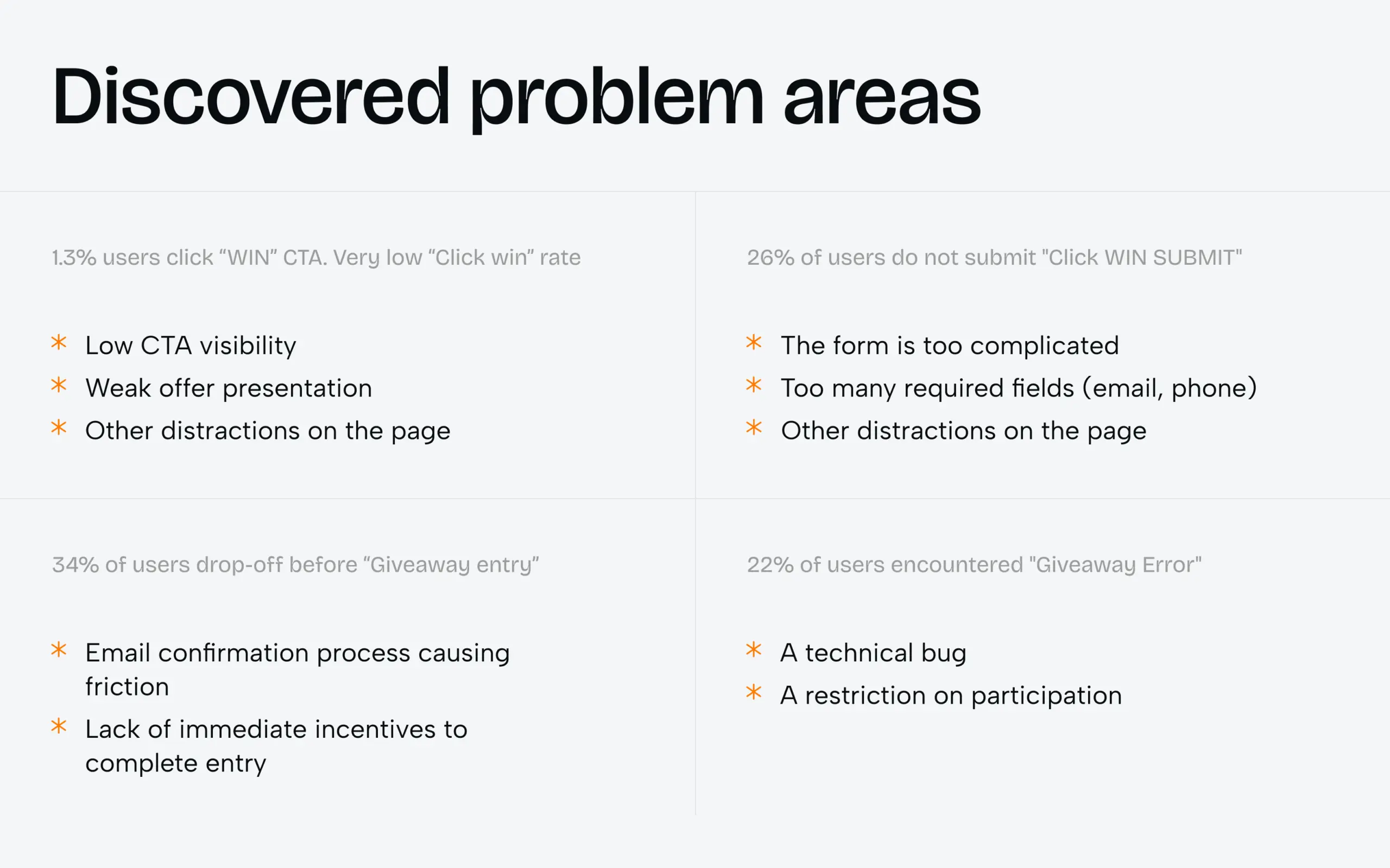
We look at:
- Where users drop off
- Which flows have low completion rates
- Where support tickets cluster
- What actions take too long
If you have analytics set up, the data shows us exactly where users struggle. Drop-off at the same step across multiple flows? That’s structural. Tasks taking 5 minutes when they should take 30 seconds? Flow problem.
If you don’t have metrics, we rely more heavily on the other steps. But if the timeline allows, we can implement tracking first and gather data for a few weeks before we start the redesign. This gives us hard evidence of where your users struggle, which means we fix the right problems instead of guessing. We believe every decision should be backed by numbers. Analytics give us the fastest path to truth.
2. Review user feedback
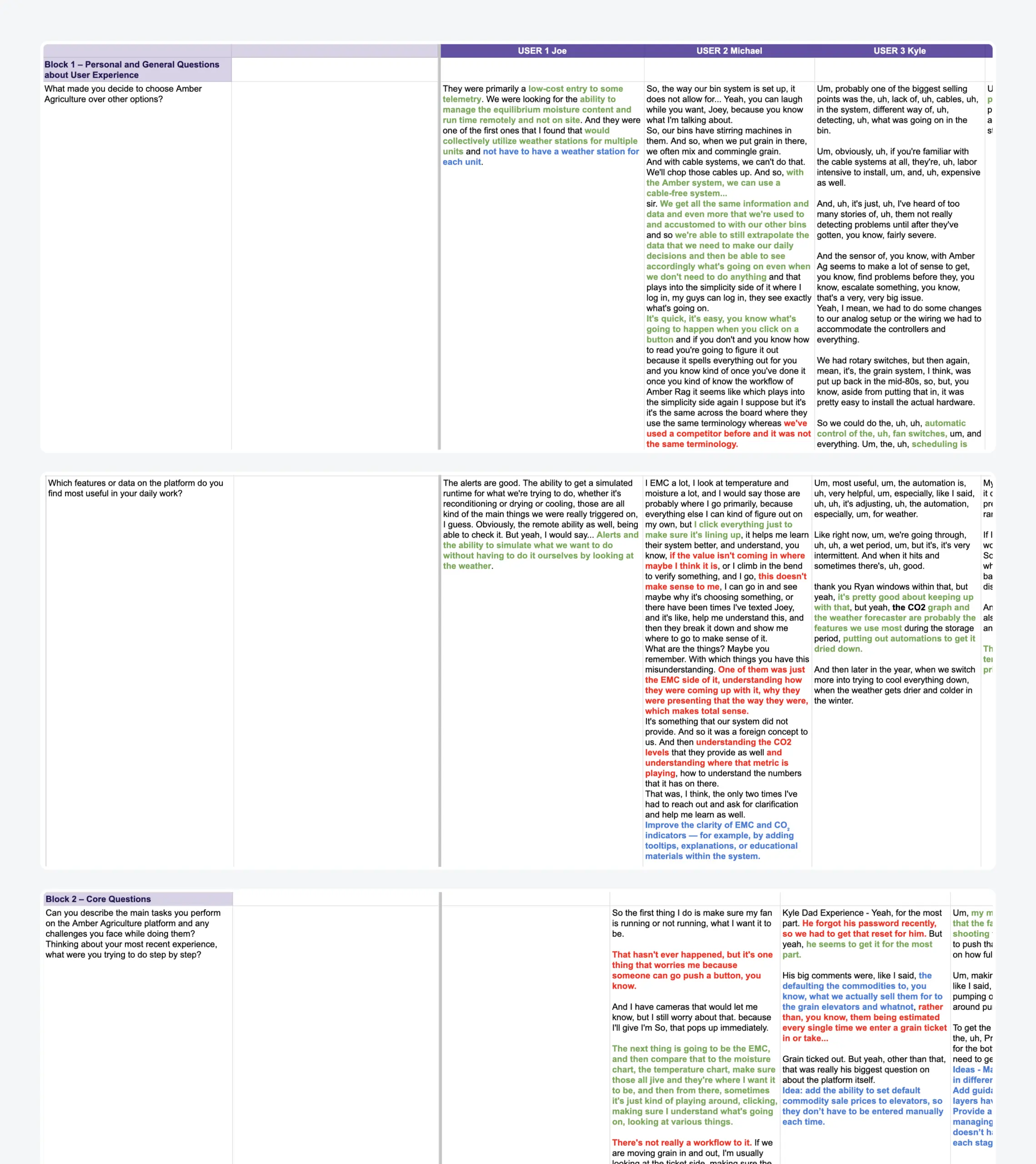
We examine:
- Support tickets and recurring complaints
- User interviews (whether you’ve already done them or we conduct them)
- Feedback forms and feature requests
When they say, “I can’t find…” that’s information architecture. When they say, “This is confusing…” that’s flow or logic. When they say, “It looks outdated…” that might just be UI.
They might not know the root cause, but they’ll tell us where the pain is.
3. Audit information architecture
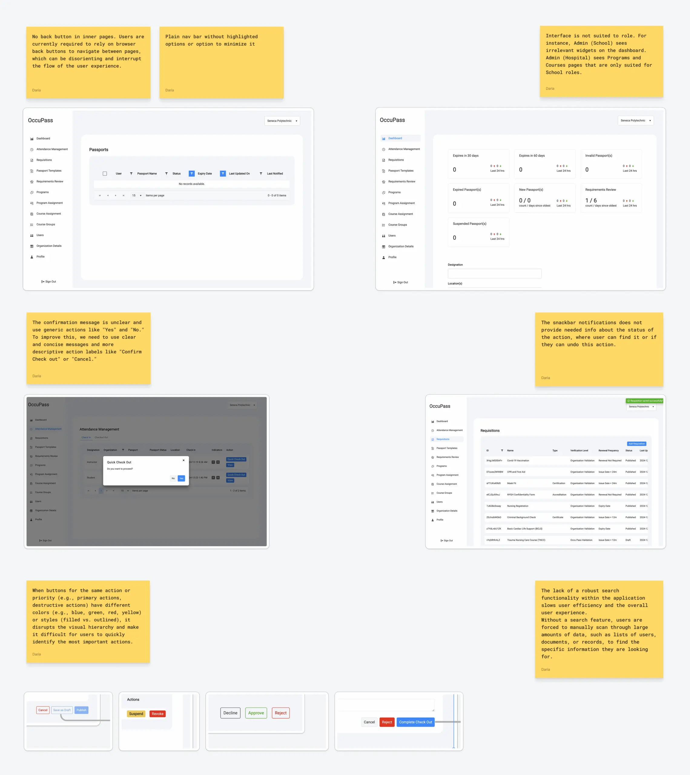
We analyze:
- How content is organized
- Whether navigation makes sense
- If users can find what they need
- Where the structure creates confusion
Bad information architecture forces users to hunt for basic features. They click through three menus to find something that should be one click away. Features get buried. Critical actions require guessing.
Good architecture makes everything feel obvious. Users don’t think about navigation – they just move through the product naturally.
4. Assess UI and accessibility
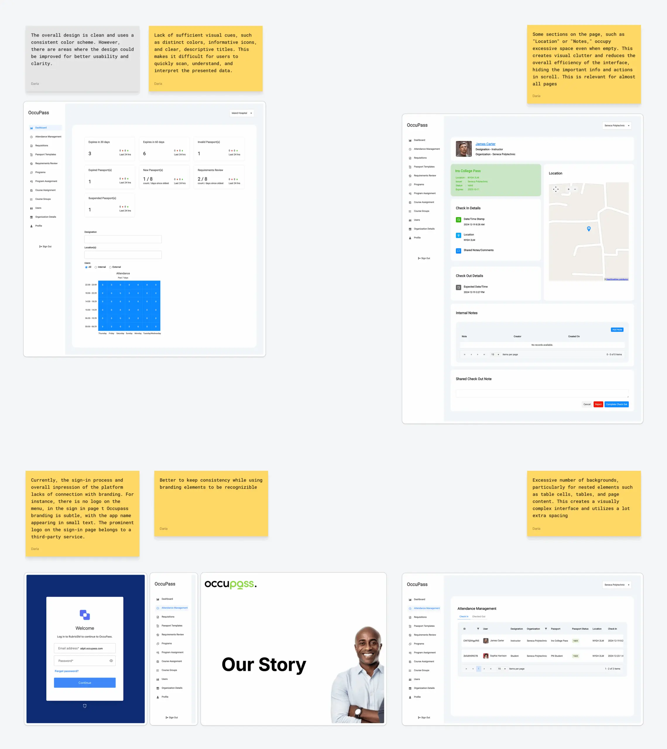
We evaluate:
- Visual consistency across the product
- Whether the interface is accessible
- If interactive elements are clear
- Whether the design supports or hinders the experience
Yes, we look at UI, but only after understanding the structural problems. UI serves UX, not the other way around.
5. Map and analyze user flows (the biggest part)

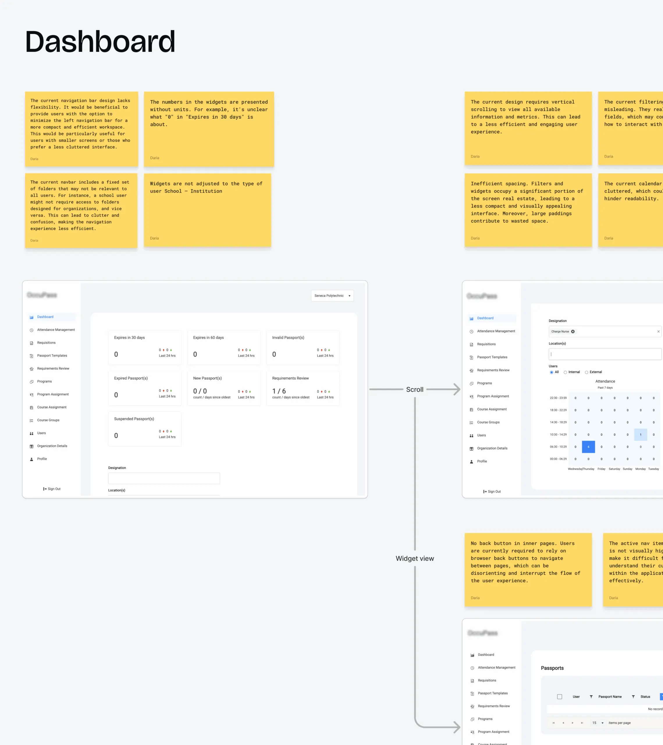
We document every user flow and evaluate:
- Number of steps required to complete tasks
- Decision points and where users hesitate
- Error states and edge cases
- Whether the logic matches user expectations
- Where friction points create abandonment
We write down everything: where users start, every click, every input, every decision point, and where they end (or abandon).
Then we count: How many steps? How many screens? How many decisions? How many places could they get stuck?
Ruslan notes: “At this stage, we generate the most hypotheses for improvement. We can’t say people don’t complete this action because ‘X reason’ definitively, because we don’t know for sure (especially if there are no metrics and user feedback). But based on UX principles, best practices, common behavioural patterns, and our team’s experience redesigning dozens products, we can identify likely problems and test solutions.”
Once we’ve mapped the problems, we structure and prioritize them. We focus on changes with the highest impact on key metrics.
Then we redesign – flows first, visuals second.
More proof: What happens when you prioritize UX over UI
The process we just walked through isn’t theoretical. Here’s what it delivers when broken flows are costing you conversions.
KlickEx: User flow simplification drove 30%+ conversion
When KlickEx came to us, they had a working product serving migrant workers who send money home across the Pacific Islands – Filipinos in Australia, Pacific Islanders in New Zealand supporting families back home.
The product functioned. People used it. But conversion rates were terrible. Users started transfers, then abandoned midway.
The core issue? Users couldn’t understand what their families would actually receive. Currency conversions weren’t transparent. KYC verification forced confusing steps across multiple jurisdictions. And the platform performed inconsistently on mobile – the only device most users had.
We built a transparent pricing calculator showing exact amounts upfront. Simplified KYC while maintaining compliance. Reorganized navigation to guide users naturally through transfers. Made it mobile-first.
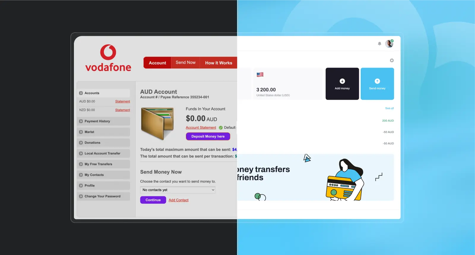
The results:
- 35.3% conversion increase in “Add Money” flow
- 30.7% conversion increase in “Money Transfer” flow
- 54.8% completion rate on mobile
- 3,000 new users monthly, reaching 53,000 active users
What this means for you: If your users start critical actions but don’t finish them, the problem is likely friction in the flow, not how modern your buttons look. Remove that friction, and conversion jumps.
Qurtuba: Streamlining workflows brought 2x learning productivity
When Qurtuba approached us, they’d been running their online school platform for years. Teachers, students, parents, and administrators all used it daily across South Africa.
But the platform was built by developers, not designed for users.
Teachers couldn’t complete assignments without jumping to Google Docs. Parents struggled to track student progress. Students found navigation confusing. Each feature worked independently with different interaction patterns, forcing everyone to constantly relearn how to do similar tasks.
We unified the workflows. Brought essential tools into the platform so teachers stopped cobbling together external solutions. Designed tailored experiences for each role because teachers don’t work like administrators. Optimized flows within the existing backend – no major overhaul required.
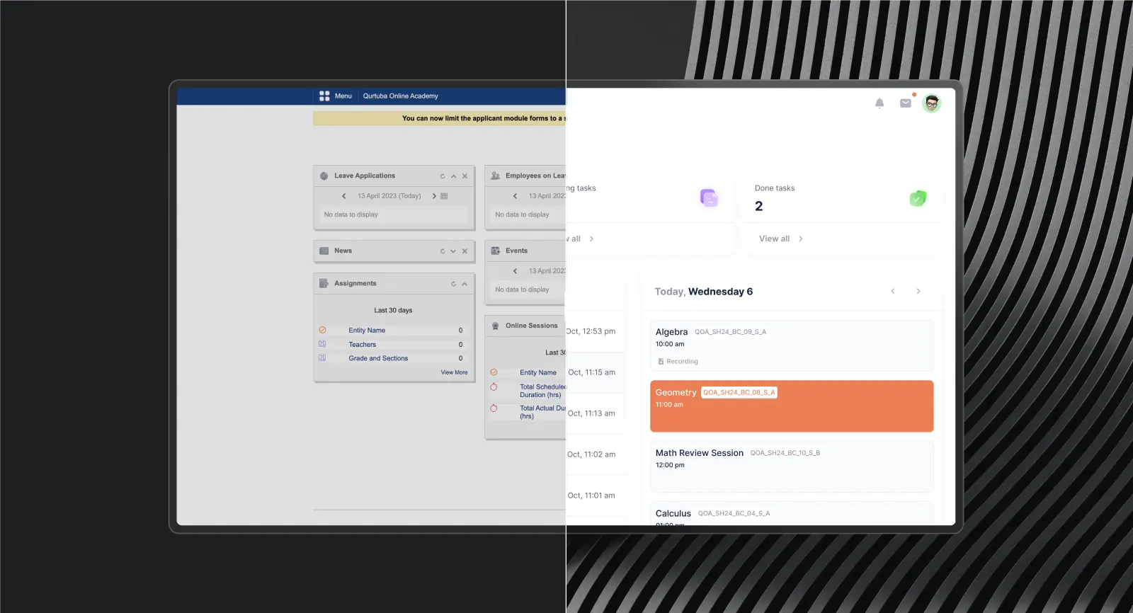
After the UX-focused redesign:
- 95% satisfaction in progress tracking
- 2x boost in learning productivity
- 25% faster response times
- Streamlined communication tools
What this means for you: If your users complain about jumping between tools or struggling with inconsistent workflows, you’re losing productivity every day. Fix the structure, and efficiency doubles.
Your product might be bleeding revenue the same way KlickEx and Qurtuba were. The question is:
Which fix does your product need?
Look for these signals:
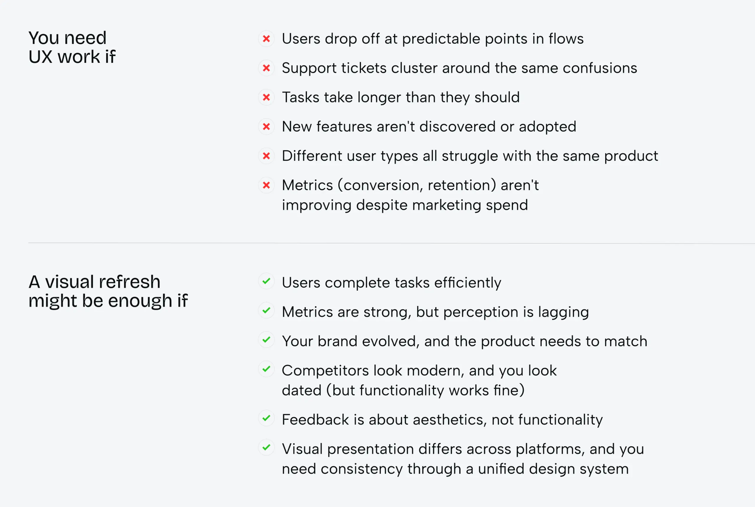
Our philosophy: Fix what matters
Whether you need UX work or just UI, here’s how we approach it.
Ruslan Vashchenko, our Head of Design, explains: “Even if we do a reskin, we still improve small UX moments that don’t affect business logic or the backend but do affect the user experience.”
If you come to us for a visual refresh, we won’t ignore obvious UX problems just because they’re “out of scope.” We’ll improve button labels, clarify error messages, adjust confusing spacing, simplify interactions – all the small moments that add up.
But if your product has broken flows, poor information architecture, or confused logic – we’ll tell you upfront, as we did with Isora. A visual refresh won’t save it.
Your success depends on your users’ success. When they can’t complete their tasks, your business suffers. When their experience works, everything else follows.
Want us to tell you exactly what needs fixing – and what doesn’t? Let’s talk.
Share this article with friends



Sep 29, 2026
6 min read
B2B website redesign without losing traffic: A complete b2b website redesign guide covering UX audits, 301 redirect mapping, and metadata preservation. Partner with a top b2b website redesign agency that boosts conversions while protecting your organic rankings.

Sep 29, 2026
8 min read
Small business web design services that fit your budget. Get affordable small business website design from one of the best website design companies for small business — with transparent pricing and no hidden fees.
