



Jul 26, 2026
9 min read
summary
Learn how to build a scalable brand system through five key phases—from discovery and strategy to visual identity, activation, and brand guidelines.
Most brands don’t fail because the logo was wrong. They fail because there was never a system behind it.
You launch. The brand looks sharp. The logo is clean, the colors feel right, the pitch deck makes a strong impression. Six months later, your marketing team is using a different shade of your primary color. Your developer built the onboarding screen with the wrong font weight. A contractor made social assets that technically follow the guidelines — but somehow feel like a different brand entirely.
Nothing broke. Nothing was stolen. The brand just quietly drifted.
This is the problem we get called in to fix more often than any other: not “we need a new logo,” but “we don’t recognize our own brand anymore.”
The brief is never the real problem
When a client comes to us, the request is almost always framed as an aesthetics problem. “Make it look better.” “Make it more modern.” “Our competitors look more premium than us.” We listen to that brief, and then we go looking for the real one underneath it.
In almost every case, the actual problem isn’t how the brand looks. It’s that the brand was never built to survive more than one person touching it. One founder picked the colors. One designer made the deck. Nobody wrote down why any of it was decided that way. So when a second designer, a marketing hire, or an external contractor enters the picture, there’s no system for them to follow — only a set of past decisions they have to guess the logic behind, often guessing wrong.
Our approach starts from that diagnosis. Before we touch a single visual, we map where the brand is actually breaking: which touchpoints feel inconsistent, where decisions are being made without a reference point, what happens when the founder isn’t in the room to approve every asset by feel. That map becomes the brief for the system we build — not a list of deliverables, but a structure designed to hold under the exact pressures that broke the last one.
That’s also how we think about scaling a brand, and it’s worth being precise about it, because the term gets used loosely. Scaling isn’t about producing more assets — it’s about whether the structure underneath those assets still holds when the brand grows. And that structure only holds if it was built around a specific tension from day one: the balance between consistency and flexibility. Too rigid, and the brand can’t adapt to a new channel without breaking. Too loose, and it stops being recognizable as itself.
That tension is exactly what the five phases below are built to resolve. Each one exists to lock down a different part of the brand — so that what’s fixed stays fixed, and what needs to flex can flex, without anyone having to guess which is which.
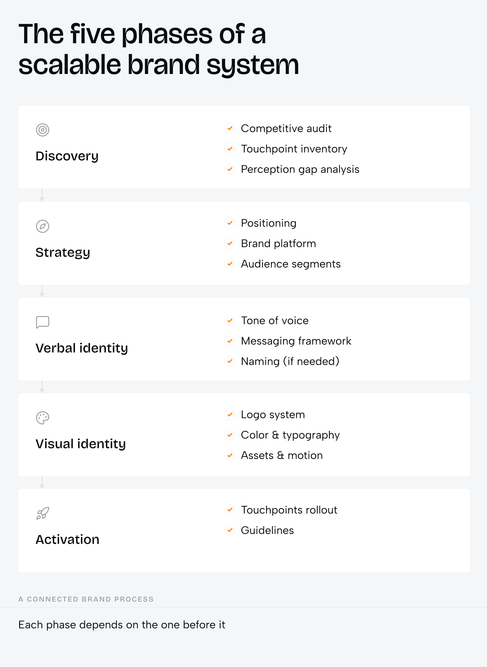
Phase 1. Discovery: finding where the brand is actually breaking
Discovery is not a kick-off call. It’s a structured phase — an audit of every existing touchpoint, a read of how the market already talks about the category, a competitive benchmark against three to five close rivals. The goal is to find the gap between what a brand intends to communicate and what its audience actually perceives.
That gap is almost always bigger than the client expects. A founder will describe their brand as “approachable” while every customer-facing asset reads as cold and corporate. A team will believe they stand apart from competitors while their visual language is indistinguishable from the rest of the category.
This is also where we find the structural weaknesses that no amount of new visual work will fix on its own: no documented reasoning behind existing decisions, no consistency across the touchpoints that already exist, no clear owner of the brand once it has to scale past one person’s judgment. Closing that gap before a single visual is designed is what saves weeks of revision and months of brand inconsistency later.
Phase 2. Strategy: the decisions that govern everything else
Strategy answers three questions before any visual gets made: why should this audience care, why should they trust this brand over the alternatives, and what territory can this brand actually defend?
The output is a brand platform — positioning, mission, values, audience segments — documented clearly enough that a designer six months from now, who never sat in the strategy meeting, can still make a decision that’s correct.
This is the phase most brand projects compress or skip entirely, because it doesn’t produce anything visual and clients are eager to see something. But every visual decision that follows — the typeface, the color temperature, the illustration style — either has a strategic root or it doesn’t. When it doesn’t, every designer who later touches the brand adds their own interpretation, and the system slowly becomes noise.
Phase 3. Verbal identity: the brand before it has a face
Verbal identity runs in parallel with the early visual work, but it answers a question visuals can’t: what does this brand sound like? Tone of voice, messaging frameworks for different audience segments, naming decisions where they’re needed.
We’ve learned to treat this phase as equally load-bearing as the visual system, even though it’s the one clients ask about least — usually because nobody’s been burned by it yet. A brand that looks consistent but sounds different in every channel — formal in email, playful on social, robotic in support — still feels fractured to the people experiencing it. We’ve seen visual systems that were flawless on paper still drift within a year, because nobody had defined how the brand talks, and every team filled that gap with their own voice.
Phase 4. Visual identity: decisions that compound
Once strategy and voice are locked, we build the visual core in a sequence that matters. Logo first, then color, then typography — in that order, because each decision constrains and informs the next.
The logo is not a symbol to us. It’s a system. A primary lockup, a secondary horizontal variant, a standalone icon, a wordmark-only version — each built for a specific context, each governed by clear rules on minimum size, exclusion zone, and dark/light mode behavior.
We don’t consider a logo finished if it only works at one size or on one background.
We treat color as architecture, not aesthetic. The palette defines semantic roles — primary action, supporting tone, accent, neutral — not just a set of swatches that “look good together.” Every color gets a purpose. Every purpose gets a token. We build the palette to hold as the brand expands into contexts the client doesn’t yet know they’ll need.
Typography carries personality at scale. In categories where visual differentiation is difficult — gaming, fintech, SaaS, AI — the typeface choice is often the most distinctive thing about the brand. We often build a dual-typeface system with clearly defined roles: one for display and brand voice, one for technical or UI contexts. That gives the brand both expression and legibility across every surface.
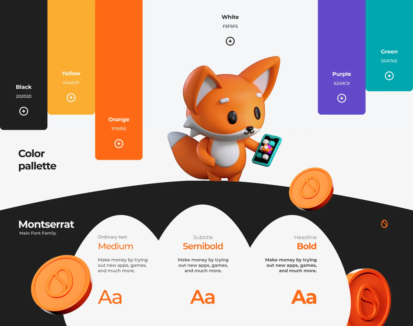
This is also the phase where the system extends — assets, mascots, motion — and where most brand systems either prove themselves or fall apart. The temptation is to keep adding: more illustration styles, more asset types, more directions. The discipline is to extend consistently, so every new element feels like it came from the same design intelligence as the first.
Mascot and character systems add a layer of scalability that a logo alone can’t reach — especially in consumer-facing brands where personality drives engagement. We build mascots directly from the brand’s existing visual language, so they become a communication tool that carries the identity into stickers, emoji sets, game interfaces, video content.
We treat motion as no longer optional. A brand that only exists as static files can’t fully inhabit the platforms where attention lives in 2026. An animated logo, a kinetic icon variant, a defined motion language for transitions — these don’t require a film budget. They require a decision, made early, about how the brand moves.
Phase 5. Activation and documentation: the brand survives contact with the world
Activation applies the identity across real materials — social templates, pitch decks, packaging, product UI, sales collateral. It’s also where the brand system proves whether it actually works, because activation is the first time people outside the core team start making brand decisions on their own.
That’s why this phase concludes with documentation, not a final asset drop. A brand system without documentation is a brand system only one person understands — and we’ve never built a brand for a client who stays the only person touching it.
Guidelines are not a formality to us. They’re the mechanism by which a brand survives contact with the world — new designers, external agencies, developers, AI tools, marketing teams in different markets. Every person who touches the brand without guidelines makes a decision based on their own interpretation. Every interpretation is a small deviation. Small deviations compound into drift.
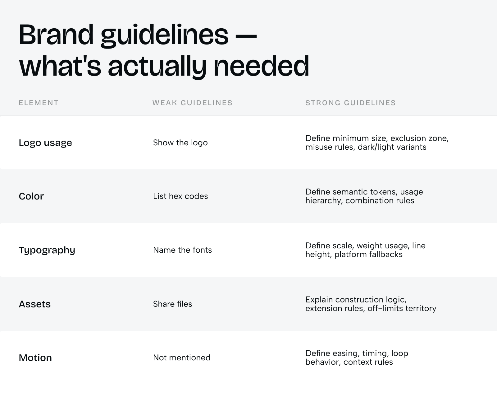
The most effective brand guidelines don’t just show — they explain. Not “use the primary color for CTAs” but “use the primary color for CTAs because it’s the highest-energy element in the palette, and diluting it across secondary elements destroys its signal value.” Good guidelines aren’t restrictions. They’re explanations — and when a designer understands why a decision was made, they make the right call themselves in situations nobody wrote a rule for.
When the reasoning is documented, anyone can make a correct decision in a situation the guidelines didn’t spell out. When only the rules are documented, every new situation becomes a question someone has to ask us. Guidelines built this way survive handoffs that would normally break a brand — when a new contractor joins six months later, or a developer builds a feature the designer didn’t spec, the system holds because the logic holds, not because someone remembered to check with the original team.
What “rescaling” a brand actually means to us
Most of the time, a brand doesn’t fail at launch. It fails the second or third time it has to grow into something it wasn’t originally built for — a new market, a new product line, a new platform, a team that’s ten times the size it was when the brand was created. That moment is what we mean when we talk about rescaling a brand, and it’s worth separating it clearly from what people usually picture.
Rescaling is not adding more assets. A brand with five hundred templates and no underlying logic isn’t more scalable than one with fifty — it’s just more expensive to maintain when it breaks. Rescaling is also not a rebrand. A rebrand throws away the equity a company has already built; rescaling is what lets that equity survive growth instead of getting reset every time the business changes shape.
What actually determines whether a brand rescales well comes down to three things we look for in every system we build, and that we diagnose for in every system we inherit from another agency:
Criteria 1
Does the system have a documented “why,” or just a documented “what”?
A brand with only rules (“use this blue”) breaks the first time someone faces a situation the rules didn’t cover. A brand with reasoning (“this blue signals trust, so we never pair it with our warning palette”) gives anyone — a new hire, a contractor, an AI tool generating an asset — the ability to make the right call in a situation nobody anticipated.
Criteria 2
Can the system absorb a new channel without a meeting?
We test this directly with clients: if a team member needed to make a TikTok asset, a print ad, or an in-app notification tomorrow, with nobody from the original brand team available, would the result still feel correct? If the honest answer is no, the brand hasn’t actually scaled — it’s just gotten more expensive to run, because every new context still requires the founder’s eye
Criteria 3
Does the system distinguish what never changes from what’s allowed to flex?
A gaming platform’s brand has to look different on a billboard than inside its own UI. A healthcare brand has to look different in a hospital waiting room than in a fundraising deck. Brands that try to look identical everywhere become rigid and eventually get redesigned out of necessity. Brands with no fixed core become inconsistent and lose recognition. The brands that rescale cleanly have drawn a clear line between the two — usually around three or four elements that are completely fixed (often the logo mark, the primary color, and one typeface) and everything else is built to flex around that core.
This is also why we treat discovery, strategy, and documentation as the parts of the process that determine scalability — not the visual work itself. A beautiful logo with no strategic root and no documented reasoning will look exactly as good the day it’s delivered and start fracturing the moment the company outgrows the room it was designed in.
How this works in practice: Scrambly
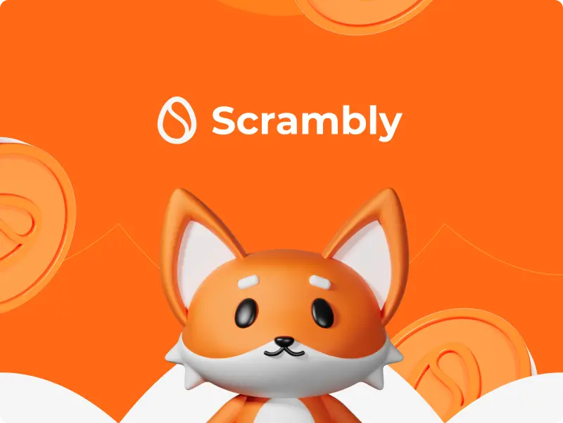
We can’t talk about brand systems built to scale without showing you Scrambly — a gamified rewards platform that turns everyday digital actions, trying a new app, completing a task, into points and prizes.
Discovery
Surfaced the actual problem: Scrambly already had a working logo and visual direction, but it carried none of the energy the product itself had. The platform was built to feel like a game, fast, rewarding, a little addictive, while the brand around it read as flat and forgettable in a crowded category of reward-based apps. Marketing, product, and merchandise had each interpreted the existing identity differently, so nothing about the brand felt unified across touchpoints.
Strategy
Set the mandate the rest of the system would follow: Scrambly needed to feel playful and youthful without losing the clarity and trust a platform handling real rewards depends on, an identity built to appeal equally to early adopters and casual users discovering the app for the first time.
Visual identity
Is where that mandate became concrete. Rather than starting over, we evolved the existing mark, an abstract S enclosed in an egg-like form, sharpening its weight and geometry until it read as confident and scalable instead of soft. A custom wordmark with tighter rhythm reinforced the same shift. Typography centers on Montserrat: geometric, modern, legible at every size, exactly what a digital-first product needs across screens of every shape.
The color system runs on high contrast. Vibrant orange (#FF6915) carries the energy and urgency of the product, while deep black and bright white hold the composition steady underneath it. Green, yellow, and purple step in as playful accents that echo the gamified experience without competing with the hero tone.
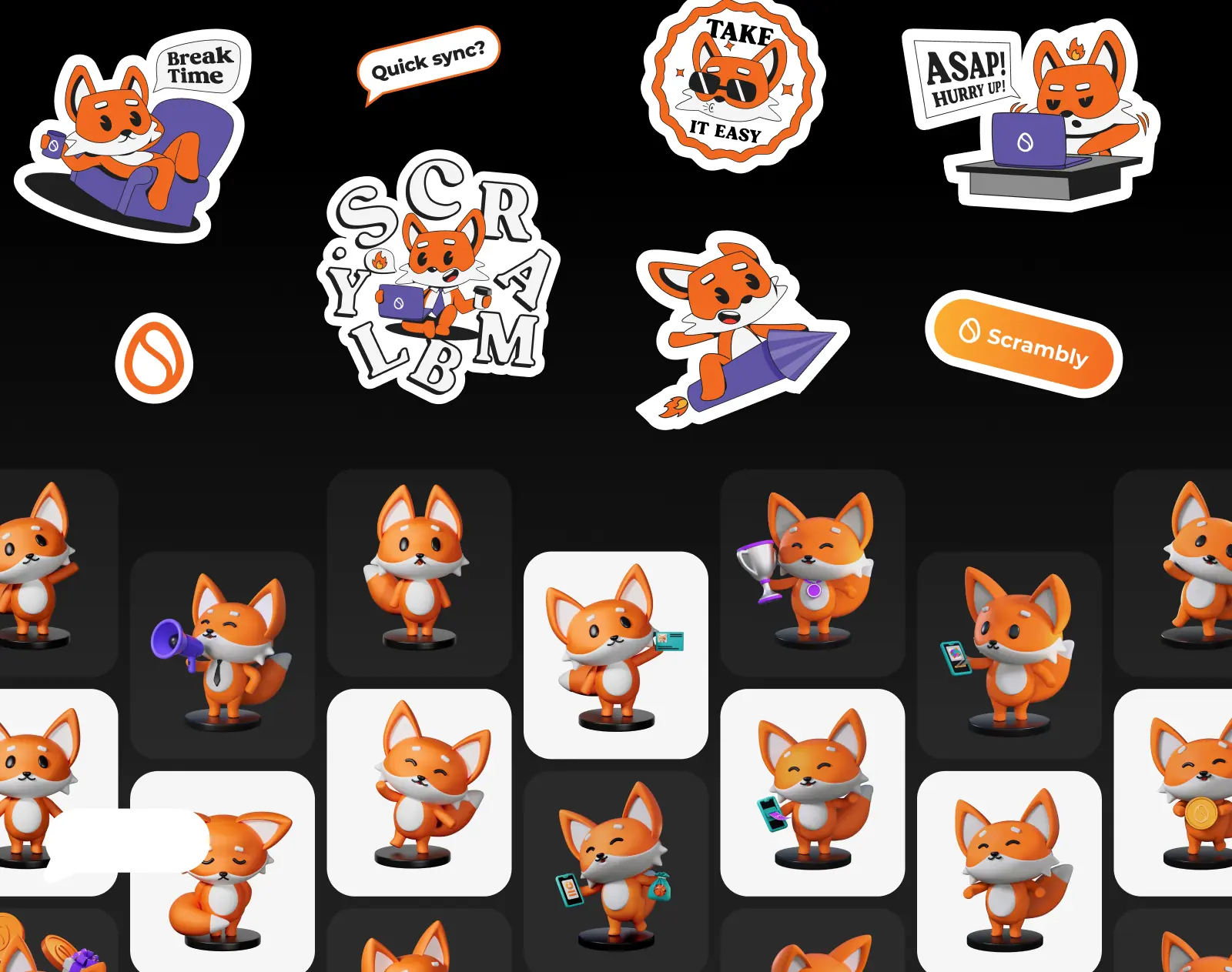
The mascot adds a character layer: a fox, built across both 3D and 2D styles, from expressive hero poses down to collectible sticker formats. It became the recognizable face of the Scrambly universe, the thing users associate with the brand before they associate it with the product screen.
Activation
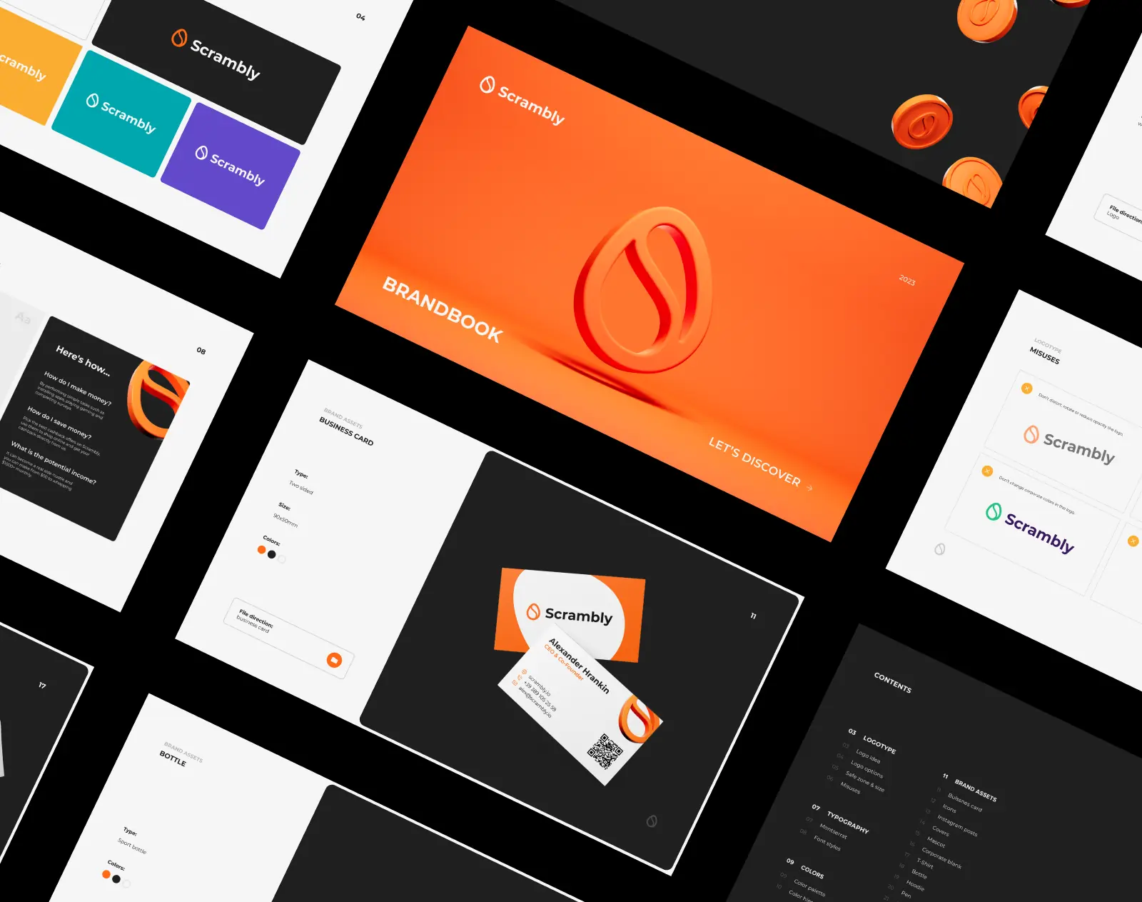
Extended the system across social content, in-app moments, and merchandise, using the mascot and color system as a consistent throughline so a code-drop post, a product screen, and a t-shirt all read as unmistakably the same brand. Brand guidelines documented the logo, typography, color, and mascot rules clearly enough that internal teams and external partners could extend the system on their own, without escalating every new asset back to the original designers.
Result
The refreshed system gave Scrambly a brand that finally matched the energy of the product underneath it, stronger visual recognition, more consistency across marketing, product, and merchandise, and a mascot system that gave the platform an emotional hook it didn’t have before. The gap between “evolution” and “reinvention” held throughout, since the brand changed enough to feel sharper without losing the recognition it had already built.
That’s the test we described above, playing out in practice: a fox, six colors, and a typeface gave teams across marketing, product, and merchandise a shared reference point, instead of each one interpreting the old identity on its own.
“They demonstrated a high level of expertise and efficiency in every phase of the project.” – Illia Frantsevskyi (CTO & Co-Founder of Scrambly)
Why we build this way
Since 2019, Phenomenon Studio has built brand systems for gaming platforms, AI studios, fintech startups, healthcare companies, and enterprise SaaS products across North America and Europe. Across all of them, the same pattern repeats: the brands that survive growth are the ones where strategy and documentation got as much attention as the logo. The brands that don’t are the ones where everyone agreed the visuals looked great, and nobody asked what would happen when the company outgrew the room the brand was designed in.
That’s the lens we bring to every engagement, whether we’re building a brand from zero or fixing one that’s already drifted. We don’t treat discovery as a formality to get through before the “real” design work starts — it’s where we find out whether the brand actually has a defensible position, or just a look its competitors haven’t copied yet. We don’t treat documentation as paperwork at the end of a project — it’s the reason a brand can survive a contractor, a new market, or a feature nobody on the original team specced.
And we don’t measure success by how many assets a brand has. We measure it by whether the system kept holding as the business it represents kept changing shape — brands that scaled into new markets, new channels, and new teams without needing a meeting every time someone had to make a decision the original brief never covered.
If you’re building a brand that needs to grow into something it isn’t yet, or trying to understand why one that looked right on day one doesn’t feel right anymore, that’s the conversation we’d want to have.
Share this article with friends



Sep 29, 2026
6 min read
B2B website redesign without losing traffic: A complete b2b website redesign guide covering UX audits, 301 redirect mapping, and metadata preservation. Partner with a top b2b website redesign agency that boosts conversions while protecting your organic rankings.

Sep 29, 2026
8 min read
Small business web design services that fit your budget. Get affordable small business website design from one of the best website design companies for small business — with transparent pricing and no hidden fees.
