Design
Development
Research
Launch
Evolve
Extend
Jun 11, 2026
10 min read
summary
Discover how a design system can cut development costs by 30%, accelerate time-to-market by 50%, improve product consistency, and support scalable growth.
Your product is growing. Features are piling up. Your design team is rebuilding the same interaction patterns. Your developers are asking, “Which version of this form validation should we use?” And QA keeps finding inconsistencies nobody caught until now.
You think: “We’ll standardize this later. Right now, we need to ship.”
But here’s what we see when founders postpone design systems: products that become expensive to maintain, confusing for users, and nearly impossible to scale without massive rework.
What “we’ll standardize this later” actually costs
You may not know exactly what a design system is. But you definitely feel when there’s a lack of a design system in your product:
- Developers recreating components from scratch: Every new feature means building and testing new components instead of reusing battle-tested ones. What could take 2 days with reusable components takes weeks when starting fresh each time.
- Designers reinventing the wheel: No shared component library means every screen is built from scratch. Inconsistencies pile up. Revisions multiply. What should be “use the standard data table” becomes “let me design another table variant from scratch” – and the same happens with cards, selectors, modals, and every other design component.
- QA catching inconsistencies late: Mismatched spacing, inconsistent margins and padding, conflicting interaction patterns – all discovered after development, when fixing them costs the most.
- Users getting frustrated: When your product looks and behaves differently across features, users notice. They trust it less. They convert less. They leave.
- Technical debt that compounds: The longer you wait to implement a design system, the more existing work needs to be refactored. What could have cost $2K at the start costs $20K later.
Ruslan Vashchenko, our Head of Design, explains the chain reaction when overlooking the design system:
“The product will be 100% inconsistent. This leads to user confusion, which leads to decreased conversions, which leads to decreased revenue. Also, such products are harder to maintain from both design and development perspectives. This leads to decreased ROI – you have to invest more money before your product starts working and generating revenue.”
Feel the difference when you build with a design system
We can’t talk about design systems at Phenomenon without showing you Isora – a live example of what happens when you build with a system from the start.
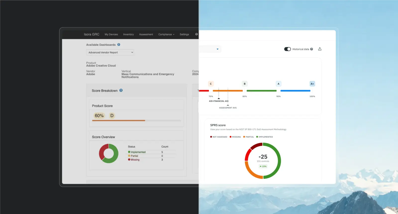
Isora is a governance and compliance platform used by over 20% of major U.S. research universities. When we started the redesign, we built the design system in parallel with the first epics.
We started with the foundation: colour tokenization. Instead of naming palettes “Blue” or “Red,” we used abstract names like “Berlin” or “Tokyo.” Why? If Isora’s brand colour shifts from blue to green tomorrow, the system adapts without breaking. We built it to be future-proof.
Then we tokenized everything else: spacing, border radii, typography, and effects. Every design variable became a reusable token. We standardized sizing in REM units so developers could apply values directly without conversion, eliminating extra work and reducing errors.
We used an atomic approach: buttons and inputs (atoms) combined into form fields (molecules), which scaled into entire dashboards (organisms). Every component was built for reuse and documented in Storybook, a mirror of the Figma design system that developers could integrate directly into code.
Ruslan explains what happened once the design system was ready:
“From that point on, life got easier. There’s now a clear division between the concept phase and implementation. During the concept phase, we brainstorm each new feature using ready-made system components, not afraid to adapt them to the feature’s needs. After polishing and approving concepts, they move to final layouts. And at this stage, we add an extra constraint: how to transfer our concepts to the final version using as many ready-made elements as possible. This approach gives us +50% to time-to-market.”
Beyond the 50% faster time-to-market, the design system delivered:
- Consistent product experience across all modules
- Faster development cycles
- Fewer revisions and rework
This is what you gain with a design system:
- Speed without sacrificing quality
- Consistency without slowing down delivery
- Your team stops rebuilding and starts reusing
- Your product feels cohesive
- Your users trust it more
Now, let’s get to the core: what exactly do we mean by “design system”? There are three levels.
The three levels of a design system: Which one is right for you?
Every product we build at Phenomenon uses some form of design system. So, the question isn’t whether you need one, but which level fits your stage and goals.
Ruslan notes: “Nobody objects to a design system. We always work with one of these manifestations: UI kit (the most basic), custom design system, or pre-built library. Without one of these options, there’s no project. It never happens that a client says, ‘Remove the UI kit, I won’t pay $500 for this.'”
Not all design systems are created equal. Here’s what we typically recommend:
1. UI kit (the baseline)
The most basic option. A collection of standardized UI elements: buttons, inputs, cards, basic components.
When it makes sense: Always. Every project needs at least this much structure.
Cost: Minimal (often around $500 – $1K)
What you get: Visual consistency, faster handoff between design and development teams
Trade-off: None. This is the minimum foundation every project needs.
2. Pre-built library (the smart shortcut)
A ready-made component library with tokens, variants, documentation, and coded components. Think Shadcn/ui, Radix, Material Design, Chakra UI, or similar.
When it makes sense: Early-stage startups (pre-seed to seed) where speed and cost matter more than unique branding.
Cost: $1–2K for library access
What you get: 30% reduction in development costs for your MVP, professional components out of the box, faster time-to-market
Trade-off: Your design won’t be completely unique. If your competitive advantage is visual differentiation, this might not work.
3. Custom design system (the long-term foundation)
A fully tailored system built specifically for your product: custom tokens, component library, interaction patterns, coded components in Storybook, full documentation.
When it makes sense: Post-MVP, when your product is stable, generating revenue, and scaling. Or from the start, if a unique design is core to your value proposition.
Cost: Significant upfront investment (varies by complexity)
What you get: Complete control, scalability, brand consistency, 30–50% faster time-to-market once established
Trade-off: Higher initial cost and longer setup time before you see the speed benefits. You’re investing now for compounding returns later
One important clarification from Ruslan:
“100% of projects that use a ready-made library from the start see a 30% reduction in development costs. I’m saying this for the second time: it reduces development costs, not design costs. This isn’t a mistake. Ready-made libraries (and custom design systems, too) mostly save developer effort because designers still need to draw all the flows and screens. Most of the design hours go into building correct UX logic, not creating buttons and inputs (that actually takes very little time).”
Translation: the 30% savings hit your development budget, not your design budget. Designers still do the strategic work, mapping user journeys, solving UX problems, and creating flows. The design system just makes turning those designs into code exponentially easier and faster.
What Pehomenon’s UI kit includes
When we build a UI kit for you, we create a complete design foundation in Figma. Here’s what every UI kit includes:
1. Colour palette (base and semantic tokens)
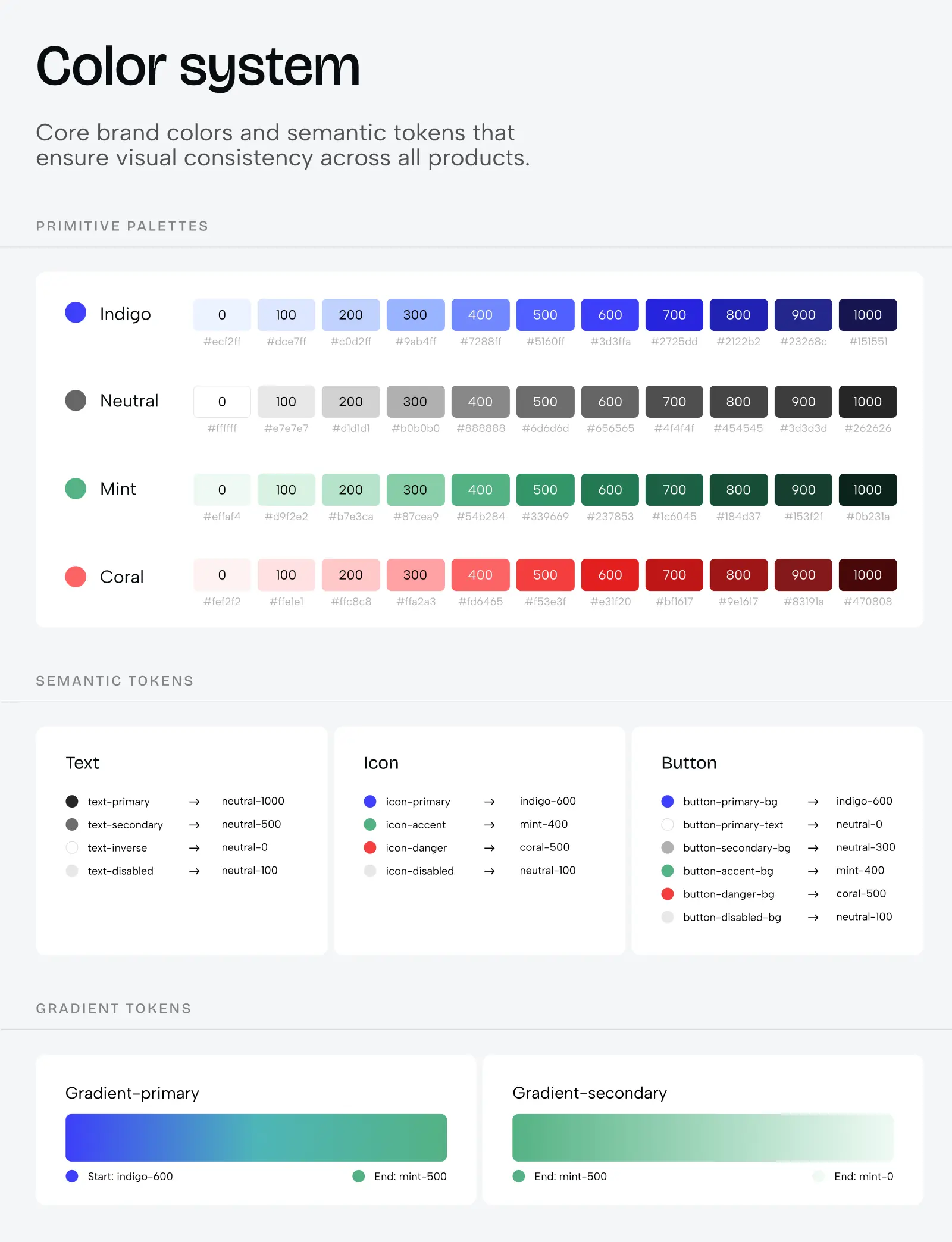
We create a comprehensive colour system with base colours (your brand palette) and semantic tokens (colours assigned to specific purposes like “primary action,” “error state,” “success message”). This structure allows easy switching between colour themes (e.g. light mode, dark mode, or even multi-brand variations). Instead of hardcoding #3B82F6 everywhere, we use tokens like “colour-primary-500” that can be updated globally in seconds.
2. Typography system
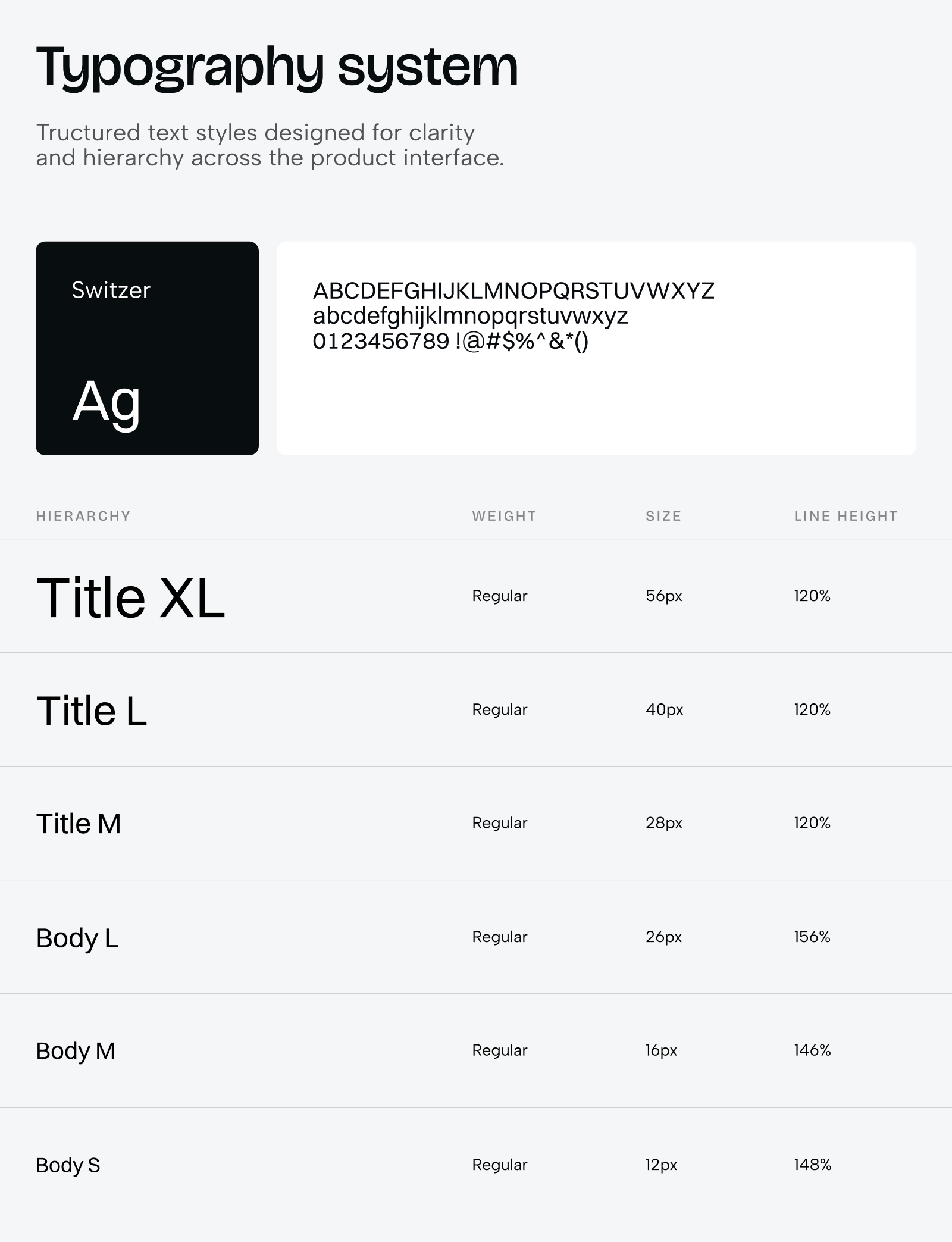
We define how text behaves across your entire product: font families, weights, sizes, line heights, and letter spacing. More importantly, we establish how typography scales across different devices and screen sizes. For products with multi-brand needs, we document how font families switch between brands while maintaining visual hierarchy. This keeps designers from picking arbitrary font sizes and maintains consistent readability throughout the product.
3. Size, spacing, and border radius systems
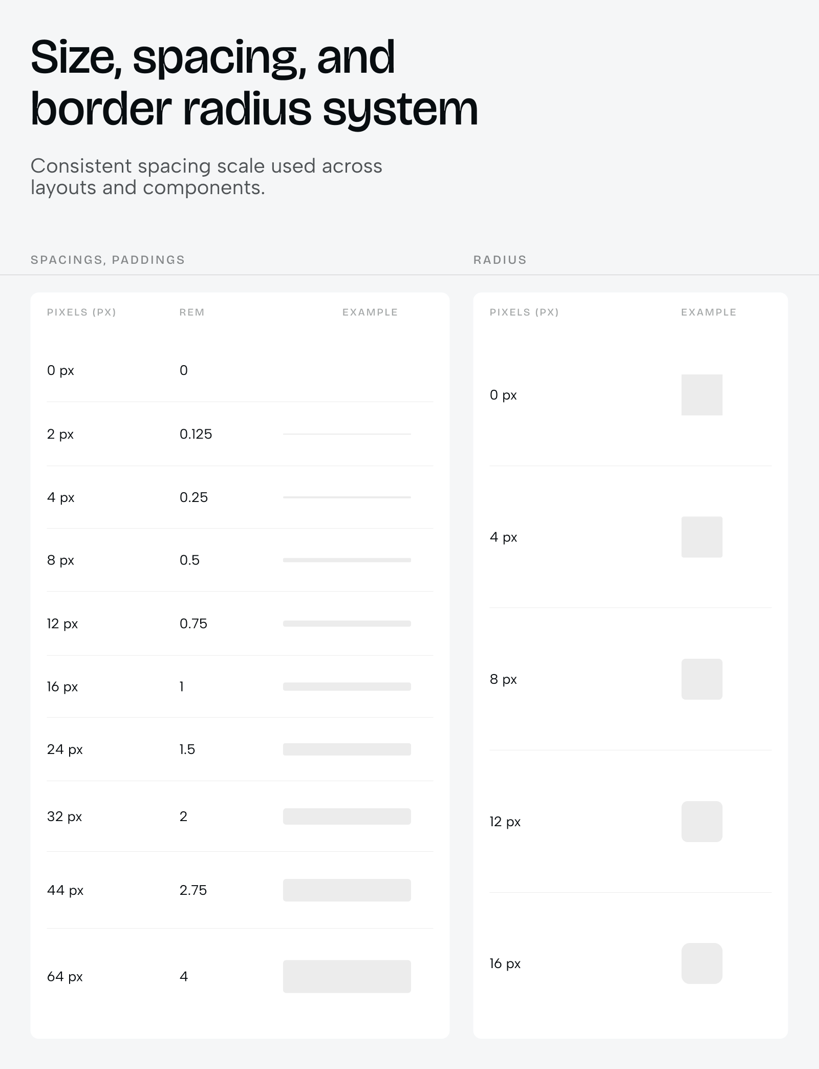
Every margin, padding, gap, and rounded corner uses predefined tokens. Instead of designers guessing “is this 12px or 16px spacing?”, they use tokens like “spacing-md” or “radius-lg”. These tokens are then consistently applied in both individual components and full layouts. This creates visual rhythm and makes your product feel cohesive. Users won’t consciously notice it, but they’ll feel the consistency.
4. Grid systems for different screen sizes
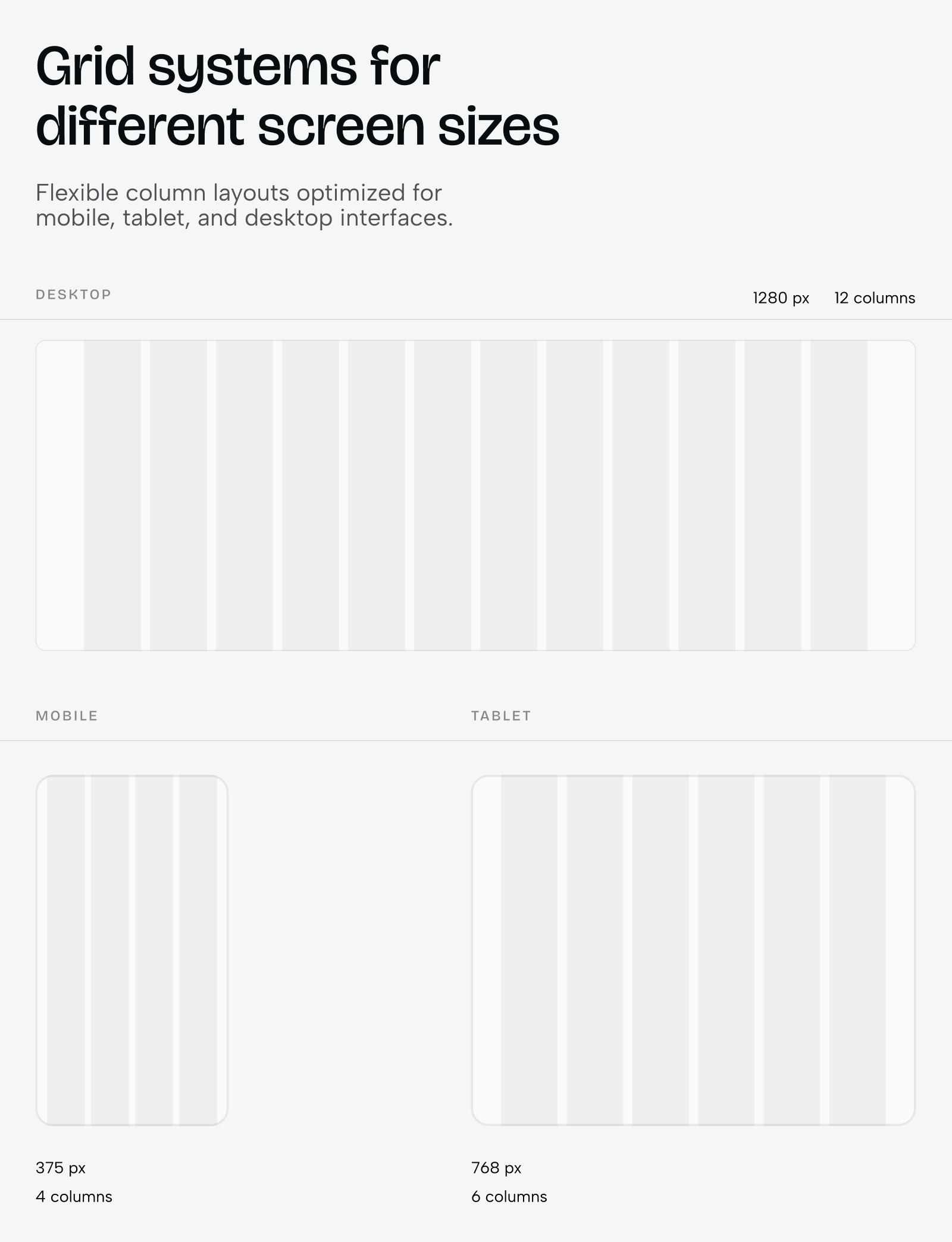
We build responsive grid structures that define how content layouts adapt from mobile (375px) to desktop (1368px+). These grids establish column counts, gutter widths, and breakpoint behaviour. Designers and developers work from the same grid foundation, which eliminates the “it looked different in Figma” problem and speeds up responsive implementation.
5. Component library
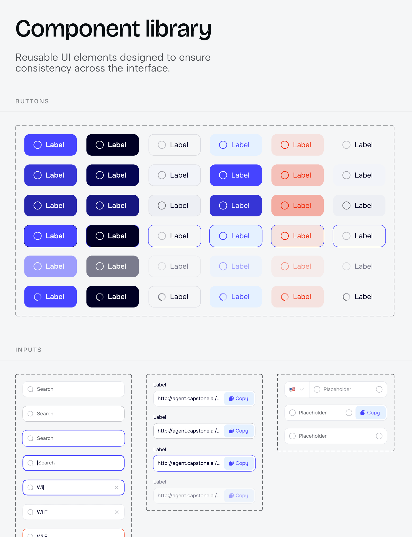
This is the heart of the system. Every reusable UI element – buttons, inputs, dropdowns, cards, modals, navigation bars – built as components using the tokens from points 1-3. Each component is designed with all its states (default, hover, active, disabled, error, loading) and variants (sizes, styles, configurations). The entire system ties back to these atomic elements, which means changing a base token updates every component automatically.
6. Component documentation for development
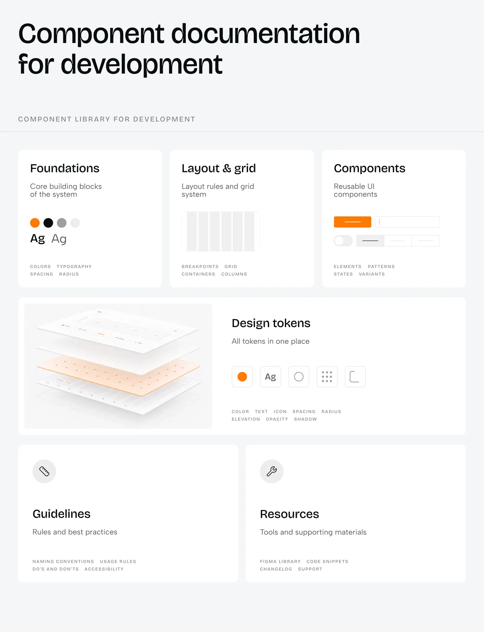
For each component, we document every state, every variant, every edge case. What happens when a button has an icon? What’s the maximum character count for a label before it truncates? How does a dropdown behave when there are 100 items vs. 3 items? This documentation means developers build components exactly as designed, with fewer questions and fewer back-and-forths.
7. Design system showcase
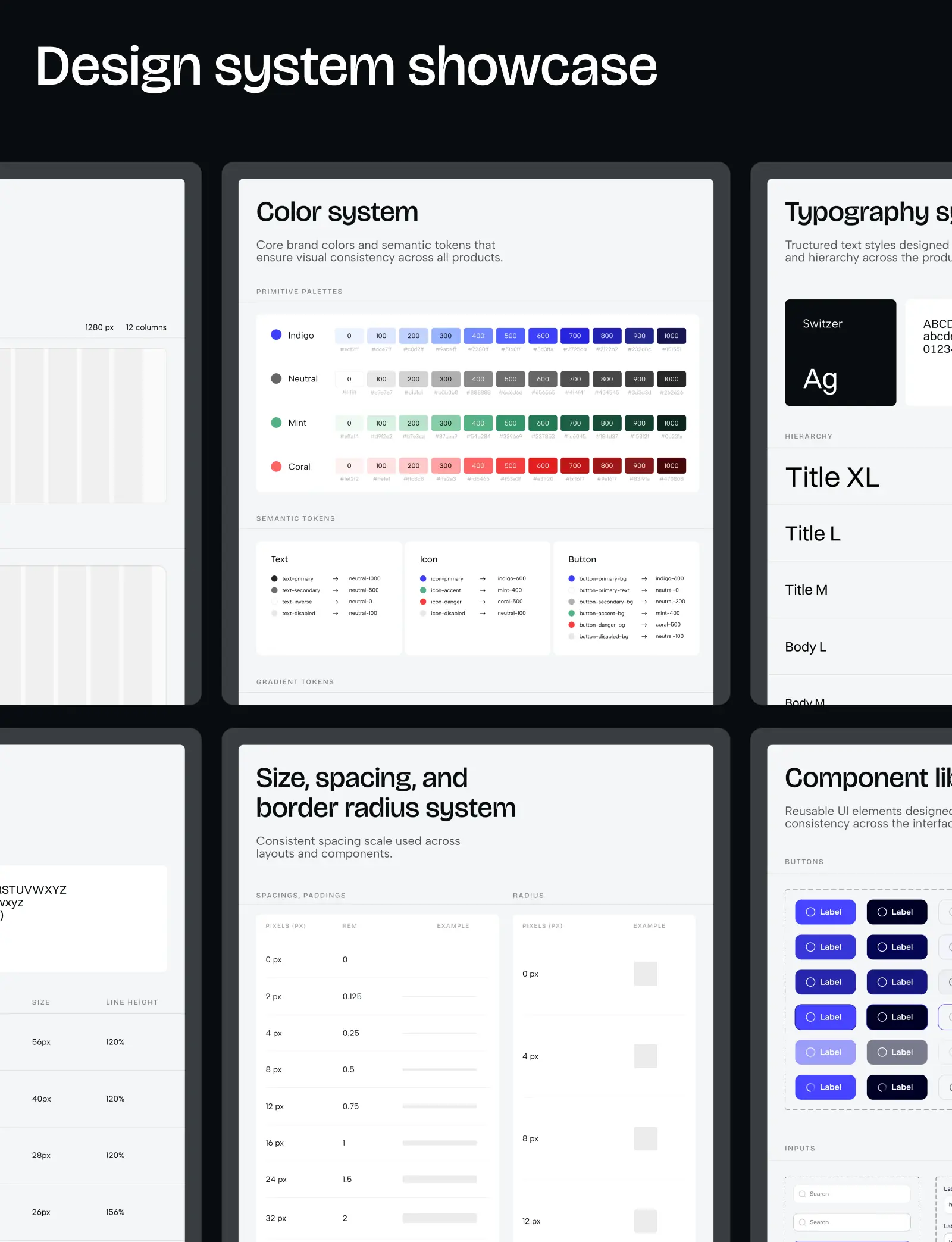
We create a centralized view where all key system elements are displayed together – a “helicopter view” of your design language, so to speak. This is especially valuable for products with multiple colour themes (multi-brand environments or light/dark modes) because you can see how the entire system adapts at a glance. It’s also useful for stakeholder presentations and onboarding new team members.
A UI kit won’t scale to a 50-feature product, but it gives you the consistency and speed you need for early-stage work, without the time and cost of building coded components. When you’re ready for those components to be production-ready in code, that’s when you move to a custom design system.
What Pehomenon’s pre-built library approach includes
When we implement a pre-built library, we provide you with components that are already coded and ready to use. It’s like assembling Lego, but the blocks are already made for you:
-
Library selection and evaluation
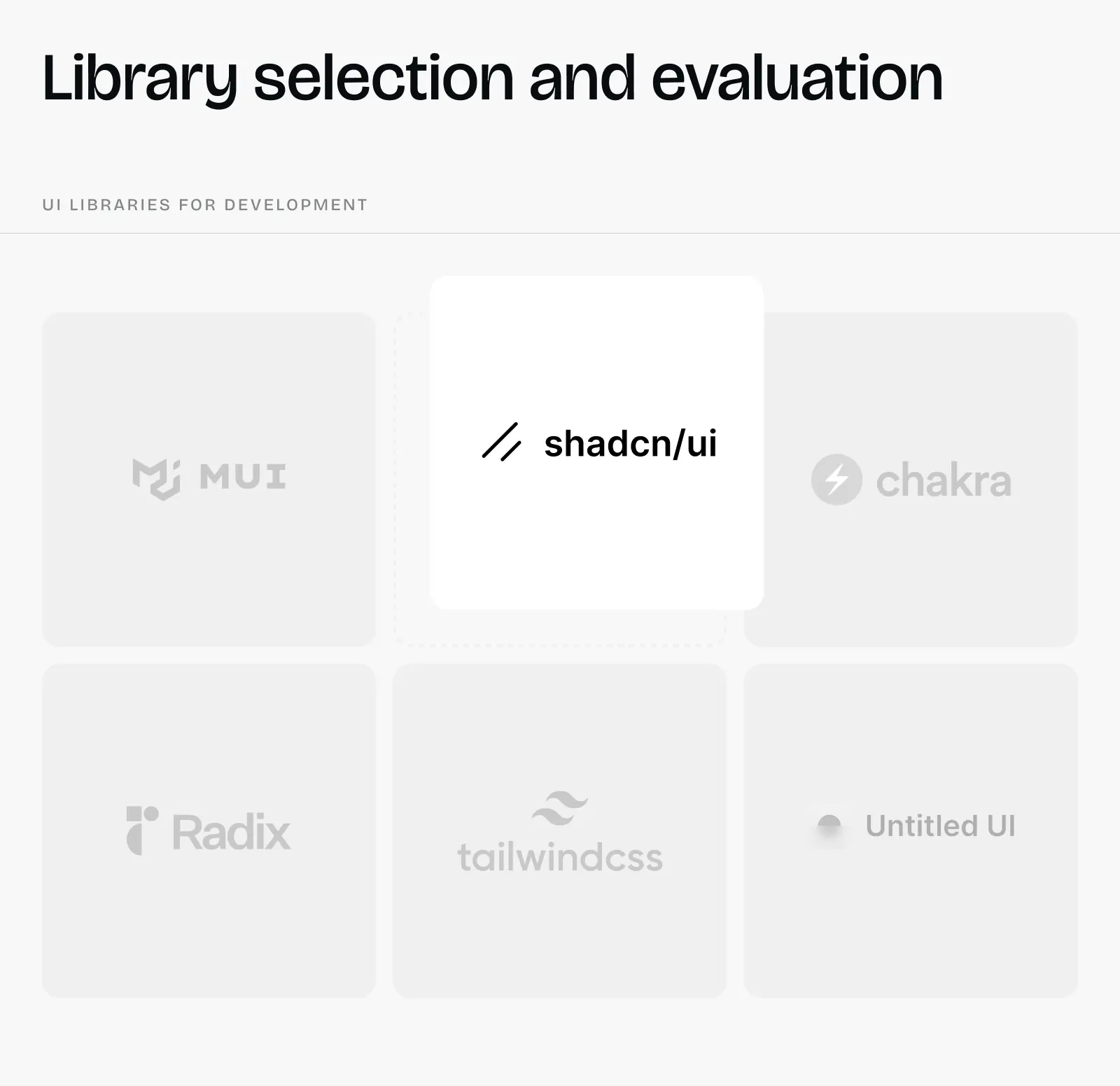
We analyze your product requirements and choose the library that best fits your needs. For modern, accessible foundations, we often turn to Radix or Shadcn/ui, which offer unstyled, customizable primitives. For data-heavy interfaces with complex tables and dashboards, we might use AG Grid or TanStack Table, or another option that fits your specific use case. We evaluate component coverage, customization depth, documentation quality, and long-term maintenance to pick the right foundation.
-
Brand customization layer
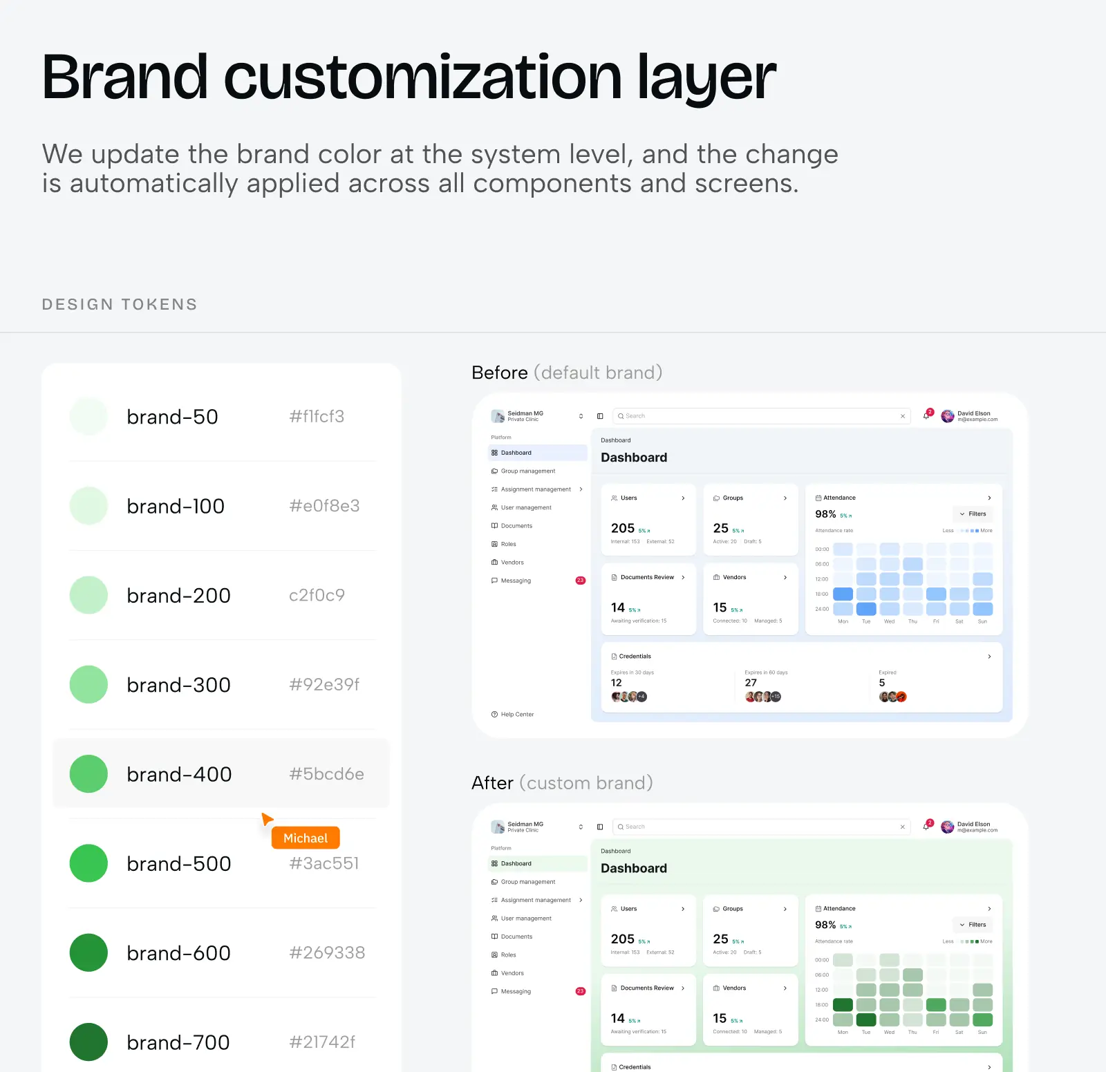
We configure the library’s theme system to match your brand: customize colour palettes within the library’s token structure, adjust typography to use your fonts while maintaining the library’s responsive scaling, modify spacing and border radius values to match your aesthetic, and adapt component variants to feel like yours, not generic library defaults.
-
Implementation
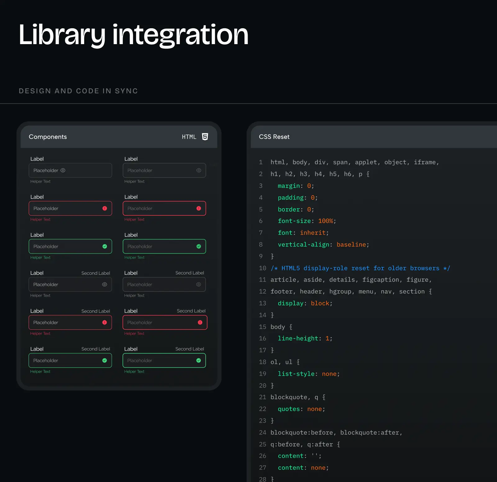
Designers start building user flows directly with the library’s components in Figma (like Shadcn/ui or Radix), and developers use the same pre-built components in code. The library handles accessibility, responsive behaviour, interaction states, and browser compatibility.
A pre-built library gives you 80% of a custom system’s power for 10% of the investment. You sacrifice some uniqueness, not beauty—pre-built libraries can look just as polished as custom systems. You gain speed, proven components, and ongoing updates and support from the library maintainers.
What Pehomenon’s custom design system includes
A custom design system includes everything from the UI kit (all 7 components in Figma) plus two critical additions that make it production-ready:
8. Storybook with coded components
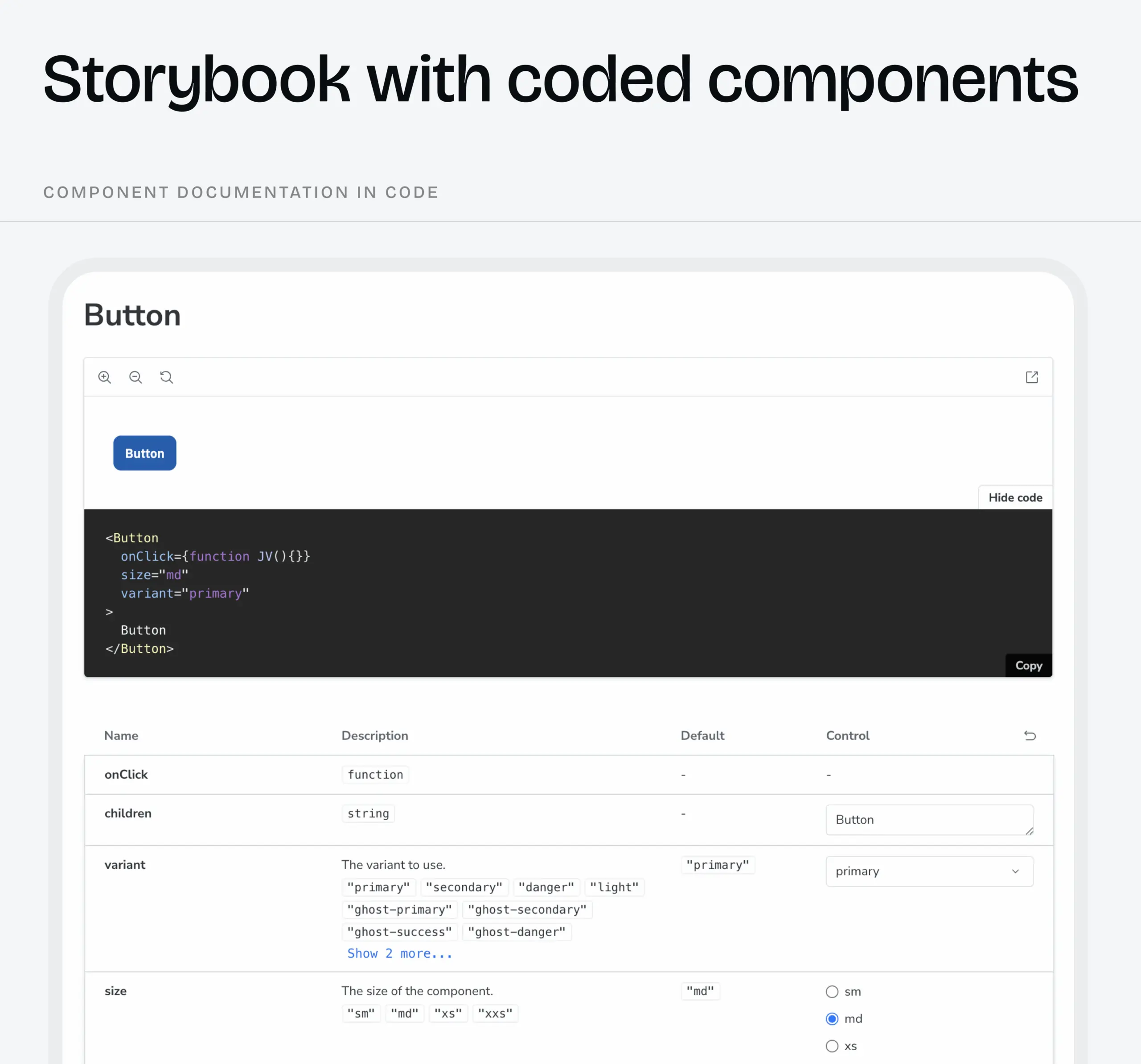
Developers build every component from scratch in code to match your unique Figma designs 1:1 (which is why we document them so thoroughly). Unlike pre-built libraries, where components are ready to use, here developers create each button, input, card, table, and so on as custom code. Once built, these components live in Storybook, an interactive library where you can see every component, every state, every variant. This is the key difference with a custom design system: developers don’t use ready-made components as with the pre-built library; they build them first, then use them.
9. Storybook documentation
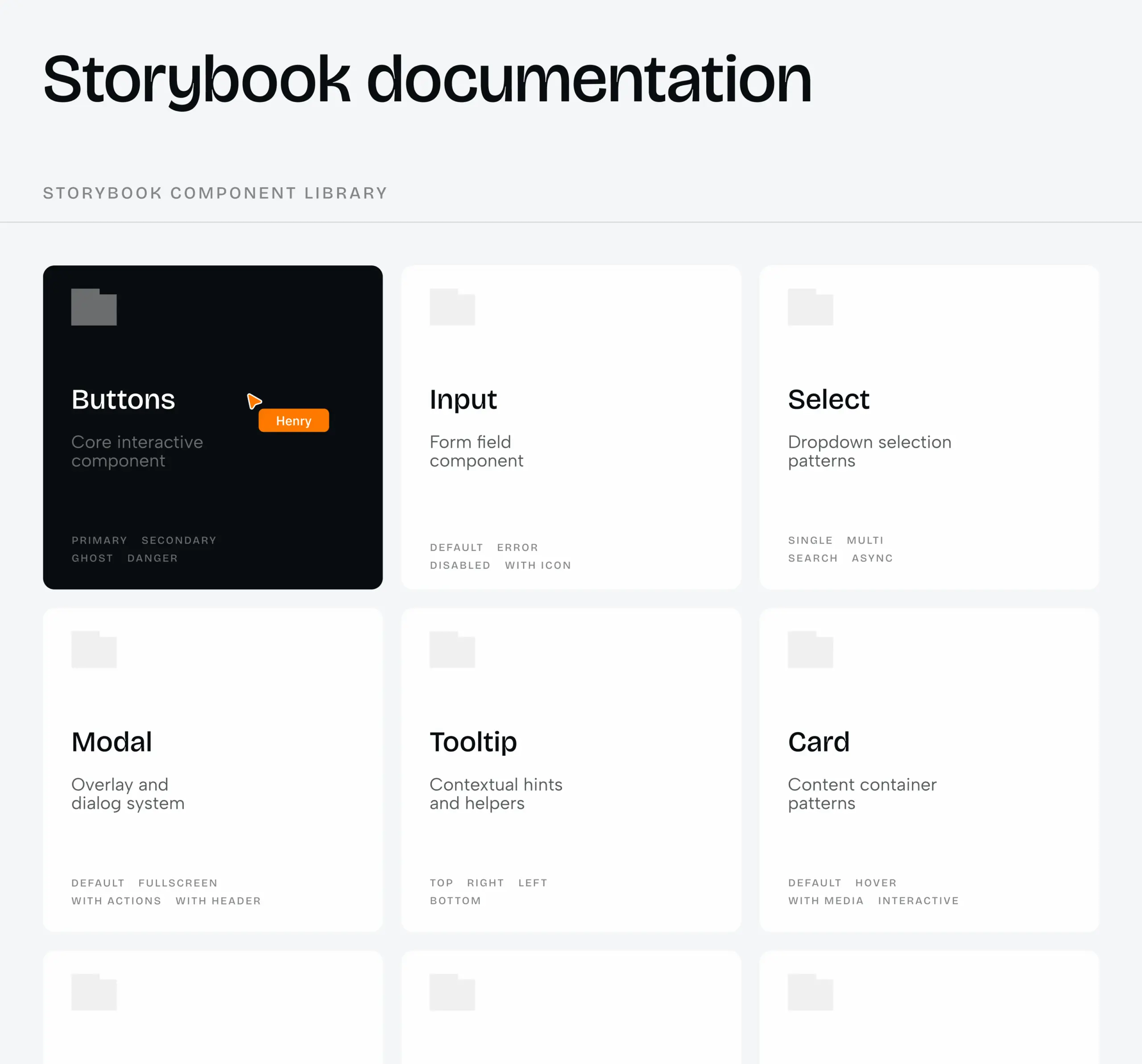
Beyond the visual component library, Storybook includes technical documentation for developers: how each component accepts data (props), how it handles different states, what dependencies it needs, and how it integrates with the rest of the codebase. This technical perspective complements the design documentation, giving developers everything they need to implement components correctly and maintain them over time.
A custom design system is a long-term investment. You pay more upfront and wait longer to see it built, but you gain complete control, perfect brand alignment, and compounding speed benefits. Once established, your team ships 30–50% faster, your product feels unmistakably yours, and scaling doesn’t mean sacrificing consistency. This is the foundation that grows with you.
When to invest in what design system level
At Phenomenon, we won’t push you toward a custom design system if your product doesn’t need it.
Ruslan’s take: “If there’s a budget and a clear need for a custom design system, we design with that in mind from the start. If not, we design using pre-built libraries. If the client only needs visual prototypes, we just make a UI kit.”
Timing matters. Here’s when each path makes sense:
Start with a UI kit when:
- You’re in the early concept/validation phase and need visual prototypes
- You’re testing ideas before committing to full development
- Budget is extremely limited, and you need the bare minimum to move forward
- You’re exploring design directions before locking in an approach
Invest in a pre-built library when:
- You’re building your MVP and want to save on development costs
- You need to ship fast, and branding flexibility isn’t your competitive edge
- You’re pre-seed or seed stage, with a limited budget
- You’re pre-launch with no validated product-market fit yet
- You’re still rapidly pivoting, and nothing is stable
Invest in a custom design system when:
- Your product has stabilized and is generating revenue
- You’re scaling and need to maintain consistency across growing teams
- Unique design is core to your value proposition (your brand differentiates you)
- You’re planning a significant product expansion
- You have a budget and a clear roadmap for long-term growth
We recommend what you actually need, not what costs more. If a pre-built library gets you 30% savings and gets your MVP launched faster, that’s what we’ll suggest. If your product demands a custom design to stand out in the market, we’ll build that. The goal is your success, not our billable hours.
The foundation you choose determines everything that follows
Whether you’re launching your first MVP, redesigning a product that’s outgrown its initial structure, or managing an enterprise platform where inconsistency is costing you conversions – the design system question isn’t “if,” it’s “which level, and when.”
As Ruslan, our Head of Design, says, “A design system isn’t only about reducing costs. It also indirectly impacts revenue. No consistency leads to user frustration, which makes tasks harder, which lowers conversion, which reduces revenue.”
The chain works both ways:
- Without a design system: Inconsistency → user confusion → lower conversions → lost revenue
- With a design system: Consistency → user confidence → higher conversions → sustained growth
If you’re just starting, a pre-built library saves you 30% on development and gets your MVP launched with professional components. If you’re scaling, a custom system gives you 50% faster time-to-market and complete brand control. If you’re somewhere in between, we’ll recommend what actually fits – not what costs more.
The worst outcome isn’t choosing the “wrong” level. It’s building without any system and paying for it later – in rewrites, frustrated users, and missed opportunities.
At Phenomenon, we match the solution to your stage. We don’t upsell custom systems when a pre-built library works. We don’t oversimplify when your product demands more. We build what you actually need to succeed.
Now, let’s figure out which design system fits your product – fill out our contact form.
Share this opening with friends


Jun 29, 2026
8 min read
React vs. Angular vs. Vue for web app development is a question most agencies answer with a blog post. Phenomenon answers it with a project brief. Our web development with React practice covers most product work — Angular web development comes in when the architecture demands it, and that distinction matters more than the framework […]

Jun 29, 2026
7 min read
Healthcare website development for teams that can’t afford to get the details wrong. Phenomenon builds web healthcare platforms and healthcare website design that accounts for HIPAA requirements, patient trust, and clinical workflow — not just the visual layer that everyone sees on launch day.
Have a project in mind?
Let's chat
Have a project to
discuss?
discuss?

Have a partnership in
mind?
mind?