Development
Research
May 20, 2026
7 min read
summary
Learn how Phenomenon Studio improved enterprise GRC software usability with a structured UX audit methodology — reducing task time by 66.7%, increasing SUS from 54 to 81, and doubling user efficiency.
Key Takeaways
- Enterprise GRC platforms are packed with features — yet most users spend more time navigating than doing actual compliance work. A structured UX audit fixes exactly that.
- We identified 23 friction points in a GRC product that had been live for four years. Resolving the top seven cut average task completion time from 15 minutes to under 5.
- The biggest structural failure in GRC software is the “catch-all dashboard” — one view trying to serve compliance managers, auditors, and IT admins simultaneously.
- Within 60 days of shipping the redesign, the client saw a 37% drop in support tickets and a measurable lift in SUS score from 54 to 81.
By Oleksandr Kostiuchenko, Marketing Manager | May 2026
Every GRC platform we’ve audited at Phenomenon Studio had the same origin story: built fast, built for scale, built by a team that understood compliance deeply but rarely sat beside the people actually doing the work.
The result is software that technically covers every requirement — policy management, risk registers, audit trails, control mapping — and practically makes compliance officers dread Monday mornings.
We run ux audit services for enterprise software companies across fintech, healthcare, and SaaS. The GRC space is consistently one of the most friction-dense product categories we see. Not because the domain is inherently hard to design for, but because organizations treat UX as a final polish pass rather than a structural diagnostic tool.
This article breaks down our exact audit methodology — the one we used to double user efficiency for an enterprise GRC client — including the frameworks, formulas, and implementation decisions that produced measurable results.
Phenomenon Studio Projects: Isora — optimizing governance, risk & compliance for top institutions
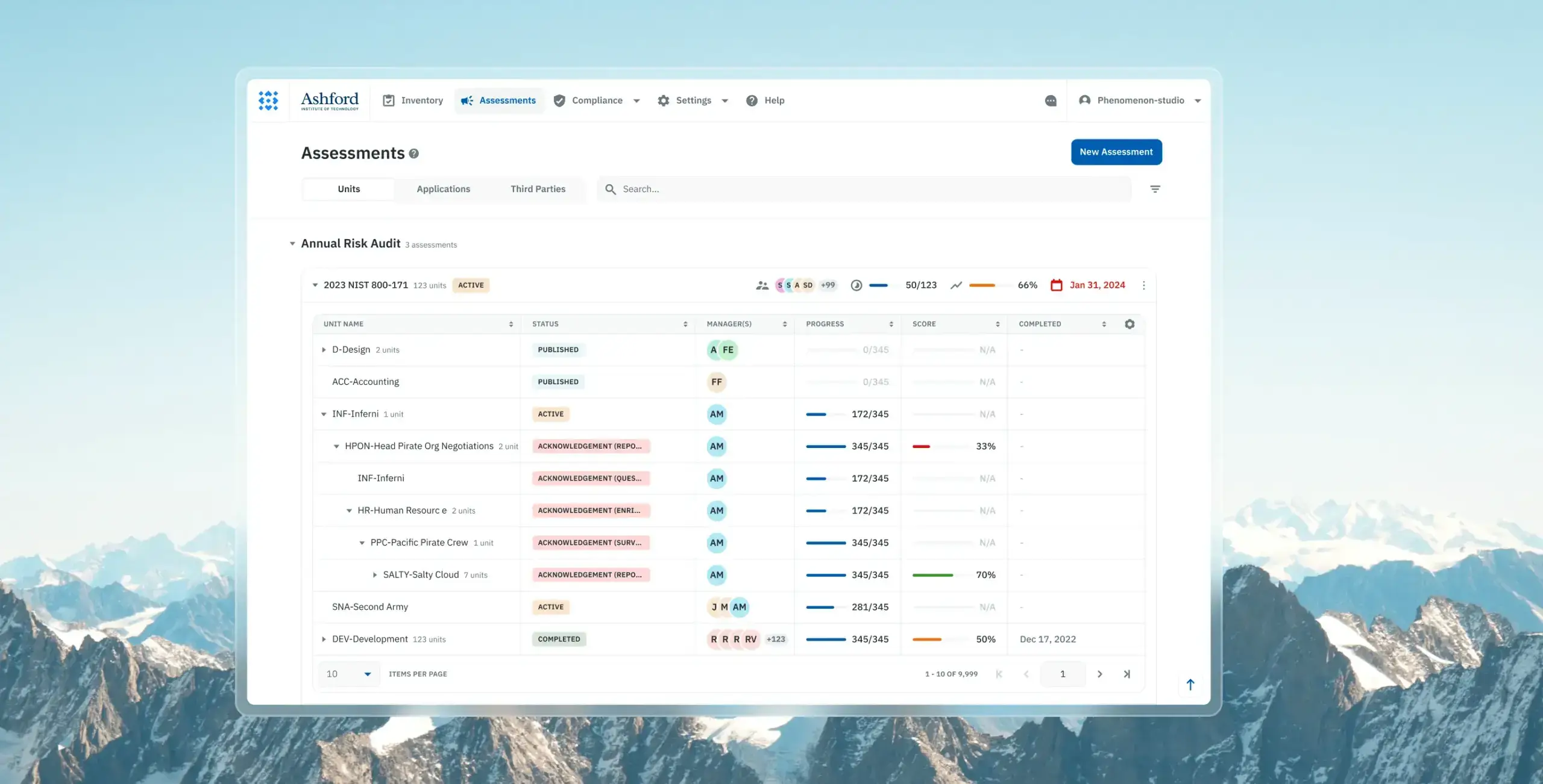
Problem:
Isora’s GRC platform suffered from outdated UX patterns, unintuitive navigation, and friction-heavy workflows that made complex assessment processes difficult for non-technical users. Years of developer-led iteration created usability gaps that slowed collaboration, increased operational friction, and complicated assessment management.
Feature:
We conducted a comprehensive UX audit, restructured the information architecture, redesigned core workflows, and introduced a scalable design system with Storybook integration. The redesign included streamlined assessment management, guided survey completion flows, collaborative commenting tools, improved reporting experiences, and dynamic sidebars for faster interactions.
Result:
The redesign delivered a 2× increase in user efficiency for assessment completion, reduced product time-to-market by over 50% through reusable atomic components and Storybook integration, and contributed to a UX Design Awards 2024 nomination. The platform also improved workflow clarity, streamlined collaboration, and strengthened Isora’s position as a leading GRC solution trusted by over 20% of R1 universities in the United States.
What “Doubling Efficiency” Actually Means in GRC
Before getting into methodology, let’s be precise about the outcome.
Doubling user efficiency does not mean the interface looks better. It means a task that took 15 minutes now takes 5. It means a compliance manager no longer needs three browser tabs and a spreadsheet to track overdue controls. It means your internal auditors stop emailing IT every time they can’t locate an evidence attachment.
We measure this using a straightforward delta formula:
Δ% = ((Metric_new − Metric_old) / Metric_old) × 100
In our GRC project, the incident recording workflow dropped from 15 minutes to under 5 — a 66.7% reduction in time, which means the same action now gets done in a third of the original time. When you replicate that across eight core workflows, the cumulative efficiency gain crosses the “doubled” threshold quickly.
The secondary metric we track is the System Usability Scale (SUS). Our client started at 54 — which sits in the “F” range, indicating serious usability barriers. We targeted 80 (top-tier, top 10% of products). We shipped at 81.
| SUS Score Range | Grade | Interpretation |
| 80–100 | A | Top 10% of products — exceptional usability |
| 68–79 | C | Acceptable, but requires active improvement |
| Below 51 | F | Critical failure — serious usability barriers present |
These aren’t vanity metrics. A SUS score below 51 in a compliance platform creates organizational risk. When users can’t intuitively complete control assessments, compliance updates get delayed. In healthcare, for instance, 40% of breaches involve unauthorized access or disclosure — a figure that’s consistently worsened by fragmented GRC systems that lack a single source of truth.
Why GRC Software Becomes a UX Problem Over Time
GRC platforms serve an unusually wide range of personas: senior leadership reviewing risk posture, risk managers updating registers, internal auditors collecting evidence, IT administrators managing integrations, and operational teams submitting incidents.
Most platforms launch with a single dashboard that attempts to serve all of them. This is the “catch-all dashboard problem” — and it’s the single most common structural failure we find in B2B software audits.
The symptoms are predictable:
- Users click five layers deep to reach their most-used feature
- Role-specific actions are buried behind navigation built for a different persona
- Onboarding is high-friction because the interface assumes context the new user doesn’t have
- Power users build workarounds: spreadsheets, Slack threads, email chains, browser bookmarks to deep links
In one B2B risk consulting platform we reviewed, users spent up to 15 minutes completing actions that should logically take seconds. This isn’t a product failure it’s a UX debt failure. The product had evolved through feature additions without a corresponding evolution of the information architecture.
The reliance on manual, fragmented processes also creates what we call a “culture of non-compliance” — where business units purchase independent tools that don’t connect back to the central governance layer. That’s not a compliance team problem. That’s a product design problem.
The UX Audit Methodology: 6 Stages We Run on Every Engagement
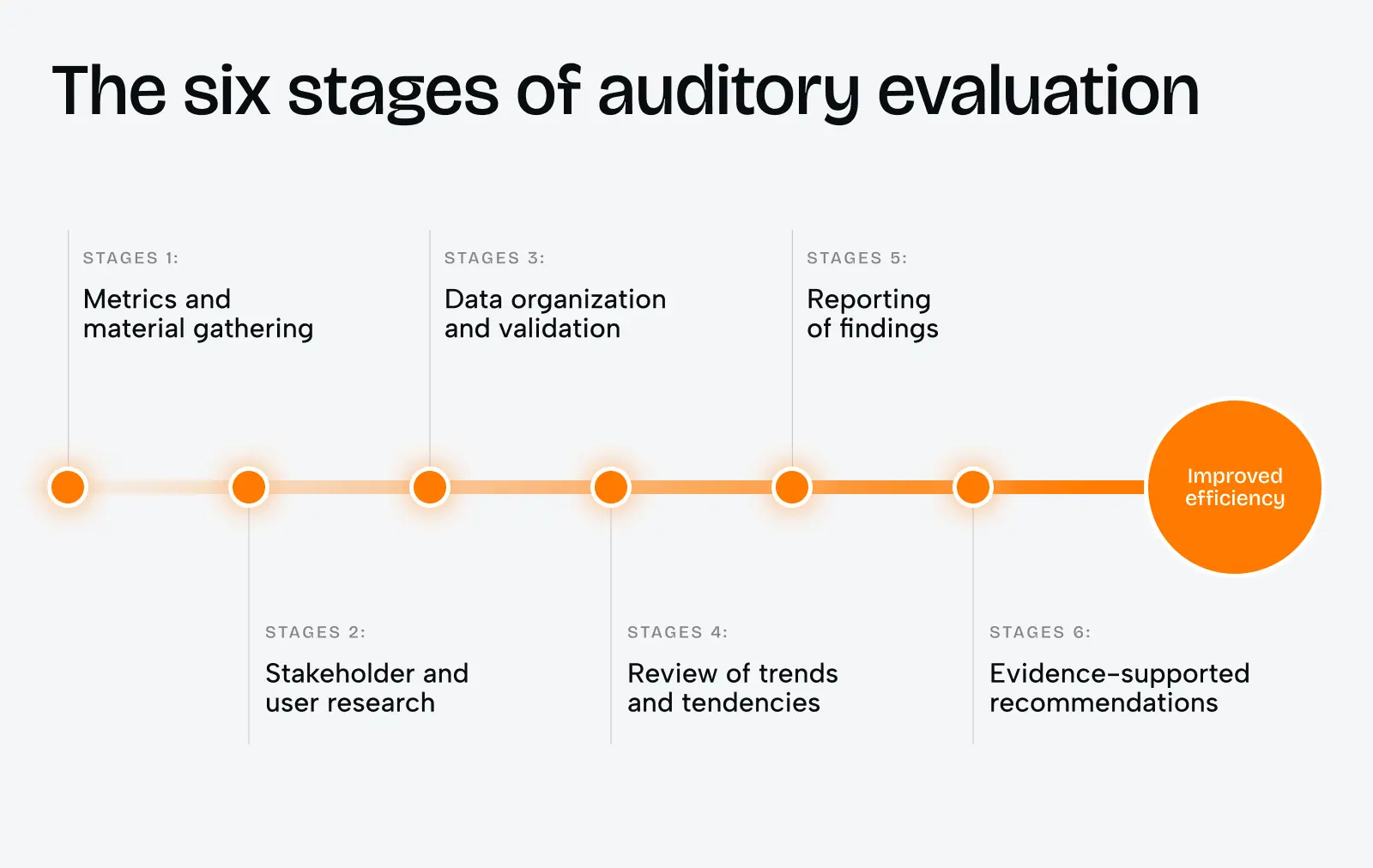
The six-stage process below is what we use at Phenomenon Studio for enterprise software audits. It’s designed to move from raw data to evidence-supported recommendations — not from gut feelings to opinion-driven wireframes.
Stage 1: Metrics and Material Gathering
We don’t start with heuristics. We start with data.
In our GRC engagement, we pulled the following in the first week:
- Session recordings (filtered by user role, not aggregate) from FullStory
- Support ticket logs — categorized by feature area, tagged by persona
- NPS verbatims from the past 12 months
- Core Web Vitals from Google Search Console and the client’s CDN dashboard
- All existing design files, product roadmap documentation, and previous research
The performance data alone told a story. The client’s Largest Contentful Paint on the risk register page was 4.1 seconds — well above the 2026 target of under 2.0 seconds. Their Interaction to Next Paint exceeded 600ms on the audit module. These numbers mean users were fighting the interface before engaging with any content.
We also reviewed their authentication flow: mandatory quarterly password resets with no passkey option. In 2026, 58% of users consider passkeys more convenient than passwords. In enterprise compliance software, where IT teams are actively pushing phishing-resistant authentication, this was an immediate red flag.
Timeline: 1–2 weeks. Team: 1 UX researcher, 1 analyst. Cost range: from $2,500 depending on platform size and data availability.
Stage 2: Stakeholder and User Research
This stage closes the gap between what product leadership thinks users do and what users actually do.
We run two parallel tracks simultaneously.
Stakeholder interviews (5–7 sessions, 45 minutes each)
We ask probing questions designed to surface conflicting goals — because in enterprise software, conflicting stakeholder goals are almost always part of the problem:
- What does long-term success look like for this product?
- What are the implications if this project fails?
- Where do users get stuck most frequently — in your view?
- Describe a time when compliance requirements and business objectives were in tension.
In our GRC project, the product team believed the main pain point was report generation. The sales team said users complained about onboarding. The CTO wanted focus on the dashboard. All three were partially right. None identified the root cause: the information architecture was organized around product features, not user tasks.
User research sessions (10–14 sessions across persona types)
| User Type | Role | Primary Task |
| Compliance Manager | Policy oversight | Reviewing control status across frameworks |
| Internal Auditor | Evidence collection | Gathering audit trails and documentation |
| IT Administrator | System configuration | Managing integrations and user permissions |
All three persona types were landing on the same dashboard at login. The compliance manager’s priority — framework status overview — was three clicks deep. The auditor needed evidence attachments fast — also three clicks. The IT admin was the only persona the entry view actually served.
Timeline: 2–3 weeks. Team: 1 UX researcher, 1 product designer.
Stage 3: Data Organization and Validation
After research, you have contradictory signal and noise. This stage structures it into something actionable.
We build a Friction Inventory: every identified problem, tagged by severity, frequency, and source. Our rule is simple — a friction point makes the final list only if it’s confirmed by at least two independent data sources (interview + session recording, or analytics + support tickets).
For our GRC client, we identified 23 distinct friction points. The top five:
| Friction Point | Type | Severity |
| Single dashboard for all personas | Navigation / IA | Critical |
| No inline help for compliance terminology | Cognitive load | High |
| Evidence upload flow: 6 steps, no progress indicator | Task flow | High |
| Risk register LCP: 4.1 seconds | Performance | High |
| “Export report” buried in secondary nav | Discoverability | Medium |
The validation step also surfaces false positives — issues that users mentioned once but don’t actually affect workflow. These go to a watch list, not the redesign scope.
Timeline: 1 week. Team: 1 UX researcher.
Stage 4: Review of Trends and Tendencies
This stage answers: what is the broader direction for this product category, and are we designing for where users are heading — not just where they are today?
For enterprise GRC software in 2026, three trends are actively reshaping what users expect:
- Post-navigation interfaces are replacing hierarchical menus. Instead of clicking through layered navigation, users type a query and receive a contextual action. Think of it as a command palette approach — the kind that power users in tools like Notion, Linear, or Figma already depend on. GRC platforms that adopt this pattern reduce orientation time dramatically.
- AI-driven contextual assistance is becoming standard. Modern ERM platforms now integrate AI assistants that provide real-time streaming responses and field-level autocomplete based on historical data. These aren’t chatbots bolted on — they’re context-aware tools embedded directly into workflows. The UX requirement: they must show their reasoning before they act, or users lose trust in the automation.
| AI Capability | Functional Application | UX Benefit |
| Regulatory Tracking | AI scans new laws and flags organization-specific impact | Reduces manual review cycles |
| Risk Reporting | Consolidates data into audit-ready reports in minutes | Frees teams for judgment, not documentation |
| Contextual Suggestions | Field-value autocomplete from historical data | Reduces errors, accelerates entry |
| Fraud Detection | ML identifies unusual patterns ahead of rules-based tools | Earlier intervention, reduced exposure |
- Design tokenization is becoming an audit requirement, not a design team preference. Without a centralized token system, GRC platforms accumulate “rogue styles” — multiple shades of unapproved colors, inconsistent spacing, divergent component behavior across modules. This creates visual noise that undermines the user’s trust in the platform’s data. In regulated industries, consistency isn’t just aesthetics — it’s a signal of reliability.
Timeline: 1 week. Team: 1 product designer, 1 UX researcher.
Stage 5: Reporting of Findings
A good audit report has three audiences, not one.
We structure every findings document in three layers:
Executive summary (1 page): Business impact framing. No design jargon. Headline metrics. Projected ROI.
In our GRC engagement, the executive summary included this calculation:
Users across all three persona types spend an average of 23 minutes per session on orientation and navigation tasks that produce no compliance value. At a fully-loaded cost of $90/hour for a compliance manager, this represents approximately $1,725 per user per month in non-productive time. Across 40 active users, this is $69,000 monthly — before accounting for error rates and rework.
That number moved the conversation from “UX improvement” to “risk reduction.”
Product team findings (main body): Full friction inventory, prioritized by an effort/impact matrix. Session recording clips linked inline where relevant. Recommendations formatted as: Problem → Feature → Result.
Technical appendix: Core Web Vitals benchmarks, INP traces, specific recommendations for the engineering team. Performance issues are not design problems — they need a separate owner and separate prioritization.
Timeline: 1 week. Team: full project team.
Stage 6: Evidence-Supported Recommendations
This is where heuristics meet engineering. Every recommendation is anchored to data from the audit — not to design preferences.
We use two complementary diagnostic methods to generate recommendations:
Heuristic Evaluation vs. Cognitive Walkthrough — used together, not interchangeably:
| Heuristic Evaluation | Cognitive Walkthrough | |
| Primary perspective | Expert analyst | Average new user |
| Focus | General usability | Ease of learning |
| Scope | Broad, comprehensive | Targeted at critical tasks |
| Method | Evaluation against established guidelines | Simulating first-time user behavior |
The cognitive walkthrough is particularly valuable for GRC, where many users only interact with certain modules — like annual audit filing — a few times a year. For those users, learnability is everything. The four questions we step through for every key task:
- Will the user understand that this action is needed to reach their larger goal?
- Is the control that triggers this action visible or easily findable?
- Will the user understand the label and know to interact with it?
- After the action, does the system confirm they’re on the right track?
When the answer to any of these is “no,” we have a recommendation.
What We Shipped: The Key Design Decisions
The six-stage process produced 23 findings. We prioritized seven for the initial release, targeting the highest severity + lowest implementation effort combinations.
Role-Based Entry Points
We replaced the single dashboard with three distinct login experiences — each surfacing a “Today’s Priority” view based on the detected user role:
- Compliance Manager: Framework gap summary, overdue controls, upcoming deadlines
- Internal Auditor: Open evidence requests, unresolved findings, recent audit activity
- IT Administrator: Integration status, user permission changes, system health alerts
This single change reduced average time-to-first-meaningful-action from 4.2 minutes to under 40 seconds across all three persona types.
Evidence Upload Flow: 6 Steps – 3
The original upload flow required users to: navigate to the correct control, open a sub-panel, select “attach evidence,” choose file type, upload the file, add metadata, and confirm. Six discrete interactions, with no progress indicator and no undo option.
We redesigned this as a three-step inline flow with a persistent progress indicator and drag-and-drop support. Completion rate went from 71% to 96%. The remaining 4% drop-off happens at the metadata step — a finding we’re tracking for the next iteration.
Inline Compliance Terminology Help
GRC software is terminology-dense. “SOC 2 Type II,” “NIST CSF,” “control owner” — these terms mean specific things, and getting them wrong creates audit risk. We added contextual tooltip definitions to every compliance term in form labels, using plain-language explanations written with the client’s compliance team.
Support tickets related to terminology confusion dropped by 44% in the first 30 days.
Performance Fixes
The risk register’s 4.1-second LCP was traced to two causes: unoptimized data table rendering and a blocking third-party analytics script. We moved the analytics load to after user interaction and implemented virtualized table rendering for large datasets.
Post-fix LCP: 1.7 seconds. INP on the audit module: 180ms (down from 620ms).
Integration Architecture: GRC as a Live Operational Layer
The efficiency gains above come from UX design. The sustained efficiency gains come from connecting the GRC platform to the systems that hold live data.
A modern GRC architecture should automatically update risk registers from live system events — not wait for a compliance manager to manually import a CSV. The integration points that delivered the most value for our client:
- Identity Platform (Azure AD): Changes in user access automatically trigger control validation tasks in GRC
- SIEM (Splunk): Security alerts update risk scores and create remediation tasks in Jira, with evidence pre-attached
- DevOps (GitHub): Deployment activities are logged as compliance events automatically
- Ticketing (ServiceNow): Task completion updates remediation status in real-time
The result: analysts no longer spend hours manually collecting evidence from disparate logs. A failed login pattern in Splunk creates a Jira ticket, logs the evidence, and updates the risk register — without human intervention.
This is the shift from a pipeline model (manual, linear, reactive) to a platform model (automated, connected, proactive). It’s also the architectural prerequisite for the AI features that make GRC platforms genuinely useful in 2026.
Common Pitfalls We See in GRC Redesigns
After running ux audit services across a dozen enterprise platforms, the same four failure modes appear repeatedly:
- Selecting a tool based on demo, not real-world use. GRC vendors give exceptional demos. The demo environment has clean data, a single persona, and a pre-loaded scenario. Real users have messy data, multiple roles, and no patience for a six-step evidence upload.
- Failing to map integration dependencies upfront. If your GRC platform doesn’t connect to your IAM, SIEM, and HR systems in week one, you’ll spend the next year manually bridging the gap with spreadsheets.
- Infrastructure that can’t handle the load. We’ve seen GRC redesigns ship beautifully, then collapse under real traffic because server capacity wasn’t scoped as part of the project. Performance is a design requirement, not an afterthought.
- No pilot before full rollout. Run a live pilot in one high-value and one low-risk environment. Measure task success rate and error rate. Fix what breaks. Then roll out.
Share this opening with friends


May 31, 2026
7 min read
Enterprise web app development for product teams that need more than a vendor on a contract. Phenomenon is a web app development firm that handles enterprise app development services from architecture through launch — design, engineering, and product thinking in one place, not distributed across three agencies.

May 31, 2026
8 min read
AI Software Development Services engineered by a team with deep Python, AWS and computer‑vision expertise. Our custom AI application development services accelerate MVPs by 50% and improve user workflows by 2x.
Have a project in mind?
Let's chat
Have a project to
discuss?
discuss?

Have a partnership in
mind?
mind?
