



Jun 3, 2025
9 min read
summary
FinTech onboarding is not just a functional gateway — it’s the moment where design, psychology, legal compliance, and business KPIs intersect.
In the FinTech world, trust is everything — and it starts in the first 30 seconds. Your product may offer industry-leading features, seamless transfers, or the best exchange rates, but if your onboarding is slow, confusing, or feels untrustworthy, users will churn before they ever experience your core value.
FinTech onboarding is not just a functional gateway — it’s the moment where design, psychology, legal compliance, and business KPIs intersect. And user experience (UX) is the glue holding it all together.
In this article, we’ll explore:
- The financial cost of poor onboarding
- The most common types of onboarding in fintech apps
- Actionable UX strategies that turn onboarding from a blocker into a growth driver
The real cost of poor onboarding
FinTech companies invest significant resources in customer acquisition, often spending hundreds of dollars per user on ads, content marketing, SEO, referral programs, and incentives.
However, according to a 2022 report by Signicat, the average onboarding drop-off rate in FinTech is 63%.[1] In other words, more than half of acquired users never even finish signing up.
This high abandonment rate translates into substantial financial losses. Signicat’s research estimated that around 120 million new bank accounts are opened across Europe each year, and with a 63% abandonment rate, approximately €5.7 billion is wasted annually on incomplete onboarding processes [2].
Before we dive into the cost of poor onboarding, it’s important to understand that not all onboarding flows are the same. In FinTech, onboarding can include several distinct types depending on the product’s purpose, legal requirements, and user goals.
Why users drop off:
- Overly complex forms
- Lack of feedback or progress indicators
- Poor mobile optimization
- Mistrust of sensitive data collection
- Requiring identity verification too early without context
Fintech ux design carries a different weight than onboarding for a typical consumer app. A banking ux design decision, how much identity information to request before a user sees any value, sits at the intersection of legal requirement and user patience, and getting that sequence wrong costs more in fintech than almost any other vertical. Designing for fintech means treating every screen as a trust negotiation, not just a task flow: users are handing over sensitive financial data to an interface they’ve interacted with for less than a minute.
Financial ux design also has to account for a wider range of user sophistication than most product categories. A first-time crypto wallet user and a seasoned day trader interacting with the same fintech app design need fundamentally different onboarding paths, yet both expect the interface to feel equally trustworthy from the first screen.
KYC Onboarding – Identity Verification
KYC (know your customer) is a mandatory process used by financial institutions to verify the identity of their users and prevent fraud, money laundering, or terrorist financing [3].
Common KYC steps include:
- Providing full name, address, date of birth
- Uploading government-issued ID (passport, driver’s license)
- Taking a selfie or video for facial verification
- Proof of address (e.g., utility bill)
Today, most teams integrate third-party KYC providers because this cuts down development time and ensures legal compliance. But even if KYC is external, the user still goes through your interface. The design experience still matters.
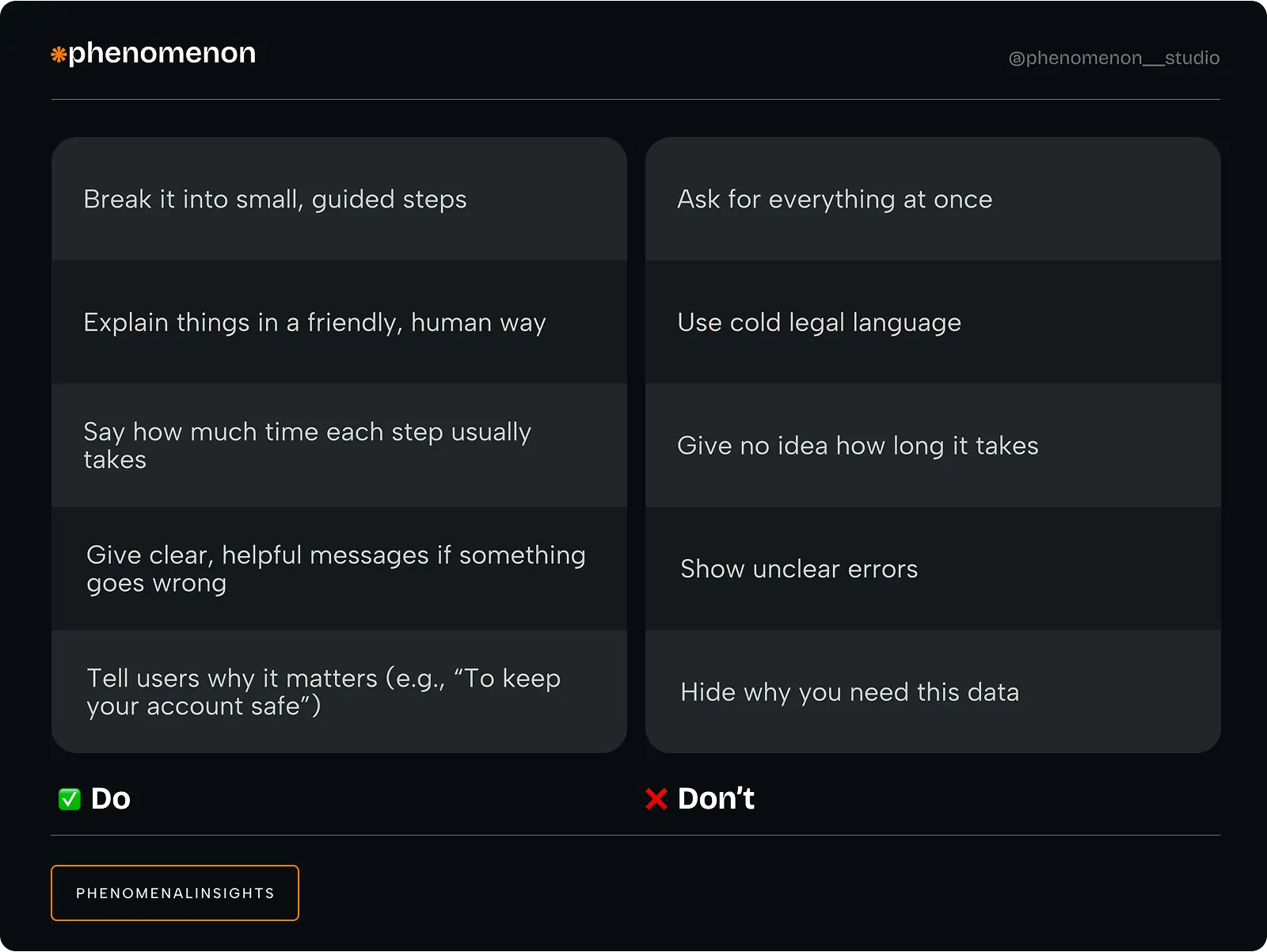
Our case
In a recent project, our team redesigned the onboarding for a mobile wallet with Solana integration. Their KYC drop-off rate was 62%. Users were abandoning the process at the document upload stage.
What we did:
- Replaced the 5-step KYC form with a step-by-step wizard and visual progress bar
- Added microcopy like “Takes less than 2 minutes”
- Used real-time photo validation
- Created illustrations and short explanations for each step
Results:
- Drop-off decreased from 62% → 27%
- Onboarding time reduced from 4.5 minutes → 1.9 minutes
- Verified user conversion rate rose by 38%
This directly impacted revenue, because verified users had higher deposit and transaction volume.
Feature Onboarding – Reaching First Value
Most FinTech users churn before they experience your product’s real value. Feature onboarding helps them take their first meaningful action:
- Send their first $10
- Set up savings
- Order their card
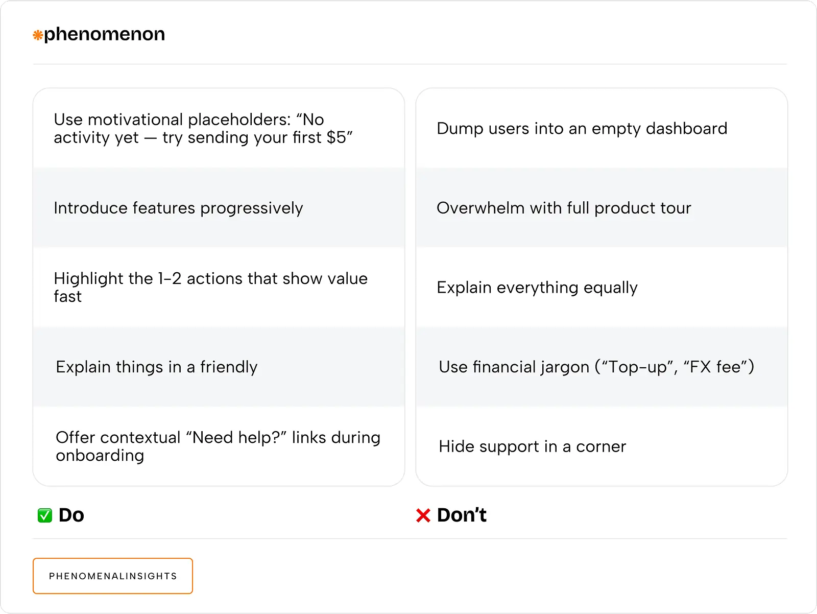
Real-case impact
In a wallet app, we noticed that 30% of users never completed their first transaction. By redesigning the empty dashboard state and adding a friendly prompt, we increased activation to 67% in just 3 weeks.
Ux finance work increasingly extends beyond the onboarding flow itself into the fintech app ui as a whole. A fintech ui design that nails the first KYC screen but reverts to cluttered, jargon-heavy interfaces on the dashboard behind it undoes most of that early trust. Fintech ui consistency, using the same visual language for progress indicators, security badges, and confirmation states throughout the product, reinforces the sense of safety that good onboarding establishes.
This matters because fintech developments in the interface layer rarely happen in isolation. User experience financial services teams build tends to feed forward: a user who trusted the KYC flow enters the dashboard already primed to trust the next interaction, while a user who felt friction early stays suspicious of every subsequent screen, even well-designed ones.
Personalized Onboarding – Aligning With User Goals
Personalization isn’t just for e-commerce. In FinTech, it helps guide users to the right tools for their goals — whether that’s saving for travel, sending money home, or investing.
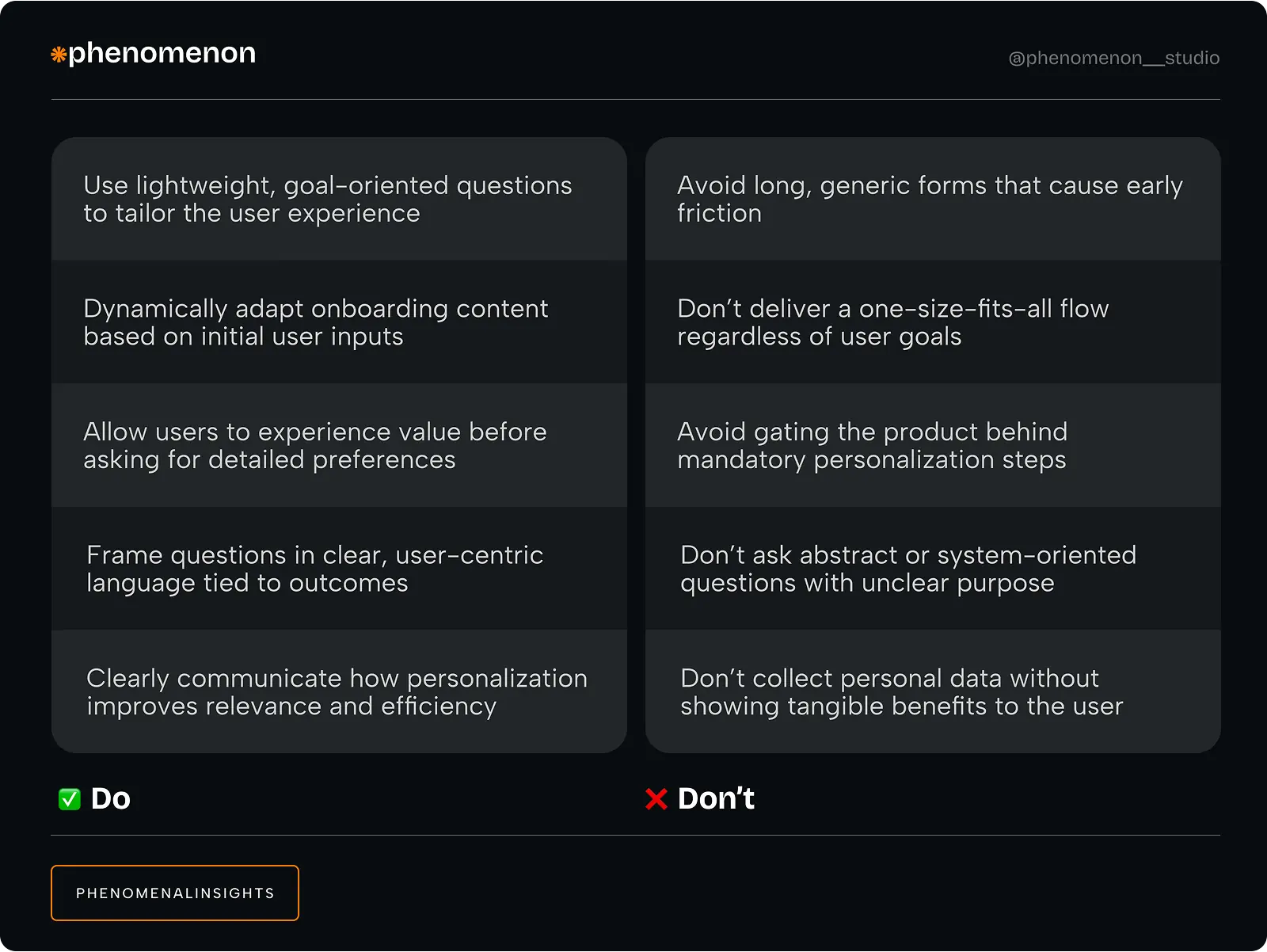
UX practices for FinTech onboarding that work
- Shorten & split: Replace long forms with a multi-step process. Show users one task at a time.
- Set expectations: Use microcopy to show how long things will take (“Takes ~90 seconds”).
- Gamify the flow: Use checkmarks, progress bars, and visual feedback to create a feeling of accomplishment.
- Trust signals: Add encryption badges, short privacy messages, and branded security visuals.
- Personalize: Ask only what’s needed. Use geolocation or previous behavior to adapt steps.
- Test relentlessly: Run A/B tests on onboarding variants. Measure activation, KYC completion, and time-to-first-transaction.
Why UX in onboarding = FinTech growth
Onboarding is your most leveraged moment. Every percentage point improvement:
- Reduces wasted CAC (Customer Acquisition Cost)
- Boosts activation rate
- Increases LTV (Lifetime Value)
- Lowers support costs
It’s not a design task. It’s a growth initiative.
UX isn’t just about how things look — it’s how they work, how they feel, and how users trust them.
Fast, friendly, and focused wins
When onboarding is designed with care, it can transform a hesitant visitor into a loyal, verified customer in minutes. When it’s not, it becomes a silent growth killer.
If you’re building or scaling a FinTech product, ask yourself:
- Are you making people feel safe, or overwhelmed?
- Are you respecting their time, or wasting it?
- Is your onboarding designed for humans — or for lawyers?
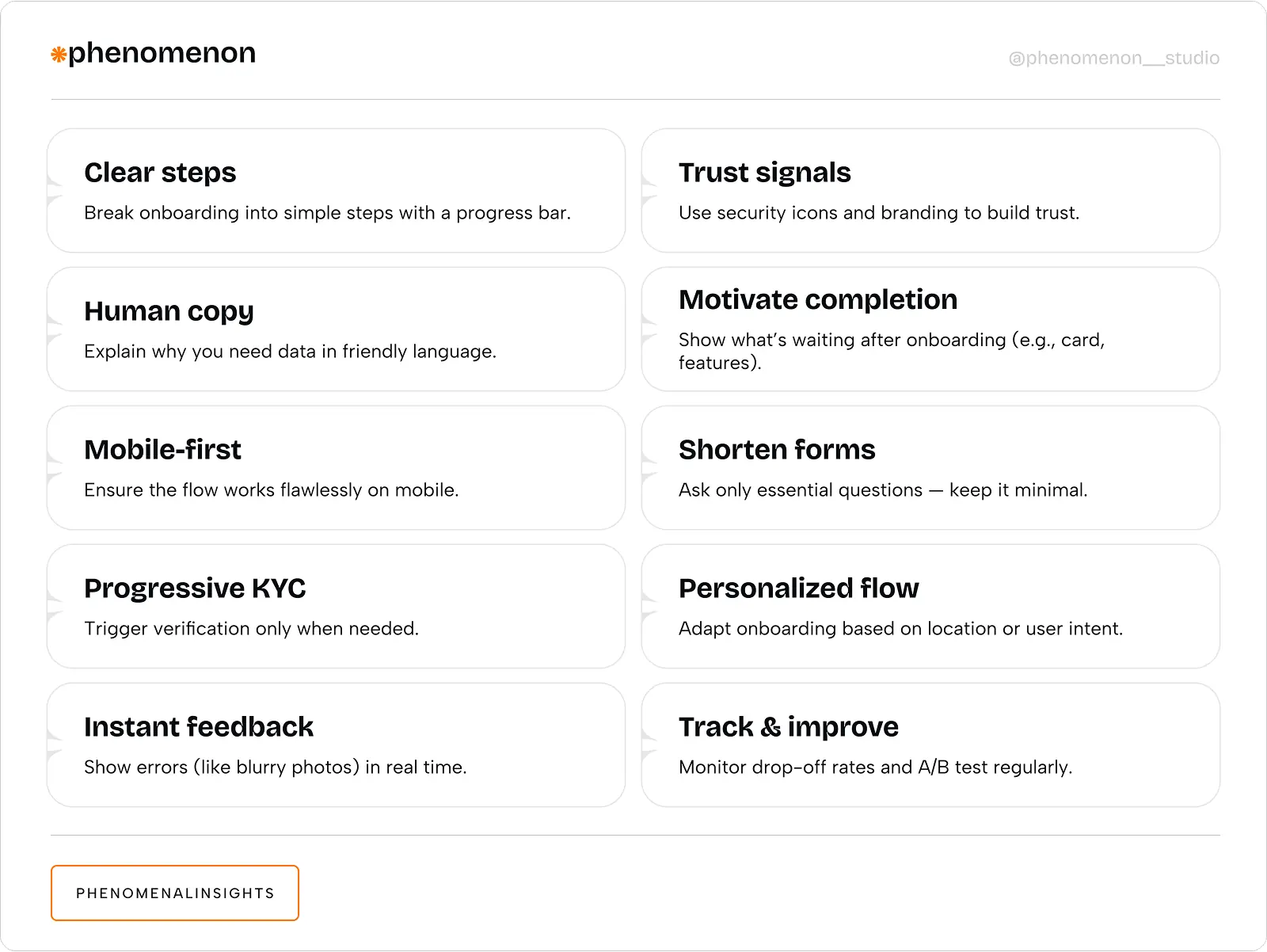
At Phenomenon studio, we use this 10-point onboarding checklist as a core framework when working with FinTech products. Whether we’re improving feature onboarding flow, optimizing time-to-value, or reducing user drop-off, this list helps us stay focused on what really matters: clarity, trust, and speed. It’s not just a guideline — it’s part of our process.
Fintech website design deserves the same scrutiny as the in-app experience, since many users evaluate trustworthiness before they ever create an account. A fintech website design that leads with vague marketing language instead of concrete security credentials sets the wrong expectation before onboarding even begins.
Invest in UX early. Because onboarding is not the beginning of a journey — it is the journey.
Share this article with friends



Sep 29, 2026
6 min read
B2B website redesign without losing traffic: A complete b2b website redesign guide covering UX audits, 301 redirect mapping, and metadata preservation. Partner with a top b2b website redesign agency that boosts conversions while protecting your organic rankings.

Sep 29, 2026
8 min read
Small business web design services that fit your budget. Get affordable small business website design from one of the best website design companies for small business — with transparent pricing and no hidden fees.
