Design
Development
Research
Launch
Evolve
Extend
Jun 24, 2026
8 min read
summary
Discover how transparent exchange rates in multi-currency UX improve trust, reduce cart abandonment, and boost ecommerce conversions by up to 35%. Learn best practices for global checkout experiences.
Showing the real exchange rate, the fee, and the final amount before a user confirms a transaction is the single change that moves multi-currency fintech conversion rates the most, and the redesign of the KlickEx cross-border payments platform is one documented example of what that looks like in practice.
Core Facts
- Baymard Institute’s research across large ecommerce checkouts puts average cart abandonment at 70.19%, with unexpected costs revealed late in the process as the leading cause (Baymard Institute, 2025).
- On the KlickEx cross-border payments platform, a transparent pricing calculator helped lift the Add Money flow by 35.3% and the Money Transfer flow by 30.7%.
- A 2025 Morning Consult survey conducted for Wise found that 92% of European banks studied were not transparent about their currency conversion fees.
- Swift’s global payments survey found that 70% of consumers and small businesses would not use a payment provider again after encountering a hidden fee (Swift, 2023).
Oleksandr Kostiuchenko | Marketing Manager, June 24, 2026.
Why Currency Confusion Kills Conversion Before It Reaches Checkout
A user converting two hundred dollars into euros has one question in mind: how much actually arrives. When a product hides that number behind a vague “rates may vary” disclaimer, or reveals the real total only after card details are already entered, the platform has manufactured its own abandonment problem.
Baymard Institute’s checkout research, built from testing large ecommerce platforms including Amazon and Wayfair, found that unexpected costs are the leading cause of abandoned transactions, and that better checkout design alone can lift conversion by as much as 35.26% on large sites (Baymard Institute, 2025). Multi-currency products tend to amplify that exact failure mode. A domestic checkout hides a shipping fee. A cross-border payment hides an exchange rate margin, and the margin is often the largest line item in the entire transaction.
According to Baymard Institute, the average large ecommerce site can recover up to 35.26% in lost conversions through better checkout design, with unexpected costs cited as the single most common cause of abandonment. — Baymard Institute, 2025
Multi-currency UX design exists to close the gap between what a system calculates and what a user sees before committing to it. Get the visible math wrong and no amount of accurate backend currency conversion saves the conversion rate. Get it right, and the screen showing the exchange rate becomes one of the highest-converting moments in the flow, not the point where people leave.
Fintech UX Design: Why the Math Has to Be Visible, Not Just Accurate
A payments engine can compute an exchange rate correctly to six decimal places and still lose a user’s trust if the interface never shows that work. Fintech UX design carries a burden most consumer software does not: every screen doubles as a financial disclosure. Users are not browsing. They are deciding whether to hand over money, based on numbers they can verify in their own head.
That changes what “good UX” means for currency screens. A generic product team optimizes for fewer taps. A fintech UX design team optimizes for fewer taps and zero ambiguity about cost, and those two goals occasionally pull against each other. Compressing a fee breakdown into one line saves screen space. It also removes the one detail that builds trust.
Fintech UX: Where Currency Math Meets Trust
Fintech UX sits at the exact point where a conversion rate, a fee structure, and a user’s bank balance intersect on a single screen. Three things have to be true at once. The displayed rate has to match the rate actually applied. The fee, where one exists, has to be visible before the user confirms, not buried in a later statement. And the final amount in the recipient’s currency has to be the headline number, not a rate the user has to translate by hand.
Miss any one of those and a platform with technically correct math still reads as untrustworthy. A product manager who hears “users don’t trust us” usually assumes a branding problem. Often it is a currency display problem wearing a branding costume.
Case Study: How KlickEx Turned Its Most Confusing Screen Into Its Highest-Converting One
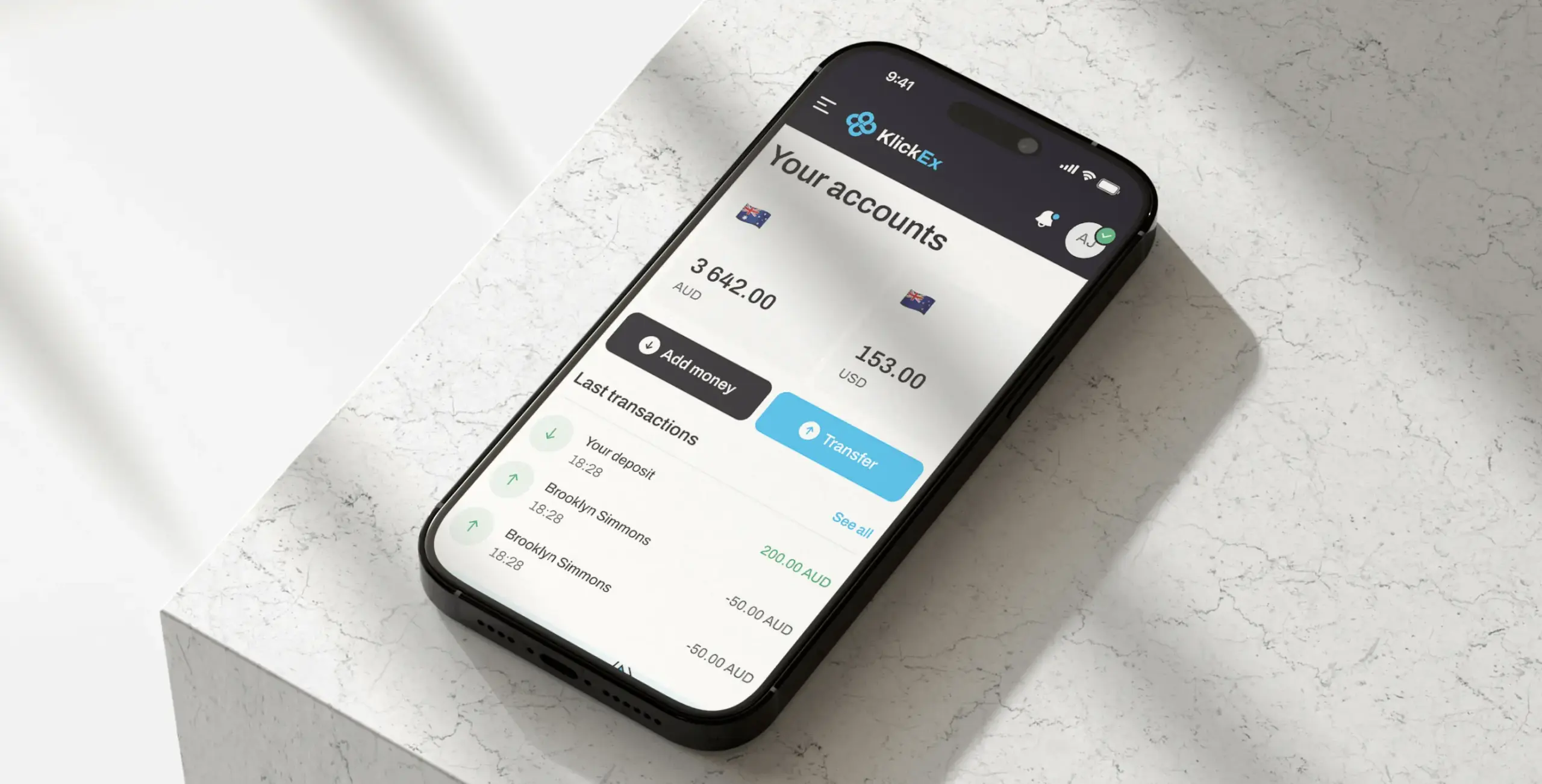
Task
KlickEx connects Pacific Island communities across nine nations through cross-border money transfers and mobile top-ups, serving migrant workers who often had no intuitive digital alternative to slow, paperwork-heavy banking. Multiple currency conversions and exchange rates made it difficult for users to understand what amount would actually reach the recipient, and that ambiguity sat in the middle of the platform’s core transaction flow.
Solution
Phenomenon Studio ran a UX audit of the existing platform, mapped the friction inside the Add Money and Money Transfer flows, and replaced the opaque conversion step with a transparent pricing calculator that shows the exact exchange rate and fees upfront, with the final amount displayed in both the sending and receiving currency. The redesign paired a mobile-first interface with a simplified KYC verification flow, a friction point covered separately in our broader research on fintech onboarding and verification design, since the same users abandoning over currency confusion were also dropping out during identity checks.
Result
The Add Money flow improved by 35.3% and the Money Transfer flow improved by 30.7%. The mobile-first redesign reached a 54.8% completion rate. KlickEx now serves 53,000 active users with 3,000 new users joining every month, a 5.6% month-over-month growth rate.
One detail from the redesign explains why it worked. Early concepts considered showing multiple currency conversion options directly on the main transfer screen, a way to demonstrate everything the platform could do in a single view. User research showed the opposite effect: surfacing every option at once overwhelmed people who already found cross-border banking confusing. The team cut the screen down to one rate, one fee, one final number, and let users dig deeper only if they chose to. That subtraction, not an addition, is what carried both flows past 30% improvement.
The Anatomy of a Transparent Exchange Rate Display
Five elements separate a currency screen that converts from one that loses people at the worst possible moment.
The live rate comes first, shown as a real number rather than a generic disclaimer. “Rates fluctuate” tells a user nothing they can act on. “1 USD = 0.92 EUR, updated 3 minutes ago” tells them exactly what they are agreeing to.
The fee sits beside the rate, never folded inside it. Bundling a markup into the exchange rate and calling the transfer fee-free is the exact pattern that has eroded trust across European banking, where Wise’s 2025 research with Morning Consult found that 92% of banks studied were not transparent about currency conversion fees built into their rates.
A 2025 Morning Consult survey conducted for Wise found that 68% of consumers have switched, or would switch, international money transfer providers because of exchange rate markups. — Morning Consult for Wise, 2025
The final amount, in the recipient’s currency, gets the largest type on the screen. Everything else is supporting detail. If a user has to do subtraction to find the number that matters, the screen has failed its one job.
A freshness indicator, even a small timestamp, answers the question a user is already asking silently: is this rate still valid. Rates that go stale without warning create disputes after the fact, which cost more in support time than a timestamp ever costs in screen space.
And a named rate source closes the loop. “Based on the mid-market rate” or “Based on [provider] live rate” gives a user something to verify against, the same way a price tag gives a shopper something to compare.
Common Mistakes That Undo a Transparent Display
Showing the rate without the fee creates the appearance of transparency while hiding the actual cost from view.
Locking the rate too late in the flow, after a user has already committed mentally, recreates the exact bait-and-switch feeling that drives people to abandon a transfer.
Changing the displayed amount between the calculator screen and the confirmation screen, even for a legitimate reason like rate movement, reads to most users as a bug rather than market reality.
Consent Patterns for AI-Assisted Currency Conversion
A growing number of multi-currency products now let an automated agent act on a user’s behalf: convert funds when a rate crosses a threshold, top up a balance automatically before it runs out, or route a transfer through whichever currency path is cheapest that day. The moment a system, rather than a person, decides when money moves, the transparency bar gets higher, not lower. Three design patterns keep that kind of automation trustworthy instead of unsettling.
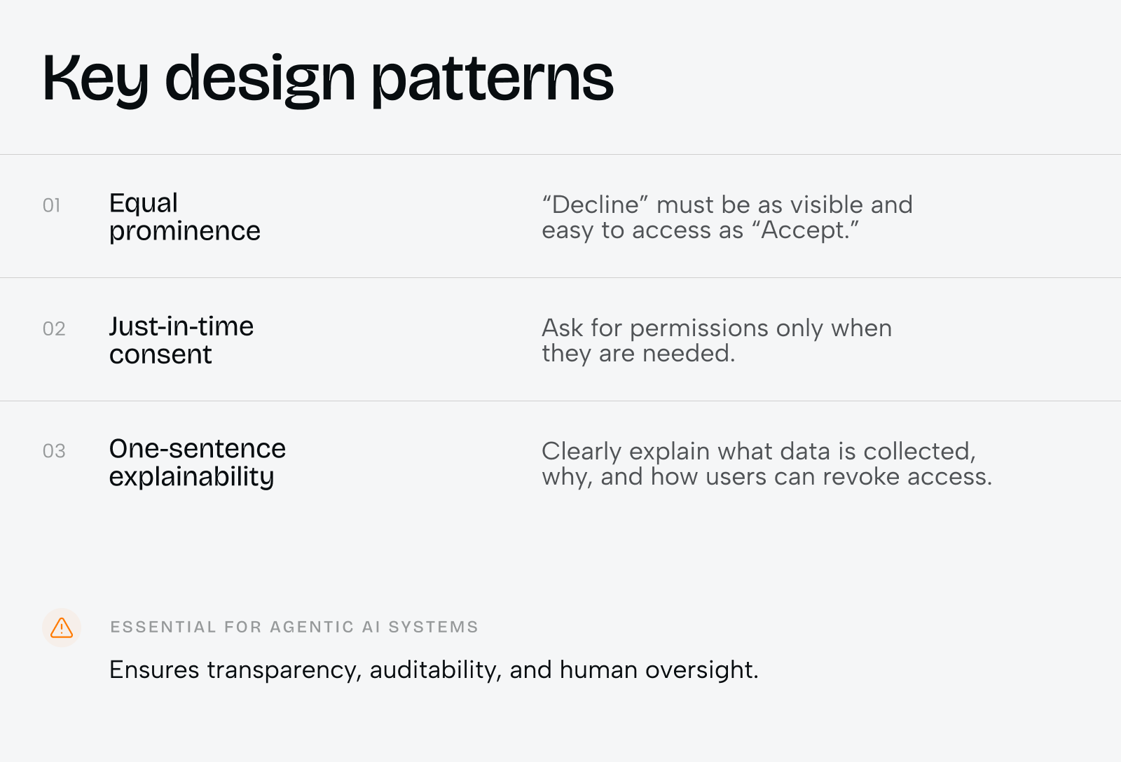
Equal prominence is the first. “Decline” needs to be exactly as visible and exactly as easy to tap as “Accept” when an agent asks permission to execute a conversion. A bright, primary-colored “Allow” button next to a gray, text-only “Not now” link is a dark pattern even when no one designed it with that intent.
Just-in-time consent is the second. An agent should ask for the ability to convert currency, hold a balance, or access a recipient’s bank details only at the moment that permission is actually needed, never as a blanket grant collected during onboarding and forgotten about afterward. A user who only sees a permission request when it’s relevant trusts the system more than one who was asked to approve everything upfront.
One-sentence explainability is the third. Before an agent converts a balance or moves money automatically, the interface owes the user one plain sentence: what is about to happen, why, and how to undo or revoke it. “Converting $500 to EUR at today’s rate because your balance dropped below your set minimum. Tap to cancel within 60 seconds” does more for trust than a settings page full of toggles ever will.
These three patterns matter most wherever an AI agent, not a person, triggers a financial action: they are what keeps automated currency conversion auditable and reversible rather than opaque, which is the difference between a feature users rely on and one they turn off.
The same logic that makes a currency screen trustworthy for a human, visible math, no hidden fees, a number that doesn’t move without explanation, applies with even less margin for error once an agent is the one pressing the button.
Opaque vs. Transparent Currency Display
| Element | Opaque Pattern | Transparent Pattern |
| Exchange rate | “Rates may vary” disclaimer | Live numeric rate with timestamp |
| Fee | Bundled into the rate, unlabeled | Shown as a separate, named line item |
| Final amount | Calculated only at confirmation | Shown upfront in both currencies |
| Rate source | Unstated | Named (mid-market or provider rate) |
Choosing a UI/UX Design Firm for Multi-Currency Fintech Products
Not every UI/UX design agency has worked on a currency screen, and the skills that make a team strong at consumer app design do not automatically transfer to financial transparency work. A UI/UX design firm evaluating a fintech brief should be asked directly how it has handled rate disclosure, fee transparency, and KYC friction together, because in cross-border products those three problems tend to show up on the same three screens.
What a Fintech Design Agency Should Bring to the Table
A fintech design agency worth hiring brings regulatory literacy alongside design skill. Currency, KYC, and cross-border compliance requirements vary by jurisdiction, and a design decision that works cleanly in one market can create a compliance gap in another. The agency should be asking about jurisdictional requirements before it sketches a single screen, not after.
Signs You’re Looking at the Right UI/UX Design Agency
A capable UI/UX design agency asks for real transaction data and real user research before proposing a redesign, rather than defaulting to a generic template. It shows prior fintech work with named clients and verifiable numbers, not vague claims about driving engagement. And it is direct about timeline: a focused UX audit of an existing currency flow typically runs four to six weeks, while a full redesign of the conversion and onboarding flow, including development, more often runs two to four months depending on how many markets and currencies are involved. An engagement at that scope typically involves a UX researcher, a product designer, and one or two engineers working alongside the client’s team.
As Rasika Raina, Senior Vice President of Cross-Border Payments at Mastercard, put it when discussing the same transparency gap, opaque pricing “causes unnecessary admin and worry for both people and business owners.”
Phenomenon Studio’s own work sits inside that range. The KlickEx engagement combined a UX audit, competitor analysis, and information architecture phase before moving into wireframes, design direction, and UI design, then into development with Next.js, TypeScript, and React Redux on the technical side.
What UI/UX Developers Need to Build Around Exchange Rates
Design intent only survives contact with real users if UI/UX developers build the supporting plumbing correctly. Four implementation details decide whether a transparent rate display actually stays transparent in production.
Rate freshness has to be enforced server-side, not just displayed client-side. A rate shown on screen and a rate applied at settlement need to come from the same source at close to the same moment, or the platform creates the exact discrepancy that erodes trust.
Rate locking during an active session prevents the experience where a user reviews a transfer, steps away for two minutes, and returns to a different number with no explanation. Most providers lock the displayed rate for a short window, often two to ten minutes, and surface a countdown so users understand why the number might change if they wait too long.
Rounding rules need to be consistent and disclosed. Currency conversion produces fractional amounts, and how a system rounds those fractions, in the platform’s favor, the user’s favor, or neutrally, is a policy decision disguised as a math detail. It belongs in the terms, not buried in code comments.
And the fee calculation has to be exposed through the same API response that carries the rate, rather than computed separately and reconciled later. Separating the two invites the kind of mismatch between displayed total and charged total that turns into support tickets and one-star reviews.
Working With a UX and UI Design Company on Currency Transparency
Teams that get multi-currency screens right rarely treat design and development as separate phases handed off in sequence. A UX and UI design company working on financial transparency needs its designers in the same room as the engineers who own the rate feed, because the constraints run in both directions. A design decision like showing rate freshness to the second, instead of the minute, carries a real backend cost. An engineering shortcut like batching rate updates every fifteen minutes carries a real design consequence: it turns the freshness indicator into a liability instead of a trust signal.
The question we hear most often from product teams who have tried to fix a currency screen on their own sounds simple: why did the new design test worse than the old one in usability sessions, even though it showed more information? The short answer is that more information is not the same as more clarity. The long answer is that without a designer and an engineer agreeing on which three numbers matter most before a single screen gets built, teams tend to add fields instead of removing ambiguity, and users punish the extra cognitive load even when every individual number on screen is accurate.
UX Design, UI Design: Where Each Discipline Touches the Currency Problem
Multi-currency products fail in two distinct ways, and the two failure modes map cleanly onto the difference between UX and UI. UX design and UI design as a pairing cover both halves of the same screen, but they are solving different problems.
UX vs UI Design in Multi-Currency Products
UX decides what information a currency screen needs to contain and in what order: rate, fee, final amount, freshness, source, in that priority. Get the UX wrong and a beautifully designed screen still confuses people, because the right facts are present in the wrong order, or buried under the wrong ones.
UI decides how that information reads at a glance: which number gets the largest type, which color signals “this is locked in” versus “this can still change,” how much visual weight a fee carries relative to the total. Get the UI wrong and a well-sequenced screen still feels untrustworthy, because the eye lands on the wrong number first.
Phenomenon Studio’s broader product design work, covered in more depth in our product strategy resources, treats UX research as the step that earns the right to start visual design, rather than running the two in parallel and reconciling disagreements after the fact.
Where to Start If Your Currency Screen Is Losing Users
A currency screen that hides its own math is rarely a deliberate choice. It is usually what happens when a transparent design gets de-scoped under deadline pressure, or when a backend team and a design team never compared notes on what “real-time rate” actually means to a user. Fixing it does not require rebuilding a payments platform from scratch. It requires rebuilding three screens with the right five elements in the right order, the way the KlickEx redesign did.
Full-cycle partnerships, where one team owns strategy, design, and development together, tend to close this kind of gap faster than handing a redesign to separate vendors for each piece. If a current onboarding or payment flow is losing users at the currency step, the fastest way to find out why is a focused UX audit of that exact screen, not a redesign of the whole product.
Share this opening with friends


Jun 12, 2026
8 min read
Discover what corporate website development companies in the USA actually deliver — from brand strategy and UX to custom code. Learn about pricing, timelines, and how to choose the right agency in 2026.

Jun 11, 2026
10 min read
Discover how a design system can cut development costs by 30%, accelerate time-to-market by 50%, improve product consistency, and support scalable growth.
Have a project in mind?
Let's chat
Have a project to
discuss?
discuss?

Have a partnership in
mind?
mind?
