Design
Development
Research
Launch
Evolve
Extend
Jun 28, 2026
7 min read
summary
Discover KYC UX best practices in FinTech. Learn how to balance compliance requirements with seamless user experience and improve onboarding conversion rates.
Key Takeaways
- 60% of prospective users abandon digital financial onboarding due to friction — most of it avoidable through sequencing, not simplification.
- Platforms that delay heavy KYC steps behind first-value delivery moments recover 20–35% of users who would otherwise abandon.
- Passive biometric liveness detection matches or outperforms active checks on both fraud resistance and conversion rate for standard consumer onboarding.
- The EU’s AMLR and mandatory EUDI Wallet integration (2026–2027) will make verified, single-tap onboarding the new competitive baseline across European markets.
By Oleksandr Kostiuchenko | Marketing Manager, Phenomenon Studio | July 2026
Effective KYC UX design applies progressive disclosure, friction budgeting, and risk-based biometric verification to reduce onboarding drop-off while satisfying AML, GDPR, and eIDAS 2.0 requirements. Studios and product teams that treat compliance as a design constraint — not a legal afterthought — consistently outperform on verified-user conversion.
KYC UX best practices: compliance as a product decision
Sixty percent of prospective users abandon digital financial onboarding before completing identity verification. Research from Signicat, Deloitte Digital, and cross-market neobank audits consistently returns this figure — and it does not describe a compliance problem. It describes a sequencing problem. When fintech ui design requires document uploads and liveness checks before a user has experienced any product value, the effort-to-motivation ratio is inverted. The user has no emotional capital to spend on a verification step.
Friction budgeting changes this logic. Rather than eliminating compliance friction — which is both impossible and legally indefensible — it reallocates friction to the moments where user motivation is highest. A user who has completed a first transfer or received a virtual card will complete an identity verification step that would have driven them away on screen one. The compliance requirement has not changed. The timing has.
The question heard most often from FinTech founders after a conversion audit: why did drop-off persist even after reducing the number of screens? The answer is almost always sequencing, not screen count. Screens in the wrong order carry more friction than the same screens in the right order — because user motivation varies sharply across the journey.
Fintech UX: four-stage progressive disclosure architecture
| Stage | B2C Requirements | B2B Requirements | Highest Friction Point | Business Optimization Target |
| 1 — Intent & Setup | Name, phone, email, OTP verification | Business legal name, contact, expected usage | Excessive initial fields, generic disclaimers | One-screen design; no document request at entry |
| 2 — Core Identification | Passport or national ID upload | Business registration docs, corporate numbers | Low OCR accuracy, blurry captures, format restrictions | Real-time capture feedback; automatic input pre-fill |
| 3 — Verification & Ownership | Biometric selfie, passcode setup | UBO mapping, corporate identity documents | Complex corporate hierarchy, paper document uploads | Configurable risk rules; progressive data requests over time |
| 4 — Validation & Activation | Automated ID matching, risk scoring | Transaction volume, industry codes, geolocational profiles | Processing delays, bank integration timeouts | Real-time status messaging; background KYC; instant activation |
FinTech UX design: how leading neobanks operationalize compliance
The neobanks that lead on verified-user conversion share one structural decision: they treat compliance-driven steps as product moments, not legal interruptions. Their specific implementations differ; the underlying logic is identical.
FinTech design agency lens: five onboarding models compared
Revolut uses lifestyle branding — animated card previews, real-time capture feedback — to reframe compliance as product engagement. Every regulatory question pairs with a visual cue explaining why the input matters. If a document capture is blurry or too dark, the user sees the specific reason immediately rather than encountering a failed validation cycle after the session has closed. Trust features (card freeze, spending limits, biometric login) appear on the main dashboard from day one.
Monzo writes its entire interface in plain English with no banking jargon and embeds a guiding chatbot directly into the onboarding stream. Multi-device continuity removes a drop-off vector most teams overlook: a user who begins registration on desktop switches to their phone via QR code and continues exactly where they stopped.
Nubank uses progressive profiling — basic accounts open with minimal data, building product momentum before requesting sensitive documentation. Legal disclaimers are converted into protective explanations. The onboarding flow closes with empowering customization: personalized credit limits, interactive PIN setup. The compliance experience ends on user control, not regulatory completion.
Wise operates a modular compliance architecture with hosted, API, and hybrid KYC configurations. Partner platforms offload regional compliance updates to Wise entirely — the system dynamically adjusts verification requirements based on the user’s residence, currency, and transaction values. This model is especially relevant for multi-market operators who cannot maintain parallel compliance stacks across jurisdictions.
N26 operates as a fully licensed German bank under direct BaFin and ECB supervision. BaFin imposed a customer growth cap in 2022 due to compliance gaps — a concrete illustration of the business cost of under-investing in compliance architecture. N26 responded with AI-assisted microcopy generation integrated into Figma workspaces, combined with a ‘snack, bite, and meal’ progressive disclosure model: essential information on screen, deeper legal detail available on expansion.
| Platform | Core Approach | Primary Friction Strategy | Post-Onboarding Trust Signal | Business Fit |
| Revolut | Bold, lifestyle-led engagement | Real-time capture feedback; single-screen micro-actions | Card freeze toggle, biometric controls surfaced on dashboard | Consumer; high acquisition volume |
| Monzo | Conversational, plain-English | Multi-device continuity; in-app guided support | Real-time transaction categories; smartwatch sync | Consumer; high support-cost reduction |
| Nubank | Progressive, human-centered | Deferred identity; inline compliance explanations | Personalized credit sliders; custom PIN setup | Emerging markets; trust-building at scale |
| Wise | Modular, multi-jurisdiction | Dynamic regional form scaling; background verification | Mid-market rate display; zero hidden fees; progress bars | Cross-border; B2B and consumer remittance |
| N26 | Licensed bank; disciplined compliance | Progressive disclosure; AI-assisted compliance microcopy | Transaction decline explanations; geolocated merchant tracking | EU regulated market; B2C banking |
What the Best Neobanks Have in Common
Despite significant differences in geography, regulation, and business models, the highest-performing neobanks share a common philosophy: compliance should feel helpful, not obstructive. Whether through Revolut’s real-time feedback, Monzo’s conversational guidance, Nubank’s progressive profiling, Wise’s adaptive verification architecture, or N26’s layered disclosure model, each organization applies the same underlying design logic.
These approaches can be distilled into three UX principles that consistently improve onboarding completion rates while maintaining regulatory compliance.
Together, these principles help maintain transparency, support auditability, and strengthen user trust while reducing onboarding abandonment. For fintech teams operating in increasingly regulated markets, they provide a practical framework for balancing conversion goals with compliance obligations.
Compliance user experience: microcopy, error states, and trust signals
How a platform communicates regulatory requirements determines whether users complete them. Vague microcopy and generic error messages are primary conversion killers — and they are entirely within the design team’s control. Forrester Research data shows specific, actionable error messages increase payment retry completion rates by up to 40%. In a financial context, vague errors carry an additional cost: users interpret them as evidence the platform cannot handle edge cases safely.
According to Forrester Research (2024), specific and actionable error messages increase checkout and payment retry completion rates by up to 40% — with the effect amplified in financial services, where trust is the primary conversion variable.
The business case is direct. ‘Something went wrong. Please try again’ restores no confidence. ‘Your bank declined this transfer — check your balance or try a different account’ gives an immediate path forward and signals the system understood what happened. Three microcopy principles drive the highest return for FinTech operators:
- Replace procedural instructions with outcome-focused language. ‘Submit documentation’ becomes ‘Upload your passport photo and selfie.’ ‘We need your information’ becomes ‘We ask for this to keep your account secure and meet KYC regulations.’
- Surface trust signals early — SSL indicators next to account-linking buttons, HIPAA or GDPR compliance badges at document capture points — not buried in a terms page.
- Implement abandon-recovery workflows. A personalized push notification or email 24–48 hours after mid-flow drop-off, with a deep link back to the exact paused step, recovers a measurable portion of abandoned verifications without manual support intervention.
“The most effective compliance UX is invisible to the user and non-negotiable to the regulator. When design teams treat those as opposing forces, they lose both battles. When they treat compliance as a design constraint, they build products that pass audits and earn trust simultaneously.” — Phenomenon Studio, UX Strategy Practice
UI UX developers and biometric verification: the business decision
Biometric authentication has replaced passwords and SMS-based OTPs as the standard for modern FinTech onboarding — not as a design preference, but as a structural necessity. Passwords generate high support costs: reset flows account for 20–30% of customer service volume in traditional banking. SMS OTPs are increasingly compromised via SIM swapping. FIDO Alliance data shows 87% of consumers prefer biometric login over passwords in financial applications.
According to the FIDO Alliance (2024), 87% of consumers prefer biometric authentication over passwords in financial applications — citing speed, security perception, and reduced friction as the primary drivers.
The business-level decision for FinTech operators is not whether to use biometrics — that is settled — but which liveness detection model to deploy. Three options define the market, each with distinct implications for conversion rate, compliance posture, and user experience.
Active liveness requires the user to blink, smile, or rotate their head in response to on-screen prompts. It provides strong psychological reassurance to risk teams who want a visible security barrier. It also increases abandonment — particularly for older users, users in poor lighting, and users with accessibility needs — and faces growing vulnerability to pre-recorded video injection attacks.
Passive liveness operates invisibly during a standard selfie capture. Advanced AI models analyze facial depth and subcutaneous patterns from a single still image — no user action required. Passive liveness reduces onboarding drop-off, accommodates all user profiles, and certified passive models consistently outperform active systems against sophisticated deepfakes. The friction here is internal: risk teams accustomed to visible security steps sometimes resist a system users do not notice.
Hybrid models resolve this conflict by running passive liveness by default and triggering active challenges only when specific risk thresholds are crossed — borderline confidence scores, high-risk geographies, or transaction volumes above standard initial limits. Friction applies precisely where risk justifies it.
| Model | User Experience | Conversion Impact | Fraud Resistance | Best Fit |
| Active Liveness | High friction — physical actions required | Negative — measurable drop-off increase | Strong vs. basic spoofs; vulnerable to video injection | Ultra-high-risk transactions, credit applications |
| Passive Liveness | Zero friction — standard selfie capture | Positive — near-instantaneous completion | Strong vs. deepfakes when certified | Standard consumer onboarding, recurring logins |
| Hybrid Model | Minimal — active only on risk trigger | Balanced — friction applied to high-risk cohorts only | High — combines strengths of both models | Cross-border remittance, neobanks, crypto platforms |
UX and UI design company responsibilities under GDPR and AML
Design choices in regulated financial products carry legal weight. Two overlapping frameworks govern most decisions a FinTech product team will face: GDPR and the EU Anti-Money Laundering framework currently being unified across all 27 member states.
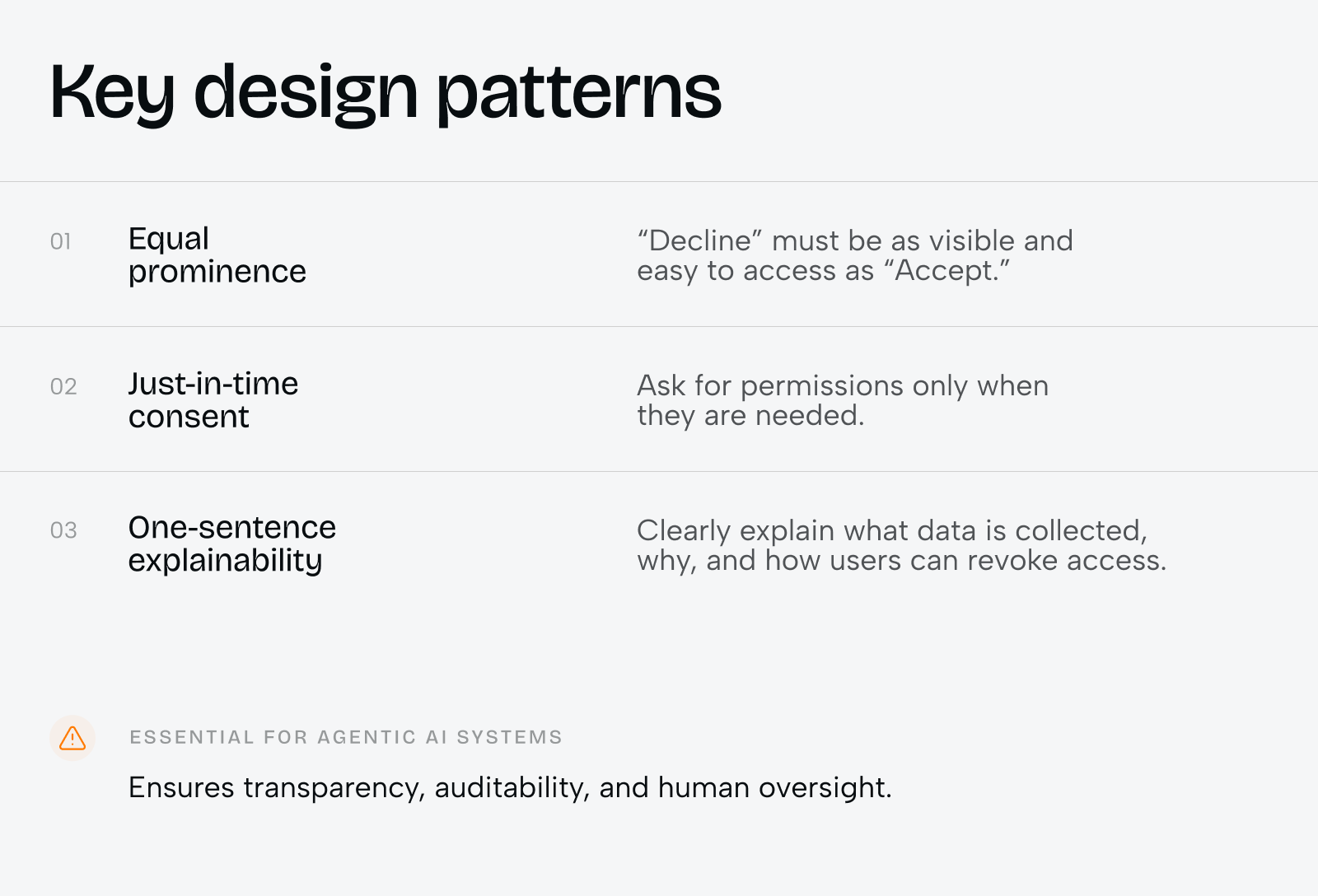
Under GDPR Article 25, Privacy by Design and Privacy by Default are legal requirements. Data protection controls must be built into the product from the earliest planning stage — not added at compliance review. For biometric data specifically, GDPR Article 9 mandates explicit consent before processing. Three design patterns resolve this without dark patterns: equal-prominence decline options (hiding the ‘decline’ button behind sub-menus is classified as an illegal dark pattern), just-in-time consent surfaced at the moment a feature is introduced, and one-sentence explainability covering what is collected, why it is necessary, and how the user revokes consent.
Case study: Klickex — fintech conversion optimization in a regulated multi-market product
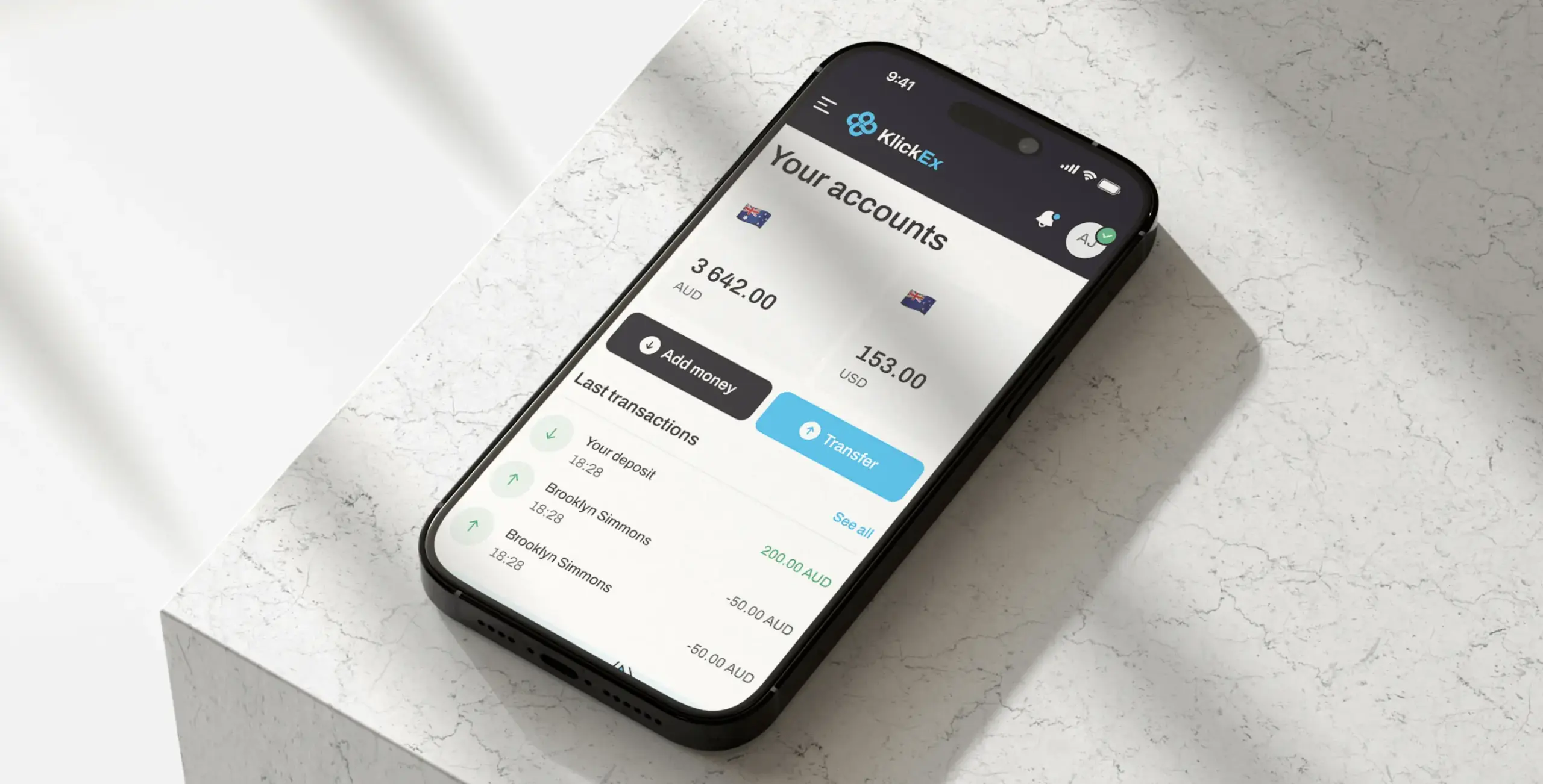
Klickex is a cross-jurisdiction remittance platform operating across Pacific Island nations — a regulated, multi-currency environment with fragmented local compliance requirements and users who have limited tolerance for onboarding friction.
Task
Users were reaching the platform with genuine remittance intent but abandoning before completing identity verification. The onboarding flow front-loaded compliance steps before users had seen any product value — a structural mismatch between user motivation and effort. Multi-currency UX was inconsistent across transaction corridors. Exchange rate transparency was absent at the moments users needed it most to commit to a transfer.
Solution
Phenomenon Studio redesigned the full onboarding and transaction flow with a progressive disclosure architecture, sequencing identity verification behind a first-value delivery moment. Exchange rate transparency — mid-market rate display, fee summary, and recipient amount — was surfaced at the point of transaction intent, not on a separate rates page. UI and UX design unified the visual language across all currency corridors, eliminating inconsistency that was reading as institutional fragmentation to new users. Real-time status messaging replaced blank wait screens during background compliance checks.
Result
Verified-user conversion increased by 35%. The platform added 3,000 net new monthly active users following launch. Both results came from design decisions — not feature additions, not marketing spend, not pricing changes. The conversion lift came from restructuring when compliance friction was asked of the user, and from making compliance visible enough to be trusted without making it heavy enough to cause abandonment.
“Phenomenon Studio redesigned our onboarding and transaction flows with a compliance-first, conversion-aware approach. The 35% lift in verified-user conversion and 3,000 net new monthly active users were direct outcomes of those design decisions.” — Klickex Product Team
Multi-currency UX and exchange rate transparency
Multi-currency UX is one of the most underrated conversion variables in cross-border FinTech. Users abandoning a remittance flow mid-transaction frequently cite confusion as the trigger — they cannot confirm whether the displayed rate is what their recipient will receive, when the rate locks, or whether the fee is already included in the quoted amount. Exchange rate transparency resolves this, but only when surfaced at the decision moment, not on a separate rates page.
Best practice positions the exchange rate, fee summary, and recipient amount in a persistent summary bar throughout the transaction flow. Where rates lock at transaction initiation, the lock confirmation must be explicit: ‘This rate is locked for 30 minutes. Your recipient will receive exactly [amount].’ For multi-currency products spanning multiple geographic corridors, ui ux branding design services that unify the visual language across corridors remove an additional trust barrier: inconsistency across markets reads as institutional fragmentation. Users who encounter a different visual experience for different currency pairs question whether they are using the same product.
UX design and UI design for the post-AMLR landscape
The EU is replacing its patchwork of national AML regulations with a unified framework standardizing compliance across all 27 member states. For FinTech operators, the business implications are concrete.
Harmonized Customer Due Diligence allows multi-market operators to run a single standardized CDD workflow across Europe rather than maintaining parallel compliance stacks per jurisdiction — a meaningful reduction in ongoing compliance-maintenance cost. Stricter Beneficial Ownership thresholds (25% for standard sectors, 15% for high-risk) create the opposite dynamic for B2B onboarding: complex corporate hierarchies must be captured and verified through the product interface without overwhelming the corporate user. This requires B2B-focused fintechs to redesign their onboarding information architecture around progressive UBO mapping rather than single document-upload events.
The EUDI Wallet mandate is the most consequential structural shift. All EU financial institutions must support EUDI Wallet integration by 2026 and meet the eIDAS 2.0 ‘High’ assurance level for AML onboarding by 2027. For users with a compliant EUDI Wallet, this eliminates manual document scanning and liveness checks for standard-risk scenarios entirely — a single authenticated tap shares pre-verified identity credentials.
According to the European Banking Authority (2024), all EU financial institutions must support EUDI Wallet integration by 2026 and meet eIDAS 2.0 ‘High’ assurance level for AML onboarding by 2027 — making single-tap verified onboarding the new compliance baseline across European markets.
Innovative UI UX design services for FinTech: what an engagement looks like
Regulated FinTech product work is not a standard digital design engagement. The team needs compliance literacy to make design decisions that do not require legal sign-off at every step. Phenomenon Studio structures FinTech onboarding engagements to front-load compliance mapping in discovery, so the design system is compliant by construction rather than corrected after the fact.
A KYC UX redesign or new-product onboarding build typically involves two senior product designers, a UX researcher, a compliance-aware content designer, and a project manager — with a compliance consultant embedded during discovery for platforms operating under HIPAA or multi-jurisdiction AML requirements. Timelines run six to twelve weeks depending on scope and third-party KYC vendor complexity.
Phenomenon Studio holds a 5.0 rating on Clutch across 50+ verified reviews, has supported companies that collectively raised over $500M, and is HIPAA-certified. If your onboarding conversion rate is below market benchmarks — or an upcoming AMLR or eIDAS 2.0 update requires a compliance architecture change — a 30-minute working call with our team surfaces specific, actionable changes without obligation.
Share this opening with friends


Jun 29, 2026
8 min read
React vs. Angular vs. Vue for web app development is a question most agencies answer with a blog post. Phenomenon answers it with a project brief. Our web development with React practice covers most product work — Angular web development comes in when the architecture demands it, and that distinction matters more than the framework […]

Jun 29, 2026
7 min read
Healthcare website development for teams that can’t afford to get the details wrong. Phenomenon builds web healthcare platforms and healthcare website design that accounts for HIPAA requirements, patient trust, and clinical workflow — not just the visual layer that everyone sees on launch day.
Have a project in mind?
Let's chat
Have a project to
discuss?
discuss?

Have a partnership in
mind?
mind?
