



Oct 16, 2025
9 min read
summary
Dark and light themes extend far beyond aesthetics — they shape how users perceive, interact with, and trust digital products.
For many users, dark mode has become more than just a trend — it’s a standard feature in operating systems. With the release of iOS 13 and Android 10, it became widely available, and users quickly embraced it. Research from forms.app shows that about 82% of Android users prefer dark mode, while among iOS users, the share ranges from 55% to 70%.
But beyond the hype, the question remains: does dark mode actually improve user experience, or is it just another design trend?
In this article, we’ll cover:
- How interface colors shape perception, comfort, and emotional connection with users.
- Designing with accessibility in mind to ensure usability for all.
- The real effects of dark mode on battery life and energy use.
- Strategies for creating thoughtful, context-aware themes rather than simple color swaps.
How dark and light modes shape user experience
Color themes don’t just change the look of an interface — they influence how users read, feel, and emotionally connect with a product. From readability and eye comfort to brand perception, the choice between dark and light mode carries more weight than simple aesthetics.
Readability and context: how mode affects content perception
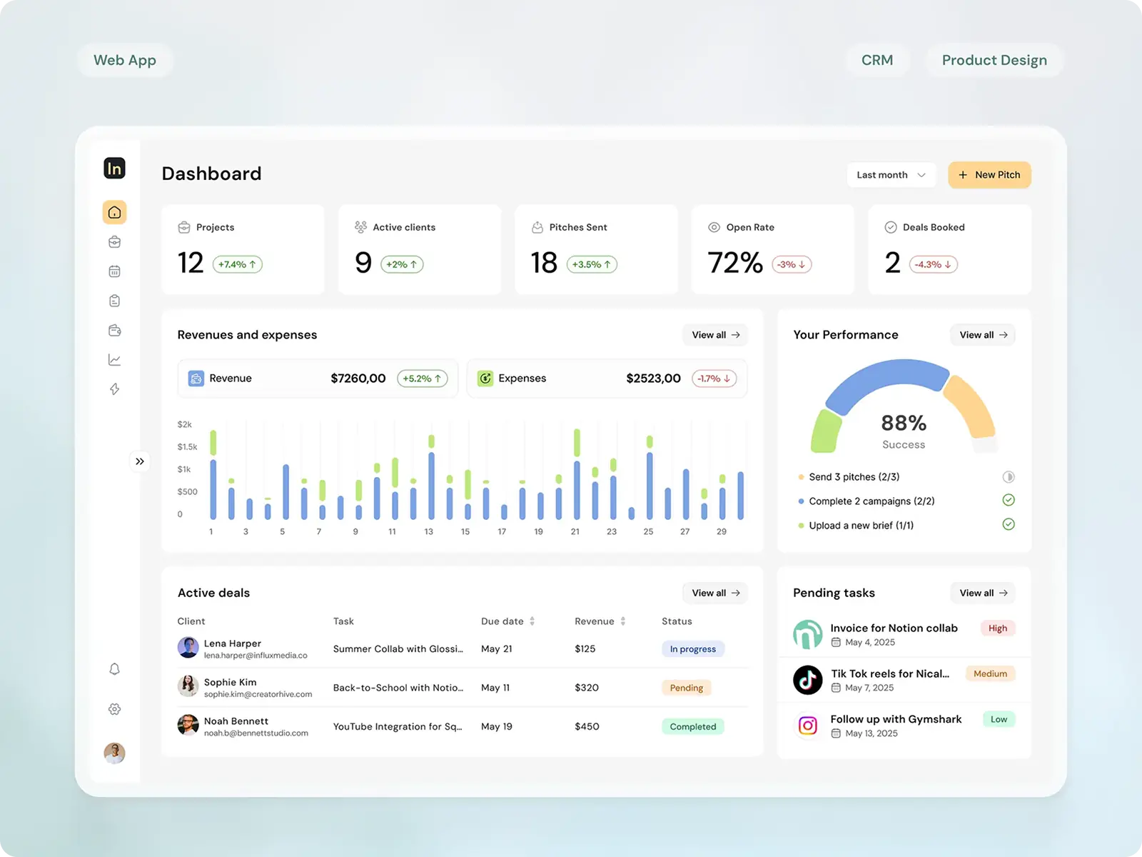
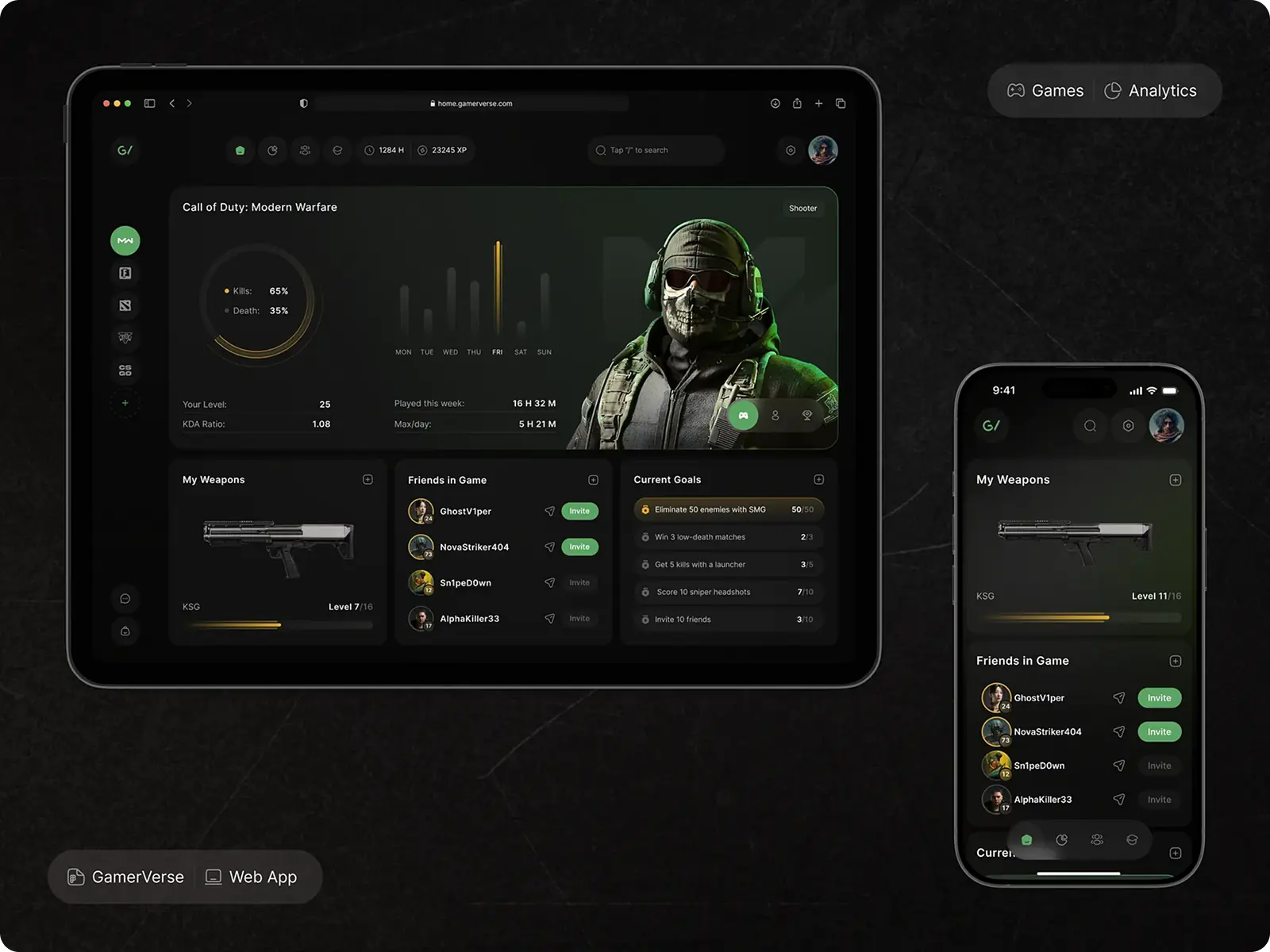
The way users perceive information depends heavily on background and contrast. Light mode generally offers better readability in bright conditions and feels familiar to most users. Dark mode can reduce glare and help focus in dim settings, though it may sometimes sacrifice legibility during long reading sessions. Nielsen Norman Group studies suggest there’s no universal “winner” — factors like ambient light, font size, and screen quality all influence readability.
The optimal mode often depends on how and where users interact with your product:
🌑 Dark mode: night reading, gaming, streaming, or design tools with heavy visuals.
🌕 Light mode: daytime reading, work apps, documentation, or long-form content.
In short, content type + environment = best mode.
Vision and comfort: the physiological side of dark vs light
A common belief is that dark mode is universally better for eye health; however, research from NLM shows the reality is more nuanced.
- In low-light environments, dark mode can reduce glare and visual discomfort, helping users maintain focus for longer periods.
- Conversely, in bright conditions, dark backgrounds can cause pupils to dilate, which may increase visual fatigue and reduce legibility.
ResearchGate studies in human-computer interaction and vision science suggest that factors such as ambient light, screen brightness, font size, and viewing distance all significantly influence visual comfort.
The healthiest approach isn’t to commit to a single mode permanently, but to adapt the interface to the user’s context. Providing flexible color options and encouraging mode-switching based on lighting and task type can help optimize comfort and usability across diverse environments.
Emotional perception and brand aesthetics: shaping user trust and identity
Color modes influence more than usability — they also shape how users emotionally perceive a product and its brand. Research in color psychology shows that:
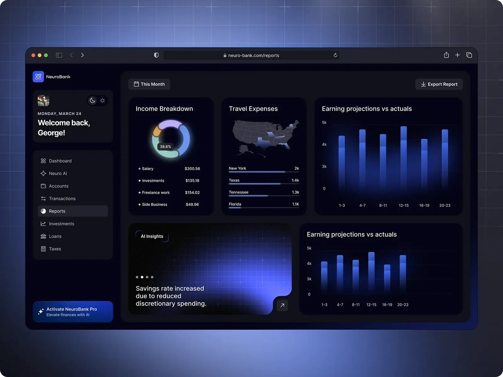
- Darker palettes often evoke associations with luxury, sophistication, and depth, which is why industries like fintech, entertainment, and creative tools frequently lean on dark interfaces.
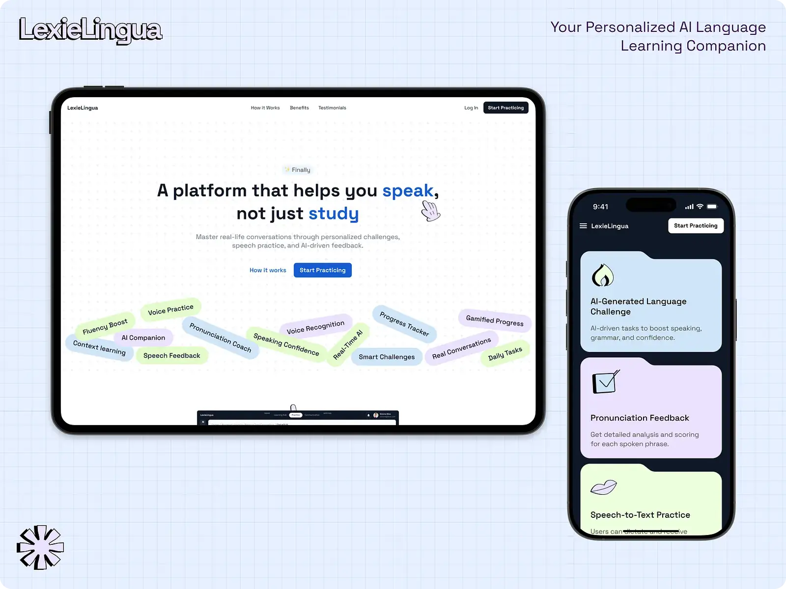
- Lighter palettes, on the other hand, are commonly associated with openness, clarity, and friendliness, making them well-suited for productivity apps, healthcare platforms, and educational tools where approachability and trust are key.
Choosing between light and dark modes is therefore not only a functional design choice, but also a strategic branding decision. Studies in human–computer interaction emphasize that visual design directly impacts users’ trust, emotional engagement, and even perceived credibility of digital products. In this sense, color modes act as part of brand storytelling, reinforcing the values and personality a product aims to convey.
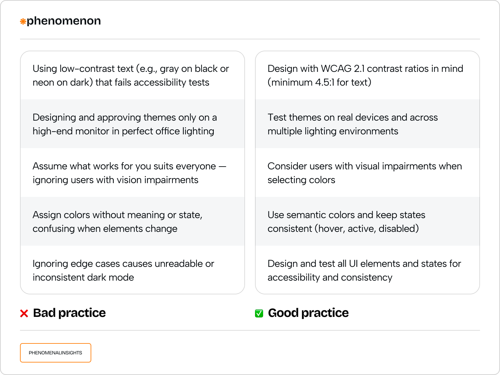
Accessibility isn’t optional
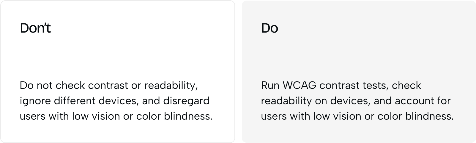
Accessibility isn’t just a checklist — it’s a core part of user experience. Yet when products adopt dark mode, accessibility often becomes an afterthought. Many dark color schemes fail to meet WCAG contrast standards, making content difficult to read. Research shows that 83.9% of major web pages have insufficient text contrast, making reading difficult — particularly for users with visual impairments, astigmatism, light sensitivity, or when subtle accent colors reduce clarity.
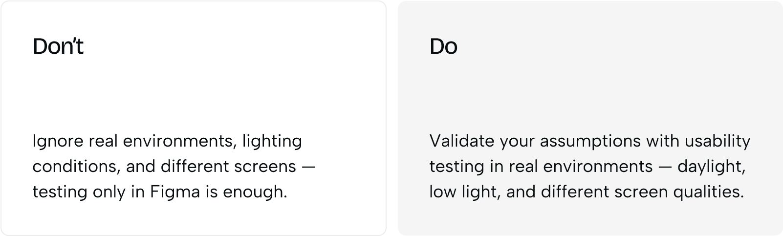
It’s important to remember that accessibility isn’t solved in Figma alone. Palettes need to be tested on real devices, under different lighting conditions, and with actual users. What looks sleek in a mockup can quickly become unusable in practice. Designing for accessibility means balancing aesthetics with clarity, inclusivity, and real-world usability.
Energy consumption: real savings or myth?
One of the main arguments for dark mode is battery life — but the impact depends heavily on screen type, brightness, and content.
- OLED/AMOLED screens: Dark mode can noticeably save power because each pixel emits its own light and turns off completely for black. Studies from Purdue University suggest that at moderate brightness (30–50%), dark mode can reduce energy use by 3–9%. However, at full brightness, savings drop significantly, even up to 63% in some cases.
- LCD screens: Dark mode barely affects energy consumption since the backlight is always on, regardless of content.
Interesting fact: many people crank up brightness when using dark mode, often negating potential savings. For example, a BBC study found that 80% of users increase brightness in dark mode, reducing any battery benefit.
When to Bring In a UX Design Agency for Theme Decisions
Everything covered above, contrast ratios, OLED power curves, emotional color associations, sounds straightforward in isolation. Coordinating all of it across a real product, tested on real devices with real users, is where most internal teams hit a wall. That’s usually when the search for a ux design agency starts.
A thorough ux design audit is often the fastest way to find out whether an existing dark mode implementation is actually failing WCAG contrast standards, the exact problem affecting 83.9% of major web pages according to the research cited earlier. A ux design company running that audit should test palettes on physical devices under varying light conditions, not just review Figma mockups, since the gap between a mockup and real-world legibility is exactly where most dark mode implementations fail.
Ux design services covering both light and dark themes require more coordination than they first appear to. A single ux design consulting firm engagement can define the token system, color relationships, and contrast rules once, then apply that logic consistently across both modes, rather than treating dark mode as an afterthought retrofitted onto an existing light-mode design.
Different verticals weigh this decision differently. Ux design for edtech products, for instance, tends to favor light mode by default given the trust and approachability associations covered earlier, while entertainment and creative tools lean toward dark mode’s luxury and depth associations. A strong ux design agency will ask about your specific industry and user context before defaulting to either mode.
When evaluating a ux design company for this kind of work, reviewing ux design portfolios for prior dark-mode or accessibility-focused projects matters more than general visual polish. Top ux design firms in this space will show contrast-testing data alongside final screens, not just the finished aesthetic. Whether the team is based in ux design delaware, ux design georgia, or works fully remote, this evidence-based process should look the same.
Ux design vs ui design confusion sometimes clouds this evaluation. A ux design vs ui distinction matters here specifically: a strong ux design website or ux design web presence from a candidate agency signals visual competence, but the actual dark-mode decision, when to use it, how to test it, how to avoid the brightness-creep problem covered in the Energy Consumption section, is a UX research question, not a UI design one. Even something as small as a ux design logo choice, dark backgrounds reading as more premium, light backgrounds reading as more approachable, echoes the same emotional-perception research covered earlier in this guide.
Dark vs light is a design decision, not a switch
Designing for dark and light modes is not just about flipping colors. It’s about making deliberate choices that balance readability, accessibility, and brand voice. A well-crafted theme doesn’t happen by accident — it’s the result of testing, refining, and anticipating how real users interact with your product across different contexts.
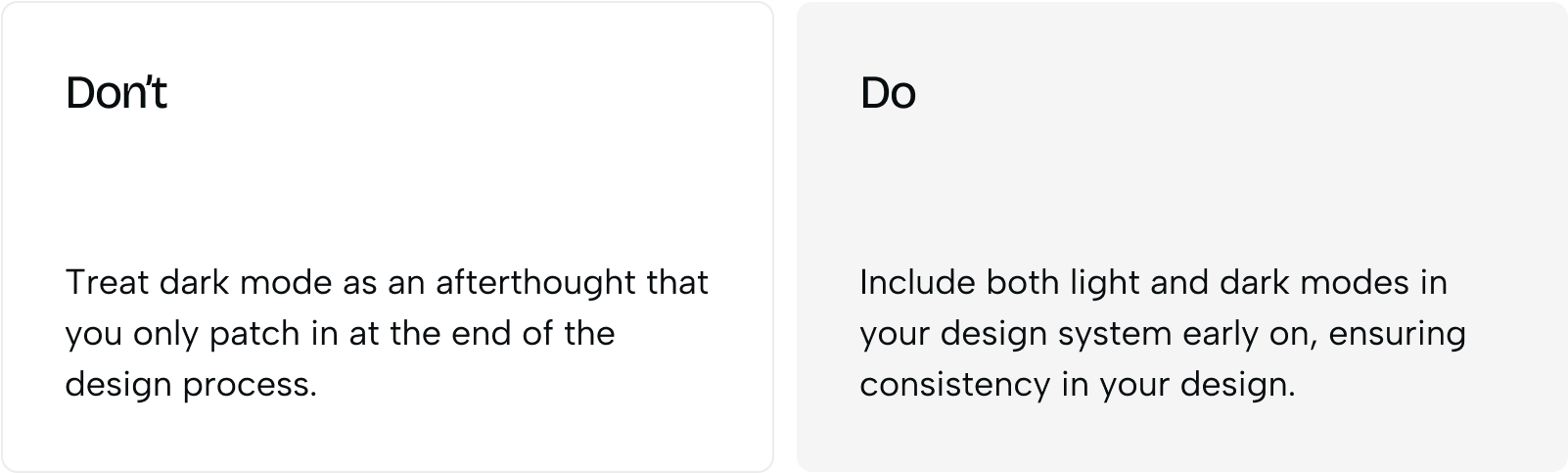
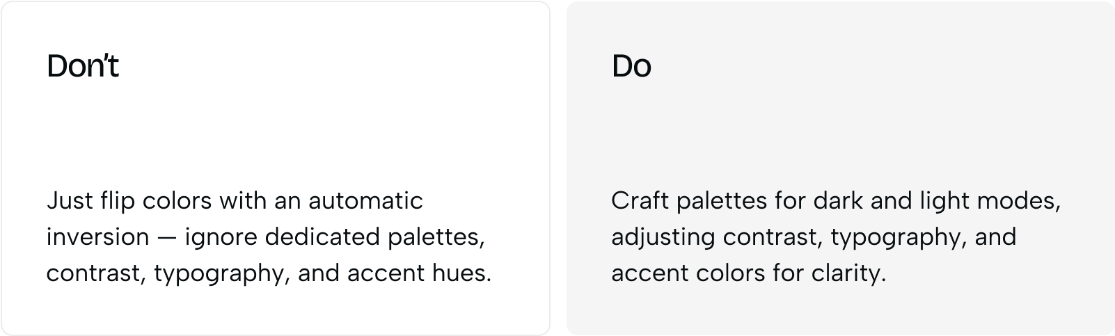
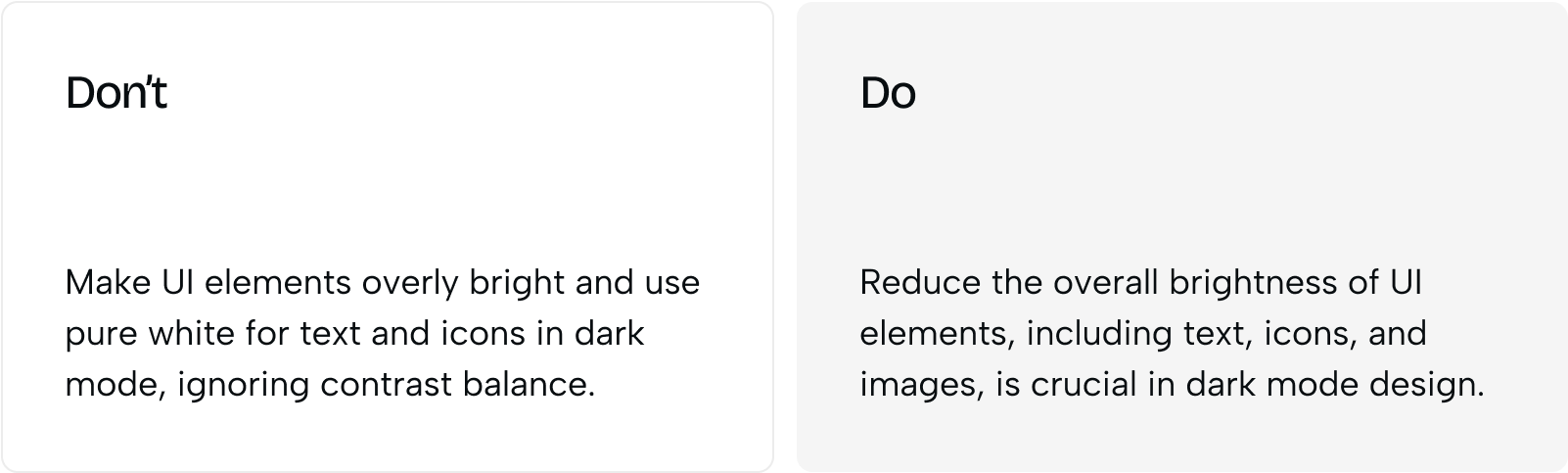
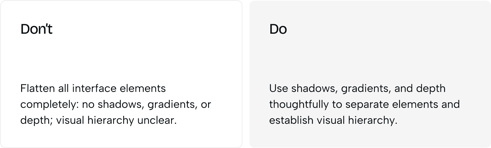
There’s no universal answer to the dark vs light debate. The best UX isn’t choosing one side — it’s giving users both.
By respecting accessibility, context, and emotional design, you can create interfaces that are not just visually appealing but also functional, comfortable, and brand-consistent.
In the end, dark mode and light mode aren’t rivals — they’re tools for better user experience when applied with intention.
Share this article with friends



Sep 29, 2026
6 min read
B2B website redesign without losing traffic: A complete b2b website redesign guide covering UX audits, 301 redirect mapping, and metadata preservation. Partner with a top b2b website redesign agency that boosts conversions while protecting your organic rankings.

Sep 29, 2026
8 min read
Small business web design services that fit your budget. Get affordable small business website design from one of the best website design companies for small business — with transparent pricing and no hidden fees.
